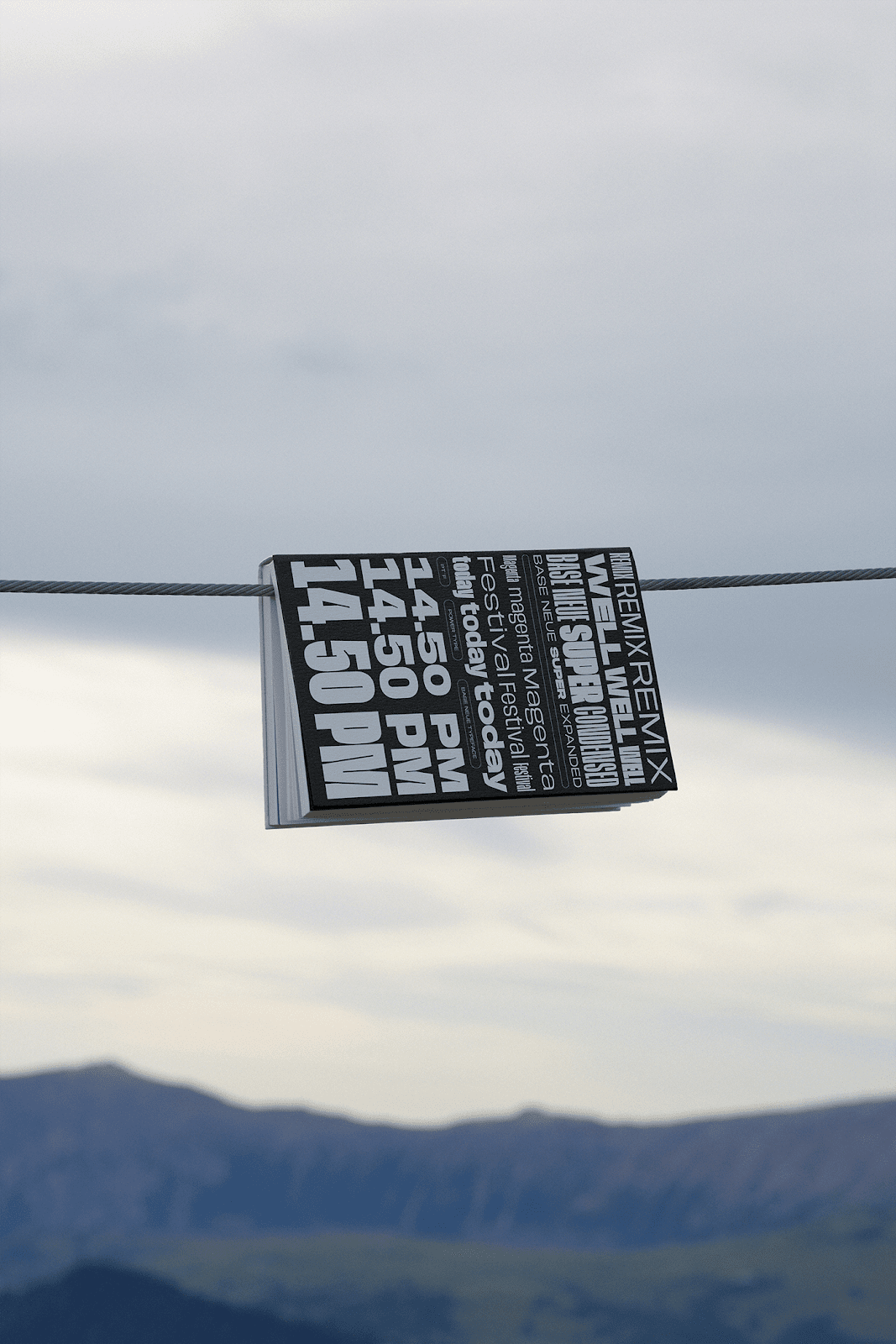
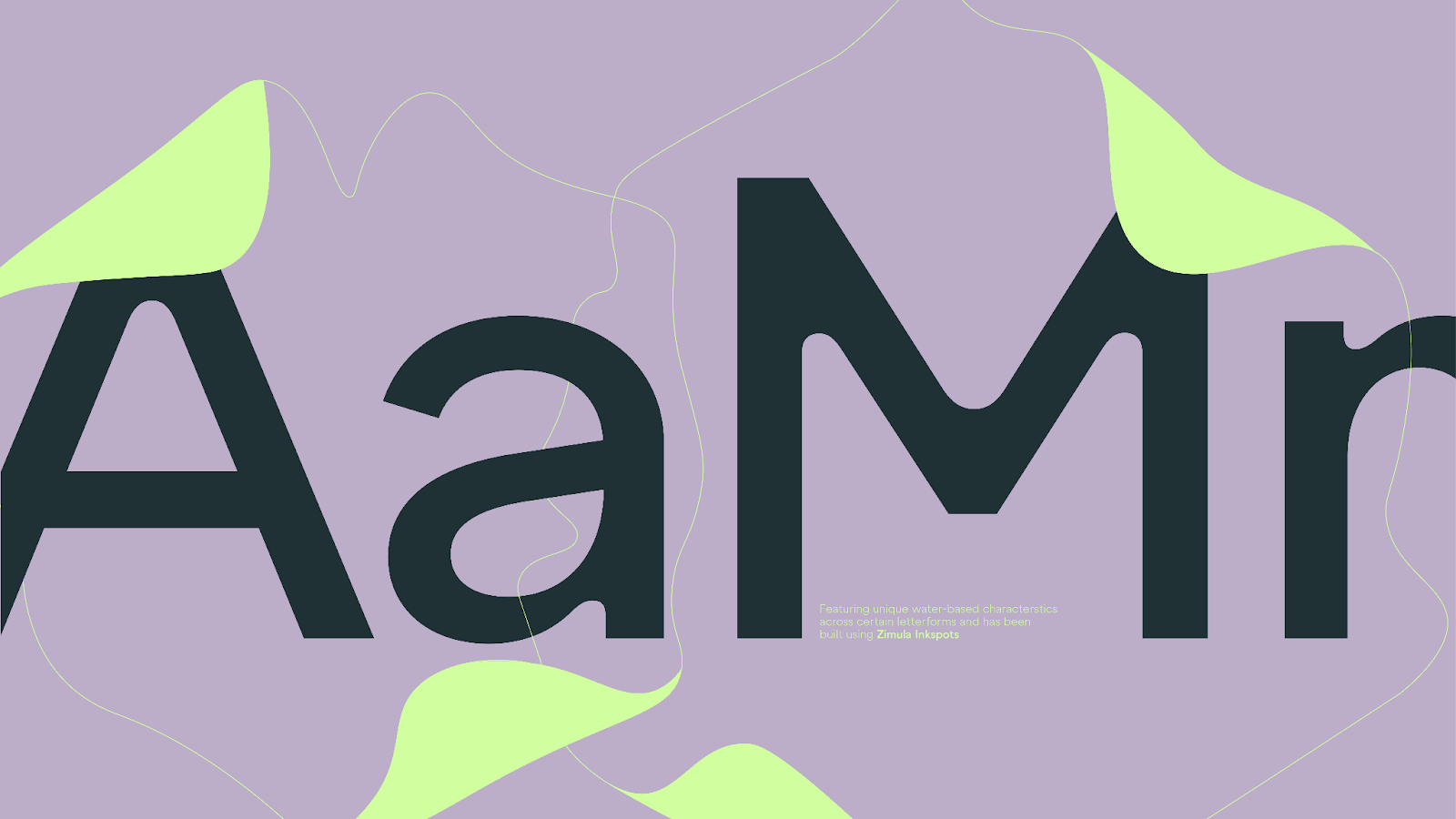
Dutch Film Days festival branding by DE_FORM uses Dutch orange and five daily hues as a six-color system, turning program flow into bold visual identity.Color does two jobs here. DE_FORM took Dutch o...
Our roundup of the best of the week explores how brand identities and tactile surfaces balance generative code, interactive packaging, and physical mass.We analyze how editorial constraints and dynam...
Algerian personal brand identity designer Mehdi Drd creates playmaker systems. The visual system relies on crisp royal blue details.Mehdi Drd designed the new M10 Studio brand with clear discipline. ...
SFC Brison is a bold retro western typeface from Skilline Fonts Co. — 5 styles built for BBQ branding, hot sauce labels, and Americana packaging designs.Most retro western typeface releases stop at o...
CGI product visualization design replaces traditional photography. Matt Oxley shows how Redshift rendering translates industrial objects to high quality.The visual system leverages a Cinema 4D and Re...
Kirill Gluschenko explores a disciplined approach to book design, treating physical formats, layout structure, and text rhythm as interdependent choices.The publication system utilizes structured lay...
taoSTUDIO builds a bilingual packaging design for Lushang Chinese Tea where hill silhouettes and leaf forms merge into a single structural identity. The mark balances traditional Chinese aesthetics wi...
A study of the generative design system for the Bengal Classical Music Festival by Shafiq Alam, translating ragas into fragmented three-dimensional arts.The core of the composition relies on a three-...
The brand identity for MORION, a modern skincare and perfumery label designed by Finland-based designer Darina Selischeva, establishes a clinical yet elegant aesthetic. Through structured type layouts...
London-based design practice Studio NinetyOne created a cohesive restaurant brand identity for YARI CLUB, a modern Japanese yakitori establishment. By combining clean typography with sharp graphic lin...
AOB Design presents a refined approach to conceptual brand identity design for CASA. The system turns the feeling of home into quiet form and space.The logo uses geometric restraint to balance form a...
s constellation packaging for Starville Jeju gives each zodiac sign a flat color field and cartoon creature across keyrings, boxes, booklets.Starville is a dark-sky resort on Jeju Island ...
Adobe expands AI design tools into Premiere, Photoshop, Illustrator, InDesign, and Frame.io — the agent automates busywork; creative pros keep the craft.The Premiere interface shows it plainly: a dar...
s technology company brand identity AI chip system for NUON balances a precise geometric mark with a deep space blue-black visual palette.The visual system is built on a modular grid. A sh...
Merging two campuses into a single engineering entity required a visual system that honors 18th-century maritime roots while signaling future technological progress. This brand identity design uses di...
PLOP #02 is a 32-page graphic design revue from Slanted Publishers examining the Polish poster—its history as protest, export product, and national myth.The second issue arrives in A4 saddle-stitched...
Milanese studio Gabriele Colia conceptualized editorial design systems representing abstract multidimensional activations.The project features clean layouts. Every page uses a strict grid. This creat...
The Daily Form relies on a dynamic brand identity rotating color system. Souto and Armanini designed this framework to adapt to constant visual changes.The layouts use a clear grid. This structural h...
Valkiria Inteligência Criativa, a design studio based in Porto Alegre, Brazil, has completed the brand identity redesign of Invicta, a Brazilian company with over 70 years of history as a reference in...
Overzero is a bold condensed display typeface designed by Fredella Agatha. The font has sharp shapes and tight spacing, making it ideal for layouts.It works well for layout designs that need to stand...
This museum brand identity design for MOMU in London uses a fluid graphic system. Bali-based WOBL Creative built the project around the physics of resonance.The visual system translates wave behavior...
Brand identity design for Wildpetals by Joshua Oladele — a botanical garden of flowers, birds, illustrated wayfinding systems, and collectible bird cardsWildpetals is a conceptual brand identity desi...
UNBLACKIT by Backbone Branding is a packaging design project. Taking into account nowadays’ great variance of dairy products and its abundance on the retail.Backbone Branding designed UNBLACKIT as a ...
Marta Cantero Fiol designs a highly sophisticated and structural denim brand identity for CAPRICHO, leveraging a bold grid system.The brand is built on instinct and desire. A modular layout dictates ...
Vietnamese illustrator LN Hung designed this comprehensive burger identity utilizing beautiful high-contrast illustrations.Vietnamese designer LN Hung established this custom brand identity using hea...
Smooothy Slider Library by Federico Valla is a graphic design project. Smooothy is an open-source, highly configurable, and framework-agnostic slider.Federico Valla designed Smooothy Slider Library a...
Our roundup of the best of the week highlights the structural tension between physical architecture, variable typefaces, and dynamic motion.We explore how grid discipline and expressive letterforms d...
Budapest-based DE_FORM Studio designed the cultural festival identity for ACEAC, using variable typography to translate dance movement into graphic design.The cultural festival identity balances high...
s FH Premier is a grotesque font family spanning three subfamilies and six weights, built for signage, transport and editorial.The hero image puts the case plainly: black le...
This 3D printed stand designed by Boogie has a clean hexagon pattern. It fits modern desks. It gives good support for large phones and uses less filament.This desktop accessory uses a honeycomb grid....
Vantage free font features hand-drawn, retro-inspired, psychedelic-style display letterforms for modern branding projects.This typeface captures the creative spirit of mid-60s counterculture movement...
Hamburg-based Yulia Noten built the Borzay packaging design around real dog behavior — stubborn, mud-curious, never the idealized good boy. And it shows.Borzay is a contemporary dog-goods brand — col...
A cultural anchor in East Harlem merges block-party energy with premium lounge aesthetics in a vibrant new brand identity designed by Tosin Sam. Read on!At the center of this visual system is a masco...
Grandiose Collection glassware brand identity by Agostina Benaglia uses a bold condensed serif and four radial gradients across packaging and print work.The logotype sets the register immediately: GR...
A cold-pressed juice brand identity challenges conventional beverage packaging through playful character-driven illustrations.lin soso designed this bold cold-pressed juice brand. The design features...
Daniele Procopio establishes a structural approach to figurative drawing. The Bologna-based illustrator utilizes a digital workflow.This digital illustration portfolio shows how strict consistency an...
Kurio by Denis El is an app interface design project. Legacy software cannot keep up with the speed and efficiency of modern fintech SaaS ecosystems.Denis El designed Kurio as an interface project. K...
Inspired by the first light of sunrise, this specialty coffee brand uses a warm palette and organic shapes to slow down the morning ritual. The packaging design centers on custom typography that mirro...
Microsonic by Estúdio BRN BRANDS: Microsonic was born from the belief that true growth comes from intelligence, not improvisation, a display typography design project.Electric blue gradients and azur...
s second collection demonstrates how kinetic typography motion design can transcend programmatic software presets to feel like physical mass.The four sequences in this series treat chara...
s new educational brand identity for Gestaliz prioritizes structural visual clarity over decorative SaaS tropes.Brazilian studio Vilarejo developed this mature visual system. The desi...
coffee as a medium to translate urban landscapes into visual assets through a comprehensive brand identity design. It transforms a global beverage staple into a vessel ...
amp;How built a brand identity system for Ideogram—brain logomark in deep navy, wide-tracked cream serif, and verbal identity built on design principles.The logomark is a stylised brain with a ne...
s Melabody project presents a clean form of inclusive beauty packaging, turning bottles into tactile sculptures for melanin-rich skincare.The Blender renders feature a strict type syste...
amp; by Creavora ® is a packaging design project. Skincare that travels with you. Explore the design features and view the full gallery.Creavora ® designed GLOWA® Skincare B...
Bold, oversized characters dominate a visual identity that prioritizes high-contrast scales and expressive letterforms. This approach to display typography design relies on extreme weight variations t...
Cylindrical boxes replace traditional plastic bags to turn a kitchen staple into an aesthetic object for the counter. This approach to packaging design shifts pasta from a mundane carb source to a cen...
KM20 Concept Store’s Web Design: A Fusion of Style and Function abduzeedo1114—24 Explore KM20 Concept Store’s dynamic web design by Embacy, blending high fashion with a seamless digital experience.
The KM20 Concept Store, celebrated as the world’s best concept store by Highsnobiety in 2017, is more than a fashion destination—it’s a cultural hub that hosts a variety of events from concerts to art exhibitions. For their 15th anniversary, KM20 teamed up with the talented Embacy team to create an online shopping experience that reflects their avant-garde ethos.
Embacy’s approach to KM20’s web design is all about synergy between high fashion and cutting-edge digital aesthetics. The site captivates from the moment you land on the homepage, with a clean yet edgy layout that mirrors KM20’s unique blend of sophistication and street style. High-resolution visuals of the latest collections take center stage, framed by a user interface that’s both intuitive and stylish.
The use of bold typography and strategic animations draws users in, making every interaction feel deliberate and engaging. This isn’t just an online store; it’s a curated experience that celebrates the artistry of fashion.
The color palette leans on monochromatic tones with strategic pops of color, emphasizing key elements like product features and special announcements. This choice keeps the overall look refined while adding moments of visual excitement. Typography, on the other hand, combines modern sans-serif fonts with bold weight variations, reflecting KM20’s fashion-forward image.
Animations play a crucial role in maintaining the site’s dynamism. Hover effects, smooth transitions, and interactive elements are executed thoughtfully, enhancing user engagement without distracting from the main content. It’s a perfect balance that Embacy has mastered, making browsing feel fluid and immersive.
Navigation on KM20’s site is as effortless as it is beautiful. The minimalist menu ensures that users can easily explore collections, events, and exclusive collaborations. Embacy’s design simplifies the shopping experience, making it accessible to both fashion enthusiasts and casual visitors. Even behind-the-scenes details, like product filtering and checkout, are streamlined for maximum efficiency.
This redesign comes as KM20 marks 15 years of redefining fashion retail. Throughout the anniversary year, the store will spotlight collaborations with renowned designers, and the website will serve as the perfect canvas for these launches. The digital space will continue to evolve, showcasing everything from limited-edition drops to interactive fashion events.
KM20’s web design is a masterclass in blending visual appeal with functionality, making it a standout example of how digital platforms can elevate brand storytelling. Embacy has created a site that’s not only stylish but also user-friendly, setting a new standard for fashion e-commerce.
Explore more of Embacy’s innovative projects on Dribbble athttps://dribbble.com/embacy.
Web design artifactsCredits* General Producer: Anastasiya Pevets
* Creative Producer: Nikita Void
* Design Director: Elisey Soloviev
* Art Director: Aleksandra Voronina
* Designers: Aleksandra Voronina, Vlad Milovskii
* Case Production & Animation: Maria Roshka
* Client (KM20): Kirill Matveyuk, Olga Karput
House of gAi: Branding and Visual Identity for the Future abduzeedo1114—24 Explore House of gAi’s branding, merging AI and design, and learn how it empowers creatives through The Creative Futures Hub.
In an era where technology and design are becoming increasingly intertwined, House of gAi stands out as a forward-thinking platform that elevates graphic designers through artificial intelligence. Founded by Anthony Wood, the former CEO of Shillington Education, House of gAi introduces The Creative Futures Hub—a community dedicated to teaching designers how to integrate AI into their creative processes seamlessly.
The visual identity of House of gAi is a testament to the harmony between technology and creativity. The branding is clean and futuristic, reflecting the innovative spirit of the platform. The user interface is intuitive, making the learning experience accessible and engaging for all designers. Typography choices lean modern and sleek, giving the site a refined look that doesn’t sacrifice clarity for style.
Custom illustrations and dynamic graphics throughout the site emphasize AI’s role in design. These visuals are not only captivating but also serve to demystify AI, positioning it as an ally in the creative process rather than a threat. It’s a thoughtful approach that aligns with House of gAi’s mission to transform how designers perceive and use AI in their work.
House of gAi goes beyond aesthetics, offering a robust suite of resources aimed at empowering designers. The Creative Futures Hub provides free courses, collaborative spaces, and events designed to foster innovation. By making AI approachable and actionable, the platform ensures that creatives remain at the forefront of the industry.
One of the standout features of the branding is its ability to evoke a sense of curiosity and possibility. The design language is intentionally forward-looking, using visuals that inspire designers to explore the potential of AI while maintaining their creative integrity. This balance between innovation and accessibility makes the platform inviting and essential.
Crystal Lin, Experience & Product Design Lead, speaks to the influence of Anthony Wood, emphasizing the impact of his mentorship on her career in design. “Anthony is without a doubt someone who changed the trajectory of my career,” she notes, underscoring the legacy of knowledge that House of gAi seeks to expand upon.
As part of its ongoing efforts to lead the conversation around AI and design, House of gAi will host a series of events titled AI and the Design Industry in December. These gatherings will feature insights from industry leaders, shedding light on how AI continues to reshape the creative landscape.
Designers eager to future-proof their skillset and revolutionize their workflows are encouraged to join The Creative Futures Hub. For more information, visit House of gAi and dive into the future of design.
Bien-Être Simple’s Vibrant Branding and Web Design by Impulso abduzeedo1113—24 Explore Bien-Être Simple’s engaging branding and web design by Studio Impulso, blending accessibility and modern aesthetics.
Bien-Être Simple (BÊS) has long been a trusted source for accessible content on mental and physical health. Recently, the media platform underwent a comprehensive rebrand led by Studio Impulso, transforming its digital presence with a vibrant, fresh, and friendly identity. The result is a visual language that breaks down barriers, ensuring health topics remain approachable and free from stigma.
Studio Impulso’s primary goal was to redefine how Bien-Être Simple communicates with its audience. The design had to feel like a safe, welcoming space, reflecting the platform’s mission of inclusivity. Every aspect, from the color palette to the web layout, was chosen to convey warmth and accessibility. The new branding signals that tough conversations about health can be approached with compassion and openness.
Color Palette: A Mix of Vibrancy and ComfortColor plays a crucial role in this rebrand. The selected hues are bright yet calming, striking a balance between energy and comfort. Shades of blue instill a sense of trust and calm, while pops of green and yellow bring a playful edge, representing hope and vitality. This thoughtful combination ensures the platform is both visually engaging and emotionally resonant, making health topics feel less intimidating.
Typography in the new design reflects a clean and modern sensibility. Sans-serif fonts dominate, chosen for their readability across screens. Paired with strategic use of bold and light weights, the text hierarchy is clear, making it easy for users to navigate the content. The font choices align with the platform’s mission: to deliver crucial information in the most digestible way possible.
A User-Centric Web ExperienceThe redesigned website, crafted by Studio Impulso, prioritizes user experience. Clean lines, intuitive navigation, and ample white space ensure that visitors can easily access articles and resources. The layout is responsive, adapting beautifully to various devices, a necessity for a platform dedicated to being universally accessible. Smooth transitions and interactive elements guide the user without feeling overwhelming.
The new visual identity and web design make Bien-Être Simple a standout in the health and wellness space. It’s a masterclass in how design can drive inclusivity and encourage meaningful engagement. Studio Impulso has successfully balanced creativity with clarity, delivering a look that embodies Bien-Être Simple’s core values.
For more details on this inspiring project, visit Studio Impulso’s portfolio at http://studioimpulso.com.
Branding and web design artifactsCredits* Art direction : @impulso.studio
* Website : www.studioimpulso.com
* Instagram : @impulso.studio
Ganezza’s Visual Identity: A Dynamic Branding Journey abduzeedo1113—24 Explore Ganezza’s vibrant branding and visual identity, designed by Turan Ramazanli, that captures energy and warmth.
Ganezza, a home furnishings retailer based in the Netherlands with locations in Schiedam and Amsterdam, has recently unveiled a striking new visual identity designed by Turan Ramazanli. This rebrand perfectly encapsulates Ganezza’s modern, inviting essence while enhancing its presence in the competitive home decor market.
Color Palette: Warmth and Creativity in Every ShadeA key element of Ganezza’s new identity is the vibrant color palette. Orange dominates, chosen for its warmth and ability to evoke feelings of happiness. This friendly, playful hue transforms spaces, making them feel full of energy and life. It’s a strategic choice, as the color not only conveys optimism but also aligns with Ganezza’s commitment to creating lively environments through their furnishings.
Balancing the bright orange are complementary tones that maintain the brand’s sophistication while allowing for moments of visual excitement. The palette is designed to be memorable, setting Ganezza apart in the home furnishings sector.
Typography and Iconography: Cohesion in Every DetailTypography in Ganezza’s branding strikes a harmonious balance between modernity and accessibility. The typeface selection reflects a dynamic personality, making every written element clear and engaging. Icons, custom-designed to pair seamlessly with the typeface, enhance the brand’s visual language, emphasizing simplicity and cohesiveness.
This thoughtful integration of type and iconography ensures that Ganezza’s messaging is as visually appealing as it is easy to digest. Every design decision contributes to a brand identity that feels both unified and versatile, adaptable to various marketing materials and store environments.
Design Philosophy: More Than Just LooksTuran Ramazanli’s approach goes beyond aesthetics. The visual identity was created with Ganezza’s core values in mind: quality, creativity, and exceptional customer service. By combining visual elements that evoke emotion with a functional, user-friendly design, the rebrand speaks to Ganezza’s mission of transforming spaces through high-quality, stylish furnishings.
The branding is both bold and welcoming, capturing the attention of a design-savvy audience while remaining approachable to everyday shoppers. It’s a reminder that effective visual identities don’t just look good—they communicate a brand’s story and values effortlessly.
For designers, Ganezza’s visual identity offers a masterclass in creating a cohesive brand experience. To explore more of Turan Ramazanli’s work, visit behance.net/X_Turan_X.
FLIPPO Pet Food: A Fresh Take on Branding and Packaging Design abduzeedo1111—24 Discover FLIPPO Pet Food’s playful branding and clean packaging design, making waves in the pet food industry.
FLIPPO Pet Food is more than just a brand; it’s a lively celebration of real, natural nutrition for pets. Developed in Spain, FLIPPO takes a bold stand against traditional pet kibble, ushering in a wave of wholesome, fresh ingredients for our loyal companions. This design-centric approach comes to life through FLIPPO’s unique branding and eye-catching packaging, crafted by the talented team at invade design, Colombia.
A Visual Feast for Pet LoversFLIPPO’s brand identity is anything but conventional. It combines playful illustrations, vibrant colors, and friendly typography to create an experience that instantly captures attention. The visual storytelling here is intentional, aimed at communicating the brand’s commitment to quality and its promise of real food for pets. The design invites pet owners to rethink what they feed their furry friends, making every interaction with the packaging memorable.
One of the standout features of FLIPPO’s design is its use of clean lines and engaging illustrations. Each packaging element feels like an invitation to a healthier, happier lifestyle for pets. The color palette bursts with energy, reflecting the brand’s fun and light-hearted personality while reinforcing its serious commitment to pet health.
Thoughtful Typography and Brand MessagingTypography in FLIPPO’s design strikes a fine balance between playful and practical. The brand uses bold, easy-to-read fonts that ensure key messages are clear, whether they’re displayed in store aisles or in a social media feed. This typographic choice complements the visuals, making the overall design both appealing and accessible.
Brand messaging leans into humor and relatability. FLIPPO’s playful copy engages pet owners with a tone that’s both fun and genuine. It’s a reminder that feeding our pets shouldn’t be a chore but a joyful experience, one that prioritizes their well-being.
From Concept to Reality: Behind the ScenesThe team at invade design worked meticulously to craft an identity that stands out in the competitive pet food market. Photography by Serena.Studio captures the freshness and quality of the ingredients, enhancing the appeal of the design. Together, these elements create a brand ecosystem that feels cohesive and authentic.
For those interested in design inspiration, FLIPPO offers a masterclass in branding and packaging that balances fun with function. Check out the full project and more by invade design on Behance at https://www.behance.net/madebyinvade.
Exploring Editorial Design in ‘EN TORNO A LA MATERNIDAD’ abduzeedo1111—24 Dive into the thoughtful editorial design of ‘EN TORNO A LA MATERNIDAD,’ crafted to resonate with themes of motherhood.
Pau Marín’s project, EN TORNO A LA MATERNIDAD, explores the essence of motherhood through a refined editorial design that merges visual storytelling with emotive impact. The design embodies the themes of care, strength, and the cycle of life, delivering a visual experience that’s as insightful as it is aesthetically appealing.
Design Approach and ConceptAt the heart of this project lies a narrative-driven approach. Marín carefully crafted the layout to reflect the nuances of motherhood, using visual metaphors and deliberate design choices. The typographic elements are minimal yet impactful, guiding the reader’s eye through the content seamlessly. Serif and sans-serif typefaces interplay to emphasize the transitions between vulnerability and empowerment that define the maternal experience.
Photography plays a crucial role in this work, capturing tender moments that resonate with authenticity. Each image, strategically placed, adds layers of meaning, complementing the textual narrative. Marín’s ability to weave text and imagery together in a harmonious flow highlights the power of good editorial design to evoke emotions.
Layout and Visual HierarchyMarín’s layout decisions ensure readability while also inviting reflection. White space is used masterfully, giving the design room to breathe and allowing the reader to absorb the emotional weight of the content. The flow from one spread to the next feels intentional, never rushed, mirroring the natural rhythms of life.
The visual hierarchy emphasizes important sections, using bold headings and thoughtful subheadings. This structure not only aids in navigation but also underscores key messages without overwhelming the viewer. The balance between text, imagery, and negative space is a testament to Marín’s understanding of editorial design principles.
Thematic Consistency and Visual MetaphorsColors in the project echo themes of nature and nurture, employing soft pastels and earth tones. These choices create a calming yet evocative palette that enhances the emotional resonance of the design. Visual metaphors, like the cyclical patterns in layouts, symbolize the never-ending cycles of care and love associated with motherhood.
For designers and illustrators, EN TORNO A LA MATERNIDAD serves as an inspiring example of how editorial design can amplify storytelling. The project encapsulates the emotional and cultural dimensions of its subject matter, offering a blueprint for blending design and narrative seamlessly.
Discover more about this project and Pau Marín’s impressive portfolio on Behance at behance.net/paumarn1.
Editorial design artifacts
Credits and thanks* Fina Perelló Andreu
* Maria José Fuentes Perelló
* Nuria Fuentes Perelló
* Nuria Marín Fuentes
* Claudia Marín Penella
* Pablo Lázaro Ballester
* Diane Gello
* Irene Martinez De La Vega
* Andrea Peregrín Moreno
* Coribel Zubillaga García
Explore ChainGPT Labs’ Web3 Brand Identity & Web Design abduzeedo1111—24 Discover ChainGPT Labs’ unique Web3 branding and web design with seamless 3D animations and a modern interface.
ChainGPT Labs stands as an ambitious venture, propelling innovation in the blockchain and Web3 startup world. A project backed by the ChainGPT team, this platform provides strategic funding, incubation, and acceleration services tailored for the Web3 ecosystem. To visually represent such a forward-thinking initiative, a distinctive and cohesive brand identity was crucial.
The design challenge was clear: introduce ChainGPT Labs as a part of the existing ChainGPT ecosystem while ensuring it had its unique presence. The team behind this creative endeavor adopted a strategy that balanced modernity with a recognizable brand connection.
Typeface Selection and Visual CohesionOne of the design cornerstones is the typographic identity. The chosen typeface blends sleek, experimental, and monospace styles, reminiscent of sci-fi aesthetics yet grounded enough to maintain clarity. This combination brings a futuristic yet approachable vibe, mirroring ChainGPT Labs’ mission of bridging advanced technology with user-friendly design.
The website, crafted with a focus on interaction, features seamless 3D animations. These animations not only add depth but also engage users in an immersive digital experience. The modern, functional interface ensures smooth navigation while highlighting essential content. The design isn’t just about aesthetics; it delivers on usability, ensuring every visual element contributes to a cohesive narrative.
3D Animations: Bringing Ideas to Life3D animation plays a pivotal role in elevating the digital experience. Each animation is thoughtfully integrated, making the browsing experience lively without compromising performance. These elements align with Web3’s ethos, suggesting a digital landscape that’s both dynamic and innovative.
Balancing Innovation and Brand FamiliarityDesigners also needed to ensure that ChainGPT Labs felt like an extension of ChainGPT’s established identity. The visual ecosystem leans into bold aesthetics while subtly referencing familiar brand cues. Strategic use of color, shape, and layout ties the Labs’ identity back to its origins, achieving a harmonious balance between innovation and brand recognition.
Why It Matters for Design EnthusiastsFor graphic and interface designers, ChainGPT Labs offers an inspiring case study in brand expansion. The project exemplifies how visual elements can maintain brand consistency while pushing creative boundaries. This thoughtful integration of typography, 3D animation, and a user-focused interface marks a new chapter for digital design in the Web3 space.
For a full breakdown of the design elements, visit the work of Sigma Software Design at https://sigmasoftware.design/.
Illustration for Impact: HART Curatorship Incubation Programme Visuals abduzeedo1108—24 Discover Anthony Lam’s captivating illustration work for the HART Curatorship Incubation Programme 2024, blending art with purpose.
HART Collective Limited’s 2024 Curatorship Incubation Programme comes alive through a series of vibrant visuals and social media collaterals designed by Anthony Lam. This illustration project, aimed at amplifying the HART initiative’s reach, seamlessly combines creativity and purpose. Let’s dive into the thought process, design elements, and impact of these compelling illustrations.
Bringing Artful Storytelling to HARTThe HART Curatorship Incubation Programme is more than just an event; it’s a platform that nurtures emerging curators and fosters artistic engagement in Hong Kong. For this initiative, HART Haus collaborated with Anthony Lam to create visuals that encapsulate the spirit of innovation and community central to the programme. With a focus on vibrant, eye-catching design, Lam’s illustrations breathe life into the promotional material, making the programme’s message resonate visually.
One of the striking features of this project is the careful choice of typography. The primary typeface used is Degular Display by James Edmondson from OH no Type Co. This choice lends a contemporary and approachable vibe to the design, complementing the modern and energetic illustrations. The type’s bold and clean lines create a sense of structure amidst the dynamic visuals.
Lam’s illustrations use a playful yet sophisticated color palette, striking a balance between the avant-garde and the accessible. The design approach draws heavily from art movements that emphasize form and rhythm, mirroring the essence of a programme that curates art as an experience. Each piece incorporates abstract shapes and flowing patterns that evoke a sense of motion, representing the evolving journey of curatorship and the fluid nature of artistic collaboration.
Illustration isn’t just about static visuals; it’s about telling a story that connects with an audience. For this project, Lam crafted designs meant to adapt seamlessly across multiple platforms, from print to digital media. The social media assets, in particular, utilize animations and interactive elements to capture the attention of a fast-scrolling audience. These designs ensure that the HART Curatorship Incubation Programme stands out in the crowded digital space.
The use of illustration as a core element of the visual identity allows for more flexibility and engagement. It provides a canvas where abstract concepts about art and curatorship can be expressed in a way that feels both authentic and exciting. Whether seen on a poster, a website, or a social post, each visual invites viewers to explore and learn more about the programme.
Illustration plays a crucial role in making art initiatives accessible to a broader audience. By employing a visually striking yet relatable design language, Anthony Lam’s work for HART bridges the gap between curators and the community. The visuals don’t just inform; they inspire curiosity and engagement, which is essential for an incubation programme that seeks to elevate emerging curators.
This collaboration also highlights the impact of thoughtful design in the arts sector. By leveraging illustration, HART Collective can convey complex ideas in a way that is immediately understandable and appealing. The choice of colors, the movement within the compositions, and the bold typography all work together to create a cohesive narrative that draws people in.
The HART Curatorship Incubation Programme’s visual identity showcases how illustration can elevate an arts initiative, making it more engaging and impactful. Anthony Lam’s designs prove that illustration, when done thoughtfully, can serve as a bridge between art and the public, turning viewers into participants and supporters.
This project is a reminder that effective visual identity goes beyond aesthetics; it tells a story that connects and captivates. As HART continues to grow its curatorship programme, the illustrations created for this year’s campaign will undoubtedly leave a lasting impression, drawing more people into the world of art and collaboration.
Graphic design and illustration artifactsCredits* Client: HART Haus, HART Collective Limited
* Typeface in use: Degular Display designed by James Edmondson. From OH no Type Co.
* Author: Anthony Lam
Graphic Hunters: Pushing the Boundaries of Sports Visual Identity abduzeedo1107—24 Explore how Graphic Hunters’ visual identity redefines sports branding through innovative design inspired by fashion and art.
Graphic Hunters, a Dutch studio dedicated to sports branding, isn’t playing by the typical design rulebook. Instead, their newly crafted visual identity steps outside the confines of traditional sports aesthetics, introducing elements drawn from fashion and high design. The result is a high-impact, versatile identity that positions Graphic Hunters as a creative club worth joining—whether as a client or a collaborator.
A New Playbook for Sports BrandingAt the heart of Graphic Hunters’ approach is the idea that the sports industry deserves a more refined and exclusive visual experience. This belief is woven into every part of their branding, which Monga Design and Vogau led with a clear vision. The goal was to create a system that balances functionality with creative exploration, breaking conventions while still delivering practical, adaptable solutions for various applications.
This innovative take on visual identity isn’t just about aesthetics; it’s a strategy aimed at redefining the brand’s place in the market. Graphic Hunters has always described itself as a team hungry for new challenges, and now, their brand identity reflects that spirit. The new look aims to make the studio stand out in the sports arena and beyond, appealing to clients and team members who value originality and impact.
Graphic Hunters’ identity combines familiar elements from the sports world—like motion and heat—with unexpected treatments. The design team drew inspiration from fashion and abstract art to create a visual language that transcends typical sports branding. This cross-pollination of ideas manifests in several core elements:
Typographic Experimentation: Instead of relying on traditional sports typefaces, the team played with a variety of fonts that feel bold and contemporary. Typography serves as both structure and disruption, bringing energy to each layout.
Photographic Treatments: The identity includes photographs that have been creatively manipulated, breaking up the grid and adding an element of surprise. This technique turns static images into dynamic design features, echoing the constant motion of sports.
Grid System and Stickers: To keep the brand’s applications cohesive yet flexible, a structured grid underpins the design. However, this is cleverly offset by playful elements like stickers and graphical interventions, which keep the brand feeling fresh and exciting.
One of the biggest challenges was making the visual system adaptable yet creatively open. Sports branding often leans into themes of power and motion, but Graphic Hunters wanted to do more. The result is a brand that’s equally at home on a team jersey or a digital campaign, seamlessly moving between refined, impactful moments and bold, playful expressions. This adaptability speaks to the studio’s ethos of being a “creative club,” where everyone is encouraged to push the boundaries.
Another essential aspect was research. The design team explored references beyond the sports realm, looking at high fashion and experimental graphic design. This broader inspiration palette allowed Graphic Hunters to create something genuinely unique for the industry. The identity’s experimental typography and abstract motifs capture the feeling of heat and energy—core elements of sports—while grounding them in a sophisticated design language.
Elevating Sports Design Beyond the FieldBy combining these unexpected references with a strong foundation of sports elements, Graphic Hunters has crafted a visual identity that is both striking and functional. It stands as a testament to the idea that sports design can be more than bold fonts and action shots. It can be a narrative of innovation and exclusivity, appealing to an audience that appreciates both the adrenaline of sports and the sophistication of high design.
Graphic Hunters’ reimagined branding proves that sports-focused design can be just as experimental and refined as any high-fashion brand. It’s a visual identity that elevates the sports studio into a space where design meets performance, art meets action, and innovation becomes the new norm. As the brand continues to grow, this identity will serve as a powerful statement of their ambition: to bring high-impact, original design to the world of sports, one project at a time.
Branding and visual identity artifactsCredits* Authors: Monga Design, Vogau and Clint Studio
* Visual identity: Monga Design (Mateus Yuzo, Michel Refatti) and Vogau (Carlos Eduardo Marin, Gabriela Colebrusco Peres)
* Motion: Clint Studio (Bruno Vitalino, Danilo Coelho, Gustavo Brazzalle, Lucas José Galego, Luciano Burger
GitHub x BUCK: Crafting a Dynamic Visual Identity for Universe ’24 abduzeedo1107—24 Learn how BUCK redefined branding and visual identity for GitHub Universe ’24 with monumental design inspired by code.
The annual GitHub Universe event is a celebration of innovation, bringing together some of the brightest minds in software development. This year, GitHub partnered with BUCK, a renowned global creative company, to reimagine the event’s visual identity. Inspired by the theme “The World’s Fair of Software,” BUCK transformed GitHub Universe ’24 into a visually immersive experience that blended the past and future of software culture. Here’s a look at how this collaboration pushed the boundaries of branding and visual identity.
The Creative Vision: Merging Tradition and ProgressGitHub Universe ‘24 marked a milestone as the event’s tenth edition. This special occasion called for a branding overhaul that both paid homage to GitHub’s legacy and celebrated the event’s ongoing evolution. BUCK’s approach was rooted in capturing the spirit of World’s Fairs, where innovation and collaboration take center stage. Ward Graumans, BUCK’s Creative Director, emphasized their intent: “We aimed to create a look that celebrates this milestone while pushing the brand forward.”
The visual system developed by BUCK didn’t just rehash previous designs. Instead, it evolved into a toolkit that incorporated new elements while staying true to GitHub’s core identity. Central to the branding were what BUCK called “Monuments of Progress.” These unique structures were a reinterpretation of their prior 2D shape library, elevated to represent key GitHub values. Each monument carried icons, mascots, and insider references from the developer community, merging playful aesthetics with thoughtful design.
Key Elements of the Visual IdentityBUCK crafted a comprehensive design system that tied together various aspects of GitHub’s event branding. The system integrated fresh color palettes, new typography, and updated logos, all influenced by the visual language of coding. The Monuments of Progress became the standout feature, serving both as iconic standalone pieces and as the basis for hero visuals. This creative concept was not just about aesthetics; it reinforced the event’s narrative, with each visual element acting as a beacon of innovation.
Beyond static design, BUCK brought these monuments to life through animations and dynamic visuals. They created a suite of digital assets, from social media content to an introductory film that illuminated the event stages. This multimedia approach ensured that GitHub Universe ’24 had a cohesive yet lively visual identity, both online and in person.
Collaboration and ExecutionThe development of this branding system was a collaborative effort between BUCK, GitHub’s in-house design studio, event producers, and external partners. The process involved tight communication and shared creative insights. According to Adam Walden, VP of Brand and Corporate Marketing at GitHub, “BUCK continues to bring taste, craft, story, and incredible attention to detail to everything we do together.” This close-knit collaboration resulted in a unified event experience that resonated across different platforms.
The team at BUCK didn’t just stop at creating a one-off design for the event. Instead, they developed a branding system with longevity, allowing GitHub to use these assets beyond Universe ’24. This evergreen toolkit ensures a lasting impact on GitHub’s branding efforts, providing flexibility for future campaigns and event rollouts.
Impact and LegacyGitHub Universe ’24’s branding is more than a visual facelift; it’s an invitation to engage and explore. By drawing from coding elements and honoring the developer community, BUCK and GitHub have created a design system that feels both cutting-edge and familiar. The Monuments of Progress symbolize GitHub’s role as a hub of innovation, while the refined color schemes and typography elevate the brand’s visual language.
This collaboration sets a new standard for event branding in the tech industry. BUCK’s creative solutions not only reflect GitHub’s ethos but also celebrate the people and projects that make the developer ecosystem thrive. It’s a testament to the power of thoughtful design and the impact of a strong, cohesive visual identity.
The reimagined visual identity for GitHub Universe ’24 exemplifies how branding can serve as a narrative tool. BUCK’s designs invite viewers to think of software development not just as code, but as a world full of creativity and progress. As GitHub continues to grow, this branding system will be a cornerstone of its visual storytelling, inspiring developers and designers alike.
GitHub Universe ’24, with its bold and vibrant identity, proves that a well-crafted brand can amplify the spirit of an event. BUCK’s collaboration with GitHub has set a high bar, showing how design, when rooted in community and culture, can make an event feel like a true celebration of innovation.
Branding and visual identity artifacts
About GitHubGitHub is the most widely adopted Copilot-powered developer platform to build, scale, and deliver secure software. Over 100 million developers, including more than 90% of the Fortune 100 companies, use GitHub to collaborate and more than 77,000 organizations have adopted GitHub Copilot.
About BUCKBUCK is a global creative company that combines design, technology, and storytelling to create compelling experiences for brands. Founded in 2004, BUCK has built a reputation for outstanding craftsmanship and innovation through collaboration with a wide range of clients across the cultural and technology spheres, including Nike, Apple, Netflix, IBM, Airbnb, and Google. Recognized as an industry leader, BUCK’s trophy case includes two Emmys, multiple gold Cannes Lions, Clios, pencils, cubes, and over 200 other awards from the most prestigious competitions in the world.
BUCK is in Residence, a collective of beautifully curated companies with the shared goal of empowering creative potential.
Chooch’s Branding Embraces Authenticity Through Playful Imperfection abduzeedo1106—24 Discover how amStudio’s branding and visual identity of Chooch captures authentic, handmade aesthetics for fashion accessories.
Chooch, formerly known as Flat Fifteen, has redefined its brand to better reflect its founder Francesca Kappo’s evolving vision. With the guidance of amStudio, this rebrand has transformed the brand’s identity from a broad handmade focus to one that is solely centered around fashion accessories. Chooch stands out with its playful name, unique backstory, and brand elements that weave together storytelling, imperfection, and tactile aesthetics.
The Meaning Behind “Chooch”The rebranding from Flat Fifteen to Chooch came as Francesca Kappo shifted her focus. The name “Chooch” is personal, rooted in a nickname given to Francesca by her uncle. He also played a foundational role in the brand’s beginnings, supplying her first batch of deadstock fabrics from his 1990s fashion label. These fabrics continue to be a vital part of Chooch’s accessory designs today, emphasizing the brand’s commitment to sustainability and storytelling.
The name itself is more than just a rebranding—it’s a celebration of heritage and identity. Short, memorable, and fun to say, “Chooch” captures the playful spirit of the brand. As Alam Mohammed, founder of amStudio, notes, the name’s flexibility in pronunciation makes it a warm, approachable identity that consumers can connect with personally. This idea carried over to the logo design, where the doubled O’s have a playful, imperfect alignment, mirroring the brand’s handmade ethos.
Playful Imperfection: The Brand IdentityAlam Mohammed and his team at amStudio developed a brand identity for Chooch that prioritizes authenticity. Hand-painted illustrations are central to this, appearing across the brand’s packaging, website, and social media. This choice keeps the look grounded, tactile, and relatable, evoking the feel of handmade fashion. By maintaining this aesthetic, the brand sets itself apart in a market often dominated by hyper-polished digital imagery.
The branding extends beyond static visuals. Chooch’s social media and marketing leverage stop-motion animations, adding a dynamic yet still homemade feel. This use of motion emphasizes the brand’s accessible nature, where every element ties back to the concept of imperfection being perfectly beautiful. The stop-motion clips give life to the fashion accessories, highlighting the fun and creativity behind each product.
Chooch’s narrative goes deeper than playful design. By continuing to use deadstock fabrics, Francesca Kappo honors her roots and commits to a more sustainable future. The tactile branding elements mirror this philosophy, creating a seamless experience from the physical product to the digital space. The history of the materials and the personal touch behind the brand make each accessory more than just a fashion statement—they become a story in themselves.
The rebranding also came with strategic moves to elevate Chooch’s market presence. The bags are now featured at the Victoria and Albert Museum’s shop as part of the first-ever Naomi Campbell exhibition. This collaboration has not only introduced the brand to a wider audience but also solidified its standing as a contemporary, fashion-forward label. The exhibition has boosted Chooch’s brand awareness and increased its social media following, translating to more sales and a growing fan base.
The Chooch rebrand exemplifies a growing trend: the embrace of imperfection in design. By favoring hand-drawn illustrations, irregular alignments, and a conversational tone, amStudio has given the brand an inviting, human feel. This approach rejects the overly polished and instead celebrates the beauty of the handmade. It’s a move that resonates well in today’s world, where consumers value authenticity and transparency.
Chooch’s rebranding is a masterclass in how thoughtful design can reflect a brand’s core values. From its name rooted in personal history to its playful logo and tactile illustrations, Chooch stays true to its story. Alam Mohammed and the amStudio team have created a brand identity that isn’t just about looking good—it’s about feeling real, celebrating imperfections, and staying connected to tradition. As Chooch grows, its story continues to inspire, reminding us that the imperfect is often the most perfect of all.
Adobe Illustrator 2025 Splash Screen Illustration: TRÜF’s “Weird Fishes” abduzeedo1104—24 Discover how TRÜF’s “Weird Fishes” splash screen for Adobe Illustrator 2025 celebrates creativity with vibrant, minimalist illustration.
The Adobe Illustrator 2025 splash screen opens with a statement: creativity meets minimalism. Designed by TRÜF Studio, the “Weird Fishes” artwork that greets users embodies Adobe’s tools while making an instant visual impact. This splash screen not only excites users about the app but also showcases Illustrator’s dynamic possibilities, creating a memorable start to the creative process. Here’s a look at the creative vision, tools, and collaboration behind this unique splash screen update.
“Weird Fishes”: A Showcase of Creative ToolsTRÜF’s “Weird Fishes” centers on playfully stylized fish, created using Adobe Illustrator’s updated typography and 3D tools, which highlight the 2025 release’s expanded capabilities. This splash screen is a celebration of how Illustrator can bring out unique textures, gradients, and typographic designs, making it feel like a blend of traditional and digital artistry. The design follows Adam G’s distinctive style—minimal yet quirky, with each element purposefully crafted to show off Adobe’s creative potential.
The splash screen, as Adobe intended, isn’t just a loading screen. It’s a reminder of what Illustrator users can “Dream Up.” As Alex Fernald and Gleren Meneghin, Adobe’s staff designers, emphasized, the splash screens are not only entry points into the app but connections to Adobe’s creative community. They bring in commissioned art, linking Illustrator users to other creators while inviting exploration of the software’s capabilities.
Balancing Art and Function in the DesignThis splash screen’s journey began the old-fashioned way—on paper. This initial sketching phase gave TRÜF the freedom to experiment with the composition, exploring the balance of shapes and lines. Once refined, the concept moved into Illustrator, where TRÜF fully explored the software’s features to enhance the digital version. In a brief, 90-second process video, TRÜF showcased their workflow from sketch to the finished splash screen, a rare peek into how minimalist, impactful design comes together.
A User-Centric Approach to IllustrationAdobe’s splash screens, including “Weird Fishes,” are a result of ongoing feedback from users. Through surveys sent to product teams, Adobe designers Alex and Gleren learned the nuances that users valued in the loading screen—like minimal launch delays and artist recognition. This feedback shaped the design, ensuring the new splash screens would spotlight the artist while maintaining the program’s efficiency.
To make the splash screen visually immersive, Adobe made adjustments based on past feedback. The artwork was enlarged, and the artist’s name appears in a larger, bold typeface, creating a clearer hierarchy that celebrates both the art and artist. As the Adobe Spectrum design system evolved, so did the splash screens, aligning with modern standards while preserving Adobe’s commitment to showcasing diverse creative voices.
Reflecting Adobe’s Evolution with Modern MinimalismHistorically, Illustrator splash screens have evolved alongside the Adobe brand. From early versions in the 1980s, featuring iconic art references, to today’s community-focused pieces, these screens highlight a shift from static visuals to dynamic creative introductions. Adobe’s recent redesign, led by Fernald and Meneghin, reimagined this format to center both the artist and the Adobe brand, using clean type and colors while expanding the visual space for the artwork. This shift reaffirms Adobe’s mission to foster connections within its creative ecosystem.
The splash screens across Adobe products are meant to offer a consistent brand experience, but each one also tells a unique story, showcasing the latest in illustration and design through collaboration with Studio team artists. Adobe’s team expanded the artwork’s size, adjusting its specs back to 2019 dimensions to create a more immersive user experience. The Adobe wordmark in red stands beside the product name in black, emphasizing the connection between Adobe and its creative community.
The Legacy and Future of Adobe Splash Screens“What’s next?” is a question Adobe’s designers are always answering. With the 2025 Illustrator splash screen’s debut at Adobe MAX 2024, Adobe introduced the latest evolution in Creative Cloud. These splash screens remain essential touchpoints, showcasing new work, enhancing user experience, and connecting each user to Adobe’s creative network.
TRÜF’s “Weird Fishes” invites Illustrator users to think beyond the ordinary. It’s a nod to the creative possibilities the software enables, a tribute to digital and analog techniques, and a reminder that every creative journey begins with opening Adobe Illustrator.
This splash screen illustration is a subtle invitation for creatives to make the most of Illustrator’s tools and capabilities, setting the stage for inspired design from the moment they open the app.
Illustration artifacts
Pillow manufactured by Adobe. Photo courtesy of Adobe
Exploring Mogo’s Branding and Visual Identity by Soofi Art Studio abduzeedo1004—24 Discover Mogo’s branding and visual identity, featuring unique typography and character design by Soofi Art Studio.
The branding and visual identity for Mogo, a burger joint, presents a fresh, playful approach to fast-food design. Created by Soofi Art Studio, this project exemplifies the power of simple yet effective design choices, especially in the context of branding. With its sharp typography and well-curated color palette, Mogo stands out without overwhelming the viewer.
Typography: A Unique TwistAt the core of Mogo’s brand identity is its typography. The standout element is the custom-designed “g” that creates a visually engaging loop. This letterform has an almost script-like feel, yet it retains the clean, structured aesthetic of a sans-serif font. This design choice is intentional, making the brand feel approachable and unique, while still maintaining a modern, professional look.
The rest of the typeface supports this choice, with simplicity ruling the overall aesthetic. Typography plays a vital role in branding as it conveys both the personality and tone of a business, and Mogo’s type achieves this beautifully. It walks the line between casual and elegant, allowing the brand to appeal to a broad audience, from burger enthusiasts to casual diners.
Color Palette: Bold Yet BalancedMogo’s color palette primarily revolves around white and darker red tones, creating a vibrant yet sophisticated visual identity. The darker red brings energy, while the white space balances it, preventing the design from becoming too aggressive. This combination ensures the brand’s visuals remain inviting without shouting for attention.
Color is a crucial aspect of branding and visual identity as it establishes emotional connections. For Mogo, the chosen colors align perfectly with the fast-casual dining experience, evoking hunger and excitement while maintaining a refined edge.
Character Design: A 50s Cartoon TwistAn exciting element of Mogo’s branding is its burger mascot, which is heavily inspired by 1950s cartoons. This playful character brings a nostalgic touch to the modern design, adding personality and charm to the brand. While the mascot does stand in contrast to the more streamlined logo and typography, this contrast is what makes the design memorable. It also offers flexibility in branding materials, from packaging to promotional items, adding a fun visual that customers can connect with.
Though the mascot brings a more whimsical tone to the overall branding, it’s well-integrated with the typography and color scheme, which remain more restrained. This balance is key to Mogo’s identity. The fun, cartoonish element doesn’t overwhelm the brand’s professionalism, making it accessible and appealing to all ages.
The visual identity of a brand must resonate with its target audience, and Mogo achieves this by blending nostalgia with contemporary design elements. Soofi Art Studio’s approach ensures the brand feels fresh and memorable, which is critical for standing out in a competitive market.
Mogo’s branding and visual identity are a masterclass in simplicity and personality. From the unique typography to the playful mascot, Soofi Art Studio has crafted a brand that feels both approachable and distinctive. The color choices, typography, and mascot come together to create a visual experience that is cohesive, balanced, and engaging.
Branding and visual identity artifactsFor more information make sure to check out Soofi Art Studio’s Behance profile.
EnAlza Branding: Visual Identity for Real Estate Growth abduzeedo1003—24 Discover EnAlza’s branding and visual identity, designed to reflect value growth and future projection in real estate.
When it comes to branding and visual identity, the story behind EnAlza offers valuable lessons. Designed by Fellas Studio, the EnAlza brand aligns its core message of growth with a cohesive visual identity. “En Alza,” which translates to “on the rise,” fits perfectly with the company’s mission: to increase the value of properties in the market. This direction heavily influenced the branding, creating a sleek, forward-thinking image that reflects both agility and elegance.
Naming plays a critical role in any branding effort. In EnAlza’s case, the expression “En Alza” directly represents the company’s promise—an upward trajectory in the real estate world. The phrase is often used in Spanish to describe something increasing in value, making it a natural fit for a project management company focused on enhancing property worth. The name itself hints at forward momentum and future success, which are key elements in building trust and excitement in potential clients.
The visual identity follows the theme of elevation quite literally. Fellas Studio translated the concept of growth and progress into the visual language of the brand. From the logo to the broader graphic universe, everything is designed to reflect a sense of rising and advancement. This is seen in the dynamic, upward-moving elements used across all visual assets. The graphics exude energy and vibrancy, symbolizing the transformational impact EnAlza aims to have on its clients’ properties.
The design approach is minimalist yet impactful. Lightness and agility are the primary characteristics conveyed through the branding, aligning perfectly with the company’s aim to offer a seamless, efficient experience in property management. This minimalism does not detract from the message; instead, it enhances clarity and creates a sense of modernity and sophistication.
Typography is clean and simple, reinforcing the brand’s focus on elegance and professionalism. The font choice complements the idea of upward movement, with letters that feel light and spacious. This creates a sense of openness and opportunity, much like the real estate ventures EnAlza manages.
The success of EnAlza’s branding lies in its ability to marry its visual identity with its mission. Every design element—from the logo’s subtle nod to upward motion to the vibrant graphic elements—reinforces the company’s promise of growth and transformation. By staying true to its core values and translating them into a cohesive visual language, EnAlza sets a strong example of how branding and visual identity can elevate a business in the real estate industry.
Whether you’re a designer looking for inspiration or a brand strategist aiming to create a compelling identity, EnAlza’s approach offers key insights. It demonstrates how a clear understanding of the company’s mission can guide every aspect of the design process, resulting in a visual identity that resonates with clients and sets the brand apart from competitors.
For more design inspiration, check out Fellas Studio’s work at Somos Fellas or on Instagram at @somosfellas.
Branding and visual identity artifactsFor more information make sure to check out Somos Fellas on somosfellas.com and Instagram @somosfellas
Editorial Design Insights from the Glosario Gráfico Project abduzeedo1002—24 Discover how editorial design shapes the Glosario Gráfico, blending typography and layout for an engaging experience.
Editorial design is a field where typography, layout, and visual storytelling converge to produce memorable publications. A striking example of editorial design excellence is the Glosario Gráfico, a project by Estudi Zeta™. This concept book highlights graphic art terms, focusing on the letters F and G. It merges function with visual appeal, offering a blend of clarity and creativity.
At its core, the Glosario Gráfico is an editorial prototype that redefines how information can be both informative and visually stimulating. Designed by Estudi Zeta™, a renowned studio, the book presents a collection of editorial artifacts that break the mold of traditional glossary design. Its purpose is to create an artistic journey, making the reading experience engaging for those interested in graphic design and typography.
Instead of presenting definitions in a typical academic format, the project uses creative typography, custom layouts, and striking imagery to bring life to otherwise static content. The focus on just two letters, F and G, may seem minimal, but this concentration allows for an in-depth exploration of design elements and their meanings. For readers, especially graphic designers, it provides an intimate look at how editorial design can elevate content.
Typography plays a starring role in any editorial design, and the Glosario Gráfico is no exception. It skillfully uses fonts to enhance the user experience, drawing attention to each word’s meaning and importance. Estudi Zeta™ doesn’t just select fonts for aesthetic reasons—they choose them to reinforce the definitions presented. The contrast between bold headlines and minimalist body text helps guide the reader’s eye, ensuring that the information flows naturally.
This is an essential principle in editorial design—typography isn’t just about picking a visually appealing font. It must enhance the reading experience and align with the content’s message. In Glosario Gráfico, the use of typefaces, kerning, and white space creates a balance that allows for readability while keeping the design dynamic.
A significant challenge in editorial design is maintaining a balance between aesthetics and functionality. Estudi Zeta™ masters this through the careful use of visual hierarchy. The way content is arranged on the page—whether it’s through grid layouts, alignment, or use of negative space—guides the reader’s attention where it needs to be. In Glosario Gráfico, no page feels cluttered, even though each one is packed with visual and textual information.
This balance is crucial, as one of the main objectives of editorial design is to organize information in a way that keeps readers engaged. By using grid systems, Estudi Zeta™ ensures that content remains visually cohesive while also allowing for creative freedom. This is an essential takeaway for designers: editorial layouts should always prioritize user experience without sacrificing artistic expression.
Another key element of Glosario Gráfico is its minimalist approach. The design doesn’t overwhelm the reader with excessive visuals or text. Instead, it uses white space effectively to allow the content to breathe. Each definition and accompanying image is given room to be appreciated, demonstrating that minimalism, when done right, can lead to a more profound impact on the reader.
In editorial design, minimalism isn’t just about reducing content—it’s about refining it. The fewer distractions there are on the page, the more attention readers will pay to what’s important. Glosario Gráfico teaches a valuable lesson in this regard: editorial design doesn’t need to be complicated to be effective.
The Glosario Gráfico by Estudi Zeta™ is a masterclass in how editorial design can turn something as simple as a glossary into a visual experience. By focusing on typography, layout, and minimalism, this project exemplifies how design can elevate content in creative and innovative ways.
Whether you’re an aspiring designer or a seasoned professional, there’s plenty to learn from Glosario Gráfico. It reminds us that editorial design is not just about making things look pretty—it’s about creating a cohesive experience that communicates effectively and captivates readers.
Activus: Branding and Visual Identity for the Digital Age abduzeedo1002—24 Explore the branding and visual identity of Activus, a global professional services firm, designed by Numinous Agency. (118 characters)
In today's digital world, a strong brand identity is more critical than ever. It's the face of your company, the first impression you make on potential clients, and the foundation of your relationship with your audience. A well-crafted visual identity communicates your values, your mission, and your unique selling proposition in a way that words alone cannot.
Recently, we came across a compelling case study that showcases the power of branding and visual identity: Activus, a global professional services firm specializing in digital transformation. Let's take a closer look at how Activus, with the help of Numinous Agency, built a brand that truly reflects its core values and aspirations.
The Challenge of Digital TransformationActivus helps businesses navigate the complexities of digital transformation. In a world where technology is constantly evolving, companies need a trusted partner to guide them through the process. Activus recognized the need for a brand identity that would position them as leaders in this field. They needed to project an image of expertise, innovation, and reliability.
Numinous Agency took on the challenge of creating a visual identity that would capture the essence of Activus. The result is a striking and sophisticated brand that perfectly embodies the company's values.
The Logo: The Activus logo is a bold and modern design that conveys both precision and dynamism. Its clean lines and geometric shapes suggest a company that is focused and efficient.
Color Palette: The color palette is simple and elegant, using a combination of deep blues and grays to create a sense of professionalism and trustworthiness.
Typography: The typography is clean and contemporary, further reinforcing the company's forward-thinking approach.
The new brand identity has been successfully implemented across all of Activus's marketing materials, from its website to its social media channels. The consistent visual language has helped to create a strong and unified brand presence.
Key Takeaways for DesignersThe Activus case study offers several valuable lessons for designers:
Understand your client's needs: A successful branding project starts with a deep understanding of the client's business, values, and target audience.
Keep it simple: A clean and uncluttered design is often the most effective.
Be consistent: Consistency is key to building a strong brand identity. Use the same visual language across all platforms.
Focus on the details: Every element of your design, from the logo to the typography, should contribute to the overall message.
By following these principles, designers can create brands that are not only visually appealing but also effectively communicate the client's core values.
To see more of Numinous Agency's work, visit their Behance profile: https://www.behance.net/numinousagency. You can also follow them on Instagram: @numinousagency.
Respo’s Minimalist Branding and Visual Identity: A Case Study abduzeedo1001—24 Explore Respo’s clean, functional branding and visual identity, blending modern minimalism with smart technology.
Branding and visual identity play a crucial role in communicating a brand’s values and connecting with its audience. In the case of Respo, a smart ionized water system, the branding successfully reflects the brand’s innovative, environmentally-conscious ethos while maintaining a clean and modern aesthetic.
Respo, which turns ordinary tap water into a safer and more effective cleaning solution, focuses on enhancing both hydration and home care. The product design and functionality are all about simplicity and efficiency. The challenge for the brand identity was to mirror this ethos—balancing technology with nature, and making it both visually appealing and functionally accessible to modern city dwellers.
At the heart of Respo’s branding lies the principle of “less is more.” The visual identity embodies a minimalist approach, aligning with the product’s design philosophy. The color palette is a blend of timeless black and white, complemented by vibrant tones, which symbolize the positive, life-enhancing qualities of water. The combination results in a look that is not only clean and modern but also distinctive.
This minimalist approach extends beyond the visual elements to the overall user experience. The graphic layout system is designed to be highly functional and flexible. This system enables the creation of visually appealing variations that maintain consistency while providing enough room for adaptation across different platforms and marketing materials.
The branding doesn’t stop at the visuals; it also extends into Respo’s packaging design. This element plays a significant role in reflecting the premium nature of the product. The packaging design needed to balance aesthetics with functionality, considering the product’s sensitive components.
The result was a unique hexagonal shape, a subtle nod to the product and brand identity. The layered black boxes inside the packaging ensure that the product is protected while providing an organized and visually pleasing unpacking experience. The packaging, much like the product itself, focuses on simplicity, elegance, and functionality.
The success of Respo’s branding lies in its ability to create a cohesive brand experience. From the minimalist logo and clean typography to the thoughtful packaging design, every element works in harmony. This consistency strengthens the brand’s identity, making it instantly recognizable and reinforcing the brand message of combining smart technology with natural solutions.
For anyone working in branding and visual identity, Respo provides a masterclass in how to balance aesthetics with functionality. The brand’s minimalist visual language and well-thought-out design choices ensure that the product not only stands out but also effectively communicates its values to the target audience.
In a world where first impressions matter, Respo’s branding shows how a clear and consistent visual identity can shape a product’s perception. Through minimalist design, attention to detail, and a focus on functionality, Respo has created a branding and visual identity that not only reflects the product’s essence but also elevates it.
For more design inspiration, check out Respo’s official website here, or visit Younique Studio for the creative process behind the branding.
Exploring the Fusion of Editorial Design and Graphic Design in ISA Style abduzeedo1001—24 Discover how editorial design and graphic design merge in ISA International Style, emphasizing simplicity and structure with bold typography.
Editorial design has always played a critical role in shaping visual storytelling. When combined with graphic design, the result is often powerful and cohesive. One striking example of this is the ISA International Style of Architecture, a minimalist yet compelling design movement that bridges the gap between form and function. In this article, we explore how editorial design intersects with graphic design through the lens of the ISA International Style, shedding light on its influence and relevance today.
The ISA International Style, designed by Brando Corradini, is rooted in clean lines, simplicity, and structure. Originating in the 1920s, it emerged as a response to overly ornate designs, embracing modernism’s preference for function over excessive decoration. While it began in architecture, its influence extends far beyond that, touching on various design disciplines, including editorial and graphic design.
At its core, ISA champions minimalism, using grids, asymmetrical layouts, and sans-serif typography to create balanced yet dynamic visuals. This design philosophy is highly applicable in editorial design, where the content must be communicated clearly and attractively, often in print or digital media.
Editorial design focuses on presenting text and images in a way that enhances readability and aesthetics. It often relies on principles of graphic design, like hierarchy, spacing, and typography, to organize information. The ISA International Style naturally lends itself to this because of its disciplined approach to structure and clarity.
One of the key aspects of ISA is its grid system. In editorial design, grids help maintain a consistent layout across pages, ensuring that text and images are harmonized. By incorporating the minimalistic approach of the ISA style, editorial designers can create layouts that feel open and uncluttered, allowing the content to take center stage.
Typography is central to both editorial and graphic design. The ISA International Style’s preference for sans-serif fonts, like Helvetica, reflects modernism’s clean and utilitarian ethos. For editorial work, sans-serif typefaces improve legibility, especially for long-form content. A well-chosen typeface enhances the editorial design by making it not just readable but also visually appealing.
While the ISA International Style originated in the early 20th century, its principles remain highly relevant. Modern editorial designers continue to apply its minimalist ethos in both print and digital spaces. Websites, magazines, and brochures often use the ISA-inspired grid systems and typography to present information clearly and efficiently.
For example, many digital platforms use these design principles to improve user experience, ensuring content is easy to navigate. The simplicity and functionality at the heart of the ISA style help create a design that not only looks good but also works seamlessly, a key objective for any editorial or graphic designer today.
Editorial and graphic design are intertwined, and the ISA International Style offers a perfect example of how these disciplines can complement each other. Through its focus on simplicity, structure, and clarity, ISA continues to influence designers who seek to create impactful yet functional designs. As we move further into the digital age, the timeless principles of the ISA International Style will likely remain a valuable guide for future generations of editorial and graphic designers alike.
This exploration of ISA International Style demonstrates its continued relevance in editorial and graphic design, showing how timeless design principles can evolve with new media. For more on Brando Corradini’s work and insights, visit brandocorradini.com .
Editorial design and graphic design inspirationFor more information make sure to check out brandocorradini.com
Onsite Mono & SemiMono: Blending Technical Charm and Flexibility in Typeface Designabduzeedo0930—24 Discover Onsite Mono & SemiMono, typefaces that blend technical precision with stylistic flexibility, expanding Onsite's versatility for modern design challenges.
The world of typography is vast and ever-evolving, constantly pushing the boundaries of what's possible in communication and expression. At the forefront of this evolution is the Onsite typeface family, a versatile collection that recently expanded its offerings with the introduction of Onsite Mono and Onsite SemiMono.
Drawing inspiration from iconic 20th-century typefaces like DIN 1451 and Eurostile, Onsite Mono and SemiMono embody a distinct technical charm and systematic structure. The square counters and clean lines evoke a sense of industrial precision, making them ideal for projects that demand clarity and readability.
Onsite Mono, as a fixed-width typeface, adheres to the traditional constraints of monospace design. Each character occupies the same horizontal space, creating a sense of uniformity and order. This characteristic makes it particularly well-suited for coding, data visualization, and other technical applications where alignment and legibility are paramount.
Onsite SemiMono, on the other hand, bridges the gap between monospace and proportional typefaces. It retains the technical nuances of Onsite Mono, such as prolonged serifs and crossbars, while incorporating proportional spacing and kerning for a more natural and fluid reading experience. This hybrid approach offers designers the best of both worlds: the technical precision of monospace and the aesthetic appeal of proportional type.
Both Onsite Mono and SemiMono offer a comprehensive range of weights and styles, ensuring seamless integration with the existing Onsite family. Whether you're working on a technical manual, a website, or a branding project, these new additions provide a wealth of typographic options to explore.
In the world of typeface design, finding the perfect balance between form and function is a constant challenge. Onsite Mono and SemiMono represent a significant step forward in this pursuit, offering designers a versatile toolkit for navigating the complexities of modern communication. With their blend of technical precision and stylistic flexibility, these typefaces are sure to inspire and empower creatives across various disciplines.
Typeface and typography artifacts Download a PDF specimen to view all the important information in one place – samples of every style in the family, character sets, OpenType features, language coverage and details of every available license.
DOWNLOAD TRIALS — For more information Visit SOCIOTYPE Follow us on Instagram
Deutsch Rebrands: LA Spirit Fuels New Visual Identity abduzeedo0930—24 Deutsch LA drops the 'LA,' embraces its independent spirit with a bold rebrand that captures the essence of Los Angeles. Discover their vibrant new visual identity!
Deutsch LA, the renowned creative agency, has undergone a significant transformation, rebranding itself simply as "Deutsch." This change marks a new era for the agency, solidifying its independent identity and celebrating its deep connection to Los Angeles. The rebranding goes far beyond a simple name change; it includes a vibrant new visual identity that encapsulates the spirit of the city and the agency's unique culture.
A Visual Tapestry Inspired by LADeutsch's new look and feel is a testament to the diversity and individuality that define both the agency and Los Angeles. It is a rich tapestry woven from mixed media, texture, color, language, code, and art. Key elements of the rebrand include a dynamic "LA" logo that seamlessly transitions into the new "Deutsch" wordmark, and AI-generated personal monikers for each employee, cleverly integrating the agency's logo with the letter "D."
These personalized logos are a visual celebration of LA's multifaceted culture, capturing the essence of everything from its sun-soaked beaches to its vibrant nightlife. Each "D" is a unique creation by Deutsch's Chief Design Officer, Adhemas Batista, reflecting the individual interests and passions of the agency's employees, their love for the city, and their diverse backgrounds.
Fluidity and FlexibilityThe new logo and font embody a sense of fluidity and movement, mirroring the dynamic energy of Los Angeles and the ever-evolving nature of the creative industry. As Batista notes, "The new logo and font boast fluidity from letter to letter, akin to the script and graffiti that fill the streets of Los Angeles." This visual language speaks to the agency's adaptability and its commitment to staying ahead of the curve.
A Celebration of IndividualityThe rebranding also reinforces Deutsch's dedication to championing diversity and individuality, both within its own walls and in the broader community. This commitment is evident in the personalized logos, the Blackness in Full Bloom program, and the agency's overall ethos.
Looking to the FutureDeutsch's rebrand is a bold statement of intent, signaling its readiness to embrace new challenges and opportunities. It is a visual representation of the agency's evolution, its independent spirit, and its unwavering optimism for the future. As Kim Getty, CEO of Deutsch, puts it, "This rebrand positions us for future big swings."
With its roots firmly planted in Los Angeles and its sights set on the horizon, Deutsch is poised to continue its legacy of innovation and creativity, pushing boundaries and inspiring others along the way. The agency's rebranding is a testament to its resilience, its adaptability, and its unwavering belief in the power of creativity to shape the future.
Branding and visual identity artifactsAbout DeutschDeutsch is a data-inspired, culturally shaped, creative studio based in Los Angeles, California. With Hollywood’s creative legacy as a backdrop and the ingenuity of Silicon Beach serving as daily inspiration, we take an integrated approach that leverages our expertise in advertising, brand strategy, business intelligence, design, media, production, music, and technology. Steelhead, our in-house production company, is the largest agency-owned production facility in the country. Deutsch is proud to work with some of the world’s most renowned global brands, including Taco Bell, Walmart, Dr Pepper, Nintendo, Adobe, Verizon Value, Snapple, PetSmart, Behr, Opendoor, NerdWallet, and more. Deutsch was named one of Fast Company’s Most Innovative Companies of 2024 and one of Adweek’s 2023 Top Five U.S. Agencies of the Year.
For more information, please visit www.deutsch.com
Exploring Éminente: A Web Design Blend of Fashion and Interactivity abduzeedo0929—24 Dive into Éminente's web design, merging fashion and interactivity with a magazine-style identity and creative animations.
Web design often aims to elevate a brand’s essence, and the Éminente project, created by Obys Agency, does just that. The project showcases a blend of fashion-focused aesthetics, interactive animations, and a sleek, magazine-like website layout. Éminente stands as a fine example of how thoughtful design choices can transform digital platforms, especially when driven by a clear concept like a “magazine.”
The starting point for Éminente’s web design was rooted in the fashion industry. As fashion is an inherently visual and dynamic medium, the design reflects that by leaning into rich visuals, animations, and interactive elements that mimic the experience of flipping through a fashion magazine. The idea was simple: create a website that feels like a high-end fashion publication, where users can not only view content but experience it in a dynamic, responsive way. This concept of a digital magazine sets the tone for the entire user experience, ensuring that the brand's visual identity is cohesive across its online and physical presence.
Animations play a critical role in Éminente’s website. Rather than using static imagery or simple scrolls, the web design introduces a layer of movement that draws users in. Each interaction feels smooth and deliberate, a nod to the meticulous design process behind it. In the case of Éminente, the animations serve a dual purpose: they enhance the storytelling aspect of the website while also guiding user behavior.
For example, as users scroll through the site, elements fade in and out, creating a sense of flow that feels natural. The animations are not overwhelming or distracting; instead, they subtly enhance the user experience, keeping the site’s aesthetic polished and modern. This thoughtful use of motion reflects the evolving role of web design as a tool for engagement, not just functionality.
Beyond the animations, the interactive nature of the Éminente website is where the project truly shines. Web design in 2024 isn’t just about aesthetics—it's about creating an immersive experience. Obys Agency has managed to strike the right balance between interactivity and usability, ensuring that while the website is visually striking, it remains easy to navigate.
Interactive elements are scattered throughout the design, encouraging users to engage with the content. Whether it’s hovering over a product for more details or clicking through various sections that load seamlessly, the site fosters a sense of exploration. This not only aligns with the fashion industry’s push for more immersive digital experiences but also positions Éminente as a forward-thinking brand.
Éminente’s web design is a masterclass in how to effectively merge creativity with functionality. By focusing on a magazine-style layout and weaving in animations and interactivity, Obys Agency has delivered a site that not only captures the brand’s identity but also offers users a unique, engaging digital experience. For designers looking to push the boundaries of web design, the Éminente project serves as an inspiring example of what’s possible when creativity meets technical precision.
Web design artifactsFor more information make sure to check out obys.agency and Dribbble. Live website: eminente.art
Creative Growth Celebrates 50 Years with Bold New Campaign and Branding abduzeedo0928—24 Creative Growth marks 50 years with a fresh branding and visual identity, celebrating the voices of artists with disabilities.
Creative Growth, a pioneer in advocating for artists with disabilities, is celebrating a monumental milestone—its 50th anniversary. This nonprofit, based in Oakland, California, has spent half a century empowering artists with developmental disabilities, providing them a platform to showcase their talents and creativity. To mark this significant occasion, Creative Growth has partnered with John McNeil Studio for a fresh brand campaign, unveiling a new identity, logo, and brand film that all celebrate the artists they serve.
A Milestone Beyond ReflectionThis rebrand isn’t simply about looking back at Creative Growth’s legacy—it’s a bold step toward the future.
The new brand identity encapsulates the energy and spirit of the artists within Creative Growth’s community. It's a visual representation of their voice, celebrating not only the achievements of the past 50 years but the organization’s ongoing mission.
Highlighting the Genius of Unheard VoicesGerald Lewis, Executive Creative Director at John McNeil Studio, puts it perfectly:
“Creative Growth reveals the genius among artists who deserve a voice, and the power of their voice is undeniable, much like a true work of art.”
Lewis emphasizes the significance of art as a transformative medium, especially for those who are often marginalized or overlooked. The rebrand aims to break down barriers, highlighting the incredible creativity of artists with developmental disabilities and ensuring their voices are heard loud and clear.
The Power of Art to Transform PerspectivesThe new brand campaign also underscores the role art plays in shaping how we view the world. Creative Growth has consistently demonstrated that art is not just a means of expression—it’s a force that can shift perspectives and challenge stereotypes. By amplifying the voices of these talented individuals, the organization has changed the way people perceive artists with disabilities and shown that their contributions are just as significant, if not more so, than those of mainstream artists.
This rebrand aims to bring these voices to an even larger audience. It’s about advocating for inclusivity, accessibility, and recognizing that art has the power to break down barriers.
Looking Ahead: Continuing the MissionAs Creative Growth celebrates its 50th anniversary, the future looks even brighter. The new brand campaign signals not just a reimagined identity but a continued commitment to supporting artists with disabilities and amplifying their talents. The organization is setting the stage for the next 50 years of advocacy, innovation, and creative growth—pun intended.
Partnering with John McNeil Studio, Creative Growth’s refreshed identity and campaign reflect the transformative impact the organization has had on both the art community and the lives of the artists they nurture.
Join the CelebrationThis 50th anniversary marks a powerful moment for Creative Growth, one that reflects on its past while pushing toward a future where art by individuals with disabilities is recognized for its brilliance. To explore the new brand campaign and join in celebrating this milestone, visit Creative Growth's website. Let’s continue to champion these incredible artists and ensure their voices are heard for the next 50 years and beyond.
The Ultra-Trail Monarque: Where Branding Takes Flight abduzeedo0927—24 Discover how the Ultra-Trail Monarque's branding and visual identity capture the essence of its environmental mission, inspiring action and awareness.
The Ultra-Trail Monarque isn't just an ultramarathon; it's a powerful movement to protect the monarch butterfly. This 4,500 km race, mirroring the butterfly's migration from Canada to Mexico, needed branding that would resonate with its mission. The design team, led by Frederic Lord, Heather Lynn, Laurence Bradley, and Léa Cluzel at Leeroy agency, rose to the challenge, creating a visual identity that's as inspiring as the race itself.
The branding centers around two core symbols: the monarch's migration route and the butterfly weed flower. The former, a stylized representation of the butterfly's journey, also traces the path that ultra-marathoner Anthony Battah will follow. The latter symbolizes the hope of planting butterfly-friendly habitats along the route, providing vital sustenance for these delicate creatures.
The color scheme draws inspiration from the monarch butterfly itself and its natural habitat. Vivid oranges and blacks, reminiscent of the butterfly's wings, blend with softer greens and yellows, echoing the meadows and forests it calls home. This vibrant palette creates a sense of energy and optimism, reflecting the spirit of the event.
The design team looked to the Art Deco movement for inspiration, infusing the branding with a touch of elegance and sophistication. Geometric patterns and stylized frames, reminiscent of Art Deco motifs, add a visual rhythm to the design, while maintaining a clear connection to the natural world.
The monarch butterfly itself served as the ultimate muse for the branding. Its graceful form, intricate wing patterns, and vibrant colors are echoed throughout the design. The rounded logo, with its flowing lines and interconnected shapes, captures the essence of the butterfly's wings, conveying a sense of simplicity and joy that appeals to all ages.
The Ultra-Trail Monarque's branding is more than just a visually appealing design; it's a powerful tool for raising awareness and inspiring action. By capturing the beauty and fragility of the monarch butterfly, it reminds us of the importance of protecting our planet's biodiversity. It's a call to action that resonates with people of all ages, inviting them to join the movement to save this iconic species.
The Ultra-Trail Monarque's branding and visual identity serve as a testament to the power of design to inspire and educate. It's a beautiful reminder that even the smallest creatures can have a big impact, and that it's up to us to protect them.
Branding and visual identity artifacts
For more information check out ultratrailmonarque.com/fr
Credits* Creative direction - Fréderic Lord
* Art direction and design - Heather Lynn
* Head of the project - Laurence Bradley, Léa Cluzel
* Agence - Leeroy
Branding and Visual Identity in Pastane Bakery’s Elegant Design abduzeedo0926—24 Discover how Pastane Bakery’s branding and visual identity showcase creativity through typography, colors, and packaging.
Pastane Bakery is a stunning example of how branding and visual identity can elevate a business’s image. Designed by Mubariz Yusifzade, this project blends minimalism with vibrant accents to create a memorable brand experience.
The bakery’s black-and-white theme is the foundation of its visual identity. This palette creates a timeless and professional appearance, while vivid colors like yellow, green, and red are used sparingly to add energy. These accents are cleverly applied to tags and smaller elements, helping them stand out without overwhelming the overall aesthetic.
Typography plays a major role in Pastane Bakery’s branding. Yusifzade experiments with different font weights and typefaces, resulting in a dynamic, yet cohesive look. This typographic diversity allows each design element to communicate clearly and attract attention.
The packaging design adds another layer to the brand’s identity. Using simple brown paper for bakery goods gives the products a handcrafted, authentic feel. Meanwhile, the sleek black-and-grey business cards add a touch of sophistication, balancing modern design with traditional values.
Every aspect of Pastane Bakery’s branding feels deliberate. From the collateral materials to the smallest tags, everything is meticulously crafted to enhance the customer experience. Yusifzade’s thoughtful approach ensures that the bakery’s visual identity is both beautiful and functional.
In sum, Pastane Bakery’s branding is a testament to the power of strong visual identity. Through a combination of clever typography, a minimalist color scheme, and carefully designed packaging, Yusifzade has crafted a brand that is both timeless and visually engaging.
For more on this project, visit Mubariz Yusifzade’s portfolio
Fertona's Bold Branding: A Visual Identity Case Study abduzeedo0925—24 Explore the striking branding and visual identity of Fertona, a financial services company. Discover how a strong logo and cohesive design create a lasting impression.
In the realm of financial services, establishing trust and credibility is paramount. Fertona, a financial services company, achieves this through a striking visual identity that marries simplicity with impact. Let's delve into the key elements that make Fertona's branding a success.
At the heart of Fertona's brand identity lies its logo, a stylized "F" that exudes both strength and dynamism. The sharp lines and geometric shapes convey a sense of professionalism and precision, qualities essential in the financial sector. The upward trajectory of the "F" suggests growth and progress, hinting at the company's commitment to helping its clients achieve their financial goals.
Fertona's color palette is a masterclass in contrast. The dominant use of black evokes sophistication and authority, while the vibrant yellow accents inject energy and optimism. This combination creates a visual language that is both bold and balanced, reflecting the company's confident yet approachable personality.
The choice of typography further reinforces Fertona's brand image. The clean, sans-serif typeface is contemporary and easy to read, ensuring clarity and accessibility across various applications. The subtle variations in font weight add visual interest without compromising legibility.
Fertona's branding extends seamlessly across various touchpoints, from business cards and stationery to website design and marketing materials. The consistent use of the logo, color palette, and typography creates a cohesive brand experience that strengthens recognition and recall.
Fertona's branding is a testament to the power of thoughtful design. By combining a strong logo with a cohesive visual language, the company has created a brand identity that is both memorable and impactful. This visual identity not only establishes trust and credibility but also sets Fertona apart in a competitive market.
Branding and visual identity artifactsKey Takeaways for DesignersFertona's branding offers valuable lessons for designers:
Simplicity is Key: A simple yet impactful logo can be more effective than a complex one.
Color Matters: Choose a color palette that reflects your brand's personality and values.
Consistency is Crucial: Maintain consistency across all brand applications to create a cohesive experience.
Think Beyond the Logo: A strong brand identity encompasses more than just a logo; it's a holistic visual language.
By embracing these principles, designers can create brand identities that resonate with audiences and stand the test of time.
For more information make sure to check out Darrin® on Behance
Love Wellness: Branding Design That's Fun and Functional abduzeedo0925—24 Love Wellness, the women's health brand by Lo Bosworth, needed branding and packaging that were as playful as they were informative. Discover how custom typography and illustrations made this brand a hit.
Love Wellness isn't your average women's health brand. It's bubbly, vibrant, and oh-so-relatable. But striking the balance between light-hearted and informative can be a tough act for any designer. So, how did Kristine Arth and Lobster Phone nail it?
Let's break down what makes this branding and packaging design sing.
The logo, inspired by a 1930s art deco type specimen, gives a nod to vintage glamor. But the playful twist on the letterforms, especially the kissable 'V,' adds a fresh, contemporary vibe. It's like your cool, stylish aunt giving you the best health advice – fun and trustworthy all at once.
Forget clinical diagrams. Love Wellness uses quirky illustrations that capture the essence of each product. It's a visual language that's both approachable and memorable. Plus, it perfectly complements the playful typography, creating a cohesive brand identity.
Ever noticed how certain colors just make you feel something? Love Wellness uses color psychology to its advantage. Each product features a unique color combo that evokes specific emotions and highlights the product's purpose. Think calming blues for stress relief or energizing yellows for a boost.
From the quirky product names (who wouldn't love "Good Girl Probiotics"?) to the cheeky illustrations, Love Wellness oozes personality. This brand isn't afraid to have fun, and that's exactly what makes it stand out in a sea of sterile health products.
Love Wellness proves that health and wellness branding doesn't have to be boring. By blending vintage inspiration with modern design sensibilities, this brand has created a visual identity that's as playful as it is powerful.
So, next time you're tackling a branding project, remember: Don't be afraid to inject some personality. A little bit of fun can go a long way in capturing hearts (and customers!).
Branding and packaging design artifactsFor more information make sure to check out Kristine Arth on Behance and lobsterphone.com
Em One: A New Typeface for the Modern Design Landscape abduzeedo0925—24 Em One, a versatile sans-serif typeface, blends simplicity and functionality for web, print, and beyond. Discover its unique features and adaptability in this article.
Hey there, fellow design enthusiasts! Today, I'm stoked to share with you a brand-new typeface that has recently caught my eye. Meet Em One, a compact, clean sans-serif typeface designed to be the cornerstone of your creative projects.
What makes Em One so captivating? It's all about balance. This typeface masterfully walks the line between simple aesthetics and functionality. You'll notice a tall x-height, minimal contrast between strokes, and moderate proportions, all working together to ensure effortless readability.
Em One's adaptability is a major plus. Whether you're crafting web pages, designing print materials, creating brand identities, or working on editorial layouts, this typeface is up to the task. It's like the Swiss Army knife of fonts, always ready to step in and get the job done.
While Em One boasts clean lines and a timeless feel, it's not devoid of personality. Distinctive elements in some letters add a touch of character without creating visual noise. Think of it as a subtle whisper, not a shout.
Em One comes in a family of 9 weights, from Thin to Black, each with its own italic counterpart. So, you've got plenty of options to play with, whether you need a bold headline or a graceful body text.
With support for over 220 languages and optimized for screens, Em One is ready to take on the challenges of today's design landscape.
Em One's combination of simplicity, functionality, and subtle character makes it a valuable addition to any designer's toolkit. If you're looking for a versatile typeface that can handle a wide range of projects, give Em One a try. I think you'll be impressed!
Typeface design and typography artifactsEm One is a functional and practical sans-serif typeface influenced by popular Swiss typefaces from the mid-20th century. Built as a multipurpose font, it excels in both display and functional contexts, remaining recognizable and characterful.
Studio Messa's Minimalist Web Design: A Masterclass in Elegance abduzeedo0924—24 Explore Studio Messa's stunning website, a testament to the power of minimalist web design. Discover how they blend grid systems, balanced compositions, and captivating imagery to create a truly luxurious online experience.
In the realm of web design, where trends come and go, Studio Messa's online presence stands as a beacon of timeless elegance. Based in Sydney, Australia, this full-service creative production studio specializes in crafting digital experiences for the world's most prestigious luxury and lifestyle brands. Their own website, designed by Martin Briceno serves as a testament to their expertise, showcasing the beauty and effectiveness of minimalist web design.
Grid Systems and Balanced Compositions: The Backbone of EleganceUpon landing on Studio Messa's website, one is immediately struck by its sense of order and clarity. This is achieved through a meticulous grid system that underpins the entire layout. Content is organized within clearly defined sections, creating a sense of visual hierarchy and guiding the user's eye across the page. Balanced compositions further enhance this sense of harmony, with each element thoughtfully placed to achieve a sense of equilibrium.
Studio Messa's website draws inspiration from the world of editorial design, where aesthetics and readability are paramount. Clean typography, generous white space, and subtle dividers create a sophisticated and uncluttered aesthetic. This approach ensures that the content takes center stage, allowing visitors to effortlessly engage with the studio's message.
While minimalist in its approach, Studio Messa's website is far from austere. Carefully curated imagery plays a vital role in supporting the content and enriching the user experience. Each image is thoughtfully selected and artfully integrated into the design, serving both an aesthetic and informative purpose.
Dividers: Subtle Yet ImpactfulOne of the subtle yet effective design elements employed by Studio Messa is the use of dividers. These simple lines serve to delineate different sections of the website, creating visual breaks that enhance readability and guide the user's journey.
Studio Messa's website is a masterclass in minimalist web design. By combining a clean grid system, balanced compositions, and thoughtfully curated imagery, they have created a digital experience that is both beautiful and functional. This approach not only reflects their expertise but also serves as an inspiration for designers seeking to create elegant and impactful websites.
For more information check out Martin Briceno Behance profile and check out the website at studio-messa.com
Where Art and Branding Intertwine: Fabric Museum's Innovative Identity abduzeedo0924—24 Explore the fascinating world of Fabric Museum, where art and branding merge seamlessly. Discover how a custom typeface, interactive logo generator, and immersive installations create an unforgettable experience.
In the heart of contemporary art lies Fabric Museum, a unique space where textiles and unconventional materials take center stage. It's a place where artists push boundaries, and branding isn't just an afterthought – it's woven into the very fabric of the museum's identity.
Inspired by the revolutionary Jacquard loom, which ingeniously connected weaving with computer code, Fabric Museum mirrors this fusion of the tangible and digital. From its early focus on fabric to its expansion into diverse media, the museum's branding reflects this evolution, bridging the gap between traditional craft and cutting-edge technology.
A Brand System Woven with InnovationThe museum's visual language is a testament to its innovative spirit. A variable logo system and a custom typeface, developed specifically for Fabric Museum, seamlessly blend traditional weaving methods with modern technology. Patterns and textures, reminiscent of textiles, are integrated into graphic elements, while punch card language and the weaving effect add a unique touch to posters and other visual communications.
The color palette further reinforces this blend of old and new. Subdued hues, echoing the natural fibers used in textiles, are juxtaposed with vibrant, digitally-inspired colors, mirroring the museum's dynamic range of media. Even the museum catalog's cover, designed to replicate the dimensions of a punch card, employs layering, die-cutting, and texture variation to signify transitions in media type.
Interactive Experiences That Engage and InspireFabric Museum's commitment to innovation extends beyond its visual identity. The "F Generator," an interactive logo generator tool, allows users to craft, customize, and output their own versions of the museum's logo. With two distinct modes – Layering and Animation – the tool encourages experimentation and creativity.
The TextLoom installation takes this interactivity to another level. Inspired by the Jacquard Loom, it lets users generate text through the process of weaving, offering a hands-on experience that connects time-honored craft with cutting-edge technology. It's a powerful reminder of the museum's mission to bridge the gap between art and technology.
Where Art and Branding ConvergeFabric Museum is a shining example of how art and branding can intertwine to create an unforgettable experience. It's a place where innovation is celebrated, where visitors are invited to explore, create, and connect with art in new and exciting ways. It's a testament to the power of creativity, technology, and thoughtful branding.
So, next time you're looking for inspiration, why not take a virtual tour of Fabric Museum? Explore its innovative branding, interactive installations, and thought-provoking exhibitions. It's a journey that's sure to leave you feeling inspired and energized.
For more information make sure to check out Jocelyn Ziying Zhao website
Connect the Dots: Fungi.era's Branding Celebrates the Power of Mushrooms abduzeedo0923—24 Discover how Fungi.era's minimalist branding and dot-based design beautifully capture the essence of mushrooms and their ability to connect the mind, body, and spirit.
In the realm of holistic health and wellness, Fungi.era is a brand that believes mushrooms are nature’s key to unlocking a deeper connection within ourselves. Purple, a design agency based in Stockholm, masterfully translated this philosophy into a visually captivating brand identity that's both minimalist and meaningful.
The Dotted Design LanguageThe heart of Fungi.era's design is a visual language built around dots. These dots serve as a metaphor for the profound connections mushrooms foster within our minds and bodies. Just as these incredible fungi enhance clarity, focus, and overall well-being, the design reflects their power to bring everything into alignment.
Whether it's improving cognitive function, boosting immunity, or restoring balance, the dots in the branding symbolize the transformative effects of mushrooms. It's a subtle yet powerful reminder of the interconnectedness of our health and the natural world.
Minimalism Meets NatureThe overall aesthetic is decidedly minimalist, echoing the brand's belief that health should be simple, pure, and interconnected. It's a visual nod to the intricate network of mycelium beneath the forest floor, a reminder that nature's intelligence is often found in its simplicity.
Every dot, every line in the illustrations tells a story of nature's wisdom. It's a design that invites contemplation, encouraging us to pause and appreciate the subtle beauty and power of mushrooms.
Fungi.era's branding is more than just a pretty design; it's a visual ode to the power of mushrooms. It's a testament to the brand's commitment to holistic health and its belief in the transformative potential of these incredible fungi.
If you're looking for inspiration in minimalist design or simply curious about the fascinating world of mushrooms, Fungi.era's branding is a must-see. It's a beautiful reminder that sometimes the most powerful connections are the ones we make with ourselves and the natural world around us.
Branding: A Case Study of Conrad Group's Transformation abduzeedo0923—24 Discover how Fable&Co. revitalized Conrad Group's branding and visual identity, emphasizing its core values and future-forward vision. This case study explores the strategic use of design elements, color palettes, and typography to create a modern, impactful brand presence.
Fable&Co. embarked on a transformative journey to revitalize Conrad Group's brand identity, aiming to capture its established reputation, creative spirit, and ambitious growth plans. The design agency sought to create a visual language that resonated with Conrad's core values of independence, trust, and results-driven operations, while highlighting its focus on innovation and collaboration.
The new brand identity needed to strike a balance between professionalism and creativity, appealing to both new and existing audiences. Fable&Co. achieved this by infusing Conrad's rich history with a modern, sleek aesthetic. The resulting design exudes a sense of sophistication and forward-thinking, reflecting the company's commitment to growth and its potential for future success.
The reimagined Conrad logo features a clean, modern typeface and subtle geometric elements, embodying the brand's minimalist yet impactful approach. The incorporation of the "+" symbol serves as a visual metaphor for Conrad's collaborative spirit and its commitment to building strong partnerships with clients and acquired businesses.
Fable&Co. developed a color palette that reinforces Conrad's brand attributes. Neutral tones, primarily soft beiges and grays, convey professionalism, stability, and warmth. These understated colors are complemented by subtle accents of cool blue, evoking trust, calmness, and a future-focused orientation.
Conrad's website underwent a complete overhaul, resulting in a modern, intuitive user interface. The minimalist layout, featuring bold typography and clear navigation, effectively showcases the company's 36+ years of expertise in travel, tourism, and hospitality marketing. The design seamlessly blends a monochrome palette with subtle accent colors, enhancing clarity and user experience.
Fable&Co. extended the new brand identity across a suite of collateral materials, ensuring consistency and sophistication. The business cards, crafted with high-quality materials and finishes, offer a tactile experience that complements the minimalist design. The strategic use of the "+" symbol throughout the branding reinforces Conrad's core message of growth, collaboration, and excellence.
Through this comprehensive rebranding effort, Fable&Co. has successfully positioned Conrad as a modern, dynamic brand that honors its legacy while embracing future challenges. The new visual identity projects confidence, creativity, and integrity, attracting potential partners, clients, and acquisition prospects. By aligning Conrad's image with its strategic goals, Fable&Co. has empowered the company to continue its trajectory of growth and value creation for all stakeholders.
Typografiya: Where the Art of Printmaking Meets Web Design abduzeedo0919—24 Discover the artistry of Typografiya, a St. Petersburg printing house. Their redesigned website blends 20th-century printing press aesthetics with modern web design. Explore their exquisite print work, delve into analog printing processes, and meet the passionate team behind the craft.
In the heart of St. Petersburg, Typografiya, a renowned printing house, is blurring the lines between the tangible and the digital. Masters of analog printing methods, Typografiya has recently unveiled a stunning website that seamlessly translates their 20th-century printing press aesthetic into a captivating online experience.
More than just a portfolio, the website is an immersive journey into the world of handcrafted print. Visitors can explore a curated collection of Typografiya's exquisite printed works, each bearing the hallmarks of traditional craftsmanship and artistic flair. But the site goes deeper, offering a fascinating glimpse behind the scenes, revealing the meticulous processes that bring these tangible pieces of art to life.
Collaborating with talented designers, Typografiya has redefined its visual language, employing striking photography and art direction that capture the boldness and beauty of their printed creations. The website's design itself mimics the tactile experience of interacting with print, with dynamic layouts that evoke the feeling of browsing through a meticulously crafted portfolio.
Typografiya's website invites you to step inside their studio, meet the passionate team behind the craft, and delve into their unique approach to analog printing. Don't miss the "Sample Box," a digital catalog showcasing the studio's diverse range of printing techniques, from letterpress and embossing to foil stamping and more.
Typografiya's website is a testament to the enduring power of print in the digital age. It's a celebration of tradition, craftsmanship, and artistry, presented through a modern and engaging online platform. Whether you're a design aficionado, a print enthusiast, or simply appreciate the beauty of handcrafted artistry, this website is a must-visit destination.
Web design artifactsFor more information check out Typografiya at typografiya.com
Editorial Design: The New Art of Bookmaking Reimagined abduzeedo0919—24 Design students Gabriele Colia and Leonor Carvalho recently showcased their innovative approach to book and editorial design in their project, "The New Art of Making Books."
Inspired by Ulises Carrión's thought-provoking text of the same name, the students embarked on a journey to deconstruct the traditional book format and redefine its elements.
Carrión's text, originally published in Kontexts Magazine in 1975, challenges readers to reconsider the book's physicality, its contents, and its very essence. Colia and Carvalho took this challenge to heart, creating a book that serves as a tangible manifestation of Carrión's ideas.
At the core of their project lies a deep exploration of the book as a metaphor. The students experimented with the book's form, pushing the boundaries of conventional design. They questioned the role of each element, from the cover to the page numbers, ultimately stripping the book down to its fundamental components.
The result is a minimalist yet thought-provoking design that invites readers to engage with the book on a deeper level. The absence of traditional page elements encourages readers to focus on the text itself and contemplate the ideas presented by Carrión.
Colia and Carvalho's project is a testament to the power of design to challenge conventions and spark new ideas. Their work is a valuable contribution to the field of editorial design and serves as an inspiration for future designers.
Editorial design artifactsCredits* Design: Gabriele Colia, Leonor Carvalho
* Photography and Image Editing: Marco Gennari, Andrea Valzania
* Project Coordinated by Leonardo Sonnoli and Irene Bacchi
* ISIA Urbino 2022
Gishi: Branding & Packaging that Redefines Wellness abduzeedo0903—24 Explore the vibrant and playful branding and packaging strategy behind Gishi, a wellness brand offering fungi extract gummies. Learn how they transformed a mundane supplement into a must-have lifestyle product.
In a market saturated with wellness products, Gishi, a brand specializing in fungi extract gummies, sought to break the mold. To achieve this, they enlisted a creative team to design a branding and packaging strategy that would set them apart. The challenge was clear: transform Gishi from just another supplement into a lifestyle statement.
Transforming the Pill BottleThe journey began with the packaging. The traditional pill bottle, often associated with medicine, needed a complete makeover. By incorporating a vibrant color palette and playful illustrations, the designers transformed the packaging into something eye-catching and modern. This strategic move shifts the perception of Gishi's gummies, making them feel less like a supplement and more like a lifestyle product.
Minimalism with a TwistTypography played a key role in communicating Gishi's brand message. The chosen typeface, Banana Grotesk, is minimalistic yet creative. The designers subtly incorporated angled titles for certain elements, adding a playful touch that complements the brand's visual language. This balance of clarity and creativity perfectly captures Gishi's appeal to a modern, style-conscious audience.
A Color StoryEach mushroom variety in Gishi's product line is represented by a distinct color, creating a visually appealing and informative packaging system. To avoid overwhelming the design, black and white elements are integrated into the layout. This creates a sense of balance and allows the vibrant colors to shine without feeling chaotic.
Playful Illustrations and IconsCustom illustrations and icons further distinguish Gishi from its competitors. These playful elements add a touch of personality and reinforce the brand's approachable nature. Beyond their decorative function, the illustrations and icons also serve as functional tools, guiding the user experience and making the brand instantly recognizable.
Gishi's branding and packaging strategy is a testament to the power of thoughtful design. By embracing vibrant colors, playful illustrations, and creative typography, Gishi has successfully elevated its products from a simple supplement to a must-have lifestyle item. The brand's fresh and approachable aesthetic not only captures attention but also communicates its unique value proposition in a crowded marketplace. Gishi demonstrates that even in a saturated market, creativity and innovation can transform a brand into something truly exceptional.
Art direction & Graphic Design: Cindy F. & Milagros Malone.
The Wombles' 50th Anniversary: Branding for a Sustainable Future abduzeedo0903—24 The iconic The Wombles partner with brands to champion sustainability. Discover how their new branding toolkit created byhow.studiocelebrates their legacy and promotes a circular economy.
The Wombles, Britain’s beloved furry environmentalists, are celebrating their 50th anniversary with a renewed focus on sustainability. Recognizing the fashion industry’s significant environmental impact, they’ve partnered with brands committed to reducing waste and promoting a circular economy.
The Challenge: Modernizing a Beloved BrandThe Wombles, with their rich history and diverse visual archive, presented a unique branding challenge. The goal was to distill their nostalgic appeal into a cohesive and recognizable toolkit that resonates with a new generation while staying true to their core values.
The Solution: “Found & Found”Inspired by the Wombles’ workshop where they transform trash into treasure, the “Found & Found” concept emerged. This ethos of circular living guided the creation of a versatile branding toolkit featuring recognizable icons, patterned pictograms, and illustrations.
A Toolkit for Sustainable StorytellingThe new branding toolkit is a treasure trove of visual and verbal assets that brand partners can leverage. It includes:
Icons and Pictograms: Instantly recognizable symbols that capture the essence of the Wombles.
Illustrations: Playful and engaging illustrations that bring the characters to life.
Straplines: Upbeat and inspiring messages that echo the Wombles’ iconic catchphrases.
The Impact: Small Actions, Big DifferenceAs the Wombles lead the way in promoting sustainable partnerships, they remind us that even small actions, like a logo on a T-shirt or a pattern on a bag, can have a significant impact when done together.
The Wombles' 50th-anniversary branding initiative beautifully blends nostalgia with a modern message of sustainability. By partnering with brands committed to a greener future, they demonstrate the power of collective action in creating a more sustainable world. The Wombles' legacy continues to inspire, reminding us that it's never too late to make a positive change.
Branding and visual identity artifactsCredits* Strategist: Luke Scott
* Copywriter: Harriet Stallibrass
* Studio Manager: Tabitha Lawrence
* Production Manager: Jojo Jardim
* Icon Illustrator: Rémi Sorbet
* 3D: Matthew Gilbert
* Snr Creative & Illustrator: Eilidh Reid
* Snr Animator: Eilidh Reid
* Snr Designers: Pip Tully, Chris Markland, Callum Richards
* Digital Design Director: Luke Scott
* Design Director: Priyjah Paramasivam
* Account Managers: Fraser Campbell & Clare Beagley
* Production Director: Romy Lazarra
* Account Director: Jess Strange
* Creative Director: Chris Clayton
* Exec. Creative Director: Cat How
For more information make sure to check out how.studio
Innovator Grotesk: Typography for the Modern Designer abduzeedo0831—24 Discover Innovator Grotesk, a typeface designed to meet the needs of today's creatives. Learn how its revolutionary licensing and focus on functionality are changing the typography game.
In the ever-evolving world of typography, finding the perfect typeface can be a challenge. It needs to be visually appealing, functional, and legally sound. Innovator Grotesk, a new typeface from Yep! Type Foundry, aims to address these challenges head-on, offering a unique blend of aesthetics, functionality, and a revolutionary licensing model.
Born from NecessityInnovator Grotesk wasn't created in a vacuum. It was born from the practical needs of its designer, a seasoned art director who sought a typeface that was both neutral and distinctive, functional across various applications, and free from the complexities of traditional font licensing.
Licensing Made SimpleOne of the standout features of Innovator Grotesk is its licensing model. Yep! Type Foundry has adopted a simplified approach that eliminates the headaches often associated with font licensing. With a one-time purchase, companies gain unlimited usage rights, regardless of their size or growth. This means no more worrying about website traffic, app installs, or the need to upgrade licenses as the company scales.
Functionality at its CoreInnovator Grotesk isn't just about looks; it's designed with functionality in mind. It boasts vertical metrics that ensure perfect alignment in UI elements, a feature particularly crucial for screen-based designs. Additionally, its high-legibility character set includes alternate characters to prevent confusion between similar-looking letters.
Aesthetics that ImpressFrom an aesthetic perspective, Innovator Grotesk is a neo-grotesque typeface with a tall x-height, making it versatile for various applications, from user interfaces to brand identities. It strikes a balance between neutrality and distinctiveness, offering a clean, modern look that's both readable and memorable.
The Future of TypographyInnovator Grotesk represents a shift in the typography landscape. Its focus on simplicity, functionality, and user-friendly licensing makes it an attractive option for designers and companies alike. As the creative industry continues to evolve, we can expect to see more typefaces embracing this approach, putting the needs of designers and users first.
Ready to experience the difference? Explore Innovator Grotesk and see how it can elevate your next design project.
New Beginnings Art Show: BUCK's Asian Artists Celebrate the Year of the Dragon abduzeedo0831—24 Discover the vibrant "New Beginnings" art show, featuring 20 BUCK artists celebrating Asian identity and the Year of the Dragon. Explore diverse visual media and support a good cause.
BUCK, a renowned global design firm, is showcasing the exceptional talent within its ranks with the "New Beginnings" group art show. This vibrant exhibition, organized by BUCK's Asian Employee Resource Group (ERG) APAC@BUCK, features the work of twenty artists from seven different Asian cultures. The show, which runs until September 30th at Land to Sea in Brooklyn, NY, uses the symbolism of the Year of the Dragon to explore themes of change, opportunity, and rebirth.
Diverse Expressions of Asian Identity"New Beginnings" is a testament to the diversity and creativity of BUCK's Asian artists. The exhibition features a wide range of visual media, including Risograph prints, giclee prints, pen plotter drawings, traditional ink works, silk scarves, embroidery, 16mm film, Riso animation, temporary tattoos, and stickers. Each piece offers a unique perspective on the Asian experience, reflecting the individual journeys and cultural backgrounds of the artists.
Art with a PurposeBeyond its artistic merit, "New Beginnings" also serves a philanthropic purpose. A portion of each sale will be donated to non-profit organizations chosen by the artists, including Heart of Dinner and A21. This initiative underscores the artists' commitment to using their creativity for positive social impact.
Experience the Magic of "New Beginnings"Whether you're an art enthusiast, a supporter of Asian representation, or simply looking for some inspiration, "New Beginnings" is an exhibition not to be missed. Visit Land to Sea before September 30th to experience the magic of this unique show. If you can't make it in person, be sure to check out the press release for more information and links to photos and videos.
A portion of each sale from “NEW BEGINNINGS” will benefit non-profit organizations chosen by each artist, including Heart of Dinner and A21.
Key takeaways:* "New Beginnings" is a group art show featuring 20 BUCK artists from 7 Asian cultures.
* The show celebrates the Year of the Dragon, symbolizing change, opportunity, and rebirth.
* The exhibition features a diverse range of visual media.
* A portion of each sale will be donated to non-profit organizations.
* The show is on view at Land to Sea in Brooklyn, NY until September 30th.
* Learn more about BUCK and its commitment to diversity and inclusion.
Inter & Co: A Case Study in Fintech Branding with Typographic Flair abduzeedo0830—24 Discover how Plau Design collaborated with Inter (formerly Banco Inter) to craft a revitalized branding and visua identity, including a custom typeface, Citrina, that captures the essence of a modern financial super app.
When a financial institution sets its sights on international expansion, a strong and cohesive brand identity becomes paramount. This was the challenge facing Inter, formerly known as Banco Inter, as they sought to reposition themselves in a competitive global market. Central to this transformation was the development of a new visual language, including a custom typeface that would become the cornerstone of their brand.
Plau Design, renowned for their expertise in typography and branding, was brought on board to collaborate with Inter's marketing, design, and development teams. The project brief was clear: create a typographic system that would not only complement Inter's existing interface font but also embody the spirit of the rebranded company – Inter & Co.
The ampersand in "Inter & Co." became a focal point, symbolizing partnership and unity. This, along with the redesigned logo, served as inspiration for the custom typeface, Citrina. Citrina draws influence from classic fonts like Futura but with a contemporary twist. Its generous x-height and distinctive letterforms, particularly the rounded "o," "c," and "e," create a visual rhythm that's both dynamic and approachable.
Versatility was key. Citrina was designed with two axes of variation – weight and optical size – allowing for adaptability across various applications. For smaller sizes, designers can further fine-tune the spacing, ensuring legibility and visual harmony. The variable web version of Citrina streamlines the design system, reducing file size and server requests.
This rebranding effort extended beyond typography. A new symbol, logo, and a cohesive visual and motion language were developed, all working in concert to differentiate Inter & Co. in a crowded market. The result is a brand identity that feels fresh, modern, and uniquely Inter.
The Inter & Co. project exemplifies the power of typography in brand storytelling. It demonstrates how a well-crafted typeface can not only enhance visual appeal but also convey the core values and aspirations of a company. As Inter & Co. embarks on its global journey, its new brand identity, with Citrina at its heart, stands as a testament to the transformative potential of thoughtful design.
Branding and visual identity artifacts
Credits* Strategy + Content: Time Inter
* Creative Direction: Bruno Ribeiro, Ralph Mayer, Ronaldo Vidal
* Type Design: Carlos Mignot, Rodrigo Saiani
* Design: Bruno Ribeiro, Ralph Mayer, Ronaldo Vidal, Rônatan Bica, Satsuki Arakaki, Carlos Mignot, Rodrigo Saiani, Aline Caruso
* Motion: Miriam Kim, Ronaldo Vidal, Rônatan Bica
For more information make sure to check out Plau Design at plau.design
Bold Graphic Design: Yeah! Indie Club Campaign abduzeedo0829—24 Discover the bold graphic design of Yeah! Indie Club by Quim Marin, featuring vibrant colors, unique typography, and a modern look.
The Yeah! Indie Club campaign, crafted by the talented designer Quim Marin, serves as an exemplary model of innovative graphic design. This campaign is a vibrant testament to how design can embody the ethos of a brand while standing out visually. Focused on capturing the spirit of indie and underground music, Marin’s work is a masterclass in using bold graphic elements to create a distinct identity.
One of the standout aspects of the Yeah! Indie Club campaign is its fearless use of color. Marin embraces bold, vibrant tones that mirror the energetic and rebellious spirit of indie culture. This choice not only draws attention but also reinforces the club's commitment to being a haven for alternative music lovers.
In terms of typography, the campaign takes a classic yet modern approach. The fonts are chosen carefully to balance readability with aesthetic appeal, ensuring that they complement the overall design rather than overpower it. The result is a visually striking yet cohesive design that communicates the club’s identity at a glance.
The layout design in this campaign is another critical component of its success. Marin's approach is clean and structured, yet it leaves room for creativity. The use of space guides the viewer’s eye across the design, making sure that each element, from text to imagery, is given its moment to shine. This attention to detail ensures that the message is clear and the design remains engaging.
The Yeah! Indie Club campaign is a prime example of how graphic design can be used as a powerful branding tool. By carefully selecting colors, typography, and layouts, Marin creates a visual language that speaks directly to the club’s target audience. This campaign doesn’t just advertise events; it builds a community around a shared love for indie and underground music.
In conclusion, the Yeah! Indie Club campaign by Quim Marin showcases the impact of thoughtful graphic design in creating a unique and memorable brand identity. With its bold use of color, beautiful typography, and structured layouts, this campaign is a reminder of the power of design in shaping the perception and success of a brand.
For more inspiring graphic design works, you can explore Quim Marin's portfolio on Behance.
Montreal's Canal de Lachine 4.0: Where Heritage Meets Innovative Branding abduzeedo0828—24 Featuring's branding for Montreal's Canal de Lachine 4.0 economic development hub marries historical elements with a forward-thinking vision. Discover how design fosters growth in this unique urban space.
Montreal's Canal de Lachine 4.0 is more than an economic development hub; it's a bridge between the city's storied past and its innovative future. This vision is captured beautifully in the branding and graphic identity crafted by Featuring, a design agency known for its thoughtful and impactful work.
The challenge was to create a visual language that aligns with Montreal's economic hubs while reflecting the unique character of Canal de Lachine 4.0. Featuring's solution is a harmonious blend of heritage and progress.
The design uses brick red and an industrial icon to evoke the area's rich industrial history. This nod to the past is balanced by vibrant green, symbolizing sustainability and the area's evolution towards a greener future. The typography is clean and modern, hinting at innovation and technology.
A recurring motif is the flowing blue line representing the Lachine Canal itself. This symbolizes both the area's industrial heritage and its ongoing transformation, connecting past, present, and future.
Featuring's design is more than just aesthetics; it's a strategic tool for attracting businesses and talent. The strong visual identity communicates the area's unique value proposition: a place where history and innovation converge, fostering growth in industries like creative arts, manufacturing, and technology.
This project is a testament to the power of branding and web design. It shows how design can capture the essence of a place, tell its story, and contribute to its economic development. Featuring's work for Canal de Lachine 4.0 is a shining example of design that's not only beautiful but also meaningful and effective.
Branding and web design artifactsCredits* Client : Ville de Montréal, PME MTL
* Agence : Featuring
* Direction de création : Karl-Frédéric Anctil
* Direction artistique / motion : Lou Tondellier
* Web : TREIZE
* Service-conseil : Laurianne Bonnici
Quarra Stone's Bold Web Design: Where Design Meets Functionality abduzeedo0828—24 Quarra Stone Company's web design showcases the power of bold typography, a striking dark theme, and seamless functionality to create a captivating digital experience that reflects the brand's commitment to innovation and quality in the stone industry.
Quarra Stone Company, a leader in natural stone fabrication, sought to elevate its online presence to match its innovative design and manufacturing approach. The redesigned website achieves this through a striking dark theme and bold typography, creating a captivating editorial look.
The design isn't just visually appealing; it's also highly functional. The website seamlessly transitions from desktop to mobile, ensuring a consistent user experience across devices. By adapting the composition without sacrificing the established look and feel, the site maintains its visual identity while being responsive to user needs.
This redesign exemplifies how thoughtful web design can effectively communicate a brand's values. Quarra's commitment to quality and innovation in the stone industry is evident in every aspect of the site. The bold typography and dark theme reflect the company's modern and sophisticated approach, while the seamless user experience demonstrates its dedication to customer satisfaction.
The new website serves as a digital showcase for Quarra's work. It not only highlights the company's expertise and craftsmanship but also allows potential clients to envision possibilities for their own spaces.
This project is a reminder that effective web design is a blend of art and science. It's about creating a visually stunning experience that also delivers on functionality and user experience. Quarra Stone Company's redesigned website is a testament to the power of design to elevate a brand and drive business success.
For more information make sure to check out Mary Up on Behance.
Onwan Branding Journey Rooted in Simplicity and Elegance abduzeedo0827—24 Onwan Interiors’ new branding by Sedjem® embodies global ambition through a modern visual identity, logo, and color palette.
The interior design world is ever-evolving, with firms constantly seeking to distinguish themselves through innovation and aesthetics. Onwan Interiors, formerly Address Interiors, has embarked on a rebranding journey that captures their commitment to both.
Central to this transformation is the new name, "Onwan," meaning "destination" or "address" in Arabic. This reflects the company's dedication to guiding clients to their desired design outcomes. The rebranding signifies not just a name change, but a renewed focus on global reach and design excellence.
The visual identity builds on this foundation. The logo animation, starting with a simple "O," emphasizes a minimalistic approach. Fluid movements and subtle transitions reflect the refined aesthetics that Onwan Interiors aims to deliver. The logotype, featuring sharp dashes at the edges, adds a touch of modernity, while its clean lines and optical kerning ensure readability and recognition.
Color plays a crucial role in the branding. The palette, ranging from warm beige to calming platinum gray, evokes emotions that align with the brand's values. Each hue contributes to a cohesive visual narrative that resonates with the audience.
This rebranding is more than just a fresh coat of paint; it's a strategic move to position Onwan Interiors as a leader in the global interior design landscape. By blending simplicity, elegance, and a touch of the future, the new brand identity effectively communicates the company's sophisticated and forward-thinking approach.
For designers and branding enthusiasts, Onwan Interiors' transformation offers a case study in effective rebranding. It demonstrates how a well-thought-out visual identity can not only refresh a company's image but also reinforce its core values and aspirations.
Branding and visual identity artifactsFor more information make sure to check out Sedjem® | Branding Agency
Crafting Branding and Visual Identity for Naia Capital abduzeedo0827—24 Discover Naia Capital’s branding, designed with a custom logo and green palette to symbolize growth and excellence.
Naia Capital, an investment boutique focused on providing capital solutions, has unveiled its new branding and visual identity. The design reflects the company’s commitment to sustainable growth and strategic guidance in the complex world of financial transactions.
At the heart of Naia Capital’s branding is a tree symbol, chosen to represent growth and stability—key elements of the company’s mission. The logo is custom-designed, integrating the tree symbol with a clean and elegant logotype. This design choice emphasizes the company’s role as a compass for businesses navigating financial markets.
The color palette, dominated by a rich green accent, reinforces the theme of growth while maintaining a professional and trustworthy image. The simplicity of the design, combined with the thoughtful use of color, ensures that Naia Capital’s brand stands out in the competitive finance sector.
This branding project was brought to life by a team of talented designers, including Leonardo Nobrega, Rodrigo Santos, and Antonio Del Esporti. Their work showcases how design can encapsulate a brand’s essence, translating complex concepts like leadership, wisdom, and growth into visual elements that are both simple and impactful.
The visual identity also extends into motion design, adding a dynamic element to the brand’s presentation. Jeanderson, Engel Gabryell, and Wagner Ernesto contributed their expertise to create motion graphics that complement the static branding materials, providing a more engaging experience for clients and investors alike.
In a sector where trust and reliability are paramount, Naia Capital’s new branding effectively communicates its values through a harmonious blend of visual elements. This thoughtful design approach not only enhances brand recognition but also aligns with the company’s strategic goals of leading and guiding businesses through the complexities of the financial world.
Explore more about this project on Behance through the designers’ profiles to see how their vision has shaped Naia Capital’s identity for 2024 and beyond.
Branding and visual identity artifactsCredits* Designers: Leonardo Nobrega | Rodrigo Santos | Antonio Del Esporti |
* Motion Design: Jeanderson | Engel Gabryell | Wagner Ernesto
Lingo™ (UAE) — Branding and Visual Identity abduzeedo0821—24 Rafael Silveira's branding project for Lingo™ (UAE) showcases a simple yet elegant visual identity. The design features a clean, modern sans-serif typeface and a striking colors.
Designed by Rafael Silveira (https://www.behance.net/slvrstudio) this project for Lingo™ (UAE) showcases a visual identity that is both simple and elegant. The branding and design features a beautiful sans-serif typeface that is clean and modern. The use of bold colors, particularly red and green, adds a striking visual element that draws attention and creates a memorable brand identity. These colors are used strategically throughout the design, highlighting key elements and creating a sense of hierarchy. The overall aesthetic is sophisticated and refined, effectively communicating the brand's message in a visually appealing way.
Werla Kosmetik: Timeless Elegance Meets Modern Branding abduzeedo0821—24 Werla Kosmetik's branding and visual identity, crafted by Design with Blink, seamlessly blend historical elegance with modern aesthetics. Discover how this unique approach sets Werla apart in the competitive cosmetics market.
Werla Kosmetik, a name echoing with the grandeur of medieval Germany, has emerged as a beacon of accessible luxury in the cosmetics industry. This brand, steeped in history, offers a range of high-quality yet affordable products, including solid shower bars, shampoos, face cleansers, lip care, and hand soaps.
Design with Blink*, the creative force behind Werla's branding, has masterfully captured the brand's essence. The logo, inspired by the teachings of Hildegard von Bingen and regional elements, features a design suitable for stamping directly onto the products. This clever approach reinforces Werla's historical roots while maintaining a contemporary feel.
The packaging, crafted from eco-friendly materials, subtly incorporates historical motifs, creating a bridge between the past and the present. This thoughtful design speaks to a growing consumer desire for sustainability without sacrificing aesthetics.
The brand's visual identity is further enriched by a hand-drawn icon reminiscent of Werla's medieval towers and an organic, human-like font. These elements evoke a sense of historical charm and nostalgia, adding a unique character to the brand. A minimalistic approach, featuring a clean font with subtle details, ensures the brand remains versatile and recognizable, even without the icon.
The color palette chosen for Werla strikes a balance between eye-catching modernity and the elegance of bygone eras. This careful selection ensures the products stand out on shelves while still paying homage to the brand's rich heritage.
Werla Kosmetik is more than just a cosmetics line; it's an experience. It's a journey through time, where the echoes of the past harmonize with the rhythms of the present. With Werla, consumers don't just purchase a product; they embrace a legacy of beauty, quality, and timeless elegance.
Jabuti: A Charismatic Visual Identity and Branding in Architecture & Design abduzeedo0820—24 Explore Jabuti’s simple and charismatic branding and visual identity in architecture, crafting cozy and inviting environments.
In the world of architecture and interior design, branding plays a pivotal role in conveying a firm’s ethos, values, and the unique experience they offer. Jabuti, a firm based in Natal, Rio Grande do Norte, exemplifies this with a carefully crafted visual identity that mirrors its dedication to creating welcoming and warm residential spaces.
Founded by Gaby and Vini, Jabuti specializes in transforming houses into homes, making their branding a crucial element of their identity. The firm’s visual identity is centered around the image of the jabuti, a tortoise that in Brazilian culture symbolizes resilience, wisdom, and longevity. This choice reflects the firm’s commitment to creating spaces that are not just aesthetically pleasing, but also enduring and full of character.
The jabuti, with its slow and deliberate movements, embodies the careful attention to detail that Jabuti Architecture & Design brings to each project. The upward gaze of the tortoise in the logo symbolizes curiosity and openness—qualities that are evident in the firm’s approach to design. Each project is seen as an opportunity to explore new ideas while staying grounded in the principles of comfort and warmth.
One of the most striking aspects of Jabuti’s branding is its ability to communicate professionalism alongside a sense of warmth. This balance is crucial in the residential market, where clients seek both trustworthiness and a personal connection with their designers. The firm’s branding successfully conveys this through its choice of colors, fonts, and imagery, all of which work together to create a cohesive and inviting visual identity.
The color palette used by Jabuti is subdued and earthy, reflecting the natural materials and warm tones that are often found in their designs. This choice not only aligns with their architectural style but also reinforces the connection between their visual identity and the environments they create. The fonts are modern yet approachable, balancing formality with friendliness—another reflection of the firm’s dual focus on professionalism and warmth.
Jabuti’s branding extends beyond just visuals; it’s an integral part of their business strategy. By establishing a strong, recognizable brand, they build trust with clients even before a project begins. This branding approach ensures that every interaction, from the first consultation to the final reveal, reinforces the firm’s commitment to crafting spaces that feel like home.
In conclusion, Jabuti’s branding and visual identity serve as a masterclass in how architecture and design firms can effectively communicate their values and approach. By carefully crafting an identity that is both professional and welcoming, Jabuti not only stands out in the competitive residential market but also creates a lasting connection with their clients.
For more information make sure to check out Will Gomes on Behance.
Thirsty Whale: A Refreshing Approach to Hydration App Design abduzeedo0820—24 Stay on track with the Thirsty Whale app design, a visually captivating water tracker designed to help you prioritize hydration.
Thirsty Whale is a mobile app that offers a seamless way to track your water intake throughout the day. Featuring an intuitive interface, it’s built to help users stay hydrated effortlessly. The app not only tracks your daily water intake but also offers personalized reminders and recommendations, making it easy to maintain a healthy hydration routine.
The design of Thirsty Whale is as functional as it is beautiful. The logo, showcasing a charming whale illustration, symbolizes the significance of staying hydrated. This playful yet meaningful design choice reflects the app’s core mission: to help you feel your best by prioritizing hydration.
Inspired by the graceful movements of whales in the ocean, Thirsty Whale’s user interface is both sleek and functional. The design team dived deep into user research, ensuring that the app meets your hydration needs while remaining easy to use. The result is a clean, intuitive interface that encourages regular use without overwhelming the user.
The app’s oceanic theme extends beyond the logo, with vibrant colors and elegant typography creating a visually appealing experience. Each design element is carefully chosen to evoke the tranquility of the ocean, making water tracking a soothing and engaging part of your daily routine.
Thirsty Whale doesn’t just remind you to drink water; it transforms hydration into an enjoyable ritual. With its blend of functional design and aesthetic appeal, this app is more than just a water tracker—it’s a step toward a healthier, more balanced lifestyle.
For more details on the design process and inspiration behind Thirsty Whale, visit the works of Nick Simo and Varvara S. on Behance.
Banking App Design Concept: Enhancing UX with Intuitive UI abduzeedo0819—24 Explore the UI and UX design process behind a cutting-edge mobile banking app concept. Discover how thoughtful features and a visually appealing interface cater to users' dynamic lifestyles and modern banking needs.
In the ever-evolving landscape of mobile applications, the demand for exceptional financial tools is on the rise. Recognizing this trend, the UI and UX team at Ronas IT embarked on a mission to create a banking app concept that seamlessly integrates essential features with an intuitive and engaging interface.
The design team's approach was rooted in understanding the needs of today's users, who lead increasingly dynamic lives. Safety, convenience, and efficiency were paramount considerations. To meet these demands, the team incorporated features that enable secure money transfers, spending tracking, and 24/7 accessibility.
A key design choice was the implementation of a dark theme, reducing eye strain and accommodating users who might access the app at any hour. This commitment to user comfort extends to the app's visual elements. Lemon yellow accents and striking 3D illustrations create a modern, high-tech aesthetic, while clear fonts ensure readability.
The team's dedication to efficiency is evident in the project timeline. In just one week, they successfully developed a comprehensive app concept, including essential workflows and adherence to banking regulations. This foundation sets the stage for the creation of a fully functional app that could redefine the mobile banking experience.
This banking app concept showcases the power of thoughtful UI and UX design. By prioritizing user needs and combining functionality with visual appeal, the Ronas IT team has demonstrated how design can elevate the way we interact with financial technology.
App design and UI/UX artifactsFor more information make sure to check out ronasit.com
The Feeling of Liminality: A Thesis Exhibit and Graphic Design abduzeedo0819—24 Martin Flores' thesis project explores the concept of liminality through graphic design. Discover how he crafted a physical space to evoke this transitional state, using posters, flyers, and an immersive environment. Keywords: graphic design, liminality, exhibit design
How do you design for a feeling? Recent design graduate Martin Flores tackled this question for his thesis project, focusing on the concept of "liminality."
Liminality is that in-between state where the old is gone, but the new hasn't fully arrived. Think of rites of passage, or moments of uncertainty and transition. Flores aimed to capture this feeling through a unique design experience.
The project centered around a physical exhibit. Visitors first encountered a gallery wall with information about liminality. A small booth offered a preview of the main installation, like a movie trailer. Following a map, participants then discovered a hidden stairwell transformed into an immersive space.
The stairwell became a physical manifestation of liminal space. Walls were plastered with flyers and posters exploring different aspects of liminality – some humorous, some philosophical. The messages aimed to be relatable, capturing the varied thoughts that often accompany transitional periods.
This design cleverly used the environment to evoke a specific feeling. The hidden stairwell, separate from the main gallery, created a sense of disorientation. The posters, with their diverse messages, mirrored the conflicting thoughts that often arise in liminal experiences.
Flores' project demonstrates the power of graphic design to go beyond aesthetics. He successfully translated an abstract concept into a tangible, interactive experience. It's a testament to how design can shape our understanding of the world, even the intangible parts.
For designers, this work offers a fresh perspective. It encourages us to think about how we can design for emotions and experiences, not just visual appeal. And for anyone who's ever felt "in between," it's a reminder that these transitional periods, while unsettling, are also opportunities for growth and transformation.
For more information make sure to check out martinfloresdesign.com/thesis
Industrial Design Meets Wellness: The KOMBU Kombucha Brewer abduzeedo0818—24 Explore how KOMBU merges industrial design and wellness with a sleek, modern kombucha brewer for home use.
Industrial design is often associated with functional, efficient, and aesthetically pleasing products. KOMBU, a new player in the market, embodies these principles with its modern kombucha brewer. Aimed at bringing kombucha brewing into the 21st century, the KOMBU brewer is designed to simplify the DIY process while adding a touch of contemporary elegance to any kitchen.
KOMBU’s industrial design is driven by a need for consistency and simplicity in the home-brewing process. Traditional kombucha brewing can be messy and inconsistent, with many brewers relying on makeshift setups. KOMBU’s patented design tackles these frustrations by introducing a streamlined, purpose-built device that ensures a better brewing experience.
The KOMBU brewer stands out for its combination of controlled, continuous, and connected design features. At the core of its innovation is a temperature-controlled system that maintains steady warmth for optimal fermentation. Each side of the brewer operates independently, allowing for customized settings that ensure consistent results with every batch.
Beyond its functional prowess, KOMBU’s design promotes sustainability. By maintaining 20% of the starter SCOBY in the jar for the next batch, it supports continuous brewing, reducing waste and ensuring that the brewing cycle is always ready for the next round.
KOMBU’s sleek, modern aesthetics aren’t just for show. The device is equipped with minimal analog controls and connects seamlessly to a mobile app for remote monitoring. This connected design element allows users to manage their brewing process from anywhere, adjusting timers and temperature settings while receiving real-time notifications.
Designed in the San Francisco Bay Area, KOMBU exemplifies how industrial design can intersect with wellness and sustainability. As more consumers prioritize health and environmental responsibility, products like the KOMBU brewer offer a glimpse into the future of home appliances—where design, technology, and wellness converge.
To learn more about KOMBU’s mission and explore the benefits of modern kombucha brewing, visit their Kickstarter campaign.
Industrial design artifactsMore information make sure to check out:
Join Our Affiliate Program - Advocate for gut-health
KOMBU Kickstarter Campaign - Check us out and back us
Learn More About KOMBU - Discover our story and vision
Innovating Regenerative Agriculture Branding abduzeedo0817—24 Point2Hectare, a regenerative agriculture startup, partners with Abissal Brands to deliver innovative biochar solutions and impactful branding.
Founded in October 2023 in Brandenburg, Germany, Point2Hectare is a rising force in the field of regenerative agriculture. What sets this young company apart is not just its dedication to innovation, but its unique approach to solving critical challenges in modern agriculture—namely, soil fertility and carbon removal. With the world's agricultural sector facing unprecedented pressure to reduce its environmental impact, Point2Hectare offers solutions that are not only ecologically responsible but also financially sustainable.
The company's flagship product is biochar, a charcoal-like substance that, when applied to soil, enhances fertility and sequesters carbon. However, Point2Hectare is far more than just a biochar producer. Their business model integrates advanced financing solutions and comprehensive data analysis services, ensuring that their clients receive not only the materials needed for regenerative farming but also the financial support and insights necessary to succeed. This multi-faceted approach allows Point2Hectare to position itself as a long-term partner to farmers, businesses, and stakeholders involved in the shift towards sustainable practices.
The branding and visual identity for Point2Hectare, developed by Abissal Brands, reflects the company's mission-driven ethos. With a sleek, modern design, the branding conveys a message of cutting-edge innovation balanced with deep-rooted responsibility toward the planet. The design elements are minimalistic yet powerful, using natural colors and bold typography to evoke the themes of regeneration and sustainability. The logo is a subtle nod to the circular economy, with shapes that imply growth and transformation—a perfect visual metaphor for the company's mission.
Abissal Brands, known for their ability to create visually compelling identities that resonate with a company's core values, has delivered a brand that not only stands out visually but also connects with Point2Hectare's audience on a deeper level. The branding is clean, modern, and professional, reflecting the forward-thinking nature of the company while maintaining an approachable and earth-centric feel.
Point2Hectare is more than just a biochar producer—it offers a comprehensive suite of services that few competitors can match. Their financing solutions help farmers adopt regenerative practices without the heavy upfront costs, and their data analysis services provide actionable insights, ensuring that their partners can maximize both ecological and financial benefits. These added services are critical differentiators in a market where sustainability and profitability often feel at odds.
Though Point2Hectare is currently focused on the German market, the company has ambitious plans to expand internationally within the next five years. With growing awareness of the need for carbon removal and soil regeneration, Point2Hectare is poised to become a key player in the global transition to sustainable agriculture. By positioning itself as a trusted partner in this transformation, Point2Hectare is setting the stage for long-term success, both in its home country and abroad.
Learn more about Point2Hectare's innovative solutions and the branding behind the company by visiting Abissal Brands.
SUSI Partners: Branding for a Sustainable Future abduzeedo0816—24 Discover howFable&Co. rebranded SUSI Partners, a sustainable investment firm. The new branding and visual identity, built on clean lines, fluid curves, and a strategic color palette, communicates trust, innovation, and a commitment to a greener future.
When it comes to branding in the investment world, clarity and trust are paramount. Fable&Co. took on the challenge of rebranding SUSI Partners, a Swiss investment firm focused on sustainable energy. The goal? To visually communicate SUSI's forward-thinking approach and commitment to a greener future.
The new brand identity is built on clean lines and a streamlined form. This minimalist style ensures versatility across platforms while projecting an image of efficiency and transparency. The logo's upward-sweeping lines and the fluid curves used throughout evoke a sense of progress and optimism.
Color plays a vital role in the rebranding. The chosen blues and greens aren't just visually appealing; they carry deep associations with nature, technology, sustainability, and innovation. This color palette subtly reinforces SUSI's core values and mission.
Typography and graphic elements further enhance the brand's personality. The combination of modern typography with a grounded design creates a balance between established expertise and progressive thinking. The overall effect is one of trust, dependability, and a global perspective on energy solutions.
The new website is the centerpiece of SUSI's brand identity. It's designed to be both practical and engaging. Meticulous planning and subtle animations create a seamless user experience, effectively showcasing SUSI's mission, approach, and culture.
Fable&Co.'s work with SUSI Partners demonstrates how thoughtful branding can reinforce a company's core values and resonate with its target audience. In a world increasingly focused on sustainability, SUSI's visual identity positions them as a leader in the energy transition.
Branding and visual identity artifactsFor more information make sure to check out fableco.uk/
Morfos Design: Merging Technology and Nature in Branding abduzeedo0815—24 Morfos Design blends technology and nature in their architectural branding and visual identity with dynamic design and biophilic elements.
Morfos Design, a Milan-based architectural consultancy, specializes in creating mission-critical control rooms and innovative buildings. Their work draws on Italian design traditions and ergonomic principles, striking a balance between technology, nature, and user-centric solutions.
The project scope included research, strategy, logo creation, and crafting a comprehensive visual identity system. Morfos’ visual identity was designed to convey a harmonious blend of technology and nature, emphasizing key elements like user-centrism, innovation, and biophilia.
Central to the project is the custom-designed "MORFOS" wordmark. This logo reflects the brand’s core values—sensibility, dynamism, and technology. The letters' fluid forms communicate movement and energy, while remaining adaptable to various compositions. The flexibility of the wordmark ensures that it integrates seamlessly across multiple platforms, enhancing the brand’s visual storytelling.
The visual language of Morfos Design takes inspiration from natural forms, merged with technological sophistication. With a minimalist color palette and modern typography, the design reinforces a connection to nature—integral to Morfos’ philosophy. The system’s flexibility ensures a cohesive brand narrative, whether in print, animations, or 3D motion.
An innovative vignette-system expands on the logo’s integration into the visual identity. These vignettes, inspired by natural shapes, are dynamic and adaptable, contributing to a fluid visual system. They can be animated or modified, reinforcing the brand's emphasis on biophilic design and technological innovation.
By incorporating elements like collaboration and user-centrism, Morfos Design successfully bridges the gap between cutting-edge technology and the calming influence of nature. This visual identity system serves as a testament to their design ethos—creating spaces that are functional, dynamic, and deeply connected to the natural world.
Branding and visual identity artifactsCredits* Strategy & Concept: Michał Markiewicz
* Creative Direction & Design: Michał Markiewicz
* Motion & 3D: Kasia Olejarczyk
* Graphic Design: Edyta Mucha
* Web Design: Edyta Mucha
For more information make sure to check out markiewicz.studio
Amplie: A Blueprint for Transformative Financial Branding abduzeedo0814—24 Discover Amplie's innovative branding strategy designed to simplify financial management and enhance user trust.
In the competitive world of financial technology, branding plays a critical role in establishing trust and clarity. Amplie, a company designed by Victor Berriel and supported by illustrator Lorena Giostri, exemplifies how effective branding can drive a company’s mission. Amplie’s goal is clear: to consolidate multiple credit cards into a singular, user-friendly experience that simplifies financial management and expands purchasing power.
At the heart of Amplie’s branding is the color blue, a deliberate choice to evoke feelings of trust, tranquility, and solidity. These qualities are essential for a brand focused on simplifying complex financial tasks. The logo, a modular design forming a lowercase "a," symbolizes the integration of various credit card limits into one comprehensive solution. This visual identity not only reinforces the company's name but also its mission to amplify the financial capabilities of its users.
Amplie's branding approach is forward-thinking, aligning perfectly with its innovative service offering. The brand’s identity is modern yet approachable, ensuring that users feel secure and supported in their financial decisions. The modular logo design, paired with the calming blue palette, provides a consistent and reassuring presence across all user interactions, from the app interface to marketing materials.
The brand’s visual identity is not just about aesthetics; it’s about creating a seamless user experience. Amplie’s branding extends beyond logos and colors—it's embedded in every aspect of the product design. The use of modular shapes and consistent color schemes across the user interface ensures that the brand’s values of simplicity and security are communicated at every touchpoint.
This comprehensive branding strategy does more than attract customers; it builds lasting relationships by fostering trust and reliability. For Amplie, branding is not just a visual element—it's a promise to enhance and simplify the financial lives of its users.
By integrating thoughtful design with a clear mission, Amplie sets a new standard in financial branding, ensuring that every interaction strengthens the user’s confidence in their financial journey.
For more information make sure to check out Victor Berriel behance.net/berrielbrands and Lorena Giostri behance.net/lorenagiostri
Branding a New Family Identity: GAIA's Empowering Approach abduzeedo0813—24 Explore how GAIA's branding gives people agency over fertility, redefining family identity.
GAIA, designed by Ragged Edge, is a powerful example of branding that challenges societal norms around family and fertility. The branding initiative aimed to dismantle the traditional stigma associated with fertility choices, offering an inclusive and empowering visual identity.
Ragged Edge's approach to GAIA’s branding was about creating more than just a logo or a tagline—it was about crafting a brand that would resonate on a deeply personal level with its audience. The concept of family is central to GAIA’s identity, but it’s a family with no fixed form. This flexibility is at the heart of the brand, offering individuals the agency to define their own family structures without being confined by conventional expectations.
GAIA’s branding is visually striking, with a focus on soft, yet assertive design elements that convey warmth, inclusivity, and empowerment. The visual identity includes a cohesive color palette, modern typography, and dynamic patterns that reflect the diversity of families and the fluidity of the concept itself. These elements come together to create a brand that feels approachable yet strong, aligning perfectly with GAIA’s mission to support people in their fertility journeys.
The brand artifacts—ranging from digital assets to physical touchpoints—serve as a constant reminder of the brand’s core message: that family can be what you make it. The branding extends beyond mere visuals, embedding itself into the company’s communications strategy and customer interactions. This holistic approach ensures that every touchpoint with the brand reinforces the message of empowerment and agency.
In conclusion, GAIA’s branding, crafted by Ragged Edge, exemplifies how thoughtful design can be used to challenge societal norms and empower individuals. By focusing on inclusivity and flexibility, the brand successfully creates a new narrative around fertility and family, making it a standout example in the field of branding and visual identity.
For more information make sure to check out Ragged Edge at raggededge.com
Gardenize's App Design for a Sustainable Tomorrow abduzeedo0812—24 Discover how Gardenize's thoughtfully crafted app design and UI/UX are empowering users to embrace composting and sustainable living.
In a world increasingly concerned with environmental sustainability, design plays a crucial role in shaping user behaviors. Gardenize, a smart mobile app designed by rondesignlab.com, exemplifies this. The app aims to make composting accessible and engaging, and its design is central to achieving this goal.
Gardenize's branding is rooted in the idea that individual actions, like composting, contribute to a larger positive impact. This is subtly reflected in the logo, symbolizing growth, care for the earth, and healthy communities.
The app's UI/UX is where its design truly shines. Recognizing that composting can be daunting for beginners, the designers prioritized simplicity and user-friendliness. The interface gently guides users through the process, from setting up a compost bin to tracking decomposition progress. Clear visuals and intuitive navigation make the app easy to use, even for those new to composting.
Furthermore, Gardenize incorporates gamification elements to make the experience more engaging. Users are rewarded for their progress, encouraging continued use. The app also fosters a sense of community by allowing users to share their achievements and connect with like-minded individuals.
Key performance indicators are seamlessly integrated into the design, allowing users to track their impact. Metrics like waste reduction, CO2 savings, and fertilizer production quantify the benefits of composting, reinforcing positive behaviors.
Gardenize's design is not just about functionality; it's about creating an emotional connection with users. By making composting accessible, rewarding, and even enjoyable, the app empowers individuals to make a tangible difference in the world.
In conclusion, Gardenize demonstrates how thoughtful app design and UI/UX can drive positive change. By seamlessly blending functionality, aesthetics, and user engagement, the app inspires a more sustainable lifestyle, one compost bin at a time.
For more information make sure to check out rondesignlab.com
Creating a Cultural Bridge: The Branding of Sundial Mirage abduzeedo0811—24 Explore the branding of Sundial Mirage, blending Arabic aesthetics with blockchain innovation. Discover its visual identity.
Sundial Mirage, a forward-thinking project hub from Saudi Arabia, exemplifies the powerful intersection of culture, technology, and art. Developed by Jakub Serge Malec, the branding of Sundial Mirage captures the essence of its Arabic roots while embracing the modern world of blockchain-powered innovation. This unique blend of tradition and technology is what sets Sundial Mirage apart in the increasingly crowded digital landscape.
The visual identity of Sundial Mirage draws heavily from its Arabic heritage. Malec's design strategy was centered around capturing the soul of the Saudi desert. The sun mirage, a symbol deeply embedded in the region's culture, becomes a central motif in the branding. The colors, inspired by the desert's warm tones, further reinforce the connection to the homeland. This careful attention to cultural detail ensures that the brand resonates deeply with its intended audience while maintaining a distinct visual identity.
What makes Sundial Mirage particularly compelling is its focus on technology, specifically blockchain. By integrating cutting-edge technology with traditional aesthetics, the brand creates a bridge between the past and the future. This synergy is not just a branding choice but a reflection of the project's mission—to create a space for future experiments and projects that blend technology with art.
The logo and visual artifacts designed by Malec are not just visually appealing but also meaningful. Each element, from the sun-inspired motifs to the desert colors, is carefully chosen to reflect the brand's dual focus on heritage and innovation.
As brands continue to evolve in the digital age, Sundial Mirage offers a blueprint for how to stay true to cultural roots while embracing modernity. The project’s identity serves as a reminder that effective branding is about more than just aesthetics; it’s about telling a story that resonates on multiple levels.
For anyone looking to create a brand that stands out in the global market, Sundial Mirage is a perfect example of how to merge cultural authenticity with technological innovation.
Branding and visual identity artifactsFor more information make sure to check out Jakub Serge Malec on Behance.
FlyHire App Design: Reimagining Freelance Marketplaces abduzeedo0809—24 Discover how FlyHire's innovative app design streamlines the freelance hiring process. With a focus on user experience, FlyHire makes finding the perfect freelancer as easy as a swipe. Explore the design choices that set this app apart.
In the ever-evolving landscape of freelance platforms, a new contender is making waves with its fresh approach to UI/UX. FlyHire, designed by Ronas IT, aims to simplify the way freelancers and employers connect.
The app's core innovation lies in its search functionality. Borrowing a page from popular dating apps, FlyHire lets users swipe through potential matches. This intuitive approach eliminates tedious scrolling and filtering, making the process of finding the right freelancer feel effortless and even enjoyable.
FlyHire's design choices reflect a deep understanding of its target audience: tech-savvy, independent professionals who value efficiency and aesthetics. The app employs a striking combination of light and dark themes, with vibrant yellow accents and calming neutrals. Rounded corners and card-based layouts contribute to a modern, visually appealing interface.
Beyond its sleek appearance, FlyHire prioritizes user experience at every turn. The streamlined onboarding process gets users started quickly, while clear navigation and intuitive icons guide them through the app's features. By focusing on simplicity and ease of use, FlyHire ensures that both freelancers and employers can find what they need without frustration.
While FlyHire's design is undeniably eye-catching, it never sacrifices functionality for style. The app's layout is carefully structured to present essential information at a glance, allowing users to make informed decisions quickly. Whether you're a freelancer looking for your next gig or an employer seeking specialized talent, FlyHire's thoughtful design makes the process feel seamless and efficient.
FlyHire is more than just a freelance marketplace; it's a reimagining of how these platforms can look and function. By combining innovative design with user-centric features, FlyHire sets a new standard for the industry. This is one app that both freelancers and employers will want to swipe right on.
App design and UI/UX artifactsFor more information make sure to check out ronasit.com
Shteiner Architecture: Modern Branding by Hicham abduzeedo0808—24 Explore how Shteiner Architecture's branding by Hicham merges modernity and elegance, reflecting their collaborative design ethos.
Shteiner Architecture, established in 2018, is a multidisciplinary consultancy firm offering collaborative design services in architecture, interior design, and landscape. Founded by a team of professional architects from Germany, Morocco, and Qatar, Shteiner aims to provide unique and competitive design solutions through partnerships with other multidisciplinary consultancies. This collaborative approach ensures that each project benefits from a diverse range of expertise, delivering results that meet clients' needs effectively.
In 2020, Shteiner Architecture sought to refine its brand identity to better reflect its commitment to modern and sophisticated design. Hicham, the designer behind the rebranding effort, focused on creating an impactful identity that merges the firm's specialization with a name that embodies both modernity and elegance. The new branding needed to convey Shteiner's cutting-edge approach while maintaining a sense of sophistication.
To achieve this, Hicham chose a neutral color palette to symbolize simplicity and added navy blue as an accent color to reflect modernity. This combination of colors ensures that the branding remains timeless yet contemporary, appealing to a broad audience while standing out in the competitive architectural market.
The logo design, a crucial element of the rebranding, encapsulates Shteiner Architecture's ethos. It is both sleek and professional, mirroring the firm's dedication to high-quality, innovative design. The new brand identity not only enhances Shteiner's image but also aligns with its mission to provide collaborative and specialized design services.
Shteiner's rebranding showcases the power of thoughtful and strategic design in establishing a strong visual identity. By working with Hicham, the firm has successfully created a brand that resonates with its values and vision. The rebranding effort underscores the
Branding and visual identity artifactsFor more information make sure to check out Hicham on Instagram, Dribbble and Behance.
The updated visual identity not only enhances ARCH's brand image but also ensures that the studio stands out in a competitive market. The thoughtful design encapsulates the essence of ARCH's work—modern, reliable, and aesthetically pleasing.
Plex Logo Redesign: A Warmer, More Inviting Branding abduzeedo0807—24 Discover how subtle changes to the iconic chevron and wordmark achieve a fresh, modern look while retaining branding and visual identity recognition.
Daniel Lasso recently shared his involvement in the Plex logo redesign. Tasked with maintaining brand recognition while creating a more welcoming feel, Lasso focused on a key element: the chevron. This iconic shape remains central, but the overall design is simplified.
The new logo features a lowercase wordmark with softer, rounded edges. Gradients are replaced with solid colors, contributing to a clean, modern aesthetic. This minimalist approach aims to make the Plex brand more approachable and inviting to new users.
Lasso explains, "The goal was to capture Plex's distinctive character while also introducing a warmer, more welcoming tone." The redesign achieves this by balancing the familiar chevron with a fresh, simplified wordmark. The result is a logo that feels both recognizable and revitalized.
The proposal I’ve created retains a key element from the original design: the chevron. As a central and iconic part of Plex’s identity, the chevron remains a prominent feature in the updated logo. My proposal embraces a simpler, more minimalistic approach, featuring a lowercase wordmark with rounded, softer edges and no gradients. This design aims to convey a more inviting and personable identity.
This project highlights the power of subtle changes in branding. By carefully adjusting existing elements and embracing a minimalist philosophy, Lasso has successfully evolved the Plex identity. The new logo retains its distinctive character while projecting a more friendly, inviting vibe. It's a testament to the impact of thoughtful, strategic design.
Branding and visual identity artifactsFor more information make sure to follow Daniel on Behance and Instagram
Branding and Web Design: A European Cultural Deep Dive abduzeedo0806—24 Discover how data-driven design reveals the cultural soul of European nations. Explore the Digital Culture Index project by &ANDSTUDIO, showcasing innovative branding and web design that translates complex data into compelling visuals.
In a world captivated by data, understanding cultural nuances is paramount for effective marketing. The Digital Culture Index (DCI) project exemplifies how design can translate complex data into compelling visuals, revealing the soul of European nations through music, content, and search trends.
The DCI, developed by &ANDSTUDIO, harnesses open-source data from platforms like Spotify, YouTube, and Google. This data unveils six distinct cultural archetypes, offering invaluable insights for targeted marketing strategies. Recognizing the growing influence of Europe on the global stage, the DCI project emphasizes the impact of globalization on individual countries.
&ANDSTUDIO's design approach is both innovative and human-centric. The team began by analyzing the flags of European countries, extracting and saturating their colors. These colors were then pixelated into squares, forming a visual metaphor for the unique personality, lifestyle, and daily routines of each nation. This pixelated flag motif, combined with portrait photography, creates a harmonious blend of data, people, and culture. The result is a design that transcends numbers, fostering a deeper understanding of European audiences.
The DCI project showcases the power of data-driven design to inform and inspire. By transforming raw data into visually engaging and culturally resonant designs, &ANDSTUDIO has created a valuable tool for marketers seeking to connect with European consumers on a meaningful level. This project demonstrates that effective branding and web design is not just about aesthetics; it's about understanding the people behind the data.
For more information make sure to check out cultureindex.digital
Branding and web design artifactsCredits* Branding: ANDSTUDIO
* Web design: NEAT DIGITAL
* Index Data Report: SYNTHESIS CONSULTING GROUP
Modern Architecture in Blackheath & Greenwich Editorial Design abduzeedo0805—24 Explore the modernist marvels of Blackheath & Greenwich in this new book by Ana Francisco Sutherland, featuring stunning editorial design by Studio Blackburn.
Studio Blackburn, a renowned international brand strategy and design studio, has unveiled its latest project: the editorial design and publication of "Modern Buildings in Blackheath and Greenwich" by Ana Francisco Sutherland. This meticulously researched book explores the post-war architectural evolution of two of London's most vibrant boroughs.
The book showcases 64 buildings by 38 architects, including luminaries like Eric Lyons & SPAN, Peter Moro, and Patrick Gwynne. It delves into the rise of social housing and modernist principles that transformed Blackheath and Greenwich. With detailed analyses, photographs, plans, and biographical insights, the book is both a visual feast and an essential resource for architecture enthusiasts and practitioners.
Studio Blackburn's design approach mirrors the book's subject matter. The layout is clean and uncluttered, allowing the architectural photography to shine. Typographic choices are bold and modern, echoing the era's aesthetic. The use of archival material and personal anecdotes adds depth and richness to the narrative.
Paul Blackburn, CEO and Founder of Studio Blackburn, expressed his enthusiasm for the project: "What began as a leaflet somewhere along the line became a 416-page book. Designing it has been a privilege, allowing the whole studio to further our interests in architecture, typography, design, and print."
"Modern Buildings in Blackheath and Greenwich" is not just a celebration of architectural achievements; it's a testament to the power of design to shape communities and reflect cultural shifts. Whether you're an architecture aficionado or simply curious about London's urban landscape, this book offers a fascinating glimpse into a transformative period in design history with inspiring editorial design.
For more information make sure to check out studioblackburn.com/work/modern-buildings
Immersy: Crafting a Brand Identity for an English School abduzeedo0805—24 Discover how Revelatio Studio crafted a vibrant branding and v sual identity for Immersy, an innovative English school in Brazil. Explore the design process, from logo creation to brand strategy development.
When Brazilian English teacher Giovanna decided to expand her freelance work into a full-fledged language school, she knew branding would be key. She turned to Revelatio Studio to transform her personal reputation into a recognizable, growth-oriented brand: Immersy.
The heart of Immersy's teaching philosophy is right there in the name: full immersion in the English language. To capture this, Revelatio Studio focused on a friendly, approachable visual identity that reflects the dynamic, innovative nature of the school.
The logo is a custom-designed typogram, with a playful, fluid "m" that symbolizes the immersive experience Immersy offers. The color palette is vibrant and youthful, while the typography blends the impactful Anton for headlines with the highly readable Plus Jakarta Sans for body text. Custom illustrations further reinforce the brand's personality and help tell its story.
Beyond the visuals, Revelatio Studio also developed a comprehensive brand strategy. This included defining Immersy's core values, target audience, and tone of voice. This strategy ensures that all communications, from marketing materials to the website, are consistent and aligned with the brand's identity.
The result is a brand that not only looks great but also effectively communicates Immersy's unique approach to language learning. It's a brand that invites students to dive in and experience English in a whole new way.
For more information make sure to check out revelatio.studio
Branding and visual identity artifactsCredits* Deliverables: Brand Strategy, Brand Naming, Verbal Identity & Visual Identity
* Creative Direction: Arthur Galvão
* Research, Strategy & Verbal Identity: Arthur Galvão
* Brand Naming: Arthur Galvão & Mateus Ritter
* Brand Design: Arthur Galvão & Thiago Ildefonso
* Illustrations: Pablo Stanley & Luana Miotelli
* Motion Graphics: Klayton Fadul
* Case Study Finalist: Xico Libório
Modwood Font: A Versatile and Playful Typography abduzeedo0804—24 Discover Modwood, a versatile and playful display font by TRÜF Creative. This eclectic typeface blends modern aesthetics with geometric shapes and organic textures. Explore its typography inspiration and use cases.
TRÜF Creative, a design studio known for its innovative typography, has recently released Modwood, a display font that defies categorization. This eclectic typeface seamlessly blends modern aesthetics with geometric shapes, organic textures, and a touch of playful whimsy.
Modwood's versatility is its standout feature. It can adapt to a wide range of design applications, effortlessly shifting its tone from serious and rebellious to artsy and even tribal. This flexibility is achieved through a carefully curated set of glyphs and alternatives, including a few hidden "easter eggs" for those who enjoy exploring the finer details.
The font is available in .otf format, making it suitable for both print and digital projects. However, it's important to note that Modwood's licensing terms prohibit its use in logos or merchandise, among other restrictions.
Typography Inspiration and Use CasesTRÜF Creative's design philosophy shines through in Modwood's unique character. The font's geometric foundation provides structure and stability, while the organic elements introduce warmth and personality. This fusion results in a typeface that feels both contemporary and timeless.
Modwood is well-suited for projects that demand a strong visual identity. Its bold forms and distinctive details make it an excellent choice for headlines, posters, and other display applications. The font's playful nature also lends itself to more creative endeavors, such as branding for children's products or packaging for artisanal goods.
Exploring Modwood's PotentialTo fully appreciate Modwood's versatility, designers are encouraged to experiment with its various glyphs and alternatives. The font's glyphs palette is a treasure trove of unique characters, allowing for endless customization and personalization for your typography dreams.
Whether you're looking to add a touch of whimsy to your next project or create a bold and memorable visual statement, Modwood is a font that deserves your attention. Its eclectic charm and boundless adaptability make it a valuable addition to any designer's toolkit.
Exploring Editorial Design in Nea Magazine Issue No. 2 abduzeedo0803—24 Discover how Nea Magazine's Issue No. 2 redefines editorial design by merging literature, storytelling, and photography.
Nea Magazine Issue No. 2 stands as a testament to the evolving art of editorial design. Created by Gabriele Colia and available on Behance, this issue builds a profound connection between literature, storytelling, and photography. The editorial team at Nea Publishing aims to challenge the traditional perceptions of these mediums, creating a collective debate that enriches the understanding of the creative process.
The latest issue follows the success of the first two, released in 2020 and 2021. Nea Magazine has continually pushed the boundaries of editorial design, utilizing its platform to explore and question the reasons behind creative and literary endeavors. Issue No. 2 continues this tradition, presenting a mature and foundational discussion on the intersections of different languages within the arts.
Central to this issue is the concept of rewriting archives and projects, combining photographic fragments into a cohesive narrative. This approach not only showcases the beauty of each medium but also emphasizes their interconnectedness. The editorial design reflects an open yard on contemporaneity, inviting readers to engage in a dialogue about the evolution of creative expression.
The physical details of Nea Magazine Issue No. 2 are meticulously crafted to enhance the reader's experience. The magazine measures 26x18 cm and contains 104 pages, printed digitally on Fedrigoni Arena Rough Ivory 100 gr paper by @tipografiamistero. The cover, made from Colorplan purple 270 gr paper, and the hand-stitched binding add a touch of artisanal quality to the publication.
Gabriele Colia’s work on this issue highlights the meticulous design and thoughtful layout that Nea Magazine is known for. The visual identity is clean and modern, yet deeply rooted in the tradition of storytelling. Each page is a blend of compelling imagery and insightful text, creating a seamless flow that guides the reader through the magazine's themes.
In conclusion, Nea Magazine Issue No. 2 exemplifies the power of editorial design to bridge diverse artistic forms. By fostering a conversation about the links between literature, storytelling, and photography, it enriches the reader's understanding of contemporary creative processes. This issue is a must-read for anyone interested in the cutting-edge of editorial design and the dynamic interplay of visual and literary arts.
For more insights into this groundbreaking issue, visit Gabriele Colia’s portfolio on Behance.
Editorial design artifacts Details* E.26x18 cm - 104 pp.
* Stampa digitale su carta Fedrigoni Arena Rough Ivory 100 gr.
* By @tipografiamistero
* Cover: Colorplan purple 270 gr.
* Rilegatura: brossura a filo refe cucita a mano.
Creative Branding and Visual Identity by DEBUT abduzeedo0802—24 Discover how DEBUT’s Chemistry project exemplifies innovative branding and visual identity through its unique design elements.
Branding and visual identity are crucial components in creating a lasting impression. DEBUT, a design studio known for its creative prowess, showcases an exemplary branding project titled “Chemistry.” This project highlights the power of thoughtful design in building a compelling brand image.
The “Chemistry” project by DEBUT revolves around creating a cohesive and striking visual identity. The design focuses on simplicity and elegance, which are essential in conveying a clear brand message. The project aims to reflect the essence of chemistry through visual elements that symbolize connection and interaction, aligning with the core theme of relationships in branding.
The visual identity of “Chemistry” uses a minimalistic approach, with clean lines and a monochromatic color palette. The design incorporates subtle yet impactful graphics that represent molecular structures, symbolizing the intricate and interconnected nature of relationships, both in chemistry and branding.
The choice of typography in the “Chemistry” project is modern and clean, enhancing readability and maintaining a professional appearance. The color scheme predominantly features black, white, and shades of grey, creating a sophisticated and timeless look. This minimalistic color palette helps in maintaining a consistent and recognizable brand image across various platforms.
The logo for “Chemistry” is a masterclass in simplicity and effectiveness. It integrates elements that resemble molecular diagrams, which not only ties back to the project’s theme but also adds a unique and memorable touch to the brand’s identity. This strategic use of scientific imagery in the logo helps in reinforcing the brand’s core message and values.
DEBUT ensures that the branding elements of “Chemistry” are versatile and adaptable. The visual identity seamlessly transitions across different mediums, including digital platforms, print materials, and merchandise. This adaptability is crucial in maintaining brand consistency and recognition in various contexts.
DEBUT’s “Chemistry” project is a testament to the impact of well-executed branding and visual identity. By focusing on simplicity, coherence, and thematic relevance, DEBUT has created a brand image that is both distinctive and enduring. This project exemplifies how thoughtful design can effectively communicate a brand’s essence and values, making a lasting impression on its audience.
For more insights and projects by DEBUT, visit their Behance page and website at http://team-debut.com/
Fryst! Branding & Visual Identity: Convenience Meets Quality abduzeedo0801—24 Discover how Fryst! blends branding and visual identity for a refreshing iced coffee experience, crafted by Xorokê Creative Studio.
In the crowded market of iced coffee, Fryst! stands out, thanks to the stellar branding and visual identity crafted by Xorokê Creative Studio. This Brazilian design firm has expertly encapsulated the essence of convenience and quality in every aspect of Fryst's presentation.
Fryst! is designed for those who demand high-quality iced coffee without sacrificing ease of use. The brand's visual identity mirrors this ethos, featuring sleek, modern packaging that communicates both the premium nature of the product and its ready-to-drink convenience. Each can of Fryst! boasts a minimalist design with bold typography and a crisp color palette that reflects the refreshing nature of the product.
The branding strategy for Fryst! focuses on creating an immediate connection with the consumer. The use of clean lines and straightforward design elements makes it easy for customers to identify the product, while the strategic placement of branding elements ensures that Fryst! remains prominent whether on a crowded store shelf or in a social media post. The visual identity is not just about aesthetics; it’s a functional design that enhances brand recall and consumer loyalty.
A crucial aspect of Fryst's branding is its commitment to quality. The packaging design not only appeals visually but also communicates the high standards of the product inside. The choice of high-quality materials for the cans and the precision in the printing process reflect the brand's dedication to excellence. This attention to detail assures customers that they are purchasing a premium product.
Moreover, Fryst's branding extends to its digital presence. The coherence between the physical product and its online branding creates a seamless experience for the consumer. Xorokê Creative Studio has ensured that the brand's digital assets, from its website to social media profiles, maintain the same high standards of design and usability. This consistency across platforms builds a strong, recognizable brand identity that resonates with consumers.
In conclusion, Fryst! is more than just an iced coffee; it is a brand experience crafted meticulously by Xorokê Creative Studio. The strategic branding and visual identity work together to highlight the product's convenience and quality, making Fryst! a standout choice in the iced coffee market. For those who value both taste and efficiency, Fryst! delivers on all fronts, proving that great design and high-quality products can indeed go hand in hand.
Explore the brilliant work behind Fryst's branding and visual identity on Xorokê's Behance page and experience the refreshing innovation of Fryst! today.
A28 Studio: Contemporary Branding and Visual Identity That Resonate abduzeedo0801—24 A28 Studio excels in creating impactful branding solutions. Discover how their collaborative design process and focus on visual identity help businesses establish a strong and memorable brand presence.
In the competitive landscape of today's market, a strong brand identity is paramount. A28 Studio, led by the visionary designer Ale Goyenaga, understands this implicitly. Specializing in contemporary branding solutions, A28 helps businesses forge connections with their audiences through compelling visual narratives.
The studio's approach is rooted in collaboration and a deep understanding of each client's unique story. A28 immerses itself in the brand's world, conducting thorough research to grasp the nuances of the industry, competitors, and target audience. This forms the bedrock upon which their creative exploration is built.
A28's design process is a harmonious blend of strategy and aesthetics. They believe that a successful brand identity goes beyond visual appeal; it should encapsulate the brand's essence and resonate with its intended audience. Through meticulous craftsmanship, A28 translates brand values into visual language, creating logos, color palettes, typography, and imagery that speak volumes.
The studio's portfolio showcases a diverse range of projects, each a testament to their versatility and commitment to excellence. From startups to established enterprises, A28 has consistently delivered branding solutions that not only meet but exceed expectations.
In a world saturated with visual stimuli, A28 Studio stands as a beacon of clarity and purpose. Their dedication to crafting contemporary and impactful brand identities sets them apart as a leader in the field. If your business seeks to make its mark and leave a lasting impression, A28 Studio is the partner to help you achieve that goal.
For more information make sure to check out Ale Goyenaga on Behance
Luce Plan: Graphic and Web Design by Liudmyla Smolanova abduzeedo0731—24 Discover the web design and graphic design for Luce Plan by Liudmyla Smolanova, featuring user-friendly interfaces and unique compositions.
Luce Plan, a leader in the international lighting sector, is renowned for its pure design and innovative technology. Designer Liudmyla Smolanova took on the challenge of creating a web design and graphic design for Luce Plan that not only reflects the company’s unique identity but also sets it apart from competitors.
Smolanova's design approach focuses on developing a user-friendly interface that effectively showcases Luce Plan's philosophy. By working with a non-standard grid and unique compositions, she has crafted a visual experience that draws users in and highlights the brand's innovative edge.
The primary objective was to make the design individualistic and distinctive. Smolanova achieved this by integrating unconventional layouts and interactive elements that capture the user's attention. Her work emphasizes the importance of standing out in a crowded market, making Luce Plan's online presence as remarkable as its products.
A key feature of Smolanova's design is its ability to balance aesthetic appeal with functionality. The interface is intuitive, ensuring that users can easily navigate through the site and find the information they need. This user-centric approach aligns perfectly with Luce Plan's commitment to innovation and quality.
The graphic design elements are equally impressive. Smolanova’s use of bold typography, clean lines, and dynamic imagery creates a cohesive and visually stunning brand identity. These elements work together to communicate the brand's message clearly and effectively, enhancing the overall user experience.
In summary, Liudmyla Smolanova’s web design and graphic design for Luce Plan exemplifies how innovative design can elevate a brand’s online presence. By combining a user-friendly interface with unique visual elements, she has created a design that not only stands out but also embodies the essence of Luce Plan.
For more on Liudmyla Smolanova's work, visit her portfolio.
MUMI's Branding and Editorial Design by Illán Vega Pablo abduzeedo0731—24 Discover the branding and editorial design for MUMI by Illán Vega Pablo, highlighting geometric identity and bold typographic choices.
MUMI, Museo de la Minería y la Industria de Asturias, stands as a testament to the rich industrial heritage of Asturias. The branding and editorial design, crafted by Illán Vega Pablo, brings this history to life through a sophisticated blend of geometric forms and sharp typography.
The design captures the essence of the mining world by representing three key elements: the surface, the depths, and the light from a miner's lamp. These elements are woven into a bold, geometric identity that navigates through the complex and often closed forms of underground galleries.
Visible grids and vertical columns create pathways in the darkness, evoking the structured yet intricate nature of mining operations. The design is not just visually striking but also functional, guiding the viewer's eye through the narrative of the museum's exhibits.
One of the standout features of the design is the use of sharp-edged typography. This typographic choice adds a distinctive character to each section, enhancing the overall visual experience. The "Sharp" finishes of the typeface provide a modern touch, contrasting with the historical subject matter, and bringing a fresh perspective to the museum's identity.
Illán Vega Pablo's approach to MUMI's branding and editorial design is both innovative and respectful of the museum's heritage. By integrating geometric shapes and thoughtful typographic choices, the design bridges the past and present, making the industrial history of Asturias accessible and engaging to contemporary audiences.
This project exemplifies the power of design in shaping cultural narratives and preserving historical identity. It showcases how thoughtful branding and editorial design can transform a museum visit into an immersive experience, leaving a lasting impression on visitors.
In summary, the branding and editorial design for MUMI by Illán Vega Pablo is a masterful blend of geometry, boldness, and typographic precision. It effectively conveys the museum's story, making it a standout example of how design can mold society, economy, and environment.
For more information on Illán Vega Pablo's work, visit his website.
Crafting Modern Visual Identity: Thig Studio’s Branding System abduzeedo0730—24 Explore Thig Studio’s modern yet timeless branding and visual identity crafted by Eunsun Park.
Thig Studio, a Seattle-based creative studio, has made a significant mark in the industry with its high-quality content and graphic projects. The studio’s new branding and visual identity, designed by Eunsun Park, seamlessly blend modern aesthetics with timeless design principles. This innovative approach positions Thig Studio as a leader in the global creative market, offering a cohesive and sophisticated brand experience.
The core of Thig Studio’s branding lies in its distinctive use of typography. Eunsun Park chose ABC Monument Grotesk for the wordmark, a contemporary grotesk typeface that reinterprets traditional design elements. The vertical arrangement of the typeface, coupled with adjusted letter spacing, enhances legibility and adds a sophisticated touch. Complementing this, the secondary typography features Times New Roman Italic, a classic serif that adds a timeless elegance to the overall design. This harmonious combination of typefaces gives Thig Studio’s brand a modern yet timeless vibe, reflecting its commitment to quality and innovation.
Thig Studio’s visual identity is further enhanced by its brand system and presentation design. The branding artifacts, showcased on platforms like Behance and the designer’s personal site, highlight the studio’s ability to create visually engaging and cohesive content. The use of clean, minimalist layouts ensures that the brand’s visual elements are both striking and functional, making it easy for clients and audiences to connect with Thig Studio’s offerings.
One of the standout features of Thig Studio’s branding is its adaptability. The design system is versatile enough to be applied across various mediums, from digital platforms to print materials, ensuring consistent brand representation. This flexibility is crucial for a global creative studio like Thig, allowing it to maintain a strong brand presence regardless of the medium.
Thig Studio’s new branding and visual identity also emphasize clarity and sophistication. The minimalist design approach ensures that the brand’s message is communicated effectively, without unnecessary distractions. This focus on simplicity and elegance makes Thig Studio’s visual identity not only aesthetically pleasing but also highly functional, supporting the studio’s goal of producing high-quality content and graphic projects.
Eunsun Park’s design expertise is evident in every aspect of Thig Studio’s branding. The thoughtful selection of typefaces, the strategic use of space, and the clean, modern layouts all contribute to a cohesive and impactful visual identity. This branding system not only elevates Thig Studio’s image but also sets a benchmark for branding and visual identity in the creative industry.
For those interested in exploring Thig Studio’s innovative branding and visual identity, the project is featured on Behance and the designer’s personal website. These platforms offer a detailed look at the design process and the creative decisions behind the branding system, providing valuable insights for anyone interested in modern branding and visual identity.
Thig Studio’s branding and visual identity are a testament to the power of thoughtful design. By blending modern aesthetics with timeless principles, Eunsun Park has created a brand that is both innovative and enduring, perfectly capturing the essence of Thig Studio’s creative vision. Explore the full branding system and see how Thig Studio continues to lead the way in the global creative market.
Branding and visual identity artifactsBrand Identity System and Presentation Design for a Seattle based Creative Studio 'Thig Studio'.
Stylish Branding and Visual Identity: The Story of Pesquera Diez abduzeedo0730—24 Discover how Pesquera Diez’s unique branding and visual identity transform architecture with innovation and sustainability.
Pesquera Diez (P10), an architecture studio with roots in Spain and Mexico, is redefining the realm of architectural branding and visual identity. Designed by Mubien Brands®, P10’s brand identity is a testament to the power of architecture to transform, inspire, and elevate. This innovative approach weaves together elements of sustainability, client stories, and architectural principles into a cohesive and compelling brand experience.
The foundation of P10’s branding lies in two key architectural concepts. The logotype, featuring a superscript “P,” mirrors a common element in architectural plans and drawings. This design choice is a nod to section drawings, which are vertical plane representations defining a building’s structural aspects. By incorporating this element, the logotype establishes a direct and meaningful connection to the architectural field.
This architectural concept is further extended to create a dynamic visual system. The design includes cutting through photography, headlines, and numbers, much like the sections in architectural drawings. The result is a minimalist yet impactful visual identity that contrasts clean layouts and architectural photography with a striking yellow hue. This powerful combination enhances brand perception and recognition, making P10 stand out in the competitive field of architecture.
P10’s commitment to innovation and sustainability is evident not only in their architectural designs but also in their branding. The clean and minimalist approach reflects their dedication to creating sustainable and innovative solutions. By integrating these values into their visual identity, P10 effectively communicates their mission and values to clients and stakeholders.
Mubien Brands® has masterfully crafted this brand identity, ensuring that every element aligns with P10’s vision. The creative direction by David Mubien and art direction by Daniel Iglesias, Javier Ochoa, Patri Orden, and Carlos Almagro have culminated in a brand that is both visually stunning and deeply connected to architectural principles. The UX/UI design by Javier Ochoa, Patri Orden, and Luana Laso, along with motion design by Daniel Iglesias, further enhance the brand’s digital presence, creating an engaging and interactive experience for users.
P10’s brand identity is not just about aesthetics; it’s about creating a meaningful connection between architecture and the people it serves. The use of architectural concepts in the branding creates a visual narrative that speaks to the studio’s expertise and passion for transforming spaces. This narrative is crucial for building trust and establishing P10 as a leader in innovative and sustainable architecture.
The meticulous attention to detail and the strategic use of design elements make P10’s branding a powerful tool for communication. It tells a story of innovation, sustainability, and transformation, resonating with clients and partners alike. By focusing on these core values, P10 not only elevates its brand but also sets a new standard in architectural branding and visual identity.
For those interested in exploring the creative process behind P10’s branding, visit Mubien Brands® on Behance or their website. Discover how architecture and design can come together to create a brand that is as innovative and inspiring as the buildings themselves.
Pesquera Diez’s branding and visual identity are a masterclass in integrating architectural principles with modern design, offering a unique and impactful brand experience. Explore the journey of P10 and see how they are transforming the landscape of architecture through thoughtful and innovative branding.
Branding and visual identity artifactsCredits* Agency: Mubien Brands
* Account Management: Victor Mubien
* Creative Direction: David Mubien
* Art Direction: Daniel Iglesias, Javier Ochoa, Patri Orden, Carlos Almagro
* UX/UI: Javier Ochoa, Patri Orden, Luana Laso
* Motion: Daniel Iglesias
Discovering the Art of Web Design: The Woodo Experience abduzeedo0729—24 Explore Woodo’s web design by Cristhian Landeo, blending fine carpentry and personalized digital experiences.
Woodo Experience, a company renowned for its fine carpentry and personalized creations, has recently showcased its exceptional web design crafted by Cristhian Landeo. The website elegantly blends the company’s dedication to quality craftsmanship with modern web design principles, offering a unique digital experience that mirrors the bespoke nature of their products.
Woodo’s primary service is creating personalized wooden furniture and objects tailored to the client’s taste. Each product from Woodo is designed with meticulous attention to detail, ensuring that every piece has its own unique meaning through its quality, shapes, and textures. This commitment to individuality and excellence is effectively captured in the web design, making it a perfect extension of the brand’s philosophy.
The website’s design revolves around the concept of “Find what you are looking for.” This theme is reflected throughout the site, providing users with a seamless and intuitive navigation experience. The graphic solution employed is not only visually appealing but also highly functional, enhancing the overall user experience.
Cristhian Landeo’s design respects and maintains the graphic line of Woodo, ensuring that the visual elements are consistent with the brand’s identity. The website showcases Woodo’s collection of wooden furniture and objects, each displayed with a keen eye for detail and aesthetics. The design uses a clean, minimalist approach, allowing the beauty of the products to take center stage.
Key features of the Woodo web design include:1. User-Centric Navigation: The website is designed to make it easy for users to explore and find the products they are interested in. The intuitive layout ensures that users can quickly access different sections of the site, enhancing their browsing experience.
Visual Consistency: The design maintains a cohesive visual identity that aligns with Woodo’s brand values. The use of consistent colors, fonts, and imagery helps to create a unified look and feel across the site.
High-Quality Imagery: High-resolution images of the products are prominently featured, showcasing the fine craftsmanship and attention to detail that Woodo is known for. These images not only highlight the products but also create an engaging visual experience for the users.
Functional Design Elements: The website incorporates functional design elements that improve usability and accessibility. From responsive design to interactive features, every aspect of the site is designed to provide a superior user experience.
Woodo’s website is more than just an online catalog; it is a digital representation of the company’s dedication to fine craftsmanship and personalized service. By integrating modern web design principles with the company’s core values, Cristhian Landeo has created a site that not only looks beautiful but also functions flawlessly.
For those interested in experiencing the blend of fine carpentry and innovative web design, the Woodo website is a must-visit. It stands as a testament to how traditional craftsmanship can be seamlessly integrated with modern digital experiences, providing users with a unique and meaningful journey.
Discover the artistry of Woodo’s web design and explore their exquisite collection at Cristhian Landeo on Behance.
Web design artifactsProductos from Cristhian Landeo on Vimeo.
Katalist: Bold Branding and Visual Identity by Lee CEE abduzeedo0729—24 Discover how designer Lee CEE created a striking branding and visual identity for Katalist, a brand focused on innovation and disruption.
Explore the bold logo, vibrant color palette, and versatile brand system that sets Katalist apart.
In the competitive landscape of modern business, a strong brand identity is essential. Katalist, a brand with a focus on innovation and disruption, sought to establish a visual presence that would capture attention and leave a lasting impression. To achieve this, they turned to the talented designer Lee CEE.
Lee CEE, known for their bold and expressive style, crafted a brand identity for Katalist that is both visually striking and conceptually rich. The logo, a stylized wordmark with sharp angles and dynamic lines, exudes a sense of energy and forward momentum. The color palette, dominated by vibrant reds and oranges, further reinforces the brand's bold and energetic personality.
But the visual identity goes beyond just a logo and color scheme. Lee CEE developed a comprehensive brand system that includes custom typography, graphic elements, and imagery. This system ensures consistency across all brand touchpoints, from marketing materials to product packaging.
One of the standout features of Katalist's brand identity is its versatility. The design elements can be easily adapted to different contexts and applications, while still maintaining a cohesive and recognizable look and feel. This flexibility allows the brand to effectively communicate its message across a variety of channels and platforms.
Katalist's brand identity is a testament to the power of design. By partnering with a skilled designer like Lee CEE, the brand has established a visual presence that is not only memorable but also reflective of its core values and mission.
For more information make sure to check out LEE CEE™️ on Behance and at madmuma.com
Maieutic: Branding and Visual Identity by G2K abduzeedo0729—24 Discover how G2K Creative Agency developed a compelling branding and visual identity for Maieutic, an agency for social and cultural innovation.
In a world increasingly focused on social and cultural progress, organizations championing these values need a brand identity that reflects their mission. Maieutic, an agency dedicated to social and cultural innovation, turned to G2K Creative Agency to craft a branding and visual identity that would resonate with its audience.
G2K understood that Maieutic's brand needed to convey its core principles: research, interpretation, and project realization. The visual identity had to be both professional and approachable, reflecting the agency's role as a partner to policymakers, administrators, and organizations.
The resulting branding is a testament to thoughtful design. The logo, a stylized "M" formed by interlocking shapes, symbolizes the interconnectedness of social and cultural factors. The color palette, featuring muted blues and greens, evokes a sense of calm and trustworthiness. The typography is clean and modern, ensuring readability and a contemporary feel.
Beyond the logo and color scheme, G2K developed a comprehensive visual identity system. This included guidelines for imagery, iconography, and layout, ensuring consistency across all Maieutic's communications. The agency also created a variety of branding artifacts, from business cards to website design, to bring the brand to life.
Maieutic's branding is a powerful example of how design can support an organization's mission. By carefully considering the agency's values and target audience, G2K created a visual identity that is both meaningful and effective.
For more information make sure to check out G2K Creative Agency at g2k.nl
Branding and Visual Identity: The Slash Digital Studio Approach abduzeedo0728—24 Explore Slash Digital Studio’s innovative branding and visual identity that seamlessly blend science and design.
Slash Digital Studio is making waves in the industry with its cutting-edge approach to branding and visual identity. By seamlessly blending science and design, Slash offers a comprehensive suite of services that includes web design, branding, marketing, and IT services. Despite being relatively new, the studio is carving out a niche for itself by creating unique and dynamic experiences for its clients.
At the heart of Slash’s branding is a vibrant and innovative logo that encapsulates the studio’s spirit. Designed by Mubariz Yusifzade and Javid Guseinov, the logo transforms the “L” in “Slash” into a “/” symbol. This symbol acts as a gateway to another dimension—dynamic, expanding, stretching, growing, and filled with surprises. The idea that anything can emerge at any moment is central to Slash’s brand identity, making it a focal point across all touchpoints.
This innovative branding strategy extends beyond the logo. Slash employs a constantly shifting and restless color palette, ensuring that the colors and design elements work in harmony to create a cohesive and lively brand presence. This dynamic approach ensures that Slash’s visual identity is always fresh and engaging, ready to surprise and delight at every turn.
The mission to encapsulate this spirit of innovation is evident in Slash’s web design as well. The website, designed by Javid Guseinov, is a testament to Slash’s commitment to creating unique and engaging user experiences. It reflects the studio’s ethos of opening new doors and opportunities, offering visitors a glimpse into the dynamic and expanding world of Slash.
Slash’s dedication to blending science and design is not just about aesthetics. It’s about creating a brand that resonates on a deeper level with its audience. The studio’s work is grounded in a deep understanding of both the technical and emotional aspects of design, ensuring that every project is not only visually stunning but also functionally superior.
This approach positions Slash not just as a service provider but as a pioneering force in the industry. The studio’s innovative branding and visual identity strategies are designed to expand and evolve continuously, keeping the brand at the forefront of design trends and technological advancements.
For those interested in seeing Slash’s work in action, the studio’s portfolio is available on Behance and their official website. The portfolio showcases a range of projects that highlight Slash’s unique approach to branding and visual identity, demonstrating their ability to create cohesive and dynamic brand experiences across various platforms.
Explore Slash Digital Studio’s innovative branding and visual identity at Slash Digital Studio. Discover how they blend science and design to create dynamic and engaging experiences that open new doors and opportunities for their clients.
Branding and visual identity artifactsCredits* Art Direction: Mubariz Yusifzade
* Design & Animation: Mubariz Yusifzade
* Web Design: Javid Guseinov
* Client: SLASH Digital Studio
Celebrating Athleticism: BIEN’s New Motion Design Reel for the Olympics abduzeedo0728—24 Explore BIEN’s latest motion design reel celebrating athleticism and animation for the Olympics.
Motion design studio BIEN has unveiled an exciting new sports reel, showcasing its animation expertise just in time for the Olympics season. This action-packed reel features dynamic work for prominent brands such as Instagram, Facebook, WhatsApp, and the Paralympics, highlighting BIEN’s prowess in motion design and animation.
BIEN’s reel is a vibrant tapestry of athleticism, capturing the essence of various sports through a hybrid animation style. Primarily employing classic 2D cel animation, known for its expressive and human touch, BIEN strategically integrates 3D animation to handle complex backgrounds and dynamic camera movements. This combination enhances the storytelling, making each scene both visually captivating and technically impressive.
One of the standout elements of BIEN’s work is its dedication to authenticity. The studio follows a ‘design with, not for’ motto, collaborating with consultants to ensure each sport is portrayed accurately. This approach involves understanding the specific plays, rules, diversity, and culture associated with each sport, resulting in a portfolio that resonates with both athletes and fans.
The reel celebrates a wide array of sports, from the grace of gymnastics to the intensity of wheelchair basketball. It not only captures the physicality of the sports but also the vibrant communities that support them. This is particularly evident in BIEN’s work with the Paralympics, a campaign born out of a passion project dedicated to inclusive representation. This initiative, initially offered for free to the committee, has evolved into an active collaboration, with BIEN now involved in character illustration and classification guidelines for the upcoming Paris games.
Hung Le, BIEN’s creative director, emphasizes the studio’s commitment to inclusive motion design. He states, “This reel showcases the best of our character animation work related to sports. But more than that, it shows our commitment to applying inclusive motion design methodology behind the scenes with deep research via cultural consultants and relentless advocacy for marginalized groups. Doing fun and dynamic animation work is no longer enough.”
BIEN’s dedication to inclusive design and accurate representation is not just a business strategy but a core principle. As a minority-owned studio, BIEN leverages inclusive design to enable and draw on the full range of human diversity, working with brands that aim to expand their market through diversity, equity, and inclusion.
For those interested in viewing this impressive showcase of motion design and animation, the sports reel is available on BIEN’s website and Vimeo channel. The reel is a testament to BIEN’s innovative approach to motion design and their unwavering commitment to authentic and inclusive representation in animation.
Explore BIEN’s latest work and see how they champion athleticism and animation this Olympics season at BIEN Motion Design Studio.
Animation and motion design videoAbout BIENBIEN is the inclusive motion design studio that helps brands be more profitable and effective through accurate representation on-screen and behind the scenes.
As a minority-owned studio, we practise inclusive design, which is a design methodology that enables and draws on the full range of human diversity. We’re interested in working with brands that want to expand the size of their addressable market through diversity, equity, and inclusion. You can view our latest work here - BIEN Motion Design Studio.
Wandergates by UNIKO: Branding for Premier Media Production abduzeedo0726—24 Learn about the comprehensive branding by UNIKO™ for Wandergates, highlighting its visual identity and premium design elements.
Discover how UNIKO™ crafted a cohesive and engaging brand identity for Wandergates™, a leading media production company specializing in premium photography and videography for top-tier hotels, resorts, and brands.
Branding is essential for any company looking to establish a strong market presence, and UNIKO™’s work for Wandergates™ stands as a stellar example. Wandergates, known for its timeless and captivating media production services, needed a brand identity that reflected its premium offerings. UNIKO™ delivered just that, crafting a seamless blend of visual and verbal elements that resonate with the company’s strategic goals.
At UNIKO™, we are proud to present the comprehensive design work we created for Wandergates™, a premium media production company specializing in timeless, eye-catching photography and videography for the world’s premier hotels, resorts, and brands.
Branding and visual identity artifactsVisual IdentityUNIKO™ designed Wandergates™’s verbal and visual identity, ensuring each element aligns seamlessly with their strategic goals. The visual identity features a logo inspired by the perfect golden circle ratios, combining strong and readable capital letters with a little palm tree that evokes a vacation vibe, capturing the essence of the hospitality industry.
Premium StationeryOur commitment to quality is evident in the premium business cards and stationery we designed for Wandergates™. Using G . F Smith Colorplan paper, renowned for its exceptional quality and versatility, we created business cards that leave a lasting impression. This high-quality paper can be transformed into various items, ensuring the brand's identity is consistently represented across all print materials.
Comprehensive Brand ElementsWe encompassed all visual, verbal, and experiential elements to represent Wandergates™ comprehensively. This includes:
Visual Identity: Naming, logo design, typography, color palette, layout designs, imagery, and visual elements in print and digital materials.
Experiential Identity: User experiences and physical spaces associated with the brand.
Website DesignWe designed and developed Wandergates™’s website with a focus on simplicity and user engagement. Custom animations and micro-interactions were introduced to enhance the aesthetic appeal and effectively communicate Wandergates™’s values. This approach significantly improved bounce rates, increased user engagement and boosted conversions.
For a closer look at our work, visit their live website at www.wandergates.com — also visit UNIKO™ at unikostudio.co
App Design for Banking: A Comprehensive Approach abduzeedo0726—24 Explore the innovative app design for banking, highlighting user-centric features and robust security measures by expert designers.
In today’s digital age, mobile banking apps have become essential for users seeking convenient and secure financial management. A recent project by designers Marina Fedorova, Mary Up, UPROCK AWARDS, and Robin Mob showcases an exemplary approach to creating a user-friendly and secure banking application. This app design project, detailed in their portfolio, emphasizes a thorough understanding of user needs, robust security features, and a cohesive design system.
User-Centric Research and AnalysisBefore diving into the design process, the team conducted extensive research to understand the target audience and their behavior. This involved analyzing customer behavior, identifying development opportunities, and performing functional and competitive analysis. Such a comprehensive approach ensures that the final product aligns with user expectations and stands out in a competitive market.
Design SystemA well-defined design system is crucial for maintaining consistency and ensuring a seamless user experience. For this project, the design system includes a typographic system, color palette, grids, and unique UI kit components adapted for both iOS and Android platforms. This structured approach allows for a cohesive look and feel across all app elements, enhancing usability and aesthetic appeal.
Security is a paramount concern in banking applications. The app features a meticulous registration process designed to maximize the protection of personal data. When users first log in, they are required to enter passport details, use a one-time password, and create a personal password. This comprehensive registration chain ensures that user data remains secure while providing a straightforward user experience.
Seamless User ExperienceThe design team focused on creating an intuitive and seamless user experience. From the login process to everyday transactions, every aspect of the app is designed to be user-friendly and efficient. The use of familiar design elements and clear navigation paths helps users complete tasks quickly and effortlessly.
The collaboration between Marina Fedorova, Mary Up, UPROCK AWARDS, and Robin Mob brings together diverse design perspectives and expertise. Their combined efforts result in a mobile banking app that not only meets high-security standards but also delivers a visually appealing and functional user experience. To explore more about their work, you can visit their portfolios on Behance, Tilda, and UPROCK .
This mobile banking app project highlights the importance of thorough research, a robust design system, and a security-first approach in app design. By prioritizing user needs and security, the team has created an application that sets a high standard in the banking industry. Their work serves as an inspiration for designers aiming to create user-centric and secure digital products.
Explore the innovative design solutions by Marina Fedorova, Mary Up, UPROCK AWARDS, and Robin Mob for an in-depth look at their creative process and other projects.
Branding and Visual Identity in Mi Nomina's Payroll Management abduzeedo0725—24 Discover how Mi Nomina's branding and visual identity make payroll management simple, efficient, and modern.
Mi Nomina: Payroll Management, designed by Paulo Henrique Tirabassi, exemplifies the quest for simplicity and efficiency in payroll management for businesses. The distinctive brand and logo, featuring clean lines and smooth contours, encapsulate the user-friendliness offered to clients.
Energetic colors such as deep orange and vibrant purple communicate confidence and growth, highlighting the modernity of Mi Nomina's services. This modern design translates into an elegant and functional user interface, with clean layouts, legible typography, and intuitive icons, ensuring a hassle-free user experience.
At the heart of the project is the mission to simplify payroll management, making it accessible and effective for all businesses. The choice of energetic colors, including deep orange and vibrant purple, conveys confidence and growth, underscoring the modernity of Mi Nomina's services. These colors not only attract attention but also instill a sense of reliability and progressiveness, essential qualities for any business-oriented software.
The user interface design is a testament to modern elegance. The clean layouts, legible typography, and intuitive icons all contribute to a seamless user experience. Each element is thoughtfully placed to minimize clutter and maximize efficiency, ensuring that users can navigate the platform with ease. The intuitive design helps users to complete tasks quickly, reducing the time spent on payroll management and increasing productivity.
Mi Nomina's commitment to innovation is evident in its approach to visual identity. By focusing on a sleek, contemporary aesthetic, Mi Nomina stands out in a market often dominated by outdated, cumbersome systems. The smooth contours and clean lines of the logo reflect the simplicity and efficiency that Mi Nomina promises to its users.
In conclusion, Mi Nomina is transforming the way companies handle payroll management. Its emphasis on a modern, efficient visual identity, coupled with a user-friendly interface, sets a new standard in the industry. By prioritizing simplicity and accessibility, Mi Nomina ensures that payroll management is no longer a tedious task but a streamlined process that enhances business operations. Embrace Mi Nomina's innovative approach and join the journey toward more effective payroll management.
Explore the full project by Paulo Henrique Tirabassi on Behance.
Branding and visual identity artifactsFor more information make sure to check out @phtirabassi
Embracing Circles: Branding Wojciech Interior abduzeedo0724—24 Discover Wojciech Interior’s branding by Alee Hyder, featuring a circle-centric symbol and a striking color palette with minimalist design.
Wojciech Interior, an interior design studio, has unveiled a compelling brand identity crafted by designer Alee Hyder. This design project, showcased on Behance, emphasizes the strategic use of circles in its symbolism, creating a visually appealing and cohesive brand identity.
At the core of Wojciech Interior’s branding is the creative use of circles. The circular motifs are not just aesthetic choices but serve to represent the studio’s philosophy of continuity and wholeness in design. Circles often symbolize unity, and here they effectively convey the seamless integration and fluidity that Wojciech Interior aims to achieve in its design projects.
The brand’s color palette is another standout feature. Dominated by black and white, the design also incorporates shades of blue and purple. This combination provides a modern and sophisticated look while adding a touch of elegance and creativity. The colors are carefully chosen to evoke a sense of calm and professionalism, aligning perfectly with the brand’s identity as an interior design studio that values tranquility and precision in its projects.
The branding artifacts, from business cards to digital interfaces, maintain a consistent use of these elements. The circular symbols and the chosen color palette are seamlessly integrated across various media, ensuring that the brand’s identity is easily recognizable and cohesive. This consistency helps in building a strong brand presence, making Wojciech Interior a memorable name in the interior design industry.
Alee Hyder’s meticulous attention to detail and the thoughtful integration of design elements. His work on Wojciech Interior’s branding not only captures the essence of the studio but also sets a high standard for brand identity design in the interior design sector. Hyder’s ability to blend symbolism with practical design needs results in a brand identity that is both visually stunning and functionally effective.
Wojciech Interior’s branding is a testament to the power of simple but thoughtful design. By focusing on symbolic elements and a refined color palette, the brand successfully conveys its core values and stands out in the competitive field of interior design. This project serves as an inspiring example of how branding can effectively communicate a company’s philosophy and aesthetic vision.
Explore more about Wojciech Interior and the creative process behind its branding on Alee Hyder’s Behance profile .
Branding and Visual Identity: A Case Study on Friends From the City abduzeedo0723—24 Explore the vibrant branding and visual identity refresh for Friends From the City, inspired by New York's unique energy.
In the competitive landscape of digital companies, a strong branding and visual identity can make all the difference. The recent rebranding of Friends From the City, a New York-based digital company, exemplifies how effective design can breathe new life into a brand.
The project, undertaken by the creative studio Holographik®, aimed to inject more personality and vibrancy into the Friends From the City brand. The challenge was to update the brand’s visuals while preserving its recognizable elements. This balance is crucial in maintaining brand loyalty while appealing to new audiences.
Drawing inspiration from the legendary Massimo Vignelli, known for his iconic redesign of the New York subway system, Holographik® utilized the same typography that Vignelli popularized. The goal was to capture the colorful, functional aesthetic that defines New York City. This approach ensured that the brand refresh was not only visually striking but also deeply rooted in the city’s cultural heritage.
Holographik® focused on two main elements: a friendly, approachable feeling and the unmistakable energy of New York City. These elements were woven into every aspect of the brand’s visual identity. The use of bold, vibrant colors and clean, functional design mirrored the dynamic and bustling nature of the city.
The design team employed a mix of strategy, art direction, and motion design to create a cohesive and engaging brand experience. This included web and mobile solutions that were both aesthetically pleasing and user-friendly. By integrating these elements, Holographik® ensured that Friends From the City’s digital presence was as vibrant and lively as its physical environment.
The Creative ProcessThe rebranding process involved extensive research and collaboration. The creative directors at Holographik® meticulously studied Vignelli’s work, ensuring that every design choice reflected the same principles of simplicity and clarity. This attention to detail was crucial in achieving a visual identity that felt both fresh and familiar.
The project was spearheaded by Holographik®, a studio renowned for its expertise in design and motion. Their portfolio spans strategy, art direction, branding, and 3D and motion design. They are known for helping brands and visionaries craft unique visual identities that create lasting value and set future trends.
The rebranding of Friends From the City serves as a powerful example of how thoughtful design can revitalize a brand. By drawing on the rich visual history of New York and incorporating modern design principles, Holographik® created a visual identity that is both timeless and contemporary.
For more information on Holographik® and their projects, visit Holographik or their Behance profile.
Elevating Visual Design with Copilot in Windows 11 abduzeedo0722—24 Discover the innovative visual design of Copilot in Windows 11, enhancing creativity and productivity through dynamic AI features.
In the ever-evolving realm of visual design, Microsoft’s latest endeavor stands as a testament to the transformative power of AI. The "Introducing Copilot in Windows 11" video, crafted by Microsoft’s Visual Design Team, encapsulates the synergy between advanced technology and creative design.
At the heart of this project is Copilot, a groundbreaking AI feature integrated into Windows 11. The Visual Design Team's objective was to highlight the nearly 200 new features, focusing on how they enhance user experience across various applications like Paint, Photos, and Clipchamp. By utilizing photo-realistic CGI and meticulously designed UI elements, the team created a vivid representation of how AI can simplify and personalize everyday tasks.
The design philosophy revolved around blending dynamic animations with real-life scenarios. This approach not only showcased the practical applications of these features but also demonstrated their potential to boost creativity and productivity. The visual storytelling was crafted to resonate with users, making the complex technology behind Copilot accessible and engaging.
Crafting the VisualsThe creative process behind the video was a collaborative effort involving a talented team of directors, designers, and animators. The Visual Design Team employed advanced CGI techniques to bring their vision to life, ensuring that each visual element was both stunning and functional. The seamless integration of UI elements into the animations helped illustrate how Copilot’s AI-powered tools can be seamlessly woven into the user’s daily workflow.
The video’s aesthetic was further enhanced by the use of dynamic animations, which served to bridge the gap between technology and human interaction. This not only made the content visually appealing but also helped in conveying the message that Copilot is designed to make technology more intuitive and user-friendly.
The Team Behind the VisionThe success of this project can be attributed to the collective expertise of the Visual Design Team. Creative Directors Cisco McCarthy and Alex Alvarado, along with Executive Creative Director Markus Weickenmeier, spearheaded the creative direction. The technical execution was led by CG Director Brian Townsend and Art Director Melissa Kim, supported by a team of skilled storyboard artists, CG supervisors, and animators.
Their collaborative effort ensured that every aspect of the video—from the initial concept to the final cut—was meticulously crafted to highlight the innovative features of Windows 11. The music, composed by Amy McKnight, added an uplifting and motivational tone, perfectly complementing the visual narrative.
Microsoft’s "Introducing Copilot in Windows 11" video is a masterclass in visual design, demonstrating how AI can be seamlessly integrated into user interfaces to enhance both functionality and aesthetics. By focusing on dynamic animations and real-life scenarios, the Visual Design Team successfully illustrated the potential of Copilot to revolutionize the way we interact with technology. For more on their groundbreaking work, visit Microsoft Design and Behance.
Visual design artifactsMaking of
Credits* Creative Director: Cisco McCarthy, Alex Alvarado
* Executive Creative Director: Markus Weickenmeier
* CG Director: Brian Townsend
* Art Director: Melissa Kim
* Storyboard Artist: Alex Alvarado
* CG Supervisor: Ziye Liu
* CG Artist: Ziye Liu, Danny Yoon
* 3D Designer: Gap Yossanun, Kyle Moore
* 3D Animator: Gap Yossanun, Kyle Moore
* UI Production Director: Patrick Flaherty
* 2D Motion Designer: Toliy Pitel, You Zhang
* Lead Producer: Ryta Karagodina Weaver
* Music: “Rise Up Let’s Go” by Amy McKnight
BM Alaric: Elevating Typography and Font Design with a Funky Serif Twist abduzeedo0719—24 Discover BM Alaric, a funky serif typeface blending elegance and playfulness. Perfect for branding and creative projects.
In the ever-evolving world of typography and font design, BM Alaric stands out as a distinctive typeface that masterfully blends historical elegance with modern playfulness. Designed by Murathan Biliktü, this funky Visigothic serif font takes inspiration from the iconic work of Herb Lubalin and Tony Di Spigna, offering a fresh twist on classic serif design.
BM Alaric is a vibrant typeface that captures the essence of Biliktü Foundry’s unique style. It features alternative characters and rare ligatures, making it an excellent choice for creative projects that demand a unique and engaging aesthetic. Whether you’re branding a music artist, designing a café menu, or crafting product packaging, BM Alaric brings a touch of historical grandeur infused with contemporary flair.
The font’s design pays homage to the grandeur of historical events, likening its impact to that of Nero watching Rome burn or Alaric’s conquest of the city. This historical reference underscores the typeface’s ability to make a bold statement and capture attention.
BM Alaric's versatility makes it suitable for various applications. Its playful yet elegant design is perfect for creative industries looking to stand out. The font’s unique ligatures and alternative characters offer endless possibilities for customization, ensuring that each design feels fresh and original.
Moreover, BM Alaric’s funky serif design is not just about aesthetics; it’s about creating a memorable visual identity. Typography plays a crucial role in branding, and choosing the right font can significantly impact how a brand is perceived. BM Alaric’s distinctive style helps brands convey a sense of creativity, sophistication, and innovation.
For those interested in incorporating BM Alaric into their projects, the typeface is available for purchase at a reasonable price. Embrace the timeless elegance and modern playfulness of BM Alaric to elevate your design projects to new heights.
Explore more about BM Alaric and other innovative typefaces from Biliktü Foundry on Behance and follow their latest updates on Instagram.
Font and typography artifactsFor more information make sure to check out
Persério's Isometric Branding and Visual Identity abduzeedo0719—24 Discover how Persério's branding and visual identity blend engineering precision with innovative design. Learn more now!
Persério, an engineering company specializing in structural projects and technical training, sets a new benchmark in the field with its compelling branding and visual identity. Designed by Willian Henrique, the brand encapsulates knowledge, technological innovation, and applied professional expertise.
At the heart of Persério's visual identity is an isometric grid, a nod to the precision and geometric rigor inherent in engineering and architecture. From this foundation, Henrique crafted a stylized "P," embodying both two-dimensional and three-dimensional elements. This logo reflects the company's commitment to blending technical mastery with innovative design.
The typography for Persério’s logo employs modern uppercase letters, portraying the company as serious, technological, and forward-thinking. This approach underscores the brand's dedication to advancing its field through resilience and continuous improvement—a philosophy echoed in its name, derived from the Portuguese word "perseverante," meaning "persevering" or "persistent."
Persério’s branding strategy goes beyond mere aesthetics. It aims to position the company as a knowledge leader, combining theoretical and practical training for structural engineering professionals. This dual focus ensures that Persério not only imparts cutting-edge technical skills but also prepares its trainees to apply these skills effectively in real-world scenarios.
Moreover, the branding emphasizes Persério's core values of resilience and determination. The company aims to be a beacon of persistence, learning from challenges, and continuously striving toward its goals despite obstacles. This narrative is integral to the brand’s identity, making it relatable and aspirational for its audience.
In essence, Persério’s branding and visual identity masterfully integrate the precision of engineering with the dynamism of modern design. This fusion not only sets the company apart in its sector but also communicates its mission to innovate and educate, creating a lasting impact on the industry.
Explore more about Persério and its innovative approach to branding and visual identity on their Behance page and learn about the designer behind the brand, Willian Henrique, on Keepo.io.
Elegant Branding and Web Design for a Modern Hair Stylist abduzeedo0718—24 Discover the elegant branding and visual identity for JULI JU, designed by Daria Lym, emphasizing modern style for a New York hair stylist.
Daria Lym, a talented designer, has crafted a refined branding and web design project for JULI JU, a hair stylist based in New York. The project focused on creating a discreet yet modern aesthetic that aligns with the stylist's sophisticated work.
Client Vision and Design ApproachThe client envisioned a branding style that was understated but contemporary, suitable for her professional environment. Daria Lym responded to this vision by developing a branding palette centered around beige and black tones. This color choice underscores the elegance and simplicity that the client sought, providing a clean and professional look.
Two distinct versions of the logo were created to offer flexibility and versatility in application. These logos embody the minimalistic yet stylish essence of the brand, ensuring that they complement the overall visual identity without overwhelming it.
The visual identity extends beyond the logo to include various branding artifacts. These elements, all maintaining the beige and black color scheme, contribute to a cohesive and polished look. The choice of typography and layout further reinforces the modern and discreet nature of the brand, aligning with the client's wishes.
Web Design HighlightsThe web design for JULI JU mirrors the branding's aesthetic principles. It features a clean, user-friendly interface that prioritizes functionality and style. The website's design ensures an intuitive user experience, allowing clients to navigate services and information effortlessly.
Daria Lym's work on the JULI JU project is a testament to the power of thoughtful design in creating a strong and elegant brand identity. By adhering to the client's vision and leveraging a sophisticated color palette, Daria has successfully developed a branding and web design that stands out in the competitive landscape of New York's hair styling industry.
Explore more of Daria Lym's design projects on Behance.
Day2Day's Stunning Branding and Visual Identity abduzeedo0717—24 Discover Day2Day's branding and visual identity by Musa WorkLab, featuring stencil-like typography, vibrant colors, and trendy text effects.
Day2Day stands out with its simple yet stunning visual identity, designed by Musa WorkLab. The project showcases a blend of modern design elements, creative typography, and strategic use of color, making it a compelling case study for effective branding and visual identity.
At the heart of Day2Day's work is its logotype, which employs a stencil-like typography effect. This choice of typography is not only visually striking but also versatile, allowing the brand to maintain a clean and professional look across various mediums. The stencil effect adds a layer of sophistication and uniqueness, ensuring that Day2Day's brand is memorable and easily recognizable.
Musa WorkLab has incorporated trendy text effects into some of the materials, adding a contemporary touch to the overall design. These effects enhance the visual appeal of the collateral, making them more engaging and visually interesting. This modern approach to text design helps Day2Day to stay relevant and appealing to its target audience.
Color plays a crucial role in the Day2Day brand identity. The primary use of yellow, paired with black, creates a bold and energetic visual presence. Additionally, red, green, and blue are used as complementary colors, adding diversity and flexibility to the brand’s visual toolkit. This strategic use of color ensures that Day2Day’s branding is vibrant and dynamic, capable of capturing attention and conveying the brand's lively personality.
The layout composition of Day2Day’s branding collateral is another highlight of the design by Musa WorkLab. The clean and organized design ensures that all information is presented clearly and attractively. This attention to detail in the layout enhances the overall effectiveness of the branding materials, making them both functional and aesthetically pleasing.
In conclusion, Day2Day’s branding and visual identity, crafted by Musa WorkLab, exemplifies how simplicity, modern text effects, and a vibrant color palette can come together to create a powerful brand presence. This project serves as an excellent reference for those looking to enhance their branding and visual identity with contemporary design elements.
For more inspiring projects, visit Musa WorkLab at musaworklab.com
Exploring Editorial Design with Maquis Magazine Vol. 06 abduzeedo0716—24 Discover the innovative editorial design of Maquis Magazine Vol. 06, capturing the essence of Corsica's beauty.
Editorial design serves as the backbone of any compelling magazine, merging visual aesthetics with functional layout to captivate readers. Maquis Magazine Vol. 06, crafted by the adept Studio FORMAT under the art direction of Quentin Moretti, is a prime example of how editorial design can elevate a publication.
Maquis Magazine is an independent publication that presents an authentic vision of Corsica. The magazine delves into the island's hidden treasures, wild landscapes, and local traditions. This issue showcases the editorial prowess of Studio FORMAT, whose design approach accentuates the unique and untamed beauty of Corsica.
The editorial design of Maquis Magazine Vol. 06 is distinguished by its seamless blend of striking imagery and thoughtfully arranged text. Each spread is a testament to the power of visual storytelling. The magazine features contributions from a diverse group of photographers and writers, including Sylvain Alessandri, Magali Cancel, François Desjobert, and others. Their work is meticulously curated to create a cohesive narrative that transports readers to the heart of Corsica.
One of the standout features of the magazine's design is its use of large, full-bleed images that capture the island's rugged landscapes and vibrant culture. This approach not only draws readers in but also provides a visual respite that enhances the reading experience. The typography is carefully selected to complement the visual elements without overshadowing them, maintaining a delicate balance between readability and aesthetic appeal.
Studio FORMAT’s attention to detail is evident in every aspect of the magazine's layout. From the choice of paper to the placement of text, each element is designed to enhance the overall narrative. The use of white space is particularly effective, allowing the content to breathe and giving prominence to the stunning visuals.
The cover of Maquis Magazine Vol. 06 is a masterclass in editorial design. It features a captivating image that encapsulates the essence of Corsica, setting the tone for the entire issue. The minimalist design, combined with a bold title, creates a striking first impression that beckons readers to explore further.
In conclusion, Maquis Magazine Vol. 06 exemplifies the best of editorial design, demonstrating how thoughtful layout and visual storytelling can transform a publication. Under the expert guidance of Studio FORMAT and Quentin Moretti, this issue not only celebrates the beauty of Corsica but also sets a high standard for independent magazines.
Editorial design artifactsCredits* Design Agency Studio FORMAT
* Art Direction Quentin Moretti
* Contributors: Sylvain Alessandri, Magali Cancel, François Desjobert, Thibaut Dini, Mélissa Guillaumin, Baptiste Giacomoni, Sébastien Leroy, Kévin Le Goff, Philippe Santini, Martin Van Boone, Audric Verdier, Laura Wencker, Noémie Wonder
For more insights into the work of Studio FORMAT and their approach to editorial design, visit their webiste at https://www.studioformat.fr/or follow them on Instagram
Abstract Illustration: The Art of Balance and Movement abduzeedo0715—24 Discover the essence of balance and movement in abstract illustration by Galina Bakinova for web projects.
Abstract illustration play a crucial role in modern design, offering unique ways to convey complex concepts. Galina Bakinova, a renowned illustrator, showcases her expertise in this field through a series of abstract illustrations designed for web projects. These artworks are not only visually striking but also encapsulate the dynamic essence of balance and movement.
Bakinova's work on these illustrations focuses on creating visuals for various screens of mobile apps and websites. The primary challenge was to develop abstract illustration that convey a sense of dynamics, movement, or balance. This approach not only enhances the aesthetic appeal of the web interface but also improves user experience by guiding the user's attention seamlessly across the screen.
In the realm of abstract illustration, balance and movement are pivotal. Balance refers to the visual weight distribution across the composition, ensuring no single part overwhelms the others. This equilibrium creates a harmonious and pleasing aesthetic, which is essential in web design to maintain user engagement and visual comfort.
Movement, on the other hand, directs the viewer's eye through the artwork, creating a sense of flow and dynamism. This can be achieved through various techniques, such as the use of lines, shapes, and colors that guide the viewer's gaze. Bakinova's illustrations masterfully employ these elements, making her work stand out in the crowded digital space.
Galina Bakinova's ApproachGalina Bakinova's abstract illustrations are characterized by their fluidity and balance. She utilizes a mix of geometric and organic shapes, blending them with a carefully selected color palette to create a sense of movement. This approach not only captures the viewer's attention but also conveys a story or a feeling without the need for explicit detail.
Bakinova's portfolio, available on Behance, showcases a wide range of projects that highlight her ability to create engaging and dynamic illustrations. Her work is a testament to the power of abstract art in digital design, providing a perfect blend of aesthetics and functionality.
ConclusionAbstract illustrations are more than just decorative elements; they are powerful tools that can enhance the user experience and convey complex ideas through visual storytelling. Galina Bakinova's work exemplifies the importance of balance and movement in creating compelling web designs. Her illustrations not only beautify the digital space but also contribute to a more intuitive and engaging user interface.
Explore more of Galina Bakinova's stunning illustrations on her official website and Behance profile
Branding and Visual Identity: Śląski Teatr Impresaryjny abduzeedo0715—24 Explore the innovative branding and visual identity of Śląski Teatr Impresaryjny, designed by Jarosław Dziubek, featuring bold colors and minimalist composition.
Śląski Teatr Impresaryjny, a prominent theater, has unveiled a striking new branding and visual identity designed by Jarosław Dziubek. This design project exemplifies the power of effective branding and visual identity in the cultural sector, utilizing bold colors, dramatic imagery, and minimalist typography to create a compelling and modern aesthetic. For more details, visit Jarosław Dziubek’s Behance.
At the heart of Śląski Teatr Impresaryjny’s visual identity is the use of bold colors, with red serving as the primary hue. This choice not only captures attention but also conveys a sense of drama and intensity, fitting for a theater setting. The simple, clean typography complements the bold color palette, ensuring that the text remains easily readable against both white and red backgrounds. This combination of bold colors and simple typography creates a visually striking and cohesive brand identity.
Dramatic ImageryThe branding of Śląski Teatr Impresaryjny is further enhanced by the use of dramatic imagery. The photographs, sometimes in color and sometimes in black and white, add depth and emotion to the visual identity. These images are carefully chosen to reflect the theatrical nature of the institution, adding a layer of visual storytelling that engages and captivates the audience.
Modern Grid SystemA key feature of the theater’s branding is the use of a modern grid system in its layouts. This approach gives the branding a sleek, Swiss-style look with a minimalist composition. The grid system ensures that all elements are aligned and balanced, creating a sense of order and professionalism. This meticulous attention to layout not only enhances the aesthetic appeal but also improves the overall user experience, making information easy to navigate and understand.
Minimalist CompositionThe minimalist composition of Śląski Teatr Impresaryjny’s branding is a testament to the power of less-is-more. By focusing on essential elements and eliminating unnecessary details, the design achieves a clean and modern look that resonates with contemporary audiences. This minimalist approach is both timeless and versatile, allowing the branding to remain relevant and impactful across various mediums and platforms.
The branding artifacts for Śląski Teatr Impresaryjny include collateral materials that feature the theater’s bold colors, simple typography, and dramatic imagery. These materials are designed to maintain visual consistency and reinforce the theater’s identity, whether they are used for promotional posters, programs, or digital content. The cohesive design ensures that the theater’s branding is instantly recognizable and memorable.
The branding and visual identity of Śląski Teatr Impresaryjny, designed by Jarosław Dziubek, is a masterful example of how thoughtful design can elevate a cultural institution. By combining bold colors, dramatic imagery, and minimalist typography within a modern grid system, the branding effectively communicates the theater’s essence and enhances its visual appeal. This project underscores the importance of strategic branding and visual identity in creating a lasting impact.
For a closer look at the design process and to explore more of Jarosław Dziubek’s work, visit his Behance profile. Discover how innovative design can transform and define the identity of cultural landmarks like Śląski Teatr Impresaryjny.
STEPPE: A Showcase of Innovative Web Design abduzeedo0713—24 Discover STEPPE, a news website with minimalist design, bold typography, and engaging content, crafted by Nurgali Sariyev.
STEPPE is a progressive news website designed by Nurgali Sariyev, offering a comprehensive platform for readers interested in life, work, and hobbies. Covering a wide array of topics, including culture, society, business, technology, and travel, STEPPE caters to active and thoughtful individuals. This article explores the innovative web design elements that make STEPPE a standout example in the digital landscape.
Minimalist Design with Bold Typography
At the heart of STEPPE’s web design is its minimalist approach, which emphasizes simplicity and functionality. The use of bold typography ensures that the website’s content is easily readable and highly engaging. This design choice not only enhances the user experience but also aligns with contemporary web design trends, making STEPPE both modern and accessible.
STEPPE’s light theme, paired with a great contrast of big and small fonts, creates a visually appealing and user-friendly interface. This contrast enhances readability and helps to organize content effectively, guiding the reader’s eye through the page. The thoughtful use of color and typography ensures that important information stands out, while maintaining a clean and uncluttered aesthetic.
Engaging Imagery and Grid SystemImagery plays a crucial role in STEPPE’s design, adding visual interest and supporting the textual content. The website uses a grid system to structure its layout, providing a balanced and orderly presentation of articles and images. This grid-based design not only improves the overall aesthetics but also aids in the seamless navigation of the site, making it easy for users to find and engage with content.
STEPPE offers a wide range of topics, making it a versatile platform for its audience. Whether readers are interested in people and the city, culture, business, or life hacks, STEPPE provides insightful articles that cater to diverse interests. This comprehensive content strategy ensures that the website appeals to a broad audience, enhancing its relevance and reach.
The design of STEPPE reflects the needs and preferences of the modern reader. By focusing on a minimalist design, bold typography, and a light theme, the website offers an enjoyable and efficient browsing experience. These elements, combined with a well-organized grid system and engaging imagery, make STEPPE a model of effective web design.
STEPPE exemplifies how modern web design can create an engaging and accessible platform for readers. With its minimalist approach, bold typography, and comprehensive content coverage, STEPPE stands out as a prime example of innovative web design. Crafted by Nurgali Sariyev, this news website not only captures the essence of contemporary design trends but also delivers a seamless and enjoyable user experience.
For more insights into the design of STEPPE, visit Nurgali Sariyev’s Behance. Explore how thoughtful design can transform a news platform into an engaging and user-friendly experience.
Bold Visual Identity: Think Very Little Posters by Ognjen Gligorijevic abduzeedo0713—24 Explore the innovative branding and visual identity of Think Very Little Posters, designed by Ognjen Gligorijevic with a modern, typographical approach.
Think Very Little, an Amsterdam-based visual platform supporting global artists, has unveiled a striking new visual identity through its latest project, the Think Very Little Posters. Designed by the talented Ognjen Gligorijevic, this project exemplifies the power of effective branding and visual identity in the art world.
The visual identity of Think Very Little Posters is a testament to modern design. With a focus on clean, uppercase sans-serif fonts and a vibrant yellow and red color palette, the posters capture attention and convey a sense of energy and creativity. This typographical approach not only enhances readability but also ensures that the message stands out, reflecting the platform’s commitment to supporting and showcasing artistic talent.
Branding for Think Very Little is meticulously crafted to reflect the platform’s mission. The use of bold colors and modern typography creates a cohesive visual language that is both contemporary and timeless. This branding strategy ensures that Think Very Little is easily recognizable and memorable, helping to establish a strong presence in the global art community.
Photography and CollaborationThe project also features photography by Hernan Corera, whose work complements the bold visual identity with striking imagery. This collaboration highlights the importance of cohesive branding elements, from typography to photography, in creating a unified and compelling visual identity.
Modern Design ElementsThe modern look of the Think Very Little Posters is achieved through careful design choices. The uppercase sans-serif font lends a sense of modernity and clarity, while the yellow and red color palette injects vibrancy and dynamism into the visual identity. These elements work together to create posters that are not only visually appealing but also effective in communicating the platform’s message.
A strong visual identity is crucial for any brand, and Think Very Little Posters exemplifies this principle. By combining modern design elements with purposeful branding, Ognjen Gligorijevic has created a visual identity that stands out in the crowded art world. This project underscores the importance of thoughtful design in building a brand that resonates with its audience and supports its mission.
Think Very Little Posters by Ognjen Gligorijevic is a prime example of how effective branding and visual identity can elevate a platform’s presence and impact. Through bold design choices and strategic use of color and typography, this project showcases the power of visual identity in the art world. For more insights and details, visit Ognjen Gligorijevic’s Behance and OGV Studio.
Explore the innovative branding of Think Very Little and see how visual identity can transform artistic platforms into unforgettable experiences.
DORICA Lamp: Greek Styled Industrial Design abduzeedo0712—24 Discover DORICA, the wireless rechargeable table lamp blending classical beauty and modern tech, redefining industrial design.
Introducing the DORICA wireless rechargeable table lamp, a stunning innovation in industrial design. Created by OSMO Design, DORICA draws inspiration from the ancient Greek Doric order, blending classical elegance with cutting-edge technology to create a versatile and aesthetically pleasing lighting solution. For more details, visit DORICA Lamp on Behance.
Past Glory, Present InspirationThe design of DORICA is rooted in the timeless elegance of the Doric order, the oldest and most iconic of the Greek architectural styles. The lamp’s minimalist form—a combination of a cylinder and a half-sphere—pays homage to this classical inspiration while offering modern functionality. The cylinder represents stability and permanence, while the half-sphere symbolizes dynamism and freedom of movement.
Shaping Light: The Half-Sphere’s Illuminating VersatilityThe primary goal behind DORICA’s design was to create an intimate, personal product that adapts to various lighting needs and situations. The half-sphere, which acts as the lamp’s illuminating body, can be oriented in multiple directions, providing flexible lighting options. This feature makes DORICA not only versatile but also immediately recognizable.
Classical Beauty Meets Modern TechThe innovation of DORICA extends beyond its design aesthetics. The half-sphere can detach from the base and function independently, thanks to a magnet that allows it to attach to any metal surface. This feature enhances its versatility, enabling it to be used both indoors and outdoors, with or without its base. Such flexibility is a hallmark of exceptional industrial design, blending form and function seamlessly.
Versatility in UseDORICA’s adaptability is one of its most striking features. Whether it’s used as a traditional table lamp or detached to serve as a portable light source, DORICA meets diverse lighting needs with ease. The ability to attach the half-sphere to various metal surfaces expands its utility, making it suitable for a range of environments—from cozy indoor settings to vibrant outdoor spaces.
The DORICA wireless rechargeable table lamp by OSMO Design is a shining example of how industrial design can merge historical inspiration with modern innovation. Its minimalist yet impactful form, versatile functionality, and user-centered design make it a standout piece in any setting. DORICA not only illuminates spaces but also enhances the aesthetic appeal of any environment it graces.
For more insights into the DORICA lamp and its exceptional design, explore the project on Behance.
Branding for Planu: Rethinking Social Calendar Apps abduzeedo0712—24 Explore Planu’s innovative logo design and branding, transforming social calendar apps with user-centered design and community focus.
Introducing Planu, the revolutionary social calendar app designed to bring people together through real experiences. This app is more than just a calendar; it’s a comprehensive platform that consolidates event information, ensuring users never miss out on important happenings. The genius behind Planu’s logo design and branding is Felipe Holman, who created a visual identity that perfectly captures the app’s mission and values.
Planu was born from a need to bridge the gap in the social calendar market. Its founder saw a market ripe for innovation, where significant events often went unnoticed due to inadequate promotion or confinement to specific platforms. Planu addresses this by offering a unified platform for all types of events, fostering real-life encounters among diverse interest groups. This vision is supported by a user-centered design approach, enhancing the overall user experience.
A Revolutionary Branding StrategyPlanu’s branding strategy is a standout in the crowded calendar app market. It combines a clean, minimalist design with a powerful message about human connections and real-life experiences. The branding process was immersive and collaborative, ensuring that every aspect of the app, from its user interface to its marketing materials, reflects its core values.
The name “Planu” itself is a clever blend of “PLAN” and “YOU,” encapsulating the app’s purpose of simplifying event discovery and planning for the individual. This naming strategy, coupled with a memorable logo, ensures that users can easily associate the app with effortless social planning.
Innovative Visual IdentityThe visual identity of Planu is designed to be fun, accessible, and instantly recognizable. The logo features a circle forming the letter “P,” symbolizing both the act of marking a date and the brand’s commitment to organized planning. Design elements, such as small squares representing calendar dates and organic circles denoting scheduled activities, are integral to the brand’s visual language. This innovative approach to logo design and branding sets Planu apart in the social media app landscape.
Enhancing User ExperiencePlanu’s user-centered design is evident in its highly customizable and user-friendly interface. It not only serves as a social calendar for event updates but also as a tool for promoters to publicize activities. The app fosters connections among different interest groups, encouraging real interactions and cultural experiences. Advanced features like ticket sales, event reservations, and travel options are integrated, making event planning comprehensive and seamless.
Building CommunityOne of Planu’s key goals is to reduce loneliness and social isolation by promoting events that align with users’ interests, fostering a sense of belonging and community. This strategy is rooted in a deep understanding of user needs and the importance of experiencing events in real life. By creating a platform that enhances social interactions, Planu is revolutionizing the way people connect and engage with their communities.
Planu is redefining the social calendar app market with its innovative logo design and branding. The app’s focus on user-centered design and community building makes it a powerful tool for discovering and enjoying meaningful social connections. Planu’s cohesive branding strategy, combined with its functional and engaging platform, ensures it stands out as a pioneering solution in the digital experience for social calendar apps.
For a closer look at Planu’s branding and design, visit Felipe Holman’s portfolio.
Sarcastic Branding and Creative Direction in Modern Design abduzeedo0711—24 Explore FAITH’s branding and creative direction, blending spirituality and consumerism with a unique visual identity.
In a world constantly seeking answers through either deep spirituality or instant consumerism, FAITH offers a satirical take on these dual pursuits. Designed by AMATEUR(DOT)ROCKS, FAITH combines a simple, clean visual identity with the aesthetics of purchase receipts, providing a unique branding and creative direction that captivates and challenges the audience.
The essence of FAITH lies in its clever depiction of modern society’s desperate search for comfort and relief. By presenting faith as a mass product, the project underscores the often commodified nature of spirituality in today’s world. This juxtaposition is the brainchild of AMATEUR(DOT)ROCKS, who meticulously crafted the entire graphic system to reflect consumerism’s immediacy and accessibility.
Branding Strategy
The branding strategy for FAITH is rooted in simplicity and clarity. By avoiding unnecessary distractions or ornaments, the focus remains squarely on the core idea. The use of a purchase receipt’s visual aesthetics reinforces the concept of spirituality as a commodity, instantly recognizable and relatable in the consumer-driven landscape.
This minimalist approach ensures that the message is both clear and impactful, resonating with an audience familiar with the trappings of modern consumer culture. The choice of a receipt as the central visual element is a stroke of genius, aligning perfectly with the project’s theme and enhancing its overall effectiveness.
Creative Direction
The creative direction of FAITH was led by a talented team, including Diego Diapolo, Ezequiel Gomez de Lima, Victoria Riveros, and Jenna Kirby. Their collective effort brought to life a visual identity that is both stark and striking, capturing the project’s essence with precision and creativity.
By leveraging the aesthetics of everyday consumer items, the team was able to create a visual narrative that is both familiar and thought-provoking. This approach not only reinforces the project’s satirical tone but also makes a powerful statement about the nature of faith and consumerism in contemporary society.
Collaborative Effort
The success of FAITH’s branding and creative direction is a testament to the collaborative efforts of AMATEUR(DOT)ROCKS and its team of designers. Their ability to seamlessly blend humor, critique, and visual appeal is evident in every aspect of the project.
By pushing the boundaries of traditional branding and creative direction, FAITH stands out as a bold and innovative example of modern design. It challenges the audience to reflect on their own beliefs and the commodification of spirituality, all while delivering a visually engaging experience.
FAITH’s unique branding and creative direction offer a fresh perspective on the intersection of spirituality and consumerism. Through a minimalist design and clever use of visual elements, AMATEUR(DOT)ROCKS has created a project that is both engaging and thought-provoking. This innovative approach not only sets FAITH apart but also highlights the power of creative direction in modern branding.
For more information on FAITH and to explore its unique visual identity, visit FAITH’s website and AMATEUR(DOT)ROCKS.
AI Stock Photos are Here to Save Your Designs abduzeedo0711—24 Lummi AI Stock Photos: 20,000+ free, customizable images with advanced filters. Save time and enhance your design creativity.
Have you noticed how stock photography has become so generic and boring lately?
It's like every site has the same uninspired and sometimes downright boring images. There is no creativity, no personality—just bland, cookie-cutter photos that don't do justice to your designs.
Even the traditional go-to's like Adobe Stock Photos, Getty Images, and Shutterstock lack that fresh, unique touch that modern creatives crave. Their collections can feel repetitive and uninspired, missing the vibrant, dynamic edge needed to make your projects stand out.
It has come to a point that it can take huge chunks of costly time just to find a subpar photo to insert into a design. It's not only a problem for workflow but a major issue for creatives who want to present the best possible designs.
This massive amount of time wasted searching for the ideal stock image spawned an idea: what if creatives could easily search through thousands of stunning photos and use them all for free wherever they wanted? This is where Lummi steps into the spotlight.
Meet Lummi, the future of AI stock photosImagine having access to over 20,000 royalty-free images for any personal or commercial project. That's Lummi, a completely free library of AI-generated stock images made by creatives from around the world.
Now, if you think this sounds great, but AI stock photos always have that weird, uncanny vibe, don't worry. With Lummi, every image goes through a thorough vetting and curation process by the team of humans behind Lummi.
In short, Lummi isn't just about filling your designs with random, boring photos that you might find on hundreds of other websites. It's about giving you stunning visuals that help you tell your story and save you valuable time so you can focus on more important parts of your projects.
But that's just the basics of Lummi. Here are a few reasons why this new library of stock photos is grabbing the attention of designers, developers, marketers, and creatives alike.
Putting that special touch on Lummi imagesPart of the problem with other AI stock photo sites is that you can't edit or alter the images. What you see is what you get, and you have to make it work for your design.
Lummi allows you to add different creative touches to the images you want to use, ensuring that each image is unique for your project. Here are a few of the things you can do.
Make manual adjustmentsIt's super easy to make standard adjustments on your Lummi images. For each image, you can manually adjust:
Exposure
Brightness
Contrast
Saturation
Hue
Plus, if you don't like the edits you made, you can always press "reset" to return to the original image settings.
Add a duotone effectIf you want to add a little more pop to your image, the duotone effect is a quality way to do that. In the tools bar, select one of the duotone colorways and adjust the opacity to your liking.
You can also add another layer of customization by selecting the colors you want to apply to the duotone. Of course, if you're not feeling the duotone filter, you can always go back to the image's original colors.
Flip your photo to make it rightSometimes, you just need that image to face the other way. With Lummi, you can easily flip images horizontally to get the right look for your design. This simple feature allows you to customize visuals even more, ensuring that every element fits perfectly into your project. It's all about making sure your designs look exactly how you envision them.
Advanced filters to find the perfect imageLummi is here to simplify your creative life with its advanced filtering system. This powerful feature lets you quickly find the perfect photo without sifting through a mountain of irrelevant options.
With Lummi's filtering system, you can sort images by various attributes to match your specific needs. Here's how it helps streamline your workflow:
Color: Whether you need a specific color palette to match your brand or evoke a certain mood, Lummi allows you to filter images by color. This means no more endless scrolling to find that perfect shade of blue or the right mix of warm tones.
Orientation: Sometimes, you need a landscape image for a banner or a portrait for a social media post. Lummi lets you filter images by orientation, ensuring you find the right format quickly.
Luminance: Looking for something bright and airy or dark and moody? Filter images by luminance to get just the right lighting and atmosphere for your project.
Number of People: Need a solo shot, a couple, or a group scene? Lummi's filters allow you to specify the number of people in the image, making it easy to find exactly what you need.
These advanced filters save you a ton of time, letting you zero in on the perfect image with minimal effort. It's like having a highly skilled assistant who understands your needs and instantly gets your perfect visuals.
Embrace AI stock photos and say goobye to boring designsEven when it comes to stock photos, AI has the potential to liberate us from tedious, repetitive tasks, allowing designers to focus on crafting something truly special and engaging.
It’s why the combination of human creativity and AI's capabilities goes beyond just saving time. Lummi, with its extensive library of AI-generated images and advanced filtering options, is a perfect example of how AI can elevate creative workflows. It empowers designers to move quickly and make those ideal customizations that perfectly match their vision, making the design process smoother and more enjoyable.
With these dynamic, free visuals at your disposal, you can create richer, more immersive experiences that connect on a deeper level.
For more information check out https://www.lummi.ai/
Galo Smoke: Branding and Visual Identity Rooted in Urban Culture abduzeedo0710—24 Discover the branding and visual identity of Galo Smoke, blending urban and underground influences in the hookah lounge industry.
Galo Smoke, founded in 2018, has emerged as a dynamic force in the hookah lounge scene of Florianópolis. The brand, crafted by designer Isaque Ramos, reflects a strong artistic influence that spans graffiti, flash tattoos, and live painting, bringing a vibrant urban and underground essence into its branding and visual identity.
Urban Influence and Creative FlairGalo Smoke’s branding and visual identity stand out in the growing yet niche market of hookah outsourcing. The brand’s unique blend of outgoing, modern, and classic elements creates a distinctive look that appeals to a broad audience. With a visual identity that is both elegant and rebellious, Galo Smoke captures the adventurous and energetic spirit of its clientele.
The design ethos of Galo Smoke is deeply rooted in creativity and innovation. This is evident in their dynamic approach to branding, which adds significant value and enhances the experience for customers and partners alike. Whether in nightclubs or events, Galo Smoke’s identity is synonymous with a high-energy, creative atmosphere.
Branding and Visual IdentityThe visual identity of Galo Smoke, designed by Isaque Ramos, is a masterclass in blending artistic elements with modern branding techniques. The brand leverages a diverse range of influences, from street art to contemporary design, to create a visual language that is both unique and recognizable.
The branding artifacts include a range of visual elements that reinforce the brand’s identity across various touchpoints. This includes everything from promotional materials to event-specific designs, each crafted to maintain a consistent and impactful visual presence.
Key AttributesThe core attributes of Galo Smoke’s branding and visual identity can be summarized as follows:
Outgoing and Modern: The brand’s design is fresh and contemporary, appealing to a modern audience.
Classic and Elegant: Despite its modern flair, Galo Smoke maintains a sense of timeless elegance.
Adventurous and Rebel: The brand’s identity is bold and daring, reflecting an adventurous spirit.
Leader and Energetic: Galo Smoke positions itself as a leader in the hookah lounge industry, with a vibrant and energetic vibe.
Creative: Creativity is at the heart of Galo Smoke’s branding, driving their innovative approach to design and customer experience.
Galo Smoke’s branding and visual identity, designed by Isaque Ramos, are a testament to the power of creative branding. By integrating urban and underground influences, the brand has created a unique and compelling identity that resonates with its audience. Galo Smoke not only stands out in the hookah lounge market but also sets a new standard for creative excellence.
For more information and to explore the visual identity of Galo Smoke, visit Isaque Ramos on Behance.
Energize Your Inner Titan: Illustration for Campaign by Mojo Creative Studio abduzeedo0710—24 Discover the powerful illustration-driven campaign “Energize Your Inner Titan” by Mojo Creative Studio for Centrum Men.
Mojo Creative Studio has launched a compelling campaign titled “Energize Your Inner Titan” for Centrum Men, a daily multivitamin supplement designed to meet the health needs of active men. This campaign, driven by striking illustrations, highlights the immense benefits and transformative power of Centrum Men.
Campaign OverviewCentrum Men is renowned for its formulation packed with essential nutrients, including lycopene, which supports heart health and overall well-being. The campaign’s primary objective is to underscore the significant difference and added value the supplement brings to daily life. With the tagline “Energize Your Inner Titan,” the campaign promises strength, power, and energy, resonating with the target audience’s desire for vitality.
The Power of IllustrationIllustration plays a pivotal role in this campaign, capturing the essence of the product’s benefits in a visually compelling manner. Mojo Creative Studio’s team, led by Creative Director and Art Director Ramy Mohamed, alongside Copywriter Amel Eid, has expertly utilized illustration to convey the dynamic energy and strength associated with Centrum Men.
The illustrations depict active, powerful figures embodying the titan-like energy that the supplement promises. These visuals not only attract attention but also communicate the product’s core message effectively. The use of bold colors and dynamic compositions enhances the campaign’s impact, making it memorable and engaging.
Multi-Media Campaign Execution“Energize Your Inner Titan” was rolled out across various media channels, including digital, out-of-home (OOH) outdoor, and print media, in both the United Arab Emirates and the United States in June 2024. This multi-media approach ensures widespread visibility and reinforces the campaign message across different platforms.
The campaign’s strategic execution in diverse media formats showcases the versatility of illustration in advertising. Whether on a billboard or a digital banner, the illustrations maintain their impact, drawing viewers in and encouraging them to explore the benefits of Centrum Men.
Mojo Creative Studio’s “Energize Your Inner Titan” campaign for Centrum Men is a stellar example of how powerful illustrations can elevate a brand’s message. By combining artistic creativity with strategic media placement, the campaign effectively highlights the transformative benefits of Centrum Men, appealing to active men seeking enhanced vitality and health.
For more information and to explore Mojo Creative Studio’s work, visit Mojo Creative Studio.
Tap: Digital Business Cards with Innovative App Design and UI/UX abduzeedo0709—24 Discover how Tap’s innovative app design and UI/UX transform digital business cards, enhancing professional networking.
Tap, a pioneering app designed by Ahmed Yassen, is set to revolutionize how professionals exchange contact information. Leveraging cutting-edge NFC and QR code technology, Tap offers a seamless and eco-friendly alternative to traditional business cards. This innovative app design focuses on enhancing user experience (UI/UX) while promoting efficient and memorable connections.
Tap’s mission is to simplify professional networking through advanced app design and user-centric UI/UX. By integrating NFC and QR code technology, the app enables instant sharing of digital business cards, eliminating the need for physical cards and reducing environmental impact. This forward-thinking approach not only saves time but also ensures that connections are both immediate and memorable.
Target AudienceTap caters to a diverse audience of business professionals, including:
Entrepreneurs
Executives
Sales representatives
Freelancers
Consultants
Creative professionals
The app is especially useful for event attendees at conferences and trade shows, as well as startups and small business owners. Tap’s intuitive UI/UX design ensures that users from various professional backgrounds can easily navigate and utilize the app’s features.
User Engagement and Continuous ImprovementFollowing its successful launch, Tap has seen impressive user engagement and satisfaction. The app’s design emphasizes a smooth user experience, with features tailored to meet the needs of busy professionals. As Tap evolves, the team remains committed to continuous improvement through user feedback and iterative design.
Future plans for Tap include:
Conducting more user interviews to understand evolving needs
Drafting new features based on user feedback
Performing further A/B testing to refine the app’s UI/UX
These steps ensure that Tap stays at the forefront of digital networking solutions, continually enhancing its app design to meet user expectations.
The Importance of App Design and UI/UXTap’s success is rooted in its exceptional app design and UI/UX. The app’s interface is designed to be intuitive, making it easy for users to create, share, and manage their digital business cards. Key features include:
NFC and QR Code Integration: Instant sharing capabilities that simplify the exchange of contact information.
User-Friendly Interface: An intuitive design that ensures ease of use for professionals of all levels.
Eco-Friendly Solution: A sustainable alternative to physical business cards, reducing paper waste and environmental impact.
Tap’s focus on UI/UX ensures a smooth and enjoyable user experience, promoting efficient networking and fostering meaningful professional connections.
Tap is more than just an app; it’s a commitment to innovative, efficient, and eco-friendly professional networking. With its cutting-edge app design and user-centric UI/UX, Tap is redefining how professionals connect. Join the revolution and experience the future of digital business cards with Tap.
For more information and to explore Tap’s innovative design, visit Ahmed Yassen on Behance.
Sociotype Journal Issue #3: Typography and Editorial Design abduzeedo0708—24 Explore Sociotype Journal Issue #3, “Home,” showcasing exceptional typography and editorial design for readers and designers alike.
Sociotype Journal Issue #3, themed “Home,” offers a profound exploration of what home means, while simultaneously serving as a showcase of exemplary typography and editorial design. This edition, crafted for those who appreciate both reading and design, delves into the multifaceted concept of home through meticulously curated content and striking visual presentation.
Exploring the Concept of HomeIssue #3 of Sociotype Journal invites readers on an extensive journey through the diverse interpretations of home. It questions what constitutes a home, how power dynamics influence the idea of home, and the realities of different living situations. From geometrically pristine master-planned utopias to off-grid DIY approaches, the journal covers a broad spectrum of domestic environments. It explores everything from Potemkin villages and replica cities to McMansions, sham castles, cube farms, hot desks, spite fences, coffin homes, hippie communes, suburban malls, and Cold War-era radar stations.
Exceptional Editorial DesignThe editorial design of Sociotype Journal Issue #3 is a testament to the power of thoughtful design in enhancing the reading experience. The journal is printed in an edition of 1,500 copies, spanning 220 pages with dimensions of 210 x 275 mm. The section-sewn, four-color printing includes two fluorescent Pantones, designed and printed in the UK on FSC and recycled papers by Fedrigoni and Sappi.
The design elements are meticulously chosen to complement the theme of home, creating a cohesive visual narrative. The use of different paper textures and colors adds depth and interest, making the physical experience of reading the journal as engaging as the content itself.
Typography: A Core ElementTypography is at the heart of Sociotype Journal’s design philosophy. Issue #3 continues this tradition with an array of type specimens that not only serve the journal’s aesthetic goals but also enhance readability and engagement. The typography in this issue is carefully selected to reflect the diverse and complex nature of the theme. Whether through bold headlines or elegant body text, each typographic choice supports the journal’s narrative and visual coherence.
A Must-Have for Designers and ReadersSociotype Journal Issue #3 is more than just a publication; it’s an art piece that melds thoughtful content with exceptional design. It stands as a resource and inspiration for designers, typographers, and anyone interested in the intersection of design and storytelling.
Sociotype Journal Issue #3, “Home,” is a brilliant example of how editorial design and typography can elevate the reading experience. Its thoughtful exploration of the concept of home, combined with meticulous design and typographic choices, makes it a standout publication in the fields of editorial design and typography.
For more information and to purchase your copy, visit the Sociotype Journal.
Luxe®: Branding and Visual Identity with Exquisite Silver Jewelry abduzeedo0708—24 Discover Luxe®, a brand specializing in luxury silver jewelry that combines sophisticated branding and visual identity.
Luxe®, a distinguished brand crafted by Sedjem® Branding Agency, has set a new benchmark in the luxury jewelry market with its innovative branding and visual identity. Specializing in exquisite silver jewelry, Luxe® is dedicated to creating unique pieces that elevate personal style to unparalleled heights. Their tagline, “Elevate your style with Luxe,” encapsulates their commitment to sophistication and exclusivity.
At Luxe®, every accessory is more than just jewelry—it’s a masterpiece. The brand’s philosophy is rooted in the belief that true luxury lies in meticulous attention to detail and the finest materials used in crafting each piece. Luxe® aims to reflect refinement and elegance in every creation, making their jewelry a symbol of both artistry and timeless beauty. This dedication is evident in their comprehensive branding and visual identity, which ensures a cohesive and luxurious experience for their customers.
Unique and Exquisite CraftsmanshipWhat sets Luxe® apart is their focus on exclusivity. Each piece of jewelry is one-of-a-kind, ensuring that wearers possess a unique item that stands out. This dedication to individuality means that whether you’re attending a special event or looking for a statement piece for everyday wear, Luxe® offers something to suit every occasion and personal style preference. Their visual identity is designed to highlight this uniqueness, with every detail reinforcing the brand’s commitment to luxury and exclusivity.
The Luxe® ExperienceIndulging in Luxe® jewelry is more than a fashion choice; it’s an experience of ultimate luxury. Their pieces go beyond mere accessories—they are representations of artistry and timeless beauty. The brand’s collection embodies the ethos of exclusivity, making each item a celebration of unique style and sophisticated design. Luxe®’s branding and visual identity play a crucial role in delivering this luxurious experience, ensuring that every customer interaction is imbued with elegance and sophistication.
The Four Pillars of Luxe®Luxe® jewelry is built on four core principles, each representing a key aspect of their brand identity:
L - Luxurious: Highest quality jewelry representing luxury and opulence.
U - Unique: One-of-a-kind pieces with their own story and design.
X - Exquisite: Meticulous craftsmanship with the finest materials, resulting in exceptional pieces.
E - Elegant: Timeless and elegant designs epitomizing style and sophistication.
Luxe® redefines what it means to wear luxury jewelry through its innovative branding and visual identity. Their dedication to creating unique, exquisite, and elegant pieces ensures that every accessory is not just worn but cherished. By combining meticulous craftsmanship with the finest materials, Luxe® offers an unparalleled experience in the world of luxury silver jewelry.
For more information and to explore their collection, visit Sedjem® Branding Agency.
Sony Music Benelux Rebranding: Crafting a New Visual Identity abduzeedo0708—24 Discover the new branding and visual identity for Sony Music Benelux, designed by Celis X Joeri.
Sony Music Benelux has unveiled a stunning rebrand, crafted by the dynamic duo Celis Jansen and Joeri Worm. Known for their innovative approach to branding, Celis X Joeri has developed a new brand strategy, creative direction, and identity that aligns perfectly with Sony Music’s vision of the Power of Attention.
Sony Music Benelux is a pioneer in the music industry, championing an artist-focused approach through a forward-thinking A&R strategy, bespoke personal growth programs, and cutting-edge studio facilities. This dedication to nurturing talent has informed every aspect of the new brand identity. The rebrand aims to highlight the company’s commitment to artists, colleagues, and partners, while promoting innovative methods for creating exceptional music.
A Detailed and Respectful DesignThe new visual identity is designed with meticulous attention to detail, showing deep respect for the creative work of artists. This identity permeates all levels of communication, from the smallest details like wrapping paper to major elements like presentation templates and personalized welcome screens for visitors. This comprehensive approach ensures that the brand’s innovative and caring nature is consistently communicated.
Dynamic and Collaborative Visual PatternsA standout feature of the new identity is its dynamic pattern, which draws inspiration from collaborative efforts. This pattern system is versatile, capable of highlighting both foreground and background elements. Observant individuals may also notice subtle references to digital audio tools within the design, creating a connection to the music industry. This flexibility allows the label to emphasize an artist’s identity when necessary, making the branding both unique and adaptable.
A Small Team, Big ImpactJoeri Worm reflects on their journey, stating, “Over the past few years, we, as a two-person branding team, have been shaping the new brand direction for Sony Music Benelux from the inside. This arrangement allows us to immerse ourselves in the company’s culture and initiate change from within. This has initiated a wave of change. We’re excited to share some of our results, even though this journey has just begun.”
The rebranding of Sony Music Benelux by Celis X Joeri is a testament to the power of thoughtful, artist-centered design. It highlights how a small team can make a significant impact by understanding and integrating into the company’s culture. This new visual identity not only elevates the brand but also sets a new standard for creativity and innovation in the music industry.
Branding and visual identity artifactsFor more insights, follow Celis X Joeri on Instagram.
Celebrating Web Design: Future London Academy’s UX & Product Design Week abduzeedo0708—24 Discover Future London Academy’s UX & Product Design Week with a creative web design inspired by London’s landmarks.
Future London Academy is gearing up for its UX & Product Design Week, and their design team has outdone themselves with a captivating landing page. The web design is a nod to London’s iconic Underground map, symbolizing the journey participants will take through the city’s top product companies.
A Journey Through LondonThe landing page brilliantly merges elements of London’s transit system with the dynamic nature of digital design. The central arrow motif doubles as a cursor and a map pin, seamlessly integrating the virtual experience with the physical exploration participants will undertake. This design choice underscores the event’s theme of bridging digital innovation with real-world applications.
Interactive ElementsOne of the standout features of this landing page is its interactivity. The design is filled with fun animations and draggable objects, inviting users to engage deeply with the content. These elements create an immersive user experience, making the navigation of the page both enjoyable and memorable. The inclusion of hidden easter eggs further enhances user engagement, encouraging exploration and discovery.
A Visual and Functional DelightFuture London Academy’s design not only captivates visually but also excels in functionality. The clear, intuitive navigation ensures that visitors can easily find information about the 4-day programme. Each section is thoughtfully laid out, providing a seamless flow of information that mirrors the structured yet fluid nature of the event itself.
Future London Academy’s UX & Product Design Week landing page is a masterclass in web design. It combines aesthetic appeal with practical functionality, drawing users in with interactive elements while providing a clear and informative journey through the event’s offerings. This design showcases how thoughtful web design can elevate user experience, making it a perfect example for aspiring designers.
Web design artifactsFor more information make sure to check out Future London Academy at https://uxweek.futurelondonacademy.co.uk/
Revitalizing Freeda Language School’s Branding and Visual Identity abduzeedo0703—24 Discover how Freeda Language School’s updated branding and visual identity reflect a vibrant, engaging learning experience.
Freeda Language School, a renowned institution in Barcelona, recognized the need for a refreshed visual identity after a decade. Designer Ilía Tuma took on this challenge, collaborating closely with Freeda’s team to modernize their brand. This article explores the new branding and visual identity that encapsulate Freeda’s dynamic spirit and commitment to engaging education.
Freeda’s original visual identity, crafted ten years ago, no longer reflected the school’s evolving ethos and vibrant student experience. As a former student, Ilía Tuma saw the opportunity to infuse the brand with elements that emphasize humanity, friendliness, and an engaging learning environment. The goal was to create a design that resonates with modern students while preserving the essence of Freeda.
Collaborative Design ProcessThe redesign process was a collaborative effort between Tuma and the Freeda team. This close cooperation ensured that the new visual identity would authentically reflect the school’s values and vision. The team aimed to create a brand that is not only modern and inviting but also inspiring and effective in conveying Freeda’s educational mission.
Key Elements of the New Visual Identity1. Friendly Illustrations: The updated identity features illustrations that capture the essence of the student experience at Freeda. These visuals add a personal and welcoming touch, making the brand feel more relatable and engaging.
Expressive Colors: A vibrant color palette was chosen to reflect the dynamic and energetic atmosphere of the school. These colors help convey a sense of enthusiasm and joy in learning, aligning with Freeda’s commitment to a positive educational journey.
Modern Typography: The typography used in the new branding is both expressive and modern, enhancing the brand’s unique character. It ensures readability and adds a contemporary flair to the overall design.
Dynamic Design System: The new design system is versatile and cohesive, allowing for consistent application across various platforms and materials. This ensures that Freeda’s visual identity remains strong and recognizable in all contexts.
The updated visual identity for Freeda Language School not only modernizes the brand but also reinforces its commitment to providing a joyful and effective educational experience. The new design makes learning at Freeda both inviting and inspiring, appealing to students from around the world.
Looking ahead, this revitalized brand identity aligns seamlessly with Freeda’s vision for the future. It positions the school as a leader in language education, ready to continue attracting and inspiring students globally. The collaboration between Ilía Tuma and Freeda exemplifies how thoughtful design can enhance and elevate an educational brand.
Branding and visual identity artfiactsFor more information make sure to check out Ilía Tuma website at tuma.world
Redefining King Pine Pictures’ New Branding and Visual Identity abduzeedo0702—24 Discover the new branding and visual identity of King Pine Pictures, designed by Alex Aperios.
King Pine Pictures, a film production company, recently underwent a significant rebranding process led by designer Alex Aperios. This collaboration with Scott Talbot, the company’s visionary leader, resulted in a refreshed logo and visual identity that harmonize vintage charm with modern appeal. This article explores the creative journey and design elements that now define King Pine Pictures.
Scott Talbot, the driving force behind King Pine Pictures, envisioned a brand identity that stood out in the competitive film industry. He sought a design that was versatile, appealing, and reflective of both classic and contemporary aesthetics. Enter Alex Aperios, a designer known for his ability to blend styles seamlessly. Together, they embarked on a journey to create a logo that encapsulated the essence of King Pine Pictures.
The Design ProcessThe rebranding process involved several rounds of conceptualization and refinement. Talbot’s keen eye for detail and clear vision guided Aperios through multiple design iterations. The goal was to achieve a balance between minimalism and vintage aesthetics, ensuring the logo was both timeless and adaptable to various applications.
After thorough exploration, the team settled on a design that perfectly married vintage flair with modern sensibilities. This logo stands out for its versatility and ability to convey the brand’s identity across different mediums.
Key Elements of the New Identity1. Logo Design: The chosen logo features a blend of vintage and modern elements, making it versatile for various uses. Its simplicity ensures it remains impactful in both digital and print formats.
Color Scheme: The color palette is carefully selected to evoke a sense of nostalgia while remaining contemporary. This dual appeal caters to a wide audience, from traditional film enthusiasts to modern cinephiles.
Typography: The fonts used in the branding materials are a mix of classic and modern styles, reflecting the company’s dedication to preserving the heritage of filmmaking while embracing new trends.
Visual Consistency: Consistency across all branding materials, from business cards to digital platforms, ensures that King Pine Pictures presents a cohesive and professional image. This consistency reinforces the brand’s reliability and aesthetic appeal.
The redesigned logo and visual identity have already begun to make a significant impact. The modern-vintage appeal of the new logo is versatile enough to be used across various platforms, enhancing the brand’s visibility and recognition. As King Pine Pictures continues to grow, this refreshed identity will play a crucial role in establishing its presence in the film industry.
The collaboration between Scott Talbot and Alex Aperios showcases the power of combining visionary leadership with creative expertise. The new branding not only aligns with the company’s ethos but also sets a strong foundation for future growth and recognition.
For more details on this project, visit Alex Aperios’ portfolio .
Branding and visual identity artifactsFor more information make sure to check out Alex Aperios at aperios-design.co.uk
Rocrea Furniture’s Sustainable and Elegant Branding & Visual Identity abduzeedo0701—24 Discover how Hosam.Brands redefined Rocrea Furniture’s branding and visual identity with sustainability and elegance.
Rocrea Furniture, a UK-based brand, merges sustainability and elegance in its designs. Known for its commitment to eco-friendly materials and methods, Rocrea creates handcrafted pieces that resonate with environmentally conscious consumers. This article delves into how Hosam.Brands revamped Rocrea’s branding and visual identity, aligning with the brand’s core values and market position.
Rocrea Furniture stands out for its dedication to sustainability and elegance. The brand’s philosophy is to create furniture that not only serves contemporary living needs but also preserves the natural beauty of materials. Each piece is handcrafted, combining traditional craftsmanship with modern aesthetics, ensuring versatility and eco-friendliness.
Understanding the vital connection between brand perception and success, Rocrea enlisted Hosam.Brands to overhaul their brand and visual identity. The objective was clear: to ensure the brand resonated deeply with its ethos and stood out in a competitive market.
The comprehensive approach aimed to create a cohesive and powerful visual identity that reflected Rocrea’s commitment to sustainability and elegance.
The ChallengeRocrea’s primary challenge was to design a unique and sustainable dining table that appeals to eco-conscious consumers in the UK. The table needed to incorporate a blend of modern and traditional elements, be space-efficient for urban living, and utilize environmentally friendly materials and production methods.
The Solution: Eco-Blend Dining TableTo meet this challenge, Rocrea developed the “Eco-Blend Dining Table.” This innovative product exemplifies Rocrea’s values:
• Sustainable Materials: Made from reclaimed wood sourced sustainably within the UK.
• Space-Efficient Design: Features a modular design perfect for urban living spaces.
• Blend of Aesthetics: Merges traditional craftsmanship with modern design elements.
• Eco-Friendly Finishes: Uses environmentally friendly finishes for durability and aesthetics.
• Local Production: Produced locally to reduce carbon footprint, packaged with eco-friendly materials, and offered at a competitive price point.
Visual Identity Elements1. Logo Design: The logo created by Hosam.Brands is both modern and timeless, reflecting the brand’s blend of contemporary and traditional styles. It is simple yet elegant, embodying Rocrea’s sustainable ethos.
Color Palette: Earthy tones dominate the color scheme, emphasizing Rocrea’s commitment to natural materials and eco-friendly practices. These colors create a warm and inviting feel, aligning with the brand’s aesthetic.
Typography: The chosen fonts are clean and sophisticated, enhancing the brand’s modern yet classic appeal. This typography supports Rocrea’s identity as a provider of elegant and sustainable furniture.
Print Design: Hosam.Brands ensured that all print materials, from business cards to brochures, reflected the brand’s core values and aesthetic. Eco-friendly printing techniques and materials were used to stay true to Rocrea’s sustainability mission.
Rocrea Furniture’s redefined branding and visual identity by Hosam.Brands successfully encapsulates the brand’s dedication to sustainability and elegance. The Eco-Blend Dining Table serves as a testament to Rocrea’s innovative approach to eco-friendly design. For a closer look at the project, visit Behance.
Branding and visual identity artifactsFor more information make sure to check out hosam.brands
Embracing Resilience: Cactus’ Unique Branding and Visual Identity abduzeedo0628—24 Discover how estúdio black shaped the resilient branding and visual identity of Cactus construction.
Cactus, a construction company, embodies resilience and sustainability, drawing inspiration from its namesake. Estúdio black crafted a compelling visual identity that mirrors these core values, combining strength with natural beauty. This article explores how the branding elements reflect Cactus’ mission to build inspiring and lasting structures.
The Vision Behind CactusCactus isn’t just about construction; it’s about creating spaces that inspire and connect. The company views each project as an opportunity to innovate, reflecting their foundation of resilience and commitment to sustainability. This vision extends beyond bricks and cement, focusing on shaping the world with solid visions and values.
Estúdio black took on the task of creating Cactus’ visual identity. The challenge was to encapsulate the essence of resilience and sustainability in a visual format that resonates with the company’s ethos. The result is a brand identity that stands out in the construction industry for its unique blend of strength and beauty.
Key Elements of the Visual Identity1. Logo Design: The logo reflects the sturdy yet adaptive nature of a cactus. Its sleek and modern design symbolizes the company’s forward-thinking approach and commitment to creating enduring structures.
Color Palette: The color scheme incorporates earthy tones, evoking a sense of natural strength and sustainability. These colors not only represent the physical materials used in construction but also the environmental consciousness of the company.
Typography: The fonts chosen are bold and solid, yet with a touch of elegance, mirroring the dual focus on strength and aesthetics.
Imagery: Visual elements include imagery of natural landscapes and construction projects, highlighting the harmony between built environments and nature. This reinforces the company’s commitment to sustainable building practices.
Connecting Through DesignCactus’ visual identity goes beyond aesthetics; it tells a story of resilience and connection. Each branding element is meticulously crafted to communicate the company’s dedication to building not just structures, but also relationships and communities. The cohesive design by estúdio black ensures that every touchpoint, from business cards to project signage, conveys a consistent message of strength and sustainability.
Cactus’ branding and visual identity, designed by estúdio black, successfully encapsulate the company’s core values of resilience and sustainability. This well-thought-out visual identity helps Cactus stand out in the competitive construction industry, demonstrating how strong design can effectively communicate a brand’s mission and vision.
Branding and visual identity artifactsFor more information make sure to check out estúdio black at bento.me/estudioblack
S+ Construction: Crafting a Distinctive Brand and Visual Identity abduzeedo0627—24 Explore the branding and visual identity of S+ Construction by Hosam.Brands, combining innovation and timeless design for Kuwait’s architectural landscape.
S+ Construction, based in Kuwait, is renowned for its excellence in both residential and commercial construction services. The company is characterized by its unwavering commitment to precision, enduring quality, and innovation. S+ Construction aims to redefine Kuwait’s architectural landscape by creating structures that stand the test of time, from custom homes to large-scale developments.
Scope of Work:* Brand Identity
* Brand Strategy
* Logo Design
* Print Design
The ChallengeCreating a minimalist brand that stands out in a saturated market is a significant challenge. The risk lies in potential genericity, making it difficult for the brand to be distinctive. S+ Construction needed a visual identity that reflected their dedication to excellence and innovation while ensuring simplicity and elegance.
The Solution by Hosam.BrandsHosam.Brands tackled this challenge head-on by designing a strong and distinctive brand identity for S+ Construction. The approach involved creating a logo that resonates with the local audience and embodies the brand’s core values. The logo is clean, modern, and versatile, suitable for various applications from digital to print materials.
Brand IdentityThe brand identity for S+ Construction emphasizes simplicity and elegance, ensuring the brand stands out while maintaining a minimalist aesthetic. The use of bold lines and geometric shapes in the logo design reflects the precision and structural integrity associated with construction. The color palette, dominated by neutral tones, underscores the brand’s professionalism and timeless appeal.
Ensuring visual consistency across all materials is crucial for leaving a lasting impression. Hosam.Brands developed a cohesive design language that spans all touchpoints, from business cards and stationery to marketing collateral and digital assets. This consistency helps S+ Construction establish a strong, recognizable presence in the competitive market.
ImpactThe new branding and visual identity have positioned S+ Construction as a leader in Kuwait’s construction industry. The brand now effectively communicates its commitment to quality, innovation, and timeless design. Clients and stakeholders can instantly recognize and trust the S+ Construction brand, knowing it represents excellence in every project.
S+ Construction’s new branding and visual identity, crafted by Hosam.Brands, successfully blend simplicity with distinctiveness. The minimalist yet impactful design reflects the company’s dedication to precision and quality, setting it apart in a crowded market. This strategic approach to branding ensures that S+ Construction continues to inspire and contribute to Kuwait’s architectural legacy.
S+ Construction, with its new visual identity by Hosam.Brands, now stands as a testament to excellence in the construction industry. The thoughtful design and consistent branding have reinforced the company’s reputation, making it a standout choice for those seeking quality and innovation in construction services.
Branding and visual identity artifactsFor more information make sure to check out hosam.brands
Eden Natural Beauty: Sustainable Branding and Visual Identity abduzeedo0627—24 Discover the branding and visual identity of EDEN Natural Beauty Products, designed by SBK Visuals, combining luxury with environmental sustainability.
Eden Natural Beauty Products, designed by SBK Visuals, offers a luxurious experience capturing the essence of nature’s pristine environments. This brand merges traditional beauty rituals’ lavishness with the purity of natural ingredients, maintaining high standards of environmental sustainability and ethical sourcing. The result is a product range that is both sumptuous and eco-friendly, perfect for those seeking the ultimate in beauty and luxury.
Design ElementsThe visual identity of EDEN Natural Beauty Products emphasizes simplicity and elegance. The logotype design is clean and modern, reflecting the brand’s commitment to purity and luxury. The packaging design uses earthy tones and minimalist graphics to highlight the natural ingredients and eco-friendly ethos of the brand. The 3D visualizations provide a detailed look at the products, showcasing their high-quality craftsmanship and aesthetic appeal.
The branding storyThe inspiration behind Eden Natural Beauty Branding and Products is a touching story of legacy and innovation. Eve, a brilliant chemist with a career in high-end cosmetics, put her career on hold to be with her ailing grandfather on his farm. Under the ancient olive trees, she listened to his stories and reminisced about their shared childhood.
One day, her grandfather expressed his concerns about the future of the family farm. Determined to honor her grandfather’s legacy, Eve decided to combine her love for science with the farm’s natural bounty. This led to the creation of a luxurious line of natural skincare products, embodying the essence of the land and her family’s heritage.
A Blend of Science and NatureEve’s innovative approach to skincare merges her scientific expertise with natural ingredients from the farm. This unique blend results in products that are not only effective but also gentle on the skin and the environment. Each product in the EDEN line is crafted with care, ensuring that it meets the highest standards of quality and sustainability.
Eden Natural Beauty Products by SBK Visuals stand out in the market for their commitment to luxury and sustainability. The brand’s visual identity, logotype design, and product design reflect its core values of purity, elegance, and environmental responsibility. This unique approach to beauty, inspired by a heartfelt story of legacy and innovation, makes EDEN a truly exceptional brand in the natural beauty industry.
The thoughtful design and compelling story behind EDEN Natural Beauty Products make it a brand that resonates with consumers seeking luxury and sustainability. SBK Visuals has successfully captured the essence of this unique brand, creating a visual identity that is both beautiful and meaningful.
Branding and visual identity artifactsFor more information make sure to check out SBK Visuals’ Behance profile.
Crafting a Luxurious Alpine Branding for Schlossbad Hotel abduzeedo0626—24 Discover the branding and visual identity crafted by OCIO Studio for Schlossbad Alpine Hotel, blending modern elegance with mountain adventure.
The branding and visual identity of Schlossbad Alpine Hotel, designed by OCIO Studio, perfectly balance the fluidity of water and the sharp edges of the mountains. This visual symphony, enhanced by vibrant red accents, encapsulates modernity and energy, setting the tone for a unique luxury experience.
Scope:
Art Direction
Branding
Visual Identity
Design ElementsThe sleek, modern logo represents both elegance and adventure. It anchors the branding across all marketing materials, from brochures to digital ads, ensuring a cohesive and inviting theme. This design approach enhances the hotel’s visual appeal and underscores its dedication to providing an unforgettable experience amidst the breathtaking Alpine landscape.
This brand design not only enhances visual appeal but also reinforces the hotel's commitment to providing an unforgettable experience amidst the breathtaking Alpine landscape.
TypographyTypography is central to the visual identity of Schlossbad Alpine Hotel. The Stravinsky font, chosen for its striking visual appeal, complements the brand’s dynamic aesthetic. Its bold, modern lines echo the sharp mountain edges, while fluid curves reflect the smoothness of water, creating a harmonious blend. This font choice enhances readability and adds a sophisticated, contemporary touch, ensuring that all communications are eye-catching and aligned with the brand’s essence.
This brand design by OCIO Studio not only elevates the hotel’s visual identity but also reinforces its commitment to offering a memorable experience in the heart of the Alps. The thoughtful integration of elements like the Stravinsky font and vibrant red color palette showcases a perfect blend of elegance and adventure, making the Schlossbad Alpine Hotel a standout in luxury hospitality.
Branding and visual identity artifactsFor more information make sure to check out OCIO Studio at ociostudio.com
Colin's Visual Identity: A Study in Branding Excellence abduzeedo0624—24 Discover the branding and visual identity of Colin by Alison Almeida, tailored for the sophisticated social clothing market.
In the competitive social clothing market, Colin stands out with its distinctive visual identity, masterfully crafted by designer Alison Almeida. This branding project aims to encapsulate Colin's mission of providing men with a sense of confidence and style through premium business attire. Almeida's design philosophy ensures the brand resonates with its target audience, offering a sophisticated and cohesive visual experience.
Branding StrategyColin's branding strategy revolves around sophistication and confidence. The visual identity is designed to appeal to men who spend most of their day in business attire. The brand's promise of premium service and high-quality fabric is mirrored in its visual elements, from the logo to the color scheme. Almeida's work ensures that every aspect of Colin's visual identity reflects its core values.
Visual Identity Elements1. Logo Design: The logo is sleek and modern, with clean lines that exude professionalism. It is a key component in establishing Colin's presence in the market, designed to be memorable and easily recognizable.
2. Color Palette: The color palette chosen by Almeida is both sophisticated and approachable. It includes a mix of classic and contemporary hues, which together create a balanced and appealing visual experience.
3. Typography: The typography is elegant and refined, contributing to the brand's upscale image. The fonts selected are easy to read, reinforcing the brand's commitment to clarity and quality.
4. Imagery and Graphics: High-quality imagery and graphics play a significant role in Colin's visual identity. These elements are carefully curated to reflect the brand's dedication to style and elegance, enhancing the overall brand narrative.
Implementation Across TouchpointsAlmeida’s design ensures consistency across all brand touchpoints. From the website to social media and physical marketing materials, every interaction with the brand reflects its visual identity. This consistency helps build trust and recognition among consumers, reinforcing Colin's market position.
Colin's visual identity, designed by Alison Almeida, is a prime example of effective branding in the social clothing market. The attention to detail and adherence to the brand's core values ensure that Colin stands out as a provider of premium business attire for men. This project highlights the importance of a well-thought-out branding strategy and the impact of a cohesive visual identity on a brand's success.
Branding and visual identity artifactsFor more information make sure to check out Alison Almeida website.
Burrote: Fun and Fresh Branding and Visual Identity abduzeedo0624—24 Explore the fun and fresh branding and visual identity of Burrote, a hot dog store in Buenos Aires, designed by Un Barco.
Un Barco, in collaboration with Cupla Arquitectura, has created a lively and inviting branding and visual identity for Burrote, a hot dog store in Buenos Aires. Located in Valentin Alsina, Burrote aims to provide a relaxed and enjoyable atmosphere through a playful and straightforward visual language.
Project Overview
Burrote, a casual eatery, needed a design overhaul that would reflect its fun and fresh approach to serving hot dogs. The project, spearheaded by Un Barco, focused on developing a visual identity that would stand out in the bustling Buenos Aires food scene. The collaboration with Cupla Arquitectura ensured that the physical space complemented the new branding, creating a cohesive and engaging customer experience.
The branding for Burrote centers around simplicity and fun. Un Barco crafted a visual language that is both approachable and memorable. Key elements of the branding include:
Playful Typography: The font choices are bold and quirky, capturing the lighthearted nature of the brand.
Vibrant Color Palette: Bright, cheerful colors dominate the visual identity, creating an inviting atmosphere.
Simple Graphics: Clean, minimalistic graphics and icons are used throughout, ensuring the branding is easily recognizable and visually appealing.
The visual identity extends to various touchpoints, including signage, packaging, and digital media. The goal was to create a consistent and cohesive brand experience that resonates with customers and reflects the laid-back vibe of the hot dog store.
Collaborative Design Approach
Working closely with Cupla Arquitectura, Un Barco ensured that the interior design of Burrote aligned with its visual guidelines. The architectural design complements the visual identity through:
Open Layouts: Spacious, open layouts that encourage social interaction and create a relaxed environment.
Complementary Materials: Use of materials and finishes that enhance the fresh and simple aesthetic of the brand.
Integrated Elements: Incorporation of branding elements into the physical space, such as logo placements and branded decor.
Conclusion
Burrote's new branding and visual identity by Un Barco successfully captures the essence of fun and simplicity. The playful typography, vibrant colors, and clean graphics create a memorable and inviting brand that stands out in Buenos Aires. The collaboration with Cupla Arquitectura ensures that the physical space enhances the brand experience, making Burrote a must-visit spot for hot dog lovers.
For more details on this exciting project, visit Un Barco.
Branding and visual identity artifactsCredits* Branding: Un Barco
* Architecture: Cupla
Inventity Foundation Branding: A Cohesive Visual Identity System abduzeedo0624—24 Discover the cohesive visual identity system of Inventity Foundation, rebranded by Markiewicz Studio, focusing on branding and visual identity.
Markiewicz Studio recently undertook a comprehensive rebranding of the Inventity Foundation, aiming to create a cohesive and recognizable visual identity system. This rebranding project encompasses several critical areas, including logo design, visual identity system, iconography, publication design, social media, print, and motion.
Project Scope and Objectives
The Inventity Foundation provides professional advisory services with a team of over 50 managers specializing in strategic, operational, financial, and ESG advisory. The foundation's mission is to offer a proven methodology and experienced managers to ambitious companies aiming for effective growth.
The rebranding aimed to reflect the existing pillars of the company's identity while adapting to new operational areas. The goal was to strengthen the brand's market position by creating a cohesive and recognizable system that maintains key elements from the previous strategy while redefining them innovatively.
Strategic Frameworks and Visual Identity
A key aspect of the rebranding was the creation of new design frameworks based on the principle of contrast. This principle combines two opposing visual directions, reflecting the foundation's core values: knowledge, adaptation, development, and connectivity.
The new symbol for Inventity blends characteristics of an asterisk (simplicity, structure, expansion) with an abstract droplet form (creativity, sharing, adaptation, abstraction). This symbol references the previous synapse-like symbol of Inventity, maintaining continuity while introducing a fresh visual identity.
Comprehensive Visual Language
The new visual language developed for Inventity includes a broad range of elements:
Color Palette and Typography: Carefully selected to reflect the brand's values and ensure consistency across all media.
Composition Guidelines: Providing a cohesive structure for all visual materials.
Graphic Elements: Including data visualization charts, iconography, and animation guidelines.
Publication Design: Redesigning a 400-page publication to align with the new visual identity.
Digital and Print Materials: Creating corporate presentation templates, promotional materials such as posters, banners, and corporate stationery designs.
The rebranding also involved extensive consultation for website redesign, ensuring that all digital touchpoints align with the new visual identity.
Conclusion
The rebranding of Inventity Foundation by Markiewicz Studio showcases a strategic approach to creating a cohesive visual identity system. By blending simplicity and creativity, the new identity effectively communicates the foundation's values and strengthens its market presence. This rebranding effort demonstrates how thoughtful design can enhance brand recognition and facilitate growth in new operational areas.
For a detailed look at the project, visit the Inventity Foundation Rebranding on Behance.
Branding and visual identity artifactsCredits* Concept, Strategy, Art Direction & Graphic Design: Michał Markiewicz
* Graphic Design, Motion, Editorial Design & Iconography: Edyta Mucha
For more information make sure to check out Markiewicz Studio markiewicz.studio
Futon®: A Masterclass in Furniture Branding and Visual Identity abduzeedo0621—24 Explore how Habib Munshi’s branding and visual identity design for Futon® elevates furniture aesthetics and sustainability.
In the realm of furniture design, branding and visual identity play crucial roles in distinguishing a company’s products and ethos. Habib Munshi’s work for Futon® is a prime example of how thoughtful branding and visual identity can enhance a brand’s presence and resonate deeply with its audience. This article explores the key elements of Munshi’s design, showcasing how it embodies Futon®’s commitment to elegance, craftsmanship, and sustainability.
Futon® is more than just a furniture brand; it’s a symbol of elegance and comfort. Since its inception, Futon® has aimed to transform homes into sanctuaries where aesthetics meet functionality. Habib Munshi’s design captures this vision perfectly, creating a visual identity that reflects the brand’s core values and high standards.
Logo Design and Visual ElementsThe logo design for Futon® is a cornerstone of its branding strategy. Munshi’s approach combines simplicity with sophistication, ensuring the logo is both memorable and versatile. Key features include:
Elegant Typography: The clean, modern typography used in the logo conveys a sense of luxury and timelessness, aligning with Futon®’s brand image.
Subtle Iconography: Incorporating subtle icons that reflect furniture elements, the logo hints at the brand’s industry without overwhelming the design.
Color Palette: A refined color palette of earthy tones and rich hues enhances the sense of warmth and comfort associated with the brand.
Craftsmanship and SustainabilityFuton® prides itself on exceptional craftsmanship, partnering with skilled artisans who share a dedication to excellence. This commitment is visually communicated through high-quality imagery and detailed design elements. Each piece of furniture is portrayed as a work of art, highlighting the meticulous attention to detail and the premium materials used.
Sustainability is another pillar of Futon®’s brand identity. Munshi’s design integrates eco-friendly themes, showcasing Futon®’s commitment to ethical practices. By using eco-friendly materials and sustainable production methods, the brand not only appeals to environmentally conscious consumers but also sets a standard in the furniture industry.
Consistency is key in branding, and Munshi ensures that Futon®’s visual identity is cohesive across all platforms. From showroom displays to the online catalog, the visual language remains uniform, enhancing brand recognition and trust. This seamless integration helps customers associate the elegance and quality of Futon®’s products with its brand image.
Impactful PresentationMunshi’s design extends beyond static visuals. The interactive elements of the online catalog and the inviting atmosphere of the showrooms create an immersive experience for customers. This approach not only attracts potential buyers but also engages them, making their journey with Futon® memorable and enjoyable.
Habib Munshi’s branding and visual identity design for Futon® exemplify the power of thoughtful design in the furniture industry. By focusing on elegance, craftsmanship, and sustainability, Munshi has created a compelling brand image that resonates with consumers and enhances the overall market presence of Futon®.
Through meticulous design and a deep understanding of Futon®’s values, Habib Munshi has crafted a visual identity that not only beautifies living spaces but also enriches lives with sustainable, elegant furniture solutions.
Branding and visual identity artifactsExplore more of Habib Munshi’s innovative designs on Behance.
Andermatt Redesign: Modern Web Design Meets Swiss Precision abduzeedo0621—24 Discover how Nurgali Sariyev’s Andermatt landing page redesign combines modern web design with Swiss-style typography and editorial aesthetics.
In the competitive world of web design, creating a landing page that stands out requires a blend of creativity and functionality. Nurgali Sariyev’s redesign of the Andermatt landing page is a striking example of this balance. This project showcases how modern web design principles, inspired by Swiss-style typography and grid systems, can transform a website into an engaging digital experience.
Embracing Swiss Style and Modern AestheticsSariyev’s redesign takes inspiration from Swiss style, known for its clarity, readability, and use of a grid-based layout. This approach gives the Andermatt landing page a clean, organized look reminiscent of high-quality editorial design. The site’s aesthetic is akin to a design or art book, presenting information in a visually appealing manner that draws users in and keeps their attention.
Several standout elements define the Andermatt landing page redesign:
Black and White Format: The choice of a monochrome palette sets the site apart from more colorful counterparts. This non-standard format not only emphasizes simplicity and elegance but also enhances the readability and impact of the content.
Typography: Excellent use of typography is central to this design. The fonts are modern and clean, enhancing the overall user experience and making the site easy to navigate.
Grid System: The Swiss-inspired grid layout ensures a balanced and harmonious design. It organizes content efficiently, guiding the user’s eye naturally from one section to the next.
Tables and Power Lines: The use of tables and architectural elements like power lines directs attention and adds a structured, sophisticated feel to the site.
Enhancing User InteractionThe redesign is not just about aesthetics; it also focuses on improving user interaction. The clear, structured layout and strategic use of tables help users find the information they need quickly and efficiently. This approach is particularly effective for a website about Andermatt, a Swiss village renowned for its year-round sports, luxury real estate, and dining options. The design ensures that potential visitors can easily explore everything Andermatt has to offer.
Andermatt aims to become one of the world’s premier ski resorts, and the website redesign reflects this ambition. The modern, sophisticated design positions Andermatt as a high-end destination, attracting tourists and investors alike. By combining beautiful web design with functional elements, Sariyev’s redesign supports Andermatt’s goal of reclaiming its status on the global stage.
Nurgali Sariyev’s redesign of the Andermatt landing page is a masterclass in modern web design. By leveraging Swiss-style typography and editorial design principles, Sariyev has created a visually stunning and highly functional site. This project exemplifies how thoughtful design can enhance user experience and support ambitious branding goals.
Nurgali Sariyev’s redesign for Andermatt sets a new standard for web design, blending modern aesthetics with Swiss precision to create a compelling and engaging user experience.
Web design artifacts Explore more of Nurgali Sariyev’s innovative designs on Behance.
Hess Academy’s Branding and Visual Identity: A Case Study abduzeedo0620—24 Discover how Blok Design crafted Hess Academy’s branding and visual identity, inspiring a lifelong love of learning.
Hess Academy in Singapore is more than just a tutoring center; it’s a vibrant educational haven that ignites curiosity and fosters a lifelong passion for learning. Blok Design, the creative force behind Hess Academy’s branding and visual identity, has crafted an identity that embodies the academy’s mission and values. This case study delves into how Blok Design achieved this alignment, creating a compelling and cohesive brand.
A Spirit of CuriosityAt the heart of Hess Academy’s branding is the spirit of curiosity. Blok Design infused this essence into every aspect of the visual identity, ensuring that the academy’s core values are reflected throughout. The design is characterized by vibrant colors, dynamic shapes, and engaging graphics that resonate with both students and parents. This approach not only attracts attention but also inspires a sense of wonder and excitement about learning.
Visual Identity ElementsThe visual identity of Hess Academy is a harmonious blend of modernity and warmth. Key elements include:
Logo: The logo features a sleek, contemporary design that symbolizes growth and exploration. Its simplicity ensures it is memorable and easily recognizable.
Color Palette: A bright, cheerful color palette is used to evoke positivity and enthusiasm. The colors are carefully chosen to appeal to a young audience while also being professional and trustworthy.
Typography: Clean, modern fonts are used to maintain readability and convey a sense of sophistication. The typography complements the overall design, adding to the brand’s cohesive look.
Creating a Cohesive BrandBlok Design’s work extends beyond the visual elements. The branding strategy includes creating a unified experience across all touchpoints. From the academy’s website to its physical spaces, every element is designed to reinforce the brand’s message of curiosity and lifelong learning. This consistent approach helps build trust and recognition among students and parents alike.
The redefined branding and visual identity have had a significant impact on Hess Academy’s audience. The vibrant, engaging visuals draw in young learners, while the cohesive brand message reassures parents of the academy’s dedication to education. This dual appeal is crucial for an institution focused on guiding young minds towards their full potential.
Blok Design has successfully captured the essence of Hess Academy through a thoughtfully crafted branding and visual identity. By emphasizing curiosity, positivity, and cohesiveness, they have created a brand that stands out in the educational sector. This case study highlights the importance of aligning branding efforts with an institution’s core values to create a powerful and inspiring identity.
Branding and visual identity artifactsExplore more of Blok Design’s innovative projects on Behance and their official website here.
Minimalist Web Design Elevates Fujifilm’s E-commerce Experience abduzeedo0620—24 Discover how minimalist web design concept enhances Fujifilm’s e-commerce, focusing on user convenience and brand individuality.
In the competitive realm of e-commerce, standing out is crucial. Nikita Minkin’s redesign concept for Fujifilm’s e-commerce platform offers a compelling case study in effective web design. Renowned for its innovative products, Fujifilm needed an online presence that matched its market reputation. The original site was cluttered, poorly structured, and indistinguishable from competitors. Minkin’s minimalist approach transforms the user experience by emphasizing convenience and brand uniqueness.
Addressing Key IssuesThe original Fujifilm site struggled with excessive information and a lack of clear structure. These issues not only confused users but also diluted the brand’s strong positioning. Minkin’s redesign tackles these problems head-on. By stripping away unnecessary elements, the new design presents a clean, focused interface. This minimalist style isn’t just about aesthetics—it’s grounded in user psychology, ensuring that visitors can navigate effortlessly and find what they need without distraction.
Emphasizing Brand IdentityA significant aspect of the redesign is its focus on Fujifilm’s brand identity. The previous design failed to distinguish Fujifilm from its competitors. Minkin’s approach rectifies this by creating a visual language that reflects Fujifilm’s heritage and innovative spirit. The design elements evoke positive emotions, aligning with the brand’s strengths and encouraging users to engage and purchase.
User-Centric DesignMinkin’s redesign features a streamlined navigation structure: Main, About, Photographers, Catalog, Cart, Checkout, and Contacts. Each section is crafted to provide a seamless user journey. For instance, the “Photographers” section highlights user-generated content, fostering a sense of community and trust. The “Catalog” and “Cart” sections are optimized for quick access to product information and smooth transactions, enhancing overall user satisfaction.
Visual and Functional HarmonyThe minimalist and brutaist design not only looks appealing but also functions efficiently. White space, clear typography, and intuitive icons guide users naturally through the site. This approach reduces cognitive load, making the browsing experience more enjoyable and effective. The emphasis on simplicity aligns with current web design trends, ensuring that Fujifilm’s site remains modern and user-friendly.
Nikita Minkin’s redesign of Fujifilm’s e-commerce platform showcases the power of minimalist web design. By addressing structural issues and highlighting the brand’s uniqueness, the new design offers a superior user experience. This project underscores the importance of thoughtful design in enhancing brand identity and user engagement in the digital age.
Web design artifactsFor more information check out Nikita Minkin’ Behance profile.
FTM Architecture: Crafting Unique Branding and Visual Identity abduzeedo0619—24 Discover FTM Architecture's innovative branding and visual identity designs for unique and creative projects.
FTM Arquitetura, founded in 2017 by Fernando Tayrone Munhos, is an architectural firm based in Sorocaba, São Paulo, Brazil. The firm is dedicated to delivering creative and innovative solutions across all stages of architecture and construction. From residential and commercial buildings to bespoke objects and spaces, FTM Arquitetura ensures that each project receives a unique and special design, enhancing its branding and visual identity.
The design philosophy at FTM Arquitetura is centered around understanding the specific needs of each client. By doing so, the firm can provide peace of mind throughout all phases of a project. Whether it's a residential home, a commercial building, or the development of specific spaces and objects, FTM Arquitetura's approach remains consistent: to creatively address the client's needs while considering new technologies, location, context, budget, and execution time, all while enhancing the project's branding and visual identity.
Comprehensive Design ApproachFTM Arquitetura's holistic approach to design is evident in their careful attention to every detail of a project. This attention is not just about aesthetics but also functionality and sustainability. The firm is committed to integrating new technologies into their designs, ensuring that their projects are not only visually appealing but also efficient and forward-thinking, thereby strengthening the branding and visual identity of each project.
One of the standout aspects of FTM Arquitetura is their ability to tailor their designs to the context and environment of each project. By taking into account the unique characteristics of the location, they create spaces that are harmonious with their surroundings. This sensitivity to context ensures that their designs are both relevant and respectful to the environment they inhabit, enhancing the overall visual identity.
Innovative and Client-FocusedInnovation is at the heart of FTM Arquitetura's design process. The firm continuously seeks out new materials and construction techniques to enhance their projects. This commitment to innovation allows them to push the boundaries of traditional architecture, delivering unique and modern solutions to their clients, thereby reinforcing the project's branding and visual identity.
Client satisfaction is a top priority for FTM Arquitetura. The firm places a strong emphasis on communication and collaboration with clients, ensuring that their vision is realized throughout the design and construction process. By maintaining a close relationship with clients, FTM Arquitetura can deliver personalized and bespoke designs that meet and exceed expectations, while solidifying the branding and visual identity of each project.
Projects by FTM ArquiteturaThe portfolio of FTM Arquitetura showcases a diverse range of projects, each reflecting the firm's dedication to unique and innovative design. From sleek and modern residential homes to dynamic commercial spaces, their work demonstrates a balance between creativity and practicality, highlighting the distinct branding and visual identity of each project.
In summary, FTM Arquitetura, led by Fernando Tayrone Munhos, stands out in the architectural landscape of Sorocaba, São Paulo, Brazil. Their commitment to understanding client needs, integrating new technologies, and respecting the context of each project ensures that they deliver unique, innovative, and high-quality designs. For anyone looking to embark on a construction or design project, FTM Arquitetura offers a comprehensive and client-focused approach that guarantees satisfaction and exceptional results, with a strong emphasis on branding and visual identity.
Branding and visual identity artifactsFor more information make sure to check out lotipa.com
Wrink Branding and Visual Identity: A New Perspective on Aging abduzeedo0618—24 Discover Wrink's branding and visual identity, designed by Blink, embracing a fresh outlook on senior citizen lifestyle.*
Wrink*, a brand designed by Design with Blink, brings a refreshing take on senior citizen lifestyle. This multicultural community aims to create meaningful experiences for elders, proving that aging can be dynamic, social, and full of purpose. The motto, "Age isn't beige," perfectly encapsulates Wrink's ethos.
The branding and visual identity of Wrink stand out with their minimalist and elegant approach. The black and white color palette gives the brand a timeless and sophisticated look, appealing to both the elderly and those who interact with them. This monochrome scheme symbolizes the simplicity and clarity that Wrink strives to bring to the lives of senior citizens.
One of the most striking elements of Wrink's branding is the font used for the logo type. It is modern yet classic, conveying both the contemporary relevance and the timeless wisdom of the elderly community. The use of asterisks as a symbol is another clever design choice. It represents the unique stories and diverse experiences of the elders, highlighting that every individual is a star in the Wrink* community.
The collaterals for Wrink are meticulously crafted, embodying the brand's commitment to quality and attention to detail. From business cards to brochures, every piece reflects the elegance and thoughtfulness of the brand. This cohesive visual identity ensures that Wrink is instantly recognizable and memorable.
Design with Blink has successfully created a brand that not only serves a practical purpose but also uplifts and redefines the perception of aging. The focus on fashion, lifestyle, and community positions Wrink as more than just a service – it's a movement. By challenging stereotypes and promoting an active, exciting, and unexpected view of aging, Wrink inspires a new generation of seniors to embrace their golden years with vigor and style.
In conclusion, Wrink's branding and visual identity by Design with Blink exemplify how thoughtful design can transform perceptions and create impactful experiences. The use of a black and white palette, a distinctive logo font, and the asterisk symbol all contribute to a sophisticated and meaningful brand presence. Wrink* is a testament to the power of design in fostering community and reimagining the possibilities of aging.
Branding and visual identity artifactsFor more information make sure to check out Design with Blink*, Yunicorn Studio and Victor Weiss
Embracing Hardships in Branding for Leadership Coach Judith abduzeedo0617—24 Explore Judith's branding by Super Studio, featuring an umbrella logotype symbolizing resilience and guidance.
In the realm of visual branding, Super Studio has crafted a unique identity for Judith, a leadership and business coach. This project diverges from the typical #lifecoach trends, emphasizing the inevitability of challenges and the tools necessary to overcome them.
Judith’s visual identity centers around the concept of resilience. The imagery of storms and pouring rain serves as a powerful metaphor for the hardships and challenges that individuals face. Instead of a conventional, cheerful logo, the design embraces a more authentic narrative: setbacks are part of the journey, but with the right mindset and tools, they can be overcome.
The centerpiece of this branding effort is the umbrella logotype. The umbrella, a universal symbol of protection against the elements, doubles as a whimsical nod to Mary Poppins—a character who appears just long enough to impart essential tools and wisdom before leaving her charges to thrive independently. This metaphor beautifully aligns with Judith's role as a coach, providing guidance and then stepping back to let her clients flourish.
Incorporating the letter "J" within the umbrella design adds a personalized touch. The rough, hand-drawn style of the umbrella underscores the theme of facing and conquering challenges. It represents both the adversities clients encounter and the supportive tools Judith offers to help them navigate these difficulties.
The copywriting for Judith’s branding is equally engaging. It conveys the coach’s philosophy and approach in a manner that resonates deeply with the intended audience. The language is clear, direct, and impactful, mirroring the straightforward yet profound nature of the visual elements.
Overall, the branding and visual identity artifacts for Judith, designed by Super Studio, offer a refreshing take on leadership coaching. They emphasize authenticity and resilience, making the brand stand out in a sea of clichéd, overly optimistic life coaching visuals.
For more insights and to view this compelling project, visit Super Studio’s website at super-studio.ca.
Branding and visual identity artifacts For more information make sure to check out Super Studio at super-studio.ca
Eco-Conscious and Innovative Web Design of Noho.co abduzeedo0617—24 Explore the new Noho.co web design by Eugenio Morev, featuring a sustainable and engaging user experience. Keywords: web design, branding.
Noho, a New Zealand-based direct-to-consumer brand, is celebrated for its sustainable and ergonomic furniture. Their latest website redesign by Eugenio Morev truly reflects Noho’s commitment to modern living and eco-consciousness.
The core metaphor of Noho.co’s design is movement, echoing the natural motion of Noho's chairs. The interactive cursor enhances this concept, guiding users through a clean and stylish digital journey. This design element not only captivates but also aligns with Noho’s values of modernity and simplicity.
The color palette, inspired by New Zealand’s landscapes, features warm earthy tones. These colors evoke comfort and trust, reflecting Noho’s B-Corporation status and dedication to transparency. The palette creates a welcoming digital environment, inviting users into a space that feels like home.
A standout feature of the site is the product cards emerging from droplets of water, symbolizing Noho’s commitment to sustainability. This design element, inspired by the founder’s experience of ocean pollution in Bali, underscores Noho’s use of reclaimed materials like fishing nets and carpets. This metaphor highlights Noho’s eco-friendly approach and offers an engaging and memorable user experience.
The website also offers a dark mode option, enabling users to personalize their browsing experience while contributing to a lower ecological footprint. This feature aligns with Noho’s sustainable values and Google’s findings on consumer preferences for eco-friendly digital experiences.
Typography plays a crucial role in Noho.co’s design. The neo-grotesk font, Switzer, was chosen for its clean and timeless aesthetic. This font enhances readability and aligns with Noho’s values of simplicity, sophistication, and sustainability.
Noho’s redesigned website is a testament to their innovative and sustainable approach to furniture design. The thoughtful and engaging web design not only showcases their products but also reinforces their brand’s commitment to eco-conscious living.
Web design artifactsCredits* Web design / motion / branding: Evgeny Morev
* Art direction: Evgeny Uprock
* Photos: Noho.co / Unsplash / Republic
* Typeface: Switzer — ITF®
All materials were used for non-commercial purposes only and belong to its owners.
For more information make sure to check out cosmos.so/eugeniomorev
MAUD: Redefining Branding and Visual Identity abduzeedo0614—24 Discover MAUD's innovative approach to branding and visual identity, focusing on boosting talent and fostering innovation.
Renan Ramos presents a compelling new project titled "MAUD: Not a Consultancy," created during the ID Lab 2 workshop by Marcelo Kimura. This design venture aims to revolutionize the approach to branding and visual identity, focusing on optimizing processes, boosting talent, and fostering innovation.
MAUD's visual identity is bold and dynamic, featuring a strong color palette and innovative typography. The design breaks away from traditional corporate norms, emphasizing human and cultural development in the creative and corporate world. This rebellion against the conventional is evident in the project's aesthetic, which combines modern design elements with a forward-thinking philosophy.
The project’s visual strategy is not just about aesthetics but also about conveying a powerful message of transformation and adaptability. The visual elements are carefully chosen to inspire and engage, highlighting MAUD’s mission to prepare organizations for an ever-evolving future. The branding approach is designed to make a lasting impression, reflecting the project's core values of innovation and progress.
Ramos’s design for MAUD serves as a case study in effective branding and visual identity. It illustrates how a well-thought-out design can transcend traditional boundaries and drive organizational change. By focusing on visual storytelling, MAUD communicates its goals clearly and compellingly, making it a standout project in contemporary design.
The project also highlights the importance of cultural and human development in the corporate world. By integrating these elements into the branding strategy, MAUD positions itself as a leader in innovative thinking and design. This approach not only sets it apart from traditional consultancies but also underscores the potential of design to influence and shape organizational culture.
In conclusion, "MAUD: Not a Consultancy" by Renan Ramos is a testament to the power of innovative branding and visual identity. It demonstrates how design can be a catalyst for change, driving both creativity and corporate success. For those interested in the future of branding, MAUD offers valuable insights and inspiration.
Branding and visual identity artifactsFor more information make sure to check out Renan Ramos on Behance and website.
Ártico: Innovative Home Store Branding and Visual Identity abduzeedo0614—24 Explore the branding and visual identity of Ártico, a Mexican home store, featuring minimalist design, a neutral color palette, and a modern aesthetic.
Ártico, a home store based in Mexico, showcases an exceptional branding and visual identity crafted by designer Aranza Herce. The brand merges fashion and home decor, focusing on aesthetic and artistic criteria, emphasizing natural and organic concepts. This approach creates a harmonious blend of elegance and simplicity, reflecting the store's commitment to both beauty and functionality in home decor.
Minimalist LogotypeThe logotype features a minimalist design aimed at creating balance and authenticity. The half-open kerning contrasts with the typeface's firmness, adding a touch of luxury. The careful distribution of punctuation elements enhances this balance, ensuring a sophisticated look. This minimalistic approach not only reflects the brand's modern aesthetic but also conveys a sense of calm and clarity, essential for a home store.
Graphic IdentityÁrtico's graphic identity employs a neutral color palette that aligns with the brand’s natural and organic theme. Shades of whites, greys, and beiges dominate, creating a serene and timeless visual experience. The use of IBM Mono typeface provides a vintage, artisanal feel, contrasting with the modern logo. The compositions are clean, with ample blank spaces and non-traditional alignments, offering a fresh and authentic aesthetic. This careful use of typography and color not only emphasizes the brand's modernity but also its roots in traditional craftsmanship.
Design ApplicationsThe branding extends to various design applications, maintaining a consistent look and feel across all touchpoints. This includes everything from in-store signage and product packaging to digital interfaces and marketing materials. The modern alignments and clean design principles ensure a cohesive visual experience, reflecting Ártico's artistic and contemporary ethos. Each application of the brand identity is meticulously designed to uphold the store's values of elegance, simplicity, and quality.
In conclusion, Ártico's branding and visual identity, characterized by minimalist design, a neutral color palette, and a modern aesthetic, effectively communicate the brand's dedication to aesthetic and artistic excellence. The thoughtful design elements, from the minimalist logotype to the clean graphic identity and cohesive design applications, ensure that Ártico stands out as a leader in the home decor industry, offering products that are not only functional but also beautiful and inspiring.
Branding and visual identity artifactsFor more information make sure to check out Aranza Herce’s website and Behance.
Packaging Design for Obsidian Noir Whisky abduzeedo0613—24 Discover Yunicorn Studio's elegant branding and packaging design for Obsidian Noir Whisky, combining traditional craftsmanship with modern aesthetics.
Yunicorn Studio presents "Obsidian Noir," a sophisticated branding and packaging design project for a whisky brand that merges traditional craftsmanship with modern aesthetics. The design is centered around the enigmatic qualities of obsidian, a volcanic glass known for its sleek, black appearance. This theme is artfully incorporated into the whisky's visual identity, creating a luxurious and timeless look.
The packaging features minimalist yet bold elements, with clean lines and a monochromatic palette, highlighting the brand’s commitment to quality and elegance. The use of high-contrast colors and refined typography ensures that Obsidian Noir stands out on the shelves, appealing to discerning whisky enthusiasts.
Yunicorn Studio's attention to detail is evident in the meticulous design choices, from the tactile feel of the materials to the strategic use of space and form. This project not only enhances the brand's visual appeal but also communicates the rich, complex nature of the whisky itself.
The bottle design is particularly noteworthy, with its sleek, angular shape and matte finish, evoking the mysterious allure of obsidian. The minimalist label design complements the bottle, featuring elegant typography and subtle metallic accents that add a touch of sophistication without overwhelming the viewer.
Additionally, the packaging incorporates sustainable materials, aligning with modern consumer preferences for environmentally conscious products. This aspect of the design not only enhances the brand's appeal but also demonstrates a commitment to sustainability, a key factor in today's market.
Yunicorn Studio’s "Obsidian Noir" project exemplifies how thoughtful design can elevate a product, making it not just a beverage but a statement piece. The design captures the essence of the whisky, reflecting its depth and complexity while appealing to modern aesthetics.
Branding and packaging design artifactsFor more information make sure to check out Yunicorn Studio at yunicorn.vc.
Merge Platform Branding: A Bold and Friendly New Visual Identity abduzeedo0612—24 Explore the new branding and visual identity for Merge Platform, designed by Hossam Etsh, focusing on enhancing remote hiring in the MENA region.
Discover the striking new visual identity for Merge Platform, expertly crafted by designer Hossam Etsh. Merge Platform focuses on streamlining remote hiring processes in Egypt, connecting businesses with top talent in the MENA region. This bold rebrand aims to enhance Merge’s mission of building exceptional remote teams and redefining workplace flexibility.
Etsh's design approach for Merge Platform centers on creating a visual identity that embodies professionalism, innovation, and accessibility. The rebranding process involved developing a comprehensive identity system, including a refreshed logo, typography, color palette, and marketing materials.
The new logo is a standout feature, designed to convey a sense of unity and collaboration. Its clean, modern lines reflect the company’s forward-thinking approach to remote hiring. The typography is carefully chosen to be both readable and distinctive, ensuring that Merge Platform’s communication is clear and impactful across all mediums.
The color palette is another critical element, selected to evoke trust and reliability. The primary colors are bold yet approachable, striking a balance between corporate professionalism and creative innovation. This color scheme is consistently applied across all brand materials, reinforcing the visual identity’s cohesiveness.
Marketing materials, including brochures, business cards, and digital assets, have been meticulously designed to align with the new visual identity. Each piece serves to communicate Merge Platform’s vision and mission effectively, ensuring that potential clients immediately recognize the brand’s values and expertise.
The rebrand also extends to Merge Platform’s online presence, with the website and social media profiles receiving a complete overhaul to match the new identity. This cohesive digital presence helps in building a strong, recognizable brand that stands out in the competitive remote hiring market.
For those interested in branding and visual identity, Merge Platform’s rebranding is a compelling example of how thoughtful design can transform a company's image and enhance its mission.
Branding and visual identity artifactsFor more information make sure to check out Hossam Etsh website.
MAHO's Branding: Simplicity, Beauty, and Functionality abduzeedo0612—24 Explore the new branding and visual identity for MAHO architecture firm, designed by Will Gomes and Pedro Zanarchi, focusing on simplicity, beauty, and functionality.
Discover the exquisite visual identity of MAHO, an architecture firm led by Marcelo Honório, crafted by designers Will Gomes and Pedro Zanarchi. Known for their innovative approach in architecture, MAHO specializes in the creation and remodeling of buildings, aiming to simplify the process for clients by blending simplicity, beauty, and functionality.
Gomes and Zanarchi have meticulously developed a comprehensive visual identity manual for MAHO. This includes a modern update to their old symbol, the cobogó, transforming it into a versatile graphic element that forms the cornerstone of the firm's new branding strategy. The result is a consistent and unique visual identity that stands out in the competitive field of architecture.
The design process focused on creating a cohesive brand that reflects MAHO’s philosophy. Stationery kits and marketing materials were also crafted, ensuring every client touchpoint is aligned with the firm’s brand values. The new visual identity is not only aesthetically pleasing but also highly functional, embodying the essence of MAHO’s architectural vision.
Each element of the branding was thoughtfully considered to ensure it conveys the firm’s commitment to simplicity and elegance. The clean lines and minimalist approach reflect MAHO’s design ethos, while the versatility of the cobogó symbol allows it to be used across various mediums, reinforcing the brand’s identity.
By integrating these elements, MAHO’s new branding effectively communicates its mission and values, making it easier for clients to connect with the firm’s vision. The updated visual identity not only enhances the firm's aesthetic appeal but also strengthens its market presence.
Branding and visual identity artifactsFor more information make sure to check out Will Gomes and Pedro Zanarchi
Bold Branding and Visual Identity: Srch by Studio Mast abduzeedo0610—24 Discover Srch's innovative branding and visual identity by Studio Mast, showcasing simplicity and impactful design.
Studio Mast's recent project, Srch, exemplifies the power of minimalist branding and visual identity. Srch, a boutique executive recruiting agency, emphasizes simplicity and results, steering clear of the excesses often associated with larger firms. This philosophy is reflected in every aspect of their brand.
Studio Mast collaborated closely with Srch founder Tighe Burke to develop a no-nonsense identity that cuts through market clutter. The brand's name itself, reduced to its essential elements, reflects this ethos. The design employs a straightforward, type-driven approach, allowing typography, color, and copywriting to convey the brand's core message.
A standout feature is the clever wordmark, where the period is halved to symbolize a new era, mirroring the sunrise concept that influenced the color palette. Black and white form the base, while shades of blue and orange add vibrancy, representing the dawn of a new day.
Studio Mast also created a digital presence for Srch that mirrors the brand's direct approach, providing essential information without unnecessary frills. Custom icons, inspired by the sunrise and using site-specific linework, simplify and explain complex ideas.
The print collateral is equally impactful, using bold typography and geometric shapes to create a strong visual identity. This project showcases how a reductive design approach can produce a powerful and lasting brand identity.
For those interested in branding and visual identity, Srch by Studio Mast offers a compelling case study in minimalist design and strategic branding. It highlights the importance of clarity, simplicity, and thoughtful execution in creating a memorable brand.
This project is a must-see for designers seeking inspiration in creating effective and enduring brand identities.
Branding and visual identity artifactsFor more information make sure to check out Studio Mast website at studiomast.co
Distinctive Branding and Visual Identity: Séren by BR/BAUEN abduzeedo0610—24 Explore the sophisticated branding and visual identity of Séren by BR/BAUEN, showcasing strategic design for the high-end real estate market.
Séren Inc., crafted by BR/BAUEN, is a prime example of effective branding and visual identity tailored for the high-end real estate market. The project was initiated to position Séren prominently in the competitive real estate sector, emphasizing its unique strengths and forward-thinking approach.
BR/BAUEN's strategy involved a deep dive into Séren's existing market position and future goals. This research-driven approach ensured the new branding would resonate with tomorrow's consumers, keeping Séren at the forefront of the industry for years to come. The design team, led by Rodrigo Francisco, balanced board insights with strategic research to create a brand that speaks to innovation and quality.
The brand philosophy is inspired by the concept of serendipity—not as a mere chance event but as a result of persistent effort and visionary thinking. This is reflected in Séren's commitment to reimagining urban development, focusing on technology and behavioral insights to create standout properties.
The visual identity is characterized by its clean, modern design, utilizing the Raglan typeface by Marinus Klinksik. The minimalist aesthetic, combined with sophisticated motion graphics by Ted Oliver, Eduardo França, and Felipe Vargas, captures the essence of Séren's innovative approach. The color palette and design elements are carefully chosen to convey a sense of luxury and forward-thinking ethos.
The branding extends to a digital presence that is both functional and elegant, providing prospective clients with a seamless user experience. Custom icons and thoughtfully designed collateral ensure consistency across all touchpoints, reinforcing Séren's brand message.
For designers and branding enthusiasts, Séren by BR/BAUEN serves as an exemplary case study in strategic branding and visual identity. It demonstrates how thorough research, combined with creative execution, can lead to a powerful and enduring brand.
This project is a must-see for those looking to understand the intersection of design and strategic branding in the high-end real estate market.
Branding and visual identity artifactsCredits* Strategy & Design Direction: Rodrigo Francisco
* Research, Strategy & Tone of Voice: Antônio Dellatore, Rodrigo Francisco
* Brand Design Development: Ted Oliver, Rodrigo Francisco
* 3D Design & Motion: Ted Oliver, Eduardo França, Felipe Vargas
* Case Design: Felipe Vargas
* Naming: Luís Feitoza
* Raglan Typeface: Marinus Klinksik
* SÉREN Partners: Alair Júnior, Fabiano Almeida, Paulo Carneiro, Renato Leal , Neiva Coelho
* Marketing Manager: Igor Vilela
For more information make sure ot check out BR/BAUEN website at brbauen.com
Stunning Branding and Visual Identity: Play Studio abduzeedo0609—24 Explore the clever branding design and visual identity of Play Studio by Jarosław Dziubek, highlighting the innovative use of typography and color.
Play Studio, designed by Jarosław Dziubek, exemplifies the power of thoughtful branding and visual identity. The project, showcased on Behance, features a striking color palette of red and black, creating a bold and memorable visual experience. The ingenious use of typography is particularly noteworthy. By rotating the letter 'Y' 90 degrees, Dziubek forms a triangle, cleverly referencing the “play” icon and adding a playful yet sophisticated element to the design.
The project’s presentation is meticulous, with each element contributing to a cohesive and enduring brand identity. The use of red as the dominant background color commands attention and reinforces the brand's energetic and dynamic nature. This attention to detail ensures the design is not only visually appealing but also long-lasting and adaptable across various mediums.
Dziubek’s work on Play Studio is a testament to the impact of effective graphic design and composition. The clean lines and geometric shapes create a modern aesthetic that is both functional and stylish. The project, completed in 2021, remains a relevant and inspiring example of how good design can stand the test of time.
For those in the design community, Play Studio serves as a compelling case study in how to balance creativity with strategic branding. The project’s success lies in its simplicity and the thoughtful integration of visual elements, making it a valuable reference for designers aiming to create impactful and enduring brand identities.
In summary, Play Studio by Jarosław Dziubek is a brilliant example of branding and visual identity, showcasing innovative typography, bold color choices, and exceptional design execution. This project is a must-see for anyone interested in the art of branding.
Branding and visual identity artifactsFor more information make sure to check out Jarosław Dziubek website.
Minimalist and Ingenious Web Design of Augen Pro abduzeedo0607—24 Explore the exceptional web design by Studio 28K for Augen Pro, showcasing innovative wearables and implant technology.
Augen Pro, a pioneer in wearable and implant technology, partnered with Studio 28K to create a web design that mirrors their innovative spirit. Augen’s products are known for merging simplistic design with advanced functionality, aiming to transform our interaction with technology. The website, designed by Studio 28K, encapsulates this philosophy, offering an immersive experience that highlights the visionary approach of Augen Pro.
Studio 28K focused on crafting a digital presence that not only showcases Augen’s groundbreaking products but also tells their story. The design prioritizes user experience (UX), ensuring that every interaction is seamless and engaging. The clean layout and intuitive navigation guide users through the site, reflecting the simplicity and sophistication of Augen’s wearable technology.
The color palette and typography were carefully selected to complement Augen’s brand identity. Neutral tones provide a sleek, modern feel, while bold accents draw attention to key areas, enhancing the overall user experience. The typography is clean and legible, ensuring that the content is easily digestible and aligns with the brand’s forward-thinking image.
Interactive elements are strategically placed throughout the site, encouraging users to explore and engage with the content. These elements not only enhance the visual appeal but also provide a deeper understanding of Augen’s innovative products. Each section of the site is designed to convey the transformative impact of Augen’s technology, from detailed product descriptions to immersive visuals.
Studio 28K’s approach to web design for Augen Pro sets a new standard in the industry. By focusing on simplicity, functionality, and user experience, they have created a digital platform that truly represents the pioneering spirit of Augen. This website is a testament to the power of thoughtful design and its ability to communicate a brand’s vision effectively.
Augen Pro’s new site is a perfect example of how web design and UX can work together to create a compelling digital experience. The collaboration between Augen and Studio 28K has resulted in a website that not only looks great but also serves as an effective tool for engaging users and showcasing innovation.
Web design and UX artifactsFor more information make sure to check out Studio 28K website.
Dynamic Branding and Visual Identity for ART on THE MART abduzeedo0606—24 Discover Firebelly Design’s innovative branding and visual identity for ART on THE MART, a public art initiative in Chicago, blending dynamic elements with strategic design.
Firebelly Design’s latest project, ART on THE MART, showcases a masterful blend of dynamic visual identity and strategic branding. The challenge was to reinvent the brand for ART on THE MART, a public art initiative in Chicago, ensuring it resonates with both seasoned art enthusiasts and casual viewers.
Drawing inspiration from the vivid projections displayed on the MART, Firebelly crafted a fluid brand identity that mirrors the transformative power of light and art. This reimagined identity incorporates elements such as dancing light reflections on the Chicago River and the timeless art deco architecture of the MART itself. The goal was to create a brand that feels both familiar and distinctively memorable.
The design system is anchored by a versatile color palette rooted in Chicago’s essence. Primary black and white tones are complemented by a fiery red, river blue, and natural wheat. These colors adapt to the artwork, allowing each campaign to evoke a range of emotions from serene to electrifying.
Firebelly’s approach to campaign layouts is equally innovative. By categorizing design assets into modes like “silhouette,” “freeze frame,” and “bending light,” the team created a cohesive yet flexible framework. This structure ensures that each artist’s projection is highlighted effectively, making the communication clear and engaging.
The ART on THE MART website extends this dynamic identity into the digital space, offering an interactive experience for users. It serves as a comprehensive resource for learning about upcoming projections, artist profiles, and planning visits. Typography plays a crucial role in the brand’s visual language, with primary typefaces inspired by the MART’s construction era, providing a modern twist on classic design.
In summary, Firebelly’s branding for ART on THE MART is a testament to the power of thoughtful, adaptive design in public art. This project not only redefines the MART’s visual identity but also reinforces its position as a cultural beacon in Chicago.
Branding and visual identity artifactsCheck out the full case study and other project at firebellydesign.com also for more information visit Will Miller’s website.
Stylish Branding and Visual Identity of Elphant® abduzeedo0605—24 Explore the fresh and vibrant branding and visual identity of Elphant®, designed by Pedro Renan, featuring a unique low-poly elephant icon and a dynamic color palette.
Pedro Renan’s latest branding project, Elphant®, showcases a brilliant fusion of modern design and vibrant aesthetics. The design is centered around a striking low-poly elephant icon, reminiscent of a 2D origami figure, which serves as the brand’s unique visual anchor.
The color palette for Elphant® is both fresh and dynamic, featuring dark blue and grey tones complemented by a vibrant yellow accent. This combination creates a visually appealing contrast that enhances the overall brand identity. The dark blue and grey provide a solid and professional foundation, while the yellow adds a touch of playfulness and energy, making the brand memorable and engaging.
Typography plays a crucial role in the Elphant® brand. The use of sans-serif fonts with varying weights brings versatility and adaptability to the design. The typography is simple yet full of personality, enhancing the brand’s identity without overwhelming the visuals. This approach ensures that the text remains readable and impactful across different mediums and sizes.
Renan’s design for Elphant® exemplifies the power of minimalism combined with strategic use of color and form. The low-poly elephant icon is a standout feature, instantly recognizable and imbued with a sense of modern sophistication. This design choice not only reflects the brand’s name but also its ethos of simplicity and elegance.
In terms of application, the Elphant® branding is versatile and adaptable. The clean lines and bold colors make it suitable for various contexts, from digital interfaces to print materials. This flexibility ensures that the brand maintains its integrity and visual appeal across different platforms and media.
Pedro Renan’s work on Elphant® is a testament to the impact of thoughtful design. By blending a distinctive icon with a vibrant yet balanced color palette and adaptable typography, he has created a brand identity that is both stylish and enduring. The Elphant® project highlights the importance of cohesive visual identity in building a memorable and effective brand.
Branding and visual identity artifactsFor more information make sure to check out Pedro Renan’s website and Behance profile.
Enchanting Branding of Quest Portal virtual tabletop RPG game abduzeedo0605—24 Explore the retro-inspired branding and game design of Quest Portal by monopo london, combining AI technology with 70’s nostalgia.
monopo london has unveiled a captivating rebrand for Quest Portal, a virtual tabletop role-playing game (TTRPG) platform. This project breathes new life into the gaming world with a unique blend of retro 70s aesthetics and modern design elements, creating a brand universe that invites users to immerse themselves in an imaginative, collaborative experience.
Quest Portal’s new identity draws heavily from the nostalgic era of the 70s, the golden age of TTRPGs like Dungeons and Dragons. The visual identity features whimsical fantasy characters and mysterious landscapes, crafted to inspire curiosity and exploration. The design is both playful and enigmatic, encouraging players to delve deeper into the game world.
A core aspect of the branding is the concept of “A Light in the Dark,” a metaphor for the blend of clarity and mystery in the game. This theme is reflected in the color palette, typography, and overall visual style. Monopo london utilized sweeping gradients, retro compositions, and a ‘Retro Veil’ overlay to create a vintage feel that resonates with the gaming community.
Typography plays a crucial role in Quest Portal’s branding. Inspired by 70s sci-fi book covers, the typographic elements evoke a sense of nostalgia while maintaining a modern edge. The primary serif font, Editorial New, adds a narrative quality to the brand, making every interaction feel like part of an unfolding story.
AI technology is seamlessly integrated into the platform, enhancing the gameplay experience. Monopo london highlighted this by incorporating AI-generated illustrations and creating an ‘AI Prompting Guide – Expansion Pack’ as part of the brand guidelines. This innovative approach ensures that the platform remains user-friendly while offering advanced features for dedicated players.
Quest Portal’s branding is a masterful blend of old and new, capturing the essence of traditional TTRPGs while leveraging modern technology to enhance the gaming experience. Monopo london’s design strategy effectively blurs the lines between reality and fantasy, inviting players to explore and create in a world where imagination knows no bounds.
Stunning Branding and Visua Identity of Provenance Box abduzeedo0604—24 Explore the stunning branding and visual identity of Provenance Box by Oleksandr Maksymov, featuring a unique curved line design that supports local producers and brings top Australian restaurants into your home.
Oleksandr Maksymov’s latest project, Provenance Box, showcases a remarkable approach to branding and visual identity. This marketplace allows customers to bring top Australian restaurants into their homes, offering a seamless way to experience fine dining with just a few steps: heat, plate, and enjoy.
The core of Provenance Box’s identity lies in its graphic element – a gracefully curved line. This versatile design choice symbolizes various natural forms, from vineyards along the seaside to hilly, mountainous terrains. The simplicity and elegance of this element capture the essence of Australia’s diverse landscapes, creating an immediate visual connection to the product’s origins.
Maksymov’s design brilliantly supports local producers, a key value for Provenance Box. The visual identity fosters a sense of authenticity and locality, appealing to consumers who value high-quality, locally-sourced food. The use of natural shapes in the branding aligns perfectly with the product’s mission, enhancing the overall user experience.
In terms of design, the minimalistic approach ensures that the focus remains on the product. Clean lines and a straightforward color palette allow the food to take center stage, while the branding subtly reinforces the product’s premium quality. The curved line element is used across various touchpoints, creating a cohesive and recognizable brand identity.
Provenance Box’s branding effectively communicates its value proposition – high-end restaurant meals at home, made possible by supporting local producers. Maksymov’s design is a testament to the power of simplicity and thoughtful design choices in creating a strong, lasting brand impression.
By focusing on design elements and their impact, this article highlights the thoughtful choices behind Provenance Box’s branding, making it a perfect fit for readers interested in branding and visual identity.
Branding and visual identity artifactsFor more information make sure to check out Oleksandr Maksymov on Behance.
Texture’s Stylish and Unique Branding and Visual Identity abduzeedo0603—24 Explore texture’s unique branding and visual identity design, focusing on minimalism and visual identity, crafted by Triangle Studio.
Texture, a brand project designed by Triangle Studio, exemplifies a perfect fusion of modern aesthetics and strategic design. Led by Art Director Kisung Jang and designer Eungi Min, this project redefines branding and visual identity with a fresh, minimalist approach.
The brand design for texture revolves around the concept of simplicity combined with a geometric essence. The design process began with a deep understanding of the brand’s story, concept, and slogan. The aim was to create a visual language that communicates the core values of the brand effectively.
The primary element of the brand identity is the logo, which features a bold, geometric typeface. This typeface is not only visually striking but also functional, providing a versatile base for various brand applications. The careful alignment and spacing of the letters create a harmonious balance, enhancing the overall aesthetic appeal.
Triangle Studio’s approach to texture’s branding involved meticulous attention to detail. The use of a grid system ensured precision and consistency across all brand elements. This system facilitated the creation of a cohesive visual identity that can be easily adapted to different media and platforms.
Space Design by AREA+ complements the visual identity with a physical manifestation of the brand’s aesthetic. The spatial design elements reflect the same minimalist and geometric principles, creating an immersive brand experience. The photos captured by AREA+ further highlight the seamless integration of these elements into the physical space.
Texture’s brand identity is a testament to the power of thoughtful design. It combines simplicity with boldness, resulting in a distinctive and memorable visual identity. This project by Triangle Studio not only enhances the brand’s visual presence but also sets a new standard in branding and visual identity design.
In conclusion, the texture brand design by Triangle Studio showcases the potential of minimalism and geometric precision in creating a strong brand identity. The project exemplifies how strategic design can elevate a brand’s visual narrative, making it both appealing and functional.
Branding and visual identity artifactsCredits* Art Direction: Kisung Jang
* Design: Eungi Min
* Space Design: AREA+
* Photo: AREA+
* Studio triangle-studio.co.kr
Dupla’s Minimalist and Brutalist Branding and Visual Identity abduzeedo0603—24 Discover how Dupla blends minimalism and brutalism in their branding and visual identity, creating a unique geometric aesthetic.
Dupla, an interior design company, is known for its innovative approach that merges technology, geometry, and mathematics to produce stunning results. Their recent branding project, led by Creative Director Luis Vásquez, showcases a perfect blend of minimalism and brutalism, creating a unique visual identity that resonates with their core values.
The design process for Dupla’s new brand identity was meticulous. It involved extensive research and analysis to ensure the final outcome not only met but exceeded expectations. The strategy centered around creating a geometric piece that forms a conceptual abstract letter ‘D’. This letter ‘D’ serves as a powerful visual language that encapsulates the brand’s values of luxury and authenticity.
The design is characterized by its minimalistic approach with brutalist-inspired cuts, resulting in an abstract 3D impression. This combination of styles gives Dupla a distinctive and memorable brand identity. The geometric forms are not just aesthetically pleasing but also convey a sense of strength and modernity, aligning perfectly with Dupla’s design philosophy.
Motion Graphics, crafted by Marlon Velásquez, further enhance the brand’s dynamic feel, bringing the static geometric forms to life. The use of motion adds a new dimension to the brand, making it more engaging and visually compelling.
VASK® Studio, the creative force behind this project, has managed to create a brand identity that is both fresh and attractive, appealing to a luxury-seeking audience. With plans to expand into six European countries, Dupla’s new branding is set to make a significant impact in the design industry.
In conclusion, Dupla’s brand identity project exemplifies how minimalism and brutalism can coexist harmoniously. The result is a powerful and abstract symbol that perfectly represents the brand’s essence. This project not only elevates Dupla’s visual identity but also sets a new trend in the design world.
Branding and visual identity artifactsCredits* Client — Dupla
* Year — 2022
* Creative Direction — Luis Vásquez
* Brand Identity — Luis Vásquez
* Motion Graphics — Marlon Velásquez
* Studio — VASK® Studio
MILLING Sans: A Modern Take on Typography and Font Design abduzeedo0601—24 Explore the innovative design of MILLING Sans Font, blending technology with typography for a unique visual identity in font design.
In the expansive world of digital design, the fusion of technology and art spawns creations that are not only functional but visually compelling. One such creation is the MILLING Sans Font, designed by the talented Fredrik Masulo Wickberg. This typeface stands out as a harmonious blend of industrial aesthetics and typographical innovation, available for exploration on Wickberg’s Behance profile.
MILLING Sans Font distinguishes itself through its unique concept, where the robustness of titanium meets the precision of automated factories. This typeface captures the essence of modern industrial processes, translating it into a clean, highly readable font suitable for both digital and print media. Its design reflects a deep understanding of the needs of contemporary typography—where clarity meets style.
Wickberg’s approach to creating MILLING was meticulous, focusing on how industrial elements can influence letterforms without compromising functionality. Each character in the font is designed with attention to detail, ensuring that it offers versatility while maintaining its unique industrial character. This makes MILLING particularly appealing for designers and brands looking to make a subtle yet impactful statement.
For those interested in typography and font design, MILLING Sans Font provides a fresh perspective on how fonts can evolve to meet the demands of modern design scenarios. Its application ranges from corporate branding to user interface design, where legibility and distinctiveness are paramount.
Moreover, MILLING’s design process highlights a trend in typography that seeks inspiration from the most unconventional places—like the interplay between technology and manual craftsmanship. This approach not only enriches the design community but also pushes the boundaries of what fonts can represent.
For enthusiasts and professionals alike, MILLING Sans Font is a testament to the innovative spirit of contemporary typography. It encourages a deeper appreciation of how background influences—such as materials and manufacturing processes—can dramatically shape the aesthetic and functional qualities of a typeface. Wickberg’s work is a compelling invitation to explore the intersections of technology and art through the lens of font design, promising inspiration and utility in equal measure.
Font design and typography artifactsMake sure to download it here.
Seamless Branding and Web Design of Mary Up's Landscape Studio abduzeedo0601—24 Explore the innovative branding and web design by Mary Up, featuring a seamless user experience and effective website structure for a landscape design studio.
Mary Up's latest project showcases an exceptional blend of branding and web design for a landscape design studio. Created for educational purposes, this landing page is a prime example of how thoughtful design can enhance user experience and streamline information search.
The project’s main goal was to develop an effective website structure for a landscape design studio. Mary Up approached this task with a focus on usability, ensuring that visitors could easily navigate through the site and find the information they need. The landing page design highlights a clean, intuitive layout that guides users effortlessly from one section to the next.
Key design elements include a harmonious color palette that reflects the natural essence of landscape design, combined with modern typography that enhances readability. The use of high-quality images and well-placed call-to-action buttons ensures that visitors are engaged and encouraged to explore the studio's offerings further.
Mary Up's attention to detail is evident in the branding elements integrated throughout the site. From the logo to the custom icons, every aspect of the design contributes to a cohesive brand identity that resonates with the studio's target audience. This meticulous approach not only strengthens the brand’s visual identity but also builds trust and credibility with potential clients.
The project also emphasizes improving user experience by facilitating easy access to essential information. By organizing content logically and using clear headings, the design ensures that users can quickly find what they are looking for. This user-centric approach is a testament to Mary Up's expertise in creating designs that are both beautiful and functional.
In summary, Mary Up's landscape design studio landing page is a stellar example of effective branding and web design. The project stands out for its seamless integration of design elements, user-friendly layout, and strong brand identity. It's an inspiring piece for designers looking to create impactful and user-centric web designs.
Branding and web design artifactsFor more information make sure to check out our Mary Up on Behance.
Smart UI + UX Design of Eat Che Calorie Screening App abduzeedo0531—24 Explore the innovative UI/UX design of the Eat Che app by Pocolo Design, a standout example of app design excellence.
Eat Che, a calorie screening mobile app designed by Pocolo Design, sets a new benchmark in app design. The app integrates advanced artificial intelligence algorithms to provide users with a detailed overview of their daily nutritional intake, including calories, proteins, carbohydrates, and fats.
The app’s design focuses on clarity and user experience, making it easy for users to navigate through their dietary information. The interface is intuitive, with a clean layout that prioritizes essential data without overwhelming the user. This balance is achieved through thoughtful use of color, typography, and iconography, ensuring that each element serves a purpose.
Pocolo Design has emphasized the importance of accessibility in Eat Che. The app’s design considers various user needs, ensuring it is inclusive and user-friendly. The use of large buttons, simple icons, and readable fonts makes the app accessible to a broad audience, including those with visual impairments.
The app’s color scheme is both aesthetically pleasing and functional. Soft, neutral tones dominate the background, creating a calming effect, while brighter colors are used sparingly to highlight key information and actions. This approach not only enhances the visual appeal but also guides the user’s attention to critical areas of the app.
Typography plays a crucial role in Eat Che’s design. The choice of fonts ensures readability across different devices and screen sizes. Clear, sans-serif fonts are used for headings and body text, contributing to the app’s modern and clean look.
Eat Che’s design also incorporates subtle animations to improve user interaction. These animations provide feedback and make the app feel more responsive, enhancing the overall user experience.
In conclusion, Eat Che by Pocolo Design is an exemplary app that combines functionality with a sophisticated design. Its user-centric approach, coupled with thoughtful design choices, makes it a standout in the field of app design.
App design and UI/UX artifactsFor more information Pocolo . Behance profile.
Explore ACME’s Bold Branding and Visual Identity Concept abduzeedo0531—24 Discover ACME’s bold branding and visual identity by invade design, highlighting the essence of performance marketing with a powerful and pragmatic approach.
ACME Performance Marketing, crafted by the talented team at invade design, showcases an innovative approach to boosting online sales. With a focus on branding and visual identity, this project underscores the essence of performance marketing, delivering a visual experience that speaks directly to the power of numbers.
ACME, a service rooted in extensive marketing expertise, bridges enterprises with enhanced online sales through precise tracking and data analysis. The branding concept, “The spark your business needs,” perfectly encapsulates this mission. The visual identity reflects this idea, emphasizing the dynamic impact of performance marketing.
The design features a bold, stacked typeface that exudes strength and readiness. This is complemented by the distinctive sparking “A,” a visual representation of ignition and growth. This combination creates a powerful and memorable brand identity that stands out in the crowded marketing landscape.
The emphasis on big numbers is clear in ACME’s branding. The approach is pragmatic, allowing the numbers to speak for themselves. The brand communicates with an emphatic and powerful voice, balancing cool, modern aesthetics with metaphorical depth. This balance ensures the brand remains both impactful and approachable.
Invade design’s work on ACME is a masterclass in combining practicality with creativity. The use of bold typography and striking visuals captures the essence of performance marketing, making it not just a service but a visual statement. This project is a testament to how thoughtful design can amplify a brand’s core message and drive its success.
For those interested in branding and visual identity, ACME’s project offers valuable insights into effective design strategies. It’s a shining example of how a brand can visually communicate its mission and values with clarity and style.
Branding and visual identity artifacts For more information make sure to check out Invade Design website at invade.design.
UDIT’s Bold and Playful Branding by Erretres abduzeedo0530—24 Discover how Erretres crafted a bold and playful branding for UDIT, Spain’s first university dedicated to design and technology. Explore the innovative design aspects of this transformation.
Erretres, a leading international branding consultancy, has crafted a bold and playful identity for UDIT, Spain’s first university dedicated to design and technology. Previously known as ESNE, UDIT underwent a significant transformation in 2023, evolving from a design school into a full-fledged university. This rebranding project reflects UDIT’s consolidated position as a premier institution for design education.
The journey to redefine ESNE into UDIT began with thorough research and analysis of global design influences and internal insights. Erretres identified that the pride in UDIT stems from the work and achievements of its students. This insight became the cornerstone of the new brand identity.
At the heart of UDIT’s visual identity is an impactful lettermark representing ‘the infinite possibilities of design.’ The innovative design uses the counterspace of the ‘D’ in ‘Design’ as a blank canvas, which expands and contracts to showcase a variety of student works. This concept is brought to life through a dynamic animation system, immersing viewers in a portal that explores these limitless possibilities.
The new logo pays homage to UDIT’s origins, retaining the existing typographic language while reimagining the previous bold underline as part of the new lettermark’s counterform. This continuity was essential for UDIT, helping communicate the transformation to its diverse audiences.
Erretres designed a flexible graphic system that adapts to the university’s various needs. The new visual identity features a versatile color palette and a typographic style derived from the logo, offering infinite possibilities while maintaining the brand’s distinct impact. This balance of bold confidence and playful creativity makes the brand relatable to professors, students, parents, and alumni.
The name UDIT, short for the University of Design & Technology, was chosen to align with industry standards while honoring ESNE’s historical significance. The new identity is complemented by a precise tone of voice that is both creative and inspirational, reflecting the university’s dynamic spirit.
Branding and visual identity artifactsAbout ErretresErretres is a design consultancy specialising in strategy, branding, and digital products. We partner with global leaders across industries to build products, services, and brands for the future. Founded in 2003 by CEO Pablo Rubio Ordás, we’re a diverse team that see design as a tool to rediscover meanings, rethink methods, and rebuild outcomes.
Innovative Branding and Visual Identity for Caladan abduzeedo0530—24 Discover how Studio Mast crafted an innovative branding and visual identity for Caladan, focusing on exploration, innovation, and precision in bioreactor technology.
Caladan, designed by Studio Mast, is a brand that epitomizes exploration, innovation, and precision in the bioreactor industry. Specializing in affordable benchtop bioreactors, Caladan offers researchers novel hardware that significantly increases throughput and data acquisition from each experiment. With fully integrated software, the Caladan system allows seamless control and monitoring, enhancing efficiency and effectiveness in scientific research.
Rob Jauquet and Mike Kobida, the founders of Caladan, identified a significant gap in the bioreactor market after years in the technology sector. Their mission was to make advanced bioreactor technology accessible to more researchers. Before launching, they partnered with Studio Mast to develop an identity that reflects their innovative spirit.
The brand identity crafted by Studio Mast embodies futuristic and organic elements with a modern touch. Inspired by the intricate process of cell division, the symbol created for Caladan establishes a strong connection to the company’s name and mission. This visual cue of growth and innovation is further emphasized by a hidden “C,” creating an unforgettable moment of recognition.
Studio Mast expanded on this theme, developing a comprehensive suite of shapes inspired by cell division. These shapes are used across all brand elements, ensuring a consistent and impactful visual language. The dynamic imagery not only symbolizes Caladan’s commitment to evolution and renewal but also provides a versatile and bold expression of the brand.
To further enhance the visual identity, Studio Mast crafted illustrations that seamlessly integrate with the brand’s overall design. These illustrations help elucidate complex topics and offer an engaging perspective on Caladan’s hardware and software. Simplified cell division imagery adds versatility, serving as bounding boxes for text and frames for photographs, creating a cohesive look that enhances the brand experience.
Through this innovative design approach, Caladan’s brand effectively communicates its cutting-edge technology and concepts, making it accessible and visually compelling to a wide audience.
Branding and visual identity artifactsThis imagery encapsulates the essence of progress, representing the company’s relentless pursuit of innovation and its limitless potential for growth and advancement. Just as cells divide and multiply to create new life, Caladan seeks to multiply its impact, pushing boundaries and driving positive change in biotechnology.
For more information check out Studio Mast, an independent graphic design and branding studio based in Denver, Colorado working with clients large and small across the world to strategically create and advance identities.
Crisol Empanadas’ Vibrant Branding and Visual Identity Unveiled abduzeedo0529—24 Uncover the vibrant branding and visual identity of Crisol Empanadas, crafted by Un Barco. Explore the cultural authenticity and design elements that bring Argentina’s culinary heritage to life.
Un Barco has brilliantly crafted the visual identity for Crisol, an Argentinian empanadas project located in Bussum, Netherlands. This design project stands out by seamlessly integrating Argentina’s rich cultural and culinary heritage into its brand.
Crisol’s branding journey begins with a unique typeface inspired by the undulations of the repulgue, the traditional crimping of empanadas. This bespoke typeface not only adds a distinctive visual flair but also pays homage to the artisanal quality of the product. The typography exudes a sense of authenticity, mirroring the handmade nature of the empanadas.
The color palette is another noteworthy aspect, featuring deep, inviting tones that evoke the richness of Argentina. This choice of colors, combined with organic shapes and patterns, creates a visually engaging experience that draws customers in. The brand’s visual elements are cohesive, reinforcing Crisol’s commitment to authenticity and quality.
Un Barco’s approach to Crisol’s visual identity goes beyond mere aesthetics. The design effectively communicates the brand’s story and values. Each element, from the logo to the packaging, is meticulously designed to reflect Argentina’s melting pot society. This thoughtful design process ensures that every interaction with the brand feels like a journey through Argentina’s diverse regions and culinary traditions.
The branding extends to the packaging, which is both functional and visually appealing. The use of traditional Argentine motifs and contemporary design elements bridges the old and the new, making the brand appealing to a broad audience. This blend of tradition and modernity is a testament to Un Barco’s design prowess.
Overall, Crisol’s branding and visual identity are a masterclass in how design can enhance a brand’s narrative and customer experience. By focusing on cultural authenticity and visual coherence, Un Barco has created a compelling and engaging brand that resonates with customers and celebrates Argentina’s rich culinary heritage.
Branding and visual identity artifactsFor more information make sure to check out Un Barco at unbarco.com
HR/STUDIO's Branding and Visual Identity by Henrique Regonato abduzeedo0529—24 Explore HR/STUDIO's minimalist branding and visual identity designed by Henrique Regonato, featuring Swiss style elements, a cohesive color palette, and elegant typography.
Henrique Regonato, a distinguished designer, unveils the visual identity for HR/STUDIO, his commercial brand name. The project, showcased on Behance, embodies a minimalist approach with a striking blend of Swiss style design elements, enhancing the studio’s unique identity.
The color palette is anchored in black and white, complemented by shades of grey and an orange accent. This combination creates a visually cohesive and modern look. The simplicity of the colors allows the orange accents to stand out, highlighting key elements and adding a vibrant touch to the overall design.
Typography plays a crucial role in HR/STUDIO’s branding. Regonato uses sans-serif fonts that are both simple and elegant. The bold contrast between font sizes emphasizes hierarchy and readability, making the content easily digestible. This choice of typography aligns with the minimalist aesthetic, ensuring that the visual identity remains clean and uncluttered.
The design style leans heavily on Swiss style principles, characterized by clarity, order, and functionality. The minimalist approach reduces visual noise, focusing on essential elements. This style is evident in the balanced layout, precise alignment, and ample white space, which collectively enhance the visual impact of the branding.
Regonato’s work on HR/STUDIO’s identity demonstrates a deep understanding of branding and visual identity principles. The minimalist design not only reflects modern aesthetics but also ensures versatility across various media and platforms. This adaptability is crucial for maintaining brand consistency, a key aspect of effective branding.
The HR/STUDIO project is a testament to Henrique Regonato’s design prowess. His ability to merge simplicity with bold design choices results in a branding that is both timeless and contemporary. For designers and branding enthusiasts, HR/STUDIO’s visual identity serves as an inspiring example of how minimalism can be effectively employed to create a strong and memorable brand presence.
Branding and visual identity artifactsFor more information make sure to check out Henrique Regonato on Behance and website at hrstudio.com.br
Discover TSPC: A Unique Take on Branding and Packaging Design abduzeedo0528—24 Dive into TSPC’s branding and packaging design by Folklore, featuring a fresh color palette and playful inspiration for a pizza brand.
The Secret Pizza Club (TSPC), a creative project by Folklore, breaks away from conventional food industry aesthetics with a fresh approach to branding and packaging design. Inspired by iconic New York pizzerias and the Teenage Mutant Ninja Turtles, TSPC showcases a playful and vibrant visual identity.
At the core of TSPC’s design is a distinctive color palette. Departing from the usual reds and yellows associated with pizzerias, Folklore opted for an unconventional mix of pink and green, set against the stark contrasts of black and white. This bold choice not only sets TSPC apart but also injects a sense of fun and modernity into the brand.
The design’s playful nature is further emphasized through its typography and graphic elements. The fonts chosen are bold and contemporary, reflecting the energetic vibe of the brand. Graphics inspired by the Teenage Mutant Ninja Turtles add a nostalgic yet fresh twist, appealing to a broad audience.
Packaging plays a crucial role in TSPC’s branding strategy. Each pizza box and accessory is designed to enhance the overall customer experience, making the unboxing as exciting as the pizza itself. The attention to detail in the packaging design ensures that every aspect of TSPC’s brand is cohesive and engaging.
Folklore’s approach to TSPC’s branding demonstrates how tradition can be reinvented with a modern touch. By blending classic inspirations with contemporary design principles, TSPC stands out in the competitive food market.
For those interested in branding and packaging design, TSPC offers a compelling case study on the power of innovative color use and playful graphics. The project illustrates how a well-thought-out design can create a memorable and distinctive brand identity, resonating with customers and leaving a lasting impression.
TSPC’s branding and packaging design by Folklore is a testament to the creativity and strategic thinking that defines successful modern branding.
Branding and packaging design artifactsFor more information make sure to check out www.folklore.mx
Artistry of Motion Design with Kickin’s Latest Poster Vol 10 abduzeedo0528—24 Explore Kickin’s Motion Poster Vol 10, showcasing exceptional motion design techniques and kinetic typography with a retro look and feel.
Kickin’s latest creation, “Kickin - Motion Poster Vol 10,” is a stunning display of motion design mastery. This ongoing exploration through experimental motion posters captivates with its blend of simple yet effective animation and innovative motion design techniques.
At the heart of this project is kinetic typography, where text comes alive through dynamic movements. The posters use simple shape transformations to create a mesmerizing visual experience, making the designs both engaging and memorable. Each animation is carefully crafted to draw the viewer’s eye and maintain interest without overwhelming the senses.
The color palette is another standout feature of this collection. Kickin employs a retro look and aesthetic, utilizing orange and red as accent colors. These bold choices add vibrancy and energy to the designs, evoking a sense of nostalgia while maintaining a modern edge. The addition of noise texture further enhances the visual appeal, adding depth and a tactile quality to the posters.
The simplicity of the design elements, combined with the complexity of the animation, demonstrates a keen understanding of motion design principles. Kickin’s ability to balance these aspects results in a series of posters that are both visually striking and conceptually coherent. This project not only showcases the technical skills involved in motion design but also highlights the creative potential of kinetic typography.
For designers and enthusiasts alike, “Kickin - Motion Poster Vol 10” serves as an inspiring example of how motion design can be both simple and sophisticated. It encourages viewers to appreciate the subtle details and thoughtful execution that go into creating effective motion graphics.
In a world where digital content is constantly evolving, Kickin’s work stands out as a testament to the power of motion design. This project is a must-see for anyone interested in the art of animation and the endless possibilities it offers.
Motion design artifactsFor more information make sure to check out Kickin . on Behance.
Discover Odd One Out’s Innovative Branding and Visual Identity abduzeedo0528—24 Odd One Out’s branding and visual identity, designed by Brian Cho, blends cultural diversity with unique coffee flavors. Explore this innovative concept design.
Odd One Out, designed by Brian Cho, introduces a captivating brand identity system that celebrates diversity through the lens of coffee culture. The project’s core idea is to approach the world with a fresh perspective, encouraging a broader view and appreciation of various cultures. The design is inspired by the historical fusion of the coin punch and wine press, which led to the creation of the printing press. This concept parallels the innovative blend of ingredients such as durian and coffee, offering an unparalleled customer experience.
The branding and visual identity of Odd One Out are meticulously crafted to reflect its unique vision. The logo and packaging designs are simple yet striking, embodying the essence of the brand. Each element is thoughtfully designed to convey a sense of curiosity and exploration, inviting consumers to delve into the unfamiliar yet delightful world of coffee beverages.
Brian Cho’s design process involved extensive research into coffee traditions from around the globe. The specialty drinks offered by Odd One Out are not new inventions but are inspired by traditional beverages consumed in various cultures. This approach ensures authenticity and provides consumers with a genuine experience of unique flavors in every cup.
The visual identity system is cohesive and versatile, allowing for consistent application across various mediums. The use of bold typography and vibrant color palettes adds a modern touch, making the brand stand out. The packaging designs are both functional and aesthetically pleasing, enhancing the overall consumer experience.
Odd One Out’s branding and visual identity not only represent the brand’s commitment to celebrating cultural diversity but also pave the way for a new and exciting consumer journey. By offering a taste of the unfamiliar, Odd One Out invites consumers to explore and appreciate the rich tapestry of global coffee traditions.
Branding and visual identity artifactsFor more information make sure to check out Brian Cho on Behance.
Discover the Vibrant Branding and Visual Identity of Go Care abduzeedo0527—24 Explore the dynamic branding and visual identity for Go Care by Magdalena Czarnecki, designed to attract younger talent to Sweden’s elderly care sector.
Magdalena Czarnecki’s design for Go Care exemplifies a perfect blend of vibrancy and inclusivity. Go Care, an initiative aimed at strengthening Sweden’s elderly care sector, seeks to inspire a younger generation to join this vital field. Czarnecki’s mission was to create a brand identity that feels young, vibrant, and inclusive, reflecting both heart and honesty.
The visual identity developed for Go Care includes a variety of brand elements such as the symbol, logotype, color palette, and supporting illustrative icons. The design strategy focused on making the brand appealing to a younger audience while maintaining a sense of warmth and humanity. This approach ensures that the brand not only stands out but also resonates with its target audience.
The brand identity guidelines were meticulously crafted, providing a comprehensive framework for consistent application across various touchpoints. These include the website, designed for both desktop and mobile platforms, as well as event and social media templates. Each element of the design was created to ensure a cohesive and engaging experience, whether viewed online or in person.
Czarnecki’s use of color is particularly noteworthy. The palette is bold yet approachable, designed to evoke positive emotions and a sense of inclusiveness. The supporting illustrative icons add a playful yet professional touch, reinforcing the brand’s friendly and accessible nature.
The logotype is clean and modern, yet it retains a sense of warmth that aligns with the overall mission of Go Care. This balance between modernity and approachability is a key aspect of the brand’s visual identity, making it both distinctive and relatable.
Overall, the branding and visual identity for Go Care successfully attract younger talent to the elderly care sector. Magdalena Czarnecki’s design effectively communicates the values and mission of Go Care, ensuring that the brand stands out in a meaningful and impactful way.
Branding and visual identity artifactsCredits* Go Care Identity – 2018
* Art Direction & Design: Magdalena Czarnecki
* Illustrations: Katarina Fegraeus
* Photography: Malin Mörner
Explore Chris Dibenedetto’s 90s Movie Posters and Their Illustration abduzeedo0527—24 Discover Chris Dibenedetto’s unique 90s movie posters. Learn how his use of color, negative space, and storytelling creates powerful illustration compositions.
Chris Dibenedetto’s alternative movie posters breathe new life into beloved 90s films, capturing their essence through a unique blend of color, negative space, and storytelling. Dibenedetto’s work stands out in the field of graphic design, not only for its artistic merit but also for its ability to resonate deeply with fans of these classic films.
Each poster is a homage to the vibrant era of the 90s, a time when films ranged from gritty and raw to whimsical and fantastical. Dibenedetto believes in telling a story with every illustration, aiming to draw viewers into the world of the film. By integrating key elements from the movies, his illustrations evoke the same emotions that the films did, creating a strong connection between the artwork and its audience.
Color plays a pivotal role in Dibenedetto’s creative process. Each hue is carefully selected to evoke the feelings associated with watching the film. This deliberate use of color acts as a subtle yet powerful bridge between the cinematic experience and the illustrative art form. For example, the soft, pastel hues in his “White Men Can’t Jump” poster capture the laid-back yet competitive spirit of the film, while the bold, contrasting colors in his “Point Break” poster reflect the intense and thrilling nature of the movie.
Negative space is another critical element in Dibenedetto’s compositions. By strategically using it, he creates focal points that draw the viewer’s eye to the most important aspects of the poster. This minimalist approach ensures that each illustration remains clean and impactful, allowing the story and mood of the film to shine through. Starting with a specific scene or character, Dibenedetto uses these elements to inspire the rest of the composition, resulting in images that are both striking and evocative.
Chris Dibenedetto’s posters are more than just visual tributes; they are a masterclass in design, demonstrating how thoughtful use of color, space, and narrative can transform a simple poster into a piece of art that resonates with viewers on a profound level.
Illustration artifactsFor more information make sure to check out Chris Dibenedetto at chrisdibenedetto.ca
Elegant Branding and Visual Identity in “Constelaciones” Documentary Series abduzeedo0527—24 Discover the elegant and timeless branding and visual identity of “Constelaciones,” a documentary series about contemporary photography in Argentina. Designed by Guillermina Teves-Bejar, this project exemplifies how simplicity and thoughtful design can create a cohesive and impactful visual identity.
Constelaciones, a compelling documentary series on contemporary photography in Argentina, has recently unveiled its refined visual identity. Designed by the talented Guillermina Teves-Bejar, this project stands out for its simplicity and impactful visual communication.
Constelaciones delves into the work of emerging local photographers, presenting their creative processes through a network of peers. This collaborative approach is beautifully echoed in its visual identity, which is both neutral and timeless.
The design framework is built upon well-defined grids and clear reading levels, ensuring information is organized and easily accessible. This neutrality in design allows the photographic works to shine, free from visual competition. Inspired by the concept of constellations, the visual elements create a sense of connection among creators, contributing to a cohesive identity and adding rhythm to the overall visual presentation.
Guillermina Teves-Bejar’s design is a testament to the power of simplicity. By using minimalistic yet strategic elements, the identity reflects the essence of the series – a network of interconnected creators exploring the boundaries of visual storytelling.
For those passionate about branding and visual identity, this project serves as a remarkable example of how thoughtful design can enhance and elevate content without overshadowing it. Constelaciones is a masterclass in balancing neutrality with impact, making it a must-see for design enthusiasts.
Explore VERN’s Innovative Branding & Visual Identity by Numinous abduzeedo0524—24 Discover VERN’s innovative branding and visual identity by Numinous, emphasizing smart home technology and energy efficiency.
Numinous Agency® took on the exciting task of reimagining VERN’s branding and visual identity, focusing on their commitment to smart home technology and energy efficiency. This project was not merely about a new look; it aimed to embody VERN’s core principles and future aspirations.
The creative journey with VERN began with an in-depth exploration of their ethos and vision. Numinous sought to create a brand identity that would not only highlight VERN’s innovative energy solutions but also promote sustainable living. The result is a brand that establishes a meaningful connection with its audience (connected circles) and solidifies VERN’s position as a pioneer in the smart home industry.
Design AspectsBrand Identity: Numinous crafted a cohesive brand identity that reflects VERN’s dedication to innovation and sustainability. The new identity is modern, clean, and forward-thinking, aligning perfectly with VERN’s mission.
Brand Style Guide: A comprehensive brand style guide was developed to ensure consistency in all communications. This guide includes detailed instructions on logo usage, color schemes, typography, and digital design principles.
Color Scheme: The color palette chosen for VERN is both vibrant and eco-friendly, featuring greens and blues that symbolize growth, sustainability, and technological advancement.
Typography: The typography used in VERN’s new branding is modern and clean, enhancing readability and reinforcing the brand’s contemporary image. It balances sophistication with approachability.
Digital and Print Design: The digital and print materials created for VERN maintain a consistent visual language, ensuring that the brand’s message is clearly conveyed across all platforms.
VERN’s brand transformation by Numinous is a testament to the power of thoughtful, strategic design in creating a brand that resonates deeply with its audience.
Discover the Innovative UI/UX of LAVVA's Mobile App Design abduzeedo0523—24 Explore the exceptional UI/UX of LAVVA's mobile app, designed by Iteo Studio, focusing on reusable components and adaptive design for smart home systems.
LAVVA - Mobile App, designed by Iteo Studio, represents a significant step forward in smart home technology. This app allows users to control and monitor their home’s systems and devices effortlessly. The project's standout feature is its robust design system, which emphasizes reusable components and adaptability for both light and dark modes.
Iteo Studio has crafted a visually appealing and highly functional app, focusing on user experience. The design system is built using reusable components, ensuring consistency across the app. This approach not only enhances the visual appeal but also simplifies updates and maintenance, making the development process more efficient.
A key element of LAVVA’s design is its ability to adapt seamlessly to both light and dark modes. The design elements are turned into symbols and variants, allowing for a flexible user interface. This adaptability ensures that the app provides a consistent experience, regardless of the user's visual preferences. The use of autolayout-based views further enhances the user experience by ensuring the interface adjusts dynamically to different devices.
The UI/UX design of LAVVA reflects a balance between form and function. Every element, from the color palette to the typography, has been meticulously chosen to create an intuitive and engaging user experience. The clean lines and minimalist design principles ensure that the interface remains uncluttered, directing the user’s attention to the most important features.
Iteo Studio’s design for LAVVA’s mobile app is a testament to the power of thoughtful design. By focusing on reusable components and adaptive layouts, they have created a system that is both aesthetically pleasing and highly practical. This project sets a high standard for app design in the smart home industry, demonstrating how effective UI/UX design can enhance user interaction and satisfaction.
App design and UI/UX artifactsFor more information make sure to check out Iteo Studio’s website at http://www.iteo.com/
Unveiling the New Branding and Visual Identity of Zalgiris Basketball abduzeedo0522—24 Explore Zalgiris's new branding and visual identity designed by &ANDSTUDIO, reflecting its rich history and modern ambition in the basketball world.
Zalgiris, a cornerstone of Lithuania's basketball heritage, has redefined its visual identity with a fresh rebrand by &ANDSTUDIO. With a legacy spanning 80 years, Zalgiris has been more than just a basketball team; it is a symbol of tradition and ambition, deeply rooted in the hearts of its fans.
The need for a rebrand stemmed from the challenges of adapting the old logo, which was not designed for the digital era. Zalgiris required a modern logo that retained its historical essence while being versatile across various digital platforms.
The rebranding effort maintained the iconic green and white colors and checkerboard patterns, encapsulated in a shield shape. This modernized design features a sleek ball and hoop, symbolizing the club's dedication to basketball and future victories. Additionally, the new logo includes the year of the club's establishment, 1944, honoring its long-standing history.
A notable addition to the rebrand is the custom font, Zalgiris Sans. Inspired by the club's passionate supporters, this font embodies Zalgiris's fighting spirit and complements the updated logo. The minimalist approach not only modernizes the brand but also keeps the essence of Zalgiris alive.
The impact of the new branding has been substantial. It has generated over 5,000,000 direct impressions and garnered mentions in more than 30 media outlets, with a media value exceeding €100,000. This widespread recognition has led to a doubling of year-over-year views on BC Zalgiris Kaunas’s social media channels. Merchandise sales have surged by 110% year-over-year, and ticket sales have reached unprecedented heights with 300,000 fans attending games, marking a 10% increase YoY. Notably, all 13 EuroLeague games held this season have sold out, highlighting the fans' unwavering support.
The successful rebrand by &ANDSTUDIO has revitalized Zalgiris's image, showcasing how thoughtful design can invigorate a historic brand, align it with modern trends, and reinforce its deep connection with fans.
Branding and visual identity artifactsCreditsClient: Zalgiris
Explore Yasbank's Dynamic Branding and Visual Identity Design abduzeedo0522—24 Discover Yasbank's dynamic branding and visual identity designed by Pedro Renan, emphasizing financial diversity, growth, and positivity.
Yasbank, a start-up digital bank designed by Pedro Renan, is making waves with its innovative visual identity. As a bank that promises to simplify financial lives anytime and anywhere, Yasbank's branding is crucial in conveying its positive and progressive vision.
The concept behind Yasbank's name is rooted in positivity. The name "Yas" is derived from the affirmation "YES," reflecting a forward-thinking and affirmative approach to financial management. The branding effectively communicates this ethos, ensuring that customers feel confident and assured in their financial journey.
The standout feature of Yasbank's visual identity is the unique 'Y' symbol, aptly named the "scalene Y." This symbol is characterized by its asymmetrical ends, each varying in size. This design choice represents financial diversity, growth, and movement, echoing the bank's commitment to adaptability and progress. The 'Y' is not just a letter but a dynamic emblem of Yasbank's mission to foster financial positivity and growth.
Pedro Renan's design integrates modern aesthetics with functional brand identity The color palette is vibrant yet professional, striking a balance that appeals to both young tech-savvy users and more traditional customers. The use of clean lines and minimalist elements ensures that the brand remains versatile across various digital platforms.
One of the key elements of this branding project is the focus on user experience. Yasbank's visual identity is designed to be intuitive and engaging, enhancing the overall customer experience. The branding extends beyond just the logo, encompassing a cohesive design language that includes typography, iconography, and visual elements that are consistent and easily recognizable.
Yasbank's branding, under Pedro Renan's creative direction, is a testament to the power of thoughtful design. By emphasizing growth, diversity, and positivity, the branding aligns perfectly with the bank's mission to make financial lives easier and more positive.
Branding and visual identity artifactsFor more information make sure to check out Pedro Renan’s website.
Discover Kolek's Innovative Branding and Visual Identity Design abduzeedo0521—24 Explore Kolek's new branding and visual identity designed by Bracom Agency, highlighting their commitment to quality and innovative design in fine porcelain tiles.
Kolek, a leading importer and distributor of fine porcelain tiles in Vietnam, recently underwent a branding transformation designed by the Bracom Agency. This project highlights the brand's commitment to enhancing the quality of living through high-quality tiles for various spaces, including living rooms, bedrooms, and bathrooms.
The new logo for Kolek embodies the brand's solid and steadfast nature. The design features a distinct 'K' mark, characterized by sharp, definitive cuts that convey a bold and well-structured aesthetic. This approach not only underscores the brand's reliability but also creates a memorable visual identity that stands out in the market.
One of the key design elements is the division of the 'K' into three parts, representing the three main spaces that Kolek aims to improve: the living room, bedroom, and bathroom. This thoughtful segmentation reinforces the brand's focus on enhancing different aspects of home interiors with their fine porcelain tiles.
In addition to the grid system used in the logo design, the choice of materials and textures plays a crucial role in the overall branding. By incorporating granite-like textures into the printing collateral, the design team effectively conveys the quality and durability of Kolek's products. This tactile approach not only enhances the visual appeal but also provides a tangible connection to the product's material qualities.
Under the creative direction of Andy Ho, with project management by Van Duc Hoa and brand design by Minh Tran and Pim Truong, the rebranding project successfully aligns with Kolek's vision. Motion graphics by Lup Phuong and photography by Duy Khang further complement the visual identity, creating a cohesive and comprehensive brand experience.
Kolek's new branding is a testament to the power of thoughtful design in elevating a brand's presence. By focusing on both the aesthetic and functional aspects, the Bracom Agency has created a visual identity that is not only striking but also deeply aligned with the brand's core values and objectives.
Branding and visual identity artifactsCredits* Creative Director: Andy Ho
* Project Manager: Van Duc Hoa
* Brand Designer: Minh Tran, Pim Truong Motion Graphic: Lup Phuong Photography: Duy Khang
* Client: KOLEK
* Sector: Fine Porcelain Tiles Distributor
* Location: HCMC, Vietnam
For more information make sure to check out Bracom Agency’s website.
Discover the Unique Branding and Visual Identity of Magically abduzeedo0520—24 Explore the unique branding and visual identity of Magically, designed by Diego Bolgioni, balancing technology and human connection.
In a world where technology and human relationships intertwine, Magically presents a branding project that emphasizes this synergy. Designed by Diego Bolgioni, this innovative visual identity serves both national and international businesses, demonstrating how crucial it is to balance technology with human connections.
Magically's rebranding journey began with a deep understanding of the brand’s core values and functionality. Bolgioni's approach was to maintain the brand’s integrity while modernizing its visual identity. The result is a design that speaks to both the technological advancements and the essential human elements of the brand.
A standout feature of this project is the clever use of a common AI icon, which Bolgioni transformed into the letter 'M' by placing it on a grid. This not only creates a visually appealing logo but also subtly reinforces the brand’s connection to technology. The design’s geometric precision and simplicity make it versatile and memorable, a perfect representation of Magically's mission.
Commissioned by VOR Inteligência Coletiva, this project showcases how a thoughtful redesign can elevate a brand's presence. The new visual identity is technically functional and aesthetically pleasing, ensuring that Magically remains relevant in a rapidly evolving market.
By focusing on both the technical and human aspects, Bolgioni has crafted a brand identity that resonates on multiple levels. This project serves as an excellent example of how design can bridge the gap between technology and human interaction, creating a "magical" experience for users and clients alike.
Magically’s new branding is a testament to the power of thoughtful design. It highlights the importance of maintaining brand integrity while adapting to modern trends. This project not only meets the growing needs of businesses but also reinforces the timeless value of human relationships in the digital age.
Branding and visual identity artifactsFor more information make sure to check out Diego Bolgioni website and on Behance.
Save the Reefs: AI Illustration Bringing Awareness to Coral Bleaching abduzeedo0520—24 Discover Paulo Oliveira's AI illustration project, "Save the Reefs," raising awareness about coral bleaching using advanced AI techniques.
Paulo Oliveira’s project "Save the Reefs" addresses a critical environmental issue through innovative design. With coral reefs experiencing mass bleaching since early 2023, Oliveira's work brings this crisis to life using AI illustration. His aim is to raise awareness and inspire action by visualizing the impact of global warming on these vital ecosystems.
The project focuses on the coral species Dendrophyllia Ramea, found off the coast of Portugal. These corals, observed incorporating fishing nets and wires into their structures, highlight the severe impact of pollution on marine life. Oliveira's illustrations capture this phenomenon with striking detail, using a blend of orange and white tones to reflect the natural colors of the corals.
Using Adobe Firefly, Oliveira has created dynamic images that evoke the urgency of the situation. The software's advanced capabilities allow him to select and test images quickly, making the creative process more efficient. This technological integration not only saves time but also enhances the realism and impact of the illustrations.
The art direction of "Save the Reefs" emphasizes the delicate balance between beauty and environmental degradation. By imagining the reefs as if they could speak, Oliveira personifies the planet's distress, urging viewers to listen and take action. The use of AI in this project demonstrates the potential of technology to amplify important messages through visual storytelling.
In terms of design, Oliveira’s work is meticulously detailed and thoughtfully composed. The illustrations are not just visually appealing but also educational, providing insight into the current state of our oceans. The project stands out for its ability to convey complex environmental issues in an accessible and engaging manner.
"Save the Reefs" is a powerful example of how AI and illustration can collaborate to address pressing global challenges. Oliveira’s project not only raises awareness about coral bleaching but also sets a new standard for how design can contribute to environmental advocacy. Through his work, he shows that art and technology can unite to create compelling narratives that drive change.
AI Illustration artifacts For more information make sure to check out Paulo Oliveira on Behance.
Explore Innovative UI/UX and Art Direction in PimpMyTrip App Design abduzeedo0518—24 Discover the cutting-edge art direction and UI/UX design of the PimpMyTrip app, crafted by Impulso Studio to offer authentic local travel experiences.
PimpMyTrip redefines how travelers explore cities by connecting them with local experts for genuine experiences. Impulso Studio took on the challenge of crafting the app's visual identity, emphasizing user-friendly design and engaging art direction.
The app's design centers on creating an intuitive user interface that enhances the user experience. The layout is clean and minimalistic, ensuring easy navigation for users of all ages. The use of vibrant colors and high-quality visuals, including cloud photography from Unsplash's Anurag Challa, brings a refreshing aesthetic to the app.
One of the standout features is the seamless integration of social media elements. This allows users to share their travel experiences effortlessly, fostering a sense of community among travelers. Impulso Studio's art direction emphasizes authenticity, mirroring the core philosophy of PimpMyTrip – locals know best.
The design process involved extensive research into user behavior and preferences. This informed the development of features like personalized address books, which enable travelers to curate their city guides based on local recommendations. This approach not only enhances the user experience but also adds a personal touch to the app.
The typography used in PimpMyTrip is both modern and legible, ensuring that users can quickly access information. The designers opted for a sans-serif typeface, which complements the app's contemporary feel. Additionally, the strategic use of white space creates a balanced and uncluttered interface, making it visually appealing.
Impulso Studio's work on PimpMyTrip is a testament to the power of thoughtful design. By focusing on UI/UX principles and innovative art direction, they have created an app that is both functional and aesthetically pleasing. This project highlights the importance of aligning design with user needs to create a compelling digital experience.
Overall, PimpMyTrip exemplifies how art direction and UI/UX design can transform a simple concept into a dynamic and user-friendly application. It stands as a benchmark for future travel apps, showcasing the potential of combining local insights with cutting-edge design.
Art direction and UI/UX artifactsCredits* Art direction : @impulso.studio
* Website : www.studioimpulso.com
* Instagram : @impulso.studio
* Cloud photography : unsplash @anuragchalla
Explore the Stunning Graphic Design of Adobe Summit 2024 abduzeedo0517—24 Discover the innovative graphic design of Adobe Summit 2024 by Damon xart and Oddfellows, featuring vibrant visuals and dynamic animations.
The Adobe Summit 2024, designed by Damon xart in collaboration with Oddfellows, stands as a testament to innovation in graphic design. This event brings together leading creatives to explore the latest trends and advancements in the industry, with Adobe at the helm, showcasing their commitment to pushing the boundaries of digital design.
Project OverviewDamon xart, a renowned designer, partnered with Oddfellows to create the visual identity for the Adobe Summit 2024. This project features a series of frames that highlight Adobe's iconic branding while infusing fresh, contemporary aesthetics. Directed by a talented team, including Jarratt Moody, Wesley Trents, and Kaitlyn Mahoney, the project brings a cohesive and dynamic visual experience.
Design ElementsThe visual identity of the Adobe Summit 2024 emphasizes bold, vibrant colors and sleek, geometric shapes. The primary image, a striking "A" logo, is rendered with a gradient of deep reds and purples, creating a sense of depth and modernity. This choice of color palette not only aligns with Adobe's brand identity but also adds a layer of sophistication and energy to the overall design.
Typography plays a crucial role in the summit's branding. Clean, sans-serif fonts are used to ensure readability and elegance, enhancing the professional appeal of the event's materials. The design team's careful selection of typefaces ensures that the summit's communications are both accessible and visually engaging.
Animation and Motion DesignThe animation work, executed by a team including Mel Poire, Theyamadasan, and Marcus Bakke, brings the static designs to life. Smooth transitions and dynamic movements are employed to guide the viewer's eye and maintain engagement. This integration of animation elevates the overall experience, making the content more interactive and compelling.
Collaboration and ExecutionThe project benefited from the collaborative efforts of a diverse group of designers and animators. Contributors like Eli Ayres, Steve Savalle, and Jordi Pagespons added their unique skills to create a cohesive and impactful visual narrative. This teamwork exemplifies the power of collaboration in achieving design excellence.
For more insights into the Adobe Summit 2024 design project, visit the Behance page.
Explore ALGAR's New Branding and Visual Identity by GAA abduzeedo0516—24 Discover ALGAR's new branding and visual identity by GAA Creative Agency, focusing on innovative design and functionality.
GAA Creative Agency has unveiled a stunning new visual identity for ALGAR, a brand known for its innovation in beauty products. The project, led by Jaime Garmendia, demonstrates a meticulous approach to balancing modern design with functional branding.
The brief from ALGAR was clear yet challenging: create a visual identity that stands out while maintaining usability. GAA Creative Agency embraced this challenge through extensive research and iterative design processes. The team focused on understanding ALGAR's core values and market positioning to craft a brand identity that resonates with its audience.
The new branding for ALGAR features a clean, modern aesthetic with a focus on simplicity and elegance. The logo is designed with minimalistic lines and balanced proportions, reflecting the brand's commitment to quality and innovation. The color palette is carefully chosen to convey sophistication and trust, essential qualities in the beauty industry.
Typography plays a crucial role in ALGAR's new identity. The chosen fonts are sleek and readable, ensuring consistency across various platforms and marketing materials. This attention to detail in typography enhances the overall visual harmony of the brand.
GAA Creative Agency's design solution includes versatile visual elements that can be adapted for different media. From packaging to digital platforms, the new identity maintains coherence and flexibility. This adaptability is crucial for ALGAR, allowing the brand to maintain a consistent image across all customer touchpoints.
The result is a visual identity that not only meets ALGAR's needs but also creates an emotional connection with its audience. Every element of the design reflects the dedication and creativity of the team at GAA Creative Agency. Their collaborative approach ensured that the final product aligns perfectly with ALGAR's vision and values.
Branding and visual identity artifactsFor more information make sure to check out GAA Creative Agency on Behance.
Web Design and Creative Direction for 2216 Group abduzeedo0516—24 Explore the innovative web design and creative direction by OCIO Studio for 2216 Group, showcasing their investment opportunities and vision effectively.
2216 Group, an early-stage European venture capital firm, recently unveiled a dynamic new website designed by OCIO Studio. Known for their forward-thinking approach and commitment to societal well-being, 2216 Group sought a digital platform that could effectively showcase their innovative startup portfolio and articulate their vision and values.
The project focused on two key aspects: creative direction and web design. OCIO Studio's team, recognized for their expertise in these areas, embraced the challenge with a fresh perspective. The resulting design captures the essence of 2216 Group's mission, ensuring a seamless blend of functionality and aesthetics.
At the core of the website's design is a minimalist approach. Clean lines and an intuitive layout guide users effortlessly through the site, providing clear information without overwhelming the viewer. The use of a restrained color palette, complemented by striking visuals, underscores the firm's professionalism and forward-thinking ethos.
OCIO Studio prioritized user experience, ensuring that navigation is straightforward and information is easily accessible. Each section of the website is meticulously crafted to highlight 2216 Group's strengths and achievements. From showcasing investment opportunities to detailing their societal impact, the site provides a comprehensive view of the firm’s activities.
Moreover, the design is responsive, ensuring optimal performance across various devices. This adaptability is crucial in today's digital landscape, where potential investors and partners may access the site from different platforms.
Through a collaborative process, OCIO Studio and 2216 Group successfully created a digital presence that not only meets the technical demands of modern web design but also reflects the values and vision of the firm. This project sets a new standard for how venture capital firms can present themselves online, blending innovation with clear, effective communication.
For more information about the project and to explore the new design, visit www.2216group.com.
Web design artifactsFor more information make sure to check out ociostudio.com.
Discover Akuto™ Sans Serif: Versatile Typography and Font Design abduzeedo0515—24 Explore Akuto™ Sans Serif, a versatile typeface for typography and font design, featuring 2 styles and 8 weights for diverse design needs.
Akuto™ Sans Serif is the latest offering from KOBU™ Foundry, designed by Brígida Guerreiro. This typeface is a versatile addition to any designer's toolkit, offering two distinct styles—regular and italic—across eight weights ranging from extra-light to black. Ideal for subheads and text, Akuto™ accommodates over 80 Latin-related languages, making it a comprehensive choice for global design projects.
This typeface includes a full set of uppercase and lowercase letters, numerals, diacritics, and punctuation characters. Additionally, Akuto™ features ligatures in both uppercase and lowercase, as well as a collection of alternates, arrows, and symbols, providing a rich palette for creative expression. The careful attention to detail in the design ensures readability and aesthetic appeal in various contexts.
For designers looking to purchase, Akuto™ Sans Serif is available in individual weights or as a variable version, offering flexibility based on project needs. This adaptability is a significant advantage, catering to both minimalist and more elaborate design requirements.
Photography by Brígida Guerreiro captures the elegance and functionality of Akuto™, while models Rodrigo Mendonça add a human touch, demonstrating the typeface's application in real-world scenarios. The project, enriched by André Oliveira's copywriting, highlights the collaborative effort behind this sophisticated typeface.
Akuto™ Sans Serif is not just a font; it's a design statement. It seamlessly blends functionality with style, making it suitable for a wide range of applications from editorial design to branding projects. For those interested in exploring this typeface, more details and purchasing options are available at kobufoundry.com.
Font design and typography artifactsFor more information make sure to check out kobu.agency.
Branding and Visual Identity of Woohoop by Marco Oggian abduzeedo0514—24 Explore the vibrant branding and visual identity of Woohoop, designed by Marco Oggian, highlighting innovative patterns and colors.
Marco Oggian's latest rebranding project for Woohoop showcases a dynamic approach to branding and visual identity. Woohoop, a leader in the customized packaging sector, sought a fresh identity that would resonate with their diverse, global clientele, which includes industry giants like Coca Cola, Siemens, Instagram, and Disney.
The challenge was to organize Woohoop's extensive product catalog into distinct subcategories. Oggian's solution was both innovative and visually striking. Each product category was assigned a unique color and geometric shape. These elements, when repeated, create patterns that offer an almost infinite number of combinations. This method not only enhances visual differentiation but also maintains a cohesive brand identity.
Oggian's design extends beyond the packaging. For the web page and presentations, the shapes and colors are blended to represent Woohoop's essence. The result is a vibrant, unified look that captures the company's creativity and adaptability. This approach ensures that Woohoop's digital and physical presence remains consistent and engaging.
The choice of colors and shapes is deliberate, with each combination designed to evoke specific emotions and associations. This thoughtful approach ensures that each product category stands out while still feeling part of the overall brand. The geometric shapes add a modern, playful touch, appealing to a wide audience and reflecting Woohoop's innovative spirit.
Typography and layout also play crucial roles in the new branding. The use of clean, modern fonts enhances readability and adds to the contemporary feel of the design. The layouts are structured to guide the viewer's eye, making navigation intuitive and ensuring that the brand's message is clear and impactful.
Oggian's work on Woohoop is a prime example of how thoughtful design can elevate a brand. By combining vibrant visuals with strategic design thinking, Woohoop's new identity not only stands out in the market but also effectively communicates the company's values and vision.
Branding and visual identity artifactsFor more information make sure to check out Marco Oggian on Behance and website a mrcggn.com
Este Studio: Bringing creativity to fintech with N26's Virtual Cards AoiroStudio0514—24 Este Studio, a design and animation powerhouse, isn't your typical creative agency. They take a deep dive into the world of technology, weaving together stunning visuals and innovative concepts. One recent project that exemplifies this perfectly is their collaboration with the digital banking giant N26. N26, known for its sleek app and mobile-first approach to banking, wanted to take virtual cards to the next level. Este Studio was tasked with creating a visual experience for N26's virtual cards that went beyond just numbers on a screen.
The result? A vibrant and interactive experience. Each virtual card comes to life with unique animations, reflecting the card's purpose. Need a card for a weekend getaway? It might be adorned with playful travel icons. Saving up for a big purchase? The animation could showcase a progress bar filling with each use. This collaboration isn't just about aesthetics; it's about creating a deeper connection between users and their finances. The animations add a layer of personality and fun, making managing money a more engaging experience.
This collaboration between Este Studio and N26 is a prime example of how design and technology can come together to create a more user-friendly and engaging experience, even within the realm of finance. It paves the way for a future where managing money isn't just a chore, but an interactive and visually satisfying journey.
3D Digital ArtEste Studio is a creative studio based in Valencia, Spain. Make sure to check out more of his works via the links below:
Behance
Instagram
Studio site
All product photos are used only for presentation for non-commercial purposes only. All rights reserved.
Branding and Visual Identity of NexBridge by Emmanuel Machado abduzeedo0513—24 Explore the innovative branding and visual identity of NexBridge, designed by Emmanuel Machado, blending technology and creativity for a unique corporate identity.
Emmanuel Machado's latest project, NexBridge, stands as a testament to the power of innovative branding and visual identity. As a partner for companies striving for technological advancement, NexBridge offers a unique approach that blends futuristic aspirations with practical support. This design project, rooted in São Paulo, Brasil, encapsulates the essence of bridging complex technological gaps, allowing businesses to concentrate on their core competencies.
NexBridge's branding and visual identity reflect a modern, sleek, and professional aesthetic. The design strategy focuses on creating a visual language that resonates with the company's mission of driving innovation. The logo, a blend of clean lines and dynamic shapes, symbolizes the bridge between current technological capabilities and future potential. This imagery is consistent across all branding materials, ensuring a cohesive and impactful corporate identity.
Machado's design approach goes beyond aesthetics, integrating functionality and clarity. The choice of typography is deliberate, with a modern sans-serif font that enhances readability and conveys a sense of forward-thinking professionalism. The color palette, dominated by cool blues and vibrant accents, evokes trust, reliability, and a touch of innovation, aligning perfectly with NexBridge's core values.
The design extends to digital and print materials, including a responsive website that offers an intuitive user experience. The interface design prioritizes user engagement, featuring streamlined navigation and interactive elements that highlight NexBridge's services and achievements. This digital presence is complemented by sleek, professional print materials that maintain the brand's visual integrity across all platforms.
Machado's work on NexBridge is a masterclass in combining branding and visual identity with strategic design thinking. It underscores the importance of a strong, cohesive brand that not only looks impressive but also supports and enhances a company's mission. By bridging the gap between technology and business needs, NexBridge's branding exemplifies how thoughtful design can drive growth and operational excellence.
Explore more of Emmanuel Machado's innovative designs and discover how branding can transform your business on Abduzeedo.
Branding and visual identity artifactsFor more information make sure to check out Emmanuel Machado at bento.me/emmanuelmachado
Nova Wallet Design: Branding and Visual Identity abduzeedo0513—24 Explore how Emote Agency's design for Nova Wallet revolutionizes branding and visual identity in fintech, making crypto more accessible and secure.
In the realm of financial technology, striking branding and visual identity are pivotal for differentiation and user engagement. Emote Agency has exemplified mastery in this field with their recent project, the Nova Crypto Wallet. This article explores the design and branding elements that set Nova apart in a competitive market.
Nova Wallet, designed by Emote Agency, marks a significant stride in financial services by offering a user-centric crypto wallet. The agency’s holistic approach included the creation of an intuitive logo, user-friendly mobile and web applications, appealing Instagram visuals, and an innovative card design. Each of these elements harmonizes to forge a robust visual narrative that speaks to both novice and experienced crypto users.
The design philosophy behind Nova Wallet revolves around accessibility and ease of use, addressing common challenges such as security risks, technical complexity, and regulatory uncertainties. Emote Agency's response was a clean, functional design that not only enhances usability but also instills trust and confidence among users. The logo’s simplicity and modernity echo the platform’s commitment to providing a straightforward and secure crypto experience.
Key to the project’s success is its empathetic user interface design. The mobile and web applications feature sleek, minimalistic layouts with a focus on smooth navigation and clear, actionable elements. This design choice significantly reduces the learning curve associated with crypto trading platforms and makes financial empowerment accessible to a broader audience.
Additionally, the visual consistency across different mediums – from the digital interface to physical cards – creates a cohesive brand experience that reinforces Nova’s identity as a trailblazer in financial technology. The choice of color palette, typographic detailing, and interactive elements are thoughtfully aligned to evoke a sense of sophistication and innovation.
Emote Agency’s work on Nova Wallet is a testament to the power of thoughtful design in the fintech sector. By prioritizing user experience and aesthetic coherence, they have crafted a branding identity that not only meets the functional demands of the market but also resonates emotionally with its users.
Branding and visual identity artifactsFor more information make sure to check out Emote Agency at emote.agency
Embracing Identity: The MIV Azedo Branding Project abduzeedo0512—24 Discover how Carolina Klippert's MIV Azedo project pioneers unique branding and visual identity solutions for gender-neutral clothing, enhancing brand recognition and style.
In a dynamic shift toward inclusive and expressive fashion, Carolina Klippert’s student project, MIV Azedo, emerges as a vivid exemplar of innovative branding and visual identity design. This project transcends traditional fashion norms by offering large, comfortable, and gender-neutral clothing that becomes an instant favorite for anyone who wears it.
Klippert's design philosophy, deeply personal and rooted in her own experiences of being labeled as the "sour lemon" of her family, leverages her narrative to craft a brand that resonates with strength and individuality. The MIV Azedo brand is a celebration of self-expression, catering to those who embrace their unique identity without the constraint of societal expectations.
The visual identity of MIV Azedo is skillfully crafted, which allows for meticulous attention to detail. The primary logo maintains its original colors as the foremost option, ensuring consistent brand recognition across various platforms. When applied on colored backgrounds, the logo is bordered with white to enhance contrast, and on black backgrounds, the character’s cap shifts to an orangered hue, aligning with the brand's vibrant and bold aesthetic.
Furthermore, the secondary logo serves its purpose in spaces where the primary logo doesn’t fit, proving Klippert’s foresight in versatile branding applications. This strategic use of design elements ensures that each piece of clothing from MIV Azedo not only carries the brand's visual signature but also stands out as a statement of personal style.
Carolina Klippert’s MIV Azedo project exemplifies how a clear, creative vision can lead to a strong and memorable brand identity. For budding designers and brands looking to carve out their niche, MIV Azedo serves as a compelling blueprint for combining personal stories with professional branding techniques to create a resonant visual identity.
Branding and visual identity artifactsFor more information make sure to check out Carolina’s Behance profile.
Cafecito Co.: Mastering Branding and Packaging Design abduzeedo0510—24 Dive into Cafecito Co.'s innovative approach to branding and packaging design, where versatility meets modern aesthetics to craft a unique identity that grows with the brand.
Cafecito Co., initially a quaint café in Garopaba, Brazil, has blossomed into a vibrant brand under the creative guidance of Céu Design. As the business expanded, it became evident that a transformation was necessary—not just a simple makeover but a complete overhaul to reflect the café’s growth and ambition.
The challenge was to craft a visual identity and packaging that could adapt to rapid growth without becoming outdated. The solution? A versatile design system that resonates with the company’s dynamic pace and broadening scope. The design team embarked on this journey by scrapping the old visual elements entirely, opting instead for a fresh canvas that would set Cafecito Co. apart in the competitive coffee industry.
Central to the redesign was the logo. The name "Cafecito Co." was rendered in various configurations—horizontal, vertical, solid, or grid-like—creating a flexible identity that could adapt to multiple contexts, from signage to packaging. This adaptability was crucial, allowing the brand’s essence to permeate every aspect of its presentation without redundancy.
The packaging design was particularly innovative. A primary white package with stark black printing was chosen for all coffee varieties, significantly reducing production costs. Differentiation between products was achieved through the use of colorful, rectangular adhesive labels containing specific bean information, accompanied by a set of interchangeable stickers. This system allowed each package to maintain uniqueness and visual appeal.
This thoughtful approach to design extended beyond mere aesthetics. Each element was conceived to enhance brand recognition while being economically and practically feasible for a rapidly expanding business. The design's success is evident in its application across new locations in Garopaba and Balneário Camboriú, where the visual identity complements the industrial chic interiors of the cafés.
Cafecito Co.'s rebranding has not only kept pace with its expansion but has also set new benchmarks for how visual identity can integrate with business growth. This project showcases how thoughtful design can translate into a flexible, lasting brand presence, proving that in the world of branding and packaging design, innovation coupled with practicality leads to enduring success.
Intrust Realty's Branding and UI/UX Design Mastery abduzeedo0510—24 Discover how Intrust Realty's expert branding and UI/UX design elevates their market presence, blending minimalist aesthetics with functional excellence to redefine real estate branding.
Intrust Realty’s latest venture into branding and UI/UX not only encapsulates the essence of minimalist design but also sets a benchmark in real estate marketing. Spearheaded by Ksenia Vitkovskaya, the project is a profound blend of aesthetic precision and functional clarity, showcasing a masterful approach to branding.
The journey began with extensive market research, analyzing both target audiences and competitors to pinpoint the exact needs and gaps in the real estate sector. This in-depth understanding enabled the creation of a graphic prototype and a robust design concept that uniquely positions Intrust Realty in the market.
The branding itself is a celebration of minimalism. The logo ingeniously combines the letter "N" with a "%" symbol, illustrating the growth and financial prosperity that Intrust promises to its clients. This symbol, alongside a specially tailored typeface for the company name, forms the cornerstone of Intrust Realty's visual identity, radiating sophistication and simplicity.
This design narrative extends to the user interface of Intrust's digital platforms. Every touchpoint is crafted to enhance user interaction, making the process of real estate transactions as seamless as possible. The interface is intuitive, ensuring that clients can navigate the platform with ease, mirroring the company’s commitment to professionalism and customer-centric service.
Intrust’s approach goes beyond traditional branding; it’s about creating a holistic experience that translates into every element of interaction with the brand. From the strategic use of typography to the thoughtful integration of the logo, every detail is a deliberate step towards setting new standards in the industry.
By focusing on minimalism and functionality, Intrust Realty not only differentiates itself in a crowded market but also redefines what real estate branding can be. This project is a perfect example of how design can influence perception and user experience in profound ways, making Intrust Realty a beacon of innovation in real estate branding.
Branding and UI/UX case studyFor more information make sure to check out Ksenia Vitkovskaya website and Behance.
Reimagining Space: Cadence’s Elegant New Branding and Visual Identity abduzeedo0508—24 Explore how Cadence's new branding and visual identity blend modern sophistication with inviting warmth, setting a new standard in architectural design.
The architecture firm Cadence, led by the visionary husband-and-wife duo Angelo and Nancy Marasco, recently underwent a transformative rebranding. With over a decade of industry experience, they joined forces with the creative agency Studio Mast to craft a brand identity that speaks to the essence of their work.
Cadence has always stood for quality craftsmanship and close client collaboration. By intentionally limiting their project intake, they provide personalized attention to each design, ensuring every space not only meets but exceeds client expectations. This approach has allowed them to focus on creating spaces that are both functional and aesthetically pleasing, truly reflecting the personal styles and needs of their clients.
The new brand identity developed by Studio Mast encapsulates a perfect blend of classical modernism with a touch of warmth, mirroring the ethos of Cadence's architectural philosophy. The rebrand includes a streamlined, modern logo that symbolizes Cadence’s commitment to innovative and forward-thinking design. This logo acts as a beacon of the brand’s ethos, promoting recognition and establishing a strong connection to their architectural work.
The choice of a primarily black color palette underscores the firm’s modernity while ensuring the brand remains inviting. The avoidance of overly saturated tones further accentuates this balance, helping Cadence stand out in a competitive market. These design choices are reflected across Cadence's digital and physical media, enhancing brand cohesion and market presence.
Photography by JC Buck and Michael de León plays a crucial role in showcasing the tangible aspects of Cadence's work, capturing the essence of the spaces they transform. This visual storytelling is complemented by effective copywriting by Katewordsmith and website design by Kinetic Studio, which together present a holistic view of Cadence's capabilities and projects.
In conclusion, Cadence's rebranding is not just about aesthetic updates; it's a strategic move to align the brand's visual identity with its core values of intentionality, functionality, and warmth. This rebrand marks a significant milestone as Cadence looks forward to a new decade of creating inspiring and welcoming spaces. The collaboration with Studio Mast has evidently paid off, offering a fresh perspective on how architectural firms can leverage branding to reflect and enhance their vision and values.
Branding and visual identity artifactsView Website
Credits* Website: Kinetic Studio
* Copywriting: Katewordsmith
* Photography: JC Buck + Michael de León
For more information make sure to check out Travis Ladue website at http://www.studiomast.co/
Refining Luxury: The Strategic Branding of Bonevi® Wine abduzeedo0507—24 Discover how Bonevi® redefined luxury in the wine market through a meticulously crafted branding and visual identity.
Industria Branding embarked on a pivotal project to redefine the brand identity of Bonevi®, a sparkling wine known for its sophistication and sensory appeal. Faced with the challenge of differentiating in a crowded market, the team designed a new brand identity that resonated with modern, sophisticated women, Bonevi®'s target audience.
The redesign began with a custom logotype, embodying luxury and elegance with its diamond facets representing the product's premium quality, and a contemporary font that captures modern sophistication. A lilac color palette was chosen to add a touch of femininity and allure, appealing directly to the intended demographic.
The strategy extended beyond the logo to a comprehensive visual identity system, ensuring consistency across all brand touchpoints, including packaging and advertising. This system aimed to evoke luxury and exclusivity with every interaction, supported by sleek packaging designs and premium materials that reflect Bonevi®'s upscale market positioning.
Strategic messaging focused on the experiential aspect of the product, positioning Bonevi® not just as a drink, but as an integral part of a sophisticated lifestyle. This approach helped to build a strong emotional connection with the audience, emphasizing moments and emotions tied to the enjoyment of Bonevi®.
The results were transformative. Bonevi® successfully carved out a niche in the market, attracting a discerning clientele and increasing engagement and sales. The brand's participation in prestigious programs and innovative franchising options further solidified its status as a pioneer in the wine industry.
Through this rebranding effort, Bonevi® not only achieved a new level of success but also set new standards for excellence in the wine industry by combining quality, sustainability, and innovation with a compelling narrative that resonates with consumers.
Branding and visual identity artifactsFor more information check out byindustria.com.
Experience Delight: Muuu Packaging Design & Visual Identity abduzeedo0506—24 Explore Muuu's playful packaging design & visual identity by Jaqueline Zanini. Dive into the world of colorful illustrations, retro logos, and fun typography, enhancing the dairy experience.
Jaqueline Zanini brings forth a captivating narrative through her packaging design and visual identity for Muuu, a disruptive brand in the dairy industry. Muuu Milk challenges conventions, offering high-quality products with a playful twist, reimagining the consumption of milk.
Central to Muuu's identity is its packaging, a delightful fusion of creativity and functionality. Each package is adorned with charming illustrations, depicting milk flowing in a deliciously whimsical manner, complemented by vibrant stickers that infuse life into the Muuu universe. The result? A collection-worthy series that adds a burst of color and joy to any refrigerator.
At the heart of Muuu's visual identity is its retro logo, featuring the iconic Muuu cow with its infectious smile. Evoking nostalgia and happiness, the logo transports consumers to simpler times, resonating with Muuu's mission to redefine milk consumption.
Typography plays a pivotal role in Muuu's branding, exuding liveliness and movement that mirror the brand's irreverent personality. The fun and dynamic display of letters adds an extra layer of excitement, setting the stage for a delightful dairy experience.
Beyond aesthetics, Muuu captivates with its flavors, promising an enchanting journey from the very first sip. Gone are the days of bland milk; Muuu introduces a world of creamy delights, leaving consumers craving for more.
In conclusion, Muuu's packaging design and visual identity by Jaqueline Zanini redefine the dairy experience. With its charming illustrations, retro logos, and fun typography, Muuu invites consumers to embark on a flavorful journey like no other. Discover Muuu today and indulge in the magic of dairy reinvented.
Packaging design and visual identity artifactsFor more information make sure to check out Jaqueline Zanini on Behance and Instagram.
Unlocking Linguistic Mastery: Bond™ Branding & Visual Identity abduzeedo0506—24 Discover Bond™, the top-grossing language learning app's branding and visual identity. Explore how design enhances user experience and reflects linguistic expertise.
Renowned for his prowess in 3D, graphic, and branding design, Olivier Segers introduces Bond™, the groundbreaking language learning app. Founded in 2013, Bond has revolutionized language education, boasting millions of active subscribers. What sets Bond apart is its tailored approach, catering to individual native languages and leveraging existing grammar and vocabulary knowledge.
The essence of Bond's design lies in its simplicity and functionality. Segers meticulously crafted a custom word mark, symbolizing conversation and the seamless journey towards linguistic proficiency. Each element, from typography to color palette, embodies the app's commitment to user-centric design.
A key highlight of Bond's visual identity is its human touch. Unlike automated alternatives, Bond's audio examples and dialogues feature real native speakers, fostering correct pronunciation and confidence in language learners.
The success of Bond underscores the importance of branding and visual identity in the digital age. By aligning design with user needs, Segers has elevated Bond beyond a mere app; it's a transformative language learning experience.
In conclusion, Bond™ exemplifies the synergy between design and functionality. Segers' masterful blend of branding and visual identity has propelled Bond to the forefront of language education, inspiring millions worldwide to embark on a journey of linguistic mastery.
This article is a testament to the power of design in shaping user experiences and driving innovation in the realm of language learning. Explore Bond™ today and embark on your journey towards fluency.
Branding and visual identity artifactsFor more information make sure to check out Olivier Segers website and Behance profile.
3D Illustrations Enhance Twitch App on Apple Store abduzeedo0503—24 Explore how Leo Natsume’s dynamic 3D illustrations bring to life the Twitch experience on Apple’s App Store, capturing the essence of live gaming and streaming.
Leo Natsume's recent collaboration with Apple to create vibrant 3D illustrations for the App Store's Twitch page showcases a unique blend of digital artistry and interactive design. This project highlights the essential role of Twitch as a streaming platform, focusing on the seamless interaction between gamers and viewers through meticulously crafted visuals.
In this series, Natsume explores the thin line between gaming and reality, a theme that resonates deeply with Twitch's user base. Each illustration captures the high-energy atmosphere of live streaming, depicting characters and live elements in a dynamic, futuristic setting. The main character, designed as a gamer within this digital universe, reflects the excitement and engagement of participating in a live stream. This character’s portrayal is both relatable and aspirational, drawing users into the Twitch experience.
Natsume's work is characterized by its high level of detail and a clear understanding of 3D composition, making each illustration not just a piece of art but a storytelling tool. By using a gamified digital world as the backdrop, these illustrations do more than represent the product; they enhance the user's understanding of and engagement with the app. This approach is particularly effective in an environment where visuals can significantly impact user interaction and satisfaction.
The choice of a futuristic aesthetic aligns well with Twitch’s brand identity, which is all about cutting-edge technology and forward-thinking. It’s a visual strategy that speaks directly to the core audience of gamers who appreciate both the technology and the creativity behind their favorite platform.
For those interested in the intersection of digital design and user experience, Natsume’s project serves as a prime example of how 3D illustrations can enhance an app’s appeal and functionality. The project not only reflects the vibrancy and energy of the Twitch community but also underscores the potential of 3D art to create engaging and immersive environments in digital applications.
3D illustration artifacts For more, follow Leo Natsume on:
Rudy Capital’s Branding: Visual Identity in Crypto abduzeedo0503—24 Discover how Rudy Capital’s branding simplifies crypto investment with a sleek, clear visual identity, making the complex world of crypto accessible to all.
In the ever-evolving landscape of cryptocurrency, Rudy Capital introduces a branding strategy that is as innovative as it is clear. Designed by SERIOUS BUSINESS, Rudy Capital’s visual identity and branding efforts aim to demystify the complexities of crypto investment, making it accessible and understandable to a broad audience. This approach not only positions Rudy at the forefront of retail crypto investment but also establishes the brand as a reliable guide in a volatile market.
Rudy’s challenge was significant: to craft a brand that translates the often-intimidating world of cryptocurrency into a user-friendly platform. The solution lay in a branding strategy that emphasizes simplicity and clarity. The visual identity of Rudy Capital is a testament to the power of design in creating trust and ease of use. With a sleek, modern aesthetic, the branding uses clean lines and a minimalistic approach that resonates well with both seasoned investors and newcomers.
The core of Rudy’s strategy, "Turning crypto complexities into clarity," is beautifully reflected in its application. The design elements chosen for the Rudy app are not just visually appealing but functional, facilitating an easier navigation through the app’s features. This clarity is further enhanced by sophisticated technological imagery that symbolizes the clear path Rudy lays out for its users’ investment journeys.
Rudy’s visual identity does more than just stand out; it communicates. The brand's commitment to transparency and inclusivity in the financial sector is embodied in every aspect of its design. This commitment is crucial in a sector known for its exclusivity and complexity, making Rudy a beacon for those seeking to understand and leverage the power of crypto investments.
For designers and brand strategists, Rudy Capital offers a clear example of how effective branding can bridge the gap between complex technology and consumer accessibility. The Rudy brand not only invites users into the world of crypto but supports them throughout their investment journey with a design that is as informative as it is inviting.
Branding and visual identity artifactsCredits* Client: Rudy Capital
* Location: Frankfurt - Germany
* Project Manager: Tijana Ostojic
* Brand Strategist: Paula Espinoza and Camilla Brandow
* Creative Director: Amadeus Estifanos
* Designers: João Ferreira, Tobias Rehnvall, Caio Rossatto
* UX Designer: Marco Rinke
* Motion Designers: Francisco Fernandes and Tobias Rehnvall
Exploring Sisense AI Assistant's UX and Branding Excellence abduzeedo0502—24 Discover how Sisense AI Assistant excels in SaaS and UX/UI design, enhancing user experience with smart branding and intuitive interfaces. Learn from this UX case study.
In the ever-evolving world of business intelligence, standing out through innovative design is paramount. The Sisense AI Assistant, designed by Rondesignlab, is an exemplar of effective UX/UI design tailored for the SaaS sector. This UX case study dives into how Sisense leverages robust design principles to enhance data interaction and user engagement.
Sisense, a seasoned player in the business intelligence software arena, offers a powerful platform that transforms diverse data sets into actionable insights and interactive reports. At the core of Sisense’s strategy is a commitment to user-friendly design, which allows users to easily navigate massive datasets and derive meaningful patterns and trends.
One standout feature is the AI-powered data exploration tool, which intelligently analyzes user behavior to recommend relevant data points and visualizations. This proactive approach not only enhances the analytical process but also customizes the user experience, making it more intuitive and responsive.
Further solidifying its market position is Sisense's strong brand identity. The logo, featuring a bold and modern typeface, acts as a visual anchor, communicating the software’s cutting-edge capabilities. More than just a logo, it is part of a comprehensive brand strategy that includes detailed guidelines covering the use of logos, fonts, colors, and overall brand voice. These guidelines ensure that every point of communication is coherent, reflecting the sophistication and clarity of Sisense as a brand.
For designers and developers involved in SaaS projects, the Sisense AI Assistant serves as an inspiring benchmark. It showcases how strategic design can facilitate better data management and decision-making processes. By prioritizing clarity and user adaptability, Sisense not only meets the analytical needs of its users but also ensures that interactions with the platform are seamless and productive.
This case study exemplifies how integrating AI with thoughtful UX design can revolutionize user interaction within business intelligence tools. For those looking to enhance their platforms, it offers valuable lessons in balancing functionality with aesthetic precision, ensuring that every user experience is both engaging and efficient.
Branding and UX design artifactsFor more information make sure to check out Rondesignlab at https://rondesignlab.com/
Branding & Visual Identity in Mood’s Café Design abduzeedo0501—24 Explore how Mood café-bakery’s branding and visual identity break the mold with organic logos and playful patterns, enhancing customer engagement.
At the intersection of creativity and culinary art, Mood café-bakery emerges with a branding and visual identity that captures both the essence of comfort food and the vibrancy of modern café culture. Designed by Iryna Solan, Mood’s branding is a delightful example of how innovative design can breathe life into the visual identity of a food and beverage establishment.
The logo of Mood is a testament to the evolving trends in logo design, featuring simple, rounded icons paired with a distinctive graphic letter capped with a dot. This design choice reflects a shift towards more organic and freeform logos, moving away from the traditional corporate sans-serif logotypes that dominate the industry. Such logos carve out a unique identity in the marketplace, drawing attention through their novelty and artistic freedom.
Mood’s branding extends beyond its logo, incorporating a playful cow print pattern and graphic representations of beverages and pastries. These elements not only enhance the visual appeal but also reinforce the brand's commitment to creating a warm, inviting atmosphere. The use of graphics that depict the café’s offerings helps communicate the quality and variety of Mood’s menu, enticing customers to experience the flavors themselves.
This approach to branding is particularly effective in a market where consumers are drawn to authenticity and creativity. By adopting a less conventional style, Mood stands out among café-bakeries, offering a fresh and engaging visual experience that resonates with a diverse audience. The distinctiveness of the branding ensures that Mood is memorable, encouraging repeat visits and fostering a loyal customer base.
In today's competitive landscape, where cafes strive to make an impression, Mood’s visual identity does more than just represent the brand; it invites customers into a story of culinary delight and design innovation. For branding professionals and café owners alike, Mood serves as inspiration, showing that embracing creativity in visual identity can lead to a strong and impactful brand presence.
Branding and visual identity artifactsFor more information make sure to check out Iryna Solan on Behance.
Effective Packaging Design for Fitamin’s Health Products abduzeedo0501—24 Explore how Fitamin’s packaging design uses a Habit Tracker Grid and symbolic graphics to enhance user engagement and convey a journey of health.
In the bustling market of health and wellness, Fitamin stands out with its innovative approach to packaging design, crafted by the creative minds at ORDINARY PEOPLE Studio. The packaging for Fitamin, a personalized healthcare platform, goes beyond mere aesthetics to encapsulate the brand's mission of fostering healthy habits across diverse lifestyles. This design strategy serves as a compelling case study for those in the field of packaging design.
The essence of Fitamin’s brand is elegantly communicated through its "Habit Tracker Grid," which is cleverly integrated into the packaging design. This grid not only serves as an informational tool listing ingredients and brand slogans but also visually represents the consumer's health journey. The use of circular graphics mimicking dietary tablets further enhances this concept, symbolizing daily achievements towards healthier living.
The design team's innovative use of space and graphic elements in the packaging speaks volumes about their understanding of functional aesthetics. By incorporating essential text and symbolic graphics, they have created a package that educates, engages, and inspires. This strategic approach ensures that every aspect of the packaging is reflective of Fitamin’s commitment to health and personal growth.
Additionally, the visual identity developed for Fitamin is not confined to the packaging alone; it extends to create a coherent brand experience across various platforms, including pop-up store wall graphics designed by NIIIZ DESIGN LAB. Such consistency ensures that the brand’s message is reinforced wherever it appears, enhancing customer recognition and loyalty.
The effectiveness of Fitamin's packaging design lies in its ability to merge practicality with visual appeal. The thoughtful placement of textual content alongside engaging graphics makes the packaging not only a container of products but also a part of the consumer’s daily health regimen.
For designers and brands looking to make an impact in the competitive health sector, Fitamin’s packaging provides a blueprint for how to use design as a tool for storytelling and customer engagement. It exemplifies how innovative design can turn everyday objects into integral parts of a health-conscious lifestyle.
Packaging design artifactsFor more information make sure to check out ORDINARY PEOPLE website and Behance profile.
Visual Identity in CHERRYBANG’s Branding abduzeedo0430—24 Discover how CHERRYBANG utilizes bold simplicity and negative space in its streetwear branding to create a stylish and memorable visual identity.
In the dynamic world of streetwear, CHERRYBANG stands out through a branding strategy that embraces bold simplicity and a striking use of negative space. Crafted by the talented Keila Alí, this branding project captures the essence of contemporary fashion while offering a fresh visual perspective that engages and inspires its youthful audience.
CHERRYBANG’s visual identity is a lesson in the power of minimalism. The brand’s logo, characterized by its simple rhombus shapes with curved sides, cleverly represents an explosion or "bang." This design choice not only aligns with the brand name but also adds a dynamic, almost kinetic feel to the logo, suggesting movement and energy, essential qualities in the fast-paced streetwear market.
The color scheme of black and white further enhances this visual impact. By keeping the palette restrained, Alí allows the design elements themselves to take center stage. This choice not only gives the brand a timeless elegance but also ensures that the designs remain versatile and adaptable across various applications, from clothing tags to large-scale advertising.
The careful use of negative space in CHERRYBANG's branding invites viewers to fill in the blanks, engaging their imagination and creating a more memorable image. This technique, while subtle, is effective in making the brand’s visual identity stand out in a crowded marketplace. It demonstrates that sophistication in branding can often come from what is not shown as much as from what is.
For designers and brand strategists, CHERRYBANG serves as a prime example of how less can indeed be more. The clean lines, sharp contrasts, and clever symbolism work together to create a stylish and impactful visual identity that resonates with the target demographic. Keila Alí’s work with CHERRYBANG showcases the importance of coherence between a brand’s name and its visual representation, ensuring that every element is purposeful and powerful.
Branding and visual identity artifactsFor more information make sure to check out Keila Alí on Behance.
UI/UX Insights: Designing WeightQuest’s Health App abduzeedo0430—24 Explore UI/UX design excellence in WeightQuest, an app merging health tracking with a user-friendly interface tailored for women, featuring smart integration.
In the rapidly evolving landscape of health and wellness technology, WeightQuest emerges as a tailored solution designed to empower women aged 25-40 on their journey towards healthier living. Created by designers Stefana Stojanoska and Valentino M., this holistic app integrates a smart scale and personal coaching with a user-centric interface that prioritizes ease of use and emotional connection.
The design of WeightQuest is focused on providing an effortless experience for its users. It features a clean, easy-to-navigate layout that helps users engage with the app without feeling overwhelmed. The simplified iconography and coherent visual language across the app ensure that users can intuitively navigate through the features, making health management both practical and accessible.
The choice of a soothing purple color scheme is particularly noteworthy. Not only does it appeal to the app's primary female demographic, but it also imbues the interface with a sense of luxury and care. This strategic use of color enhances the user's emotional engagement with the app, fostering a serene and supportive environment for personal health journeys.
Typography in WeightQuest is handled with a similar sensitivity; legible sans-serif fonts contribute to a contemporary and approachable aesthetic. This choice complements the app's clean design and supports readability, a crucial aspect when users interact with health data and coaching tips.
Moreover, the integration with a smart scale exemplifies the seamless blend of hardware and software. The scale's minimalist design and the straightforward functionality of connecting it to the app underline the brand's commitment to convenience and user-focused design. By allowing the app to generate personalized wellness plans based on precise data from the smart scale, WeightQuest provides a customized experience that respects individual goals and preferences.
For UI/UX enthusiasts and app developers, WeightQuest is a sterling example of how design can enhance functionality and user satisfaction. By aligning aesthetic choices with user needs and technological capabilities, the designers have created an app that stands out in the crowded health and wellness market.
App design, UI/UX artifactsFor more information make sure to check out Stefana Stojanoska and Valentino M..
Branding and Visual Identity in Ostraka’s Pottery Art abduzeedo0429—24 Discover how Ostraka merges branding and visual identity with artisanal pottery in Macedonia, creating minimalistic yet functional designs.
Located in the picturesque region of Macedonia, Ostraka is not just a pottery studio; it is a place where the tradition of craft meets the modernity of branding and visual identity. Annelies Clauwaert, the designer behind Ostraka, has masterfully created a brand that stands out for its simplicity and functional beauty, a reflection of the handcrafted products the studio is known for.
Ostraka’s approach to pottery is characterized by minimalism and practicality. This philosophy is seamlessly woven into their branding, starting with the name itself. Derived from the term 'ostraca', signifying a piece of pottery shard with historical significance, the name echoes the studio’s connection to history and tradition. This concept is further explored in the studio’s logo design—a stark, geometric form that contrasts yet complements the organic essence of pottery.
The visual identity of Ostraka is a testament to the power of understated elegance in branding. The logo’s robust lines and clear geometry serve as a counterbalance to the fluidity and irregularity inherent in handcrafted pottery. The use of a monochrome color scheme, highlighted by an earthy orange, adds a modern touch while paying homage to the warmth and authenticity of the clay used in their creations.
In a world dominated by mass production, Ostraka’s mission resonates strongly. They aim to reintroduce a human connection to objects we use daily, emphasizing that behind every item is a story and a pair of hands that shaped it. This philosophy not only enriches the user experience but also enhances the value of each piece.
The branding extends beyond logo and color palette to include a comprehensive brand identity, web design, and lifestyle photography that encapsulates the essence of Ostraka’s work. These elements come together to tell a cohesive story, inviting consumers to partake in a culture of appreciation for the handmade and the thoughtfully designed.
By delving into the design journey of Ostraka, one gains insight into how branding can encapsulate and elevate the ethos of a craft, turning everyday items into pieces of art that carry a narrative and a purpose.
Branding and visual identity artifactsFor more information make sure to check out Annelies Clauwaert website at ahzostudio.com
Lifestyle photography courtesy of cottonbro studio
Graphic Design & Nostalgia in Sandro Rybak's Posters abduzeedo0429—24 Explore Sandro Rybak's Crystalis posters, a blend of graphic design and nostalgia inspired by the 1997 Hale-Bopp event. Available at DROOL.
The Crystalis Poster Series by Sandro Rybak presents a vivid journey back to 1997 through its inspiration drawn from the appearance of Hale-Bopp. These posters, available at DROOL, not only captivate with their unique aesthetics but also encapsulate a sense of nostalgia, making them a perfect subject for design enthusiasts and collectors alike.
Sandro Rybak, based in Trier, Germany, has been a freelance illustrator and graphic designer since 2016. His work is renowned for its exploration of bizarre and vibrant shapes, masterfully combining a digital airbrush technique with modern twists. Rybak's style is a refreshing blend of past influences and futuristic visions, often leaning into the realms of science fiction and fantasy to pull at the viewers' heartstrings.
The Crystalis series consists of three distinct posters, each evoking different emotions while maintaining a consistent thematic approach. This design choice reflects Rybak's intent to create visual experiences that resonate deeply with viewers, stirring feelings of nostalgia through both subject matter and stylistic execution.
Graphic design aficionados will appreciate Rybak's adept use of color and form, which together foster a dynamic yet harmonious visual landscape. The posters' digital airbrush aesthetic adds a layer of depth and sophistication, setting them apart from conventional designs and aligning them more closely with fine art.
For those interested in the convergence of graphic design and nostalgic themes, Rybak's work serves as a perfect example of how contemporary tools and techniques can be applied to evoke past eras effectively. His approach demonstrates a profound understanding of visual impact, ensuring that each piece not only captures attention but also remains memorable long after the first glance.
By featuring these posters, we delve into a design narrative that is both educational and inspiring, proving that graphic design is not just about creating an image, but also about storytelling and emotional engagement.
Posters and graphic design artifacts
For more information make sure to check out sandrorybak.com
HubSpot CRM's Enhanced UI/UX Design for SaaS abduzeedo0428—24 Discover the user-centric approach to HubSpot CRM's latest UI/UX design by rondesignlab.com, emphasizing ease of use and seamless functionality across devices.
In a digital landscape where efficiency and accessibility are paramount, the recent redesign of HubSpot CRM by Rondesignlab represents a significant leap forward in UI/UX for SaaS platforms. This overhaul not only enhances visual appeal but also fortifies the user experience with intuitive navigation and responsive design, essential for today's on-the-go professionals.
User-Centric Design PhilosophyHubSpot's commitment to user-centric design is manifest in every aspect of the CRM’s interface. The redesign focuses on simplifying the user journey, ensuring that every interaction is as intuitive as possible. This approach is particularly evident in the application's streamlined onboarding process, which guides new users through the platform with clarity and ease.
"Designed for simplicity, built for efficiency." This principle resonates through the application, from the vibrant color scheme that energizes the user interface to the thoughtful layout that anticipates user needs.
Mobile-First AdaptabilityRecognizing the increasing demand for mobile accessibility, Rondesignlab has tailored the HubSpot CRM application to fit the bustling lifestyle of modern professionals. With a design that's as functional on a smartphone as it is on a desktop, the app ensures that users can manage their customer relationships effectively, no matter where they are.
The website for HubSpot CRM extends this philosophy. It serves as a comprehensive portal for potential users, offering detailed guidance and resources that highlight the platform's capabilities. The responsive design guarantees that the site is as navigable on tablets as it is on other devices, making it a versatile tool for users worldwide.
A Seamless SaaS ExperienceThe culmination of this design effort is a SaaS solution that not only meets the practical demands of business professionals but does so with a user-first ethos that is both engaging and straightforward.
"As professionals continue to seek solutions that can keep pace with their dynamic workflows, HubSpot CRM stands out as a beacon of innovation in SaaS design," — notes the team at Rondesignlab.
This redesign by Rondesignlab not only elevates the HubSpot CRM but also sets a new standard for SaaS applications, where functionality and user experience are seamlessly intertwined. The project serves as a testament to the power of thoughtful UI/UX design in transforming software into an indispensable ally for business growth.
App design and UI/UX case studyFor more information make sure to check out rondesignlab.com
Feat: A New Era in Entertainment Branding abduzeedo0427—24 Feat reinvents branding and visual identity in entertainment, blending strategy with creativity to create impactful connections. Explore their unique approach.
In an industry where creativity meets commerce, Feat stands out as a beacon of innovation in entertainment branding. With Alexandre Brandl’s visionary design, Matheus Pinheiro's dynamic motion graphics, and Aldenis Rodrigues' impactful copywriting, Feat constructs a unique visual narrative that transcends traditional branding.
Blending Emotion with LogicFeat operates under the philosophy that emotion and logic are inseparable in the crafting of powerful brand identities. This belief is the foundation of their strategy, influencing how they approach projects for brands, artists, and events. Through this lens, Feat not only advises on sponsorships and launches but also creates authorial projects that embody the essence of their clients.
Design That Speaks VolumesThe core of Feat’s visual identity revolves around creating connections that resonate deeply with audiences. Alexandre Brandl's designs are not merely aesthetic enhancements but are strategic tools that weave complex stories into accessible visuals. These designs echo the vibrancy of the entertainment world and are tailored to move lives and foster partnerships.
"It’s about establishing a pulse that synchronizes everyone involved,"
Alexandre Brandl comments, capturing the essence of Feat's mission. This synchronization is visible in every aspect of Feat’s branding, from the initial logo to the final touchpoints across various media.
Enhancing the visual storytelling, Matheus Pinheiro’s motion graphics bring Feat's identity to life. Motion is more than animation; it’s a narrative device that guides the audience through the emotional landscape of the brand. Coupled with a thoughtful color palette, these elements ensure that Feat's messages are not just seen but felt.
Feat’s approach to branding in the entertainment sector exemplifies how innovative design can profoundly influence audience engagement. By merging strategic thinking with creative execution, Feat crafts more than just a brand; they create a memorable experience that resonates across the emotional spectrum, solidifying their place as leaders in entertainment branding.
Branding and visual identity artifactsFor more information make sure to check out Ale Brands & Co website.
Elevating Business Insights: Index Press Branding by Koto abduzeedo0427—24 Discover how Index Press by Koto revolutionizes branding and visual identity, providing unique insights for business leaders. Dive into the transformative design approach.
In 1996, the venture capital firm Index Ventures was founded, and it has since become a pivotal player in funding major tech innovators like Discord, Dropbox, and Slack. With a profound understanding that "Ideas don't build businesses, People do," Index Ventures sought to enhance their influence by offering targeted, practical advice through a new initiative—Index Press.
Developed by Koto, a firm celebrated for its cutting-edge design philosophy, Index Press was envisioned as 'A Signal in the Noise.' This concept focuses on delivering crystal-clear guidance amidst the overwhelming flood of generic business advice. The initiative spans a series of books and a resource hub that includes podcasts, articles, and interactive applications, all aimed at empowering founders with invaluable insights.
One of the standout features of Index Press is TeamPlan, an app released alongside the book series. It equips entrepreneurs with tools to benchmark their company against top tech giants, facilitating smarter decisions in organizational design and team growth strategies.
The design of Index Press stands out for its adherence to Index Ventures' existing visual identity while introducing a fresh, editorial twist that echoes contemporary publishing styles. This identity is anchored by a prominent 'i' symbol, linking directly to the foundational ethos of Index Ventures and ensuring a cohesive visual experience across various formats—from digital interfaces to print.
Anton Martinez, Koto's Digital Creative Director, explains that the visual strategy for Index Press was meticulously crafted to enhance user engagement. Each content type is distinct—illustrations, data visualizations, and photography are differentiated by unique color schemes and graphic elements, simplifying navigation and enhancing the user's journey through the content.
The launch of Index Press was celebrated in New York with an event that brought together notable founders and industry experts. The brand's presence was palpable, from the design of the event space to a dynamic NASDAQ tower launch campaign, all of which underscored the innovative spirit of Index Press.
Index Press not only serves as a testament to the power of branding in establishing a niche within the competitive venture capital market but also highlights the critical role of design in creating an engaging, informative brand experience that resonates with its audience.
Branding and visual identity artifactsFor more information make sure to check out Koto Studio at koto.studio
Aruba Conservation Foundation's New Branding by How&How abduzeedo0426—24 Discover the transformative branding designed by How&How for the Aruba Conservation Foundation, aimed at enhancing local engagement and ecological preservation.
In January 2024, the branding agency How&How embarked on a significant journey with the Aruba Conservation Foundation (ACF), tasked with crafting a new identity that would resonate deeply with the local community and bolster the conservation efforts across the island. This collaboration marks a pivotal shift from traditional conservation messaging to a more dynamic and engaging community approach.
"We're not just preserving nature; we're amplifying its voice." This statement from Cat How, Creative Director at How&How, encapsulates the new strategic direction for ACF—a direction that transcends mere visual changes and taps into the collective consciousness of Aruba's residents.
More Than a Visual UpdateHow&How’s challenge was to transform the ACF from being perceived merely as a park management organization to being recognized as Aruba’s authoritative voice on biodiversity and ecological resilience. The rebrand included a strategic overhaul that began with a new name and unfolded into a comprehensive update of the foundation's visual and verbal identity.
"Turning local pride into conservation action." This pullquote reflects the core mission of the rebranding effort, which was surprisingly not aimed at increasing tourism but at fostering local support for environmental conservation.
Integrating Nature with CultureThe redesign introduced a sophisticated color palette reflecting Aruba's diverse ecosystems—dunes, marshes, the ocean, and scrubland. Each color choice was deliberate, aiming to mirror the natural beauty and variety of the island's landscapes.
A new logo and modular illustration system were also developed. The logo merges themes of land, sea, and collective action into a bold marque that commands attention and respect. Meanwhile, the illustration system allows for flexibility in representation, letting flora and fauna ‘grow’ to suit various layouts and applications.
"Our designs reflect our commitment to nature and community." By integrating local flora and fauna into the visual identity, How&How not only highlighted the island’s natural diversity but also engaged the community's connection to their environment.
This rebranding by How&How for the Aruba Conservation Foundation stands as a testament to how thoughtful design can bridge the gap between nature conservation and community pride. It's a compelling narrative of embracing a local spirit to protect and celebrate the natural world, ensuring that the voice of Aruba’s nature is not just heard but also cherished.
Branding and visual identity artifactsFor more information make sure to check out www.how.studio
Crafting Fintech Identity: A Closer Look at Deserve Branding abduzeedo0425—24 Dive deep into the evolution of fintech branding and visual identity with the Deserve Branding project by Humbleteam, featuring a unique color palette and modern aesthetics.
In the competitive fintech landscape, the power of a distinctive brand identity cannot be underestimated. The project ‘Deserve Branding’ by Humbleteam is a compelling case study in effective visual strategy for a fintech brand. This article explores the design elements that make the brand both visually appealing and strategically sound.
Visual Strategy and Color DynamicsAt the core of Deserve’s branding is a carefully chosen color palette that combines shades of blue and indigo with striking pink and orange accents. This combination not only sets the brand apart in a market dominated by more conservative hues but also injects a sense of energy and innovation into the visual identity. The use of gradients enhances this effect, adding a layer of depth and modernity that speaks to both the brand’s heritage and its future-oriented ethos.
The typography employed in the Deserve branding further underscores the brand's commitment to clarity and usability. A sans-serif font is utilized for its clean, approachable look, while the bold logotype ensures that the brand remains memorable in a sea of competitors. These elements together foster a sense of trust and professionalism, critical in the fintech sector where customer confidence is paramount.
Subtle Echoes of the PastA notable aspect of the Deserve project is its nod to 80s futurism. This aesthetic choice does not merely serve as a stylistic preference but acts as a bridge connecting the era known for its bold visions of the future with today's technological advancements in financial services. This retro-futuristic vibe resonates particularly well with a demographic that appreciates a blend of nostalgia and modernity in service delivery.
As noted by Humbleteam’s lead designer, “Our goal was to merge tradition with innovation. The 80s futurism aesthetic complements the forward-thinking technology solutions provided by Deserve.”
In ConclusionDeserve’s branding exemplifies how thoughtful design can effectively convey a fintech brand’s values and vision. By combining vibrant colors, functional typography, and a hint of retro appeal, Humbleteam has crafted an identity that is not only visually captivating but also strategically aligned with the brand’s objectives.
In an era where fintech companies vie for attention and loyalty, such a well-orchestrated visual identity is not just desirable—it’s essential.
Branding and visual identity artifactsFor more information make sure to check out the humbleteam 🟠website at humbleteam.com
FREY’s High-End Furniture Branding Identity abduzeedo0424—24 Delve into FREY's branding journey, where custom high-end furniture is given a branding and visual identity that exudes quality, functionality, and design excellence.
In the competitive sphere of high-end furniture, FREY emerges as a brand where craftsmanship meets innovation. LOTIPA™, the creative force behind FREY's new visual identity, has woven a narrative that encapsulates more than just furniture—it captures an ethos of elegance and an unwavering commitment to quality.
Where every detail tells a story. In the realm of custom furniture, FREY stands out with a brand identity that speaks volumes of its dedication to craftsmanship. From the initial design consulting to the manufacturing and assembly, every step is a testament to FREY’s meticulous approach.
The Fabric of DesignFREY's offerings encompass a broad spectrum, including interior design services and the creation of bespoke projects that cater to both commercial and residential spaces. Their brand identity, designed by the experts at LOTIPA™, mirrors this versatility. The visual elements—a confluence of clean lines and understated elegance—reflect FREY's mission to furnish spaces with enduring and functional beauty.
"Endurance in every fiber." This highlights the lasting quality of FREY's furniture, where the finish and functionality are as flawless as the materials used.
The Material of DreamsAt FREY, the pursuit of a flawless finish is relentless. The brand identity conveys this journey through a palette that is as rich and textured as the high-quality materials used in their furniture pieces. The logo and typeface exude modern sophistication, ensuring the visual representation of FREY is as refined as the products themselves.
With a forward-looking vision, FREY's visual identity by LOTIPA™ sets a new precedent in the furniture industry, promising a legacy of design that’s as enduring as the pieces they create. This isn't just furniture; it's a narrative woven into the very spaces people inhabit, enriching lives with design that lasts.
Branding and visual identity artifactsFor more information make sure to check out Lotipa Studio website at lotipa.com
Floow Tennis Club’s Branding and Visual Identity Redesign abduzeedo0423—24 Step onto the court with Floow Tennis Club’s refreshed branding and visual identity, crafted to embody the dynamic essence of the sport.
Floow Tennis Club, established in 1998, stands as a haven for the sport's enthusiasts, embracing the fluidity and precision inherent in tennis. This year, Studio sch_ was tasked with revitalizing Floow’s identity, aligning it more closely with its unique character and its ambition to attract new members and talents.
"Capturing the essence of the game in design." Floow’s visual identity now mirrors the tennis ball's journey, from the racquet’s strike to the court’s rebound.
Design Serving MotionThe brand's logo reimagines this athletic ballet with a clever twist on the letterforms 'W' and 'F,' suggesting a ball's unpredictable trajectory and bounce. The design speaks to the club’s evolution from a multi-sport institution to a specialized tennis community.
A visual homage to the sport's kinetic energy. The club’s signature colors—three shades of green—draw inspiration from the very field of play, printed crisply on equipment and apparel, inviting recognition and solidarity among members and staff.
From Court to Core BrandingMaintaining a strong, coherent identity, Studio sch_ developed supporting graphics inspired by the geometric and organic shapes of tennis equipment. This intricate graphic language elevates Floow’s brand, granting it a sophisticated and identifiable presence.
Floow Tennis Club's rebranding isn't just a change of visuals; it's a strategic serve aiming to expand its community and foster regional talent. Studio sch_’s approach has ensured that the club’s brand resonates not only with its legacy but also with its future aspirations.
With their eyes on the prize, Floow Tennis Club’s new branding is a rallying cry for all who love the sport—a call to come and be part of a community where every swing and every serve tells a story. This is more than a club; it's a legacy being built one match at a time.
Branding and visual identity artifactsFor more information make sure to check out Studio sch_ - website.
IZI Mobile's Digital-First Branding Identity abduzeedo0423—24 Discover IZI Mobile's innovative digital approach to telecom with a branding and visual identity that speaks to the tech-savvy user, entirely accessible online.
In a realm where technology evolves at lightning speed, IZI emerges as a trailblazer for digital telecom services. Designed by the visionary Ihor Tkvnk, IZI's brand identity epitomizes the ease and efficiency of modern connectivity.
"Telecom reimagined for the digital age." This statement distills the core of IZI's branding narrative—a narrative where every interaction, from support to service, is gracefully woven into a digital tapestry.
IZI disrupts the traditional telecom landscape by offering its services entirely online, casting aside physical service offices and traditional call centers. Instead, customers engage with the brand through a sleek mobile application and rely on chat support for assistance.
"Service at your fingertips." This mantra encapsulates IZI's commitment to accessibility, ensuring that customers can connect to their services anytime, anywhere.
Typography That Talks TechCrafting a visual identity for IZI, Ihor Tkvnk focused on modernity and user accessibility. The logo's clean lines and crisp font reflect a brand that’s both approachable and authoritative, appealing to a demographic that values the speed and simplicity that technology brings to their lives.
At the heart of IZI’s visual identity lies a dedication to the user experience. The brand's interface is designed with the user journey in mind, promising intuitive navigation and seamless interactions. This commitment to UX is not just about aesthetics—it's about creating a sense of trust and dependability.
With IZI's unveiling, we see the future of telecom branding—one where clarity and digital integration take center stage. As the brand grows, its identity is poised to resonate even more deeply with its audience, promising a service that’s as reliable as it is revolutionary.
IZI’s transformation under Ihor Tkvnk’s guidance reflects a broader shift in brand identity strategies, where user-centric design and digital fluency are non-negotiable for success in the tech industry.
Branding and visual identityFor more information make sure to check out Ihor Tkvnk on Behance.
Cadence’s Exquisite Branding & Packaging Design abduzeedo0422—24 Dive into Cadence™'s world where luxury hydration meets stunning branding and packaging design, by the creative experts at addressarts.
In the bustling metropolis of Los Angeles, a new brand rises, redefining the luxury hydration market. Cadence™, a brainchild of Ross MacKay and George Heaton, breathes life into the fusion of high performance and majestic living. This 2024 launch is a testament to the founders’ vision of translating athletic excellence into an elevated product experience.
Crafting a Visual SymphonyThe challenge was formidable: to design an identity and branding that would be the beacon of luxury in a saturated market. The team at addressarts rose to the occasion, creating a brand identity that mirrors the product's sophisticated science and the serene congruence of mind and body.
"Where precision meets art." Cadence™ stands as a hallmark of design prowess. The brand’s typography, centered around the fluid logo, is a dance of elegance and adaptability. This is a brand that speaks in the language of daily routines and peak performance, all while championing focus and productivity.
The chosen typeface for the logo, Exposure by 205TF, exudes a sense of establishment, with connected edges that whisper the tranquility of water's flow. Editorial New and Neue Montreal, sourced from PangramPangram, round out the brand’s typographic voice, delivering messages in harmonious clarity.
The Art of Realistic ImageryEmbracing CGI and renders, addressarts has pushed the boundaries of traditional design workflows. The result is a tactile visualization of the brand — imagining the cool touch of a Cadence™ can, the sight of it resting on a work desk, or accompanying a morning run.
"Envisioning the tactile sensation of premium hydration." This meticulous process birthed not only a packaging design but a sensory prelude to the product itself.
Cadence™ now strides confidently into the future, its branding and identity presence as potent as the drink within its sleek cans. It's an identity that grows alongside the brand, promising to keep pace with Cadence™ as it sets new industry benchmarks. As addressarts eagerly anticipates what's on the horizon, one thing is certain: Cadence™ is poised to quench the thirst of the discerning, one can at a time.
Cadence™ packaging design is bold yet minimal at the same time. Despite the size and boldness of the logo, the can design looks clean and minimal. Black and white palette dominance allows for the fresh and pure feel, which perfectly aligns with the product’s all natural formula. Looking at the can, we can feel the science-backed ingredients blend without getting bored or overwhelmed.
Branding and visual identity artifacts For more information make sure to check out addressarts.com
Calmaria 2.0 App Design and UI/UX Preview abduzeedo0419—24 Explore the newly refined Calmaria.app with new app design to aid relaxation and anxiety relief, now with enhanced UI/UX including stats
This week, I had some free time and managed to finish the new version of my breathing app, Calmaria.app, starting with iOS and soon moving on to Android. Including a new app design with improved UI/UX including different themes, statistics and some easter eggs.
I initially created Calmaria at the beginning of the pandemic as a way to cope with anxiety. At that time, I was just starting to learn SwiftUI, and my routine primarily involved searching for answers on various websites, especially Stack Overflow. Often, the solutions I found were similar to my problem, but not exact. Consequently, I spent a lot of time translating these solutions and trying out different variations. Back then, I had no AI to assist me. Now, four years later, things have changed dramatically. With AI's help, I was able to rewrite the code to include the features I wanted, such as synchronization between watch and phone, different themes, and more scalable code. Moreover, I accomplished this in a fraction of the time it used to take.
The process has been incredibly educational, and as a designer, it has enabled me to experiment more, I can spend way more time refining how things look, feel and work, focus on craftsmanship and, most importantly, to discard ideas that looked promising in mocks but did not translate well into the product.
I can also reuse many other experiments I've done in the past. For example, the homescreen uses the concept of circles moving based on the device's gyro movement. I did that last year and reused it for this one. Now, I want to add more themes or even open it so people can play with SwiftUI and send their themes as well.
To add a fun element to the discussion, I don't know if designers should code or not, but I do have fun building my ideas.
Here’s a little preview before it goes live in the next coming days.
Laken's Luxury Real Estate Brand Identity abduzeedo0418—24 Explore how Laken's branding marries luxury with nature, crafting a visual identity for a premier real estate haven in Gramado, Brazil.
Crafting an Oasis of Tranquility — Nestled in the lush serenity of Gramado, Brazil, the Laken development redefines the essence of upscale living. Faced with the challenge of distinguishing Laken in a competitive luxury market, INDUSTRIA BRANDING crafted an identity that echoes both the elegance and natural allure of this exceptional locale.
"Luxury living harmonized with nature, the branding strategy for Laken unites sophistication with the tranquil essence of its surroundings, giving life to a brand that resonates with its elite clientele.”
An Emblem of SerenityThe solution to Laken’s branding challenge was as clear as the waters surrounding it—a logo that encapsulates the serenity of the environment. The flying duck silhouette is more than a symbol; it's a narrative of freedom and grace. Accompanied by a bespoke logotype and a color palette mirroring the calm of Laken's setting, the identity system speaks to the heart of the luxury-seeking homeowner.
Embracing nature's palette, the chosen hues convey the tranquility of Laken’s environment, cementing its status as a sanctuary of peaceful living.
The branding endeavors brought Laken into the limelight as a coveted destination for those who seek refinement and serenity. The newly established identity garnered attention, setting Laken apart as not just a residence but as a retreat that promises an intimate connection with nature’s grandeur.
The result? A brand that stands proudly as a beacon of luxury, grounded in the values and visions of its patrons. Laken's success story is a testament to the power of a brand when it’s skillfully aligned with its market's aspirations.
Where branding meets aspiration, the Laken story is a celebration of branding done right—a visual symphony where every element, from the logo to the color scheme, plays its part in attracting a clientele that yearns for exclusivity infused with the tranquility of nature. Laken now enters the market not just with properties, but with a promise—a haven where luxury is cradled in the lap of nature.
Branding and visual identity artifactsFor more information make sure to check out byindustria.com
Los Kalakos Tequila Blanco: Minimalist Packaging Design
abduzeedo0913—23
Los Kalakos' Tequila Blanco 2023 isn’t just another beverage in the spirits aisle – it's a masterclass in brandjng and packaging design presented on a bottle. Commissioned by the illustrious Ernesto Serna, known to many as Sr. Brander, this project had its visual DNA mapped out by the artful hands of Moisés Guillén.
What is immediately striking is the deceptive simplicity of the design. Guillén doesn’t just do minimalism. He owns it. His minimalistic approach allows the beauty of the white label to shine, painting a canvas of purity and refinement. But do not mistake this simplicity for lack of depth. With the faintest of strokes, Guillén ensures that every element sings, even in its subtlety.
The custom logotype, for instance, is a feat in itself. While many might marvel at the clean lines, the cognoscenti will appreciate the cunning use of negative space that gives the letters an illusion of depth. It's reminiscent of the agave leaves folding in on themselves – a delightful nod to the very heart of tequila. This is not just a logotype; it's Guillén's witty tip of the hat to the spirit's origins.
Perhaps the true hallmark of great design is scalability. And this branding identity doesn’t falter, whether it's embossed on glass, stamped on cork, or imprinted on paper. Guillén has crafted an identity for Los Kalakos that seamlessly adapts, echoing a consistent narrative irrespective of the medium.
In a world overflowing with loud designs clamoring for attention, Los Kalakos' Tequila Blanco reminds us of the power of restraint. It isn’t just about being seen; it's about being remembered. Guillén’s work isn’t just about branding; it's about leaving an indelible impression.
For those who understand design, Los Kalakos isn’t just another tequila. It's a visual narrative, bottled. Cheers to Guillén, for serving us design perfection with a hint of agave.
Chess Set 3D Concept Design: Louis Berger's Minimalist Marvel
abduzeedo0913—23
In the ever-evolving world of design, it's a rare feat when an artist manages to strike a balance—quite literally—between functionality and aesthetic. Enter Louis Berger, whose recent conceptual 3d exploration has set the design sphere aflutter on abduzeedo.com: a minimal chess set, where pieces almost defy gravity in their quest for balance.
Crafted with the precision that only an industrial designer can offer, Berger's chess set offers two CMF variants: solid beech, exuding a natural warmth, and the sleek 7000 aluminum, for those with an inclination for the contemporary. It's minimalism, but not as we know it. Instead of stripping down, Berger's approach is more akin to sculpting; chiseling away the superfluous until only the essential remains.
A masterstroke lies in the pieces being designed as rotational bodies. By subtracting material in the barest number of CNC passes, Berger introduces subtle nuances, giving each chess piece its unique flair while maintaining an overarching sense of unity. It's like a symphony where every instrument has its solo moment yet contributes harmoniously to the entire ensemble.
The tools? Rhino 3D laid the foundation, crafting these exquisite pieces in the virtual space. Luxion Keyshot brought them to life with breathtaking realism, while Photoshop added those final touches, refining Berger's vision to perfection.
In a world drowning in complexities, Berger's chess set stands as a beacon for the 'less is more' ethos. It reminds us that true design genius often lies not in how much one can add, but in how much one can take away while still telling a compelling story.
To Louis Berger, we raise our pawns in salute. Here's to many more checkmates in the game of design.
3d industrial design visualizations
For more information make sure to check out Louis Berger at www.louisberger.de
Typomotion: Where Typography Meets 3D &Motion Design
abduzeedo0912—23
In the dynamic world of design, there's a curious dance that takes place, blending the classical allure of typography with the innovative dynamism of illustration. Enter Typomotion by Patata School, a riveting exploration that marries these two worlds. By striking a harmonious balance between clarity of message and sheer visual delight, it forms a bridge from the bygone era of traditional printing presses to the ultramodern design sensibilities.
At a glance, Typomotion dazzles with its modern aesthetics—think contemporary color palettes splashed with eye-catching visual effects. Yet, beneath its surface lies an homage to time-honored design principles. It's bold, it's colorful, but it's never chaotic. The animated effervescence, the gradients that are reminiscent of a painter's canvas, all toe the line of Graphic Design's sacrosanct principles. And the consistency? It's uncanny. Whether it's the fonts, materials, or the nuanced dance of movement, Typomotion ensures there's a red thread running throughout.
One might wonder, what's the secret sauce behind such mastery? The answer: a spirit of exploration. The magic lies in the meandering journey, whether it's delving into the convergence of 2D and 3D texturing, or the playful art of using one letter to sculpt another.
Crafted and rendered through the versatile capabilities of Blender, these animations aren't just a showcase of technical prowess. There's a deceptive simplicity that underscores their creation, highlighting efficiency in material usage, an innate understanding of light play, and a mindful nod to render times. But the brilliance of Typomotion doesn't stop here. The creators have distilled their genius into a comprehensive course at PatataSchool.com, ensuring that the magic is shared and propagated.
But, here's the crux. While the machinery and software are enablers, the heart of 3D design pulsates with ideas and their execution. As the creators behind Typomotion would attest, design evolution is akin to a domino effect—one idea sparks another, leading to a kaleidoscope of unique outcomes. The value? It's not in mere execution, but the intent that molds it.
Concluding on a note for aspirants, while Patata School's course arms you with techniques, the real teaching lies in molding your thought process. As you immerse in the world of Motion Design, remember, the canvas is vast, and your imagination, boundless. So, why wait? Dive in, explore, and let your creations speak volumes.
3d and animation
As this series of Typomotion repeats in all its different forms: Go Learn with us at Patata School!
For more information make sure to check out Cabeza Patata Studio website or follow them on Behance.
The Zen of "Framed": A Modern Take on Photographic Branding
abduzeedo0912—23
In a digital age punctuated by ephemeral moments and fleeting glimpses, "Framed" Photographic Studio emerges as a beacon of sheer elegance. One might say, in the vast desert of pixelated immediacy, here lies an oasis that cherishes the craft of true photography. That was the backstory for this branding and visual identity project by Pedro Garcia.
"Framed", more than a name, is an assertion. An assertion that every moment captured within its walls is worthy of being framed - not just on social platforms for transient applause, but on the tangible walls of our personal sanctuaries. It boldly claims its territory in the modern photographic realm, yet chooses not to flaunt with flamboyance but with a graceful nod to its roots.
The studio, bathed in a seamless blend of minimalism and cutting-edge technology, envelops patrons in an ambiance that whispers sophistication. It's a testament to Pedro Garcia's design goals, where the absence of noise amplifies the beauty of the focus.
At the heart of "Framed"'s branding is a design language that speaks volumes in hushed tones. The logo, ingeniously simplistic, uses circles as an homage to camera lenses, weaving in the subtleties of composition and framing. One cannot help but draw parallels to the very essence of capturing life through a lens, the cyclical nature of moments that come full circle in memories.
Then there's the typography. A delightful nod to the Swiss Style – stark, bold, yet effortlessly fluid. The contrasting type sizes create a visual dance, capturing the eye, much like the studio itself captures essence.
In an era where complexity often clouds clarity, "Framed" by Pedro Garcia stands tall and still, a testament to the belief that sometimes, less is indeed more. It reminds us that in the vast cacophony of modern photography, there is still a space for the timeless, the classic, the elegantly simple.
Branding and visual identity artifacts
For more information make sure to check out Pedro Garcia website or follow him on Behance .
Son of a Tailor Branding — Fashioning a Future Through Design
abduzeedo0912—23
In the world of fashion, where waste rivals design, emerges Son of a Tailor, whispering loudly in the ears of those who care. Crafted by RAGGED EDGE, the branding and visual identity has a story as bespoke as the garments it represents.
Fashion's ugly secret is its wastage – overproduction that speaks of inefficiency rather than luxury. Enter Son of a Tailor. Their mantra? "Unless you want it, we won't make it." They redefine "standard", delivering garments that fit the soul as much as they do the body. In the mad rush of mass-produced "standard" sizes, they've become the industry's elegant rebuttal.
But a brand of such ambition needs a cloak to match. RAGGED EDGE's challenge wasn't small: capture the spirit of a business that's as much about planet and people as it is about pullovers. The result? A branding that's minimal yet evocative, as if it were sketched with an engineer's precision and an artist's flair. A visual narrative that, like the garments, fits perfectly wherever it's displayed—be it digital channels, packaging, or even the garments themselves.
"Made to match a brand voice that's exacting but ever optimistic." If Son of a Tailor were a person, he'd be the astute observer in the corner—analyzing, understanding, innovating.
In partnering with RAGGED EDGE, Son of a Tailor didn't aim for sameness. The collaboration birthed a brand ethos rather than just aesthetics. While the world zigged towards the predictable, they zagged, ensuring their identity remained 'one of a kind'.
A nod to Andreas Pless and Charlie McKay is imperative. They captured the brand's essence in photographs, rendering the tangible soul of Son of a Tailor.
To conclude, in an industry often blinded by glitz, Son of a Tailor and RAGGED EDGE have painted a vision where fashion meets function without forgetting the earth. A minimalist yet meaningful dance of branding and belief. Here’s raising a toast to them and the unsung heroes behind the curtains—Andreas, Jess, Michelle, and the team. Design, after all, is where conviction meets collaboration. Cheers!
Branding and visual identity artifacts
For more information make sure to check out RAGGED EDGE website or follow them on Behance.
An Explosive Mingle of Music & Motion Design: Massive × Visible
abduzeedo0911—23
In a digital age saturated with stimuli, where brands jostle for the spotlight, Rocketpanda Studio has seamlessly crafted a motion design symphony for the eyes and ears with their "Massive × Visible" project for Visible – the new kid under Verizon's umbrella.
The premise was straightforward: Visible wanted to vibe with the younger demographics. Enter MassiveMusic. They curated the brand's sonic essence, strumming the chords that resonate with today's youth. Rocketpanda Studio then married this auditory delight with their design prowess, breathing life into it with vibrant colors and motion graphics. The offspring of this union? An explosive visual-musical journey.
Design, like a great story, has its ebbs and flows. Here, Rocketpanda painted a narrative of moods and backgrounds derived from Visible's brand identity, which in itself is a harmonious blend of user-friendliness with a touch of sass. A white ball – the unassuming protagonist – took the audience by the hand, dancing through geometries pulsating to the beat.
The nuances of animation took this narrative further. The studio delved deep into the brand's UI, cherry-picking elements that would pirouette with grace, all while creating a tantalizing visual spectacle. And oh, the colors! Contrasting black with electric blue, the palette was nothing short of visual candy. Then there were moments of crescendo – radial explosions that married drama with design, creating moments that would make the audience's heart skip a beat.
But what is a composition without its maestros? Kudos to the masterminds at Rocketpanda Studio. The direction, the illustrations, the animations – every stroke, every frame was a testament to their commitment to design excellence.
In conclusion, "Massive ×" isn't just a project. It's an experience, a visual ballad that does more than just appeal to the eyes. It speaks, it sings, and most importantly, it resonates. Hats off, Rocketpanda. You've indeed rocketed beyond the ordinary.
Motion design stills
Credits
* Direction: Rocketpanda
* Creative Director: Riccardo Albertini, Filippo Martinelli
* Illustration: Marco Goran Romano, Federica Amico
* Animation: Andrea Nobis, Lorenzo Florissi, Filippo Martinelli, Riccardo Albertini, Annamaria Gentili, Elena sinigaglia
Biomachine: A Masterclass in Branding and Visual Synthesis
abduzeedo0911—23
Design, in its purest form, tells stories. With Radmir Volk's newest branding endeavor, "Biomachine," he tells not one but a multitude of tales, delicately laced together by one defining motif. At the heart of Biomachine lies a vision—health and self-development, interwoven with daily life's multifaceted elements. It's no minor feat, and yet, Volk's design makes it seem effortless.
The Biomachine symbol, reminiscent of a kaleidoscope of life's moments, conjures associations as varied as its inspiration. To the discerning eye, its aesthetics might evoke memories of other icons, like the logo of Okta. However, while there might be fleeting similarities, Volk's design distinguishes itself in a nuanced yet impactful manner.
There's the iris, hinting at clarity of thought and vision. It also flirts with the imagery of mechanical life, perhaps a nod to the biomechanical harmony we seek. The symbol can evoke the warmth of the sun or the delicate petals of a flower, embodying the cyclical nature of life and the persistence of growth.
The Biomachine concept is based on a new approach to thinking, nutrition, psychology, habits, household items and ecology. The key task of the company is to combine all these components that affect human health
But the genius lies not in the specifics but in the versatility. Much like a chameleon that takes on the hue of its surroundings, the Biomachine branding and emblem adapts to the viewer's psyche. Some may see a testament to the integrated self—a composite of myriad components. Others, a subtle reminder of their own personal journeys and aspirations.
Minimalist? Yes. Simplistic? Far from it. It's a design narrative that, while subtle in its wit, is profound in its reach. Radmir Volk's Biomachine is not just a media platform. It's a mirror reflecting our quest for holistic well-being. In a word? Brilliant.
Branding and visual identity artifacts
For more information make sure to check out Radmir Volk on Behance or website.
The Moon’s Celebration 2023: Packaging Design Memories for Mid-Autumn Night
abduzeedo0911—23
As August sun fades, a perennial moment arrives, bathing families in a radiant glow: the Mid-Autumn Festival. Ah, those tea-sipping, cake-sharing reunions, under the vast expanse of a moonlit sky, are reminiscent of stories told in hushed tones, whispers of old. In 2023, Bracom and W Gourmet orchestrated a symphony in the form of packaging design, echoing sentiments from that very celestial dance.
Enter, "The Moon's Celebration" - where the moon isn’t just a celestial body, but an artwork of detailed etching. Imagine, a box mimicking that very Mid-Autumn night where heavens flirt with the earth. Bracom's ingenuity is unmistakable. The moon viewed from the heavens is meticulously crafted, a design language laced with finesse.
The execution is an aesthetic rhapsody. Through innovative paper scanning and light techniques, the "Full Moon" isn't merely an orb in the sky. It's an entity with curves, character, and charisma. This isn't your grandmother's moon; it’s a modern retelling of an age-old narrative. Draped in gold foil, embossed with stars and swathes of light, the design is more than packaging; it’s an emotion.
Within this packaging design gem, the details are astute. The lid, transparent as the Mid-Autumn night air, crafted from mica, juxtaposes the velvet outer wrap. Durability? Ensured with a sturdy frame and metal handle. A box, but oh, a keepsake too.
To honor the uniqueness of the subject, Bracom's design team employed paper scanning and light techniques. With flexible folds and artistic adaptations on the surface, the "Full Moon" emerges with a fresh, magnetic beauty, no longer a simple smooth sphere. The fusion of paper material and curvatures breathes modernity into an image seemingly traditional and familiar. Not only illuminated by light, but the moon also becomes even more impressive through meticulously artistic, romantic details. Techniques of gold foil stamping and embossing bring sharp yet natural renditions of stars, beams of light, and sky clouds. All these elements contribute to enriching the splendor of the familial picture on the Reunion Festival day. Alongside the elegance, the internal details and structure of the cake box are equally remarkable. The transparent lid is crafted from mica, allowing viewers to clearly see every detail of the Mid-Autumn night scene. The box's surface is wrapped in velvet fabric with a sturdy rim frame and metal handle, creating a refined and durable whole.
In design, often less is more. Yet, with "The Moon's Celebration", the more you observe, the more you see. A reflection of life, if you will. With a cup of tea and a slice of cake, one can’t help but marvel at the artistry, and perhaps, just perhaps, at the grandeur of life too. After all, isn’t design about embracing the nuances, appreciating the multiple facets and layers? Ah, just like that ever-alluring moon. Cheers to design, memories, and the Mid-Autumn Night.
3D and packaging design
Credit
* Creative Director: Andy Ho
* Project Manager: Van Duc Hoa
* Designer: Minh Tran, Duy Tran
* 3D Visualization: Duy Tran
* Content writing: Hoa Nguyen
For more information make sure to check out Bracom Agency website
Pulling Strings and Connecting Dots: The Wowme Branding and Visual Identity
abduzeedo0910—23
Alena Razenkova shared a project on on branding and visual identity she crafted for "wowme." At first glance, the challenge might seem daunting: branding a company that aims to merge the world of personal brand building with the intricate threads of corporate team management. But as with every design puzzle, Razenkova finds the solution in the most unexpected of places - a children's game.
"wowme" is not just a company; it's a vision that seeks to unite professionals across the globe and provide them with unparalleled tools for team management and precise target customization. The soul of this vision is captured in the logo—an invisible ball of threads, each unwinding in its direction. It's a powerful metaphor, encapsulating how "wowme" unravels the complexities of business management, connecting disparate tools, and resonating with audiences.
The real magic, however, lies in the branding's secondary elements. Inspired by the nostalgia of childhood, Razenkova uses the simple game of connecting dots to form images. In the "wowme" branding, patterns of dots are accompanied by numbers or text. Whether on a digital platform or a tangible offline product, these dots invite the audience to engage, draw the lines, and reveal the bigger picture. It's playful, interactive, and yet deeply resonates with the company's mission to connect and enhance businesses.
Visually, the color palette is a refreshing mix that mirrors the brand's essence. The yellow/lime accent adds vibrancy, evoking a sense of innovation and freshness. In contrast, the gray and black grounds the branding, giving it a professional and timeless look.
In conclusion, Alena Razenkova's design for "wowme" is a masterclass in storytelling. By blending the simplicity of childhood memories with the intricacies of the corporate world, she crafts a brand identity that not only stands out but also invites engagement, making every touchpoint an experience. In a world where connections are everything, "wowme" pulls the right strings.
Branding and Visual identity artifacts
For more information make sure to check out Alena Razenkova Behance profile.
Solino by Fol.: An Exemplary Display of Branding and Visual Identity
abduzeedo0909—23
The world of branding and graphic design is ever-evolving, but certain projects manage to stand out with their sheer brilliance and creativity. 'Solino by Fol.' is one such marvel from the reputed design studio, Fol., based in Istanbul, Turkey.
At the core of this brand's visual identity is a harmonious and impactful color palette. The bold decision to choose yellow and red as accent colors is both daring and distinctive. These colors are historically perceived as being strong, vibrant, and full of energy. In the context of Solino, they act as a compelling backdrop that draws attention and ensures that the branding remains memorable.
The symbol of Solino deserves special mention. A circle and a square juxtaposed perfectly, it is an emblem of simplicity and versatility. This intriguing geometric blend not only stands on its own but also serves as a form for the accompanying typography. It's a testament to how Fol. skillfully balances aesthetics with functionality.
Speaking of typography, Solino's logotype is another great extension of the symbol. The design studio has cleverly incorporated internal font contours that borrow shape edges from the primary symbol. This ingenious interplay between the symbol and typography ensures cohesion across the brand's visual representation. The choice of a clean sans serif font for the brand's visual identity typography further emphasizes the brand's modern, sleek approach. The contrasting font sizes create a dynamic visual rhythm that is both appealing and easy to digest.
An element that particularly catches the eye is the dotted pattern employed in some of the visual identity materials. It imparts an elegant touch while also infusing a sense of freshness. This subtle addition serves as a reminder of the attention to detail that Fol. brings to their designs.
In conclusion, Solino by Fol. isn't just a brand; it's a study in design excellence. It epitomizes how the right color palette, symbolic representation, and typography can coalesce to create a timeless visual identity. For design enthusiasts and professionals alike, Solino is a beacon of inspiration, reminding us of the limitless possibilities that lie within the realm of design.
Branding and visual identity artifacts
For more information make sure to check out Fol . website or follow them on Behance.
Panamã Skincare Branding and Packaging Design: Simplicity and Sophistication
abduzeedo0908—23
In the bustling streets of Buenos Aires, Argentina, the design powerhouse Empatía® was approached with a unique task: to craft a branding and visual identity for Panamã, a rising star in South Korean skincare. A brand that embodies the spirit of uncomplicated elegance, Panamã's ethos resonated perfectly with the principles cherished by empatía®.
Skincare, in the eyes of Panamã, is not just a regimen but an art form, one that harmoniously blends simplicity with effectiveness. It's a dance between the skin's intrinsic beauty and the nourishing touch of crafted formulations. To encapsulate this dance, empatía® envisioned a design that was as unobtrusive as it was enchanting.
Their approach prioritized two pivotal elements: quality and functionality. Keeping Panamã's vision at the core, they meticulously designed a packaging that would become an emblem of restrained luxury. The matte containers, exuding an air of sophistication, are intentionally muted, allowing the contents to claim the spotlight. Minimalism triumphs, with a hint of the brand subtly gracing each product, and descriptions that are concise yet comprehensive, ensuring that the consumer's attention is undivided.
In today's age of visual cacophony, where brands often shout for attention, Panamã, with the help of empatía®, chooses to whisper. Their packaging doesn't clamor, it converses. It doesn't overwhelm, it intrigues.
Panamã's collaboration with empatía® is more than just branding; it's a testament to the timeless beauty that emerges when simplicity meets sophistication. As you delve into the world of Panamã skincare, you're not just engaging with a product, but a meticulously curated experience, a testament to the prowess of Argentine design and South Korean skincare philosophy.
Branding, visual identity and packaging design
For more information make sure to check out Empatía® website or follow them on Instagram @byempati
Veri Healthcare CGM Tracker App: A Seamless Fusion of Functionality and Aesthetics
abduzeedo0908—23
In the ever-evolving realm of healthcare technology, Rondesignlab proudly presents Veri, the groundbreaking Healthcare CGM Tracker App. Designed meticulously to bridge the gap between health and user experience, Veri stands as a testament to the potency of intuitive interface combined with compelling visual design.
Veri's mission? To assist users in discovering foods and habits ideal for their individual needs, aimed at achieving weight loss, reversing insulin resistance, and promoting a longer, healthier life.
The journey towards Veri's exceptional user interface was an intricate one. Rondesignlab undertook the challenge to prototype and trial multiple iterations, ensuring that the final product was not just functional but also intuitive. This commitment resonated in the visual design, where elements like color, typography, and iconography harmonized to manifest an interface that was both cohesive and captivating.
Central to the success of Veri was the adoption of a user-centered design ethos. A comprehensive user research phase enabled the team to dive deep into the expectations and preferences of their target demographic. Armed with these insights, the design process became a dynamic dance of iteration, incorporating real-time user feedback.
Simplicity stands at the forefront of the Veri app. From viewing tasks, setting reminders, to marking completions, users find a streamlined experience, needing only a few finger taps. The app's navigation shines in its straightforwardness, boasting easy-to-use buttons that facilitate effortless activity tracking.
Speaking of visual appeal, Veri's color palette is nothing short of invigorating. A blend of bright and bold hues not only establishes a sense of vigor but also nudges users towards increased app interaction.
In summary, Rondesignlab's Veri app is a beacon of how user-centered design, backed by rigorous research and feedback incorporation, can lead to a product that is both beneficial for health and a delight to the eyes.
Branding and app interface design artifacts
For more information make sure to check out rondesignlab website or follow them on Behance.
In the thriving world of Swedish consultancy, the Nordic Behaviour Group (NBG) stands tall. They're not just any consultancy, but one with a speciality in transforming behaviour to address the challenges of the real world. With their deep dive into behavioural science and data-driven methods, NBG is rewriting the rules of strategic consulting.
This dynamism demanded a brand identity to match. Enter Niklas Rosén and Gustav Nordebrink, renowned branding maestros known for their minimalist flair peppered with a sprinkle of wit. Their mission? Carve out a brand strategy, identity, and digital experience that does justice to NBG's groundbreaking approach.
Inspiration came calling from the serene Nordic landscapes. Rosén and Nordebrink, in a stroke of brilliance, introduced a flag system that uses flagpoles as a distinct graphic element. These could be blended seamlessly with the brand's typography and wordmark, introducing a playful touch to the overall design. The calming imagery of the sea and clouds further accentuates this, serving as a homage to the unity of the Nordic nations and an embodiment of the brand's name.
We were honoured to be invited to create NBG’s brand strategy, brand identity, and digital experience from scratch in close collaboration with the founders. Drawing inspiration from the Nordic heritage, we developed a flag system that uses flagpoles to create a distinctive graphical language that can be playfully combined with the wordmark and typography. We also aimed to evoke a calming, almost mindful atmosphere inspired by the clouds and sea, which serve as a metaphor for the name and the connection between our Nordic countries.
Every intricate 3D detail was sculpted to perfection by Huwan Peng, while Harry J. Atkins breathed life into the digital sphere. Together, this team delivered a brand identity that's not only visually arresting but also optimally positioned for branding in search engines.
For a deeper dive into this masterpiece, head over to id-c.se/work/nbg.
"36 Days of Type" - Character Illustration in Type
abduzeedo0907—23
Every year, the design community ardently awaits the 36 Days of Type challenge, and 2022 was no exception. Among the plethora of participants, one particular artist's works emerged with distinct acclaim – Mohamed Sherif Midoo with a mix of illustration and typography.
What distinguishes Midoo's contributions to this challenge is not merely the aesthetic finesse but his profound understanding of character and form. His illustrations for the 36 days are a testament to this. Each letter and number, although bound to its foundational shape, takes on a life of its own, becoming a character with emotion, depth, and narrative.
For instance, his representation of the letter 'A' was not just a letter but an emblem of avant-garde artistry. He played with shadows, lights, and even incorporated landscapes within some alphabets. With each passing day, Midoo managed to surprise his audience. There was a consistent element of unpredictability. Just when you thought you had understood his style or found a pattern, he would challenge that perception the next day.
Midoo’s craftiness in blending styles is remarkable. Some characters felt like they were etched in the annals of classical art, while others had a contemporary touch, juxtaposing the old and new seamlessly. This "time-travel" through styles offers viewers an expansive experience of typography's evolution, all within the span of 36 days.
His choice of color palettes, textures, and forms all intertwined to convey not just the significance of the type but also the emotion behind each character. Letters weren't just static symbols; they were dynamic, filled with motion and emotion, as if each had its own tale to narrate.
In conclusion, Mohamed Sherif Midoo's illustrations for the 36 Days of Type 2022 challenge weren’t just about typeface and characters. They were about storytelling, history, art, and most importantly, limitless creativity. His works serve as a reminder that in the world of design, letters and numbers are not just symbols; they are a canvas, waiting to be transformed into art. Midoo did just that, and his works will undoubtedly remain a highlight for years to come.
Illustration and typography samples
Sketches & Outline
For more information make sure to check out Mohamed Sherif Midoo Behance profile.
Art Meets Gourmet: TRÜF's Chocolate Packaging Design Magic for DAR
abduzeedo0906—23
In a delicious merger of art and taste, TRÜF, presents a compelling illustration project for DAR's latest gourmet chocolates. By seamlessly blending their innovative design techniques with the luxurious appeal of DAR's chocolates, TRÜF has delivered an experience that tantalizes not just the palate but also the eyes.
DAR, always at the forefront of combining the finesse of art with gourmet treats, has launched two new chocolate bars, "Wild Orange" and "Ecuador," both carved out of 72% organic and ethically traded chocolate. What sets these bars apart is not just their taste but the intricate designs that grace their packaging, courtesy of TRÜF.
"Wild Orange" features a contemporary typographic display of '23', signifying the special blend curated for this year. It is a bold move, eschewing traditional imagery of oranges or orchards, instead opting for a sleek and modern representation that catches the eye and invokes the unique taste that awaits inside.
On the other hand, the "Ecuador" bar resonates with spirited dynamism. Its design is a testimony to the chocolate's intensity and the handmade craftsmanship that goes into its creation. The lively and vigorous artwork mirrors the rich heritage of Ecuadorian cocoa beans and the robust flavors encapsulated within.
But beyond the visuals, there's an underlying narrative. With each design, TRÜF invites consumers to embark on an artistic journey. The illustrations aren't mere decorations; they are a pathway to understanding the essence of each chocolate bar. Through this collaboration, DAR and TRÜF are reinforcing the concept that enjoying chocolate is not just a gastronomical affair but also an artistic experience.
In a world where the lines between art and everyday products are increasingly blurred, this partnership stands as a testament to the power of design and narrative.
SAI Japan Vintage: Branding with Fusion of Tradition and Modernity
abduzeedo0906—23
In a world where the boundaries between tradition and innovation blur, SAI Japan Vintage emerges as a beacon of impeccable fusion. Created by the talented Yurie Takashima, the branding and visual identity showcases a profound understanding of both worlds and serves as a bridge to unify them.
SAI Japan Vintage is more than just a fashion label; it’s a statement. Delving deep into the rich tapestry of Japanese culture, the brand brings forth an unconventional and diverse fashion experience, embedding spiced-up Japanese essence into the day-to-day lives of its aficionados. The craftsmanship is undeniably authentic, with items hand-stitched in Japan using the venerable dead stock fabrics originally intended for traditional kimonos.
The challenge, however, lay in the brand's earlier calligraphy logo. While beautifully crafted and evocative of a deep-seated tradition, it failed to resonate with the young souls hungering for novelty amidst authenticity. The younger generation, with their discerning taste and heightened sustainability awareness, craved a symbol that reflected both the traditional richness and the innovative spirit of modernity.
Understanding this dichotomy, Takashima embarked on a journey to redesign the logo. The outcome? A revamped visual identity that effortlessly marries the timeworn with the contemporary. This upgraded logo is a testament to SAI’s philosophy, standing firmly at the intersection of age-old materials and modern thought, and heralding an era where fashion becomes a canvas to express individuality without forsaking roots.
In essence, SAI Japan Vintage, under Takashima's deft touch, becomes more than a brand; it transforms into a movement. It invites everyone to embrace the best of both worlds, proving that authenticity and modernity can, indeed, coexist harmoniously in the realm of fashion design.
Branding and Visual identity artifacts
For more information make sure to check out Yurie Takashima website or follow her on Behance.
Okta's Vibrant Branding and Visual Identity by Athletics
abduzeedo0906—23
The world of branding and visual identity design has witnessed yet another great case study with the rebranding of Okta by Athletics. With a footprint in over 150 countries and partnerships with brands like Zoom, JetBlue, and T-Mobile, Okta stands as the epitome of secure identity cloud systems. With such a mantle to hold, the need for a brand identity that captures the essence of its core beliefs was paramount.
Athletics, in partnership with Okta's internal brand team, embarked on this transformative journey. Their mutual commitment was clear: to create a brand image that underscores Okta's dedication to individual empowerment and agency. It was a task that demanded a design not only reflective of the company's ethos but also one that positions Okta at the pinnacle of its niche.
A glance at the refined wordmark makes the meticulous attention to detail evident. The leaner weight coupled with crisper edges, an assertive foundation for the 't', a redesigned 'k', and an overall enhancement in clarity reflect the brand's renewed vigor. Athletics' collaboration with the renowned typeface design studio, Dalton Maag, only added another layer of finesse to these micro-refinements.
However, the pièce de résistance of the rebrand is undeniably Okta's new brand symbol. The "Aura" at its core is a revolutionary concept around which the entire brand ecosystem orbits. This unique symbol is not just an icon but a storyteller, its spokes capable of portraying images, and when animated, they deliver a dynamic, layered experience.
The incorporation of 3D and motion into Okta's identity, particularly through the Aura and the overarching brand system, introduces a fluidity and depth that's a visual treat. But what truly personalizes the brand is the warm and genuine portrait photography, capturing individuals in their most authentic moments. This human touch distinctly sets Okta apart in the expansive tech realm.
Lastly, the rejuvenated voice of Okta resonates with the enthusiasm and ingenuity of its founders. It strikes the perfect balance between visionary foresight and pragmatic planning, much like an inventor charting the path to the future. In summary, Athletics has crafted a brand identity for Okta that is not just distinctive, but emblematic of its core beliefs.
Branding and visual identity artifacts
For more information check out the full case study at Athletics website
Saleah recently took on a heartwarming project with Soapy Faith, a brainchild of breast cancer survivor Krystal James. Born out of adversity and resilience, Soapy Faith emerged as a beacon of hope for those seeking natural beauty & body care products tailored for sensitive skin.
The main challenge for Saleah was to break the traditional mold that often surrounds faith-based brands, which can sometimes be misconstrued as outdated or overdone. Saleah brilliantly pivoted Soapy Faith's brand positioning into one that is not only rooted in faith but also in fun, highlighting its vegan ethos. Saleah cleverly integrated puns, wordplay, and double entendres to resonate with a wider audience, all the while embracing the brand's uplifting origin story.
Design-wise, Saleah opted for a refreshing change from the prevailing minimalist trends. Channeling a 70s retro California vibe, the visual identity of Soapy Faith stood out with its soft, swirly aesthetics, paying homage to the brand's sunny roots. Saleah's choice of bold colors, devoid of typical green and brown, set Soapy Faith distinctly apart in the vegan and organic product market. This vibrant palette was used judiciously, spotlighting products like their Breast Cancer Awareness line.
Inspiration was drawn from the brand's original playful logo featuring soap bubbles. Saleah reintroduced this element, combined with water droplets and the elegant "Queens" typeface, resulting in a design that was both fun and regal.
Saleah's dedication to detail extended beyond just the packaging. Every brand touch point, from box tapes to the 200 quote cards, was meticulously crafted. The highlight of this branding venture was the photoshoot. Understanding the importance of representation in the beauty industry, Saleah collaborated with two stunning Black models, one of whom sported an empowering afro. The photoshoot locations were a blend of elegant studio shots and sunny on-location captures, with photographers Emilynn Rose and Halves bringing the brand's vision to life.
In conclusion, Saleah's branding for Soapy Faith is a testament to the designer's ability to weave stories, emotions, and design into a cohesive and engaging brand identity. Through this project, Saleah has not just created a brand; she has birthed a movement that seeks to redefine beauty norms and celebrate individuality.
The 59th Quarterly Edition from Field Notes titled "Foiled Again," showcases a revered printing technique. Over the years, various Field Notes editions have incorporated the art of hot-foil stamping - a method where metallic or pigmented foils are applied to paper through heat and pressure. This process, initially patented by Ernst Oeser from Germany in 1892, modernized the traditional gold leaf manual application in the publishing sector. The 1950s witnessed further refinement as plastics enhanced these foils, introducing innovative applications in printing, packaging, and related fields.
The distinction of "Foiled Again" lies in its collaboration with Studio on Fire, based in St. Paul, Minn. Renowned for their foil-stamping and die-cutting precision, Studio on Fire's craftsmanship is often deemed unparalleled. Their accolades span across sectors, including cannabis, alcohol, and playing cards, where they've masterfully blended multiple foils, inks, embossing, and diecuts. Abduzeedo.com shared insights from a visit to Studio on Fire, praising their blend of traditional and modern technologies and the adept team steering the helm.
The edition features always awesome artwork by Aaron Draplin, highlighting the production process. This artwork was hot-stamped in silver foil on the newly introduced Neenah Pearl "Indigo" 110# cover stock by Studio on Fire. Inside, it houses 48 pages of 60# Finch Opaque text, lined with silver ink and bound together with three staples.
An added touch to this edition is a complementary tuck box, reversing the cover art's colors: using blue foil on Neenah Pearl “Sterling” stock. This box safeguards three Field Notes notebooks, ensuring they remain pristine until used. However, potential buyers should be aware of the limited print run due to the edition's intricate design.
A special gesture for their subscribers saw Field Notes requesting Studio on Fire to use gold foil on “Poppy” stock, encased in a red-foil-on-“Bright Gold” box. Subscribers are set to receive both the “Indigo”/Silver and exclusive “Poppy”/Gold "Foiled Again" 3-Packs in the unique 2023 subscriber box. Future editions for Fall, Winter, and Spring are eagerly anticipated.
Product images
Specifications
01. Proudly foil-stamped by the good people of Studio on Fire, St. Paul, Minn., and printed by the good people of Active Graphics, Inc., Oak Brook, Ill.
02. Cover: Neenah Pearl 105#C “Indigo” (Subscriber edition: “Poppy”) foil stamped on a Saroglia FUB Die Cutter Foil Stamper.
03. Innards: Finch Paper Opaque Smooth 60#T “Bright White,” with a fine, 1-color application of metallic soy-based Toyo ink.
04. Inside covers/innards printed on a Mitsubishi Diamond Series 40" 6-color press.
05. Bound by a Heidelberg ST350 Stitchmaster 8-pocket saddle stitcher, with appreciation to Samuel Slocum, George W. McGill, and William J. Brown, the “Founding Fathers of the Staple.”
06. Corners precisely rounded to 3/8" (9.5mm) by a CRC round-corner machine.
07. Ruled lines: 1/4" (6.4mm).
08. Memo book dimensions are 3-1/2" × 5-1/2" (89mm × 140mm).
09. FIELD NOTES uses only the Futura typeface family (Paul Renner, 1927) in its materials.
10. All FIELD NOTES memo books are printed and manufactured in the U.S.A.
11.Limited edition of 26,000 3-Packs
12.UPC: 850032279246
About Field Notes
Founded in 2007, Field Notes is a memo book brand headquartered in Chicago, and is a joint venture between Portland, Oregon-based Draplin Design Company and Chicago-based design firm Coudal Partners. Its memo books are proudly printed and manufactured in the United States. Learn more at fieldnotesbrand.com.
Mohamed Sanad, a Cairo-based creative force, has carved a niche for himself in the world of design through his exceptional logo creations. With clients spanning the globe, his portfolio is a testament to the power of graphic design in conveying brand identities and stories. Logo design, often described as the cornerstone of branding, requires a delicate balance of artistry and strategic thinking. Mohamed Sanad approaches this task with finesse, understanding that a well-crafted logo is more than just an image; it's a symbol that encapsulates a brand's essence and values. What sets Mohamed Sanad apart is his ability to dive deep into the core of each client's identity. He delves into the intricacies of their mission, vision, and unique selling points, translating these elements into visual representations that resonate with audiences. His logos aren't merely designs; they are narratives, stories told through shapes, colors, and typography.
One of Mohamed Sanad's remarkable talents lies in his versatility. His client roster spans a wide range of industries, from tech startups to boutique fashion brands, from global corporations to local businesses. Regardless of the sector, he adapts his artistic vision to create logos that align seamlessly with each client's identity and aspirations. In Cairo, where ancient traditions meet modern aspirations, Mohamed Sanad's work reflects the city's spirit of evolution and growth. Moreover, Mohamed Sanad's design philosophy is firmly rooted in the belief that simplicity is the ultimate sophistication. He crafts logos that are elegant, clean, and timeless. Each element is carefully considered, and unnecessary embellishments are discarded, leaving behind logos that stand the test of time and remain memorable.
Logo design
Mohamed Sanad is designer based in Cairo, Egypt. You can check out more of his works via the links below:
In the bustling world of branding, names like João Corrêa rise above the crowd, injecting subtle humor and minimalist magic into every design venture. Caktus Agency, a powerhouse driven by an all-female team, recently unveiled their new brand identity. And the mind behind it? None other than João Corrêa, with support in creative direction from Julia Martins.
Caktus is not just an agency; it’s a narrative. It embodies the strength and grace of every woman in its team. From Brazil to the US, its founder has touched many horizons, aiming to build an identity that resonates with both markets. A brand that is as solid as it is delicate, Caktus required a visual narrative that matched its ethos.
Despite the seasoned professionals under its banner, Caktus Agency's brand had to radiate not just experience but also novelty. Conveying expertise, especially given the company's recent inception, was a challenge. The essence of contrast - from new to established, from strength to softness - needed pictorial representation.
Enter João Corrêa. His solution was brilliantly simple yet deep - embrace the contrasts. Steering clear from traditional branding norms, João centered the identity around this concept. The resultant logo, mirroring the essence of Caktus, came in two variations, each telling a different part of the Caktus story.
In conclusion, Caktus Agency's new brand identity, crafted meticulously by João Corrêa, is not just a visual treat but a testament to how branding can truly encapsulate a company’s soul. It's a reminder that in the world of {branding}, contrasts can coexist, creating a narrative that is both compelling and authentic.
Branding and visual identity artifacts
For more information make sure to check out João Corrêa Behance profile.
Jose Manuel Vega's recent endeavor for SZENT. This premium incense brand concept flaunts a minimalist yet luxurious design, proving that sometimes less truly is more.
SZENT's design takes a refreshing detour from the ornate staples of the incense industry. Instead, Vega masterfully marries typography and a delicate color palette of soft pastels. The result? A visual identity that's not just elegant, but also a distinct head-turner on crowded shelves.
Dig a little deeper into the brand name, and you'll uncover the genius behind Vega's subtle humor. 'SZENT' is a clever amalgamation of 'scent' and 'zen'. Not only does the name evoke feelings of tranquility and aroma, but its visual representation is equally thoughtful. The brand's wordmark brandishes an extended 'Z'. This elongated design is reminiscent of an incense stick, gracefully tilted on its holder, further enhancing the brand's association with serenity and calm.
With this project, Jose Manuel Vega proves that branding isn't just about being seen; it's about making a lasting impression. SZENT's minimalist design and tongue-in-cheek brand name exhibit the designer's keen sense of aesthetics combined with a whisper of wit.
For those keen on cutting-edge branding, Vega's work with SZENT stands as a testament to the power of minimalist design in an era where subtlety and humor can make a brand truly memorable. The world awaits, with bated breath, for his next masterstroke in the realm of branding.
Branding and packaging design
For more information make sure to check out Jose Manuel Vega on Behance.
In the realm of architecture, where structures meet artistry and functional design intertwines with aesthetics, the brand identity holds paramount importance. Santiago Nicolas Smud's recent branding project for the iconic Martín Gómez architectural firm is a testament to this harmonious interplay.
Martín Gómez is not just an architectural firm; it is a legacy. Spanning over three countries - Argentina, Uruguay, and Paraguay - and boasting a rich history of more than three decades, the firm has cemented its reputation in crafting architecture that fosters a deep connection with nature and emphasizes enhancing the quality of human life. In essence, the buildings they create are not mere structures but poetic narratives of the relationship between humanity and the environment.
Entrusted with the Herculean task of creating a brand identity that encapsulates this rich legacy, Santiago Nicolas Smud went above and beyond to create a dynamic and versatile visual grid. Drawing inspiration from the myriad geometric shapes and structures that Martín Gómez projects are renowned for, Smud developed a grid that captures the firm's initials in an array of interpretations. This approach beautifully mirrors the versatility and diversity of the firm's architectural endeavors. Each rendition of the initials, like the firm's projects, is distinct, yet they all seamlessly align with the overarching brand philosophy.
The genius of Smud's design lies in its adaptability. The dynamic grid system he has crafted can be molded and adapted across various platforms and mediums, ensuring that the brand's essence remains consistent and unmistakable. The visual language, while deeply rooted in geometry, resonates with the ethos of Martín Gómez: commitment to nature, human-centric design, and architectural excellence.
In conclusion, Santiago Nicolas Smud's branding and visual identity project for Martín Gómez is more than just a design; it's a celebration of the firm's principles, history, and vision. Through this brilliant collaboration, the architectural giant's identity is set to resonate with audiences, old and new, across South America and beyond.
In the realm of design, the art is often in the details. Such is the case with the recent branding and visual identity created by Tática Studio and Paulo Barbosa (@paulojsbarbosa) for Clínica Sinua. Sinua is a celebration of the inherent beauty of the human form. It's an ode to the curves, the gentle movement of skin, the nuances of a smile.More than anything, Sinua is about subtlety and valuing the tiniest of details that make us who we are.
Clínica Sinua's essence revolves around respecting and highlighting these beautiful details, and it was imperative for the branding to resonate with this core principle. The design journey embarked by Tática Studio and Paulo Barbosa was highly collaborative. Maria and Lucas, the visionaries behind Sinua, showed immense trust in the process and dived deep into the studio's unique methodology. This partnership allowed the team to carve out a branding identity that not only reflects Sinua's ethos but also ensures its distinctive positioning in the market.
The task was multifold. On one hand, the name "Sinua" needed to align with the clinic's ethos, the architectural essence of the space, and the narrative of its partners who prioritize unparalleled excellence in every procedure. On the other hand, a strategic color palette was conceived after a thorough analysis of the local market to ensure that Sinua would make a mark and stand out distinctively.
Branding and visual identity
Credits
Client: Sinua
Service: Naming and Brand Identity
Year: 2023
Design: Paulo Barbosa
Strategy: Paulo Barbosa and Carol Lopes
Motion: Maurício Alves
Photography: Lara Imperiano
For more information make sure to check out Tática Studio website and follow them on Behance.
Maumstudio, renowned for its minimalist designs tinged with wit, recently undertook an exemplary branding and visual identity project for the CHOSHOP space. The occasion? Celebrating the 50th anniversary of Amnesty International's Korea branch. CHO SHOP, drawing its name from the English rendition of the Korean pronunciation for 'CANDLE', showcases products that represent the core values of Amnesty International: pride, inclusion, courage, solidarity, equality, and love.
The creative genius behind this branding initiative, Dalwoo Lee, led the direction with impeccable style. The graphic design, masterfully executed by Yoonji Lee, Jeawon Chung, and Hyunjin Lee, captures the essence of Amnesty's 50-year journey in Korea, seamlessly blending minimalism and humor. Their designs don’t just stop at graphics; Eunhye Oh, leading the space and product design, collaborated with Youngbak Jeong, Hanwool Kim, and Kyoungjin Kim to bring to life candlesticks and candles, symbols of Amnesty's ever-burning spirit.
Motion work, skillfully handled by Hyunjin Lee, added a dynamic layer to the branding initiative, while Dongyi Jung expertly managed the project, ensuring a smooth journey from conception to execution. A special nod to Juyeon Lee, whose photography encapsulated the true essence of the project, providing the perfect visual representation of the CHOSHOP brand.
In conclusion, Maumstudio's branding expertise shines bright in the CHOSHOP project. Their unique combination of minimalist design and subtle humor, all while emphasizing the crucial message and values of Amnesty International's Korea branch, serves as a testament to the power of effective branding in creating memorable and impactful visual narratives.
With projects like these, it's clear why many consider branding to be an art form, and Maumstudio, its virtuoso artists.
Branding and visual identity artifacts
Credits
Client: INTERNATIONAL AMNESTY KOREA
Role: Identity, Product Design, Graphic Design, Space Design
Creative Direction: Dalwoo Lee
Graphic Design: Yoonji Lee, Jeawon Chung, Hyunjin Lee
Space, Product Lead: Eunhye Oh
Space, Product Design: Youngbak Jeong, Hanwool Kim, Kyoungjin Kim
Branding for Ateliê Tati Maria: Where Minimalism Meets Mastery
abduzeedo0831—23
In the heart of Itatiba, there's a haven of artistry that resonates with exquisite craftsmanship - Ateliê Tati Maria. An emblem of dedication and mastery, this space is adorned with high-quality cold porcelain creations. Every piece, whether pristine white or uniquely customized, echoes a story. And these tales are spun with love and precision by the artist Tati Maria herself, a maestro with a legacy stretching over 25 remarkable years.
Enter Abissal Studio. Renowned for their minimalist design and a cheeky twist of humor, they undertook the challenge of crafting a branding and visual identity for Ateliê Tati Maria. And they didn't just meet expectations - they surpassed them.
The branding subtly interweaves the workshop's ethos with modern design elements. It's a harmonious blend of Tati Maria's quarter-century of passion with Abissal's signature minimalist approach. This collaboration captures the essence of the Ateliê, not just as a space but as a testament to the artisan's dedication. It brings to light the intricate balance between the timeless allure of porcelain and the fresh vibrancy of today's branding aesthetics.
SEO enthusiasts, here's your cue: when you think of 'branding' that seamlessly marries tradition with contemporary design, think Abissal Studio and Ateliê Tati Maria. It's a visual symphony that beckons admirers from all corners.
For a deep dive into this spectacular branding journey, and to appreciate the genius behind it, make a pit stop at the Abissal Studio website. Or, take a leisurely stroll through their portfolio on Behance. It's a showcase that promises inspiration and awe in equal measure.
The 4 Color® Branding: A Symbiotic Blend of Minimalism and Wit
abduzeedo0829—23
In the contemporary branding universe, it's not often that you witness the perfect marriage of minimalism and subtle humor. Yet, that's precisely what Numinous Agency brought to the table when the visionary founder of The 4 Color®, Anthony Smith, sought their expertise.
Anthony Smith, more than a photographer, is a storyteller with an ardent devotion to passion, craft, and color. The 4 Color, his brainchild, was never just a business; it was a vivid embodiment of those principles. For Smith, a logo wasn’t just a design – it was the face of his ethos. He needed a visual identity that would mirror the profound depth of his brand.
Numinous Agency, renowned for their minimalist aesthetic interlaced with a dash of humor, was the ideal collaborator for this undertaking. The project, spanning discovery, stylescapes, logo creation, branding, and a comprehensive style guide, was not just about splashes of color or trendy design elements. It was about understanding and manifesting the very soul of The 4 Color.
Drawing inspiration from the very name, Numinous cleverly wove the concept of 'four' into their design, ensuring the visual identity seamlessly encapsulated the brand’s focus on color and storytelling. The final logo was not just emblematic but also emblematically Numinous - simple yet sophisticated, with a hint of wit that's unmistakably characteristic of their work.
By the project's end, it was clear that Anthony Smith had made the right decision partnering with Numinous Agency. The final branding not only did justice to The 4 Color’s narrative but also exemplified Numinous’ unique style. For those looking to explore, The 4 Color's visual identity, crafted by the brilliant minds at Numinous, is now on full display at The4Color.com.
For brands seeking to make their mark, this collaboration serves as a testament: when branding meets passion and craft, magic ensues.
Branding and visual identity artifacts
Credits
* Business: The 4 Color®
* Founder/Photographer: Anthony Smith
* Web: The4Color.com
For more information make sure to check out @NuminousAgency or Instagram visit their website at Numinousco.com
Alexis Franklin: Mastering digital portraits with Procreate
AoiroStudio0829—23
In the realm of artistry, the digital canvas has become a place of boundless exploration and innovation. Dallas-based freelance artist Alexis Franklin has harnessed the power of Procreate, the versatile and intuitive digital illustration app, to create a stunning collection of digital portraits that are both captivating and evocative. With Procreate as her tool of choice, Alexis Franklin's artistic journey has been elevated to new heights. The app's powerful capabilities have allowed her to seamlessly translate her creativity onto the digital canvas, producing portraits that are rich in detail, emotion, and authenticity. The art of portraiture has a unique ability to capture the essence of the human spirit, and Alexis Franklin's digital portraits do just that. Through her masterful use of Procreate's brushes, layers, and textures, she brings her subjects to life with a remarkable level of realism. The interplay of light and shadow, the delicate nuances of facial expressions, and the intricate details of each piece are a testament to her skillful craftsmanship. One of the defining features of Alexis Franklin's work is her ability to infuse each portrait with a sense of connection. Whether it's a gaze that pierces through the screen or a smile that warms the heart, her portraits invite viewers to engage with the emotions and stories that lie within. It's a testament to her keen observation and empathetic approach to art.
Procreate's user-friendly interface and extensive range of tools have enabled Alexis Franklin to experiment and innovate without constraints. From exploring various color palettes to seamlessly blending digital strokes, her artistic process is marked by fluidity and experimentation. Procreate's responsiveness to touch and pressure ensures that her digital brushstrokes are as expressive as those on a traditional canvas. What makes Alexis Franklin's journey with Procreate particularly inspiring is her dedication to pushing the boundaries of digital art. Her portraits not only showcase her mastery of the medium but also challenge the notion that digital art lacks the depth and soul of traditional techniques. Through Procreate, she proves that the digital realm can be a realm of limitless possibilities. As we immerse ourselves in Alexis Franklin's digital portraits, we're reminded of the transformative power of technology in the hands of a skilled artist. Her work is a celebration of the marriage between human creativity and digital innovation, an example of how technology can amplify artistic expression rather than diminish it.
Digital art
Alexis Franklin is a freelance artist based in Dallas, TX, USA. You can check out more of her works via the links below:
Behance
Instagram
All product photos are used only for presentation for non-commercial purposes only. All rights reserved.
Stylish Bramding: An Insight into 'BlueBeat' by Min Hui Hu
abduzeedo0829—23
In the bustling world of design, few manage to strike the harmonious balance between tradition and innovation quite as effectively as Min Hui Hu from China. Enter BlueBeat – not just another music center, but a revolution in the realm of drum training. Abduzeedo.com is elated to delve into the visual and conceptual genius behind this distinctive brand.
At its core, BlueBeat breaks the shackles of traditional drum teaching methodologies. Through its avant-garde instructional materials, it promises a swift mastery of drumming skills. The emphasis here is not merely on teaching but on imbibing professionalism and pragmatism, catering to drum enthusiasts across the spectrum of expertise. Yet, what truly sets BlueBeat apart is not just its groundbreaking teaching approach but its impeccable design aesthetics.
Visually, BlueBeat is a symphony of subtlety and style. Dominated by a serene yet bold blue, the palette evokes feelings of depth, tranquillity, and rhythm - perfectly aligned with the ethos of a modern drum center. This blue doesn't just sing; it resonates, setting the backdrop for every touchpoint of the brand.
Complementing the color palette is the use of condensed typography. Sleek, modern, and effortlessly cool, it communicates the brand's commitment to professional excellence while ensuring it remains approachable to novices and professionals alike.
However, the pièce de résistance has to be the innovative graphic of oval lines. This element, reminiscent of sound waves and rhythmic patterns, gracefully adorns their packaging design and other collaterals. More than a mere graphic, it symbolizes the harmonious blend of tradition and modernity, the very essence of BlueBeat.
In conclusion, Min Hui Hu's BlueBeat is not just a brand; it's a sensory experience. It’s a testament to how design, when done right, can elevate a brand from being just a service to a resonating story. In the sea of designs that Abduzeedo has witnessed, BlueBeat undeniably strikes a chord.
Branding and visual identity artifacts
For more information make sure to check out Min Hui Hu on Behance.
Olivier Duclos: The Wind Behind Nordé's Iconic Branding
abduzeedo0828—23
When it comes to groundbreaking branding, Olivier Duclos knows just the way to capture an audience's attention. Recently, Duclos took on the exhilarating task of reimagining the visual identity for Nordé – a Canadian brand synonymous with endurance against the notorious Canadian cold.
Nordé isn't just any clothing line; it's an eco-responsible brand tailored to combat the fierce winters of Canada. Recognizing the brand's dedication to providing sustainable and cold-resistant apparel, Duclos infused his minimalist style with a whimsical twist. How? By letting the unpredictable Canadian winds dictate the brand's new identity.
In a unique and refreshing approach, Duclos let the wind become the chief artist. A subtle nod to Canada's erratic winter winds, he allowed them to "shape" Nordé's identity, bringing to life a brand image that's as dynamic as the climate it's crafted for. The result? A brand identity that's fluid, captivating, and incredibly representative of Nordé's ethos.
But Duclos didn't stop there. With his hallmark sense of humor, he subtly integrated witty design elements that not only reflect Nordé's resilience but also position the brand as the go-to destination for all winter needs. A visual representation so effective, it's as if the wind itself whispered its secrets into Duclos' designs.
In a nutshell, Olivier Duclos' rebranding of Nordé is a masterclass in branding. His clever use of nature's elements, paired with minimalist aesthetics, solidifies Nordé's spot as an essential in every Canadian's winter wardrobe. The collaboration has repositioned Nordé, not just as an apparel brand, but as an embodiment of the Canadian spirit, braving every storm with grace and tenacity.
For those on the hunt for standout branding, Olivier Duclos and Nordé serve as a shining example of what's possible when nature, humor, and design converge.
Branding and visual identity artifacts
For more information make sure to check out Olivier Duclos website or follow him on Behance.
Branding Bakery Two: A Tale of Two Sisters in Kurashiki
abduzeedo0828—23
In the heart of Kurashiki, Okayama, a new dawn breaks with the aroma of freshly baked pastries wafting through the streets. This is not just another bakery, but the dream-turned-reality of sisters Yumi and Hito. Breaking free from the shackles of their mundane jobs, their daring vision gave birth to "Bakery Two." And while Yumi’s playful, easy-going spirit played with Osouzai bread, Hito’s perfectionist touch guaranteed every loaf was impeccable.
It was this unique combination of personalities that designer Jin Fujiwara sought to capture when given the challenge of branding this blossoming bakery. Drawing inspiration from the contrasting yet harmonious nature of the sisters, Fujiwara transformed their distinct characters into mascots. These lively illustrations, showcasing Yumi’s zest and Hito’s precision, became the heart of the bakery's identity. Such a move is not just about aesthetics, but about weaving a narrative. When customers walk into the bakery, they aren’t just buying bread; they’re investing in the sisters’ story.
However, what truly set this brand design apart was the audacious choice of color palette. Merging vibrant yellows with deep blacks, Fujiwara created a visual symphony that echoed the sisters' harmony. This dynamic contrast not only ensured Bakery Two stood out in the crowded market but also evoked warmth, reminiscent of the glowing morning sun and the depth of a starry night.
Furthering the playful ethos, the branding voice danced to the rhythm of hip-hop, taking inspiration from famous lyrics. Such a choice might seem unconventional for a bakery, yet it flawlessly mirrored the bakery's ambient tunes and the sisters' unique vibe.
As brands continually seek differentiation in a saturated market, it's heartwarming stories like that of Yumi and Hito, brought to life by brilliant designers like Jin Fujiwara, that remind us of the potent blend of authenticity and innovation. "Bakery Two" is not just a bakery – it's an experience, a brand, and above all, a testament to the power of dreams.
Branding and visual identity artifacts
For more information make sure to check out Jin Fujiwara.
Pioneering Sustainable Change through 99Recycle — a brand concept
AoiroStudio0828—23
In a world where environmental consciousness is paramount, individuals and businesses alike are seeking innovative ways to contribute to sustainable development. Anvar K, the designer behind Of Nuances, has crafted a brand concept that aligns seamlessly with the ethos of a greener future. Enter 99Recycle — Sustainable Development Bureau®, a revolutionary idea that embodies sustainable practices and forward-thinking design. Anvar K's journey into designing the 99Recycle brand concept was fueled by a deep-rooted passion for sustainability and a keen eye for design aesthetics. The result is a brand that goes beyond the conventional, encompassing not only the principles of eco-friendliness but also a commitment to ethical practices and societal growth.
At the core of 99Recycle is the idea of a Sustainable Development Bureau®, a hub of innovation and collaboration dedicated to catalyzing positive change. The brand's name, "99Recycle," signifies the vision of a world where recycling isn't just an option but a way of life, where resources are cherished and reused to create a harmonious balance between progress and preservation. Anvar K's meticulous attention to detail is evident in every aspect of the 99Recycle brand concept. From the minimalist yet impactful logo design to the thoughtfully chosen color palette that mirrors nature's hues, the brand exudes a sense of purpose and authenticity. Every visual element is a testament to Anvar K's dedication to conveying the brand's core values through design. One of the most compelling aspects of the 99Recycle brand concept is its integration of technology and sustainability. Anvar K envisions a brand that not only advocates for eco-friendly practices but also harnesses the power of digital innovation to streamline processes, educate, and engage communities.
Branding
Of Nuances is a creative studio based in the country of Georgia. You can check out more of his works via the links below:
Personal Site
Behance
Instagram
All product photos are used only for presentation for non-commercial purposes only. All rights reserved.
Branding Brilliance with a Touch of Whimsy: Cantone Studio™ Crafts Identity for Flockt&Co.
abduzeedo0825—23
There's an old saying: "Furniture should always be more than just functional. It should tell a story." Cantone Studio™ has spun an enchanting tale for Flockt&Co., a burgeoning furniture brand from the snowy realms of Norway. Renowned for their minimalist flair sprinkled with humor, Cantone's approach to branding is no laughing matter.
At the heart of Flockt&Co.'s brand identity is the aspiration to carve a niche in sustainable furniture, radiating with Norwegian warmth. As eco-friendliness merges with unparalleled craftsmanship, the challenge for Cantone was clear: How to weave this narrative into a cohesive brand tapestry that draws the environmentally-aware onlooker? And boy, did they flock to it with gusto!
Branding, as Cantone sees it, is more than just slapping on colors and fonts; it's about understanding. The studio began their journey with meticulous research. Peeling back the layers of Flockt&Co.'s ethos, they delved deep into its vision, mission, and the very threads of its values. Competitor analysis wasn't just a box to tick; it was a treasure trove of insights, revealing what made Flockt&Co. a unique bird in the sustainable furniture forest.
Drawing from the well of insights, Cantone's design philosophy harmoniously married the starkness of Norwegian aesthetics with the green heart of sustainability. The result? A color palette that's as vibrant as a Norwegian sunrise yet as grounded as the eco-principles Flockt&Co. stands for. These colors aren't just eye candy; they shout modernity from the rooftops, assuring onlookers that Flockt&Co. is as contemporary as it gets.
In sum, Cantone Studio™'s branding prowess for Flockt&Co. stands as a testament to the magic that ensues when deep understanding meets minimalist design. It's a visual treat with an underlying narrative, ready to beckon eco-conscious consumers to take a seat, both literally and figuratively. One might say, with branding like this, everyone would want to be part of the Flockt.
Reimagining Rewards — Minimalistic Branding for Rewrd
abduzeedo0825—23
Ganiyu Razak, recently unfolded a new branding odyssey for "Rewrd". Commissioned between May to June 2023, the project's compass pointed toward Visual Branding, Illustrations, Graphic Design, and Guidelines. Tunbosun Tobiloba chipped in with motion graphic marvels, amplifying the project's vibrancy.
Rewrd isn't just another platform; it's a celebration of everyday purchases. It romances the idea that every purchase, big or small, deserves a pat on the back. By simply uploading a purchase receipt, Nigerians are ushered into a world of exciting rewards, all while championing their go-to stores and restaurants. Plus, in a world drowning in data, Rewrd offers brands an underwater telescope into the depths of user behaviour and buying patterns.
Diving into the logo, Razak’s ingenuity shines. After thorough research, the star and ribbon were chosen as visual mascots for Rewrd. The logo, thus, emerges as a beacon of exclusivity and exhilaration. The brand mantra, "Shop. Earn. Repeat.", succinctly captures this essence, establishing a cyclical dance of buying and earning.
Typography has been wielded with precision. The header font, Familjen Grotesk, oozes reliability and modern flair. Meanwhile, the body text finds its voice in General Sans. The colour palette is a vibrant nod to Gen Z, mirroring the brand's youthful, energetic aura.
Illustratively, Razak opted for simplistic perspective illustrations, fortifying Rewrd's visual lexicon. More than just design elements, these illustrations are emotive conduits, weaving deeper connections with the audience. Furthermore, the photographic choices, a collage of youthful zest, beautifully complement the brand's ethos.
Razak’s creation for Rewrd isn't just about aesthetics; it's an experience. An experience that hopes to resonate, foster trust, and firmly place Rewrd on a pedestal in the industry. Once again, his 20-year journey in minimalist design has given birth to a brand identity that is as profound as it is beautiful. And for those who engage with Rewrd, it promises to be a delightful ride.
Branding and visual identity artifacts
For more information make sure to check out Ganiyu Razak on Behance.
Ewelina Gąska: Crafting abstract realms through her 3D Posters
AoiroStudio0824—23
In the realm of design and illustration, there are creators who possess a unique ability to transport viewers into otherworldly dimensions through their artistry. Ewelina Gąska, a talented designer and illustrator based in Poland, is one such visionary. With her exceptional skills in 3D design, she crafts abstract posters that defy conventions and invite audiences to explore mesmerizing visual landscapes.
Ewelina Gąska's journey as a designer and illustrator began with a passion for pushing the boundaries of creativity. Armed with a deep understanding of visual aesthetics and an unquenchable curiosity, she embarked on a quest to create 3D abstract posters that would challenge perceptions and spark the imagination. Her posters are a symphony of shapes, colors, and textures that converge to form captivating visual experiences. Each composition is a testament to her mastery of 3D design techniques, where geometric forms blend seamlessly with organic elements, giving rise to dynamic and ethereal visuals that dance before the eyes.
Ewelina's abstract posters are not mere static images; they are living, breathing entities that evoke emotions and thoughts within the viewer. The interplay of light and shadow, coupled with intricate layering, creates a sense of depth that beckons exploration. The vibrant color palettes she employs add a layer of emotion, with hues and tones communicating feelings that words often fail to capture.
Abstract Art
Ewelina Gąska is a freelance designer and illustrator based in Warszawa, Poland. You can check out more of her works via the links below:
Personal Site
Behance
Instagram
All product photos are used only for presentation for non-commercial purposes only. All rights reserved.
Introducing ZenZone: Elevate Your Well-Being with a Tranquil Experience
abduzeedo0824—23
In the realm of app design, few have managed to strike the perfect balance between UI/UX and visual aesthetics quite like Alaz Turkmen, with a keen eye for minimalist details and a wit sharper than a Zen master's sword, Turkmen recently unveiled his latest creation for ZenZone.
For those yearning to break away from the digital noise, ZenZone is a beacon of serenity. With the world accelerating around us, Turkmen's design philosophy is to slow down and appreciate the beauty in simplicity. Through his exquisite app design, ZenZone invites users into an oasis of calm, underpinned by user-friendly interfaces and soothing visuals. It's no surprise the application feels so intuitive; every pixel seems to whisper, "Relax, you're in a safe space."
The cherry on this digital cake? The entrancing illustrations sourced from MidJourney. Turkmen, with his minimalist approach, subtly interweaves humor in the design, making each interaction a delightful surprise. These illustrations, emblematic of MidJourney's famed artistic caliber, become a bridge between the digital and the ethereal, urging users to traverse into realms of tranquility.
But ZenZone isn't just about looking good. The UI/UX design ensures that users can effortlessly meander through the app, whether they're seeking guided meditations, relaxation exercises, or just a moment of stillness amidst the chaos. The app design feels like a gentle nudge, reminding users to pause, breathe, and recalibrate.
In summary, Alaz Turkmen's work on ZenZone is a testament to his prowess in the world of UI/UX and app design. Merging a minimalist design with a hint of humor and an emphasis on user experience, he has crafted a digital sanctuary for all. ZenZone is not just an app; it's a movement towards a calmer, more centered life. Dive in, and let the tranquility wash over you.
App design, UI and UX
For more information make sure to check out Alaz Turkmen on Behance.
Mitsume: Illuminating Tokyo's Art Scene with a blast of colours
AoiroStudio0823—23
In the vibrant heart of Tokyo, where creativity flows as freely as the bustling energy of the city, a gifted designer and artist named Mitsume is leaving an indelible mark on the artistic landscape. Armed with nothing more than a computer and a mouse, Mitsume has ignited the visual senses of many through her latest work—a dynamic collection that bursts forth with color and comes alive with charismatic characters. Mitsume's journey into the world of design and art began with a spark of curiosity and a canvas as limitless as the digital realm. With her trusty mouse as a paintbrush, she embarked on a mission to infuse her creations with a vivaciousness that is as characteristic of Tokyo as its neon lights. Her latest collection stands as a testament to her dedication and ingenuity.
At the heart of Mitsume's recent work lies a symphony of colors that dance across the digital canvas. Like an artist's palette in motion, her creations are an explosion of vibrancy that resonates with the vivacity of Tokyo itself. Each stroke and hue seem to emanate from the city's vibrant streets, conveying a sense of energy that captivates the viewer's gaze.
But it's not just the colors that make Mitsume's work extraordinary—it's the characters that inhabit her canvases. Playful, expressive, and brimming with personality, these characters breathe life into the world she has crafted. With a single glance, they convey emotions, tell stories, and create a sense of connection that transcends the digital divide. Her ability to capture the essence of the city's dynamic spirit is nothing short of remarkable. Through her art, she beckons viewers to join her on a visual journey through Tokyo's streets, alleys, and hidden corners.
Digital art
MITSUME is a designer and artist based in Tokyo, Japan. You can check out more of her works via the links below:
Personal Site
Behance
Instagram
All product photos are used only for presentation for non-commercial purposes only. All rights reserved.
Google DeepMind’s Visualizing AI: A Revolutionary Project Breaking Stereotypes and Opening Conversations
abduzeedo0823—23
In the technologically driven era we find ourselves, there's a dire need for a balanced discourse surrounding Artificial Intelligence. Enter Google DeepMind's "Visualizing AI" project, an avant-garde initiative that beckons the masses to perceive AI in a light quite unlike its pop-culture representation. This groundbreaking endeavor commissions a spectrum of artists to create open-source imagery, setting the stage for the diverse interpretations of AI's role, concerns, and potential.
Traditional AI imagery, often clouded by dystopian narratives, has portrayed a narrow, sometimes ominous perspective of this transformative technology. DeepMind's project seeks to break this pattern, allowing world-class creators to bring forth a multi-dimensional picture of AI's societal impact. Instead of providing artists with traditional tools such as moodboards, DeepMind paired them with scientists. This symbiotic relationship facilitated the creation of imagery that truly captured AI's philosophical essence.
One of the project's standout pieces involves Large Data Models. A mesmerizing visual interpretation, it depicts initial data as small cubes exhibiting soft, glitchy movements. As the training set develops, a grid encapsulates the data, symbolizing the containment and recognition of underlying data relationships. Over time, the data model expands, representing the ever-evolving complexity and sophistication of AI.
Another captivating piece draws from Large Language Models, inspired by the likes of Bard and ChatGPT. The animation navigates the complex web of large data models, starting with a thought-provoking prompt. The visual, shunning representations of machine control, uses neutral shapes, evoking no connection to real-world products. The animation's flow, moving across shattered shards, encapsulates the intricate process of data perception, synthesis, and interference.
"Visualizing AI" stands as a testament to Google DeepMind's commitment to making AI accessible and encouraging open dialogue. By blending art with technology and fusing the creative spirits of artists with the analytical minds of scientists, this project ushers in a new age of AI understanding. Visit deepmind.com for a closer look at these extraordinary visuals, or explore platforms like unsplash.com and pexels.com to further delve into AI’s artistic horizon.
3d visualizations
For more information make sure to checkout:
deepmind.com
unsplash.com
pexels.com
About the author
Wes is a Design Director based in Brooklyn, New York. With over 15 years of experience, he mixes a bold interplay of color and form on a line between abstract and realism.
As the founder and creative brain behind CREAM3D since 2012, he has created design and motion for a diverse range of clients in tech, pharmaceutical, advertising, fashion & editorial.
He strongly believes in exploring and experimenting with visual styles, techniques and software to push the limits of a project brief and his own creativity.
Balancing the Senses: A Deep Dive into Glade's Latest Product Photography Series
abduzeedo0823—23
The art of storytelling is not confined to words. A photograph, when crafted with precision, speaks a myriad of tales. When GLADE USA approached our agency, they envisioned a product photography series that transcended the conventional. Anna Keville Joyce, with her impeccable creative direction, has indeed redefined this narrative.
The theme, "Balancing the Senses," is more than just a title; it's an experience. Each fragrance – from the cozy "Fall Night Long" to the exhilarating "Champagne Cheers" – was given a life of its own. Joyce's choice to use a playful and festive approach intertwines perfectly with the essence of Glade, invoking feelings of nostalgia, warmth, and celebration.
Anna Keville Joyce, known for her astute attention to detail, collaborated with an exceptionally talented team. Magali Polverino's skill with the lens impeccably captures the mood, ensuring that each photograph not only showcases the product but also tells its story. The props, curated by the maestro Pato Katz and masterfully placed by Andres Lehmann, elevate the visuals, adding layers of depth. Every detail, down to the food styled by Loli Braga Menendez, has been harmonized to balance the senses, truly embodying the project's theme.
What sets this series apart is its ability to make the audience feel. "Pumpkin Spice Things Up" is not just a fragrance; it's the essence of autumn, a sip of your favorite latte, the rustling of leaves underfoot. "Marshmallow Irish Cream" transports you to a fireside gathering, warmth, laughter, and the sweet aroma of toasted marshmallows in the air.
This collaboration, produced by the esteemed Huinca Buenos Aires, showcases what's possible when creativity meets passion. It’s not just a product promotion; it's an invitation to a sensory journey, crafted with love, precision, and a dash of festive playfulness.
Anna Keville Joyce's creative direction for GLADE USA is not just a testament to her prowess but also an ode to the power of collaborative creativity. This is more than photography. It's art. It's sensation. It's a symphony for the senses.
Creative direction photography
Individuals
Fall Night Long
Berry Bliss
Pumpkin Spice Things Up
Marshmallow Irish Cream
Apple of My Pie
Pine Wonderland
Champagne Cheers
Mulled Wine
Draft sketches
Making of
Credits
* Client: Glade USA
* Production House: Huinca Buenos Aires
* Creative Direction + Styling: Anna Keville Joyce
* Photographer: Magali Polverino
* Prop Specialist: Pato Katz
* Food Styling Assistant: Loli Braga Menendez
* Prop Master: Andres Lehmann
Accuraten's Minimalist Approach to Audeo Ventures' Branding
abduzeedo0822—23
Audeo Ventures, a leading venture capital firm with a keen interest in fintech, consumer tech, and logistics, recently collaborated with Accuraten for a branding overhaul. Given Audeo's commitment to investing in software-centric startups, the rebranding needed to mirror this focus while keeping in line with their mission of "backing the next generation of bold founders."
Accuraten's minimalist design philosophy was evident in the updated logo. With an emphasis on simplicity and clarity, the design effectively conveyed the idea of interconnectedness, subtly nodding to the phrase, "All the dots are connected in this case."
In addition to the logo redesign, Accuraten worked on developing a new website for Audeo Ventures. The site showcased a balanced mix of functionality and design, offering a seamless experience to its visitors.
Branding is a nuanced process where even the smallest elements can convey significant meanings. Accuraten's rebranding for Audeo Ventures is a clear example of how minimalist design can communicate a brand's essence effectively.
Audeo Ventures' new branding, crafted by Accuraten, is a reflection of its commitment to pioneering ventures and innovation. As Audeo continues its journey in supporting new founders, its refreshed branding stands as a beacon of its core values and vision.
Branding and visual identity
For more information make sure to check out Accuraten Website or follow them on Behance and Instagram.
Cyber Shadows: A 100% Photoshop 3D Project by RETOKA
abduzeedo0821—23
In the realm of digital artistry, the boundaries of creativity are constantly pushed, and the project "Cyber Shadows" by the talented artist RETOKA stands as a testament to this fact. Unlike conventional 3D projects that rely on complex software and intricate modeling, Cyber Shadows is a remarkable creation entirely crafted within Adobe Photoshop. This unique approach brings a fresh perspective to the world of 3D and motion design, showcasing RETOKA's mastery in manipulating visual elements to evoke a futuristic and retro ambiance.
The core of Cyber Shadows lies in its innovative composition. Through intricate layering, blending, and precise manipulation, RETOKA conjures a captivating holographic illusion that seems to leap off the screen. The clever use of chrome and RGB effects further amplifies this holographic quality, bestowing an otherworldly luminance to the human facades that dominate the artwork. Set against a mysterious black backdrop, these ethereal forms exude a sense of enigma and intrigue, drawing viewers into a realm that feels both familiar and distinctly futuristic.
A striking element that distinguishes Cyber Shadows is its deliberate nod to the aesthetics of the 1980s, reminiscent of the iconic sci-fi film "Blade Runner." This retro vibe is masterfully infused with modern design sensibilities, resulting in a seamless blend of the past and the future. The choice of colors, typography, and composition harken back to the neon-soaked era of cyberpunk, while the meticulous execution showcases RETOKA's dedication to detail and precision.
One of the most remarkable aspects of Cyber Shadows is the absence of traditional 3D modeling or artificial intelligence. RETOKA's skillful utilization of Photoshop's tools and capabilities challenges the conventional expectations of 3D and motion design. The artist's creative process becomes a captivating narrative of digital artistry, where every pixel is meticulously placed, and every layer is thoughtfully composed to construct a visual symphony.
In conclusion, "Cyber Shadows" is a groundbreaking testament to the creative potential within the digital realm. RETOKA's ability to harness the power of Photoshop to craft a mesmerizing 3D experience defies expectations and leaves an indelible mark on the world of art and design. With its tantalizing holographic illusions, chromatic effects, and captivating retro-futuristic vibes, this project invites viewers to explore a realm where imagination knows no bounds, and the fusion of past and future creates something truly extraordinary.
Photoshop compositions
100% Photoshop, no 3D, no AI created by RETOKA. Make sure to check out their website and Behance profile.
Digiconic's New Branding: A Visual Symphony of Expertise and Imagination
abduzeedo0821—23
In the crowded market of technology companies, a brand's visual identity often becomes its strongest communicator. Rashed Khan, an esteemed graphic designer, recently undertook the challenge of rebranding Digiconic, a vanguard in the tech arena. The results? A blend of sophistication and creativity that resonates with the firm's mission.
Digiconic, known for seamlessly fusing digital prowess with iconic solutions, has always been at the forefront of technological evolution. Their mandate is clear: drive industries into the future, balancing software development, AI, and data analytics, all while ensuring human touchpoints remain intact. With such a unique ethos, their branding needed to be equally distinctive.
Enter Rashed Khan's visual narrative. Central to this rebranding is a custom logotype that deftly balances rounded and sharp corners. This duality perhaps hints at Digiconic's ability to meld soft, human interactions with the hard-edged realm of technology. Complementing the logotype is a color palette that exudes freshness – a symphony of black, green, white, and grey.
But it's the abstract shapes in the brand graphics that truly pique curiosity. Half rectangle, half circle, these forms appear in varying orientations, teasing the observer's imagination. Do they represent the confluence of the digital and the organic? Or perhaps the cyclical nature of innovation? Khan remains tantalizingly silent on their meaning, leaving the audience to wonder and interpret. Regardless of the underlying message, the shapes certainly succeed in forging a simple, yet modern pattern.
In conclusion, Rashed Khan's branding for Digiconic isn't just about aesthetics. It's a testament to the company's vision – one where technology, innovation, and human experience converge. As we look to a future redefined by technology, Digiconic's visual identity is a beacon, encouraging us to envision a world of endless digital possibilities.
Branding and visual identity artifacts
For more information make sure to check out Rashed khan website or follow them on Behance or Instagram.
Painting whimsical worlds inspired by Ghibli movies
AoiroStudio0821—23
In the charming city of Marseille, France, resides a talented illustrator who has captured the hearts of many with her enchanting watercolor illustrations. Clémence Guillemaud, fueled by her passion for art and a deep appreciation for the whimsical worlds of Studio Ghibli movies, embarked on a creative journey that led to a captivating series of watercolor masterpieces. Drawing inspiration from the enchanting narratives and visually stunning landscapes of Studio Ghibli films, Clémence Guillemaud channeled her artistic prowess to bring these worlds to life through her own lens. Each watercolor illustration is a testament to her skill in capturing the essence of Ghibli's storytelling, while adding her unique touch of creativity and imagination. Clémence's journey into the world of Ghibli-inspired art began with a desire to pay homage to the magical films that have touched the hearts of millions. With meticulous attention to detail and a deep understanding of color and composition, she embarked on a mission to recreate the enchantment of these movies on paper.
Her watercolor series is a kaleidoscope of vibrant hues and delicate brushstrokes. Whether it's the rolling hills of the countryside from "My Neighbor Totoro" or the mystical bathhouse of "Spirited Away," Clémence's illustrations capture the nostalgia and wonder associated with Ghibli movies. Each piece exudes a sense of warmth and familiarity, inviting viewers to reminisce about their own experiences with these beloved films. What makes Clémence Guillemaud's work particularly captivating is her ability to infuse her own artistic sensibilities into Ghibli's iconic visuals. While staying true to the essence of the original scenes, she adds a touch of her imagination, resulting in watercolor illustrations that are both homage and original creation.
Watercolor Art
Clémence Guillemaud is an illustrator based in Marseille, France. You can check out more of her works via the links below:
Personal Site
Behance
Instagram
All product photos are used only for presentation for non-commercial purposes only. All rights reserved.
abduzeedo0820—23
When you think of branding that's vibrant yet minimalistic, the new visual identity of Buff Motion immediately springs to mind. This renowned design and motion studio recently unveiled its brand refresh for 2023, and it’s nothing short of a design marvel.
At the heart of the rebrand lies the concept of movement, eloquently captured even in its static form. Buff's design DNA now integrates 'squiggles', a brilliant depiction of motion paths, or simply put, the trajectory an object undertakes when animated. This focus on movement is no accident; after all, Buff's passion is centered on all things motion. The updated logo, radiating the essence of movement, solidifies this sentiment.
The color palette too has witnessed a transformation. Gone are the overwhelming hues, making way for a neat, minimalistic selection of warm neutrals peppered with playful shades of green, orange, and yellow. Being predominantly digital, the brand's colors have been thoughtfully chosen to optimize for low energy consumption, especially on OLED displays. From screen-friendly colors, ample contrast, to a dominant dark grey background for their website, Buff's rebrand screams eco-friendly sophistication.
An interesting nod to versatility is the introduction of new font families, designed to appeal to both corporate and creative sectors. This strategic move mirrors Buff's inherent desire to bridge the world of business with design.
As Buff Motion sails into its 10th year, there's a palpable emphasis on authenticity. Chloe Flexman, Co-Founder and Studio Director, encapsulated the brand's evolution succinctly, "Our journey wasn’t just about crafting a new identity; it was about unveiling our true self. From refining our 'what' and 'how' to introspecting our 'why', this brand refresh symbolizes our relentless pursuit of growth and our commitment to making a lasting impact."
In essence, Buff 2023’s brand refresh isn’t just about aesthetics; it’s a profound reflection of a decade-long journey, capturing the spirit of motion, minimalism, and the pursuit of genuine identity. For those in search of branding inspiration, look no further.
Branding and visual identity
Demo reel
For more information make sure to check out buffmotion.com or follow them on Instagram.
Minimalist Branding: Crafting the Identity of CAFEAKS
abduzeedo0819—23
LIn the bustling heart of Portland, the discerning eye will find CAFEAKS, a boutique coffee shop that stands out, not just for its aromatic brews, but for its impeccable branding and packaging design, crafted by the celebrated minimalist graphic designer, Zhangtao.
From the outset, Zhangtao's design approach paid homage to Portland's unique regional cultural character. The letter logo of CAFEAKS is an emblem of meticulous craftsmanship. With strokes that are thick, friendly, and immediately striking, it exudes warmth and vitality, reminiscent of a freshly brewed cup of coffee on a chilly Portland morning. The composition primarily leans on English, reflecting the locale, but is subtly accented with Chinese, paying tribute to Zhangtao's cultural lineage and introducing an international flavor.
But Zhangtao’s ingenuity doesn't end there. He incorporated the letter 'x' as a central graphical motif in the brand's visual narrative. This seemingly simple character serves a dual purpose. On one hand, it symbolizes the ritual of connection—two lines intersecting, much like the connection between the coffee shop and its patrons, or perhaps the meeting of cultures in this globally connected age. On the other, the 'x' signifies the unknown, hinting at the limitless possibilities of coffee flavors waiting to be discovered at CAFEAKS.
The packaging of the coffee products further epitomizes Zhangtao's minimalist aesthetic. Stripped of unnecessary embellishments, the design features a clear and intuitive information layout. Customers can, at a mere glance, discern the quality and essence of the coffee they're about to indulge in.
In a world overflowing with design clamor, Zhangtao's work for CAFEAKS serves as a beacon of minimalist elegance. It is a testament to the power of simplicity, proving that sometimes less truly is more.
Branding and visual identity
For more information make sure to check out 张韬 zhangtao website or Behance profile
abduzeedo0818—23
The world of design is in a constant state of evolution, and at its forefront stands the captivating realm of motion design. This feature presents an exclusive look into the mesmerizing kinetic typography experiments crafted by visionary motion designer Ina Kavaliuk. Through a seamless fusion of After Effects and Cinema 4D, Kavaliuk's creations redefine the boundaries of motion graphics.
Ina Kavaliuk kinetic typography experiments demonstrate her artistry and technical mastery.
The synergy between After Effects and Cinema 4D forms the foundation of Kavaliuk's awe-inspiring motion pieces. These software platforms enable her to craft kinetic typography that dances and evolves in mesmerizing ways. Each piece encapsulates a distinct narrative, seamlessly woven into the moving letters.
Kavaliuk's experiments showcase her flair for innovation. From kinetic text that morphs into intricate shapes to typography. Her designs evoke emotions and narratives that transcend traditional typography.
One striking aspect of Kavaliuk's work is her ability to infuse designs with rhythm and energy. The text seems to pulse and breathe, engaging the viewer on a visceral level. Her kinetic typography experiments are a symphony of motion, color, and composition, orchestrated with precision.
Through her designs, Ina Kavaliuk pushes the boundaries of motion design, inspiring both seasoned professionals and aspiring designers alike. Her work resonates, exemplifying the power of artistry in technology-driven design.
In conclusion, Ina Kavaliuk's kinetic typography experiments offer a glimpse into the future of motion design, where typography becomes a dynamic and emotive art form. Her groundbreaking work continues to inspire and shape motion design for years to come.
kinetic typography from INA on Vimeo.
After Effects & Cinema 4D motion graphics and motion design stills
For more information make sure to check out Ina Kavaliuk Behance profile.
Sphere Digital's Vision with Captivating Branding Project*
abduzeedo0818—23
Distinguished within the graphic design sphere, The Sparks Design has earned accolades for its visionary branding endeavor for Sphere Digital, an esteemed digital marketing agency catering to the elite echelons. The collaboration has yielded a remarkable branding narrative that mirrors Sphere Digital's prowess in curating bespoke virtual journeys, propelling brands toward uncharted digital pinnacles.
With an illustrious track record of translating ideas into visual marvels, The Sparks Design proved to be the quintessential creative ally for Sphere Digital's transformative initiative. The project was fueled by Sphere Digital's ethos encapsulated within its moniker—a complete, immersive digital realm symbolized by the term "sphere."
In a move that resonates with their commitment to immersive experiences, Sphere Digital extends a carefully crafted starter kit upon client enrollment. The Sparks Design ingeniously channeled this notion into a visual identity resonating with personalized luxury. The branding resonates with the agency's logo, a harmonious integration of interconnected elements akin to a digital sphere, embodying Sphere Digital's holistic digital approach.
Masterfully wielding color schemes, typography, and visual elements, The Sparks Design brought Sphere Digital's brand to life. The design firm artfully balanced modern aesthetics with timeless sophistication, a visual language befitting Sphere Digital's discerning clientele.
The branding project also deftly encapsulated Sphere Digital's monthly engagement. As each month dawns, clients are greeted with a curated package that mirrors the agency's unwavering dedication to pioneering digital trends. The Sparks Design's creative interpretation of this monthly journey seamlessly marries artistic expression with strategic thinking, resonating with Sphere Digital's commitment to perpetual innovation.
In summation, The Sparks Design's synergy with Sphere Digital epitomizes the harmonious convergence of artistry and branding strategy. The branding venture serves as a radiant testament to The Sparks Design's aptitude in crafting evocative narratives through design, synergizing seamlessly with Sphere Digital's mission of elevating brands within an encompassing sphere of digital solutions. This collaboration stands as an emblem of both entities' dedication to redefining digital marketing's upper echelons.
Branding and Visual Identity artifacts
For more information make sure to checkout The Sparks design* website.
Branding Capturing the Essence of the Kikie's Crunchy Bars
abduzeedo0817—23
The art of branding transcends mere aesthetics; it captures the soul of a product. Vailio Agency, renowned for its adeptness in branding and packaging design, recently showcased this mastery through their transformative project for The Kikie's crunchy bars.
The Kikie's isn't just another brand. Its unique quinoa-based chocolate bars, vegan and gluten-free, bring a gustatory delight to the health-conscious connoisseur. Embodying the philosophy of "wholesome meets heavenly," The Kikie's strives for the intersection of nourishment and indulgence, ensuring every bite is a testament to quality and satisfaction.
Understanding the brand's ethos, Vailio Agency embarked on crafting a visual identity that was both playful and pristine. The chosen palette of vibrant ultramarine paired with expansive plains of white is not merely about color; it reflects the brand's transparency, purity, and vivacious spirit. This duality speaks to the heart of The Kikie's – a treat that is both delightful and nourishing.
But it's the details that truly steal the show. The packaging incorporates subtle yet delightful "bite" elements, hinting at the scrumptious experience that lies within. This delightful touch adds a dash of whimsy to the design, encapsulating the joy of indulging in The Kikie's bars.
In a market inundated with snack options, Vailio Agency's branding and packaging design for The Kikie's ensures it stands out - not just for its vibrant visuals but for the narrative it weaves. A narrative of authenticity, joy, and the pleasure of treating oneself without compromising on health.
Kudos to Vailio Agency for crafting a visual journey that does justice to The Kikie's promise. Through their ingenuity, the brand is poised to elevate every snacking experience, ensuring consumers relish the blend of health and taste, bite after delightful bite.
Branding and packaging design artifacts
For more information make sure to check out Vailio Agency website or follow them on Behance
Crafting SeidrLab's Transformational Branding and Visual Identity
abduzeedo0817—23
In the realm of branding, where aesthetics and core values merge to convey a brand's spirit, Mubien Brands has once again showcased its profound expertise. With two decades of witnessing brands evolve and resonate, the recent SeidrLab branding endeavor truly stands out as an epitome of insightful creativity.
SeidrLab, a vanguard in the domains of data science and technology, expressed a fervent desire to embody its dedication to innovation, unparalleled expertise, and a forward-moving vision. Mubien Brands, understanding this earnest vision, plunged into crafting a brand identity that goes beyond mere visuals – it captures the soul.
In a brilliant twist of modernity meeting ancient lore, the branding draws inspiration from the Norse art of Seidr, famed for its prophecies and transformative power. This became the backbone of SeidrLab's brand narrative. Mubien's team, leveraging this concept, designed a variable logo replete with motifs of magical sparkles. It's a seamless marriage between the arcane and the digital, truly encapsulating SeidrLab's tagline: “Technical solutions that feel like magic.”
One can't help but be enamored by the chosen color palette. The deep purple-blue hue, combined with soft gradients, isn't just about visual appeal. It's a story – a story that invites trust and whispers tales of ancient mysticism, perfectly aligning with SeidrLab's essence.
What Mubien Brands has achieved for SeidrLab is not just a logo or a palette. It's an identity – distinct, profound, and resounding. SeidrLab, with its renewed branding, is poised to not just predict the future through its data prowess but to mold it, driving transformative change for its clientele.
This project stands as a testament to Mubien Brands' unparalleled ability to understand, adapt, and manifest brand visions. SeidrLab’s journey, under the brand's crafted identity, is now set to be legendary. The future beckons, and they are ready.
Branding and visual identity artifacts
Credits
* Brand Articulation: Tenielle Stoltenkamp
* Agency: Mubien Brands
* Account Management: Victor Mubien
* Creative Direction: David Mubien
* Motion: Daniel Iglesias
* 3D: Daniel Iglesias
* Photography: Anthony Kan
* Art Direction: Daniel Iglesias, Javier Ochoa, Patri Orden, Carlos Almagro
* UX/UI: Javier Ochoa, Patri Orden, Luana Laso
For more information make sure to check out Mubien Brands website or follow them on Instagram
JAM Stunning 3D Typography Celebrates Freedom and Creativity
abduzeedo0817—23
In the ever-evolving world of 3D design, where the fusion of art and technology gives birth to unparalleled expressions, Leonardworkx LWX's recent typography project emerges as a mesmerizing ode to freedom and creativity. With two decades in the industry, it's rare to encounter projects that captivate as instantly and deeply as this one does.
Leonardworkx LWX's collection isn't just an assemblage of designs; it's a powerful narrative. Each piece seamlessly blends abstract artwork with 3D lettering, creating a visual journey that beckons viewers to delve deep into the ethos of self-pride, kindness, and relentless dreams.
The genius of this project lies in its ability to evoke profound emotions. The words crafted in exquisite 3D typography are not just letters; they are sculpted beliefs. They urge one to feel proud of who they are, to show kindness even in adversity, to dream beyond horizons, and to steadfastly persevere, irrespective of obstacles.
One of the standout qualities of Leonardworkx LWX's work is the way the 3D lettering interacts with its abstract environment. It doesn't just sit on the canvas; it dances, it molds, and it becomes one with the vibrant strokes of abstraction. This perfect choreography between typography and abstract forms brings each concept to life, painting a vivid picture of the freedom and limitless boundaries of creativity.
In a career spanning 20 years, it's projects like these that remind veteran designers of the magic that drew them to the world of 3D design in the first place. Leonardworkx LWX's artistry serves as a beacon, inspiring both emerging and seasoned designers to push the envelope, to dream, and most importantly, to never give up.
As one delves into this magnificent collection, it becomes evident that it's more than just art—it's a testament to the human spirit's undying urge to express, evolve, and soar. One can only applaud Leonardworkx LWX for crafting such an impactful narrative and sincerely hope that many more masterpieces are on the horizon.
3D Typography
For more information make sure to check out Leonardoworx LWX website or Behance profile.
A Marvelous Recreation: Morgan Villette's Tribute to Marvel with a Personal Touch
abduzeedo0816—23
In the vast world of motion design, every so often, a project comes along that captivates the heart and the imagination. One such project, created by the seasoned motion designer and writer with two decades under his belt, Morgan Villette, achieves just that. Morgan's most recent endeavor stands as a testament to both his craft and the profound bond shared between a father and son.
At the core of this captivating endeavor was Simon, Morgan's 6-year-old son. Bursting with enthusiasm, Simon expressed a desire to embody every superhero in the iconic Marvel universe. Morgan saw this not merely as a playful wish but as an opportunity to combine his professional prowess with the innocent imagination of his child.
The project's mission was ambitious: to reconstruct the emblematic Marvel Studios intro video. But rather than merely replicating the visuals, Morgan infused the project with an intimate and personalized touch. The initial sequence is graced with Simon's drawings, bringing to life a child's perception of these larger-than-life characters. These hand-drawn renditions stand in stark contrast to the polished animations we're accustomed to, and that's where their beauty lies. They represent the unfiltered creativity of a child, merging seamlessly with Morgan's intricate animation.
But the magic doesn’t end there. Simon didn't just lend his drawings to this project; he became the focal point. As the sequence unfolds, viewers are greeted with scenes of Simon stepping into the shoes – or, more aptly, the capes and suits – of the beloved Marvel superheroes. Through clever editing, imaginative settings crafted from home resources, and the boundless energy of a 6-year-old, the video is a delightful blend of professional motion graphics and genuine childhood wonder.
This project underscores the incredible potential that lies at the intersection of experience and imagination. It's a reminder that even in an industry driven by technology and precision, there's room for the raw, untamed creativity of youth. Morgan Villette's adaptation of the Marvel intro serves as a poignant tribute to the superheroes of the cinematic world while celebrating the everyday superhero that resides in every child's heart.
For those who have been in the industry as long as Morgan, projects like these rekindle the spark of why many began their journey into motion design – to tell stories that resonate, inspire, and bring joy. And in this endeavor, both father and son have truly soared to heroic heights.
Fan Art - MARVEL STUDIOS INTRO from Morgan Villette on Vimeo.
Motion design stills
For more information make sure to check out Morgan's website or follow him on Behance.
Crafting Identity through Geometry and City Soul by BEM Design Studio
abduzeedo0816—23
In the alchemy of branding, the true magic lies in stitching together identity, purpose, and emotion. This is the feat BEM Design Studio masterfully achieved with ÁreaBH, a brand that combines the heartbeat of Belo Horizonte (BH) with the pragmatic concept of self-storage.
At the core of ÁreaBH is a brilliant marriage of linguistics and geometry. The play on the city's abbreviation and its phonetics with the mathematical formula for area is sheer genius. The name itself, ÁreaBeagá, becomes an ode to the city, while subtly highlighting the brand's offering - customizable storage spaces defined by their square footage. Just as the area of a rectangle is malleable, determined by its base and height, so too are the storage solutions offered by ÁreaBH.
By evoking the city's beloved nickname, the brand crafts an immediate bond with the residents of Belo Horizonte. This is not merely a business, it whispers; it's a part of the city's tapestry, born from its spirit and tailored for its people.
The visual elements are equally poignant. The color palette, influenced by the emblematic symbols of Belo Horizonte, encapsulates the essence of the city while emphasizing the brand's commitment to space, safety, and hygiene. The logo, with its play on rectangular forms, showcases the brand's versatility, ingeniously juxtaposing the mathematical and the practical.
BEM Design Studio's creation isn't just a brand; it's a narrative. ÁreaBeagá resonates with the soul of Belo Horizonte, while echoing the brand's promise to its clientele. This symphony of locality, mathematical brilliance, and functional appeal ensures that ÁreaBeagá isn't just remembered, but cherished - an emblem of innovation, commitment, and an indelible bond with its community.
Branding and visual identity artifacts
For more information make sure to check out BEM Design Studio website.
abduzeedo0815—23
In the realm of branding, success emerges from a blend of storytelling and astute visual representation. CH_LAB DESIGN STUDIO, in their collaboration with Micro V, has epitomized this philosophy, curating an experience that transcends mere aesthetics to touch the chords of empathy and familiarity.
Micro V, a brand stepping into the niche of feline care and hygiene, bases its ethos on an intricate dance between cats and their owners. The brand doesn't just offer products; it offers an understanding – a recognition of the minute, often overlooked intricacies of feline-human interactions. The slogan "cleanness can be closer" isn’t merely a tagline, but a commitment. Addressing the myriad cleaning challenges faced by cat aficionados, Micro V endeavors to simplify the complexities, making the bond between cat and owner seamless and unburdened.
Yet, it's in the visual articulation of the brand where CH_LAB truly shines. The "V (‘Wei’)" logo, more than just an emblem, encapsulates a sentiment. A kitten, emblematic of curiosity, becomes an allegory for the brand's inquisitiveness and dedication to understanding the nuances of feline care. This delightful depiction of ‘Wei’ with its pert derrière is an ingenious touch, adding a dash of whimsy and humor. Whether you spot it on cat litter packaging, a logistics box, or even a manual, this feline symbol serves as a beacon of instant brand recognition.
More than just identification, the emblem facilitates an emotional resonance. In ‘Wei’, consumers don't just see a logo; they glimpse moments with their own furry companions. It’s this emotional connect, interwoven with practicality, that sets Micro V apart.
In conclusion, CH_LAB DESIGN STUDIO’s endeavor with Micro V is not just a branding project; it's a poetic confluence of design, emotion, and purpose. The true essence of branding lies in this transcendence, and CH_LAB has demonstrated this with aplomb.
Branding and visual identity artifacts
For more information make sure to check out CH_LAB DESIGN STUDIO website.
Grid Precision with Brazilian Flair: Editorial Design for REVISTA CAJU
abduzeedo0815—23
The world of editorial design received a refreshing touch of ingenuity when Rafaela Erna Kreutz unveiled her project for REVISTA CAJU's Semana da arte moderna ed.01, a publication that throws a spotlight on Brazil's vibrant Modern Art Week. Kreutz's work is an artful blending of the stark and structured Swiss Style with the heartwarming pulse of Brazil's rich culture.
At first glance, the minimalist style is unmistakably reminiscent of the Swiss design school: clean lines, structured layouts, and a well-organized sense of space. However, this is not just another page out of the Helvetica handbook. Delving deeper, one notices the undulating flow of the more organic typography. It's as if the straight-laced Swiss fonts decided to dance to the samba beats, resulting in letters that are both fluid and full of life.
Then there are the sporadic bursts of vibrant colors, so intrinsic to the Brazilian palette. They act as visual interludes in the otherwise restrained design landscape, reminding the viewer of the country's tropical spirit. These bold splashes serve as not just aesthetic additions but a narrative device, guiding the reader through the various features of the Modern Art Week.
However, it's the subtlety in the melding of these two worlds that truly stands out. Kreutz doesn't let one overshadow the other. Instead, she achieves a harmonious balance where the cool, methodical Swiss approach is warmed by the passionate embrace of Brazilian artistry. It's a testament to her prowess as a designer that she makes this fusion seem both natural and novel.
In conclusion, Rafaela Erna Kreutz's design for REVISTA CAJU is more than just a visual treat. It's a cultural symphony, where two distinct design philosophies come together to sing a collective ode to the art of editorial design. As we turn each page, we are reminded that when done right, design can indeed transcend boundaries and become a universal language.
Editorial design artifacts
For more information make sure to check out Rafaela Erna Kreutz Behance Profile.
A Pioneering UX Overhaul: Accuraten Bureau Uplifts GENXT’s Digital Identity
abduzeedo0814—23
In today’s data-driven landscape, the marriage of secure data analysis and genomics is vital. GENXT, an industry frontrunner utilizing Confidential Computing in genomics, champions this cause by providing an exceptional network for privacy-centric cross-database relative searches without exposing genetic information. But with groundbreaking services comes the requisite for an equally avant-garde digital persona and web design. Enter Accuraten Bureau, armed with the expertise to redefine GENXT’s online footprint.
The challenge was clear: Enhance GENXT’s digital identity ahead of a pivotal conference, while ensuring the ethos of confidentiality and innovation remained central. Accuraten Bureau’s approach was holistic, merging the worlds of UX design and graphic artistry to forge a unique digital experience.
Starting with the color palette, Accuraten moved away from conventional tones, opting instead for a fresher, more dynamic spectrum. These colors not only elevated the brand’s visual aesthetic but also subtly conveyed the values of security, innovation, and trust.
Typography, often overlooked, was given its due attention. The chosen typeface, clean yet commanding, mirrors the precision of genetic sequencing while ensuring optimal readability. It bridges the often daunting world of genomics with a user-friendly interface, fostering both understanding and engagement.
But it’s the user experience where Accuraten truly shone. Recognizing that GENXT’s clients need seamless access to complex data, the revamped website offers intuitive navigation pathways, balanced with immersive graphics. The website’s design ensures visitors, whether genomics novices or experts, can effortlessly explore GENXT’s revolutionary offerings.
In conclusion, Accuraten Bureau’s transformation of GENXT’s website is a testament to the power of well-executed branding and UX design. They’ve crafted a digital realm where the complexity of genomics meets the simplicity of user-centered design, all while amplifying a brand ethos focused on confidentiality and innovation. GENXT now stands poised, with a digital identity befitting its stature, ready to champion the future of confidential genomic computing.
Web design artifacts
Credits
* Design: Sveta Koliada
* Development: Michael Khlystalin
For more information make sure to check out Accuraten website.
Shimmering Transcendence: An Abstract 3D Exploration of Glass
abduzeedo0814—23
In the realm of 3D design, where ideas are translated into tangible visuals, Javier Pardina's latest project titled "Shimmering Transcendence" has illuminated a new dimension. As a bewitching amalgamation of art and technology, it defies boundaries and stirs the viewer’s imagination to embark on a journey through intricate realms.
Utilizing the robust capabilities of Cinema 4D in conjunction with the power of Redshift, Pardina has rendered a series of 3D illustrations that delve into the heart of abstract forms. What stands out immediately are the pristine, glass materials that become the focus of this project. The compositions, largely macro in style, elevate the intricacy and detailing, forcing viewers to hone in and appreciate the microscopic universe he has painted with light and pixels.
The refractive properties of glass serve as a playground for Pardina. When light interacts with these materials in his creations, magic happens. It bends, dances, and shimmers. These refraction effects not only add a sense of realism to the compositions but also infuse them with an ethereal, dreamy aura. Each particle, meticulously designed, plays its part in this grand symphony, showcasing both the fragility and strength of glass as a medium.
Perhaps what makes "Shimmering Transcendence" a masterpiece is its ability to evoke emotions. As one gazes at these forms, there's an overwhelming sensation of diving deep into the mysteries of the universe, of uncovering secrets veiled behind shimmering particles. Every facet, every glint transports us into a world where the boundaries between the real and the surreal blur.
In conclusion, Javier Pardina, through his adept use of 3D tools and an unerring vision, has gifted the world a project that truly resonates with its name. "Shimmering Transcendence" is not just an exploration of glass particles; it's a journey into the soul of abstraction, a celebration of the limitless potential of the digital medium.
3D illustration examples
For more information make sure to check out Javier on:
Gabi Emmerich’s Illustrations: Brazilian Birds Light Up Kids’ Bath Products
abduzeedo0811—23
Illustration has the uncanny ability to bridge the gap between the imaginative world and reality. A remarkable testament to this is Gabi Emmerich's recent project that showcases illustrations for kids' bathroom products, and it's nothing short of enchanting.
Drawing from a childhood memory and an observation as innocent as birds reveling in post-rain puddles, Gabi crafts an entire collection around it. However, it isn't just any birds that have taken the center stage. These are birds inspired by the native avifauna of Brazil – a vibrant tapestry of colors, unique patterns, and those iconic tufts that many species boast.
Upon observing her illustrations, one can't help but be reminded of the myriad hues that Brazilian birds like the Tucan, Arara, and Sabiá bring to the table. Gabi's keen attention to detail and her vivid color palette ensure that each product becomes an educational yet playful tool. Children using these products are not just introduced to the basics of personal hygiene but are also offered a glimpse into Brazil's rich biodiversity.
Furthermore, the choice of birds as characters serves a dual purpose. While they naturally appeal to children given their playful and spirited nature, they also symbolize freedom, exploration, and an innate curiosity – traits we often associate with childhood.
The whimsical nature of these illustrations, combined with the practicality of bathroom products, ensures that bath time isn't just a mundane routine. Instead, it transforms into a mini-adventure, where kids can imagine these birds playfully splashing water, singing their heart out, and sharing tales of their Brazilian adventures.
Gabi Emmerich's project is not just a testament to her illustrative prowess but also her ability to tap into the wonderment of childhood and nature's beauty. It reminds us that sometimes, the most profound inspirations can come from the simplest of observations. In this case, the cheerful chirping and bathing of birds after a fresh rain shower.
Bravo, Gabi, for turning an everyday product into a canvas of creativity and cultural celebration!
Illustration examples
For more information make sure to check out Gabi Emmerich website and Behance profile.
Reinventing Clic: Jarosław Dziubek's Masterstroke in Branding
abduzeedo0811—23
In the realm of branding and visual identity, there are few designers who can match the sheer talent and innovation of Jarosław Dziubek. His recent project for the company "Clic" is a testament to his unparalleled creative prowess.
At the heart of the new identity is a custom logotype that's both edgy and chic. Dziubek crafts the letters of "clic" with sharp, bold corners, but it's the letter "C" that truly captivates the observer. While the overall design has a blocky feel, he brilliantly contrasts this by introducing two smoothly rounded corners at the opening of the "C". It's this delightful interplay of sharp and smooth that makes the logo not only memorable but also visually arresting.
The palette, however, is where the identity comes alive. The choice of yellow and black isn't just contemporary; it's electric. Yellow, often symbolic of energy, creativity, and clarity, paired with the timeless elegance of black, gives Clic an identity that screams fresh and modern. It's audacious yet sophisticated, capturing the essence of a brand ready to lead and not just follow.
But Dziubek doesn't stop at the logo. He extends his magic touch to a series of collaterals that beautifully mirror the brand's new ethos. From business cards to letterheads, each piece is a study in design excellence, reflecting the same energy and precision as the central logotype.
The crowning jewel, however, is the web design. In an era where digital presence defines a brand's reach and reputation, Dziubek ensures Clic's online identity is as impactful as its offline one. The website is a blend of functionality and aesthetics, ensuring users get a taste of Clic's new identity at every click.
In conclusion, Jarosław Dziubek's work for Clic isn't just a branding project; it's a masterclass in design thinking. By seamlessly blending bold typography, a daring color palette, and impeccable collateral design, he's given Clic an identity that's set to turn heads and capture hearts.
Branding and visual identity artifacts
For more information make sure to check out Jarosław Dziubek Behance profile.
It Was There All Along: A Creative Epiphany by The Heist
abduzeedo0810—23
The essence of creativity often finds itself in the most unexpected of places. It's this underlying theme that sets the stage for The Heist's inaugural animation film, "It Was There All Along." This motion design project is a deep and compelling examination of the creative process, a journey filled with obstacles, doubts, and the endless search for the next big idea.
From the outset, The Heist embarked on a mission to define the unique style and direction of their animation, ensuring that the visuals would be cohesive and engaging. Yet, they soon realized that something crucial was lacking. The rewrite became a cathartic process, culminating in a piece that stands as an ode to the very nature of being a creative.
Michael Kern, the Chief Creative Officer, describes this project as a "eureka moment that screams inception." It's a statement that resonates deeply, encapsulating the sense of accomplishment and the profound satisfaction that stems from realizing a vision that seemed elusive.
The Director of Animation, Prajay Mehta, paints a vivid picture of the meticulous planning that went into the project. He elucidates the delicate balance achieved by the team, intertwining polished CG with flat, frantic graphical animation and kinetic typography. The result is a narrative rich in symbolism and emotional resonance.
What sets "It Was There All Along" apart is not just the visual spectacle but the universal message it conveys. The humorous observations of daily hindrances, the frustrating disconnect between art and commerce, and the relentless desire to craft a compelling story reflect a shared human experience.
The film doesn't shy away from the hurdles that creatives face, but instead, it turns them into the very fabric of its narrative. It's a reminder that the spark of inspiration can ignite at the least expected moment, and that the quest for creativity is a path fraught with challenges, yet filled with immense rewards.
In conclusion, "It Was There All Along" by The Heist is a triumphant celebration of the creative process. It's a love letter to artists, writers, and dreamers, inspiring us to search beyond the obvious and embrace the unexpected. It's more than just a film; it's a testament to the power of creativity that lives within us all.
It Was There All Along from The Heist on Vimeo.
Motion design stills
For more behind the scenes come check out our Behance
Sawdust & Notch: Crafting 3D Art Through Simulation
abduzeedo0809—23
Sawdust, the renowned design studio hailing from London, UK, has recently unveiled a groundbreaking 3D., digital art and illustration project that speaks volumes about their innovative approach and technical prowess. Commissioned by Notch's art team, this creative endeavor aimed to augment their new visual profile with a series of captivating artworks.
The process behind these artistic masterpieces was both intricate and methodical. Sawdust designed four distinct rigid body/dynamic simulations for each piece, allowing objects to collide and move freely within a three-dimensional space. The fluidity of motion and collision rendered a sense of life to otherwise inanimate forms, creating a visual spectacle that transcends the traditional boundaries of digital art. Out of the 600 frames generated through each simulation, a single one was meticulously handpicked, forging a unique composition that renders each artwork incomparably distinct.
The 3D tools at the heart of this project were Cinema4D and Redshift, both leading names in the world of digital graphics. Through these platforms, Sawdust crafted four differently themed visual expressions, each characterized by unique materials and illumination techniques. The contrasts of light and shadow, the nuances of texture, and the vibrancy of colors were all skillfully manipulated to produce visuals that are not just aesthetically pleasing but also resonate with the underlying themes.
One of the standout aspects of this collaboration is Notch's intent to showcase the versatility and strength of their software by recreating the scenes and renders using their platform exclusively. This serves as a testament to both Notch's robust capabilities and Sawdust's remarkable design sense, all of which translate to an art form that is not merely confined to visual splendor but also celebrates the technical virtuosity.
In the ever-evolving realm of 3D and digital art, where technology and creativity often intertwine, Sawdust's project is a remarkable beacon of innovation. It represents not only an alliance between two significant names in the industry but also a shared vision that elevates the medium to a level where art is not simply viewed but also experienced.
This collaboration between Sawdust and Notch's art team has set a new standard, not only in terms of visual appeal but also in the utilization of technology to create pieces that are both unique and evocative. It is an inspiring example of how art and technology can coalesce to produce something truly extraordinary, enhancing the way we perceive and interact with the digital world.
3D illustration and digital art examples
For more information make sure to check out Sawdust website.
Translucent Man: A Ghostly Twist on Character Design by Seunghak Lee
abduzeedo0808—23
In the heart of Seoul, the city that never ceases to artistically surprise, resides an illustrator with a flair for the translucent, the ghostly, the barely-there-but-still-somehow-fully-present. Seunghak Lee, a name resonant in the cavernous halls of illustration, has once again graced the world with an exquisite set of illustrations and character design, tastefully titled, "Translucent Man."
At a glimpse, the transparency in these drawings might elicit chuckles from those acquainted with the less mature ghosts of Nintendo's Luigi games. But, oh, the depth that lies beneath that translucent surface! "Translucent Man" isn't just a Casper for the cultured; he's a being with a personality as full and robust as a well-steeped cup of Korean tea.
Lee's illustrations and character design have always tip-toed on the ethereal, but with "Translucent Man," he has taken a plunge into an aesthetic that captures a whimsical, yet sophisticated presence. Imagine your reflection in a foggy mirror, now imagine that reflection winking back at you - that's the essence of this work.
Each piece plays with textures and colors, ensuring that although the man is translucent, his character is not. Lee uses his skilled hand to create an image that is both ethereal and tangible, somehow solid in its intangibility. For graphic designers, it’s an inspiring piece, a glimpse into how lines and colors can transcend mere depiction to capture something ineffable.
The humor here is subtle, like the wry smile of an experienced graphic designer as they watch a beginner fumble with layers in Photoshop. It's there in the character's expressions, in the playfulness of the poses, in the delicate way the translucent effect reminds us of our own mortality – but in a cute way.
"Translucent Man" is a gentle poke in the ribs, a nudge that encourages you to see the deeper side of design and illustration. It's also a nod to a time when ghosts were friendly, when see-through meant something mysterious, not just a setting on your smartphone camera.
In a world increasingly obsessed with the tangible and the overt, Seunghak Lee's charcated design and illustrations remind us that what's unseen can be just as real, if not more so, than what's right in front of our eyes. In this set, Lee has not just drawn a translucent man; he has illustrated a transparent truth – that personality and essence cannot be hidden, even behind the most ghostly of exteriors.
It's enough to make one ponder, in a minimalist sort of way, of course.
Character design samples
For more information make sure to check out Seunghak Lee’s profile on Behance or Instagram.
Brown Branding Mockup Series: A Designer's Dream Come True
abduzeedo0808—23
As someone who has been in the design world for 20 years, I can testify to the importance of having the right tools at your disposal. The latest offering that has captured my professional interest is the Brown Branding Mockup Series by Showcase Mockups. I'm thrilled to share some insights into why this series is a must-have for any serious designer, regardless of their specialization.
The Brown Branding Mockup Series is an array of elegantly crafted mockups that showcase various objects including paper bags, boxes, envelopes, letterhead, and business cards. These items are integral to building and representing a brand's identity, and what better way to present them than with highly realistic and customizable mockups?
Versatility: The series caters to a broad spectrum of design needs, be it branding for a start-up or rebranding for an established organization. The different objects provided allow for a complete and cohesive presentation.
Quality: Created by Showcase Mockups, the team behind renowned design resources, the quality is impeccable. Every detail, texture, and shadow has been meticulously crafted to produce a lifelike replica of the real thing.
Ease of Use: Even though I have two decades of experience, I appreciate tools that simplify my workflow. These mockups are easy to work with and allow for quick adjustments, making them suitable for designers at any stage of their career.
Including the Brown Branding Mockup Series in your portfolio isn't just about aesthetics; it's about demonstrating your ability to create cohesive brand identity across various mediums. It exhibits your understanding of how each element, from business cards to packaging, plays a role in brand perception.
I wholeheartedly recommend taking advantage of this offering by Showcase Mockups. Whether you're presenting a concept to a client or enhancing your portfolio, the Brown Branding Mockup Series is an invaluable asset that highlights the nuanced craft of branding.
In my extensive career, I have rarely come across a set of mockups so finely tuned to the needs of modern designers. Don't miss out on this exceptional opportunity to elevate your work. Visit showcasebh.com and enrich your design toolkit today.
SABER's Striking Identity: Modern Branding in Black & White
abduzeedo0807—23
In the bustling heart of London's design industry, SABER stands as a beacon of innovation, quality, and contemporary style. Established in 2015 by a group of passionate young entrepreneurs, this interior design and supply brand has made a name for itself by focusing on modernity, functionality, and individualized design sensibilities. It was MỘC CREATIVE took up the mantle of transforming SABER's core values into a tangible and resonant branding and visual identity project.
SABER is more than just a name; it's a statement. The brand's philosophy revolves around three vital attributes: prestige, quality, and modernity. These tenets are not merely a corporate mantra but a commitment to every customer's desires and functional needs. The young energy that the founding team exudes translates into the brand's personalities - youthful, dynamic, and pioneering.
MỘC CREATIVE's challenge was not a small one. Translating the unique energy of a brand like SABER into a visual and conceptual identity required an understanding that extended beyond conventional design paradigms. The branding project had to encapsulate not just SABER's commitment to quality but its drive to push boundaries and be a special version of itself.
Embracing SABER's minimalist ethos, MỘC CREATIVE opted for a simple yet bold black and white color scheme, with a clean sans serif font for the logo. This seemingly simple choice was profound, reflecting the brand's dedication to modern, unfussy elegance. The lack of color was not an absence but a statement, a testament to SABER's commitment to quality without distraction.
The visual elements were designed to be an embodiment of SABER's personalities. They resonate with not just the vibrancy of youth but also the wisdom that accompanies the pursuit of quality and integrity in design.
But MỘC CREATIVE did not stop at aesthetics. They took the branding a step further, weaving SABER's ethos into every aspect of their presence, from their digital footprint to their in-store experience. Every touchpoint was an opportunity to reinforce what SABER stood for.
In conclusion, MỘC CREATIVE's branding project for SABER is a testament to the power of understanding a brand's core values and translating them into a coherent and compelling visual identity. It's a story of youthful passion meeting seasoned expertise. It's a tale of a young brand being sculpted into an emblem of modernity, quality, and innovation. And above all, it's a showcase of how design can breathe life into a brand, turning it into a living, resonating entity.
Branding and visual identity
For more information make sure to check out MỘC CREATIVE.
Branding & Packaging Magic: Olivier Segers Designs for Resonant
abduzeedo0806—23
With a rich background in graphic and packaging design spanning over two decades, Olivier Segers is a name synonymous with creativity, innovation, and elegance. His most recent endeavor, a branding and packaging design project for the vitamin water company Resonant, is no exception to his sterling reputation.
Resonant is more than just a product - it is a promise of wellness and rejuvenation. The brand's identity hinges on its commitment to using 100% natural ingredients and sourcing water from a spring nestled in health-focused Osaka, Japan. Understanding this, Segers expertly crafted a brand image that doesn't merely mirror Resonant's values, but amplifies them in a compelling and vibrant manner.
Utilizing a palette of radiant colors, Segers has achieved a design that encapsulates Resonant's vivacity and commitment to natural wellness. He steered clear from the stereotypical 'nature' cliches, instead opting for a unique aesthetic that disrupts the vitamin water industry, standing bold and unique amidst a sea of competition.
Central to Segers' design is the innovative brand system - a consistent set of visual and communicative elements that distinctively resonate with Resonant's target audience. This system not only adds cohesion to the brand but also magnifies its individuality in a market that thrives on differentiation.
In a grand flourish characteristic of Segers' award-winning finesse, he designed a fully custom-made typeface for Resonant, thereby cementing its distinctive identity. This not only adds an additional layer of uniqueness to the brand but also imbues a sense of sophistication and refinement.
In conclusion, Olivier Segers' design for Resonant is more than just a branding and packaging design – it's a comprehensive brand system that transforms a simple vitamin water brand into a resonant symbol of purity, health, and individuality. Segers' work proves once again that design, when done right, is not just an aesthetic decision but a powerful tool for storytelling and differentiation.
Branding and packaging design artifacts
For more information make sure to check out Olivier Segers website or follow him on Behance.
Urban Soul Project Book: A Masterpiece Blend of Design & Story
abduzeedo0804—23
In the realm of design and editorial design, where form seamlessly marries function, the Urban Soul Project Book, meticulously curated by AG Design Agency, is an epitome of this union. Devised as a tribute to the architectural prowess of Urban Soul Project, this creation elegantly interlaces the vivacious culture of the team with their influential projects, creating a narrative that is as captivating as it is informative.
The book represents a gestalt of the people behind Urban Soul Project, their passions, and the creativity that pours from their souls into the buildings they craft. It is a testament to their journey, a thirteen-year long saga of ceaseless striving for architectural excellence.
The two-part composition of the publication is an ode to the "Less, but Better" principle. Bound in a hard cloth cover, the upper part delves into the soul of the architectural team. By asking over a hundred individuals to share their most vivid memories, the songs that fuel their creativity, their most frequently uttered phrases, and their favorite colors, the reader gains an intimate understanding of the architects who breathe life into the Urban Soul Project. This, is more than just graphic design; it is a carefully designed narrative that exudes authenticity and human connection.
The lower section transitions into a visual journey of the company's major projects, morphing the narrative into a catalog of visual delight. Here, the photographic artistry complements the architectural mastery of the Urban Soul Project, creating an aesthetic symphony of light, lines, and shadows. Through the lens of eminent photographers, the pages tell a wordless story of the countless hours spent on site visits, the tension and excitement of sketching and planning, and the collaborative spirit that infuses every structure with a distinct personality.
From a branding perspective, the Urban Soul Project Book is an exemplar of immersive storytelling. It encapsulates the heart and soul of the company, etching its essence onto every page, and showcasing the brand as a living, breathing entity.
When it comes to editorial design, the book triumphs through its seamless blending of text, images, and design elements. It respects the reader's journey, guiding them from the energetic ethos of the Urban Soul team to the tangible fruits of their labor. Each page, each image, each word is placed with a purpose, and that is to celebrate architecture's artistic and humanistic spirit.
In the end, the Urban Soul Project Book is more than just a publication - it's a beautifully designed time capsule, preserving the soulful journey of an architectural firm, its people, and the spaces they have breathed life into.
Branding, graphic design and editorial design
Credits
* Branding: AG Design Agency,
* Creative Direction: Alexandros Gavrilakis,
* Art Direction: Anna Trympali, Yiannis Petris,
* Publication: Aris Marinakis Architectural Editions,
* Curation: Vasillis Bartzokas & Design Ambassador,
* Print: The Future Format,
* Photos: Giorgos Vitsaropoulos
For more information make sure to check out AG Design Agency website.
Panarama: Breathing the Riviera's Heartbeat into Branding & Design
abduzeedo0803—23
Today, I’d love to be discussing Futura's recent endeavor, the Panarama project — a triumphant fusion of branding, graphic, and interior design that perfectly captures the spirit of Mexico's Riviera Maya.
The Panarama project is a phenomenal blend of an art gallery and concept store based in the sun-drenched locale of Playa del Carmen. Futura's objective was clear: to encapsulate the essence of the tropical surroundings and the pristine beaches into the heart of Panarama, giving it a distinct personality that echoes the vibrant culture of Riviera Maya.
Now, this is where it gets interesting: Panarama is not merely a store. It's an initiative that places creativity, innovation, and collaboration at its heart. From curating a unique collection of art pieces, textiles, objects, and prints, to providing a platform for artists and designers, Panarama is a cultural ambassador of Riviera Maya. To top it off, they also serve up some delicious barista-style coffee - who wouldn't love that!
The graphic branding for Panarama is subtly powerful. Their icon stands out - a duct-taped banana. This light-hearted satire is a cheeky nod to the world of high art, reminding us all that this is no snobbish gallery. Instead, it's a warm, welcoming space full of beautiful art, culture, and yes, bananas.
Shifting gears to the interior design, Futura has outdone themselves. They've perfectly translated the hues of the Riviera's natural surroundings onto the walls of the store. Walking into Panarama, one is enveloped by the colors of the beach, the tropical greenery, and the golden Mexican sun. It's an aesthetic delight, to say the least.
What I admire most about Futura's work on Panarama is their holistic approach. The seamless integration of branding, graphic design, and interior design elevates the project to more than the sum of its parts. It's a space that doesn't just sell products, but offers a rich, immersive cultural experience.
As a minimalist designer, I appreciate the clean lines and the careful color choices of the Panarama project. Futura has managed to bring together a variety of elements in a cohesive, visually pleasing way that doesn't feel cluttered or chaotic - a testament to their expertise.
In conclusion, Panarama is a vivid portrayal of the Riviera Maya's soul, carefully crafted by the master designers at Futura. It’s a testament to the magic that can happen when branding, interior, and graphic design work in harmony to tell a compelling story. And above all, it's a gentle reminder that design, like art, is best enjoyed with a sense of humor and a cup of good coffee.
Branding, graphic design and interior design artifacts
Credits
* Art Direction: Futura
* Design & Production: Futura
* Illustrations & Posters: Malika Favre and Violeta Hernandez
For more information make sure to check out Futura’s website.
Diving into Nelson Balaban's Vibrant Tomato Branding Fiesta
abduzeedo0803—23
Today we're stepping away from the minimalist monochromes of my world and diving into a vibrant palette of a different kind, as we explore a fascinating branding project by Nelson Balaban.
Now, if you've been following the design world even half as avidly as I do, you've likely heard of Nelson. A fellow Brazilian designer, he's got an eye for detail and an affinity for the unconventional. His latest self-initiated venture is a personal brand project of a fictitious tomato-based product company based in Spain. This is not your typical branding project, and that's precisely why I love it.
The project is a wonderfully evocative blend of the past and the present, perfectly capturing the 200-year journey of the humble tomato in Spanish cuisine. From the fresh, sun-kissed fruit we adore in our salads to the ubiquitous "tomate frito" that lends a burst of flavor to a plethora of dishes, tomatoes have evolved from an afterthought to a hero in Spanish culinary narratives.
Drawing inspiration from the unruly and vivacious La Tomatina festival held in Buñol, Nelson's branding project has a joyous effervescence about it. Just like the festival where thousands of participants let loose, pelting each other with ripe tomatoes, Nelson's design celebrates the whimsical spirit of the tomato. The carnival-esque chaos of La Tomatina is brilliantly translated into playful brand elements, each carrying a zest for life. There's a lovely sense of motion, a feeling of being in the middle of a joyful, tomato-flinging festival right in the heart of Spain.
Nelson's design sensibilities are woven throughout the branding project. His careful use of color brings a richness that calls to mind ripening tomatoes under the Spanish sun. The warm reds are balanced with the earthy greens and yellows of a traditional Spanish palette, creating a comforting yet energetic atmosphere. His minimalist approach in font and layout selection contributes to the overall clean and modern look, while the unexpected humor in the design keeps the brand light-hearted and engaging.
What is truly spectacular about this project is the story it tells. It's not just a branding for a tomato-based product company; it's a vivid, engaging chronicle of the tomato's journey in Spanish culture. Every design element, from the typography to the color scheme, tells us a tale of this fiery red fruit that conquered a nation’s culinary landscape over two centuries.
To sum it up, Nelson's branding project is a tomato-flavored fiesta that delights the senses while serving up a hefty dose of Spanish history and culture. He reminds us, in his typically innovative style, that design can be playful, powerful, and can take you on an unexpected journey.
If you’re ever in need of a reminder of how design can be fun, fresh, and full of character, take a leaf out of Nelson's book, or in this case, a tomato. I can't wait to see what he comes up with next, but for now, I'm going to grab a jar of "tomate frito" and get cooking, with this captivating design playing in my mind.
Branding and visual identity artifacts
For more information make sure to check out Nelson Balaban’s website or Behance profile.
Capturing California: A Summer Break Photography Journey
abduzeedo0802—23
This summer I went on a road trip and I’m excited to share with you a series of photography work that I captured during my summer break in the beautiful state of California. From the scenic landscapes of Bakersfield to the enchanting coastal views stretching from Malibu to Pismo Beach, my lens was eager to capture every unforgettable moment.
California's diverse landscapes have always been a source of inspiration for artists, and this summer was no exception. I wanted to focus on preserving classic moments that truly embody the essence of this remarkable state. Simple palm trees standing tall against a pristine blue sky, seemingly eternal golden sunsets gracing the horizon along the Pacific coast – these sights are the epitome of California's allure.
In today's digital age, generative AI has revolutionized the way we create images, simplifying the process through writing prompts and predefined explanations. While this technology undeniably has its place in the creative world, it is vital for artists not to forget the value of translating their vision directly from the environment before them.
Embracing the art of photography means allowing ourselves to observe, interpret, and connect with the world around us. It requires honing our skills in composition, colors, and the understanding of natural light – elements that can only be mastered through consistent practice and dedication. As artists, we must strive to maintain the intimate connection between our craft and the environment that fuels our creativity.
For those interested, I am excited to offer Lightroom presets that I personally used for some of the images in this collection – Urbano and Escuro. These presets were designed to complement the distinct tones and atmospheres present in California's diverse locales.
As we continue to embrace technology in our creative endeavors, let us not forget the importance of preserving the essence of artistry. Let’s never forget that the true magic of photography lies in the connection we foster with our surroundings, and the endless possibilities that arise when we take the time to interpret and express our vision through our lenses.
So, let's pick up our cameras and immerse ourselves in the world around us, practicing our craft with passion and dedication. Here's to capturing timeless moments, and may our love for photography never wane.
Photography examples
For more photos check out my Unsplash profile. Download the Lightroom presets Urbano and Escuro.
abduzeedo0802—23
In the ever-evolving landscape of design, I find myself profoundly awed by the emerging potential of Generative AI. These modern tools, Midjourney and Discord, have become a veritable extension of my artistic palette. Remarkably, they enable me to conceive a plethora of illustrations and photography styles from the convenience of my smartphone. Venturing further into the realms of the possible, I have started harnessing the power of RunwayYML to breathe life and motion into my creations.
This promising horizon, however, is not without its challenges. The task of formulating the precise prompts to guide these intelligent systems is akin to learning a new language — one that encapsulates aspect ratio, styles, width, and countless other artistic parameters. In essence, it's akin to becoming a bilingual artist.
In a recent instance, my son requested an illustration of a Mazda Miata cruising towards a radiant sunset. The task was accomplished with a level of ease that would have been unthinkable not long ago. This simplification and democratization of creative expression heralds an era of immense opportunity.
Consider this: in the early stages of my career, the quest for the ideal stock image was both time-consuming and costly. Now, the challenge lies in transcribing our imaginations into comprehensible instructions for a virtual artist. While this paradigm shift is accompanied by issues such as copyright implications, it is undeniably a significant step towards the future of design.
Admittedly, the prospect of human artists becoming obsolete can evoke trepidation. Yet, in the face of such concerns, I perceive an incredible opportunity to harness this technological advancement. My task, as I see it, is to continue refining my ability to communicate my artistic vision to this innovative medium. In doing so, I am confident that I will be able to leverage Generative AI to realize creative concepts that were once solely the stuff of dreams.
Generative AI examples
Movie still, San Francisco Nob Hill foggy night corner street restaurant, pensive stillness, view of the bridge at night with fog, cinestill 50d
Young female vampire vogue magazine cover style — style minimalist and raw
Stunning blonde short dress walking with casual look little blurred photo amateur Terry Richard’s style 35mm Leica f1. 4
Person in front of a laptop side view in a dark room with the screen of the monitor as the only light source matrix vibe — ar 16: 9 — style Carravaggio painting
Fluffy clouds on black background little lighting effects 8k
Asteroid falling in the atmosphere like a ball of fire 35mm f1. 2 shallow depth of field 16: 9 cinematic photo realistic film grain look
Cinematic composition of a woman in white dress walking inside of an old library towards a closed door with lights coming from it. Blade Runnerunner look 21: 9 panavision futuristic eerie
Illustration on the back of a new Mazda Miata driving towards the sunset on a empty road. Horizon Chase 80s style
Branding and Packaging Design for RISE DELTA Q by STARCK
abduzeedo0802—23
Label work on the branding and redesign for RISE DELTA. The world of coffee saw its most innovative update in 120 years with the release of the RISE DELTA Q by STARCK, a revolutionary espresso machine that alters the century-old principle of top-to-bottom brew.
The traditional brewing method results in the loss of the rich aroma, taste, and quality of coffee due to oxidation when it comes into contact with air. Portugal's leading coffee brand, Delta Q, challenged this status quo by introducing RISE - Reverse Injection System Experience. Defying gravity and keeping air out, this new system facilitates a constant temperature, consistent crema, superior taste, and overall coffee quality, free from oxidation.
Manufactured entirely in Portugal, the groundbreaking system comes wrapped in a contemporary machine designed by acclaimed French industrial designer Philippe Starck. The seamless blend of innovative technology and timeless design promises not just superior coffee, but an elevated, sensory experience for coffee connoisseurs.
The rebranding had to be remarkable to match the revolutionary nature of the product. The simple act of extracting and drinking espresso was transformed into an extraordinary experience that incites consumers to view life, and coffee, from a fresh perspective. Hence, the concept “Perfectly in Reverse” was born, infusing a touch of magic into all communication aspects.
The branding revolved around a minimal typographic design that encapsulated the reversal theme. This minimalist design approach extended to all brand materials, including packaging and the website, allowing the spotlight to remain firmly on Starck's striking volcano-shaped machine.
The result is a product that feels like a testament to Starck's sentiment, "From down to up, when your morning coffee is no longer subject to gravity, you can start dreaming your life and our future.” With RISE DELTA Q by STARCK, the daily coffee ritual becomes an invitation to dare, dream, and embrace the extraordinary in the mundane.
Branding and packaging design
Credits
* Agency: Label Brand Studio, Lisbon, Portugal
* Creative Director: Nuno Rodrigues
* Copywriter: Augusto Pardal, Nuno Rodrigues
* Designer: João Pina
* Art Director: Cristiana Mamede
* Set Design: André Portugal
* Motion Designer: Rodrigo Antunes
* General Manager: Raquel Alves
* Account Manager: Catarina Duarte
For more information check out https://risebydeltaq.com/
Label is a Portuguese branding agency, born in 2001, that believes in brands that feel, think and communicate from human to human, building bonds and strong relationships through a common purpose. Label believes in design and creativity to rebuild and restore the world we live in. Label wants to transform attitudes, companies and societies to positively impact them with new ideas, alternative strategies and challenging thinking.
Delta Cafés is the leading coffee company in Portugal, since 1961. Delta Q is the company brand operating in the coffee capsule market, also a leader, since 2007. Today, Delta Q is sold in more than 25 countries and 5 continents.
Phillippe Starck is a french industrial architect and designer known for his wide range of designs, including interior design, architecture, household objects, furniture, boats and other vehicles.
abduzeedo0801—23
Renowned Milanese pastry shop, Martesana, recently partnered with Drogheria to breathe fresh life into its brand while preserving its time-honored legacy. A household name since 1966, Martesana's new branding and visual aesthetic is a nod to the 20th-century corner shops, charmingly reimagined for the contemporary audience.
The essence of the branding journey started with the timeless Baskerville font, morphed into a sleeker, sans-serif avatar for a modern appeal. The enduring brand color, orange, was retouched to an earthier hue, subtly alluding to the quality of their handcrafted pastries. Complementing this was the introduction of a sky blue counterpoint, borrowed from the signage of the original 1966 store.
In a strategic move to enhance brand recognition and narrative, Martesana's packaging underwent a significant transformation. With eco-consciousness at its core, plastic was replaced with velvety, tactile Fedrigoni Materica paper in shades of Red Earth and Water. Elements like embossing and hot pressing added a tangible layer to the customer's experience. The packaging also showcases an elegant, transparent arch, inspired by the architectural motif from Martesana's first store, inviting consumers into their sweet, culinary world.
The Christmas packaging saw a festive interpretation of the rebranding ethos. The Panettone boxes, wrapped in the earthy, Red Earth paper, were designed to serve as enduring keepsakes, underlining Martesana's commitment to sustainability. The interior of the box sported a contrasting sky-blue, reminiscent of the original store signage, and a delicately embossed logo running around the volume of the box, enhancing the tactile sensation.
An exciting offshoot of the rebranding initiative was the design of Martesana's flagship store in Porta Romana. Blending tradition and a homely ambiance, the store exudes authenticity through its sensorial materials – wood, terracotta, gold finishes, and a paper factor mimicking cream texture. A multi-textured counter sits at the heart of the shop, much like a layered cake, topped with a sinuous light line, an artistic representation of pastry craft. Dominating the space, the arch reappears, connecting the store to the brand's origins, and serving as an inviting gesture to step into the Martesana universe. The design also includes a "focus point" showcasing key products, doubling as a tasting area, emphasizing Martesana's reimagined brand - a sweet mélange of nostalgia and innovation.
Branding and packaging design artifacts
For more information make sure to check out Drogheria website.
Athletics launches web design for career and education platform, Guild
abduzeedo0801—23
When the venerable design agency Athletics joined forces with Guild to invigorate their website with a new web design, it was akin to a meeting of minds in the digital realm. Athletics took on the task of seamlessly integrating Guild's refreshed brand identity, meticulously crafted by COLLINS, into the online landscape. It was a project that was nothing short of an intricate dance between aesthetics and functionality.
Throughout this grand endeavor, Athletics was confronted with a puzzle of sorts - conveying Guild’s unique value proposition to its diverse audiences - employers, learning partners, and working adult learners. Each had different expectations, yet their experiences had to be woven together in a harmonious blend, all while maintaining a bold and engaging narrative flow. Quite a herculean task, indeed!
Karthik Chandhramoulie, the Sr. Director of Marketing at Guild, praised the collaboration, stating, “Thank you for your incredible work on our new Guild website. Without your contributions, we would not have launched a beautiful, functional and scalable site on time with our Brand launch! It has been an incredible journey and we have enjoyed partnering with Athletics throughout.”
The fruit of Athletics' labor is a website that presents a full spectrum of tonalities, a tribute to the myriad paths and experiences Guild's students might tread on their academic journey. It's a kaleidoscope of stories that weave together to paint a vivid portrait of Guild's mission.
To present the multifaceted student stories, Athletics crafted flexible site modules, complete with imagery, headlines, bylines, and data. This allows for a layered storytelling experience that builds as users scroll, fostering an intuitive and enjoyable reading journey.
The member spotlight module is particularly innovative. It enables site visitors to delve into the narratives of multiple members within a single page, offering a vibrant tableau of the Guild community. This design allows the Guild team to integrate various forms of content - images, quotes, data, videos - crafting a riveting snapshot of each student's unique journey.
Athletics didn’t just stop at telling stories; they ensured these stories were told in style. Full bleed, bold photography of real employees were employed to celebrate the impactful student journeys, each unique yet interconnected in the tapestry of Guild’s community. The hero photography further enhances Guild’s new brand identity developed by COLLINS.
Moreover, Athletics used animated radiating forms as a visual metaphor for Guild's mission. These radiating forms symbolize how Guild helps learners magnify their innate talents, showcasing them to the world.
Rounding off their comprehensive design, Athletics introduced a suite of micro interactions, each subtly reinforcing the concept of upward momentum. This suite of interactions mirrors the learners' growth and potential, subtly nudging the narrative towards Guild's ultimate goal - empowering learners to reach their full potential.
In all, this journey of collaboration and innovation is a testament to Athletics' two decades of expertise in the field of digital and web design, their unwavering commitment to their craft, and the subtle humor they sprinkle throughout their creative process.
Web design, site design and UX artifacts
Your browser does not support the video tag.
Your browser does not support the video tag.
Your browser does not support the video tag.
Your browser does not support the video tag.
Your browser does not support the video tag.
For more information make sure to check out Athletics website.
abduzeedo0801—23
A few weeks back, we embarked on an exciting journey together, exploring the realm of golden text effects in Photoshop. Using layer styles, we converted everyday text into a lustrous gold that truly caught the eye. The process was simple yet rewarding, kind of like discovering a hidden gem in the vast mine of digital design.
However, in an era dominated by generative AI, we often find ourselves questioning the longevity of such skills. Will there be a day when the art of manual digital design becomes a mere echo of the past, much like an ancient scroll in a high-tech world? It’s akin to the evolution of the culinary world, where despite the inundation of processed foods, there's an undeniable charm and sense of satisfaction in a home-cooked meal. Could it be that we, as graphic designers, will remain the equivalent of the home chefs in this AI-dominated world?
Though such questions are fascinating, they're not the main focus of today's discussion. We’re here to delve into a new chapter, exploring the potential of Figma. Yes, you read that right. I’ve recreated our spectacular gold text effect in Figma.
The transition to Figma wasn’t a smooth ride. It involved intricate manipulation of fill and stroke gradients, battling the almost rebellious nature of vectors. However, the end result? It was as splendid as a gold nugget in a prospector's pan! It's not only visually appealing but also retains the adaptability that’s essential in today's dynamic world.
So, I warmly invite you to try out the golden text effect in Figma. It's professional, it's sleek, and it's delightfully scalable. You can download it right here.
Go ahead, add this shimmering touch to your design repertoire, and make your creations stand out in the crowd. Remember, no matter what tools we use - be it AI, Photoshop, or Figma - our creative spirit is the driving force behind the masterpieces we craft. So, let’s keep on designing, keep on innovating, and most importantly, keep having fun while doing it!
Until our next adventure in the expansive universe of design. Stay golden, my friends!
Sonic Symphony: Fay Translates Lobe's Aural Art into Visual Branding
abduzeedo0731—23
In a symphony of sound and design, FAY, has orchestrated a captivating branding and visual identity for Lobe, North America's inaugural spatial sound studio. Leaning into Lobe's rich auditory tapestry, Fay's design translates the unseen ebb and flow of sound into an equally immersive visual narrative.
Lobe, a harbinger of 4DSOUND technology, sweeps its visitors into a sonic voyage. From ceiling to floor, speakers paired with custom vibroacoustic panels transform the studio into an aural landscape where the sounds of meditations and wellness events resonate. Yet, the challenge was to visually encapsulate this very auditory experience.
Enter Fay, the maestro of design, armed with an innovative solution: a custom generative software. The software animates each letter in 'Lobe', empowering them to move independently, mimicking the sound's organic migration across the studio. The outcome is a dynamic, shape-shifting wordmark that visually echoes Lobe's core ethos.
But Fay's design does more than just look good. It gives Lobe a digital agency: a source of autonomy to rapidly generate brand and event-specific assets. Through advanced algorithmic systems, this tool can weave an almost infinite variety of logo variations, both static and animated. In a seamless fusion of technology and design, the logo can sync live with the studio's sound, creating a real-time visual performance on their website, mirroring the studio's immersive experiences.
Fay's design for Lobe is a visual overture that resonates with the studio's unique auditory narrative. It showcases how an innovative fusion of technology and aesthetics can create a brand identity that's not just seen but also felt. Fay has amplified Lobe's brand volume, orchestrating a visual identity that dances to the rhythm of its sonic heart.
Branding and visual identity artifacts
For more information make sure to check out FAY’s website
Common Enemy: A Powerful Sneaker Brand with a Bold Design System
abduzeedo0731—23
New York-based design studio Virgo, led by the visionary Dave Frankel, has crafted a compelling design system for Common Enemy, a revolutionary sneaker brand. Rooted in an assertive and urgent approach to typography and color, the brand identity reflects the dynamism and diversity of basketball culture while paying homage to historic protest movements.
At the heart of Common Enemy's design system lies the display typeface, GT America. A condensed sans-serif font that merges the essence of 19th-century American Gothics with 20th-century European Neo-Grotesk typefaces. This choice strikes a balance, ensuring a natural fit for athletic performance while harkening back to the powerful typography of 1960s protest movements worldwide.
The color palette is equally impactful. The brand-red orange hue embodies kinetic energy, commanding attention with its loud and urgent nature. Complementing this primary color are multiple secondary gradients that add depth and uniqueness to the brand's visuals. Each gradient pays tribute to the multifaceted nature of basketball, a game cherished for its diversity and inclusivity.
Drawing inspiration from the lines on basketball courts, abstract linework emerges as a recurring theme in Common Enemy's visual identity. These elements can be found in the photography, shoe box design, and bag packaging, further cementing the brand's connection to the sport.
The logotype incorporates an ingenious touch: the liner treatment above and below the brand name references the inbound lines on a basketball court. This detail not only adds a subtle nod to the sport but also reinforces the brand's association with motion and progress.
As for the symbol, Common Enemy opted for an abstract representation of the initials "C" and "E." The design cleverly captures the essence of movement, effortlessly aligning with the brand's energetic spirit.
Common Enemy was founded in 2020 by PUMA alum Ryan Gordon to change the conversation around public health in the U.S., and today is officially hitting the ground running by donating 5% of every purchase to nonprofits fighting for legislation that improves public health.
Common Enemy's design system, spearheaded by Dave Frankel and Virgo, showcases an impeccable fusion of aesthetics and purpose. By seamlessly blending athletic influences, historic references, and contemporary abstract elements, the brand establishes a unique identity that resonates with sports enthusiasts and design aficionados alike.
With a compelling and dynamic visual language, Common Enemy is set to make a lasting impact in the sneaker market, embracing diversity, and celebrating the spirit of basketball and activism.
Brand and product design artifacts
For more information make sure to check out Dave Frankel website.
abduzeedo0728—23
Time for some 3D sculpture from the renowned Katt Phatt™ Studio, showcasing the intersection of neon lights, metalwork, and typography. The centerpiece is the word "FORM," skillfully constructed from neon lights and set upon a metallic base, embodying a fusion of industrial chic and vibrant nightlife aesthetic. The sculpture champions a hyperrealistic style, where the luminescent glow from the neon letters delicately reflects off the metallic surface, enhancing the mood and ambiance of the piece.
Each capital letter in "FORM" is evenly spaced, slightly raised from the base, resulting in an unmistakable 3D effect. The strategic use of lights and shadows conveys depth and perspective, a testament to the studio's prowess in 3D art and design.
Providing a stark contrast to the brilliance of neon and the sheen of metal is the black background. This neutral canvas directs the viewer's gaze towards the sculpture, transforming the piece from a mere object into the subject of focus. The resulting image reverberates with simplicity and elegance, demonstrating the power of minimalist design.
This 3D artwork isn't just a spectacle for the eyes; it's a versatile symbol that could be interpreted in myriad ways. Whether serving as an ad for a neon light vendor, a modern art piece in a contemporary living space, or even a pedagogical aid for 3D design principles, the application scope is wide.
In conclusion, Katt Phatt™ Studio's "FORM" art piece is a splendid example of the power of 3D art, showcasing how design, lighting, and minimalism can unite to form an evocative and compelling work of art. This image underscores the boundless creativity and innovation in the realm of 3D design and is yet another testament to the talent residing within the walls of Katt Phatt™ Studio.
3D artwork
For more information make sure to check out Katt Phatt™ Studio website or Behance profile.
HomeCourt Branding by Mint Brings a New Cultural Hub to Life
abduzeedo0727—23
In a transformative branding and visual identity project, Mint Agency breathes life into Toronto's newest arts and culture hub, HomeCourt. Situated in the heart of downtown Toronto, HomeCourt offers a multi-functional space for discussions, workshops, photography, videography, events, and more, all with a signature design that reflects its creative nature.
Executive Creative Director Kim Tarlo and her team at Mint drew inspiration from art institutes and high fashion brands, incorporating elements of Swiss Design to create a striking yet minimalist aesthetic for HomeCourt. The design exudes modern sophistication, juxtaposing oversized typography with simple icons. The black and off-white color palette is accentuated with neon splashes, embodying HomeCourt's bold spirit.
Typography plays a significant role in establishing HomeCourt's branding, with the classic Neue Haas Unica font paired with the elegant Editorial New font. This unique combination of fonts brings a balanced contrast, reflecting HomeCourt's timeless and contemporary duality.
The design team at Mint also developed a compelling wordmark and icon for HomeCourt, by stretching and overlapping the 'H' and 'C'. This versatile icon serves as a blank canvas, symbolizing the creative freedom the space offers. The icon expands into a high-fashion-inspired monogram used across the venue and merchandise, speaking to the audacity of the Ossington Strip.
With urban space becoming a rare commodity, HomeCourt was conceived to facilitate shared experiences, community building, and creative work. Signage design was pivotal, as it needed to represent HomeCourt and be adaptable to the space's various uses. Mint ensured the brand's visibility across Toronto through diverse mediums such as billboards, lightboxes, and wild postings.
Furthering HomeCourt's commitment to nurturing creativity, the team has announced the HomeCourt Artist's Residency, a bi-annual program aimed at supporting the next generation of artists and creatives. Led by William Uko, a Toronto-based photographer, director, and visual thinker, the residency will provide hands-on mentorship sessions, peer-to-peer guidance, access to industry tools, and the use of HomeCourt space.
Through their branding and visual identity project, Mint Agency successfully encapsulates HomeCourt's ethos and underlines its pivotal role in the cultural landscape of the vibrant Ossington neighborhood.
Branding and visual identity artifacts
HomeCourt is now open to help inspire and provide support to Toronto’s creative community. Visit thisishomecourt.ca to learn more.
abduzeedo0726—23
In the bustling realm of hospitality management, a fresh and innovatively thought out branding strategy has emerged from the skilled hands at Skinn Branding Agency. A company that started as a humble startup and scaled up exponentially, Huswell required a brand makeover that truly encapsulated their ethos, positioning, and essence. The challenge was to create a visual identity that echoed their vision while staying true to their role as a one-stop hospitality partner providing seamless services for owners, investors, and tenants.
Intriguingly, the approach Skinn adopted for Huswell veered off the beaten path. Where the common route taken is to focus on potential guests, they chose to shift the focus to the source, the landlords. This revolutionary move flipped the narrative, recognizing the pivotal role of landlords in shaping first-class experiences.
The Skinn team understood that Huswell's extensive service list, including advertising, set-up, regulatory and repairs, along with their data-backed nature and insightful online platform, demanded a visual identity that was as clean, efficient, and elegant as the services offered. Thus, they created a brand that didn't intrude but subtly, yet powerfully, announced its presence.
Central to this new identity is the Huswell 'H'. More than a letter, it's a beacon signaling to owners, platform, and tenants alike that they've arrived at the right destination. A sanctuary that offers a perfect balance in the rental process through chosen third-party platforms, providing a sense of security and certainty.
Huswell stands as a symbol of quality, a label that assures a smooth, seamless experience in managing properties. Recognizing that the journey is not always straightforward or easy, Skinn created a brand identity that offers solace. It was crucial to project an image that provided 'breathing room' for property owners, a calming influence in the turbulent world of hospitality management.
The brand identity and visual design, thus, reflect a sense of flowingness. The fluid design and soft curves give a sense of calm, symbolizing the ease and efficiency that Huswell brings to the table. In a nutshell, the rebranding operation has expertly aligned Huswell's growth trajectory with its visual representation, resulting in a brand that is not just a name or a logo, but a quality label offering a promise of the best hospitality management services.
This unique rebranding strategy by Skinn Branding Agency for Huswell reinforces the value of thoughtful and intentional design. It's a testament to how visual identity can not only represent a brand but also personify its ethos and aspirations, creating an engaging and dynamic interaction between the brand and its audience.
Branding and visual identity assets
For more information make sure to check out the Skinn Branding Agency website.
abduzeedo0726—23
In an insightful branding and visual identity project, How&How agency created a transformative image for Biozeroc, a UK-based startup looking to disrupt the building materials industry. While climate change discussion often focuses on fossil fuels, agriculture, and single-use plastics, Biozeroc sheds light on an unnoticed perpetrator: concrete. Concrete, as the second most consumed material on Earth, after water, contributes to 8% of global emissions.
Traditional building materials have seen little innovation over the years. Concrete, especially, has reigned unchallenged, despite the carbon emissions of the cement used to create it. How&How were tasked with communicating Biozeroc's mission to challenge this reality and lead the change with zero-carbon alternatives.
Understanding that conventional branding strategies, such as showcasing the company's research, would risk portraying the brand as unscalable and experimental, How&How sought a different route. They needed to differentiate Biozeroc from the sea of "green" companies, avoiding an overly friendly image that could hinder the company's credibility in the tough-nosed construction industry.
"How&How were very enthusiastic in their work. They took the time to understand our process, get to know the team, and create a brand that really represents our mission and our company values. We felt like they understood the essence of our brand, and delivered an identity that is true to Biozeroc."
How&How's solution was a bold brand that not only represented concrete alternatives but embodied the ambitious vision of reinventing the world's most exploited building materials. From this concept, the brand idea "House of Hard Things" was born.
Biozeroc's new branding positions the company as the industry's bastion of solidity, the first point of contact for anyone looking for innovative solutions in bricks, panels, blocks, and more. How&How successfully transformed Biozeroc's brand identity to mirror their aspiration to achieve what once was thought impossible. Through this, they positioned Biozeroc as the trailblazer in addressing the construction industry's significant yet overlooked role in combating climate change.
|
Before |
After |
Branding and visual identity case study
For more information make sure to check out How&How website.
abduzeedo0725—23
My journey through generative AI has really started after I got blown away by some of the results I got with Midjourney. Today the theme is pirates and the prompt was to generate a hyper - realistic portrait of a pirate in the style of an antique photograph, capturing the spirit of the Golden Age of Piracy. The pirate should embody the archetype of a seafaring rogue, with a weathered face, adventurous gleam in his eyes, salt - and - peppered beard, tricorn hat, scarred forehead, well - worn seafarer's shirt, and worn - out leather waistcoat filled with old maps and a compass. His left hand should rest on the hilt of an ornate, well - used cutlass, while in his right hand he holds a weathered spyglass. His attire includes a skull - and - crossbones sash, weathered trousers, and scuffed leather boots with ornate buckles. The background should subtly depict a Jolly Roger flag, a wooden ship, a half - buried treasure chest, and an endless ocean. Elements of fantasy such as a mythical sea monster's shadow or a mermaid's silhouette should blur the line between realism and imagination. The image should be bathed in the warm hues of an old photograph, with diffused lighting, focused on the pirate's face and gradually reducing detail towards the edges, encapsulating the spirit of freedom, rebellion, adventure, and danger associated with piracy.
Generative AI illustrations or photography
For more information make sure to check out midjourney.com
abduzeedo0725—23
A recent highlight on design blog abduzeedo.com delves into the realms of unconventional typography, editorial design and graphic design with Slanted Magazine #40—Experimental Type 2.0. Initially released in autumn 2023, the magazine swiftly sold out, prompting numerous inquiries about further availability. Given this demand, a second call for submissions was initiated, leading to the reprint of the entire issue in black and white. This new edition also features exciting additional content across a total of 320 pages.
Experimental Type 2.0 embarks on a journey through unorthodox design strategies. This exploration displays a collection of projects where mishaps are intentionally included in the design process, designs inspired by errors and imprecision, and typefaces developed from unique concepts or systems. This avant-garde issue shines a light on pioneering approaches and novel techniques, including everything from processing to AI-generated and variable fonts.
Each work included in this edition offers a sneak peek into unexplored creative territories. By challenging established conventions and limitations, these projects redefine the parameters of design. Nevertheless, the exploration doesn't stop there. The continuous uncovering of new domains, technologies, and ideas fuels perpetual inspiration, research, and experimentation.
For those with an interest in the evolving landscape of typography and design, Slanted Magazine #40—Experimental Type 2.0 is an excellent addition to their library. This publication does not merely present the status quo of contemporary design, but pushes the envelope, encouraging designers to continually challenge conventions and venture into new, uncharted territories of creative expression.
Editorial design
Credits
* Publisher: Slanted Publishers
* Release: July 2023
* Publishing Direction: Lars Harmsen, Julia Kahl
* Release: July 2023
* Format: 16 × 24 × 1.7 cm
* Volume: 320 pages
* Language: English
* Printer: Stober, Germany
* Workmanship: Softcover with thread-stitching, black and white
* ISBN: 978-3-948440-56-5
* Price: € 21.–
The First Light Flag of Syracuse, NY — Graphic Design
abduzeedo0724—23
In a transformative graphic design project, Syracuse, NY, proudly unveiled a new city flag, symbolizing the city's heritage, topography, and ambitions. The flag's redesign was led by Art Director and Senior Designer Eric Hart, an eighth-generation Syracusan, and carries the inspiring name "The First Light Flag."
Each element of the flag design is rooted in a deeply meaningful representation of Syracuse. At the flag's core, a six-pointed star recognizes the Six Nations of the Haudenosaunee, the area's indigenous population, and the city's six previous names. The blue triangles portray the city's geographical landscape - its rolling hills and valleys. In contrast, the sun's warmth and the city's rebirth are symbolized by a vibrant orange. The historical salt industry and the city's snowy winters are reflected in the flag's white. Azure blue nods to the Onondaga Lake and the Erie Canal, while navy blue represents Syracuse's fertile soil and its hardworking inhabitants.
This graphic design endeavor was orchestrated by AdaptCNY, a local non-profit that initiated the Syracuse flag redesign competition back in 2019. The contest officially started in November 2022, and by May 2023, four semifinalists were selected from 300 design submissions. Among them was the First Light flag. Syracuse residents were invited to vote on the designs, and on Flag Day, June 14, 2023, The First Light flag emerged as the winner. The city officially adopted it as the new city flag on June 20, 2023.
Licensed under "Creative Commons 0," the First Light flag's design is in the public domain, making it free for commercial use by everyone. Hart has set up an online shop selling First Light flag merchandise, and there are plans to incorporate the flag design into various city projects, including murals and city park integrations, enhancing its visibility across Syracuse.
Graphic design artifacts
For more information on the First Light flag and Eric Hart check out:
Finn & Gray Boosts Branding for Minneapolis' Headwaters Painting
abduzeedo0724—23
Established in 2015 by Ryan Turry, Headwaters Painting has made a name for itself as a provider of quality painting services in the Minneapolis area. Over the years, the company has seen steady growth, becoming an integral part of the local community. However, with expansion came new challenges. Founders Ryan and Danie Turry realized the need to rejuvenate their brand to keep pace with their changing customer base and expanding service areas. Their objective was to create a distinct branding and visual identity in a highly competitive marketplace of painting contractors, carving out a unique niche that would resonate with their clientele.
In pursuit of this goal, they brought on board Finn & Gray, a boutique creative agency known for its innovative approaches. The agency was charged with the mission of breathing new life into Headwaters Painting's visual identity. This encompassed all aspects of the brand, from the logo and color scheme to the style of photography used. The website was also given a thorough overhaul, resulting in a modern, user-friendly interface that reflects the high standards of Headwaters Painting. The refreshed visual identity is a testament to the company's commitment to staying at the forefront of their industry, continually adapting to meet the needs and tastes of their ever-evolving audience.
Branding and visual identity
In a close-knit collaboration with Finn & Gray, Headwaters Painting aimed to devise an amplified, contemporary website experience that genuinely embodies the company's services while attracting their progressive audience. The new logo and brand emblem were created using bold, neat strokes, and a hint of vintage allure to illustrate meticulousness and attention to detail. The choice of vibrant colors was intended to stir feelings of creativity and dynamism. The updated visual identity brought into play a wider color spectrum, indicative of growth, insight, and heightened visual versatility.
"We're thrilled to have worked hand in hand with Headwaters Painting on this vibrant rebranding venture," commented Amanda Nagy, the co-founder of Finn & Gray. "Our objective was to build a unique, energetic, and contemporary brand persona that would augment Headwaters Painting's stature in the local Twin Cities market and strike a chord with their desired audience. We are exceedingly proud of the final output and the compelling challenge it posed."
Additionally, Finn & Gray devised an enthralling marketing campaign to exhibit Headwaters Painting's prowess and vast portfolio. This included arresting imagery and riveting videos that underscored the team's fervor for transforming environments through their unmatched painting services.
In their alliance with Finn & Gray, Headwaters Painting underwent a significant branding metamorphosis, positioning themselves as an engaging yet proficient enterprise. The result is a visually entrancing and compelling brand that strikes a chord with homeowners not just in Minneapolis and St. Paul, but also further afield.
"We now feel more unified and authentic to our business identity than ever," stated Danie Turry, co-owner of Headwaters Painting. "Partnering with Finn & Gray and availing their comprehensive Trifecta package was something we didn't realize we required. Every facet of our brand is deliberate and distinct."
In conjunction with their rebranding festivity, Headwaters Painting launched a charity campaign, pledging to paint the exterior of a disadvantaged family's home. Community members are invited to propose worthy recipients via a Google Form.
The refreshed brand identity of Headwaters Painting will be uniformly implemented across all platforms and interaction points, reinforcing the company's stature as a premier painting contractor in the Twin Cities marketplace.
For more information make sure to check out finnandgray.com
abduzeedo0724—23
On Abduzeedo.com, we're always eager to showcase the fascinating intersection of design and technology. One of our recent favorites is a series of experiments utilizing a generative AI tool called Midjourney. With the uncanny ability to turn imagination into reality, this tool interprets prompts based on popular movies such as The Warriors or iconic video games like Final Fight, generating detailed, vivid images that exceed expectations.
A particularly stunning demonstration of generative AI with Midjourney's prowess was when it was prompted to reimagine Rio de Janeiro in the 50s. The accuracy and finesse with which it replicated the city's nostalgic charm were truly remarkable. But where Midjourney truly distinguishes itself is in its stunning portrait photography. Whether interpreting the edgy, raw aesthetic of Terry Richardson's work, or the dramatic chiaroscuro typical of a Caravaggio painting, the AI impressively captured the essence of each style.
However, despite its promising results, Midjourney's process of utilization via Discord proves to be its Achilles heel. The lack of a standalone app, as compared to the user-friendly interface of Adobe Firefly, significantly hampers its accessibility. This, we hope, will be improved in future updates.
To provide a glimpse into the creative possibilities of Midjourney, we've included some examples below, showcasing both the original prompts and the resulting AI-generated images. As you peruse these, remember the power of AI – it not only emulates our reality but has the potential to transform and reimagine it in ways we could have never imagined.
As technology continues to evolve and merge with the creative world, the future of design is exciting and brimming with endless possibilities. Generative AI with Midjourney is just one stepping stone in this journey, but it's a testament to the potential and versatility that AI holds in the realm of design and creativity.
Generative AI examples and prompts
Portrait of a redhead young and beautiful woman in astronaut suit and helment showing light reflections on the visor of the helmet staring up the dark sky in space 35 mm Kodachrome film 70s cinema look
1960s medium - full off - center shot, 35 mm Kodachrome film still, capturing a Japanese woman standing on a New York street corner, wearing a traditional kimono made of silk and dark sunglasses, blue/ white palette, accessorized by sleek pearl earrings, another moody late - night in Tokyo
Stylish and beautiful young redhead woman with freckles photo Terry Richardson style Leica 35mm f1. 8
African American break dancer in the NYC subway during the 80s. He's adorned in an iconic leather vest reminiscent of the movie 'The Warriors'. His hair is a neatly styled afro, a symbol of both fashion and culture at the time. He stands in a power stance, eyeing the camera with an intense, confident gaze. The subway station around him echoes the grit of the city - worn - down tile walls tagged with vibrant graffiti, flickering fluorescent lights casting a raw glow. Amidst the hustle of the moving crowd, he stands out - an embodiment of his generation's defiance, resilience, and artistry. Capture this moment, making the viewer feel as if they've stepped into a snapshot of history.
Portrait of a group of young women chatting in a Caravaggio style painting. Hyper realistic and great contrast of light and shadows.
New York city times square in late 70s at night raining photo realistic Leica 35mm film grain
Hyper realistic woman walking towards a circle light source blade runner style night and light effects
Copacabana, Rio de Janeiro in the 50s bossa nova film grain
Good guy walking on the streets of nyc full of trash as part of the first phase of the classic arcada game Final Fight, with the same game style.
Branding and Visual Identity Cox Lewis by The Modern World
abduzeedo0721—23
Cox Lewis is a hearing health company that wants to change the way people think about hearing loss. They wanted to move away from the negative perceptions around aging and focus on the concept of connection. The Modern World, created a branding and visual identity that was tactile and sensory, and they embedded the essence of the brand right through the business from external touchpoints to walking through the door of the practice.
The Modern World, the agency that worked with Cox Lewis on this project, said that the goal was to "dispel the perception that our hearing health is something that we only have to deal with when we're old and grey." They wanted to bring the Cox Lewis brand to a younger audience by highlighting how our hearing connects us to the world we live in, and the detrimental impact that any loss can have on how we live our lives.
The project was a success, and Cox Lewis has seen a significant increase in younger patients since the rebrand. The new brand identity has helped to change the way people think about hearing loss, and it has made Cox Lewis a more attractive option for younger patients.
Here are some of the key takeaways from this case study:
The negative perceptions around aging can create a reactionary attitude towards hearing health.
Hearing loss is just the tip of the iceberg. The ripple effects can be isolation, depression, loneliness, cognitive decline and missing out on life's great joys.
Cox Lewis wanted to change the way people think about hearing loss by focusing on the concept of connection.
They created a brand identity that was tactile and sensory, and they embedded the essence of the brand right through the business from external touchpoints to walking through the door of the practice.
The project was a success, and Cox Lewis has seen a significant increase in younger patients since the rebrand.
“Having worked in marketing in previous roles, I have had experience of agencies’ creative processes for branding projects. But The Modern World’s was unlike anything I’d seen before. It was super–collaborative, explorative, and due to distance, all done remotely! We felt like we were making ground really quickly and the final outcome exceeded all our expectations.” – Beth Lewis, Partner, Cox Lewis
Branding and visual identity artifacts
Details
* Typefaces: Object by Pangram Pangram, Argesta by Atipo
Reinventing Tradition: Athletics' Dynamic Branding for The Nation Magazine
abduzeedo0720—23
Founded by abolitionists in 1865, The Nation has stood as a steadfast advocate for independent journalism, tirelessly working towards a more democratic and equitable world. With a rich legacy of engaging with pressing issues and inspiring movements, The Nation sought to revitalize its brand to better resonate with its evolving audience. Tasked with this momentous challenge, brand studio Athletics took on the mission of revitalizing and modernizing The Nation's visual identity, propelling it to the forefront of progressive political and cultural discourse.
Driven by the need to reflect the shifting times and reinforce its position, The Nation collaborated with Athletics to create an amplified and contemporary site experience. Guided by the vision of being bolder and more imaginative, the revitalization aimed to engage deeply with new and existing users while celebrating modernity.
The redesigned editorial platform showcases a strategic expansion of reach and relevance, inviting users to immerse themselves in a captivating digital environment. The iconic Nation red takes center stage, serving as a powerful visual signifier for brand recall and seamless navigation. Retaining the essence of the print publication, the signature white printed scroll now graces the digital space, creating an open and inviting atmosphere, with red rules elegantly delineating information.
The updated visual identity introduces an expanded secondary color palette, infusing optimistic tones and enhancing visual flexibility without overshadowing the core brand colors. To ensure legibility and iconicness in the digital age, Athletics collaborated with Tré Seals of Vocal Type to refine the wordmark while paying homage to its historical significance and original masthead. A flexible approach to the wordmark was developed, allowing it to adapt seamlessly across various digital platforms.
The masthead underwent a striking update, harnessing the power of scale to project boldness, imagination, and precision. The redesigned homepage architecture emphasizes responsiveness to breaking news, announcements, and thematic suites of articles, providing a dynamic and immersive reading experience.
Through their partnership with Athletics, The Nation has embraced a transformative branding journey that respects its storied history while embracing the demands of the digital age. The result is a visually captivating and engaging platform that reinforces The Nation's position as a leading voice in progressive journalism, ready to tackle the extraordinary shifts of our time.
Branding and visual identity
For more information make sure to check out brand studio Athletics website.
abduzeedo0719—23
Diana D'Achille has poured her passion and creativity into designing a free Apple Watch face gallery app, featuring her very own animal illustrations.
If you own an Apple Watch and are passionate about both art and animals, you’re going to love this new free app! Diana created a captivating new app, called Watch Faces Gallery Animals, allowing users to explore a collection of her very own hand-designed animal illustrations for their Apple Watch! Whether you’re an animal lover or an art enthusiast, this free app is bound to captivate your imagination and bring a touch of whimsy to your daily wrist.
Although some animals demand intricate details, presenting challenges along the way, Diana embraces them wholeheartedly, using these moments as opportunities for growth and learning. Her determination to overcome these obstacles adds depth and character to her artwork and Apple Watch app. We hope you love her animals!
Design & App Process
All of Diana's captivating animal illustrations begin with a sketch, either on paper or her trusty iPad Pro using an Apple Pencil in Procreate. Before immersing herself in the creative process, she diligently conducts thorough research on the chosen animal. Diana's artistic pursuit is driven by a passion to infuse each animal with its unique personality and best characteristics.
Once Diana completes her initial animal sketch, she then transitions it over to Illustrator, where she skillfully transforms the sketch into a triangular mesh. This meticulous process ensures that every intricate detail of the animal takes shape for the masterpiece that will soon come to life.
Download free app: Apple Watch Faces Gallery Animals
Free Apple Watch face of killer whales Diana designed by hand
Diana D’Achille’s design process: Low polygon animal vector to finalized Apple Watch face for her app
Happy penguin Apple Watch face illustration
You can follow her on the below platforms -
Instagram
Facebook
Twitter
Discord
Download free app: Apple Watch Faces Gallery Animals
Branding spotlight: Martin Corbo's Concept for GlobalPay
abduzeedo0719—23
Martin Corbo, a designer from the beautiful Montevideo, Uruguay, unleashed an inspired, non-commissioned branding and brand identity concept for GlobalPay. The project presents a sophisticated blend of modern design elements with a firm grounding in GlobalPay's core principles.
Corbo's creative vision has turned the abstract concept of borderless financial management into a tangible brand experience. He chose a color palette of deep blues and bright greens, mirroring the global nature of the platform, while also symbolizing trust and growth. The innovative logo design features intersecting lines that suggest movement and connectivity, reinforcing GlobalPay's commitment to seamless international transactions.
Beyond visual elements, Corbo's project strategically addresses the user experience. The thoughtful arrangement of the interface and emphasis on transparency illustrate the essence of GlobalPay. The design elements guide the users effortlessly through transactions, fostering trust in the platform.
Corbo’s attention to detail, evident in every aspect of the branding, reflects his deep understanding of GlobalPay's mission. His innovative use of color, symbolism, and layout combines to form an aesthetic experience that's as intuitive as it is visually pleasing.
In a world where digital transactions are the norm, effective branding can be the deciding factor for a user. Martin Corbo’s reimagining of GlobalPay's brand not only aesthetically enhances the platform but also amplifies its core principles of simplicity, transparency, and connectivity. This project underscores Corbo's creative prowess, delivering a masterclass in modern branding. It serves as an exciting glimpse into the future of fintech branding, revealing how design can truly elevate a platform and its user experience.
Branding and visual identity artifacts
Credits
* Art Direction & Design: Martín Corbo
* Logo animation:Julieta Poyet
For more information make sure to check Martin Corbo’s website or follow Martin on Behance and Instagram.
Revamping Diesel Car Oil: Branding & Visual Identity by Janiczak
abduzeedo0718—23
The project spearheaded by Jack Janiczak is centered around the development of an all-encompassing branding and packaging design for Diesel Car Oil. The target demographic consists of automobile owners and enthusiasts who prioritize top-tier lubricants for their diesel-fueled vehicles. The intent behind this endeavor is to craft a striking and visually compelling visual identity that underscores the product's trustworthiness, operational excellence, and commitment to superior engine preservation.
This undertaking encapsulates the creation of a visual identity and packaging design for Diesel Car Oil. The chief deliverables incorporated into this assignment include:
Packaging Design: The aim here is to concoct an appealing yet practical packaging solution that boosts product visibility on shelves, transmits critical product data effectively, and reinforces the branding. Factors like the shape of the bottle, design of the label, hierarchy of information, and material choice are taken into account to guarantee an upscale and eco-friendly packaging solution.
Brand Guidelines: The project is set to formulate an exhaustive set of branding guidelines that illustrate the correct application of the logo, color palette, typography, and other visual elements across diverse marketing collateral. These guidelines are instrumental in ensuring uniformity in brand depiction, thus helping to maintain a robust visual identity across various touchpoints.
Branding and visual identity
For more information make sure to check out Jacek Janiczak’s website or follow him on Dribbble and Instagram.
Realistic and Super Scalable Gold Effect in Photoshop With Only Layer Styles
abduzeedo0717—23
In this tutorial I will show you how to create a super simple gold effect in Adobe Photoshop using just layer styles. No adjustments layers, no clipping masks, nothing, just one layer and Layer Styles. The text effect in the image is a 3D rendering in gold on a dark background. The text is raised off the background, and the letters have a bevel and emboss effect that gives them a realistic, three-dimensional appearance. The gold color is achieved using a gradient overlay layer style. The text is also surrounded by a subtle outer glow that helps to further define the edges of the letters.
If you want you can download the source file directly and play with it.
Download the Photoshop file
Buy on
Tutorial
Step 1
Let's start the tutorial with a dark background, you can create one with Noise and Clouds or you can find a nice texture, perhaps generate one with AI. After that type the text you want. I chose a serif font because I like how elegant the gold effect looks, but it will work with any font.
Step 2
Layer Styles, yes, that’s it! We will only use layer styles. The first thing to do is to add a Gradient Overlay. I am using a gradient that reminds me of gold with dark yellows and beiges. You could try different variations.
Step 3
Now let’s add some Bevel & Emboss. Use the values below. One point to highlight is the Shadow and Highlight modes with Color Dodge. The reason for that is to add reflections at the top and bottom of the text.
Step 4
Texture. You can add texture by selecting that option under Bevel & Emboss. I used a default pattern, but I would recommend that you search or generate different metal textures for even better results.
Step 5
Inner Glow with black and Multiply Blend Mode will add the dark shadows and volume to the composition.
Step 6
This is an important step. Add stroke to create the side reflections, you could create different variations, I kept it simple with a gradient from white to black and white again. Add more variation for more reflection effects.
Step 7
This one I added by accident and quite liked what it did. Int increased the strength, saturation and contrast of the gradient. A happy surprise.
Step 8
Shadows. I added 2 shadows. One is the dark one and the second one is a orange/yellow one to create a reflection of the color as if light is bouncing off and hitting the background.
Conclusion
By following these steps in this tutorial, you will end up with something like the image below. Very simple and elegant.
Refreshed Visual Identity for Blas Studio: Colorful Elegance from Argentina
abduzeedo0717—23
Argentinian design studio, Blas Studio, recently embarked on an ingenious endeavor to redesign their own visual identity and branding. Based in the heart of Argentina, Blas Studio is renowned for their innovative and groundbreaking designs. Their latest project, however, turns the spotlight onto their own identity, unveiling a new look that is vibrant, fresh, and distinctively elegant.
The new branding is a captivating mix of simplicity and sophistication. At first glance, the san-serif typography stands out, setting a tone of minimalistic elegance. The typeface, in its simple structure, emphasizes readability while subtly communicating a modern and professional aesthetic. However, Blas Studio doesn't just stop there.
Their updated visual identity introduces a delightful array of colors that lend an intriguing depth to their brand. Contrasting with the minimalist typography, the palette is audacious yet tastefully restrained, offering a playful take on the brand’s Argentine roots. The vibrant hues reflect the studio's creative spirit, their embrace of the unexpected, and their commitment to delivering visually stimulating designs.
A significant element that amplifies the new branding's visual interest is the integration of organic graphics. The brand ingeniously contrasts the stark simplicity of typography with fluid, almost free-form graphic elements. This adds a hint of the organic, softening the brand's overall appearance, making it more welcoming while retaining its professional poise.
The most charming aspect of the redesign, though, is the subtle glitch effect on their logo. The glitch, an unexpected and contemporary design feature, is suggestive of digital disruption, keeping the brand modern and relevant in today's digital age.
Blas Studio's redesign journey is a testament to their adaptability and their creative prowess. They've perfectly captured their essence, delivering a vibrant, fresh, and sophisticated visual identity and branding that truly speaks volumes about the design maestros behind it. It's an inspiring reminder of how design can elevate and redefine a brand, even when that brand is your own.
Branding and visual identity artifacts
For more information make sure to check out blas-studio.com or follow them on Behance and Instagram.
abduzeedo0717—23
In a captivating exploration of color and form, the Brazilian illustrator Leo Vargas has brought to life a mesmerizing personal project that deftly fuses the extraordinary with the ordinary. This series of illustration artworks, composed of a myriad of characters and shapes in dynamic interaction, dances on the line between abstract artistry and recognizable representation, drawing viewers into a world teeming with vivid imagination.
Each artwork in the series sings with a symphony of hues that seem to leap from the page, creating a vibrant atmosphere that is both inviting and enticing. Vargas' use of color is not merely an aesthetic choice but a narrative device. From the softest pastels to the most shocking neon, the colors in Vargas' palette tell a story of their own, rendering visible the emotional undercurrents of each scene. His distinctive style of bold colors intertwined with intricate textures provides a depth and richness, inviting the viewer's eye to explore every inch of the canvas.
Vargas' character designs are a sight to behold. Each figure is an embodiment of individuality, showcasing a wide range of emotions and interactions. Yet, in each of these characters, there is a harmonious balance with the shapes that surround them. Geometric shapes, lines, and curves all conspire to construct this fantastical realm. The characters are not only interacting with each other but also with the shapes, giving life to the inanimate.
Texture is another critical element in Vargas' work. He skillfully employs texture to imbue his illustrations with a tangible feel, adding another layer of realism to his abstract world. Whether it's the graininess of a rock or the smoothness of a surface, the textures interact in delightful harmony with the color and form.
Leo Vargas' illustration work ismore than just a test of different compositions, shapes, and character stylization; they are a testament to his skill as an artist and his ability to convey intricate narratives through color, form, and texture. This series serves as a vibrant playground for the senses and a bold statement of Vargas' innovative artistic vision. The brilliant way he orchestrates these elements together not only reveals a love for experimentation but also a mastery of his craft.
Illustration examples
For more information make sure to check out Leo Varga’s website or follow him on Behance
Crafting Nature's Delight: Packaging Design and Branding for Onuka Chocolate
abduzeedo0714—23
In the realm of artisanal chocolate, Onuka stands as a beacon of delectable treats that embrace the goodness of nature. With a mission to redefine the concept of healthier indulgence, Onuka collaborates with local farmers, hand-selecting exquisite cocoa beans to create a range of flavors that celebrate Indonesia's rich cultural heritage. To elevate their brand and overcome marketing challenges, Onuka partnered with EGGHEAD Branding Agency, embarking on a transformative journey of packaging design, illustration, and branding.
Recognizing the importance of capturing the attention of health-conscious individuals seeking guilt-free pleasures, EGGHEAD embarked on a mission to enhance Onuka's brand awareness. The collaborative effort between the agency and Onuka paved the way for a comprehensive branding strategy that encompassed logo development, product packaging, captivating illustrations, and enchanting storytelling narratives inspired by Indonesian folklore.
EGGHEAD's solution was rooted in portraying Onuka as an artisanal, locally-sourced, and nature-inspired brand. The visual direction sought to communicate the brand's commitment to wholesome ingredients and its profound impact on the world. The journey began with the creation of a logo that symbolized Onuka's dedication to sourcing high-quality ingredients. The logo, simple yet bold and modern, subtly incorporated a cocoa pod into the lettering, representing the brand's essence.
Building upon this foundation, EGGHEAD delved into the realm of packaging design, using it as a canvas to narrate the story of Nusantara's heavenly delights. The carefully crafted packaging illustrations brought to life the captivating flavors and cultural significance embedded in each delectable creation. Through intricate details and vibrant colors, the illustrations conveyed the essence of Indonesian folklore, immersing consumers in a world of rich traditions and natural wonders.
EGGHEAD's remarkable collaboration with Onuka has resulted in a visually stunning and emotionally resonant branding transformation. The packaging design, illustrations, and branding elements collectively embody the artisanal spirit, local pride, and commitment to nature that define Onuka. With every heavenly bite, Onuka Chocolate invites consumers to savor a guilt-free indulgence that celebrates the harmony between flavor, tradition, and the world's greater good.
We developed a visual direction that conveys the true value of being an artisan, local, and earthy brand. We want the brand to be wholesome by treasuring nature’s flavor and creating a meaningful impact for the world’s greater good. To truly bring Onuka brand to life, EGGHEAD started with the development of a logo that would represent Onuka’s commitment to high-quality, locally-sourced ingredients. The logo arrived in a simple yet bold and modern with a subtle cocoa pod incorporated into the lettering.
Branding, illustration and packaging design artifacts
For more information make sure to check out EGGHEAD Branding Agency website.
abduzeedo0713—23
Future School.AI is an online learning platform for Indian teens that uses a distinctive visual identity and engaging communication strategy to inspire and empower young minds. The branding and name, "Future School.AI," encapsulates the essence of the program, highlighting the importance of future readiness and the integration of artificial intelligence.
The visual identity of Future School.AI created by Alessia Oertel is marked by a symbol where the word AI is represented as "≥," signifying greater than or equal to in mathematics. This symbol not only reflects the school's scientific nature but also symbolizes its ambition to excel and push boundaries. The forward-facing angle of the symbol represents progressive change, aligning with Future School.AI's mission.
To complement its visual identity, Future School.AI employs a carefully selected color palette. The prominent use of yellow evokes positivity and optimism, while a mix of saturated primary colors adds vibrancy and enthusiasm to the brand. The incorporation of dark, saturated shades conveys a sense of prestige, establishment, and the pursuit of excellence.
Imagery plays a significant role in the Future School.AI experience, with custom motion ASCII videos taking center stage. Through using playful 3D objects transformed into ASCII representations, the courses come to life.
By combining geometric sans serif and humanistic oblique serif fonts, Future School.AI's typography reflects the brand's commitment to modernity, future readiness, and refinement. This harmonious blend of fonts adds an elegant touch to the overall visual identity.
The communication strategy of Future School.AI is resolute and empowering, focusing on the mantra "Learn. Lead. Level up." This message encourages students to embark on a journey of continuous learning, leadership development, and skill enhancement. By delivering thought-provoking messages and captivating narratives, Future School.AI aims to make a profound impact on the personal and intellectual growth of its students.
Overall, the branding and visual identity of Future School.AI are designed to inspire and empower young minds to embrace their potential and shape a better future. Through its distinctive visual identity, engaging communication strategy, and transformative experiences, Future School.AI propels students towards a future brimming with possibilities.
Branding and visual identity artifacts
For more information make sure to check out Alessia Oertel’s website and Behance profile.
abduzeedo0713—23
In the heart of the picturesque landscape nestled at the foot of Mount Movris, alongside the historic river Larissos, lies the enchanting Mavrogiannis estate. This haven of natural beauty, resonating with its unique sights, sounds, and inhabitants, serves as the very essence of the estate's identity. Recognizing the significance of these vibrant elements, esteemed designer Nikos Mavrikakis embarked on a captivating packaging design project that pays homage to this remarkable place and the winery it represents.
Driven by the profound reverence the winery owners hold for nature and their unwavering commitment to crafting an entirely natural product, Mavrikakis has masterfully crafted four distinct wines using indigenous Greek grape varieties. With each bottle, he sought to evoke a poetic narrative that delicately reveals the hidden realities often obscured by the hustle and bustle of modern life.
Drawing inspiration from the symbiotic relationship between rural life and the natural world, Mavrikakis expertly weaves together visual themes that capture the transcendental bond between humans and nature. Through his meticulously designed representations, he not only immerses us in the idyllic setting of the Mavrogiannis estate but also introduces it to the wider public.
The packaging design for each wine label takes us on a visual journey, inviting us to explore the depths of the winery's soul. From intricate illustrations of flora and fauna to mesmerizing landscapes bathed in warm hues, the labels offer glimpses into the tapestry of emotions and stories that unfold within each bottle. Mavrikakis's artistic interpretation gracefully intertwines the essence of the wines with the rich natural heritage of the estate, resulting in a truly captivating sensory experience.
As we behold the exquisite packaging design created by Nikos Mavrikakis, we are reminded of the profound connection between humans and nature. Through his artistic lens, he encapsulates the essence of the Mavrogiannis estate, infusing it into every detail of these remarkable wine bottles. These creations not only celebrate the winery's dedication to producing natural and exceptional wines but also serve as an introduction to the timeless beauty and poetic allure of this remarkable estate.
In the world of wine packaging design, Nikos Mavrikakis's visionary approach sets a new standard, urging us to pause, reflect, and appreciate the boundless wonders that surround us.
Packaging design examples
For more information make sure to check out Nikos Mavrikakis website.
abduzeedo0712—23
In recent years, the realms of 3D and motion design have seen an influx of intriguing projects that breathe life into inanimate objects. One such noteworthy collaboration is between Australian tap manufacturer Sussex and innovative creator Jonathan Formento, resulting in a captivating series of 3D films titled "Duet."
"Duet" represents a symbiotic blend of two metaphorical elements: time and form. Much like the seamless interplay between moon and water signifying the passage of time, the two objects merge to form a unique piece, accentuating Sussex's exceptional design ethos.
This endeavor goes beyond simply illustrating the product's functionality or visual allure. Instead, it delves deep into the narrative behind the product, portraying its essence and the meticulous thought process embedded in each design. "Duet" is a melody of elegance and beauty that subtly showcases the range in varying light conditions and scenarios.
But the project doesn't stop there. It ingeniously incorporates natural elements to depict the product's formation, focusing not just on the design piece, but also the environment it inhabits. It's about the harmony between the product and its surroundings, spotlighting how they coexist and complement each other.
"Duet" takes viewers on a journey through time, from the break of dawn to the tranquility of dusk. It doesn't merely exhibit the product, but explores abstract depictions, bringing the tap to life as it journeys through a full passage of time. It’s a story that transcends the tangible and ventures into the realm of symbolism and metaphor.
Formento’s masterful execution of "Duet" underlines the potency of 3D and motion design in transforming seemingly mundane objects into compelling narratives. With its blend of creativity, elegance, and narrative depth, "Duet" truly encapsulates the harmonious fusion of time and form.
3D and motion design stills
For more information make sure to check out Jonathan Formento’s website.
abduzeedo0712—23
Navigating the complex labyrinth of Brazilian finance - encompassing Taxes, Pix, digital banks, and much more - has always posed a daunting challenge for non-Brazilians, especially those eyeing investment opportunities in the country. However, with the advent of Banking Jungle, an elucidative guide to the intricacies of the Brazilian financial system, this convoluted maze has become significantly more approachable.
Banking Jungle is an English podcast conceptualized and hosted by Gabriel Falk, with the goal of simplifying Brazil's financial world for foreigners. It eschews perplexing jargon, replacing it with a straightforward narrative that effectively educates listeners. But what truly distinguishes Banking Jungle is its innovative branding, expertly crafted by a talented Brazilian design studio - Chá de Bold.
Chá de Bold infused a breath of fresh air into an industry usually characterized by somber, cold visuals. The studio broke away from these staid norms, introducing a playful and engaging visual identity that both attracts and entertains all with colorful illustration. To further accentuate the Brazilian essence, iconic elements such as Christ the Redeemer donning a Faria Limer's puffer jacket, the vibrant toucan, the native guarana plant, the rhythmic samba tambourine, and the ubiquitous caramel dog - a well-known Brazilian meme - have been ingeniously integrated into the branding and illustration work.
The illustration work is not only aesthetically appealing but they also serve a deeper purpose. They embody a narrative of financial literacy, gently guiding foreigners through Brazil's financial landscape. While the visuals are inherently fun and whimsical, they subtly convey the gravity of the subject matter, helping the audience absorb complex financial concepts with ease.
Chá de Bold's creative endeavour is not merely about making banking visually compelling, but about fostering a deeper understanding of Brazil's financial system, demystifying its complexity, and ultimately, making it accessible to all. With its beautiful illustrations, the studio brilliantly showcases how design can serve as an effective tool in educating and engaging audiences in even the most daunting of subjects.
We developed a more attractive and fun visual identity, which reversed the serious and cold language of the world of finance, in addition to bringing Brazilian icons such as Christ the Redeemer with a Faria Limer’s puffer jacket, toucan, guarana plant, samba tambourine, and even the caramel dog (this is a huge e famous Brazilian meme and icon).
Branding, illustration and visual identity artifacts
abduzeedo0711—23
In the bustling universe of design, Studio Alpeto has carved out a galaxy of their own with their latest endeavor, the branding and packaging design for Orion Midnight, a men's fragrance that breathes life into the enigma of the celestial hunter. The project is a stellar manifestation of inspiration, drawn from the immortal strength and hunting prowess of the mythological Orion. In its heart, Orion Midnight is a homage to the constellation, adorning its wearer with an aura as magnetic as the mythical hunter himself.
As you open the packaging, the design narrative unfolds like a star-studded sky. A burst of invigorating hues greets you, a testament to Orion's vast and mysterious domain. The packaging captures the essence of the fragrance inside; zesty citrus and sparkling bergamot, entwined with an intriguing hint of black pepper. The boldness of the design captures the viewer's gaze, embodying Orion's resilient spirit.
The sophistication of the brand extends to the structure of the packaging itself. A heart of earthy tones emanates from the box, reflecting the fragrance's aromatic accords of cedarwood and patchouli. The intricate detail, paired with the touch of lavender, adds an element of refinement to the overall branding, much like the complexity of the scent itself.
The base of the package design is an artistic interpretation of the starry night. Bathed in shades of warm amber and sensual musk, the packaging leaves a lasting impression, just as Orion lights up the night sky. The textural elements of the design mimic the magnetic allure of Orion, encapsulating the masculine charm that is at the core of this fragrance.
Studio Alpeto has indeed created a packaging design masterpiece that stands as a testament to their innovative and imaginative spirit. The Orion Midnight project demonstrates their ability to translate the depth and complexity of a brand's story into a visual journey, bringing the constellation down from the night sky and into the palms of their consumers. The result is nothing short of a design constellation that weaves a captivating narrative of strength, allure, and mythological charm.
Branding and packaging design artifacts
For more information make sure to check out Studio Alpeto’s website.
Kristopher Ho: Adding vibrance to Hong Kong's Streets with ‘FORGIVENESS’ Mural Art
AoiroStudio0711—23
In the bustling city of Hong Kong, where creativity knows no bounds, a talented artist by the name of Kristopher Ho has been making his mark on the urban landscape. With his incredible mural art, Kristopher Ho has been a key contributor to HKwalls, a non-profit arts organization and annual street art festival that aims to transform the city's streets into vibrant and inspiring spaces. Born and raised in Hong Kong, Kristopher Ho's passion for art began at a young age. With a keen eye for detail and a deep appreciation for the city's vibrant energy, he embarked on a mission to bring his creativity to the streets. His mural art not only beautifies the urban environment but also serves as a powerful medium for storytelling and self-expression. One of Kristopher Ho's notable contributions has been his participation in HKwalls, an organization dedicated to promoting street art culture and supporting local artists. Through this annual street art festival, artists like Kristopher Ho are given a platform to showcase their talent and create captivating murals that engage and inspire the community. Kristopher Ho's mural art is characterized by a bold and dynamic style. His vibrant color palettes and intricate compositions command attention, inviting viewers to immerse themselves in the narrative of each piece. His work injects new life into public spaces, transforming mundane walls into captivating works of art. Through his artistry, he brings a sense of joy, inspiration, and cultural richness to the streets of Hong Kong, fostering a deeper connection between the city and its residents.
The first thing I considered was how the mural would interact with its surroundings. Though a mural should be able to standalone in a way, yet I would always pay a lot of attention to its surroundings. How the mural would fit and interact with its environment. Everything is connected together to form an art piece. How an artist works with nature and the urban environment in this case, to create something truly unique, and of course, under the perfect lighting.
Mural Art
Kristopher Ho is an artist based in Hong Kong, Hong Kong SAR of China. You can check out more of his works via the links below:
Personal Site
Behance
Instagram
All product photos are used only for presentation for non-commercial purposes only. All rights reserved.
AoiroStudio0711—23
In the bustling city of Amsterdam, where creativity thrives, lies a brand studio known as Studio Chong. Renowned for their exceptional work in brand design and strategy, Studio Chong recently undertook an exciting project—a rebrand of Vacay, a beloved cocktail can brand now under the ownership of Gerry's. The result is a stunning and captivating identity that perfectly captures the essence of Vacay's spirit. Vacay has long been associated with relaxation, fun, and indulgence—a taste of paradise in a can. As the brand transitioned under the ownership of Gerry's, they sought to refresh Vacay's identity while staying true to its core values. This is where Studio Chong stepped in, armed with their creativity, expertise, and a deep understanding of the brand's essence. The team at Studio Chong embarked on a journey to reimagine Vacay's visual identity, ensuring that it would resonate with both loyal consumers and attract new enthusiasts. The goal was to create a design that would evoke a sense of escape, embodying the brand's promise of a delightful getaway in every sip. The result of Studio Chong's work is a visual identity that exudes vibrancy, sophistication, and a touch of wanderlust.
So we created a new identity for the lovers of life. Vacay’s brand is a window into freedom as a state of mind, no passport required. The new look is bright and spontaneous. We took their brand attitude to heart, and got playful with their logo itself. We built on the fun and irreverence of their illustrations and brought the identity to life across bars, experiences, social and merch.
Visual Identity Refresh
Studio Chong is a brand studio based in Amsterdam, Netherlands. You can check out more of their works via the links below:
Studio Site
Behance
Instagram
All product photos are used only for presentation for non-commercial purposes only. All rights reserved.
Life Extending Sticker: A Simple Way to Avoid Fruit and Vegetable Waste
abduzeedo0710—23
Makro, in partnership with creative agency Grey, has introduced an innovative graphic design solution to promote sustainability and responsible consumption in Colombia. The newly launched Life Extending Sticker aims to raise awareness among Colombians about the value of utilizing fruits and vegetables throughout their lifecycle, ultimately fostering a more sustainable Colombia and world.
The initiative, developed by Makro and Grey Colombia, seeks to extend the lifespan of fruits and vegetables by providing consumers with valuable information and recipe suggestions based on their level of ripeness. By doing so, the project addresses the critical issue of food waste and encourages more responsible production and consumption practices, aligning with Sustainable Development Goal (SDG) 12.
Makro's CEO, Nicolás Tobón, emphasized the significance of this corporate initiative, highlighting its contribution to savings and sustainability. The graphic design sticker, placed on fruits and vegetables according to their ripeness, offers recipe recommendations for each stage, with a focus on utilizing produce at its ripest. These recipes can be found on Makro Colombia's Instagram account (@makrocolombia).
The Life Extending Stickers serve as a valuable educational tool, challenging the misconception that fruits and vegetables are no longer usable once they have ripened. By providing consumers with practical information, Makro empowers them to make the most of their produce and avoid unnecessary waste.
The stickers can be found on various fruits and vegetables such as bananas, avocados, tomatoes, mangoes, and papayas. In addition, Makro's Instagram account showcases a range of recipes that utilize these ingredients effectively.
"In terms of communication, there is no small media for a big idea, and something used for decades like the analog, low tech, small fruit sticker can be repurposed. We live in a country where fruits and vegetables are abundant, but we need a change of behavior on how fruits and vegetables are perceived when they ripe, that behavior change is a win-win for Makro clients and for the environment" — Juan Jose Posada, President and Chief Creative Officer, Grey Colombia.
In collaboration with Grey, Makro has taken a simple yet powerful approach to combat food waste. The 1-square-inch stickers, similar to traditional fruit stickers, utilize color-coding to communicate the level of ripeness. This analog solution offers an accessible and visually appealing way to address the global and local issue of food waste without relying on complex technology.
Juan Jose Posada, President and Chief Creative Officer of Grey Colombia, emphasized the importance of changing perceptions and behaviors surrounding ripe fruits and vegetables. He expressed his belief that repurposing a small and long-established medium like the fruit sticker can drive significant positive change for both Makro's clients and the environment.
The Life Extending Sticker initiative from Makro and Grey Colombia showcases the power of graphic design to tackle social and environmental challenges. By providing consumers with valuable information and empowering them to make sustainable choices, this project contributes to a more sustainable and responsible Colombia while encouraging individuals to play an active role in reducing food waste.
Graphic design and ad campaign stills
Credits
* Client: Makro
* Client development director: Eric Pell
* Marketing Director: Juan Yepes
* Agency: GREY Colombia
* Global Chief Creative Officer: Javier Campopiano
* President / Chief Creative Officer LATAM: Diego Medvedocky
* President / Chief Creative Officer: Juan José Posada
* Chief Executive Officer: Jorge Serrano
* Executive Creative Director: Juan Cárdenas / Sebastián Benítez
* Creative Director: Andrés Núñez
* Art Director: Vanessa Sánchez
* Copywriter: Juliana Daza
* Designer: William Hernández
* Designer: Han Lin
* Account Director: Diana Espitia
* Production Director: Andrea García - Townhouse
* Photography: Germán Rojas
* Director: Jorge Vélez (El Mono) - Whisky
* Executive Producer: Juan Lerner - Whisky
* Music: Camilo Lucena - Machina
* Postproduction: Julián Ceballos - Townhouse
* Chief Reputation Officer: Florencia Kessler
* PR agency: Talkability
* Head of Global Creative Excellence: Maru Sokolowski
Decriminalize Poverty in Tennessee — Interactive storytelling about social issue
abduzeedo0710—23
Tubik design agency, has recently collaborated with Zealous to create a thought-provoking web design and interactive project called "Decriminalize Poverty in Tennessee." This powerful endeavor was born out of a comprehensive report on the criminalization of poverty in Tennessee, conducted by the Vera Institute of Justice and supported by Free Hearts, a local organization led by formerly incarcerated women.
The project aims to shed light on the issue of poverty and its criminalization in Tennessee through an engaging and interactive storytelling experience. Tubik and Zealous have transformed the report into a digital archive featuring over 500 voices of those impacted by poverty-related criminalization. This comprehensive collection of stories serves as a powerful tool for raising awareness and driving social change.
The website itself serves as a campaign hub, rallying individuals to join the fight against the criminalization of poverty. Tubik's expertise in web design is evident in the seamless and intuitive user experience they have crafted. By leveraging scrolling effects such as parallax, the website effectively captures the user's attention and guides them through the conversation.
The interactive nature of the project allows visitors to delve deep into the narratives and understand the profound implications poverty has on communities across Tennessee. Through a combination of compelling visuals, immersive storytelling, and user-friendly navigation, Tubik has created an experience that fosters empathy and understanding.
Furthermore, the website offers practical steps and resources that empower individuals to contribute to building a better future. Tubik's design expertise shines through in their ability to balance aesthetics with functionality, ensuring that the message is conveyed clearly and effectively.
"Decriminalize Poverty in Tennessee" is not only a testament to Tubik's design prowess but also a testament to the power of design as a catalyst for social change. By translating a complex report into an engaging digital experience, Tubik and Zealous have created a platform that amplifies the voices of the affected, educates the public, and advocates for a fairer and more compassionate society.
abduzeedo0710—23
Nupoor Godse, a talented designer, recently took part in the renowned typography project, 36 Days of Type 2023, and embarked on a creative journey of diverse typography. This annual project encourages designers, illustrators, and graphic artists to showcase their individual perspectives on the letters and numbers of the Latin alphabet. For 36 consecutive days, participants are challenged to design a unique letter or number, resulting in a captivating array of visual interpretations.
Godse's approach to the challenge was both innovative and inspiring. With each passing day, she delved into the intricate world of typography, meticulously exploring the distinct shape and structure of each letterform. What makes her project truly remarkable is her ability to experiment with various styles, pushing the boundaries of traditional typography.
From bold and geometric designs to delicate and ornate letterforms, Godse's collection encapsulates a myriad of artistic expressions. Each letter and number is a testament to her creativity and versatility as a designer. The project becomes a playground for her imagination, where she effortlessly transforms simple symbols into captivating visual experiences.
“During this year's challenge, I embarked on a journey of creating a diverse collection of letters and numbers, approaching each letterform in a different style and exploring its unique shape and structure.”
The diverse collection showcases Godse's keen eye for detail and her dedication to craftsmanship. Through her exploration of different styles and approaches, she demonstrates the endless possibilities that typography offers. Every letterform becomes a canvas for her artistic expression, highlighting the beauty and complexity of this often overlooked aspect of design.
As viewers navigate through her collection, they are taken on a visual journey that challenges preconceived notions of what typography should be. Godse invites us to see letters and numbers not just as functional elements, but as works of art that can evoke emotions and spark imagination.
Nupoor Godse's typography project for 36 Days of Type 2023 is a true testament to her talent and creativity. Her diverse collection of letterforms showcases the immense possibilities within typography and inspires fellow designers to explore new avenues of expression. With each unique design, she proves that even the simplest symbols can become powerful vehicles for artistic exploration and storytelling.
Typography examples
For more information make sure to check out Nupoor Godse’s website.
abduzeedo0708—23
On the leading edge of minimalist design, Loooop Studio has once again pushed the boundaries of what art and creativity mean in our modern world. The Studio recently unveiled a new project titled 'One Line Celebrities' which has sparked both intrigue and admiration from its audience. This innovative venture ingeniously merges the seemingly disparate worlds of pop culture and design, creating an artistic intersection where familiarity meets novelty.
For the uninitiated, the concept of the project is as simple as it is captivating. It involves encapsulating the very essence of various globally recognized figures using nothing more than a single, continuous line. The results? Strikingly identifiable portrayals of figures as varied as Barack Obama, Bill Gates, and Mike Tyson, amongst others.
'One Line Celebrities' stands as a testament to Loooop Studio's remarkable ability to distill complex forms and personalities into straightforward yet immediately recognizable designs. Each line in the artwork embarks on a distinctive journey, tracing the unique features and character traits that make each celebrity identifiable. The collection ends up as varied and captivating as the personalities it seeks to represent, an array of minimalist yet detailed depictions that resonate with viewers around the world.
This new project is reminiscent of the Studio's previous work, 'One Line Animal Drawings'. Echoing its predecessor, 'One Line Celebrities' continues the studio's exploration of minimalism and reinforces their belief in the power of simplicity in design. It is an exploration of how much can be conveyed with how little, challenging the notion that complexity equates to depth.
Yet, the striking simplicity of the drawings shouldn't be mistaken for a lack of effort or creativity. The essence of the 'One Line Celebrities' project lies in the ability to capture the spirit and character of these individuals with such a pared-down design. The challenge comes in creating simplicity from complexity, distilling a personality down to its core elements and then translating that into a single, coherent line.
The new 'One Line Celebrities' project has brought Loooop Studio back into the spotlight, reinforcing its position as a master of minimalist design. It is a shining example of the power of minimalism, demonstrating that complexity can be reduced, distilled, and reinterpreted into something simple yet deeply engaging. The line might be simple, but the journey it embarks on, and the stories it tells, are anything but.
One line drawings
For more information check out Loooop Studio Behance profile or follow them on Instagram.
Madrid's Tourism Office with "Part of You" Logo Design and Brand Identity Concpet
abduzeedo0706—23
In the dynamic world of logo design, branding, and visual identity, Jeffrey Ludlow Saenz and Diego Sendín from Point Of Reference Studio have emerged as trailblazers, showcasing their unmatched creativity and innovative approaches. Their latest branding, logo design and motion design project, "Part of You," reimagines Madrid's tourism office, delivering a rebranding concept that leaves an indelible mark.
"Part of You" is a visionary motion design project that elevates an existing visual signal, making it the centerpiece of the Madrid tourism office's new identity. Saenz and Sendín have meticulously crafted every element, from the vibrant color palette to the iconic symbol, ensuring a seamless and visually captivating result. The project's color palette revolves around a striking shade of orange, imbuing the design with energy, warmth, and a sense of vibrancy synonymous with Madrid.
At the heart of this remarkable project is an iconic symbol that Saenz and Sendín have ingeniously created. Drawing inspiration from the letter M, they have multiplied and rotated it across five different angles, forming the lines that compose an extraordinary five-point star. This visually captivating and symbolically representative icon encapsulates Madrid's dynamic spirit, providing a visually appealing and meaningful visual identity for the tourism office.
Through their meticulous attention to detail, Saenz and Sendín have seamlessly integrated typography, motion graphics, and visual elements to forge a visually cohesive and engaging motion design project. The fluidity of their animations, combined with the captivating color palette and iconic symbol, captures the very essence of Madrid's tourism office in a remarkable and unique manner.
"Part of You" is not only visually stunning, but also a testament to Saenz and Sendín's ability to push the boundaries of traditional design concepts. Their speculative approach to the rebranding of Madrid's tourism office showcases their innovative thinking and creative vision, setting a new standard in the world of logo design, branding, and visual identity.
With "Part of You," Jeffrey Ludlow Saenz and Diego Sendín from Point Of Reference Studio have once again proven their expertise in the realm of motion design. Their seamless fusion of creativity, technology, and storytelling has resulted in a project that breathes new life into Madrid's tourism office, leaving a lasting impact on viewers.
As the logo design, branding, and visual identity landscape continue to evolve, Saenz and Sendín remain at the forefront, consistently pushing boundaries and redefining the possibilities. "Part of You" stands as a shining example of their remarkable talent and their unwavering commitment to creating captivating and impactful motion design projects that resonate with audiences worldwide.
Logo design, branding and visual identity artifacts
For more information make sure to check out:
Jeffrey Ludlow Saenz website and Behance profile
Diego Sendín Behance profile
Point Of Reference Studio website and Behance profile
Enthralling Motion Design Project: Le Motion Club - Edition IV Teaser
abduzeedo0705—23
In today's hyper-connected world, the significance of personal connections often goes unnoticed. Sensing this gap, Benoît and Ulysse from bumo.fr embarked on a motion design mission to unite talented individuals in their beloved hometown of Toulouse, nestled in the charming south of France.
Enter Le Motion Club - Edition IV Teaser, a mesmerizing motion design project that captivates audiences with its allure.
On May 14, 2022, a truly remarkable event unfolded as the 4th edition of Le Motion Club took center stage in a prestigious theater as part of the Figuré.e graphic design festival, organized by the esteemed Collectif Pépite. The event brought together local creative professionals who enthralled the audience with captivating conferences, igniting an unquenchable fire of inspiration within the hearts of all attendees.
Recognizing the exceptional nature of the venue, Benoît and Ulysse were determined to create a teaser that would truly do it justice.
Their tireless efforts bore fruit in early May 2023 when the teaser they crafted received the illustrious Jury's Prize at the renowned Motion Motion Festival held in Nantes. Among a selection of top-tier productions, their Le Motion Club - Edition IV Teaser stood out, celebrated for its exceptional quality and creative brilliance.
At the heart of this awe-inspiring project lay Art Direction, where Benoît and Ulysse skillfully blended a diverse range of techniques, including typography, 3D animation, graphic design, and illustration. The result was a vibrant and enchanting celebration of creativity—a harmonious fusion that effortlessly captured the essence of the event. As talented individuals from various creative backgrounds converged at Le Motion Club to showcase their unique visions, the project's design beautifully mirrored the convergence of ideas, breathing life into the shared experience.
Remaining true to their artistic roots, Benoît and Ulysse embraced the influences that have shaped their creative journey. Drawing inspiration from the pulsating energy of video games, the captivating storytelling found in animated movies, and the cutting-edge technologies of our digital era, they infused the project with references that both inspire and captivate. Their aim was to mesmerize audiences, offering a delightful escape into a realm where imagination reigns supreme.
Benoît and Ulysse's Le Motion Club - Edition IV Teaser serves as a testament to their unwavering dedication to fostering genuine connections and crafting extraordinary experiences. Through their remarkable artistry and unyielding passion, they have successfully united people, igniting inspiration, and forging meaningful bonds within the vibrant creative community of Toulouse and beyond.
Motion design stills
Sound design
To elevate the project to new heights, we joined forces with our talented friends at Buddy. Their expertise in crafting mesmerizing musical compositions and sound design added an electrifying dimension, leaving the audience spellbound during the teaser's premiere at the event.
Fontwerk Unveils Case 2.0: A Typography Marvel for Branding Projects
abduzeedo0705—23
Fontwerk, the renowned type foundry, is proud to introduce Case 2.0, the latest iteration of their timeless Neo-Grotesque font. With its wealth of expertise and delightful surprises, Case 2.0 possesses a no-nonsense personality that makes it an ideal choice for any branding endeavor.
The Case Collection is the product of Fontwerk's extensive experience in crafting corporate fonts tailored to clients' specific preferences for a sans serif typeface inspired by beloved classics. Notable industry figures Erik Spiekermann, Anja Meiners and Ralph du Carrois have been instrumental in numerous highly acclaimed custom-type projects. However, they often found themselves working on variations of the ubiquitous Neo-Grotesque. With Case, they amalgamated the best elements of this genre and infused it with a fresh, modern vitality. Case 2.0 represents a complete overhaul of this confident and matter-of-fact typeface.
One of the most distinctive features of Case lies in its name itself. Derived from the systematic characteristic of terminating characters such as c, a, s, e, and their counterparts, including capital letters, small caps, and unicase characters, each glyph occupies its specific height. This design choice emphasizes horizontality, compelling an almost compulsive sense of harmony and enabling tight spacing and experimental applications. As the weight increases, this feature becomes increasingly dominant, culminating in ExtraBlack, which boldly pushes the limits. This intentional inversion of harmony empowers designers to create more concise logos, wordmarks, and headlines. Given that a typeface's name should encapsulate its character, and considering that most (co)designed fonts by Erik Spiekermann consist of four letters, the naming of Case felt like a natural choice.
Case's exceptional legibility is another of its remarkable strengths, attributed in large part to its three optical sizes: the core family, perfect for most applications and larger use; Case Text, suitable for more extensive content; and Case Micro, designed specifically for small text.
In this latest version, the Fontwerk team has diligently reworked Case from the ground up. They have expanded the font and character sets, introducing a unicase feature, and significantly enhancing language support. Case now embraces Cyrillic, Greek, and Vietnamese scripts in addition to Latin African languages. Whether it's a grand branding project or a modest design task, Case delivers a knockout performance, offering a familiar and reassuring neutrality while standing out from its competitors.
According to Ivo Gabrowitsch, the Founder of Fontwerk, "With its striking emphasis on horizontals, outstanding legibility, genuine italics, and support for 490 languages, Case presents a modern alternative to the classics. It confidently meets the ever-growing demands of complex branding projects. Working closely with Ralph, Anja, and Erik, we are thrilled to have developed a typeface that combines no-nonsense aesthetics with nuanced character, injecting freshness into the world's most popular font genre."
Editorial Design Project by Umbrella Pine Publishers & Creative Studio
abduzeedo0705—23
Umbrella Pine Publishers & Creative Studio is thrilled to unveil their latest creation: the much-anticipated issue no. 12 of BLICKFANG – Deutschlands beste Fotograf:innen, the esteemed German photography annual. Showcasing a remarkable collection of works from both established photo artists and up-and-coming talents, this edition captures the essence of Germany's vibrant photography scene.
Meticulously initiated and designed by Umbrella Pine, the team poured their heart and soul into this project, infusing it with a plethora of love and positive vibes. The result is a visual masterpiece that exemplifies their unwavering commitment to excellence.
BLICKFANG stands out as an extraordinary compilation, meticulously produced and adorned with intricate details. The book's covers come in two captivating colors - orange and purple - offering readers a choice that reflects their personal taste. Inside, the publication boasts two distinct types of paper, both FSC-certified, ensuring a sustainable approach to the printing process. Additionally, the inclusion of two bookmarks and elegant foil stampings on the cover adds an extra touch of sophistication to this remarkable piece of art. And, in line with Umbrella Pine's dedication to the environment, the entire production process was carried out with a climate-neutral approach.
The printing of this extraordinary edition was entrusted to the renowned Gutenberg Beuys Feindruckerei, known for their exceptional craftsmanship and attention to detail. Their expertise and dedication bring the pages of BLICKFANG to life, ensuring that each image is beautifully rendered and that every detail shines through.
Umbrella Pine Publishers & Creative Studio has once again raised the bar in the realm of editorial design with the creation of this remarkable photography annual. BLICKFANG - Deutschlands beste Fotograf:innen Issue no. 12 serves as a testament to their unwavering commitment to quality and their passion for showcasing the finest works of German photographers. This stunning publication is a true celebration of creativity, artistry, and the rich tapestry of Germany's photography scene.
Editorial design artifacts
Spread by the photographer CHRISTIAN ANGERER
Spread by the photographer PER APPELGREN c/o BOSCHtoBANRAP
Spread by the photographer MORITZ ATTENBERGER
Spread by the photographer DANIEL CHASSEIN c/o Markenfilm Hamburg
Spread by the photographer RAPHAEL BRUGGEY / crumbs food
Spread by the photographer MATTHIAS DAVID
Spread by the photographer DENNIS DIRKSEN
Spread by the photographer BJÖRN EWERS c/o COSMOPOLA
Spread by the photographer STEFAN FALKE c/o laif
Spread by the photographer GABO
Spread by the photographer ANATOL GOTTFRIED c/o Severin Wendeler
Spread by the photographer CHRISTINA HASENAUER c/o Double T Photographers
Spread by the photographer ULI HECKMANN
Spread by the photographer STEFAN HOBMAIER
Spread by the photographer PETER HÖNNEMANN
Spread by the photographer STEFFEN HOFEMANN c/o WILDFOX RUNNING
Spread by the photographer LARS LANGEMEIER c/o Anette Blase – Agentur für Fotografen
Spread by the photographer RASMUS KAESSMANN c/o Neubauerschwarz
Spread by the photographer ANDRE KIRSCH
Spread by the photographer JEANNETTE PETRI
Spread by the photographer ALEX RANK
Spread by the photographer PHILIPP RATHMER c/o UPFRONT
Spread by the photographer HEIDI RONDAK c/o Rockson Stockholm
Spread by the photographer FELIX L. SALAZAR
Spread by the photographer JÖRG STECK
Spread by the photographers SILLY.BERLIN
Spread by the photographer HARRY WEBER
Making of
For more details please have a look here: blickfang-dbf.com
All rights reserved and many thanks to all involved photographers: #blickfangdbf #2mal2mal3 #umbrellapine #weareumbrellapine
Feel free to follow:
instagram.com/blickfang_dbf
linkedin.com/company/blickfang-dbf
facebook.com/blickfang.dbf
For more information make sure to check out Umbrella Pine website or follow them on Instagram
Branding and visual identity for Ébano Wood Furniture
abduzeedo0704—23
Felipe Vargas, recently undertook a captivating branding and visual identity project for Ébano, a distinguished Brazilian wood furniture brand located in Angola's bustling city of Luanda. With a primary focus on serving the Brazilian community residing in Angola, Ébano realized the need to reposition itself in the market to gain a competitive edge and connect with its target audience after over 8 years of operation.
To initiate the brand's transformation, Felipe Vargas Design embarked on an in-depth analysis of the local market, trends, competitors, and target audience. Armed with valuable insights, they embarked on a series of naming exercises to discover a name that would embody the brand's journey thus far while seamlessly fitting into its new phase.
After careful consideration, the perfect name emerged—Ébano, inspired by the rich African wood known as ebony. Ebony possesses a distinctively dark and dense color, signifying nobility and often employed by African artisans to create magnificent statues. Furthermore, the word "Ébano" holds a connotation of affection, perfectly encapsulating the brand's dedication to providing quality wood furniture that evokes warmth and emotional connections.
Moving on to the brand's visual identity, Felipe Vargas Design drew inspiration from the iconic Baobab tree, deeply rooted in African culture and history. The logo design mimics the Baobab tree's majestic form, with a long trunk and branches that converge at its apex. This symbolism represents Ébano's cultural significance and its role as a witness to African heritage.
Incorporating elements of asymmetry, the logo reflects the natural variations found in trees, where no two branches appear identical. Furthermore, the design incorporates geometric shapes inspired by mathematics and the precision associated with furniture craftsmanship. These elements come together to create a harmonious blend of organic forms and structured geometry, reflecting the essence of Ébano's artistic creations.
The logo's typography features a striking geometric font with capital letters, exuding magnificence and authority—essential attributes that align with Ébano's brand positioning. The selected font, Widescreen from the esteemed foundry Dalton Maag, adds a touch of sophistication and ensures a visually impactful representation of the brand.
In a nod to the brand's history, Felipe Vargas Design retained the colors from Ébano's previous logo to ensure a smooth transition during the redesign process. Additionally, strategic research highlighted the continued importance of the color red within the industry, further cementing its presence in Ébano's new visual identity.
The collaboration between Ébano and Felipe Vargas Design has resulted in a captivating brand transformation, elevating the wood furniture brand's position in the market. With a compelling name, an evocative logo, and a meticulously crafted visual identity, Ébano is poised to captivate its Brazilian clientele in Angola, establishing itself as a symbol of elegance and craftsmanship in the realm of wood furniture.
Branding and visual identity artifacts
For more information make sure to check out Felipe Vargas’ website or follow him on Behance.
Vratislav Pecka: Unleashing Creativity Through Graphical Poster Series
AoiroStudio0703—23
Vratislav Pecka's journey as a graphic designer began with a deep passion for visual storytelling and a keen eye for detail. Inspired by the rich cultural heritage of Prague and its vibrant artistic community, he embarked on a mission to create visually stunning and thought-provoking poster designs that would leave a lasting impact on viewers.
What sets Vratislav Pecka apart is his distinctive graphical style, characterized by bold colors, intricate patterns, and a harmonious fusion of typography and imagery. Each poster in his series is a masterpiece in its own right, showcasing his ability to seamlessly blend aesthetics with conceptual depth. Through his graphical poster series, Vratislav Pecka provokes a sense of curiosity and invites viewers to delve deeper into the narratives behind his designs. Each composition is meticulously crafted, with every element serving a purpose in conveying the intended message. Whether it's the clever use of symbolism, the juxtaposition of contrasting elements, or the incorporation of subtle details, every aspect of his work is carefully considered and contributes to the overall impact.
Furthermore, Vratislav Pecka's posters possess a timeless quality that transcends trends and fads. His designs are rooted in the principles of good design, where form and function work in harmony to create an aesthetic appeal that stands the test of time. This ability to create visually striking compositions with lasting relevance is a testament to his skill and artistic vision. Beyond his technical proficiency, Vratislav Pecka's work also reflects his passion for pushing the boundaries of graphical design. He constantly seeks to challenge conventional norms and explore new possibilities, experimenting with different techniques, styles, and mediums. This relentless pursuit of innovation is evident in his ever-evolving body of work.
Poster Design & Graphic Design
Vratislav Pecka aka PosterLad is a graphic designer based in Prague, Czech Republic. You can check out more of his works via the links below:
Personal Site
Behance
Instagram
All product photos are used only for presentation for non-commercial purposes only. All rights reserved.
Think Packaging®'s packaging design for Supreme Coffee's iced cans
AoiroStudio0703—23
With an impressive portfolio of innovative and visually striking designs, Think Packaging® has established itself as a leading force in the industry. Their latest project, collaborating with Supreme Coffee, has resulted in a sleek and captivating packaging solution for their iced coffee cans. Supreme Coffee, known for its commitment to delivering exceptional coffee experiences, sought a packaging design that would embody their brand ethos and elevate their iced coffee range. Turning to Think Packaging® for their expertise, the collaboration set out to create an unforgettable visual experience that would not only captivate consumers but also reflect the quality and premium nature of Supreme Coffee's products. Think Packaging®'s design team, armed with their unparalleled creativity and attention to detail, embarked on a journey to bring Supreme Coffee's vision to life. Their goal was to create a packaging solution that would not only stand out on the shelves but also convey a sense of sophistication and excellence.
The result is a packaging design that exudes elegance and refinement. The sleek, minimalistic cans feature a combination of matte and glossy finishes, creating a subtle contrast that enhances the visual appeal. The Supreme Coffee logo, tastefully embossed on the cans, adds a touch of sophistication and serves as a testament to the brand's commitment to quality. Think Packaging®'s collaboration with Supreme Coffee showcases their ability to create packaging that not only stands out visually but also resonates with the brand's values and connects with consumers on an emotional level. The sleek and captivating design evokes a sense of luxury and indulgence, elevating the overall perception of Supreme Coffee's products.
Packaging & Graphic Design
Think Packaging® is what they called a ‘Cardboard Engineering’ studio based in Auckland, New Zealand. You can check out more of their works via the links below:
Studio Site
Behance
Instagram
Credits
Structural design: us, Think Packaging
Typography/design: Coffee Supreme
Collaboration, production & final imagery: Porter Packaging
All product photos are used only for presentation for non-commercial purposes only. All rights reserved.
Streamlining Booking with a User-Centric UI/UX Design Concept
abduzeedo0629—23
In the fast-paced digital age, convenience and ease of use are crucial factors when it comes to booking services. Enter the innovative app and web design concept by Elina Liubinskaya, revolutionizing the booking experience with an emphasis on user comfort and simplicity. This UI/UX concept introduces several notable features, including group reservations and seamless check-in via the app, aimed at enhancing user convenience.
At the forefront of this concept is a thoughtful consideration for user experience. The color palette, consisting of black, white, purple, red, and grey, creates an elegant and visually appealing interface. These colors combine to provide a modern and sophisticated aesthetic, while ensuring clear visual cues and a consistent brand identity throughout the app and web design.
To complement the visual design, Elina Liubinskaya utilizes a simple sans-serif font called Neue Montreal. This choice enhances readability and maintains a clean and uncluttered appearance, aligning with the overall simplicity and effectiveness of the design concept.
One standout feature of this UI/UX concept is the ability to make group reservations. Whether it's planning a family vacation, a business trip, or a social gathering, users can easily book multiple slots or accommodations for their entire group. This functionality eliminates the hassle of making separate bookings, streamlining the process and saving valuable time.
Furthermore, the inclusion of check-in functionality via the app adds an extra layer of convenience. Users can complete the check-in process beforehand, eliminating the need to wait in long queues upon arrival. This seamless integration simplifies the user journey and allows individuals to start enjoying their experience right away.
Elina Liubinskaya's design concept excels in its simplicity and effectiveness, catering to the needs and desires of modern users. By employing a visually appealing color palette, the concept creates an engaging interface that captivates users. The choice of Neue Montreal font ensures clear communication and legibility throughout the design.
The introduction of group reservations and check-in via the app elevates the booking experience, making it more convenient and comfortable for users. With these features, planning a trip or reserving services becomes a breeze, saving time and reducing stress.
In conclusion, Elina Liubinskaya's UI/UX app and web design concept explores new standards for booking app experiences. With its simple aesthetics, intuitive functionality, and emphasis on user comfort, this concept exemplifies the power of thoughtful design in simplifying and enhancing the booking process.
UI/UX design concept artifacts
For more information make sure to check out Elina Liubinskaya Behance page.
Charming and Minimalist Branding and Visual Identity for Blend
abduzeedo0628—23
Charlotte Slegers has delivered a truly enchanting and minimalist branding project for Blend Coffee Shop, showcasing her impeccable design skills. The project exudes a sense of charm and elegance through the clever use of script typography, creating a unique visual identity that captures the essence of the coffee shop.
The script typography chosen by Slegers adds a touch of sophistication and a personal, handwritten feel to the brand. The flowing curves and delicate lines of the script create a harmonious and inviting aesthetic, reflecting the warm and welcoming atmosphere of Blend Coffee Shop. The typography serves as the focal point of the branding, captivating attention and leaving a lasting impression.
To add contrast and visual interest, Slegers incorporates cute graphics into the branding. These playful elements complement the script typography and inject a sense of whimsy into the overall design. The combination of elegant script and charming graphics strikes the perfect balance, creating a visually appealing and memorable brand identity.
In addition to the captivating branding elements, Slegers extends her design expertise to the packaging of Blend Coffee Shop's milk bottles. Here, she opts for a minimalist approach, focusing solely on the word "blend" rendered in the script typography. This choice adds a touch of elegance to the packaging, ensuring a cohesive and refined visual experience across all touchpoints. The simplicity of the design allows the quality of the product to shine through while maintaining a consistent brand aesthetic.
Charlotte Slegers' branding work for Blend Coffee Shop is a testament to her ability to create captivating and elegant designs. The script typography, combined with cute graphics and minimalist packaging design, forms a cohesive visual identity that perfectly represents the coffee shop's charm and style. This branding project showcases Slegers' talent for blending elegance, minimalism, and playfulness, resulting in a brand that is sure to stand out in the competitive coffee industry.
Branding, packaging design and visual identity
Photography by Ketut Subiyanto All product photos are used only for presentation for non-commercial purposes only. All rights reserved.
For more information make sure to check out Charlotte Slegers’ website or follow her on Behance.
Vibrant Branding and Visual Identity for LFG Wellness Podcast
abduzeedo0628—23
LAT | A Creative Company has delivered a stunning branding and visual identity for LFG, a wellness podcast dedicated to spreading happiness and positivity through exercise. The American brand incorporates the well-known urban acronym into its DNA, standing for Life Fitness Goals. With a vision to inspire and uplift, LFG aims to share real-life stories of individuals who have overcome challenges through physical and mental fitness. LAT's creative output for LFG encompasses a positive, honest, and straightforward brand that resonates with its audience.
A Striking Brand Identity
LAT's approach to the LFG branding centers around positivity and authenticity. The wordmark features a semi-bold, sans-serif font, which conveys a sense of strength and clarity. This choice reflects the podcast's dedication to promoting well-being and achieving fitness goals. The brand palette utilizes warm, muted, yet vibrant colors that evoke a feeling of energy and positivity. By carefully selecting these hues, LAT establishes a visual language that aligns perfectly with LFG's core values.
The Smiling Face Icon
At the heart of LFG's visual identity lies a cleverly crafted brand icon. The letters LFG are ingeniously arranged to form a smiling face, reinforcing the podcast's message of happiness and positivity. This iconic element immediately captures attention and becomes a memorable symbol associated with the brand. The incorporation of the smiling face adds a touch of warmth and friendliness to the overall visual identity.
Distinctive Episode Covers
One of the standout applications of the brand identity is evident in the design of each podcast episode cover. LAT's team meticulously crafts unique typographic compositions for each cover, ensuring that every episode has its own distinct character. While the designs differ, they all maintain a consistent feature—the presence of a subtly stylized smile, conveyed through lines or font. This unified element provides a sense of cohesion and reinforces the brand's positive messaging.
LAT | A Creative Company's branding and visual identity for LFG wellness podcast showcases their exceptional talent for creating vibrant and engaging brand experiences. By combining a semi-bold, sans-serif wordmark, a warm color palette, and a distinctive smiling face icon, they have crafted a visual identity that reflects the podcast's mission to inspire and uplift. The attention to detail is further exemplified through the unique typographic compositions for each episode cover, adding a personal touch to the brand's visual storytelling. With LAT's expert touch, LFG has established a powerful brand identity that truly resonates with its audience and emphasizes the importance of fitness for overall well-being.
Branding and visual identity artifacts
For more information make sure to check out LAT | A Creative Company website or follow them on Behance.
Brilliant branding for 74STUDIO: embracing elegance and minimalism
abduzeedo0627—23
Interior design is a delicate art of crafting spaces that harmonize form and function. Dariusz Jabłoński, with his exceptional design prowess, has created a captivating branding and visual identity project for 74STUDIO—an interior design firm. With a focus on simplicity and elegance, Jabłoński's work utilizes a unique visual language that embodies the spirit of the studio. Inspired by blueprint designs, the project features a striking representation of the number 74 using rectangles, while embracing Swiss Style influences to create beautiful compositions and layouts.
Visual Language: A Blueprint-Inspired Elegance
Jabłoński's visual language for 74STUDIO immediately captures attention with its simplicity and elegance. The use of rectangles to form the number 74 pays homage to blueprint designs, evoking a sense of precision and architectural influence. This clever and relevant choice establishes a visual connection to the studio's core focus on interior design, immediately conveying the expertise and attention to detail that defines their work.
The composition and layouts of the branding materials exemplify Jabłoński's mastery of design principles, drawing inspiration from the iconic Swiss Style. A simple grid system is employed, allowing for a structured and balanced arrangement of elements. Text is thoughtfully positioned on the grid, creating a harmonious balance within each composition. This meticulous attention to detail ensures that every aspect of the design serves a purpose, resulting in visually appealing and aesthetically pleasing brand materials.
Simplicity and Elegance in Harmony
The essence of 74STUDIO's visual identity lies in the seamless harmony between simplicity and elegance. Jabłoński's choice to embrace minimalism allows the brand to make a strong statement without overwhelming the viewer. The super simple visual language, combined with the Swiss Style influences and clever use of the grid system, conveys a sense of sophistication and professionalism. This approach highlights the studio's ability to create clean and refined interior spaces that enhance the lives of their clients.
Dariusz Jabłoński's branding and visual identity project for 74STUDIO sets the stage for success, encapsulating the studio's expertise and design philosophy. The visually striking representation of the number 74 with rectangles pays tribute to the studio's focus on interior design, while the Swiss Style-inspired layouts and composition create a sense of balance and aesthetic appeal. Through the simple and elegant visual language, Jabłoński has crafted a lasting impression that positions 74STUDIO as a premier destination for exceptional interior design services.
Dariusz Jabłoński's branding and visual identity project for 74STUDIO successfully captures the essence of the interior design firm. The super simple and elegant visual language, with its blueprint-inspired elements, serves as a testament to the studio's precision and attention to detail. With compositions inspired by the Swiss Style and clever use of a grid system, the project exudes balance and harmony. Jabłoński's exceptional design skills have created a visual identity that positions 74STUDIO as a trusted authority in the world of interior design, showcasing their ability to transform spaces with simplicity, elegance, and timeless style.
Branding and visual identity artifacts
For more information make sure to check out Dariusz Jabłoński on Behance and Instagram.
Pablo Alfieri's 3D Explorations of the Iconic Dome Zero
AoiroStudio0626—23
In the realm of automotive design, few cars have achieved the legendary status and timeless appeal of the Dome Zero. Originally introduced in the 1970s, this sleek and futuristic sports car continues to captivate enthusiasts and designers alike. One such designer, Pablo Alfieri, based in Barcelona, has taken his passion for the Dome Zero to new heights through his remarkable 3D explorations, short films, and motion graphics. Pablo Alfieri's fascination with the Dome Zero is evident in his artistic endeavors, where he skillfully blends his mastery of 3D design with his deep appreciation for the car's iconic form. Through his creative vision and technical prowess, Pablo has breathed new life into the Dome Zero, presenting it in ways that capture its essence and showcase its unparalleled design. One of the highlights of Pablo's work is his series of 3D explorations of the Dome Zero. With meticulous attention to detail and a keen eye for aesthetics, he has meticulously recreated the car's curves, angles, and distinctive features. Through these digital renderings, Pablo invites viewers to immerse themselves in the timeless beauty and futuristic allure of the Dome Zero. Through fluid animations, seamless transitions, and atmospheric soundscapes, Pablo's motion pieces evoke a sense of movement and energy, capturing the essence of the Dome Zero's exhilarating performance.
The project was started by Minoru Hayashi in 1975, with the goal of producing sports cars using knowledge gained from auto racing. Despite multiple prototypes and homologation efforts, the Zero was never approved by regulatory bodies for sale in Japan or overseas. As a result, the project was not commercially viable, and the Zero never entered series production.
3D art & motion
Pablo Alfieri is a 3D artist based in Barcelon, Spain. You can check out more of his works via the links below:
Personal Site
Behance
Instagram
Credits
Creative Direction: Pablo Alfieri
Produce by: Playful
CGI artist: Macs Riedels, Jose Gallardo, Mariano Abel & Borja Alegre
Sound Design: Guido Smider
All product photos are used only for presentation for non-commercial purposes only. All rights reserved.
Revolutionizing the Road: Thomas Moeller's Web Design for Telo Trucks
AoiroStudio0626—23
In the realm of electric vehicles, innovation knows no bounds. One such groundbreaking project is Telo Trucks, an electric truck company spearheading the transportation industry with their cutting-edge EV truck designs. And at the helm of their web design and interaction design is the talented and visionary creative director, Thomas Moeller. Based in London, Thomas has successfully crafted a digital experience that perfectly complements Telo Trucks' revolutionary offerings. Telo Trucks has set out to challenge the status quo by developing an electric truck that combines the efficiency and sustainability of an EV with the practicality and compactness of a mini cooper. With a range comparable to that of Tesla vehicles, Telo Trucks aims to disrupt the commercial and logistics sectors, offering businesses an eco-friendly alternative without compromising on performance.
Understanding the significance of digital presence in today's world, Telo Trucks enlisted the expertise of Thomas Moeller to create a web design that not only showcases the company's innovative solutions but also engages and captivates the audience. Thomas, with his keen eye for detail and extensive experience in design, rose to the challenge and delivered a visually stunning and user-friendly website.
The Telo Trucks website, with its sleek and modern aesthetic, perfectly mirrors the company's commitment to sustainability and technological advancement. Thomas meticulously crafted an interface that seamlessly integrates stunning visuals, intuitive navigation, and informative content to provide visitors with an immersive and engaging experience. The website serves as a virtual showroom, allowing users to explore Telo Trucks' remarkable offerings from the comfort of their own screens.
One of the key challenges in designing the Telo Trucks website was effectively communicating the unique selling points of their EV trucks. Thomas tackled this with finesse, employing compelling visuals, interactive elements, and concise yet impactful messaging to convey the impressive capabilities of the vehicles.
Web design & Interaction design
Andrés Belisario is an industrial designer based in Mexico city. You can check out more of his works via the links below:
Personal Site
Behance
Instagram
All product photos are used only for presentation for non-commercial purposes only. All rights reserved.
AoiroStudio0626—23
Andrés Belisario, a talented industrial designer, has embarked on a remarkable project called Abyssal Gigantism, which presents an experimental eyewear concept that feels both futuristic and remarkably plausible. This groundbreaking project offers a glimpse into a world where fashion meets technology, creating a fusion of style and functionality that is truly awe-inspiring. Inspired by the captivating forms and structures found in the abyssal zone, Andrés Belisario has crafted a collection of eyewear that combines elements of nature, technology, and imagination to create an entirely unique visual experience. One of the most striking features of the Abyssal Gigantism concept is its unconventional shape and size. The eyewear designs boast an oversized and sculptural aesthetic, commanding attention with their bold and daring presence. The concept also explores the use of cutting-edge materials and manufacturing techniques. From augmented reality (AR) displays to biometric sensors and customizable interfaces, the eyewear concept envisions a future where technology seamlessly integrates with fashion. Imagine having instant access to information, immersive digital experiences, and personalized functionalities right at your fingertips, all within the confines of a stylish pair of eyewear.
Abyssal Gigantism represents more than just a fashion statement; it signifies a new era of wearable technology that enhances our daily lives in ways we have yet to fully comprehend. From health monitoring and real-time information displays to augmented reality overlays and personalized experiences, this conceptual eyewear opens up a world of possibilities, redefining the way we interact with the world around us.
Industrial design
Andrés Belisario is an industrial designer based in Mexico city. You can check out more of his works via the links below:
Behance
Instagram
All product photos are used only for presentation for non-commercial purposes only. All rights reserved.
Pally Restaurant branding: a blend of retro charm and contemporary flair
abduzeedo0623—23
In a world where nostalgia and innovation collide, Pally Restaurant emerges as a captivating embodiment of the modern-retro aesthetic. Designed by the talented team at vve.design, Pally's branding and graphic design project take inspiration from the early modernism of the 1940s, weaving a visual narrative that seamlessly blends the charm of yesteryears with the excitement of today.
From the moment guests step foot into Pally, they are transported on a visual journey that encapsulates warmth, sociability, and timeless style. At the heart of this captivating experience is the dynamic logo, paying homage to the design sensibilities of the 1940s. This era, characterized by its artistic revolution and boundless creativity, serves as the perfect foundation for Pally's brand identity.
Drawing on a vibrant color palette and creative typography, Pally's branding captures the essence of the past while firmly grounding itself in the present. The Scarlet color palette, with its vibrant red hue and subtle hints of orange, invigorates the space and stimulates the appetite, creating an atmosphere that is both inviting and inspiring.
One of the notable features of Pally's branding is the presence of multiple marks rather than a single logo. This strategic decision allows the brand to adapt and cater to diverse audiences and contexts, ensuring a unique and tailored experience for every customer. Furthermore, the occasional use of a globe symbol represents Pally's global cuisine, surprising patrons with unexpected moments of delight and emphasizing the rich culinary offerings.
The fusion of retro charm and contemporary flair is further accentuated through meticulously crafted typography. The Contralto font family, along with the timeless Helvetica Neue font family, strikes a perfect balance between the aesthetics of the past and the demands of the present, resulting in a harmonious blend that echoes throughout Pally's visual identity.
In conclusion, Pally Restaurant's branding project, masterfully executed by vve.design, is a testament to the power of design in evoking emotions, setting the stage, and capturing the imagination of its audience. By seamlessly blending retro charm with contemporary flair, Pally invites guests on a culinary adventure where vintage aesthetics and modern sophistication coexist in perfect harmony.
Branding and graphic design
For more information make sure to check out vve.design website.
Vegan-Focused design: Grazer's branding and visual identity
abduzeedo0622—23
Lina Forsgren, a talented designer hailing from Sweden, has showcased her exceptional skills in a multi-faceted design project for Grazer—a revolutionary dating and friend-finding app catering specifically to vegans. From the creation of a new branding, visual identity and brand book to the UI design of the app and website, as well as launch campaign materials, Forsgren's work brings together a seamless fusion of creativity and conscious connection.
Creating a Vegan-Centric Visual Identity
Forsgren's first feat was crafting a new visual identity and brand book for Grazer. With an emphasis on veganism, the identity exudes a sense of compassion and consciousness. Vibrant and fresh, the design elements seamlessly blend organic shapes with a modern aesthetic. The color palette, dominated by nature-inspired hues, reflects the app's commitment to fostering connections among like-minded individuals who are passionate about veganism.
The success of Grazer lies in its user experience, and Forsgren masterfully translated the brand's essence into intuitive UI designs for the app and website. The user interface maintains a clean and uncluttered look, allowing users to effortlessly navigate and connect with others who share their vegan lifestyle. Forsgren's attention to detail ensures that every aspect of the design serves a purpose, providing an enjoyable and meaningful experience for Grazer's users.
To promote the app and capture the attention of the target audience, Forsgren created captivating launch campaign posters and a press kit. The posters, adorned with eye-catching visuals, convey the essence of Grazer—bringing people together in a conscious and compassionate manner. The press kit showcases Forsgren's talent for combining typography and imagery to create a cohesive and impactful narrative, highlighting the app's unique features and benefits.
Forsgren's design work for Grazer goes beyond aesthetics; it creates a space for the vegan community to connect and forge meaningful relationships. By centering the visual identity, app design, and campaign materials around veganism, she establishes a shared language that resonates with the target audience, fostering a sense of belonging and unity.
Lina Forsgren's design project for Grazer showcases her talent and commitment to creating a visual identity that resonates with a specific community. From the vegan-centric visual identity and brand book to the intuitive UI design for the app and website, her work seamlessly blends creativity and functionality. The launch campaign materials serve as a powerful invitation for like-minded individuals to connect and build relationships within the vegan community. Forsgren's exceptional design skills have undoubtedly contributed to the success of Grazer, creating a platform that truly connects the consciously like-minded.
Branding and visual identity
App design
Web design
Posters
Credits
* Art Director & Graphic Designer: Lina Forsgren
* Graphic Design Assistants: Julia Jax & Lisa Åsberg
* Photography (content): Navarri Aydemir
* Fonts: Logo featuring Marguerite Grotesk by Charlotte Rhode
* Brand fonts are Recoleta Alt by Latinotype & Linear Sans by Gradient
Check out the project at Grazer and make sure to visit Lina Forsgren Behance profile and website at linaforsgren.com. You can also find Lina on Instagram
Big Apple Beats: vibrant 3D illustrations that capture New York's rhythm
abduzeedo0621—23
RETOKA Studio and Ruben® have joined creative forces to bring us an extraordinary project titled Big Apple Beats. In this captivating collection of 3D illustrations, the artists aim to visually encapsulate the vibrant sounds of New York City. By utilizing the city's iconic lights, they have crafted unique shapes that symbolize the pulsating beat that resonates throughout the metropolis. Through a masterful combination of photography and digital effects, they have created bold and colorful visuals that resemble music equalizers. Their intention is to celebrate the diverse and energetic culture of New York by capturing the rhythm and flow of its sounds.
The Big Apple Beats project immerses viewers in a world where sound is transformed into vibrant visuals. Retoka Studio and Ruben® have skillfully merged photography and digital effects to create images that pulsate with energy. The bold colors and dynamic shapes echo the rhythm of the city, giving us a visual representation of the auditory tapestry that is New York. These illustrations not only engage the senses but also serve as a testament to the artists' creative prowess and their ability to evoke emotions through visuals.
An Artistic Fusion
What sets Big Apple Beats apart is its unique blend of photography and digital manipulation. By integrating real-life photographs of the city's lights, the artists ground their work in reality, while the digital effects add a fantastical and surreal dimension. The result is a harmonious fusion of the tangible and the abstract, breathing life into the very essence of New York's auditory landscape. The artists' keen eye for detail and their ability to translate sound into shape and color create an immersive and captivating experience.
Protection of Artistic Ownership
In an era where artificial intelligence (AI) is advancing rapidly, Retoka Studio and Ruben® have taken a stand to protect the integrity and ownership of their work. They explicitly state that the images in the Big Apple Beats project are created without the use of AI and that any reproduction or use of the images, including by AI algorithms, without written consent is strictly prohibited. This dedication to protecting their artistic vision ensures that their work remains exclusive and preserves the value of their creative output.
With their Big Apple Beats project, Retoka Studio and Ruben® have delivered a visual symphony that encapsulates the rhythm and energy of New York City. Through their innovative blend of photography and digital effects, they have crafted a collection of 3D illustrations that vividly portray the beat and flow of the city's soundscape. These bold and colorful visuals invite viewers to immerse themselves in the vibrant culture of New York, experiencing its pulse through captivating imagery. By protecting the integrity of their work, the artists reinforce the value and uniqueness of their artistic creations.
3D illustration and digital art
For more information make sure to check out RUBEN® and RETOKA websites.
Revitalizing QuickBooks: Rondesignlab's Stylish take on their visual system
AoiroStudio0621—23
In the bustling city of San Francisco, where innovation and creativity thrive, Rondesignlab, a forward-thinking design agency, has been making waves with their transformative projects. Their latest endeavor involved collaborating with QuickBooks, a renowned financial software company, to modernize their visual style and give it a fresh, contemporary look. With a keen eye for detail and a flair for typography and colors, Rondesignlab has successfully breathed new life into the QuickBooks brand. QuickBooks, a household name in the world of financial management, sought to revitalize their visual identity and stay ahead of the curve in a rapidly evolving market. Recognizing the need for a modern, stylish approach, they turned to Rondesignlab for their expertise in creating visually captivating and impactful designs.
One of the key elements that Rondesignlab tackled in this project was typography. They understood the power of typography to convey personality and evoke emotions. Drawing inspiration from the sleek lines and curves found in modern architecture, Rondesignlab carefully selected a typography style that exuded sophistication and professionalism. The chosen typefaces were not only visually appealing but also legible and versatile, ensuring a seamless integration across QuickBooks' various platforms and marketing materials.
In addition to typography, Rondesignlab explored the creative potential of colors to enhance QuickBooks' visual identity. They carefully curated a palette that struck a harmonious balance between vibrancy and elegance. By incorporating bold, modern hues with more muted tones, Rondesignlab created a visual language that conveyed professionalism, trust, and innovation. This strategic use of colors not only caught the eye but also communicated QuickBooks' commitment to providing cutting-edge financial solutions. By modernizing these elements, Rondesignlab added a touch of contemporary flair to QuickBooks' visual identity, reinforcing their commitment to staying at the forefront of their industry.
The partnership between Rondesignlab and QuickBooks has resulted in a successful visual transformation for the financial software giant. The modernized typography, thoughtfully selected colors, and refined visual elements have given QuickBooks a fresh and contemporary look while retaining its trusted reputation. Rondesignlab's expertise in merging aesthetics with functionality has set QuickBooks on a path to continued success in an ever-evolving industry.
Visual System Refresh
Rondesignlab is a design studio based in San Francisco, CA. You can check out more of their works via the links below:
Studio Site
Behance
Instagram
All product photos are used only for presentation for non-commercial purposes only. All rights reserved.
Stylish branding and visual identity for 3H Architects
abduzeedo0620—23
When design meets architecture, the result is often a harmonious blend of creativity and functionality. VAN Studio has accomplished precisely that with their remarkable branding and visual identity project for 3H Architects. This project showcases an exquisite typography composition, coupled with a cleverly employed grid system that seamlessly integrates across all aspects of the brand's editorial design. With a monochromatic color palette dominated by black, this project exudes sophistication and elegance.
One cannot help but be captivated by the typography composition in VAN Studio's work for 3H Architects. The super stylish type treatment serves as the project's centerpiece, commanding attention and leaving a lasting impression. The typography's clean lines and precise arrangement demonstrate a meticulous attention to detail. Its visual impact is enhanced by the clever use of a grid system, allowing for consistency and cohesiveness throughout all the brand materials.
VAN Studio's decision to employ a black and white color palette speaks volumes about the project's elegance and sophistication. Black takes the stage as the dominant background color for the business cards and covers, providing a strong visual foundation. The contrast of the white text against the black background creates a striking effect, conveying a sense of authority and professionalism. This monochromatic simplicity ensures a timeless aesthetic that transcends passing trends.
One of the most impressive aspects of this project is the thoughtful implementation of a grid system across all editorial design elements. VAN Studio's meticulous use of the grid brings a sense of order and structure to the visual identity. The consistent placement of text and imagery creates a seamless visual experience, enhancing readability and reinforcing the brand's identity. This deliberate approach ensures a cohesive and polished look throughout all brand materials.
From business cards to covers, VAN Studio has achieved a remarkable level of consistency across all brand materials. The harmonious integration of typography, grid system, and monochromatic color scheme creates a unified and impactful visual identity for 3H Architects. Each touchpoint reinforces the brand's message of sophistication and professionalism, leaving a lasting impression on clients and stakeholders.
VAN Studio's branding and visual identity project for 3H Architects is a testament to the power of meticulous typography, a monochromatic color palette, and a well-executed grid system. This project showcases the studio's exceptional design sensibilities, resulting in a strikingly stylish visual identity. From the carefully composed typography to the thoughtful use of a grid system, every aspect of the design has been crafted with precision and elegance. 3H Architects can now proudly present themselves with a brand identity that is sophisticated, cohesive, and timeless.
Branding and visual identity
For more information make sure to check out VAN Studio’s website or follow them on Behance.
Stunning branding and visual identity project for Lila Labo
abduzeedo0620—23
In the dynamic world of design, finding simplicity and elegance can be a challenging task. However, renowned designer Jarosław Dziubek has achieved just that with his breathtaking branding and visual design project for Lila Labo. This project showcases a perfect blend of bold sans-serif typography, a black and white theme, and carefully chosen secondary typefaces, resulting in a design that captivates with its simplicity and sophistication.
One of the standout features of this project is the remarkable use of typography. Dziubek's choice of a bold sans-serif font for the logo design exudes confidence and modernity. The sharp and clean lines of the typography create a strong visual impact, instantly capturing the viewer's attention. Moreover, the black and white color scheme further accentuates the typography's boldness and ensures a timeless appeal.
Dziubek's attention to detail shines through in the project's secondary typeface selection. Complementing the dominant sans-serif font, he incorporates a serif typeface, adding a touch of sophistication and refinement. This thoughtful combination brings depth and versatility to the overall design, allowing for a harmonious balance between simplicity and elegance.
The project's black and white theme plays a vital role in its overall success. By embracing this classic color palette, Dziubek has created a design that transcends trends and remains eternally stylish. The simplicity of black and white exudes a sense of purity, while also allowing the typography and other design elements to take center stage. The result is an aesthetic that is both powerful and understated.
Beyond the logo and visual elements, Dziubek's design extends seamlessly to the collateral and packaging materials. The cardboard packaging, perfectly in tune with the project's minimalist approach, adds a tactile and eco-friendly touch. This consistency throughout the various touchpoints enhances the brand's identity and reinforces its commitment to elegance and simplicity.
Jarosław Dziubek's branding and visual design project for Lila Labo stands as a testament to the power of simplicity and elegance in design. With its bold sans-serif typography, skillful use of secondary typefaces, and striking black and white theme, this project captivates viewers and leaves a lasting impression. From the logo design to the packaging, every element exudes sophistication and showcases Dziubek's exceptional talent. It is a masterclass in creating a visual identity that is both refined and impactful.
Branding and visual identity
For more information make sure to check out Jarosław Dziubek’s Behance profile.
Danny Ivan's early Summer 3D Explorations with Maxon Cinema 4D
AoiroStudio0619—23
Summer is a time of boundless inspiration, where vibrant colors, warm breezes, and the spirit of adventure are in the air. For Portugal-based 3D artist Danny Ivan, this season serves as the perfect backdrop for his latest creative journey. Armed with his trusted tool, Maxon Cinema 4D, Ivan has embarked on a series of mesmerizing 3D explorations that push the boundaries of his creativity and bring his imagination to life. In his summer 3D explorations, Ivan delves into a world where reality and abstraction collide. With a keen eye for color, composition, and depth, he meticulously constructs captivating scenes that transport viewers into dreamlike realms. Using Maxon Cinema 4D, Ivan manipulates shapes, textures, and lighting to create visual narratives that are as visually stunning as they are thought-provoking. One of the defining key features of Ivan's work is his masterful use of color. He expertly blends vibrant hues and subtle gradients to evoke a sense of energy and playfulness. From the warm tones of a summer sunset to the cool blues of a refreshing ocean, his color choices reflect the essence of the season, filling his creations with warmth and joy.
As a 3D artist, Ivan constantly seeks to challenge himself and evolve his craft. His summer explorations serve as a testament to his dedication to pushing creative boundaries and embracing the endless possibilities of his chosen medium. With each new project, he expands his artistic horizons and leaves a lasting impression on those who encounter his work.
Digital Art
Danny Ivan is a 3D artist based in Portugal. You can check out more of his works via the links below:
Personal Site
Behance
Instagram
All product photos are used only for presentation for non-commercial purposes only. All rights reserved.
Celebrating Diversity and Beauty: Elena Virastiuk's Captivating Series "Girls"
AoiroStudio0619—23
In the world of art, there are few things as captivating as the human form. Ukrainian artist and illustrator Elena Virastiuk has taken this fascination to new heights with her latest series titled "Girls." Through her remarkable talent and keen eye for detail, Virastiuk explores the diverse appearances of girls and celebrates their individuality, creating a collection that is both visually stunning and thought-provoking. The "Girls" series is a testament to the beauty and complexity found in the various forms and features of girls. With each artwork, Virastiuk captures the essence of femininity, embracing the uniqueness of each subject. From different ethnicities to a wide range of body types and facial features, she showcases the rich tapestry of women's appearances, celebrating their diversity. One of the remarkable aspects of Virastiuk's work is her ability to portray not only physical attributes but also the emotions and stories that lie beneath the surface. Each illustration in the series tells a tale of individuality, strength, vulnerability, and resilience. Through subtle expressions and meticulously crafted details, Virastiuk invites viewers to engage with these characters on a deeper level, encouraging empathy and understanding.
Beyond the visual allure, Virastiuk's "Girls" series is a celebration of individuality and self-acceptance. By showcasing a diverse range of appearances, she challenges societal norms and beauty standards, encouraging viewers to embrace and appreciate the beauty in all its forms. In a world that often pressures individuals to conform to a narrow definition of beauty, Virastiuk's work serves as a reminder that true beauty lies in our differences.
Elena Virastiuk's "Girls" series is a testament to her artistic prowess and her ability to capture the essence of human beauty. Through her masterful illustrations, she invites us to celebrate diversity, challenge preconceived notions, and embrace the uniqueness of every individual. In a world where inclusivity and self-acceptance are paramount, Virastiuk's work serves as an inspiration and a reminder that there is beauty to be found in every face and every story.
Digital Illustration
Elena Virastiuk is an artist and illustrator based in Kiev, Ukraine.. You can check out more of her works via the links below:
Behance
Instagram
All product photos are used only for presentation for non-commercial purposes only. All rights reserved.
Captivating motion design: unveiling Malt's New Year animation
abduzeedo0616—23
In the realm of motion design, creativity knows no bounds. Artists Rafael Covo, Léa Fanjat, and Mathieu Debruyère recently embarked on an exciting project commissioned by Malt. The task at hand? To craft a delightful wish card in motion, celebrating the arrival of the new year 2023. The goal was clear: to infuse the video with playfulness, joy, and a touch of Malt’s brand essence.
To bring their vision to life, the talented trio began by delving into the world of storyboarding. This crucial step allowed them to map out the flow and sequence of the animation, ensuring a coherent and engaging narrative. Drawing upon their collective expertise, they meticulously outlined the journey of a charismatic ball, which would become the project’s central character. Interacting with vibrant and abstract shapes, the ball would embody the spirit of celebration and convey Malt’s core values.
Once the storyboard was finalized, the team shifted their focus to the animation process. Armed with their ideas and creative flair, Rafael, Léa, and Mathieu set to work, employing their technical skills to bring the project to life. Frame by frame, they meticulously crafted the movements, ensuring a seamless and visually captivating experience for the viewers.
The result of their labor is a mesmerizing display of motion design. The ball dances across the screen, gracefully navigating a tapestry of vibrant shapes and colors. Its playful interactions with the abstract elements evoke a sense of joy and anticipation, perfectly encapsulating the spirit of the new year. Through their expert craftsmanship, Rafael, Léa, and Mathieu have successfully translated Malt’s brand values into a visually stunning animation.
In conclusion, the motion design project created by Rafael Covo, Léa Fanjat, and Mathieu Debruyère for Malt’s New Year Motion 2023 is a testament to their artistic prowess and their ability to weave a compelling narrative through animation. By skillfully storyboarding and animating the project, they have crafted a visually striking and engaging wish card that captures the essence of Malt and heralds the arrival of a new year filled with excitement and possibilities.
Davide Pagliardini's Color Experimental Typeface Project with Lobster Studio
AoiroStudio0615—23
Typography has long been a powerful tool for visual communication, and designers continue to push its boundaries, experimenting with new forms, styles, and techniques. One such visionary in the field is Davide Pagliardini, a talented visual and motion designer based in Milano, Italy. His recent collaboration with Lobster Studio has resulted in a groundbreaking project—a color experimental typeface that challenges traditional notions of typography and brings a vibrant and dynamic visual language to life. Davide Pagliardini's passion for pushing creative boundaries is evident in his work, and his collaboration with Lobster Studio takes this passion to new heights. Together, they embarked on a journey to redefine typography by infusing it with color and motion. The result is a stunning typeface that breaks free from the constraints of static black and white letterforms and embraces a vibrant and dynamic visual experience. This project is not just about adding color to typography; it is a meticulous exploration of how color can enhance the meaning and impact of words. Each letterform is carefully crafted with a unique color palette, creating an interplay of hues that evokes emotions and engages the viewer on a deeper level. The experimental typeface becomes a visual symphony, where each letter dances with its own vibrant personality.
The collaboration between Davide Pagliardini and Lobster Studio goes beyond the creation of a mere typeface. It is an exploration of the relationship between color, motion, and typography, and the potential to create immersive and captivating visual experiences. The typeface comes to life through motion design, as each letterform seamlessly transitions and transforms, captivating the viewer's attention and igniting their imagination. By breaking away from the traditional constraints of typography, Davide Pagliardini and Lobster Studio have opened up a world of possibilities.
We did a small experimental project, with the goal of pure exploration: starting from the Lobster name and brand palette, I create different lettering artworks in 2D, which they translated into 3D. The result is short animated bumpers, trying through 3D to remain faithful to the original illustrations, experimenting with techniques and styles.
Typography
Davide Pagliardini is a visual and motion designer based in Milano, Italy. You can check out more of his works via the links below:
Personal Site
Behance
Instagram
All product photos are used only for presentation for non-commercial purposes only. All rights reserved.
Ardhira Putra's colorful illustration and motion design for AAPI Heritage Month
abduzeedo0614—23
In the realm of illustration and motion design, Ardhira Putra, a talented artist hailing from Singapore, has captured the essence of nostalgia and childhood wonder in his latest project. His work, titled "MTVID for AAPI Heritage Month," is a heartfelt homage to the early 90s and the iconic music videos that shaped an entire generation's imagination. Abduzeedo.com is delighted to present this remarkable piece by Ardhira Putra.
Ardhira Putra's MTVID project takes us on a journey down memory lane, evoking the same emotions and excitement that the artist experienced during his childhood. He reminisces about the golden era of MTV, where music videos were not only a form of entertainment but also a source of inspiration. With influences from renowned directors such as Spike Jonze and Michel Gondry, Ardhira's dream of creating MTV idents since high school has finally materialized.
The timing of this project is significant, as Ardhira specifically created the MTVID artwork to honor AAPI (Asian American and Pacific Islander) Heritage Month. By infusing his work with cultural references and symbols, Ardhira celebrates the diversity and rich heritage of the AAPI community. Through his unique artistic style, he successfully blends nostalgia, cultural pride, and a touch of modernity.
In MTVID, Ardhira Putra showcases his exceptional talent for illustration and motion design. His use of vibrant colors, fluid lines, and dynamic compositions breathes life into the artwork, inviting the viewer into a whimsical world of music and memories. The attention to detail is impeccable, with each frame exuding a sense of joy and playfulness.
Ardhira Putra's MTVID for AAPI Heritage Month is a remarkable testament to the power of art and its ability to transport us back to cherished moments in time. By blending nostalgia, cultural representation, and his own artistic vision, Ardhira has crafted a piece that resonates with viewers on a deep emotional level. As we marvel at his talent and creativity, we eagerly anticipate what the future holds for this gifted artist from Singapore.
Illustration and motion design stills
For more information make sure to check out Ardhira Putra on Behance and Instagram.
Thought & Found's exquisite brand and visual identity for Branch
abduzeedo0614—23
In the bustling world of design, there are projects that manage to stand out effortlessly, capturing the essence of simplicity and elegance. Thought & Found, a renowned design studio based in Australia, recently showcased their impeccable skills in a remarkable brand and visual identity project for Branch. The collaboration resulted in a captivating logo design and collaterals that exude a sense of understated sophistication. By utilizing a simple sans-serif font and drawing inspiration from the Swiss style, Thought & Found has crafted an aesthetic that is both timeless and striking.
Thought & Found's logo design for Branch is a testament to the power of minimalism. The designers opted for a clean and uncomplicated approach, utilizing a sleek sans-serif font. The logo portrays a sense of professionalism and modernity while maintaining a welcoming and approachable feel. The carefully selected typography exudes confidence and clarity, reflecting Branch's values and goals. It serves as an iconic symbol that can easily be recognized and associated with the brand.
The visual identity of Branch designed by Thought & Found follows a Swiss style inspired grid, further enhancing the overall elegance of the brand. The designers employed a harmonious combination of white space and well-organized layouts, creating a balanced and visually pleasing experience across all collaterals. This meticulous attention to detail reinforces Branch's commitment to excellence and professionalism.
From business cards to letterheads, Thought & Found has ensured that every collateral piece reflects the refined nature of the brand. The choice of a consistent color palette, featuring a minimalist blend of neutral tones, adds to the overall sophistication. The collaterals are meticulously crafted, offering a seamless integration of the logo and typography. This thoughtful execution not only reinforces brand recognition but also creates a cohesive and memorable visual experience for Branch's audience.
Thought & Found's brand and visual identity project for Branch is a testament to their remarkable design expertise. By adopting a minimalist approach and drawing inspiration from the Swiss style, they have managed to create a visually striking and timeless brand identity. The simplicity and elegance of the logo design, coupled with the meticulous execution of collaterals, establish a cohesive and professional visual language for Branch. Thought & Found's collaboration with Branch serves as an inspiration for designers seeking to achieve a balance between simplicity, elegance, and brand authenticity.
Brand and visual identity
Credits
* Project: Branch
* Branding: Thought & Found
* Instagram: @thought_found
Unveiling the branding and visual Identity of Merkezsiz
abduzeedo0614—23
In the rapidly evolving world of cryptocurrency and blockchain technology, Merkezsiz has emerged as a beacon of knowledge and exploration. Founded in 2022, this content creation lab and podcast series embarked on a mission to demystify Web3.0 and engage a wider audience through accessible content in Turkish. To help them transcend the boundaries of the crypto community, Merkezsiz sought the expertise of Sömestr Studio to craft a branding and visual identity that would resonate with both insiders and outsiders alike.
Sömestr Studio embraced the challenge with fervor, recognizing the need for an approachable look that would invite those unfamiliar with the intricacies of blockchain to join the conversation. Their goal was to create a branding and visual identity that would bridge the gap between the complex world of crypto and the general public.
Drawing inspiration from the dynamic and ever-changing nature of blockchain technology, Sömestr Studio crafted a vibrant visual pool that would captivate and engage viewers. Bold and lively colors were carefully selected to evoke a sense of curiosity and excitement. The illustrations, meticulously designed, served as visual cues, simplifying complex concepts and making them more accessible to the audience.
Typography played a pivotal role in establishing Merkezsiz's brand character. Sömestr Studio opted for a strong, distinctive typeface that exuded confidence and credibility. The choice of fonts, combined with thoughtful layouts and compositions, enhanced the legibility and overall visual impact of the brand.
The collaborative effort between Merkezsiz and Sömestr Studio resulted in a comprehensive brand identity that seamlessly extended across digital and print media. From the logo that graced their website and podcast cover art to the consistent application of visual elements in their social media presence, every touchpoint exuded the same sense of energy and approachability.
Through their partnership with Sömestr Studio, Merkezsiz not only unlocked a visually compelling branding and brand identity but also gained a powerful communication tool. By utilizing this cohesive and engaging visual language, Merkezsiz successfully extended their reach beyond the crypto arena, captivating a wider audience and igniting curiosity in the world of decentralization and blockchain technology.
As Merkezsiz continues to navigate the uncharted waters of Web3.0, their branding and brand identity will serve as a beacon, guiding newcomers and enthusiasts alike on a journey of discovery. The collaboration between Merkezsiz and Sömestr Studio stands as a testament to the power of visual storytelling and its ability to break down complex ideas, making them accessible to all.
In the pursuit of knowledge and the democratization of blockchain content, Merkezsiz and Sömestr Studio have joined forces, leaving an indelible mark on the landscape of Web3.0. Their shared commitment to excellence and inclusivity promises a future where decentralized technologies are within the reach of every curious mind.
Branding and visual identity
For more information make sure to check out Sömestr Studio website or follow them on Behance.
AoiroStudio0614—23
In the world of 3D art, there are artists who push the boundaries of creativity and immerse us in extraordinary visual experiences. Madrid-based 3D artist Lee Griggs is one such visionary artist, whose latest series titled "Strand Man" has captivated audiences with its eerie and abstract monochrome portraits. Lee Griggs has gained recognition for his distinctive style and innovative approach to 3D art. With "Strand Man," he takes us on a journey into an enigmatic world where monochrome hues and intricate details merge to create hauntingly beautiful portraits. Each artwork in the series is a testament to his technical prowess and artistic sensibility. The portraits in "Strand Man" exhibit a surreal quality, with the subjects seemingly trapped in a realm of mysterious strands. These strands, meticulously crafted and arranged, weave around the figures, obscuring parts of their faces and bodies. The result is an otherworldly atmosphere that invites viewers to delve into their own interpretations of the narratives behind the art. Griggs's attention to detail is remarkable, as every strand and contour is meticulously rendered to convey depth and texture. The play of light and shadow adds a sense of drama, enhancing the ethereal quality of the artworks. Through his masterful use of monochrome tones, Griggs creates a visual language that is both captivating and unsettling.
What makes "Strand Man" truly intriguing is its ability to evoke emotions and provoke introspection. The enigmatic nature of the portraits invites viewers to contemplate the human condition, exploring themes of identity, isolation, and the interconnectedness of our experiences. Griggs's work challenges us to question our perceptions and delve into the depths of our own psyche. Lee Griggs's artistry extends beyond the technical aspects of 3D rendering. With "Strand Man," he demonstrates his ability to create thought-provoking and emotionally charged visual narratives. Each artwork is a testament to his unique vision and his ability to push the boundaries of traditional artistic conventions.
3D Art
Lee Griggs is a 3D artist and a pioneer currently based in Madrid, Spain. You can follow more of his works via the shared links below.
Personal Site
Behance
Twitter
All product photos are used only for presentation for non-commercial purposes only. All rights reserved.
Revitalizing Grenier brand identity and editorial design
abduzeedo0613—23
Since its inception in 1992, Grenier has been a steadfast supporter of the Quebec marketing and communications industry. Over the years, it has evolved into a trusted resource for information, education, and recruitment, providing unparalleled support to professionals in the field. To streamline Grenier's offerings and reinforce its position as a leading industry player, LG2 Canada embarked on a transformative journey to revamp the brand identity and editorial design
LG2 Canada recognized the importance of capturing Grenier's essence while infusing it with a modern visual language. The first step was to reimagine the iconic Grenier logo and editorial design, which now pays homage to the world of publishing and information media. The updated logo's design embodies a sleek and contemporary aesthetic, reflecting Grenier's evolution while honoring its roots.
The graphic platform developed by LG2 Canada breathes new life into Grenier's visual identity. It artfully incorporates elements such as sheets of paper, newspaper columns, and even fax machines, acting as a heartfelt tribute to those who contributed to the growth of the business. These visuals serve as a powerful reminder of Grenier's rich history and its ongoing commitment to providing valuable resources and insights to the industry.
With this rebranding effort, LG2 Canada has successfully positioned Grenier as a trusted and forward-thinking authority in the field. The revitalized visual identity exudes professionalism and expertise, establishing Grenier as a go-to destination for marketers, communicators, and aspiring professionals alike.
The collaboration between LG2 Canada and Grenier has resulted in a brand transformation that seamlessly combines the legacy of the past with the innovation of the present. The renewed brand identity and editorial serves as a visual manifestation of Grenier's continued dedication to the industry, while paving the way for future growth and expansion.
In an ever-changing landscape, Grenier's partnership with LG2 Canada ensures that it remains at the forefront of the Quebec marketing and communications industry. As Grenier continues to provide indispensable resources and support, its revitalized brand identity will serve as a beacon, guiding professionals towards success and propelling the industry to new heights.
LG2 Canada's skillful execution of Grenier's rebranding project demonstrates the power of visual storytelling and its ability to transform perceptions. By breathing new life into Grenier's identity, LG2 Canada has solidified its position as a creative force, leaving an indelible mark on the industry it serves.
Branding and editorial design
For more information make sure to check out LG2 Canada Behance profile.
AoiroStudio0612—23
In the realm of furniture design, there are creators who dare to challenge conventions, redefine aesthetics, and elevate functionality to new heights. Mariusz Becker and Philip Lück, two visionary motion designers from Germany, have joined forces with Tylko, the innovative furniture brand, to reimagine the concept of wardrobe furniture. Their collaboration has birthed a collection that seamlessly marries cutting-edge design with practicality, setting a new standard for modern living spaces. Mariusz Becker and Philip Lück, known for their exceptional skills in motion design, have taken their creative talents to uncharted territories with this venture. With an unwavering passion for pushing boundaries, their collaboration with Tylko reflects a shared vision to revolutionize the way we think about wardrobe furniture. Together, they have set out to create a collection that not only boasts striking aesthetics but also offers unparalleled functionality and personalization.
The collection created by Becker and Lück in collaboration with Tylko goes beyond aesthetics and personalization. It also embraces functionality and convenience. The designers have incorporated smart storage solutions, intuitive organization systems, and clever features to maximize space utilization and simplify daily routines. This fusion of form and function creates wardrobes that not only enhance the visual appeal of a room but also streamline the user experience.
Given the very tight production timeline, we mainly focussed on the overall layouts of the rooms, creating a modern and sleek aesthetic. As we could rely on previous morphing setups, we really could focus R&D on lighting, texture aesthetics as well as overall pacing of the motion itself.
3D Art
German based directing duo named Mariusz Becker and Philip Lück based in Cologne and Trier. You can check out more of their works via the links below:
Studio Site
Behance
Instagram
All product photos are used only for presentation for non-commercial purposes only. All rights reserved.
Unveiling the collaboration between Raku Inoue x Gap: celebrating the wonders of the Natural World
AoiroStudio0612—23
Enter the extraordinary collaboration between Raku Inoue, the renowned Japanese-based Montreal artist and designer, and Gap, the iconic clothing brand. Together, they have embarked on a journey to create a collection that harmoniously blends art, fashion, and the wonders of nature. Raku Inoue, known for his awe-inspiring botanical artworks, has taken his creative prowess to new heights with this partnership. With a deep reverence for nature, Inoue's art captures the delicate intricacies and vibrant colors of various flora and fauna. His artistic vision, coupled with Gap's commitment to timeless style and quality, has given birth to a collection that celebrates the natural world in all its glory. The collaboration between Raku Inoue and Gap revolves around the theme of the natural world.
Through a meticulous and artistic lens, Inoue's designs breathe life into Gap's iconic t-shirts, creating wearable art that evokes a sense of wonder and appreciation for the world around us. From organic cotton to eco-friendly dyes, every effort has been made to minimize the ecological impact while still delivering garments of the highest quality and artistic expression.
The Raku Inoue x Gap collaboration is more than just a meeting of artistic minds—it's a statement of the importance of preserving and cherishing our planet. Each design serves as a reminder of the intricate beauty found in nature, inspiring us to foster a deeper connection with our surroundings.
By wearing these garments, we become ambassadors for the natural world, spreading awareness and appreciation wherever we go.
Illustration & T-shirt design
Raku Inoue is a multi-disciplinary artist & designer based in Montreal, Canada. You can check out more of his works via the links below:
Behance
Instagram
All product photos are used only for presentation for non-commercial purposes only. All rights reserved.
Captivating branding for Delay: embracing reflection and artistry
abduzeedo0611—23
Lasca Studio, renowned for their creative prowess, has embarked on a captivating branding journey with Delay—an emerging brand that stems from a profound moment of self-discovery. Delay’s essence lies in the sharing of a visionary perspective that ignites artistic expression and celebrates beauty. Guided by the principles of presence, intention, and introspection, Lasca Studio has meticulously crafted a visual identity system that revolves around the theme of reflection. Through the clever use of symbols, textures, and materials, Delay’s branding exudes transparency and solidity, evoking a sense of depth and self-discovery.
At the heart of Delay’s branding project is a symbol that represents the mirror and its luminous shine. The symbol serves as a visual metaphor for the introspective journey and the process of looking within oneself. Lasca Studio has ingeniously captured this concept, giving the symbol a captivating and intriguing quality that draws viewers in. The reflective surface of the symbol serves as a reminder of the brand’s core values and its commitment to self-exploration.
Lasca Studio has taken great care in selecting textures and materials that embody the essence of Delay. By combining transparency and solidity, the branding project conveys a harmonious blend of vulnerability and strength. The chosen textures evoke a sense of depth and tactility, inviting individuals to immerse themselves in the brand’s captivating world. From sleek and reflective surfaces to natural and textured materials, every element has been thoughtfully considered to enhance the brand’s visual storytelling.
Delay’s visual identity system goes beyond the symbol and materials, encompassing a holistic approach to brand representation. Each element, from the logo to the typography and color palette, has been meticulously designed to reflect the brand’s spirit. Lasca Studio’s thoughtful curation ensures that every aspect of Delay’s visual identity resonates with the audience, creating a cohesive and immersive brand experience.
Lasca Studio’s collaboration with Delay has birthed a mesmerizing branding project that embraces the power of reflection and artistic expression. The symbol, textures, and materials intertwine to create a visual identity that invites individuals to delve into their own introspective journey. Delay’s branding project celebrates the beauty that arises from self-knowledge and artistic awakening, fostering a sense of depth and meaning. With Lasca Studio’s creative prowess, Delay’s visual identity system truly captures the essence of the brand, inspiring individuals to explore their inner selves and embrace the beauty that surrounds them.
Branding and packaging design
Credits
* Photography: Oshiro
For more information make sure to check out lascastudio.com or follow them on Behance or Instagram.
Studio 5·5: crafting a captivating brand identity for Pilo Hotels
abduzeedo0609—23
Pilo, a revolutionary youth hostel nestled in Lyon's historic Croix Rousse district, breathes new life into a former 19th-century college. This innovative hotel concept blurs the boundaries between work and play, seamlessly merging the comfort of a hotel with the vibrant spirit of a youth hostel. Studio 5·5 took charge of the entire branding and visual identity for Pilo, leaving no stone unturned in their quest to create a captivating brand experience.
From the inception of the brand name to the establishment's signage, including the graphic and digital identity, 5·5 meticulously crafted every aspect of Pilo's visual presence. Embracing their creative freedom, 5·5 drew inspiration from the everyday items found in a hotel's laundry room, transforming them into whimsical design elements.
The typography used in Pilo's branding was influenced by the soft folds of duffel bags, lending a playful and inviting touch to the visual identity. In a stroke of artistic ingenuity, a slipper was stitched onto a t-shirt, imbuing the design with a sense of unexpected delight. Messages were artfully inscribed onto sheets, injecting a touch of personalized charm. Additionally, embroidered badges were employed as room indicators, adding a tactile element to the overall experience.
Studio 5·5's approach to Pilo's visual identity was akin to a joyous exploration, where the hotel itself became a vibrant playground for design experimentation. The result is a brand identity that seamlessly combines comfort, youthfulness, and creative energy.
By immersing themselves in every facet of the project, from name creation to signage, Studio 5·5 ensured a cohesive and immersive brand experience for Pilo Hotels. The visual identity is an embodiment of the establishment's ethos, delivering a fresh take on the traditional hospitality industry.
Pilo Hotels' collaboration with Studio 5·5 serves as a testament to the power of thoughtful design in capturing the essence of a brand. With their innovative approach and attention to detail, Studio 5·5 has successfully brought Pilo's unique concept to life through a captivating brand identity that leaves a lasting impression on visitors.
Branding and visual identity artifacts
For more information make sure to check out Studio 5·5’s website.
Elevating branding for Badara architecture office by Monga
abduzeedo0609—23
Monga Design, a renowned studio hailing from Brazil, has undertaken a remarkable branding project for Badara, an esteemed architecture office located in Florianópolis-SC. Combining elements of Brazilian culture and a deep appreciation for the country's roots, Monga Design crafted a visual identity that exudes elegance and simplicity.
The comprehensive branding project encompassed logo design, visual identity, stationery, social media design, web design concepts, and promotional materials. Additionally, Monga Design played a pivotal role in creating the name for the office, carefully aligning it with the essence of the brand.
Badara, led by three partners and childhood friends—Isadora, Laura, and Gabriel—operates with a vision of enriching the Brazilian way of living while staying deeply connected to nature and culture. Monga Design sought to capture this authentic spirit and their constructivist approach to architecture.
The name "Badara" draws inspiration from Florianópolis' symbolic tree, Guarapuvu, and the three syllables represent the collaborative efforts of the three partners, each marked by the letter "A." The design team incorporated the shapes found in Brazil's flag—a square, rhombus, and circle—to further emphasize the constructivist influences.
For the logo, Monga Design utilized the Caju typeface, designed by Brazilian designer Kauan Miranda. By strategically incorporating the letter "A" in the logo, they were able to convey the strength of well-designed columns and the radial unity of roots. The rounded letterforms reflect the softness required to nurture an individual's curiosity.
The color palette takes cues from the Brazilian flag, but with a softer and more expansive range. Inspired by nature and local architectural textures, Monga Design developed an earthy yet vibrant selection of colors, capturing a youthful, Brazilian, and elegant aesthetic.
In a time when Brazil's national symbols had been misappropriated and associated with nationalism and hostility, Monga Design aimed to reclaim the country's true essence through their work. By infusing creativity, joy, playfulness, and authenticity into the branding for Badara, they sought to showcase the beauty and resilience of Brazil.
Monga Design's branding project for Badara is a testament to their commitment to thoughtful design, paying homage to Brazilian culture while creating an elegant and impactful visual identity.
Branding and visual identity artifacts
Credits
* Visual Identity: @mongadesign — @mateusyuzo @michelrefatti
* Naming: @sete.cc — @marcos_tomazeli @natlourennco
* Logo font: Caju, from @kauanzzera
For more information make sure to check out Monga Design’s website
Athletics unveils vibrant branding project for MLS GO
abduzeedo0608—23
In an exciting collaboration between MLS and Athletics, a dynamic branding project has emerged, introducing MLS GO—an engaging program designed to capture the hearts of young soccer enthusiasts. As the name suggests, MLS GO serves as a lively gateway for children to immerse themselves in the world of soccer. Athletics, renowned for their innovative design approach, has crafted a comprehensive identity system that brings the brand to life. Central to this project is the MLS GO word mark and a lovable mascot, both of which embody the spirited essence of the league.
Athletics worked closely with MLS to develop a vibrant and energetic identity for MLS GO. The word mark cleverly incorporates bold typography that exudes a sense of movement and enthusiasm. The playful arrangement of letters reflects the program's lively nature and invites young soccer enthusiasts to join the action.
At the heart of the MLS GO branding project is the lovable GO mascot. Inspired by the tradition of classic soccer mascots, the GO mascot embodies the lighthearted spirit of the league. This endearing character dribbles and juggles with a mischievous charm, effectively capturing the attention and imagination of children everywhere. The mascot serves as a relatable and engaging figure, encouraging the next generation of players to lace up their cleats and take part in the exhilarating world of soccer.
Athletics went beyond just the word mark and mascot, creating a cohesive and immersive identity system for MLS GO. From the vibrant color palette that radiates energy to the custom illustrations that bring the program to life, every element has been meticulously designed to resonate with young soccer enthusiasts. The result is a 360-degree brand experience that captivates and inspires children to embrace the joy of the beautiful game.
The collaboration between MLS and Athletics has yielded an exceptional branding project for MLS GO—a program that serves as a vibrant gateway for children to immerse themselves in the world of soccer. With the engaging MLS GO word mark and the lovable GO mascot, the project exudes energy and playfulness, inviting the next generation to embrace the sport. Athletics' meticulous attention to detail in crafting a comprehensive identity system ensures that MLS GO will leave a lasting impression on young soccer enthusiasts, encouraging them to lace up their cleats and shout, "GOOOOO!"
Branding and visual identity artifacts
For more information make sure to check out Athletics’ website.
abduzeedo0607—23
Rithmm, a small team of senior designers boasting a combined 15+ years of design experience, recently undertook a branding and visual identity project that has caught the attention of industry experts. Led by the award-winning Logo Specialist & Brand Designer, Kwaku Amprako, Rithmm collaborated with Hexeon™, an AI cybersecurity company specializing in advanced threat detection and prevention solutions.
Hexeon™ prides itself on its cutting-edge technology, utilizing artificial intelligence to provide robust security measures for businesses and organizations. Recognizing the need to showcase the efficiency and effectiveness of Hexeon's approach, Rithmm set out to create an identity system that would embody trust, security, and efficiency.
The creative direction set by Kwaku Amprako and his team focused on developing a visual language that would resonate with Hexeon's target audience. The result is a compelling brand identity that reflects the company's innovative spirit and commitment to safeguarding digital assets.
The logo created for Hexeon™ captures the essence of cybersecurity, blending sleek, geometric shapes with a hint of futuristic appeal. The clean lines and contemporary typography exude professionalism and expertise, while the choice of colors—predominantly deep blues and vibrant greens—conveys a sense of trust and reliability.
In addition to the logo, Rithmm crafted a comprehensive visual identity system for Hexeon™, including a versatile color palette, typography guidelines, and accompanying graphic elements. The cohesive design elements across all brand touchpoints—website, marketing collateral, and digital assets—create a consistent and memorable experience for Hexeon's customers.
The collaboration between Rithmm and Hexeon™ has been a resounding success, with the visual identity project earning praise from both industry peers and the client. The resulting brand identity not only reinforces Hexeon's position as a leading AI cybersecurity company but also establishes a strong foundation for their future growth and success in the competitive market.
As Rithmm continues to make waves with their impressive design work, their partnership with Hexeon™ serves as a testament to their expertise in creating impactful and visually captivating brand identities.
Branding and visual identity
For more information check out Rithmm.io website or follow them on Behance or Instagram.
Exquisite branding and visual identity for Tanner Bates
abduzeedo0606—23
London-based design studio Stylo Design has brought its creative expertise to the forefront with a remarkable branding and visual identity project for Tanner Bates, a renowned traditional leather working company based in Devon. With a team of skilled artisans and a commitment to using oak bark tanned leather from Europe's only remaining oak bark tannery, Tanner Bates stands as a testament to the preservation of traditional craftsmanship.
As Tanner Bates sets its sights on new markets, innovative designs, and the integration of modern digital technology with time-honored techniques and materials, they recognized the need for an updated identity and marketing collateral that would resonate with today's discerning consumers.
Stylo Design rose to the challenge and devised a solution that perfectly encapsulates the essence of Tanner Bates. Classic typography takes center stage in the branding, evoking a sense of timeless elegance. Paired with this, a captivating logo marque was crafted, drawing inspiration from the iconic leather working saddlers knife and the scenic countryside that provides the raw materials for Tanner Bates' creations.
Leather making and working are deeply ingrained in our national heritage, and Tanner Bates remains one of the few companies upholding these rich traditions. Their craftsmanship and utilization of the finest quality leather have earned them a prestigious reputation worldwide.
Stylo Design's branding and visual identity project pays homage to Tanner Bates' legacy while paving the way for a vibrant future. The marriage of classic typography and a thoughtfully designed logo perfectly represents the fusion of tradition and innovation that defines the company.
With their updated identity, Tanner Bates is well-equipped to venture into new territories, captivating a wider audience who appreciates the harmonious blend of craftsmanship and contemporary sensibilities. Stylo Design's creative prowess has elevated Tanner Bates' brand image, ensuring they remain a beacon of excellence in the world of traditional leather working.
Shteiner: branding and visual identity with unity and harmony
abduzeedo0606—23
Hicham, a talented graphic designer, was commissioned to create a branding and visual identity for Shteiner architecture studio. The goal was to develop a logo that would represent the collaborative nature of the firm and reflect its commitment to delivering unique and sophisticated design solutions.
Taking into account the studio's multidisciplinary approach, Hicham set out to design a logo that would capture the essence of Shteiner's work. After careful consideration, he decided to merge the specialization and the name to create a powerful and impactful identity.
The logo features a combination of clean lines and bold typography. The wordmark "Shteiner" is rendered in a modern and elegant font, exuding a sense of professionalism and sophistication. The use of neutral colors, such as shades of gray, reflects simplicity and timelessness, while the addition of navy blue as an accent color adds a touch of modernity and freshness to the overall design.
Hicham's attention to detail is evident in the logo's composition. The carefully balanced elements create a sense of harmony and unity, reflecting the collaborative nature of Shteiner architecture studio. The logo is versatile and can be applied across various mediums, including digital and print, without losing its impact.
In addition to the logo, Hicham also developed a comprehensive visual identity system for Shteiner. This included the selection of fonts, color palette, and graphic elements that would further reinforce the studio's brand image. The result is a cohesive and visually appealing identity that effectively communicates the studio's values and professionalism.
Overall, Hicham's branding and visual identity project for Shteiner architecture studio successfully captures the essence of the firm. Through a thoughtful combination of design elements, he has created a logo and visual identity system that reflects modernity, elegance, and collaboration. The new brand identity is poised to elevate Shteiner's presence in the industry and attract clients who value innovative and sophisticated design solutions.
Branding and visual identity
For more information make sure to check out Hicham on Dribbble or Instagram.
Sérgio Fonseca recently unveiled an exceptional branding and visual identity project for MONO, an award-winning architectural collective that fosters collaboration among architects, designers, engineers, and other professionals passionate about shaping spaces. Led by Sérgio Vieira and Mellize Paganotti, MONO is dedicated to creating intellectually and rationally driven architectures, finding innovative solutions through simplicity.
The project was born out of the necessity to reposition MONO, which is currently enjoying a period of growth, working with prominent companies, design firms, and architecture studios. This prompted a comprehensive redesign of the entire visual identity.
At its core, MONO thrives on the collaborative energy between individuals. This inspired the creation of a pulsating and dynamic visual identity. The logo features a bespoke typography that incorporates unexpected shapes, conveying a sense of movement even when static.
To amplify MONO's energetic and creative essence, a radiant orange hue was introduced. It serves as a vibrant, expansive, and thrilling visual system, juxtaposed with the classic contrast of black and white.
The result is a visual identity that embraces the minimalist principles of simplicity, clarity, and timelessness while becoming truly authentic, distinctive, and pulsating. The use of vibrant orange adds a burst of energy to the brand, capturing the essence of MONO's collaborative and innovative approach.
Every aspect of MONO's visual identity exudes a sense of vibrancy and dynamism. From the bold typography to the radiant orange hue, the design encapsulates the essence of MONO's creative spirit. It creates a lasting impression and positions MONO as a cutting-edge and forward-thinking architectural collective.
Sérgio Fonseca's branding and visual identity project for MONO has successfully revitalized the brand's image. The dynamic and vibrant design captures the essence of collaboration and innovation that defines MONO's work. The brand now stands out in a competitive industry, attracting clients and partners who value authenticity and creative excellence.
They are not a pair of glasses, nor googles. It’s the Apple Vision Pro, and it’s a spatial computer.
AoiroStudio0605—23
It’s a first and starting price at $3499. A groundbreaking AR product that is set to revolutionize the way we interact with technology and the world around us. With a seamless blend of virtual and real-world experiences, this Vision Pro device promises to take our digital interactions to a whole new level. Apple's commitment to pushing the boundaries of technology is evident in this cutting-edge AR product. Harnessing the power of advanced computer vision, machine learning, and high-resolution displays, this device seamlessly overlays digital content onto the physical environment, blurring the lines between what is real and what is virtual. Imagine being able to see and interact with virtual objects in your own living room, or exploring distant places as if you were physically there. Apple aims to unlock a world of possibilities, from immersive gaming experiences to transformative educational tools, and even reimagining how we work and communicate. Apple's relentless dedication to user experience shines through in the intuitive interface and sleek design of this AR device. Combining state-of-the-art hardware with powerful software capabilities, it promises to deliver a seamless and immersive AR experience like never before.
In their words
“Today marks the beginning of a new era for computing,” said Tim Cook, Apple’s CEO. “Just as the Mac introduced us to personal computing, and iPhone introduced us to mobile computing, Apple Vision Pro introduces us to spatial computing. Built upon decades of Apple innovation, Vision Pro is years ahead and unlike anything created before — with a revolutionary new input system and thousands of groundbreaking innovations. It unlocks incredible experiences for our users and exciting new opportunities for our developers.”
An infinite canvas for apps at work and at home: visionOS features a three-dimensional interface that frees apps from the boundaries of a display so they can appear side by side at any scale. Apple Vision Pro enables users to be even more productive, with infinite screen real estate, access to their favorite apps, and all-new ways to multitask. And with support for Magic Keyboard and Magic Trackpad, users can set up the perfect workspace or bring the powerful capabilities of their Mac into Vision Pro wirelessly, creating an enormous, private, and portable 4K display with incredibly crisp text.
Engaging entertainment experiences: With two ultra-high-resolution displays, Apple Vision Pro can transform any space into a personal movie theater with a screen that feels 100 feet wide and an advanced Spatial Audio system. Users can watch movies and TV shows, or enjoy stunning three-dimensional movies. Apple Immersive Video offers 180-degree high-resolution recordings with Spatial Audio, and users can access an exciting lineup of immersive videos that transport them to entirely new places.
Apple Vision Pro will be available early next year on apple.com and at Apple Store locations in the U.S., with more countries coming later next year.
Dynamic branding for tech consultancy Reaktor, balancing IQ & EQ
abduzeedo0605—23
In an exciting collaboration, brand studio Athletics has revealed an impressive new branding work for renowned tech consultancy Reaktor. With an impressive roster of clients including the United Nations, adidas, and Netflix, Reaktor has cemented its position as a leading force in the digital world. The goal of Athletics was to create a cohesive identity system that would unify Reaktor's global teams, capture the essence of their passionate employees, and differentiate them from other tech consultancies.
The Chief Marketing Officer of Reaktor, Riikka Friman, expressed her satisfaction with Athletics' partnership, stating that the new branding and visual identity system is a true celebration of Reaktor's work and people. Founded in 2000 and now spanning 9 cities worldwide, Reaktor maintains a people-centric approach, valuing collaboration over technology.
Reaktor's identity is a well-kept secret in the cultural landscape, building custom software and powering digital products for major brands. However, the team at Reaktor remains humble and rarely boasts about their accomplishments. Athletics recognized this unique quality and aimed to preserve their personality throughout the rebranding process.
The resulting visual identity for Reaktor incorporates two layers: IQ and EQ. The IQ layer represents formality and structure, while the EQ layer showcases playfulness and organic elements. This duality reflects the professional expertise and creative magic that Reaktorians bring to every project. The brand platform, known as "Culture of Better," embraces progress as an interactive practice and informs both external marketing and internal company values.
To maintain the balance between IQ and EQ, Athletics developed a comprehensive design system. The website's exploration centers around the tension between the two characteristics, resulting in a visually captivating experience. The color palette draws inspiration from this dichotomy, combining vibrant tones with more subdued shades.
In the rebrand, Reaktor's existing "R" wordmark was subtly modified to enhance balance and incorporate a visual element that represents the contrast between IQ and EQ. Additionally, employee photography plays a crucial role in conveying Reaktor's Nordic humility and core values of care, autonomy, continuous learning, self-empowerment, and teamwork.
With Athletics' expert touch, Reaktor now possesses a powerful and cohesive branding and brand identity that captures their ambition and humble nature. This rebranding effort ensures that Reaktor stands out in the competitive tech consultancy landscape and continues to make a lasting impact on the digital world.
COCO by Keren Tal — branding and visual identity that redefines the world of pralines
abduzeedo0605—23
Ark Visual Studio, a renowned creative agency, recently took on a challenging branding and visual identity project for COCO by Keren Tal, a premium praline brand. Keren Tal, the visionary founder of COCO, presented the Ark team with a unique request: to create a brand identity exclusively using the color black. This bold choice aimed to establish a remarkable contrast between the exterior and interior of her exquisite pralines, and Ark Visual Studio embraced this challenge with enthusiasm.
By harnessing the power of black, Ark Visual Studio crafted a sophisticated brand that flawlessly captures Keren's meticulous attention to detail and unwavering commitment to excellence. The strategic use of black evokes a sense of depth and opulence, setting COCO apart from its competitors and creating an unforgettable brand experience.
Every element of the COCO brand reflects Keren's clear vision and dedication to quality. From the sleek packaging design to the meticulously crafted pralines nestled within, every aspect exudes a sense of luxury and exclusivity. The black color palette elegantly emphasizes the premium nature of COCO's products, leaving a lasting impression on customers.
Ark Visual Studio skillfully translated Keren's passion into a comprehensive visual identity that embodies the essence of COCO. The logo, with its clean lines and intricate details, captures the brand's sophistication and artistry. The choice of typography further reinforces COCO's refined image, conveying a sense of timelessness and craftsmanship.
In addition to the visual components, Ark Visual Studio ensured that COCO's brand experience extended to other touchpoints. They designed a captivating website that showcases the brand's story, history, and the meticulous process behind creating each praline masterpiece. The user interface and overall aesthetic of the website harmoniously integrate with the visual identity, further enhancing the overall brand experience.
Thanks to Ark Visual Studio's expert craftsmanship and Keren Tal's unwavering vision, COCO now stands as an extraordinary brand that redefines the world of pralines. With its captivating black branding and unwavering commitment to quality, COCO is poised to leave a lasting impression on discerning chocolate lovers around the globe.
Manyway: a humanized global transaction experience through a unique branding
abduzeedo0603—23
Manyway, the platform that offers hassle-free global exchanges, transfers, and crypto experiences, is revolutionizing the world of finance. With a commitment to seamless transactions and a foray into the realm of cryptocurrencies, Manyway has become the go-to platform for individuals and businesses alike. El Gadelo's distinctive branding project perfectly captures the essence of Manyway's mission by blending simple sans-serif typography with casual hand-drawn illustrations, creating a humanized visual language. Combined with a warmer, green-inspired color palette, the project brings a touch of humanity and approachability to Manyway's brand identity.
El Gadelo's unique branding project for Manyway goes beyond a purely corporate aesthetic by infusing the visual language with elements that evoke a sense of humanity. The combination of simple sans-serif typography and hand-drawn illustrations creates a delightful juxtaposition that brings warmth and approachability to the platform. This human touch ensures that Manyway's users feel connected and supported throughout their transaction journey.
In the pursuit of a more approachable and friendly visual identity, El Gadelo's branding project for Manyway embraces a warmer, green-inspired color palette. By moving away from traditional corporate blues, the project introduces a sense of vitality and friendliness to the brand. The choice of warmer greens instills a feeling of growth, prosperity, and trust, further enhancing Manyway's appeal to users.
The blending of simple sans-serif typography with casual hand-drawn illustrations in Manyway's branding project strikes a delicate balance between simplicity and authenticity. The clean lines and legibility of the typography provide a sense of professionalism and reliability, while the hand-drawn illustrations inject a personal and relatable touch. This fusion of styles creates a visual language that resonates with users on a human level, establishing a sense of trust and familiarity.
El Gadelo's branding project for Manyway breaks away from the traditional corporate design approach, embracing a more humanized and approachable visual identity. The mix of simple sans-serif typography and casual hand-drawn illustrations, combined with the warm, green-inspired color palette, creates a brand that speaks to the humanity of its users. It fosters a sense of trust, transparency, and ease of use, making Manyway a platform that users can rely on for their global transaction needs.
El Gadelo's branding project for Manyway successfully infuses the platform's visual identity with a human touch. By combining simple sans-serif typography with casual hand-drawn illustrations and a warm, green-inspired color palette, Manyway's branding exudes approachability, trustworthiness, and authenticity. This unique blend creates a visual language that speaks directly to the humanity of Manyway's users, establishing a strong connection and enhancing the overall transaction experience. With Manyway's humanized branding, users can confidently navigate the world of global exchanges, transfers, and cryptocurrencies, knowing that they are supported by a platform that truly understands their needs.
Branding and visual identity
For more information make sure to check out El Gadelo on Behance or Instagram
Elevate your branding design projects with stunning FREE mockups
abduzeedo0603—23
In the realm of branding design, attention to detail is key to creating an impactful and memorable visual identity. A set of mockups has emerged that not only fulfills this requirement but also enhances the overall look and feel of your portfolio. Crafted by the talented team at tbtbo Brand Mastering, these mockups offer a balanced corporate style that is versatile and adaptable. Available for free download, this comprehensive set includes all the essential elements you need to kickstart your company's branding journey.
The mockups curated by tbtbo Brand Mastering embody a neutral and balanced corporate style that suits a wide range of businesses and industries. The design elements are meticulously crafted with simple scaling rules, ensuring that they seamlessly adapt to different branding needs. Whether you're working on a tech startup, a creative agency, or a corporate firm, these mockups provide a solid foundation for building a cohesive and professional visual identity.
The tbtbo Brand Mastering mockup set encompasses everything you need to establish a strong brand presence. It includes a thoughtfully designed font, a captivating logo, a sleek business card, an elegant folder, a professional letterhead, a sophisticated envelope, and a stunning presentation template. This comprehensive collection empowers designers to create a unified and polished brand experience across various touchpoints.
Recognizing the importance of flexibility in branding design, tbtbo Brand Mastering invites feedback and suggestions for further enhancements. If you feel that the mockup set could benefit from additional elements or features, the team welcomes your input. By actively engaging with the design community, tbtbo Brand Mastering ensures that the mockups remain dynamic and adaptable, allowing designers to continuously refine and expand their branding projects.
The tbtbo Brand Mastering mockups not only elevate your branding design projects but also enhance the visual impact of your portfolio. By showcasing your work within these professionally crafted mockups, you can present your designs in a realistic and visually appealing manner. This attention to detail and presentation quality demonstrates your expertise and adds a touch of sophistication to your portfolio, leaving a lasting impression on potential clients and employers.
The mockups created by tbtbo Brand Mastering offer a valuable resource for branding designers, providing a balanced corporate style that enhances any project. With its versatility, comprehensive set, and customizable nature, this collection empowers designers to create visually stunning brand identities. By incorporating these mockups into your portfolio, you can elevate the presentation of your work and make a lasting impression in the competitive world of design.
Fresh and elegant UI & UX concept for interior design enthusiasts
abduzeedo0602—23
In the bustling world of interior design, a new mobile app is making waves with its sleek and minimalist user interface. Meet AI Home Planner, a visionary concept brought to life by the talented designer Andrew Chornomorets, hailing from the picturesque city of Görlitz, Germany. With its refreshing lime green accent color and an elegant editorial design reminiscent of a printed book, AI Home Planner offers a seamless and immersive experience for design enthusiasts with a fresh UI & UX design.
At the heart of AI Home Planner's design lies a commitment to minimalism. Chornomorets has carefully curated a clean and uncluttered interface that allows users to focus on the essence of interior design. The app's simplicity is complemented by the strategic use of negative space, creating a sense of calm and harmony that perfectly aligns with the app's purpose.
AI Home Planner sets itself apart with its choice of a vibrant lime green accent color. This energetic hue breathes life into the app, infusing each screen with a sense of freshness and vitality. The lime green accents serve as visual cues, guiding users through the various functionalities and enhancing the overall user experience.
Drawing inspiration from the world of print design, Chornomorets has incorporated elements of elegant editorial design into AI Home Planner. The app's layout and typography choices create a sophisticated and refined atmosphere, resembling the pages of a beautifully designed book. This attention to detail not only elevates the user experience but also adds a touch of luxury to the overall aesthetic.
AI Home Planner aims to provide users with an immersive experience akin to flipping through the pages of a high-end design magazine. With its elegant design and intuitive user interface, the app seamlessly guides users through the process of planning and visualizing their dream homes. From browsing curated design inspiration to creating mood boards and virtual room renderings, AI Home Planner brings the world of interior design to users' fingertips.
Andrew Chornomorets' AI Home Planner app presents a fresh and elegant approach to UI/UX design for interior design enthusiasts. The minimalist aesthetics, lime green accents, and editorial-inspired layout combine to create a visually stunning and immersive experience. With this visionary concept, Chornomorets has successfully bridged the gap between digital technology and the timeless allure of printed design, allowing users to embark on their interior design journeys with style and sophistication.
UI & UX design for concept mobile app
For more information make sure to check out Andrew Chornomorets on Behance and Instagram.
Alex Maltsev's magical 3D illustration series for Honor Magic VS
abduzeedo0602—23
In the realm of digital art, there exists a captivating collection of 3D illustrations that seamlessly blend creativity, symbolism, and a touch of enchantment. Created by the talented artist Alex Maltsev, these mesmerizing artworks were specifically crafted as wallpapers for the Honor Magic VS smartphone. With the overarching theme of "Magic," Maltsev's designs intricately explore the realms of abstraction, simplified aesthetics, and the boundless possibilities of 3D space.
Maltsev's creative idea revolves around infusing the essence of "Magic" into his designs. Drawing inspiration from the word itself, he employs artistic abstraction and a deliberate focus on simplified elements to create a series of captivating illustrations. With a keen eye for detail, Maltsev expertly combines 3D space and symbolic elements to give life to his digital masterpieces.
The series encompasses two distinct design directions, each with its own unique visual allure. In the first direction, Maltsev continuously writes out the word "Magic" in a flowing manner. The letters intertwine and overlap, creating a mesmerizing visual rhythm that echoes the mysterious and elusive nature of magic itself.
The second design direction sees Maltsev scramble the letters of "Magic" to form intricate compositions. These abstract arrangements transform the familiar word into an enigmatic puzzle, challenging viewers to decipher the hidden meaning behind the jumbled letters. It is through this deliberate chaos that Maltsev highlights the unexpected and unpredictable nature of magic, further enhancing the allure of the illustrations.
Alex Maltsev's 3D illustrations breathe life into the Honor Magic VS smartphone, transforming it into a portal to a world of wonder and enchantment. The wallpapers not only showcase the device's vibrant display but also reflect its cutting-edge technology and innovative design philosophy. By offering a range of visually captivating options, Honor Magic VS users can effortlessly personalize their devices with a touch of magic.
Alex Maltsev's series of 3D illustrations designed for the Honor Magic VS smartphone embodies the essence of magic, intertwining artistry, abstraction, and 3D space. Through the continuous writing and scrambled letter compositions, Maltsev invites viewers into a world where imagination knows no bounds. With these mesmerizing wallpapers adorning their devices, Honor Magic VS users are transported to a realm of captivating enchantment, embracing the magic in their everyday lives.
Embracing classic elegance and typography mastery in UI/UX and web design
abduzeedo0601—23
In the vast realm of web design, the ability to captivate users with an unforgettable visual experience is paramount. Netguru Agency, a renowned name in the industry, recently unveiled their latest web design and UI/UX project that showcases the perfect fusion of simplicity, elegance, and typography expertise. Spearheaded by the talented designer, Elina Liubinskaya, this project embraces a classic approach while seamlessly blending it with modern aesthetics.
One of the standout features of Netguru Agency's web design project is the masterful use of typography. Elina Liubinskaya understands the power of typography and has skillfully harnessed it to create a remarkable user experience. The project's typography exudes sophistication and professionalism, captivating visitors from the very first glance. The contrasting font sizes create a stylish interplay, guiding the users' attention through the content effortlessly.
Netguru Agency's design project confidently embraces the timeless allure of a black and white color palette. This bold choice not only elevates the overall elegance of the design but also enhances the visual impact of the typography. The monochromatic palette creates a sense of harmony and allows the content to take center stage. It also adds a touch of minimalism, contributing to a clean and sophisticated user interface.
Elina Liubinskaya's expertise in utilizing the classic grid style shines through in Netguru Agency's web design project. The design seamlessly merges the boundaries between digital and print, imbuing the interface with a distinct charm. The classic grid structure provides a strong foundation, ensuring a logical and intuitive layout. The result is a web design that exudes a sense of familiarity, as if browsing through a well-designed printed material.
Netguru Agency's web design project, curated by the talented designer Elina Liubinskaya, showcases a perfect blend of elegance, simplicity, and typography mastery. The clever use of contrasting font sizes, the timeless black and white color palette, and the classic grid style all come together to create an exceptional user experience. This project stands as a testament to the power of marrying traditional design principles with modern aesthetics, resulting in a web design that feels both familiar and cutting-edge. Netguru Agency's dedication to excellence in web design has once again left a lasting impression in the industry, inspiring designers and captivating users worldwide.
UI/UX design and web design artifacts
For more information make sure to check out Elina Liubinskaya on Behance.
abduzeedo0601—23
Pass Pro is a podcast that takes you behind the scenes of the music industry. Hosted by Mélodie Gambin, a music industry veteran with over 10 years of experience, Pass Pro features interviews with artists, managers, and other industry insiders about their experiences and insights. The Pass Pro team wanted to create a branding and UI/UX experience that was both visually appealing and informative.
For this project they worked with the design agency AB Projets Studio to create a brand identity that was both modern and stylish. The resulting identity features a custom typeface, a bold color palette, and a dynamic layout.
The UI/UX of the Pass Pro app was also carefully designed to make it easy for users to find and listen to episodes. The app features a clean and intuitive interface, as well as a number of features that make it easy to discover new content. For example, users can browse episodes by genre, artist, or guest. They can also create custom playlists and save episodes for offline listening.
The Branding
The Pass Pro branding is based on the idea of a "pass" that grants access to the inner workings of the music industry. The logotype features a custom typeface that is both modern and stylish. The typeface is used throughout the branding, including on the website, social media, and app.
The color palette for Pass Pro logo is black and white, but there are bold and vibrant auxiliary colors. The colors are used to create a sense of energy and excitement. The colors are also used to differentiate between different sections of the branding, such as the website, social media, and app.
The layout of the branding is dynamic and engaging. The use of negative space helps to create a sense of movement and excitement. The layout is also used to highlight the key features of the Pass Pro brand, such as the podcast episodes, the guests, and the music industry insights.
The UI/UX
The Pass Pro UI/UX is clean and intuitive. The app features a simple navigation system that makes it easy for users to find and listen to episodes. The app also features a number of features that make it easy to discover new content, such as the ability to browse episodes by genre, artist, or guest. Users can also create custom playlists and save episodes for offline listening.
The Pass Pro UI/UX works. The app has been praised for its clean and intuitive design, as well as its ability to make it easy for users to find and listen to content.
The Pass Pro branding and UI/UX are simple and efficient. The branding is both visually appealing and informative, while the UI/UX is clean and intuitive. The result is a podcast experience that is both enjoyable and informative.
For more information make sure to check out AB Projets Studio’s website or follow them on Behance and Instagram.
Branding for Ana Flora symbolizing the endless cycles of nature
abduzeedo0601—23
Rutka Studios, a Brazilian design studio, has recently completed an exceptional branding and packaging design project for Ana Flora, a natural and handmade soap company. With a deep-rooted commitment to caring for people and nature, Ana Flora embodies the essence of sustainability and mindful living.
The core message of Ana Flora's brand, "from nature to shower," captures the profound connection between the mind, body, and the natural world. Rutka Studios ingeniously translated this concept into a visually captivating design solution. Every aspect of the branding, including colors, typography, graphics, and symbol conceptualization, was meticulously crafted to evoke a sense of relaxation, lightness, and peace. The strokes and typography in the symbol not only accentuate the brand's beauty and simplicity but also rekindle the timeless bond between humans and nature.
Committed to their sustainable ethos, Ana Flora ensures that every detail, from ingredient selection to packaging, is carefully considered and produced in an environmentally friendly manner. Their natural soaps are meticulously handcrafted using nourishing oils, vegetable butters, and essential oils, providing protection and fragrance for the skin without harming the environment.
The symbol developed by Rutka Studios to visually represent the brand encapsulates the sprouting of various plants, converging at a central point. Resembling a circle, the strokes of the symbol flow seamlessly, symbolizing the endless cycles of nature. The fusion of symmetrical and harmonious geometric strokes with the pure and simple elements of nature creates an enchanting visual language for Ana Flora.
Rutka Studios' branding and packaging design for Ana Flora exemplify the power of design to convey a brand's values and essence. With their thoughtful and sustainable approach, Ana Flora continues to inspire individuals to embrace the therapeutic and transformative moments that occur in the shower, reminding us all of the profound connection we share with nature.
Branding and visual identity
Credits
* RutkaStudio
* Creative Leader & Design: Victor Rutka
* Photography: Victor Rutka, Ana Beatriz Torres
* Client: Ana Flora
* Services: Brand Strategy, Brand Identity, Art Direction, Print & Packaging.
Fore more information make sure to check out Rutka Studio website or follow them on Behance and Instagram
In the world of branding and design, typography plays a crucial role in creating a visual identity that captures attention and communicates a brand's essence. Almarena Creative, a distinguished branding digital studio based in Lyon, France, has recently caught the eye of design enthusiasts with their remarkable project: the creation of a stunning custom sans serif typeface called Goïa™. Goïa™ is a testament to Almarena Creative's commitment to craftsmanship and attention to detail. Designed from scratch, this bespoke typeface showcases the studio's dedication to developing unique and memorable visual identities for their clients. With its clean lines, balanced proportions, and elegant letterforms, Goïa™ strikes the perfect balance between sophistication and approachability. The development process behind Goïa™ is a testament to Almarena Creative's expertise in type design. Meticulous research, sketching, and iterative refinements were conducted to ensure that every glyph of Goïa™ was meticulously crafted. The result is a typeface that not only stands out but also seamlessly integrates with various design applications, from print materials to digital platforms.
Goïa™ is more than just a typeface—it is a versatile typeface that embodies the spirit of the brands it represents. Its extensive character set, including multilingual support and a wide range of stylistic alternatives, allows designers to express their creativity while maintaining a consistent visual identity across different touchpoints. Almarena Creative's commitment to excellence is evident in every aspect of Goïa™. From its legibility at different sizes to its careful consideration of spacing and kerning, this custom typeface ensures optimal readability and visual harmony in various design contexts.
Typography
Almarena Creative is a branding, digital studio based in Lyon, France. You can follow more of his works via the shared links below.
Captivating branding for Yellow Brick Road Mobility sets a new path for adventure
abduzeedo0531—23
Yellow Brick Road Mobility, a groundbreaking mobility adventure program, has taken a bold step forward with its newly unveiled branding and visual identity, masterfully crafted by the creative agency Thought & Found. This innovative program, rooted in traditional Orientation and Mobility Skills for individuals with blindness or low vision, challenges conventions and redefines what it means to embark on an exciting journey.
Thought & Found, renowned for their ability to push boundaries and break new ground in the realm of branding, was approached by Yellow Brick Road Mobility to bring their vision to life. The objective was to capture the essence of adventure while embracing the program's commitment to empowering individuals with visual impairments.
The result is a captivating visual identity that eschews traditional tropes, injecting a sense of playfulness and audacity into the brand's image. The thoughtfully designed logo merges the iconic imagery of the yellow brick road with a modern and dynamic aesthetic, symbolizing the program's mission to navigate uncharted paths and challenge societal norms.
The color palette chosen by Thought & Found further reinforces the program's spirit of adventure. Vibrant shades of yellow, reminiscent of the iconic yellow brick road, are combined with bold pops of complementary colors. This harmonious blend evokes a sense of excitement, energy, and optimism, reflecting the transformative experiences that participants can expect from Yellow Brick Road Mobility.
Typography played a crucial role in conveying the program's message. Thought & Found carefully selected a unique typeface that strikes the perfect balance between legibility and personality. The typography adds a contemporary touch to the brand, representing the program's progressive approach while ensuring accessibility for all.
By intertwining traditional Orientation and Mobility Skills with a willingness to defy convention, Yellow Brick Road Mobility and Thought & Found have successfully created a visual identity that resonates with both participants and onlookers. The branding invites individuals with blindness or low vision to embrace their sense of adventure and embark on a journey of self-discovery, confidence, and empowerment.
Yellow Brick Road Mobility's new branding, brought to life by the visionary team at Thought & Found, serves as a beacon of inspiration for both the visually impaired community and society at large. It showcases the power of reimagining traditions and defying expectations, demonstrating that limitations can be overcome and new paths can be forged.
With its captivating visuals and fearless spirit, Yellow Brick Road Mobility is paving the way for a new era of mobility adventures, transforming lives and empowering individuals to embrace the unknown with confidence and joy.
Branding and visual identity artifacts
For more information and more branding work, make sure to check Thought & Found website or follow them on Behance or Instagram.
Mural and lettering work breathes wew life into Ware's Skatepark
abduzeedo0531—23
In a vibrant display of artistic ingenuity, Chris Page, a talented local designer, has transformed the heart of Ware, Hertfordshire, with his mesmerizing mural and lettering work titled SkateWare. Situated within the recently revamped skatepark, this creative endeavor brings a fresh burst of life and energy to the beloved community space.
SkateWare is the brainchild of Betongpark, renowned specialists in concrete skatepark design and construction. With a mission to revitalize the existing skatepark, which had seen better days, the development aimed to deliver a modern and engaging space for skateboard enthusiasts of all ages.
Eager to contribute to the project and uplift his local community, Chris Page approached the local council with an offer to provide his design services. The council readily embraced his proposal, recognizing the opportunity to infuse the skatepark with additional vibrancy and character. Together, they set out to create a large floor mural at the park's entrance, complemented by captivating painted interventions throughout the park.
The mural design by Page features the letters "S" and "W," representing the name "SkateWare." By carefully overlapping each letter, the artist cleverly crafted intersections that invite viewers to explore the play of negative space and vibrant colors. Spanning an impressive 9.2 by 6 meters, the mural serves as a striking visual centerpiece, drawing visitors into the skatepark with its bold and captivating presence.
Page's artistic vision successfully captures the essence of skateboarding culture, blending dynamic lettering with a contemporary aesthetic. The vivid colors and meticulous attention to detail reflect the exhilarating energy and passion that resonates within the skateboarding community.
SkateWare, with its masterful mural and intricately crafted lettering, is more than just an artistic addition to the skatepark—it's a testament to the power of creativity to transform spaces and inspire communities. Chris Page's work serves as a shining example of the profound impact that art can have on urban landscapes, breathing new life into familiar environments and fostering a sense of pride and belonging among locals.
The residents of Ware can now rejoice in the vibrant and inviting atmosphere of their newly rejuvenated skatepark, thanks to the visionary work of Chris Page and the collaborative efforts of the local community. SkateWare stands as a testament to the transformative power of art, reminding us all of the beauty and inspiration that lie within our own communities.
In the ever-evolving landscape of motion design, there are talented artists who captivate our senses with their creative storytelling and visual mastery. Jae Jin Lee and Jina Suk, two exceptional motion designers hailing from Seoul, South Korea, have recently left their mark on the small screen with their breathtaking work for the popular Netflix show, "The Glory."
"The Glory" has taken the world by storm, captivating audiences with its gripping storyline, stunning visuals, and captivating characters. Behind the scenes, Jae Jin Lee and Jina Suk have played a pivotal role in bringing the show's visual identity to life through their exceptional motion design work. From the opening sequence to the dynamic transitions and impactful visual effects, every frame created by Jae Jin Lee and Jina Suk showcases their extraordinary talent and keen eye for detail. They have skillfully crafted a visual language that complements the show's narrative and enhances the overall viewing experience. One of the standout aspects of their work for "The Glory" is their ability to seamlessly blend various artistic elements, including typography, illustration, and 3D animation. This multidisciplinary approach results in visually stunning compositions that immerse the audience in the show's world and leave a lasting impression.
Jae Jin Lee and Jina Suk's meticulous attention to detail is evident in every aspect of their work. Whether it's the precise timing of animations, the choice of color palettes that evoke mood and atmosphere, or the seamless integration of visual effects, their contributions elevate the show to new heights. Their collaboration extends beyond the visual realm, as they work closely with the show's creative team to ensure that their motion design aligns seamlessly with the show's overall aesthetic and storytelling. This collaborative approach allows them to create a cohesive visual narrative that enhances the show's impact and engages the audience on a deeper level.
3D Art & Motion
This project has been worked with the collaboration of Jae Jin Lee and Jina Suk. You can follow more of their Behance profiles via the shared links below.
Bold and colorful and innovative UI design for Nomology
abduzeedo0530—23
In the fast-paced world of contextual video advertising, Nomology has emerged as a leader in the US market. To align their online presence with their vision and brand positioning, Sigma Software and Design Team collaborated with NOM to create a new website that embodies their essence: bold, simple, and straightforward, yet unique. The result is a stunning UI/UX and web design project that captivates users from the moment they land on the site.
One of the most remarkable aspects of this project is the innovative use of the Webflow platform. Departing from traditional development tools, Sigma Software and Design Team opted for the no-code website builder, which proved to be a game-changer. This decision not only saved time and resources but also allowed for the rapid development of a responsive, multi-breakpoint website that seamlessly scales across mobile and tablet devices right "out of the box."
The new Nomology website is a testament to the power of modern design techniques and the integration of technology. The interface is sleek, with a minimalistic aesthetic that exudes professionalism and sophistication. The color palette, predominantly composed of bold and vibrant hues, reflects the brand's energy and dynamism, instantly capturing visitors' attention.
Navigating the website is a breeze, thanks to the intuitive user experience carefully crafted by the design team. Users can effortlessly explore Nomology's range of services, case studies, and success stories, all while enjoying a seamless journey through the various pages. The strategic placement of interactive elements and engaging visuals enhances user engagement and ensures a memorable experience.
Furthermore, the website is optimized for speed and performance, guaranteeing a smooth browsing experience across devices. Nomology's commitment to staying at the forefront of the industry is reflected in the integration of cutting-edge technologies that seamlessly deliver content and capture the essence of their brand.
In conclusion, Sigma Software and Design Team have successfully brought Nomology's vision to life with a visually striking and user-friendly website. By leveraging the Webflow platform and embracing innovative design practices, they have created a digital presence that aligns perfectly with Nomology's position as a leader in contextual video advertising. This project stands as a testament to the power of collaboration and the limitless possibilities of modern web design.
Brut's identity: a perfect blend of clean sophistication and playfulness
abduzeedo0526—23
Brut, the renowned mixed media production company, recently embarked on an exciting journey of redefining its visual identity. Tasked with this challenging project, Marta Veludo Studio collaborated with the exceptional talents of Clémence Gouy and the creative minds at Brut, including Martin Allais, Marga López, Sara Camacho, web developer Ismael Zigelbaum, and the animation prowess of Melissa Farina and AB Babaei. The result? A remarkable logo design, branding, and visual identity that capture the essence of Brut's multifaceted nature.
The primary objective of the project was to encapsulate Brut's diverse creative force—a formidable group of animators, designers, and directors—within a concise visual representation. Marta Veludo Studio rose to the occasion, employing a meticulous blend of clean sophistication and playful elements to achieve this goal.
The new logo design serves as the cornerstone of Brut's visual identity. It boasts a clean and sober aesthetic, exuding a sense of professionalism and creative prowess. The incorporation of bold typography adds a touch of strength and stability, reflecting the company's established presence in the industry.
However, the designers at Marta Veludo Studio also recognized the need to infuse a sense of playfulness into the brand's identity. To achieve this, subtle yet captivating elements were integrated throughout the visual identity. From the carefully chosen color palette that balances muted tones with vibrant pops of energy, to the dynamic logo animation crafted by Melissa Farina, every aspect exudes a spirited personality that resonates with Brut's dynamic team.
Additionally, sticker animations, skillfully created by AB Babaei, inject an element of excitement and interactivity into the brand. These animated stickers serve as delightful surprises, further reinforcing the brand's playful nature and encouraging engagement with its audience.
By collaborating with the talented Clémence Gouy and the creative team at Brut, Marta Veludo Studio has succeeded in crafting a comprehensive visual identity that perfectly captures the essence of Brut. The clean, sober, yet playful approach reflects the company's dynamic spirit, while the logo design, branding elements, and animations harmoniously work together to showcase its exceptional talent pool.
The collaboration between Marta Veludo Studio, Clémence Gouy, and the team at Brut has given birth to a revitalized visual identity that is both sophisticated and approachable. It serves as a testament to the power of thoughtful design and the ability to distill the essence of a creative powerhouse into a captivating brand identity.
Logo design, branding and visual identity artifacts
Liquid shapes and retro-Futuristic vibes collide in a digital art extravaganza
abduzeedo0525—23
Immerse yourself in a realm where art and technology intertwine, where liquid shapes come alive in a symphony of colors, and where retro-futuristic vibes take on a new digital form. Get ready to be captivated by AbstractFlow, an extraordinary digital art series crafted by the AI-powered Midjourney. This groundbreaking collaboration pushes the boundaries of creativity, blurring the lines between reality and imagination in a visual extravaganza like no other.
AbstractFlow is a testament to the remarkable capabilities of artificial intelligence. Powered by Midjourney, Flavio Melchiorre's artwork transcends traditional boundaries, bringing to life a fusion of liquid forms and retro-futuristic aesthetics. The AI-driven process allows for a harmonious blend of organic beauty and technological precision, resulting in a mesmerizing visual experience that defies expectations.
Drawing inspiration from the enchanting allure of liquid shapes, Midjourney's algorithms meticulously analyze and recreate their fluidity, capturing the dynamic movement and essence with unparalleled precision. The result is a series of digital artworks that celebrate the elegance and grace found within the ever-changing forms of liquids. Each composition within AbstractFlow is an intricate dance of vibrant hues and mesmerizing patterns, inviting viewers into a realm of abstract wonder.
But AbstractFlow doesn't stop at the mastery of liquid forms. Midjourney's AI algorithms effortlessly incorporate retro-futuristic vibes into Melchiorre's creations, infusing the artworks with a nostalgic charm and a futuristic edge. The AI's ability to understand and adapt to the artist's vision adds an extra layer of depth and intrigue to the series, transporting viewers to a realm where the past and the future converge in a harmonious union.
AbstractFlow showcases the incredible potential of AI-driven artistry, where the collaboration between human creativity and machine intelligence yields breathtaking results. Through Midjourney's transformative capabilities, Flavio Melchiorre pushes the boundaries of what is possible, inviting us to explore a world where the boundaries of artistic expression are expanded beyond imagination.
Experience the mesmerizing fusion of liquid shapes and retro-futuristic vibes in AbstractFlow, where the visionary artistry of Flavio Melchiorre and the remarkable AI capabilities of Midjourney collide in a digital art spectacle that will leave you in awe. Step into this captivating journey and witness the breathtaking synergy between human and machine.
3D AI digital art
For more information make sure to check out Flavio Melchiore’s website or follow him on Behance.
Captivating logo design, branding, and UX for NEW BANK
abduzeedo0524—23
Esteemed designer Sophie Gogishvili has once again captivated audiences with her latest creation—a remarkable logo, branding, and interface design for NEW BANK, an innovative financial app set to revolutionize the traditional daily banking approach. With the goal of seamlessly integrating banking services into users' smartphones, NEW BANK aims to transform the way we manage our finances.
Gogishvili's logo design for NEW BANK is a harmonious blend of elegant typography and subtle handwritten scribbles, infusing the sleek and modern san serif Swiss style with a touch of humanity. The logo depicts a minimalist representation of a bank vault, symbolizing security and trust, while the addition of the handwritten elements adds a personal and approachable aspect, making users feel connected and valued.
In addition to the logo, Gogishvili's branding efforts for NEW BANK are equally stunning. She deftly combines the graceful typography with a captivating mix of deep blues and crisp whites, establishing a cohesive and memorable brand identity. The typography exudes confidence and professionalism, while the inclusion of the handwritten scribbles injects a sense of warmth and individuality, resonating with users on a personal level.
Gogishvili's expertise extends seamlessly to the interface design, where she showcases her talent for creating intuitive and user-friendly experiences. The interface of NEW BANK is sleek, minimalist, and efficient, stripping away unnecessary clutter and focusing on delivering a seamless banking experience. The layout prioritizes ease of navigation, ensuring that users can effortlessly access essential features and manage their finances with confidence and ease.
By collaborating with Sophie Gogishvili, NEW BANK has elevated its brand presence and visual identity to new heights. Her exceptional design work not only reflects the app's commitment to accessible, secure, and convenient banking solutions but also brings a human touch to the world of finance.
As the financial landscape continues to evolve, NEW BANK's forward-thinking approach, combined with Sophie Gogishvili's artistic prowess, positions the app as a game-changer in the industry. With its captivating logo, enchanting branding, and user-centric interface, NEW BANK is poised to redefine the way we bank, infusing the world of finance with a perfect blend of elegance and humanity.
Visual Identity for Brava, platform to amplify voices, a safe and welcoming place.
AoiroStudio0524—23
In the vibrant city of Natal, Brazil, a branding design studio is making a significant impact with their exceptional work. Rima Estudio, a Natal-based studio, recently took on a transformative project for Brava, a dynamic and inclusive platform dedicated to the discussion and sharing of work by cis women and trans people.
Brava is not just a space; it is a movement that amplifies voices and provides a safe and welcoming environment for its diverse community. Recognizing the importance of creating a brand identity that reflects these values, Brava turned to Rima Estudio to bring their vision to life. Rima Estudio embarked on the challenge of capturing the essence of Brava and translating it into a compelling visual identity. Through extensive research and collaborative discussions, they gained a deep understanding of Brava's mission, values, and aspirations. This knowledge served as the foundation for the rebranding efforts. The result was a stunning and inclusive brand identity that encapsulates the spirit of Brava. Rima Estudio crafted a logo that symbolizes unity and diversity, intertwining elements that represent cis women and trans people. The logo is a powerful representation of the platform's commitment to amplifying voices and creating a space where everyone feels seen and heard.
They carefully selected a color palette that reflects the vibrant energy of Brava while conveying a sense of inclusivity. The typography chosen for the brand exudes a modern and welcoming vibe, further enhancing the overall brand experience. Rima Estudio's work for Brava goes beyond visual aesthetics. They understood the ever-evolving nature of Brava and its need to constantly reinvent itself to better serve its community. Rima Estudio's flexible design approach allows for seamless adaptations and updates as Brava continues to grow and evolve.
Visual Identity
Rima Estudio is a branding design studio based in Natal, Brazil. You can follow more of their works via the shared links below.
Unleash creative potential with inspiring brand & visual identity for AUF Studio
abduzeedo0523—23
Markiewicz Studio, renowned for their innovative design solutions, has recently completed a remarkable brand and visual identity project for AUF Studio. With a comprehensive scope that included research and analysis, strategy development, logo design, visual identity system creation, print materials, and animations, the project truly showcases the studio's expertise.
AUF Studio, an architectural firm with a distinguished 30-year history, specializes in a diverse range of projects, spanning from single-family homes to small office buildings. Their mission is to craft safe and functional spaces for conscious clients, embodying a strong commitment to design excellence.
The brand name AUF derives from the abbreviation of Architecture, Urbanism, and Form, reflecting the studio's core focus. Markiewicz Studio recognized the inherent strength and recognizability of the three-letter name and decided to integrate it as an integral part of the brand identity.
The AUF symbol, a combination of the letters "A," "U," and "F" within basic geometric shapes like squares and circles, forms the centerpiece of the visual identity. These elements establish a connection with space, order, and the context of each project. The simplicity of the symbol allows for endless transformations while maintaining its integrity.
The visual language employed by Markiewicz Studio is characterized by reductionism and simplicity. The typography, color palette, minimalist icons, and the symbolic AUF logo work in harmony to create a cohesive visual system. However, what truly sets it apart is the dynamic nature and adaptability of the elements within the system.
The AUF symbol floats across the grid, creating an array of captivating compositions. By adhering to a precise layout grid and strict system guidelines, the studio has crafted increasingly engaging and surprising variations. The transition from 2D to 3D adds another layer of visual interest, effectively conveying the transformation from design concept to real-world realization.
In addition to its contemporary appeal, the visual language pays homage to modernism and Bauhaus ideals, which are foundational to the world of architecture. This reference serves as a nod to the studio's deep respect for the design pioneers who have shaped the industry.
Markiewicz Studio's brand and visual identity project for AUF Studio exemplifies their commitment to excellence and ability to create visually captivating and conceptually sound design solutions. Through their meticulous research, strategic approach, and creative execution, they have successfully brought AUF Studio's brand to life, enabling them to connect with their audience on a deeper level.
Layer Design empowers a greener future with branding and visual identity for Croft
abduzeedo0522—23
In its mission to pave the way for a sustainable future driven by hydrogen power, US-based start-up Croft has enlisted the expertise of Layer Design. From the very beginning, Layer Design has been intimately involved with the branding, leading the development of an impactful identity and product portfolio that highlights the potential of hydrogen technology. The focus was on celebrating robust engineering, simple usability, and engaging forms that empower users with the long-range and extreme capabilities of hydrogen.
Layer Design played a pivotal role in shaping Croft's brand identity. From the inception of the project, they collaborated closely with the Croft team to understand their vision and goals. This collaboration resulted in the creation of a powerful brand mark that captures the essence of the brand's mission. In addition to the brand mark, Layer Design also developed a comprehensive CMF (Color, Material, Finish) strategy, a tone-of-voice guide, and engaging product designs that align with Croft's values and purpose.
The collaboration between Layer Design and Croft extended beyond branding and visual identity. Layer Design actively participated in numerous workshops with the Croft team, lending their expertise to assist in raising further funding for the start-up. This comprehensive involvement showcases Layer Design's commitment to the success and growth of their clients.
By meticulously crafting a brand identity that embodies the essence of Croft's vision, Layer Design has positioned the start-up as a force to be reckoned with in the sustainable energy industry. Through their expertise in product design and packaging, Layer Design has successfully showcased the robust engineering and simple usability of Croft's hydrogen-powered products.
With their innovative branding and visual identity project, Layer Design is playing a significant role in shaping a greener future. By empowering users with the potential of hydrogen power, Layer Design and Croft are jointly spearheading the movement towards a more sustainable and environmentally friendly world.
To learn more about Layer Design and their impactful work in the field of branding and visual identity, visit their website and discover how they are leading the way towards a brighter and greener future.
FCB Artgroup Tbilisi Transforms Packaging Design for HeidelbergCement
abduzeedo0522—23
HeidelbergCement Georgia, the largest aggregate manufacturing company in Georgia, recognized the urgent need for an upgrade to their packaging and corporate identity, including packaging design. To tackle this challenge, they enlisted the expertise of FCB Artgroup Tbilisi. The goal was to create a visual style that showcased the brand's innovative side while emphasizing the quality of their products.
FCB Artgroup Tbilisi embarked on a comprehensive branding project, focusing on developing a visually captivating concept that incorporated the brand's identity components. The team skillfully crafted strokes and shapes within the patterns, representing the product's purpose and usage. The core idea revolved around showcasing the versatility of HeidelbergCement's offerings, highlighting the many ways they can be applied.
The results were outstanding. The modern design effortlessly resonated with the target audience, allowing HeidelbergCement Georgia to re-establish its brand image with confidence. The bold new packaging design instantly caught consumers' attention, leading to an increase in product popularity and sales.
FCB Artgroup Tbilisi's expertise in branding and design allowed HeidelbergCement Georgia to differentiate itself in a competitive market. The revamped packaging not only exuded innovation but also conveyed the brand's commitment to delivering high-quality products.
The collaboration between FCB Artgroup Tbilisi and HeidelbergCement Georgia exemplifies the transformative power of effective branding and design. With meticulous attention to detail and a deep understanding of the brand's objectives, FCB Artgroup Tbilisi successfully reimagined HeidelbergCement Georgia's packaging, injecting it with a fresh and contemporary appeal.
This packaging design project by FCB Artgroup Tbilisi for HeidelbergCement Georgia demonstrates the significant impact of thoughtful branding and design. Through a comprehensive approach that integrated visual identity components, the brand achieved a successful rebranding that captivated consumers and resulted in increased product popularity and sales.
Branding reimagined on new culture for Beams London
AoiroStudio0522—23
In the bustling city of Manchester, a branding agency is making waves with their remarkable work in redefining brand experiences. Only, a Manchester-based agency, recently took on an exciting project that involved rebranding Beams London, a new venue and event space located in the heart of East London. Beams London holds a unique place in history, as it was once part of the iconic Tate & Lyle sugar factory situated on the banks of the River Thames. This former warehouse has now been transformed into a sprawling 55,000 sq ft event space, offering a captivating setting for a wide range of occasions. The task of rebranding Beams London was entrusted to Only, a highly regarded agency known for their expertise in brand strategy and design. With a deep understanding of the venue's rich history and potential, Only set out to create a brand identity that would capture the essence of Beams London and resonate with its target audience.
To begin the rebranding process, Only delved into the unique features and character of the venue. They sought to encapsulate the venue's transformation from an industrial powerhouse to a vibrant and versatile event space. Through meticulous research and collaboration, Only carefully crafted a brand strategy that would highlight the distinctive aspects of Beams London. The visual identity developed by Only for Beams London reflects the venue's heritage and modernity. They devised a logo that combines elements of industrial design with a contemporary twist, representing the transformation from past to present. The logo captures the essence of Beams London, conveying a sense of space, creativity, and possibility. Through their creative vision and attention to detail, Only has successfully captured the essence of Beams London, weaving together its rich history with a contemporary aesthetic.
Branding
Only . is a branding agency based in Manchester, United Kingdom. You can follow more of their works via the shared links below.
In the fast-paced world of finance and technology, there is a constant need for companies to evolve and adapt to meet the changing needs of consumers. One such company that recognized this need is Wise (formerly known as TransferWise), a pioneering fintech firm that aims to revolutionize the way people manage money internationally. And at the helm of their remarkable global rebrand was the renowned UK-based agency, Ragged Edge.
Ragged Edge, known for their expertise in brand strategy and design, took on the challenge of redefining the Wise brand to reflect its forward-thinking approach and global impact. The task at hand was no small feat, as the rebrand required careful consideration of Wise's core values, target audience, and the competitive landscape of the fintech industry.
The first step in the rebranding process was to develop a brand strategy that would lay the foundation for the visual identity and communication approach. Ragged Edge conducted extensive research and collaborated closely with the Wise team to understand their mission, values, and unique selling points. This in-depth analysis formed the basis for a comprehensive brand strategy that would guide the rebranding efforts. With the brand strategy in place, Ragged Edge set out to create a visual identity that would capture the essence of Wise's mission and resonate with its diverse global audience.
Ragged Edge developed a vibrant and versatile color palette that reflects the global reach of Wise and the diversity of its users. They also carefully selected typography that conveys a sense of trust, clarity, and modernity. But the rebranding efforts didn't stop at the visual identity alone. Ragged Edge worked closely with the Wise team to develop a comprehensive brand system that encompassed all touchpoints, from digital interfaces to physical collateral. The aim was to ensure a consistent and cohesive brand experience across all channels and interactions.
Rebrand Strategy
RAGGED EDGE is a global brand agency based in London, United Kingdom. You can follow more of their works via the shared links below.
Logo design and stylish branding journey for Neosaga
abduzeedo0519—23
In the ever-evolving landscape of design, where logo design, brand identity, and art direction intertwine, Lucas Matheus and Neosaga have embarked on a thrilling project that promises to captivate audiences. This collaboration takes center stage, introducing a stunning visual identity that seamlessly merges timeless elegance with contemporary flair.
At the heart of the Neosaga branding lies a remarkable logo design, a stylish serif logotype that proudly showcases the word "Neo." This carefully crafted typographic gem instantly draws attention with its subtle yet distinctive personality. The fusion of classic serifs with a modern twist epitomizes the project's artistic vision, capturing the essence of Neosaga's identity.
Playing with a captivating black and white color palette, the Neosaga branding project takes a bold step forward by adding a vibrant splash of yellow to the mix. This strategic use of color serves as a striking visual element that effortlessly captures the viewer's attention. The luminous yellow hue becomes a symbolic representation of the brand's vitality and dynamism, injecting a sense of energy and enthusiasm into every aspect of the visual identity.
One key element that unifies the Neosaga branding is the prominent use of a yellow circle. This design element serves as a versatile graphic device, making appearances across various touchpoints of the brand's visual identity. From business cards to website layouts, the yellow circle acts as a consistent and recognizable symbol, reinforcing the brand's presence and creating a cohesive aesthetic experience.
The masterful art direction by Lucas Matheus and Neosaga shines through every aspect of this project. Their keen eye for detail, meticulous craftsmanship, and innovative thinking breathe life into the Neosaga brand, elevating it to new heights. Through their artistry, they have successfully crafted a visual identity that not only captures attention but also leaves a lasting impression in the minds of its audience.
As the design world continues to evolve, projects like the Neosaga branding serve as a testament to the power of art direction, branding, logo design, and visual identity. Lucas Matheus and Neosaga have demonstrated their ability to push boundaries, merging the old with the new, and creating a remarkable experience that seamlessly blends elegance, vibrancy, and authenticity. The Neosaga branding project stands as a beacon of inspiration for aspiring designers and enthusiasts alike, reminding us of the endless possibilities that lie within the realm of design.
Laura Normand is a talented Paris-based artist whose work revolves around vibrant and captivating digital illustrations. With a particular focus on flowers, her series of colorful artworks brings the beauty and allure of nature to life in a unique and captivating way. Normand's digital illustrations are characterized by their bold and vivid color palettes, intricate details, and a whimsical touch. She expertly captures the essence of different flowers, from delicate roses to exotic orchids, and transforms them into eye-catching compositions that exude a sense of joy and energy. Through her art, Normand explores the intersection of nature and digital technology, blending the organic forms of flowers with the precision and versatility of digital illustration tools. Her work showcases a deep appreciation for the intricacies of botanical shapes, textures, and patterns, and she skillfully employs various digital techniques to bring out their vibrant qualities.
The use of vibrant colors in Normand's illustrations adds a dynamic and lively element to her artworks. Each artwork is a celebration of the diverse and rich hues found in nature, showcasing a harmonious interplay of bold and contrasting tones. The result is a visually stunning series that is both visually pleasing and emotionally evocative.
Digital Illustration
Laura Normand is an Pop & Trippy! Artist based in Paris, France. You can follow more of her works via the shared links below.
Chochoi Creative, a dynamic branding studio based in Ho Chi Minh City, Vietnam, and they published a recent collaboration with Nam Coffee, a brand dedicated to bringing Vietnam's exceptional coffee beans to the global stage. Nam Coffee's mission is not just about showcasing the rich heritage and tradition of Vietnamese coffee, but also about embracing the authentic and intricate details that make the coffee experience truly special. Chochoi Creative recognized the importance of incorporating these elements into the brand's visual identity and packaging design. The team at Chochoi Creative embarked on a journey to create a brand identity that would encapsulate the essence of Nam Coffee's story. They seamlessly blended Saigon's historical narrative with a contemporary twist, while staying true to the coffee's authentic roots. The result is a brand that exudes both a sense of tradition and a modern, vibrant energy.
By strategically incorporating this texture on both sides of the coffee bags, they pay homage to the small but significant aspects of the coffee experience. It is a testament to their attention to detail and their dedication to capturing the essence of the brand. The branding also cleverly incorporates the slogan "Grounded in Vietnam - Roasted in California," symbolizing the fusion of two contrasting yet complementary cultures. To further emphasize this concept, Chochoi Creative uses a "fabric texture" that metaphorically represents the blending of these two worlds. It is a visual representation of the harmonious marriage between Vietnamese coffee traditions and the modern, Californian coffee scene.
Chochoi Creative's work for Nam Coffee is a masterclass in storytelling through design. Their ability to intertwine historical narratives, cultural symbolism, and contemporary aesthetics creates a visual language that speaks volumes about the brand's identity. The result is a captivating and visually cohesive brand that not only catches the eye but also resonates with coffee enthusiasts and connoisseurs alike.
Packaging Design
Chochoi Creative is a branding, illustration, packaging design studio based in Ho Chi Minh City, Vietnam. You can follow more of their works via the shared links below.
Generative AI 3d illustrations: The Balancing Act 2
abduzeedo0508—23
Mike Campau, a seasoned digital artist with over three decades of experience, has embarked on an exciting artistic endeavor, pushing the boundaries of his renowned "Balancing Act" series. In a groundbreaking move, Campau has embraced the power of generative AI, creating captivating artworks solely based on word prompts and without any image references. The result is a collection that retains the distinct "Mike Campau look" while delving into the abstract realm shaped by artificial intelligence.
What sets this series apart is the intriguing perspective it offers. Rather than capturing precise representations of real-world objects, Campau's creations offer a glimpse into how generative AI perceives them. It is a thought-provoking exploration of producing art through the lens of a computer, yet one that draws on human influence as its primary source. In an era that promises increased collaboration between humans and machines, Campau's work stands as a testament to the potential of finding the right balance between the two.
Undoubtedly, AI represents a revolution in the world of art. With a career spanning over three decades, Campau asserts that this technological advancement is the most significant he has witnessed. The integration of AI into his creative process has unlocked new horizons, propelling his ideas beyond their initial concepts at an unprecedented pace. Every piece produced in this series emerges from a stream of consciousness, a dynamic and exhilarating creative session that has reignited Campau's passion for art.
As he delves deeper into this project, Campau aims to push the limits of his artistic expression as far as possible. By striking a delicate equilibrium between thought, text, and image, he endeavors to redefine the boundaries of his own artistic journey. Through his ongoing exploration, he invites art enthusiasts and enthusiasts alike to join him, eagerly awaiting new developments and fresh inspiration that keep the delicate balance alive.
To stay updated with the progress of this remarkable project, be sure to check back regularly. Campau's dedication to maintaining the harmony between human creativity and generative AI guarantees a captivating and ever-evolving artistic experience. Prepare to embark on an enthralling journey where artistry meets technology and pushes the limits of imagination.
Original generative AI prompt runs
AI candy version prompts
AI prompts for: A little Summer Balance
AI promtp: Keeping Balance in your life can both be painful and fragile
AI prompts: Sea life Inspired
AI prompts: Marbles inspired
AI promtps: Industrial version
AI prompt: Work Hard while still keeping that Balance
AI prompt: Eating right is all part of the Balance... especially sushi!
AI prompt: I need my morning coffee to keep me Balanced
Anton & Irene are renowned interaction designers who have made significant contributions to the field of UX and beyond. We love their work on abdz. One of their notable works is out now and it’s the book titled "Universal Principles of UX: 100 Timeless Strategies to Create Positive Interactions between People and Technology." Anton & Irene delve into 100 timeless strategies that form the foundation of successful UX design, making the book a valuable resource for both beginners and experienced professionals in the field. Each principle is explained in a concise and accessible manner, accompanied by real-world examples and case studies that highlight its practical applications.
Anton & Irene's expertise shines through in their ability to distill complex concepts into actionable strategies. Their writing style is engaging and informative, making the book an enjoyable read for anyone interested in UX design. The principles presented in the book are not bound by specific technologies or trends, making them relevant and applicable across different platforms and contexts. By sharing their knowledge and experiences, Anton & Irene empower designers to create user experiences that are intuitive, accessible, and delightful. Their book serves as a inspiring roadmap for navigating the ever-evolving landscape of UX design, providing invaluable guidance and inspiration for those looking to make a positive impact in the field.
About the book
User Experience is a field notable for its expansiveness, complexity and persistent evolution. The book is not a chronological retelling of the history of user experience design. It is also not a technical how-to book that will show readers how to become a perfect user experience designer one step at a time. It's a philosophical anthology of case studies, situations, problems, and contradictions encountered across more than fifteen years of working on real world client projects that will teach you how to think, rather than tell you what to do. Buy the book now
Book Suggestions
Anton & Irene is a duo of design directors and designers based in Brooklyn, NY, USA. You can follow more of their works via the shared links below.
Sérgio Fonseca and Pedro Paulino, two talented designers from Brazil, recently completed an impressive branding and logo design project for Legg, a Brazilian furniture brand. The brand was founded with the purpose of meeting the needs and desires of those who seek originality and practicality in design. With a modern and timeless design, Legg bets on furniture that reflects the way of being and living of its customers.
The name of the brand, Legg, arises from the objective of creating the unprecedented and going beyond. The name is an abbreviation that combines the meanings of "legna" (wood in Italian), "legacy," and also "leg."
Sérgio and Pedro's branding solution for Legg is a bold and visually striking wordmark that embodies the brand's contemporary and avant-garde spirit. The wordmark is crafted from well-defined modular shapes, resulting in capital and long letters that present the necessary magnificence and grandeur. The first "G" stands out, reaching the brand's contemporary and avant-garde spirit.
Inspired by minimalism and clarity, the primary chromatic palette is based on the purity of white and black, while the secondary colors seek to enhance the materials present in the brand's products. The visual simplicity of the branding solution directs the spotlight to what really needs to be exposed with greater relevance: the incredible furniture.
Overall, Sérgio and Pedro's branding solution for Legg is a testament to the power of simplicity in logo design and brand identity. Their use of bold and well-defined shapes, combined with a minimalistic chromatic palette, effectively communicates the brand's contemporary and avant-garde spirit while showcasing the incredible furniture Legg produces. If you're looking for inspiration for your next logo design or brand identity project, be sure to check out Sérgio and Pedro's work for Legg.
Bonhomme Studio is a Paris-based creative studio that specializes in design, brand identity, and interaction design including web design, UI and UX. They have worked with a wide range of clients across various industries, including fashion, music, and advertising. One of their most notable collaborations was with the iconic French brand, Lacoste, on the occasion of their 90th anniversary. For this project, Bonhomme Studio was tasked with refreshing Lacoste's website to celebrate the brand's rich heritage and iconic design. The goal was to create a digital experience that would engage and excite users, while also reinforcing the brand's core values of authenticity, elegance, and innovation.
The resulting website was a stunning showcase of Lacoste's history, culture, and products. Bonhomme Studio used a combination of bold typography, vibrant colors, and sleek graphics to create an immersive experience that brought the brand to life. One of the key features of the website was the use of 3D animations and visual effects to highlight Lacoste's iconic products and designs. Bonhomme Studio created a series of dynamic animations that showcased the brand's signature crocodile logo, as well as their iconic polo shirts and other products.
The website also featured a range of interactive elements, including an archive of Lacoste's past collections and collaborations, as well as an interactive timeline that traced the brand's history from its founding in 1933 to the present day.
Interaction Design & Web Design
Bonhomme Studio is a creative studio based in Paris, France. You can follow more of their works via the shared links below.
Polish creative agency Ars Thanea recently completed a stunning CG animation project powered by the new OKNOPLAST window. The result is a breathtaking volcanic world that tells a raw and beautiful story inspired by nature.
The Ars Thanea team was tasked with creating an animation that would highlight the individual character of the PAVA window. The animation needed to showcase the product's signature attributes and demonstrate how it could enhance the beauty and comfort of any home.
The agency decided to create a whole CG volcanic world that focused on a realistic simulation of lava - its structure, movement, color, and textures. The team seamlessly transformed the lava into liquid glass, a transparent substance that filled the frame. The result is a visually stunning animation that captures the beauty and power of nature.
The animation takes viewers on a mesmerizing journey through a rugged and awe-inspiring landscape. The use of color, lighting, and texture is masterful, creating a rich and immersive world that draws viewers in from the very beginning.
The PAVA window plays a central role in the narrative, depicted as a gateway to a world of natural beauty and tranquility amidst the chaos of the volcanic landscape. The animation effectively showcases the unique features of the window and highlights how it can enhance the comfort and aesthetics of any home.
In conclusion, Ars Thanea's CG animation project is a remarkable feat of motion design and 3D animation. The agency's skillful use of CG technology has produced an animation that is both visually stunning and conceptually powerful, delivering a compelling message about the unique attributes of the PAVA window. If you're looking for inspiration for your next CG animation project, this project by Ars Thanea is definitely worth checking out.
Tendril Studio has collaborated with Deserve Cards to develop a Motion Graphics and 3D Visual Language that represents the core values of their brand. The project was aimed at expanding their design system to create a more engaging and visually appealing experience for their customers.
The team at Tendril delved deep into the Deserve universe and created a set of animations and static images that showcase the brand's core concepts and features. The project highlights four fundamental values of Deserve Cards- Flexibility and Customizability, Data Intelligence, Mobile Centricity, and Platform Depth.
The Motion Graphics and 3D Visual Language created by Tendril are a testament to the studio's exceptional skill in crafting immersive brand experiences. Each animation and image has been designed to highlight the core values of Deserve Cards in a visually stunning and compelling way.
In addition to the motion graphics and 3D visual language, Tendril also developed a series of typographic animations that explore the same core concepts. These animations are modular, allowing them to be used for different applications and formats, providing Deserve Cards with more flexibility and versatility in their marketing campaigns.
The project is a testament to Tendril's ability to create innovative and captivating brand experiences. The Motion Graphics and 3D Visual Language developed for Deserve Cards not only showcase the brand's values but also provide an engaging and immersive experience for customers.
In conclusion, Tendril's collaboration with Deserve Cards to create a Motion Graphics and 3D Visual Language is a fantastic example of how creativity and innovation can transform a brand's identity. The project highlights the importance of a cohesive design system in creating an immersive and engaging customer experience.
Hussain Almossawi is a talented 3D artist and art director based in Brooklyn, NY, USA. Recently, he created a concept work that reimagines what would happen if Lamborghini, the iconic sports car brand, ventured into the world of high-end performance footwear. The concept is a celebration of the 60th anniversary of the legendary sports car manufacturer, transforming the sleek lines and iconic details of the car into a unique and stylish shoe design. The concept work is a stunning blend of luxury, style, and high performance. The shoe design features the same curves and angles as Lamborghini's iconic sports cars, with aerodynamic lines and bold, aggressive styling. The shoe is designed to be both functional and fashionable, with a unique blend of high-performance materials and innovative design features.
The shoe design features intricate details such as neon lights and vents, similar to those found in the luxury sports car, providing a unique and innovative look. The project offers a fresh take on footwear design, bringing together the elements of high-end fashion and automotive design.
3D Art
Hussain Almossawi is an author, designer, and art director based in Brooklyn, NY, USA. You can follow more of his works via the shared links below.
Delicious brand identity and packaging design for chocolate co.
abduzeedo0503—23
Beta, a leading design agency, has recently undertaken a packaging design project for Morella Chocolates, a brand that prides itself on offering healthy products made with top-quality ingredients. The goal of the project was to create a packaging design that reflects the brand's bold and geometric style while maintaining a minimalistic approach.
Morella Chocolates was founded by Morella Potolicchio, and their products are free from sugar, refined flour, gluten, and preservatives. The brand's commitment to using high-quality ingredients sets them apart in the market, and Beta aimed to capture this uniqueness in their packaging design.
The design agency focused on creating a clean and striking graphic design that would be visually appealing and easy to digest on the different products offered by the brand. The result is a bold packaging design that incorporates the brand's signature geometric shapes and minimalistic approach.
The design features a strong black and white color palette with pops of vibrant colors, which adds a touch of playfulness to the overall design. The use of bold typography and simple graphics makes the packaging stand out on the shelves, drawing the attention of potential customers.
Beta's packaging design for Morella Chocolates perfectly encapsulates the brand's core values and unique selling point. The design is both visually appealing and functional, effectively communicating the brand's message to potential customers.
In summary, Beta has successfully delivered a packaging design that reflects Morella Chocolate's bold and geometric style while maintaining a minimalistic approach. The design agency has effectively captured the brand's commitment to quality ingredients, making it stand out in a crowded market. The packaging design is sure to attract potential customers and drive sales for Morella Chocolates.
Brand identity and packaging design
For more information make sure to check out Betas website or follow them on Behance or Instagram.
Romain Trystram is an art director and illustrator based in Agadir, Morocco, known for his colorful and imaginative illustrations. Recently, he had the opportunity to work on an exciting project for Label Expo in Mexico City. Label Expo is a leading trade show for the label and package printing industry, and Romain was commissioned to create the branding and illustrations for the event. The challenge was to convey the complex and technical aspects of label printing in a way that was visually engaging and accessible to a wide audience. Romain's solution was to create a series of bold and colorful illustrations that showcased the different stages of the label printing process. He used a mix of 2D and 3D elements to add depth and texture to the illustrations, and the bright colors helped to create a sense of energy and excitement. The branding for the event was also designed by Romain, using a modern and minimalistic approach that was consistent with the illustrations.
Digital Art & Illustrations
Romain Trystram is an art director and illustrator based in Agadir, Morocco. You can follow more of his works via the shared links below.
Brand mark, 3D visualization and animation for Tesseract Icons
abduzeedo0501—23
Tesseract Icons, a brand dedicated to creating new and unique digital art, has recently caught the attention of the design world thanks to the exceptional work of the team at Sawdust. The project, commissioned by Leagas Delaney, involved the creation of a brand mark visualization and animation that would embody the spirit of Tesseract's innovative approach to digital art.
Tesseract Icons is a new space of ownership, distinction, and culture, offering a platform for creators to explore the archetypes of humanity through their art. The brand partners with owners of iconic assets to provide exclusive digital art licenses and works with some of the most influential artists, fashion designers, musicians, celebrities, and luxury brands to create new, singular digital art.
The designers at Sawdust.works were tasked with bringing this unique concept to life through the brand mark visualization and animation. They succeeded in creating an animation that captures the spirit of Tesseract Icons, embodying the brand's dedication to innovation and creativity. The visualisation is eye-catching, dynamic, and truly reflects the brand's mission to offer a new space for digital art.
The animation, which was created for use across all of Tesseract's digital channels, is a testament to the talent and expertise of the designers at Sawdust.works. Their ability to turn an abstract concept into a visually stunning piece of work is a true testament to their skills and creativity. The brand mark visualization and animation for Tesseract Icons is a testament to the power of digital art and serves as a beacon for the future of the industry.
In conclusion, the brand mark visualization and animation for Tesseract Icons, created by the talented designers at Sawdust.works, is a true masterpiece. It captures the spirit of the brand and serves as a powerful symbol of the innovative approach to digital art. The animation will undoubtedly leave a lasting impression on viewers and help to establish Tesseract Icons as a leading brand in the world of digital art.
Dynamic animations and motion design — Nike, Just for Fun
abduzeedo0501—23
Nike Kids is a live-action piece directed by MANSON and produced by CANADA, with support from R/GA Shanghai. The talented team at Studio Bliss was responsible for the dynamic animations and motion design featured throughout the project.
The concept for the project was inspired by the perception of sport in China, where it is often viewed as a strict and competitive activity rather than a fun game. Nike wanted to challenge this perception and encourage kids to play sports in a more relaxed, enjoyable way.
To bring this message to life, MANSON created a live-action piece showcasing kids participating in unconventional sports activities, such as playing catch backwards, jumping off a trampoline onto a bomb, and racing against a dog. The aim was to break free from the traditional rules of sports and encourage a more playful approach.
Bliss added an extra layer of whimsy to the piece through their animations, which were layered over the real-life footage. The animation served as the perfect tool to create a lighter and more playful world, and helped to emphasize the message that sports should be seen as a game for children, rather than a strictly competitive activity. Through their work on Nike Kids, Bliss helped to bring the director's vision to life and create a truly dynamic and imaginative final product.
At Bliss, we have completed this piece with animations over the real images. The animation in this piece is crucial: it is the ideal tool to create a much more lighthearted and playful world. We managed to create a crazier universe, closer to what sport should be for a child: a game.
GV, previously known as Google Ventures, recently underwent a rebranding and relaunch of their corporate website with a simpler UX. The new strategy and branding was created by the talented teams at Synchronized Studio and Moniker SF. The new website offers ample scaling opportunities and provides a clear reflection of the company's mission and values.
GV's new branding strategy is focused on their mission to partner with entrepreneurs and help them build great companies. The rebranding and relaunch of GV's corporate website did not include a new logo. However, the new website still showcases the company's commitment to partnering with entrepreneurs and helping them build great companies.
The new website and UX design, designed and developed by Synchronized Studio and Moniker SF, brings GV's brand to life in a visually stunning and user-friendly way. The clean, modern design with bold typography showcases the company's portfolio, team, news and thought leadership in a way that is easy to navigate and engaging. The site's responsive design ensures that it looks great on all devices, providing a seamless user experience no matter how it's being accessed.
The website's ample scaling opportunities are a testament to GV's commitment to helping startups grow and scale. The site's scalable architecture provides the flexibility to grow and evolve as the company grows, making it an ideal platform for showcasing GV's portfolio and thought leadership.
In conclusion, GV's rebranding and relaunch of their corporate website is a clear reflection of the company's mission and values. The new visual identity, UX and website, created by Synchronized Studio and Moniker SF, convey a sense of collaboration and partnership, making it the perfect platform for showcasing GV's portfolio and thought leadership. The website's ample scaling opportunities provide the flexibility for the company to grow and evolve, making it a valuable asset for startups looking to scale and succeed.
Letters and ligatures creating intricate logo designs
abduzeedo0428—23
Hungarian graphic designer KissMiklós has created a stunning series of typography compositions that showcase the beauty of serif fonts, letters and ligatures. While they may not all be logos in the traditional sense, they are undoubtedly works of art in their own right.
Miklós' passion for typography is evident in each composition, as he skillfully combines letters and ligatures to create intricate designs that are both beautiful and functional. The use of serif fonts adds an air of sophistication and elegance to the designs, while the ligatures create a sense of fluidity and movement.
In some cases, the compositions are not immediately readable as text, but instead take on the appearance of abstract artworks. However, Miklós' skillful use of typography ensures that each composition retains a sense of balance and harmony, even when the letters and ligatures are intertwined in complex ways.
While the designs may not all be logos, they certainly have the potential to be used in branding and identity projects. The intricate compositions are visually striking and would make a strong impression on potential customers or clients.
In the words of the designer himself, "I love to make ligatures and find connections between letters." It is this passion for typography that shines through in each of his designs, creating compositions that are both visually stunning and thought-provoking.
Overall, KissMiklós' series of typography compositions is a beautiful example of the power of typography in graphic design. By showcasing the beauty of serif fonts and ligatures, Miklós has created a series of designs that are both timeless and contemporary. Whether used in branding or simply as works of art, these designs are sure to leave a lasting impression.
Thought-provoking series of 3D numbers for the Imperial Business School
abduzeedo0428—23
OPX Studio recently created a series of 3D numbers for an education-focused publication, designed by Made Up Studio, that is both visually stunning and thought-provoking. Titled "OPX Studio: Imperial Business School '9 Digital Transformation Mistakes'", the project is a perfect example of how design can be used to communicate complex ideas in a simple and engaging way.
The brief for this project was to create a series of 3D numbers that would suggest change within the shape itself, without any literal reference to digital transformation. The designers at OPX Studio were able to accomplish this by utilizing a stylish orthographic projection perspective that gives the numbers a three-dimensional feel.
The color palette for the project is fresh and contemporary, with a soft red that provides a pop of color without being too overwhelming. The mix of lines and pattern textures in the design adds depth and interest, while also helping to convey a sense of movement and change.
What is particularly impressive about this project is the way in which it is able to communicate complex ideas in a simple and accessible way. The nine digital transformation mistakes that are highlighted in the publication are each represented by a number, which allows readers to quickly and easily understand the key points of the article.
Overall, OPX Studio's series of 3D numbers for the Imperial Business School publication is a fantastic example of how design can be used to communicate complex ideas in a simple and engaging way. By avoiding any literal reference to digital transformation and instead suggesting change within the shape itself, the designers were able to create a visually stunning and thought-provoking design that is both beautiful and functional. If you're looking for inspiration for your own design projects, this is definitely one to check out!
Explosive logo design & brand identity for Hot Sauce
abduzeedo0427—23
Logo design, brand identity, and packaging design artifacts are essential elements for any brand to establish a distinctive identity and create a lasting impression. This is especially true for a product like hot sauce, where taste and flavor are key selling points. Brave Hot Sauce, created by erva® design, is a brand that has succeeded in creating a unique and memorable identity through its use of visual elements.
At the heart of Brave Hot Sauce's branding is the "flavor bomb" icon. This bold and explosive image perfectly encapsulates the brand's commitment to delivering an unparalleled taste experience. The icon has been incorporated into all aspects of the brand's communications, making it instantly recognizable to consumers. This is a testament to the importance of a strong logo design in creating a memorable brand identity.
However, branding goes beyond just a logo. A brand's identity is made up of a range of visual elements that work together to create a cohesive image. Brave Hot Sauce has successfully used the flavor bomb icon to create a range of supporting visual elements that reinforce its brand identity. For example, by deconstructing the bomb and using just the spark in their communications, they have created a visual representation of the brand's liveliness and energy.
Packaging design is another crucial aspect of branding, particularly for consumer goods. A well-designed package can attract attention and convey important information about the product inside. Brave Hot Sauce's packaging design is another example of how a brand can use visual elements to create a distinctive identity. The bold, black background with the flavor bomb prominently displayed creates a striking visual that stands out on store shelves.
In conclusion, logo design, brand identity, and packaging design are crucial elements for any brand, particularly in the competitive world of consumer goods. Brave Hot Sauce, created by erva® design, is a brand that has successfully used visual elements to create a unique and memorable identity. By incorporating the flavor bomb icon into all aspects of its branding and packaging, Brave Hot Sauce has established itself as a bold and exciting brand that delivers an unparalleled taste experience.
Logo design, brand identity and packaging design artifacts
Ensemble is a design studio based in Manchester, UK, that specializes in branding and strategy. Recently, the studio had the opportunity to work on a rebrand project for InVision, a leading digital product design platform. The challenge for Ensemble was to harness the existing equity in the brand and refine it. The team worked closely with InVision's internal team to understand their goals and vision for the future of the company. The result of the collaboration was a refined and simplified brand identity that communicated InVision's values and offerings clearly and effectively. The new identity was developed with flexibility in mind, allowing for variations in color and style while maintaining a cohesive visual language. Overall, Ensemble's work on the InVision rebrand project demonstrates their expertise in branding and design, as well as their ability to work collaboratively with clients to achieve their goals.
InVision has always been known as a product for creativity, allowing users to build whatever they decided to. Whilst their audience was no longer solely the design industry, a visually creative approach was something that we still wanted to harness in the new direction. This, paired with the repositioning of their product, led us to develop the thought that this was not a workspace, but a platform for creativity of all kinds; be it conversation, scribbles, reference or challenges. In short, this was a place for the ‘art of the possible’.
Brand Identity
Ensemble Design Studio is a brand strategy studio based in Manchester, United Kingdom. You can follow more of their works via the shared links below.
Brand identity and digital design system for Doconomy
abduzeedo0426—23
Brand identity and digital design are two crucial elements for any business looking to make an impact in today's marketplace. That's why Swedish design duo Gustav Nordebrink and Niklas Rosén, known collectively as ID—C, teamed up with Doconomy, an innovative impact-tech startup, to create a comprehensive brand identity and digital design system that aligns with the company's core values.
Doconomy's mission is to provide digital tools that enable consumers and brands to understand and reduce the environmental impact of consumption. Since its inception in 2018, Doconomy has been investing in measures to tackle climate change and has developed a range of financial tools to inspire positive change.
To support this mission, ID—C worked closely with Doconomy's internal teams over a period of two years to develop a brand strategy, brand identity, digital design system, digital products, and websites. The result is a robust system that embodies Doconomy's functional values and is optimized for the global market and ever-evolving innovations.
The new brand identity and digital design system are integral to Doconomy's success. They reflect the company's commitment to innovation and sustainability, while also ensuring that it stands out in a crowded marketplace. The design system is flexible, scalable, and adaptable, making it easy for Doconomy to keep up with the latest technological advancements and trends.
Moreover, the new digital products and websites are intuitive and user-friendly, making it easy for consumers and brands to understand and reduce their environmental impact. By creating a comprehensive ecosystem of financial tools, Doconomy is empowering individuals and companies to make informed decisions that have a positive impact on the environment.
In conclusion, ID—C's collaboration with Doconomy has resulted in a comprehensive brand identity and digital design system that embodies the company's values and mission. The new design system and digital products reflect Doconomy's commitment to innovation and sustainability while empowering individuals and companies to make positive environmental choices. As a result, Doconomy is well-equipped to continue its mission of driving positive change and reducing the environmental impact of consumption.
3D, concept art & motion design case study — The Quarry
abduzeedo0425—23
Nomographic is proud to present "The Quarry," a stunning motion design, 3D, and concept art project. This captivating piece takes you on a journey to a fantastical medieval England, where a pair of weary travelers awaken an abominable rock golem within an abandoned limestone quarry. The project is a proof of concept for a larger story that explores themes of friendship, bravery, and honor.
Not only is "The Quarry" visually stunning, but it also represents Nomographic's dedication to innovation and efficiency in their production pipeline. By creating short pieces like this, Nomographic is able to test new software and perfect their process, ensuring that each project they work on is of the highest quality. From the intricate details of the medieval setting to the seamless motion of the characters, "The Quarry" is a testament to Nomographic's exceptional skills in the fields of motion design, 3D, and concept art.
Concept Art
A well-planned project starts with pre-production of which concept art plays a key part. It allows the production team to have reference point whilst developing and building assets. It is really useful as a unifying vision and helps keep things on track in terms of art direction.
Animation
After the models have been sculpted and rigged, the scene comes alive as keyframing begins. It’s prudent, however, to do it in stages and progressively increase the level of detail once the timing is locked.
3D Look Development and FX
The final visual aesthetic takes shape. Look development is worked on throughout the project, with refinements being added at every stage. These include textures, shaders, lighting, procedural simulations and compositing.
As part of exploration, we often throw in a wildcard idea. What if the scene took place at night with a raging storm cloud in the background illuminating our mystical villain from behind?
Music & Sound Design
Sometimes overlooked and often underappreciated, audio can be credited as 50% of the narrative experience. Sound design allows Nomographic to make the world believable and feel the weight of the character, whilst custom music sets the emotional tone and elevates the tension.
This piece, albeit short, is a great example of the type of work they do over at Nomographic. Their full-service offering and complete production pipeline allows them to have control over every step of the process when creating high-end 3D animation.
For more information make sure to check out Nomographic website
monopo london was invited to create the brand identity and strategy for the new messaging platform Ghost – a supercharged messaging app founded by a former Giphy product and engineering team to make messaging more expressive. The design agency crafted a full visual identity to reflect the brand’s core belief that communicating between friends should be more honest and playful.
Ghost is a new messaging consumer app built with Web3, Chat GPT and ZK primitives. Its unique ‘Ghost Messaging’ mode allows users to send anonymous messages to private groups, encouraging safer, more honest and more playful discussions. The app makes it easy to share embarrassing or honest thoughts, and injects a level of play in the conversation with friends. The integration of Chat GPT allows users to ask and generate endless responses with their friends. Toxicity is filtered out with anonymous reporting mechanisms, and with ZK Proof technology, user data and identities are protected. In the modern realisation that the world is controlled by algorithms and invasions of privacy, Ghost aims to empower the user to help all voices be heard and own their honest convictions. Those principles were key to the brand identity created.
Brand identity artifacts
Ghost your Voice
With a primarily Gen-Z target audience, Ghost's brand identity needed to speak to a generation that is well-versed in expressing and protecting their identities and has a healthy suspicion of large digital platforms. monopo london followed suit by developing tongue-in-cheek messaging that harnesses Ghost’s playful tone of voice.
“We used playful statements such as ‘Ghost your Messages. Speak your mind.’ to appeal to a comms-savvy Gen-Z audience. The brand goes on to “Ghost” other frustrations about modern communication, and replace them with more playful alternatives.”
- Mélanie Hubert-Crozet, Creative Director of monopo London
Ghost your Guidelines
Already familiar with the Web3 environment, monopo london knew that an accessible and human brand identity was necessary to gain the attention of a younger audience. The agency eschewed familiar tech brand tropes to instead create an identity that feels owned by the community. Web3, ZK Proofs and blockchain are just tools upon which the service runs but they remain undetectable to the user.
“We wanted Ghost to feel like it is created and owned by the community that uses the app. Leaning into a colourful digital DIY aesthetic makes it feel like anybody could make a piece of Ghost communications tomorrow, just on their phone or laptop.”
- Ferdaws Alizada, Graphic Designer at monopo london
As goals for the new brand identity, playful chunky typographic statements sit alongside a bright saturated color palette with cut-out collaged visuals. The brand lends itself to endless improvisation and expansion, with the Ghost character as a constant “muse” to riff on. The identity doesn’t feel juvenile, but it sparks memories of an inner child discovery equal to cutting out mood boards or pinning your favorite poster to your bedroom walls. It is an accessible feeling that excites and ignites all of us, and an important barrier that many Web3 brands fail to break through.
“Everyone can discover their own way of using Ghost. We are incredibly inspired by the many different applications that users find within the app and we love that the branding system represents this sense of play and experimentation.” - Cem Kozinoglu, founder of Ghost
Ghost your Website
Supporting the launch, monopo london designed Ghost’s ‘Coming Soon’ page to introduce the playful ethos of the brand. Filled with interactions and animations, the website is a digital sample of what it feels like to enter the realm of Ghost. A full interactable website will launch in early Summer of 2023.
“Web3 technologies can be intimidating for new users, so we made sure to create an interactive web experience where people can connect with the playful spirit of the app, even before downloading it.”
- Stella Grotti, Interactive Art Director at monopo london
Make no mistake however - Ghost might be playful but it is built on carefully-considered technologies that ensure privacy and security.
About monopo
monopo was founded in Tokyo by Yoshiyuki Sasaki (CEO) and Shun Okada (COO), in 2011. Originally a digital design agency, monopo quickly grew into a full-service, design-driven creative agency offering digital experiences, branding, advertising and film content, from conception to production. Today, monopo counts 30 people in Tokyo, 8 people in London, 2 people in New York and 2 people in Saigon.
monopo set up its London office in March 2019 under the direction of Mélanie Hubert-Crozet (Creative Director) and Mattijs Devroedt (Managing Director). Clients include Canada Goose, onefinestay, Yamaha music, Shiseido and Yonex.
Credits
Ghost Founder: Cem Kozinoglu
Creative & Art director: Mélanie Hubert-Crozet
Strategic director: Mattijs Devroedt
Producer: Maud Dedecker
Lead graphic designer: Ferdaws Alizada
Interactive art Director and Digital Design: Stella Grotti
Mathieu L.B is a French art director and 3D artist who has created some stunning 3D illustrations for Primavera, his work features a unique blend of abstract shapes and bold, vivid colors that create a dynamic and eye-catching visual experience. Using his skills in 3D modeling and rendering, Mathieu L.B has created a series of illustrations that perfectly capture the energy and spirit of Primavera. Each piece is a complex composition of geometric shapes and vibrant colors that come together to create a striking image that is both beautiful and thought-provoking. One of the standout pieces in his series is an image of a large, multi-colored structure that resembles a modernist building or sculpture. The intricate details and vibrant colors make it appear almost like a futuristic cityscape, and it perfectly captures the excitement and energy.
Mathieu L.B's work for Primavera is a perfect example of how 3D illustration can be used to create stunning, dynamic visuals that capture the essence of a brand or event. His use of abstract shapes and bold colors creates a sense of excitement and energy that perfectly captures the spirit of Primavera, and his attention to detail and skillful rendering create images that are both beautiful and impactful.
3D Illustrations
Mathieu L.B is an art director and 3D illustrator based in Paris, France. You can follow more of his works via the shared links below.
Logo design and brand identity for charging network service
abduzeedo0424—23
Logo design and brand identity are crucial elements in creating a company's visual identity. They help to communicate the company's values, mission, and personality to the target audience and create a lasting impression. In this post, we will take a closer look at the logo design and brand identity for Orio, a company that provides charging networks for vehicles, created and shared by Jarosław Dziubek.
The color palette for Orio is blue and black, which is a classic combination that exudes professionalism and reliability. The blue symbolizes trust and stability, while the black adds a touch of sophistication and elegance. The bold sans-serif font used in the typography is both beautiful and impactful, making the brand easily recognizable.
The logo design itself is simple yet effective, featuring the brand name "Orio" in the sans-serif font mentioned above. The blue and black color scheme is carried through in the logo, creating a cohesive and consistent visual identity. The simplicity of the logo design allows it to be easily recognizable, even when viewed in smaller sizes, making it an excellent choice for use on various platforms and materials.
Overall, the logo design and brand identity for Orio are well thought out and executed, effectively communicating the company's values and mission to its target audience. The use of blue and black, along with the bold sans-serif font, creates a strong and recognizable visual identity that will help the brand stand out in a crowded market. If you're looking for inspiration for your next logo design or brand identity project, be sure to check out the work of Jarosław Dziubek!
Logo design and brand identity artifacts
For more information make sure to check out Jarosław Dziubek on Behance and Instagram.
Omar. Aqil is a talented digital artist from Lahore, Pakistan, who has gained recognition for his stunning 3D artworks. He recently published a series named "Decode," which features Aqil's skill in creating complex, abstract compositions that play with form, color, and texture. Each artwork is a unique exploration of different shapes and patterns, resulting in a mesmerizing visual experience and featuring lovely sneakers! Aqil's use of color is particularly impressive, with bright hues that contrast against dark backgrounds to create a sense of depth and dimension. The shapes themselves are also fascinating, with intricate curves and angles that seem to shift and transform as you look at them from different angles.
Overall, Omar. Aqil's "Decode" series is a beautiful showcase of his digital art skills and his ability to create stunning, abstract compositions that push the boundaries of what's possible with 3D art. It's definitely worth checking out for anyone interested in contemporary digital art.
3D Art
Omar. Aqil is a digital artist based in Lahore, Pakistan. You can follow more of his works via the shared links below.
Abacus, Switzerland's leading software development company, is embarking on a new chapter in its journey by collaborating with Hup.Studio to revamp its visual identity. This bold move aims to create an engaging and dynamic visual experience for Abacus' social media platforms, showcasing their innovative spirit and commitment to excellence. In this blog post, we'll explore the creative process behind this captivating 3D and motion design project.
Hup.Studio's pitch revolves around the use of spheres in motion on geometric paths. These spheres signify the flow of information and data, essential elements in the world of software development. The design features straight, curved, and angular lines along which the spheres move and interact, forming mesmerizing patterns that capture the viewer's attention. These interactions create seamless looped videos, offering an immersive and continuous visual journey that speaks to Abacus' innovative approach to software development.
Hup.Studio's focus on using minimal sets to display the harmony of the composition aligns perfectly with Abacus' reputation for creating streamlined, efficient software solutions. The simplicity of the design allows the viewer to appreciate the elegance of the composition, emphasizing the interconnectedness of the elements within the visual identity. This minimalist approach ensures that the message is conveyed in a singular and straightforward manner, reflecting the core values of Abacus as a software development company.
By adopting this new visual identity, Abacus aims to create a lasting impression on their social media platforms. The dynamic and engaging nature of the design is bound to attract attention, drawing in new clients and reinforcing the company's reputation as a premier software development firm in Switzerland. The seamless loops and intriguing patterns invite viewers to explore and engage with Abacus' content, fostering a sense of connection and trust.
The collaboration between Abacus and Hup.Studio signifies a groundbreaking approach to visual identity in the software development industry. The captivating design, featuring spheres in motion on geometric paths, demonstrates the synergy between these two creative powerhouses. The minimalist aesthetic and engaging visual experience are sure to leave a lasting impression on Abacus' social media audience, reaffirming their position as Switzerland's premier software development company.
Our focus is on using minimal sets to showcase the harmony of the composition in a singular and straightforward way.
Subra's unique brand identity and UI design for NFT Market
abduzeedo0421—23
The NFT market is witnessing the birth of numerous innovative applications, and Subra is no exception. Designed by Jordan Vitanov, Subra boasts a distinctive brand identity and user interface UI design that sets it apart from the competition. In this blog post, we'll delve into the visual elements that make Subra a standout platform.
Subra's brand identity is derived from the intricate world of digital art and blockchain technology. The symbol, a stylized abstract composed of four interconnected trapezoids, embodies the connectivity and dynamism inherent in the platform. This unique emblem is paired with a modern, sans-serif typeface that resonates with the minimalist and geometric design language.
Subra's color palette features a deep black background combined with a striking green accent color. This palette choice not only enhances the platform's visual appeal but also communicates a sense of sophistication and technological prowess. The black backdrop conveys elegance and exclusivity, which are key aspects of the high-quality NFTs available on Subra. In contrast, the vibrant green accent symbolizes innovation and growth, underscoring the platform's cutting-edge position in the NFT market.
UI Design
The UI design of Subra is clean and user-friendly, enabling seamless navigation for users. The layout adopts a card-based design that effectively showcases featured NFTs. Each detail page displays the artwork, title, artist's name, and price, providing users with vital information at a glance.
Subra's interface skillfully integrates the brand identity elements, such as the symbol and color palette. The deep black serves as the backdrop for the menu bar, while the vivid green accent is utilized for buttons, icons, and other interactive components.
Through meticulous design, Jordan Vitanov has created a compelling brand identity and UI design for Subra. The harmonious fusion of the symbol, color palette, and layout results in an engaging experience for users and distinguishes Subra from other NFT applications. As the digital art landscape continues to expand and evolve, it's thrilling to witness groundbreaking designs like Subra's that push the boundaries of creativity and user experience.
When it comes to designing a user-friendly and visually appealing app, UI/UX design plays a crucial role. UI (User Interface) design is all about creating the look and feel of an app, while UX (User Experience) design is about crafting a seamless and intuitive user journey. The combination of these two disciplines can make or break the success of an app, especially in the highly competitive world of banking apps.
That's why we're excited to share with you the concept design for a banking app that we've recently come across. Created by Agustin Posse and Inés Rama, this app design showcases bold colors and stylish typography that immediately catches the eye. Let's take a closer look at what makes this design stand out and what we can learn from it.
Firstly, the color scheme of the app is worth noting. It features a predominantly blue and white palette, which are commonly associated with trust, security, and professionalism – all essential traits for a banking app. However, what makes this app design unique is the use of bold and bright colors, such as a vibrant shade of green for the "Deposit" button and a striking pink for the "Pay" button. This approach adds a touch of playfulness and excitement to the app, making it feel less intimidating and more approachable.
Another standout feature of this app design is the typography. The use of a bold sans-serif font for the headlines and a clean and modern serif font for the body text creates a sense of hierarchy and makes the content easy to read. Additionally, the use of ample white space and well-placed graphics ensures that the app doesn't feel cluttered, further enhancing the user experience.
Overall, the concept design for this banking app is an excellent example of how bold colors and stylish typography can be used to create a visually appealing and user-friendly app. The combination of the two makes for a unique and engaging experience that sets it apart from other banking apps on the market. As designers, we can learn a lot from this app design, from the effective use of color to the importance of typography in creating a seamless user experience.
In conclusion, UI/UX design is essential when it comes to creating successful and engaging apps. The concept design for this banking app by Agustin Posse and Inés Rama is an excellent example of how the use of bold colors and stylish typography can create a visually appealing and user-friendly app. By taking inspiration from this design, we can create apps that not only look good but also provide a seamless and intuitive user experience.
Polar, Ltda. is a design studio based in Sao Paulo, Brazil that recently launched a new website for their portfolio that showcases their impressive body of work. The project was carried out by an in-house team that followed the studio's new visual identity guidelines. The new website is a reflection of the studio's creative vision and the high-quality design work that they deliver to their clients. Polar, Ltda.’s new website is designed to showcase their diverse portfolio of work across various design disciplines, including branding, packaging, editorial design, and digital design. The website features a modern and minimalist design, which makes it easy to navigate and showcases their work in a clear and concise way.
One of the most impressive aspects of Polar's new website is its emphasis on visual storytelling. The site's design is driven by high-quality images and videos that give visitors a glimpse into the studio's creative process and the unique design solutions they provide for their clients.
The main objective with the new site was to create a space capable of organizing a growing number of projects of different scales and nature. In addition, new features have been implemented, such as an area for news and updates and a form for budget requests.
Web Design & Interaction Design
Polar, Ltda. is a Brazilian design studio based in São Paulo, Brazil. You can follow more of their works via the shared links below.
Brand identity and logo design with unique approach to street food
abduzeedo0419—23
YumBun, the creator of the first-ever streetside bao in London, partnered with How(&How) to rework their strategy, brand identity, logo design, and create a new visual identity and tone-of-voice to stand out in the crowded market of copycats. The branding agency developed a brand idea called 'Bounce and Rise' to reflect YumBun's playful energy and standard-raising culture.
The new logo design, typography formats, and messaging created by How & How Studio reflect YumBun's unique approach to street food, which takes it back to its original meaning by experimenting with different flavors and textures. By emphasizing maximum taste with minimum impact, YumBun's conscious mindset is reflected in their branding strategy.
The How(&How): We cooked up a new brand strategy, visual and verbal identity and web design and build with lashings of progressive optimism. Our brand idea, ‘Bounce & Rise’, spoke to Yum Bun’s bouncy baos, playful energy but also standard-raising culture. We served it all up in an expressive, responsive website—complete with a library of new photography—filled with Yum Bun's signature fusion of Japanese craft and belly-rubbing warmth.
London's food truck industry is filled with stands promising world cuisine, but YumBun's innovative, playful, and conscious approach to street food sets them apart. The work done by How & How Studio has highlighted YumBun's fusion of Japanese craft and belly-rubbing warmth, making their brand identity a great example of how a brand can stand out in a crowded market.
As featured in The Brand Identity, YumBun's new branding is sure to draw in customers looking for something new, exciting, and socially responsible.
20 YEARS FORWARD & BACK Semi Permanent unique approach to design
abduzeedo0418—23
Semi Permanent, the creative platform that has been a staple of the design world for the past two decades, has released its first major published work, a book titled 20 YEARS FORWARD & BACK. This non-linear time capsule explores the last twenty years of creativity, showcasing significant projects from the past, as well as new ideas that will guide us into the future. The book features contributions from a wide range of creatives, including filmmaker Roman Coppola, industrial designer Sabine Marcelis, architect Bjarke Ingels, and artist CJ Hendry, among others.
One of the standout features of the book is the unique approach to creative process showcased in each body of work. In some cases, the book provides a moment of pause and reflection, as in the case of fashion designer Bünyamin Aydin, who uses personal photography to draw a line between what his eye sees on his travels and how it manifests in his seasonal collections. In other cases, the book serves to demonstrate the power of creativity to affect change, as in the extensive conversation about the ‘New Spaces of Justice’ project.
As an object, the book design is playful and teched-out, employing a semi-reflective cover, a full front-cover index, custom fonts, and flush pages edges that create a hefty box-like feel. An architectural approach to content presents information in increasing granularity, starting with contributions from monumental creative forces and moving into a fully cataloged archive of Semi Permanent works. This book-as-object approach is its own time-capsule, a future-proofed resource, and thus exists within its purpose.
Overall, 20 Years Forward & Back is a celebration of the past twenty years of Semi Permanent, while also marking a new chapter for the platform as it launches its Brand Studio to the world. As Murray Bell, the Founder and Executive Creative Director of Semi Permanent, explains:
“The book is a new iteration of Semi Permanent fostering creativity in all its disciplines at a global scale.”
The book is available globally from the Semi Permanent Shop and at Semi Permanent festivals taking place in Singapore, Sydney, and Wellington.
TRULY DESIGN is a talented street art crew based in Torino, Italy, known for their unique and captivating street art projects. The team recently completed a new project that has caught the attention of art enthusiasts and basketball fans alike. The project involved transforming a basketball court into a work of art based on the theme of Orange County. The TRULY DESIGN team began the project by first preparing the surface of the court, cleaning and priming it for the artwork that was to come. Using vibrant colors and intricate details, the team transformed the court into a stunning work of art that pays homage to Orange County, California. The court features iconic imagery associated with the area, such as palm trees, surfboards, and beach scenes. The design also includes a basketball with wings, symbolizing the freedom and excitement of the sport. TRULY DESIGN's use of color and attention to detail is truly impressive, creating a work of art that not only enhances the visual appeal of the basketball court but also reflects the spirit.
Illustration & Street Art
Truly Design is a street art crew based in Torino, Italy. You can follow more of their works via the shared links below.
AI-Powered assistance for designers: Tacoball iPhone and Apple Watch game creation process
abduzeedo0417—23
In the age of digital design, professionals are continually seeking innovative tools to streamline their workflow and enhance the creative process. With the advancements in artificial intelligence (AI), designers now have a powerful ally to help them explore and expand their ideas. Today, I will showcase how AI played a significant role in developing the Tacoball game for iPhone and Apple Watch, offering valuable guidance and resources throughout the journey.
AI in Concept Development
Designers often face challenges when brainstorming, conceptualizing, and translating ideas into reality. AI models like ChatGPT can provide insights, suggestions, and solutions to help designers overcome these obstacles. During the Tacoball game development for iPhone and Apple Watch, AI contributed to conceptualizing the game mechanics and layout, proving to be an invaluable resource.
Seamless Coding Assistance
Coding is an essential aspect of game development, and AI can offer support by generating code snippets, recommending best practices, and resolving issues. When building the Tacoball game for iPhone and Apple Watch, AI played an active role in writing code for both versions, ensuring a smooth and efficient process.
Debugging and Troubleshooting
AI can also assist with debugging and troubleshooting, analyzing error messages, and providing actionable solutions. In the Tacoball game development for iPhone and Apple Watch, AI helped identify and fix issues related to bundle identifiers and app integration, resulting in a seamless experience across devices.
App Store Integration
Navigating the complexities of app integration with the Game Center and preparing promotional material for the App Store can be daunting. AI facilitated the integration process, guiding the designer through crucial steps, and helped create a compelling App Store listing to promote the game.
Freedom for Designers to Experiment
AI empowers designers with the freedom to experiment and see their designs come to life as real products. The Tacoball game development process exemplifies this, as AI enabled the designer to explore various game mechanics, layout options, and integration techniques. By streamlining the creation process, designers can focus on their vision, iterate quickly, and push the boundaries of their creativity without being bogged down by technical challenges.
VHS tapes and no need of internet connection or sign-ins
Tacoball, the classic game inspired by the nostalgic era of games. This game was created by a father and son duo who wanted to fight boredom without relying on complicated tutorials or internet connections.
With its retro graphics inspired by old VHS tapes (each screen is a reference to a famous VHS tape), Tacoball takes you back to a simpler time. The unique game that lets you play by tilting your phone! With no levels or power-ups to worry about, the objective of the game is to keep the ball bouncing by using your phone's tilt feature to move the paddle back and forth.
But that's not all! For even more convenience, Tacoball is also available on the Apple Watch, allowing you to play right on your wrist. Simply use the crown to control the paddle and keep the ball bouncing for as long as possible.
With its simple yet addictive gameplay, Tacoball is the perfect way to pass the time without any complicated tutorials or internet connections.
AI has proven to be a game-changer for designers, enabling them to explore and implement their ideas with ease, even if they lack coding expertise. The Tacoball game development process for iPhone and Apple Watch is a testament to this. Despite having no prior experience in coding a game, I managed to get the game up and running in less than an hour, thanks to the power of AI.
The AI-driven process showcased the power of artificial intelligence in streamlining workflows, providing coding assistance, and overcoming challenges that would have otherwise been insurmountable for someone without a programming background. From concept development to coding and debugging, AI played a crucial role in guiding me through each stage, transforming a mere idea into a fully functional game for iPhone and Apple Watch.
This story is an encouraging example of how AI can democratize the creative process, making it accessible to a broader range of individuals. By offering tailored guidance and support, AI empowers designers to bring their ideas to life without being constrained by technical limitations. As artificial intelligence continues to evolve, I and all designers can expect even more innovative solutions to support their creative endeavors and help them push the boundaries of what they can achieve.
Different promo materials
For more information make sure to check out the App Store or
Brand identity and logo design for better, bigger burgers
abduzeedo0417—23
Michele Verze, a renowned designer, has recently completed a brand identity and logo design project for Bigger, a well-known takeaway joint in the city center of Verona, northern Italy. The eatery has earned immense popularity among university students and locals alike, owing to its locally sourced quality products and meats. As Bigger decided to open a new restaurant, the brand was looking to develop a playful and fun identity that would reflect the character of its employees, products, and customers.
The new logo is a result of a natural evolution of the original Bigger brandmark. The design process aimed to simplify the overall design, removing unnecessary elements and finding the perfect balance between legibility and personality. The color palette for the logo and other branding collateral was inspired by the interior design of the new restaurant, particularly the light design, creating an exciting visual experience for customers during night-time.
To create consistency across all touch points and applications, a suite of graphic symbols featuring popular kitchen ingredients was designed. Working closely with the interior design team at VicenziDalbon, Michele Verze introduced bespoke posters made with the new suite of illustrations to add vivacity to the restaurant and bring a piece of the brand's "street" origins inside.
The character of the brand is reflected in the colloquial tone of voice, humor, and irreverence featured in all copy touch points. By bringing the vivacity of Bigger inside the restaurant, the design team was able to create a cohesive brand identity that perfectly represented the fun and playful nature of the business.
Michele Verze's branding and logo design for Bigger is a perfect example of how a brand's identity can evolve while still maintaining the essence of its original design. The result is a fresh and modern identity that resonates with Bigger's target audience while staying true to the brand's heritage.
Branding and logo design artifacts
For more information make sure to check out Michele Verze website
Fun with Fabrics - N°1 "Basics" is a stunning project created by Roman Bratschi that showcases the potential of 3D illustration in exploring the textures and properties of different fabrics. Through the use of Cinema 4D, Octane, and Photoshop, Bratschi has created a series of intricate and beautiful compositions that feature inflated shapes and forms, highlighting the unique characteristics of each fabric material.
The project is a testament to Bratschi's mastery of 3D illustration, as he expertly manipulates the fabrics to create a range of effects, from super shiny surfaces to more "cozy" and inviting textures. The attention to detail is remarkable, with each fold and crease of the fabric expertly rendered to create a sense of depth and realism.
The compositions themselves are both playful and sophisticated, with Bratschi exploring the interplay between different forms and textures to create dynamic and visually engaging images. The use of color is also noteworthy, with Bratschi employing a range of hues to highlight the unique properties of each fabric material.
From a technical perspective, the project is a tour de force, with Bratschi demonstrating his mastery of the Cinema 4D, Octane, and Photoshop tools to create complex and nuanced 3D illustrations. The use of lighting and shadow is particularly impressive, with Bratschi expertly manipulating the light sources to create depth and dimensionality within each composition.
Overall, Fun with Fabrics - N°1 "Basics" is a testament to the potential of 3D illustration in exploring the textures and properties of different materials. Bratschi's expert use of Cinema 4D, Octane, and Photoshop has resulted in a series of stunning and visually engaging compositions that showcase his technical skill and artistic vision. Whether you're a fan of 3D illustration or simply appreciate beautifuland innovative design, this project is well worth checking out.
Dave Ordnajela is an art director based in Mexico, who has designed a stunning poster series about Japanese modified cars. His posters showcase the intricate and unique designs of these cars, which have become popular in the world of car enthusiasts. He was immediately captivated by the design, and since then has been fascinated by the unique modifications and designs of Japanese cars. The poster series, which features five different Japanese cars, was created as a personal project. Each poster showcases a different car, from a Toyota Supra to a Honda NSX, and highlights the intricate details and modifications that make these cars so special. Ordnajela's design approach is both minimalist and bold, featuring strong geometric shapes and vibrant colors. The posters are a testament to his skill as an art director, and his ability to capture the essence of the Japanese modified car culture.
Digital Art
Dave Ordnajela is an art director and illustrator based in Mexico. You can follow more of his works via the shared links below.
Spicer Warin, an esteemed brand known for its fine jewelry and stones, is expanding its business and aiming to appeal to a younger generation while maintaining its reputation for superior quality and provenance. The brand's collection includes pieces from prestigious historical houses such as Cartier, Van Cleef & Arpels, and Boucheron, each designed as an eclectic work of art. To capture the spirit of the pieces and appeal to a broader audience, Spicer Warin has developed a new logo design and brand identity with a focus on finding a balance between timeless and modern.
The new identity features a new logotype and typeface, using Quadraat, a classic and delicate high-contrast serif typeface designed by Fred Smeijers, paired with Relative, a well-proportioned, geometric sans-serif typeface designed by UK-based type foundry Colophon.
The ethereal imagery used in the new brand identity enhances the beauty of the creations and transports us out of the everyday and into a place of mystery, contemplation, and even enchantment. Spicer Warin's new design is contemporary yet timeless, making it relevant today and in the future.
While Spicer Warin has a loyal customer base, the brand's ambition is to expand into new territories and appeal to a younger generation. The new designs build a stronger and more contemporary identity that reflects the brand's diverse historical collection and is as relevant today as when it was first conceived.
In conclusion, Spicer Warin's new brand identity captures the spirit of its pieces and appeals to a broader audience. The use of Quadraat and Relative typefaces and the ethereal imagery create a contemporary yet timeless design that reflects the brand's superior quality and provenance. With a focus on finding a balance between timeless and modern, Spicer Warin is set to expand its business into new territories and appeal to a younger generation.
TIGHTYPE’s latest typeface is inspired by flyers from the ’90s
abduzeedo0413—23
TIGHTYPE, a renowned typeface foundry, has recently launched a new typeface named Macan that is sure to impress typography and graphic design enthusiasts. The Macan typeface draws inspiration from the Grotesque genre of the last century, stencil typefaces' industrial aesthetics, and the mesmerizing qualities of rave flyers from the 90s. The result is a versatile Neo-Grotesque type family that marries modern proportions with geometric details and minimal stroke contrast.
Macan boasts a solid version that is incredibly versatile, making it suitable for various design projects. Additionally, its Stencil companion introduces more decorative elements, inspired by the whimsical type spotted on promotional flyers of Wicked Sound System, an Acid House-loving crew organizing "wild and lawless full moon parties" in San Francisco in the early 90s.
Macan's stencil version challenges the purpose of bridges, treating them more like an element of adornment, similar to Milton Glaser's "Glaser Stencil," which partially translates the functional aspects of stencils into aesthetic features. The bridges in Macan's Stencil version are both rounded and straight, both functional and ornamental, both severe and quirky.
The character widths of both Macan and Macan Stencil are identical, and they were developed simultaneously, ensuring they work together flawlessly. This process influenced each other's character shapes, rhythm, and proportions. The typeface is equipped with numerous stylistic and contextual alternates, figure sets, case-sensitive forms, and an extensive collection of uppercase and lowercase ligatures.
Macan's nine weights with corresponding italics in two sub-families are fluent in most Latin languages (including Vietnamese) as well as Cyrillic and Greek. The typeface is available on TIGHTYPE's website, making it accessible to anyone interested in typography and graphic design.
In conclusion, Macan is a remarkable typeface that combines the aesthetics of the last century's Grotesque genre, industrial stencil typefaces, and mesmerizing qualities of rave flyers from the 90s. Its versatile and decorative elements make it an ideal typeface for various design projects. With its stylistic and contextual alternates, Macan offers a range of options for creative professionals.
Typeface & typography examples
Fully equipped with numerous stylistic and contextual alternates, figure sets, case-sensitive forms, and an extensive collection of uppercase and lowercase ligatures, Macan’s nine weights with corresponding italics in two sub-families are fluent in most Latin languages (including Vietnamese) as well as Cyrillic and Greek, and available via TIGHTYPE’s website.
Blake Scott is a talented graphic designer and illustrator and he was commissioned to work on the branding and packaging design for Slims Pizza, a local restaurant that prides itself on using only the freshest ingredients and making everything from scratch. The project was a perfect fit for Scott, who loves creating designs that are both functional and aesthetically pleasing. He started by researching the history of pizza and pizza restaurants, looking for inspiration for his designs. He also spent time getting to know the owners of Slims Pizza and learning about their unique approach to pizza-making.
The result of Scott's hard work is a branding and packaging design that perfectly captures the essence of Slims Pizza. The logo, which features a simple but stylish pizza slice, is easily recognizable and memorable. The packaging design is also eye-catching, with bold colors and clean lines that make it stand out on the shelf.
Digital Art
Blake Scott is a graphic designer, and illustrator and art director based in Auckland, New Zealand. You can follow more of his works via the shared links below.
Editorial design — Gloria Cortina, The Infinite Sublime
abduzeedo0412—23
Renowned Mexican designer, Gloria Cortina, is known for her unique design inspirations, ranging from Mayan art to 20th-century modernism, natural and archaeological environments, and Mexico's unique Arts and Crafts. The furniture and objects she creates produce specific aesthetics, and they are extremely place-sensitive. Recently, Cortina's show in NYC was commissioned by Cristina Grajales Gallery, and the book editorial design for the show was created to reflect the balanced coexistence of heritage and modernism that inhabits the designer's creative process.
The book, titled "Gloria Cortina, The Infinite Sublime," is more than just a catalog. The layout, typography, and materials make this book a design object in itself. The book aims to communicate the vision and work methodology of the designer, showcasing how she transforms materials taken from nature to create avant-garde expressive objects.
The editorial design make the book take the reader on a journey from the early stages of Cortina's creations to their materialization, displaying hand-drawn sketches, and pictures from the hand-crafting workshops. Through the use of different materials and papers from rustic to processed, and printing finishes, the book tells an ancient story of the designer's creative process.
The subtle yet eloquent layout and editorial design of the book reflects the designer's creative process, and the design objects are place-sensitive. The book responds to the parameters of the curatorial script of Cortina's solo show at the gallery in NYC.
In conclusion, "Gloria Cortina, The Infinite Sublime" is a beautiful book design that showcases the vision and work methodology of the renowned Mexican designer. The book is a reflection of Cortina's creative process and how she transforms materials taken from nature to create avant-garde expressive objects. The book design itself is a design object, using different materials, and the layout reflects the designer's aesthetics.
“I like to understand the essence of things, it’s about understanding the world, but there’s this connection with the wellbeing of a piece. It’s something that brings you peace and joy.” –Gloria Cortina
Editorial design
As part of the furniture show at the Cristina Grajales Gallery in New York City a piece of music was commissioned by Gloria Cortina to the sound designer Justin Sorensen, the soundscape created can be listened to by following the QR code on the last page of the book to complete the multisensory experience.
Marcelo Schultz, a passionate sneaker enthusiast and illustrator, has created a series of illustration compositions titled Abstract Sneakers. The project is a perfect amalgamation of Marcelo's love for sneakers and art. He has beautifully captured the essence of different sneaker designs through his abstract interpretations.
Marcelo has used traditional art materials like pencil, paper, and eraser to meticulously hand-draw each illustration. He then translated them into vibrant digital images using digital tools such as Adobe Illustrator and Photoshop. The combination of traditional and digital techniques has resulted in a dynamic set of illustrations.
The project aims to push the boundaries of traditional sneaker illustration. Marcelo has experimented with bold colors, dynamic shapes, and intricate textures to create abstract interpretations that pay homage to classic sneaker designs while breaking new ground in the world of sneaker art.
Marcelo invites everyone to take a look at his project and leave their impressions. He welcomes all constructive criticism and is always looking for ways to grow and improve as an artist. If you enjoy his work, he also invites you to follow him on social media, where he regularly posts updates on his latest projects and loves interacting with fellow art enthusiasts.
My goal with this project was to capture the essence of different sneaker designs while also pushing the boundaries of traditional sneaker illustration. By experimenting with bold colors, dynamic shapes, and intricate textures, I aimed to create abstract interpretations that both pay homage to classic sneaker designs and break new ground in the world of sneaker art.
In conclusion, Marcelo Schultz's Abstract Sneakers is a beautiful project that captures the essence of sneaker designs through abstract interpretations. His use of traditional and digital techniques has resulted in a dynamic set of illustrations that push the boundaries of traditional sneaker art. The project is a must-see for sneaker enthusiasts and art lovers alike.
Illustration set
For more information make sure to check out Marcelo Schultz on:
Marianna Tomaselli is a talented illustrator and art director based in Milan, Italy. She has been commissioned to create a series of vintage-style illustrations for Portofino Gin, a premium gin brand that takes inspiration from the charming Italian seaside town of Portofino.
Marianna's illustrations capture the essence of Portofino - its architecture, landscapes, and local flora - with a playful and whimsical touch. Each illustration features a different aspect of the town, from its iconic pastel-colored houses to the vibrant Mediterranean sea. The vintage-style of the illustrations lends a timeless quality to the Portofino Gin brand, making it stand out on store shelves and in bars.
Designing a series of illustrations for a premium gin brand was not without its challenges. Marianna had to carefully balance the brand's desire for a vintage aesthetic with her own artistic vision. She experimented with different color palettes, brushstrokes, and techniques to create illustrations that would be both eye-catching and true to the brand's identity.
Digital Art
Marianna Tomaselli is an illustrator and art director based in Milan, Italy. You can follow more of her works via the shared links below.
As a brand designer, Daniela Almeida has worked with numerous clients to help them establish their own unique brand identities. But when it came to designing her own personal brand, she faced a new set of challenges.Creating a brand for oneself can be a daunting task, as it requires a deep understanding of one's own values, personality, and goals. Daniela knew that her brand needed to reflect her passion for design, her attention to detail, and her commitment to creating meaningful and impactful work.
To begin the process, Daniela started by conducting a thorough self-assessment. She asked herself a series of questions about her strengths, weaknesses, and goals, as well as her personal style and aesthetic preferences. This allowed her to get a better sense of who she was as a designer and what she wanted her brand to convey.From there, Daniela started to develop a brand strategy, which involved defining her target audience, brand messaging, and key brand attributes. She knew that her brand needed to be approachable, professional, and focused on quality, so she worked to develop a visual identity that would reflect these qualities.
Graphic Design
Daniela Almeida is a brand designer based in São Paulo, Brazil. You can follow more of her works via the shared links below.
Logo design and branding for strong identity for Spotto
abduzeedo0410—23
A logo is the face of a brand and the first point of contact with potential customers. It's what distinguishes a company from its competitors and communicates the essence of the brand. Spotto, the smartest real estate platform, is a great example of a brand with a strong logo design and branding that effectively communicates its values and goals.
The branding of Spotto began with a well-thought-out strategy and a spot-on brand name. The company's tagline, "Go Spotto. Go Smart," perfectly captures its innovative approach to real estate. The positioning of the brand was entirely sourced from collecting the right insights for buyers and sellers. These insights were then translated into a streamlined trajectory for real estate agents and customers.
The logo design of Spotto is a visual representation of the brand's values and goals. The concept of "society is our customer" is visualized throughout the branding, from the logo to the organic shapes. The logo combines form, color, and the right messaging with visuals that put the audience center stage. The use of bright and cheerful colors, such as orange and blue, gives the brand a more approachable and relatable look.
The logo of Spotto has been designed in a way that it can be used across various platforms and mediums. It works well on social media, websites, and printed materials. The logo has been designed to reflect the innovative and data-driven approach of the company.
In conclusion, a strong logo and branding is crucial for the success of any company. The logo is the first point of contact with potential customers and should effectively communicate the essence of the brand. Spotto's logo and branding effectively communicate its values and goals, and reflect the innovative and data-driven approach of the company. The use of bright and cheerful colors gives the brand a more approachable and relatable look, and the logo has been designed to be versatile and adaptable across various platforms and mediums.
Logo design and branding artifacts
For more information make sure to check out skinn.be
Designing a comprehensive iconography system for RTL Group Deutschland
AoiroStudio0410—23
Lucas Carrascosa is a talented graphic designer based in Köln, Germany, known for his branding and iconography work. Recently, he had the opportunity to work with RTL Group Deutschland to create more than 450 icons that represent their digital presence.RTL Group Deutschland is one of the leading television and radio broadcast companies in Germany. With the increasing popularity of their digital media outlets, they wanted to ensure that their online presence was visually appealing and user-friendly. To achieve this, they enlisted the expertise of Lucas Carrascosa and his team. The project involved creating a comprehensive iconography system that would represent the brand's digital channels, including their website, mobile app, social media, and video platforms. The icons were designed to be simple yet visually appealing, with a consistent color palette and style that would make them easily recognizable. Lucas and his team meticulously crafted each icon, ensuring that they were legible and easy to understand. They also ensured that the icons were scalable and adaptable to different screen sizes and resolutions.
Graphic Design
Lucas Carrascosa is a designer based in Köln, Germany. You can follow more of his works via the shared links below.
WB Sans: A typeface that tells the story of Warner Bros
abduzeedo0410—23
In 2019, Pentagram, the world-renowned design firm, collaborated with MCKL, a typeface design studio, to create a new custom typeface for Warner Bros. as part of its brand identity redesign. The result of this collaboration is the WB Sans, a family of fonts that reflects the new brand positioning of the company, "We believe in the power of story."
To create the WB Sans, the design team drew inspiration from the lettering in the WB shield and the animated quality of signmaking. The typeface features condensed letterforms that relate to the elongated "WB" in the shield, which has been an iconic symbol of Warner Bros. since its creation in 1970.
The typeface was designed to be clean, modern, and timeless, while still carrying a sense of the company's history. The curvature of the "R" in the WB Sans references the redrawn "B" in the logo, tying the typeface to the company's visual identity.
The WB Sans family of fonts includes Warner Bros. Condensed Bold, a custom typeface inspired by the WB monogram. This typeface is used for the wordmarks of the various divisions and other display typography. The typeface has a look and feel that is uniquely Warner Bros., making it an integral part of the company's visual identity.
The Pentagram and MCKL team visited the company's headquarters in Burbank to learn more about its heritage, including its famous studio lot and on-site restaurant Commissary. This helped the design team gain a deeper understanding of the company's values and history, which they incorporated into the WB Sans.
The new typography is highly versatile and works well across a range of mediums, including print, digital, and motion. The WB Sans reflects the company's commitment to storytelling and creativity, and is a testament to the power of effective design in communicating a brand's message.
In conclusion, the WB Sans is a custom font that tells the story of Warner Bros. and its commitment to storytelling. The work reflects the company's heritage and values, while still being modern and timeless. As part of the company's identity redesign, the WB Sans has become an integral part of the company's visual identity and is highly versatile across a range of mediums.
Typeface applications
Credits
Design direction by Pentagram: Emily Oberman, Tim Cohan, and Tom Grunwald
Branding and logo design Inducto revolutionary coffee machine
abduzeedo0407—23
Schneider Studio shared a branding and logo design project for Inducto, a consumer electronics brand based in New York, USA, has developed a revolutionary coffee machine with patented first-generation technology using induction heating and magnetic stirs. The machine allows users to control the temperatures of extraction while keeping the beans or tea in motion for optimal extraction. It also has the ability to make cold-pressed coffee, hot cocoa from scratch, and even marijuana butter at record speed. Pre-orders for the product will be available in 2023.
To develop a brand identity and packaging design that matched the product's innovative technology, Inducto collaborated with Schneider Studio. The branding process faced several challenges, including building a new brand from scratch, increasing customer trust, and identifying target markets that were ready to adopt a new product. The visual identity needed to strike a balance between a high-tech product and a household assistant.
Inspired by the circular form of the coffee machine's key features, including temperature adjustment and induction heating, Schneider Studio developed a brand identity that revolved around the customer. The slogan "Revolves around you" and creative concept embodied this idea. The logo drew inspiration from Dieter Rams' Braun era, emphasizing the brand's core values of innovation, simplicity, free thinking, and honesty. The chosen colors also reflect these values.
The result is a brand identity and packaging design that is sleek and modern while remaining approachable and user-friendly. The circular design elements are incorporated throughout the branding, including the product packaging, creating a cohesive look and feel. The branding not only reflects the product's innovative technology but also reinforces the brand's focus on the customer's needs and experience.
With its unique and patented technology, Inducto is poised to redefine the coffee brewing experience. The brand's collaboration with Schneider Studio has resulted in a strong visual identity that perfectly captures the product's key features and benefits. As the brand prepares for its launch in 2023, its modern and approachable branding is sure to make a strong impact on consumers
Illustration is an art form that has the power to communicate complex ideas and emotions in a way that is both visually engaging and thought-provoking. One artist who is making waves in the illustration world is Estevan Silveira, a graphic designer and illustrator based in Sao Paulo, Brazil.
Estevan has been working in the design and illustration field since 2010, and in that time has collaborated with publishers, producers, and advertising agencies to create compelling visuals for a range of projects. His focus is currently on working with design and production companies, creating style frames, doing art direction, and concept art for film, TV, and advertising. Estevan also has a passion for working with book and magazine publishers, particularly when it comes to creating posters and covers.
One of Estevan's defining characteristics as an illustrator is his versatility. He enjoys exploring different styles and languages, and believes that his identity is found in his use of color and contrasts. He is particularly skilled at using positive and negative space to create striking compositions and silhouettes. Despite primarily using digital tools, Estevan is adept at creating looks that simulate traditional mediums such as brushes, nankeen, collages, and various finishes.
Horror and science fiction are two genres that Estevan is particularly drawn to, and he enjoys exploring them in his illustrations. He is also passionate about storytelling and exploring metaphors and symbols in his work. Although he has a special love for pop culture themes, Estevan's talent as an illustrator is versatile and he enjoys creating pieces that span a range of genres and subject matter.
Overall, Estevan Silveira is an exciting illustrator whose work is sure to continue making an impact in the design and illustration world. His versatility, use of color and composition, and love for storytelling make him a standout talent in the field.
Logo design, packaging and visual identity for Alon Shabo Store
abduzeedo0406—23
Art Direction, Branding, Logo Design, and Packaging Design are all critical components of any successful business. Each of these elements works together to create a unique and memorable visual identity for a brand, helping it stand out in a crowded marketplace. In this article, we will explore the art direction, branding, logo design, and packaging design for Alon Shabo Store, a trendy lifestyle brand known for its minimalist aesthetic and use of simple yet elegant design elements.
Art Direction
The art direction for Alon Shabo Store is focused on simplicity and elegance. The brand's minimalist aesthetic is reflected in all of its visual elements, from its logo design to its packaging. The use of negative space and clean lines creates a sense of balance and harmony that is both visually appealing and memorable.
Branding
The branding for Alon Shabo Store is centered around its minimalist aesthetic and use of simple yet elegant design elements. The brand's visual identity is focused on its use of color, with a simple yet striking color palette of red and pink stripes that is used throughout all of its branding materials. This color scheme is designed to evoke feelings of passion and love, creating an emotional connection with the brand's target audience.
Logo Design
The logo design for Alon Shabo Store is simple yet elegant, featuring a simple uppercase typography that is both modern and timeless. The use of negative space in the logo design creates a sense of balance and harmony, while the bold typography makes a strong visual statement that is easy to read and remember. The minimalist design of the logo is reflective of the brand's overall aesthetic and is designed to be easily recognizable across all of its branding materials.
Packaging Design
The packaging design for Alon Shabo Store is designed to be both functional and visually appealing. The use of different hues of red and pink in stripes creates a sense of movement and energy that is both eye-catching and memorable. The minimalist design of the packaging is reflective of the brand's overall aesthetic and is designed to appeal to its target audience of young, trendy consumers.
In conclusion, Alon Shabo Store's art direction, branding, logo design, and packaging design all work together to create a unique and memorable visual identity for the brand. The minimalist aesthetic and use of simple yet elegant design elements help the brand stand out in a crowded marketplace and create an emotional connection with its target audience. With its focus on simplicity and elegance, Alon Shabo Store is a brand that is sure to continue to resonate with consumers for years to come.
Illustration, geometry and stylish work of Nick Matej
fabiano0405—23
Ahoy Matej is a designer and illustrator based in Croatia with a distinct style that is both playful and minimalist. His illustrations are instantly recognizable, featuring bold lines, geometric shapes, and bright colors. In this article, we will explore his unique style and approach to illustration.
His style is heavily influenced by his love of geometry and the use of basic shapes to create complex designs. His illustrations often feature triangles, circles, and squares arranged in a way that creates a sense of movement and depth. The use of bright, bold colors also adds to the overall energy of his work.
You will realize that his illustrations are not only visually appealing but also convey a sense of fun and playfulness. Many of his designs feature animals or other whimsical characters, and his use of bold colors and geometric shapes gives them a unique personality.
Illustration of Dipsea Sleepovers Case Study
The Dipsea Sleepover is a project a series of illustrations created for Dipsea, a female-founded startup and story studio that focuses on women's sexual wellness. They also aid restful sleep through a series of short stories and soundscape programs.
The illustrations are a series of scenes depicting couples in intimate moments, set against dreamy, pastel-colored backgrounds. The scenes are carefully crafted to convey a sense of intimacy and connection, while also leaving plenty of room for the viewer's imagination.
The use of color and composition is particularly noteworthy. The soft, muted colors create a dreamlike quality that enhances the sensual nature of the illustrations. The use of negative space also adds to the overall aesthetic, allowing the viewer to focus on the essential elements of the scene.
Coinread is an innovative platform that provides users with detailed insights and information about the world of cryptocurrency. Whether you are a beginner or an experienced trader, Coinread is designed to provide accessible and convenient data alongside with great UI UX design that helps you get acquainted with digital tokens. The platform is the brainchild of Ramotion, a digital product agency based in San Francisco, CA, USA, known for creating stunning digital experiences that deliver business value.
The brand identity and UI UX design for Coinread is a testament to Ramotion's prowess in the digital design space. The design team leveraged their expertise in visual design, UI UX design, and user experience to create an intuitive platform that delivers value to its users. One of the key design elements of the Coinread platform is its branding. The design team created a bold, modern, and distinct visual identity for the platform that communicates its mission and values. The brand identity features a distinctive icon that represents the digital token world, while the color scheme is designed to evoke trust, reliability, and stability. The design team also created a clean and intuitive interface that enables users to navigate the platform easily. The interface features a minimalist design with clear and concise typography, making it easy to read and understand the information presented. The platform also features intuitive navigation and user flows that allow users to access the information they need quickly and easily.
As our team understood the product and identified its primary attributes, we began drafting different sketches of the future brand identity. It is an intermediate step in our visual identity design process, where we try to find the right conceptual metaphors while drawing the correct shape of the future brand. On the left side of the notebook, you can see some of the earliest iterations that resemble the coin shape, the guiding star, and others that resemble the idea of cryptocurrencies. On the right side are the options that were selected by the client and had a deep research brand logo process.
Brand Identity & UI UX Design
Ramotion is a digital product agency based in San Francisco, CA, USA. You can follow more of their works via the shared links below.
Logo design, branding and visual identity for Harmonic
abduzeedo0404—23
FAY shared the logo design, branding and visual identity project for Harmonic, a leading software platform that indexes critical and current startup data, is changing the game for investors, venture capitalists, partners, and influential firms. With over 6 million startups and 110 million professional profiles updated daily, it is a vital database for those seeking transparency and equity in the startup universe. Harmonic's mission is to provide essential and up-to-date information, delivering changes as they happen. The company's Chrome extension reveals a company's funding history, team growth, and more, providing users with valuable insights.
In 2022, Harmonic enlisted the help of FAY to take the platform to the next level of growth. The team worked to reimagine Harmonic's strategic positioning, messaging, visual identity, accompanying system, and website. The resulting work is underpinned by a researched precision and bold, dynamic visual language that seamlessly applies to motion graphics.
The mark itself evokes an abstract letter 'h' for Harmonic and represents the company's three key product differentiators. The forms meet at the center, a nod to their expansive network of data that users can navigate across multiple dimensions. Harmonic's colorful visual identity is showcased in OOH concepts that riff off the platform's ability to deliver robust, hyper-focused results.
The core typeface, Beausite Classic, is neo-grotesque with a geometric twist, making it a perfect match for the startup sector. Harmonic's vibrant, neon brand colors allow the company to assertively stand out in the world of tech. The visual identity system was applied to everything from the website to motion graphics, sales collateral, campaign concepts, and social media.
In conclusion, Harmonic's reimagined visual identity and accompanying system is a prime example of the power of design to elevate a brand and communicate its unique value proposition. The company's dynamic visual language and bold mark reflect the nature of the industry it serves, providing a seamless and intuitive experience for its users. Harmonic is poised to continue its growth trajectory, thanks in part to the expert design work done by FAY.
Logo design, branding and visual identity artifacts
Credits
Project team: Aron Fay, Chi Hao Chang, Will Ferguson
Client team: Max Ruderman, Stephanie Lee, Nate Shirley
For more information make sure to check out FAY’s website.
Pointed Typography: a modern take on graphic design
abduzeedo0403—23
Graphic design is an ever-evolving field, and every now and then, a new technique or style emerges that captures the imagination of designers around the world. One such example is Pointed Typography, created by Txaber, a renowned graphic designer. This unique approach to typography is built from a grid of dots, and it's a fresh take on an age-old tradition.
The concept of Pointed Typography is relatively simple, yet extremely fresh and beautiful. The grid of dots serves as the building blocks for each letter and number, and then scaling is applied to create the desired size and shape. This approach allows for a great deal of flexibility, making it possible to create letters and numbers with a range of thicknesses and styles. It's an incredibly versatile technique that allows designers to experiment with a wide variety of visual styles.
The Pointed Typography font is eye-catching and instantly recognizable. Its unique style is perfect for a wide range of applications, from advertising to branding. It's a modern take on typography that can breathe new life into any design project.
To showcase the versatility of Pointed Typography, the designers over at Txaber has included several fictitious exercises with different marks. These exercises demonstrate the font's adaptability, as it can be used to create everything from minimalist designs to bold, attention-grabbing graphics.
Overall, Pointed Typography is a prime example of how modern design techniques can reinvigorate traditional practices. Its unique style and versatility make it a valuable tool for any designer looking to push the boundaries of typography. Whether you're working on a branding project or creating eye-catching visuals for a product, Pointed Typography is sure to capture the attention of your audience.
Logo design, visual identity and packaging for Booma
abduzeedo0403—23
SWEETY & CO created the logo design, visual identity and packaging design for Booma, a brand of high-quality hygiene and care products for babies that are vegan and organic. The brand offers a range of products such as shampoo, moisturizer, and anti-diaper rash ointment, all designed to preserve the health of both the baby and the planet.
The Challenge
Booma's main challenge was to create a visual identity and packaging that would connect with the playful atmosphere of childhood while conveying the brand's excellence and reliability to parents. The design team aimed to develop a fun, cute, and friendly visual identity that would be both elegant and trustworthy.
The Solution
To start the project, the team drew inspiration from the universal truth that kids hate bath time. Booma's packaging aims to change this with a fun, playful approach that transforms bath time into a loving and caring family moment. The packaging design plays with the double meaning of "boo" - the caring "my boo" and the scaring "boo" of ghosts and bogeymen - to create cute and fun monsters that balance the brand's high quality with a playful approach.
The monsters were created from the geometry of the Booma logo, which was inspired by famous shape sorter and building toys. The institutional version of the logo is used on the packaging to balance the fun with the brand's high quality. The light background associated with monospaced typography adds elegance and minimalism to the packaging, making it both fun and sophisticated.
The love involved in care makes bath time much more than a hygiene routine. According to experts, it's an opportunity to strengthen ties with the child and stimulate autonomy and senses. Booma's fun and cute packaging design turns this sometimes tense and tiring moment into a happy, light, safe, and memorable experience for babies and parents alike.
In conclusion, Booma's packaging design is a testament to the power of creativity and design to make a difference in people's lives. The brand's fun, playful, and elegant approach transforms bath time into a fun family moment, making it an unforgettable experience for parents and babies.
Brand identity, logo design and packaging design artifacts
Illustration, 3D and motion design for The Thrill is Gone
abduzeedo0403—23
Today, I want to introduce you to Reggie Perry, Jr's new 3D short film, which is a stunning visual representation of Nina Simone’s “The Thrill is Gone.” In this 3D masterpiece, Reggie takes you on a journey through the emotional ups and downs of love, loss, and heartbreak, providing a unique experience for fans of illustration and motion design.
To create this visually stunning short film, Reggie utilized Blender and Premiere Pro, two powerful tools that allowed him to bring the magic of this classic song to life in a whole new way. The stunning visuals and emotional depth of this piece will leave you captivated and moved, reminding us of the power that motion design and illustration have to tell stories and evoke emotion.
Reggie Perry, Jr is a multidisciplinary creator from Atlanta, Georgia. You can find more of his work on his website, reggieperryjr.com. With his extensive experience in graphic design, illustration, motion design, and other creative fields, Reggie is an artist to watch out for.
If you're a fan of illustration and motion design, Reggie Perry, Jr's 3D short film is an experience you won't want to miss. It's a beautiful representation of the power that art has to connect us emotionally, and it's a testament to the limitless possibilities of combining technology and creativity.
Experience the magic of Nina Simone’s “The Thrill is Gone” in a whole new way with Reggie Perry, Jr's new 3D short film. I used Blender and Premiere Pro to create a stunning visual representation of this classic song. The film takes you on a journey through the ups and downs of love, loss, and heartbreak. You’ll be captivated by the stunning visuals and the emotional depth of this piece.
So what are you waiting for? Sit back, relax, and experience the magic of Nina Simone’s “The Thrill is Gone” in a whole new way with Reggie Perry, Jr's stunning 3D short film.
Oddval breaks away from the norm of traditional geometric sans-serif typeface mold, defying conventions to create a truly captivating font. The font's creators, Stan and Mirela of Type Forward, have infused it with a unique aesthetic appeal that makes it anything but boring. With distinct ink traps that create a one-of-a-kind oval shape for each letter, Oddval stands out from other fonts while remaining easily legible, even in small paragraphs of text.
Not only is Oddval visually striking, but it is also highly functional. It supports numerous languages, multiple weights, a variable font, and OpenType features, making it perfect for a variety of applications, particularly creative projects.
Aside from its unique aesthetic appeal, Oddval is also highly functional. It supports numerous languages, multiple weights, a variable font, and OpenType features. This typeface is perfect for various applications, especially for creative projects.
Additionally, FourPlus, a creative studio, played an integral role in presenting Oddval to the world. Through stunning visuals and a well-chosen name, they showcased the typeface's unique qualities and versatility, highlighting its potential for creative expression.
Typeface
About the typeface
Oddval has a strong presence in the text due to its high x-height, minimal stroke contrast, and slightly wide oval shapes.
The Oddval type family includes 9 weights ranging from hairline to heavy, with corresponding Italics for a total of 18 fonts. These fonts are also available as a single variable font file, allowing you to create without limits.
The typeface is designed with extensive language support, including Extended Latin, Cyrillic, and Greek, covering over 220 languages. It also includes advanced typographic features, such as standard and discretionary ligatures, a stylistic set, contextual alternates, tabular and small figures, fractions, and language localizations.
Suitable for both print and on-screen media, Oddval is ideal for use in headlines and logotypes. It can also be set in short paragraphs to create a unique contemporary feel.
3D Houdini experimeantations for music video Mitosis
abduzeedo0401—23
Ian Frederick envisioned a 3D surreal undersea dreamscape that would transform along with the music, and the concept inspired him to create the music video for Mitosis. As a scuba diving enthusiast, Ian has always been fascinated by the strange and beautiful world beneath the waves, which provided him with the perfect setting for his imaginative idea. The music track starts with minimal instrumentation and gradually builds in complexity and intensity, evoking images of a single-celled organism slowly evolving into a more complex being. Ian wanted to take the already surreal and abstract world and push it further to create something vibrant and captivating.
The music video for Mitosis begins with a single-celled organism, and as the audio track gradually increases in complexity over time, the quantity, complexity, and movements of the organisms also increase. Coral reefs grow and spread, fish undulate, and abstract sea plants wiggle and sway in the current while colorful thermal vents explode. The hues and caustic light shimmer as schools of fish swarm until finally, the video culminates in one grandiose wide shot of the entire coral reef. The music swells to a grand orchestral climax, accentuating the epic and fantastical nature of Mitosis. Ian's love for the undersea world and his skill in design and animation shine through in this captivating music video that takes viewers on a mesmerizing journey of evolution and wonder.
3D making of and stills
Ian Frederick went into the project with the intention of using Houdini as much as possible to learn through experimentation. He aimed to exaggerate the undersea world, which required a lot of FX work. Despite the film being experimental, he wanted to have a loose game plan in place. To provide some structure, he drew storyboards and assembled them into a sequential narrative. Ian used the term "loose" because he knew that things would inevitably change during the design process. As is common with experimental design, he discovered some happy accidents that he didn't plan for, and some of his original ideas didn't work out as well as he had hoped. For instance, he had initially included recognizable sea creatures such as an octopus and seahorse in his storyboards, but during the design process, he decided to keep all the flora and fauna very abstract instead.
Javier Pardina, a skilled 3D artist, has created a breathtakingly beautiful visual spectacle using Maxon Cinema 4D and Redshift Render. The work, titled "Particle Cobwebs," features a delicate and intricate network of sparkling particles that seem to float in mid-air, forming a gossamer web that is both ethereal and mesmerizing.
The level of detail in the cobweb network is remarkable, with each individual strand and particle being precisely placed to create a cohesive and realistic effect. The use of light and shadow further enhances the 3D work, adding depth and dimensionality to the cobwebs.
One of the most impressive aspects of "Particle Cobwebs" is how the sparkling particles are animated to create a sense of movement and fluidity. The particles seem to dance and shimmer in the light, adding to the overall ethereal quality of the work.
The color palette chosen by Pardina is also noteworthy, with a combination of cool blues and warm golds creating a sense of contrast and balance. The overall effect is both calming and energizing, making it a perfect piece for a variety of settings.
The use of Maxon Cinema 4D and Redshift Render is particularly impressive in this 3D work, allowing for a level of detail and realism that would be difficult to achieve with other software. The attention to detail in the cobweb network and the use of lighting and animation truly showcase the power of these 3D tools.
Overall, "Particle Cobwebs" is a stunning example of the beauty and versatility of 3D art. Javier Pardina's skillful use of Maxon Cinema 4D and Redshift Render has resulted in a visual masterpiece that captures the imagination and inspires wonder. This 3D work is sure to leave a lasting impression on anyone who views it.
3D stills
For more information make sure to check out Javier Pardina’s Website or follow him on Behance and Instagram
Brander Agency has recently launched a visually appealing and user-friendly UI UX design for a financial mobile app called Monoboost Finance Management App that prioritizes security and ease of use. This app aims to help users plan their finances while providing them with easy access to all its functions.
The agency's UI UX design team worked closely to create a clean and modern interface that instills trust and security in users. The app's main color scheme is a combination of blue and green, which creates a sense of calm and trust. The use of icons and typography is consistent throughout the app, making it easy for users to navigate and understand.
One of the app's key features is the dashboard, which displays the user's financial overview in a simple and intuitive way. The dashboard is designed to be easy to understand, with clear and concise visualizations of the user's finances. The app also allows users to set financial goals, track their spending, and receive personalized financial advice.
In terms of security, the app uses the latest encryption and security protocols to protect user data. Users are required to set a password and biometric authentication to access the app, ensuring that only authorized users can view their financial information.
The task was to launch a visually appealing and user-friendly financial mobile app that prioritizes security and ease of use, allowing users to plan their finances. Our goal was to create a clean and modern interface that instills trust and security in users, while also providing them with easy access to all of the app's functions
Overall, Brander Agency has successfully created an app that is both visually appealing and user-friendly, prioritizing security and ease of use. The app's clean and modern interface instills trust and security in users, while also providing them with easy access to all of its functions. Monoboost Finance Management App is a great example of how UI UX design can be used to create a successful financial app.
Vintage poster style illustration work of Dongkyu Lim
abduzeedo0330—23
Illustration is a powerful visual medium that allows designers to communicate complex concepts in a simple and engaging way. Dongkyu Lim is one such artist who has mastered the art of illustration, with his works drawing inspiration from symmetry and industry. In this post, we'll take a closer look at some of Dongkyu Lim's vintage poster-style illustrations and explore the inspiration behind his work.
Dongkyu Lim's spot illustrations are a visual treat for anyone who appreciates vintage art styles. Inspired by industrial concepts and symmetric products, his works evoke a sense of nostalgia while retaining a modern aesthetic. The use of faded objects without or with less background is a defining feature of Lim's work, which gives it a vintage or retro feel.
One of Lim's most notable works is his vintage poster-style illustration of a watch. The illustration features a vintage watch with a muted color palette that gives it a timeless quality. The use of symmetry in the composition adds a sense of balance and harmony to the overall design. Similarly, his illustration of a vintage ship features a sleek design that captures the essence of the machine's classic aesthetic.
Lim's illustrations are not limited to vintage products and machinery. His work also features nature-inspired illustrations such as a leaf and a butterfly. In both cases, Lim's use of symmetry and muted colors creates a sense of harmony that makes the illustrations both aesthetically pleasing and easy to understand.
These spot illustrations were done as personal projects inspired by industrial concepts and symmetric products. I tried to make it look like a vintage or retro poster style by fading the object without or with less background.
In conclusion, Dongkyu Lim's vintage poster-style illustrations are a testament to the power of illustration as a communication tool. His work is a fusion of modern and vintage aesthetics, with a focus on symmetry and industry-inspired concepts. Whether it's a vintage watch or a bicycle, Lim's illustrations capture the essence of the subject matter in a simple and engaging way. If you're a fan of vintage art styles, then Dongkyu Lim's illustrations are definitely worth checking out!
Illustration examples
For more information make sure to check out Dongkyu Lim on:
Facialteam, a facial feminization clinic that caters to the transgender community, has launched The Foundation, a long-term social responsibility project. The Foundation serves as the third pillar of Facialteam's vision and seeks to support the transgender community's social needs by promoting respect, dignity, gender equality, and inclusiveness. That was the context for the logo design and brand identity project.
The Foundation's mission is to raise awareness of the challenges faced by the transgender community and support actions that foster dialogue, education, and information. As a welcoming and open logo design and brand, the Foundation uses flexible and intense visuals to create an approachable yet assertive positioning. This visual identity comprises a wide color palette, a set of shapes that can be combined to achieve various compositions, and photography.
The Foundation's logo design and brand identity is a powerful representation of its values, with a focus on inclusivity, diversity, respect, and love. Its visuals interact harmoniously to create a message that resonates with not only its primary audience but also the general public.
The brand's flexibility allows it to adapt to a wide range of communications, from print to digital, enabling it to connect with its target audience in diverse ways. This adaptability is critical for a brand that aims to create a dialogue and foster education on a sensitive issue.
By supporting and promoting respect and inclusiveness, The Foundation positions itself as a brand that stands for more than just its services. It highlights Facialteam's commitment to supporting the transgender community and creating a more inclusive society.
Branding and visual identity for augmented reality developer
abduzeedo0329—23
Estúdio Capim created the branding and visual identity for Jeph, the leading augmented reality (AR) developer in Brazil and a renowned figure in the world of AR. Jeph has been helping some of the world's most innovative brands to connect with their audience through immersive AR experiences. To establish Jeph as an appealing partner for brands with a futuristic outlook, a strong and authentic identity was created.
The concept was to showcase Jeph's artistry and present him as an innovative and attractive partner for brands that prioritize cutting-edge technology. To achieve this, an unconventional approach was taken. The project was centered on rejecting conventional design rules and experimenting with maximalism and anti-design trends.
Despite the intentionally loud and messy appearance, anti-design requires a high level of care and precision. The project was meticulously executed, with a combination of different typographies, overlapped images, and crowded spaces that defy traditional design standards.
The identity also features internet-inspired elements and a versatile sticker family that can be used in various layout compositions, making it fun and modern. The result is a highly unique and bold identity that stands out from the crowd.
By positioning Jeph as a pioneer in AR development, the identity appeals to forward-thinking brands that seek to engage with their audiences in new and exciting ways. With his bold and highly distinctive identity, Jeph is set to become a go-to partner for brands that want to push the boundaries of technology and design.
Flagship, a global creative studio, collaborated with designers Niklas Rosén and Gustav Nordebrink to create their digital experience. Rosén and Nordebrink were given the responsibility of designing Flagship's branding, visual identity and website to convey their vision and values through an online platform.
The designers' approach to the project was to simplify Flagship's branding while refining their visual toolbox. Guided by Flagship's brand vision of "finding clarity," Rosén and Nordebrink streamlined the communication and developed a more cohesive look and feel for the brand. They achieved this by thoughtfully reducing unnecessary design elements and incorporating the square, the central building block of Flagship's logotype, into a pixelated pattern that symbolizes the transformation from complexity to clarity. This pattern serves as the foundation of Flagship's visual identity and can be seen throughout their digital experience.
Creating a digital experience that effectively communicated Flagship's vision and values was a key challenge of the project. Rosén and Nordebrink overcame this challenge by focusing on clarity and simplicity. They worked closely with Flagship throughout the project, ensuring that every aspect of the design accurately reflected their brand vision and values. From the choice of colors and typography to the layout and user experience, every element of the design was carefully crafted to create a cohesive and compelling digital experience.
The end result was a visually stunning website that effectively communicated Flagship's brand identity to their target audience. Rosén and Nordebrink's design perfectly reflected Flagship's innovative and diverse ideas. The designers' focus on simplicity, clarity, and precision resulted in a digital experience that showcased Flagship's innovative and diverse ideas in a way that resonated with their target audience.
In conclusion, the collaboration between Flagship and designers Niklas Rosén and Gustav Nordebrink is an excellent example of how a talented design team can effectively communicate a brand's vision and values through a digital experience. Their focus on simplicity, clarity, and precision resulted in a visually stunning website that perfectly reflected Flagship's brand identity.
When it comes to creating user experiences, it's easy to focus on functionality and usability. But there's another important factor that can make or break an interface: emotion. Emotion plays a crucial role in user experience (UX) because it influences how people feel about and interact with a product. That's the focus of this post, designing for delight.
The concept of designing for delight is rooted in the idea that emotional engagement is essential to creating a positive user experience. Simply put, delight is the feeling of pleasure or happiness that a user experiences when interacting with a product. Designing for delight means intentionally creating moments that evoke positive emotions and make users feel good about using a product.
Why is designing for delight important?
Delightful experiences can have a significant impact on user behavior. When users enjoy using a product, they're more likely to return to it and recommend it to others. Positive emotions can also increase engagement and motivate users to complete tasks. On the other hand, negative emotions can lead to frustration, confusion, and even abandonment of a product.
Designing for delight can also differentiate a product from its competitors. In a crowded marketplace, products that evoke positive emotions and stand out from the crowd are more likely to capture users' attention and loyalty.
I have zero context how or why this lovely, delicate animation was approved by leadership. But I'm 98% certain it wasn't pitched with business impact jargon.
Instead someone probably advocated hard for delight — or simply showed leadership what sheer delight feels like. pic.twitter.com/QKybwTtQ8J
There are many ways designers can create delightful experiences, but it all starts with understanding the user. By conducting user research, designers can gain insights into users' needs, desires, and pain points. This information can be used to create solutions that not only solve problems but also evoke positive emotions.
One way to create delightful experiences is to use micro-interactions. Micro-interactions are small, contained moments that occur within a product, such as a notification or animation. By designing micro-interactions that are playful, informative, or surprising, designers can create moments of delight that enhance the overall user experience.
Facebook react feature
Another way to create delightful experiences is to use visual design. Color, typography, motion and imagery can all be used to evoke emotions and create a sense of delight. For example, a bold, bright color scheme might be used to create a playful, energetic vibe, while a more muted color palette might evoke a sense of calm and tranquility.
Google Assistant loading listening animation
The Aesthetic-Usability Effect — Users are more tolerant of minor usability issues when they find an interface visually appealing. This aesthetic-usability effect can mask UI problems and can prevent issue discovery during usability testing. Identify instances of the aesthetic-usability effect in your user research by watching what your users do, as well as listening to what they say. — Nielsen Norman Group
In conclusion, designing for delight is a critical component of creating successful user experiences. By understanding the role of emotion in UX and intentionally creating moments of delight, designers can create products that not only solve problems but also leave users feeling happy and satisfied.
Branding and packaging design for coffee company Fuli
abduzeedo0328—23
Studio Alpeto, a web design & development agency, created the branding and packaging design for Fuli, a Santa Barbara-based coffee company, is committed to providing the highest quality coffee for coffee lovers everywhere. As the world navigates through challenging times during the Covid-19 pandemic, Fuli hopes to offer a warm and friendly atmosphere where customers can enjoy their favorite brew.
The Fuli brand was created with the intention of promoting friendship and comfort, making it the perfect choice for a coffee break with friends. The brand colors were carefully selected to reinforce this feeling, inviting customers to relax and enjoy their coffee in a welcoming environment.
To achieve a cohesive and attractive brand image, Studio Alpeto, a top-notch web design and development agency, was entrusted with creating the Fuli branding and packaging. They designed everything from the logo to the website, ensuring a seamless and consistent brand experience for customers.
Fuli's commitment to quality is evident in their roasting process, which produces the finest coffee blends. Whether you're grabbing a to-go Fuli cup or spending time with loved ones, their coffee is sure to provide the perfect pick-me-up.
The Fuli branding and the brand colors were specifically designed to provide a feeling of friendship, and comfort, and to be the top choice for a coffee break with your friends
In a world that can often be fast-paced and overwhelming, Fuli offers a place to unwind and relax with a warm cup of coffee. With their exceptional branding and high-quality coffee, Fuli is sure to become a top choice for coffee enthusiasts everywhere.
Unlock the Magic of AI for Your Branding and Visual Identity
abduzeedo0328—23
In the competitive world of business, having a strong branding and visual identity is crucial. With the rapid evolution of technology, artificial intelligence (AI) has become a powerful tool to help businesses stand out from the crowd. The Embacy Team is a group of experts in creating effective branding and visual identity solutions using AI technology. They partner with Nanosemantics, a technology development company, to deliver innovative AI projects that enhance branding and visual identity.
Nanosemantics' unique approach removes the need for clients to understand the technicalities of AI. Instead, the team takes care of everything, ensuring predictable and effective results. Clients can sit back and let the experts work their magic, safe in the knowledge that their branding and visual identity is in good hands.
When it comes to creating a strong visual identity for your brand, choosing the right font is crucial. For their latest project, Nanosemantics opted for CoFo Sans, a neutral grotesque font from Contrast Foundry. This font strikes the perfect balance between simplicity and character, with austere square and humanistic silhouettes. It's an ideal choice for a well-defined identity and text-based typography.
The iconic part of the Nanosemantics logo encodes several images at once — a fingerprint, a labyrinth, a speech bubble and a brain. Modern IT-companies strive to build communication using as few images as possible.
AI may seem like a miracle, but it's really just a type of magic that Nanosemantics has perfected. Let them unlock the potential of AI for your branding and visual identity needs, and watch your business soar to new heights. Trust in the experts and let the magic happen.
Maitá is a cosmetics line that believes in the power of conscious consumption and its impact on society. In this branding project, every aspect was carefully crafted to transmit the company's purpose and bring a human touch to the market. From naming and logo to visual identity and packaging, the brand aimed to symbolize the individual and their collaboration in collective society.
The name Maitá was chosen for its feminine and strong qualities, representing Brazilian biodiversity and its ecological richness. The visual identity was inspired by the expressions and features of the human face, with a series of shapes and curved lines creating textures, symbols, and shapes. The typography of the logo carried a quarter circle as its base shape, while the chosen fonts balanced out the design with modern and humanistic elements.
Nature, people, and source materials were the inspiration for the color palette, resulting in an eclectic and versatile range of tones. The packaging featured a unique texture that represented the power of expansion and possibility, with colors inspired by the source materials of each product. The display of information was planned with a clear and objective hierarchy, highlighting the brand's concepts of community and plurality.
Maitá is a brand that understands its impact on the world and aims to make a positive difference through a partnership with nature and regional Brazilian manufacturers. Their love for the Brazilian biome and natural production processes is transmitted through their real and accessible products. With a strong brand identity that stands out from its competitors, Maitá is a brand that represents conscious consumption and the power of collective action.
Branding and visual identity artifacts
Credits
Customer service: Alex Reuter.
Creative direction: Alex Reuter, Guilherme Rosa e Juliano Jover.
Naming: Karine Bono.
Designers: Alex Reuter, Guilherme Rosa e Juliano Jover.
In the fast-paced modern world, sending packages can be quite an arduous task, particularly when it comes to finding a reliable and cost-effective service. This is where Fireart Studio's latest app design concept app, Sendel, comes in. Sendel is a remarkable solution that facilitates the seamless shipment of packages across cities, providing users with a dependable and budget-friendly alternative.
With Sendel, users can enjoy a convenient, fast, and trustworthy delivery service that simplifies the package sending process. In addition to being a convenient option for users, Sendel also presents an excellent opportunity to earn some extra cash. By delivering boxes while on the move, users can make some additional income with ease.
Fireart Studio's innovative approach to package delivery with Sendel is indeed a game-changer. They have created an intuitive and user-friendly app that makes package delivery hassle-free and efficient. The app's cutting-edge design and intuitive interface are impressive, making it easy for anyone to use.
In their in-depth case study, Fireart Studio provides an insightful look into their creative process and the challenges they faced during the design and development of Sendel. The case study offers an excellent opportunity for those interested in design to gain an understanding of the complex process involved in creating innovative products.
In conclusion, Fireart Studio's Sendel is a remarkable design concept that promises to revolutionize the package delivery industry. It offers a reliable, affordable, and convenient solution for sending packages across cities. Moreover, its unique feature of allowing users to earn some extra income by delivering boxes while on the move makes it stand out from the rest. If you're looking for a hassle-free and efficient package delivery service, Sendel is the way to go. Don't forget to check out their in-depth case study to learn more about this innovative product.
App design concept
Fireart Studio is a design studio based in Warsaw, Poland. You can follow more of their works via the shared links below.
Stylish poster and illustration inspired by HBO The Last of Us
abduzeedo0324—23
The Last of Us has taken the world by storm, captivating gamers with its intense gameplay, engaging storyline, and stunning visuals. The HBO's The Last of Us series captured all of that and recently, illustrator Estevan Silveira from Sao Paulo, Brazil created a breathtaking poster design and illustration inspired by the series, featuring one of the game's most terrifying creatures/zombies, the Clicker.
The poster design is a stunning example of Silveira's skill as an illustrator. The Clicker, with its gruesome appearance and deadly nature, dominates most of the composition. The two protagonists of the game, silhouetted in the bottom left corner, are barely visible, almost as if they are struggling to survive against this formidable foe.
Silveira's use of color is a standout feature of the poster design. The vivid hues of red and green, contrasting against the dark shadows of the background, create a sense of tension and danger. The texture of the illustration is also noteworthy, with rough, jagged lines and splatters adding a sense of movement and urgency to the piece.
The overall style of the poster design is reminiscent of a comic book illustration. The bold lines and vibrant colors are reminiscent of classic comic book art, while the use of texture and movement brings a modern edge to the piece. This unique blend of styles creates a poster design that is both visually striking and perfectly captures the essence of the Last of Us game.
In conclusion, Estevan Silveira's poster design inspired by the HBO Last of Us series is a stunning example of the power of illustration. Through his use of color, texture, and style, Silveira has created a piece that captures the intensity and excitement of the game, while also showcasing his own immense talent as an illustrator.
"When you're lost in the darkness, look for the light."
Rafael Serra, a talented artist and designer from Porto, Portugal, has been inspiring us with his awe-inspiring typography and lettering creations for quite some time. At Abduzeedo, we have featured his work in the past, and his latest series only reinforces our admiration for his craft.
In his latest series, Rafael takes his love for lettering to the next level, showcasing his mastery of the art in a stunning collection of pieces. Each work is a visual feast for the eyes, with intricate details and beautiful color palettes. Serra's approach to lettering is both skillful and imaginative, demonstrating his deep understanding of the beauty and power of words.
One of the standout pieces in the series is a typography composition that features an intricate mix of letters, shapes, and textures. The letters are beautifully crafted, with each stroke and curve carefully considered to create a retro and harmonious design. The use of color is also impressive, with a muted palette that adds a sense of elegance and sophistication to the piece.
Another piece in the series is a striking composition that features a mix of bold an lettering. The letterforms are carefully balanced, with each element complementing and enhancing the other to bring that retro, old school look. The use of negative space adds depth and dimension to the piece, creating a sense of movement and energy that draws the viewer in.
Overall, Rafael Serra's series is a testament to his talent and creativity as a designer. Each piece showcases his mastery of the craft, as well as his unique and imaginative approach to lettering. We are continually inspired by his work, and we can't wait to see what he creates next.
Lettering
Rafael Serra is a lettering artist based in Porto, Portugal. You can follow more of his works via the shared links below.
Painting Work of Chris Firger: A Journey Through Color and Form
fabiano0324—23
Today we're showing the imaginative and captivating world of Chris Firger, a talented artist whose work spans across a variety of mediums, including painting, drawing, and sculpture. With a keen eye for color and form, Firger's art invites viewers on a journey of exploration and discovery, with each piece offering a unique and thought-provoking perspective on the world around us.
From vibrant abstract compositions to evocative figurative works, Firger's art is a testament to the power of creativity and imagination. You need to explore the work of this exciting artist and gain insight into the inspiration behind his creations.
Chris Firger's artistic process is fascinating to watch, and his videos showcasing him painting are truly mesmerizing. If you watch you'll be able to witness the evolution of a piece of art from its earliest stages to its completion.
What's particularly striking about Firger's painting videos is the fluidity and expressiveness of his movements. Whether he's using a brush or palette knife, he seems to move with a natural grace and ease, deftly manipulating the paint to create stunning visual effects. And the colors he uses are truly breathtaking - bold and vibrant, with an almost electric intensity that draws the viewer in.
Chris Firger is a landscape painter born in Haverhill, Massachusetts in 1989. He studied at McGill University in Montreal, Quebec and currently works out of his studio in Salem, Massachusetts. Chris's work can be found in galleries and private collections in the US and abroad.
Each piece is unique and thought-provoking, inviting viewers to immerse themselves in Firger's world of color and form. Whether you're an art enthusiast or simply appreciate the beauty and power of visual expression, I highly recommend taking some time to explore Chris Firger's gallery at https://www.chrisfirger.com and a special look at https://www.instagram.com/chris_firger/reels.
To celebrate the Design Leaders Programme, at the end of 2022 Future London Academy hosted a series of Design Leadership Webinars with some of the world’s best Chief Creative Officers. During the webinars guests from R/GA, Saatchi & Saatchi, Atlassian, BCW Global, and Mejuri talked about how they got to the Chief Creative Officer position, solving bigger problems and leading bigger teams. That required a visual identity work to go with the program.
Future London Academy’s design team created a colorful, playful identity for their Design Leadership Webinar series. The identity is inspired by 90s video games, with pixel graphics and recognizable game elements such as hearts, keys, and dollar signs.
The team wanted to create an identity that was both fun and professional, and they succeeded in doing just that. The identity is sure to stand out in the crowded world of online webinars, and it’s sure to get people excited about learning more about design leadership.
With that metaphor in mind, Future London Academy’s team used the 90s video games’ aesthetic as the main inspirational source. Pixel graphics and recognisable game elements such as hearts, keys, and dollar signs become the central elements of the identity. And even though leadership to some people may sound very serious, strict and grown-up, Future London Academy believes that it can be fun, inspiring, creative and unconventional. That’s why the identity is extremely colourful, juicy and bright.
The identity is also a great reflection of Future London Academy’s commitment to creativity and innovation. The team is always looking for new ways to make learning fun and engaging, and this identity is just one example of that.
If you’re looking for a webinar series that is both educational and entertaining, then be sure to check out Future London Academy’s Design Leadership Webinars. The identity alone is worth the price of admission!
UX for Protectimus: A Modern, User-Friendly 2FA App
abduzeedo0323—23
Valery Che shared an app design and UX project for Protectimus, a new 2FA app that aims to make protecting your online accounts easier than ever before. The app offers a variety of features that make it a convenient and secure option for anyone looking to add an extra layer of security to their online presence.
One of the key features of Protectimus is its support for a variety of different types of 2FA tokens. This means that you can use the app with a wide range of online services, including Google, Facebook, and Twitter.
The app also offers a number of features that make it easy to use, such as a built-in token generator and a cloud backup system. This means that you can easily generate new tokens and restore your existing ones if you lose your phone or your tokens are accidentally deleted.
The philosophy of the product was directly reflected in the design: nothing superfluous — only elegant and understandable features. You won't find an abundance of bright colors, funny illustrations or funny characters in the application, because they shouldn't be there. Protectimus is a serious, technological tool that demonstrates parts of the interface when necessary and hides the unnecessary. When designing the application, we focused on usability using gestures dictated by the mobile system.
In addition, Protectimus offers a number of customization options, such as the ability to change the color of your tokens and the ability to add a personal message to your tokens. This means that you can make the app your own and make it easy to remember which tokens are for which accounts.
Protectimus is a great option for anyone looking to add an extra layer of security to their online accounts. The app is easy to use, offers a variety of features, and is compatible with a wide range of online services.
'Carry On' Concept — a large container that can hold a mini container
AoiroStudio0322—23
Seokoo Yeo, a student of Industrial Design, has made a significant contribution to sustainable living by designing a larger container that can carry a mini container. This small yet innovative design change helps users to remember the existence of the mini container, reducing the likelihood of it being forgotten and wasted. Waste is one of the most significant challenges the world is facing today, and every small step towards sustainable living counts. Seokoo Yeo's design is one such step that encourages sustainable living and contributes to reducing unnecessary waste. The idea behind the design is simple - to make it easier for people to remember the mini container and use it effectively. The design also helps to reduce waste by ensuring that the mini container is not forgotten or left behind. This is particularly useful in situations where people may be in a hurry or have a lot of things to carry, making it easy to forget about the mini container. By making it easier to carry both containers together, Seokoo Yeo's design ensures that the mini container is not wasted and can be used effectively.
The main concept is combining mini container with the normal container that we use daily. Through this small change, I aim to make mini ones more recognizable and eventually reduce meaningless wastes of the mini ones. Users can carry on their sustainable journey by reducing the wastes.
Industrial Design
Seokoo Yeo is a student based in Seoul, Korea. You can follow more of his works via the shared links below.
Branding for High Tide drinks with a 60s-inspired visual identity
abduzeedo0322—23
High Tide is a new cannabis-infused drinks brand that is quickly gaining popularity. The company was founded by two friends who were looking for a way to enjoy the benefits of cannabis without the negative effects of smoking. High Tide's products are made with all-natural ingredients and contain a unique blend of CBD and THC. A unique branding attribute.
In addition to its delicious taste, High Tide is also known for its stylish visual identity. The brand was created by Unlearn Studio, a creative practice based in London, UK. The identity borrows cues from the 60s and brings them into the 2020s through the use of strong typography balanced by a calm and positive color scheme, informed by High Tide’s flavors range.
The logotype for High Tide is based on Ouroboros by Velvetyne. Ouroboros is a classic typeface that is both modern and timeless. The logotype is used on all of High Tide's packaging and marketing materials.
The secondary fonts Azo Pro and Mabry Pro, mixed with iconography, are used to create dynamic typographic layouts. These fonts are used on High Tide's website, social media pages, and other marketing materials.
The visual identity for High Tide is both stylish and effective. It is a perfect example of how branding can be used to create a positive and memorable experience for consumers.
High Tide is a new cannabis-infused drinks brand with a 60s-inspired visual identity. The visual identity was created by Unlearn Studio, a creative practice based in London, UK. The identity borrows cues from the 60s and brings them into the 2020s through the use of strong typography balanced by a calm and positive color scheme, informed by High Tide’s flavors range. The visual identity is both stylish and effective and is a perfect example of how branding can be used to create a positive and memorable experience for consumers.
Lettering artwork for Netflix Queue magazine cover
abduzeedo0322—23
The Netflix Queue magazine is a monthly publication that highlights the best of Netflix's content. For the first time, the magazine's cover featured lettering as the main visual element, deviating from the brand's usual photography and star-focused look.
The lettering piece Abraham Lule created for the magazine celebrates Mexican heritage in a sophisticated way that stays visually cohesive with the typical style for the magazine, while also helping it to stand out among the pack.
Lule's lettering piece is a striking example of how typography can be used to create a visually appealing and meaningful design. The artwork is simple yet effective, with straight lines and a bold color palette. The word "Mexico" stretches vertically across the cover, with the words "que", "se", and "vea" placed in the design as if intertwined with the Mexico word.
The lettering piece is a powerful visual representation of Mexican heritage. The bold colors and straight lines evoke the country's rich culture and history. The piece is also a sophisticated and modern take on typography, which is sure to appeal to Netflix's target audience.
Lule's lettering piece is a beautiful and creative example of how typography can be used to create a visually appealing and meaningful design. The artwork is sure to stand out among the pack and appeal to Netflix's target audience.
Lettering work
New York-based Letterer and Illustrator Abraham Lule was born and raised in Mexico. He describes his body of work as design with a human touch, featuring beautiful imperfections that bring an undeniable crafted flair to his flamboyant work. He has worked for clients such as Netflix, Facebook, José Cuervo, Amazon, and ESPN. He is also a Typography Excellence Medallist, and the Type Directors Club has recognized him as an Ascender, Outstanding Typographer under 35.
Branding and visual identity for Kolek by Bracom Agency
abduzeedo0321—23
Bracom Agency and Terrazzo Graphic System have teamed up to create an amazing branding and visual identity for Kolek, the top importer and distributor of fine porcelain tiles in Vietnam. Kolek is all about providing high-quality tiles for all kinds of projects, from household to architecture and interior design.
The brand is known for its professionalism and dedication to innovation, always striving to optimize the function of their porcelain tiles. Kolek's commitment to durability and sustainability has made them a top choice for architects and builders alike. Their tiles are perfect for creating beautiful and functional living spaces, especially in the living room, bedroom, and bathroom.
So, what's the design concept behind Kolek's new brand identity? The keyword is "enhance," which represents the brand's goal of elevating the entire living experience. The letter K in the logo is bold and trendy, yet solid and stable, just like Kolek's products. The three-part structure of the letter K represents the three main spaces that Kolek wants to enhance: the living room, kitchen, and bathroom.
The brand's main product, the Terrazzo tile, is highlighted with a grinding stone texture in the background. This creates a remarkable and memorable brand identity that is sure to capture the hearts of viewers. Kolek is also committed to sustainable development, which is why they have minimized color printing techniques and use compatible color paper and environmentally friendly inks.
Overall, Kolek's new branding and visual identity perfectly reflects the brand's commitment to quality, sustainability, and innovation. We can't wait to see how this brand continues to grow and thrive in the future!
Branding artifacts
Credits
Author: Andy Ho, Creative Director @ Bracom Agency
Unsaid Studio is celebrating their 4 year anniversary in style with a brand new sizzle reel that's sure to blow you away. This video is an energetic overview of their incredible portfolio and a chance to reflect on the themes that have defined their work over the past few years. Pure motion design inspiration.
If you're not familiar with Unsaid Studio, they're a creative agency that specializes in motion design and 3D animation. They work with clients across a wide range of industries, from advertising and entertainment to technology and healthcare. Their team of talented designers, animators, and producers are dedicated to bringing their clients' visions to life in the most innovative and captivating ways possible.
The new sizzle reel is a showcase of some of their most impressive work, featuring stunning visuals, intricate animations, and captivating storytelling. From epic action scenes to heartwarming narratives, this video has it all. Each project is a testament to Unsaid Studio's creativity, technical expertise, and unwavering commitment to quality.
What's most impressive about this video is the way it captures the essence of Unsaid Studio's brand. Their work is all about pushing boundaries and exploring new frontiers in motion design and 3D animation. They're not afraid to take risks and try new things, which is evident in every frame of this sizzle reel.
So if you're looking for inspiration, or just want to see some truly amazing motion design and 3D animation, be sure to check out Unsaid Studio's new sizzle reel. It's a testament to their incredible talent and creativity, and a perfect way to celebrate their 4 year anniversary. Congratulations, Unsaid Studio! Here's to many more years of pushing the boundaries of motion design and 3D animation.
Branding for Manifest — A Unified Brand Communications Agency
abduzeedo0321—23
Manifest, the unified brand communications agency, has unveiled its new branding, website, and corporate structure. The agency's in-house brand strategy team designed the new identity to reflect its mission of building brands that change the world. Manifest's growing network of studios and its unified strategic approach is at the forefront of the brand.
As a credible alternative to the status quo, Manifest needed a brand to match its ambitions. The agency's position in the industry has shifted, and it is no longer seen as a thorn in the side of the agency establishment.
Manifest's new look is all about simplification, ensuring that its client work remains front and center. The brand facets, from the website to the typeface and color palette, are designed to elevate the vernacular and not overcomplicate things. The brand's interstitials and tone of voice guidelines ensure that the Manifest tone remains intact.
Manifest believes that a successful brand is one that works for everyone connected to it, and the agency has developed its identity and brand system with this in mind. With six studios across the globe and a 24-hour unified creative cycle, Manifest is committed to Diversity, Equality, and Inclusion, and it frequently features in Best Place to Work lists.
We believe a successful brand is nothing if it can’t work for everyone connected to it and that’s why we developed our identity and brand system with our people in mind — laying solid foundations that give us the chance to express ourselves as an agency.
But as striking as a minimal branding can be, we didn’t want to lose the Manifest tone and have brought this to life through brand interstitials and in our Tone of Voice guidelines.
Following three years of record growth, Manifest recently opened its sixth studio in Los Angeles, California, joining teams in London, Manchester, Stockholm, New York and Melbourne to provide a 24-hour unified creative cycle. As well as its new B-Corp status, Manifest was first agency to achieve full Blueprint status for its commitment to Diversity, Equality and Inclusion, frequently features in Best Place to Work lists and has launched numerous positive-impact joint ventures outside of the creative industries, such as Ecologi.com, Raws and Cofndrs.
Brand identity that emphasizes glamor and modernity for AUSTERIA
abduzeedo0321—23
In the competitive world of business, branding is a vital component that can make or break a company's success. A strong brand identity sets a company apart from its competitors and communicates its values and unique offerings to its target audience. This is precisely why AUSTERIA, a barwine located in Sidney, Ohio, embarked on a branding project to establish its brand identity and attract more customers.
AUSTERIA's branding project had a clear objective - to position the barwine as a hub for learning about the local wine culture through unique experiences. To achieve this, the brand identity of AUSTERIA took inspiration from the Art Deco movement, which emphasizes luxury, glamor, and modernity. This inspiration was reflected in the brand's visual identity, which incorporated geometric shapes, bold typography, and a muted color palette.
The design team at Estudio Albino, who led the branding project, understood that AUSTERIA's target audience would primarily be millennials and Gen Zers who are tech-savvy and rely heavily on search engines to find local businesses. Therefore, they prioritized search engine optimization (SEO) while developing the brand's website, social media profiles, and other online marketing materials. They used relevant keywords, high-quality images, and engaging content to improve the brand's visibility on search engines and social media platforms.
Estudio Albino also ensured consistency across all AUSTERIA's brand touchpoints. They developed a comprehensive brand style guide that outlined the brand's visual and verbal identity, including its logo, color scheme, typography, and tone of voice. This guide was shared with AUSTERIA's staff to ensure that all communication and marketing materials remained consistent with the brand's identity and values.
Thanks to Estudio Albino's expertise and dedication, AUSTERIA successfully established a unique and recognizable brand identity that resonated with its target audience. The barwine became known not just for its drinks but also for its immersive and educational experiences, all of which were reflected in its branding. With a strong brand identity and effective SEO strategies, AUSTERIA has positioned itself as the go-to destination for wine enthusiasts in Sidney, Ohio, and beyond.
Illustration Spotlight: V É L O by Made Up Studio, Ode to Cycling
abduzeedo0320—23
Art enthusiasts, it's time to delve into an incredible illustration that captures the essence of cycling. Today's focus is "V É L O," a captivating artwork by Made Up Studio that pays tribute to cycling and its diverse emotions, ranging from joy and tranquility to pain.
The work features an abstract representation of a cyclist in motion. The use of bold colors and geometric shapes creates a striking visual impact, evoking the intense emotions associated with cycling.
One can't help but be drawn to the fluidity of the lines and shapes, which seem to dance across the canvas. The minimalist design allows for the viewer's imagination to fill in the details, making the experience both personal and relatable. The cyclist's posture and the dynamic background hint at the constant movement and determination needed to conquer the challenges that come with cycling.
The color palette is a brilliant combination of bright, contrasting shades. The vibrant hues of red, blue, and yellow create a sense of energy, optimism, and excitement. The subtle gradient effect in the background adds depth and dynamism to the piece, further enhancing its visual appeal.
What makes V É L O truly inspiring is its ability to evoke different emotions in the viewer. It brings to life the joy of a casual ride, the tranquility of a quiet journey, and the pain of pushing oneself to the limit. The illustration serves as a reminder of the diverse experiences and emotions that cycling can offer.
In a world where visual art is becoming increasingly digital, Made Up Studio's V É L O is a testament to the power of imagination and creativity. This piece is not only a tribute to cycling but also a celebration of the boundless potential of illustration as a medium for storytelling and emotional expression.
As an artwork that resonates with the viewer, V É L O is a stunning example of how illustration can capture the essence of an experience. Made Up Studio's unique and imaginative tribute to cycling is sure to inspire countless artists and cycling enthusiasts alike.
Unseen Studio®, a brand, digital and motion studio based in Bristol, United Kingdom, is known for its stunning and captivating 3D visualizations. Recently, they shared a personal 3D visualization series titled "Dreamscapes," which explores surreal scenes and spaces in great detail. Through the 'Dreamscapes' series, Unseen Studio® showcases their creativity and mastery of 3D design, taking the viewer on a journey to an alternate reality. Each visualization in the series tells a unique story and evokes a range of emotions from wonder and amazement to curiosity and intrigue. Join us as we explore the captivating 3D visualizations of Unseen Studio® and delve into the fascinating world of creativity.
This collection features work from the last couple of years; all of the pieces are personal concepts created as a way to develop my personal style in 3D artwork and refine my skills in Cinema 4D and Redshift.
3D Art
Unseen Studio® is a studio specializing in brand, digital, and motion-based in Bristol, United Kingdom. You can follow more of their works via the shared links below.
Unhappy Boy, a 3d dedicated series about the search of happiness
AoiroStudio0320—23
Tzeho Lai is a 3D artist from China where we sharing of of thosnotable works is his dedicated 3D series titled "Unhappy Boy". This series explores the concept of people who are naturally pessimistic and are always unhappy, despite their best efforts to find happiness in life. Through his art, Tzeho Lai wants to shed light on the struggles that many individuals face on a daily basis. The "Unhappy Boy" series showcases these struggles in a poignant and relatable way, highlighting the emotions and experiences of those who constantly battle with negative thoughts and feelings. Despite the dark themes of his work, Tzeho Lai's creations are visually striking and captivating. His use of color, texture, and form adds a layer of complexity to his pieces, allowing the viewer to connect with the subject matter on a deeper level.
There may be some people who are naturally pessimistic, they are always unhappy, they always force themselves to do things they don’t like, They always have many troubles, but they never give up life, they are called "UNHAPPY BOY".
3D Art
tzeho lai is a 3D artist based in China. You can follow more of his works via his Behance profile.
Motion design — a short film tribute Jordan Reborn
abduzeedo0319—23
Stance Studio and ADMK have released a stunning short film tribute to Michael Jordan and his iconic Solid Gold OVO Air Jordan sneakers, directed by Blvckstance. The film uses motion design to tell the story of Michael Jordan's journey to greatness through the metaphor of his famous sneakers and their impact on basketball and pop culture.
The film showcases Michael Jordan's journey to perfection through his most significant victories, using the iconic monologue from Michael Jordan's 2014 ad, "Maybe it's my fault." The golden version of the sneaker shown at the end represents Jordan's growth and experience as a player. The legendary limited edition Solid Gold OVO Air Jordan sneakers, made of pure gold by renowned artist Matthew Senna in 2016, were sold at auction for $2 million.
The film's sound combines calmness with sharp low-frequency strikes to describe Michael's wit and power on the court. A tiger's roar has been added to enhance the perception of the moments where Michael dunks the ball. The artistic team has managed to organically combine motion design with sound and storytelling to create a stunning tribute to Michael Jordan and his impact on basketball and pop culture.
The team assembled worldwide for this project has made it into a brand film, and the use of sand as a visual language to show Michael Jordan's professional growth adds to the overall impact of the film. The movement of the sand is fluid and undulating, highlighting the bright moments of his career, and the flashes of light on the sneakers and sand represent Michael's fame. The transformation of the sand from black to gold underscores the long journey from a simple player to an NBA superstar.
As the world navigated the challenges brought on by the pandemic, in-person events and festivals took a huge hit. The Melbourne International Jazz Festival was no exception. However, the team behind the festival refused to give up and worked tirelessly to find ways to keep the festival alive. And in 2022, they were finally able to bring back the joy and excitement of live events and Motherbird — was behind the branding and visual identity for the festival.
To mark this momentous occasion, the festival's organizers enlisted the help of branding experts to create a brand that perfectly captured the spirit of the festival's emergence. The goal was to create a brand that exuded energy, spirit, and dynamism.
The branding project started with extensive research to understand the festival's target audience, history, and values. The team also looked at other successful festival brands for inspiration.
The team ultimately settled on a vibrant, colorful brand identity that featured bold typography and an abstract design that captured the movement and dynamism of jazz music. The branding elements were used across all festival materials, including posters, billboards, social media, and merchandise.
The Melb Int’l Jazz Fest's emergence was a triumph in the face of adversity, and the festival's branding perfectly captured the festival's spirit of resilience, energy, and dynamism. The festival will undoubtedly continue to be a staple in Melbourne's cultural calendar for years to come.
Branding artifacts
Let’s dance
Music has many dimensions, the more you listen, the more you uncover. We worked with 3D2D to build a three-dimensional, moving, evolving and dancing brand. From each motion piece we derived a series of still images, giving the brand the flexibility to always reinterpret itself – much like jazz.
Reaching new audiences
With jazz continuing to fuse with new music it inevitably reaches new audiences, primarily a younger demographic. With this comes the expectation that the delivery of the festival needs to evolve with its audience. A clear focus for the 2022 festival was to build a stronger online presence, meaning we needed to ensure the brand was captivating, shareable and relevant. Working with the team at Common State we devised a digital strategy that allowed a flexible brand system to be rolled out. This resulted in a staggering 42% of the audience being first time attendees.
Nostalgia-inspired 'Playlist Studio' Cover Art by FOREAL®
AoiroStudio0315—23
FOREAL® is a high-end CGI studio known for its exceptional visual work that pushes the boundaries of what is possible with digital art. In addition to their impressive portfolio, they have shared about their series of nostalgic studio playlist covers for their Spotify music playlists. Each playlist cover is a stunning work of art, featuring intricate details and vibrant colors that capture the essence of the music within. Striking imagery creates a sense of nostalgia and a connection to the music that is truly unique. What makes FOREAL®'s playlist covers so special is their ability to seamlessly blend the digital and the tangible, creating a sense of depth and texture that is truly mesmerizing.
Curated by our team of designers and artists, each playlist is brought to life with a unique visual concept that blends retro audio devices with modern techniques. Infused with a sense of nostalgia by mimicking traditional airbrush art by combining different techniques like CGI-based illustration and 2D graphic design.
3D Digital Art
FOREAL® Studio is a studio specializing in high-end CGI fused animation, illustration, and art direction. You can follow more of their works via the links below.
Mezmo, a tech company specializing in coding and AI, recently collaborated with a talented artist to create a hero rebrand and motion design video that captured the essence of their brand. The company wanted a video that showcased their abstract style and unique brand elements, while still communicating their values and mission.
The video was designed to be visually striking and attention-grabbing, using the company's brand colors and shapes as inspiration for the animation and transitions. The artist used their creativity and skill to create a seamless video that told a story of who Mezmo is as a brand without being too literal.
The abstract style of the video helped to convey the company's innovative and forward-thinking approach to technology. It was clear that Mezmo is a company that is not afraid to take risks and push boundaries to achieve their goals.
The video also showcased the company's dedication to providing cutting-edge solutions that are both effective and efficient. Mezmo's commitment to excellence and their ability to adapt to changing technology trends was evident throughout the video.
Overall, the hero rebrand video was a stunning showcase of Mezmo's unique brand identity and their commitment to providing innovative solutions in the field of coding and AI. The artist's ability to create a visually striking video that perfectly captured the essence of the brand was truly impressive.
This video is a testament to the power of creative collaboration between a brand and an artist, and how the combination of both can create something truly remarkable. It is a video that captures the imagination, sparks curiosity, and inspires viewers to learn more about Mezmo and their innovative solutions.
'Art Buddies' — Duo 3D Series by Pol Solà and David Pocull
AoiroStudio0314—23
Pol Solà and David Pocull are two talented digital artists who have collaborated on an exciting project titled 'Art Buddies'. This 3D digital art series showcases a balance between positive and negative space and the harmonious integration of different artistic movements. Inspired by the art movements of cubism, fauvism, and Bauhaus, Pol, and David have added a contemporary twist to create something truly unique. The series is a testament to their exceptional skill and creativity, each piece featuring intricate details and vibrant colors that bring abstract shapes to life. What makes 'Art Buddies' so captivating is the balance between positive and negative space, with each piece featuring a perfect harmony of the two. The use of different artistic movements adds an extra layer of depth, creating a world that is both familiar and otherworldly.
Our inspiration came from the art movements of cubism, fauvism, and Bauhaus, but we wanted to add a contemporary twist to create something unique. We achieved this by using volumetric shapes and gradient elements in a way that creates a sense of spatial distribution and juxtaposition, resulting in a stunning visual experience.
3D Digital Art
Pol and David are both digital artists located in Spain and Switzerland. You can follow more of their works via the links below.
Fugitiva, a design studio based in Mexico, has recently created an innovative branding project for Becoming, an architecture and interior design studio based in Santo Domingo, Dominican Republic. The branding features a unique logotype with organic lines that express the brand's core of constant transformation and seeking of innovation.
The logotype created by Fugitiva is a perfect representation of the art and architecture conceived by Becoming. The minimalist aesthetic where form follows function is showcased through the narrow and geometric typography used in the logotype, based on the Archivo typeface. The typeface adds a sense of balance and harmony to the design, complementing the overall look and feel of the brand.
The color palette used in the branding project is integrated with gray tones and a green accent. The grays that go from dark to light give balance and space to the composition, while the green works as a highlight resource. The green accent adds a touch of freshness and vitality to the overall look, perfectly complementing the organic lines of the logotype.
The entire branding project is a perfect reflection of Becoming's core values and vision. The logotype, color palette, and typography work together seamlessly to create a unique and cohesive brand identity. Fugitiva's attention to detail and design expertise are evident in every aspect of the branding project.
In conclusion, Fugitiva's branding project for Becoming is a prime example of how a well-designed brand identity can help communicate a company's values and vision. The use of organic lines in the logotype, combined with a minimalist aesthetic, creates a strong brand identity that is both modern and timeless. The color palette perfectly complements the overall design, adding balance and depth to the composition. Overall, the branding project is a testament to Fugitiva's design excellence and creativity, and it is sure to help Becoming stand out in a crowded marketplace.
Branding artifacts
For more information make sure to check out Fugitiva .co website. You can also visit Behance or follow them on Instagram
At Optio, their commitment to providing financial expertise and user-friendliness is what sets them apart in their industry. When they approached Properly Studio for a branding project, they knew that they needed a brand that would represent their values and help them stand out from the competition.
The team at Properly Studio was up for the challenge. They started by exploring different design concepts, but they quickly honed in on one idea that felt captured the essence of Optio's brand: negative space. By cutting the letter O in half for the first and last characters of Optio, the team created a logo that was both unique and memorable.
But the designers didn't stop there. They wanted to create a brand that was modern, yet elegant. To achieve this, the team played with blurs and gradients in the branding materials, creating a look that was both eye-catching and sophisticated.
The end result was a branding project that perfectly represented Optio's values and mission. The negative space logo and elegant design helped Optio stand out in their industry and attract customers who valued both financial expertise and user-friendliness.
At Properly Studio, they believe that a strong brand is essential for any business looking to succeed in today's market. If you're looking to create a unique and memorable brand that truly represents your values, contact them. Properly Studio specializes in branding, design, and digital marketing and can help take your business to the next level.
Branding: Canterbury Coffee's redesign by Here Be Monsters
abduzeedo0313—23
In the competitive coffee industry, standing out is crucial. With over 40 years of experience, Canterbury Coffee has become a trusted B2B coffee company in Canada. However, despite their success, their brand had gone cold over the years, hence the need for a new branding work to revitalize the image.
Recognizing the need for a change, Here Be Monsters led a full rebranding process for Canterbury Coffee, including research, strategy, writing, and brand identity. They also revamped the website and redesigned the catalogs to create a brand that was both visually appealing and memorable.
The new brand spirit, "To Be Routinely Exceptional," represents Canterbury Coffee's commitment to delivering not just high-quality products, but exceptional customer service as well. The new logo embodies this promise, reflecting the company's dedication to excellence.
At Here Be Monsters, we believe that a strong brand identity is essential for any business looking to thrive in today's market. By working with Canterbury Coffee, we were able to create a brand that truly reflects their values and sets them apart from the competition. A big highlight for me was the beautiful illustration created as part of the brand identity material. The style feels modern but with a nice use of textures.
If you're looking to revitalize your brand and stand out in your industry, contact us at Here Be Monsters. We specialize in branding, design, and digital marketing and can help you take your business to the next level.
As we all know, good coffee in a favourite mug gives a warm and comfortable feeling. And Canterbury sells good coffee products with warm customer service. So naturally, the new logo is based on a typographic C made from the warm, and iconic handle of a coffee mug. From there, the identity system followed suit with human-centric illustrations, cozy web icons, personable photography and warmer writing.
Branding artifacts
For more information make sure to check out Here Be Monsters website.
3D cloth exploration: captivating abstract compositions
abduzeedo0310—23
Creating cloth materials in 3D has always been an opportunity for artists to create beautiful and captivating abstract forms and compositions. However, replicating the way cloth moves and drapes in the real world can be a difficult task. Fortunately, with advancements in software like Maxon Cinema 4D, creating realistic cloth simulations has become more accessible than ever before.
The amazing people at rawandrendered.com created and shared a series of abstract animations and illustrations focused on exploring the capabilities of Cinema 4D's new unified simulation engine and Redshift materials. By experimenting with different settings and parameters, the artists were able to create stunning visuals that showcase the intricacies of cloth materials.
One of the key features of the new simulation engine is its ability to handle multiple types of simulations simultaneously. This means that the artists were able to create complex cloth simulations alongside other types of simulations, such as fluid or particle simulations, without having to switch between different engines. This allowed for a more streamlined and efficient workflow, which in turn allowed the artists to focus on the creative aspects of their work.
Another important aspect of creating realistic cloth simulations is the materials used. The Redshift materials in Cinema 4D allowed the artists to create cloth materials that not only looked realistic but also behaved realistically. By adjusting parameters like stiffness, friction, and stretch, the artists were able to create materials that responded realistically to different types of movements and interactions.
Overall, this series of experiments showcases the power and versatility of Cinema 4D when it comes to creating realistic cloth materials. By leveraging the capabilities of the new simulation engine and Redshift materials, artists can create stunning visuals that capture the essence of cloth materials in a virtual environment. As technology continues to advance, it will be exciting to see what new possibilities emerge in the world of 3D cloth simulation.
Dan Zucco, a talented graphic designer and 3D artist that we have featured here on Abduzeedo quite a few times, has recently released a limited edition collection of stunning 3D generative works that pay homage to the mesmerizing colors and forms of the Shambala music festival in the UK.
This collection comprises of 22 unique designs, each showcasing intricate and visually striking compositions created using simple 3D geometries such as spheres, cubes, and other shapes. These designs can be viewed from different angles, including front, top, and perspective views, each with a gorgeous color palette that adds to the overall aesthetics of the artwork.
While some of the pieces bear striking resemblances to Bauhaus or modernist compositions, the use of 3D and soft edges gives them a contemporary and modern twist, that gives that feeling of familiar yet, new and fresh. The limited edition prints are available in a range of sizes, with only 60 prints available in the total collection, making them a unique addition to any art lover's collection.
The prints are professionally printed on Innova FibaPrint white matte paper, ensuring that the artwork's colors are vivid and vibrant, with exceptional image sharpness and tonal range.
In summary, Dan Zucco's limited edition collection of generative works is a remarkable example of how graphic design and 3D technology can come together to create breathtaking works of art. The collection's stunning colors, intricate geometries, and limited availability make them a must-have for anyone who appreciates the beauty of graphic design and 3D art. Whether you're an art collector or simply looking for a statement piece to decorate your home or office, this collection is sure to captivate and inspire.
JUMP Bikes, JUMP On Campaign — beautiful typography
abduzeedo0308—23
JUMP Bikes is a shared electric bike company that has made it their mission to encourage more people to ride bikes and reduce their carbon footprint. In an effort to reach a wider audience and increase their ridership, JUMP Bikes launched an out of home campaign shared by Juan Carlos Pagan featuring the phrase "JUMP ON" as a rallying cry, an excellent example of amazing typography. The campaign utilized a film and OOH (out-of-home) advertising to showcase the many different types of JUMP riders.
The "JUMP ON" campaign utilized large typographic phrases that mimicked the white lines of road signs, creating a visual impact that was impossible to ignore. The campaign featured real-life JUMP riders of all ages and backgrounds, including commuters, tourists, and leisure riders, with each rider showcasing a unique story and reason for choosing JUMP Bikes.
The goal of the campaign was to encourage more people to try JUMP Bikes and become part of the electric bike revolution. By using the phrase "JUMP ON," the campaign not only promoted the brand but also conveyed a sense of urgency and excitement, inviting potential riders to join the movement and make a positive impact on the environment.
Since the launch of the campaign, JUMP Bikes has been acquired by Uber and subsequently sold to Lime, but the legacy of the "JUMP ON" campaign lives on. The campaign served as a powerful example of how effective out of home advertising can be, particularly when combined with a clear and compelling message.
In conclusion, the "JUMP ON" campaign was a successful out of home advertising campaign that utilized a powerful message and visual impact to promote JUMP Bikes and encourage more people to join the electric bike revolution.
Campaign typography
For more information check out Juan Carlos Pagan on:
Tubik is a renowned design studio based in Ukraine that has earned a reputation for creating visually stunning and emotionally impactful designs. "Under the Same Sun" is an illustration series that explores themes of unconditional love, harmony and devotion, wildlife, and humanity. The series features a collection of illustrations that are both beautiful and thought-provoking, each one capturing a unique moment in time and telling a powerful story. Each image is a testament to the power of art to inspire and uplift the human spirit. Through their "Under the Same Sun" illustration series, Tubik has created a world that is both enchanting and enlightening, inviting viewers to explore the mysteries and wonders of the natural world.
Digital Art
tubik is an interactive design studio based in Ukraine. You can follow more of their works via the links below.
Janusz Jurek is a talented digital artist based in Poland, his latest series of abstract silhouettes in spellbinding positions is a third testament to his unique vision and exceptional skill. Each image in the series is a stunning work of art, featuring intricate details and vibrant colors that bring the silhouettes to life. What makes Janusz Jurek's work so captivating is his ability to seamlessly blend elements of the abstract and the concrete, creating a world that is both familiar and otherworldly. His use of particles adds an extra dimension to the images, imbuing them with a sense of motion and energy that is truly mesmerizing.
3D Digital Art
Janusz Jurek is a digital artist based in Ostrów Wielkopolski, Poland. You can follow more of his works via the links below.
Have you ever seen those beautiful designs with a reeded glass effect on Pinterest or Savee.it? It's a common technique used to add a touch of elegance and sophistication to your designs, and it's not as difficult to achieve as you might think. In this Photoshop tutorial, we'll show you how to create a stunning reeded glass effect using just the Displace filter. Whether you're a graphic designer or just looking to add some creativity to your projects, this technique is a great way to enhance your artwork and make it stand out. So, let's get started!
Photoshop tutorial
Step 1
Create a new document then with the Rectangle Tool U add a new rectangle. The width is not that important, you will be able to change it later.
Then with the gradient tool create a gradient similar to the image below. Look at some reeded glass textures for reference.
The last part here and probably the most important. Select the rectangle and go to Edit>Define Pattern. Name your pattern. We will use it for the next step.
Step 2
Add a new layer then go to Layer>Layer Style>Pattern Overlay. Select the pattern you created. Change the scale if you want it to be bigger or smaller. After that save this file and name it “displace-map”. It will be the way we will distort our image.
Convert the image to Smart Objects and go to Filter>Distort>Displace. Play with some values, for this image I used the values below.
Step 5
If you make a selection then select the Filter mask you can hide or expose the filter from the image. Pretty much mask the filter. I selected half of the canvas and filled it black so half of the photo has the displace effect and the other half not.
Step 6
Now I use the same layer from step 2 and then move it to be over the photo. Then I change the blending mode of the Pattern Overlay to Multiply at 70%.
Step 7
Duplicate that layer then change the Pattern Overlay Blending mode to Pin Light at 25%. That will give a nice glass look to the image.
Conclusion
There it is, a super simple way to create a glass distortion or reeded glass effect in Photoshop. You can probably do the same in any tool that supports this type of displace filter.
Get the source file
You'll have access to all the necessary layers, textures, and patterns used to create the reeded glass effect in this Photoshop tutorial. This will save you time and effort in recreating the effect from scratch, and you'll be able to use the source file to create your own designs with ease.
The source file is fully editable, so you can tweak the settings and adjust the effect to suit your own preferences. Whether you're a professional designer or a hobbyist, this source file is a valuable resource for creating high-quality designs that will impress your clients and followers. So, why not give it a try and take your designs to the next level?
Adrián San Vicente is a talented 3D designer based in Dubai and we are featuring his NFT series titled "Welly Burger". This unique collection features more than 4000 NFTs, each one featuring a smiling shiba inu character that has become a beloved icon in the world of digital art. The Welly Burger NFTs are more than just cute and charming images - they are a reflection of the artist's deep passion for 3D design and digital art. Each NFT is meticulously crafted with intricate details and vibrant colors, making them a true work of art. Through his Welly Burger NFT series, Adrián San Vicente has created a world that is both playful and imaginative, inviting viewers to immerse themselves in a world of joy and wonder. Check out the full series on OpenSea.
NFT Art
Adrián San Vicente is a 3D designer based in Dubai Marina, United Arab Emirates. You can follow more of his works via the links below.
Blackbird Studio is a talented artist who an NFT series titled "Landscape of Dreams", which offers a unique insight into the artist's abstract dreams. The series features a stunning collection of digital artworks that are inspired by Blackbird Studio's dreams and the subconscious mind. Each piece is a visual representation of the artist's innermost thoughts and feelings, and offers a glimpse into the mysterious and fascinating world of the human psyche. Check out the full series on OpenSea.
What makes the creations of a human artist special, when we already have examples of the work of Mother Nature? The mysterious, almost magical quality we associate with all things beautiful. Will we be able to achieve this goal with AI?
3D Art — AI
Blackbird Studio is a creative designer based in Nantes, France. You can follow more of his works via the links below.
The Abduzeedo design blog is excited to showcase a recent branding and visual identity project for architect Andreia Anjos, who is based in Sintra, Portugal. The project was created by Luiz Design and features a contemporary design style that incorporates many angles into her projects, it was important to create a visual identity that truly represented her unique perspective.
The goal was to create a strong symbol that would effectively capture Andreia's personality while staying true to her field of expertise. To accomplish this, the designer decided on a symbol with straight lines and angles that would give the brand a distinct DNA.
The visual identity reflects Andreia's modern and sophisticated style, with a nod to the angles that are so important in her work. The symbol derives from the simplification and abstraction of the letter A heavily inspired by blueprint drawings. The color palette chosen for the project, which is basically black and white, adds a sense of professionalism and stability to the brand.
The use of a strong symbol, combined with a simple color palette, makes for a memorable and recognizable visual identity that accurately represents Andreia Anjos' work. The design is simple yet impactful, making it easy to apply to various mediums such as business cards, websites, and social media.
In summary, the visual identity project for architect Andreia Anjos by Luiz Design successfully captures her personality and style through a strong symbol with straight lines and angles. The carefully chosen color palette adds a sense of professionalism and stability to the brand, making it easy to apply across various mediums. The Abduzeedo design blog looks forward to seeing how this visual identity will elevate Andreia's work as an architect.
Unnecessarily high-quality craft paper textures FREE
abduzeedo0303—23
Are you tired of the same old graphic design textures? Do you long for a vintage, 90s grunge look? Look no further than Derin Baysal's set of free craft paper textures!
These images are perfect for adding a unique, edgy feel to your designs. Whether you're creating a flyer for a grunge band, a retro-inspired poster, or a bold graphic for social media, these craft paper textures are sure to give your work a distinct personality.
Baysal's textures are carefully crafted to give the appearance of real-life paper, with all of its natural imperfections. The set includes a variety of colors and styles, ranging from light beige to deep, rich browns. Each file is high-resolution, making it easy to incorporate into your designs without losing quality.
One of the great things about these textures is their versatility. They can be used as a background for text or images, or layered on top of other images for a truly unique effect. They're perfect for adding depth and dimension to flat designs, and can be easily customized to match your project's color scheme.
To use them, simply download the set from Baysal's link and import them into your design software. From there, it's as easy as dragging and dropping the texture into your design and adjusting the blending mode as needed.
So if you're looking to add a touch of grunge to your designs, be sure to check out Derin Baysal's set of free craft paper textures. They're a fantastic resource for any designer looking to add a little bit of vintage style to their work.
Craft paper textures
This pack is FREE!
Download
For more information and to check out more amazing work and resources like this one make sure to visit Derin Baysal website or follow her on Behance and Instagram.
NuMar: minimalist visual identity for a contemporary art space
abduzeedo0302—23
NuMar is a contemporary art space that has recently undergone a visual identity makeover by Ognjen Gligorijevic. The new visual identity is minimalist, elegant, and very typographic. This article explores the design elements that make up NuMar's visual identity and how they reflect the essence of the art space.
The NuMar logo is the centerpiece of its visual identity. The logo is a bold, sans-serif wordmark but with a lot of personality. The font used in the logo is modern and minimalist, reflecting the contemporary nature of the art space. The use of uppercase letters conveys strength and confidence, while the absence of any other design elements keeps the focus solely on the name.
NuMar's color palette is primarily black and white, but the usage of imagery contrasts well with the simple palette. The use of a monochromatic color scheme creates a sense of sophistication and elegance, which is perfect for an art space. The occasional images add pop of color that draws the viewer's attention, highlighting important information like event dates or exhibition titles.
NuMar's visual identity is heavily typographic. The font used in the logo is carried throughout all marketing materials, creating a consistent and cohesive look. The font used is easy to read and has a modern feel that complements the contemporary art on display at NuMar.
NuMar's visual identity is carried through to all of its marketing materials, including business cards, posters, and exhibition catalogs. The minimalist design approach ensures that the focus is on the art, with the branding acting as a subtle accent. The absence of any unnecessary design elements ensures that the information is easily readable and accessible.
NuMar's new visual identity perfectly reflects the essence of the art space. The minimalist design approach creates a sophisticated and modern look that complements the contemporary art on display. The use of a consistent color palette and typography ensures that the branding is recognizable and cohesive across all marketing materials. Overall, NuMar's new visual identity is a perfect example of how a minimalist approach can be effective and impactful.
Visual identity
For more information make sure to check out Ognjen Gligorijevic website at ogvstudio.com or follow him on Behance and Instagram.
Illustration and 3D art: exploring the beauty of paper collage
abduzeedo0301—23
Fiona Lena Brown, an art director and designer based in Buenos Aires, Argentina, has recently created a series of stunning illustration compositions that combine the beauty of Portuguese words with a unique 3D paper collage style. Inspired by her recent trip to Brazil, Fiona's illustrations are a perfect blend of subtle colors, beautiful texture, and great sense of depth, enhanced by some hard shadows.
As a visual artist myself I am always fascinated by the intricacies of reproducing this type of paper style effect. It seems like Fiona enjoys exploring the endless possibilities that paper offers, and this is reflected in her work. Fiona's paper collage style is a perfect example of her creative ingenuity, where she uses paper as a medium to create texture and depth, making her illustrations look almost lifelike.
Her recent work is a testament to her skills as an artist and her ability to blend different forms of visual art seamlessly. By combining the timeless beauty of illustration with the modern, dynamic flair of 3D art, Fiona has created a unique visual language that captures the imagination of viewers.
Each illustration is a visual feast for the eyes, showcasing the beauty of the Portuguese language in a new light. Sentences like “ola linda”, “bons moviments”, “sorriso” are an inspiration for the details and delicate shadows in each illustration bring the words to life, making them appear almost three-dimensional.
In conclusion, Fiona Lena Brown's unique paper collage style is a perfect blend of illustration and 3D art, creating stunning visual art that captures the imagination. Her art is a reflection of her creative ingenuity, passion for paper, and willingness to explore beyond traditional boundaries of visual art. Fiona's art inspires us to explore the endless possibilities of paper as a medium to create beautiful, lifelike visual art.
Illustration work
For more information make sure to follow Fiona Lena Brown on Behance and Instagram.
LeapX is a highly innovative and forward-thinking design company that specializes in creating cutting-edge technology solutions. One of their most impressive collaborations is with OPPO, in which they have envisioned the future of home robotics for older adults with a multi-talented robot called Xiaobu. As the world's population ages, there is an increasing need for innovative solutions that can help older adults maintain their independence and quality of life. Xiaobu is a highly advanced robot that is designed to provide a wide range of services, including providing assistance with daily tasks. LEAPX's collaboration with OPPO has resulted in a truly remarkable product that is set to revolutionize the way we think about home robotics. I really enjoyed seeing all the work behind the creation of Xiaobu.
We wanted Xiaobu to feel like a trustworthy companion so we made a clear distinction between the face and the functional display. In addition we added movement at the waist and shoulder so Xiaobu can communicate more naturally with simple gestures and body language.
Industrial Design
LeapX is a design and innovation company. Founded by the creators of the DJI Mavic series. You can follow more of their works via the links below.
3D typography conveying a sense of change and evolution
abduzeedo0301—23
Matthew Gilbert, a talented artist, has created a stunning set of 3D illustrations that showcase the versatility and beauty of this art form. The set features the word "adapt," with each letter designed to convey a sense of change and evolution. Gilbert's work is a testament to the power and potential of 3D art, which allows artists to create incredibly detailed and realistic illustrations that are both beautiful and impactful. With his set of 3D typography & letters, Gilbert has captured the essence of adaptability and reminded us of its importance in our fast-changing world
Using a combination of elements, Gilbert has created a unique three-dimensional type that is perfect for our fast-changing times. The letters are crafted with meticulous attention to detail, with each element carefully chosen to represent a different aspect of adaptability. For example, the "a" is designed with a combination of gears and cogs, suggesting the idea of machinery and innovation. The "d" features a DNA strand, symbolizing the importance of adaptation in biological systems. Each letter has its own unique combination of elements, making the set a true work of art.
The set was created using Blender 2.9, Lightroom, Photoshop, and Illustrator. These powerful tools allowed Gilbert to bring his vision to life with precision and accuracy. Blender, in particular, is a popular 3D modeling software that has gained a reputation for its ease of use and robust feature set. Gilbert used the software to create the three-dimensional letters and elements, while Lightroom and Photoshop were used for post-processing and final touches.
The result is a stunning set of illustrations that demonstrate the incredible potential of 3D art. Gilbert's work is not only visually striking but also serves as a reminder of the importance of adaptability in our fast-paced world. As we continue to navigate an ever-changing landscape, it is essential to remain flexible and open to new ideas. Gilbert's work inspires us to do just that.
In conclusion, the set of 3D typography created by Matthew Gilbert is a testament to the power and beauty of 3D art. The use of Blender, Lightroom, Photoshop, and Illustrator allowed Gilbert to create a truly unique and stunning set of letters that convey the importance of adaptability in our modern world. As we continue to embrace new technologies and ways of thinking, let us remember the importance of staying adaptable and open to change.
3D typography compositions
For more information make sure to check out Mattew on Behance and Instagram.
Figma 80s style logotype — easy tutorial for nostalgic effects
abduzeedo0228—23
As an ardent admirer of 80s-style logotypes and the aesthetics of that era, I fondly reminisce about watching TV commercials and show vignettes as a child, which prominently featured 3D designs with chrome materials, reflection, and light effects. The 80s were a period of color extravagance and experimentation with digital images, where designers pushed the boundaries of what was possible with their creativity. It was a time when anything could be done, and everything was worth trying. That was the inspiration to try this in Figma.
Even after several decades, I find myself constantly drawn to the allure of this design style, always seeking ways to recreate it using various design tools. Recently, I have been using Figma for work for the past five years and have been continually amazed by its growing set of features and the vibrant community creating plugins to enhance the design experience.
For my latest project, I leveraged Figma's robust toolset, including its gradient capabilities, and an incredible plugin called Noise & Texture by Rogie King to create a stunning image that captures the essence of the 80s design style. The ability to seamlessly integrate these tools and plugins within the Figma platform has allowed me to bring my creative visions to life with ease, and I am excited to see where this journey takes me next.
Here’s a quick preview of what I did.
Step 1
Create a text in all caps so we can have the center of the gradient the same across all letters. There are other ways to achieve it lowercase but it will require extra work with masking shapes.
For the gradient you can play with different colors but it’s important that the middle of it to have a sharp black to white transitions. Ideally you have a super light color at the bottom, like white then a dark color at the top. In between you have variations but the middle is the hard transition.
Step 2
To create the 3D look add an outside stroke. Make it bigger than 4px. Then use a gradient for the stroke color. Make sure they don’t match the fill one to create some light effects and the sense of depth What I mean is that they have in a way to have a slight offset.
Step 3
Add some inner shadows to create some more depth.
Step 4
Duplicate the layer and apply the Layer Blur effect.
Step 5
Change the blend mode of that layer to Overlay and use 50% for opacity. After that, duplicate that and change the blend mode to Screen at 80%. That will create a glow effect.
To add some extra flares just create a circle and apply the Diamond Gradient. Use white for the center and black for the sides. Then just change the Blending to Color Dodge. Boom you created a lens flare. Just move them around in your design.
3D billboards to celebrate the reveal of the Louis Vuitton and Nike “Air Force 1” by Virgil Abloh partnership
AoiroStudio0228—23
Inertia Studios is a highly skilled and innovative motion design studio that has made a name for itself in the world of visual effects and animation. One of their most impressive works is their motion design for the 3D billboards that celebrated the reveal of the highly anticipated Louis Vuitton and Nike "Air Force 1" partnership, by Virgil Abloh. The billboards were a true work of art and engineering, featuring intricate 3D arrangements that perfectly captured the essence of the collaboration between LV and of course sneaker design by Nike. Inertia Studios worked closely with Louis Vuitton and Nike to create a design that not only looked amazing but also effectively promoted the new partnership.
Bringing through the wider campaign in a dream-like fashion, whilst celebrating the savoir-faire of the collection, Inertia blurred the lines between traditional and digital. An imaginary interpretation of future branded spaces - surrealist, digital, boundless - celebrating and featuring the LV x Nike NFT’s.
Motion Design
Inertia Studios is an animation studio based in London, UK. You can follow more of their works via the links below.
3D intricate compositions with SideFX HoudiniRedshift
abduzeedo0228—23
Tear is a breathtaking project by Chinese artist 万 为春, featuring intricate, abstract and quite beautiful 3D renderings done using SideFX Houdini and Redshift. The compositions in Tear are stunningly detailed, with textures and lighting that create a sense of realism. However, what sets this project apart is the way the scenes are connected by wires or webs, creating a sense of cohesion throughout the project.
万 为春's mastery of SideFX Houdini and Redshift is evident in every scene of Tear. Houdini's procedural approach to creating 3D models and Redshift's powerful rendering capabilities allow him to create complex and dynamic scenes. The attention to detail in each scene is remarkable, with textures and lighting that evoke a sense of realism.
One of the most striking aspects of Tear is the range of emotions and themes that are explored throughout the project. The use of lines to connect the scenes creates a sense of continuity that ties everything together, making it feel like one cohesive project rather than a collection of disparate scenes.
The use of wires or webs in the compositions of Tear is particularly noteworthy. The delicate lines create a sense of movement and flow, leading the viewer's eye through the scene and giving the impression of a connected world. This creates a sense of depth and complexity that is not often seen in 3D art.
Overall, Tear is a stunning showcase of the power and potential of 3D artwork. 万 为春's attention to detail and ability to evoke emotion through his art is truly remarkable.
This project is a must-see for anyone interested in the world of 3D art, and a testament to the incredible talent of Chinese artist 万 为春.
Brand identity with elegant and minimalist look for Caggregate
abduzeedo0227—23
Caggregate is a brand identity that exudes simplicity, elegance, and minimalism. The brand's black and white color palette and use of circles for its symbol create a unique and sophisticated look that is both timeless and modern. Caggregate's branding is a perfect example of how simplicity can be used to create a lasting impact.
The use of circles in Caggregate's branding is a smart choice as it is a versatile shape that can represent a variety of concepts. In the case of Caggregate, the circles seem to represent the concept of unity and coming together, which is fitting for a brand name that plays with the word “aggregate” ad tries to get ideas together. The circles are also used in a subtle way, which adds to the overall minimalistic look and feel of the brand.
The black and white color palette used in Caggregate's branding is another smart choice. Black and white are classic colors that are always in style and are versatile enough to be used in a variety of applications. They are also simple and easy to work with, which makes them a popular choice for designers. The use of these colors in Caggregate's branding adds to the overall elegance and sophistication of the brand.
Overall, Caggregate's branding is a great example of how simplicity and minimalism can be used to create a memorable and elegant brand. The use of circles and the black and white color palette work together to create a sophisticated and modern look that is both timeless and versatile. Whether it's on a website, business card, or product packaging, Caggregate's branding is sure to leave a lasting impression. If you're looking for inspiration for your own branding, Caggregate is definitely worth checking out.
Yet another great poster series by Vratislav Pecka
AoiroStudio0227—23
Vratislav Pecka, also known as PosterLad, is a highly talented graphic designer based in Prague. One of his most impressive works is his poster design series, which showcases his unique style and creativity. PosterLad's poster designs are truly works of art, featuring bold colors, striking typography, and eye-catching imagery. Each poster is a unique creation that captures the essence of the subject matter in a visually stunning way. PosterLad's poster design series is a testament to his skill and dedication as a designer. His work is highly influential and has been recognized by numerous awards and publications. You can purchase the posters over posterlad.com
Poster Design
Vratislav Pecka is a graphic designer based Prague, Czech Republic. You can follow more of his works via the links below.
Motion design work for Velocity at MWC Barcelona by Sawdust
abduzeedo0227—23
Sawdust, a London-based motion design studio, has created a mesmerizing motion design piece for Velocity, a mobile app launching at MWC Barcelona. The 3D world featured in the motion design piece is a visual treat, with its stunning color palette and captivating visuals. Sawdust's talent and skill are evident in this motion design piece that showcases a variety of design elements, including 3D, light effects, and refraction of light.
The motion design piece created by Sawdust for Velocity is an excellent example of the studio's design philosophy. The studio believes in creating designs that are both visually stunning and engaging, and this motion design piece is no exception. The 3D world featured in the piece is beautifully crafted, with every element carefully placed to create a sense of movement and depth. The color palette used in the design is both vibrant and soothing, making it a perfect fit for the mobile app.
One of the standout features of this motion design piece is the use of light effects and refraction. The way light interacts with different elements in the design is mesmerizing and adds a new dimension to the motion piece. The motion design piece showcases Sawdust's mastery over design elements and their ability to create designs that are not just beautiful but also functional.
Overall, the motion design piece created by Sawdust for Velocity is a stunning example of their talent and skill. It showcases their design philosophy and their ability to create designs that are both visually stunning and engaging. Sawdust's work for Velocity is sure to be a hit at the MWC Barcelona and will leave a lasting impression on everyone who sees it.
Branding embodies bold, sophisticated vision of the Fisher Center
abduzeedo0226—23
Belmont University's Fisher Center for the Performing Arts is a beacon of inspiration and engagement in the heart of Nashville. With its 150,000 square feet of space, the center contains a European-style performance hall, multipurpose ballrooms, rehearsal spaces, dressing rooms, and state-of-the-art technical facilities. That was the context for the branding project created by Shehan Rodrigo
The branding and visual identity of the Fisher Center is as bold and sophisticated as the center itself. The iconic F logotype draws upon inspiration from various musical and architectural details. At first glance, the logotype resembles the forte symbol used in Western music notation to indicate a passage to be played loudly and with strength. It also incorporates unique architectural elements that adorn the Fisher Center, and the accentuated angles of the lettermark reflect the graceful movement of classical ballet dancers.
The careful blending of these elements creates a brand identity that embodies the grandiose vision of the Fisher Center. The logotype is instantly recognizable and serves as a symbol of the center's commitment to artistic excellence and innovation.
The Fisher Center's branding reflects its status as an artistic catalyst for engagement and discovery. It serves as a beacon for visitors and students alike, drawing them into the world of the performing arts.
The brand identity is also an integral part of the center's art direction. The Fisher Center's visual language is bold and striking, with a color palette that is both sophisticated and modern. The visual language is designed to evoke the sense of grandeur and majesty that visitors experience when they enter the center.
Overall, the Fisher Center's branding is an excellent example of how a strong visual identity can reflect the core values of an organization. The Fisher Center's commitment to artistic excellence, innovation, and engagement is embodied in every aspect of its brand identity, from the iconic F lettermark to the bold visual language.
In conclusion, the Fisher Center for the Performing Arts is not only a world-class venue for the performing arts, but also a testament to the power of branding. The Fisher Center's brand identity is a symbol of its grandiose vision, and it serves as an inspiration for artists, students, and visitors alike.
Branding Experimentum: a new paradigm in conscious lifewear
abduzeedo0225—23
Buhler Creative Studio shared a branding and visual identity project for a new fashion company called Experimentum.
In a world dominated by fast fashion, Experimentum dares to challenge the status quo. With a focus on conscious lifewear, this brand seeks to make a real and positive impact on the planet while providing a pleasant shopping experience for its customers.
The concept of Experimentum is based on experimentation with new possibilities, unifying the ephemeral and the profound in arts and relationships. The brand is committed to ecological issues and the practice of solidarity with all living beings. By making small changes in our lifestyle, we can generate big impacts everywhere.
To visually represent the Experimentum brand, minimalism, sophistication, and timeles are the key guiding principles. The use of typography is central to the brand's identity, with a fully typographical logo that is visually minimalist, sophisticated, and timeless. The strength and authority of the brand are emphasized through the use of capital letters.
Incorporating the importance of music to the brand, sound waves are used as a graphic element to represent music. This reflects Experimentum's commitment to experimentation and exploring new horizons.
The brand's audience is diverse, appealing to both males and females between the ages of 18 and 30, from all social classes, making the brand accessible to everyone.
Experimentum is not just another clothing and accessories brand, but a new paradigm in conscious lifewear. The brand's proposal to make a real and positive impact on the planet while providing a pleasant shopping experience for customers is truly unique.
In a world where fast fashion dominates, Experimentum is leading the way in creating desire for real lifewear and streetwear. The brand's commitment to sustainability and social responsibility sets it apart from its competitors.
In conclusion, Experimentum is not just a brand, it's a movement. A movement towards a more conscious and sustainable future. By making small changes in our lifestyle, we can all make a big impact. Experimentum shows us that fashion can be more than just clothes, it can be a way of life.
OP-1 Field brought to life: A stunning 3D design showcase by Hugo Barbosa in Blender
abduzeedo0223—23
Hugo Barbosa's 3D work created in Blender showcasing the OP-1 Field synthesizer, sampler, and sequencer is a stunning display of modeling, materials, motion, and render. The Stockholm-based company Teenage Engineering designed and manufactured the OP-1 Field, and Hugo Barbosa's work brings it to life in a way that is both realistic and imaginative.
One of the most impressive aspects of Barbosa's work is his attention to detail in the modeling of the OP-1 Field. Every button, knob, and dial on the device is faithfully recreated in 3D, down to the smallest details. This level of precision and accuracy is essential for creating a believable representation of the OP-1 Field, and Barbosa has nailed it.
In addition to the modeling, Barbosa's use of materials is equally impressive. The OP-1 Field's casing is made of plastic, and Barbosa has captured the texture and finish of the material perfectly. The buttons and dials have a metallic sheen that reflects light in a realistic way, and the overall effect is one of a high-quality, well-made piece of equipment.
The motion of the OP-1 Field in Barbosa's work is smooth and fluid. The animation of the device's screen is particularly impressive, with Barbosa capturing the fluidity of the graphical interface in a way that is both mesmerizing and engaging.
Finally, the render of the OP-1 Field in Barbosa's work is simply stunning. The lighting and shadows are expertly handled, with the device casting realistic shadows on the surface it sits on. The reflections on the OP-1 Field's plastic casing are perfectly captured, with the surrounding environment reflected in a way that feels both realistic and otherworldly.
In conclusion, Hugo Barbosa's 3D work showcasing the OP-1 Field synthesizer, sampler, and sequencer is a masterful display of modeling, materials, motion, and render. The attention to detail and the skillful execution of each element make for a truly immersive and impressive experience. Fans of the OP-1 Field, as well as those with an appreciation for 3D design, should not miss this incredible work.
For more information make sure to check out Hugo on:
Forest IQ is an innovative tech platform focused on protecting our rainforests. The company recently embarked on a branding effort with Mondial Studio that would position it as a more corporate-focused entity rather than a traditional NGO.
The main goal of the project was to create a branding and visual identity that felt more at home in the technology and finance worlds, without resorting to cliché environmental charity graphic language or earthy colors. To achieve this, the Forest IQ team went back to the drawing board and came up with a new visual identity that reflects the company's core values while also appealing to a more corporate audience. The new visual identity is centered around a symbol that represents data storage while abstractly depicting trees, which symbolize the company's commitment to preserving our planet's rainforests.
The symbol is versatile and can be used in different ways to build the brand identity. It can be used as a frame for image containers or to graphically depict supply chains, demonstrating how the Forest IQ database tracks the entire journey from rainforest to consumer.
The color palette was carefully selected to strike a balance between vibrancy and professionalism. A lime/yellow hue was chosen for immediacy and urgency, while a deep blue provides a more sober and professional tone to the overall brand. This combination of colors helps to evoke a sense of urgency in the viewer while also conveying the company's professionalism and credibility.
In conclusion, the Forest IQ rebranding effort has successfully positioned the company as a more corporate-focused entity, without losing sight of its core values. The new visual identity is versatile, modern, and aligned with the company's mission to protect the world's rainforests. With its vibrant color palette and versatile symbol, Forest IQ is poised to make a significant impact in both the technology and finance worlds, attracting clients who value sustainability and environmental responsibility.
TL;DR
Forest IQ branding redesign to appeal to a more corporate audience.
The new visual identity features a versatile symbol representing data storage and trees.
The color palette balances vibrancy and professionalism with lime/yellow and deep blue tones.
Vibrant urban illustrations by Brazilian illustrator Davi Augusto
abduzeedo0223—23
Davi Augustois a talented Brazilian illustrator with an incredible portfolio of work in a wide range of illustration styles. We have featured him in the past but if you don’t remember here we go again. Davi’s unique style blends hand-drawn sketches with digital manipulation in Photoshop, resulting in vibrant urban illustrations that feature youthful characters in urban settings.
One of the standout features of Davi's illustrations is his use of color. He uses bright and bold colors, such as pinks, oranges, and blues, to create a lively atmosphere that captures the youthful spirit of his characters. His color schemes perfectly complement the urban backdrops, creating a harmonious balance between the character and their surroundings.
Davi's attention to detail is another standout feature of his artwork. Each character is drawn with a unique personality and style, reflecting the diversity of people found in urban settings. He pays close attention to small details, such as clothing, accessories, and facial expressions, bringing his characters to life and making them relatable to his audience.
Davi uses Photoshop to manipulate his illustrations and add digital elements, textures, and patterns to his hand-drawn sketches. This unique blend of techniques results in visually stunning works of art that showcase his talent and creativity as an illustrator.
Davi's illustrations are a testament to his ability to capture the vibrancy and energy of urban life. His unique style and attention to detail make his artwork a must-see for anyone interested in digital illustration and Photoshop.
If you're a fan of digital art or just looking for inspiration, be sure to check out Davi Augusto's illustrations. His vibrant and youthful artwork is a visual feast that will leave you in awe of his talent and creativity
For more information make sure to check out Davi on:
Aloniq's branding and app design is a great example of minimalist but elegant branding and app design.. Thanks to the innovative work of Accuraten Bureau and Denis Valetin, the dark green and grey color palette exudes trustworthiness, while the simple san-serif typography exudes professionalism and sophistication. The user-friendly and visually stunning app design is crucial for early stage businesses looking to connect with potential investors and partners.
The minimalist Aloniq logotype is simple and elegant which represents the company's mission of combining diverse groups of people and ideas to create something new and valuable. Accuraten and Valetin have created a cohesive and powerful brand that accurately reflects Aloniq's forward-thinking approach to investing.
Aloniq is raising the bar for the rest of the industry with their innovative approach to venture capitalism. If you're a startup founder looking for a partner that truly understands what it takes to succeed, Aloniq should be at the top of your list.
For more information make sure to check out Accuraten Bureau on:
AUF Studio: A Minimalist and Elegant Branding for Safe and Functional Spaces
abduzeedo0222—23
Markiewicz.studio shared a branding project for AUF Studio, an architectural studio with over 30 years of experience in creating safe and functional spaces for conscious clients. With their focus on context, details, stability, and emotions, AUF Studio has established a reputation for delivering comprehensive projects, single-family homes, small office buildings, small architecture, and product design.
The AUF brand name is an abbreviation for Architecture, Urbanism, and Form, which is reflected in their minimalist and elegant branding. The AUF symbol, composed of the letters "A", "U", and "F" incorporated into basic shapes like a square and a circle, represents the relationship between space, order, and project context.
AUF Studio's visual language is based on simple and reduced elements, including typography, a limited color palette, minimalist icons, and a simple symbol. The arrangement and relationships of these elements in the system provide a unique and dynamic look. The symbol "floats" across the grid in various compositions, creating engaging and surprising variations.
One of the unique features of AUF Studio's branding is the smooth transition from 2D to 3D, allowing them to communicate the key moment in design when the project becomes a reality. The visual language reflects the brand owners' spatial thinking, form play, and vision, and pays tribute to modernism and the Bauhaus ideas that laid the foundation for contemporary architecture.
At AUF Studio, the focus is on delivering safe and functional spaces, and their branding reflects that ethos. The minimalist and elegant branding communicates the brand's mission while providing a unique and dynamic look that is both engaging and surprising. Whether it's a comprehensive project, a single-family home, or a small office building, AUF Studio has the expertise and experience to create safe and functional spaces that meet their clients' needs.
The timeless appeal of Olivetti's industrial and minimalist design style
abduzeedo0221—23
Olivetti, the Italian manufacturer of office equipment, has made a significant impact on the world of industrial design. With their focus on functional, minimalist design, Olivetti products have become icons of modernism and have influenced countless designers over the years. In this blog post, we'll take a closer look at the Olivetti design style and its influence on industrial and minimalist design.
Olivetti's design philosophy can be traced back to the company's founder, Camillo Olivetti, who believed that the purpose of design was to serve the needs of the user. This idea was reflected in Olivetti's products, which were designed to be functional, durable, and aesthetically pleasing. One of the most notable examples of this approach is the Olivetti Lettera 22, a portable typewriter designed by Marcello Nizzoli in 1950. The Lettera 22 was not only a technical masterpiece but also a design masterpiece, with its clean lines, simple form, and elegant typeface.
The Olivetti design style was characterized by its focus on simplicity, functionality, and the use of high-quality materials. Olivetti products were designed to be durable and long-lasting, with a timeless aesthetic that transcended fads and trends. The company's design team, which included luminaries like Ettore Sottsass and Mario Bellini, emphasized the importance of ergonomics and usability in their designs. This focus on user-centered design made Olivetti products not only beautiful but also practical and easy to use.
One of the hallmarks of the Olivetti design style is the use of color. Olivetti products often featured bold, bright colors, such as red, yellow, and blue. These colors were used not just for aesthetic purposes but also to improve the functionality of the product. For example, Olivetti's M-24 electronic calculator, designed by Mario Bellini in 1972, used color coding to make the different functions more easily identifiable.
Today, the Olivetti design style continues to inspire designers in the fields of industrial and minimalist design. Its focus on simplicity, functionality, and quality materials remains relevant, and its influence can be seen in everything from Apple products to Scandinavian furniture. If you're interested in incorporating the Olivetti design style into your own work, consider focusing on clean lines, bold colors, and user-centered design. By following these principles, you can create designs that are both beautiful and functional, just like the iconic Olivetti products that came before.
Cinobo is a new movie streaming-on-demand platform, specializing in independent and alternative cinema. They strongly support the concept of personal suggestions and curation, which is why their service does not make use of any algorithm.
In the world of app design, branding is essential to success. Your brand identity should not only convey your company's values and mission, but also stand out from the competition. Miltos Bottis, a design agency specializing in film and media, has developed a brand identity that is both independent and convention-breaking. This identity is heavily based on a bespoke typeface called Cinobo Display.
Setting the stage for Greece’s largest independent movie streaming platform.
Cinobo Display is a custom typeface that perfectly captures the attitude and alternative character of Miltos Bottis' platform, Cinema No Borders. Inspired by the rigid geometry of old movie theater signs, the typeface consists of only uppercase letters and covers the latin and greek alphabets across two weights, regular and outline. When paired with Noi Grotesk and countless movie frames or footage from their catalog, Cinobo Display highlights many different types of content.
But the branding doesn't stop there. Miltos Bottis also incorporates a subtle nod to the full meaning of their name with a rogue O in the logotype and a sharp motion around the main typographic elements. This not only adds a unique touch to the brand identity, but also further expresses the attitude and character of the platform and its collection.
In conclusion, Miltos Bottis has developed a brand identity that perfectly captures the independent and convention-breaking character of their platform, Cinema No Borders. With a custom typeface like Cinobo Display, paired with Noi Grotesk and movie frames or footage from their catalog, Miltos Bottis has created a brand that is instantly recognizable and unforgettable. By taking risks and thinking outside the box, they have set themselves apart in the crowded world of app design and branding.
Are you looking to create a beautiful, eye-catching light effect in your Photoshop designs? Look no further than our tutorial on using Angular Gradient and Color Dodge blending to achieve a stunning, fluorescent-like effect. In this post, we'll walk you through the steps necessary to create a professional-grade light effect that's sure to impress.
First, open up a new Photoshop document and create a new layer. Select the Gradient tool and choose the Angular Gradient option. From there, select the colors you want to use in your gradient, ensuring that they complement each other well. In our example, we used a range of blues, purples, and pinks to create a dynamic, multicolored effect.
Once you've created your gradient, switch to the Color Dodge blending mode. This will allow your colors to really pop and create that fluorescent-like glow you're looking for. From there, adjust the opacity of your layer as necessary to achieve the desired effect. You may also want to experiment with different colors and blending modes to achieve the exact look you're after.
In conclusion, using Angular Gradient and Color Dodge blending in Photoshop is a powerful way to create a beautiful and dynamic light effect in your designs. Whether you're creating a new wallpaper for your phone or designing a poster for a client, these techniques are sure to come in handy. So why not give them a try and see what stunning results you can achieve?
Here's a video tutorial showing how to create this effect.
Photoshop video tutorial
You can also do the same thing in Figma. You can check it out here.
Neon Worms — colorful illustrations with the Blend Tool in Illustrator
abduzeedo0220—23
RETOKA shared another phase of their series of illustrations titled Neon Worms. If you're an illustrator looking to add some glowing effects to your designs, you might be interested in this series with the backstory about the "neon genes" discovered by Dr. Jacqueline Johnson and her team of scientists on the planet Zion. While you may not be able to clone the Neon Worms and study their genetic makeup like Dr. Johnson, you can still use Adobe Illustrator's Blend Tool to create neon-like effects.
First, let's review what the Blend Tool is in Adobe Illustrator. The Blend Tool allows you to create a series of intermediate shapes and colors between two or more objects. This tool is perfect for creating smooth transitions between different shapes, colors, and opacities.
To create a neon effect using the Blend Tool, start by drawing two shapes that you want to blend together. For example, you could draw a circle and a rectangle. Select both shapes and then go to Object > Blend > Make. This will create a blend between the two shapes.
Next, double-click on the Blend Tool icon in the toolbar to open the Blend Options dialog box. Here, you can adjust the number of steps between the two shapes, the spacing, and the orientation of the blend. For a neon effect, you may want to increase the number of steps to create a smoother transition.
To add color to the blend, select the blend and then go to Object > Blend > Blend Options. In the Blend Options dialog box, select "Specified Steps" from the drop-down menu under "Spacing." Then, select "RGB" from the drop-down menu under "Color." Here, you can choose a starting and ending color for the blend.
For a more vibrant neon effect, choose bright, bold colors that contrast well with each other. You can also experiment with adding gradients or patterns to the blend for a more complex effect.
With Adobe Illustrator's Blend Tool, you can easily create neon-like effects in your illustrations. While you may not have access to the Neon Worms' genetic makeup like Dr. Johnson, you can still channel their neon glow in your designs. So, let your imagination run wild and experiment with different shapes, colors, and blend options to create your own unique neon illustrations.
Neon Worms
Last year, a team of scientists led by Dr. Jacqueline Johnson made a groundbreaking discovery while exploring the planet Zion. They discovered a new species of worm, which they named the "Neon Worms."
These worms possessed the unique ability to emit a bright neon glow, unlike any other known organism on that planet.
Excited by their discovery, the team successfully sequenced the Neon Worms' DNA on Earth to study their evolution further. Dr. Johnson's initial research focused on the genetic and cellular mechanisms that allowed the worms to produce this neon glow.
The team quickly realized that the worms' DNA contained a previously unknown set of genetic sequences, which they named the "neon genes." These genes are encoded for the production of special pigments.
Further studies revealed that the neon worms had evolved in a unique environment, deep underground on Zion where the only light source was a specific type of radioactive minerals. These minerals emit a radiation that triggers the activation of the neon genes.
The scientists were able to clone the worms and study their unique genetic makeup, which opened up new possibilities for the field of genetics and the study of evolution.
The neon worms became a valuable tool for researchers as they continue to unlock the secrets of their unique abilities and the role they played in the evolution of life on Zion.
Fluxus is the newest coffee project from one of the biggest coffee roasters in Turkey. Inspired by the international community of artists, composers, and designers that was Fluxus, the founders decided to use the name to represent their coffee brand. And we have to say, it's a match made in heaven! Coffee has always been a form of art, and the branding work that MarkaWorks Branding Agency did for Fluxus captures that perfectly.
The branding of Fluxus is bold yet simple, with a monogram using the letter "X" that resembles the shape of the V60 coffee maker. The drops that represent brewing coffee add a touch of artistry to the logo. Vibrant colors such as red and blue were chosen for the packaging, which contrasts perfectly with the dark navy bottom half of the box. But the biggest surprise is inside the box: plain red coffee packaging that pops against the other colors. A sticker label on the packaging gives information about the coffee's origin and flavor profile.
At Fluxus, they take their coffee seriously. They're not just creating a beverage, they're creating an experience. And their branding reflects that. With its art-inspired elements, Fluxus is sure to catch the eye of coffee lovers in Turkey and Europe. So if you're a coffee lover looking for a new experience, try Fluxus. You won't be disappointed!
The world of carpeting is vast and diverse, ranging from wall-to-wall carpet to creative carpet tiles. And one new brand has emerged, offering a complete solution for all carpeting needs. With six decades of experience, four sub-brands, and a strong commitment to sustainable flooring solutions, Belysse is leading the way in the industry. Let's take a closer look at how skinn branding agency created a unique brand identity for Belysse.
Belysse is a modern, mature, and elegant brand designed for people. Their brand strategy allows for the interplay between an international, main brand and four sub-brands, each with its own unique features and identity.
The naming of Belysse is both confident and elegant, with 'Lysse' paying homage to the river Lys - an origin of the flax industry. And the 'Be' radiating the self-confidence that this brand is here to stay.
Belysse's green colour palette reflects their sustainable focus, while the typeface is timeless, modern, and clear - just like the brand itself. With a focus on innovation and sustainability, Belysse's visual identity is a blend of tech and emotion, with clean and pure imagery.
And when it comes to activation, Belysse is all about making a powerful first impression. They've introduced their new brand to a relevant audience with digital teasers, smart targeting, and clear content.
In a corporate world that can be reserved and formal, Belysse's warm, relaxed personality stands out. They allow their main brand and sub-brands to intertwine while also giving them the freedom to express their own unique identities.
At Belysse, the focus is on people - the passionate individuals who make innovative, sustainable products with the end user in mind. And that's exactly what their visual identity expresses. Welcome to the world of Belysse - where sustainability meets style!
Monterra: sipping on sustainable and vegan wines with stylish packaging design
abduzeedo0217—23
For over a decade, Monterra has been creating top-of-the-line wines sourced from picturesque vineyards in South Australia. But in recent times, the brand has taken a conscious step towards sustainability and veganism. And boy, have they hit it out of the park!
To celebrate their new values and differentiate their core range from their premium offerings, Monterra knew they needed a fresh review. And that's when the magic happened. That's where Byerlee comes into the picture and designs a stylish new label and packaging.
Gone are the traditional white labels that once adorned the core range. Instead, Monterra has opted for a modern, adventurous appeal that speaks to the budget-conscious consumer.
Each wine's unique characteristics and flavour profile are now celebrated through varied label tones and organically inspired artwork. Plus, with a spirograph-styled pattern radiating from the label's centre, the label itself becomes an abstract depiction of the wine's tasting structure and length.
And that's not all. Monterra has also made an eco-friendly push, using uncoated paper stock made from 30% post-consumer waste material to make their labels. It's a small step towards a larger cause, but every step counts.
The result? A range of wines that are both distinctive and alluring, standing tall and proud in their category, while simultaneously complementing Monterra's premium offerings. So, the next time you're sipping on a Monterra, you know you're not only getting a delicious glass of wine but also doing your bit for the planet. Cheers to that!"
We have posted projects from RETOKA, but we’re always amazed with the work they produce, exploring where digital art meets futuristic design! This innovative studio has recently unveiled a set of illustrations that will leave you in awe.
The series features digitalized portraits of humanoids that look like holograms, and they are simply mesmerizing. The illustrations were created using Adobe Photoshop, and the level of detail and precision is truly impressive.
Each portrait in the series has a unique look and personality. Some of them have sharp angles and vibrant colors, while others have a softer, more muted palette. But all of them have a distinct holographic quality that makes them feel like they are jumping out of the screen.
What makes RETOKA's illustrations so captivating is the way they blur the line between reality and the digital world. The humanoids look like they could be living, breathing beings, yet at the same time, they have a distinctly digital and futuristic feel. It's as if we are catching a glimpse of what humans might look like in a not-so-distant future.
One of the things I love about this series is how simple yet intriguing the concept is. RETOKA didn't need to overcomplicate things to create something beautiful and captivating. They simply took the idea of a hologram and applied it to the human form, creating a set of illustrations that are both visually stunning and thought-provoking.
If you're a fan of Adobe Photoshop, you'll be amazed at the level of detail in these illustrations. RETOKA clearly knows their way around the software, and they've used it to create something truly unique and inspiring. From the lighting and shadows to the intricate patterns and textures, each portrait is a work of art in its own right.
So if you're looking for some inspiration for your next digital art project, or just want to marvel at the incredible talent of RETOKA, be sure to check out this series of holographic humanoids. They are a beautiful and captivating example of what can be achieved with Adobe Photoshop and a little bit of imagination.
An insight into redesigning the Midland Appliance logotype
abduzeedo0215—23
When it comes to branding, one of the most important elements is the logo. It's the visual representation of your brand, and it's the first thing that customers see when they encounter your business. So, it's no surprise that Full Punch, a design agency, was recently contacted to assist with redesigning the logo of Midland Appliance, a household appliance dealer located in Canada. Here are some insights about the project shared by Paul von Excite
Midland Appliance was founded in 1972, and since then, they've established themselves as a leading dealer in the upscale and luxury segments of the market. With such a long and successful history, it's important that their logo reflects their brand's values and identity. That's where Full Punch comes in.
As an experienced design agency, Full Punch understands the importance of creating a logo that not only looks great but also effectively communicates the essence of the brand. In this case, they were tasked with creating a cursive-style typography that would give Midland Appliance a more refined and sophisticated look.
When it comes to typography, there are countless options available, but cursive is a classic choice that can add elegance and personality to any design. By opting for a cursive style, Full Punch is giving Midland Appliance a more sophisticated and upscale feel, which aligns perfectly with their focus on the luxury market.
But it's not just about the style of the typography - Full Punch also had to consider the color scheme and overall design of the logo. The right combination of colors and shapes can make a big impact on how customers perceive your brand. With Midland Appliance, Full Punch opted for a simple, clean design that emphasizes the typography, with a color scheme that's both modern and timeless.
Overall, the new logo that Full Punch created for Midland Appliance perfectly captures the essence of the brand. It's sophisticated, elegant, and modern, while also paying homage to the brand's long history. This is a great example of how a well-designed logo can enhance a brand's identity and reputation.
If you're looking to redesign your own brand's logo, it's important to work with an experienced design agency that understands the importance of branding and the impact of a great logo. With the right combination of style, color, and design, your logo can be a powerful tool in building a strong and recognizable brand. Check out the case study below.
Sketching
After reviewing the briefing, I started to get a sense of how the letters would work together in a different variety of styles. This immediately gave away that we needed to use the natural flow of the letters to our benefit.
Concept Development
It was clear we needed to find a middle ground between the top two sketches. Using the flow of the top left sketch and the mono-line thickness of the top right sketch. Besides, adding a more pronounced M which could be used as a stand-alone icon.
Although definitely an improvement, the "M" felt a bit lost compared to the other characters. I decided to use the top right sketch "M" I made earlier as a reference because it felt more cohesive.
The middle bottom M felt the best as a wordmark and also as a stand-alone icon. With a small touch, reducing the length of the bottom left stroke, the foundation was set.
Refinement
It still feels a bit wonky overall, which we are going to solve in the final stage.
A few pointers:
The ascenders are slightly bent, which need to be straight.
Add extra weight and look at all the line work.
Make sure all the characters have the same italic slant.
Increase the top-line of the M.
Reduce size of the "i" dot.
The Final Logo
The time spent to get it visually to this level was totally worth it. It feels cohesive as a whole and the consistency is massively improved.
For more information and to check out more works visit Paul von Excite's website.
Are you tired of the same old NFT collections that feature the same type of art over and over again? Look no further than the Blueshift Collective - a free and open NFT collective that celebrates individuality while still creating a cohesive collection.
The Blueshift Collective provides visual creators with a theme and graphical frame, giving them the freedom to interpret it in their own unique style. This approach ensures that each piece is as individual as the artist who created it. And, with each exhibition comes not only an NFT trading card, but also an original NFT curated by Blueshift.
But why stop there? The Blueshift Collective is more than just a platform for artists to showcase their work - it's a community. By joining the Blueshift Collective, you'll be part of a network of creatives who are passionate about pushing the boundaries of NFT art.
So, whether you're an illustrator, 3D artist, or just someone who loves to create, the Blueshift Collective is the perfect platform to showcase your skills and join a like-minded community. Join us and let's create something unique together.
Theme 01/ Alpha
The first theme is named Alpha. The Alpha theme could be interpreted really broad, e.g. the first thing, dominance, the first letter, the beginning of a new journey, etc. Inspired by this theme the Blueshift artist created 13 pieces of digital art, which were released as 100 collectible trading cards per artwork through the collection on Opensea.
How it works
Each theme comes with a graphical frame that empowers the themes concept. For the Alpha theme a square frame divided in two, creating a plus was chosen as a prerequisite of the basic composition. The end result of each art piece was made with this foundational setup, making the artworks in the exhibition consistent and coherent.
Exhibition 01 Alpha
With the spirit of old school art groups such as Evokeone, Depthcore, Intrinsic nature & Slashthree, Blueshift proudly presents its first exhibition, Alpha. The first step of a new journey where we hope to inspire a new generation with personal digital art.
Between zero and alpha by Theo Aartsma
Work inspired by the old American Indian tale of the black wolf (anger,fear,worry) and the white wolf (love, peace,calm). Showing the inner conflicts of life. The wolf looking at you represents awareness and the turning point of courage. You CAN choose which one you feed.
Alpha by Stop Rewind
A reflection of our attempt to capture our infinite complex reality through astronomical, biological and mythological narratives.
3, 2, 1, Fight! by Hervé Spycher
A trip back to the early days of gaming. The NES console was revisited with some die hard competitors. Who's going to get the advantage over the other?
Too much water by Theo Aartsma
Portraying the opposite of the artist block. In a vast ocean of ideas, the realization sometimes gets lost.
To be a king by Theo Aartsma
Who is the king? When can you call yourself a king? A definition is one thing, but is it reality? Is it black and white? You vs the rest?
You feel my (he)art? by Stop Rewind
Is AI generated art for digital artists the equivalent of what the camera was for traditional painters? Inspired by the Pinocchio story I wondered if AI art could be like a real boy. For this piece no AI was used only analog elements & 3d where used to emphasize on the question how much the process matters in the end.
Out of square by Theo Aartsma
;
Work as play by Stop Rewind
In 2019 my son was born and seeing him play spontaneously got me interested again in the idea of effortless play. I used his clay creations as a base of the collages.
Let’s play again by Stop Rewind
In 2019 my son was born and seeing him play spontaneously got me interested again in the idea of effortless play. I used his toys and creations as a base of the collages.
Wormhole-hop by Arno Mulder
In the far (or maybe not so far) future where wormholes have been stable long enough, a travel agencies has organized this “Wormhole-hop”. An exciting journey through our galaxy’s main landmarks such as the brightest Alpha star, the Pillars of creation and many more. Not for the faint hearted though, it could still be a bumpy ride…
Theo Aartsma
It’s about me always wanting to do things alone (a solid closed cube). I’m trying to break this up and be more open. It’s learning me that more meaningful and interesting things happen this way (forming the + shape in the positive and negative space)
Divide by
Kowabunga by Stop Rewind
In 2019 my son was born and seeing him play spontaneously got me interested again in the idea of effortless play. I used his toys and creations as a base of the collages. This got me interested again in my own old toys. I revisited this old friend from the 90’s. This one was for obvious reasons one of my favorites. Mixed it up with play-doh clay to make the waves.
Giveaway
To celebrate the first release Blueshift gives away the first 10 trading card NFTs of each artwork. DM or reply with your polygons supported wallet address on their Instagram or Twitter account and they’ll send you the trading card.
If you enjoyed the first exhibition make sure you follow Blueshift on
As a collaboration between the production company Final Frontier and the renowned animation studio Le Cube the exhibition Life Between Blocks is now open at Silk Gallery. The gallery, which always plays with the limits between design, illustration, and contemporary art, is proposing a new exhibition to celebrate this increasingly hybridized scenario.
Like an open love letter, Oddis walks through the history of industrial design and resignifies iconic pieces in his playful and vibrant aesthetic. Specifically, he uses the forms of modern design from the mid-20th century as a starting point and in the exhibition “Life Between Blocks” he plays with and reinvents the spirit of the objects that have inspired him so much.
It is a dance between geometric figures and exciting colors as a celebration of life itself through the objects that have transformed it. Between painting, graphic work, and a light installation, the exhibition is an ode to the ideas that have revolutionized a way of life.
Santiago Oddis, Argentine designer and artist, takes us on an exciting graphic journey where the design, the subject and the transformation of both over time, fuse explosively and erase the borders of each discipline to become a powerful whole.
“Life Between Blocks”, a solo exhibition by Santiago Oddis, can be visited until February 20th Pelayo 52 or virtually at www.silk-gallery.com.
Santiago Oddis is an Argentine illustrator and designer currently working as a Creative Director and partner at Le Cube. Born in San Juan, graduated in Communication and Graphic Design from FAUD and based in Buenos Aires, Argentina, his body of work is in constant search for the simple, positive and powerful creative process.
About Le Cube
Le Cube is an award-winning design and animation studio focused on character-driven and storytelling for brand content and advertising. Their characters and stories are sharp, fluid and undeniably breathtaking. Le Cube describes itself as: “Masters of the classical techniques and lovers of new technologies.”
Final Frontier is a production company specializing in animation, character design, visual effects, stop motion, and mixed media.
With a unique and diverse roster of international studios and directors it provides complete solutions for any motion project. Final Frontier goes beyond the traditional media, with FFXR, an experimental and interactive development for virtual and augmented reality developments, FF Entertainment delivering exceptional Content Creation, and an in-house creative audio studio providing music and sound for animation and video games.
Silk celebrates contemporary graphic art, bringing together boundary pushing artists from eclectic backgrounds, offering a physical manifestation of digital work born outside of the traditional institutions. Silk serves as a momentary crystallization of an expansive and ever-changing medium, exploring this hybrid and infinite genre through selected work created by the artists we love, like Sebastian Curi and Yukai Du.
Matthew Gilbert is a talented 3D artist who is known for his unique and detailed creations. One of his most impressive works is his digital representation of the Nintendo Gameboy Color, which took him several months to complete. The project is a testament to Matthew's dedication and attention to detail, as he meticulously recreated every aspect of the classic gaming device, from its iconic form factor to its classic color scheme. The final result is an incredibly accurate and highly detailed 3D model that perfectly captures the essence of the original Gameboy Color. Whether you're a fan of classic gaming or simply appreciate the art of 3D modeling, Matthew's work is sure to impress and inspire.
Not only has the exterior of the console been modelled from mechanical and technical drawings, the inside shell, PCB components and motherboard have also been fully realised through the use of modelling, photoscans, reference imagery and custom designed assets – this attention to detail has led to arguably one the most accurate and detailed model of a Gameboy Colour on the internet.
3D Blender
Matthew Gilbert is a 3D Visual Artist at OMSE MGilbertDesign. You can follow more of her works via the links below.
We would like to feature the work of Niklas Rosén and his collaboration with Kurppa Hosk on the Superlative SB01 (Space Bee), a groundbreaking product that is set to revolutionize the world of music technology. The Superlative SB01 is a true work of art and engineering, and it is the world's thinnest and only rechargeable analog synthesizer. Niklas and Kurppa Hosk worked together to create a design that not only looked amazing but was also highly functional and user-friendly. The synthesizer's analog sound is warm and rich, making it a versatile instrument that can be used in a wide range of musical styles. Niklas's work on the Superlative SB01 is a testament to his ability to create designs that are not only beautiful but also highly functional and practical.
The website launched simultaneously with the Kickstarter launch of the SB01 where it surpassed it’s goal (1 million SEK) within 24 hours. I was involved in the entire project scope and mainly led the design process for the website (UI & UX). The website and the identity as a whole, will continuously to grow as new products launches in the future and the framework has been designed to be flexible enough for this.
Visual Identity & Web Design
Niklas Rosén is a designer based in Vällingby, Sweden. You can follow more of his works via the links below.
Celebrating Valentine's Day with a simple animation in Figma: a radar that spots love around
abduzeedo0212—23
Valentine's Day is a time to celebrate love and remind us that it is all around us. This year, instead of buying generic gifts, why not create a personalized and unique one for your loved ones? If you're a designer or looking to get into design, Figma is a great tool to help you create a special animation to celebrate the day of love. In this blog post, we'll show you how to create a simple animation in Figma, using gradients to recreate a radar that spots a heart.
Step 1: Create the Radar Base
To start, create a new Figma file and draw a circular shape to serve as the base for our radar. Then, add a second circle inside the first one and fill it with a gradient. This gradient should go from light to dark, representing the signal strength of the radar.
Step 2
Create a ring by subtracting 2 circles from the base one. The add some shadows to create the faux 3D effect. Here are my values:
Next, we'll create a line that will sweep around the radar to give the appearance of a searching signal. To do this, let’s use the Angular Gradient option from white to black. Then we just change the Blend to Color Dodge.
Angular Gradient
rgba(246, 246, 246, 1)
rgba(0, 0, 0, 1)
rgba(0, 0, 0, 1)
Step 3: Add the Heart Shape
Now that we have the sweep effect, it's time to add the heart shape that the radar is searching for. Draw a heart shape in Figma and place it anywhere outside of the radar. Make sure to use Color Dodge for the Blend.
Step 4: Final Touches
To finish, create a prototype to add the animation, add any additional details or effects that you'd like. You can add a highlight around the ring to simulate the light reflection. You can also add text, such as "Love is always around us" to emphasize the Valentine's Day theme
Final prototype
In conclusion, Figma is a powerful tool for designers, allowing you to create animations with ease. With its gradient and animation features, you can create a simple yet meaningful animation to celebrate Valentine's Day and show your loved ones that love is all around us. Whether you're a seasoned designer or just starting out, this project is a great way to learn about Figma and the basics of animation. So, give it a try and let your creativity run wild!
You can also check out a demo in HTML/CSS version at
Drive-In, lights, action! Cars in movies get a cool illustration twist
abduzeedo0211—23
Cars have always been a staple in movies, from the classic muscle cars in "Grease" to the futuristic rides in "The Fifth Element". And let's not forget the unforgettable scene in "The Italian Job" where Mini Coopers drove through the narrow streets of Turin. But have you ever wondered what those iconic movie cars would look like as illustrations? Well, wonder no more because artist Romain Trystram based in Agadir, Morocco has got you covered.
Two years ago, Romain started posting his illustrated movie cars on Instagram and since then, he's been revving up the engines of movie fans everywhere with his unique take on some of the most memorable vehicles in cinematic history. Romain sees his illustration series as a playground to try new things and experiment with different styles, and we're definitely not complaining. From the sleek lines of the "Blade Runner" spinner to the rugged design of the "Mad Max" interceptor, Romain's illustrations are a feast for the eyes and a trip down memory lane for movie buffs.
Not only are Romain's illustrations visually stunning, but they also showcase his passion and attention to detail. He takes the time to research each car and its place in the movie, bringing to life the vehicles that have become just as much a part of the film as the characters themselves. So, whether you're a fan of classic movies or the latest blockbusters, Romain's illustrations are sure to rev your engine and bring a smile to your face. And who knows, you might even discover a new favorite movie car in the process. So buckle up, grab some popcorn, and get ready for a ride through the world of movie cars like you've never seen it before.
In conclusion, Romain Trystram's illustrated movie cars series is a unique take on some of the most iconic vehicles in cinematic history. His passion for movies and attention to detail shine through in each illustration, bringing to life the cars that have become just as much a part of the film as the characters themselves. So if you're a movie buff and a car enthusiast, be sure to check out Romain's work and let the illustrations rev your engines!
Sherwin-Williams, the renowned paint and coatings company, has recently released its latest marketing campaign, and it is a true feast for the eyes. Directed by ECD Jayson Whitmore, these spots are a beautiful, dynamic, and colorful representation of the brand and its products. The visuals are a fresh live-action/CG mashup that departs from the fully animated world, which is a refreshing change.
The team behind these stunning spots, Laundry, did an incredible job in bringing the campaign to life. They expertly combined live-action footage with computer-generated imagery to create a visual experience that is both eye-catching and memorable. The creative use of color and motion is sure to leave a lasting impression on viewers.
What's more, the campaign features a beloved canine friend in a starring role. The use of a dog adds a touch of heart and humor to the spots, making them relatable and enjoyable to watch. The combination of stunning visuals, live-action, and CG elements, and the appearance of a furry friend, make these spots a truly unique and unforgettable experience. Kudos to the Laundry team and ECD Jayson Whitmore for creating such a memorable campaign for Sherwin-Williams.
Stills
Storyboard
Credits
Client: Sherwin-Williams
Agency: CYLNDR
ECD: Jayson Whitmore
Executive Producer: Matthew Primm
Producer: Susie Kim
Coordinator: Wyatt Winokur
Coordinator: Mihta Garan
VFX Supervisor/Technical Director: Dennis Shin
Art Director: Chris Armstrong
Storyboard: Nick Diaz
Storyboard: Eddie Lin
Design: Chris Murray, Jackie Doan, Shuyun Xiao
2D Animation: Joseph Moon, Yongmin Park
3D Animation: Aaron Sather, Cody Courmier, Brandon Mathews
Compositing: Anthony Medina, Fabio Lamarche, Aaron Sather, Cris Kong, Jon Lorenz
To meet future demands on quality, specialization, and sustainability, two of Sweden’s (and Europe’s) foremost printing companies joined forces to create a unique and comprehensive offering: everything from world-class art printing to large format printing for entire spaces, all produced with a minimal negative impact on the environment.
Their own windmill powers the entire production. We made that the foundation of both the name and the identity.
The new company was named By Wind – a name that encompasses the broad offering; Art Printing By Wind, Commercial Printing By Wind, and Architecture Printing By Wind. And that can highlight specific technologies (e.g., Foil Printing By Wind) and collaborations (e.g., Acne Studios By Wind).
Given the central meaning of wind power, the logotype conveys the wind force and power generated at the printing facility in real-time. The icon can be applied in various formats, from 5x5 pixels to 5x5 cardboard boxes. In a world full of mock-ups, By Wind wants to inspire actual printing. Using 3x2 meter-sized sheets, we animated the icon on-site at the printing facility in a classic flip-chart fashion, and 25 boxes on a pallet were arranged into a rotating animation. A motion that also brings the rhythmic work of the printing press to mind.
The other design elements are developed to take care of large amounts of information and energize the whole category. The directness and attitude of a media house – more dynamic than static and more digital than analog. All to reach the market through all channels and challenge an old-fashioned image of the printing business.
Nowadays, it is not enough to be Nordic's top-quality printing company. Not even to be the Nordics' most sustainable printing company. You need to be both. At the same time.
About By Wind
By Wind is one of the Nordics' leading quality printing companies, with an ambitious sustainability agenda that makes a difference in practice. By Wind is a recent merger of two of Sweden's largest and most reputable printing companies: Göteborgstryckeriet in Mölndal and Danagård Litho in Ödeshög. It is not enough to be Nordic's top-quality printing company. Not even to be the Nordics' most sustainable printing company. You need to be both. At the same time. Our business areas range from Art Printing and Commercial Printing to Architecture Printing.
About F&B Happy
F&B Happy is a brand agency of strategic and creative minds. We help our clients develop brands that make a world of real difference. F&B Happy is part of the Forsman
& Bodenfors family and the global marketing network Stagwell.
Credits
Design Director: Oskar Andersson
Brand Strategist: Anders Kornestedt
Client Director: Camilla Smids Lövgren, Anette Anderson
RM Mono is the monospaced version of RM Neue. Each character in RM Mono fits in a box of the same width (600 units). While developing RM Mono, we also took the time to update RM Neue with a few new glyphs, tighter tracking, better kerning, and an overall facelift.
This monospaced version closely follows the original design of RM Neue and its utilitarian roots. There is an alternate single-storey ‘a’, and ‘f’ with a bottom serif as well as a new alternate ‘R’. There are arrows, fractions, superior and inferior numerals, as well as multiple geometric symbols to choose from. With the punctuation in RM Mono being a little bit oversized and the Regular weight being a little bit heavier than a usual grotesque, we believe that it could even perform well if used as a coding font.
RM Mono is available in 5 weights, ranging from Light to Black, matching the weights of its sister family, RM Neue. The extensive language support (Latin Extended A) allows type setting in most European languages written with the Latin script.
As always with CoType fonts, the focus was to create a type family that functions well for graphic design purposes, like posters, logos, and booklets. RM Mono will pair very well with RM Neue to create a unique house style for any business – as we have often seen Aeonik and Aeonik Mono being used side by side to create more interesting typographies hierarchies.
FREE double sided, A2 type specimen poster and variable fonts on all Full Family purchases.
Microsoft Design is a team of creative professionals dedicated to designing and delivering innovative products and experiences for people around the world. Their latest offering, Microsoft Create, is an online space for creators that connects with the Microsoft Designer App to provide a comprehensive design solution. Microsoft Create consists of two main websites: Creator Hub and Learn and Grow. Creator Hub offers a catalog of templates that are ready to use for social media, video, presentations, and more, making it easier for creators to get started with their projects. Learn and Grow, on the other hand, is a marketplace and learning platform that provides creators with the resources and support they need to grow their skills and create even more impactful designs.
With “energy” and “creative pulse” as the lighthouse concepts that guided this visual identity, we considered showing Microsoft Create as an empowering tool for users' businesses. We aimed to build a brand system that captivates and inspires all those who want to make an impact and express their work and ideas.
Brand Identity & Interaction Design
You can follow more of the Microsoft Design team via the links below.
RLY Network, a token protocol platform, and brand identity by Serious.Business
AoiroStudio0206—23
serious.business is a digital design studio that specializes in creating innovative and impactful designs for clients from a variety of industries. The studio is known for its commitment to quality, attention to detail, and ability to deliver results that exceed client expectations. One of their most notable projects is the work they did for the RLY Network Association, a non-profit that builds and maintains the RLY Protocol for launching token economies. The team at "serious.business" worked closely with the RLY Network Association to understand their mission and goals, and developed a visual identity that effectively communicated the RLY brand to their target audience. Overall, the work of "serious.business" demonstrates their expertise in digital design and their ability to help clients achieve their goals through the creation of impactful and memorable visual identities.
Brand Identity & Interaction Design
serious.business is a brand & digital studio based in Munich, Germany. You can follow more of their work via the links below.
Munich-based artist Marterium is a talented 3D artist who is constantly pushing the boundaries of creativity and exploring new dimensions in his art. His art series titled "Mentis Abstractae", is a collection of Marterium's abstract 3D artworks that showcase his unique perspective on the world and his ability to bring abstract concepts to life through his art. The series explores themes such as creativity, consciousness, and the inner world, and it is characterized by its use of vibrant colors, intricate details, and organic forms. Exploration is an important part of the creative process, and Marterium has been able to develop a unique style that is all his own and has captured the attention of art lovers around the community.
Exploring different techniques, colors, and materials to create visually pleasing compositions.
3D Art
Marterium is a 3D artist based in Munich, Germany. You can follow more of his work via the links below.
Brand Identity & System definition for Traffic-Productions.de
AoiroStudio0206—23
Hrvoje Grubisic is a creative director and the founder of HOLOGRAPHIK®. The team at HOLOGRAPHIK® specializes in developing brand and visual identities for clients from various industries. They are known for their innovative and impactful designs that effectively communicate the brand message to the target audience. One of their notable projects is the visual identity work for Traffic-Productions.de. The team at HOLOGRAPHIK® worked closely with Traffic-Productions.de to understand their brand values and target audience, and developed a visual identity that reflects the company's mission and resonates with its audience. The result was a strong and cohesive visual identity that has helped Traffic-Productions.de to establish itself as a leader in its industry. Let's give a closer look.
Brand Identity
HOLOGRAPHIK® is a studio based in Crotia with collaborators in Serbia as well. You can follow more of their work via the links below.
Singula builds teams to develop websites, services and applications, move products to the cloud, and turn a legacy-filled solution into a lean microservice architecture. They already have 200+ engineers working on our team. With a simple brand and a website full of interesting transitions and 3D effects that seem to rely on three.js it runs smoothly at 60fps on my laptop.
We talk frankly about the risks and difficulties, suggest different ways of solving the problem, and share our blueprints from previous projects.
Build your own digital universe with the help of the Singula team
The key idea of Singula's website is to encourage the user to make contact. They opted for simple forms and low-density content. And a simple font without capital letters encourages the user to communicate informally. Visual forms resemble microscopic elements, such as atoms, which make up the entire cosmos.
We don’t want you to flip through a bunch of tabs and long texts to understand what the company does and whether it suits you. Singula’s design allows them to invite you to their digital universe, build, develop, and grow your product together.
Meet Vipurva Parikh, a seasoned photographer hailing from India with 20+ years of snapping stunning shots under his belt. He's traveled the world capturing everything from portraits to automobiles and still life. These days, he's taking to the skies for a series of aerial landscapes that'll soon be available as art prints on paper and canvas. When he's not in Mumbai, you'll find him in a charming Himalayan village. His latest work focuses on the interplay between man-made and natural elements, creating abstract and awe-inspiring compositions from a bird's-eye view.
I started by shooting the coastlines around India and then salt-pans in the state of Gujarat in India. My most current work covers prairies shot across BC and Alberta in Canada during harvest season. The lines created by the combine harvester and the bales of hay drying in the sun come together to produce interesting vistas of colors and shapes.
Beloved food magazine Bon Appétit, gets a fresh rebrand
abduzeedo0205—23
Bon Appétit, the well-known food and dining magazine, has recently undergone a revamp, and it was just in time for its holiday issue. This new and improved print magazine, which hit newsstands and dinner tables last December, has been reimagined under the leadership of Arsh Raziuddin (Creative Director), Caroline Newton (Design Director), and the design studio MCKL.
The rebrand of Bon Appétit is a welcome change for fans of the magazine who have been eagerly awaiting its relaunch. The new look and feel of the magazine is bold, fresh, and modern, with a focus on showcasing the best in food and dining. With its updated design, the magazine is poised to attract a new generation of readers who are passionate about food, cooking, and the dining experience.
At the heart of the rebrand is a commitment to quality content, with a focus on delivering articles that are informative, engaging, and visually appealing. Whether you're a seasoned cook or just starting out in the kitchen, you'll find something of interest in the pages of Bon Appétit. From delicious recipes and expert cooking tips to behind-the-scenes looks at some of the world's best restaurants, this magazine has something for everyone.
One of the key features of the new Bon Appétit is its emphasis on visual storytelling.
With beautiful photography, infographics, and illustrations, the magazine will transport you to a world of culinary delights and inspire you to try new recipes and techniques. The design of the magazine has also been updated to make it easier to read, with a clean and modern layout that is both aesthetically pleasing and user-friendly.
Stellar: A new home for the best freelance creatives
abduzeedo0203—23
Businesses are hiring freelancers now more than ever. But in the creative freelance industry, there are no platforms to find high-end, vetted talent. Most of the popular creative websites are not selective and are oversaturated with low quality work, making it difficult to find even one diamond in the rough.
Stellar is a new platform that solves this issue, connecting serious design-minded businesses to expert freelancers. The platform features an exclusive group of hand-picked freelancers across branding, photography, web design, product design, illustration, motion, and copywriting. It is invite-only, guaranteeing quality at every turn.
"Stellar is a fantastic resource for companies and creatives looking for top talent. It's one of the few resources I trust when sourcing potential collaborators or referring work out. Every creative on the platform is at the top of their game and the ability to search by style, pricing, and industry experience makes it easy to find the right creative."
– Jessica Strelioff, freelance brand designer
Stellar is now live. Browse expert creatives, or sign up to be invited below.
Irene Neyman shared a design concept for a packaging design for milk, not any milk but Space Milk. Magic is a term that has been around for centuries, conjuring up images of spells, incantations and fantastical creatures. It is a concept that has captured the imagination of people for generations, and continues to do so today. But what exactly is magic, and where can it be found?
According to Irene Neyman, the illustrator behind this work, magic can be found in the unlikeliest of places - a bottle of milk. They invite readers to take a sip of this magical elixir and embark on a journey through the galaxies, where they will witness aliens taking care of space cows and see fairy-tale heroes and fantastic beasts bottling milk. This simple act of drinking milk is transformed into a fantastical experience, one that promises to transport the reader to another world and fill them with a sense of wonder and awe.
The concept of magic as a hidden force that can be unlocked with a simple gesture is an intriguing one, and the author's imaginative take on this theme is sure to inspire readers to look at the world with fresh eyes. Whether you believe in magic or not, there's no denying that the power of the imagination to transform the ordinary into the extraordinary is truly magical in and of itself. So why not take a sip of this magical milk, and let yourself be transported on a journey through the stars, to a place where anything is possible.
Illustration inspired by travels, books and people, who can make our life amazing and colorful
abduzeedo0202—23
Irene Neyman is a self-taught illustrator & graphic designer from Ukraine, who creates a strong visual and emotional connection between brand, design, and audience. Irene is now based in Canada and for the last 4 years, she has been working on projects all over the world.
She specializes in, but not limited to, illustrations & designs for editorial, apps, websites, brands, publications, character design and so much more. Her illustration style is about a balance of bright colors, simple shapes and meanings, and experiments with textures and details playing on them. Irene works with all mediums, digital & print, coming up with unique and suitable solutions.
“I truly believe that being open to new challenges in a fast-changing world is a crucial skill for a designer, so I mix it with my endless thirst for knowledge and new things.”
Irene decided to connect her life with a career in art because she has been immersed in illustrating since she was a kid. Her path in illustration & design began more than 4 years ago when she decided to completely change the course of her life journey.
“I'm largely inspired by travels, books and people, who can make our life amazing and colorful.”
You can find more of Irene's works on her website and Instagram page.
Enter the world of 'The Dimensionals Multiverse' — Web3 Gaming
AoiroStudio0201—23
A groundbreaking NFT RPG game that takes you on a journey through a web3 gaming multiverse. Explore the countless dimensions, each with its unique heroes to collect and adventure to embark on. Immerse yourself in a game like never before, where the heroes you collect are yours to keep, as non-fungible tokens (NFTs) on the blockchain. Join the multiverse and become a hero yourself in THE DIMENSIONALS MULTIVERSE! The game is still in the making, please make sure to follow their Twitter
NFT RPG Game
Announcing KOA and his pet robot EVE! They’re best buddies and our two main hero’s in a journey through the multiverse! A thread 🧵 pic.twitter.com/mulgBcRggW
Earthfoam nostalgic and fresh design for new organic and fair-trade sleep brand
abduzeedo0201—23
Earthfoam is a new organic and fair-trade sleep brand with an end-to-end sustainable supply chain. Having launched in November 2022 with the singular goal of offering honest products (natural rubber mattresses, mattress toppers, and pillows) that bring sustainability to the forefront without sacrificing function or form.
Design
Earthfoam’s visual identity and branding marries retro and modern elements to create a look and feel that is both nostalgic and fresh. Reflective of our value proposition, roomy, inviting, and high-quality visuals shine throughout our U/X, packaging, and branded collateral including a bespoke magazine that tells the story of how Earthfoam products are made in the style of a children’s bedtime story. Earthfoam’s use of stylized photography and graphic treatments layer in abstract and unexpected elements like cheeky bedroom-dwelling sheep that hint at the surrealist absurdities that sleep and dreams can invoke.
Not only are our products fully sustainable, but so is almost all of the packaging that they are delivered with (we’re still trying to figure out how to wrap our toppers in paper). From the cardboard boxes to the paper wrapping we have aimed to apply our principles to everything we do.
Within the fields where our latex grows, the farmers also cultivate ceylon tea and pure bee honey. In order to further support them, we created these wake up kits which will come with each of our mattresses.
They include a tin of 25 tea bags and two jars of pure bee honey as well as a magazine telling the Earthfoam story.
Branding for Ecuador, Pilsener World Edition Qatar 2022
abduzeedo0201—23
The leading beer brand in Ecuador, Pilsener, has a history of over 110 years and is a significant part of the AB InBev portfolio in the region. Known for its association with friendship, tradition, and social gatherings, Pilsener is a staple in the country for events such as football games, festivals, and meals. The aim was to design a special packaging for the Qatar 2022 World Cup that would evoke national pride and excitement for Ecuador's participation in the event. The design takes on a comic book aesthetic to showcase the moments leading up to the goals, capturing the glory and memories that will forever be cherished by passionate fans.
Panorama Branding designed 4 cans and bottle labels that reflect 4 different goals in the last 4 world cups, which helped to get Ecuador qualified. Supporting the historic relationship between the brand and the national team as an official sponsor for many decades.
The designers worked hand in hand with the client to create a concept that expresses and symbolizes how big Ecuador has always been in its soccer history.
With this proposal Panorama Branding wanted to toast the future, remembering the most important feats of the past. Capturing the most important moments of the team in the last 4 soccer world cups and through various matches. Thus, forging a new cry of optimism and using the most iconic moments of our soccer history.
RITM Generator, an interactive tool that generates abstract waveform graphics
AoiroStudio0131—23
In the world of design, innovation is key to pushing the boundaries of what's possible. And Antlii's latest project is doing just that with RITM, an interactive web-based tool, designed to generate abstract waveform graphics. With their waveform generator, Antlii created a tool that allows users to generate unique, abstract graphics in real-time, simply by adjusting a few parameters. A result is a tool that is both accessible and powerful, allowing designers and artists to create stunning, one-of-a-kind graphics with ease. Whether you're looking to add a touch of abstract elegance to your designs, or you're simply interested in exploring the possibilities of generative art, Antlii's waveform generator is a must-see.
The application runs on the 5PJS library and uses a Simplex-based noise algorithm to generate and animate the graphics.
Interactive Web Tool
Antlii is a creative and developer based in Kyiv, Ukraine. You can follow more of his works via the links below.
Reviving a Legend: The Nissan 300zx Fairlady in Full CGI by Christer Stormark and Szymon Kubicki
AoiroStudio0131—23
The Nissan 300zx Fairlady is a timeless classic, revered by car enthusiasts around the world for its sleek design, powerful engine, and timeless style. And now, two talented artists, Christer Stormark and Szymon Kubicki, have brought the legendary sports car back to life in full CGI. Christer and Szymon are both highly skilled 3D artist and designer, known for their attention to detail, technical proficiency, and artistic vision. Together, they have created a stunning recreation of the Nissan 300zx Fairlady that captures the spirit of the original car while adding a modern twist. The result is a breathtaking piece of digital art that showcases the car's iconic design, impressive performance, and unique character.
My idea was to create a nice scenery with some nice shots from a static camera along the road. I wanted to capture the feel of the cold while the sun had some warmth to it, hence the water on the road, but ice on the water.
3D & CGI Graphics
You can follow more of their works via the links below.
At the heart of Molecule's brand is a commitment to using science and technology to improve people's lives. The company's mission is to bring cutting-edge biotechnology to the masses, and Redkroft has helped to bring this mission to life through a brand that is both scientific and empathetic. The agency has used the language of science to build a brand that is authoritative and trustworthy, while at the same time using empathy to create a brand that is approachable and relatable. The result is a brand that appeals to both scientists and the general public, communicating the importance of Molecule's work in a way that is accessible and easy to understand. Let's take a closer look.
Branding & Graphic Design
Redkroft. is a brand design studio based in Warsaw, Poland. You can follow more of their works via the links below.
&Walsh rebrands Lex, welcoming in a new generation of LGBTQ+ community creators
abduzeedo0130—23
&Walsh created the messaging framework, visual identity, UX/UI toolkit, and website design & development for the queer-owned and operated social app. Before the social app, there was the Personals Instagram account, created by Lex founder and CEO Kell Rakowski in 2017. Rakowski created the Instagram account to mirror old school newspaper personal ads where the words folks used to describe themselves and others were more important than any selfie they took. After two years and 10,000 personals, Rakowski launched Lex as a lo-fi, text-centered dating app where queer people could be their unapologetic selves without facing censorship from major social media sites.
Inspired by the idea that the vibrant social app is a queer playground, &Walsh designed a whimsical, fluid logo for Lex. They developed a visual identity that tells a story of growth, energy, and well-being, all while maintaining a raw-edge. These brand attributes can be seen in the distinguishable main brand color “Lex Green,” its complimentary color palette of spring tones, and playful illustrations depicting flowers, flames, mountains, hearts, and stars juxtaposed with rough textures.
To honor Lex’s relationship to words as a means to self-describe, and therefore self-empower, &Walsh created a messaging framework written by and for queer people. They developed copy lines for custom stickers that are authentic to queer vernacular, which are available to users both on and offline to communicate pronouns, special interests, and more.
In addition to the brand assets, &Walsh developed a UX/UI toolkit as well as designed and developed Lex’s desktop and mobile website. Lex users (warmly referred to as Lexers) helped inform design and development decisions by providing feedback on accessibility and usage to the Lex team. The desktop and mobile site now serve as a fresh introduction to the app and its main features, as well as a gateway to the Apple App Store and Google Play for downloads.
About &Walsh: Creative agency founded by Jessica Walsh, based in New York specializing in brand strategy, art direction, design, and production.
AboutLex: Lex is a queer-owned and operated text-centered social app founded by Kell Rakowski in 2019. Lex is headquartered in Brooklyn, New York, but is available to queer people across the globe for free on both iOS and Android.
Billielis is known for his explorations and the stylish gold theme works in Cinema 4D. His series of works, titled "Experiments in Form," showcase his unique approach to 3D art, characterized by a mix of abstract and realistic elements, bold colors, and intricate details. Billielis' work is heavily influenced by his background in art direction and his passion for exploring the boundaries of 3D. He uses Cinema 4D as his main tool, creating a wide range of 3D illustrations that are both visually striking and thought-provoking. His series is a journey through a world of mystery, creativity, colors, and forms.
3D Art
Billielis is a 3D Illustrator and Art Director based in Edinburgh, United Kingdom. You can follow more of his works via the links below.
Aleksey Rico's latest series of illustrations for a board game, titled 'The Thing', is a nostalgic trip through some of the most iconic elements of pop culture. From Star Wars to X-Files, this series features a mix of classic elements that will transport you back in time and make you reminisce about the good old days.
The series is named after the classic 80s movie 'The Thing', which adds a touch of nostalgia and mystery to the illustrations. Each illustration features a different element of pop culture, such as a Star Wars lightsaber or an X-Files alien, and gives it a unique twist. The use of vibrant colors and bold lines adds a sense of energy and excitement to the illustrations, making them a feast for the eyes.
One of the standout elements of the illustrations is the attention to detail. Each illustration is filled with small details that reference the specific element of pop culture it represents. For example, an illustration featuring a Star Wars lightsaber includes small details such as the Jedi symbol and the lightsaber's button. These small details add a sense of authenticity to the illustrations and make them even more enjoyable to look at.
The series is not just for fans of the specific elements of pop culture featured in the illustrations. The illustrations appeal to a wide audience, as they capture the essence of nostalgia and the joy of remembering the good old days. Each illustration tells a story and evokes emotions, making them a perfect addition to any collection or display.
In conclusion, Aleksey Rico's 'The Thing' series is a must-see for anyone who loves pop culture and nostalgia. The illustrations capture the essence of the classic elements of pop culture and give them a unique twist, making them a joy to look at. Make sure to check out this series, you won't be disappointed!"
Let me start by saying, there is only one 'Peter Tarka' and he has been inspiring us for years now. Peter Tarka is an Art Director and 3D artist based in London, UK, his series of works showcase his unique approach to 3D art, characterized by a mix of abstract and realistic elements, bold colors, and intricate details. He uses Cinema 4D as his main tool, creating a wide range of 3D artworks that are both visually striking and thought-provoking. His series is a journey from the past year, through a world of shapes, colors, and forms, and his artworks are a reflection of his personal exploration of the medium.
All work done in Cinema 4D and renderd in Octane or Redshift.
3D Art
Peter Tarka is an art director, and 3D artist based in London, UK. You can follow more of his works via the links below.
Branding and visual identity for AI powered recruitment platform
abduzeedo0126—23
Halo Lab, a design studio based in Ukraine, shared a branding and visual identity project for Casefair, a cutting-edge recruitment platform that utilizes AI to screen and identify top candidates for companies. The goal is to ease the burden on HR departments by only presenting them with the most suitable candidates. This is accomplished by having applicants complete various problem-solving tasks, which are then graded by the platform. The HR team can then easily select from the top performing candidates.
After carefully designing the company's visual identity, Halo Lab presented our concept for Casefair, which included using light green as the primary color to symbolize hope, balance and reliability. The overall design is sleek and modern, highlighting the high-tech nature of the company.
The new logo cleverly incorporates imagery related to searching and working with people. It can be interpreted as a human figure with a raised hand, a "cone of vision" or even a radar screen, perfectly capturing the essence of Casefair. The client was extremely pleased with our design and implemented it immediately.
Credits
Agency: Halo Lab team
Valentine Boyev - Art Direction
Mais Tazagulov - Brand Designer
Margarita Didyk - Project Manager
For more information make sure to check out Halo Lab team
Telsón Tequila — a bold tequila brand with aspirational swagger
abduzeedo0125—23
Vicarel Studios website shared a case study with us detailing the branding and visual identity work done for Telson Tequila. Tequila is one of the fastest growing spirit categories in the market. With countless options and a huge price spectrum, selecting a quality, reasonably-priced tequila can feel like a daunting task. New brands are popping up every day. With rapidly growing visual noise on shelf, we needed to develop an immediately-identifiable, instantly recognizable brand that not only stands out on shelf but inspires an elevated consumer experience.
The Solution
We developed a boldly simple brand through floods of color and minimal design elements. These design choices were paired with a type system that balances masculinity and approachability. A subtle sense of craft is conveyed through hand lettering and illustration throughout the brand, and the use of travel coordinates evokes curiosity and a connection to where the spirits are produced. With use of embossing and gold foil, Telsón fits right in as a luxurious, sippable tequila that can flourish without celebrity endorsements.
Strategy
We started by immersing ourselves in research on both Mexico and tequila, and a few themes bubbled to the surface. There was a dichotomy of ornate architecture and decorative design elements found in larger Mexican cities was contrast by a more casual, hand-crafted aesthetic found in rural areas. Harnessing this tension between ‘premium' and ‘authentic Mexico’ supported Telsón’s desire to appeal to both well informed spirit drinkers as well as those who simply want to catch a buzz with some friends.
Logo Design
Hand painted street signage was the strategic impetus for Telson's logotype, and this was complimented by an elegant script. The mark draws inspiration from the decorative doorways and ornamentation found in Mexican architecture, and it is comprised of two letter “T's” mirroring each other — for Telsón Tequila. The resulting mark is a + sign, representing this spirit's ability to elevate and enhance any occasion.
Early on, we explored a variety of scorpion illustrations (a telsón is the last appendage in an arthropod). Ultimately, a more minimal and less pictorial direction helped better position the brand as aspirational and premium.
Visual Language
Balancing the tension point between “premium” and “authentic Mexico” was achieved through contrasting the boldly simple design aesthetic with a series of elements that were rooted in both craft and place. Illustration styles, hand drawn elements and design elements such as GPS coordinates all nod to the careful craftsmanship of Telsón.
The brand’s heavy use of yellow is inspired by the Mexican sunshine, and is symbolic of happiness, wealth and prosperity. The typographic system for the brand balances a bold elegance with undertones of craftsmanship and travel.
Packaging Design
The labels and shipper boxes were a great opportunity to communicate Telsón’s connection to the heritage craft of harvesting agaves for their tequila. We focused on establishing a connection to the distillery’s physical location in Jalisco, Mexico through the inclusion of the GPS coordinates on the neck of the bottle and an illustration of rolling agave fields.
To further convey an aspirational brand positioning, we pulled inspiration from travel documents such as passports and luggage tags for the layout of the secondary label.
Photography
With the support and creative prowess of Joe Friend, we set up an environment that was minimal and rustic. Small pieces of wood, plants, sand, glass, and light that's been cast as if through agave plants all help the brand photography feel premium, experiential and ripe for enjoying with one’s friends.
Art Direction and Visual Language
As a grassroots brand with an aspirational brand positioning, we worked to balance the feelings of “premium” and “authentic Mexico” whenever possible. While Telsón may be a more sophisticated brand, at the end of the day, it's tequila: one shot too many is one shot in the right direction 😃.
The collateral continues to embrace the tension between high end and casual fun. Swaggy and party. Mexico and modern. Telson produces seriously quality tequila without taking themselves too seriously.
Credits
Client: Romero Brands
Services: Art Direction, Visual Identity Design, Logo Design, Packaging Design, Collateral Design
Sarah Beth Morgan explores scars from bullying in new short film
abduzeedo0125—23
After a successful 2022 festival circuit with accolades (including Brooklyn Film Festival - Audience Award for Animation, Pictoplasma Berlin - Official Selection, SCAD Savannah Film Festival - Official Selection for Global Shorts Forum), Sarah Beth Morgan’s poignant short film about the universal scars of childhood bullying is now available to view online.
The narrative follows a young woman’s journey as she navigates isolation, exclusion, and anxiety bred from bullying by her peers. Out of this trauma, blooms a sense of healing and connection that touches all audiences. Alongside a team of over 30 supremely talented women, Sarah Beth Morgan is spreading awareness of what this trauma is and what it does to someone, and letting them know they are not alone.
“In 2005, I was a victim of schoolgirl bullying. When I started 7th grade, my best friends began excluding me, calling me names, and terrorizing me over the internet and in-person. But then, in 8th grade, these same classmates turned around and decided to be my friends again- with no mention of the past year. I was too scared to say anything- but so happy to have my friends back- that I didn’t call them out or defend myself. This experience has plagued me with trust issues, has exaggerated my perfectionism and people-pleasing qualities. Anyone can be subject to this type of bullying, regardless of gender, race, ethnicity, class, or worldly location.
"I want others out there to know they are not alone and to see their story validated through concrete visuals. I want to pierce the viewers of this film with deep-rooted, gut-wrenching empathy. And I want people who have experienced this trauma to know they are not alone.” – Director, Sarah Beth Morgan
“We’re so proud of the team’s efforts since production kicked off in 2019 and seeing the film find an audience through the last few years in the film festival circuit. Hornet joined forces to produce the film, since we instantly recognized the major impact Sarah Beth’s style and voice has to tell a human story. We hope this online release will help to foster more conversations and we’re so excited to see it out in the world.” –Hornet Managing Director, Hana Shimizu
“It's been incredible to witness the impact the film has made on so many audience members and hearing firsthand how people have related to the story. It feels so unique and special to create something that really resonates with folks.” – Animation Director, Taylor Yontz
“While the final film is something I’m extremely proud of, I’m even more proud of the close bonds we’ve created among our crew while designing & animating together. Sometimes it felt like one giant healing & therapy session, where we’d all work through our collective wounds together by creatively collaborating. ‘Between Lines’ was forged from trauma, but a sense of healing and connection sprouted from the creative process.” - Director, Sarah Beth Morgan
Anatolii Babii is a digital artist whose series we are featuring, is heavily influenced by the nostalgia of the Y2K era. His latest series titled "Y2K Aesthetics" is a collection of artworks that pay homage to the nostalgia of the early 2000s, characterized by bold colors, pixelated graphics, and a futuristic vibe. The series features a variety of different subjects, including pop culture icons, everyday scenes, and abstract compositions, all rendered in a style reminiscent of the early days of digital art. Babii's use of vibrant colors and pixelated graphics is reminiscent of the early days of digital art and captures the spirit of the Y2K era perfectly.
The era of the 2000s means a lot to me, because in 2001 I first discovered the magic of Photoshop while studying at the computer academy, knowing nothing about computer graphics and design in general.
3D Art
Anatolii Babii is a digital artist based Kyiv, Ukraine. You can follow more of his works via the links below.
Recently, Leo Becker shared a brand identity project work for a podcast that aimed to make audio the main focus of its visual identity. Leo and the team behind the project wanted to create a strong graphic representation that would help the podcast stand out in an increasingly crowded market.
One of the main elements of the visual identity was the use of audio forms. These forms were designed to be animated and move in sync with the audio, creating an immersive and engaging experience for listeners. The team behind the project believed that this approach would help to create a unique and memorable visual identity for the podcast.
The possibilities for this approach were endless, and the team spent a lot of time experimenting with different animation techniques and styles. They wanted to ensure that the final design was not only visually striking, but also perfectly in sync with the audio.
Fala Colega is a podcast whose mission is to give voice to Brazilian creative professionals. They are talking about the career, life and backstage of the best designers in Brazil. The idea of the project was to visually translate the main element, the conversation, the voice, the chat that happens with the participants. We found it in the way in which the sound propagates in the pronunciation of the name of the program, and from the simplification of this, the entire visual expression of the project was born.
The result was a visually stunning brand identity that perfectly captures the essence of the podcast. The use of audio forms in sync with the audio creates a sense of immersion and engagement that is sure to captivate listeners. The team behind the project is confident that this brand identity will help the podcast to stand out in a crowded market and become a favorite among listeners.
Overall, the brand identity project for this podcast was a great success. The use of audio forms as the main element of the visual identity, and the ability to sync them with the audio, opened up endless possibilities for creating a strong and memorable graphic representation for the project. It’s great to see the final results and it is sure to be a hit among listeners.
I’ve been making some of the artwork we created on the site available as limited digital art for purchase on Etsy (only 100). There’s something about printed work that is different from just digital. Maybe it’s just my age and generation but if you’re like me, you can have some fun decorating your walls with some of the Abduzeedo exclusive artwork. This one is inspired by an old favorite tutorial, the ABDZ Weave Pattern in Illustrator published back in 2014.
This minimalist artwork is inspired by a classic, art deco, weave pattern found in traditional flooring. The piece features a subtle yet striking design with an interlocking pattern and subtle shadows that will add a touch of elegance to any room.
The neutral color palette and clean lines make it a versatile choice for any decor style. Display it on your wall as a standalone piece or pair it with other minimalist decor for a cohesive look. Its perfect for wall decoration in modern, minimalist and Scandinavian interior design.
Add this piece to your home and experience the beauty of simplicity.
Includes 2 variations. Straight and diagonal pattern. For more information checkout our Etsy store.
An Introduction to the AI Generative Sneakers by Grant Franck
AoiroStudio0123—23
Grant Franck is a 3D artist and design director who has pushed the boundaries of sneaker design with his use of AI generative techniques. His series of AI-generated sneakers showcase the potential of technology to create unique and creative outcomes. Franck's use of AI algorithms allows him to generate an almost infinite number of sneaker designs, each with its own distinct characteristics and features.
Ive been using Ai to develop visual narrative and ideas. A kind of visual diary of sorts.
3D Art
Grant Franck is a design director and 3D artist based in Cape Town, South Africa. You can follow more of his works via the links below.
Adobe Illustrator Splash Screen by Daniel Escudeiro
AoiroStudio0123—23
Daniel Escudeiro is a design & creative director whose work has been featured on the splash screen of Adobe Illustrator. Escudeiro's use of vibrant colors, bold lines, and dynamic compositions have made his illustrations stand out, and his work has become synonymous with the Adobe Illustrator brand. The splash screens are the first thing that users see when they open the software, and Escudeiro's illustrations set the tone for the creative experience that lies ahead. His designs are not only visually striking but also convey the idea of the limitless possibilities that Illustrator offers.
Digital Art
Daniel Escudeiro is a design and creative director based in Rio de Janeiro, Brazil. You can follow more of his works via the links below.
Retro Meets Reality: Mission Pilots and the DropKick Apollo's Space-themed Vintage Illustrations
abduzeedo0123—23
Clint Studio shared a series of illustrations for Mission Pilots and the DropKick Apollo that really caught the attention of many, including me. The illustrations feature a vintage look with a comic-style that is based on the space theme but brings inspiration from volcanoes and chemical elements like carbon.
The illustrations depict different scenarios, from space missions to space stations, and even planets and galaxies. The use of vintage colors and textures gives the illustrations a unique and nostalgic feel that transports the viewer to a different era. The comic-style adds a fun and dynamic element to the illustrations, making them not only visually stunning but also engaging and interactive.
One of the most striking elements of the illustrations is the way they incorporate the inspiration from volcanoes and chemical elements like carbon, but also brings other themes that make them look like from the 80s illustrations we could see in skateboard decks from Powell Peralta and Santa Cruz.. The illustrations feature different planets and landscapes that resemble volcanoes, with fiery eruptions and ash clouds. The use of carbon in the illustrations adds a sense of depth and realism, making the illustrations feel like they are alive and in motion.
Mission Pilots and the DropKick Apollo's illustration and animation work is a must-see for anyone interested in space, vintage art, and animation. The illustrations capture the imagination and transport the viewer to a different world, making them a perfect addition to any collection or display.
Exploring the Beauty of silk textures through the 3D Art of Stu Ballinger
AoiroStudio0123—23
The series is a collection of mesmerizing 3d textures and lighting scenes rendered using Cinema4D. The series captures the beauty of exploring in a way that is both realistic and fantastical, with each piece featuring detailed renders, adorned with ethereal elements such as floating silk textures, and colorful lighting transitions. Ballinger's use of color, light, and texture is masterful, creating a dream-like atmosphere that is both captivating and serene.
3D Art
Stu Ballinger is a 3D artist based in Victoria, Australia. You can follow more of his works via the links below.
Celebrate the Lunar New Year of the Rabbit — Graphic Design
AoiroStudio0123—23
The Lunar New Year is a time for celebration and tradition, and what better way to mark the occasion than with a beautiful graphic card design? This year, the Lunar New Year falls under the sign of the Rabbit, and many designers have taken inspiration from this symbol to create stunning designs that capture the spirit of the holiday. The use of vibrant colors and dynamic composition makes this card design stand out and perfect for wishing a happy new year to your loved ones.
Graphic Design
Aaoo Studio is a creative director based in Tainan City, Taiwan Region. You can follow more of his works via the links below.
O Bloco: brand identity with infinite possibilities
abduzeedo0120—23
When it comes to branding, one of the most important aspects is the ability to adapt and evolve with the times. This is exactly what the unique brand design work for O Bloco represents. The company, whose name means "The Block" in Portuguese, has created a changeable brand system that offers infinite possibilities.
One of the key elements of O Bloco's branding is its use of the concept of a block in different perspectives. A block can represent many things, from a building block to a block of time, and O Bloco has used this idea to create a visual identity that is both versatile and dynamic.
For example, the company's logo features a simple block shape that can be easily adapted and transformed to fit different contexts. This allows the brand to maintain a consistent visual identity while still being able to communicate different messages and ideas.
Additionally, O Bloco's branding also takes into account the different ways that people understand and perceive the concept of a block. By considering these different perspectives, the brand is able to connect with a wide range of audiences and communicate its message in a way that resonates with them.
Rob Juárez is a 3D artist whose work is heavily influenced by his love of sneakers. His series of 3D sneaker explorations are not only visually stunning but also push the boundaries. He has a keen eye for detail and his artworks are defined by clean lines, bold shapes, and vibrant colors. I just love how the whole series has this cool wave vibe! Check it out.
3D Art & Explorations
Rob Juárez is a freelance 3D & CGI designer based in Mexico City, Mexico. You can follow more of his works via the links below.
Introducing the "Let's Talk About Feelings" NFT Collection on Playbook
abduzeedo0119—23
Playbook is a platform that makes it easy to organize, share, and collaborate on creative files with your clients and team. And now, Playbook is excited to announce a new addition to its community – the "Let's Talk About Feelings" NFT collection.
This collection, created by Leo Natsume, is inspired by a mix of styles, transitioning between anime, abstract art and demonstrates some feelings that we express in different moments of our lives. The aim is for the NFT holder to use the avatar image on their social networks.
The "Let's Talk About Feelings" NFT collection is a unique and creative way to express yourself online. The collection features a variety of 3D illustration of emotions, from happiness and excitement to sadness and anger, allowing you to choose the perfect avatar to match your mood.
In addition to being a fun and expressive way to personalize your social media presence, the "Let's Talk About Feelings" NFT collection is also a valuable addition to any collection. As a non-fungible token, each NFT is one-of-a-kind and cannot be replicated or replaced.
If you're a fan of 3D, anime, abstract art, or just looking for a new way to express yourself online, the "Let's Talk About Feelings" NFT collection is definitely worth checking out. And with Playbook's easy-to-use platform, sharing and collaborating on these NFTs with your clients and team is a breeze.
Be sure to visit Playbook and check out the "Let's Talk About Feelings" NFT collection today!
A Look at the beautiful packaging design for the Lunar New Year
AoiroStudio0118—23
The Lunar New Year is a time for celebration and tradition, and what better way to mark the occasion than with a beautiful packaging design. As the world's largest annual human migration, the Lunar New Year is a time when families come together to share gifts and goodies. And with this comes an opportunity for brands to showcase their creativity through their packaging design. Let's take a closer look at the work of Han Pham.
Packaging Design
Han Pham is a designer based in Hanoi, Vietnam. You can follow more of her works via Behance.
Eiuchre (/yʊˈkrɛ/) is an independent watch brand from Shenzhen, China, that designs and manufactures stylish, quality timepieces for young consumers in the Asian market, inviting them to express their true feelings and be authentic.
The company invited fagerström to develop its new brand identity and packaging design for its first watch collection that was introduced to the market by the end of 2022.
The new identity revolves around the concept of empathy to invite consumers to discover the positive aspect of all our emotions, even those that are apparently negative, since something valuable can always be learned in order to manage them properly and grow as individuals.
The logo is a wordmark in which the letter 'i' for Eiuchre has been replaced by an exclamation mark, which is commonly used in writing to express strong feelings, but which at the same time represents the hour hand of a watch.
The packaging stands out for its minimalist design and for presenting a watch dial made with holographic foil stamping, which reflects different shades of color depending on the intensity of the light and the angle at which it hits the box, evoking the idea that each emotion is associated with a certain color.
Through its Empathy Collection, the brand wants to remind young people in Asia that although this predominantly digital space we live in constantly paralyzes our nerves, we are human beings and emotions keep us alive.
I’ve been making some of the artwork we created on the site available as limited digital art for purchase on Etsy (only 100). There’s something about printed work that is different from just digital. Maybe it’s just my age and generation but if you’re like me, you can have some fun decorating your walls with some of the Abduzeedo exclusive artwork. This time I’m sharing a artwork inspired by the breathing app that I created called Calmaria [ feminine ] /kɑʊma’ɾia/
In Portuguese it means calmness, tranquility, calm. It’s often used by seamen and surfers to indicate that there are no waves in the ocean. That mood perfectly translates to what this app intends to do, bring peace of mind and tranquility to your busy day to day life. Just breathe and relax.
This theme was the driver inspiration of a breathing application to help you relax (calmaria.app) and now we're bringing the same relaxing feel to your space. A simple yet calming artwork tor remind you to focus on what really matters, and most importantly, just breathe and relax.
We offer 4 different variations. The original color with white and black background and 2 additional variations, a monochrome and my favorite, the sand/pastel style.
Branding and visual identity for Montrean - Real Estate Space
abduzeedo0117—23
Ryan Pinheiro and team took the saying “we value our history by choosing the right place to live” to drive the direction of their branding and visual identity project for Montrean real estate company.. A family-owned real estate office brand from the interior of São Paulo, Brazil. For the project, there was a need for a name with strong phonetics that conveyed tradition and security, that was familiar but that did not use the owners' last name, so "Montrean" appears.
Going back to the past, the team analyzed that in the Neolithic period, during the construction of the historic monument Stonehenge (England), people began to leave nomadism and begin the search for strategic places to live. The brand carries the concept of Stonehenge stones, in addition to the great historical reference, the stones form a kind of house, composing the perfect house to live in, the exact purpose of the brand.
To make the brand more didactic for your customers, Ryan and team look to translate Montrean's services into its own symbol. The same being changeable, covering the types of real estate worked on, such as houses, apartments and commercial properties.
Brand Manifest
"We believe that each person has their space in the world, our duty is to find it for you. We are involved with the history of each family that seeks us out, in order to present the right property for the right person. Makes it more alive, we know how to choose this place assertively."
Stonehenge (England), inspiration for the Montrean’s symbol.
New Year, New Skills: Learning to Shoot Better Videos in 2023
abduzeedo0116—23
We are halfway through the first month of 2023 and like many of us we set resolutions to improve ourselves and our skills. For those interested in photography and videography, why not make 2023 the year you take your video production to the next level? That is one of my goals as I know I have to understand that video content is the future.
One great way to do this is by taking a course from FroKnowsPhoto. The FroKnowsPhoto Video Course is a comprehensive guide to all aspects of video production, from pre-production planning to post-production editing. The course is taught by professional photographer and videographer Jared Polin, who has years of experience in the industry and a wealth of knowledge to share.
The course covers everything you need to know to produce high-quality videos, including:
Camera settings and equipment: Learn how to use your camera to achieve the best results and understand the different types of equipment available.
Audio: Discover how to capture and edit great audio to enhance your videos.
Lighting: Learn how to light your scenes to create the right mood and atmosphere.
Composition and storytelling: Understand the principles of good composition and how to use them to tell a compelling story.
Editing: Learn how to edit your footage and create a polished final product.
The course is designed for all skill levels, from beginners who are just starting out to experienced videographers looking to take their skills to the next level. With over 20 hours of video content, you'll have plenty of opportunities to practice and improve your skills.
So, if you're looking for a new year resolution that will help you create better videos, consider taking the FroKnowsPhoto Video Course. With Jared's expert guidance, you'll be well on your way to producing high-quality videos that you can be proud of.
For more information check out the FroKnowsPhoto Video Course today and start your journey to becoming a better videographer in 2023!
The series, entitled "Good Habits," features a collection of 3D art that explores the impact that simple, daily habits can have on our lives. Through the use of vibrant colors and fluid motion, Varó brings to life the idea that small changes in our daily routine can lead to big improvements in our overall well-being. The series serves as a reminder that even small actions can have a significant impact on our lives and encourages us to strive for self-improvement. Check it out.
As every habit, one single day means nothing until you incorporate in your daily basis. Living in this frenetic world and stressful is easy to forget them all, but at least doing 1-2 every day can keep you alive. This is a reminder to myself that turned into a small personal project :)
3D Art & Motion
Carlos Antón Varó is a 3D artist based in Madrid, Spain. You can follow more of his works via the links below.
The series features a collection of 3D renderings of empty picture frames, each with a different environment. Crafted by Stanislav Gvozd, the frames are placed in a variety of settings but all shared the mutual charisma of light. The concept of emptiness is central to the series, with the empty frames representing the idea of something missing or lacking. The frames themselves are beautifully crafted, take a closer look.
3D Art
Stanislav Gvozd is a 3D artist based in Eastbourne, United Kingdom. You can follow more of his works via the links below.
Introducing Base Neue, a sleek and modern font that is perfect for any design project. With its clean and simple design, Base Neue is versatile enough to be used for everything from branding and advertising to web design and even print materials. Base Neue is definitely worth checking out. Download it now and give your designs a fresh new look!"
Weights from thin to black and then there are widths from Super Condensed to Super Expanded, which of course are all used in various media, from heading or titles to body text. Base Neue provides a total of 108 styles consisting of 779 glyphs per style. 95 different languages are supported, and it also has access to alternative letters and interesting ligatures.
Typography
Credits
Type Designer : Teguh Arief
Published at Power Type™ Foundry
Power Type™ Foundry is an independent Digital Type Foundry based in Indonesia. You can follow more of their works via the links below.
The outdoor industry has a recycling problem. The products that enable us to endure harsh weather conditions are often the same ones putting toxic chemicals into our waterways and landfills; unrecyclable and unacceptable. Working at the intersection of science, engineering and design, Amphico is paving the way for a radically simple solution.
Amphico founder Jun Kamei was developing an amphibious gill for humans when he discovered something that would change the course of his company: a material with the potential to disrupt the outdoor industry. Unlike most waterproof materials like Gore-Tex which are made of layers of different plastics and chemical coatings, this new innovation, now known as Amphitex, is a mono-material that can be given a second life.
Deciding to keep Amphitex and the gill experiment under a single masterbrand with more products underway, there was a lot Amphico had permission to talk about: global warming, preservation, adventure, circularity, performance, forever chemicals, biomimicry – the list goes on. But for such a fast-changing company, we chose to anchor the brand in a vision; one that could help people quickly understand the company as it evolves while helping their team focus on realizing a single future.
The vision we ultimately embraced emerged from a contradiction we noticed in the category: that the more materials and material combinations used by outdoor apparel and equipment brands, the more difficult they made their products to recycle. With the rare exception of biodegradable materials, they were harming the environment they so cherish. Looking inward, Amphico was doing the opposite. Amphitex, the gill and everything that would come next would be made of the same innovative mono-material, enabling a future where every component of even the most complex jacket could be made of one thing.
This vision inspired our brand idea, Everything One Thing. At Amphico, there would be no fabric-of-the-month or juggling materials: just one versatile, same-source polymer for every innovation; ultimately leading the outdoor industry towards a circular future.
The design system we developed was rooted in science, and reflected in nature—namely the lotus leaf. The leaf’s naturally water-repellent properties were the original inspiration for Kamei’s material, and became the foundation for our complex system of fluid lines and textures too (as well as the colour palette). These lines not only mimicked the shape of the leaves, but also of water and topography—undulating mountain ranges on maps which allude to Amphico’s outdoor credentials and ambitions. Zimula by La Bolde Vita foundry was chosen as the primary typeface due to its soft-edge, ‘watery’ inktraps and circular letterforms.
Amphico is How&How’s first beneficiary of the GetSet initiative. In 2022, Amphico was chosen as a winner of the Terra Carta Design Lab, launched by HRH King Charles III and Sir Jony Ive. For more information check out: www.how.studio and the full case study.
3D illustration of funky characters and interesting textures by Jungmin Ryu
abduzeedo0113—23
Jungmin Ryu is a talented 3D illustrator and animator from South Korea who currently resides in Rotterdam, Netherlands. She has a unique style that is characterized by her use of texture and fun-filled characters in her illustrations.
Jungmin's 3D illustrations and animations are used by clients to bring personality and some fun to any marketing material. She is also a regular contributor to online art communities and regularly showcases her work on social media platforms.
One of the things that sets Jungmin apart from other illustrators and animators is her use of texture and character design in her work. She creates highly detailed, lifelike characters that are full of personality and charm. She continues to push the boundaries of her craft and is always looking for new and exciting ways to express herself through her art.
If you're looking for a talented 3D illustrator and animator with a unique style, look no further than Jungmin. With her skills and creativity, she is sure to bring your project to life in a way that is both visually stunning and highly engaging.
For more information make sure to check out Jungmin Ryu’s Website and Instagram.
Gestures, peninsulas, and conceptual illustrations by Doug Fuchs
abduzeedo0112—23
Doug Fuchs is a renowned independent designer and illustrator, who runs the creative studio The Point Studio based in Seattle, WA. He has a wealth of experience working with some of the biggest names in the industry including Microsoft, Stanley, Letflix, Publix, Nestle and many more.
Points are a versatile design element that can be found everywhere, from gestures and peninsulas to ideas. They can be sharp or round and are often used to keep score. Doug Fuchs is an expert in making points that stand out and make a lasting impact.
At The Point Studio, Doug works closely with clients to understand their needs and create designs that meet their objectives. He has a keen eye for detail and uses his skills to create unique and impactful designs that stand out from the competition.
Doug’s experience working with a wide range of clients has given him the knowledge and skills to create designs that are tailored to the specific needs of each client. Whether you are a small business looking to make a splash in the market, or a large corporation wanting to refresh your brand, Doug Fuchs and The Point Studio can help.
In conclusion, Doug Fuchs is an experienced and talented designer who is dedicated to helping clients achieve their goals through his creative studio The Point Studio. His skills and experience make him the perfect choice for anyone looking to make a lasting impression with their design work.
For more information make sure to check out Doug Fuchs Website and Instagram.
When it comes to designing for a brand, it's important to consider the history and context of the location. For the Union Square rebrand in Saigon, Andrew Millington and PurpleAsia took inspiration from the city's rich typographic history and incorporated it into the design to create a strong and provocative graphic voice across all communications.
Though the names of the building and streets have changed over the years, Union Square has always been a landmark destination in the centre of the city. Welcoming a new generation of guests while paying homage to the site’s history and importance, Union Square will continue to stand the test of time, in part, thanks to our strong partnership with the managing team. Essential Management Group partnered with PurpleAsia to create a distinctive brand and customer journey, one that would pay homage to the building’s history while honouring its new, cutting-edge, fashion first approach to luxury shopping. Such a brief resulted in a bold portrait of the new Vietnam, an icon of luxury and lifestyle with deep history and roots.
One of the key elements of the design is the striking icon that celebrates one of Saigon's most iconic colonial structures. This icon serves as a symbol of the brand and helps to establish a connection with the city's history. To enhance the user experience, we also implemented a set of distinguishing background colors across the responsive website design, allowing for a fresh and surprising experience with each visit.
With the rebrand and upgrades complete, Union Square is now home to a wide variety of high-end shops, each offering a unique selection of the best international brands, ranging from premium to luxury. The retail paradise spreads across six curated floors and continues to set a worldwide standard for luxury shopping. In time, Union Square will also be home to delicious cafes and restaurants, ensuring a complete multisensory experience for both Vietnamese and international customers. Overall, the Union Square rebrand is a perfect example of how design can be used to enhance a brand and create an unforgettable experience.
Quirkchat app design is specifically crafted to appeal to passionate geeks
abduzeedo0111—23
QuirkChat is a revolutionary social video and collaboration platform for geeks and hobbyists. The platform emphasizes community moderation and building, making it a safe and inclusive space for users to share and discuss their interests. One of the standout features of QuirkChat is Quips, which allows users to add 15-second video reactions and commentary about any fandom topic. This unique feature allows users to express their thoughts and opinions in a creative and engaging way.
The design of QuirkChat is specifically crafted to appeal to passionate geeks. It's a little "mad" and playful, allowing users to feel a sense of belonging and resonance with the platform. The design is meant to coincide with users' emotionality and provide an outlet for their passions and interests. QuirkChat is more than just a platform for video sharing, it's a community of like-minded individuals who share a common love for all things geeky.
QuirkChat is a must-have for any geek or hobbyist looking for a social platform that values community building and moderation. The Quips feature, in particular, is a game-changer, providing a unique and engaging way to share thoughts and opinions on your favorite fandoms. The design of QuirkChat speaks to the passionate geek in all of us, making it a perfect place to express yourself, discover new interests and connect with like-minded individuals.
We started with getting the audience's insights. Such enthusiastic people want to be bright, unique, and stand out. They want to be themselves and do what they want. So, we applied a color scheme with electric violet, light magenta, and dahlia yellow. And we made a rainbow with them on a black background, which added a contrasting perception of bright life inside the application. The next step is custom icons and stickers that distinguish QuirkChat from other social networks. And brilliant emotional photos to show the follower's happiness with using the app. Spice it up with a convenient placement in the user interface and get a magical design.
The core business idea of Bricr is providing a complete all-in-one suite to real estate professionals, investors, brokers, municipalities, housing developers, and corporations. With that in mind, they developed a state-of-the-art, customer-centric solution to unleash the market potential for real estate owners, buyers, and tenants. The only thing they lacked was a fitting brand identity that would help them achieve their goals, and that’s where we came in.
We have created a comprehensive brand identity along with the website, communicating class, focus, and out-of-the-box thinking. The new robust-looking logo is associated with networking and construction, while the clean cobalt-blue-and-white color scheme underlines the company’s no-nonsense approach to making business. The client was more than happy to accept and adopt our idea.
Control Studio shared a branding and visual identity project for Turntabl, which was created with the goal of transforming the way individuals view software development. It aimed to challenge the notion that the industry was dull, stale, and primarily beneficial to large corporations. The company sought to shift the focus to skilled individuals and establish itself as an employee-owned business that provided opportunities for highly talented individuals to work with some of the biggest companies in the world while also contributing to the growth of Ghana as a technology hub.
Turntabl's mission is to make a positive impact in Ghana, by developing a sustainable and quality-focused enterprise with a global perspective. The company offers competitive wages to its employees and aims to bring about as much positive change as possible. Ultimately, Turntabl plans to transfer ownership of the company to its employees, so that the wealth generated can have the most significant benefit for Ghana.
The company engaged Control Studio to create a brand that would challenge the conventional perception of software agencies and inspire people to see the industry in a new light. The brand aims to disrupt the tired and disingenuous nature of the industry by changing people's understanding of what software companies can be, ultimately enabling them to be more successful on a global scale and stand out in the marketplace.
First of all, I didn't know that Alibaba had a dedicated design team and was putting 'product design' projects on Behance, and a lot more. I wanted to share about their platform entitled: 'Energy Expert ®' which is an energy management system that helps companies move towards carbon neutrality with technology, and innovation. Imagine energy saving and carbon reduction for enterprises, helping them to reduce energy consumption by 10% on average. Let's take a closer look.
Our creative brief was to elevate its visual identity and product design, presenting Energy Expert as an established and progressive competitor in their field.
Product Design — UX Design
Credits
Qiaoqiao Tang, Xiao Tan, Genle Zhu
Alibaba Cloud Design team of 80+ that brings together professionals across a variety of design spheres, based in Hangzhou, China. You can follow more of their works via Behance.
Visual Identity for Nikita Efremov — Sneaker Store
AoiroStudio0109—23
Another visual identity project that caught my eye. For the redesign for Nikita Efremov, a sneaker store by the fine folks at Choice. Their approach was really focused on the visual identity, mostly the logotype itself. I love how they pushed the envelope to make the visual identity streamlined in brand-related marketing use cases. It definitely gives a premium and yet fashionable overall identity.
Exclusive sneakers shop, unique things, and interior items. The brand is moving to the next level of development so updating the corporate identity and redesign have become the key tasks of this process.
I wanted to kick it off with always-inspiring work by Tubik Studio and their web design for Stutte University. The design is a nice play with big, bold typography, a clean layout, and colorful 3D imagery. I somehow like the thin-stroke visuals for the iconography, and notice the subtle gradients. Stay inspired!
Welcome to take a glance at our design project inspired by the education theme, the modern university website, neat and functional, friendly and informative, with positive user experience supported by solid composition and visual hierarchy, thoughtful content arrangement, custom graphics, and smooth animation.
Web Design - UI/UX
Credits
Art Direction — Anastasiia Kutnia
UI/UX Design — Anastasiia Kutnia
Motion Design — Kirill Erokhin, Lada Kunitsa
Copywriting — Marina Yalanska
Tubik Studio is a design studio based in Dnipro, Ukraine. You can follow more of their works through the links below.
COLORS branding for House of Cultivar to celebrate craft cannabis
abduzeedo0106—23
House Of Cultivar are on a mission to "cultivate, curate, and celebrate craft cannabis". They commissioned Made Up Studio to create an identity for their new product: COLORS. The brief was to create an identity that communicated the many 'strains' inherent in this new product, suggestive of a 'remix', with colors and forms coming together to create something new.
3D typography is a powerful tool for creating eye-catching and visually striking designs. By adding an extra dimension to traditional text, 3D typography can be used to create a sense of depth and movement in a design. This is especially effective when used as key art for a brand, as it can help to grab the attention of the viewer and communicate the brand's message in a unique and memorable way.
In addition to using 3D typography as key art, it can also be useful to create an animated version of the design. This can be particularly effective if the brand is trying to convey a sense of energy or movement, as the animation will help to bring the design to life.
Another way to make use of 3D typography is to create an editable poster for new releases. This can be a great way to create a cohesive look and feel for a brand, as the poster can be customized with the brand's color palette and typeface usage. This can help to ensure that all of the brand's marketing materials have a consistent look and feel, which can be especially important when trying to establish a strong brand identity.
Finally, it can be helpful to create a stripped back vector version of the type with brand guidelines relating to logo usage, color palette, and typeface usage. This can be useful for creating templates or for use in situations where the full 3D typography design may not be appropriate. By providing clear guidelines for how the brand's logo and typography should be used, it is easier for designers and marketers to create materials that accurately reflect the brand's identity.
I created some 3D typography, to be used as key art for the new brand, in addition to an animated version, an editable poster for their new releases, and a stripped back vector version of the type with brand guidelines relating to logo usage, colour palette, and typeface usage.
Scroll for artwork, brand, and process.
Artwork: static
Process: sketches
Process: art
Overall, 3D typography is a powerful tool that can be used in a variety of ways to create striking and memorable designs. Whether it is used as key art, in an animated version, as part of an editable poster, or in a stripped back vector version, 3D typography can help to establish a strong and cohesive brand identity.
Visual Identity for Information Day of The University of Hong Kong
AoiroStudio0105—23
I stumbled across this striking visual identity for the 2022's Information Day of The University of Hong Kong designed by Anthony Lam. What I love about this design is quite inspired by the iconic Knowles Building, the powerhouse of the Faculty since 1970s. There is almost this brutalist-inspired visual key accent and it's worth checking out on ABDZ.
The metamorphosing grid which frames the ever-growing dynamics in vivid colours represents the spectrum of the undergraduate programmes and the vibrancy and diversity of learning experiences awaiting to be explored, projecting hope and energy to prospectus students’ future, just like the motto of the Faculty says, The Future is Here.
Visual Identity
Anthony Lam aka Atelier Avocado is a designer based in Hong Kong. You can follow more of his works through the links below.
This car. The 911 by Porsche. You recognize it right away just by its shape and those iconic headlights. What about if it's made of fabrics? This is the exploration of textures that Thiago Tallmann was going through during his research of textiles and with a little play of creativity. The results are quite amazing and totally worth an attribute for ABDZ. Which one is your favorite exploration? Mine is the one going with the vibes of white and pink.
explorations during material research of fabrics and textiles, with a touch of art direction and the iconic look of a Porsche 911.
3D & Digital Art
Thiago Tallmann is a 3D artist based in Curitiba, Brazil. You can follow more of his works through the links below.
Continuing my streak of featuring designers, and artists based in Portugal. I wanted to showcase the work of Bruno Silva and the visual identity he has done for Herdade do Pinheiro, a luxury residential development company. What a bold approach Bruno took designing a modern and elegant visual system connected with the theme of nature. The accent of green is pretty prominent and that's what makes it beautiful.
The vision was to create a bold and contemporary identity that would embody and enhance the company's history. That elevates its values and origins.
Visual Identity
Bruno Silva is a brand designer based in Faro, Portugal. You can follow more of his works through the links below.
Giulio is a pasta factory located in Buenos Aires. The founder Julio, a friend of Brenda Diaz Aberastury, began to think about the identity for this project years ago when the kitchen was nothing more than a borrowed space in his parents' house. Brenda’s goal with this redesign was to sustain the foundation of an identity that began as an adventure.
We wanted to capture those first illustrations and vibrant colors that identified it, rework them and articulate them in a different way to achieve a young brand with a lot of personality.
Revealing a new brand identity and website, KOBU looks to reverse the commodification of travel
abduzeedo0103—23
KOBU is to travel and real estate, what MR PORTER is to menswear — a highly curated and coveted resource of the world’s most imaginative dwellings and the visionaries who have shaped them.
Founded in 2016 by entrepreneur and creative Rich Northen and a team including former Mr & Mrs Smith curators, Soho House designers, fashion creatives and writers, each has left their mark along the way.
Within KOBU’s travel division, which is the core offering, each hotel and property is handpicked. More than just beautiful design, KOBU looks for spaces that create a mood so gravitational that they inspire you not only to visit, but to center your trip around them.
“From the moment you step foot in a KOBU stay you can sense the countless hours of craft and passion that have been poured into them— a feeling words can rarely portray.” – Rich Northen, Cofounder.
There is a great emphasis on showcasing the hotels on the site with the same meticulous attention to detail. Aleksandra Personick, KOBU’s Head of Content, is dedicated to bringing richness to each hotel feature, something that has been diluted down to product details in the age of e-commerce. Under her direction, each immersive feature masterfully captures the mood, thoughtfully leveraging high-quality photography and highlighting a curated list of local favorites to explore in the area.
“Stays such as Sussurro, an off-grid, sophisticated escape in Mozambique; Numeroventi, an artist and design residency in Florence; Piaule, a spa retreat nestled in the deciduous forest of Upstate New York; or properties for sale such as Barefoot Luxury, 36 sublime homes along the coast of the Cape Verde Islands, have each created an experience so unique and authentic they deserve to stand out.” – Aleksandra Personick, Head of Content.
The KOBU brand and site recently underwent a full redesign under the direction of CEO Marc Personick, in an effort to evolve its brand to best support these incredible hotels and properties. Having recently partnered with Impala to offer bookings, KOBU are creating a seamless end to end experience that filters out the noise and thoughtfully rethinks the endless commodification of travel.
“The balance was to create an identity that was bold, yet minimal — one that would allow the hotels and properties themselves to shine through. We really pushed to create an experience that made exploration feel effortless, where you can just be in awe of each stay.” – Marc Personick, CEO
Inspired by the bold hoteliers, architects, and designers who have dared to challenge the conventional concept of a hotel, KOBU is well on its way to establishing itself as a lighthouse brand and platform for design travel.
About KOBU
KOBU, which means ‘inspiration’, is a group of like-minded people who value travel, property, furniture and objects by the quality of their design, functionality and aesthetic as well as their environmental impact. Kobu’s mission is grounded in the potential of offering a totally new service to the market that resists commodification and tells a deeper, more immersive story about spaces. The KOBU site is constantly evolving with new tools and services for users and the company is working with cutting-edge tech partners to roll out unrivaled user experiences to the platform.
First article for the new year for me, and it's been a long while. I missed this space a lot and I needed to rest mentally to fully reset. Very recently, I spent my winter holiday in Portugal with my family. We visited the cities of Lisbon and Porto, it was an incredible time for us. Both cities have their own personalities for us to discover and we will make sure to come back soon. On that, I wanted to share the visual identity of the city of Porto that we actually experienced during our visit. Even though this work has been published in 2014, it's still very present in the city. Lovely work by Studio Eduardo Aires and as they quote: 'Ancient, Very Noble, Always Loyal, Undefeated City of Porto.'
Porto has always been a very passionate city. It has a scale that allows for a relationship of proximity. Here we feel cozy, we feel at home. We develop a feeling of ownership with every landmark, with every street. The city is ours. And with each step, we recognize its accent and its attitude.
Visual Identity
Studio Eduardo Aires is a brand designs studio based in Porto, you can follow more of their works through these links.
Colorful, symmetric and psychodelic illustrations by Yo AZ
abduzeedo0102—23
If you're looking for some truly eye-catching and unique illustrations, you need to check out the work of Yo Az. This talented illustrator has a knack for creating colorful, symmetric, and psychedelic designs that are sure to grab your attention and hold it.
One of the things that sets Yo Az's illustrations apart is their use of bold, vibrant colors. Whether it's a geometric pattern or a more organic design, the hues used in these pieces are always bold and striking.
In addition to their bold color palettes, Yo Az's illustrations are also notable for their symmetry. From intricate mandalas to repeating patterns, these pieces often feature a sense of balance and harmony that is truly mesmerizing.
But don't let the symmetry and color fool you - these illustrations are also packed with psychedelic flair. From trippy patterns to surreal landscapes, Yo Az's work is sure to transport you to another world.
Whether you're looking to add some visual interest to your home or simply want to escape reality for a bit, these illustrations are sure to do the trick.
Overall, if you're in need of some truly unique and visually stunning artwork, you can't go wrong with the illustrations of Yo Az. Head to Yo Az’s portfolio and see what catches your eye and you won't be disappointed:
Isometric 3D Illustrations with a Vector and Colorful Look by Artur Tenczynski
abduzeedo1230—22
If you're in search of stunning isometric 3D illustrations that are both vector-based and bursting with color, look no further than the work of Artur Tenczynski. This talented illustrator has created a collection of 3D illustrations that are sure to captivate and inspire.
The vector style of these illustrations allows for clean, crisp lines and a high level of detail, while the use of bright and bold colors adds a lively and energetic feel. Whether you're looking for 3D illustrations for a presentation, a website, or just for fun, Artur Tenczynski's collection is sure to have something for you.
Some of the standout pieces in this collection include a mix of simple geometric elements with day to day objects like soda cans. Each of these illustrations showcases Artur Tenczynski's skills in creating 3D objects and environments that feel lifelike and believable.
In addition to the impressive 3D elements, Artur Tenczynski also includes subtle touches of 2D elements in his illustrations, such as flat text and graphics. This adds an extra layer of interest and depth to the overall compositions.
Overall, Artur Tenczynski's collection of isometric 3D illustrations with a vector and colorful look is a must-see for anyone in need of high-quality 3D visuals.
Be sure to check out more of Artur Tenczynski work on his website or social media profiles:
I am a fan of posters and I decided to bring some of the artworks I created for the blog to an Etsy store. For the first product we’re making available an abstract artwork for the lovers or minimalist and geometric compositions. It features a series of perfectly circular shapes that seem to blend seamlessly into one another, creating a mesmerizing visual effect. The use of a vibrant RGB color scheme adds an extra layer of depth and dimension to the piece, making it a perfect addition to any minimalist home decor.
The circles in this artwork seem to dance and flow, creating a sense of movement and energy. It's hard to look away from the mesmerizing pattern, and the bold colors only serve to enhance the overall impact of the piece. Whether you're looking to add a pop of color to your living space or simply want to make a statement with your artwork, this piece is sure to do the trick.
Minimalist design often relies on the use of clean lines and simple shapes, and this abstract artwork fits the bill perfectly. The geometric circles and bold colors make for a bold and eye-catching piece, while the overall design remains simple and understated. It's the perfect blend of sophistication and style, making it a great choice for anyone looking to add a touch of modern flair to their home decor.
Lettering Series of popular logos with a retro look
abduzeedo1228—22
Rafael Serral's latest collection features lettering work that has been given a retro twist! Rafael has reimagined some of the most iconic logos, such as Netflix, Nike, Patagonia, Burger King, Adidas and more, giving them a vintage feel. Each design has been carefully crafted to pay homage to the original logo while adding a unique twist.
Not only are these designs visually striking, but they also make for great conversation starters. The retro aesthetic adds a touch of nostalgia, making these pieces perfect for anyone looking to add a bit of personality to their space. Plus, with such well-known brands being given a retro makeover, these designs are sure to grab the attention of anyone who sees them. Whether you're a fan of classic design or just looking to add some character to your home or office, these retro logo recreations are sure to fit the bill.
For more information make sure to check out Rafael Serra on:
Fever vizualizes the trajectories of the goals in the World Cup 22
abduzeedo1227—22
The project is manifested as a combination of different passions: football, coding, motion & graphic design. Offering a different viewing perspective on the most prestigious football tournament in the world.Design is minimal, and the story is told by using simple geometry and the team's recognizable flag colors, Match duration and timeline is represented by a sphere, displaying every goal in time as an arc in the globe.
Motion is driving the excitement – rapid & intense movement.
Every goal is celebrated, and the moves preceding the ball hitting the net is what makes spectators burst with anxiety, momentum and finally a fever pitch of excitement.
A real-time editor was developed to create each replay, setting every move of the ball in the field, and adding different motion & visual styles to compose the uniqueness of the goal.
Minimalist style branding and visual identity for Argon
abduzeedo1226—22
Jarosław Dziubek shared a branding and visual identity with a minimalist style using just typography and the use of a clean, sans serif font for Argon. The font is used consistently across all branding materials, such as business cards, marketing materials, and the company website.
The color palette is simple, with a focus on neutral colors such as black, white, and gray. To create a cohesive brand identity Jarosław established a clear typographic hierarchy, using different font sizes to distinguish between different levels of information and to draw the viewer's attention to important elements.
Overall, the goal of the branding and visual identity was to create a sleek, modern, and professional look that reflects the company's focus on efficiency and simplicity.
For more information make sure to check out Jarosław Dziubek on Behance and Instagram.
Website design for "area" a museum and creative space for artists
abduzeedo1226—22
The Area Museum and Creative Space is a place where artists, theater actors, and other creative professionals can come to share and showcase their work. Recently, Anton Beliy has been working to increase our sales and MAU metric by expanding our target audience. He planned to do this by running advertising campaigns specifically targeting 3D artists, designers, and other creatives. Prior to this effort, the museum primarily functioned as an exhibition theater.
To achieve our goals, Anton decided to redesign the website and change the focus of the company to better align with the needs and interests of our target audience.
Our goal is to create a welcoming and supportive environment for artists and creative professionals to share their work and connect with one another. By redesigning the website and shifting our focus, we hope to attract a wider range of visitors and increase our sales and MAU metric. We are excited to see where this new direction takes us and hope that you will join us on this journey.
It’s been seven years since Manychat was founded. In that time, we have powered billions of conversations between brands and customers; added support for the world’s leading messaging apps, including WhatsApp, Facebook Messenger, Instagram, Telegram, and more; built a global team and company, with 140 teammates across four offices in San Francisco, New York, Barcelona, and Yerevan.
Today, we are a leading Customer Conversation Platform (CCP), with tens of thousands of paying customers in 170 countries around the world, who use Manychat to power delightful, interactive experiences on several conversational channels.
What do our customers, our broader community, and our teammates all have in common? We all want to go above and beyond the usual tactics and strategies. We are constantly looking for an edge, an advantage that we can use to build a great customer experience, which in turn leads to building a great company. Simply put, we are a community of edge seekers. No matter how far we go, we want to keep pushing.
Meet the new Manychat identity, made for edge seekers around the world. In close collaboration with a leading brand experience design company COLLINS, we developed an identity that reflects us the most.
The Manychat brand identity system uses the design signal ‘Beyond The Edge’ as an overarching visual principle for everything we make. The system juxtaposes ‘Inside’ and ‘Beyond’ elements in a variety of ways to create a unique and flexible system that can grow with us.
Inside
Structural, geometric elements and calm colors express the laser focus and extreme clarity of our technology.
Beyond
Expressive, human forms and bright colors that expand beyond the structural constraints, and represent the boundless performance that Manychat enables. Beyond elements express our bold confident originality, agile responsiveness and eternal momentum and progression.
Branding for largest independent publisher of scientific journals in Northern Eastern Europe
abduzeedo1223—22
Extrica, which was founded in 1999, is the leading publisher of scientific journals in Northern Eastern Europe, focusing particularly on engineering science. In addition to engineering, the company also publishes journals in the fields of medicine, physics, and science. In addition to its publishing activities, the company also hosts international conferences that draw speakers from over 30 countries around the globe.
Client needs
Extrica's aim was to help scientists focus on the content and quality of their research, rather than worrying about grammatical issues or other minor constraints when submitting papers.
Design value
Previously known as JVE Journals, the company is now called Extrica. The name was chosen because it reflects the company's goal of finding scientific solutions and simplifying the publication process. The letter X, which is prominent in the company's new name, is meant to be dynamic and expressive, while also allowing the focus to remain on the content of the company's work. The change to Extrica represents a fresh start and a new approach, with a focus on innovation and simplicity.
3D abstract illustrations are a visually stunning way to bring color and depth to your designs. Using tools like Blender, you can create intricate and complex 3D abstract illustrations that are truly one-of-a-kind. Hugo Barbosa specializes in using Blender to create 3D abstract illustrations, and his 3D abstract illustrations are perfect for use in a variety of applications, from digital marketing materials to print media.
One of Hugo Barbosa’s recent projects was creating a series of colorful wave abstract illustrations for a client. Using Blender, he was able to bring these dynamic and vibrant designs to life, adding depth and movement to the waves through the use of 3D modeling. The end result was a stunning set of abstract illustrations.
Tools
Blender 3D
Maxon Cinema 4D
Octane Render
For more information make sure to check out Hugo Barbosa’s website or follow him on Behance and Instagram. You can also download the wallpapers with the link below.
&Walsh rebrands food app jow, championing the everyday pleasures of food
abduzeedo1221—22
&Walsh created the new brand, imagery and custom type for Jow, a personal grocery shopper at your fingertips. Jow simplifies your day-to-day so you can take back time for yourself and your loved ones.
They came to &Walsh to explore a rebrand as they moved into the US market (from France). In the rebrand, the goal was to transition Jow from a technology app to a service that can improve your everyday life. “We set out to capture the “Joie de Jow”, the exuberant enjoyment of life.”
Summary
&Walsh rebrands JOW, a personal grocery shopping app that helps you identify what you want to cook with grocery delivery to your door.
The rebrand took a global perspective as JOW expanded their offering from France to the US
The goal for the rebrand was to transition Jow from a technology app to a service that can improve your everyday life.
&Walsh sets out to capture the “Joie de Jow”, the exuberant enjoyment of life. All creative choices champion the everyday pleasures of food that we share with our family, friends, partners, and pets.
The headline type is a custom modified font with playful ligatures. We created an alternate option of the font with squiggles for more expressive and heartfelt moments.
Key Brand Elements described by &Walsh
Custom Typeface: The headline type is a custom modified font with playful ligatures. We created an alternate option of the font with squiggles for more expressive and heartfelt moments.
Color Palette: We retained the JOW orange but supported it with a palette that is both bright and warm. The color choices were inspired by colors that frequent home kitchens.
Graphic Elements: Imperfect graphic elements (uneven circles and lines) celebrate Jow’s simple outlook on cooking: “We don’t do perfect, we do possible”
Patterns: Inspired by classic kitchen tablecloths, we created a library of woven patterns that can be used as backgrounds, wallpaper, and frames for photography.
For more information and to read the full case study make sure to check out &Walsh website.
FONTZ Premium includes all 14 3D fonts in source and isolated PNG files. Premium Blender Add-on included. Excellent for marketing materials (posters, social media posts, reels/stories, etc.), presentations, apps, game or web design, or any visuals you need.
A free tier of 8 3D fonts is included.
What is inside?
Source files (Blender files)
Rendered PNG files with transparent background of every isolated letter
Bright, dreamy, and beautiful illustrations depicting the world around by Anna Pers Bräcke
abduzeedo1219—22
Anna Pers Bräcke is an illustrator and designer based out of Borlänge, Sweden. Anna’s illustrations are bright, dreamy, and beautiful depictions of the world around her. She has had the pleasure of working for various magazines, businesses, and more.
For more information make sure to check out Anna Pers Bräcke website and Instagram
"On the Road" is a typography illustration created by Davi Augusto featuring a classic VW bus and a guitar. The image is set against a simple white background, allowing the bold, colorful font to take center stage. The words "On the Road" are written in a playful, retro font that perfectly captures the spirit of the iconic VW bus and the adventurous lifestyle it represents. The inclusion of the guitar adds a musical element to the illustration, further reinforcing the theme of travel and exploration. Overall, the illustration successfully conveys a sense of freedom and possibility, inviting viewers to hit the open road and experience all that life has to offer.
For more information make sure to check out Davi Augusto on
Talllk café is a coffee brand belonging to ifanr, located in Uhub,Guangzhou. The concept of the brand system is to present "Talllk", the state of different voices in the same space.
Branding and visual identity for mental health digital platform
abduzeedo1213—22
teale is a personalized mental support, for everyone. Is a mental health digital platform dedicated for HR teams who want to drive the growth of people. Allows employees to be more resilient by getting to know each other better and acting on it daily to that companies can grow sustainably.
The brand identity was inspired through the organic shapes, textures and nature elements, that remind places that is possible to relax, be calm, explore personal emotions and have a chance to find ourselves. The colors chosen are associated to the brand values: courage; impact; honesty and collaboration, also connected to people emotions and needs.
Vibrant display of colorful illustrations for IBM Think 22 Event
abduzeedo1213—22
IBM Think 2022 is an annual conference where industry leaders, innovators, and experts come together to explore the latest developments in technology and discuss how they can be applied to drive progress and solve some of the world's most pressing challenges. This year's event will focus on topics such as artificial intelligence, cloud computing, and data analytics, and will feature a variety of keynote speeches, panel discussions, and workshops. Attendees will have the opportunity to network with like-minded individuals and learn from some of the leading minds in the tech industry.
The illustrations that Mário Domingos creates feature a vibrant display of colorful text and geometric shapes throughout different compositions. These bold, eye-catching designs are inspired by the latest developments in technology and are meant to reflect the innovative and forward-thinking spirit of the conference.
Citte is focused on transforming cities into environments that prioritize people's quality of life and promote sustainable, intelligent urban development. Using technology and innovation, Citte aims to create spaces that cater to individuals' needs and desires, with a focus on inclusivity, value, and hospitality. At Citte, we believe that by combining technology and social spaces, we can create a better future for all.
Designing, developing and enabling intelligent and sustainable proposals for urban centers, spaces of common use aimed at improving the community, as well as the entire chain that involves the most different places of common use, creating with the support of technology and a lot of innovation, environments that speak to the reality of their individuals, that meet their needs and their desires, whether tangible or ideal.
With a focus on people at the center of all development, we daily focus on the individual and the collective, to create relationships and interactions that are even more inclusive, valuable, and welcoming, mindful of the larger background involving public and private management, cost reduction in municipal, state, and federal budgets, and better functioning of large cities.
With this in our mindset, at Citte we breathe the essence of uniting technology with quality of life derived from the maximum use of social spaces, making for and by people, a more ideal society designed for the future.
RETINAA designed Switzerland’s next-generation passport introduced on 31.10.2022. Its design celebrates Swiss cartographic tradition and depicts an imaginary journey along watercourses, from the Alpine peaks down to the valleys, through the country's 26 cantons, and to the world beyond.
Under daylight conditions, the design embodies the spirit of the great natural landscapes of Switzerland. Under UV light, a topographic view of the landscapes appears, enhanced with architectural landmarks.
RETINAA is a design office specializes in security documents, anti-counterfeiting features, and authentication solutions for governments, high-security printers, technology suppliers and brands.
DEBUT shared the brand identity for architecture firm 32 South is simple and elegant, with a focus on negative space. The company name is presented as a series of typography-based logos that can be repeated to create an overall brand image.
Zero Resets the E-commerce Playbook with New Site and Designs for Retailer Neighborhood Goods
abduzeedo1210—22
Even pre-pandemic, traditional department stores struggled to meet the demand for more engaging brick-and-mortar retail experiences. Successfully filling this gap was Neighborhood Goods, a new type of department store that hosts DTC and brick-and-mortar brands, and offers events, dining and an assortment of experiences that encourage exploration and discovery. Later, as the pandemic swept over the US, Neighborhood Goods’ online sales increased substantially, encouraging them to rethink their digital retail experience for an increasingly online world. Turning to integrated creative agency Zero, they collaborated to design a new platform to match their philosophy and a branding refresh aligned with their ambition to transform the retail industry.
Zero understood that a guiding principle for creating the new site was to mirror the feeling you get from a physical Neighborhood Goods store - the curation, warmth and expertise of the staff, and their overall approach to storytelling. Working with their team, the agency made sure Neighborhood Goods’ values and perspectives came through on the new site – promoting discovery, and at the same time, building trust in their talent for curation while keeping the customer experience centered.
“Especially during a time when people can feel so siloed by the pandemic we wanted to instill the feeling of a neighborhood or community into the site to bring a human touch,“ says Zero Creative Director Chelsea Goldwell. “Because they host around 130+ partner brands at the same time, we also had to strategize around how to keep the experience unified. We're not only defining a single brand language for Neighborhood Goods but all the brands that they house as well.”
Tackling this challenge meant making sure that the site was designed and developed to be flexible enough to house different types and amounts of information without feeling too cluttered or empty at any point. This meant that everything, from ramen noodles to lipstick to full on workout machines, needed to be presented with respect for each brand’s voice. To do this, Zero adapted a design language of shapes and colors, using them on the site and owned channels as content frames or decorative elements to celebrate the many unique partners, products, communities, spaces, and stories that make up Neighborhood Goods.
“The more simple geometric forms are used to represent Neighborhood Goods’ partners, whereas the more bespoke forms with ink traps speak to the diverse team and people that make up the family of Neighborhood Goods,” explains Goldwell. “We also developed unique formulas of shape, color and typography to differentiate different parts of the brand such as values, collections, events, and themes.”
Zero also took great care to make the online shopping experience feel personal and truly curated, adding modules that highlight the Neighborhood Goods team and give their perspective on goods and brands, purposefully bringing in direct quotes and team member's photos into these moments.
This philosophy of personalization and flexibility extended to the management of the site, which allows the Neighborhood Goods team to change layout, look and feel regularly, and to easily create different content types such as collections, stories, and events. This approach also found a home offline, with the new design system giving Neighborhood Goods the ability to evolve as needed, whether opening new stories or growing their offering.
Zero was excited by the scope and scale of the project, driving the agency to be inventive in making sure that the magic of Neighborhood Goods translated online. “We love owning the entire process from strategy to brand to website, so Neighborhood Goods ended up being the perfect partner, allowing us to create a design system that translates seamlessly from printed material, to social, to the site,” adds Zero Account Director Andrea Meilgaard. “By looking at their brand and website holistically rather than as separate parts, we were able to create something that really rethinks how retail brands can engage their audiences online. Neighborhood Goods is a brand always looking for new ways to delight and we’re happy to be able to rise to that challenge.“
About Zero
Zero is an integrated creative agency with offices in New York and Milwaukee. We specialize in building brands and digital experiences. We’re winners of Fast Company’s 2021 Innovation by Design Awards in the “the best graphic design” category. | www.zero.nyc
"Spiral" — Glassy Gradients in Cinema 4D, Houdini & Photoshop
abduzeedo1210—22
3D images can add a unique and eye-catching element to any design project. The glassy gradients inspired by spirals by Roman Bratschi in these images provide a mesmerizing effect that is sure to draw attention. The colors in these images are vibrant and striking, creating a sense of movement and energy.
The gradients in these 3D images mimic the flowing, spiraling movements of glass as it is being formed and manipulated. The colors used in these images range from deep, rich hues to light, ethereal shades, creating a beautiful and dynamic visual effect. The spiral shapes and glassy texture add a sense of depth and dimension to the images, making them truly stunning to behold.
Alternative color variations
Details
Glassy Gradients - N°7 "Spiral"
TOOLS Cinema 4d I Houdini I Octane I Photoshop
For more information make sure to follow Roman Bratschi on
Maia is an architecture and interior design studio located in São Paulo. With a minimalist approach to his projects, highlighting the essence present in his work.
The visual harmony developed for Maia, relies on the preservation and alignment of concepts that the studio takes with it. Leaving no doubts about the sophistication and modernity. In order not to be just any studio, the entire visual structure was tilted to the "premium" side, generating value and trust at the first glance.
Sergii Golotovskiy shared an illustration, art direction and concept art project titled Kaineng City. There is not much information about the project but it seems to be for or inspired by the online game Guilded Wars 2 - End of Dragons.
For more information make sure to check out Sergii on:
Camang:gam branding inspired by geometric shape of Korean alphabet
abduzeedo1206—22
studio le_m shared a beautiful branding and visual identity project for Camang:gam. The name of Camanggam is derived from 'Mukgam', which means black persimmon in Korean. We would like to continue the tradition of the ink stick with the seeds of the black persimmon tree growing in the garden of the black persimmon Stay.
Inspired by the form of Camanggam's main area, we created the house shape which is used as our key graphic element throughout the applications.
For the wordmark, we focused on the geometric shape of Korean alphabet, Hangul. We eliminated the vowels and simplified the consonants of 까망감(Camanggam) to emphasize geometric features such as lines, curves, circular and rectangular shapes the letters have.
For more information make sure to check out Studio leM on studiolem.co.kr and follow them on instagram at @le_m.design.
Marwan Ramadan shared a branding identity project created for H10. In this direction, they customized a unique typeface to be their logo. The implementation of the typeface is to emphasize the roads and lanes, where H10 is always on.
The edge is the logo itself and the main graphic element in the brand identity construction; this gives H10 a sense of ownership and fulfills the brand awareness needed.
Our logo is flexible and extendable just like the roads, this will give us the freedom of having a dynamic yet unique brand identity.
Spyk — A sturdy serif in two optical sizes and 26 stylesabduzeedo1205—22
Many fonts try to stay quietly in the background and blend in with the content elegantly. Not so Spyk. It is extroverted and loud, lively and fresh, razor-sharp and muscular. If it really wants to, it can carry information. But why should it limit itself?
Introductory offer
For one week I’ll offer a 25% discount on each subfamily and individual styles. Use the code RELEASE-SPYK-25 at checkout (valid until 08 December 2022).
Newsletter
As a newsletter subscriber you get 35% on new releases. And you’ll never miss a new release and special offer. Just saying. All you need to do is download the trial fonts and check the box „Sign up for the newsletter“.
The release of the Spyk family is once again accompanied by a limited edition poster. This time I have teamed up with Lit Create from Berlin. They have designed this spooky beauty. The posters are limited editions and free with every full family license purchase. If you purchased a family license and you want to get a poster, please send a mail with the receipt and your contact details to hi@renebieder.com.
Nidia Dias had the pleasure to work with the PVG team (Product Visualization Group) at Meta for the past 6 months, helping them explore different visual languages for different situations and products.
Here are some images that Nidia is currently able to showcase grouped by similar styles.
Credits
3D and design: NIdia Dias
Client: Meta
Team members: Brendi Wedinger, Bri Marie, Timothy Zarki, Todd Hersey, Yuchia Kao
Neolabs is an AI Art Generator that creates new and creative artwork by studying and learning the techniques of millions of images. The company asked for a modern and tech-savvy take on the new upcoming wave of ai generated content.
As the product is to turn words into images, I played along those lines by making the logo “N” out of small circles representing the pixels of an image. The entire branding used a purple palette to stand out among other companies with the same product.
SciFi Interface and Cyberpunk inspired new Frontribe site abduzeedo1202—22 Frontribe has built a new website for its talent agency with the primary goal of astonishing other experienced front-end developers. They have shared their process and design snaps with us and it's quite awesome, check it out!
“The process started by outlining the business requirements. After deciding on the core of the business, we started to mock up visuals and copy. We decided to stick with themes popular amongst developers: games (cyberpunk was an obvious pick at that time), sci-fi, and electronic music. It all felt very fun and gave us a lot of room for creative freedom."
Gathering website requirements helped us to narrow the creative process to general ideas. We picked 3D scrollable animation right at the beginning and listed everything we’d need to look after when executing the project. Performance and sticking with native scroll were on top of our list.
The production process was iterative, and we’ve been circulating design concepts through copywriting and coding on every website section. We wanted to create a clickable prototype ASAP so we could discover boundaries and dead ends early on. In fact, half of the design was created within the browser as we plugged the 3D models there and first figured out what we could do with them. We used exported PNGs as the sections' start/end frames and built UI on top of that.
HomepageThe homepage is the front cover of our business. This is where we started, gathered resources, and have been mocking up ideas to create something nontrivial, design- and code-wise. Ultimately, we wanted to impress other frontend developers. The cyberpunk/sci-fi vibe came up pretty early as something attractive to our audience.
Page for developersTake your frontend career to the moon through our unique career management service.
Agile developers love to build, explore, and push the limits. We want to help them to achieve their best. Frontribe finds a gravity between engineers and business owners so they can orbit together around the same goals.
Page for companiesWe continue with space analogies through the For Companies page design.
Running a business is more down to earth, and we understand the typical challenges of companies. We’re here to help with human resourcing. No matter what your digital needs are, you want to hire the best developers in their fields — those who are hooked on your ideas and who want to ride there with you.
Styleguide and designFor more information make sure to check out
abduzeedo1130—22
The saying "don't judge a book by its cover" simply means that outward appearance is not an indicator of someone or something's value or worth. While this a beautiful saying to live by, the truth is that people are always judging books, people, places and things by their covers. Regardless of the inherent value a brand, book, or product holds, the face presented to the world is the underlying factor in how it will be perceived or judged by others looking in.
Graphic design’s purpose is to mold and shape the “look” of something to aesthetically and accurately represent its inherent value, information and meaning. YUNGBLD’s purpose is to deliver designs that allows for people to accurately judge your brand by its cover - the cover you portray to the world - as you are and deserve to be seen.
“The Power of Now” was a book that I was not interested in reading simply because of the boring cover. After I read it, I found this book was filled with life-changing principles that I wouldn’t have been able to access had I not given it a chance. So I decided to create a new cover - one that makes you feel as good as you do when you read the contents of the book. A cover that represents the eye-opening ideas contained within.
To achieve this, we used elements of bright, rebellious, unapologetic “Dopamine Design” (clashing full-color saturation, bold textured type, primary colors with neons and freehand drawn elements). This type of design makes us feel good and lights up our neurotransmitters, a stark contrast to the flat, pastel, minimal millennial design of the last decade. We hope you love our take on this classic book.
For more information make sure to check out YUNGBLD studio on:
abduzeedo1129—22
Loooop, a French creative studio specialized in one line art and we’d like to share a project with you. Wild Lines 2 is a collection of animal drawings drawn with just a single line. It’s a very special project to us because it’s the sequel of the very first project we shared on the internet.
The first appearance of line art was so long ago, it predates civilization. Cave-dwellers would draw pictures of animals and other natural events that they saw. Animals continue to have a place in art until today and our new project “wild lines 2” is a sequel - actually a continuous series - of fauna drawings using a continuous line. With our distinctive style, we try to capture the unique beauty of the design that truly belongs to the key features of each animal. We hope you’ll like it and appreciate this ‘less is more’ moment.
For more information check out Loooop website and make sure to follow them on Behance.
abduzeedo1128—22
MobTarget is a digital intelligence company that offers mobile advertising solutions for small, medium and large companies.
Developing products from operators and technology partners, MobTarget brings innovations to advertisers and has a Big Data of ultra-segmentation, retention and engagement.
The concept for MobTarget's visual identity is to work with the frequency of waves and radiation that support the functionality of cell phones, from their construction to their everyday use. Variation of Electromagnetic Radiation defines the color palette, covering from low to high frequencies. Graphically vibrant and dynamic wave spectra materialize the company's big data
For more information make sure to check out ADD Branding on:
abduzeedo1127—22
The Brand Estrid is a disruptive start-up taking on the big players in the skincare and beauty space with products made with the planet in mind. Their mission is to make an impact on gender-based discriminatory pricing. Estrid aspires to make a difference in other ways as well, like making sure all products are vegan and cruelty-free and by making high-quality hardware that lasts a lifetime.
Mission Studio Ahremark’s relationship with Estrid began in the early days, prior to Estrid’s initial introduction to the public. Estrid came to Studio Ahremark to elevate and reshape their initial visual concepts to better fit their ever-so-picky and demanding audience.
After designing Estrid’s brand identity, Studio Ahremark proceeded to work on their new website giving Estrid the web presence that they deserved.
For more information make sure to check out Studio Ahremark’s website or follow them on Behance and Instagram.
abduzeedo1124—22
I am a fan of Eslam Mhd and his always fun and beautiful 3D work. I follow him on Instagram where I get most updates of his new 3D explorations in Blender. Elsam also inspired me to learn Blender. Well, I haven't learned just yet but I am still trying. For this post I'd love to share the artwork imagining what if the McDonald's logo was made out of a Big Mac.
View this post on Instagram A post shared by Eslam Mhd | Designer (@eslammo7amed)
Branding and visual identity for Moreau Kusunoki by Voodoo Voodoo
abduzeedo1124—22
Dialogues between space and time — Berlin-based studio VOODOO VOODOO creates a new visual identity for architecture practice Moreau Kusunoki
Moreau Kusunoki is an internationally renowned Franco-Japanese international architecture practice founded in 2011 by Nicolas Moreau and Hiroko Kusunoki, whose combined experiences include working at the renowned architecture firms of SANAA, Kengo Kuma, and Shigeru Ban. The practice has won various projects in design competitions, including the award-winning proposal for the Guggenheim Helsinki, Sciences Po’s new university campus in the centre of Paris, the National Lighthouse Museum in Brest, and the Powerhouse Parramatta Museum in Sydney, Australia
Central to Moreau Kusunoki’s design approach is the intersection between Japanese and French culture, expressed through the poetry behind each small detail and the wider context we inhabit. It’s an exchange of sensibilities guided by a humble desire for natural and intuitive solutions. These two cultural voices are continuously oscillating between the ephemeral and permanent, transient memories and lasting legacies.
The visual identity Voodoo Voodoo developed for Moreau Kusunoki draws inspiration from the Japanese concept of ‘Ma’, which is intrinsic to Moreau Kusunoki’s practice. ‘Ma’, often perceived as negative space, suggests an interval, a moment to pause and experience of the ‘space between’ — spaces welcoming silence and defining structure.
The new visual identity embodies this dialogue between space and time: the certainty of our axes sets our grid. The uncertainty of a moment that unfolds sets our rhythm. Moreau Kusunoki’s visual language is shaped by these complementary dualities: close and far; the part and the whole; the light and the dark.
The identity system features a wide spectrum of printed assets and digital applications, including stationery, templates for internal and external communications, office organisational assets, publications, plan drawings, signage, and website. The latter was implemented in collaboration with London based studio LeCollective.
The finely-crafted bespoke envelopes and stationery were produced by Baddeley Brothers, one of the oldest printing companies in the UK, using a selection of GF Smith papers.
Project Credits
* Creative Direction & Design: Catarina Pereira / @voo.doo.voo.doo
* Client: Moreau Kusunoki / @moreau.kusunoki
* Web Development & Code: LeCollective / David Holland
* Print and Stationery: Baddeley Brothers / @baddeleybros
* Papers: G. F. Smith / @gfsmithpapers: Strathmore Writing Wove, Ultimate White / Colorplan Pale Grey / Takeo Satogami, Charcoal
* Typefaces: Scto Grotesk A by Schick Toikka / @schicktoikka & Velino by DS Type / @dstype_foundry
* Collaborators: Design and Templates: Silke Klinnert / @silkeklinnert & Lauren Pereira / @peartreecreative
Studio Profile
Voodoo Voodoo is a creative studio specialising in design, creative direction and content creation. We provide art direction, branding, design and editorial expertise to a diverse array of clients, partnering with brands, individuals, galleries and cultural institutions.
Founded by creative director Catarina Pereira, Voodoo Voodoo operates as a flexible collective. It assembles bespoke, fit-for-purpose teams from its trusted network of talented creatives to respond to each brief.
Voodoo Voodoo’s approach is research-based and led by creative experimentation. Our process is an exchange. We work together to query, understand, react and push boundaries. New challenges are opportunities to create meaningful work and respond with impactful solutions.
In tandem with commissioned work, Voodoo Voodoo also puts a great emphasis on self-initiated projects such as — TONGUES — an online platform which features interviews with those who go ‘against the grain’.
Voodoo Voodoo and TONGUES both share an appreciation of people and ideas that challenge the status quo. Inspired by alternative cultures and processes, we embrace critical thinking and vibrant dialogue to inspire meaningful change.
TONGUES was founded in 2020 by Catarina Pereira, and is developed in close partnership with our editor Alexander Matthews.
abduzeedo1123—22
The Greenpeace Magazine DE stands for journalism with an attitude.For this issue they have chosen Europe as their topic and assigned a young German journalist to travel through nine European countries for a long reportage focusing on the youth of those countries. The working title is "Continent Utopia – Who else but us? On the way to the youth of Europe". She has visited the following countries: Poland, Hungary, Romania, Greece, France, Italy, Spain, Scotland and Belgium.
The central questions were:
Which visions do young people develop?
Which are the immediate problems they have to deal with?
What are their views on the political situation?
How do they engage in something (politics, environmentalism etc.)?
Which emotions are driving them considering an uncertain future?
This is where Vébé ® came in with this paper-design illustration : "Make a wish".
I voluntarily made no roughs, no drafts for this image. This brings me to create more instinctively. The aim was to put forward all the things which do not please me in this world. By leaving a star at the top, also the symbol of Europe, I wanted to suggest hope for the viewers. Because hope can be a powerful key for something better.
For more information check out www.greenpeace-magazin.de ;
Animated version made by Squarefish
For more information make sure to check out Vébé ®:
Tion, Germany’s second largest independent power producer new brand by Fable&Co
abduzeedo1122—22
Fable&Co shared the new brand identity for Tion. Hurtling towards the energy transition, Tion (previously called Pacifico Renewables) identified the need to strategically reposition & rebrand to facilitate a wider breadth of proposition. Fable&Co. embarked on a journey of discovery into the very heart of publicly listed green energy investments.
Strategically motivated ambitions ignited the decision for Pacifico Renewables to evolve from a renewables native into the energy transition company of tomorrow – sparking significant new opportunities for investors. Shifting their focus beyond purely solar & wind projects they set their sights on a wider & more diverse spectrum of global opportunities on offer, as the worlds electricity system seeks to decarbonise.
The new brand mission statement, ‘Accelerating the transition toward a clean energy future’, is used front & centre throughout branded communications to clearly articulate the brands noble ambitions & objectives. A shortened version of this mission statement was crafted – ‘Future in motion’. This emotive yet succinct new tagline balances a positive, inspirational & motivational sentiment throughout the brand messaging.
A new brand name was imperative to better reflect their new proposition & positioning. Following multiple naming workshops, the client made the decision to embrace the name ‘Tion’ – representing their lofty ambitions & future aspirations.
The suffix ‘-tion’ composes the last four letters of “transition”, whilst commonly found in nouns of action such as “acceleration”, “innovation” & “motion”.
‘Tion’ is memorable, modern & dynamic, & perfectly captured their progressive nature & agile approach, along with their purpose & virtues as a brand.
The visual identity was created to represent Tion Renewables as a highly progressive, innovative & forward thinking renewable energy company, whilst maintaining a crucial sense of quality, trust & reliability. From the technical & confident character innate within the logo, through to the ‘ion’ inspired grid asset & motion influenced extending lines, the brand identity tells a subtle visual story of the brand mission, ‘accelerating the transition toward a clean energy future’, in a simple yet scientific way.
Depicting this narrative with precision, structure, accuracy, intelligence & innovation all found in abundance throughout the elements of the identity system.
The new website would play a crucial role in promoting the brand by effectively communicating Tion’s brand mission, culture & personality. Becoming the employer of choice by attracting the brightest minds within the energy industry was fundamental to their continued growth & success.
As a publicly listed independent power producer, it was crucial that the website adhered to regulatory requirements, such as housing legacy data & reports. Integrations with real-time share information & third party HR software were also utilised to streamline business efficiencies.
It was important to strike just the right balance of practical & effective, with providing a progressive & rewarding user experience. This was achieved through the use of subtle line animations & on-page transitions that created an engaging experience, whilst thought-provoking statistics & statements reinforce Tion’s experience & credibility.
For more information make sure to check out Fable&Co website.
Stylish composition with mixing circles in Photoshop
abduzeedo1120—22
For this Photoshop tutorial I will show you how to create a super stylish image using circles and gradients with Layer Styles. Then we will add some little effects with blur and noises and that’s it. I promise you, it’s quite simple and a lot of fun. By the way, you can do this tutorial in Figma, Illustrator, Pixelmator, pretty much any tool you are familiar with that has gradients.
Step 1
Create a new document and with the Paint Bucket Tool “G”, fill the background layer with black (#000000).
Step 2
With the Ellipse Tool “U”, create a circle in your canvas.
Step 3
Now let’s use Layer Styles to add a gradient:
First change the Fill Opacity to 0;
Then in Gradient Overlay use Angle for the Style;
Use 3 Stops for the Gradient. For my first circle the first stop is Blue with 100% Opacity, the second stop is Green with 100% Opacity at 50% location, and the last stop is the same green but this time with 0% Opacity;
Change the Angle to -90 degrees.
Step 4
Duplicate the circle and move it down. Then change the gradient colors. For this one I used the same blue for the beginning, then replaced the green for red. Also change the angle to 90 degrees now. That will flip the gradient.
Step 5
Repeat the same process and move the third circle down. This time use yellow first, then yellow in the middle and red in the end. The end will be 100% Opacity while the first yellow will be 0% opacity. Keep the 90 degrees for the angle.
Step 6
Create a layer with all the other layers merged by clicking Command+Option+Shift+5.
Apply a Tilt-Shift Blur (Filter>Blur Gallery>Tilt-Shift) to this layer.. Tweak with the values based on your taste. It doesn’t matter that much. After that change the Blend Mode to Screen.
Step 7
Duplicate this layer and change the Blend Mode to Overlay.
Step 8
Create a layer with all the other layers merged by clicking Command+Option+Shift+5. After that add some noise by going to Filters>Add Noise.
Conclusion
Add your logo and you can add a Photo Filter to change the colors a bit, but the design is over. You can try different angles or more circles. Now it’s up to you.
Variation keeping the white background by keeping the fill opacity to 100% for the top circle
Art That Transforms: Our Curated Picks From The Creative Growth Holiday Show
ibby1120—22
In lieu of a gift guide chock full of products that may serve a nice, cozy purpose like keeping your feet warm we’re here to introduce you to our curated picks from the Creative Growth Holiday Show, our most treasured non-profit organization that you can feel good supporting this holiday season. The Oakland, California based Creative Growth has been around since 1974 with a mission to advance the inclusion of artists with developmental disabilities in contemporary art while providing a supportive studio environment and gallery. Each year, the organization pulls together key pieces for their “Holiday Show” from the over 140 artists that call this community home including one-of-a-kind textiles, furniture, ceramics, rugs, woodwork, drawings, paintings, prints, and much more. Proceeds from the much-anticipated sale directly benefit the artists and creativity in all its forms.
For the 2022 season, the in-person event is back by popular demand after a two year hiatus brought on by the pandemic. One key silver lining of the pandemic is that the work of Creative Growth artist’s is now available to shop online for those not local to the Bay Area. That’s where you come in! Enjoy our curated collection of favorite pieces from the online show here including pieces by Dan Miller, Aurie Ramirez, Raydell Early, Ying Ge Zhou and more. With the purchase of a piece of Creative Growth art, you’re bringing unique art into your home but also giving back to Creative Growth and the artists that call the Oakland-based studio home.
“We work with over 140 talented artists so I recommend an array of gifts that showcase the range of practices we support,” says Nadia Ghani, Creative Growth Exhibitions and Gallery Manager. “We’re excited to unveil two curated holiday window display cases featuring highlights from the artists Jo Beal, Lateefa Noorzai, and John Martin. And for the poetry lover, the Creative Growth Dear Volcano chapbook has just been released and is sure to delight.”
abduzeedo1118—22
Rare Volume designed two interactive data experiences for WarnerMedia’s New York headquarters in Hudson Yards. Each installation leverages live social media data to allow users to understand the spectrum of activity and conversation surrounding WarnerMedia and its many subsidiaries.
Hot Lines
Hot Lines creates a look into WarnerMedia’s impact on popular culture through the lens of social media. The realtime exhibit tracks lines from shows and films as they are quoted on Twitter. Visitors can interact with a show to discover the most frequently quoted lines and watch video clips of these fan-favorite moments.
Custom Rare Volume software automates the analysis process by extracting the closed caption track from broadcast-ready media assets. Then the software scours Twitter and, assisted by Natural language processing (NLP) algorithms, identifies the most popular moments.
The coarse timing information provided by the closed caption track allows the software to trim the clip to the precise moment of the media. The software can also further refine the trimming timing using speech recognition assisted by a whitelisted dictionary derived from the quoted text.
A cinematic UI layer allows users to surface different media clips and filter Twitter to explore the most commonly quoted “hot lines” of the day.
Universe
Universe is a realtime visualization that aggregates the company’s various social media feeds to present a holistic look at the latest activity around WarnerMedia.
The interactive visualization cycles through various WM properties via an expansive simulation of particles. Interacting with the particle allows users to deep-dive into social posts, related media, and other WM properties.
We designed a shared user interface for both interactives. The interface is designed to spotlight media, with the ability to dynamically adapt to various asset types and aspect ratios. The system also features a search tool that allows users to drill into the corporation’s various subsidiaries.
For more information make sure to check out Rare Volume, ESI Design website.
Vibrant, funky brand and packaging illustrations for Minus Coffee
abduzeedo1118—22
Calvin Sprague, was commissioned by the team behind Minus Coffee to create some vibrant, funky brand and packaging illustrations for their new beanless coffee cans. These cans are made of aluminum, and the brand illustrations are sprinkled across Minus Coffee's website and social media to bring a young, fun feel to the brand.
Credits
* Agency: Transport NY
* Illustration: Calvin Sprague
For more information make sure to check out Calvin’s website.
abduzeedo1117—22
ODUPLO STUDIO shared a branding and visual identity work for the Wild Tattoo Society®, a tattoo studio located in Panama City, Panama, formed by Selene Erazo, Alicia Olayvar and Michelle Arrue, three intense and passionate tattooists who come together in search of creating a movement of change in the market, a movement that escapes the conventional and become a reference.
The proposal is to promote positive and confident communication, which aggregates and makes the brand become a symbol of the flags it carries, we can convey this message through graphic pieces, creating a community through aesthetic and affirmative words that reflect the soul of the brand.
The logo needed to be intense, provocative, bold and still convey sophistication and originality.
Pointed endings convey boldness,wildness, dangerousness, the ending of the W seeks to represent the claws of a beast, animalistic and ready to attack and the straight shape seeks to give sophistication and seriousness to the project, reflecting another side of the brand.
Credits
* Wild Tattoo Society®
* Panama City, Panama
* 2022
* Art Direction: ODUPLO STUDIO
abduzeedo1116—22
Studio Carreras shared the visual identity created for The Black Sheep Community, an online platform for future thought leaders. They develop their wisdom and put it into practice by making assignments and question series.
Startling Brands helps Contentful to create a three dimensional brand experience in its new office
abduzeedo1116—22
Contentful is the world’s leading composable content platform for digital builders at digital-first companies. Over 25 percent of Fortune 500 companies use Contentful to create and manage digital experiences for their customers across every channel. Founded in Berlin in 2012, the global enterprise employs over 750 people from 70 nations in locations in Berlin, Denver and San Francisco. Contentful connects a vast app and partner ecosystem together with their API-based software to free digital builders to build the next chapter of digital experiences. Today, more than half a million programmers and thousands of companies worldwide rely on the Berlin unicorn, including brands such as Siemens, Plaid, Danone, Bang & Olufsen, Zalando, and N26.
From 2020 to 2022, Startling Brands partnered with the interior design studio toi toi toi creative studio affectionately known as T3 to deliver wayfinding and environmental graphic design applications for Contentful’s new 8 215 sq.m new office in Berlin’s neighborhood of Gesundbrunnen.
For more information check out Startling Brands' website
Muller Next — is highly versatile font by Fontfabric Type Foundry
abduzeedo1115—22
Muller Next – the type system that will take you to the next level. As you can tell by the name, the system derived from our bestselling and very-much-loved typeface – Muller. But the font’s story doesn’t end here. The very first sketches of the author Radomir Tinkov appeared more than 10 years ago. Needless to say, the perfect geometry of Muller stood the test of time and continues to be relevant even today. So we thought – how can we make it even better?
This is where our creative director – Plamen, enters the picture. With the help of the brilliant designer, Leon Hugues, he took the challenge to further develop the family, dramatically expanding its functionality. After many brainstorming sessions, thousands of hours of hard work and a couple of fights with a few letters, Muller Next was born. 216 styles. 9 widths.12 weight. Plus italics. From extremely compressed to ultra expanded – the options are endless. A font that broadens the perceptions of typographical design spaces like no other
Click here to explore Muller Next
* • 12 weights • 9 widths • 2 variable fonts • 216 fonts •
Get the 6 free fonts
* available for commercial use
Zero targets inclusivity with designs for Juvee energy drink
abduzeedo1115—22
Juvee worked with the Zero team to evolve the existing can design and logo (developed by Herman Scheer) to an expansive digital and IRL ecosystem. While most energy drinks are performance-centered, Juvee’s designs and messaging offer a different outlook that is more inclusive, more youthful, and counter to the energy drink brand extremes that have been historically in-market.
Juvee is a new energy drink by Matthew “Nadeshot” Haag – former esports champion, mega-creator and founder of the global lifestyle brand and gaming organization 100 Thieves.
abduzeedo1114—22
Finding Forte — A Typographic Search for Traces by Mara Reissberger and Tom Koch showcases Forte, this lively and friendly typeface that everyone knows, has been used, misused, and overused for over six decades now, ever since it was published by The Monotype Corporation in 1962. Well-known figures in the typographic world like Stanley Morison and Vincent Connare have stood in the limelight of this typeface’s sprightly lifelines. But the typeface’s designer, Karl Reißberger, remained little known. Until now.
This book traverses the world in search of “findings” such as Reißberger’s early posters, original designs, and advertising materials to trace the origin story of the “typeface everyone knows.” Sixty years after Forte’s first appearance, it has found new life as Toshi Omagari’s revised typeface, Forte Forward. Its release accompanies this book.
Also finding its way into this book on Forte are the artistic visions of thirty-one contemporary artists who have examined Forte’s formal language in dialog with its historical outlines. The interpretations of these international creatives open up new approaches to typography.
Finding Forte—A Typographic Search for Traces
* Editors: Mara Reissberger, Tom Koch
* Publisher: Slanted Publishers
* Release: September 2022
* Format: 17 × 24 cm
* Volume: 224 pages
* Language: English, German
* Workmanship: Hardcover with glossy spot varnish, thread-stitching, full color
* ISBN: 978-3-948440-42-8
* Price: € 29.–
abduzeedo1114—22
AKÍBA, meaning thank you in Fang, an Equatorial Guinea language, is a massage and well-being space in Barcelona. I was commissioned to develop an identity that represents the connection between two important pillars of its owner: body health and Africa. The space is led by founder Tamara Ndong Bielo, an African woman from Malabo (Equatorial Guinea) based in Barcelona, who believes in the importance of thanking your body for sustaining you every day.
AKÍBA is built on sustainable values, respecting the environment, promoting fair trade and responsible consumption with all products that are used in the space.
Design concept
The biggest challenge about developing this identity was the representation of the connection between body health and the strong link with Africa that the brand has.
Three layers make up the AKIBA identity: the wordmark, as the core of the brand; the visual system, with unique patterns; and the colors, as a way to complement the brand in a natural and inclusive visual design but also with a strong personality.
The creation of AKÍBA’s logo letterforms was inspired by historically-referential elements such as African pattern fabrics, where the geometric forms and the duplicated lines denote Africa. Taking this visual idea into a logo was the way that AKIBA’s logotype was created.
The logotype was also designed with the intention to break from the’ fine and delicate’ category norm found in traditional massage and relaxation brands. I harnessed Africa’s recognizable energy cues to explore and create a bold and strong letterform logo.
This logo also allowed us to develop our own visual system. Using each letter and playing with it through position and repetition to generate several unique reticles that only AKÍBA could have. Again the African fabric patterns are the inspiration in creating this design.
The color palette is inspired by nature and diverse skin tones. Exploratory mixing and matching of skin and nature tones birthed a color palette that looks natural and close.
But, as we know already, AKÍBA is not only a space where you can heal your body, but a space of holistic healing with the promise of vitality. This was the rationale for a bright color within the brand lock-up to generate contrast with the warm part of the design identity.
It should be noted that the founder’s intent is to expand her vision to Malabo in the future, so the design identity needed to be adaptable. That is why we need a forward-thinking identity with the ability to work visually in two different cities and cultures, such as Barcelona (now) and Malabo (in the future).
The combination of all the design elements create an unconventional design for a massage brand. A brand that adapts to being bold and expressive when necessary, and tender when communicating relaxation and massage.
For more information make sure to check out Tamara González's website
abduzeedo1113—22
It’s been more than 10 years since I wrote the tutorial about neon effects in Photoshop. I still love creating light effects in Photoshop and a lot has changed since the last time I played with this type of light effect. So I decided to take it a try and create a simple and reusable effect using just Layer Styles so you can use it for your own designs.
Step 1
Start a new document in photoshop and fill the background layer with a radial gradient. I am using for the center color a dark pink (#470f26) blending to a dark blue (#130b2b). You can play with different colors later to change the way your neon color works.
Step 2
For the text I used a super nice font called Ohm Bold from Adobe Fonts. You can use any font or graphic you want. In the end I have an example with the Spotify logo.
Step 3
Now to the fun part. Let’s go to Layer Styles. The first part is adding a Bevel & Emboss to create a volume to the object. Use the values below for reference. They might need to be tweaked depending on the thickness of the strokes of your object.
Step 4
Continuing with Layer Styles, this time let’s add 2 Inner Shadows to create a neon burning effect.
Step 5
To soften the effect we use Inner Glow in the layer styles. Notice that for all the Inner Shadows and Inner Glow we use Color Dodge for the Blend Mode.
Step 6
Up to this part, everything was inside of the neon tube. Now let's make it glow. For that we will use Outer Glow. Again, white for the color and Color Dodge for the Blend Mode.
Step 7
To expand the light and add more dimensionality let’s add 3 Drop Shadows using white for the color and Color Dodge for Blend Mode. Use the values below for reference. You can add more or remove some of them if you want to simplify your design.
Step 8
After those steps you will end up with something like the image below. Notice how the light burns more in the center and fades towards the edge of the tube. You can now tweak with the Fill of the layer to make that inner white stronger. I find 1% to be the best option for my graphic.
Step 9
To add more realism let’s create some smoke. Add a new layer and go to Filter>Render>Clouds. After that resize the layer and make it much bigger so the smoke gets much more subtle. Change the Blend Mode to Multiply with 85% Opacity.
Step 10
Duplicate that layer and change the Blend Mode to Color Dodge with 100% opacity. Also just move it around a bit so it doesn't align with the layer below as they are the same.
Conclusion
Group the 2 smoke layers and mask the group. Then with the Brush Tool and a soft brush with white for the color you just paint over some areas to give a hit of the smoke. That’s it, your design is over and you have a super simple, reusable, neon effect.
abduzeedo1113—22
Spellbrand shared a branding and packaging design for Santa Domenica cigars. The cigars are made with high-quality tobacco. Thanks to their tobacco suppliers from the Dominican Republic, Brazil, Nicaragua, Ecuador, and Cuba, they assure the finest quality cigars with exquisite taste and smooth draw.
Santa Domenica cigars please even the most demanding smoker’s palate, providing them with a memorable experience with each puff. To bring that premium luxury and high quality to life, SDP came to Spellbrand to create a brand strategy and stunning branding and visual language.
Design
Premium cigars and cigar smoking, in general, have become a luxury activity and a sign of culture, sophistication, and gentleness. To bring these attributes to the forefront, Spellbrand came up with a winning brand strategy and brand story that then translated into a heraldic emblem primary logo design that still manages to look modern and elegant.
After the primary and secondary logo icons were created Spellbrand then designed a stunning cigar label along with a humidor design and a simple yet practical box design. The design hints at quality but also makes the brand approachable.
Spellbrand also created a series of gift boxes and limited edition cigar boxes for those special cigars that SDP would produce from time to time. The official brand pattern we created looks luxurious and when printed on a satin inset, it just takes the package to the next level.
Spellbrand completed the branding by creating a beautiful e-commerce store website for the client. The stunning design and elegance of the website is unmatched in the small cigar retail sector. The beautiful layout, photos and colors were hand crafted to lift the cigar brand to the stratosphere. Coupled with a robust commerce store built-in, this client is set to take on the Cigar world!
For more information make sure to visit Spellbrand's website
abduzeedo1112—22
Gretes is a sustainable sleepwear brand that decided to glance into a new perspective of silk products: a sleep dress, nightshirt, bralette or turban — each is made from sustainably managed pine and eucalyptus forests, leaving Gretes on top of other modern brands that no longer can afford to be luxurious only because of their quality or history.
As Gretes decided to change its material — natural silk — and focus on making Gretes a sustainable version of silk out of plants, one obstacle occurred. The brand needed to find a way of preserving its previous customers that loved traditional silk yet bringing the new clientele that sought to keep up with fashion that is one with nature. Hence, a sweet spot to communicate the balance between those two audiences was crucial.
Design value
Since the brand is all about sleepwear, we naturally compare it to the night dream. But when thinking about it from the new perspective, from now, Gretes is an endless, comfortable and nature-inspired dreaming throughout the whole day.
When starting in this direction, Andstudio thought of combining modern and innovative approaches with traditional luxury. In typography, modernity is portrayed with a very straightforward Grotesk Sans Serif, while archaic luxury is depicted in Script font that mimics handwriting from royal documents and letters. The photography style and colors are all about that sweet, simple and innocent feeling, which hides imagination that is often expressed by more profound means of sensuality.
At Geodesic — geometric sans-serif built with straight lines and pure spheres
abduzeedo1111—22
At Geodesic is a geometric sans-serif built with straight lines and pure spheres. This font family was inspired by orbital science and synthetic geometry. It follows the core principles of today’s typeface design and rational proportions. At Geodesic combines aesthetics with everyday function; it is precise, smart and relevant; and it was made for modern design and contemporary branding.
At Geodesic is available in 18 styles — starting with the delicate Air, crossing paths with the optimised for high- density screens Retina, and arriving at the robust Super. At Geodesic is also available as a variable font with two axes: Weight [Air—Super] and Italic [0°—8°]. By purchasing the full family you get the variable font.
Available exclusively at arillatype.studio/font/at-geodesic
Arillatype.Studio®
Arillatype.Studio® is a design studio with a passion for typography exploring the intersection of creativity, craft and technology. We design contemporary retail typefaces and charismatic custom fonts. We work with designers and agencies worldwide on helping brands to encapsulate their voices typographically.
We are an international team holding decades of creative expertise and a wide range of backgrounds. Our headquarters are located in Málaga (Spain).
abduzeedo1110—22
Heydays Studio shared a branding and visual identity for Plateful. Do you know that one third of all food produced is wasted and never reaches your plate? Plateful seeks to reduce food loss by disrupting the normal supply chain. We wanted to show how much work goes into getting food on our plates every day—so we had a photographer friend join Plateful's producers, farmers and customers for one week to capture the work that goes into it.
Credits
* Naming, strategy and design by Heydays & Goods
* Photography by Anne Valeur
* Wordmark drawn by Clara Isaksson
abduzeedo1109—22
Lucía Vega shared a branding project for Hangar, a craft beer project produced in Buenos Aires, Argentina. The brand has hangars as its inspiration and the designers base its logo on that whole idea. The starting point for the development of the identity was to tell the story of each beer, where it comes from, what it is made of and what its qualities are in order to learn more about a drink that accompanies us so much.
For more information make sure to check out Lucía Vega on:
abduzeedo1109—22
With the endless number of playlists, podcasts, and livestreams we now carry around in our pockets, the idea of listening to a radio station feels antiquated — but we often make exceptions for our local public radio. For the Bay Area, that special local station for the past 80 years has been KALW. With their anniversary on the horizon, COLLINS was challenged with creating a new identity to propel them forward into the next 80 years. They delved into KALW’s history to create a visual identity system that directly reflects its uniqueness and showcases its undeniable connection to the Bay Area. The result is a colorful and bold identity, including a new logo inspired by letterforms of jazz and classical concert posters from the 50s and 60s, that can grow with them as they continue to reimagine and redefine local radio.
Some thoughts from COLLINS Designer Barney Stepney:
“COLLINS has had an office in San Francisco for a number of years now. It's a city we love and owe an incredible amount to, so we aim to work to support our community as much as we can. In 2016, we began our work with the remarkable people at the Exploratorium. In 2019, we started our work with the great San Francisco Symphony. In a large part, San Francisco's vibrancy and perpetual sense of possibility is due to its many music and cultural scenes. KALW is a critical voice for those spaces. They also happen to be one of the most pioneering radio stations in the US. So, it was a unique opportunity. At COLLINS, we’ve worked with Spotify, Warner Music, SF Symphony and Bose, too. The internal well of language and experience in crafting design solutions for musical or music-adjacent organizations is deep at COLLINS. With KALW, we had a special chance to further that experience by working with a station that was such a Bay Area fixture.”
He continues, “In our research we came across a logo that KALW used in the late 70s. It was strange, made from stencil lettering, with weird shapes and dimensions that were entirely inconsistent with each other. In its rigidity of form, we instantly recognized the logo was also inconsistent with the fluid, flamboyant, hippie style of art and design in San Francisco in the 1970s. In that weirdness, though, we found surprising character, memorability and tons of energy. We loved the idea of using a stencil for the new identity. There's a blunt, utilitarian aspect to a stencil that anyone can understand. It is also representative of building blocks coming together to form a whole - and a community - which is exactly what KALW has successfully done over the last 80 years. A bold voice travels far. We wanted to create a logo that would be as unique and powerful as KALW’s voice itself and expresses the vibrant future they continue to build with the Bay Area community. We wanted the logo to act as the main source of imagery in KALW’s communications. This puts the brand identity front and center. The rest of the brand system, including the colors, was inspired by both the simplicity of jazz and classical concert posters from the 1950s and 60s, and a Disney film like Fantasia 2000’s George Gershwin’s musical composition “Rhapsody in Blue”. Those intense color pairings were memorable and delivered life and energy in short, bright bursts. We wanted to do something similar for the KALW brand, so we employed color pairings that vibrate and feel unfamiliar.``
Credits
* COLLINS: Barney Stepney; Alex Wallace; Tom Elia; Dev Valladares; Eric Park
* Photography: Barney Stepney; Monica Semergiu; Graham Holoch; Melissa de Mata
* KALW Public Media: David Boyer; Liz MacDonald; Tina Pamintuan
For more information make sure to check out COLLINS website.
Branding & visual identity for TONTON architecture atelier
abduzeedo1108—22
Another Collective shared a branding and visual identity for TONTON, an architecture atelier that results from an exercise of space creation and how it makes us feel, how it conditions our life, how it changes our perspective, and our approach in the most mundane circumstances.
The word TONTON is the result of a repetition. An interjection that arises from a touch, a repetition of words from which we made the real strength of the project. The brand design exercise had precisely that starting point, which resulted in a constant use of the name separately at a graphic level.
In addition to this separation, its use makes use of both the upper and lower part of the graphic space, in a geometric approach, attributing a construction side to the identity, something that also appears in the objects. Thus, the graphic construction made its strength the linguistic repetition that extends to the elements of the brand, represented geometrically through paper as an object..
Credits
* Art Direction Another Collective
* Design Bruno Soares / Eduardo Rodrigues
* Motion Graphics Lyft Studio
* Client Tonton — Atelier de Arquitectura
* Year 2019
For more information make sure to check out Another Collective on:
Design for educational tool that helps blind children learn Braille-based writing
abduzeedo1108—22
Nora Kaszanyi shared a really cool design project for an open source educational tool for blind children called “tacTiles”, an educational tool that is designed to help blind children learn Braille-based writing. While children with sight have many tools available to teach the alphabet, a blind child only meets the system of points.
With 3D printing technology “tacTiles” helps to provide a more narrative and therefore more affordable base for the blind students primarily, but older blind people and those who lost their vision late can also rely on it during the learning process. The kit actually replaces an alphabet book but it does it with tactile pictograms assigned to the letters.
Taking advantage of 3D printing capabilities, this is achieved on an open source interface that allows you to make it available anywhere in the world and make it feasible for everyone via ready to print downloadable files.
For more information make sure to check out Nora Kaszanyi on:
* Behance
* Instagram
* Website
Jerry-Lee Bosmans Printmaking Challenge Version 13
abduzeedo1107—22
We have posted and featured Jerry-Lee Bosmans quite a few times here on abduzeedo.com — we love how amazing, colorful and stylish Jerry’s work is and that’s why we will keep sharing any new project here. For this post we’d love to feature the Printmaking Challenge V13 collection. As usual, it’s beautiful and as a bonus you gaot to download free wallpapers.
Download free wallpapers
For more information make sure to check out Jerry-Lee Bosmans on:
Welcome to Synth — illustration & motion design with a retro vibe
abduzeedo1107—22
Seth Eckert shared another beautiful motion design project with killer illustration work. Welcome to Synth is an introduction to the creative possibilities of synthesizers. To learn more about the project or about how to get started with synths visit our dedicated page.
Collaboration by The Furrow. From the minds of Sanctus. Presented by Twenty Thousand Hertz
Credits
* Executive Producer Seth Eckert
* Music Wesley Slover, Joe Basile
* Art Director Renaud Lavency
* Narration Dallas Taylor
* Copywriting Casey Emmerling
* Technical Director Wesley Slover
* Creative Director Seth Eckert
* Design Renaud Lavency, Rommel Ruiz, Grace Poole, Seth Eckert
* Sound Design & Mix Trevor Richardson
* Animation Nick Parente, Jordan Scott, Thiago Steka, Ricardo Drehmer, Matt Jameson
* Producer Janet Tousseau, Casey Emmerling, Andrew Anderson, Samantha Rinebold, David Roux
* Special Thanks Adam Plouff, Zack Lovatt
For more information make sure to check out Seth on:
abduzeedo1107—22
Sweety & Co shared a branding and packaging design for Básico&Co was created with the objective of becoming the largest ecosystem of digital native platforms and brands inspired by the basic lifestyle. It's own brand Basico.com is already one of the main essentials e-commerce in Brazil.
To create an identity that represents the modern and minimalist concept of the brand using as a starting point the Basico.com's identity and elements. To be simple and easy to recognize elements were the main desires and requests.
Bringing the focal point to the letter B, we created a modular structure that follows the entire brand identity. This base unit appears as a point, as a photographic support and also as a brand asset.
abduzeedo1104—22
The ZHEESHEE team presented their new animated short The Spark. It is the story of a young boxer and his ancestors. All of us face situations that seem absolutely hopeless at some point, and we all often have to find a spark to come out of it victorious.
Director Artem Shcherbakov shares his impressions of the project:
The Spark was a new and big challenge for us. We've been working on game cinematics and commercials with animation for several years, but making our own art project has always been our dream. This story allowed us to try out new styles in art, animation, and storytelling. Thanks to the project our team has grown stronger and many talented artists from all over the world have become part of it.
Case study
Art director of the project Maks Trofimov about working on concepts:
What I love most is creating quick, emotional sketches. Creating things that set the whole team on fire, that are a point of attraction for creative forces. The most incredible thing about this project was the sense of everyone's involvement and energy to be carefully transferred into the canvass. And because this project took longer than usual, it was very curious to see how the original idea changes shape, how it grows and becomes infused with each artist's strength and purity.
Animation
Anton Chistiakov, Lead Animator:
The absolute sharpness and vividness of the visual style of The Spark naturally led to the idea of realizing it in animation on twos. Into The Spider-Verse was the primary reference for inspiration and deep frame by frame exploration.
It was very cool that we ended up being able to realize what we had in mind, and the 2D effects, 2D animation inserts further enhanced the effect we were going for. But working on the twos brought with it a lot of technical challenges. Does it always have to be twos, or in fast-paced action sequences can we go for the classic 24 frames per second? Should the characters always copy their position relative to the camera in moments of repetition (as it turned out, this does not always lead to a better effect). What to do with clothing dynamics? Getting the animation pipeline right was the key to putting everything we had in mind into practice.
Check out case study - https://vimeo.com/766685646/0c47590de8
More Stills
Artem Shcherbakov is sure that a great future awaits the story The Spark. Now the ZHEESHEE team is discussing the possible development of the invented world in the form of a game or an animated series.
Editorial design for Farta independent magazine about gastronomy
abduzeedo1103—22
Another Collective created the editorial design for Farta, a publication that believes in the value of popular Portuguese gastronomy. It comes into existence to talk about Portuguese cuisine as it is, from a popular perspective: carefully looking at what everyone eats on the streets, when you sit in a restaurant, at a counter to order the daily menu, what we eat at home. It’s about how we cook and season, how we scoured the world for ingredients to create an identity that is ours alone. It’s about tables always full: of communion, community, and food.
Between dozens of carefully printed pages, Farta wants to showcase our country’s most iconic recipes, tell the stories of those who prepare them daily, in which context they come about, how they proliferate, are gnawed, wolfed down, devoured. Discover those who cook Portuguese food, popular to the core, that nourish generations and underline a culture that is growing across borders.
Farta’s first issue is all about Francesinha, a true bulwark of the city of Porto, Invicta’s demigoddess. The perfect matter to bring together an array of diners avid for knowledge to discuss the magic around Francesinha and the rituals that surround it.
Farta is an independent magazine without any institutional support or advertising.
Credits
* Art Direction Bruno Soares / Eduardo Rodrigues
* Design Eduardo Rodrigues
* Project Management Ricardo Barbosa
* Photography Álvaro Martino
Farta Credits
* Concept Another Collective / Rafael Tonon
* Editor Rafael Tonon
* Art Direction Bruno Soares / Eduardo Rodrigues
* Photography Álvaro Martino / Eduardo Rodrigues / Pedro Lopes / Tiago Lessa
* Cover Photo Tiago Lessa
* Ilustration Min
* Contributors Álvaro Martino, Bepolar Design Studio, Cursed Francesinhas,
* Diana Barnabé, Filipe Soares, Inês Matos Andrade, João Rodrigues,
* Pedro Lopes, Pedro Tavares, Teresa Castro Viana, Tiago Lessa,
* Vasco Coelho Santos
* Proofreading Pedro Tavares, Ricardo Barbosa
* Translation Pedro Tavares
* Video João Rodrigues
For more information make sure to check out Another Collective website.
abduzeedo1103—22
Anthony Lam shared the re-branding exercise of brewjob, which is aimed at distilling the brand image with a more straight-forward approach while maintaining the unique witty / fun / savvy culture of the cafe, given the name that stands out naturally.
The wordmark is revised in all small letters, making the brand more relatable and less intimidating. A very basic look humanistic font — “Manrope”, is chosen to be used throughout all brand offerings for easy maintenance of brand image consistency.
In taking the letter “b” and “j” in the wordmark naturally forms a memorable acronym for the brand — bjb, as an interesting coincidence it is transformed into a “bjb face”, an intuitive, innocent and curious face waiting to explore the word of coffee matters.
Brand color usage is thoughtfully constrained into primitive colors with a neon touch, supported by black and white. The palette is well balanced with the brand being enthusiastic and calm in different scenarios.
For more information make sure to check out Anthony Lam on:
Institute of Design new story, identity and visual system by COLLINS
abduzeedo1102—22
In advance of their 85th anniversary, the prestigious Institute of Design in Chicago wanted to reimagine its long-held beliefs about its practice. To pursue this vision, ID invited COLLINS to create a new story, identity and visual system that helps transform what design means to them. The reimagination spans every facet of the school, including:
A comprehensive new brand story based on the idea of The Evolutionary: a departure from the “revolutionaries” using design to purely disrupt the status quo in favor of more “evolutionaries” — people who can design intelligent answers to today’s complexities that also create paths to better tomorrows
New visual identity
Custom dynamic typeface and motion graphics
Credits
* COLLINS: Joseph Han, Sanuk Kim, Jing Qi Fan, Eric Park, Tom Elia, Janet Ginsburg, Alex Blumfelder, Alex Athanasiou
* Typeface Design: Joseph Han, Sanuk Kim, Jing Qi Fan, Ryan Bugden
* Nucleus: Chelsea Carlson, Gena Cuba, Elizabeth Talerman
* Microsite Development: Raphaël Améaume
* Website: Self Aware
* Photography: Mari Juliano, Celso Assunção
* Institute of Design: Anijo Mathew, Kristin Gecan, Denis Weil, Ruth Schmidt, Judd Morgenstern, Matt Mayfield, Brandon Kinports, Arnold Fishman
For more information make sure to check out the full case study at COLLINS website.
New brand for Bow Wow Academy, renowned dog training school
abduzeedo1101—22
Bow Wow Academy is a renowned dog training school. While their focus on positive reinforcement makes training seriously fun, Bow Wow’s old brand identity was anything but. They needed a brand refresh that conveyed their unleashed positivity.
Rethink solution was to put dogs on center stage, starting with their logo. From there, we kept the fun flowing with a canine-inspired color palette, a pup-centric pattern, and bone-shaped doggy diplomas, proving that even old brands can learn new tricks.
For more information make sure to check out Rethink website.
abduzeedo1101—22
Martin Aleith and the amazing type designers from PFA Typefaces shared their new creating: Haben Grotesk, a contemporary more constructed low contrast sans serif typeface. Its geometric approach is influenced by some of the classic Grotesk typefaces like Helvetica or Neue Haas. But unlike these traditional ones Haben Grotesk really shows humor. It draws attention through one characteristic refinement that runs throughout the glyph set. While the outer edges of almost all glyphs are rectangular, the inner edges are rounded. This makes Haben an unmistakably confident typeface and will add a casual elegance to your work.
The family is available in six weights ranging from Light to Extra (Black) with matching Italics. In rejection of the ordinary the Haben Grotesk is a uniwidth typeface, where each glyph doesn’t change its width between all styles which means the text layouts remain the same in the event of changing the font style. The typeface covers all Latin Extended-A languages, includes a character set of +950 glyphs and offers a wide range of Opentype features. There is a huge selection of functional and unexpected shapes to discover.
For more information make sure to check out PFA Typefaces
Branding for interior design startup based in France
abduzeedo1031—22
S.F.IN is a startup based in France. Its a brand that helps corporate and Enterprises to build timeless interior design, they provide fresh Ideas and solid designs. The challenge was to make the brand solid, clean, young, and reliable.
We created a new powerful and Simple brand identity in order to highlight the brand values.
Credits
* Client: S.F.IN
* Project: Logo design - Brand Identity
* France, Paris - 2022
* Ahsan Khan - Behance | Instagram
* Shahzad Ali - Behance | Instagram
* Alee Hyder - Behance | Instagram
abduzeedo1007—22
I will start this review by saying that it has been several years since the last time I used a tablet that’s not an iPad or Android. I mean a digital tablet for drawing. I used to love the Cintiq, it was the most amazing piece of tech and despite the fact that I am not an illustrator, I always found the tool super useful in Photoshop, but it is a bit too big for my needs right now. I know times have changed. New tech, new possibilities but I am back to using a tablet, this time a Wacom Intuos S.
The best thing about the Intuos S is the size. It’s small and portable. I can carry it with me anywhere plus it doesn’t take a huge amount of space on my desk. It has replaced my mouse and trackpad and I do love it, plus I do feel my wrist and shoulder are also thanking me. Let me give you more details from their website, trust me, I could not describe it any better, again.
Explore new ways to get creative with Wacom Intuos. Master 3D art, become an amazing illustrator or edit photos to make them pop off the screen. Free downloadable software and online training will help you realize your creative dreams.
Product description
Wacom Intuos pen tablet has been designed for those who are getting started drawing, painting or photo editing with their Mac, PC, Chromebook or select Android smartphones/tablets. Whether it’s the light super-accurate pen, the stylish design, the included software or online tutorials, Wacom Intuos is all you need to get creative digitally. Wacom Intuos can also be used to easily write, edit or convey ideas to in education or remote work settings.
Wacom Pen 4K
The first thing you’ll notice when using Wacom Intuos is how natural it feels. Thanks to EMR (Electro-Magnetic Resonance) technology, the battery free pen with 4,096 levels of pressure sensitivity provides a natural drawing experience that can keep going as long as you do. Whilst its ergonomic design and light weight make it sit comfortably in your hand, allowing you to experience both precision and control.
Super stylish design
Wacom Intuos is as slim as a smartphone and light enough to take anywhere (only 230g). And while its sleek and stylish design takes up very little desk space, it’s still as durable and robust as ever. Plus, no matter your décor, the Wacom Intuos comes in black and pistachio colors that suit any surrounding.
The tablet’s features include a dynamic built-in pen tray that stops the pen from rolling off the tablet and four customizable short-cut ExpressKeys™.
Some photos on my desk
As I mentioned, I’ve been using this tablet as my main input in addition to the keyboard. It took me a while to get used to it again but now I really love it. I created my last Photoshop tutorial using it and there’s more to come. Perhaps I will even get into some illustration :)
Conclusion
One of the best things about this tablet, in my humble opinion, is that it’s also affordable. The starting retail is around $70. The Intuos I’m using retails at $100 because it’s bluetooth, even though I only use it with the cable for better connectivity.
For more information make sure to check out wacom.com.
Swile is a brand that is bold, friendly and entertaining
abduzeedo1006—22
Thibaut Crepelle shared a motion design project created for Swile. The project has many contributors but the focus here is on the motion design and branding. Swile is a brand that is bold, friendly and entertaining. This video is the representation of all the aspects of the identity, from the font all the way to the product.
Animation Breakdown
Animation was made in a way that the elements are always in motion, the idea here was to create catchy movements and attractive transitions to reflect the fact that everything appearing on the screen is a single product and a single brand.
Storyboard
The idea was of course to remain consistent with the brand codes, starting with a first 2D typographic part and then gradually moving towards 3D product animation.
Check out the full product at swile.co
For more information make sure to check out Thibaut on
abduzeedo1006—22
Jonas Daley shared a photography series called Black Gobi. In the region where Haixi and Dunhuang meet, there is a bewildering expanse of black Gobi hills. Qilian Mountains lie to its east and Lop Nur situated to its west. It has a typical plateau landform and due to the high altitude the climate is cold and windy all year round.
In the autumn of 2020, I drove to this uninhabited land. Meeting my eyes was a weird, little-known landform that took its shape more than 75 million years ago, making it an explorer haven. The black Gobi consists of soft soil, very tricky for vehicular travel. Most of the region is not passable to vehicles, so I had to travel on foot. Along with the dusk always came the icy wind.
The desert and the Gobi, bearing no vegetation, appeared in various shapes and continuously from the horizon. I hoped to explore this territory in my own way and record those beautiful moments.
For more information make sure to check out Jonas Daley on:
* Behance
* Instagram
* Website
Fable&Co rebrand award winning, London based production company, Hide&Seek
abduzeedo1005—22
Earlier this year Fable&Co embarked on a full rebrand for award winning, London based production company, Hide&Seek. Responsible for crafting transformative films that move people, organisations & the world. The team have very recently had one of their documentaries (The Ten Dollar Death Trip) aired on Netflix. Their work is watched by millions worldwide; inspiring global policy change & influencing over £200m of critical funding for key causes.
Fable&Co’s challenge was to create a slick new visual identity which better reflected Hide&Seeks abilities. Paramount to the brief was to demonstrate the critical role that ‘perspective’ has in demystifying complex societal matters, by demonstrating the reality of life through an alternative lens used by the mainstream media.
The new logo was crafted to simply denote the playful narrative behind the name Hide&Seek. The word ‘hide’ sits behind the other letters in the wordmarque, hidden from view, like the stories Hide& Seek masterfully to bring to light with aplomb.
Emblematic of a modern, progressive aesthetic, a distinctive brand monogram was created to complement the primary wordmarque. Designed as a simple yet highly distinctive H&S monogram, offering greater flexibility & versatility across the inevitable variety of sizing requirements.
The contemporary, avant-guard & pioneering aesthetic of Hide&Seek’s new brand identity perfectly reflects the superior quality of films they produce. The simple, black & white colour palette is further supported by a polished ‘metallic-like’ gradient which is used throughout the brand identity, which gives the identity additional depth & progressive ‘high-tech’ qualities, helping emphasise the innovation inherent within both the techniques & philosophies which Hide&Seek embodies.
For more information make sure to check out the Fable&Co website.
abduzeedo1004—22
ATOM63 (You Zhang) shared a series of abstract explorations during their everyday challenge, focusing on the colors while keeping the shapes simple. Some scenes are handcrafted and some are procedurally generated. The results turned out to be pretty interesting and can be used in many areas.
Images
For more information make sure to check out ATOM63 (You Zhang) on:
Bold look for The First Nutritional Bodycare Brand, iota by ROOK / NYC
abduzeedo1004—22
iota, the first nutritional body care brand, is redefining personal care to go beyond the superficial and into the world of comprehensive health by targeting the skin microbiome from the neck down. Launching with two hero products, the Supervitamin Body Wash+ and the Superplant Body Serum+, each formulation delivers the most comprehensive approach to health in bodycare with a unique two-fold method: 1) A proprietary blend of microbiome-balancing prebiotics and postbiotics that directly targets the root of skin health and helps address skin issues before they occur, and 2) An expansive composition of multivitamins and essential actives thoughtfully curated based on compatibility and the unique benefits to skin health they each offer. The final compositions for each product were selected to optimize for radiance, firmness, hydration and smoothness.
“Traditional personal care has a quick-fix approach to issues like breakouts, odor and dry skin that too often neglects the root cause of these issues — our skin microbiome,” says iota co-founder and beauty industry vet Monique Meneses. “iota was created to increase skin health awareness. It’s critical for comprehensive health, just like sleep, gut health, nutrition and exercise.”
ROOK/NYC partnered with Monique Meneses and her business partner and husband, Ray Kim, to create the brand name, visual identity and packaging design. The name, iota, takes inspiration from the millions of tiny organisms that make up the body’s microbiome. The iota wordmark was crafted to evoke the feeling of continuous motion with its unique kerning and orientation throughout. A refined balance of science and luxury were the driving force behind the brand’s visual aesthetic, which is anchored by a sophisticated black and white palette, with a hidden touch of moss green lining the secondary packaging.
“In partnership with our client, we meticulously iterated on the layout of the packaging design to celebrate the artful science of ingredients and functionality without crowding the overall design” - Mark Christou, Founder & Creative Partner, ROOK/NYC
Branding and visual identity for Finbull — Estudio de inversión
abduzeedo1004—22
Placebo Estudio shared a branding and visual identity project for Finbull, an investment bureau that was created after finding out a big problem: the general population in Mexico virtually has no financial education. ─Nobody has taught us how to properly manage our money, and let it works for us, instead of we were slaves of it.─
We have designed a graphic identity with a classic character, the color palette is based on deep blue and red, both adding formality and seriousness to the brand. Additionally, geometric patterns were created that bring a youthful context and complement the entire identity.
The symbol is based on a bull that is in an alert position or support, complemented with a serif typeface to achieve a perfect harmony between the logo and symbol.
For more information make sure to check out Placebo Estudio on:
abduzeedo1003—22
Patswerk •◡• shared a set of illustrations for Duurzaam (sustainable) Groningen: a portal for all things sustainable. Here inhabitants of Groningen (municipality) can find government info, neighborhood initiatives and personal inspiration on how to ecologically deal with topics such as energy, food, garden, home, waste, travel or business.
Credits
* Art direction: G2K
* Client: Duurzaam (sustainable) Groningen
* Type of project: Illustration
For more information make sure to check out Patswerk •◡• on:
abduzeedo1003—22
Thomas Dubois shared an awesome illustration project based on my favorite superhero. Thomas mentions that he is not a big fan of superheroes in general, but Batman has something different to him, especially Gotham city. I have to agree with Thomas, Batman has in my opinion the most inspiring style with the dark, full of light effects mood. As Thomas mentioned, he has always been fascinated with Gotham.
There is something really interesting from the architectural point of view, where architecture can be a support for story-telling.
Process
The tools used for this project were Adobe Photoshop and Wacom Intuous tablet. You can get the prints available on INPRINT
Branding — Texture, helps people grow based on book contents
abduzeedo1003—22
Bold Period Inc shared a branding and visual identity project for Texture, a mobile social platform that smartly records and shares sentences you meet in books. You can start reading comfortably with sentences, and write down your favorite sentences with scrap. And through the sentences, you can learn new books and discover your reading taste that you didn't know.
‘Texture’ started with the concern of reading well, recording well, and growing. Online bookstores and e-books are full of unilaterally selected photos and writings. It is not easy to find a book that suits your taste in recommendations of new books, famous writers, and popular books. That's why we created this brand to meet sentences that touched our hearts and connected the process to reading naturally.
Brand core value
‘Read. Discover. Connect.’ is the core values of the app service ‘Texture’ that helps people grow based on book contents. Within these brand core values, textures provide users with a service to search and collect sentences. And users can learn their reading tendencies and communicate with other users through collected sentences.
Field Notes and Hatch Show Print Come Together For Unique Letterpressed Memo Books
ibby0923—22
This just in from Hatch Show Print and Field Notes, our absolutely favorite memo book brand and joint venture between Portland, Oregon-based Draplin Design Company and Chicago-based design firm Coudal Partners. Hatch Show Print, Nashville's legendary letterpress print shop, was founded by the brothers Hatch in 1879 and remains the living heartbeat of classic American poster design. Since Field Notes first started, they’ve known that if they were going to use quarterly limited editions to explore the history of American printing, publishing and design, they were going to have to collaborate with the infamous Hatch Show Print at some point. And that point has finally arrived. The resulting “Hatch Show Print” Edition memo books are now available at fieldnotesbrand.com and from fine retailers worldwide.
“Hatch is known for letterpress posters that use heritage typography and display images that somehow always seem fresh and vibrant, but also timeless,” said Jim Coudal, cofounder of Field Notes. “But Hatch makes large posters, and we make small notebooks. So we had to figure out how to make those signature formats work together.”
Collaborating on Pressing Issues
Field Notes imagined a three-poster public service campaign about effective poster design. They called it Pressing Issues: A Series on Ink, Paper, and Muscle. They wrote some copy and handed it off to the crew at Hatch to design and print. Next, the three finished posters were cut into covers for the fall memo books and Field Notes included one from each in the 3-Packs. Each poster yielded six covers, and Hatch utilized a variety of inks throughout the print run. As a result, along with the natural variations in letterpress printing, there’s a ton of variety in the limited edition — no two packs are exactly alike.
Field Notes also produced “Bumping Elbows with Ghosts,” a short film shot at Hatch Show Print while the collaboration was on press. Field Notes cofounder Aaron Draplin explores Hatch’s amazing archives, follows the printing process, learned a ton, and for the most part, managed to stay out the way.
This limited edition set is part of Field Notes’ Quarterly Edition Series, which is available individually or as a year-long subscription that includes two packs of each quarterly release, as well as exclusive bonus items with each edition. With this release, subscribers receive two 3-Packs of the “Hatch Show Print” Edition and a subscriber-exclusive “Mini-Poster Set,” featuring all three of Hatch's original designs. Annual subscriptions are $120 including shipping in the U.S. (International subscriptions are $130 plus a one-time $20 shipping charge that covers the full year.)
About Field Notes
Founded in 2007, Field Notes is a memo book brand headquartered in Chicago, and is a joint venture between Portland, Oregon-based Draplin Design Company and Chicago-based design firm Coudal Partners. Its memo books are proudly printed and manufactured in the United States. Learn more at fieldnotesbrand.com.
Skadi co. — Fishing company branding & visual identity
abduzeedo0923—22
Yaroslav Cherkunov shared a branding and visual identity project for a fishing company. I believe that might be the first one of its kind here on abdz.do and we love it! The project was created for Skadi co.
For more information make sure to check out Yaroslav Cherkunov on:
abduzeedo0923—22
Dan Zucco shared a 3D project called Closer, which is a collection of 100 generative 3D works launched on gen.art, the world's leading generative art NFT platform. The collection sold out within 24 hours!
Closer explores the beauty of simplicity within complex systems. Understanding the makeup of the universe seems impossible, but if we look closer we see systems at play. Getting closer changes our perspective and broadens our understanding of the larger picture.
The selection of works below are now owned by NFT collectors. Some of these are available through opensea on the secondary market.
For more information make sure to check out Dan Zucco on:
* Behance
* Instagram
* Website
Pixelmator Pro 3.0 makes it easy to create with stunning design templates and mockups
abduzeedo0923—22
I have been using Pixelmator since they announced they were making it back in the early 2000s. I’ve always been a fan of the work that Simonas and team do. They’ve been innovating in every single release and It’s awesome to see what Pixelmator 3.0 brings. Design templates and mockups will make it easier for more folks to create amazing images with one of the best design software out there. You should give it a try.
200+ Design Templates
With more than 200 stunning new templates, you can quickly create high-quality designs in a wide range of different formats, including social media posts, resumes, posters, cards, and others. It takes just a few clicks to personalize a template and turn it into something that’s uniquely yours.
Fully-Customizable Mockups
Mockups let you easily bring your designs to life by displaying them in beautifully-designed compositions. Find mockups for devices such as Mac, iPad, and iPhone, and printed media, including posters, book covers, and more. Freely customize mockups with a number of alternative lighting effects, or recolor different elements in compositions to find just the right look for your design.
The ultra high-quality mockups are perfect for both personal or professional use. In fact, the Pixelmator marketing team has already given the new mockups its seal of approval and we are now using them to showcase Pixelmator Pro on the App Store! If you’d like to learn more about how you can make your own designs pop using mockups, check out our latest Youtube tutorial.
Other features
* Smart Replace
* Element Alternatives
* Document Colors
For more information make sure to check out pixelmator.com
abduzeedo0922—22
Go is an inspiration hub for brand designers and strategists created by Ozan Karakoc and his friend Gunter Soydanbay with the goal to create an online platform and share our knowledge and experience with students, industry professionals and brand enthusiasts. In this project, you will find the brand identity, website and social media graphics designed for the Go platform.
We deliver the original content of Go for free in social media platforms you've already been enjoying, Instagram and Twitter, as well as Medium.
For more information make sure to check ot Ozan Karakoc on:
Illustration collection to celebrate the end of the summer
abduzeedo0922—22
Fall is upon us here in the northern hemisphere so it’s a good time to celebrate the end of the summer with a set of amazing illustrations by HELLO KACZI.
For more information make sure to check out HELLO KACZI on:
abduzeedo0922—22
I love the simplicity and elegance of this branding project created by Marie-Soleil Laberge. I know it might look too simple, but it’s not easy to get the right balance between minimalism and the feeling of unfinished work, like there’s something missing. Marie achieved that quite well in my point of view.
For more information make sure to check out Marie-Soleil Laberge on:
abduzeedo0921—22
Niklas Hellborg shared a super stylish brand identity project for IKONIC APPAREL a company that handles primarily the sales of NEUW Denim, Human Scales & the authentic British street fashion brand FRED PERRY in Norway. They are apparel pushers, marketeers and retail experts in love with what they do and the brands they market.
For more information make sure to check out Niklas Hellborg on:






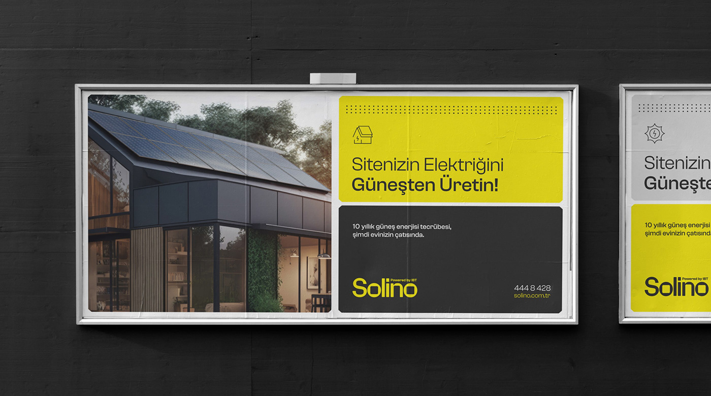
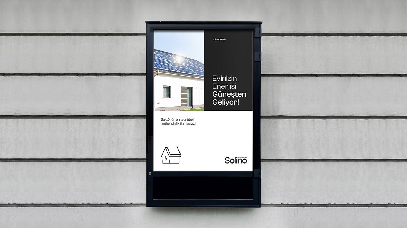
 For more information make sure to check out


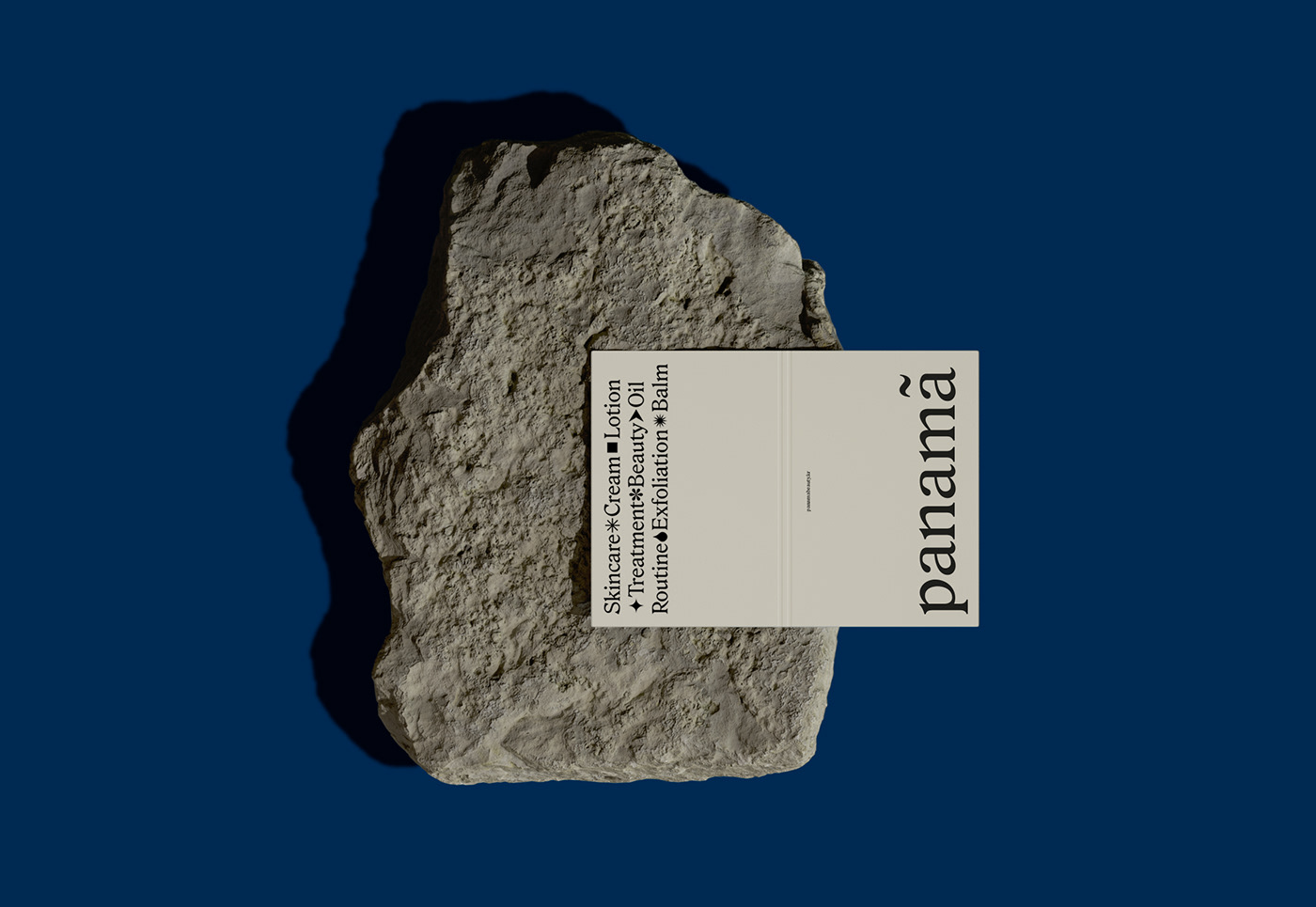


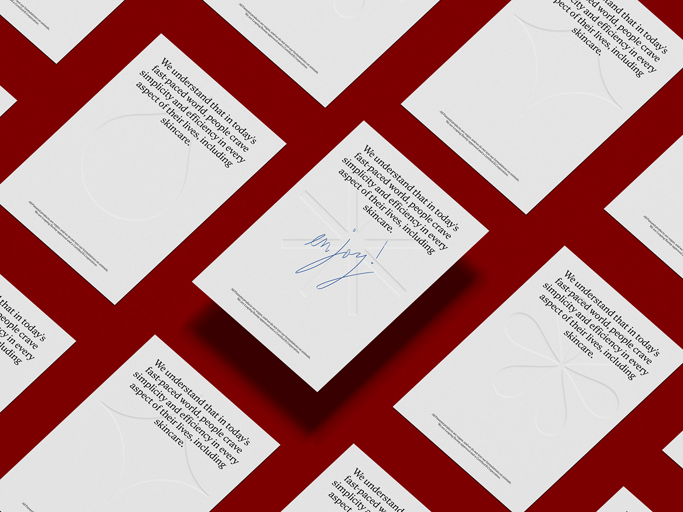


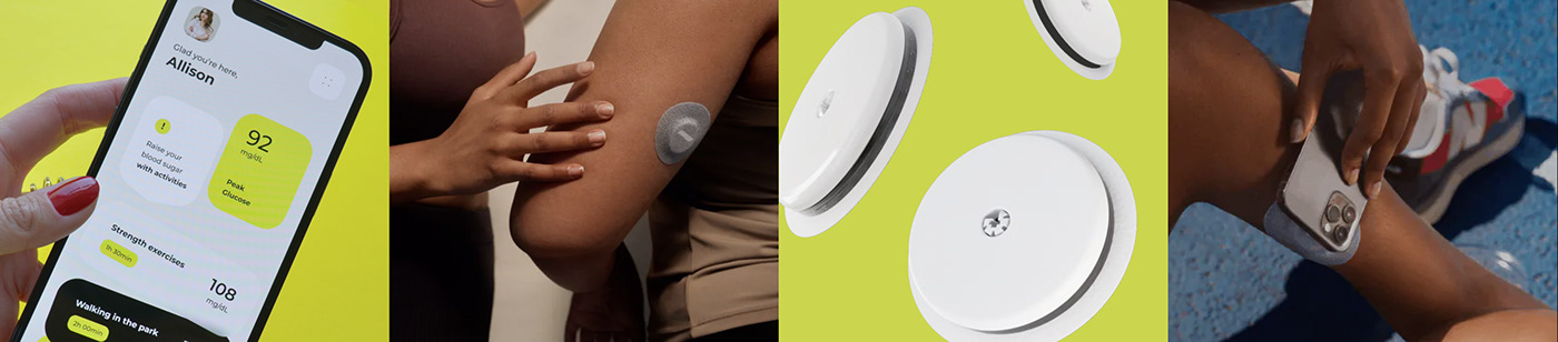


 For more information make sure to check out


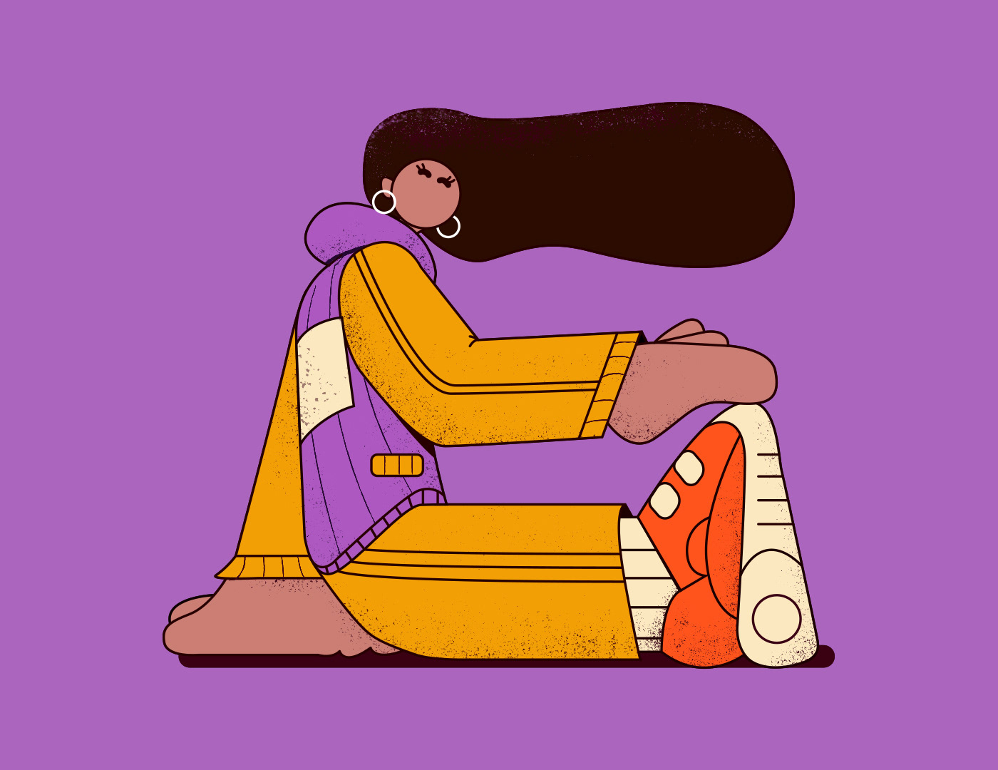


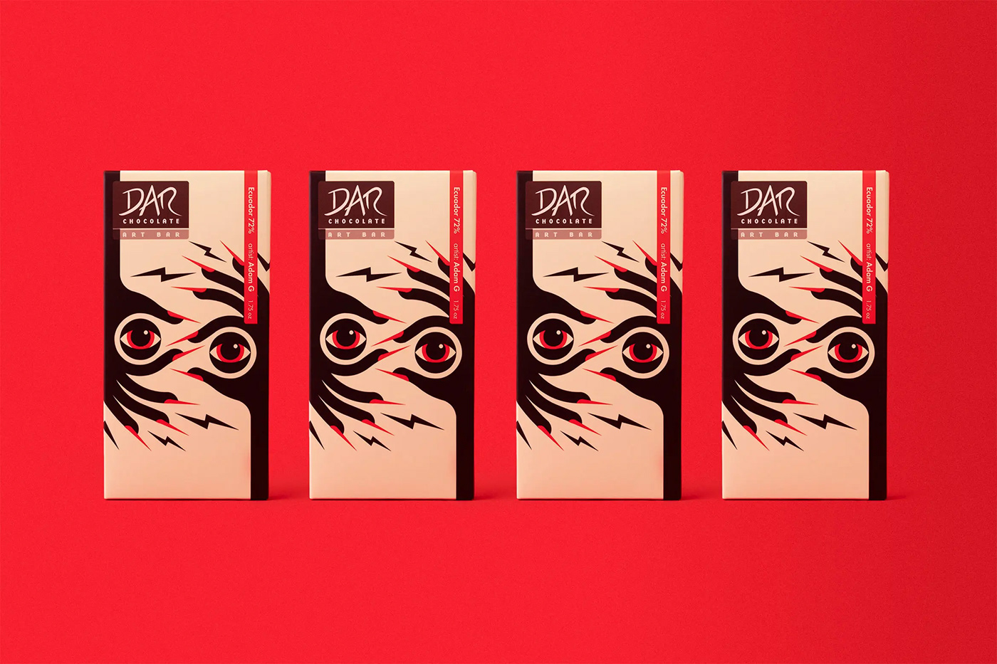


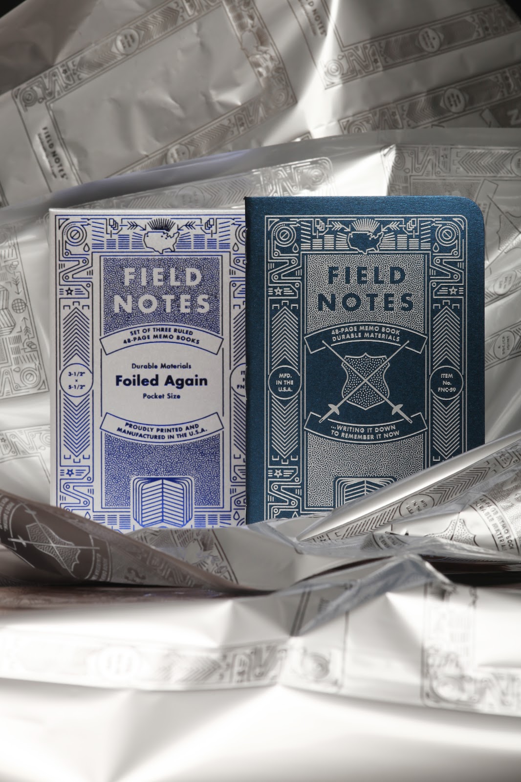


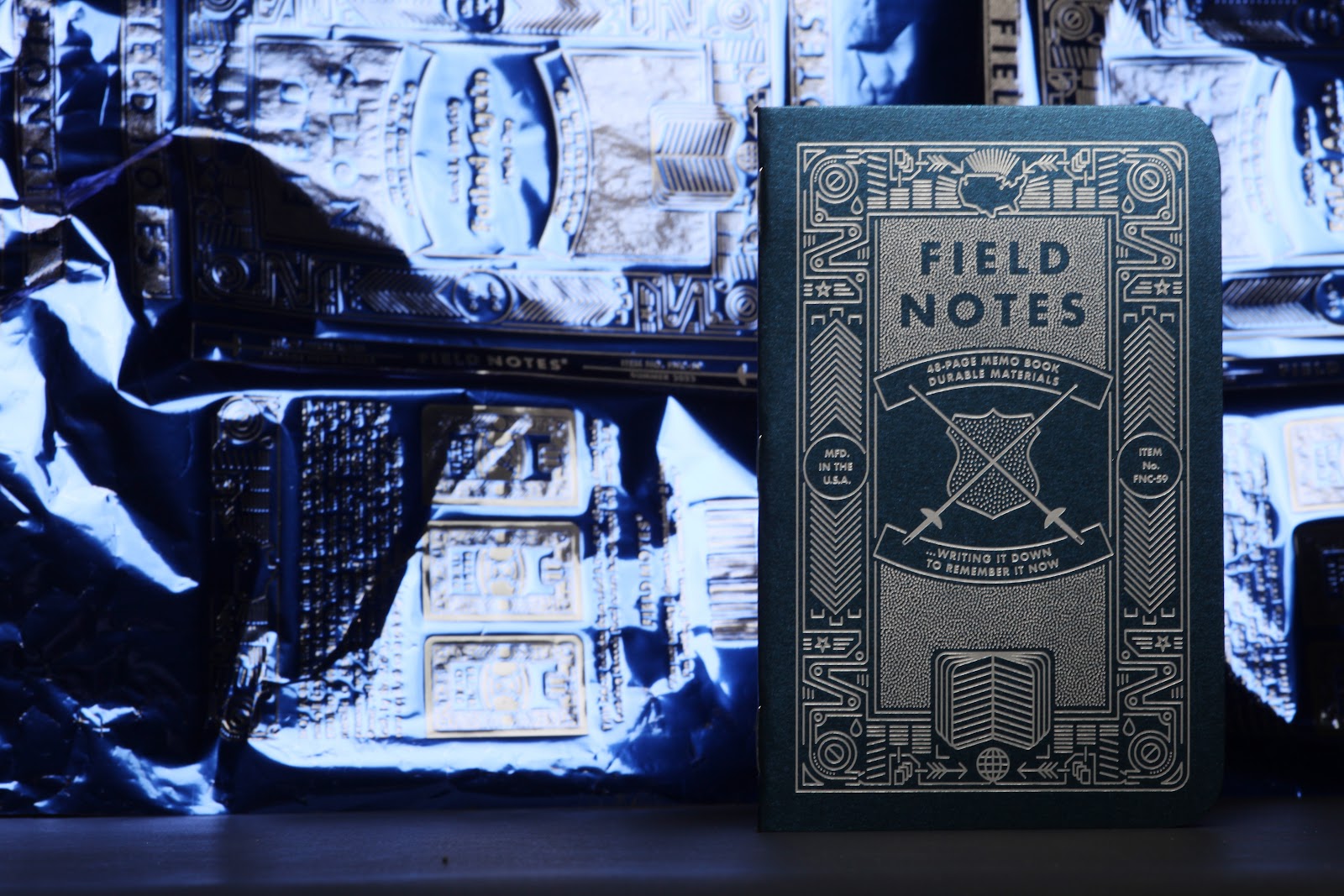


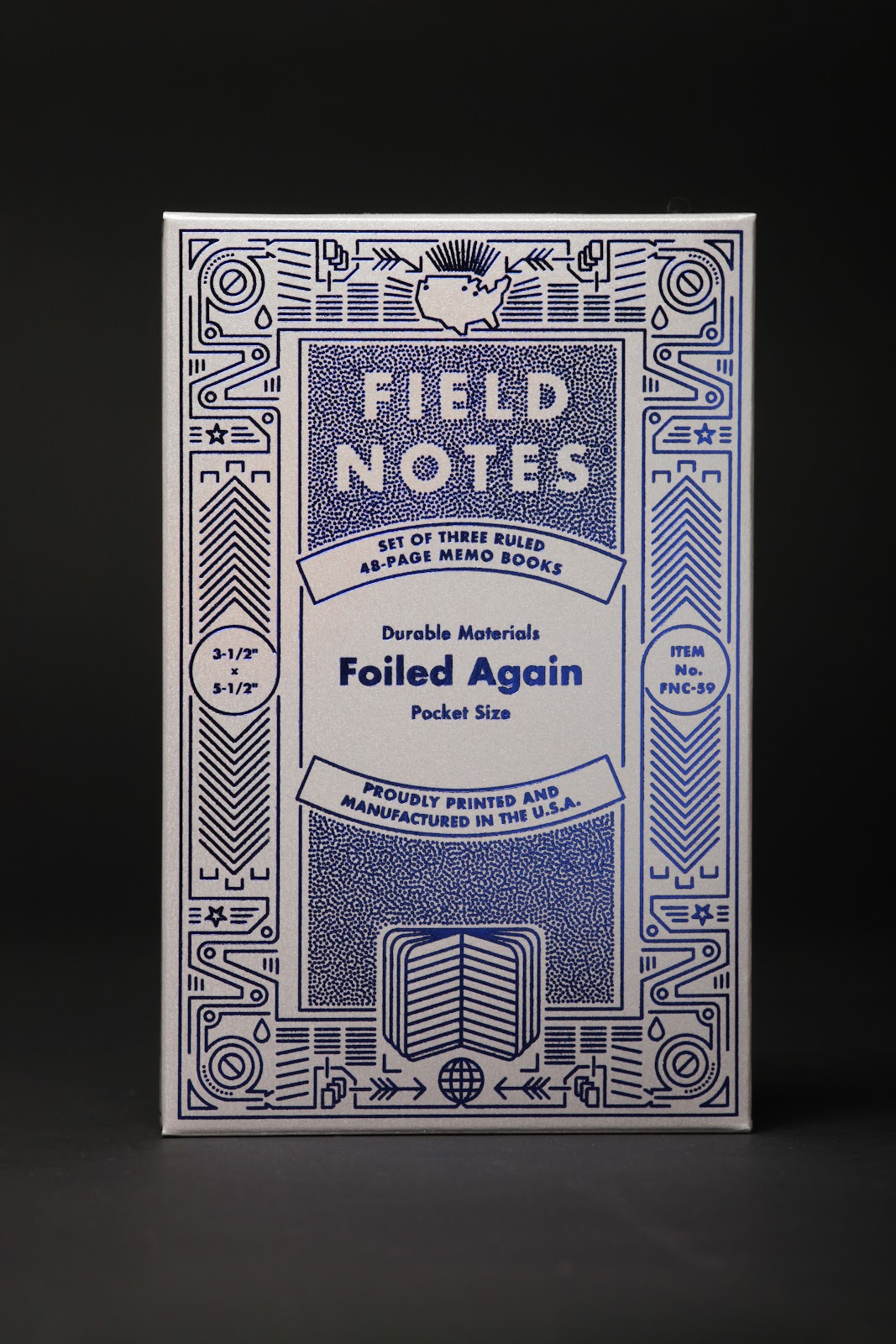

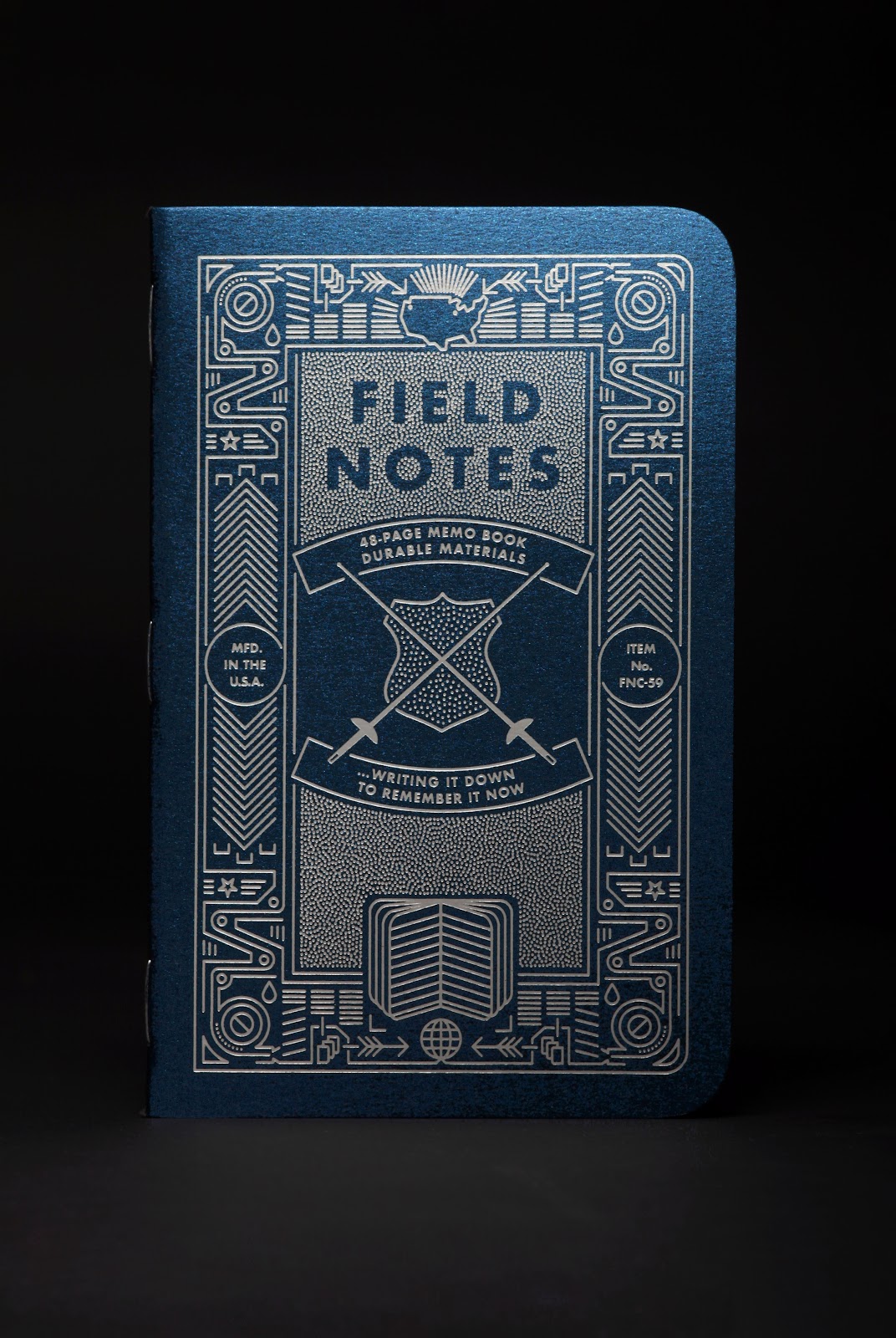


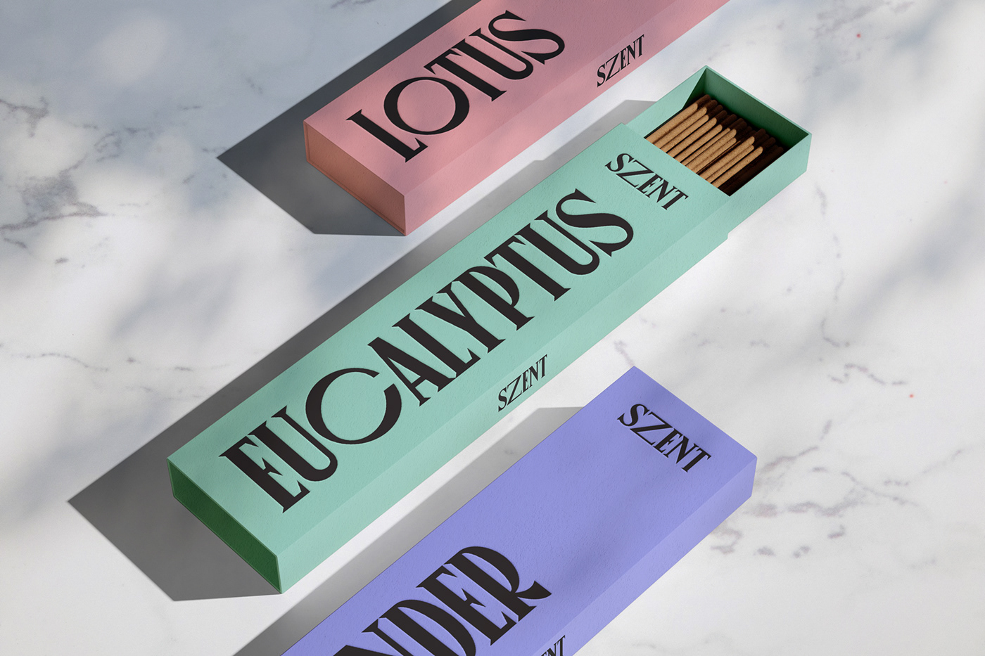


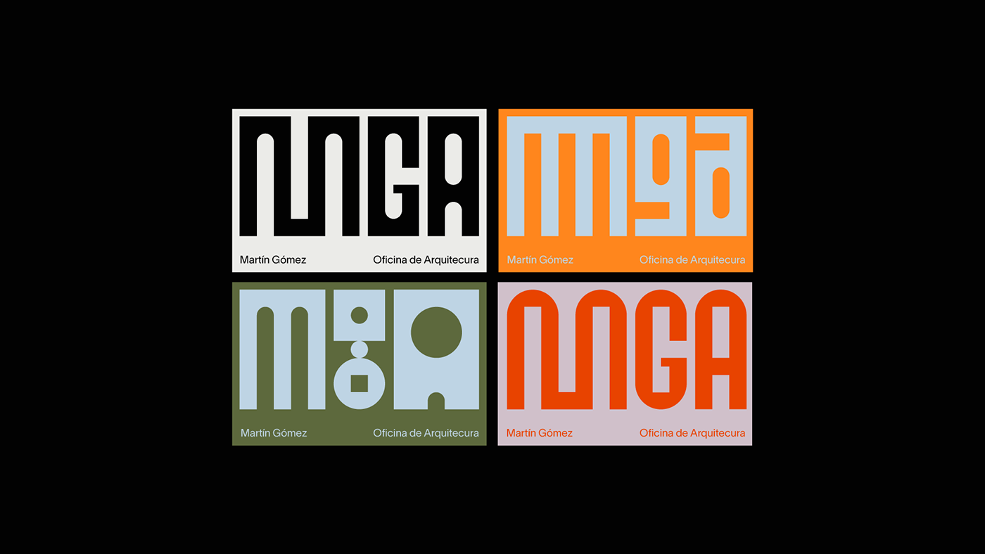


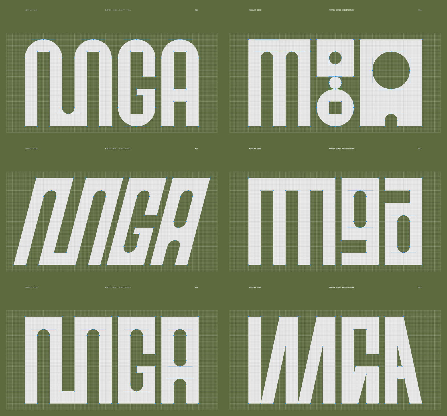
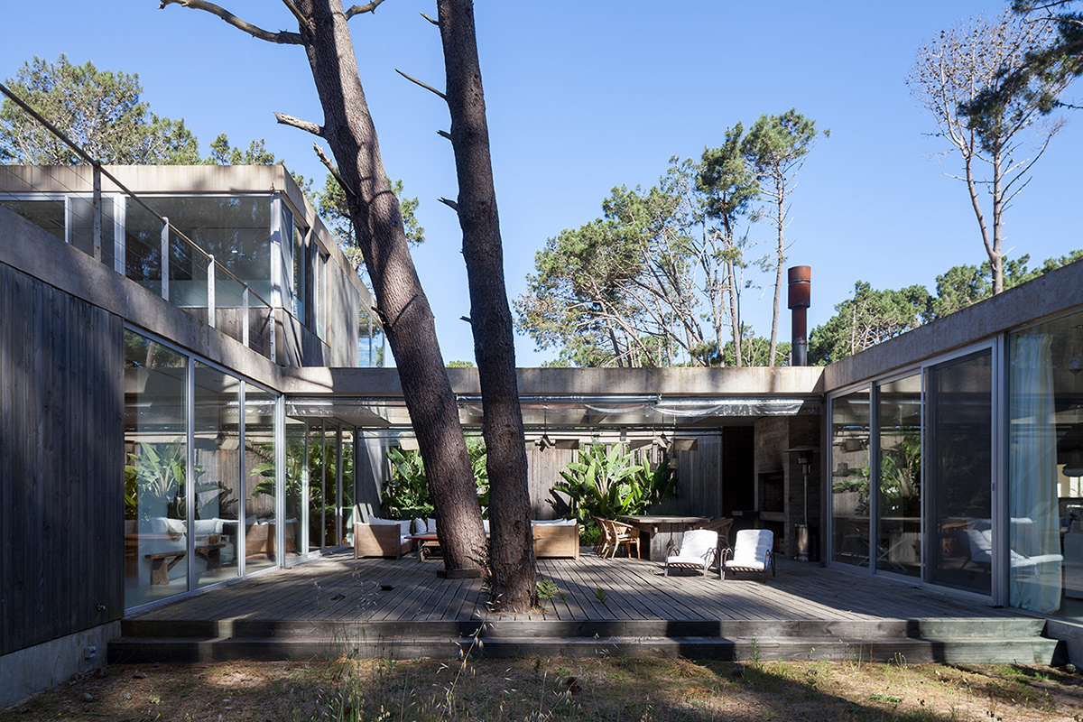


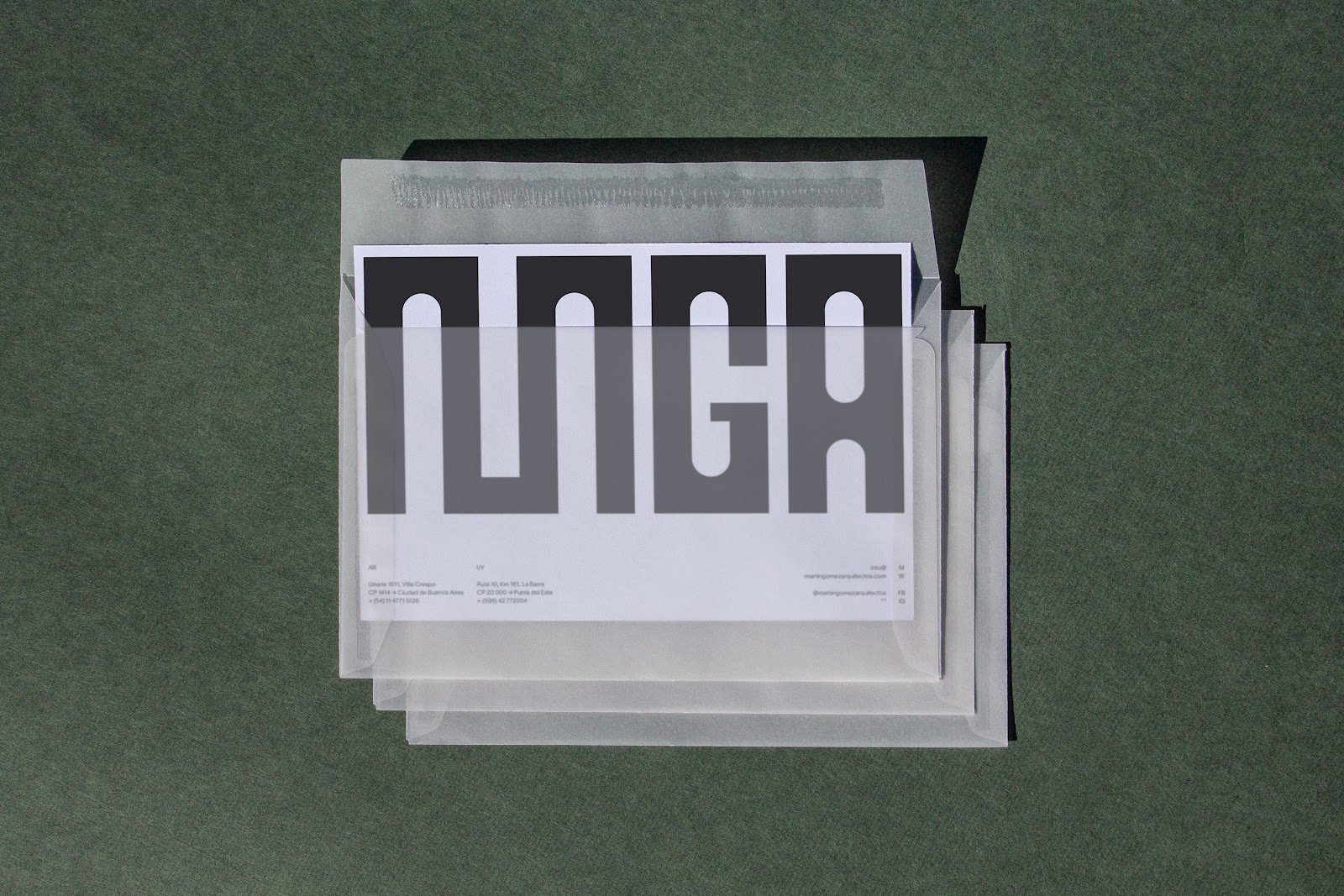


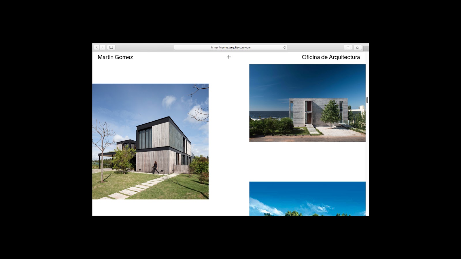


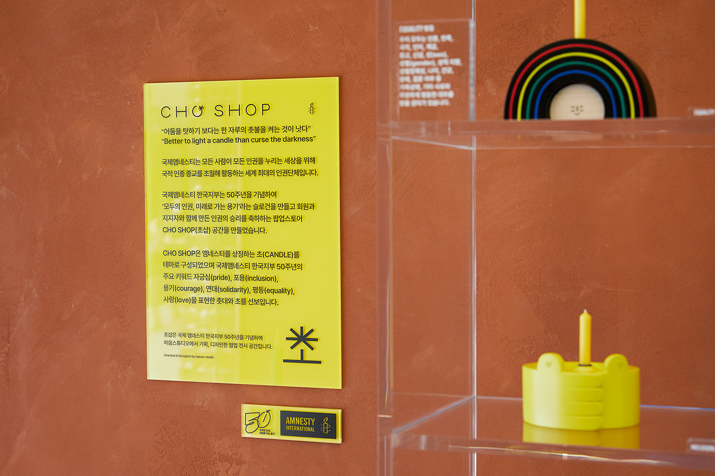
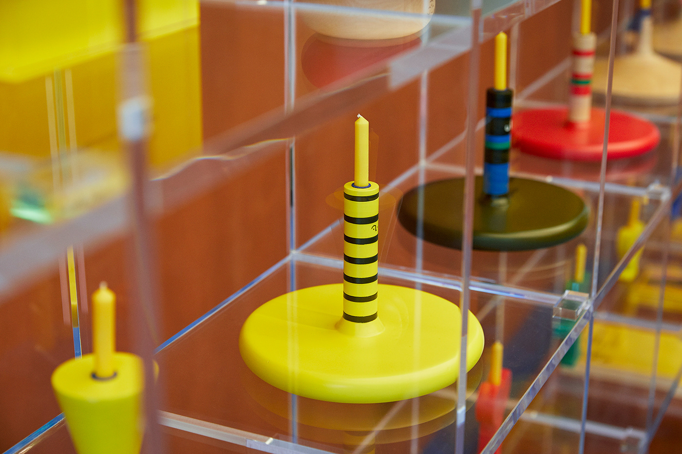


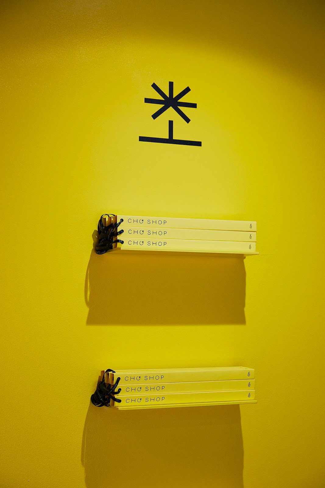


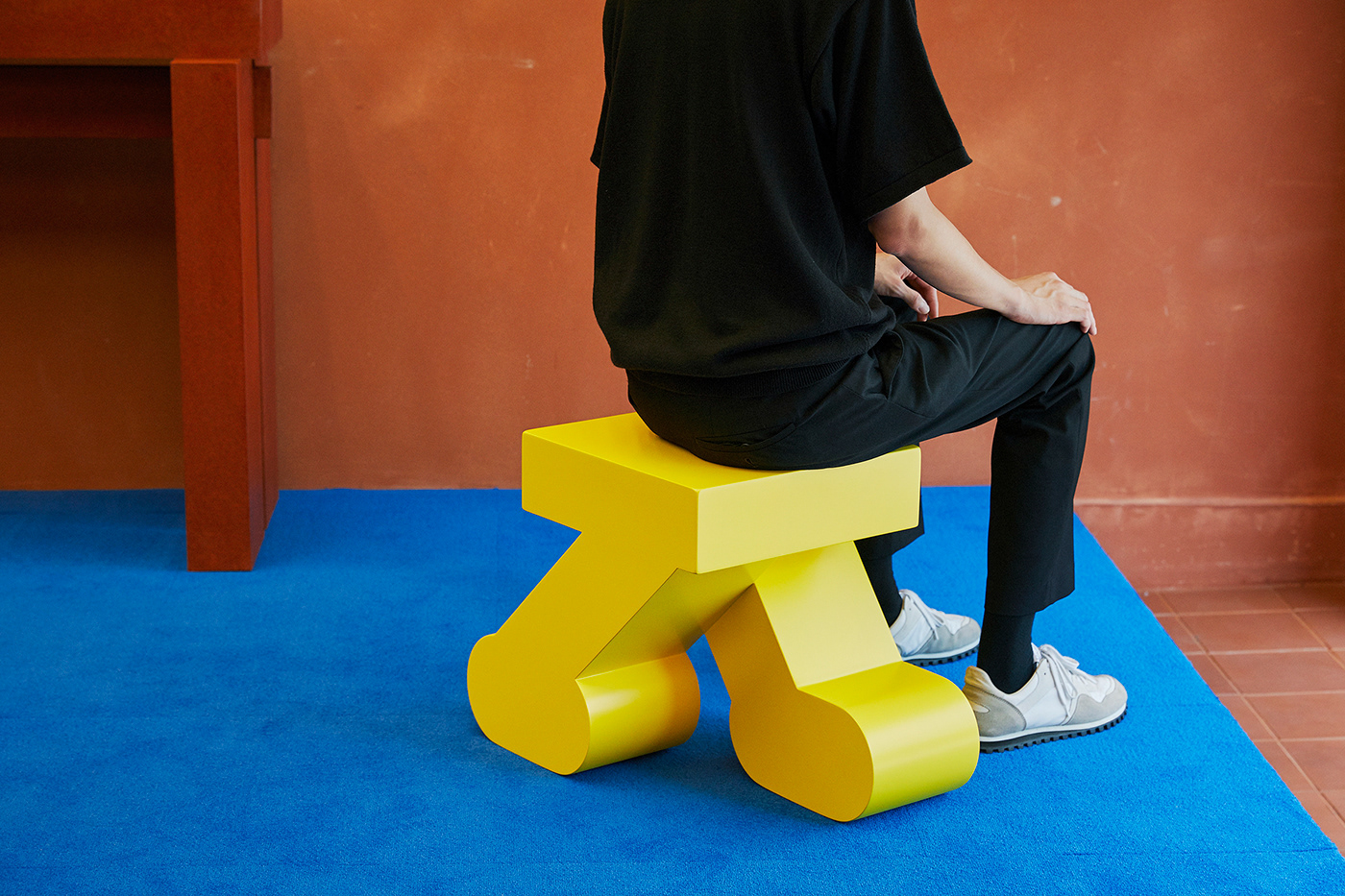


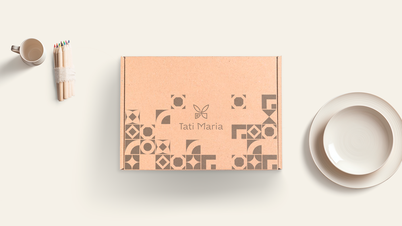


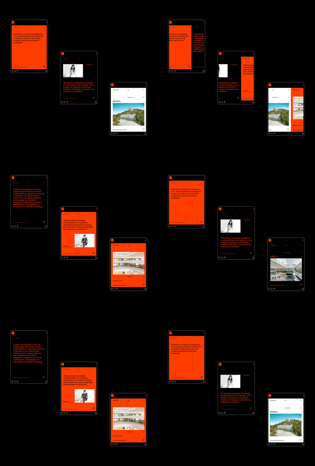


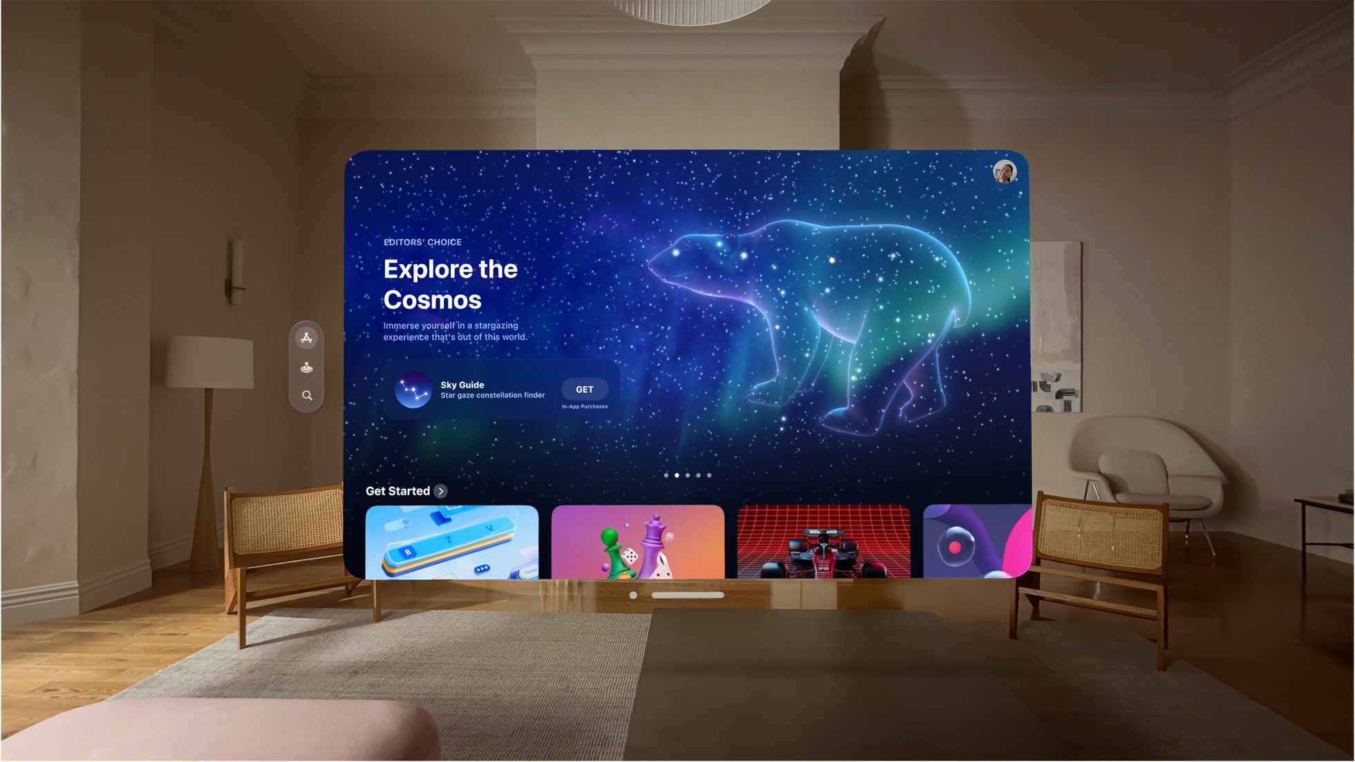


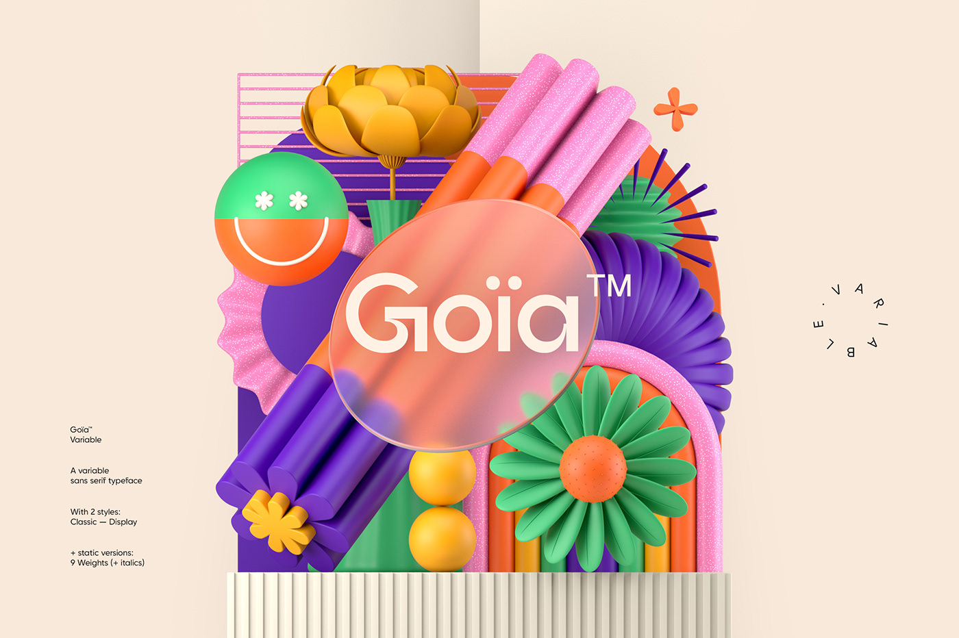


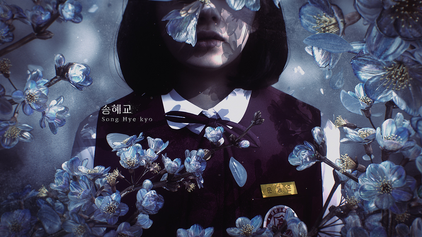


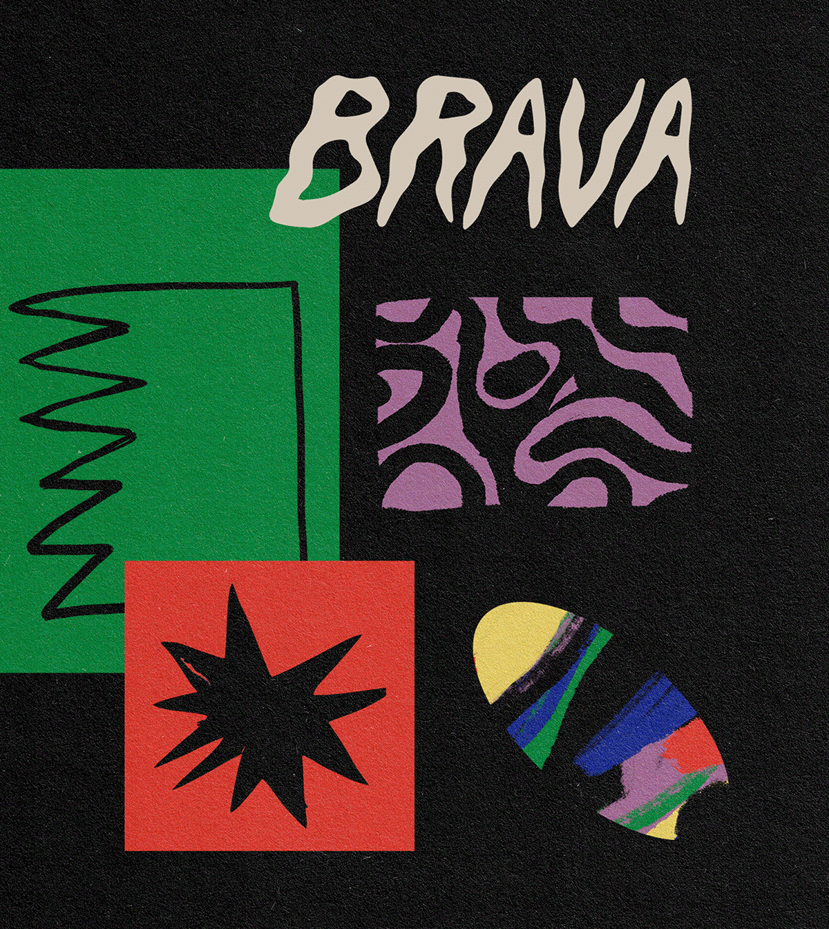


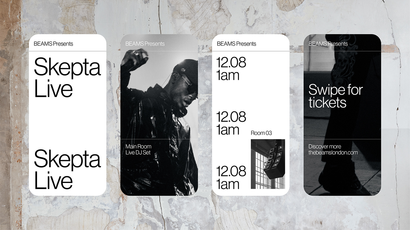


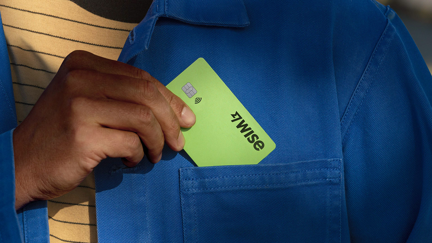


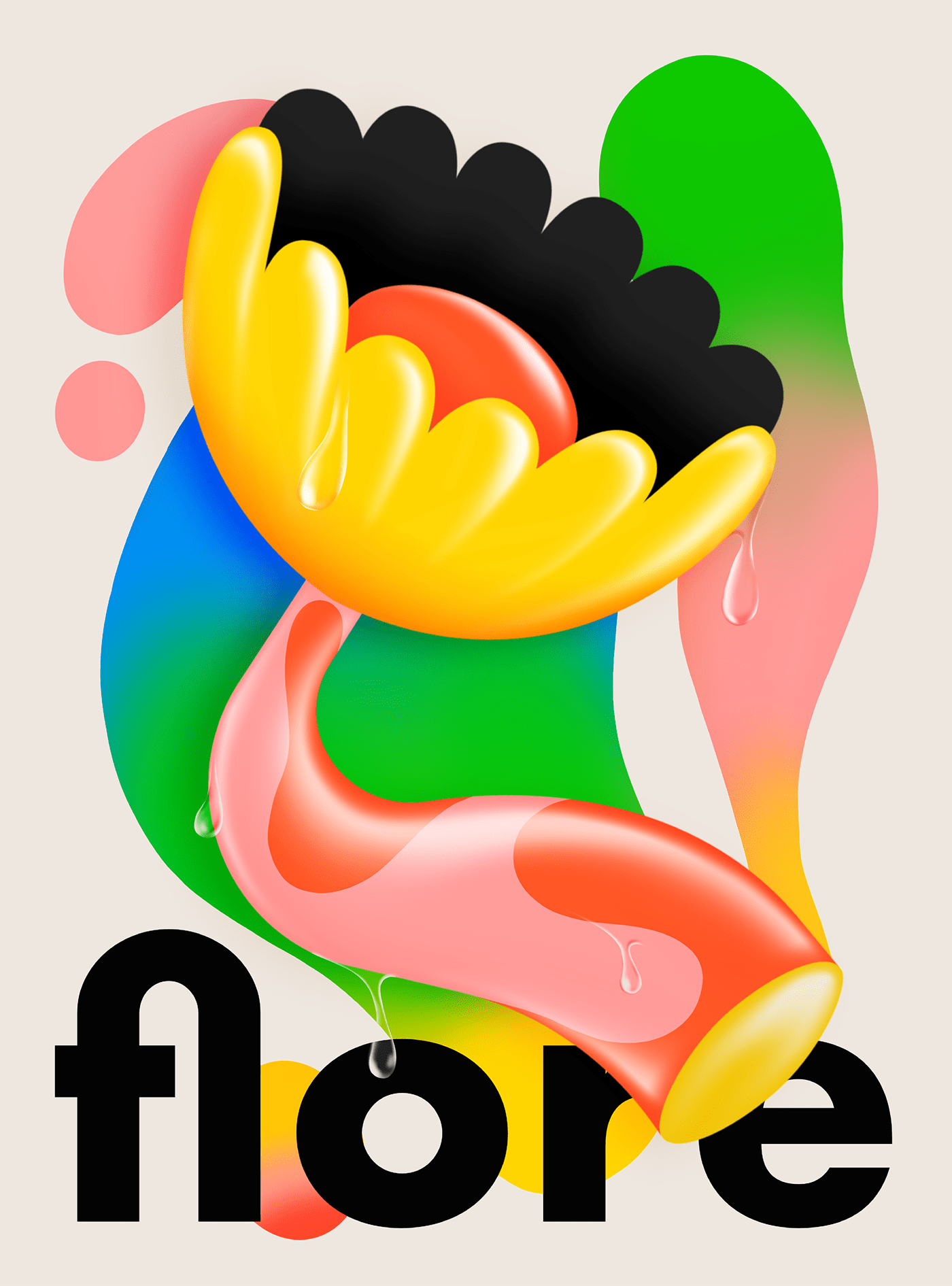


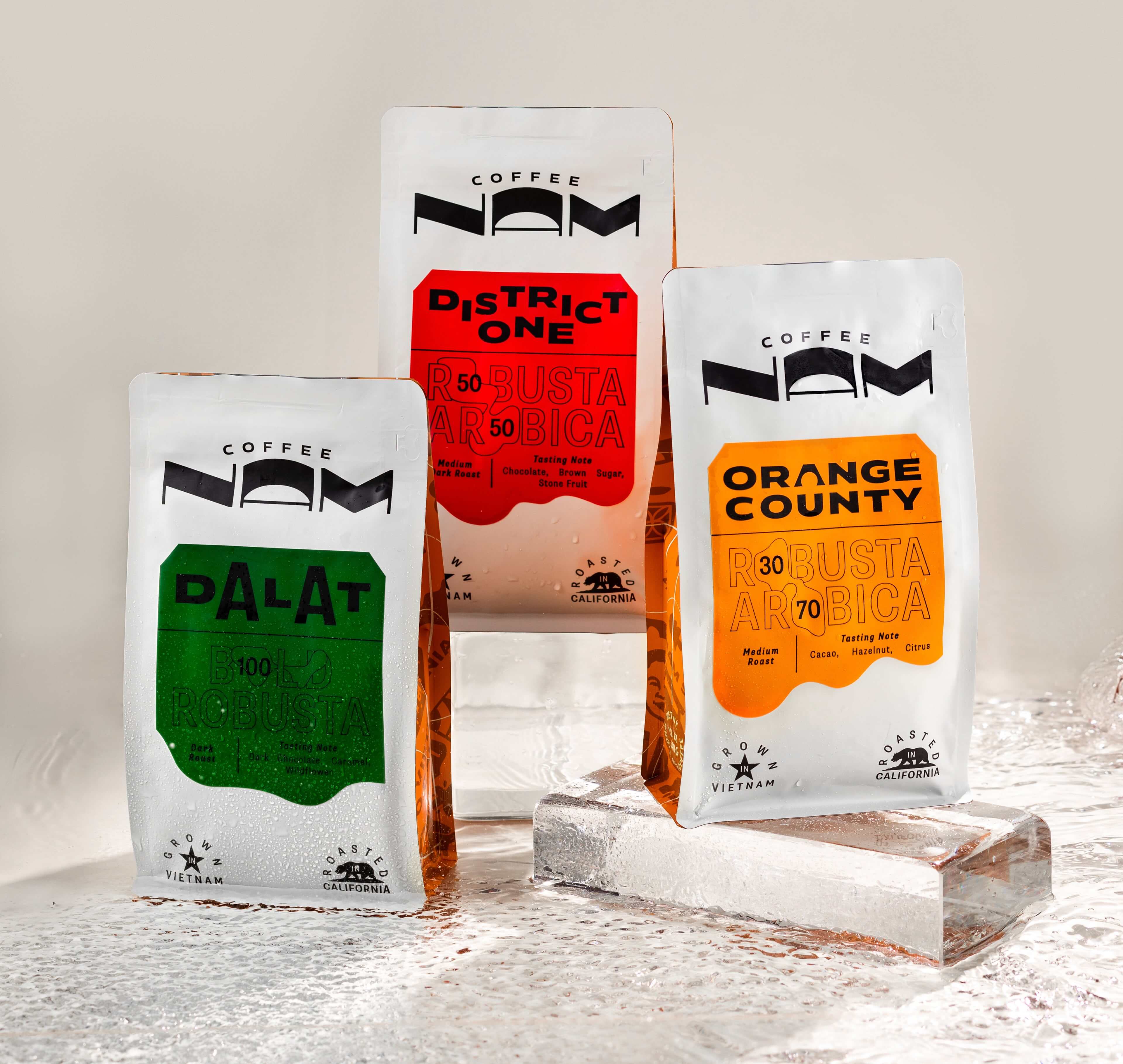


 AI promtps: Industrial version





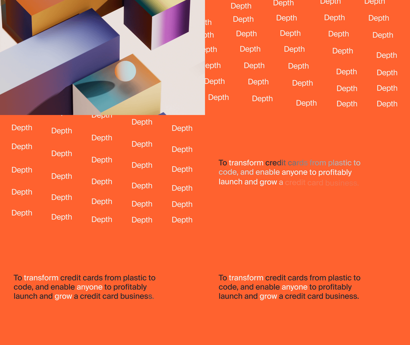


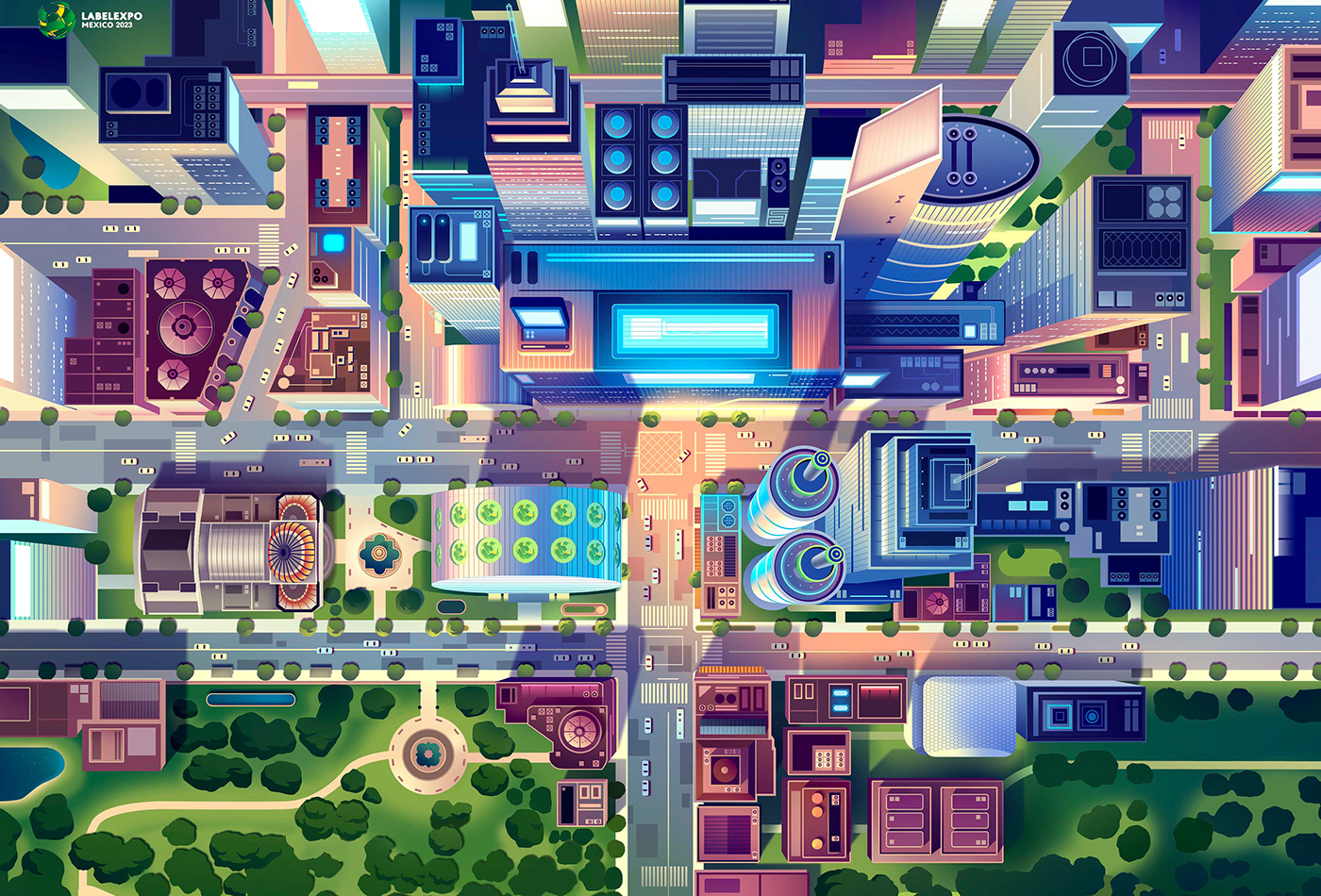


 For more information make sure to check out


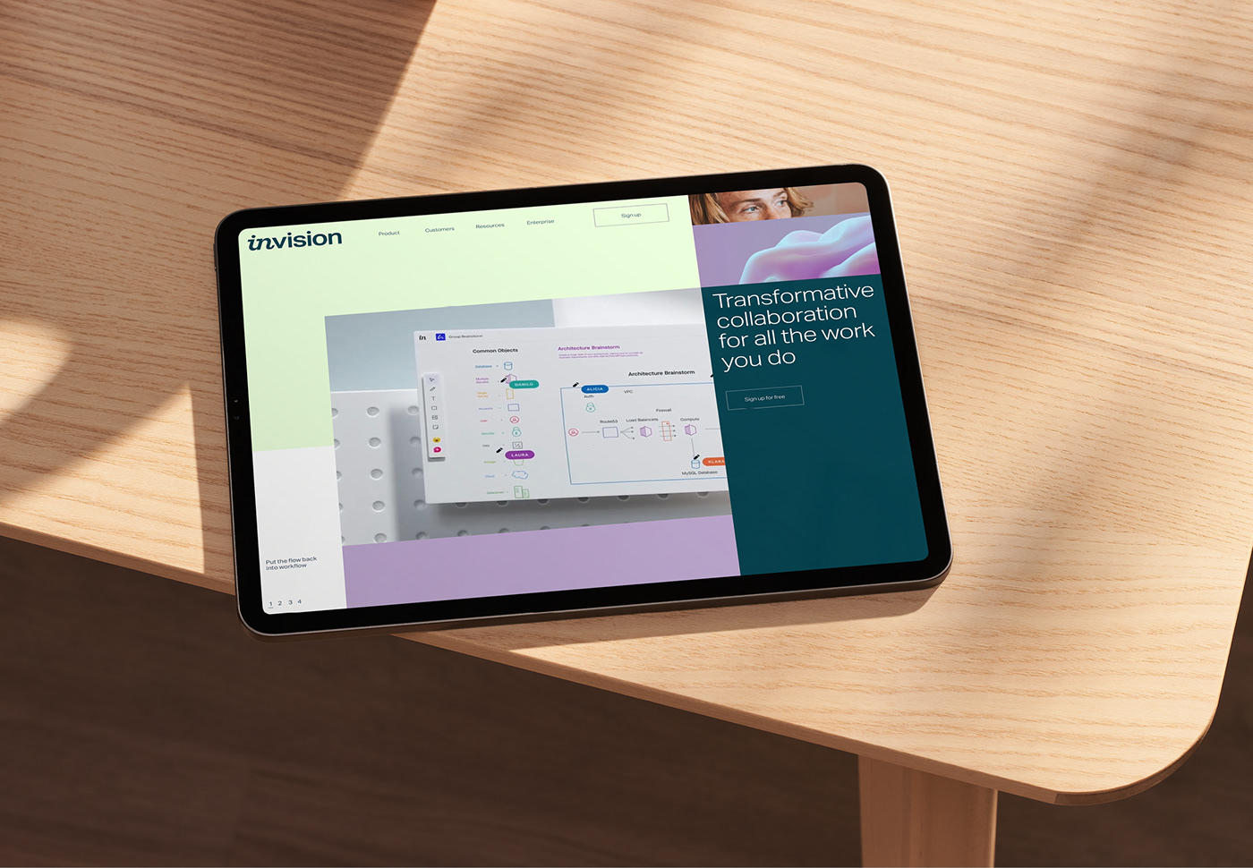


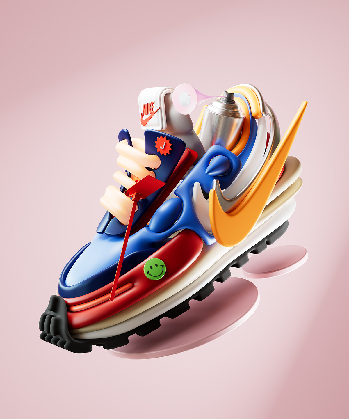


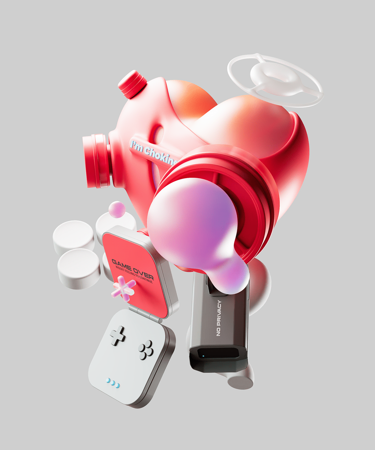


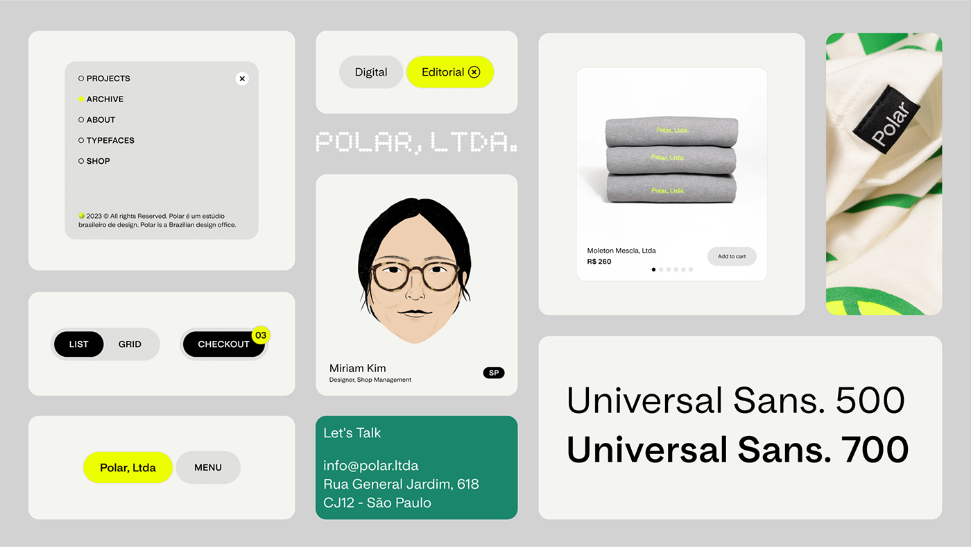


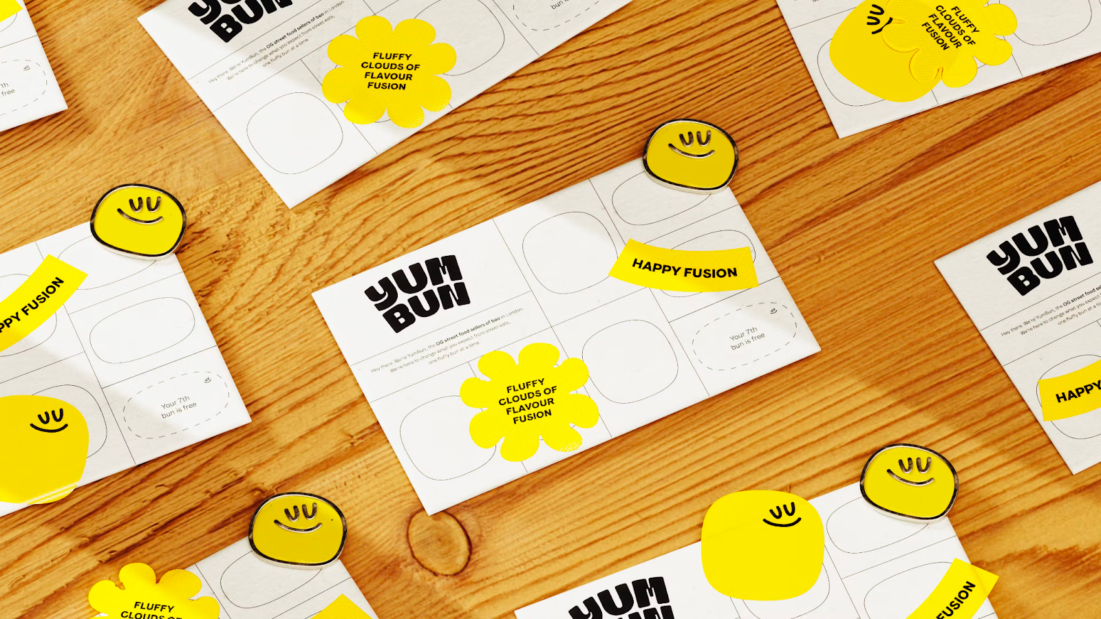


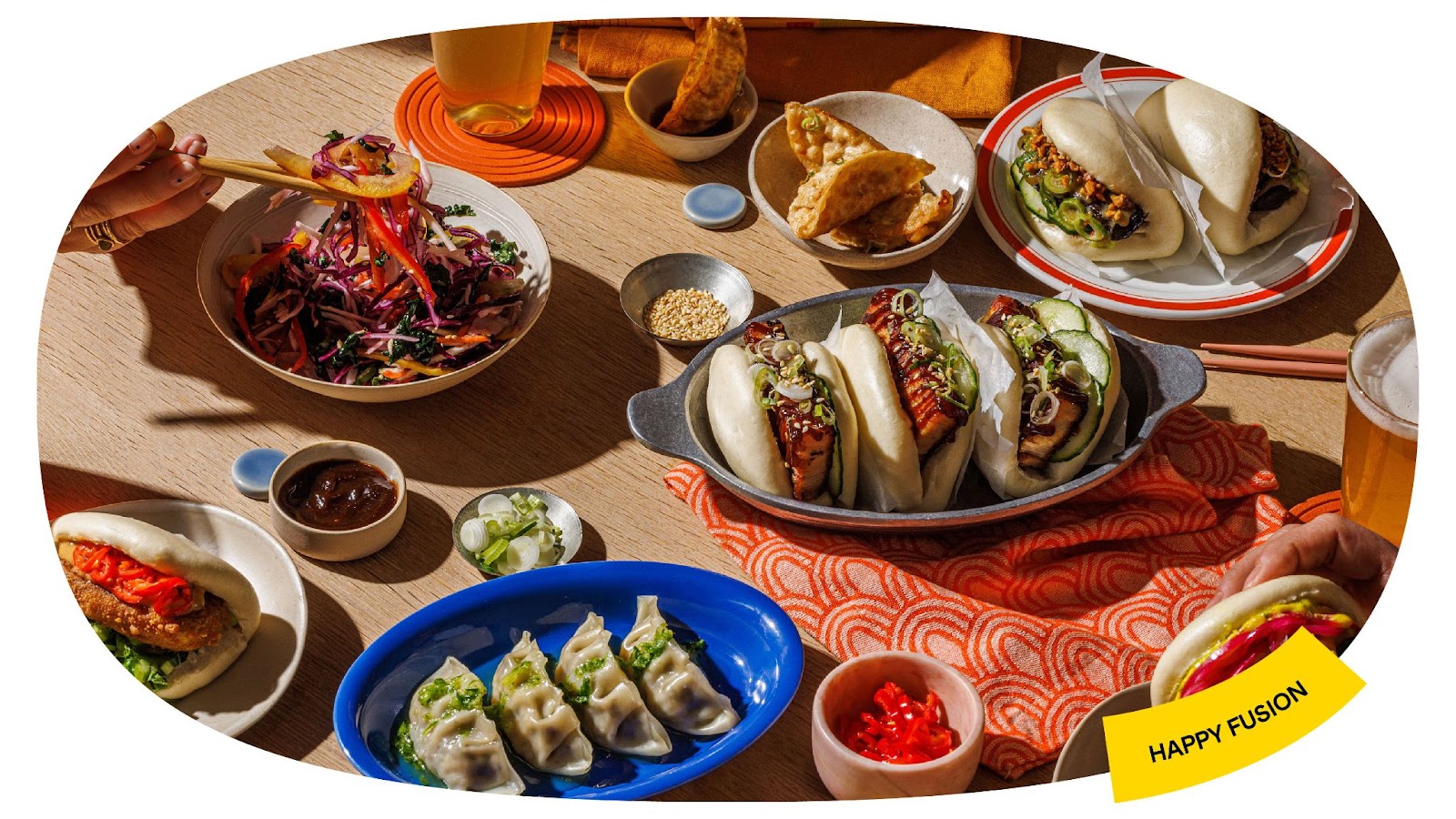


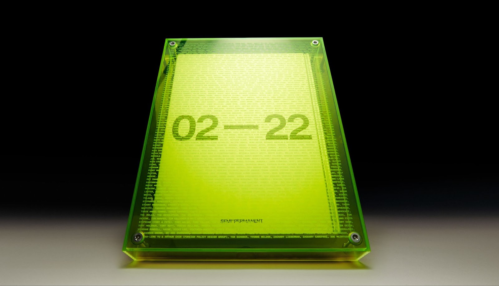
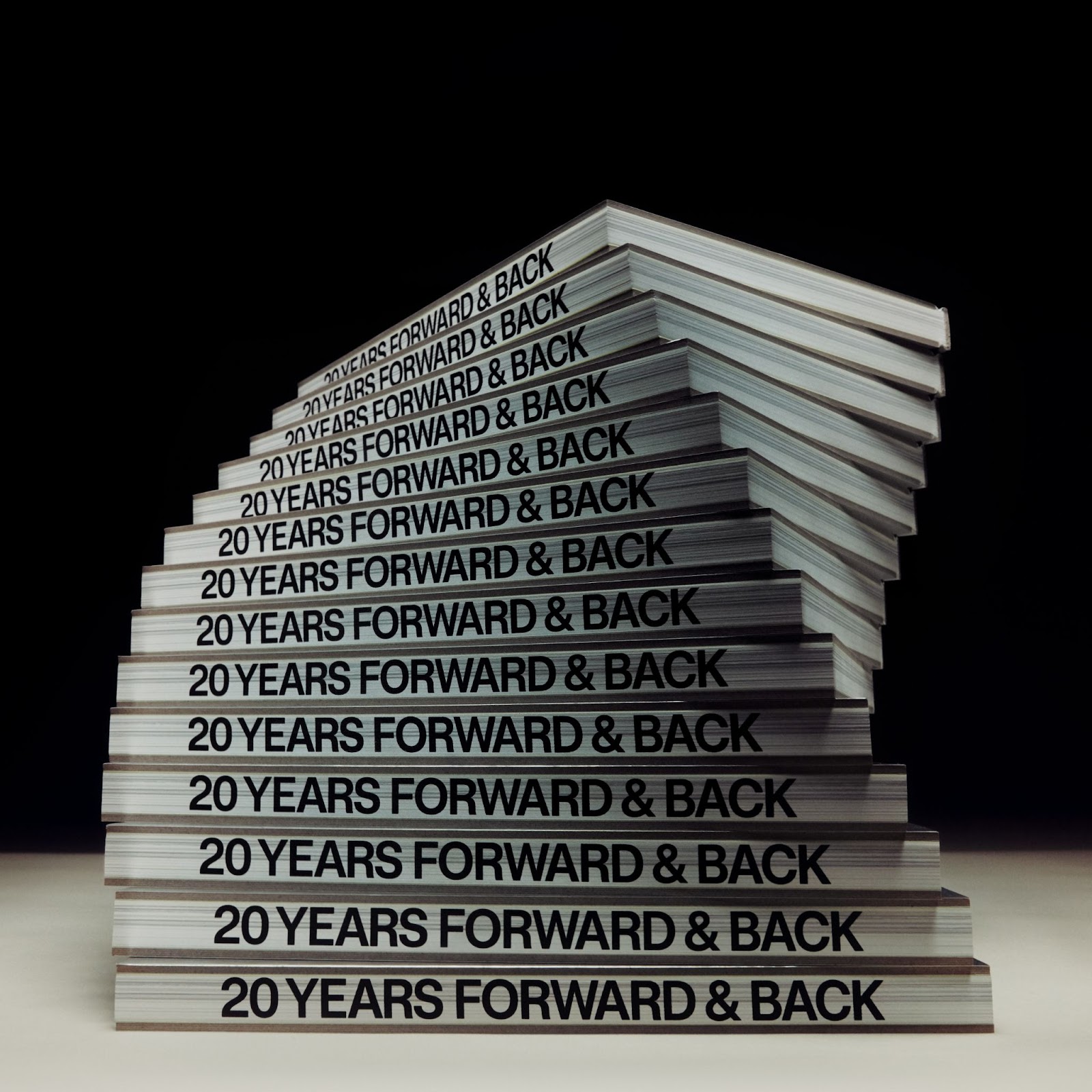


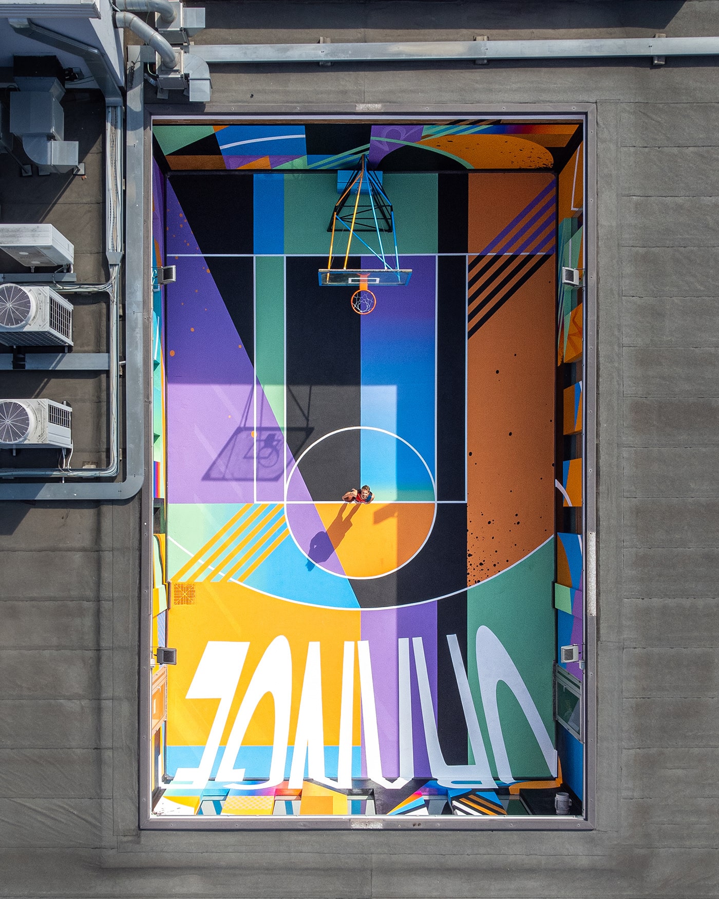






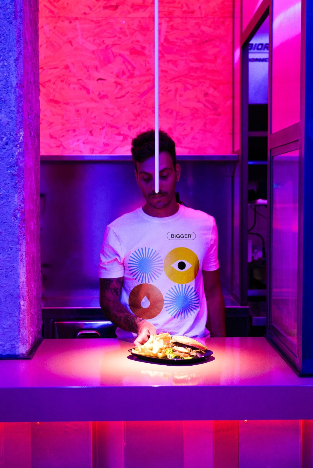


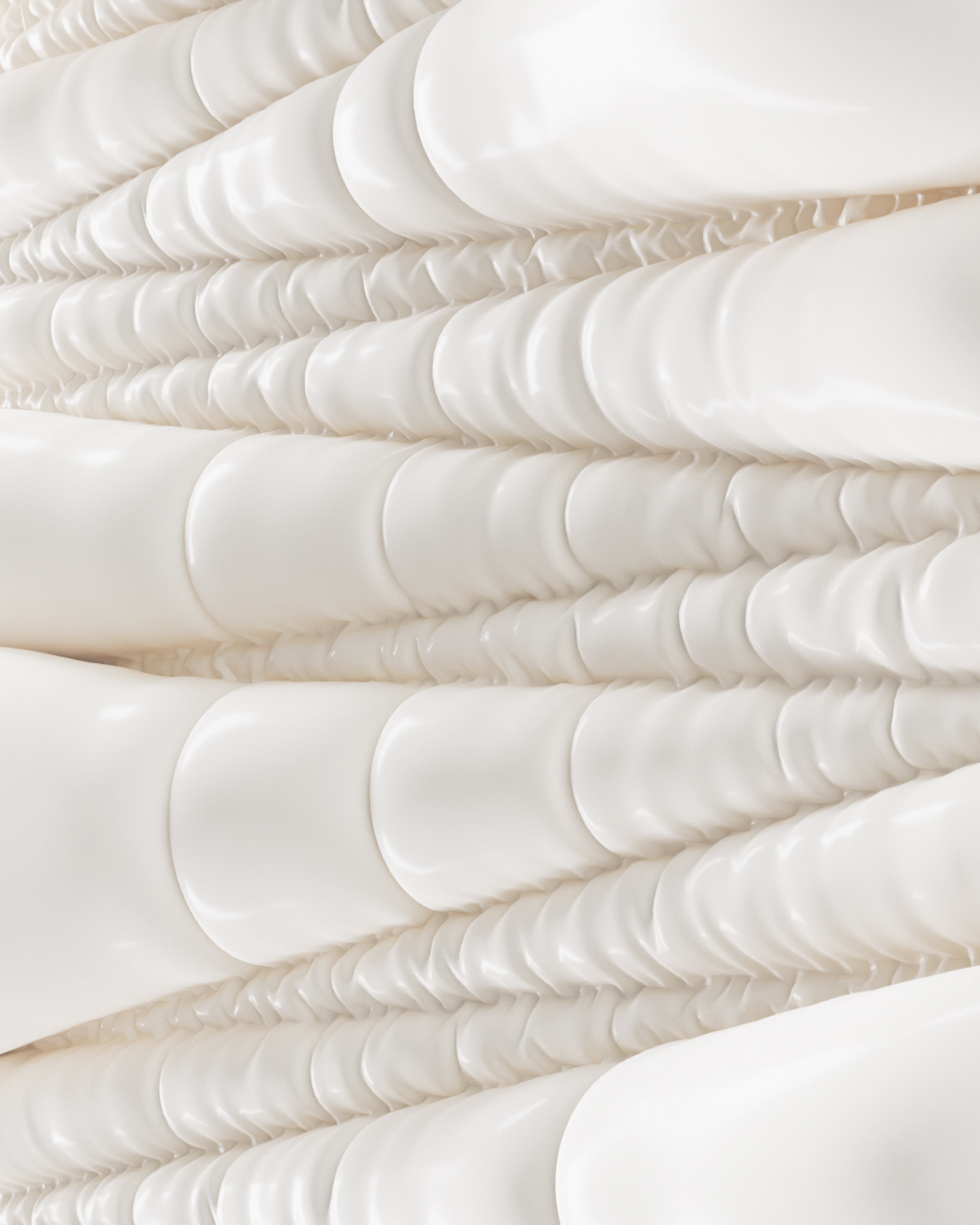


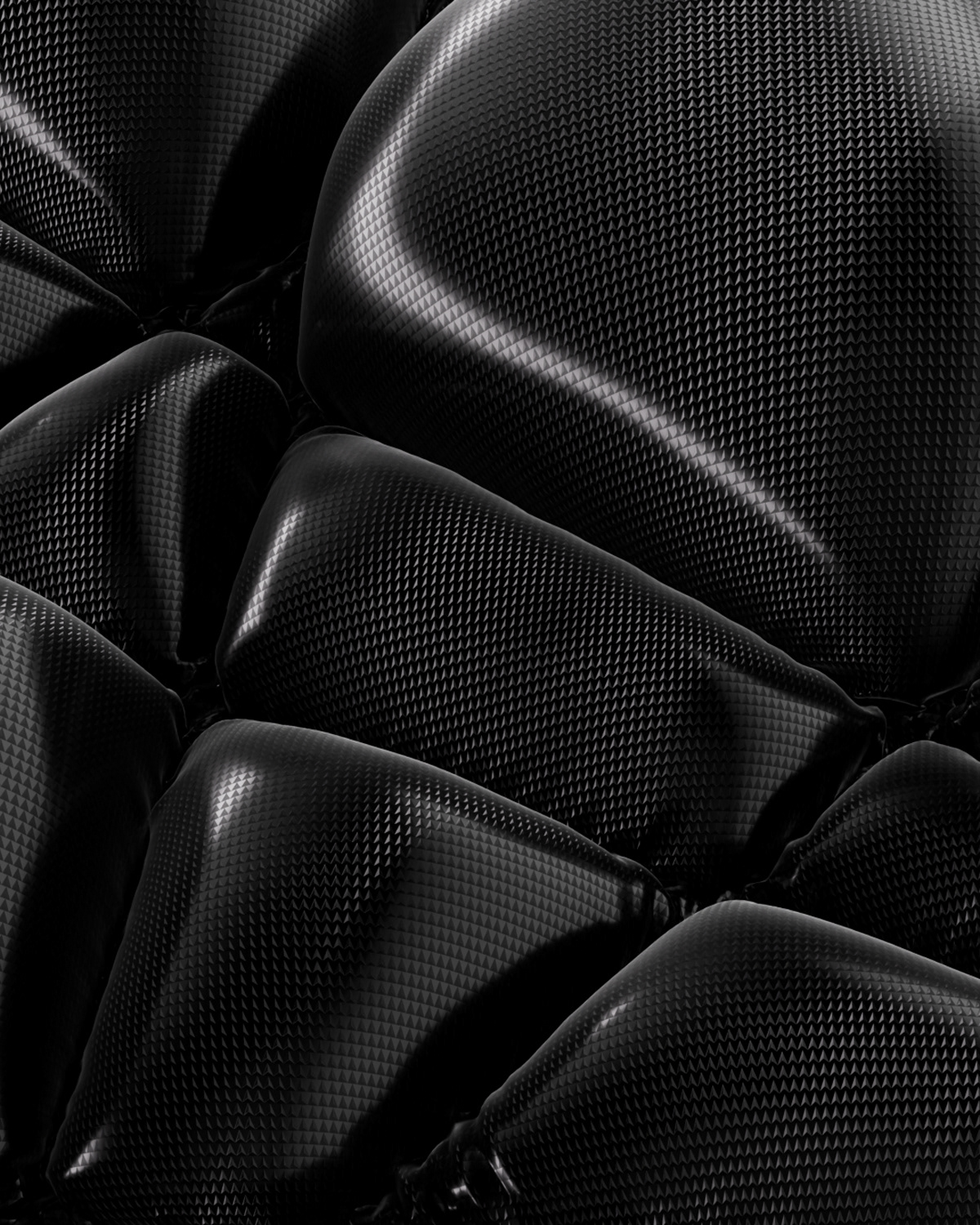


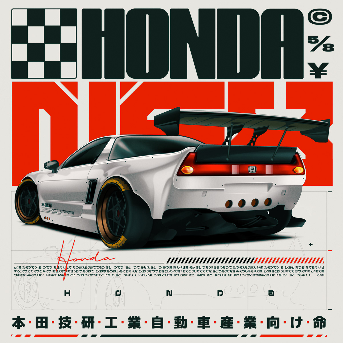


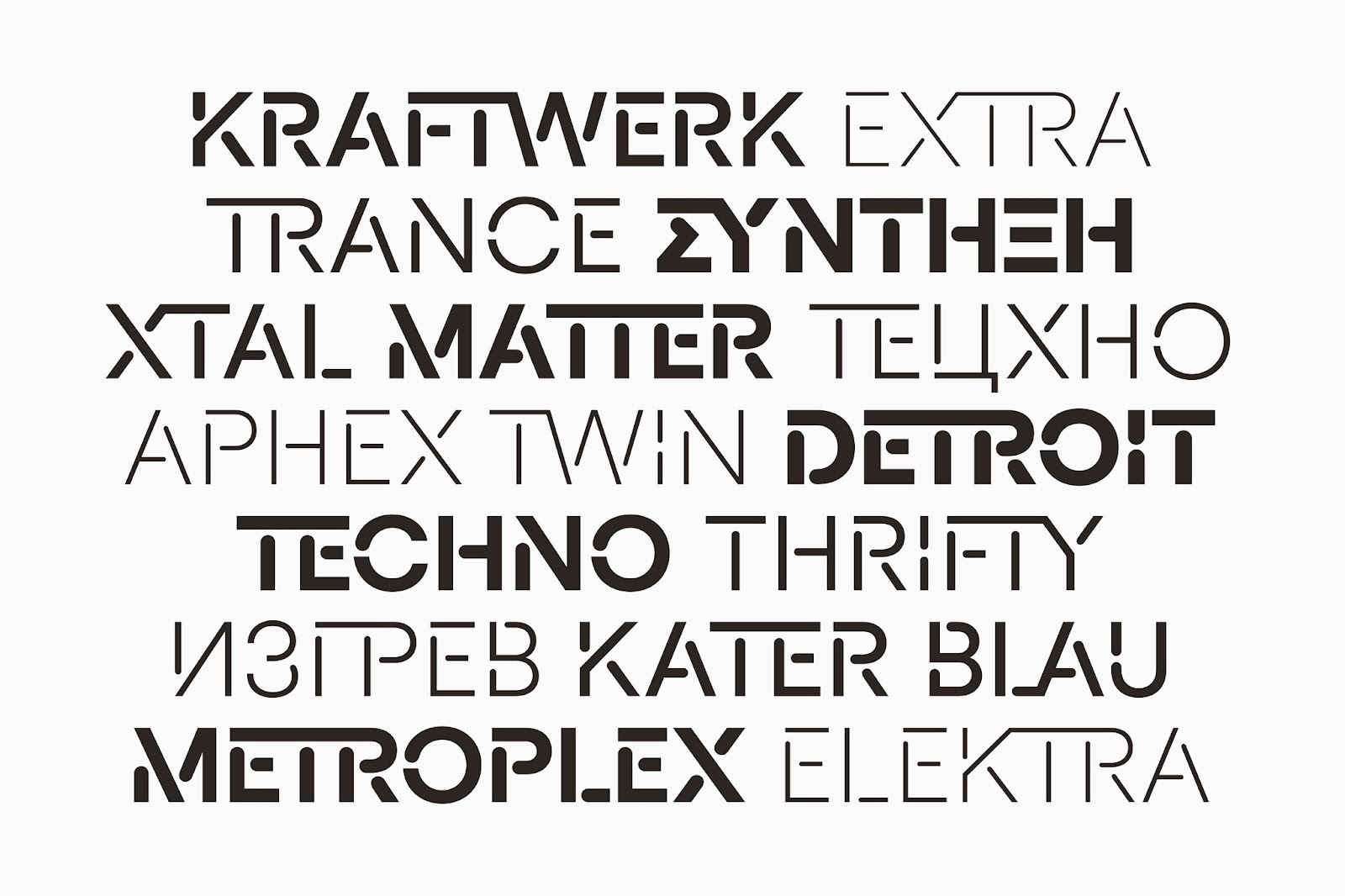


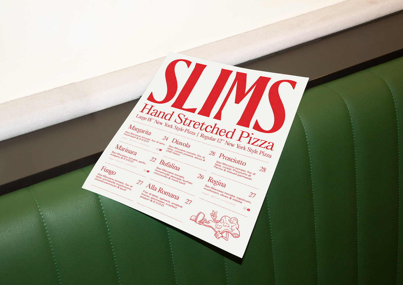


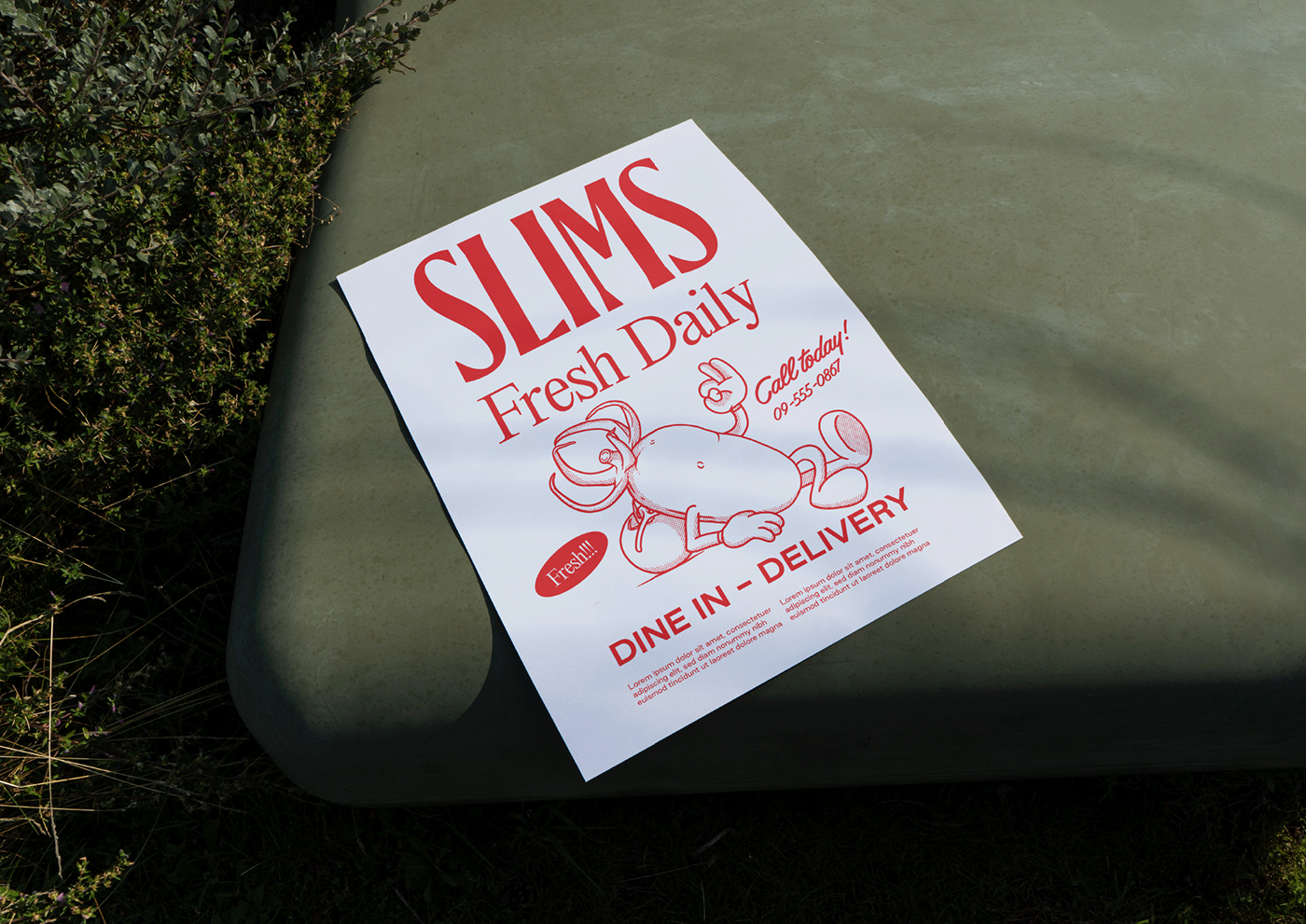


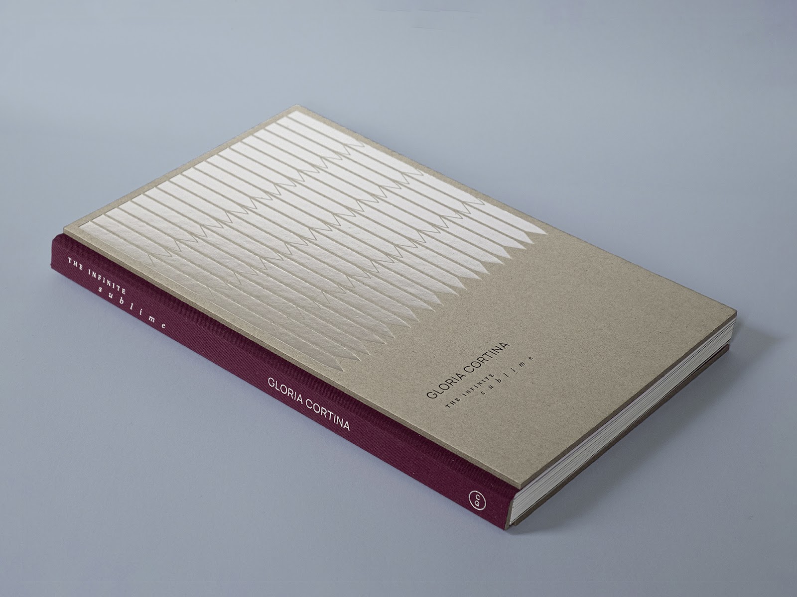


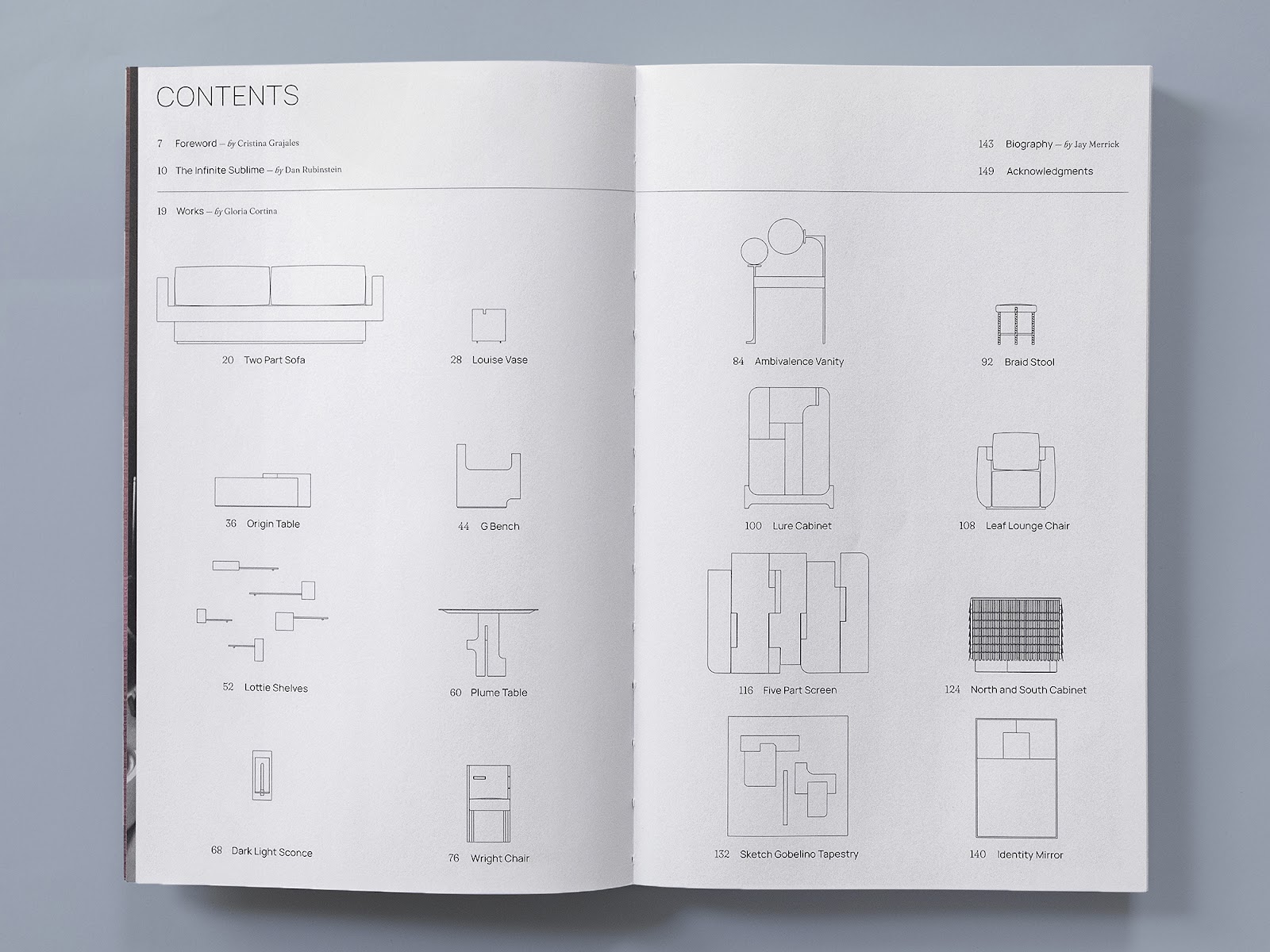


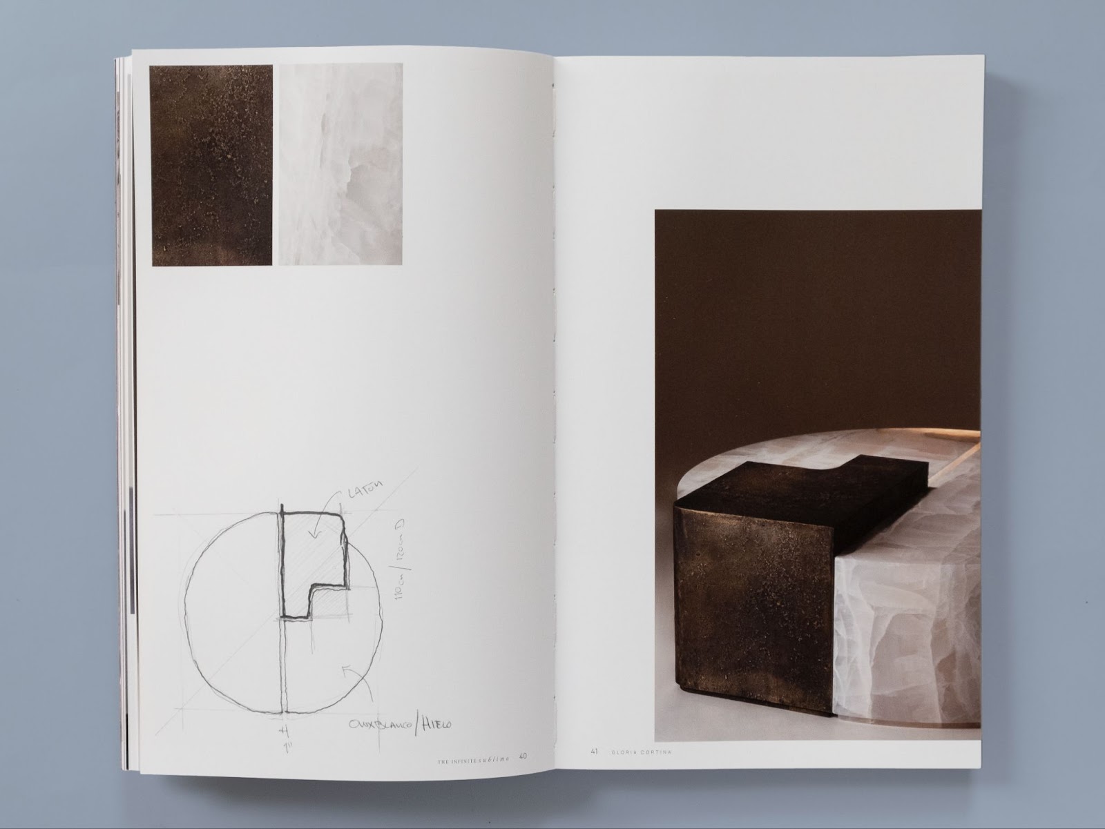


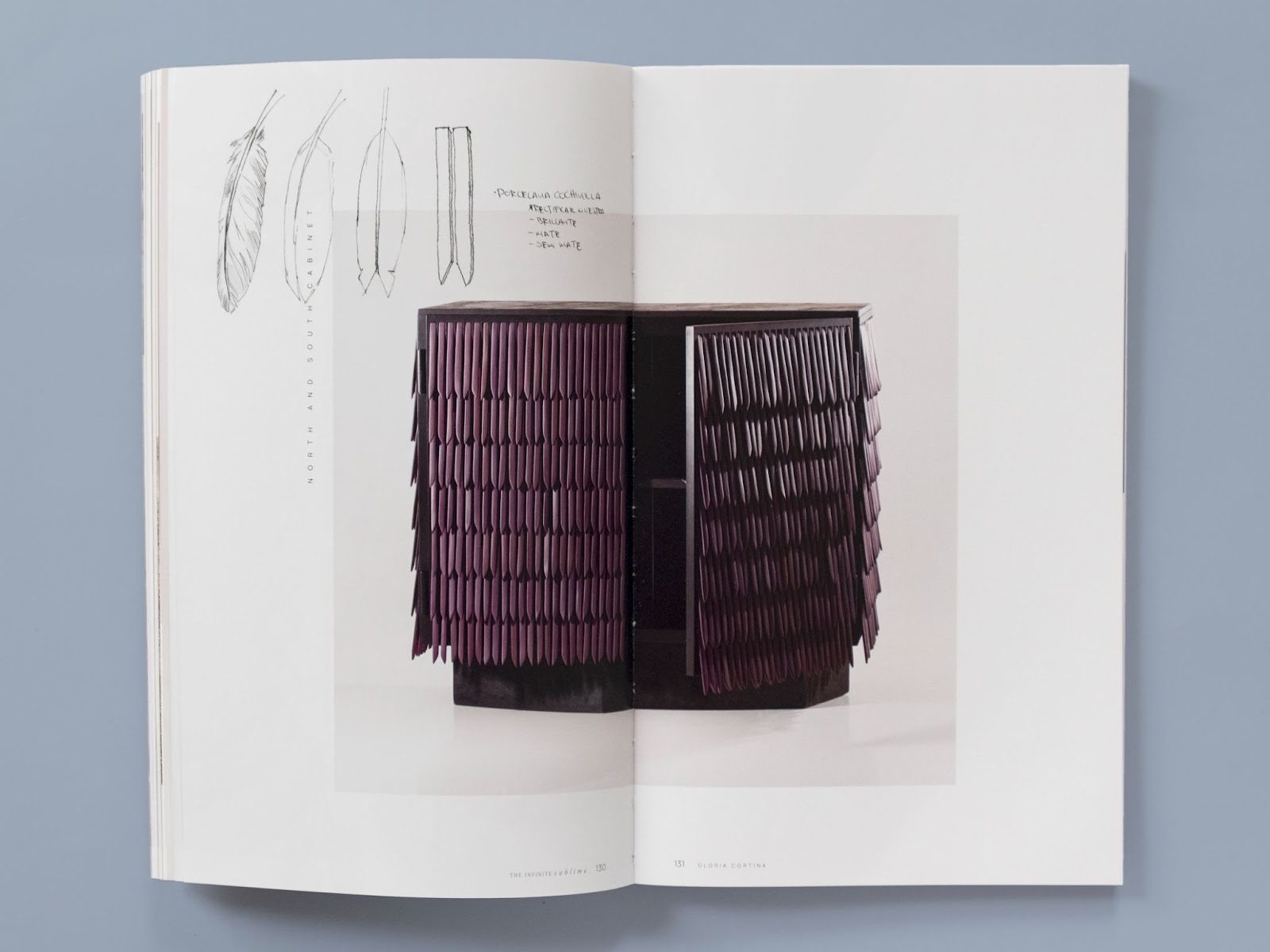
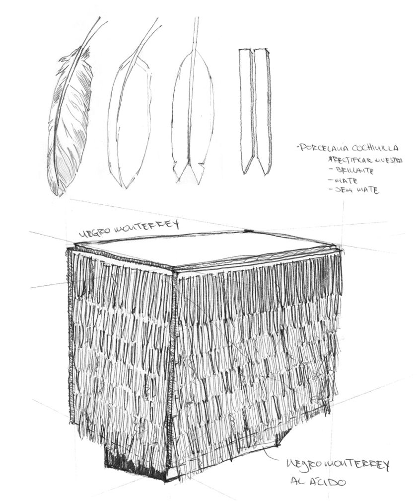


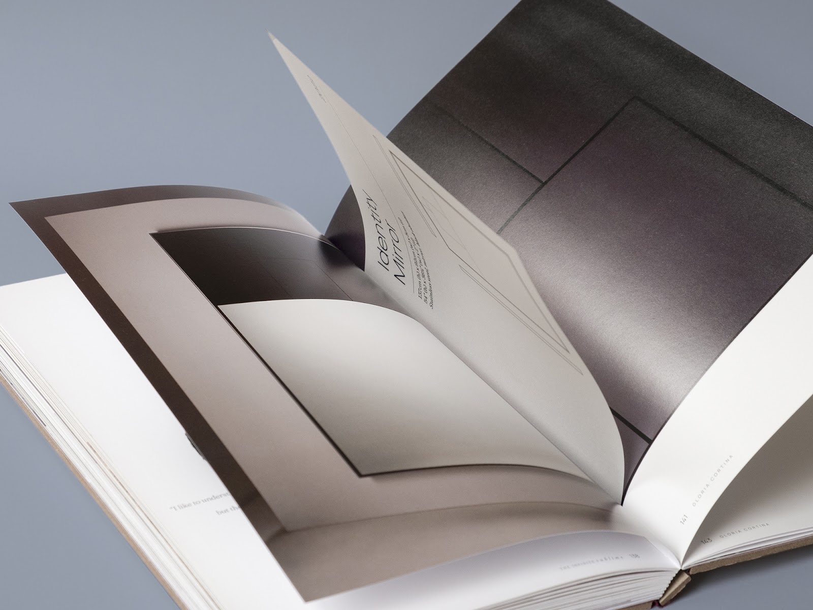


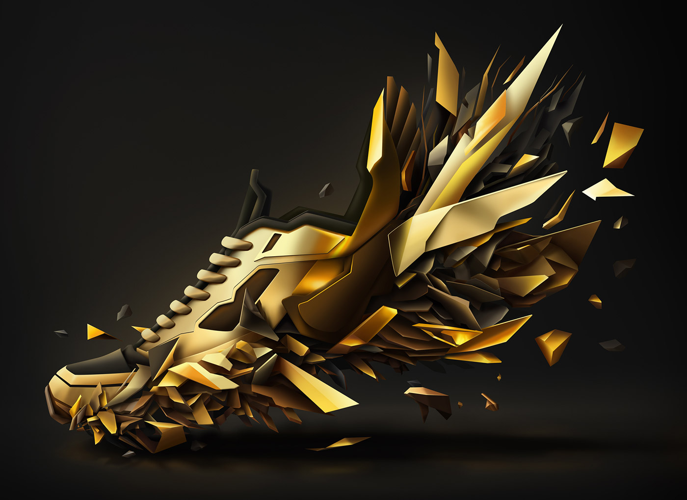
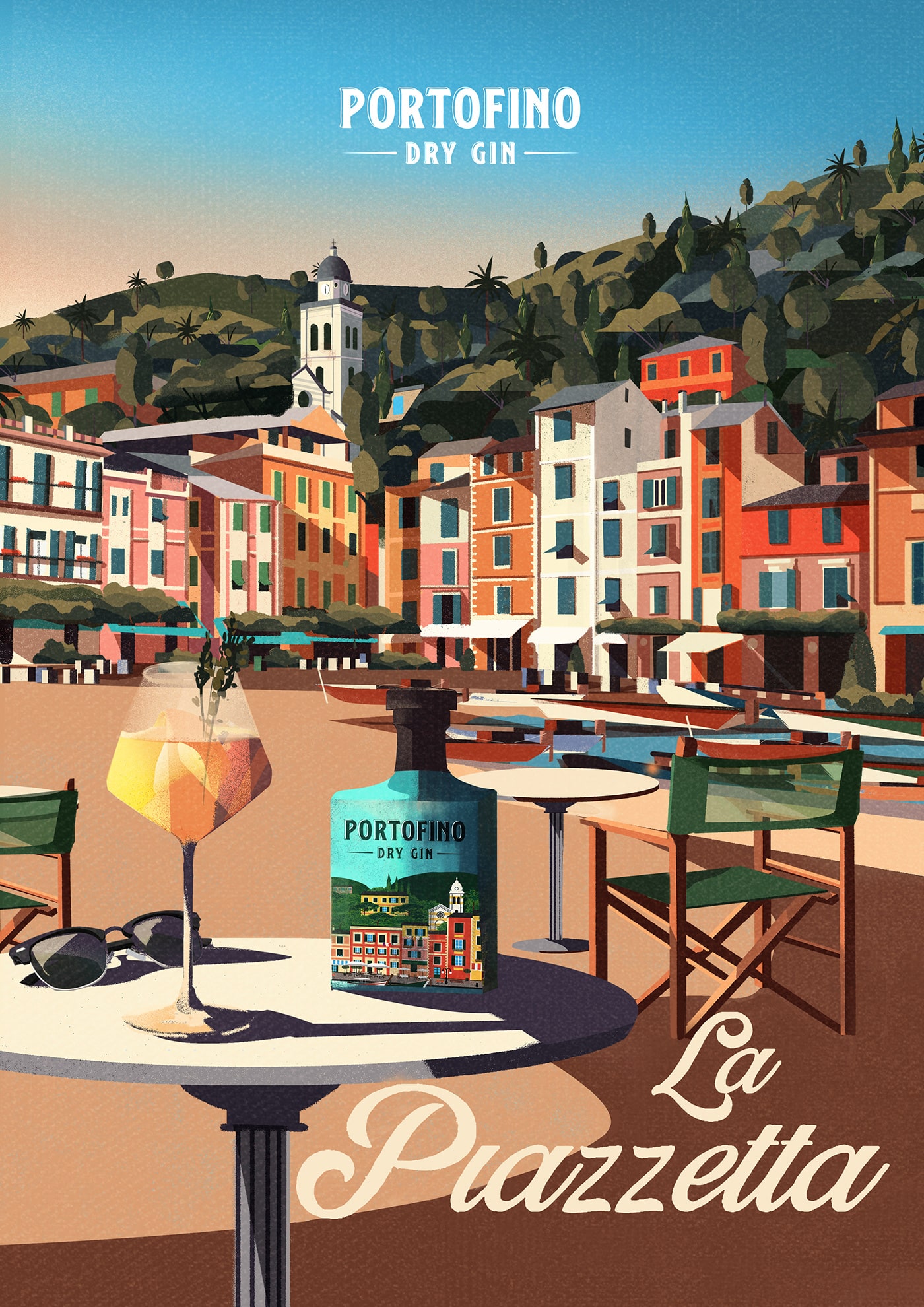


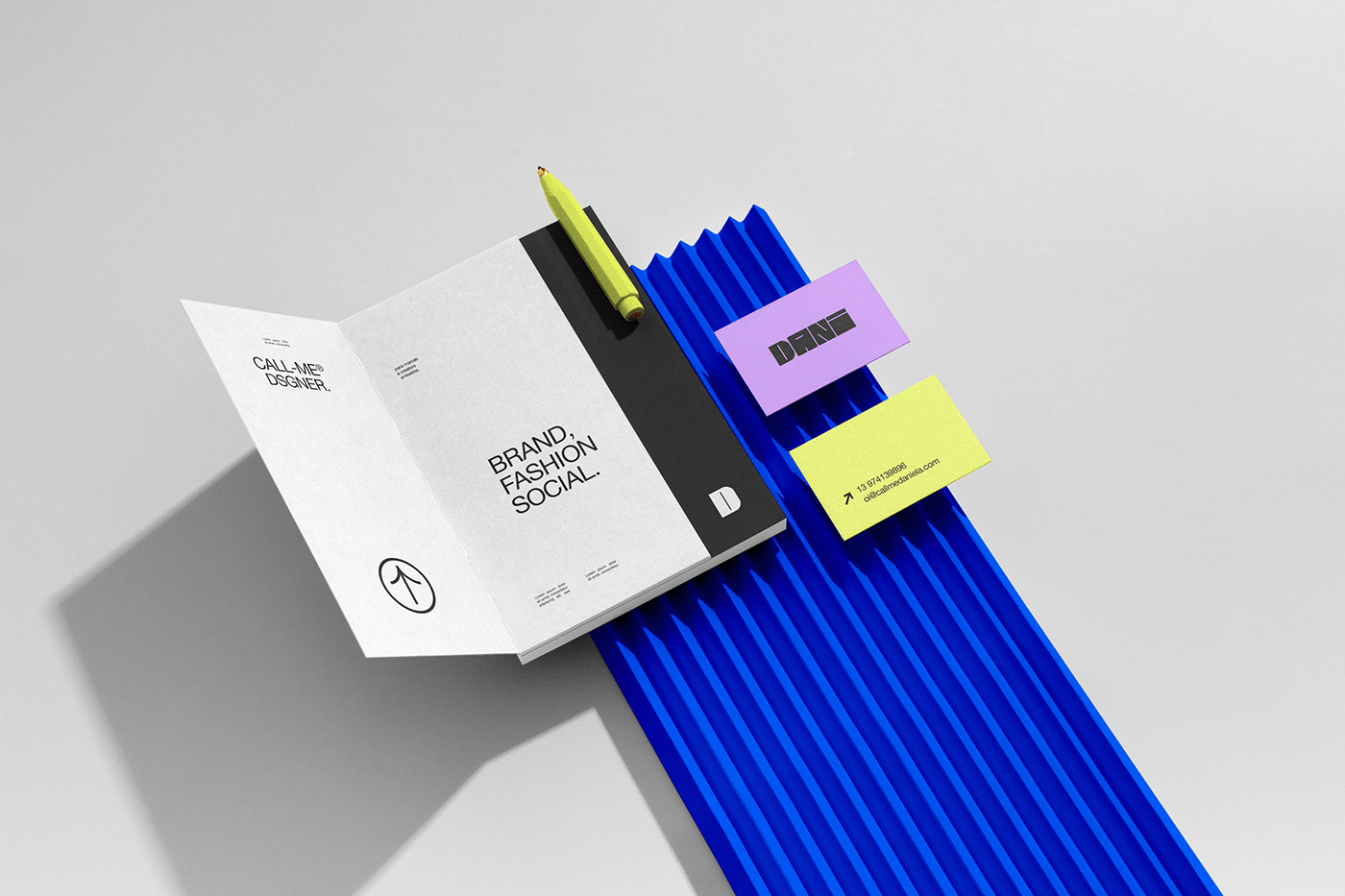





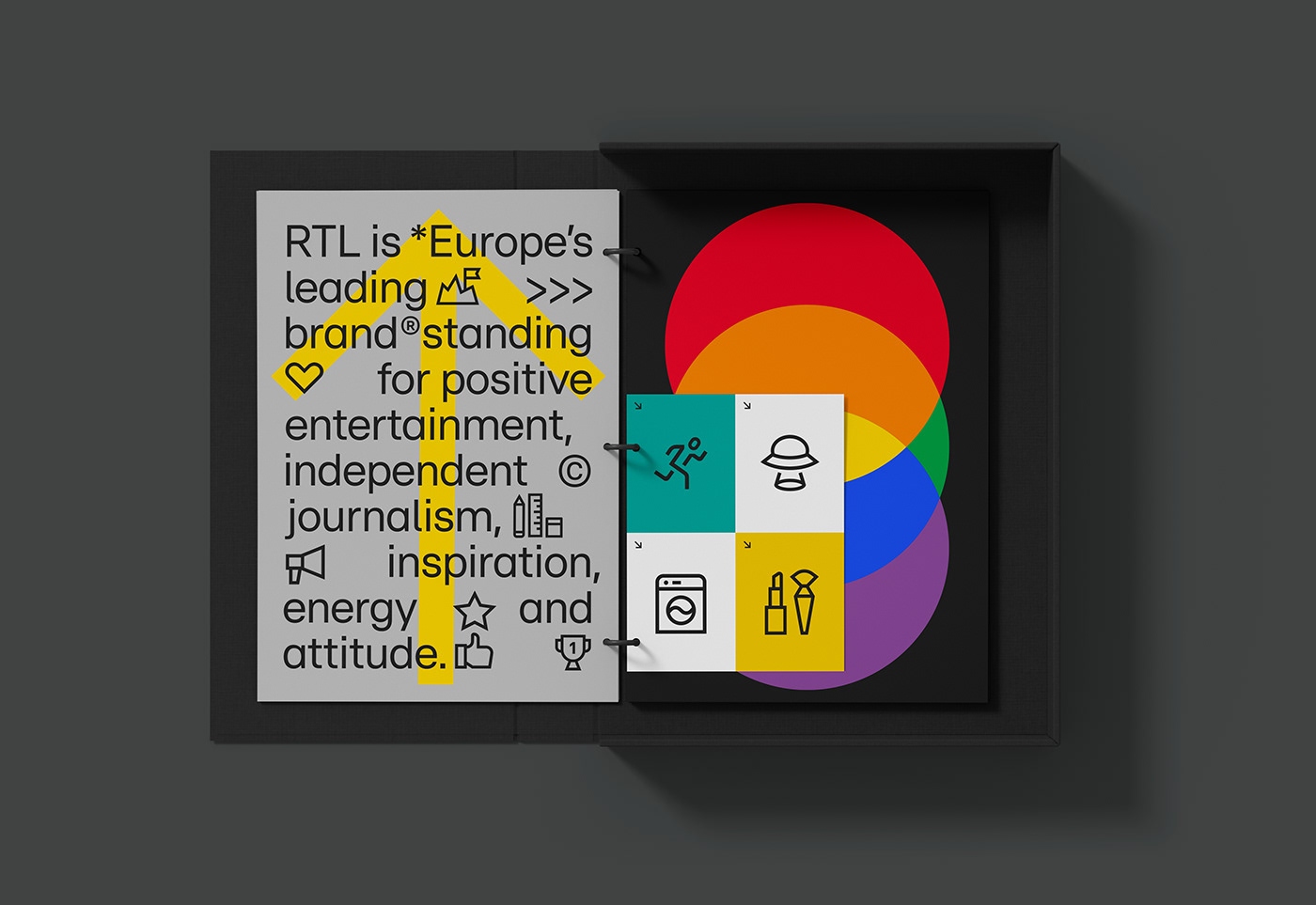












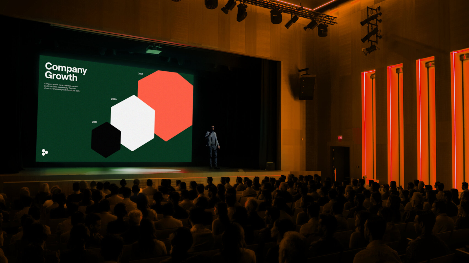






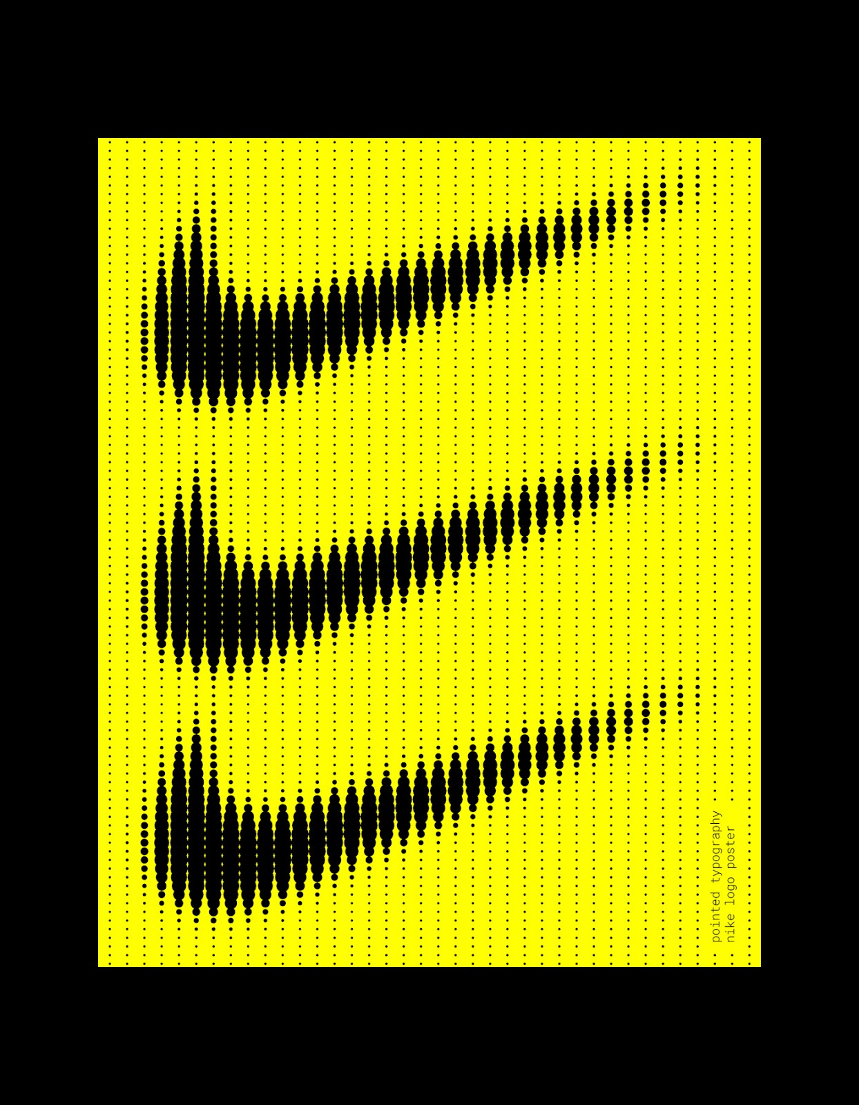


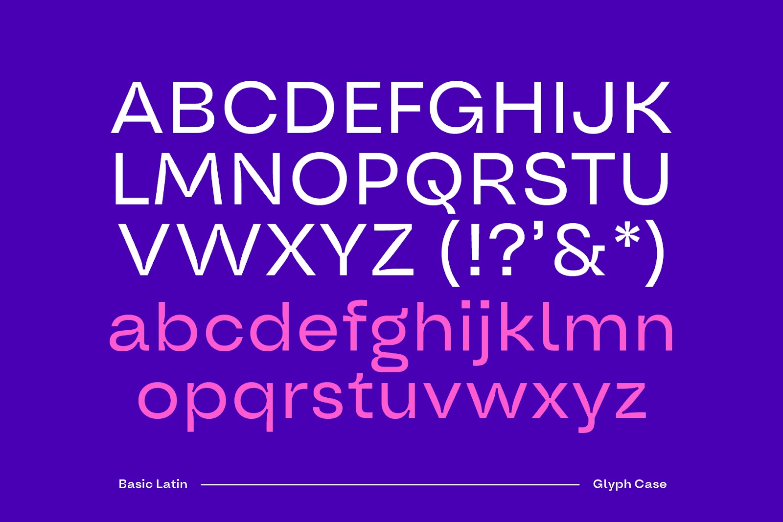






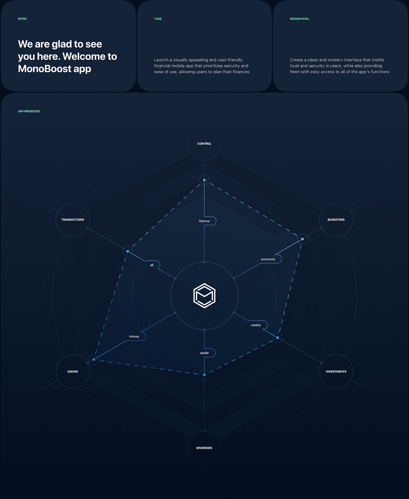




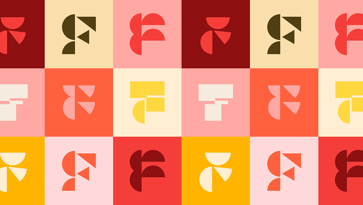




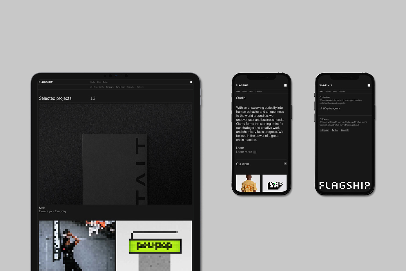

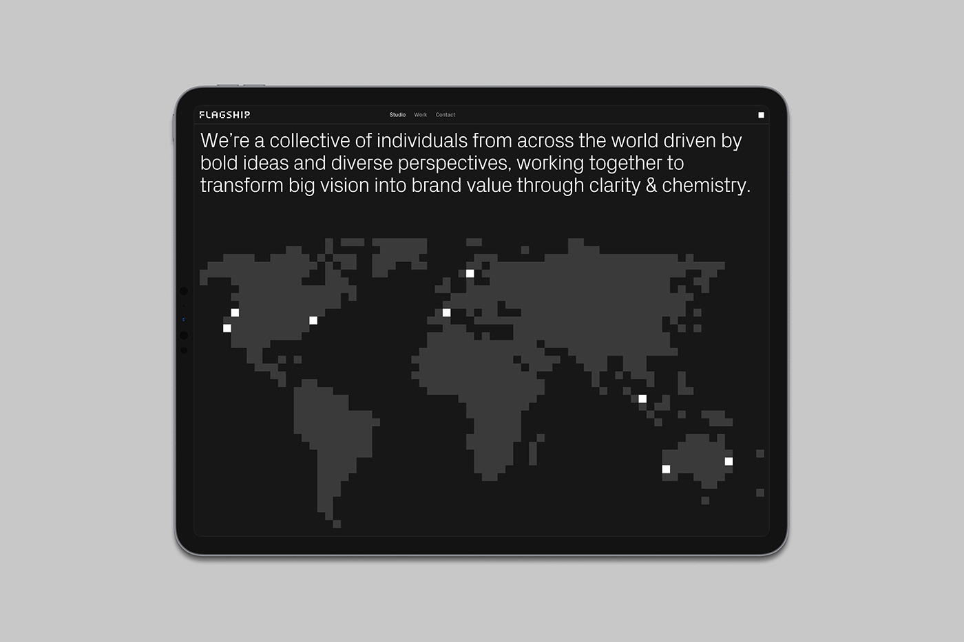


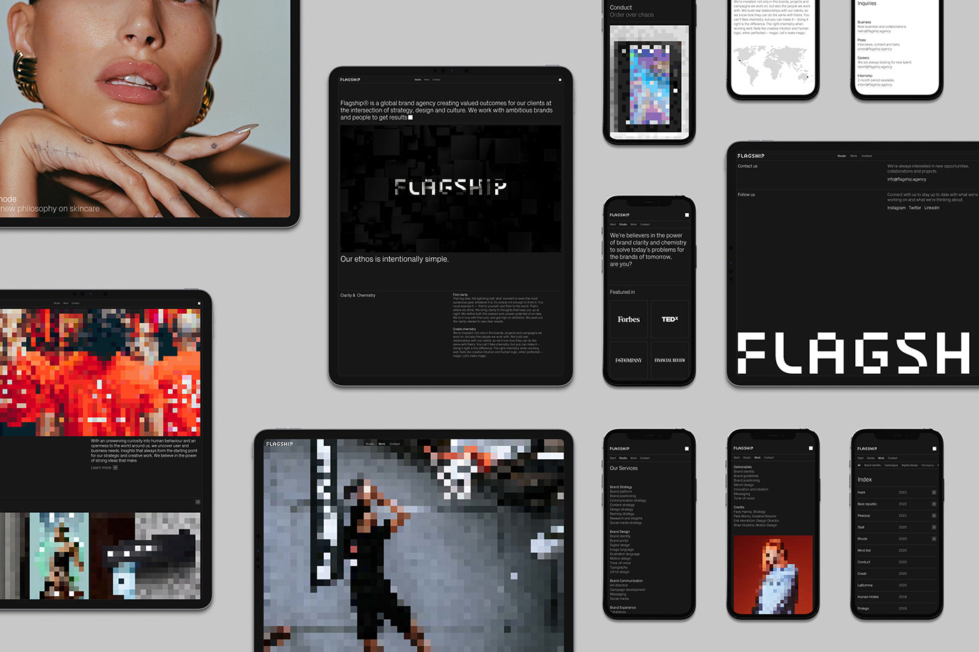


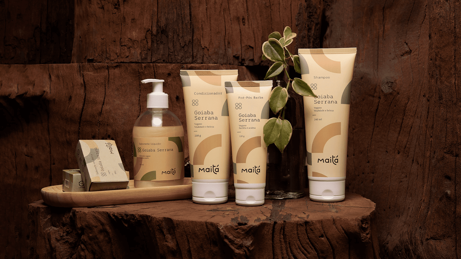


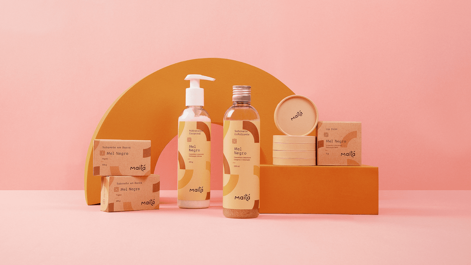


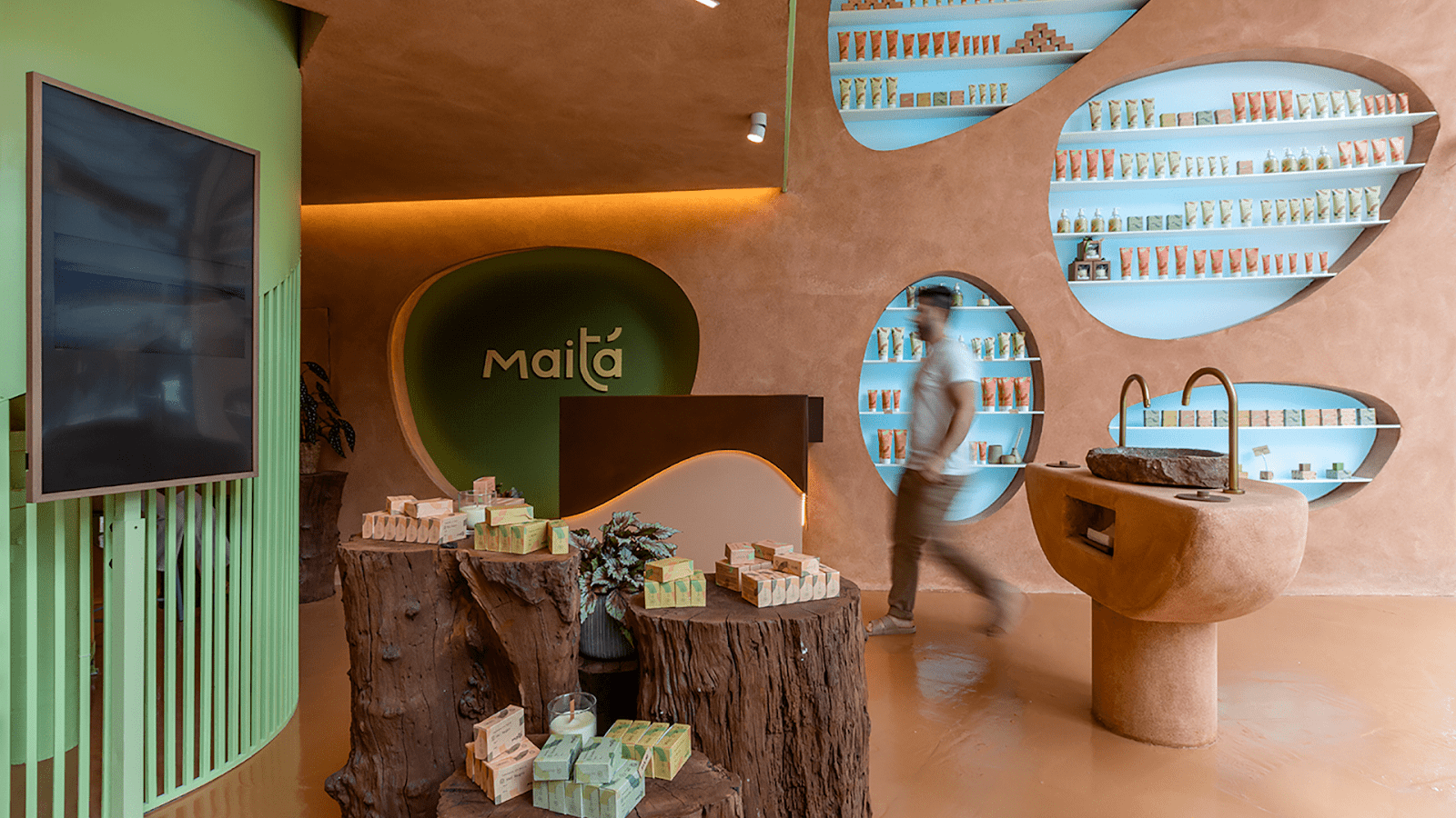
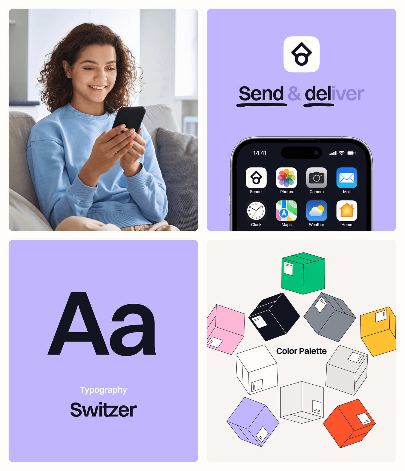


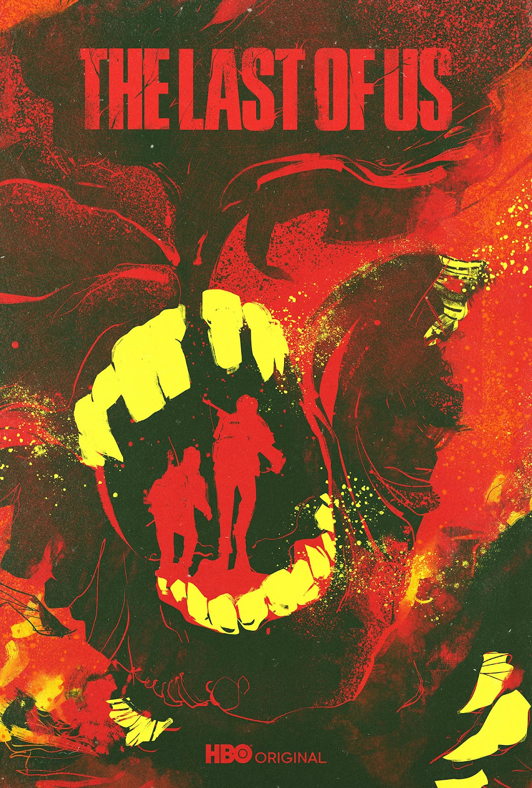



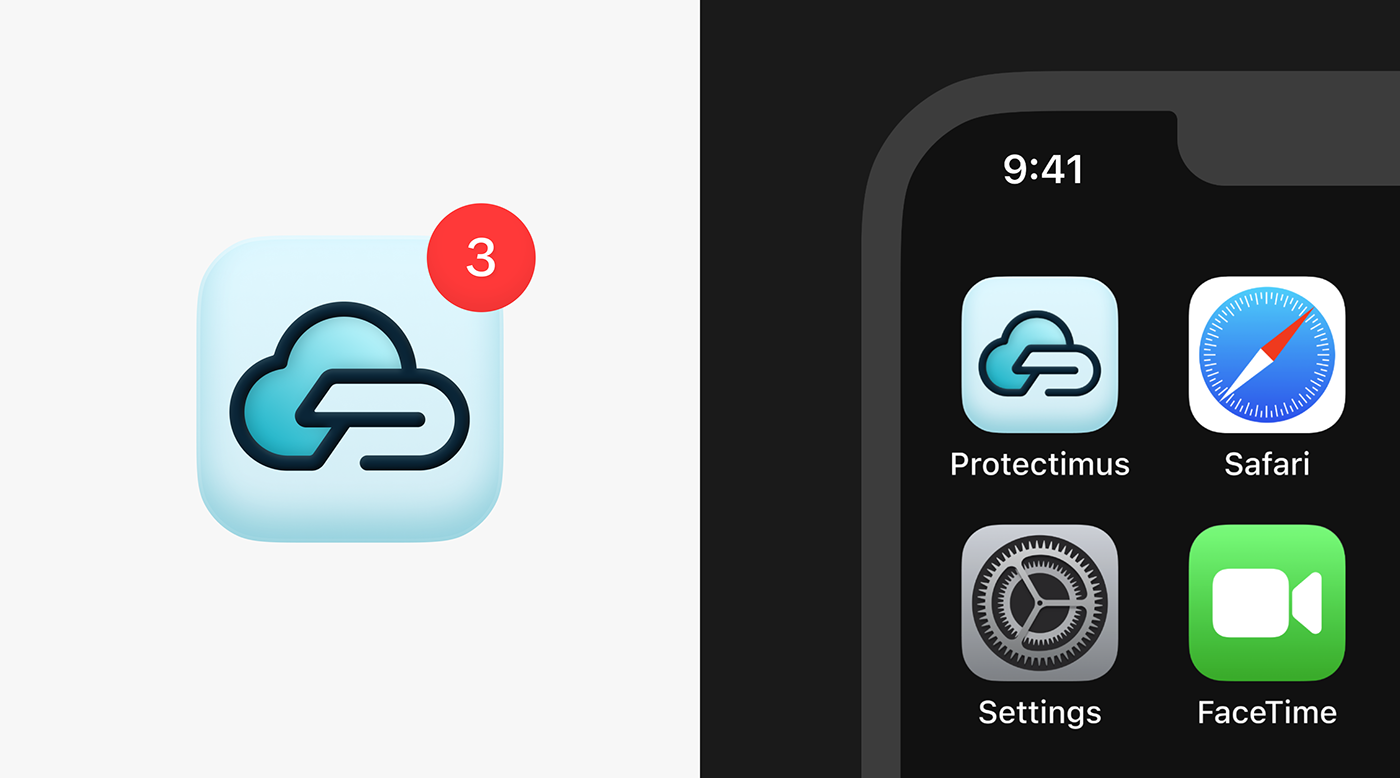


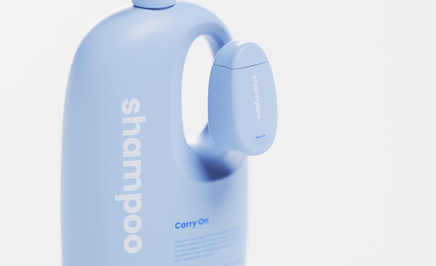


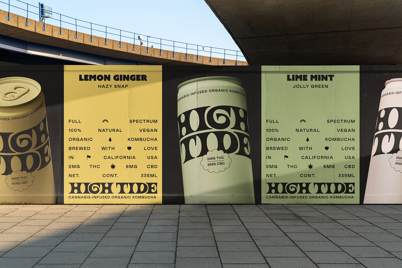
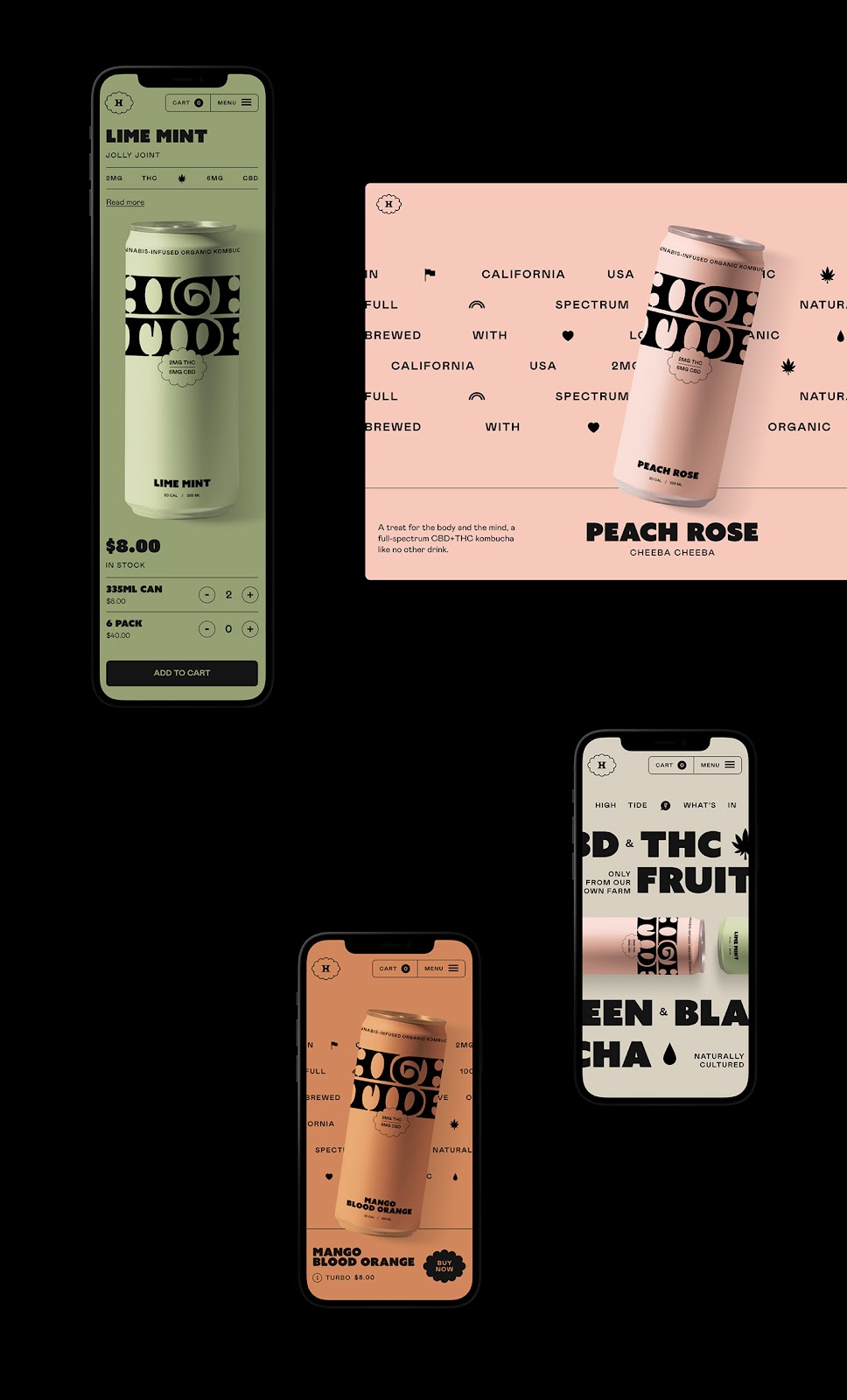


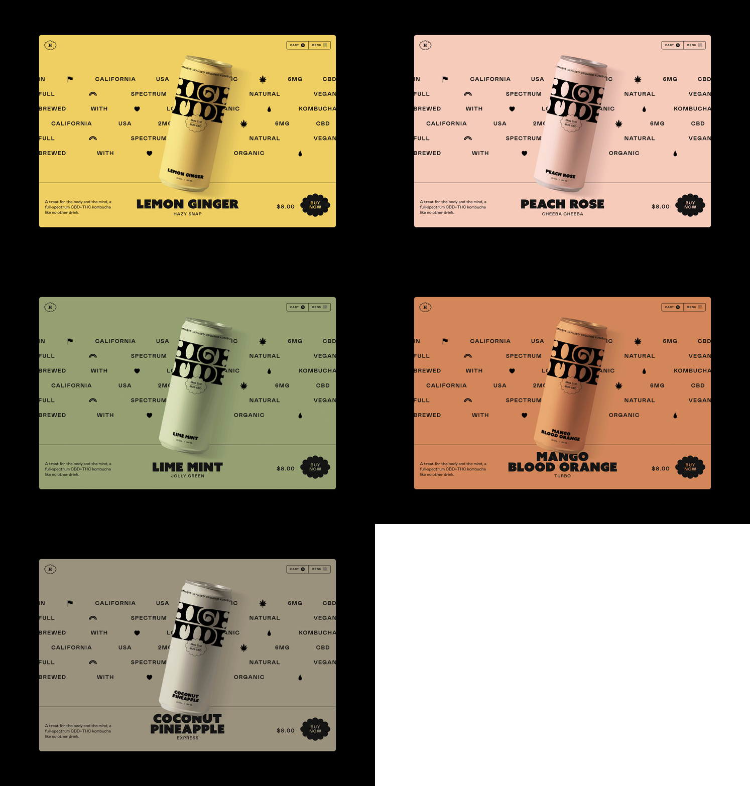


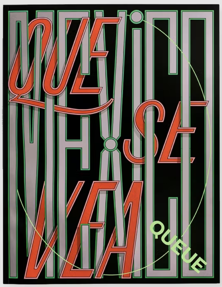


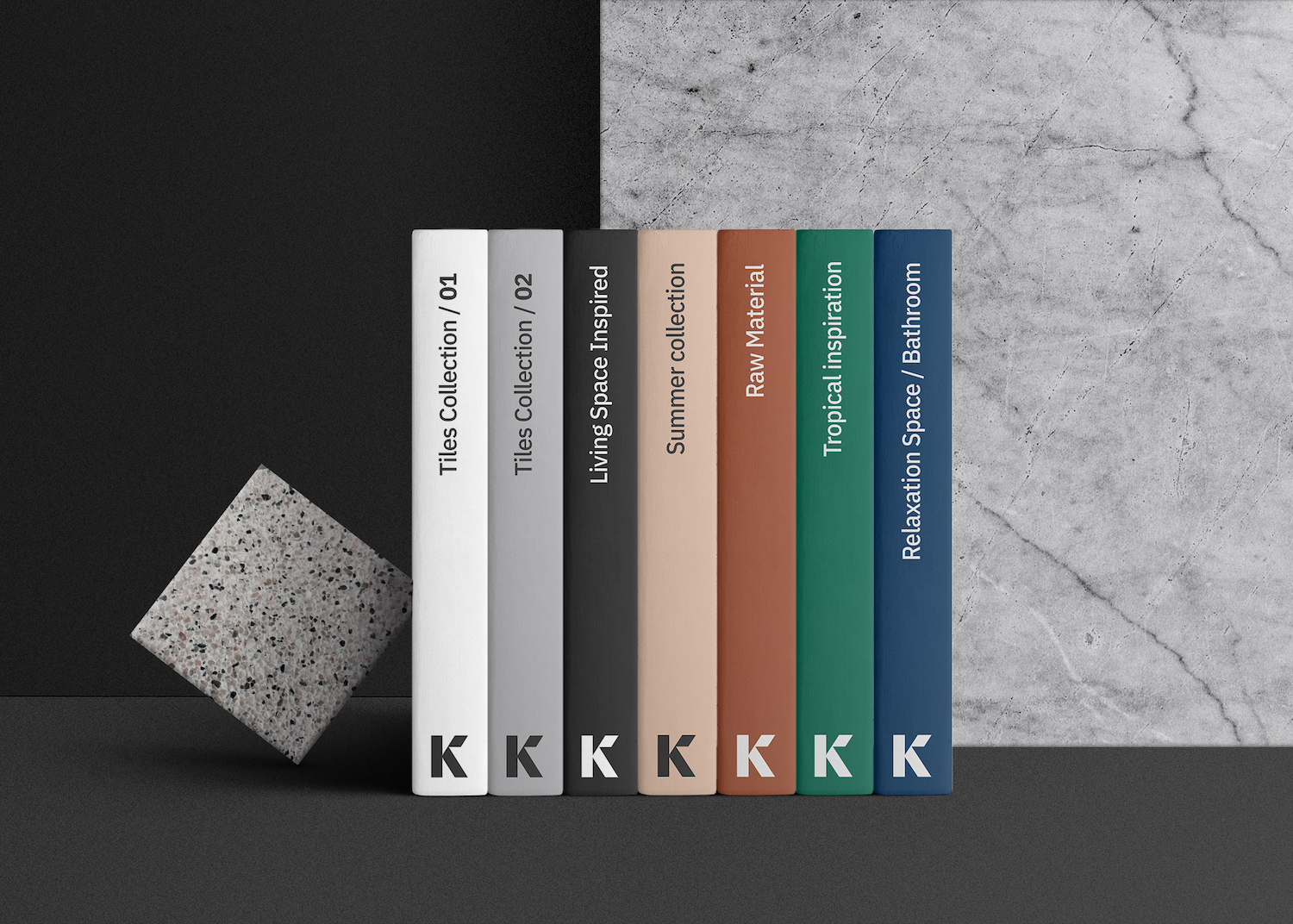


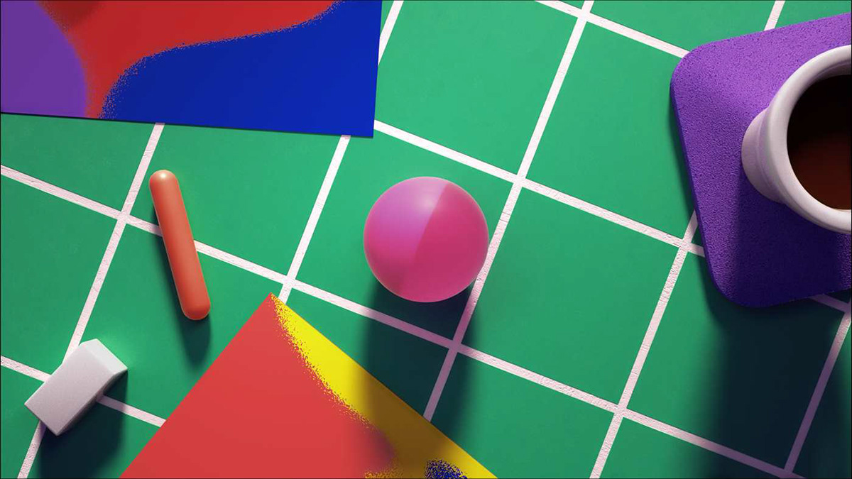

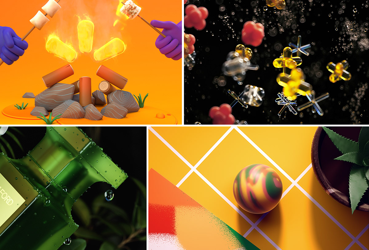


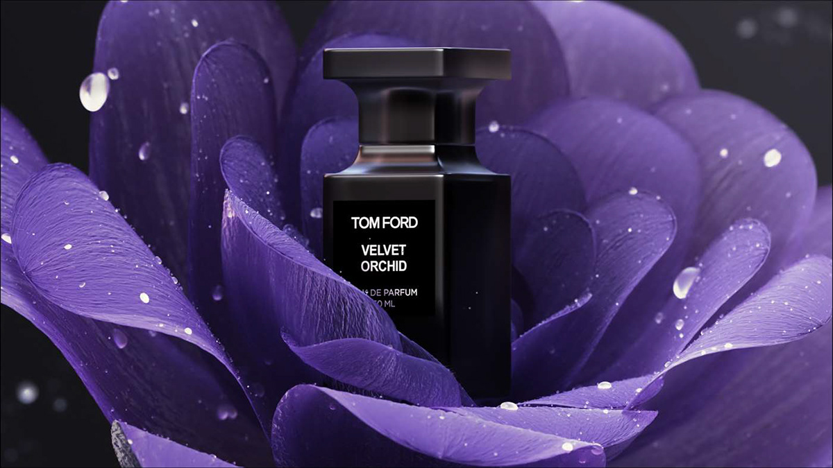




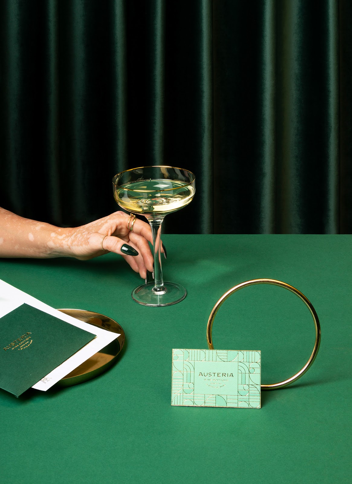








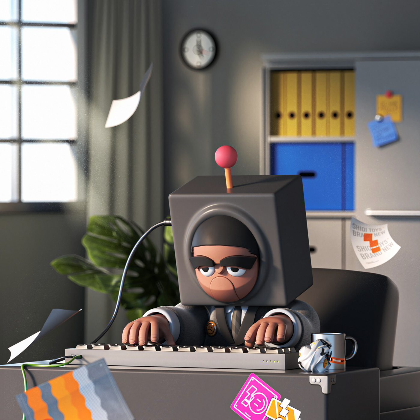


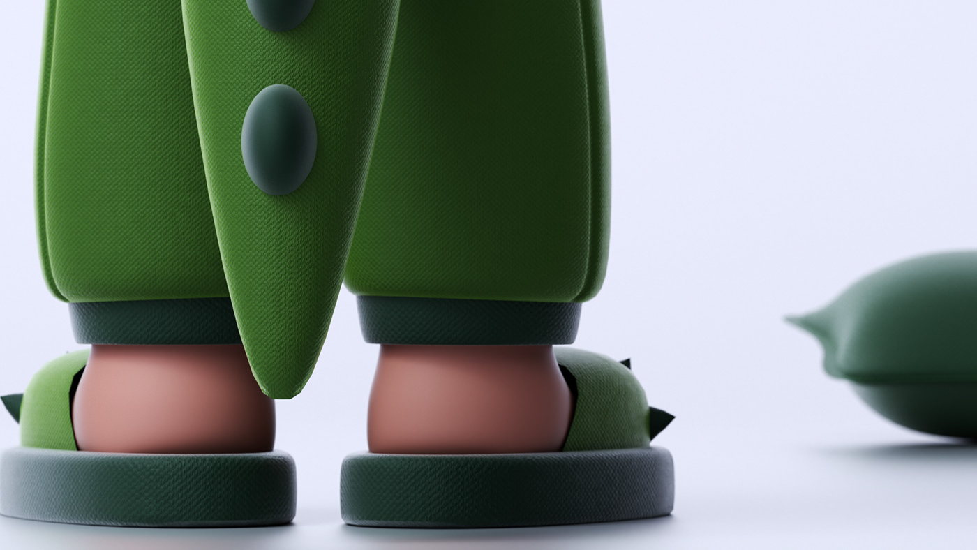




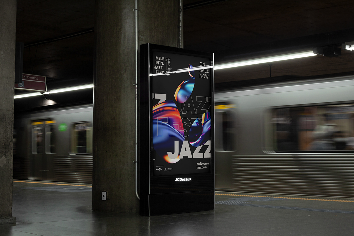


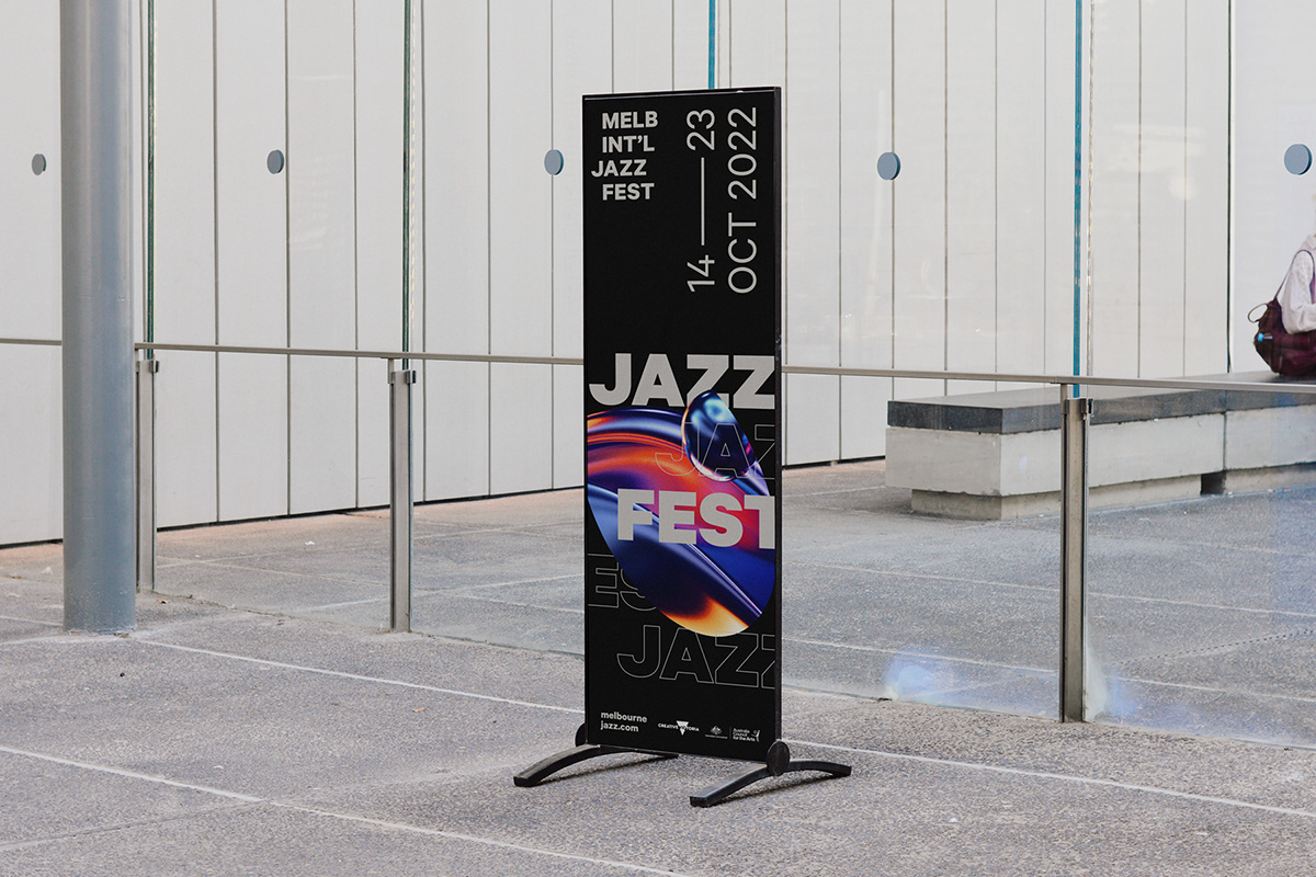


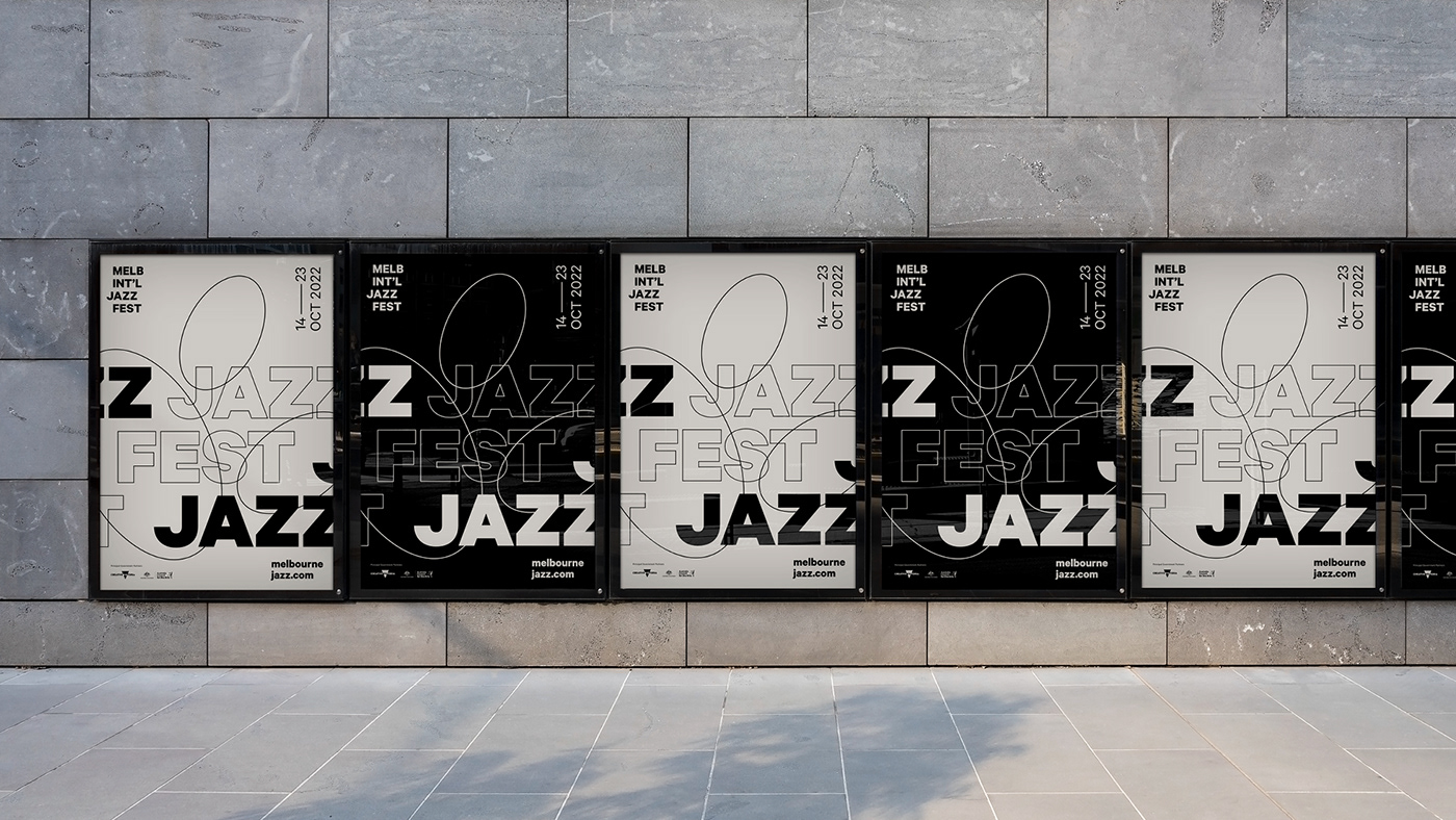


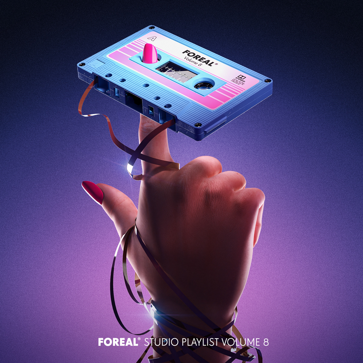




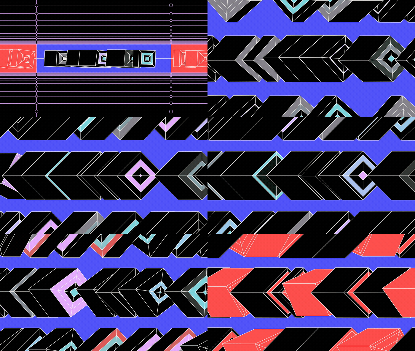




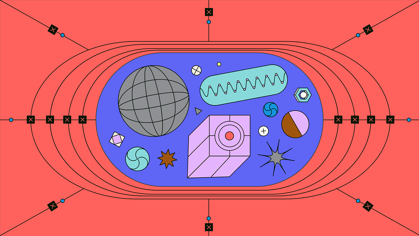


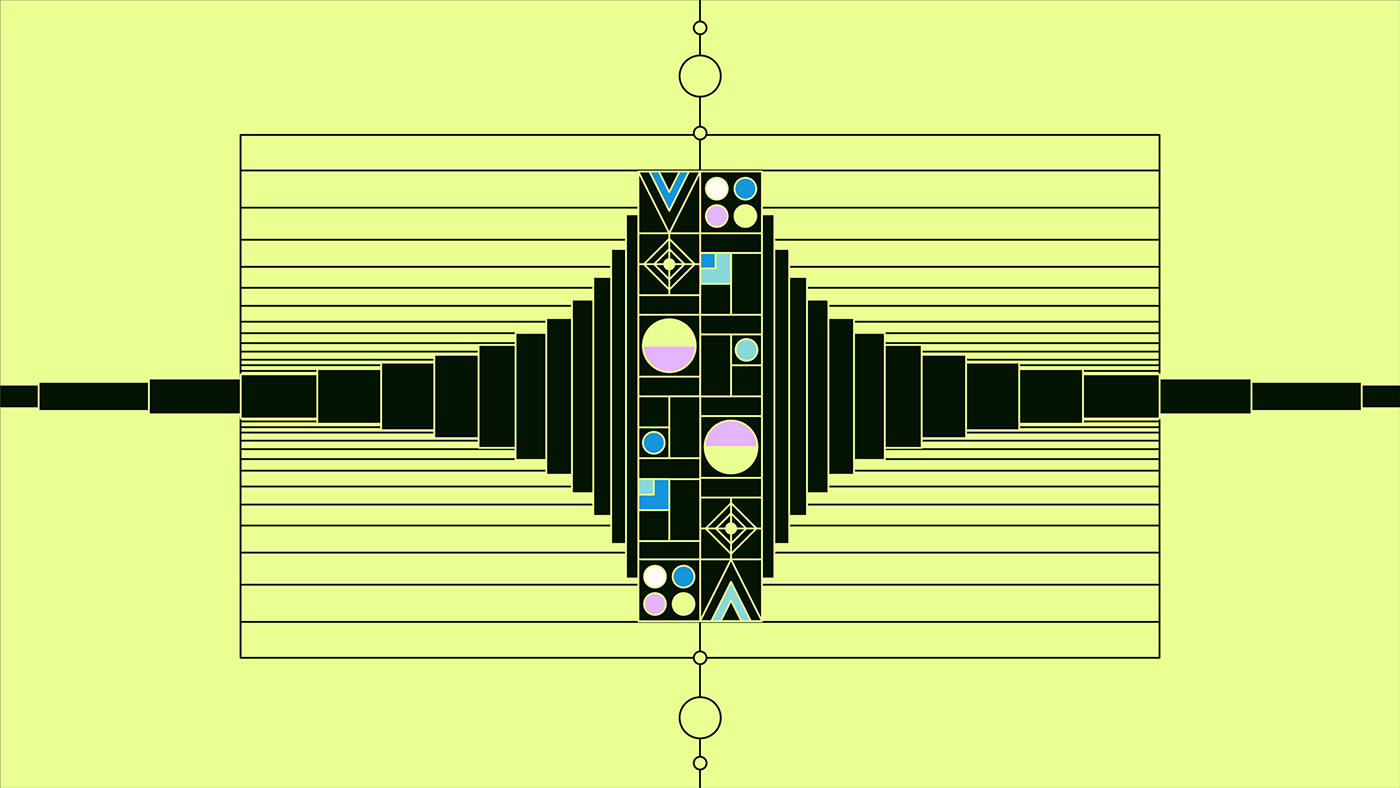


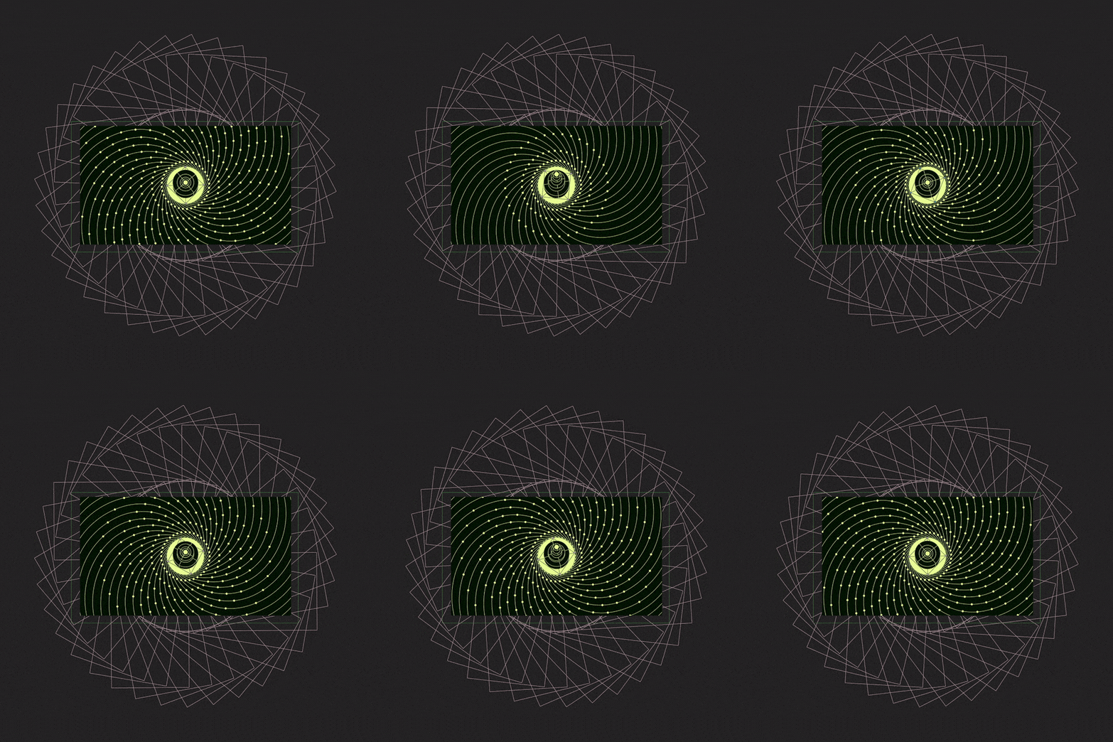

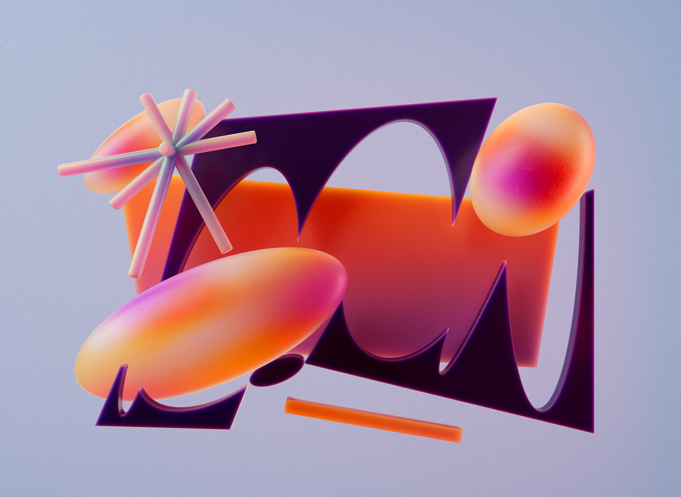


 For more information make sure to check out
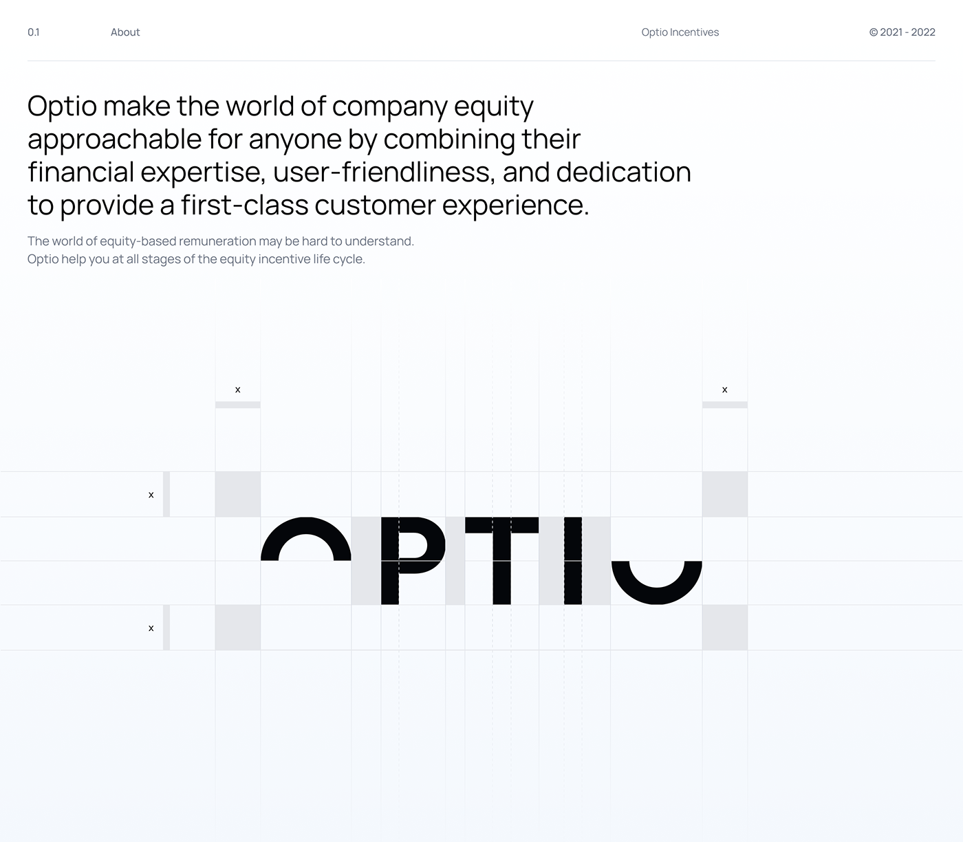


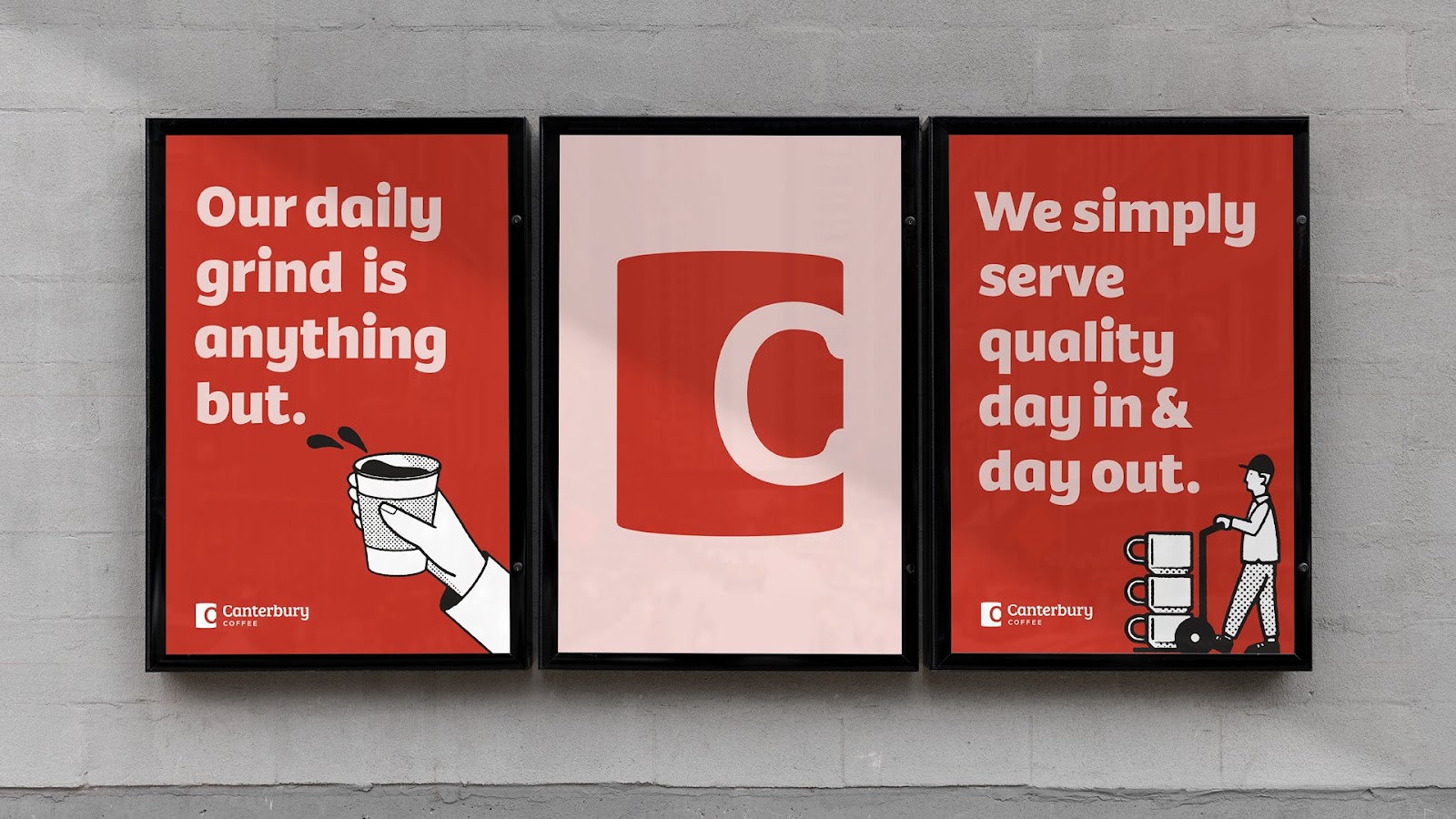








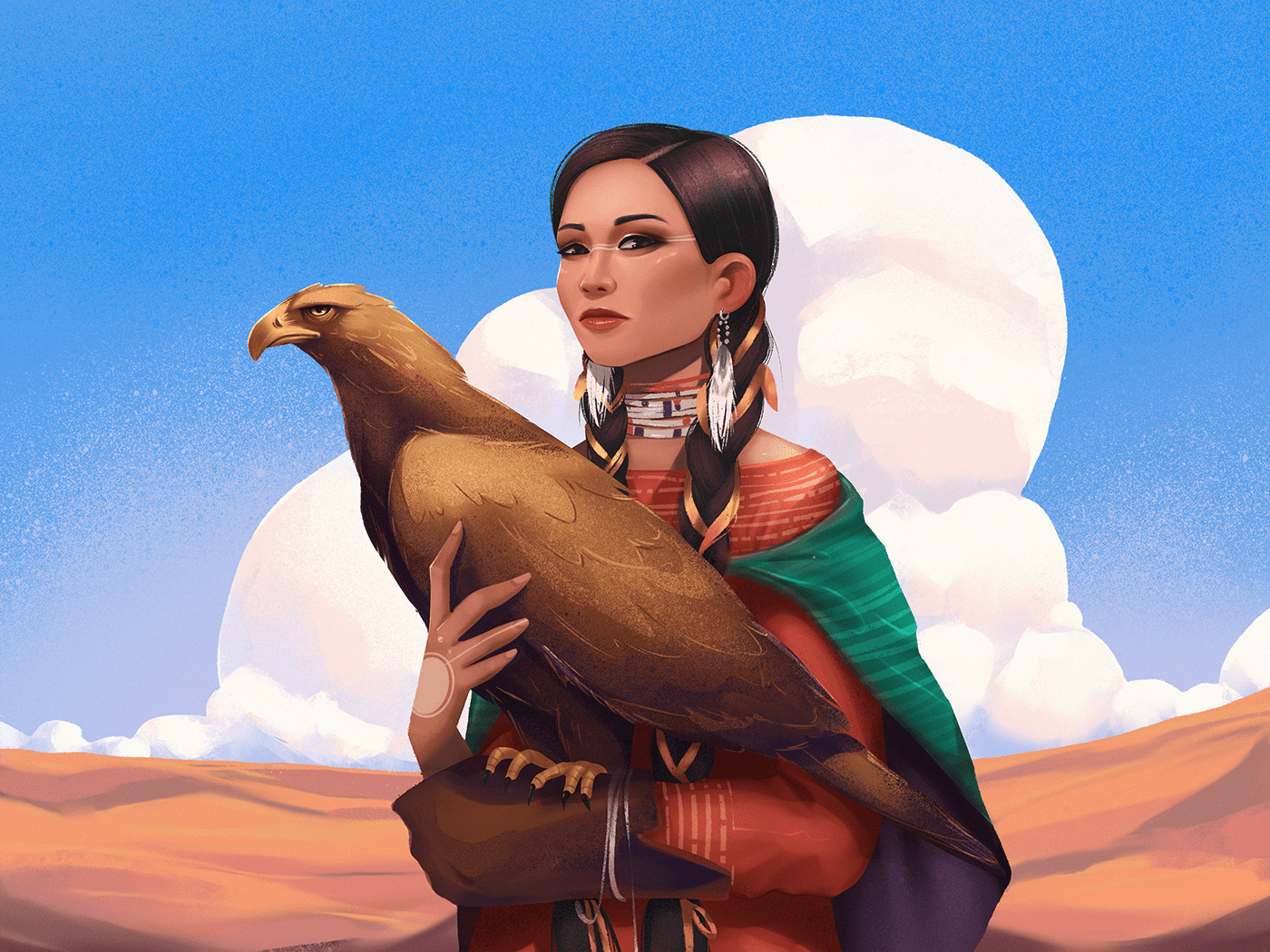






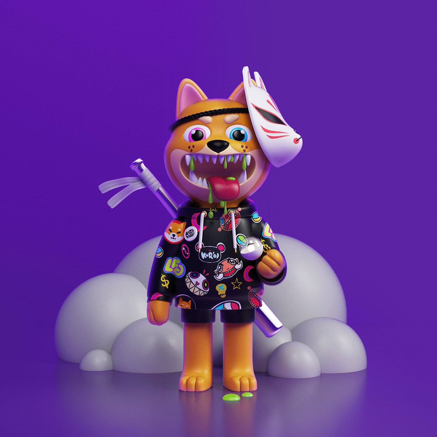


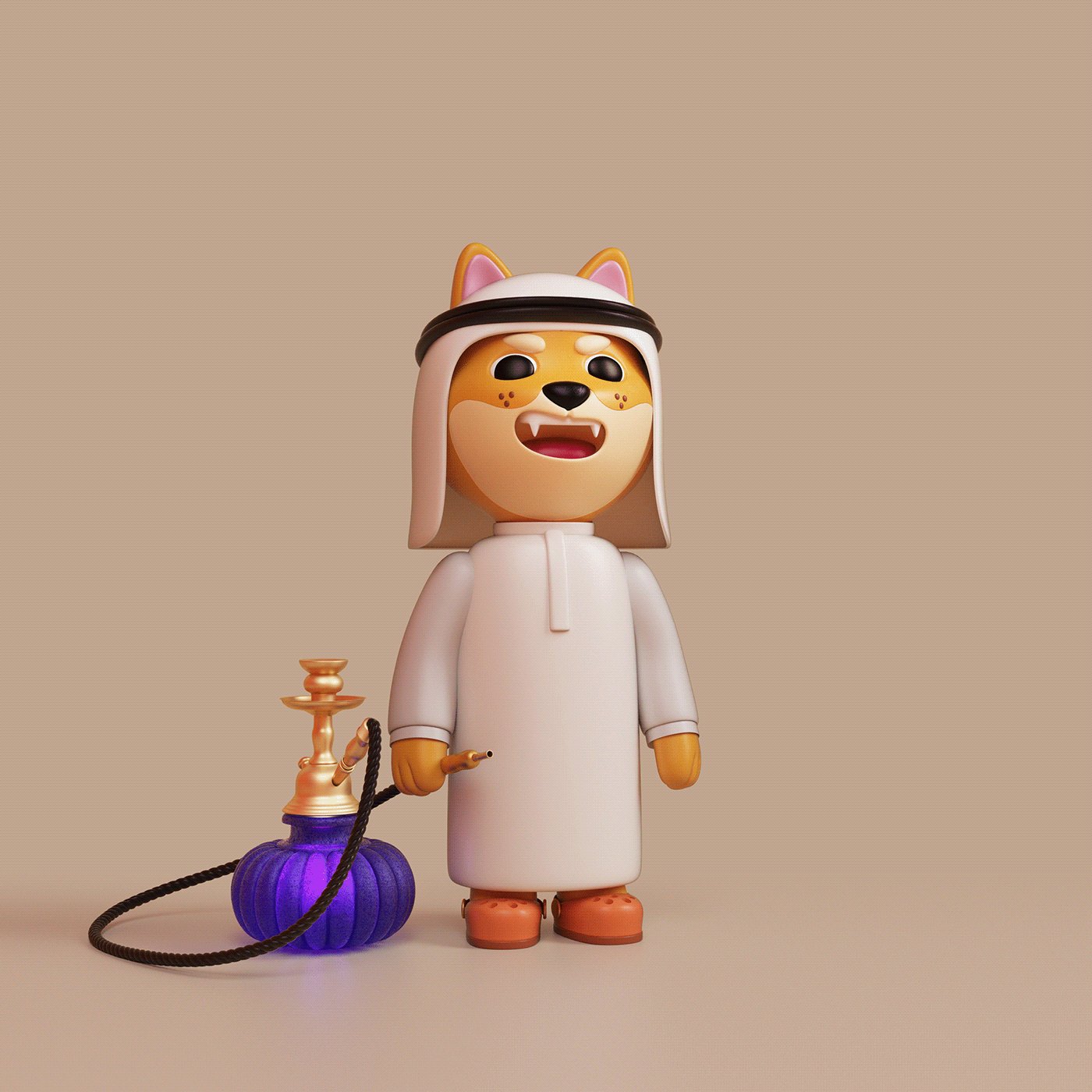
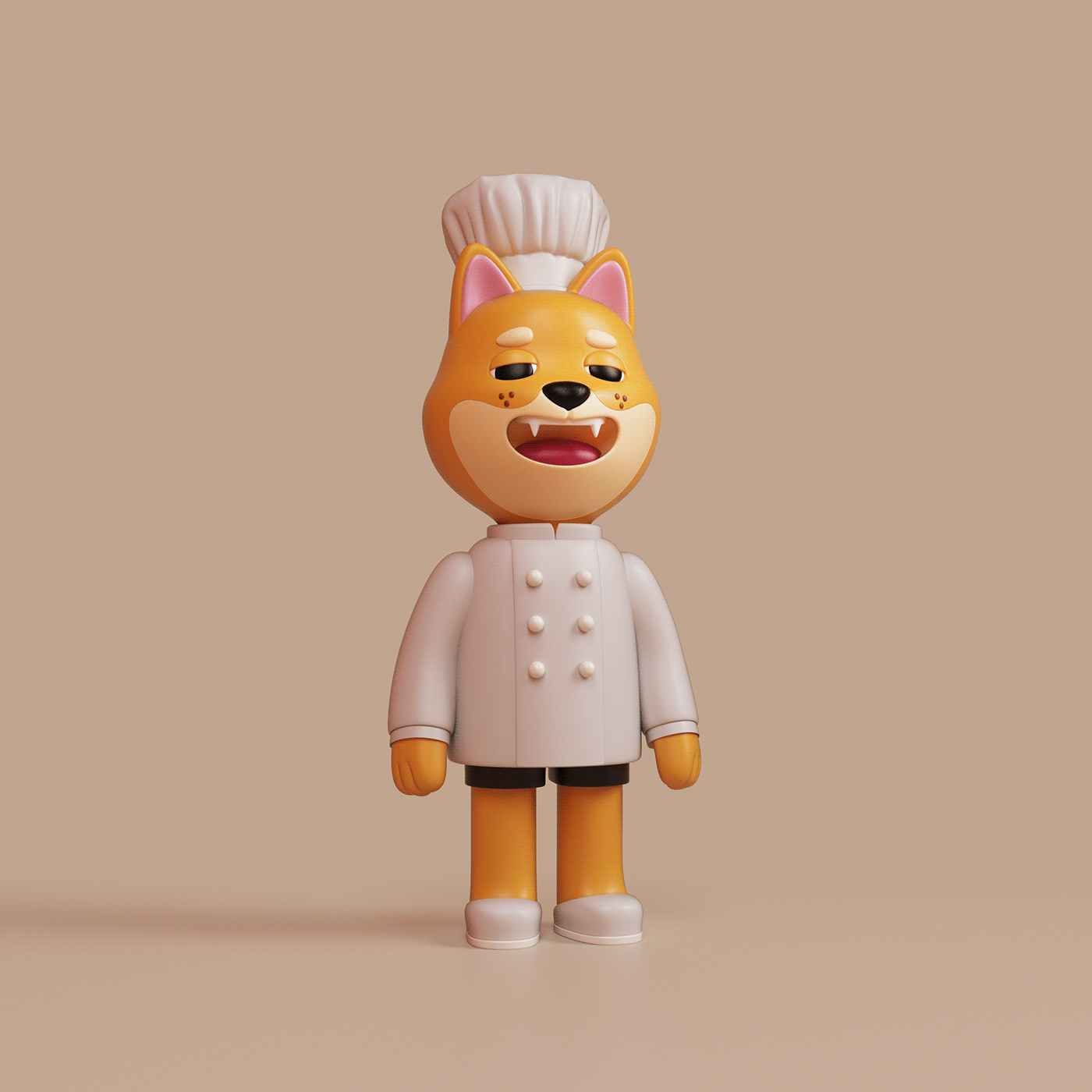


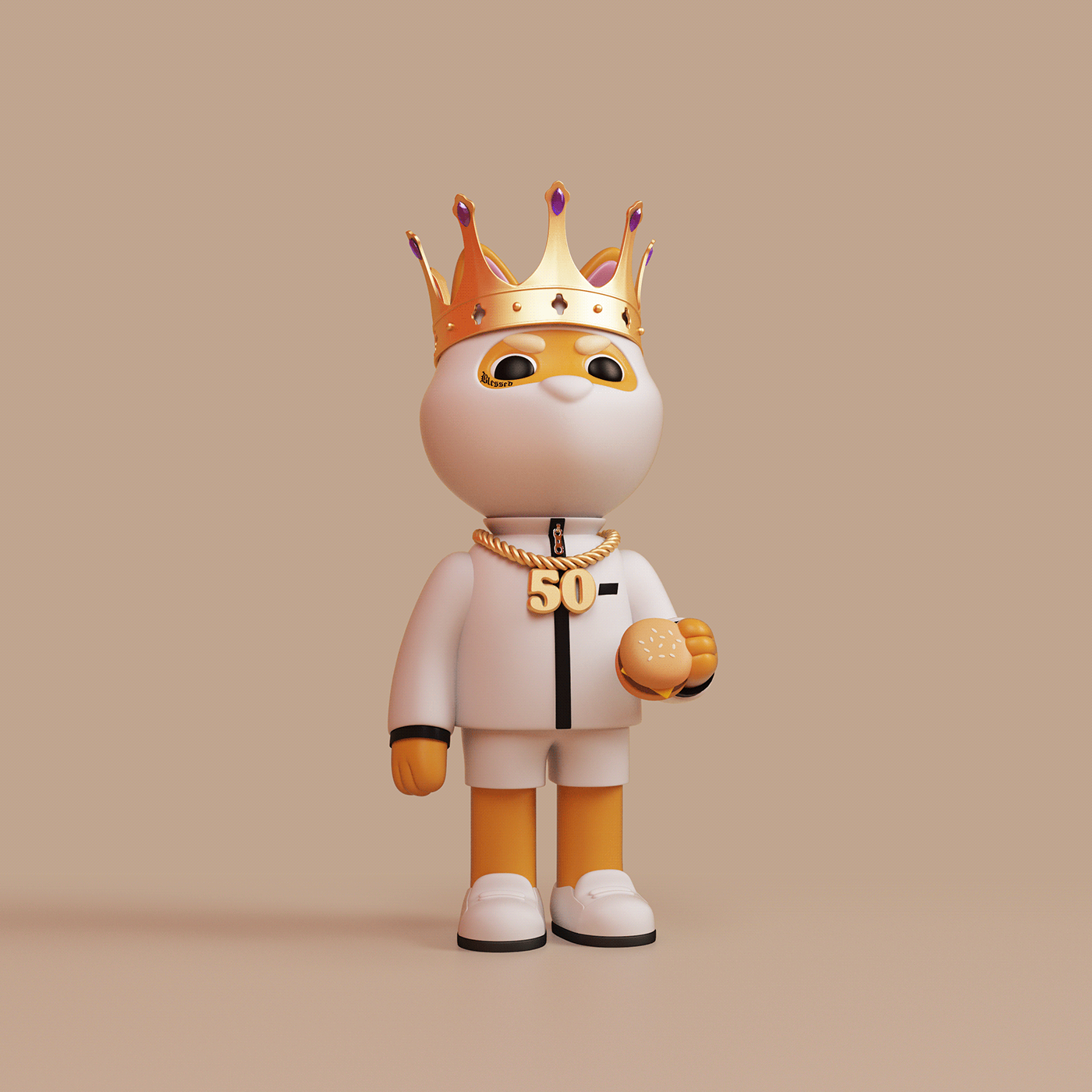


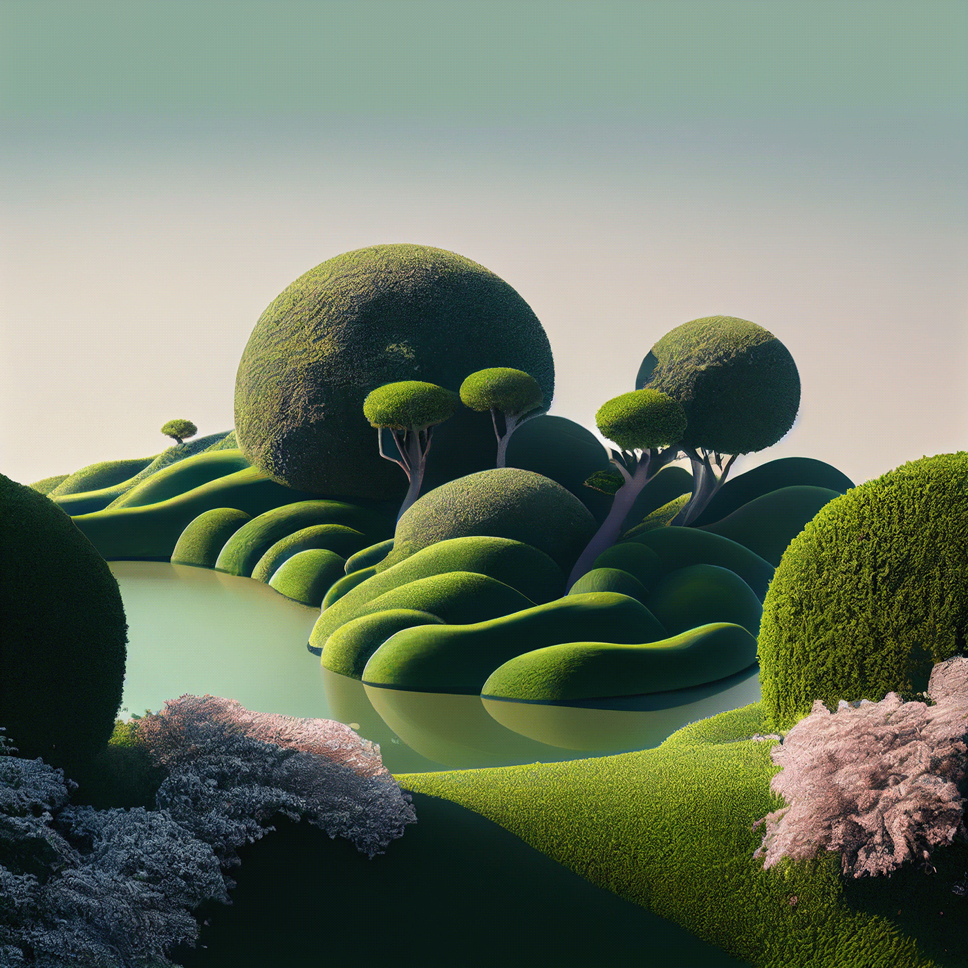






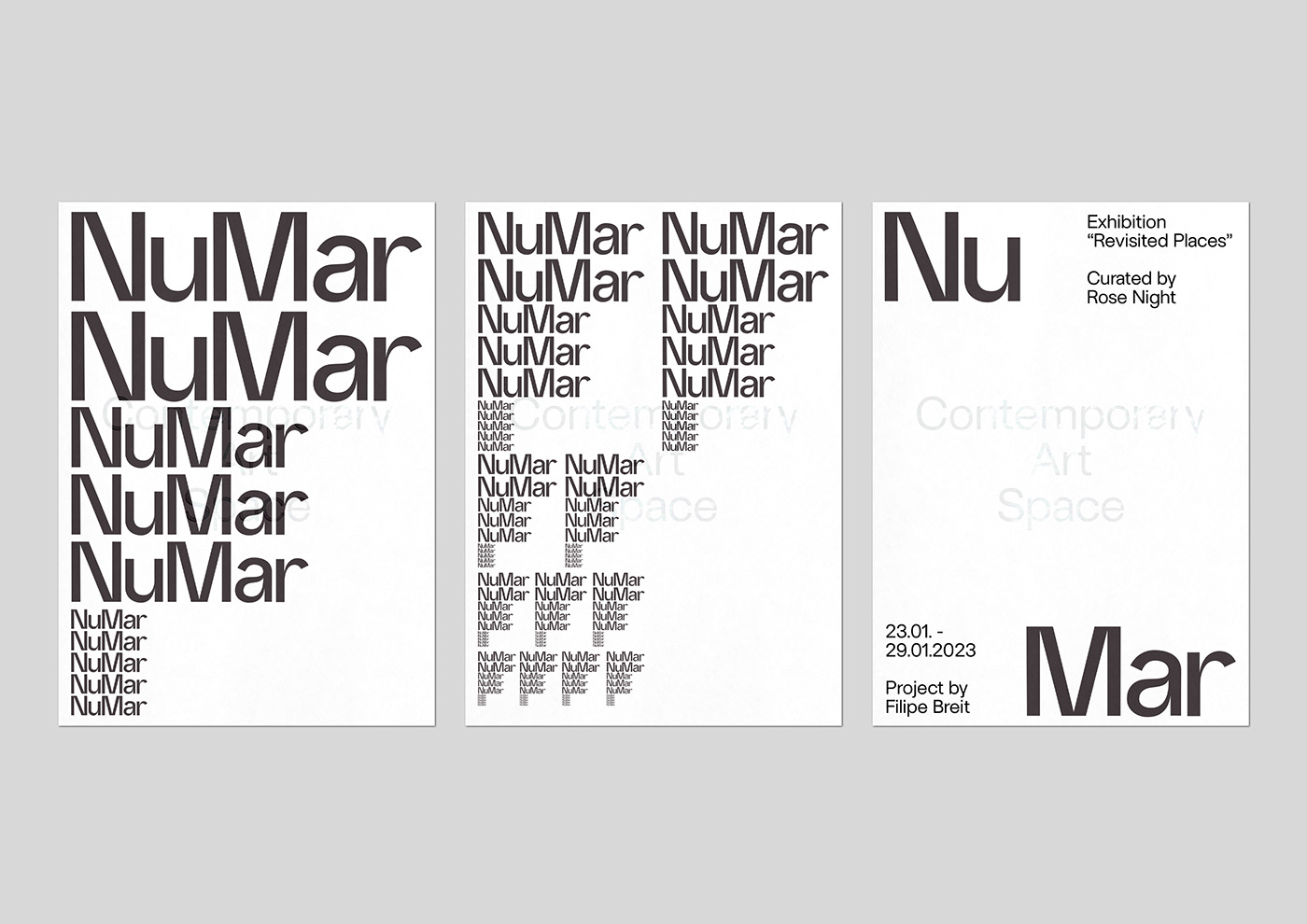


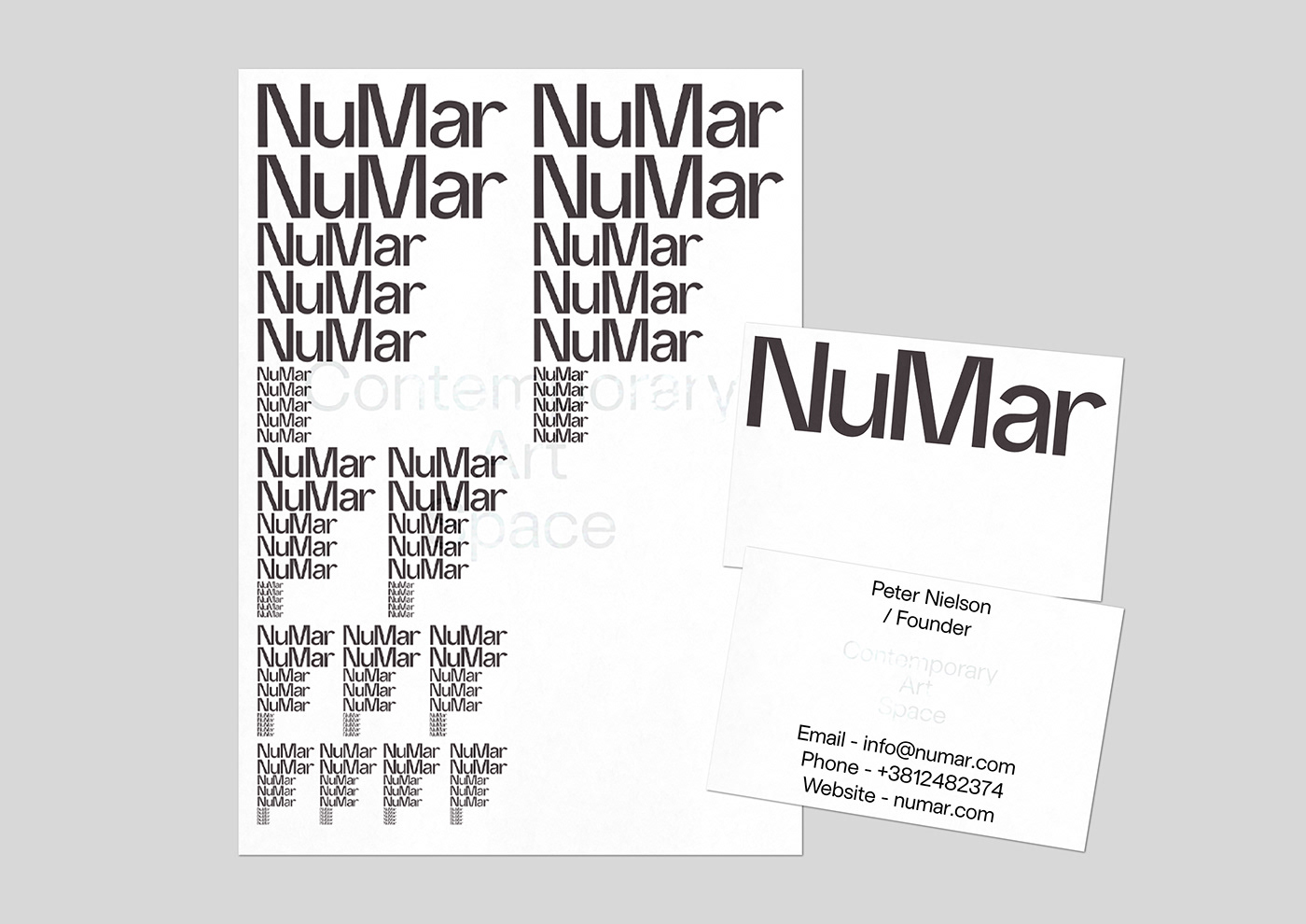

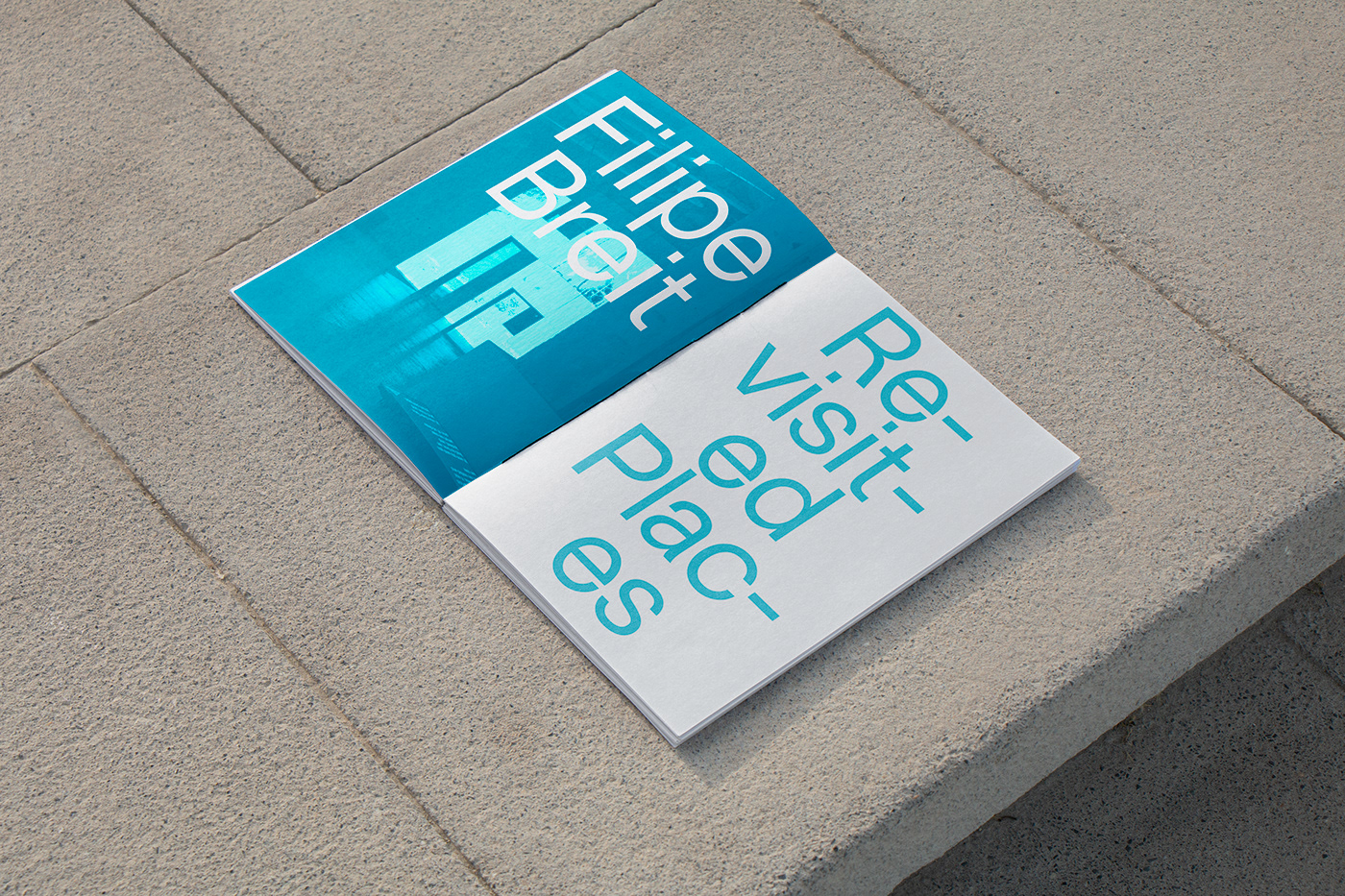


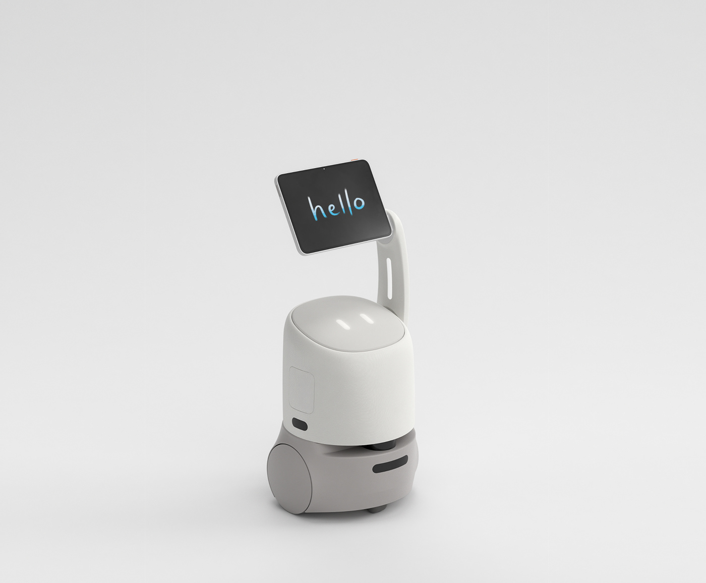


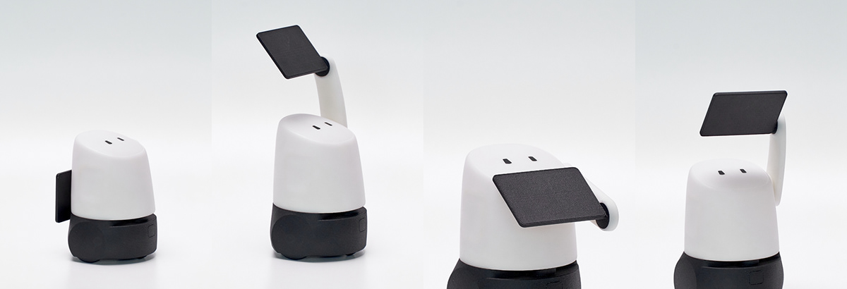


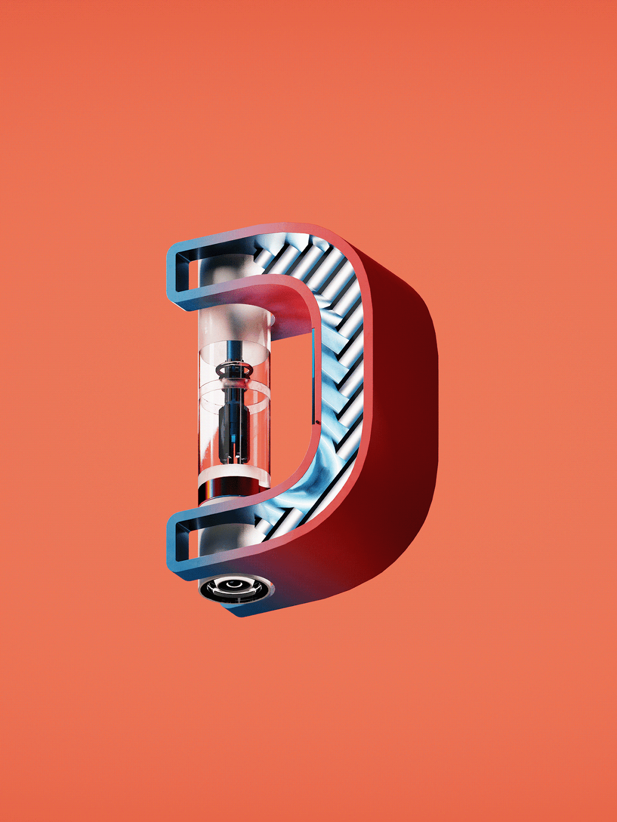


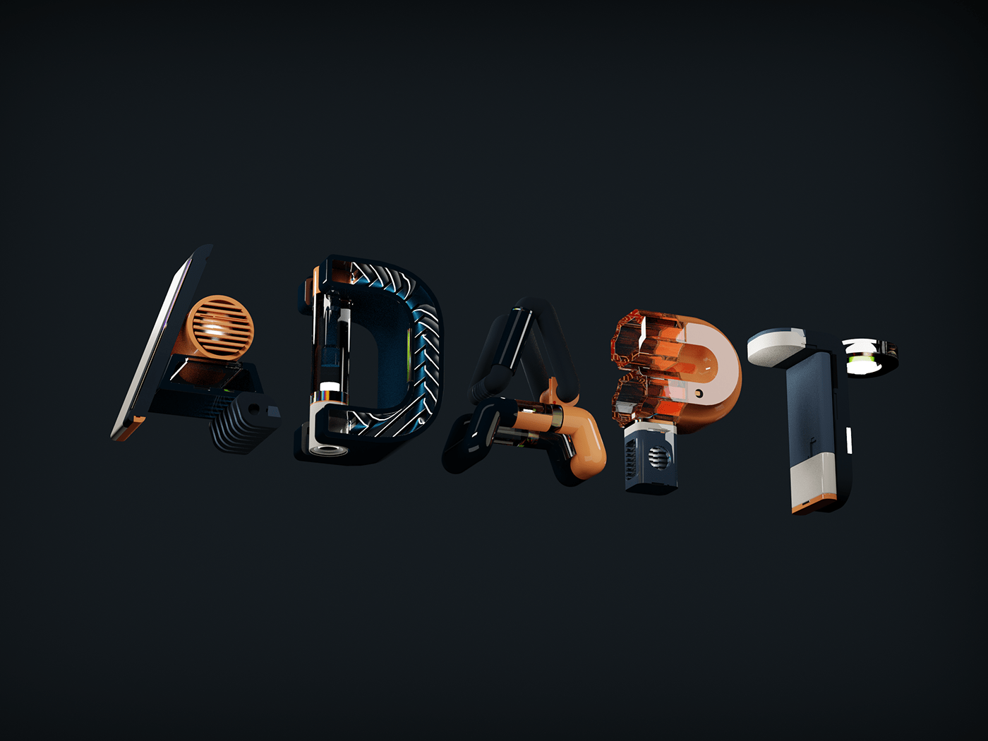


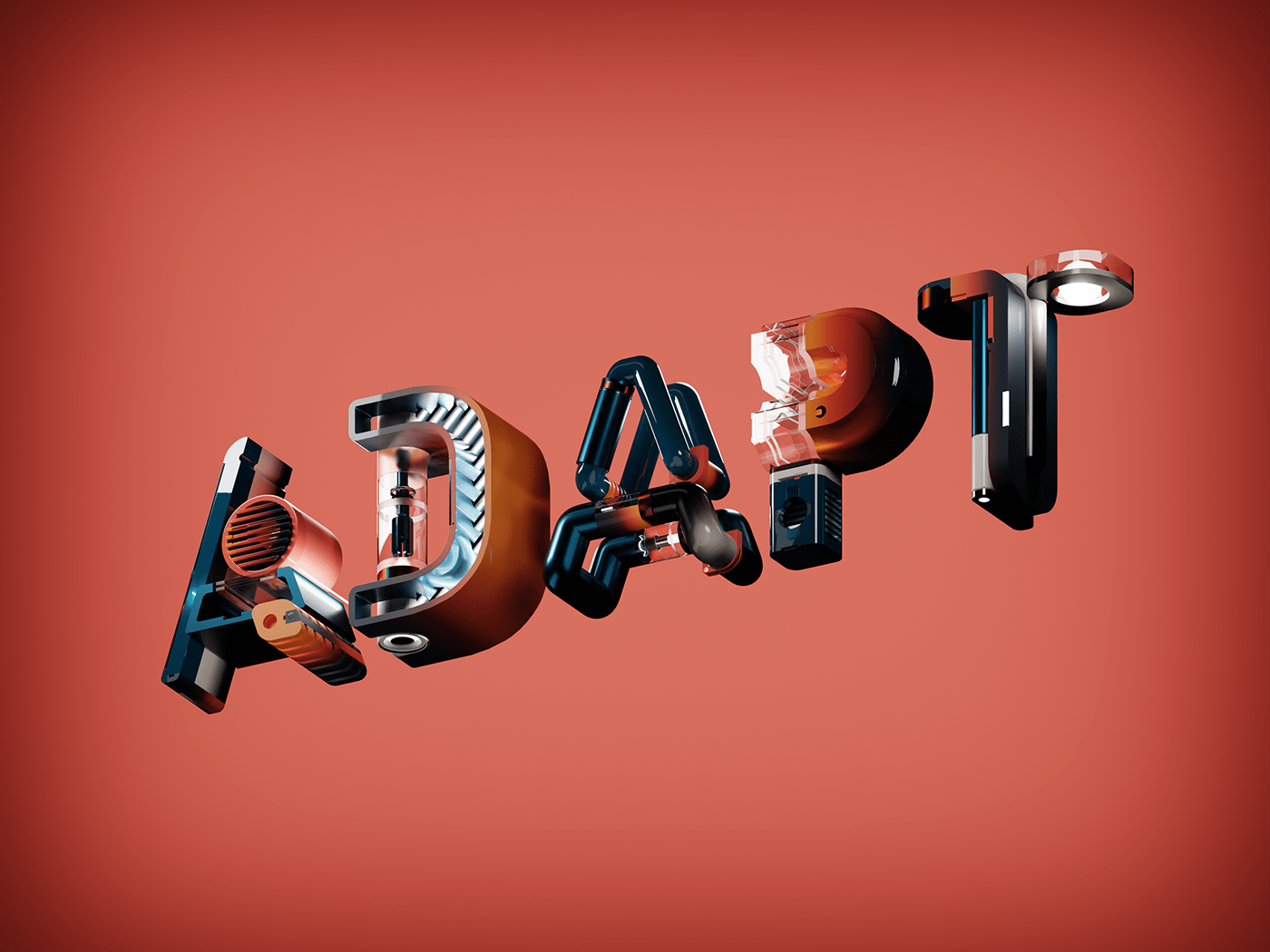


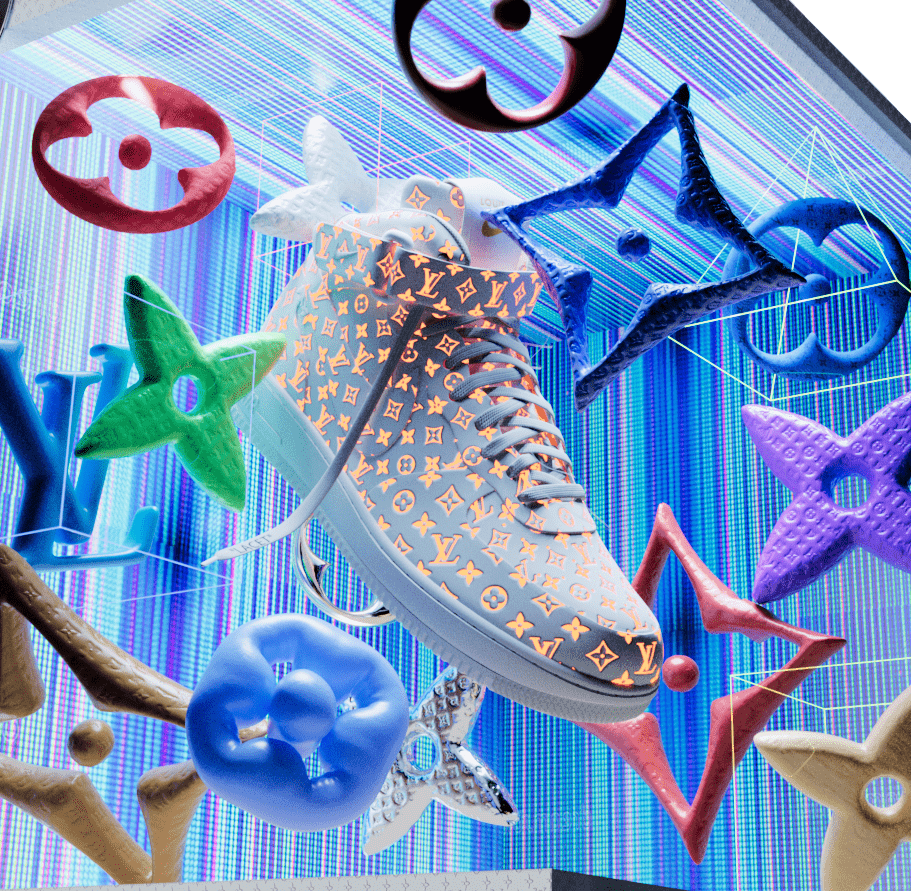


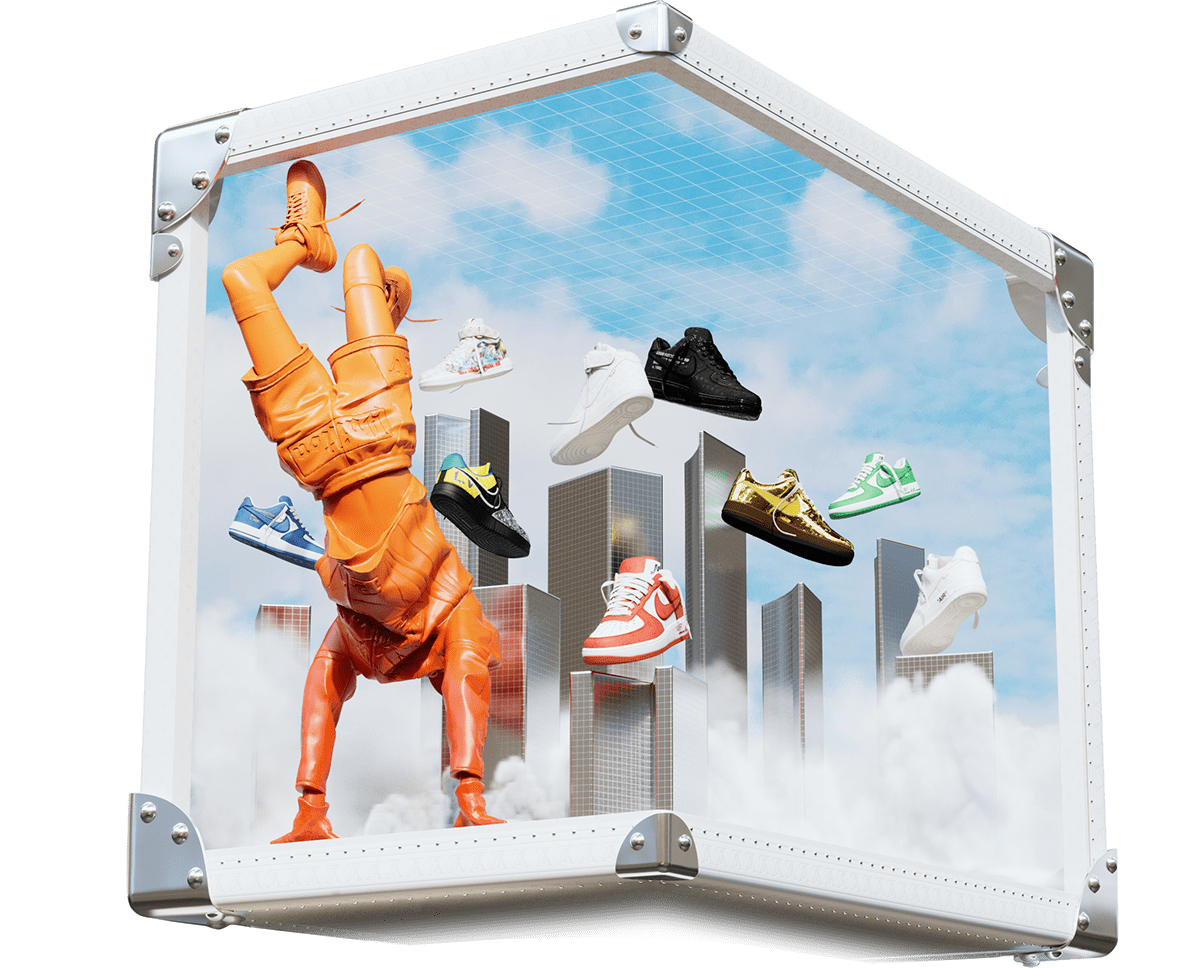


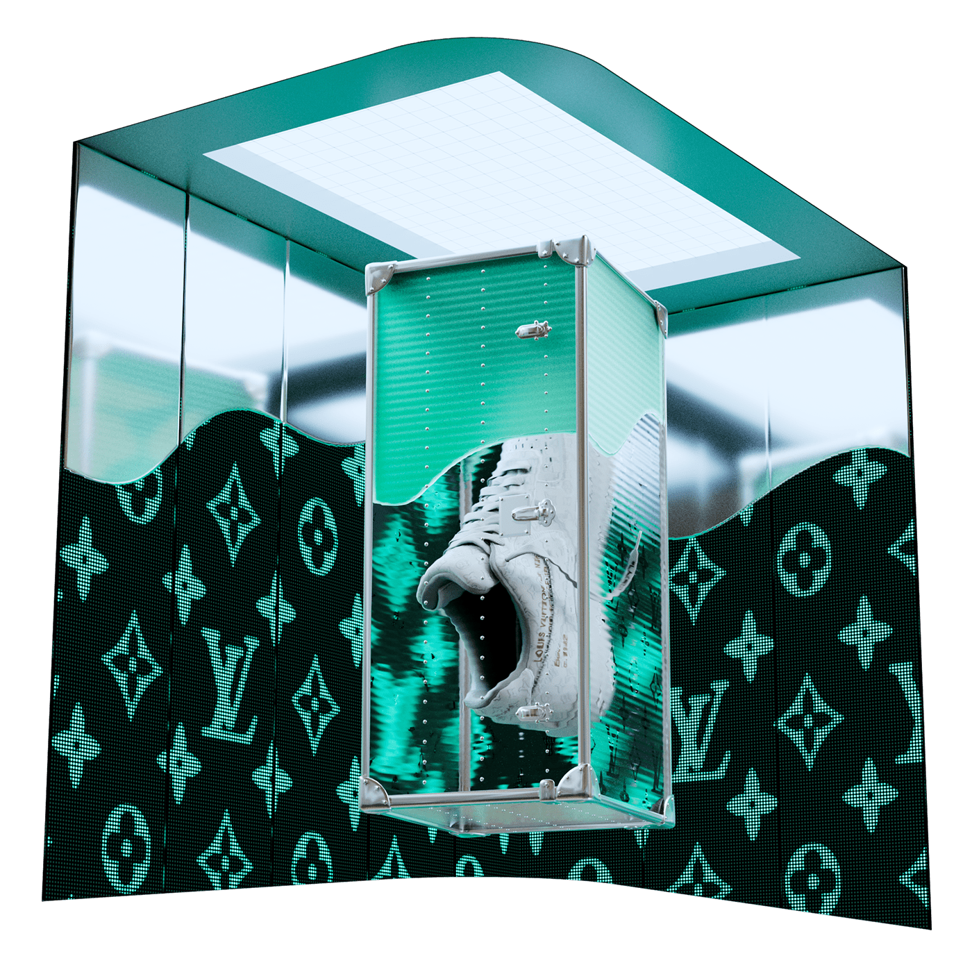


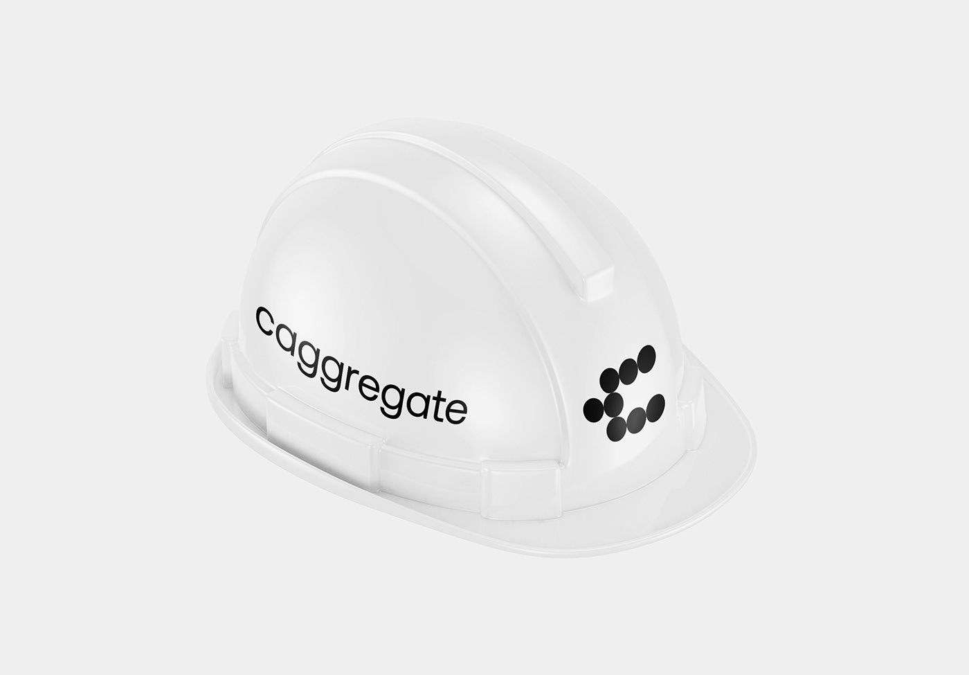


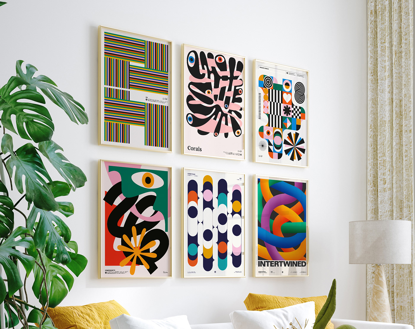


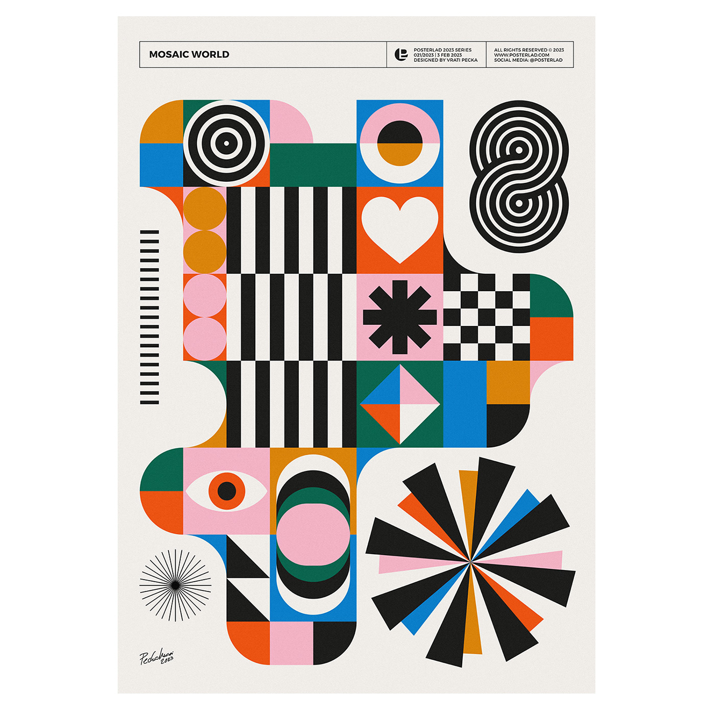


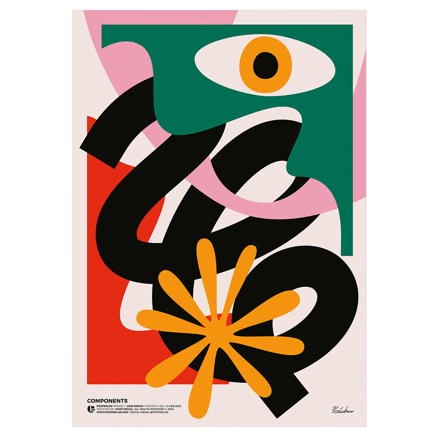


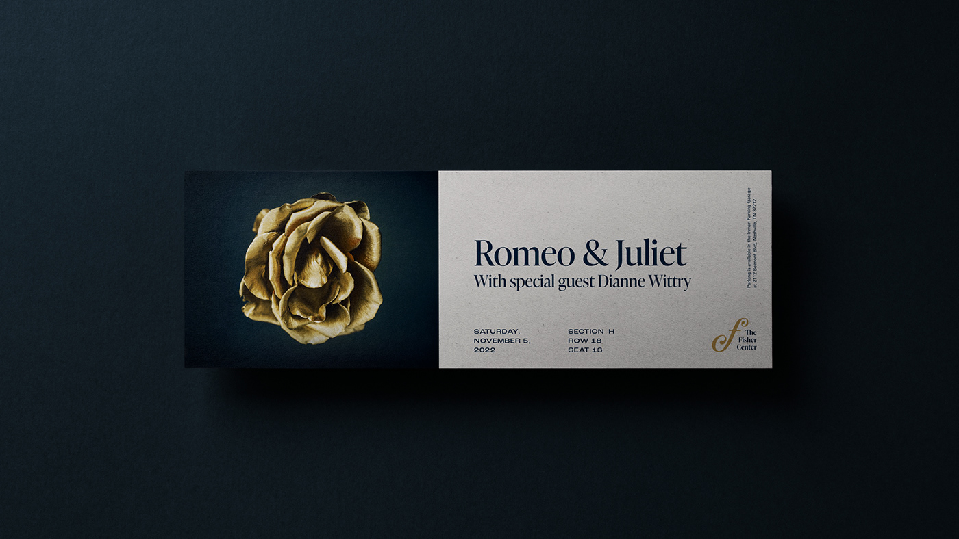



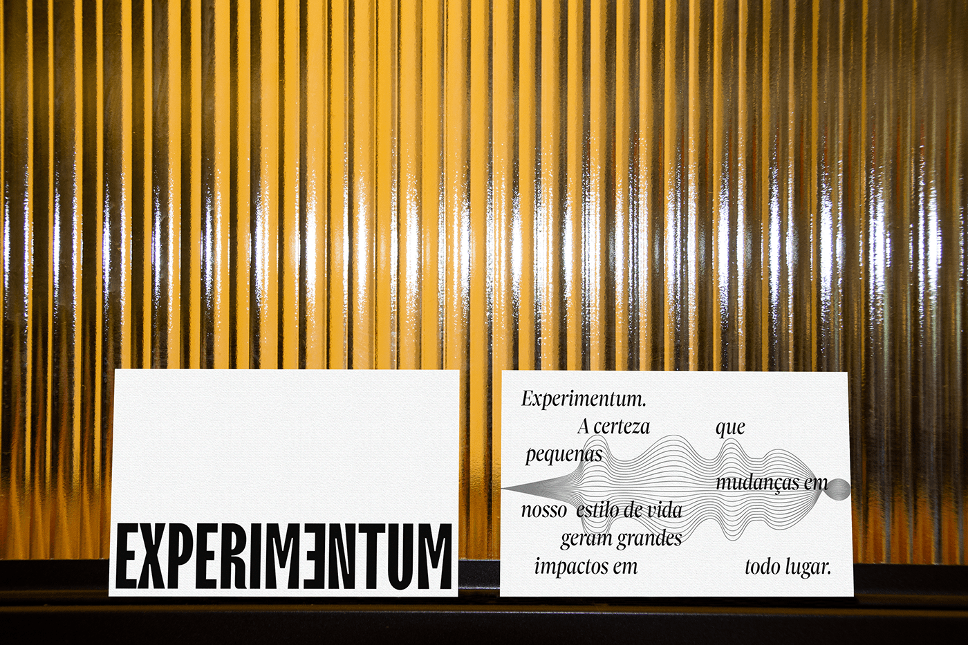




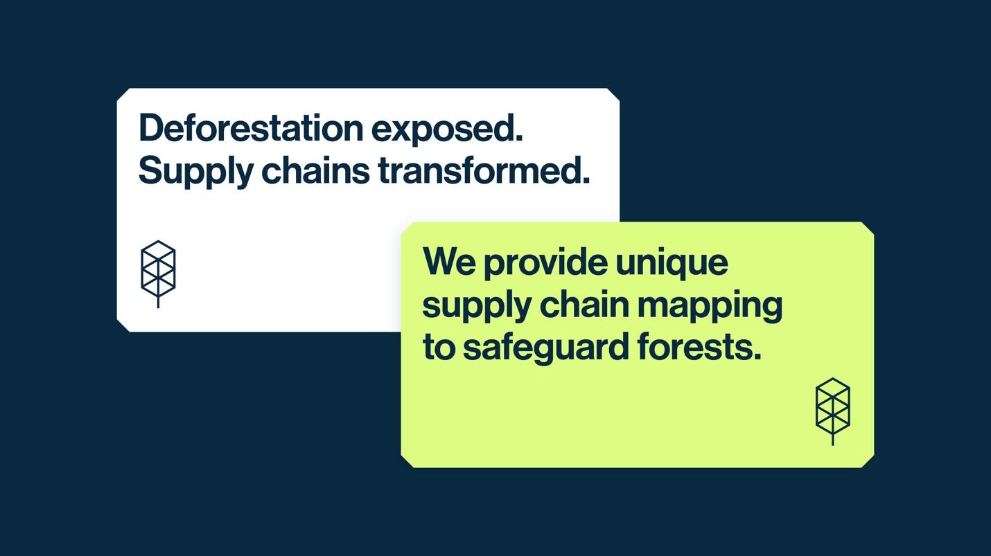

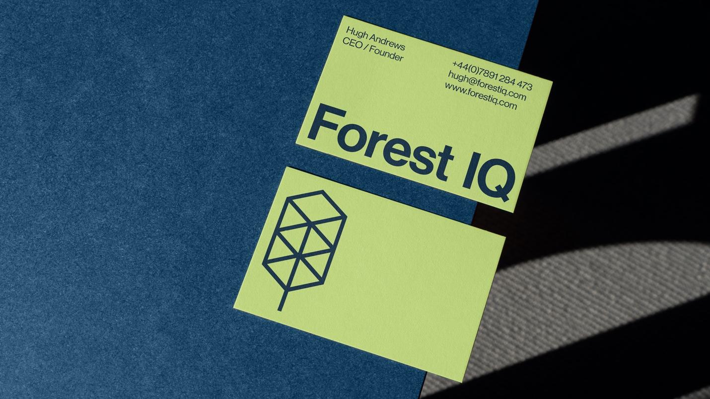


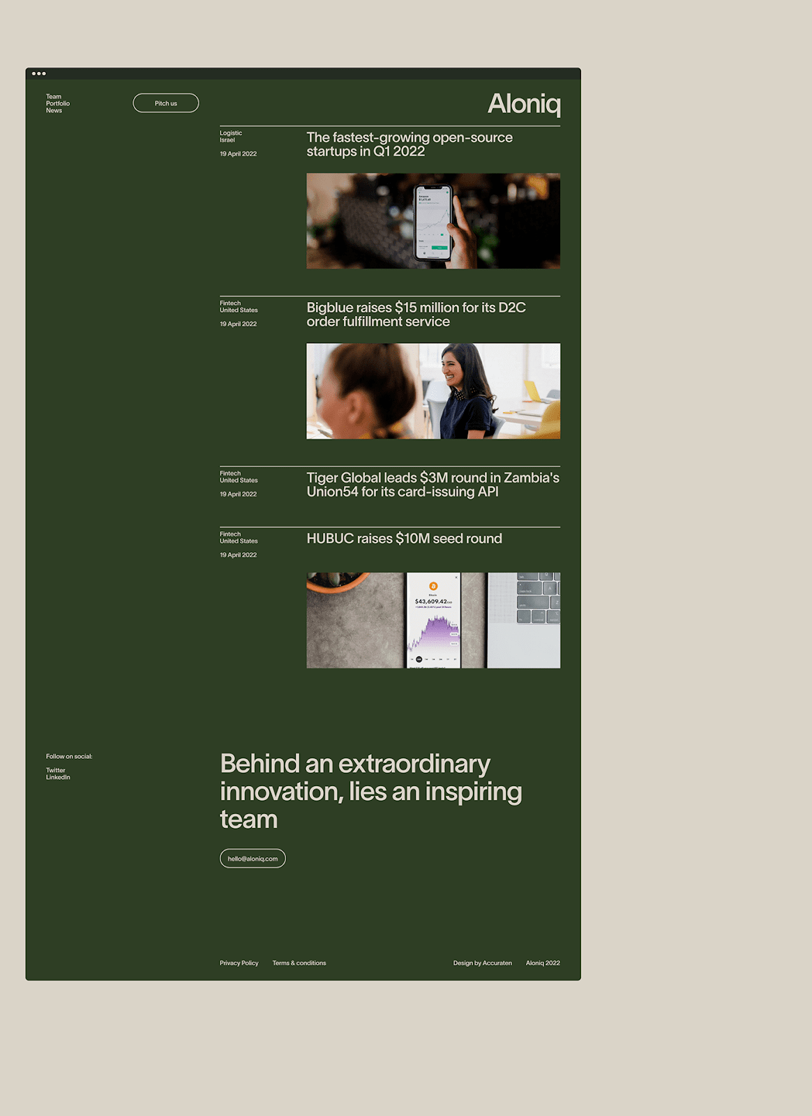


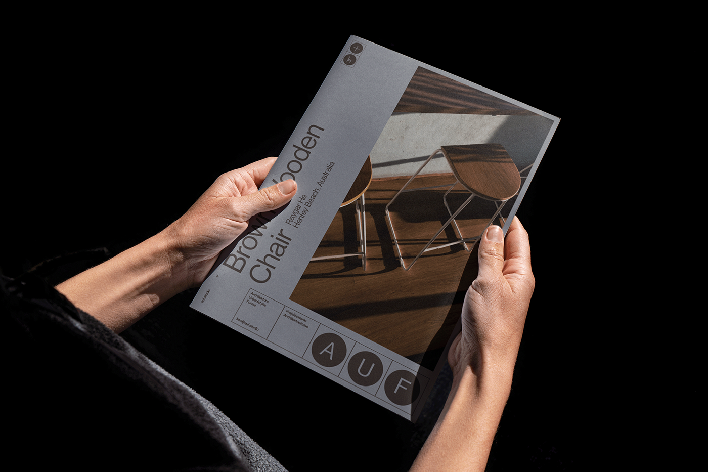


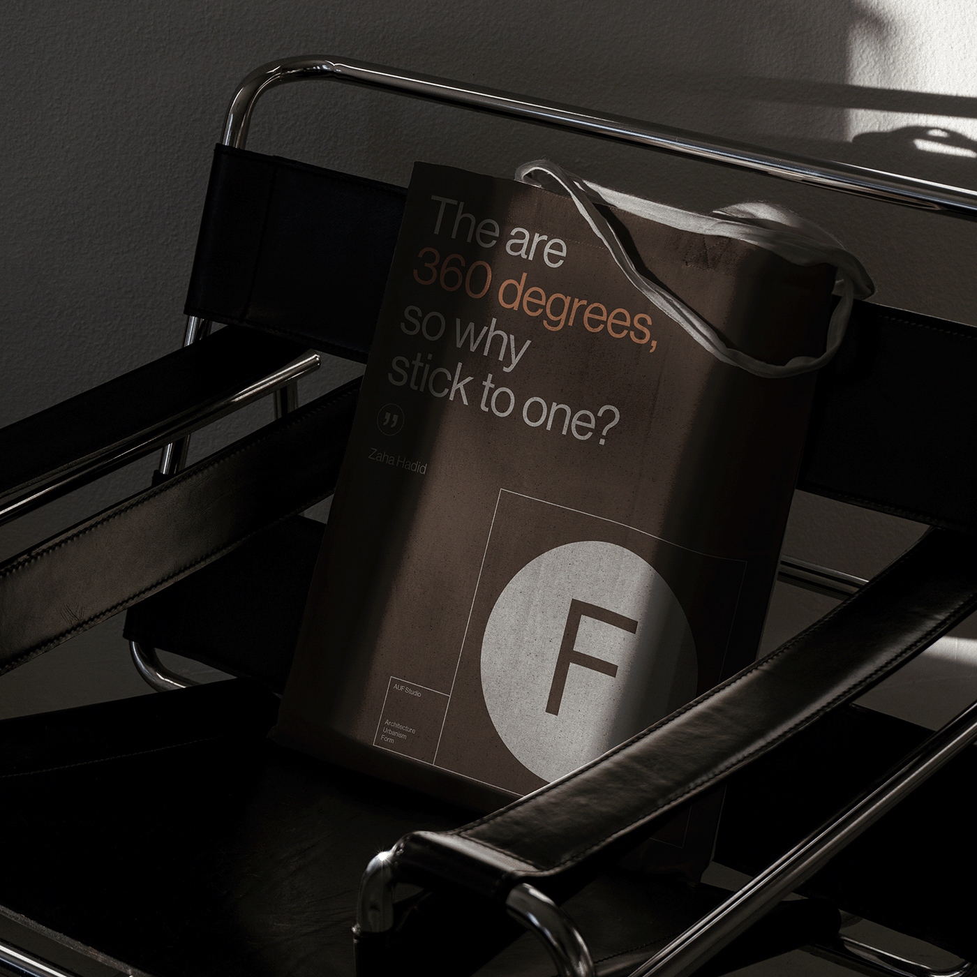








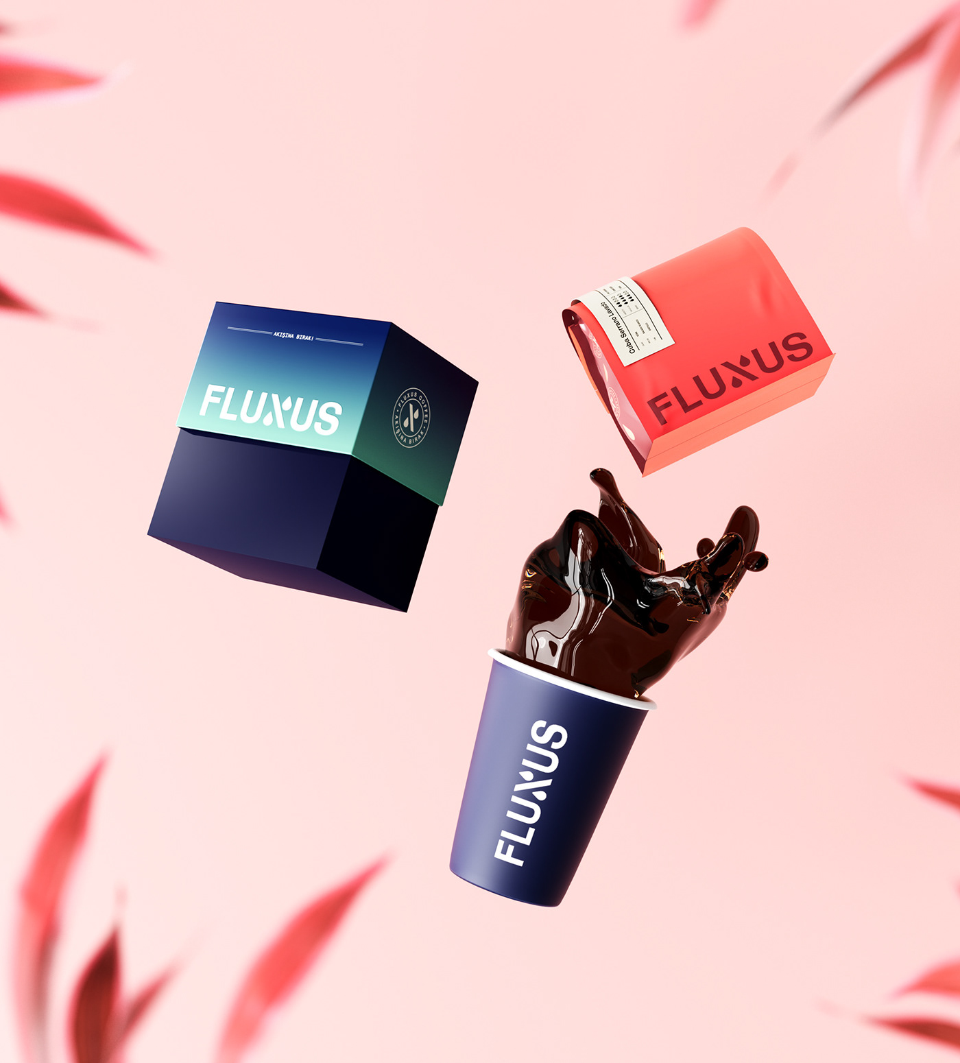










 ;
;


 Divide by


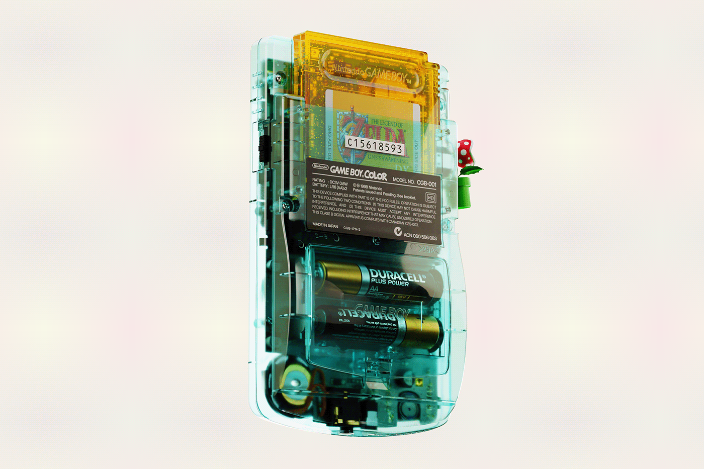


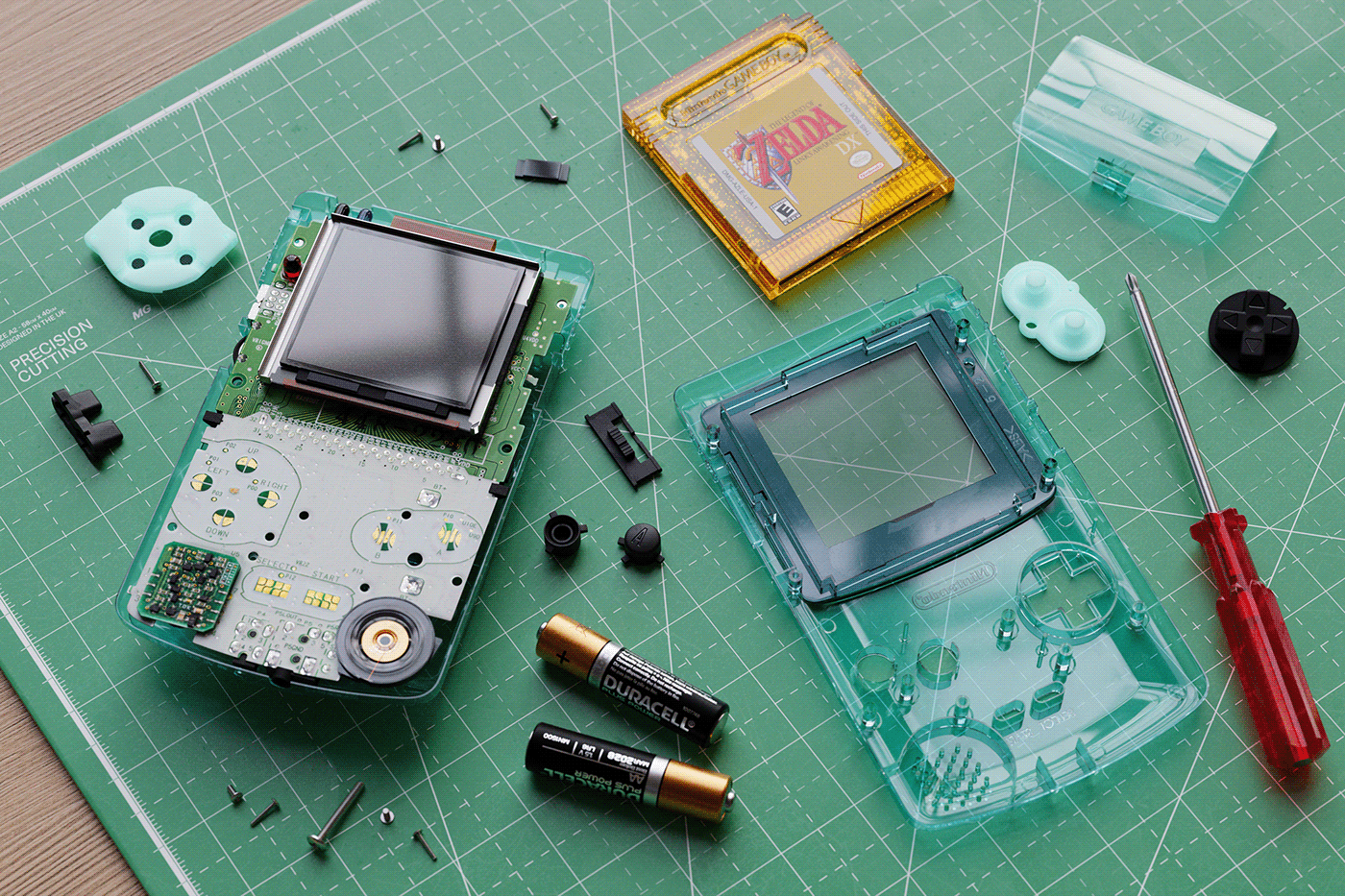


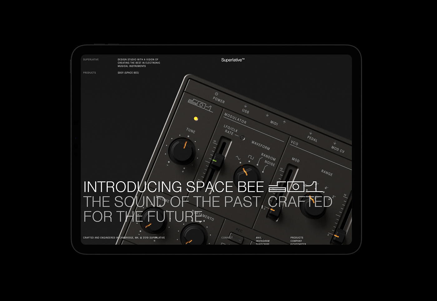








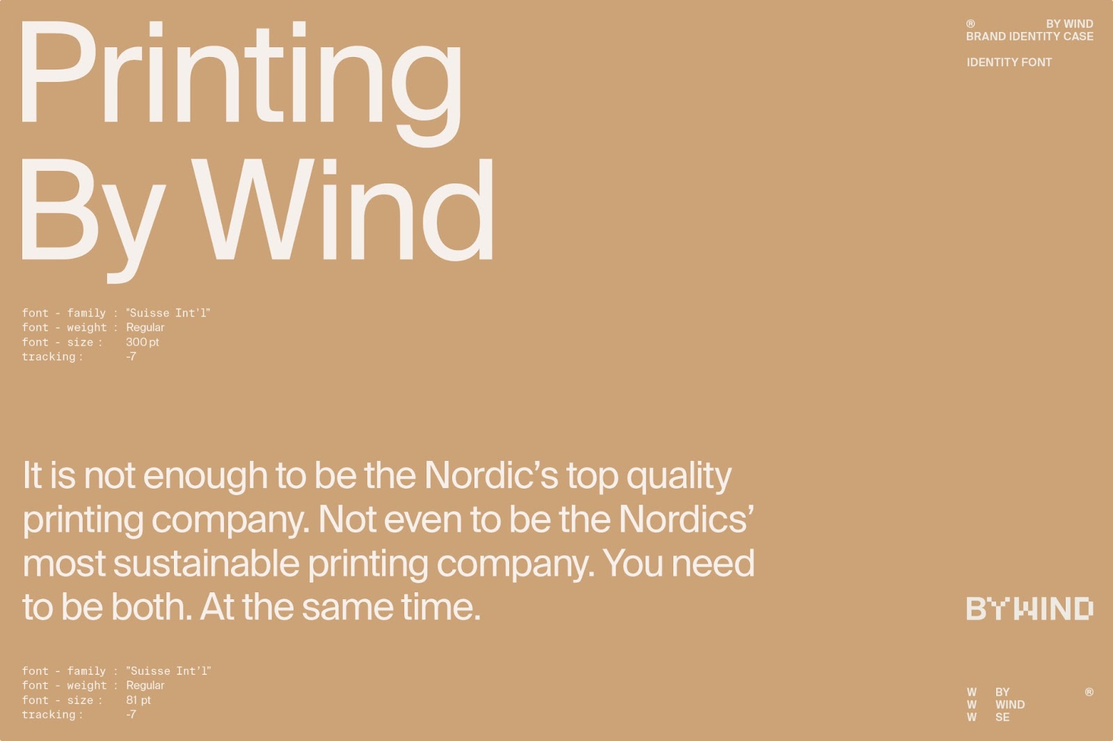




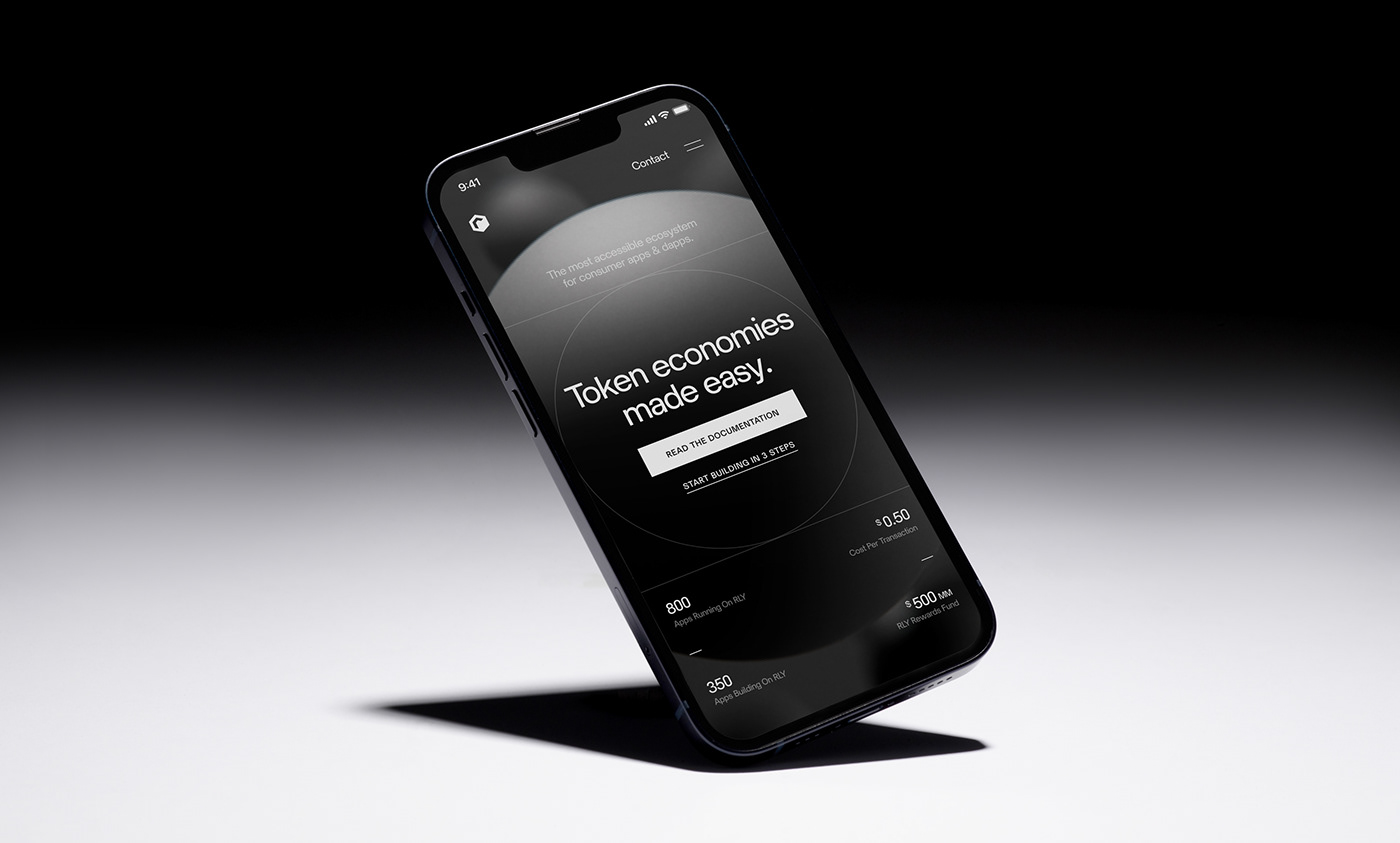


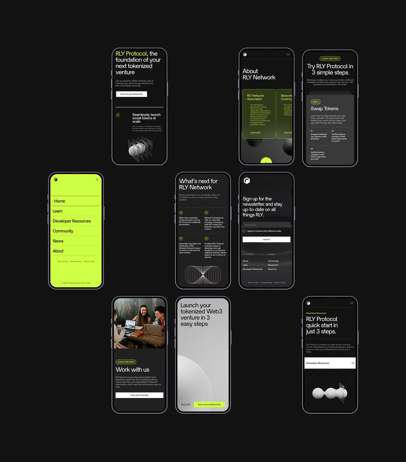




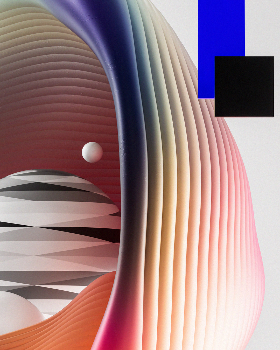


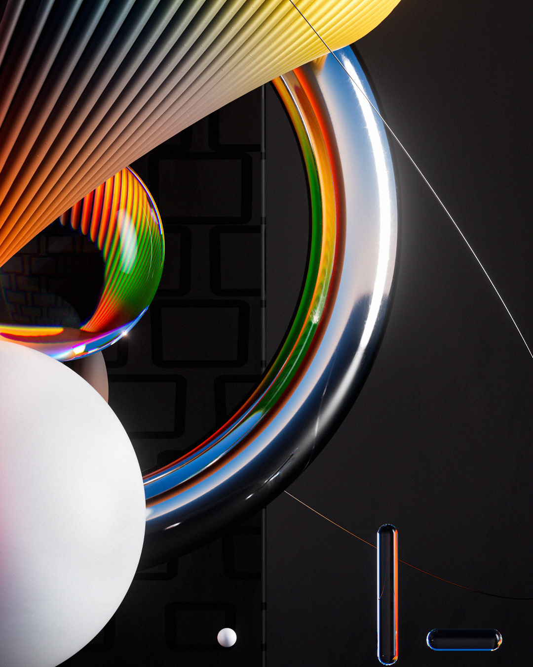


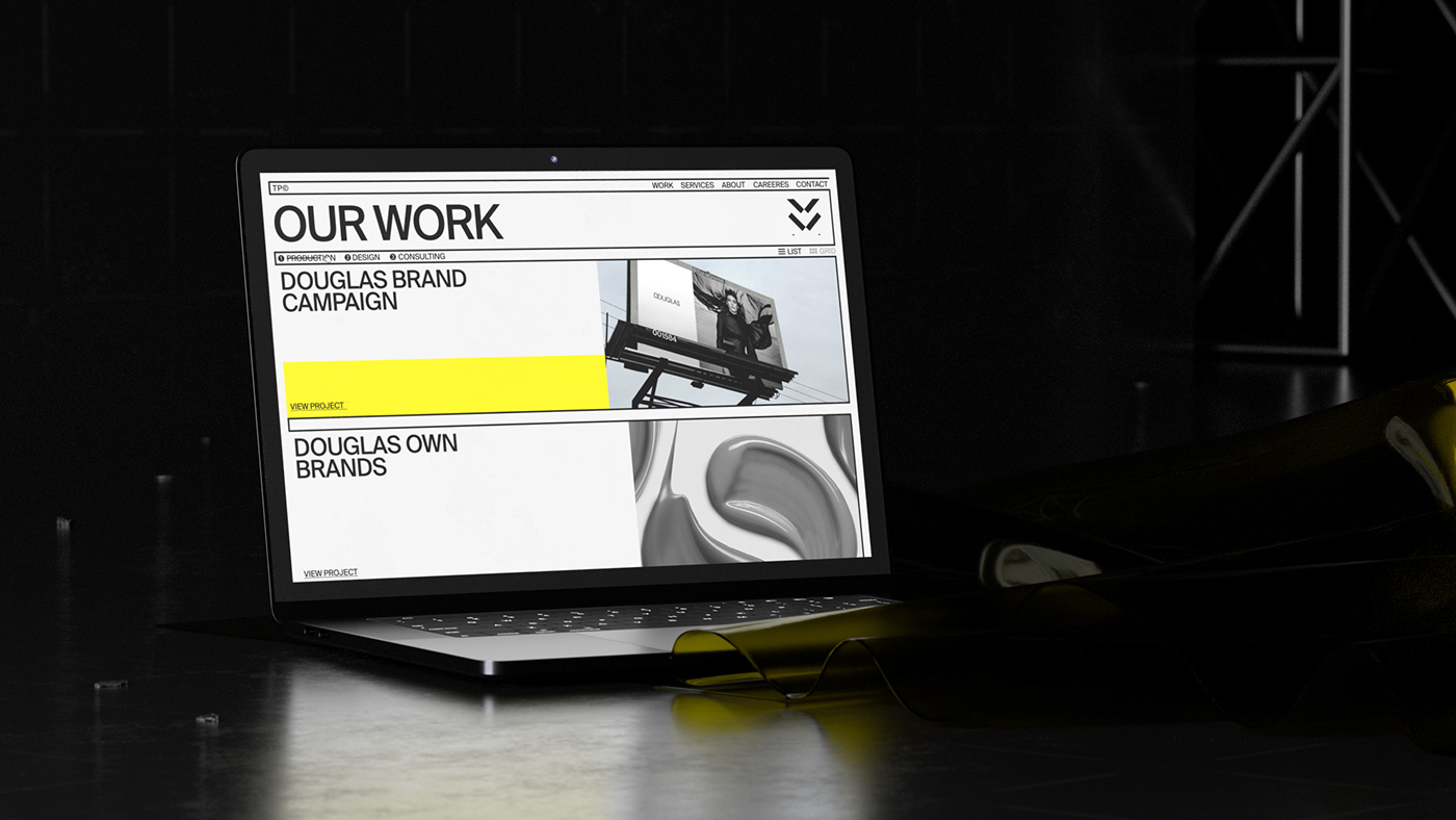


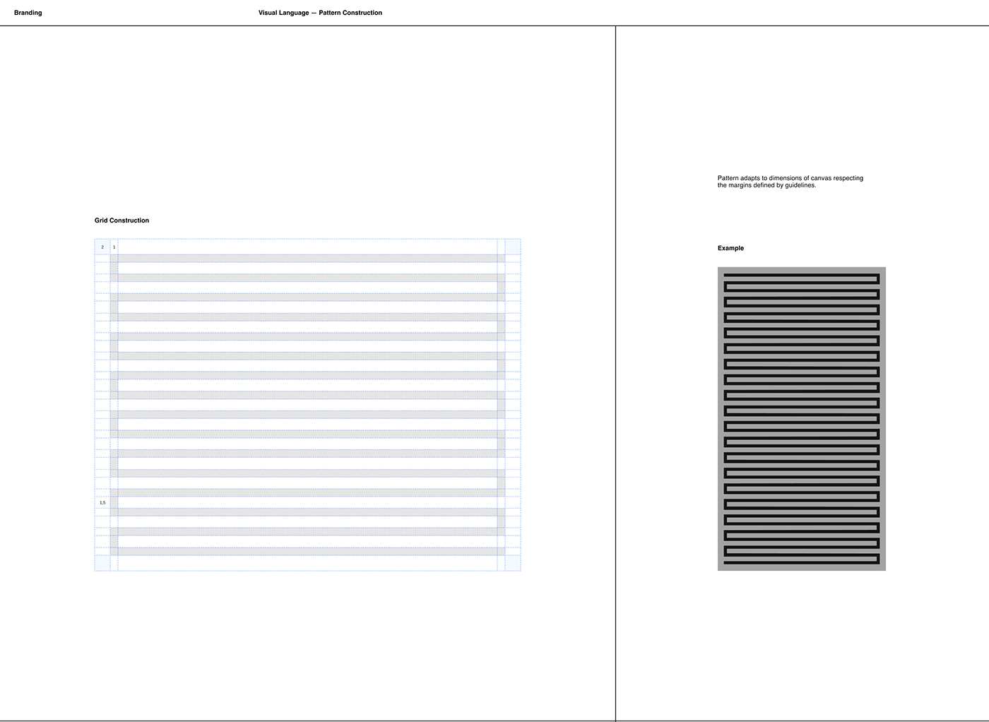








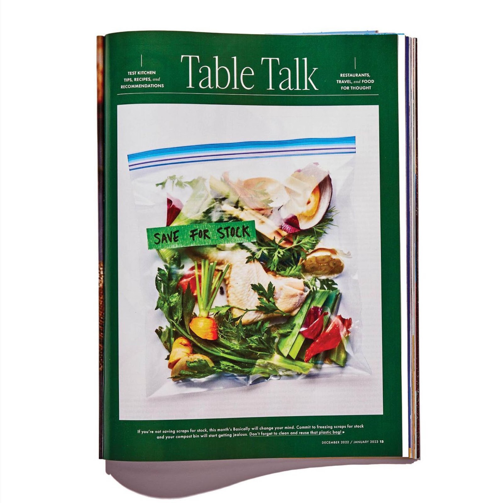


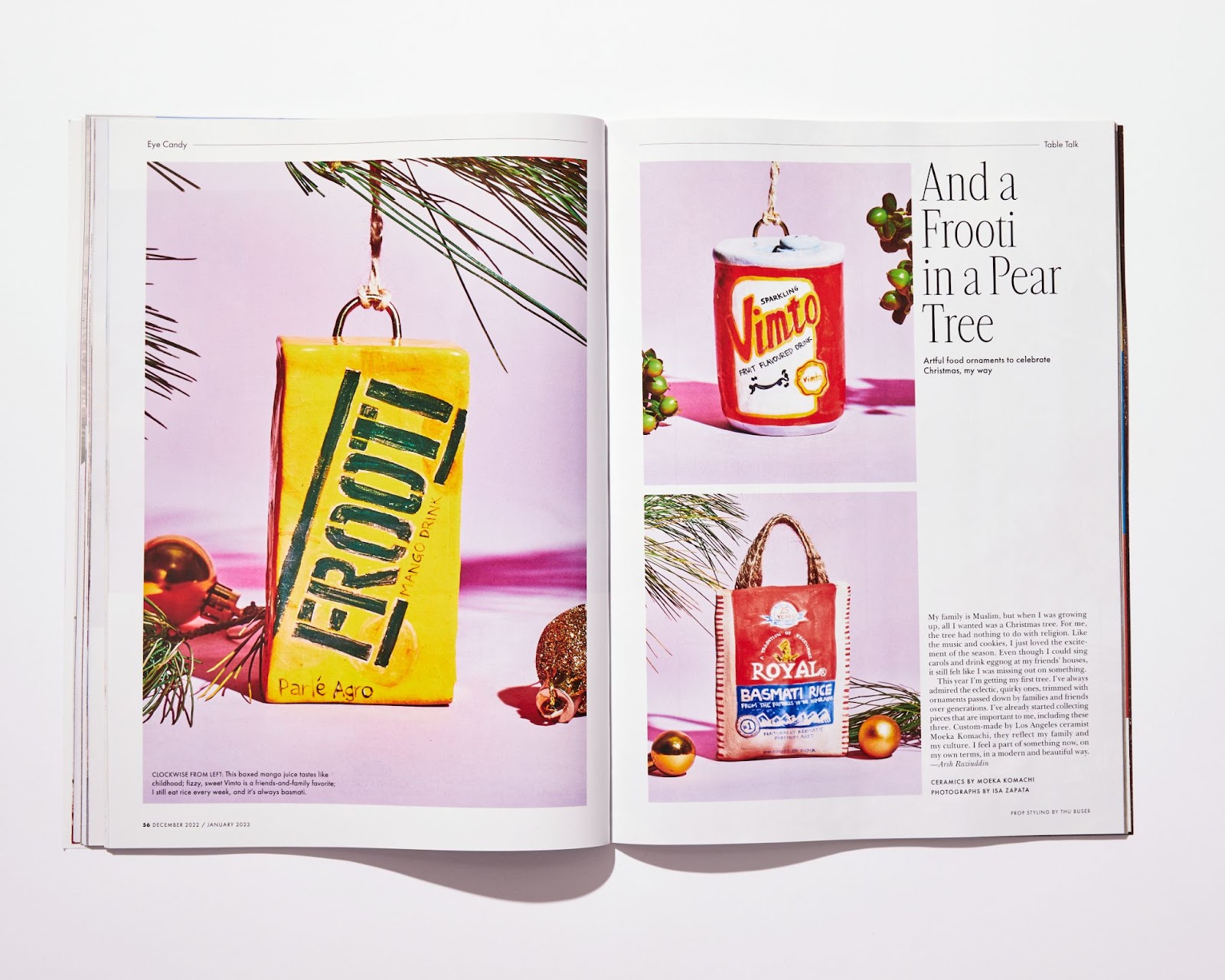




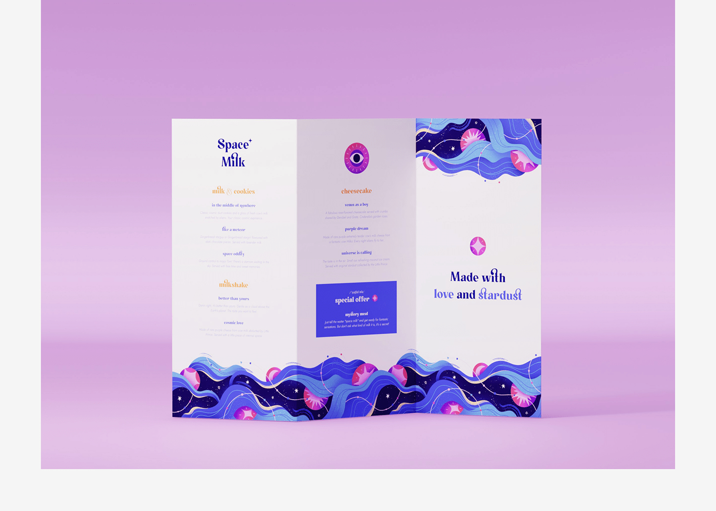


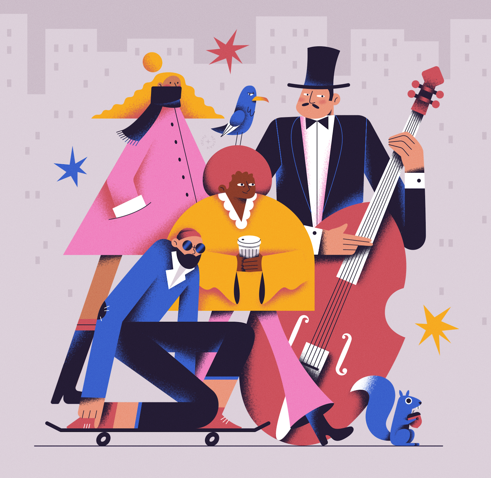






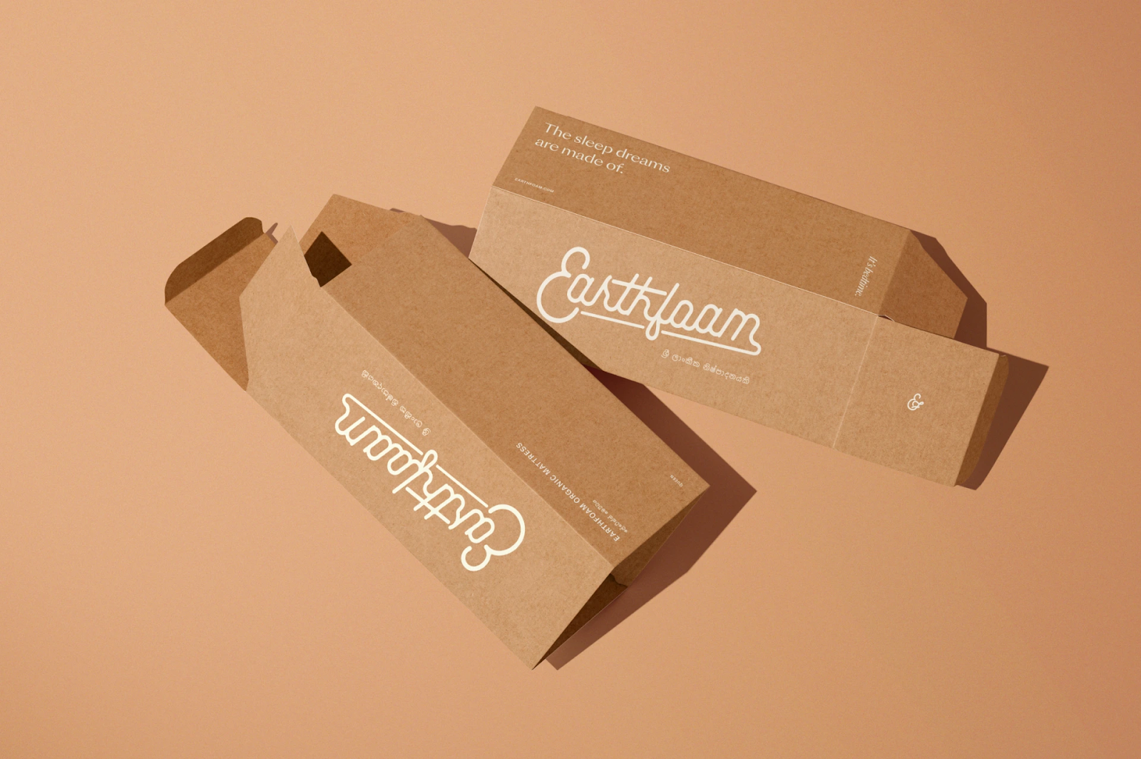


 For more information make sure to check out


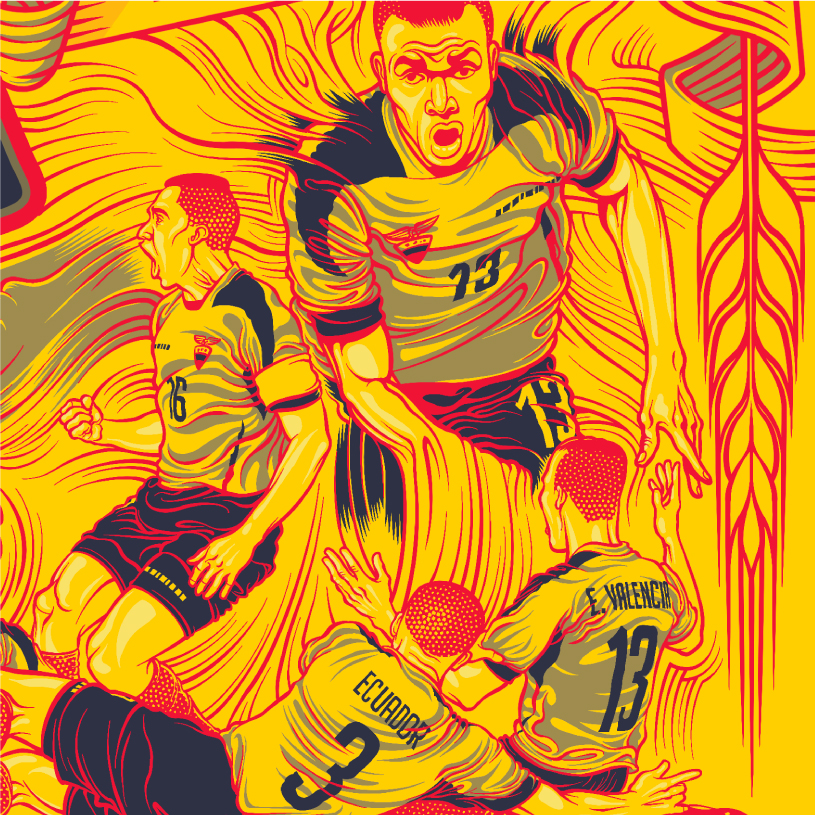
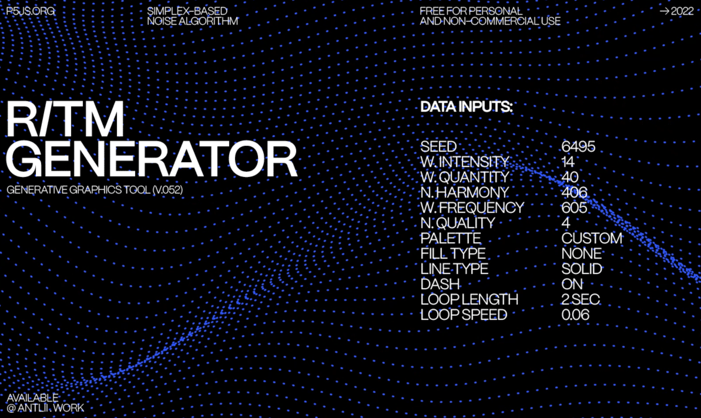


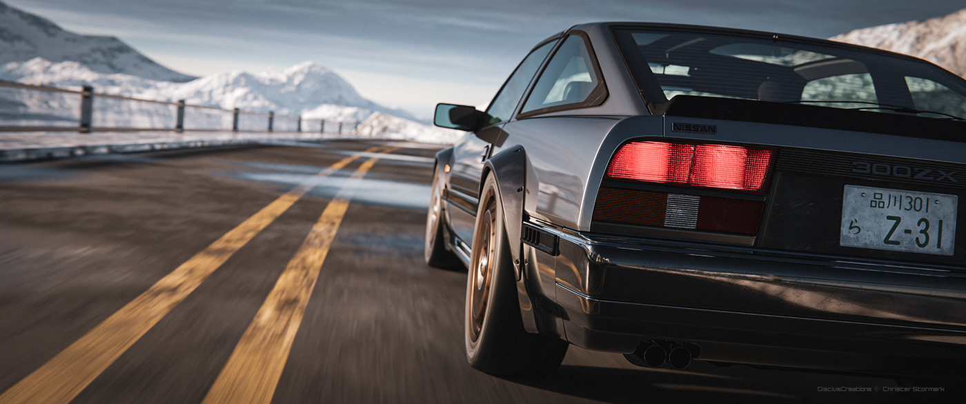


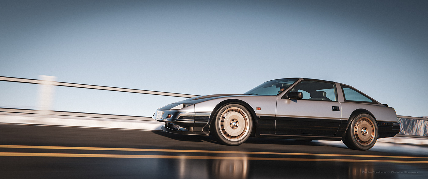
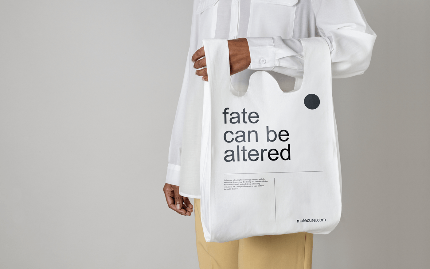


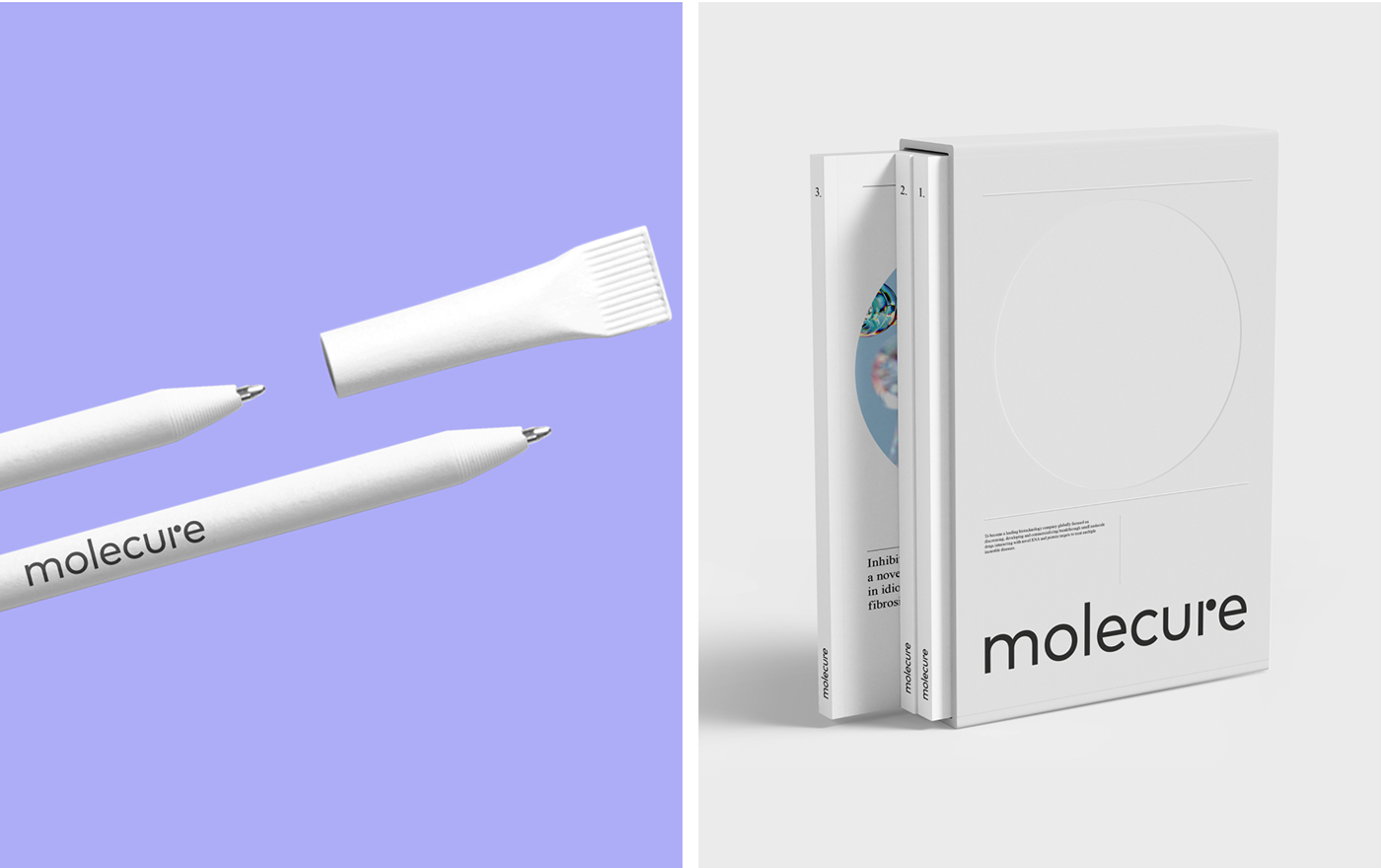


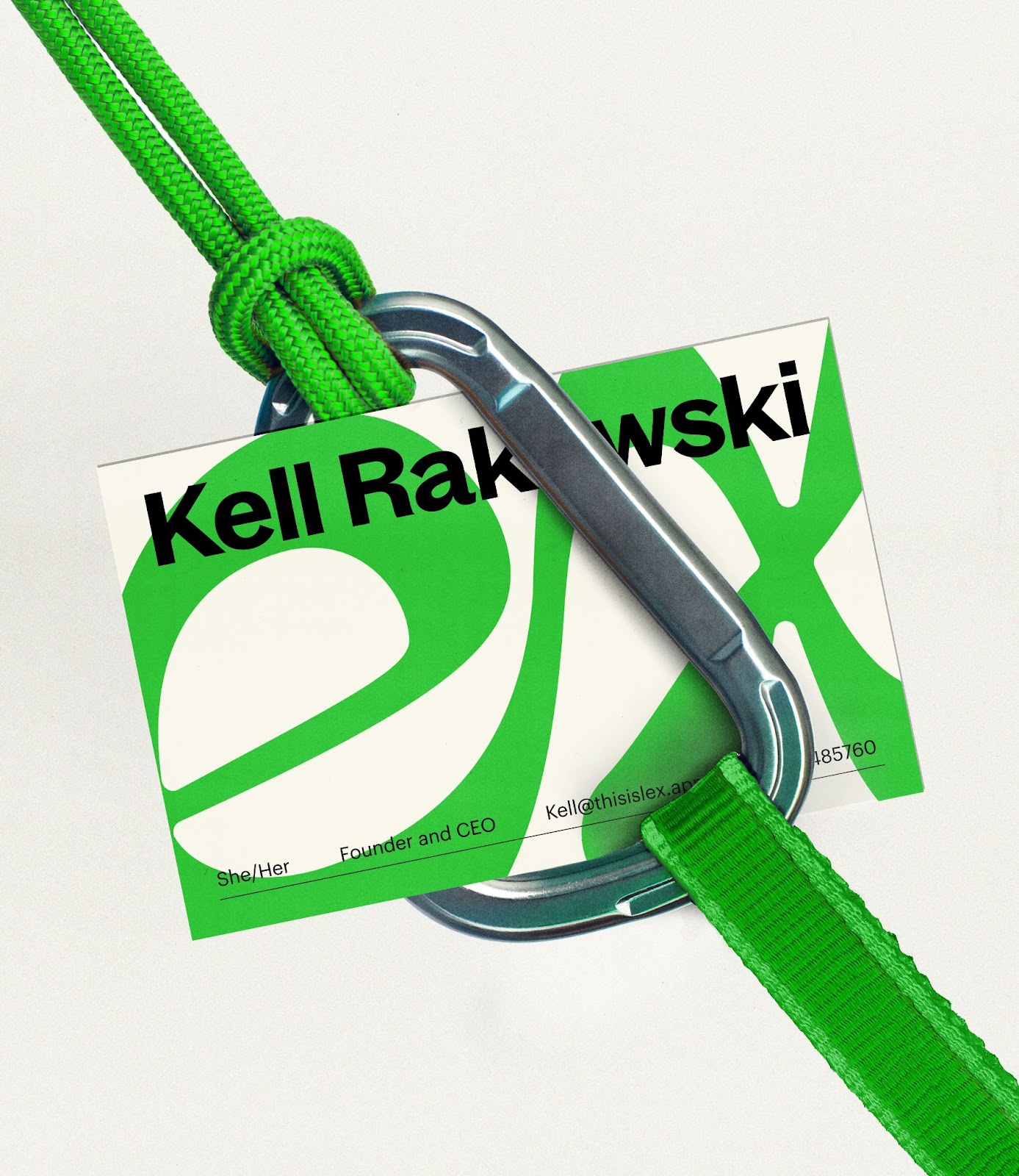


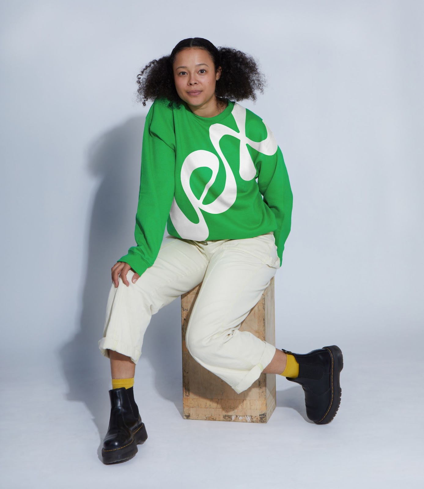


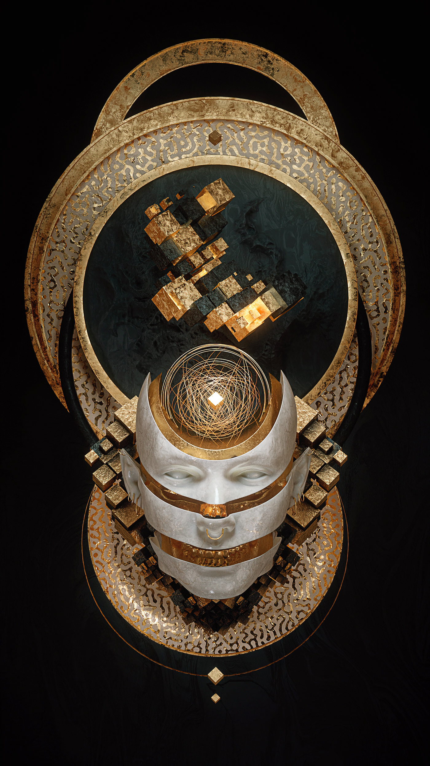


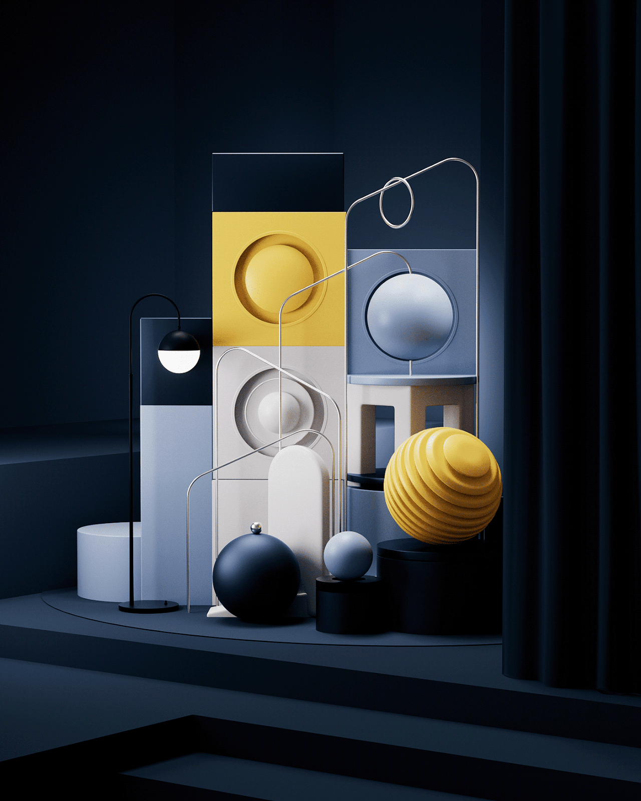






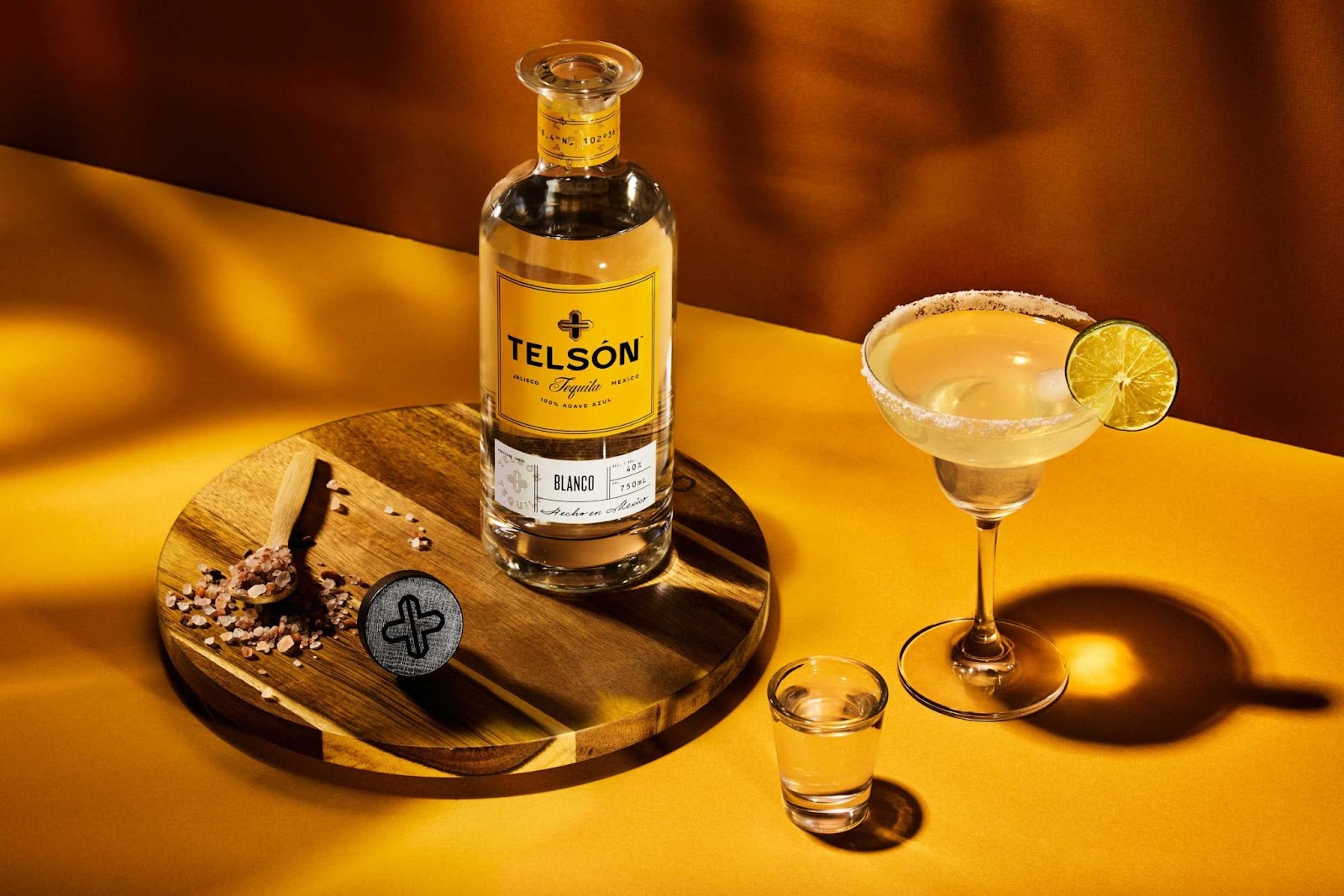


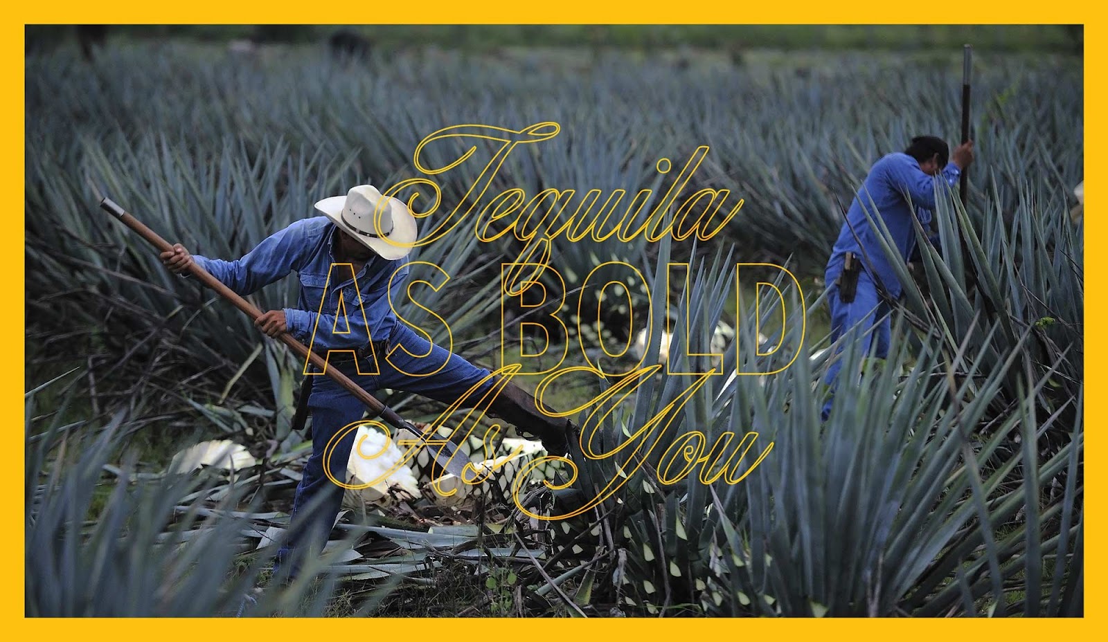


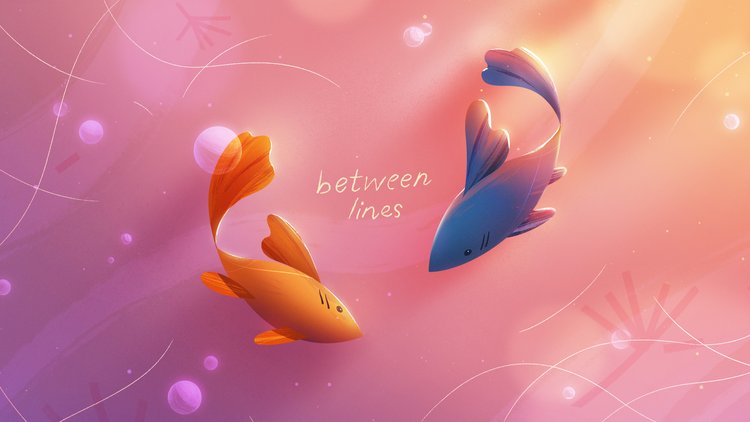
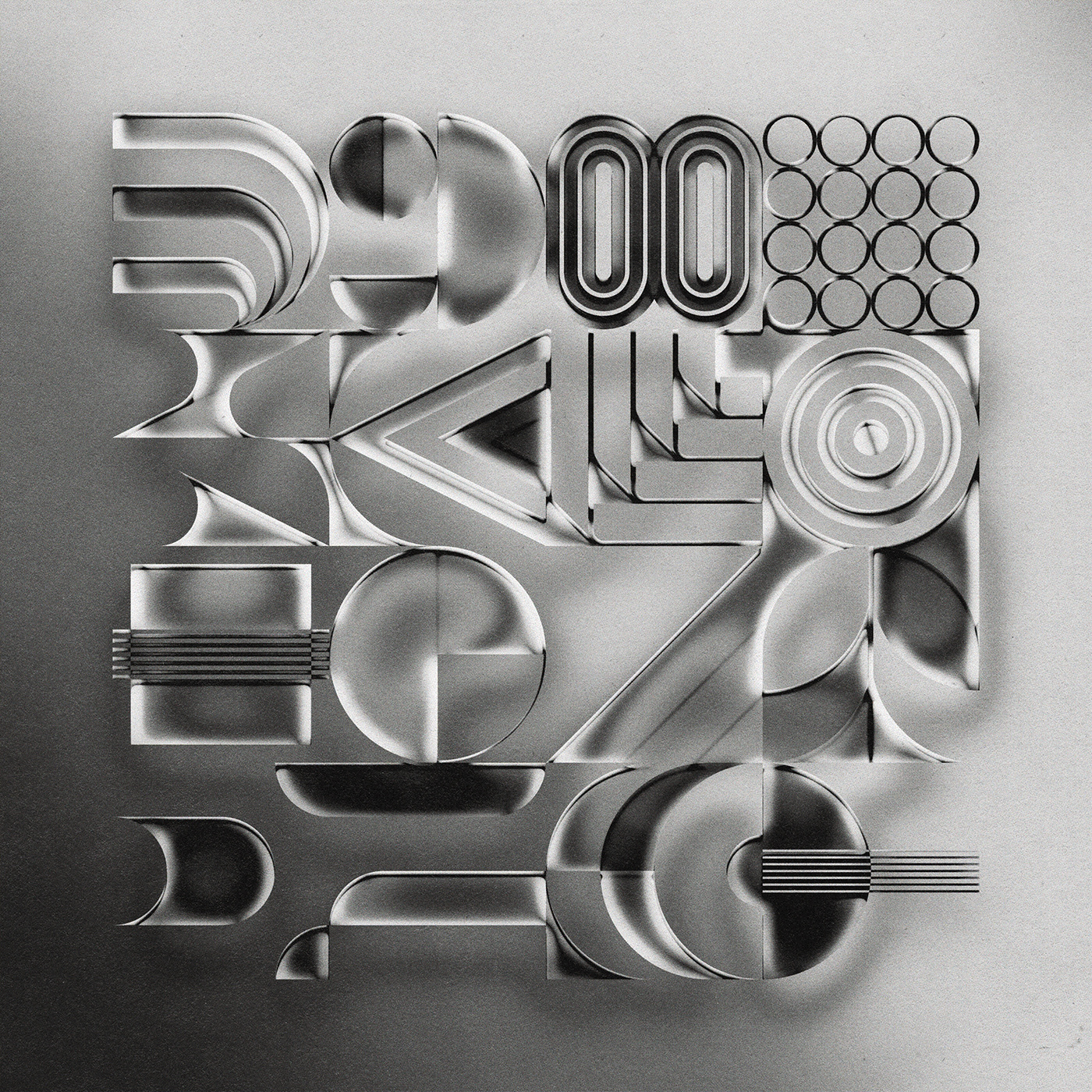


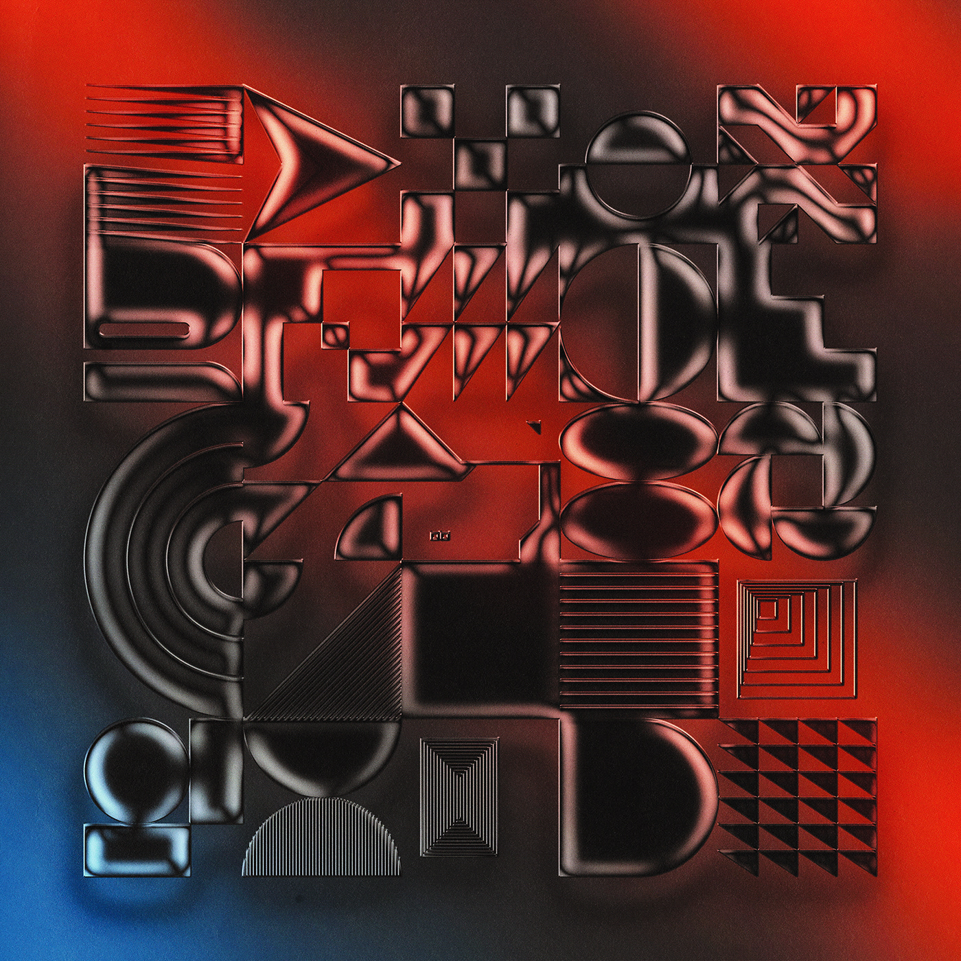






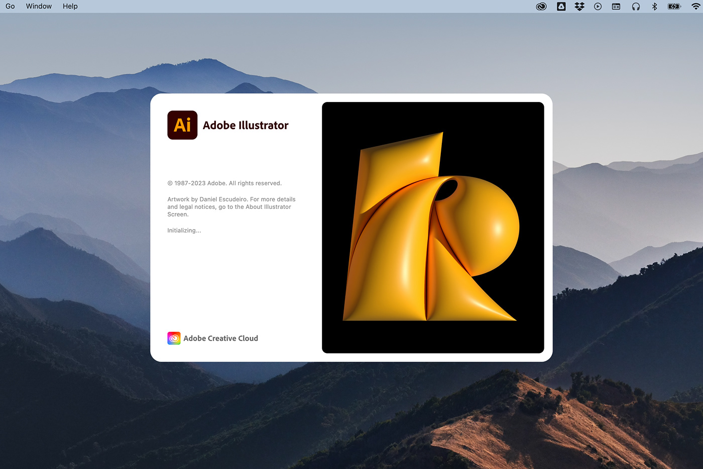


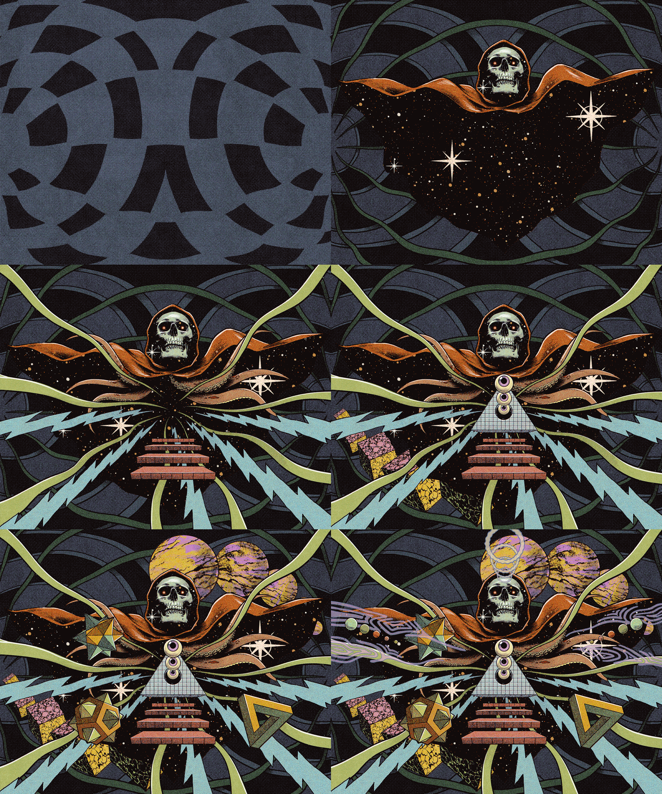


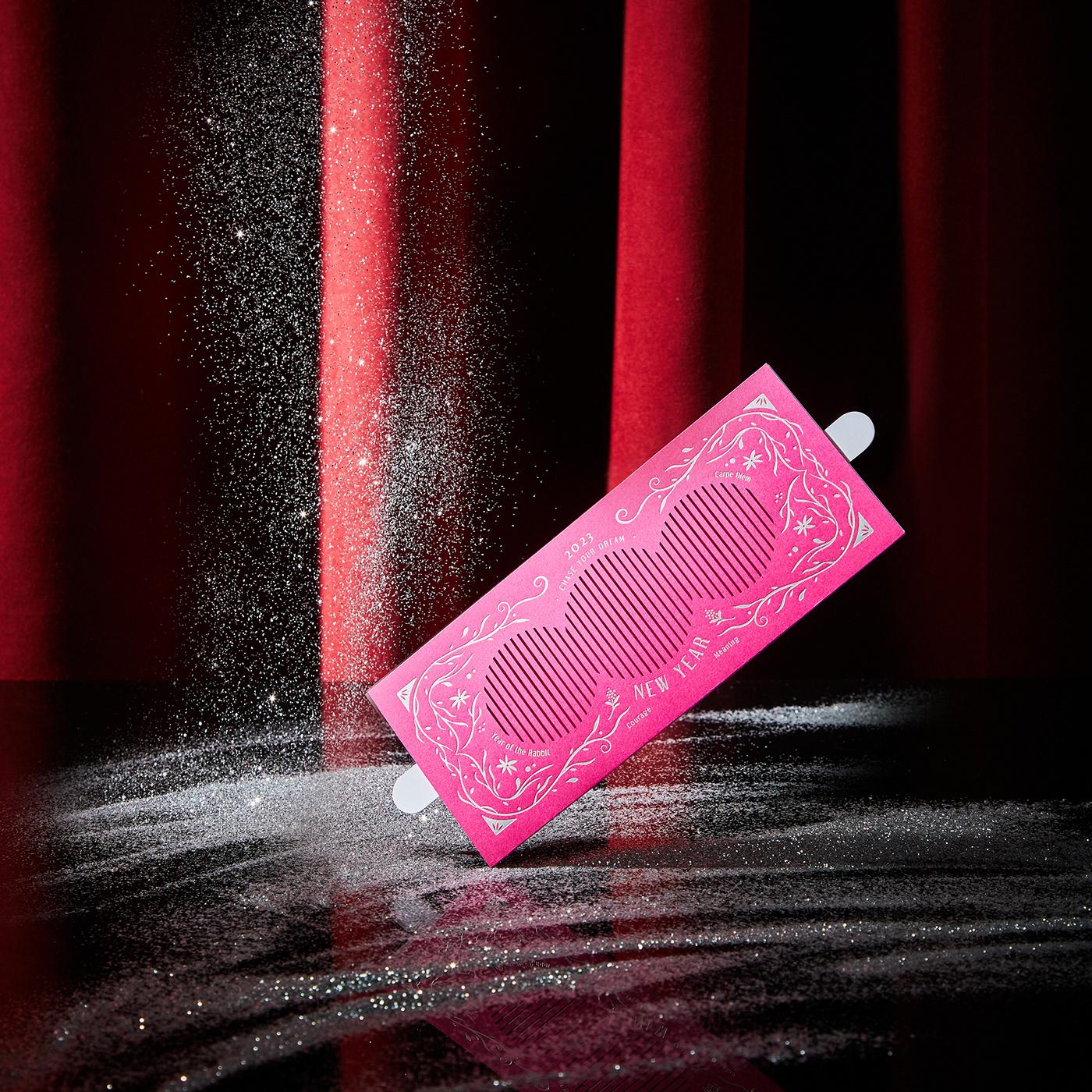


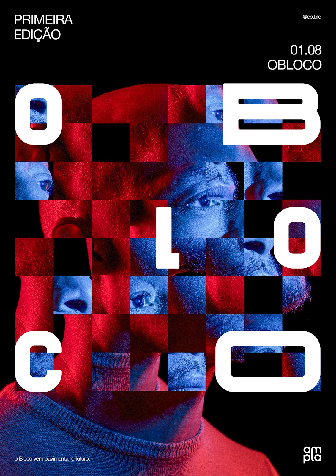
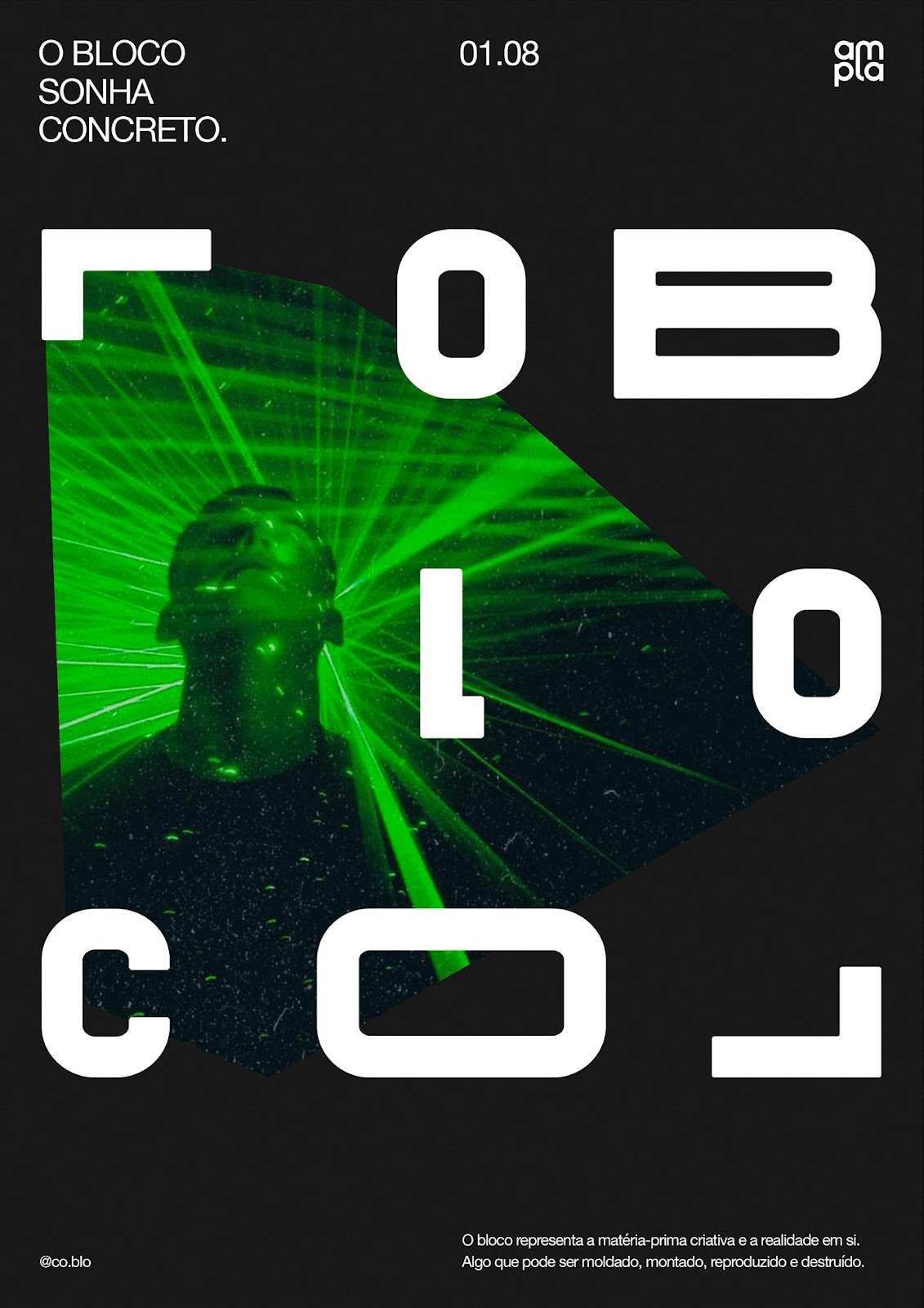


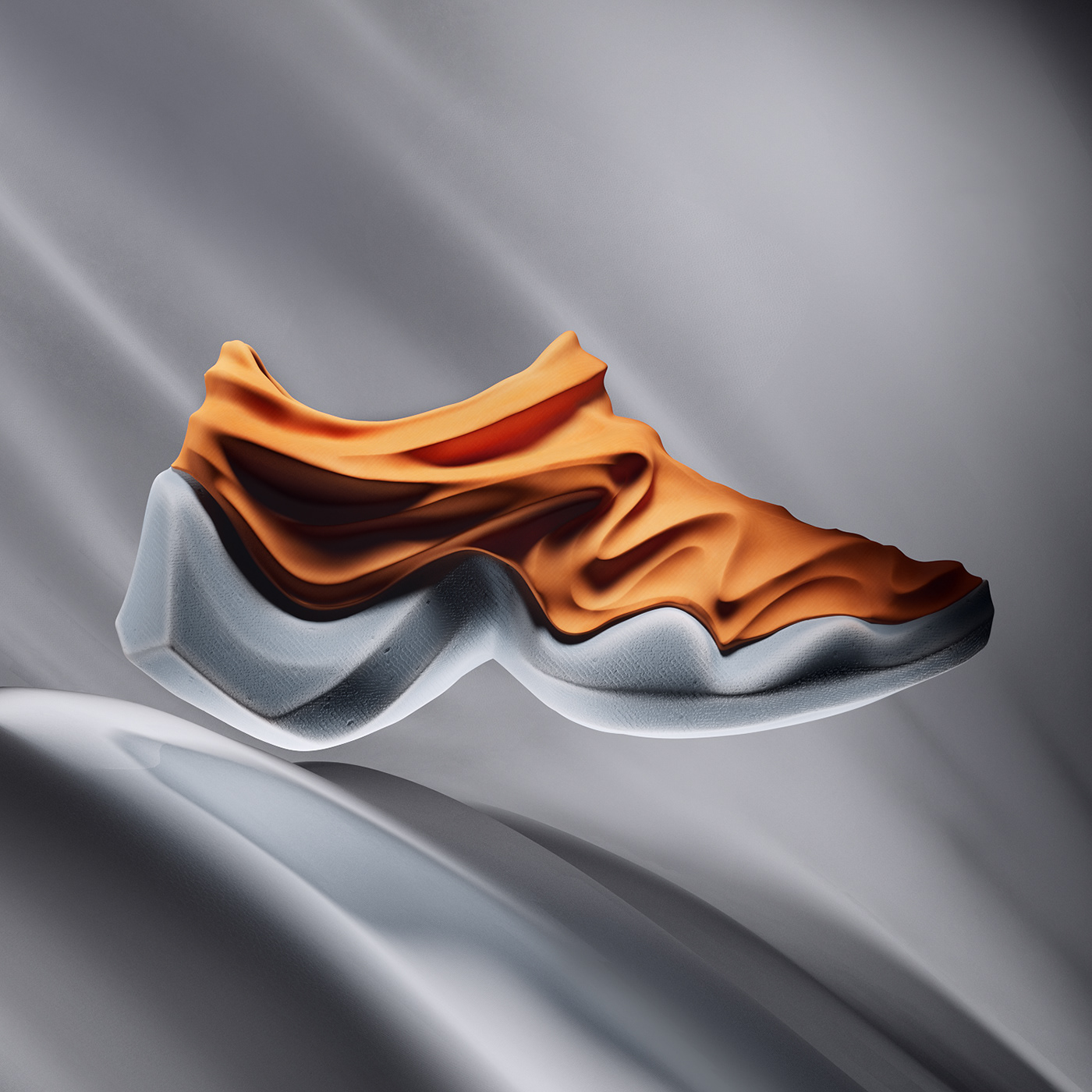


 *Sign up in this link to have a chance to receive one of the NFTs giveaway.