Planet Xamarin: Recent Episodes
soundbite.fm

Yesterday marked a bitter sweet moment in the world of mobile development: Xamarin, a tool that has been instrumental in the evolution of cross-platform mobile applications, was officially archived. This news brings a mix of emotions for me. As a... Continue Reading →
I am writing this at 2 AM so there will certainly be some emotions involved, but this blog post needs to be written.
Yesterday it was the 1st of May, 2024, and the Xamarin reached the end of its life (support), with a short message:
Xamarin support ended on May 1, 2024 for all Xamarin SDKs including Xamarin.Forms.
... and the public repository has been archived forever.
To be honest, this was announced way back, enough months ago, but this happening triggered some emotions in me.
I am writing this because the Xamarin project and the whole community around it greatly impacted my professional and private life.
Through the last 8 years, I delivered more than 30 Xamarin-related sessions and workshops and answered a lot of questions about it, I can proudly say that I spread a huge amount of word regarding Xamarin... and back in 2018, I made also a couple of code contributions to Xamarin.Forms.
And now, the code written by me will always stay there, sealed and archived, resting and living inside thousands of mobile apps.
I will always remember the first time my PR was approved, and how I felt when my code was merged into the Xamarin.Forms project. Those moments are for life! ❤️
I got the recognition from MicrosoftFor the first time, I started playing with Xamarin back in 2016, and after a few lines of code, I fell in love, which led to the fact that this platform will always be in my heart ❤️
View this post on Instagram A post shared by Almir Vuk (@almir.vuk)
Through this journey I had a chance to meet and hang out with some of the greatest people I know, I contributed to the Xamarin.Forms project, I have written a lot of Xamarin content on my blog, I spoke at Xamarin Expert Day events a couple of times.
And one of my favourite photos ever was taken at Xamarin Expert Day in Cologne.
Back in 2019, Cologne, Germany, Xamarin Expert Day ❤️... more speaking engagements here:
Speaking about Xamarin in Zagreb, Croatia, in December of 2017Speaking about Xamarin.Forms in Neum, Bosnia and Herzegovina, April 2017Portoroz, Slovenia, Xamarin session, 2019... and there a lot of more and a huge bucket of great memories and events related to Xamarin!
Now what comes next?
Microsoft now has .NET MAUI and a new project and I want to see them succeed with it. If you did not check it out, you should definitely!
In short words, .NET MAUI is:
*Multi-platform*
.NET MAUI uses the latest technologies for building native apps on Windows, macOS, iOS, and Android, abstracting them into one common framework built on .NET.*One codebase*
Use a single C# codebase and project system for all device targets to build apps that look and feel like the native platforms.*Productive*
Build beautiful apps faster and easier by integrating the power of Visual Studio with .NET MAUI.
... and regarding me, I will continue to play with .NET MAUI, and mobile apps as a side project for now.
Currently, I am working as a Lead Architect at run.events GmbH, where my daily work is not much related to the mobile side.
But you can expect here to read content about .NET MAUI or mobile development from time to time.
Regarding the mobile dev, in my free time, I am working on my own workshop regarding mobile development and it will be based on different mobile frameworks including the .NET MAUI.
Thank you, Xamarin! 💙
I am sad to see Xamarin going away, but I am confident that the .NET MAUI team will do their best to keep this .NET mobile story going with the MAUI project.
I am sad to see Xamarin reaching the end since it had a huge impact on my career, my private life, my connections, the stories which are written, the friends which are made, and the best community in the world this framework had!
I will always remember the "old days" and the old version of Xamarin, all the interactions we had on Twitter, and at the events... I will always remember Xamarin University, Planet Xamarin... and the best team working on it...
... in other words, this special framework will always be in my heart!
So Long, and Thanks for All the Fish, Xamarin! 💙
... Requiescat in pace, my friend Xamarin 💌
TL;DR: Learn to design a directional compass using Syncfusion .NET MAUI Radial Gauge control. Dynamically update the directional compass values using the Compass sensor and customize the Radial Guage’s appearance for better visualization.
Syncfusion .NET MAUI Radial Gauge is a multi-purpose data visualization control that displays numerical values on a circular scale. Its rich set of features includes axes, ranges, pointers, and annotations that are fully customizable and extendable. We can use this control to design speedometers, temperature monitors, multi-axis clocks, circular progress indicators, watches, and more.
In this blog, we’ll see how to design a directional compass using the Syncfusion .NET MAUI Radial Gauge control and update the direction using the Compass sensor.
Let’s dive in!
Understanding the compass sensorThe Compass sensor monitors the device’s orientation relative to the Earth’s magnetic North. By providing real-time information on device heading direction, it enables us to create dynamic compass apps.
For more details, refer to the Compass Platform-specific information.
Monitoring the compass sensorUsing the Compass sensor, you can monitor the device’s magnetic North heading. Using the ICompass interface, you can determine whether the compass is actively monitored or not. The IsMonitoring property returns true if monitoring is ongoing. You can start monitoring using the ICompass.Start and stop it with ICompass.Stop methods.
Refer to the following code example.
RadialGuageViewModel.cs
private void ToggleCompass(){ if (Compass.Default.IsSupported) { if (!Compass.Default.IsMonitoring) { Compass.Default.ReadingChanged += OnCompassReadingChanged; Compass.Default.Start(SensorSpeed.UI); } else { Compass.Default.Stop(); Compass.Default.ReadingChanged -= OnCompassReadingChanged; } }}
Updating the compass heading changesTo obtain the changes in the compass heading, we will utilize the ICompass.ReadingChanged event. By using this event and handling it in our OnCompassReadingChanged method, we can dynamically update the compass direction.
Refer to the following code example.
RadialGuageViewModel.cs
private double reading, rotationAngle; public double Reading { get { return reading; } set { reading = value; this.RaisePropertyChanged(nameof(Reading)); } } public double RotationAngle { get { return rotationAngle; } set { rotationAngle = value; this.RaisePropertyChanged(nameof(RotationAngle)); } } private void OnCompassReadingChanged(object sender, CompassChangedEventArgs e) { this.Reading = e.Reading.HeadingMagneticNorth; this.RotationAngle = 360 - e.Reading.HeadingMagneticNorth; }
In the above code example, we’ve updated the Reading property with the current heading and calculated the rotation angle to reflect the direction accurately.
The RadialGuageViewModel class subscribes to the Compass.ReadingChanged event to receive updates on compass heading changes. Within the event handler Compass_ReadingChanged, you can handle the compass heading changes as required.
Refer to the following code example, which illustrates how to update the direction text based on the compass heading changes dynamically.
RadialGuageViewModel.cs
private string readingText;public string ReadingText{ get { return readingText; } set { readingText = value; this.RaisePropertyChanged(nameof(ReadingText)); }} private void OnCompassReadingChanged(object sender, CompassChangedEventArgs e){ this.Reading = e.Reading.HeadingMagneticNorth; this.RotationAngle = 360 - e.Reading.HeadingMagneticNorth; var degree = (int)this.Reading; string direction = string.Empty; if (degree < 30) { direction = "N"; } else if (degree >= 30 && degree < 90) { direction = "NE"; } else if (degree >= 90 && degree <= 120) { direction = "E"; } else if (degree >= 120 && degree < 180) { direction = "SE"; } else if (degree >= 180 && degree <= 210) { direction = "S"; } else if (degree >= 210 && degree < 270) { direction = "SW"; } else if (degree >= 270 && degree <= 300) { direction = "W"; } else if (degree >= 300 && degree < 360) { direction = "NW"; } ReadingText = $"{degree}\u00B0 {direction}";}
The RadialGuageViewModel class efficiently handles updating direction text when there are changes in the compass heading.
Designing a directional compass using .NET MAUI Radial GaugeWe can create a visually appealing and functional compass by customizing the .NET MAUI Radial Gauge’s properties and binding the Compass sensor values.
To do so, please follow these steps:
Step1: Register the Syncfusion core handlerFirst, we should set up the Syncfusion core handler in the MauiProgram.cs file to utilize the Syncfusion NET MAUI controls (In this case, Radial Gauge).
MauiProgram.cs
builder .UseMauiApp<App>() .ConfigureSyncfusionCore()
Step 2: Initialize the Radial GaugeInitialize the Syncfusion .NET MAUI Radial Gauge control in the MainPage.xaml file using this documentation.
Refer to the following code example.
xmlns:gauge="clr-namespace:Syncfusion.Maui.Gauges;assembly=Syncfusion.Maui.Gauges"<gauge:SfRadialGauge/>
Step 3: Customize the Radial Gauge axis angleLet’s customize the Radial Gauge axis by setting its StartAngle and EndAngle to 270 degrees to place the North (N) direction label at the top. Usually, the Radial Gauge axis’s start angle is zero and will be updated clockwise by default.
Refer to the following code example.
MainPage.xaml
<gauge:SfRadialGauge> <gauge:SfRadialGauge.Axes> <gauge:RadialAxis StartAngle="270" EndAngle="270" RadiusFactor="0.6"> </gauge:RadialAxis> </gauge:SfRadialGauge.Axes></gauge:SfRadialGauge>
Step 4: Customize the Radial Gauge axis labelYou can customize the Radial Gauge axis labels by adjusting the properties such as LabelPosition, CanRotateLabels, Minimum, Maximum, and ShowLastLabel properties.
Refer to the following code example.
MainPage.xaml
<gauge:SfRadialGauge> <gauge:SfRadialGauge.Axes> <gauge:RadialAxis LabelPosition="Outside" CanRotateLabels="True" Minimum="0" Maximum="360" ShowLastLabel="False"> </gauge:SfRadialGauge.Axes>
Step 5: Customize Radial Gauge axis ticksThen, customize the Radial Gauge axis ticks by utilizing the TickPosition, ShowAxisLine, and MinorTicksPerInterval properties.
Refer to the following code example.
MainPage.xaml
<gauge:SfRadialGauge> <gauge:SfRadialGauge.Axes> <gauge:RadialAxis ShowAxisLine="False" TickPosition="Outside" MinorTicksPerInterval="5" Interval="30"> <gauge:RadialAxis.MajorTickStyle> <gauge:RadialTickStyle LengthUnit="Pixel" StrokeThickness="2" Length="15" /> </gauge:RadialAxis.MajorTickStyle> <gauge:RadialAxis.MinorTickStyle> <gauge:RadialTickStyle LengthUnit="Pixel" Length="10" /> </gauge:RadialAxis.MinorTickStyle> </gauge:SfRadialGauge.Axes>
Step 6: Customize the Radial Gauge axis shape pointerUsing the ShapePointer class, let’s add an inverted triangle to indicate the current value on the Radial Gauge axis.
MainPage.xaml
<gauge:RadialAxis.Pointers> <gauge:ShapePointer Offset="-45" OffsetUnit="Pixel" ShapeType="InvertedTriangle" /></gauge:RadialAxis.Pointers>
Step 7: Customize the Radial Gauge axis needle pointerNow, add a NeedlePointer to indicate the directions as shown in the following code example.
MainPage.xaml
<gauge:RadialAxis.Pointers> <gauge:NeedlePointer Value="0" NeedleLengthUnit="Factor" NeedleLength="0.3" NeedleStartWidth="1" NeedleEndWidth="1" NeedleFill="#FFC4C4C4" KnobRadius="0" TailLengthUnit="Factor" TailLength="0.3" TailWidth="1" TailFill="#FFC4C4C4"> </gauge:NeedlePointer> <gauge:NeedlePointer Value="270" NeedleLengthUnit="Factor" NeedleLength="0.3" NeedleStartWidth="1" NeedleEndWidth="1" NeedleFill="#FFC4C4C4" KnobRadius="0" TailLengthUnit="Factor" TailLength="0.3" TailWidth="1" TailFill="#FFC4C4C4"> </gauge:NeedlePointer></gauge:RadialAxis.Pointers>
Step 8: Customize Radial Gauge axis annotationTo enhance the visual representation of the Radial Gauge, add the direction label onto the gauge axis using the Annotations.
MainPage.xaml
<gauge:RadialAxis.Annotations> <gauge:GaugeAnnotation DirectionUnit="AxisValue" DirectionValue="270" PositionFactor="0.6"> <gauge:GaugeAnnotation.Content> <Label Text="W" FontAttributes="Bold" FontSize="20" TextColor="Black" /> </gauge:GaugeAnnotation.Content> </gauge:GaugeAnnotation> <gauge:GaugeAnnotation DirectionUnit="AxisValue" DirectionValue="0" PositionFactor="0.6"> <gauge:GaugeAnnotation.Content> <Label Text="N" FontAttributes="Bold" FontSize="20" TextColor="Black" /> </gauge:GaugeAnnotation.Content> </gauge:GaugeAnnotation> <gauge:GaugeAnnotation DirectionUnit="AxisValue" DirectionValue="90" PositionFactor="0.6"> <gauge:GaugeAnnotation.Content> <Label Text="E" FontAttributes="Bold" FontSize="20" TextColor="Black" /> </gauge:GaugeAnnotation.Content> </gauge:GaugeAnnotation> <gauge:GaugeAnnotation DirectionUnit="AxisValue" DirectionValue="180" PositionFactor="0.6"> <gauge:GaugeAnnotation.Content> <Label Text="S" FontAttributes="Bold" FontSize="20" TextColor="Black" /> </gauge:GaugeAnnotation.Content> </gauge:GaugeAnnotation></gauge:RadialAxis.Annotations>
Designing a directional compass using .NET MAUI Radial GaugeBind compass value in the .NET MAUI Radial GaugeFinally, bind the Compass’ Reading property value from the RadialGuageViewModel class in the .NET MAUI Radial Gauge axis Shape pointer, which indicates the current direction.
Also, bind the RotationAngle property value from the RadialGuageViewModel class to the Radial Gauge’s Rotation property to rotate the Radial Gauge based on the Compass value.
Refer to the following code example.
MainPage.xaml
xmlns:system="clr-namespace:System;assembly=netstandard" <VerticalStackLayout.BindingContext> <local:RadialGuageViewModel/></VerticalStackLayout.BindingContext><!--Display direction text--> <Label x:Name="CompassLabel" HorizontalTextAlignment="Center" FontAttributes="Italic,Bold" VerticalOptions="Center" HorizontalOptions="Center"> <Label.FormattedText> <FormattedString> <Span Text="Current location" /> <Span Text="{x:Static system:Environment.NewLine}" /> <Span Text="{Binding ReadingText}" FontAutoScalingEnabled="True" FontAttributes="Italic,Bold" FontSize="20" /> </FormattedString> </Label.FormattedText> </Label> <!-- Bind Compass value in the .NET MAUI Radial Gauge --> <gauge:SfRadialGauge Rotation="{Binding RotationAngle}" > <gauge:SfRadialGauge.Axes> … <gauge:RadialAxis.Pointers> <gauge:ShapePointer Value="{Binding Reading}" Offset="-100" OffsetUnit="Pixel" ShapeType="InvertedTriangle" /> </gauge:RadialAxis.Pointers> </gauge:SfRadialGauge.Axes> </gauge:SfRadialGauge>
Refer to the following output image
Dynamically updating the directional compass valuesGitHub referenceFor more details, refer to Creating a directional compass using .NET MAUI Radial Gauge GitHub demo.
ConclusionThanks for reading! In this blog, we’ve seen how to design a directional compass using Syncfusion’s .NET MAUI Radial Gauge control and how to update its direction using the Compass sensor.
We’d appreciate your feedback! If you have any suggestions, specific requirements, or ideas for controls you’d like to see in our .NET MAUI suite, please share them in the comments section below.
Syncfusion’s .NET MAUI controls are meticulously crafted with .NET MAUI, ensuring seamless integration with native framework controls. Optimized to handle extensive data, these controls are ideal for developing high-quality, cross-platform mobile and desktop apps.
If you need further assistance, don’t hesitate to contact us through our support forum, support portal, or feedback portal. We’re always ready to help!
Related blogs* Developing a Temperature Monitor UI in .NET MAUI * Everything You Need to Know About .NET MAUI Radial Gauge Control * Design Different Styles of Radial Sliders Using the .NET MAUI Radial Gauge * Create a Modern Conversational UI with the .NET MAUI Chat Control
This blog explains how to create a patient appointment manager app using Syncfusion .NET MAUI controls.
In October 2022, Microsoft announced that Xamarin and Xamarin.Forms apps will no longer be supported after May 1, 2024, which is just eight months from the writing of this post. The reason for this deadline is that Xamarin is being replaced by its successor technology, .NET MAUI.
What Happens if You Do Nothing?
Most likely, your Xamarin apps will continue working for a few months after that date. However, starting on May 1, Apple will require that updates to any apps be built with their latest SDKs, versions that will not be supported by older versions of Xamarin (but are supported by .NET MAUI). And Google will likely do the same at a later date. This is why you’ll have to upgrade to .NET MAUI before you can make even the smallest update or fix to your app and release it to the store.
Several months later, the app stores will likely start to remove apps that haven’t been updated to their latest SDKs, meaning your Xamarin app that hasn’t been updated to .NET MAUI will be delisted.
Upgrade Path: Xamarin Native Apps
For businesses with Xamarin Native apps, the migration to .NET for iOS and .NET for Android can be a shorter effort than that required from Xamarin.Forms apps. To assist with this, Trailhead Technology Partners offers a structured approach, starting with a thorough analysis of your existing Xamarin Native app.
Our experienced mobile developers can then refactor and adapt your codebase to the latest versions of .NET, optimizing performance, and leveraging any new .NET MAUI features. Throughout the migration process, we prioritize maintaining app functionality and a first-class user experience, ensuring a seamless transition for your users.
Upgrade Path: Xamarin.Forms Apps
Xamarin.Forms apps can be migrated to .NET MAUI. While this can require a bit of manual work, it has the benefit of getting your app onto the very latest .NET mobile technologies.
Trailhead Technology Partners guides this migration by first assessing your Xamarin.Forms app to identify any necessary adjustments before migrating it to a .NET MAUI app. Our skilled team then undertakes any necessary code modifications and UI changes, all while leveraging .NET MAUI’s advanced features to deliver a consistent and polished user experience across multiple platforms.
With a focus on code reusability and responsive design, Trailhead will ensure that your app shines in .NET MAUI.
Similarities to Y2K
You also may have noticed that this May ’24 deadline for migrating Xamarin apps to .NET MAUI bears some resemblances to the Y2K crisis. Just as the year 2000 threatened to disrupt software due to the way dates were encoded, the shift to .NET MAUI is driven by the need to modernize and adapt to the changing mobile technological landscape. And as with Y2K, ignoring this transition could lead to serious consequences, including app delisting and loss of business.
However, with the right strategy and partners in place, this situation can be turned into an opportunity for growth and modernization of your mobile app.
Four Options: Which One Is Right for You?
Hopefully, by now you’re convinced to make the upgrade. If so, you may be wondering what process is the best fit for your specific mobile app. At Trailhead, we can help evaluate your app’s specific needs, but we see all Xamarin apps falling under one of these four approaches:
1. Migrate to .NET MAUI or Xamarin Native to .NET
The first and most proactive option is to migrate your Xamarin.Forms apps to .NET MAUI and Xamarin Native to .NET for iOS and Android. Beginning this migration process early is imperative to ensure enough time for a smooth transition before the May ’24 deadline.
At Trailhead, we specialize in these migrations, with a deep understanding of both Xamarin and .NET MAUI ecosystems. Our experienced team will work closely with you to ensure your apps not only meet the new technological standards but also leverage the enhanced capabilities of .NET MAUI.
2. Embrace Web-Based Mobile Technologies
Another viable path forward is migrating your Xamarin or Xamarin.Forms apps to web-based technologies like React Native or Ionic. By leveraging web technologies, some teams can streamline their development processes and potentially reach a broader audience. However, this option requires careful consideration of your app’s complexity, your team’s capabilities, and your specific user experience requirements.
Trailhead’s expertise in both native and web-based app development equips us to guide you through this transition and recommend the best approach for your business.
3. Graceful App Shutdown
If your app’s lifecycle has reached its natural end, gracefully shutting it down before the May ’24 deadline could be a prudent decision. This approach ensures a smooth exit for your users and prevents any negative impact on your brand’s reputation.
Our team at Trailhead can help you devise an exit strategy that minimizes disruption and communicates the transition effectively to your user base.
4. Do Nothing
Our least recommended approach is to do nothing and risk crashing out of the app stores. Inaction could lead to app delisting and a loss of customer trust. At Trailhead, we strongly advise against this approach. Before allowing this to happen, please contact us so we can leverage our expertise to help you navigate your options.
Trailhead: Your Migration Partner
At Trailhead Technology Partners, we are experts in cross-platform mobile development and understand the importance of planning carefully for your Xamarin to .NET MAUI transition. With our extensive experience in building Xamarin and Xamarin.Forms apps, we’re poised to guide you through this process seamlessly.
Our team of experts will collaborate closely with your business to determine the best path forward, ensuring your apps remain relevant, reliable, and competitive beyond May 2024. Don’t let this transition be a daunting challenge—let it be a steppingstone towards innovation and growth.
Contact Trailhead today to embark on this exciting journey together!
The post Are You Prepared for the End of Xamarin Support? appeared first on Trailhead Technology Partners.
//I will be updating this post soon
Inside azure portal Create a Resouce “+” sign >Select Mobile> SelectMobileApp>
I have written :
AppName : MyForm
Subscription:Payasyougo
Select a new resource group or create a new one
Now you have to select free plan for dev/testers for Appservice Plans and Create it
Step2:
After your service is activated then go to all resouces and select myform(appservice)
Inside which you have to select EasyTable option:
Create a database for now i am creating a free database use any credential as you like and select the free category for testing database API.
Step3:
After Free DataBase API is created then we have to
Embedding free icons :
Step 1 : Download the .ttf file from here : https://materialdesignicons.com/
Step 2 : Add the .ttf file inside shared project [In my case materialdesignicons-webfont.ttf is my .ttf file]
Step 3 : Inside your Shared Project you will have assemblyinfo.cs file.
Put this assembly info :
[assembly: ExportFont(“materialdesignicons-webfont.ttf”, Alias = “PermanentMarker”)]
You can Rename Alias Name as “materialdesignicons” too.
Step 4 : Inside your MainPage.Xaml
<Image BackgroundColor=”Red” VerticalOptions=”CenterAndExpand” HorizontalOptions=”CenterAndExpand”>
<Image.Source>
<FontImageSource Glyph=”” FontFamily=”materialdesignicons-webfont” Size=”44″/>
</Image.Source> </Image>

Embedding Text Font inside Xamarin forms :
Step 1 : Download ttf file from here https://fonts.google.com/
Step 2 : Add .ttf file inside shared Project
Step 3 : Inside your Shared Project you will have assemblyinfo.cs file.
Put this assembly info :
[assembly: ExportFont(“Pacifico-Regular.ttf”, Alias = “Pacifico”)]/
Step 4 : Inside your MainPage.Xaml
<Label Text=”Welcome to Xamarin.Forms!” FontFamily=”Pacifico” HorizontalOptions=”Center”
VerticalOptions=”CenterAndExpand” >
</Label>
Different regions and cultures follow distinct calendar systems, reflecting their unique traditions and historical context. These calendar systems often vary in month lengths, year starts, and year ends. In today’s globalized world, developing applications that cater to users from diverse cultures and regions is essential.
The Syncfusion .NET MAUI Calendar control provides different calendar types, enabling developers to cater to a broader user base and users to interact with dates according to their cultural or regional preferences.
In this blog, we’ll explore the different calendar types and their basic functionalities in the .NET MAUI Calendar control.
Note: If you are new to this control, refer to the .NET MAUI Calendar getting started documentation for background knowledge.
Different calendar types
The .NET MAUI Calendar supports different calendar types and displays dates, months, and years based on the one specified. Gregorian is the default calendar type.
Types | Description |
Gregorian | This type of calendar is the most widely used civil calendar worldwide. The minimum supported date value is 01/01/01, and the maximum supported date value is 31/12/9999. The current year of the Gregorian calendar is 2023. |
Hijri | This calendar type is mostly used in Saudi Arabia and the United Arab Emirates. The minimum supported date value is 01/01/01 (in Gregorian 18/07/622), and the maximum supported date value is 03/04/9666 (in Gregorian 31/12/9999). The current year of the Hijri calendar is 1444. |
Korean | This type of calendar is very much like the Gregorian calendar and it only supports the current era. The minimum supported date value is 01/01/2334 (in Gregorian 01/01/01), and the maximum supported date value is 31/12/9999 (in Gregorian 31/12/12332). The current year of the Korean calendar is 4356. |
Persian | This type of calendar is mostly used in Iran. The minimum supported date value is 01/01/01 (in Gregorian 21/03/622), and the maximum supported date value is 13/10/9378 (in Gregorian 31/12/9999). The current year of the Persian calendar is 1402. |
Taiwan | This type of calendar, too, is like the Gregorian calendar and only supports the current era. The minimum supported date value is 01/01/01 (in Gregorian 01/01/1912), and the maximum supported date value is 31/12/8088 (in Gregorian 31/12/9999). The current year of the Taiwan calendar is 112. |
Thai | This type of calendar is exactly like the Gregorian calendar and only supports the current era. The minimum supported date value is 01/01/544 (in Gregorian 01/01/01), and the maximum supported date value is 31/12/10542 (in Gregorian 31/12/9999). The current year of the Thai calendar is 2566. |
UmAlQura | This type of calendar represents the Saudi Hijri calendar and is nearly identical to the Hijri calendar. The minimum supported date value is 01/01/1318 (in Gregorian 30/04/1900), and the maximum supported date value is 29/12/1450 (in Gregorian 13/05/2029). The current year of the UmAlQura calendar is 1444. |
You can easily change the calendar type using the Identifier property in the SfCalendar. Refer to the following code example.
<calendar:SfCalendar x:Name="Calendar" Identifier="Hijri"> </Calendar:SfCalendar>
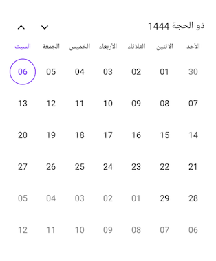
Different calendar views
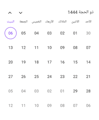
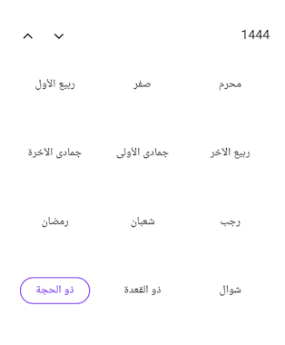
The .NET MAUI Calendar control enriches the experience of using different calendar types by incorporating various calendar views, including month, year, decade, and century views. These distinct views offer versatile options for interacting with dates, months, and years based on the specified calendar type.
 |  |
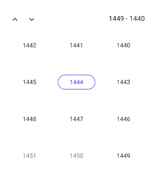 | 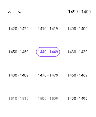 |
Different calendar views in .NET MAUI Calendar control
You can change the calendar view using the View property in the SfCalendar. Refer to the following code example.
<calendar:SfCalendar x:Name="Calendar" Identifier="Hijri" View="Month"> </Calendar:SfCalendar>
Specifying the date value
When working with different calendar types in the .NET MAUI Calendar, you can assign a date value to its properties in two ways.
Generating a date
You can create a date value by declaring the calendar type while creating the date instance.
Refer to the following code example. Here, we’ve declared the date by specifying the calendar type as Hijri.
SfCalendar calendar = new SfCalendar();Calendar hijriCalendar = new HijriCalendar();DateTime date = new DateTime(1444, 12, 6, hijriCalendar);calendar.SelectedDate = date;
Generating a date without calendar type
You can also create a date value without explicitly specifying the calendar type. In this case, the .NET MAUI Calendar will automatically convert and interpret the date value based on the specified local system’s calendar type.
Refer to the following code example. Here, we’ve used the Gregorian date, but the .NET MAUI Calendar control converts it to the corresponding Hijri calendar date.
SfCalendar calendar = new SfCalendar();DateTime date = new DateTime(2023, 6, 24);calendar.SelectedDate = date;
Specifying the flow direction
The .NET MAUI Calendar control automatically adjusts the flow direction based on the specified calendar type. This means that when you choose a calendar type with a right-to-left flow direction, such as in the Arabic calendar, the .NET MAUI Calendar control will automatically display the calendar elements in a right-to-left orientation.
The right-to-left supported calendar types in the .NET MAUI Calendar are:
- Hijri
- Persian
- UmAlQura
Conclusion
Thanks for reading! In this blog, we have explored the various calendar types available in the Syncfusion .NET MAUI Calendar control and their versatile features. With this, you can enhance the experience of your global users.
Explore other features in the Calendar control in its documentation. Try out the .NET MAUI demos available on GitHub and share your feedback or ask questions in the comments section.
If you are not a Syncfusion customer, try our 30-day free trial to see how our components can enhance your productivity.
You can also contact us through our support forum, support portal, or feedback portal. We are always happy to assist you!





Related Blogs
As you may already know, there’s no App Center support for .NET MAUI yet (and possibly won’t be). Trailhead is using Azure Pipelines for many of our projects, including for generating our mobile builds and distributing them to the app stores (Apple and Android). One of the challenges when you do this is bringing in […]
The post Using Private NuGet Feeds with .NET MAUI and Azure Pipelines appeared first on Trailhead Technology Partners.
Hi there 👋
As you know or maybe don't know. I write for *InfoQ*, and approximately I wrote 3-4 news coverage articles per month.
I am part of the *.NET Content editors team* and each month, we write and cover new stuff in the #dotnet world.
Last month, August 2023, I
Syncfusion is preparing for its third major release of the year, Essential Studio 2023 Volume 3. It will bring exciting new features to enhance the user experience. Anticipated for release by the end of September, we’re confident that this update will surpass our users’ expectations.
In this blog, we’ll see some new features we expect to roll out in the Syncfusion Xamarin platform as part of 2023 Volume 3.
PDF Viewer
You can expect the following new features in the Xamarin.Forms PDF Viewer.
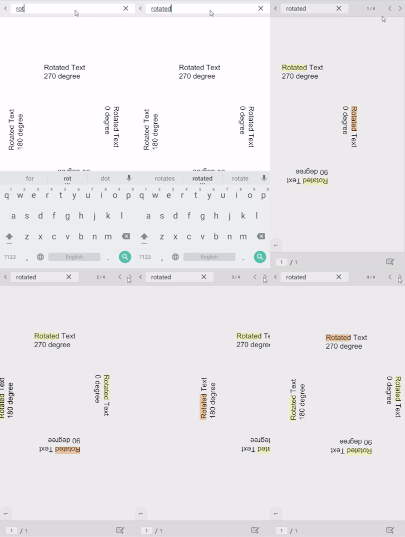
Text search for rotated text and documents
This feature will allow you to search for specific words that are rotated in normal and rotated PDF documents. This will help us save time when compared with manual scrolling through pages to find the needed content.
Render the document link annotation’s border
From 2023 Volume 3 on, you can render borders for the document link annotations.
GoTo action button for the form field
You can navigate to a specific page in a PDF when pressing the GoTo button in the form field.
Conclusion
Thanks for reading! Along with these highlights, you can enjoy other exciting new features and bug fixes in our Syncfusion Xamarin platform for the 2023 Volume 3 release. Check them out once the release is launched. It won’t be long!
Stay tuned to our official YouTube, Twitter, Facebook, and LinkedIn channels for announcements about the release. Please let us know in the comments section below if you have any feedback.
You can also reach us through our support forums, support portal, or feedback portal. We are always happy to assist you!
Related blogs
Welcome to our Chart of the Week blog series!
Today, we’ll create a horizontal bar chart to visualize the price comparison of groceries using the Syncfusion .NET MAUI Cartesian Charts control. This control is supported on both desktop (Windows and Mac) and mobile platforms (Android and iOS).
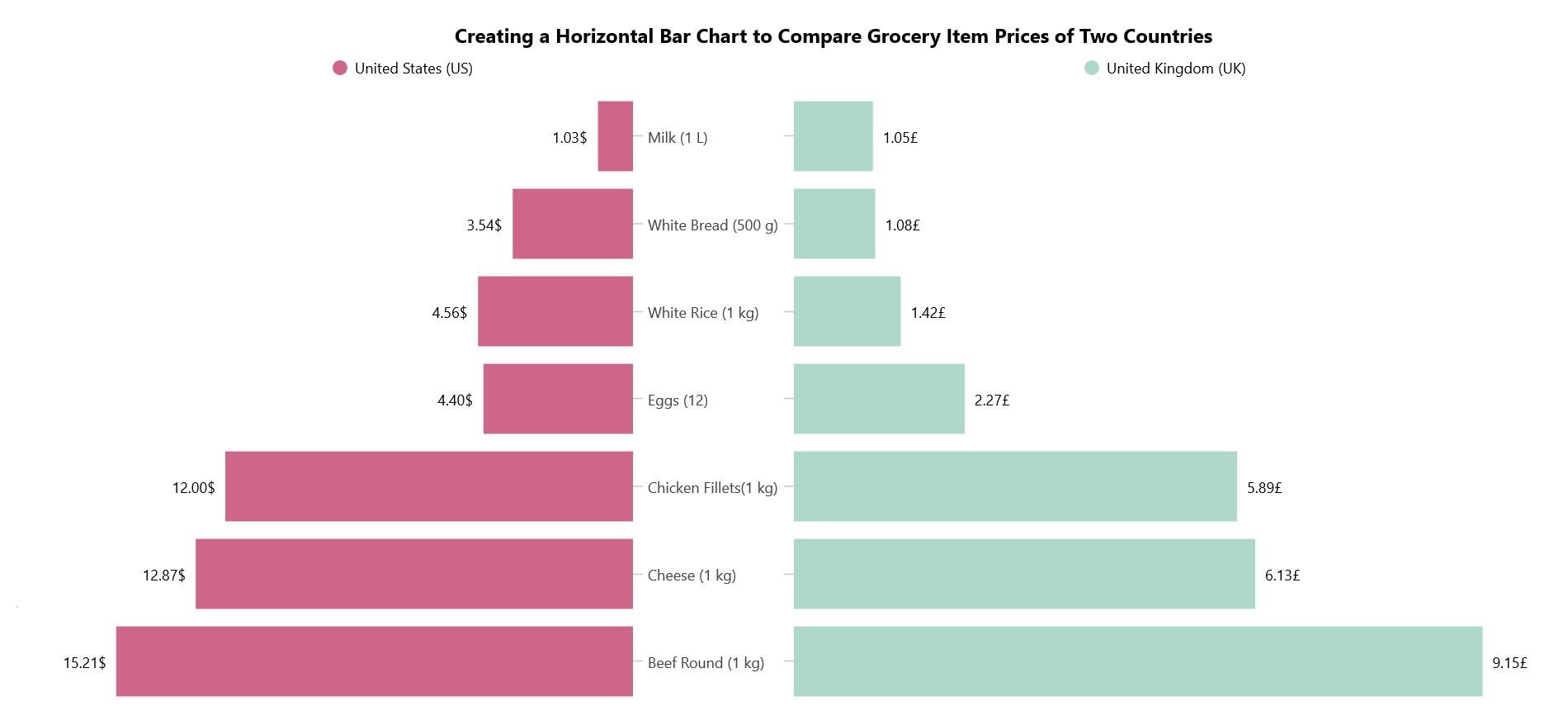
In this blog post, we’ll compare the prices of groceries in the United States and the United Kingdom using a horizontal bar chart that resembles a pyramid graph. It will allow us to identify and compare the prices of various grocery items easily.
Let’s get started!
Step 1: Collecting grocery price data
Before creating the chart, let’s gather data on grocery prices in the United States and the United Kingdom.
Step 2: Preparing data for the chart
Create a Model class that includes properties for storing information about grocery items and their prices in the United States and the United Kingdom.
Refer to the following code example.
public class Model{ public string GroceryItem { get; set; } public double USPrice { get; set; } public double UKPrice { get; set; } }
Then, configure the ViewModel class to create a collection of grocery item price details and store it in an observable collection using the GroceryPriceDetails property.
Refer to the following code example.
public class ViewModel{ public ObservableCollection<Model> GroceryPriceDetails { get; set; } public ViewModel() { GroceryPriceDetails = new ObservableCollection<Model>(); GroceryPriceDetails.Add(new Model() { GroceryItems = "Milk (1 L)", USPrice = 1.03, UKPrice = 1.05 }); GroceryPriceDetails.Add(new Model() { GroceryItems = "White Bread (500 g)", USPrice = 3.54, UKPrice = 1.08 }); GroceryPriceDetails.Add(new Model() { GroceryItems = "White Rice (1 kg)", USPrice = 4.56, UKPrice = 1.42 }); GroceryPriceDetails.Add(new Model() { GroceryItems = "Eggs (12)", USPrice = 4.40, UKPrice = 2.27 }); GroceryPriceDetails.Add(new Model() { GroceryItems = "Chicken Fillets(1 kg)", USPrice = 12.00, UKPrice = 5.89 }); ; GroceryPriceDetails.Add(new Model() { GroceryItems = "Cheese (1 kg)", USPrice = 12.87, UKPrice = 6.13 }); GroceryPriceDetails.Add(new Model() { GroceryItems = "Beef Round (1 kg)", USPrice = 15.21, UKPrice = 9.15 }); } }
Step 3: Layout definition
Define the layout using a Border element. Inside the border, we utilize a Grid to place our content.
Refer to the following code example.
<Border StrokeShape="RoundRectangle 20" StrokeThickness="4" Stroke="Gray" Margin="20"> <Grid ColumnSpacing="0"> <Grid.ColumnDefinitions> <ColumnDefinition Width="*"/> <ColumnDefinition Width="*"/> </Grid.ColumnDefinitions> <Grid.RowDefinitions> <RowDefinition Height="*"/> </Grid.RowDefinitions> </Grid></Border>
Step 4: Configuring the Syncfusion .NET MAUI Cartesian Charts
Let’s configure the Syncfusion .NET MAUI Cartesian Charts control using this documentation.
Refer to the following code example.
<Grid > <!--US Chart --> <chart:SfCartesianChart Grid.Row="1" Grid.Column="0" <chart:SfCartesianChart.XAxes> <Chart:CategoryAxis /> </chart:SfCartesianChart.XAxes> <chart:SfCartesianChart.YAxes> <Chart:NumericalAxis /> </chart:SfCartesianChart.YAxes> </chart:SfCartesianChart> <!--UK Chart --> <chart:SfCartesianChart Grid.Column="1" Grid.Row="1" <chart:SfCartesianChart.XAxes> <Chart:CategoryAxis /> </chart:SfCartesianChart.XAxes> <chart:SfCartesianChart.YAxes> <Chart:NumericalAxis /> </chart:SfCartesianChart.YAxes> </chart:SfCartesianChart></Grid>
Now that we’ve configured the Syncfusion .NET MAUI Cartesian Charts control, let’s see how to create a horizontal bar chart that resembles a pyramid with it!
Step 5: Initialize the horizontal bar chart
To compare the grocery item prices, we’ll use the ColumnSeries instance and set the IsTransposed property to true to initialize the horizontal bar chart.
<!--US Grocery Items Price Chart --><chart:SfCartesianChart IsTransposed="True" > .. <Chart:ColumnSeries /></chart:SfCartesianChart><!--UK Grocery Items Price Chart --><chart:SfCartesianChart IsTransposed="True" > … <Chart:ColumnSeries /></chart:SfCartesianChart>
Step 6: Binding data to the bar chart
This step involves using the ColumnSeries instance to bind the grocery items’ price data.
Refer to the following code example.
<!--US Grocery Items Price Chart --><chart:SfCartesianChart IsTransposed="True" > … <chart:ColumnSeries ItemsSource="{Binding GroceryPriceDetails}" XBindingPath="GroceryItem" YBindingPath="USPrice" /></chart:SfCartesianChart><!--UK Grocery Items Price Chart --><chart:SfCartesianChart IsTransposed="True" > … <chart:ColumnSeries ItemsSource="{Binding GroceryPriceDetails}" XBindingPath="GroceryItems" YBindingPath="UKPrice"/></chart:SfCartesianChart>
In the previous code, we’ve bound the ItemSource property with the GroceryPriceDetails property. The XBindingPath is bound with the grocery items count, and the YBindingPath is bound with the price details.
Step 7: Initializing the legend
A legend displays information corresponding to the chart series. Let’s implement a legend in our bar chart, as shown in the following code example.
<chart:SfCartesianChart.Legend> <Chart:ChartLegend/></chart:SfCartesianChart.Legend>
Step 8: Customizing the chart appearance
We can customize the appearance of the horizontal bar chart using various properties and styles.
Customizing the title
Refer to the following code example, which customizes the chart title using the Label property. In it, we’ve defined the title’s Text, FontSize, FontAttributes, and other properties.
<Label Grid.Row="0" Grid.ColumnSpan="2" Text="Creating a Horizontal Bar Chart to Compare Grocery Item Prices of Two Countries" TextColor="Black" FontSize="16" FontFamily="TimeSpan" FontAttributes="Bold" HorizontalOptions="Start" Padding="350,5,0,0"/>
Customizing the axes
Let’s customize the x- and y-axes using properties such as LabelStyle, AxisLineStyle, and MajorTickStyle.
<!--US Chart Axis Customization --> <chart:SfCartesianChart.XAxes> <chart:CategoryAxis IsInversed="True" ShowMajorGridLines="False" LabelCreated="CategoryAxis\_LabelCreated"> <Chart:CategoryAxis.LabelStyle> <chart:ChartAxisLabelStyle TextColor="#49454F" FontSize="12" LabelAlignment="Center"/> </Chart:CategoryAxis.LabelStyle> <Chart:CategoryAxis.AxisLineStyle> <chart:ChartLineStyle StrokeWidth ="0"/> </Chart:CategoryAxis.AxisLineStyle> <Chart:CategoryAxis.MajorTickStyle> <chart:ChartAxisTickStyle Stroke="#C5C8CE"/> </Chart:CategoryAxis.MajorTickStyle> </Chart:CategoryAxis> </chart:SfCartesianChart.XAxes> <chart:SfCartesianChart.YAxes> <chart:NumericalAxis IsInversed="True" ShowMajorGridLines="False" Maximum="18" IsVisible="False"> </Chart:NumericalAxis> </chart:SfCartesianChart.YAxes><!--UK Chart Axis Customization --> <chart:SfCartesianChart.XAxes> <chart:CategoryAxis ShowMajorGridLines="False" IsInversed="True"> <Chart:CategoryAxis.LabelStyle> <chart:ChartAxisLabelStyle TextColor="Transparent" FontSize="1" Margin="-5"/> </Chart:CategoryAxis.LabelStyle> <Chart:CategoryAxis.AxisLineStyle> <chart:ChartLineStyle StrokeWidth ="0"/> </Chart:CategoryAxis.AxisLineStyle> <Chart:CategoryAxis.MajorTickStyle> <chart:ChartAxisTickStyle Stroke="#C5C8CE"/> </Chart:CategoryAxis.MajorTickStyle> </Chart:CategoryAxis> </chart:SfCartesianChart.XAxes> <chart:SfCartesianChart.YAxes> <chart:NumericalAxis IsVisible="False" ShowMajorGridLines="False" Maximum="10"> </Chart:NumericalAxis> </chart:SfCartesianChart.YAxes>
Customizing the series data labels
Add the chart’s data label and customize the label formats as shown in the following code example.
<!--US Chart Axis Customization --><chart:ColumnSeries ShowDataLabels="True" Label="United States (US)"> <Chart:ColumnSeries.DataLabelSettings> <chart:CartesianDataLabelSettings LabelPlacement="Outer"> <chart:CartesianDataLabelSettings.LabelStyle> <chart:ChartDataLabelStyle LabelFormat="0.00'$" Background="White"/> </chart:CartesianDataLabelSettings.LabelStyle> </chart:CartesianDataLabelSettings> </Chart:ColumnSeries.DataLabelSettings></Chart:ColumnSeries><!--UK Chart Axis Customization --><chart:ColumnSeries ShowDataLabels="True" Label="United Kingdom (UK)"> <Chart:ColumnSeries.DataLabelSettings> <chart:CartesianDataLabelSettings LabelPlacement="Outer"> <chart:CartesianDataLabelSettings.LabelStyle> <chart:ChartDataLabelStyle LabelForm”t="0.00’£" Background="White"/> </chart:CartesianDataLabelSettings.LabelStyle> </chart:CartesianDataLabelSettings> </Chart:ColumnSeries.DataLabelSettings></Chart:ColumnSeries>
Customizing the series appearance
We also apply the color for each series using the Fill property. Refer to the following example.
<!--US Series--><chart:ColumnSeries Fill="#CD6688"></Chart:ColumnSeries><!--UK Series--><chart:ColumnSeries Fill="#AED8CC"></Chart:ColumnSeries>
After executing the previous code examples, our output will look like the following image.
GitHub reference
For more information, refer to the project on GitHub.
Conclusion
Thanks for reading! This blog showed how to create a horizontal bar chart using the Syncfusion .NET MAUI Cartesian Charts control to visualize a price comparison of grocery items in the United States and the United Kingdom. We encourage you to follow the steps provided and share your thoughts on the experience in the comment section below.
You can contact us through our support forum, support portal, or feedback portal. We are always happy to assist you!
Related blogs
This blog explains the steps to replicate a storage UI using Syncfusion .NET MAUI controls with code examples.
This blog explains how to create a simple .NET MAUI app that provides a ChatGPT-like user interface and service using OpenAI APIs.
In the ever-evolving landscape of software development, staying abreast of new technologies is a crucial undertaking. The introduction of .NET MAUI, the successor to Xamarin.Forms, has ignited discussions among project managers, team leads, and software engineers about the potential benefits and implications of migrating from the familiar Xamarin.Forms framework. This article delves into the considerations […]
This blog explains the process of incorporating custom symbol badges into your app using the Syncfusion .NET MAUI Badge View control.
This blog explains the steps to create a hospital appointment booking application using Syncfusion .NET MAUI controls with code examples.
While .NET MAUI layouts are extremely useful for developing graphical interfaces, it’s always nice to have additional options for arranging elements on the screen. In this article, you will learn about the DockLayout, a layout provided by the .NET MAUI Community Toolkit! To facilitate the understanding of this explanation, I will divide it into the following subtopics: 🔹 .NET MAUI…Continue Reading→
This blog explains the use of the TileLayer of .NET MAUI Maps to navigate locations on OSM (OpenStreetMap).
This blog explains how to visualize machine impact test results using the Syncfusion .NET MAUI Box and Whisker Chart.
In this post, I want to show you how to publish a .NET MAUI app via TestFlight from an Azure Pipeline. These tools allow you to create cross-platform Android and iOS apps, then use pipelines to build the app any time its code changes, and deploy an unofficial version of the app to a group […]
The post .Net MAUI + Azure Pipelines + iOS TestFlight! appeared first on Trailhead Technology Partners.
We are using : https://github.com/icsharpcode/SharpZipLib Library for Zipping and Unzipping the Files inside our dotnet maui project. MainPage.xaml MainPage.xaml.cs MainPageViewModel.cs Make sure you have setup Media integration inside your Dotnet maui project for taking camera photo. https://learn.microsoft.com/en-us/dotnet/maui/platform-integration/device-media/picker?tabs=android
This blog provides the show notes for our July 20, 2023, webinar, “Develop a Loan Interest Calculator App in .NET MAUI.”
In this post, I'll focus on basic and intermediate animations that can be incorporated into .NET MAUI projects. INFO: The authenticity of my publications is my most sincere commitment. I always start by putting my ideas into my own words and occasionally use GPT-3.5 to improve the content. In this way, I seek to ensure maximum clarity in my writings. If I use GPT-3.5 or another similar too...
Step 1 : Plugins to add https://github.com/takuya-takeuchi/UltraFaceDotNet Step 2 : Files to be downloaded .bin and .param https://github.com/Linzaer/Ultra-Light-Fast-Generic-Face-Detector-1MB/tree/master/ncnn/data/version-RFB Step 3 : Add this downloaded files to newly created data folder of your project and don’t forget make it as Embedded Resource Step 4 : MainPage.xaml Step 5 : MainPage.xaml.cs Step 6: DetectService.cs Step 7: IDetectService.cs Read More
This blog explains how to visualize the global wealth distribution in 2021 using the Syncfusion .NET MAUI Pyramid Chart.
When performing an operation that takes time, it’s crucial to inform users that a process is ongoing and that they need to wait before taking further action. Progress indicators are a good option to achieve this, as they visually show the percentage of progress that a process takes. In this article, we will learn how to use them in .NET…Continue Reading→
In this blog post, I'll show you how to use the Android emulator on macOS to debug a .NET MAUI or Xamarin.Forms application from a virtual machine with Windows and Visual Studio 2022.
The post How to use the Android emulator on a macOS host for debugging in a virtual machine with Windows appeared first on MSicc's Blog.
James does some experiments with building .NET MAUI UI without any XAML at all and completely in C#! We discuss the pros, cons, and if James will continue his journey to C# only! Follow Us Frank: Twitter, Blog, GitHub James: Twitter, Blog, GitHub Merge Conflict: Twitter, Facebook, Website, Chat on Discord Music : Amethyst Seer - Citrine by Adventureface ⭐⭐ Review Us (https://itunes.apple.com/us/podcast/merge-conflict/id1133064277?mt=2&ls=1) ⭐⭐ Machine transcription available on http://mergeconflict.fm
This blog explains how to visualize the top coffee-producing countries worldwide in 2020 using the Syncfusion .NET MAUI doughnut chart control.
In this blog post we will play and see what layout features CollectionView is providing to .NET MAUI developers. CollectionView is a layout/control which we can be useed in order to show some collection of data.
MAUIUIJuly is back! This post is my entry for .NET MAUI UI July
This blog explains the features of the new .NET MAUI Accordion control rolled out in the 2023 Volume 2 release and the steps to get started with it.
This blog explains how to develop a hotel booking UI using Syncfusion .NET MAUI controls with code examples.
This blog explains the numeric up-down button feature available in the Syncfusion .NET MAUI Numeric Entry control and the steps to get started with it.
Howdy! 💁♀️ I am thrilled to share my article for the .NET MAUI UI July 2023 calendar created by Matt Goldman, during the month of July, this calendar will publish various educational contributions created by industry experts about .NET MAUI. In this article, I will guide you step-by-step in building the Uber Delivery screen in a simple way. Let’s get started!…Continue Reading→
.NET 8 is on the way and we have some great updates on C# 12, NativeAOT for .NET iOS apps, and oh.... .NET MAUI gets a VS Code extension!!! Tune in! Follow Us Frank: Twitter, Blog, GitHub James: Twitter, Blog, GitHub Merge Conflict: Twitter, Facebook, Website, Chat on Discord Music : Amethyst Seer - Citrine by Adventureface ⭐⭐ Review Us (https://itunes.apple.com/us/podcast/merge-conflict/id1133064277?mt=2&ls=1) ⭐⭐ Machine transcription available on http://mergeconflict.fm
This blog explains the features of the new .NET MAUI Expander control introduced in the 2023 Volume 2 release and the steps to get started with it.
This blog explains the features of the new .NET MAUI Chips control introduced in the 2023 Volume 2 release and the steps to get started with it.
In this blog, we’ll see how US tech companies tend to utilize the dual-class voting structure more frequently than non-tech companies using the Syncfusion .NET MAUI Area Chart.
.NET 8 is the next LTS release and is currently in preview. .NET, .NET MAUI, and Visual Studio 2022 release a public preview every month for quite some time. On Tue, Jul 11, another preview version of .NET 8 got released along with VS2022 17.7.0 Preview 3.0. After installing the latest preview bits. the Android […]
For my last year’s contribution to the .NET MAUI UI July event, I replicated the F1 TV app. This year…
The post MAUI UI July 2023 – Replicating Wolt app appeared first on Andreas Nesheim.
This blog explains the features of the new Syncfusion .NET MAUI Numeric Entry control and the steps to get started with it.
This blog explains the features of the new .NET MAUI Image Editor control released in the 2022 Volume 2 and the steps to get started with it.
Knowing how to save files in our applications is very important, however, the perception has been that implementation can be tedious. Thanks to the .NET MAUI Community Toolkit using FileSaver, you can now save files much faster. In this article I will show you all the necessary elements to achieve it. 🔧 First of all… What do I need to know?…Continue Reading→
In this blog, we will visualize the U.S. methane gas emission data for the year 2021 using the Syncfusion .NET MAUI pie chart control.
This blog explains the new features planned for inclusion in the Syncfusion Essential Studio 2023 Volume 2 release for the Xamarin.Forms platform.
This article shares the experience of the team Syncfusion at the Microsoft Build conference for the year. 2023.
In this blog, we will use the Syncfusion .NET MAUI waterfall chart to track monthly sales details for a year and look at accompanying code examples.
Youtube Link : https://youtu.be/swYvmdlgWS0 Everything is based on server setup. Less code lies for dotnet maui :
Pour valider les nouvelles fonctionnalités d’une application, il vaut mieux les tester dans un environnement isolé. En effet, tu ne voudrais pas risquer les données de tes utilisateurs ! Découvre alors comment configurer différents environnements pour ton application mobile.
Image caching is a technique that stores images in cache memory to improve an app’s performance. If we search for an image, the app first looks for the image in the cache. If the image is found in the cache, the application will not try to load the image from the source.
The image cache is significant because it helps reduce the app’s loading time and data usage. By caching images, the app can retrieve them more efficiently, which leads to a better user experience.
In this blog, we’ll see how to implement the image caching feature in Syncfusion’s .NET MAUI Avatar View control.
Image caching in .NET MAUI
In .NET MAUI, ImageSource is a default feature that caches downloaded images for a day. The UriImageSource class provides properties to customize the image caching behavior. The Uri property specifies the image’s URI, and the CacheValidity property sets the image’s local storage duration.
The default value for CacheValidity is one day. CachingEnabled is another property that toggles image caching on or off, with the default value being true.
Refer to the following code example.
<Image> <Image.Source> <UriImageSource Uri="https://www.syncfusion.com/blogs/wp-content/uploads/2022/06/Introducing-.NET-MAUI-Avatar-View-Control-thegem-blog-justified.png" CacheValidity="10" /> </Image.Source></Image>
Implement image caching in .NET MAUI Avatar View
The .NET MAUI Avatar View is a graphical representation of a user’s image. It allows you to customize the view by adding images, background color, icons, text, and more. You can also display useful information such as initials and status.
Developers can easily create an Avatar View by customizing the prebuilt vector images to meet their specific requirements. This control can be utilized in various apps such as social media, messaging, and email clients, where user profiles play a vital role.
Let’s see the steps to add the Syncfusion Avatar View control to your .NET MAUI app and implement the image caching feature in it.
Step 1: Create a .NET MAUI app
First, create a .NET MAUI application.
Step 2: Add .NET MAUI Avatar View reference
The Syncfusion .NET MAUI controls are available on NuGet.org. To add the .NET MAUI Avatar View to your project, open the NuGet Package Manager in Visual Studio, and search for Syncfusion.Maui.Core, and then install it.
Step 3: Register the handler
Syncfusion.Maui.Core NuGet is a dependent package for all Syncfusion .NET MAUI controls. In the MauiProgram.cs file, register the handler for Syncfusion core.
Public static class MauiProgram{ public static MauiApp CreateMauiApp() { var builder = MauiApp.CreateBuilder(); builder .UseMauiApp>App>() .ConfigureFonts(fonts => { fonts.AddFont(“OpenSans-Regular.ttf”, “OpenSansRegular”); fonts.AddFont(“OpenSans-Semibold.ttf”, “OpenSansSemibold”); }); builder.ConfigureSyncfusionCore(); return builder.Build(); }}
Step 4: Add the namespace
Add the Syncfusion.Maui.Core namespace on your XAML page.
xmlns: syncfusion ="clr-namespace:Syncfusion.Maui.Core;assembly=Syncfusion.Maui.Core"
Step 5: Initialize the .NET MAUI Avatar View control
Then, initialize the .NET MAUI Avatar View control using the following code.
<syncfusion:SfAvatarView />
Step 6: Load custom image in .NET MAUI Avatar View
You can add a custom image in the Avatar View using the ImageSource property and by setting Custom as the value in the ContentType property. Refer to the following code example.
<syncfusion:SfAvatarView ImageSource="avatarviewimage.png" ContentType="Custom" VerticalOptions="Center" HorizontalOptions="Center" HeightRequest="200" WidthRequest="400" />
Step 7: Implement image caching in .NET MAUI Avatar View
Finally, implement the image caching feature in the .NET MAUI Avatar View using the ImageSource property for optimal image handling.
<syncfusion:SfAvatarView ContentType="Custom" VerticalOptions="Center" HorizontalOptions="Center" HeightRequest="200" WidthRequest="400" > < syncfusion:SfAvatarView.ImageSource> <UriImageSource CachingEnabled="True" Uri="https://www.syncfusion.com/blogs/wp-content/uploads/2022/06/Introducing-.NET-MAUI-Avatar-View-Control-thegem-blog-justified.png" CacheValidity="10" /> </ syncfusion:SfAvatarView.ImageSource></ syncfusion:SfAvatarView>
Now, you can quickly search for images and retrieve them without reloading them from the remote source in the .NET MAUI Avatar View control.
Reference
For more details, refer to the project on GitHub.
Conclusion
Thanks for reading! In this blog, we’ve seen how to implement the image caching feature in the .NET MAUI Avatar View control for optimal image handling. To try out the Avatar View control, download our Essential Studio for .NET MAUI.
If you are not a Syncfusion customer, you can use our 30-day free trial to see how our components can benefit your projects.
We encourage you to check out our .NET MAUI controls’ demos on GitHub and share your feedback or questions in the comments below.
You can also contact us through our support forum, support portal, or feedback portal. Our team is always ready to assist you!
Related blogs
WeatherForecastController.cs Don’t forget to add plugin : https://github.com/tomasmcguinness/dotnet-passbook

Implementing single sign-on (SSO) in Xamarin.Forms involve integrating with an identity provider that supports SSO protocols like OAuth or OpenID Connect. Here’s a general outline of the steps involved:
- Choose an Identity Provider: Select an identity provider that supports the SSO protocol you want to use, such as OAuth or OpenID Connect. Popular choices include Google, Facebook, Microsoft Azure Active Directory, and Okta.
- Set up Identity Provider: Follow the documentation provided by the identity provider to create an application or client, obtain the necessary client credentials (client ID and client secret), and configure the allowed redirect URLs.
- Add NuGet Packages: In your Xamarin.Forms project, add the necessary NuGet packages to handle the SSO integration. The specific packages required will depend on the identity provider and protocol you’re using. Common packages include
Xamarin.AuthandMicrosoft.Identity.Client. - Implement Login Page: Create a login page in your Xamarin.Forms application where users can initiate the SSO process. The page should have a button or link that triggers the authentication flow.
- Handle Authentication Flow: When the user clicks the SSO button, initiate the authentication flow by invoking the respective APIs provided by the selected identity provider. This typically involves redirecting the user to the identity provider’s login page.
- Receive Callback: Configure a callback URL in your application, which will be used by the identity provider to redirect the user back to your app after authentication. Handle this callback in your app’s code to retrieve the authentication token or code.
- Exchange Token/Code: Once you receive the authentication token or code from the identity provider, exchange it for an access token or id token by making a request to the identity provider’s token endpoint. This step may require using the client credentials (client ID and client secret) obtained during the setup phase.
- Store and Use Tokens: Store the received tokens securely (e.g., in the device’s secure storage or encrypted) and use them for subsequent authenticated requests to the identity provider’s APIs or any other protected resources.
- Implement Logout: Provide a logout mechanism in your app that allows users to end their SSO session. This usually involves invoking the identity provider’s logout endpoint and clearing the stored tokens from your app.
- Error Handling: Implement appropriate error handling throughout the SSO process, including cases like token expiration, token revocation, network errors, etc.
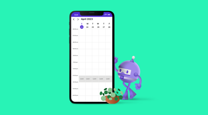
Time regions are specific units of time used to define periods or durations. The .NET MAUI Scheduler supports customizing time regions. This customization includes adjusting the duration of time regions, setting specific start and end times, handling interactions in time regions, and defining recurring time regions.
By having their time regions customized, schedulers become more efficient and tailored to individual needs. For instance, in a doctor’s scheduling application, time regions can be customized to account for lunch and break times, which can prevent appointment scheduling during those times. This customization is essential to ensure there are no conflicts between appointments and that sufficient time is allocated for rest and meals.
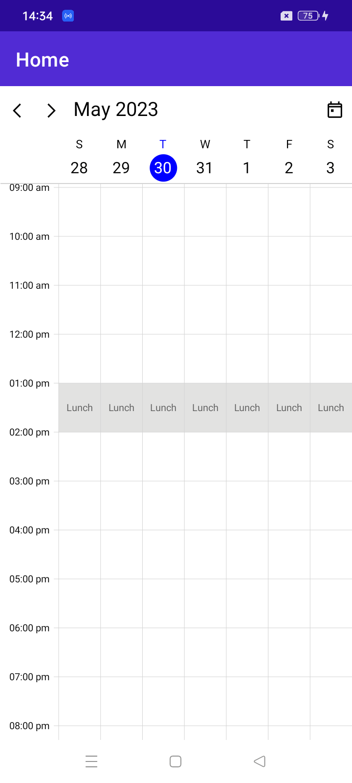
Note: If you are new to this control, refer to the .NET MAUI Scheduler getting started documentation before proceeding.
This blog will show you how to create and customize time regions in the .NET MAUI Scheduler control.
Defining the time region
Defining the time region requires the essential details in the following table.
Customization options | Summary |
Customize the time region start date and time. | |
Customize the time region end date and time. | |
Customize the time region background color. | |
Customize the text rendered in the time region. | |
Customize the style for the time region text. |
Interaction restriction on a time region
In the .NET MAUI Scheduler, the SchedulerTimeRegion class supports controlling, enabling, or disabling touch interaction for a time region using the EnablePointerInteraction property. It prevents touch interaction on disabled time slots.
Time region globalization
The time region feature provides globalization support, enabling users to customize time regions to align with different time zones or regional conventions using the TimeZone property. This can reduce errors when working across different time zones.
Recurring time region
The time region feature provides recurrence support to repeat the same time region on a regular or periodic interval using RecurrenceRule. For example, you can schedule a daily lunch break for a doctor’s appointment scheduling system.
For more details about the recurrence rule, refer to the recurrence rule documentation.
The recurring exception is an advanced feature of time region recurrence that allows the exclusion of specific occurrences of a recurring time region by using the RecurrenceExceptionDates property in the SchedulerTimeRegion class. This feature is useful when a regular schedule needs to be altered on a particular day or for a particular period, such as holidays or planned maintenance.
Resource-based time region
The time region feature provides resource support to create customized time slots based on specific resources or assets using the ResourceIds property. A resource-based time region defines the availability of those resources for scheduling.
Applying the time regions to .NET MAUI Scheduler
The .NET MAUI Scheduler uses the TimeRegions property in the SchedulerTimeSlotView class to customize the timeslots based on specified time regions and their properties such as StartTime, EndTime, Text, Background, and TimeZone.
SfScheduler scheduler = new SfScheduler();scheduler.View = SchedulerView.Week;ObservableCollection<SchedulerTimeRegion> timeRegions = new ObservableCollection<SchedulerTimeRegion>();//// Adding time region in the scheduler time region collection.timeRegions.Add(new SchedulerTimeRegion(){ StartTime = DateTime.Today.Date.AddHours(13), EndTime = DateTime.Today.Date.AddHours(14), Text = "Lunch", EnablePointerInteraction = false, RecurrenceRule = "FREQ=DAILY;INTERVAL=1",});//// Assigning the scheduler time region collection to the TimeRegions in DayView of .NET MAUI Scheduler.scheduler.DaysView.TimeRegions = timeRegions;this.Content = scheduler;
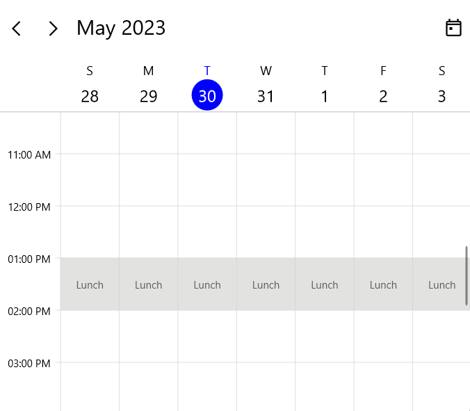
Conclusion
Thank you for your time! This blog post showed you how to create and set a time region in the .NET MAUI Scheduler. You can explore other features in the Scheduler control in its documentation.
If you are not a Syncfusion customer, try our 30-day free trial to see how our components can enhance your projects.
Please try the samples available in our .NET MAUI sample location and share your feedback or ask questions in the comments section. Or contact us through our support forum, support portal, or feedback portal. We are happy to assist you!
Related blogs
This article will broaden your understanding of XAML by demonstrating how to replicate a sign-up user interface in .NET MAUI.
ChatGPT and Copilot were the primary focus of this year’s MSBuild 2023, Microsoft’s annual developer conference. From the .NET MAUI perspective, with just around 1 year of official support left for Xamarin, which will end on May 1, 2024, the main focus was on the upgrade from Xamarin to .NET MAUI. Two options are available […]

In this blog post, we will explore the process of developing a .NET MAUI application that leverages OpenAI’s ChatGPT APIs to deliver place recommendations based on the user’s location. The application will feature a user-friendly interface where users can input their geographical location, and in return, they will receive information about popular landmarks and attractions nearby.
To get started with developing the application, there are a few prerequisites that need to be fulfilled:
- OpenAI account: You will need to have an account with OpenAI to access their APIs and obtain an API key.
- OpenAI API key: Once you have an account, generate an API key from OpenAI. This key will be used to authenticate your requests to their APIs.
- .NET MAUI installation: Ensure you have the necessary dependencies and tools installed for .NET MAUI application development. This includes having the .NET SDK, MAUI workload, and related libraries set up on your development machine.
Next, I’ll detail how to meet these prerequisites.
Note: To access OpenAI’s APIs in your .NET MAUI application, you need the API key, which is not free. If you are considering a paid account, this blog will give you an idea of how you might utilize it, even if you can’t follow along. Check the pricing page for more details.
How to create an Open AI account
To create an OpenAI account, follow these steps:
- Go to the official OpenAI website.
- Look for the Sign Up button on the website’s homepage and click on it. This will direct you to the account creation page.
- Fill out the required information in the sign-up form.
- Verify your email address by clicking on a verification link sent to your registered email.
- Once your registration is successful, you should be able to log in to your OpenAI account using the credentials you provided during the sign-up process.
By following these steps, you can create an OpenAI account and gain access to their services.
How to get an OpenAI API key
To obtain an OpenAI API key:
- Visit the OpenAI website and sign in using your account credentials.
- Navigate to the API section of the OpenAI platform. This can be found in the Account Settings.
- Create a new secret API key. This is where you are required to purchase it.
Create a place explorer app with .NET MAUI
Please create a .NET MAUI application and follow the instructions within the project.
Configuring ChatGPT APIs
To integrate the ChatGPT library and call its APIs in your .NET MAUI project, follow these steps:
- Reference and bootstrap the ChatGptNet library. Open the Package Manager Console from the Tools menu in Visual Studio, and run the following command to install the ChatGptNet library.
Install-Package ChatGptNet
- In the MauiProgram.cs file, locate the CreateMauiApp Add the following code.
builder.Services.AddChatGpt(options =>{ options.ApiKey = ""; // Your API Key Here; options.Organization = null; // Optional options.DefaultModel = ChatGptModels.Gpt35Turbo; // Default: ChatGptModels.Gpt35Turbo options.MessageLimit = 10; // Default: 10 options.MessageExpiration = TimeSpan.FromMinutes(5); // Default: 1 hour});
Add necessary NuGet packages
In this application, I will utilize the Syncfusion .NET MAUI controls, specifically the Maps, Busy Indicator, and Popup controls. These controls will play crucial roles in enhancing the functionality and user experience of the app.
The Maps control will be the centerpiece of the application, allowing users to select a specific location by picking the latitude and longitude. With the Maps control, users will have an interactive and visually appealing interface to navigate and explore different areas.
To provide a seamless user experience, I will incorporate the Busy Indicator control. This control will be activated when the application communicates with the ChatGPT API to retrieve recommendations based on the selected location. The Busy Indicator will display an animated loading indicator, assuring users that the app is working in the background to fetch the desired information.
I will utilize the Popup control to present the output corresponding to the selected location. This control will enable me to display relevant information and recommendations in an organized and visually appealing manner.
Syncfusion .NET MAUI components are available on NuGet.org. To add SfMaps to your project, open the NuGet package manager in Visual Studio, search for Syncfusion.Maui.Maps, and then install it. Similarly, SfBusyIndicator is available in the Syncfusion.Maui.Core NuGet package and SfPopup is available in the Syncfusion.Maui.Popup NuGet package.
Handler registration
Syncfusion.Maui.Core NuGet is a dependent package for all Syncfusion .NET MAUI controls. In the MauiProgram.cs file, register the handler for Syncfusion core.
using ChatGptNet;using ChatGptNet.Models;using Microsoft.Extensions.Logging;using Syncfusion.Maui.Core.Hosting;namespace ChatGPTinMAUI;public static class MauiProgram{ public static MauiApp CreateMauiApp() {var builder = MauiApp.CreateBuilder();builder.UseMauiApp<App>() builder.ConfigureSyncfusionCore(); builder.Services.AddChatGpt(options => { options.ApiKey = ""; // Your API key here; options.Organization = null; // Optional options.DefaultModel = ChatGptModels.Gpt35Turbo; // Default: ChatGptModels.Gpt35Turbo options.MessageLimit = 10; // Default: 10 options.MessageExpiration = TimeSpan.FromMinutes(5); // Default: 1 hour }); #if DEBUG builder.Logging.AddDebug(); #endif return builder.Build(); }}
Designing the UI
Create the required UI:
- Declare the required namespaces in the ContentPage, which represents a page in the application’s user interface.
The XAML code begins with declaring the necessary namespaces using the xmlns attribute. The required namespaces are:
- “clr-namespace:Syncfusion.Maui.Maps;assembly=Syncfusion.Maui.Maps” for the Syncfusion Maps control.
- “clr-namespace:Syncfusion.Maui.Core;assembly=Syncfusion.Maui.Core” for the Syncfusion BusyIndicator control.
- “clr-namespace:Syncfusion.Maui.Popup;assembly=Syncfusion.Maui.Popup” for the Syncfusion Popup control.
<ContentPage xmlns="http://schemas.microsoft.com/dotnet/2021/maui" xmlns:x="http://schemas.microsoft.com/winfx/2009/xaml" xmlns:maps="clr-namespace:Syncfusion.Maui.Maps;assembly=Syncfusion.Maui.Maps" xmlns:busy="clr-namespace:Syncfusion.Maui.Core;assembly=Syncfusion.Maui.Core" xmlns:syncfusion="clr-namespace:Syncfusion.Maui.Popup;assembly=Syncfusion.Maui.Popup" x:Class="ChatGPTinMAUI.MainPage"></ContentPage>
- Inside the ContentPage, add an instance of the busy:SfBusyIndicator control. Here, I am naming it busyIndicator.
<ContentPage xmlns="http://schemas.microsoft.com/dotnet/2021/maui" xmlns:x="http://schemas.microsoft.com/winfx/2009/xaml" xmlns:maps="clr-namespace:Syncfusion.Maui.Maps;assembly=Syncfusion.Maui.Maps" xmlns:busy="clr-namespace:Syncfusion.Maui.Core;assembly=Syncfusion.Maui.Core" xmlns:syncfusion="clr-namespace:Syncfusion.Maui.Popup;assembly=Syncfusion.Maui.Popup" x:Class="ChatGPTinMAUI.MainPage"> <busy:SfBusyIndicator x:Name="busyIndicator"> </busy:SfBusyIndicator></ContentPage>
- Add a ScrollView element to provide vertical scrolling functionality for the content within the page. Within the ScrollView, add a Grid element. The Grid is a container for other controls and allows flexible layout arrangements.
<ContentPage xmlns="http://schemas.microsoft.com/dotnet/2021/maui" xmlns:x="http://schemas.microsoft.com/winfx/2009/xaml" xmlns:maps="clr-namespace:Syncfusion.Maui.Maps;assembly=Syncfusion.Maui.Maps" xmlns:busy="clr-namespace:Syncfusion.Maui.Core;assembly=Syncfusion.Maui.Core" xmlns:syncfusion="clr-namespace:Syncfusion.Maui.Popup;assembly=Syncfusion.Maui.Popup" x:Class="ChatGPTinMAUI.MainPage"> <busy:SfBusyIndicator x:Name="busyIndicator"> <ScrollView> <Grid> </Grid> </ScrollView> </busy:SfBusyIndicator></ContentPage>
- Inside the grid, add a maps:SfMaps control. This control displays a map using OpenStreetMap tiles. The MapTileLayer element defines the URL template for the map tiles, and the MapZoomPanBehavior specifies the zooming and panning behavior.
<ContentPage xmlns="http://schemas.microsoft.com/dotnet/2021/maui" xmlns:x="http://schemas.microsoft.com/winfx/2009/xaml" xmlns:maps="clr-namespace:Syncfusion.Maui.Maps;assembly=Syncfusion.Maui.Maps" xmlns:busy="clr-namespace:Syncfusion.Maui.Core;assembly=Syncfusion.Maui.Core" xmlns:syncfusion="clr-namespace:Syncfusion.Maui.Popup;assembly=Syncfusion.Maui.Popup" x:Class="ChatGPTinMAUI.MainPage"> <busy:SfBusyIndicator x:Name="busyIndicator"> <ScrollView> <Grid > <maps:SfMaps x:Name="maps"> <maps:SfMaps.Layer> <maps:MapTileLayer UrlTemplate="https://tile.openstreetmap.org/{z}/{x}/{y}.png"> <maps:MapTileLayer.ZoomPanBehavior> <maps:MapZoomPanBehavior MinZoomLevel="3" MaxZoomLevel="10" EnableDoubleTapZooming="True" ZoomLevel="3"> </maps:MapZoomPanBehavior> </maps:MapTileLayer.ZoomPanBehavior> </maps:MapTileLayer> </maps:SfMaps.Layer> </maps:SfMaps> </Grid> </ScrollView> </busy:SfBusyIndicator></ContentPage>
- Inside the Grid, add a syncfusion:SfPopup control. I am naming popupDisplay. It displays a pop-up window when triggered. The SfPopup.ContentTemplate defines the content that will be displayed in the pop-up. It contains a grid with a label displaying the places to visit in the selected location and a scroll view with a label bound to a ContentText property for displaying the content.
<ContentPage xmlns="http://schemas.microsoft.com/dotnet/2021/maui" xmlns:x="http://schemas.microsoft.com/winfx/2009/xaml" xmlns:maps="clr-namespace:Syncfusion.Maui.Maps;assembly=Syncfusion.Maui.Maps" xmlns:busy="clr-namespace:Syncfusion.Maui.Core;assembly=Syncfusion.Maui.Core" xmlns:syncfusion="clr-namespace:Syncfusion.Maui.Popup;assembly=Syncfusion.Maui.Popup" x:Class="ChatGPTinMAUI.MainPage"> <busy:SfBusyIndicator x:Name="busyIndicator"> <ScrollView> <Grid > <maps:SfMaps x:Name="maps"> <maps:SfMaps.Layer> <maps:MapTileLayer UrlTemplate="https://tile.openstreetmap.org/{z}/{x}/{y}.png"> <maps:MapTileLayer.ZoomPanBehavior> <maps:MapZoomPanBehavior MinZoomLevel="3" MaxZoomLevel="10" EnableDoubleTapZooming="True" ZoomLevel="3"> </maps:MapZoomPanBehavior> </maps:MapTileLayer.ZoomPanBehavior> </maps:MapTileLayer> </maps:SfMaps.Layer> </maps:SfMaps> <syncfusion:SfPopup x:Name="popupDisplay" IsOpen="false" ShowHeader="False" WidthRequest="500" HeightRequest="300"> <syncfusion:SfPopup.ContentTemplate> <DataTemplate> <Grid RowDefinitions="20,*"> <Label Text="5 places to visit in this location :" FontSize="14" FontAttributes="Bold" /> <ScrollView Grid.Row="1" > <Label Text="{Binding ContentText}" Margin="0,10,0,10" /> </ScrollView> </Grid> </DataTemplate> </syncfusion:SfPopup.ContentTemplate> </syncfusion:SfPopup> </Grid> </ScrollView> </busy:SfBusyIndicator></ContentPage>
Overall, the XAML code creates a content page with a Busy Indicator control, a scroll view, a Maps control, and a Popup control.
Implementing the code-behind
- Declare the following namespaces in the code-behind file:
- ChatGptNet and ChatGptNet.Models: Namespaces for the ChatGptNet library, which provides functionality for making calls to OpenAI’s ChatGPT API.
- Syncfusion.Maui.Maps: The Syncfusion Maps control’s namespace for displaying maps.
using ChatGptNet;using ChatGptNet.Models;using Syncfusion.Maui.Maps;
The code is within the ChatGPTinMAUI namespace, and the MainPage class is defined as a partial class extending the ContentPage class.
using ChatGptNet;using ChatGptNet.Models;using Syncfusion.Maui.Maps;namespace ChatGPTinMAUI;
public partial class MainPage : ContentPage{}
- Define the Title and ContentText properties. The Title is a bindable property defined using the BindableProperty.Create method. It represents the title of the page and enables binding, animation, and styling. The ContentText property is also a bindable property, representing the content text displayed on the page.
using ChatGptNet;using ChatGptNet.Models;using Syncfusion.Maui.Maps;namespace ChatGPTinMAUI;public partial class MainPage : ContentPage{ public String Title { get { return (String)GetValue(TitleProperty); } set { SetValue(TitleProperty, value); } } public static readonly BindableProperty TitleProperty = BindableProperty.Create("Title", typeof(String), typeof(MainPage), String.Empty); public String ContentText { get { return (String)GetValue(ContentTextProperty); } set { SetValue(ContentTextProperty, value); } } public static readonly BindableProperty ContentTextProperty = BindableProperty.Create("ContentText", typeof(String), typeof(MainPage), String.Empty);}
- In the MainPage constructor, initialize the page by calling InitializeComponent and subscribe to the Loaded event.
using ChatGptNet;using ChatGptNet.Models;using Syncfusion.Maui.Maps;namespace ChatGPTinMAUI;public partial class MainPage : ContentPage{ public String Title { get { return (String)GetValue(TitleProperty); } set { SetValue(TitleProperty, value); } } public static readonly BindableProperty TitleProperty = BindableProperty.Create("Title", typeof(String), typeof(MainPage), String.Empty); public String ContentText { get { return (String)GetValue(ContentTextProperty); } set { SetValue(ContentTextProperty, value); } } public static readonly BindableProperty ContentTextProperty = BindableProperty.Create("ContentText", typeof(String), typeof(MainPage), String.Empty); private IChatGptClient \_chatGptClient; private Guid \_sessionGuid = Guid.Empty; MapMarkerCollection mapMarkers = new MapMarkerCollection(); MapMarker mapMarker = new MapMarker(); public MainPage() { InitializeComponent(); this.Loaded += MainPage\_Loaded; mapMarkers.Add(mapMarker); this.BindingContext = this; }}
- The MainPage\_Loaded event handler is invoked when the page is loaded. Retrieve an instance of the IChatGptClient service using dependency injection in this event.
using ChatGptNet;using ChatGptNet.Models;using Syncfusion.Maui.Maps;namespace ChatGPTinMAUI;public partial class MainPage : ContentPage{ public String Title { get { return (String)GetValue(TitleProperty); } set { SetValue(TitleProperty, value); } } public static readonly BindableProperty TitleProperty = BindableProperty.Create("Title", typeof(String), typeof(MainPage), String.Empty); public String ContentText { get { return (String)GetValue(ContentTextProperty); } set { SetValue(ContentTextProperty, value); } } public static readonly BindableProperty ContentTextProperty = BindableProperty.Create("ContentText", typeof(String), typeof(MainPage), String.Empty); private IChatGptClient \_chatGptClient; private Guid \_sessionGuid = Guid.Empty; MapMarkerCollection mapMarkers = new MapMarkerCollection(); MapMarker mapMarker = new MapMarker(); public MainPage() { InitializeComponent(); this.Loaded += MainPage\_Loaded; mapMarkers.Add(mapMarker); this.BindingContext = this; } private void MainPage\_Loaded(object sender, EventArgs e) { \_chatGptClient = Handler.MauiContext.Services.GetService<IChatGptClient>(); }}
- Add the MainPage\_Tapped event handler. The MainPage\_Tapped event handler is called when the user taps on the map. It retrieves the latitude and longitude of the tapped location and calls the GetNearByTouristAttraction method.
using ChatGptNet;using ChatGptNet.Models;using Syncfusion.Maui.Maps;namespace ChatGPTinMAUI;public partial class MainPage : ContentPage{ public String Title { get { return (String)GetValue(TitleProperty); } set { SetValue(TitleProperty, value); } } public static readonly BindableProperty TitleProperty = BindableProperty.Create("Title", typeof(String), typeof(MainPage), String.Empty); public String ContentText { get { return (String)GetValue(ContentTextProperty); } set { SetValue(ContentTextProperty, value); } } public static readonly BindableProperty ContentTextProperty = BindableProperty.Create("ContentText", typeof(String), typeof(MainPage), String.Empty); private IChatGptClient \_chatGptClient; private Guid \_sessionGuid = Guid.Empty; MapMarkerCollection mapMarkers = new MapMarkerCollection(); MapMarker mapMarker = new MapMarker(); public MainPage() { InitializeComponent(); this.Loaded += MainPage\_Loaded; mapMarkers.Add(mapMarker); this.BindingContext = this; } private void MainPage\_Loaded(object sender, EventArgs e) { \_chatGptClient = Handler.MauiContext.Services.GetService<IChatGptClient>(); } private async void MainPage\_Tapped(object sender, Syncfusion.Maui.Maps.TappedEventArgs e) { var latlong = (this.maps.Layer as MapTileLayer).GetLatLngFromPoint(e.Position); var geoLocation = "Latitude:"+ latlong.Latitude.ToString() + ",Longitude:" + latlong.Longitude.ToString(); await GetNearByTouristAttraction(geoLocation); this.popupDisplay.Show(e.Position.X, e.Position.Y); this.popupDisplay.Show(e.Position.X, e.Position.Y); }}The GetNearByTouristAttraction method is an asynchronous method that fetches nearby tourist attractions based on the provided geolocation. It displays a loading indicator while the request is being processed. It makes a request to the ChatGPT Client to get recommendations for tourist attractions and then updates the ContentText property with the response.
using ChatGptNet;using ChatGptNet.Models;using Syncfusion.Maui.Maps;namespace ChatGPTinMAUI;public partial class MainPage : ContentPage{ public String Title { get { return (String)GetValue(TitleProperty); } set { SetValue(TitleProperty, value); } } public static readonly BindableProperty TitleProperty = BindableProperty.Create("Title", typeof(String), typeof(MainPage), String.Empty); public String ContentText { get { return (String)GetValue(ContentTextProperty); } set { SetValue(ContentTextProperty, value); } } public static readonly BindableProperty ContentTextProperty = BindableProperty.Create("ContentText", typeof(String), typeof(MainPage), String.Empty); private IChatGptClient \_chatGptClient; private Guid \_sessionGuid = Guid.Empty; MapMarkerCollection mapMarkers = new MapMarkerCollection(); MapMarker mapMarker = new MapMarker(); public MainPage() { InitializeComponent(); this.Loaded += MainPage\_Loaded; mapMarkers.Add(mapMarker); this.BindingContext = this; } private void MainPage\_Loaded(object sender, EventArgs e) { \_chatGptClient = Handler.MauiContext.Services.GetService<IChatGptClient>(); } private async void MainPage\_Tapped(object sender, Syncfusion.Maui.Maps.TappedEventArgs e) { var latlong = (this.maps.Layer as MapTileLayer).GetLatLngFromPoint(e.Position); var geoLocation = "Latitude:"+ latlong.Latitude.ToString() + ",Longitude:" + latlong.Longitude.ToString(); await GetNearByTouristAttraction(geoLocation); this.popupDisplay.Show(e.Position.X, e.Position.Y); this.popupDisplay.Show(e.Position.X, e.Position.Y); } private async Task GetNearByTouristAttraction(string geoLocation) { this.busyIndicator.IsRunning = true; if (string.IsNullOrWhiteSpace(geoLocation)) { await DisplayAlert("Empty location", "No Suggestions", "OK"); return; } if (\_sessionGuid == Guid.Empty) { \_sessionGuid = Guid.NewGuid(); } var query = "Tell me 5 places near the following location (Each with 20 words) " + geoLocation; ChatGptResponse response = await \_chatGptClient.AskAsync(\_sessionGuid, query); this.ContentText = response.GetMessage(); this.busyIndicator.IsRunning = false; }}
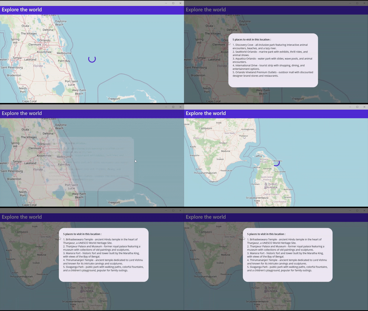 That’s it; we have successfully created a .NET MAUI application with a map control that displays popular tourist attractions near a selected location.
Reference
For more details, refer to the project on GitHub.
Conclusion
This blog guided you in creating a .NET MAUI application that leverages the power of the OpenAI ChatGPT API to deliver tourist recommendations based on the user’s location.
Feel free to experiment by modifying the prompts to enhance the quality of the suggestions. Additionally, you can explore the option of changing the ChatGptModels enum value within the AddChatGpt method in MauiProgram.cs to observe if different models yield improved outcomes.
Syncfusion’s collection of .NET MAUI controls offers a comprehensive suite of tools that enable developers to create robust and feature-rich applications. With their extensive customization options and intuitive APIs, Syncfusion controls provide seamless integration into the .NET MAUI framework, making building cross-platform applications with enhanced functionality easier.
Please try out the steps in this blog and share your feedback in the comment section below. You can also reach us through our support forum, support portal, or feedback portal. We are always happy to assist you!
Related blogs

Welcome to our Chart of the Week blog series. Today, we’ll create an inverted column chart using the Syncfusion .NET MAUI Cartesian Charts control. The inverted column chart is commonly used for plotting comparative data values in reverse order. In this example, we will compare Meta Reality Labs’s yearly operating losses from 2019 to 2022.
Step 1: Gather yearly revenue loss data
Refer to the Meta’s Money Pit: Metaverse Bet Bleeds Billions article by Statista and extract data from it. We will utilize the .NET MAUI column chart to create the same user interface.
Step 2: Populate the data for the inversed column chart
Create the MetaLabLossModel class to hold the year and loss data for Meta’s Reality Labs division with the Year and Loss properties.
Refer to the following code example.
public class MetaLabLossModel
{ public double Year { get; set; } public double Loss { get; set; }}
Then, generate a collection of Reality Labs division’s operating details with the help of the MetaLabLossDetails class.
public class MetaLabLossDetails
{ public MetaLabLossDetails() { LossDetails = new List<MetaLabLossModel>() { new MetaLabLossModel {Year = 2019, Loss = -4.5}, new MetaLabLossModel {Year = 2020, Loss = -6.6}, new MetaLabLossModel {Year = 2021, Loss = -10.2}, new MetaLabLossModel {Year = 2022, Loss = -13.7} }; } public List< MetaLabLossModel > LossDetails { get; set; }}
Step 3: Configure the Syncfusion .NET MAUI Cartesian Charts control
Now, configure the Syncfusion .NET MAUI Cartesian Charts control by following this documentation.
Refer to the following code example.
<Chart:SfCartesianChart x:Name="chart"> <Chart:SfCartesianChart.XAxes> <Chart:NumericalAxis> </Chart:NumericalAxis> </Chart:SfCartesianChart.XAxes> <Chart:SfCartesianChart.YAxes> <Chart:NumericalAxis> </Chart:NumericalAxis> </Chart:SfCartesianChart.YAxes></Chart:SfCartesianChart>
Step 4: Bind data to the chart
Use Syncfusion’s ColumnSeries instance to bind the Meta Reality Labs’s operating loss data into the chart.
Refer to the following code example.
<Chart:ColumnSeries XBindingPath="Year" YBindingPath="Loss" ItemsSource="{Binding LossDetails}"></Chart:ColumnSeries>
In this example, we’ve bound the LossDetails with the ItemSource property. We’ve also specified the XBindingPath and YBindingPath with the Year and Loss properties, respectively.
Step 5: Position the chart axis
To design the inversed column chart, position the chart axis using the CrossesAt and Name properties of the chart axis.
<Chart:SfCartesianChart.XAxes> <Chart:NumericalAxis CrossesAt="-1" Name="primary"> </Chart:NumericalAxis></Chart:SfCartesianChart.XAxes>
To assign the crossing axis to the chart series, use the XAxisName property.
<Chart:ColumnSeries XAxisName="primary"></Chart:ColumnSeries>
Step 6: Customize the chart appearance
Let’s enhance the appearance of the column chart by customizing the axis elements, data labels, column colors, and titles.
Refer to the following code example to add a title to the chart.
<Chart:SfCartesianChart.Title> <Label Text="Operating Loss of Meta's Reality Labs Division" HorizontalTextAlignment="Center" FontSize="Title" TextColor="#FF5E768E"/></Chart:SfCartesianChart.Title>
Then, configure the axis and modify the axis elements as shown in the following code example.
<Chart:SfCartesianChart.XAxes> <Chart:NumericalAxis Interval="1" ShowMajorGridLines="False" > <Chart:NumericalAxis.LabelStyle> <Chart:ChartAxisLabelStyle FontSize="20" Margin="-40" TextColor="Black"/> </Chart:NumericalAxis.LabelStyle> <Chart:NumericalAxis.MajorTickStyle> <Chart:ChartAxisTickStyle StrokeWidth="0"/> </Chart:NumericalAxis.MajorTickStyle> <Chart:NumericalAxis.AxisLineStyle> <Chart:ChartLineStyle Stroke="Black"/> </Chart:NumericalAxis.AxisLineStyle> </Chart:NumericalAxis></Chart:SfCartesianChart.XAxes><Chart:SfCartesianChart.YAxes> <Chart:NumericalAxis Maximum="0" IsVisible="False" ShowMajorGridLines="False"/></Chart:SfCartesianChart.YAxes>
Then, customize the column colors and enable data labels with the desired label formats.
<Chart:ColumnSeries XBindingPath="Year" Fill="#FF0A3B7E" YBindingPath="Loss" ItemsSource="{Binding LossDetails}" ShowDataLabels="True"> <Chart:ColumnSeries.DataLabelSettings> <Chart:CartesianDataLabelSettings> <Chart:CartesianDataLabelSettings.LabelStyle> <Chart:ChartDataLabelStyle FontSize="20" LabelFormat="$0.0B"/> </Chart:CartesianDataLabelSettings.LabelStyle> </Chart:CartesianDataLabelSettings> </Chart:ColumnSeries.DataLabelSettings></Chart:ColumnSeries>
After executing these code examples, we will get output like in the following image.
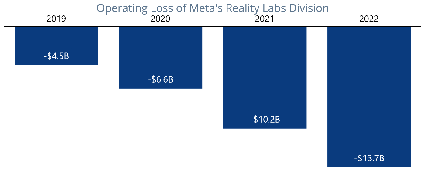
GitHub reference
For more information, refer to the project on GitHub.
Conclusion
Thanks for reading! In this blog, we’ve created an inversed column chart to visualize the net revenue loss of Meta’s Reality Labs over time using the Syncfusion .NET MAUI Cartesian Chart. We encourage you to try these steps to visualize your desired data and share your feedback in the comments section below.
You can also reach us through our support forum, support portal, or feedback portal. We are always happy to assist you!
See you in our next blog!
Related blogs
In this walkthrough, we will explore the custom filtering support provided by Syncfusion’s Autocomplete control. The Autocomplete control was designed to give users possible matches as they type, and it comes with a range of features such as different suggestion modes and custom search.
Using the custom filter support, we can create a Google search experience where suggestions are filtered based on user input.
This blog will guide you through the steps to achieve this behavior. By implementing this custom filtering feature, you can provide your users with more accurate and relevant search suggestions that enhance their overall experience. So, let’s learn how to utilize this feature of Autocomplete control in a .NET MAUI app.
How to add the Syncfusion control
First, we’ll incorporate the Autocomplete control and associate data with it.
Step 1: Add the .NET MAUI Autocomplete reference
Syncfusion’s .NET MAUI controls are available on NuGet.org. To add the .NET MAUI Autocomplete to your project, open the NuGet package manager in Visual Studio, search for Syncfusion.Maui.Inputs , and then install it.
Step 2: Handler registration
In the MauiProgram.cs file, register the handler for the Syncfusion core.
using Microsoft.Extensions.Logging;
using Syncfusion.Maui.Core.Hosting;namespace GoogleSearchDemo;public static class MauiProgram{ public static MauiApp CreateMauiApp() {var builder = MauiApp.CreateBuilder();builder .ConfigureSyncfusionCore() .UseMauiApp<App>() .ConfigureFonts(fonts => { fonts.AddFont("OpenSans-Regular.ttf", "OpenSansRegular"); fonts.AddFont("OpenSans-Semibold.ttf", "OpenSansSemibold"); }); #if DEBUG builder.Logging.AddDebug(); #endif return builder.Build(); }}
Step 3: Include the namespace
After adding the NuGet package to the project, as discussed in the previous reference section, add the XML namespace to the MainPage.xaml file, as shown in the following code example.
xmlns:editors="clr-namespace:Syncfusion.Maui.Inputs;assembly=Syncfusion.Maui.Inputs"
Step 4: Add the Autocomplete control
Add the Autocomplete control inside a grid. Also, customize the Autocomplete control with these properties:
- Placeholder: Displays a text hint inside the control before the user inputs any value.
- MaxDropDownHeight: Maximum height of the dropdown list that appears when it gets opened.
- TextSearchMode: Sets the search mode for matching items in the Autocomplete control’s data source. This property is set to Contains, meaning the control will show all items containing the typed text.
- WidthRequest and HeightRequest: These properties set the preferred width and height of the control.
<Grid Margin="0,20,0,0"> <editors:SfAutocomplete HeightRequest="50" Placeholder="Search something" MaxDropDownHeight="250" TextSearchMode="Contains" WidthRequest="300"> </editors:SfAutocomplete></Grid>
Step 5: Set custom filtering class
The Autocomplete control supports applying custom filter logic to suggest items based on your filter criteria using the FilterBehavior and SearchBehavior properties. The default value of FilterBehavior and SearchBehavior is null. Here, the FilterBehavior is set to CustomFiltering. Creation of the CustomFiltering class is explained in the upcoming section.
<Grid Margin="0,20,0,0"> <editors:SfAutocomplete HeightRequest="50" Placeholder="Search something" MaxDropDownHeight="250" TextSearchMode="Contains" WidthRequest="300"> <editors:SfAutocomplete.FilterBehavior> <local:CustomFiltering/> </editors:SfAutocomplete.FilterBehavior> </editors:SfAutocomplete></Grid>
With this, the UI part is completely implemented. Let’s focus on the backend where the CustomFiltering class is implemented.
Creating the CustomFiltering class
Next, let’s create a Google-like suggestion filter using the custom filter property of the .NET MAUI Autocomplete control.
Step 1: Create a custom class
Create a class named CustomFiltering and import the Syncfusion.Maui.Inputs namespace, which provides classes and interfaces for the Autocomplete control.
using Syncfusion.Maui.Inputs;using System.Xml.Linq;namespace GoogleSearchDemo{ public class CustomFiltering { }}
Step 2: Implement the interface
Implement the interface IAutocompleteFilterBehavior in the CustomFiltering class. This interface defines the filtering behavior for the control. The first step is to import the necessary namespaces required for the code to execute.
using Syncfusion.Maui.Inputs;using System.Xml.Linq;namespace GoogleSearchDemo : IAutocompleteFilterBehavior{ public class CustomFiltering { }}
Step 3: Customize the constructor method
Define a constructor method, which is called when an instance of the CustomFiltering class is created. In the constructor, call the GetGoogleSuggestions method with the initial search term test.
using Syncfusion.Maui.Inputs;using System.Xml.Linq;namespace GoogleSearchDemo{ public class CustomFiltering : IAutocompleteFilterBehavior { public CustomFiltering() { GetGoogleSuggestions("test"); } }}
Step 4: Define the filtering method from IAutocompleteFilterBehavior
Define the GetMatchingItemsAsync method, which is responsible for filtering the data for the Autocomplete control. It takes two arguments: the SfAutocomplete class’s source object and an instance of the AutocompleteFilterInfo class. The AutocompleteFilterInfo class contains the current filter text entered by the user.
using Syncfusion.Maui.Inputs;using System.Xml.Linq;namespace GoogleSearchDemo{ public class CustomFiltering : IAutocompleteFilterBehavior { public CustomFiltering() { GetGoogleSuggestions("test"); } public Task<object> GetMatchingItemsAsync(SfAutocomplete source, AutocompleteFilterInfo filterInfo) { return GetGoogleSuggestions(filterInfo.Text); } }}
Step 5: Define a method to get Google suggestions
Define a private, asynchronous method named GetGoogleSuggestions, which makes a web request to the Google search suggestions API to fetch suggestions for the given query.
It takes a string parameter query as input and returns a list of suggestions as an object. It uses the HttpClient class to make the web request and parses the XML response to extract the suggestions.
using Syncfusion.Maui.Inputs;using System.Xml.Linq;namespace GoogleSearchDemo{ public class CustomFiltering : IAutocompleteFilterBehavior { public CustomFiltering() { GetGoogleSuggestions("test"); } public Task<object> GetMatchingItemsAsync(SfAutocomplete source, AutocompleteFilterInfo filterInfo) { return GetGoogleSuggestions(filterInfo.Text); } private async Task<object> GetGoogleSuggestions(string query) { if (string.IsNullOrEmpty(query) || string.IsNullOrWhiteSpace(query)) { return new List<string>(); } string xmlSuggestions; using (HttpClient client = new HttpClient()) { try { var searchQuery = String.Format("https://www.google.com/complete/search?output=toolbar&q={0}", query); xmlSuggestions = await client.GetStringAsync(searchQuery); } catch { return null; } } XDocument doc = XDocument.Parse(xmlSuggestions); var suggestions = doc.Descendants("CompleteSuggestion") .Select( item => item.Element("suggestion").Attribute("data").Value); return suggestions.ToList(); } }}
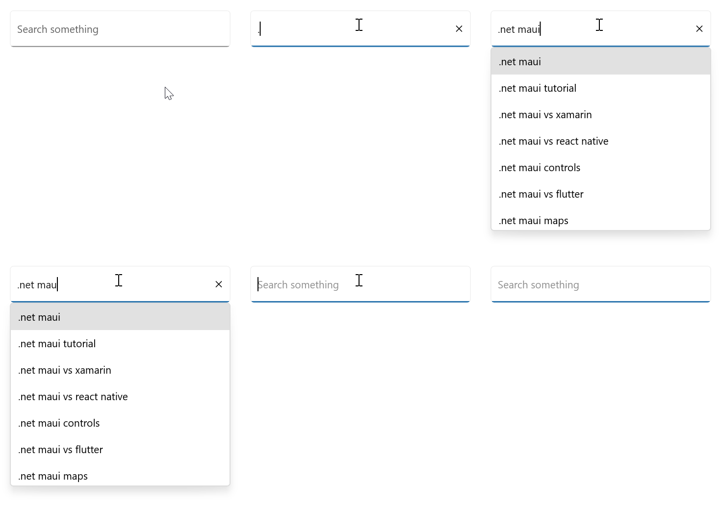
GitHub reference
For more information, refer to the demo on GitHub.
Conclusion
Thank you for taking the time to read this blog post. In this article, we have discussed the necessary steps to display Google search suggestions in our .NET MAUI Autocomplete control with custom filtering support. We recommend exploring the Getting Started documentation. We hope you found this information helpful.
If you are an existing Syncfusion customer, the new version of Essential Studio is available for download from the License and Downloads page. For those who are not yet Syncfusion customers, we offer a 30-day free trial to explore our available features.
Please let us know in the comments section below if you have any specific feature requests for our .NET MAUI controls. Additionally, you can contact us for assistance through our support forums, support portal, or feedback portal. We are always happy to help you!
Related blogs
James is on a mission to get his app on as many platforms as possible. This time he dives through his journey of getting his Android apps into the Amazon App Store which also means onto Windows 11! What did he have to do and what was the experience like for his end users?
Follow Us* Frank: Twitter, Blog, GitHub * James: Twitter, Blog, GitHub * Merge Conflict: Twitter, Facebook, Website, Chat on Discord * Music : Amethyst Seer - Citrine by Adventureface
⭐⭐ Review Us ⭐⭐
Machine transcription available on http://mergeconflict.fm
Sponsored By:
- Laird Superfood: Are you ready to feel more energized, focused, and supported? Go to https://zen.ai/mergeconflict2 and add nourishing, plant-based foods to fuel you from sunrise to sunset. Use our promo code mergeconflict at checkout to save 15% off your purchase today! Promo Code: mergeconflict
Support Merge Conflict
If you’re looking to improve your app’s user-friendliness and interactivity, consider adding animations. Lottie makes it possible to incorporate animations in JSON format without slowing down your app. Learn more about Lottie and how to integrate it into .NET MAUI by reading our article!
The explanation will be divided into the following points:
 What is a Lottie animation?
Initial setup
Choosing your animation
Adding the animation to your project
First of all… What do I need to know? 
What is a Lottie animation?
Lottie is an open-source file format for animations based on JSON. It’s part of SkiaSharp and allows you to send animations to any platform as easily as sending static assets. Lottie is an alternative to GIFs and other types of animated files, and offers the following benefits:
 Reduced file size: Lottie files are much smaller than other formats like GIF or MP4 while maintaining the same quality.
Vector-based adaptability: Lottie’s animations are vector-based, allowing you to scale them without affecting resolution.
Limitless customization: Since Lottie’s animations are vector-based, you can customize them without worrying about resolution.
Interactivity: You can manipulate animation elements to make them interactive and respond to user interactions such as scrolling, clicking, and mouse-over.
Let’s start!
We will learn to implement it by applying the following instructions:
 Initial setup
 Add from NuGet Package – SkiaSharp.Extended.UI.Maui – At the time of writing this article, this Nuget Package is in a preview version. To add it, you must activate the “Include prereleases” option.

Go to your MauiProgram.cs file
In the CreateMauiApp method, go to the line .UseMauiApp<App>() and add the following line of code just below it:
 Don’t forget to add the
 using SkiaSharp.Views.Maui.Controls.Hosting; at the top of the class.
Go to your .xaml file and add the following namespace. (In this example we will add it in the MainPage.xaml)
 Choosing your animation
Now you need to select the animation you want to use in your app. You have two options for doing so:
Create an animation in Adobe After Effects: You can create your animation and export it to a JSON file with the help of the Bodymovin extension.
Or select an animation already created in Lottiefiles. – In this article, we will implement this option. Therefore, apply the steps explained below:
Step 1: To find an animation on Lottiefiles, start by creating an account. Next, use the search bar to enter a topic. For the purpose of this example, I will search for “Girl”. Once you have located the desired animation, click on it.

Step 2: Once you have clicked on the animation, go to Download button  Upload to My Workspace option.

Step 3: Once you have completed the previous step, a button will appear to save the animation. This will be available in your workspace, ready to download. To do this, go to the right side menu and select Lottie JSON Download.

 Adding the animation to your project
We have already downloaded the animation to use in our app! Now all that remains is to add it to the project.
Add the animation to the Raw folder: Go to Resources Raw Right click add Existing files yourAnimation.json.

Displaying the animation:
To add the animation, we will use the SKLottieView from the SkiaSharp namespace, which we added at the beginning of this article with the alias “skia”.
SKLottieView provides different properties that allow you to have more direct control over the animations. The most important of these properties are the following:
Source: It’s the animation that will be played in your application, remember that it’s in .JSON format– [Of type SKLottieImageSource]
Progress: It’s the animation’s current playback progress. – [Of type TimeSpan]
RepeatCount: You can specify how many times the animation should be repeated. It’s default value is 0, but you can set it to -1 to repeat the animation infinitely. – [Of type int]
RepeatMode: It’s the way in which the animation will be repeated. This can be Restart or Reverse. the default is Reset. – [Of type SKLottieRepeatMode]
How to do it code?
To visualize your animation, it is important to add the HeightRequest and WidthRequest properties.And done!  From now on, you are ready to implement Lottie animations in your .NET MAUI applications!

<Label Text=”Thanks for reading!  ” />
” />
Spanish post:

Welcome to the second blog of our blog series, Chart of the Week!
Today, we are going to create a line chart to visualize the rising average egg prices in the U.S. using the Syncfusion .NET MAUI line chart control. This control is supported on both desktop (Windows and MacCatalyst) and mobile platforms (Android and iOS).
Due to avian influenza, the national average egg price in the United States has increased by 120% since the beginning of 2022. The national average cost for a dozen large, grade A eggs more than doubled, from $1.93 in January to $4.25 in December 2022.
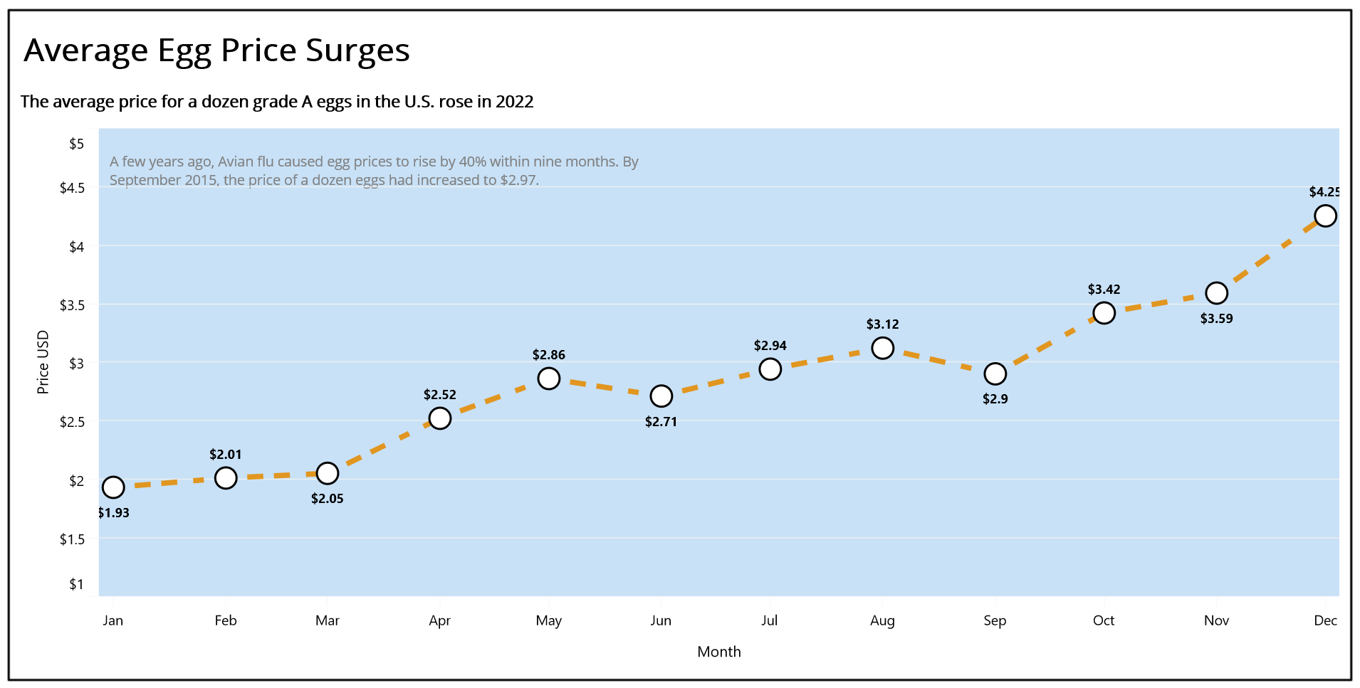
Let’s see the steps to create a line chart visualizing the surge in U.S. egg prices in 2022 using the Syncfusion .NET MAUI line chart control.
Step 1: Gathering surge in egg price data
Before creating a chart, we should gather the egg price data from the United States consumer price index.
For this blog, we are obtaining data on the rise in egg prices from January to December 2022. You can also download it as a CSV file.
Step 2: Preparing the data for the chart
To create a line chart in .NET MAUI, we should provide the egg price data in a specific format. Therefore, create the EggPriceModel class to hold monthly data using the Month and AveragePrice properties.
Refer to the following code example.
public class EggPriceModel{ public DateTime Month { get; set; } public double AveragePrice { get; set; } public EggPriceModel(DateTime month, double averagePrice) { Month = month; AveragePrice = averagePrice; }}
Next, generate the collection of egg prices with the help of the AverageEggPrices class and its AveragePrices property. Convert the CSV data to a collection of egg prices using the ReadCSV method and store it in the AveragePrices property.
public class AverageEggPrices { private List<EggPriceModel> averagePrices; public List<EggPriceModel> AveragePrices { get{ return averagePrices; } set { averagePrices = value; } } public AverageEggPrices() { AveragePrices = new List<EggPriceModel>(ReadCSV()); } public IEnumerable<EggPriceModel> ReadCSV() { Assembly executingAssembly = typeof(App).GetTypeInfo().Assembly; Stream inputStream = executingAssembly.GetManifestResourceStream("EggPriceChart.Resources.Raw.eggpricechart.csv"); string? line; List<string> lines = new List<string>(); using StreamReader reader = new StreamReader(inputStream); while ((line = reader.ReadLine()) != null) { lines.Add(line); } return lines.Select(line => { string[] data = line.Split(','); DateTime date = DateTime.ParseExact(data[0], "MMMM", CultureInfo.InvariantCulture); return new EggPriceModel((date), Convert.ToDouble(data[1])); }); }}
Step 3: Configuring the Syncfusion .NET MAUI Cartesian Charts
Let’s configure the Syncfusion .NET MAUI Cartesian Charts control using this documentation.
Refer to the following the code example.
<chart:SfCartesianChart > <chart:SfCartesianChart.XAxes> <chart:DateTimeAxis > </chart:DateTimeAxis> </chart:SfCartesianChart.XAxes> <chart:SfCartesianChart.YAxes> <chart:NumericalAxis> </chart:NumericalAxis> </chart:SfCartesianChart.YAxes></chart:SfCartesianChart>
Step 4: Binding egg price data
Now, let’s bind the egg price data in the chart using the LineSeries. Refer to the following code example.
<chart:LineSeries XBindingPath="Month" YBindingPath="AveragePrice" ItemsSource="{Binding AveragePrices}"></chart:LineSeries>
In this example, we bound our chart to the AveragePrices property containing the monthly egg price data. We have also specified the x and y critical paths with the Month and AveragePrice properties, respectively, which inform the chart about the data points to be utilized for the x- and y-axes.
Step 5: Customizing the chart appearance.
We can customize the line chart’s appearance by changing the axis elements’ appearance, like showing data labels at the line points, changing the line style, adding data markers, and adding titles to the charts.
Refer to the following code example to customize the line chart title using the Title property.
<chart:SfCartesianChart.Title> <Grid HeightRequest="100"> <Grid.RowDefinitions> <RowDefinition Height="0.7*"/> <RowDefinition Height="0.3*"/> </Grid.RowDefinitions> <Label Grid.Row="0" Margin="3" Text="Average Egg Price Surges" HorizontalOptions="StartAndExpand" VerticalOptions="CenterAndExpand" FontAttributes="Bold" TextColor="Black" FontSize="Header" /> <Label Grid.Row="1" HorizontalOptions="StartAndExpand" VerticalOptions="CenterAndExpand" Text="The average price for a dozen grade A eggs in the U.S. rose in 2022" TextColor="Black" FontAttributes="Bold" FontSize="20"/> </Grid></chart:SfCartesianChart.Title>
Let’s customize the axis title and set the interval type, text color, font size, and other properties.
<chart:SfCartesianChart.XAxes> <chart:DateTimeAxis ShowMajorGridLines="False" IntervalType="Months" Interval="1" EdgeLabelsDrawingMode="Fit"> <chart:DateTimeAxis.Title> <chart:ChartAxisTitle TextColor="Black" FontSize="14" Text="Month"> </chart:ChartAxisTitle> </chart:DateTimeAxis.Title> </chart:DateTimeAxis></chart:SfCartesianChart.XAxes><chart:SfCartesianChart.YAxes> <chart:NumericalAxis> <chart:NumericalAxis.Title> <chart:ChartAxisTitle TextColor="Black" FontSize="14" Text="Price USD"> </chart:ChartAxisTitle> </chart:NumericalAxis.Title> </chart:NumericalAxis></chart:SfCartesianChart.YAxes>
Refer to the following code example to customize the line chart’s axis lines and tick lines.
<chart:SfCartesianChart.XAxes> <chart:DateTimeAxis > <chart:DateTimeAxis.AxisLineStyle> <chart:ChartLineStyle Stroke="GhostWhite" /> </chart:DateTimeAxis.AxisLineStyle> <chart:DateTimeAxis.MajorTickStyle> <chart:ChartAxisTickStyle Stroke="GhostWhite" /> </chart:DateTimeAxis.MajorTickStyle> </chart:DateTimeAxis></chart:SfCartesianChart.XAxes><chart:SfCartesianChart.YAxes> <chart:NumericalAxis > <chart:NumericalAxis.AxisLineStyle> <chart:ChartLineStyle Stroke="GhostWhite" /> </chart:NumericalAxis.AxisLineStyle> <chart:NumericalAxis.MajorTickStyle> <chart:ChartAxisTickStyle Stroke="GhostWhite" /> </chart:NumericalAxis.MajorTickStyle> </chart:NumericalAxis></chart:SfCartesianChart.YAxes>
Refer to the following code example to customize the axis labels using the LabelFormat property and set the Minimum and Maximum properties for the NumericalAxis.
<chart:SfCartesianChart.XAxes> <chart:DateTimeAxis.LabelStyle> <chart:ChartAxisLabelStyle LabelFormat="MMM" FontSize="13" TextColor="Black" /> </chart:DateTimeAxis.LabelStyle> </chart:DateTimeAxis></chart:SfCartesianChart.XAxes><chart:SfCartesianChart.YAxes> <chart:NumericalAxis Minimum="1.5" Maximum="5"> <chart:NumericalAxis.LabelStyle> <chart:ChartAxisLabelStyle LabelFormat="$###.##" FontSize="13" TextColor="Black" /> </chart:NumericalAxis.LabelStyle> </chart:NumericalAxis></chart:SfCartesianChart.YAxes>
Then, customize the line stroke style, color, and width using the StrokeDashArray, Fill, and StrokeWidth properties, respectively.
<chart:LineSeries x:Name="series" Fill="#e19620" StrokeWidth="5" StrokeDashArray="2,3,3" XBindingPath="Month" YBindingPath="AveragePrice" ShowMarkers="True" ShowDataLabels="True" ItemsSource="{Binding AveragePrices}"></chart:LineSeries>
Customize the chart data labels using the CartesianDataLabelSettings property and the label style with the appropriate format. To show the data labels, we need to enable the ShowDataLabels property in the LineSeries.
<chart:LineSeries.DataLabelSettings> <chart:CartesianDataLabelSettings LabelPlacement="Outer" UseSeriesPalette="False"> <chart:CartesianDataLabelSettings.LabelStyle> <chart:ChartDataLabelStyle LabelFormat="$###.##" Margin="0,25,0,0" LabelPadding="10" FontAttributes="Bold" /> </chart:CartesianDataLabelSettings.LabelStyle> </chart:CartesianDataLabelSettings></chart:LineSeries.DataLabelSettings>
Then, customize the chart’s data points using the MarkerSetting property and enable the markers using the ShowMarkers property in the LineSeries.
<chart:LineSeries.MarkerSettings> <chart:ChartMarkerSettings Height="55" Width="20" Fill="white" Type="Circle" Stroke="Black" StrokeWidth="2" > </chart:ChartMarkerSettings></chart:LineSeries.MarkerSettings>
Finally, let’s customize the chart’s plot area like in the following code example.
<chart:SfCartesianChart.PlotAreaBackgroundView> <AbsoluteLayout BackgroundColor="#c8e1f7"> <Label LineBreakMode="WordWrap" Margin="10" TextColor="Gray" WidthRequest="{OnPlatform Android='300',WinUI='500',iOS='300',MacCatalyst='500'}" Text="A few years ago, Avian flu caused egg prices to rise by 40% within nine months. By September 2015, the price of a dozen eggs had increased to $2.97." FontSize="{OnPlatform WinUI='13',Android='10',MacCatalyst='13',iOS='10'}" AbsoluteLayout.LayoutBounds="0,0.04,-1,-1" AbsoluteLayout.LayoutFlags="PositionProportional"/> </AbsoluteLayout></chart:SfCartesianChart.PlotAreaBackgroundView>
After executing these code examples, we will get the output like in the following image.
GitHub reference
For more details, refer to the demo on GitHub.
Conclusion
Thanks for reading! In this blog, we have seen how to use the Syncfusion .NET MAUI line chart to visualize the rise in U.S. egg prices in 2022. Like this, you can also visualize other trends and changes in prices over time. We encourage you to try the steps discussed and share your thoughts in the comments below.
If you require assistance, please don’t hesitate to contact us via our support forum, support portal, or feedback portal. We are always eager to help you!
Related blogs
A login form allows users to enter their credentials, such as an email address and password, to authenticate and gain access to a website or application.
The .NET MAUI DataForm can be used to create various data forms. In this blog, I will explain how to develop and validate a login data form using the .NET MAUI DataForm.
Initialize the data from the control
- Create a new .NET MAUI application in Visual Studio.
- Syncfusion .NET MAUI components are available at nuget.org. To add the SfDataForm to your project, open the NuGet package manager in Visual Studio, search for Syncfusion.Maui.DataForm, and then install it.
- To initialize the control, import the control namespace Syncfusion.Maui.DataForm in XAML or C# code and initialize the DataForm.
Refer to the following code to initialize the .NET MAUI DataForm.
MainPage.xaml
xmlns:dataForm="clr-namespace:Syncfusion.Maui.DataForm;assembly=Syncfusion.Maui.DataForm"<dataForm:SfDataForm x:Name="loginForm"/>
Register the ConfigureSyncfusionCore handler for Syncfusion core in the MauiProgram.cs file.
MauiProgram.cs
using Syncfusion.Maui.Core.Hosting;public static class MauiProgram{ public static MauiApp CreateMauiApp() { var builder = MauiApp.CreateBuilder(); builder.ConfigureSyncfusionCore(); builder.ConfigureSyncfusionCore(); }}
Create login data from the model
Create a login form with the following fields to get email addresses and passwords.
LoginFormModel.cs
public class LoginFormModel{ [Display(Prompt = "example@mail.com", Name = "Email")] public string Email{ get; set; } [Display(Name = "Password")] [DataType(DataType.Password)] public string Password { get; set; }}
Create login form editors
By default, the data form auto-generates the data editors based on primitive data types such as string, enumeration, DateTime, and TimeSpan in the DataObject property.
You can change the editor layout default (label and editor) and floating label layout using the LayoutType property.
Refer to the following code example. In it, we set the data form model (LoginFormModel) to the DataObject property from the view model class to create the data editors for the login form with a floating label layout.
Please refer to the code to bind the LoginFormModel property from the DataFormViewModel class.
MainPage.xaml
...<ContentPage.BindingContext> <local:DataFormViewModel/></ContentPage.BindingContext><dataForm:SfDataForm x:Name="loginForm" DataObject="{Binding LoginFormModel}" LayoutType="TextInputLayout" />
Refer to the code to initialize the LoginFormModel property.
DataFormViewModel.cs
public class DataFormViewModel{ /// <summary> /// Initializes a new instance of the <see cref="DataFormViewModel" /> class. /// </summary> public DataFormViewModel() { this.LoginFormModel = new LoginFormModel(); } /// <summary> /// Gets or sets the login form model. /// </summary> public LoginFormModel LoginFormModel { get; set; }}
Design the login form page
Let’s design the login page with images, buttons, checkboxes, and labels.
Refer to the following code to add an image to the login form.
MainPage.xaml
<Border Grid.ColumnSpan="{OnIdiom Default=2, Desktop=1}" Stroke="Transparent" Background="{OnIdiom Phone=#83E9EE,Desktop=Transparent}" Grid.RowSpan="{OnIdiom Default=1, Desktop=2}"> <Border.StrokeShape> <RoundRectangle CornerRadius="0,0,100,100"/> </Border.StrokeShape> <Image Source="login.png" Grid.Row="0" Grid.Column="0" HorizontalOptions="Center" Aspect="AspectFit"/></Border>
Next, add the Remember Me checkbox and Forgot password label in the login form.
MainPage.xaml
<Grid ColumnDefinitions="0.5*,0.5*" Grid.Row="2" Padding="12,0,0,0" VerticalOptions="Start"> <HorizontalStackLayout VerticalOptions="Center" Padding="10,0,0,0" > <CheckBox Color="{StaticResource Primary}"/> <Label Text="Remember me" FontSize="12" VerticalOptions="Center" /> </HorizontalStackLayout> <Label Text="Forgot password?" Grid.Column="1" TextColor="{StaticResource Primary}" HorizontalTextAlignment="Center" Padding="10,0,0,0" FontSize="12" VerticalOptions="Center" /></Grid>
Then, add the LOGIN button in the login form.
MainPage.xaml
<Button Text="LOGIN" x:Name="loginButton" HeightRequest="40" VerticalOptions="End" HorizontalOptions="Fill" Margin="20,0,20,0" CornerRadius="10" Padding="0" FontAttributes="Bold" Grid.Row="3" Background="{StaticResource Primary}"/>
Next, refer to the following code to add the Don’t have an account? Sign Up label in the login form. You can refer to this blog for how to create a signup form.
MainPage.xaml
<Label Grid.Row="4" Padding="0,12,0,0" HorizontalOptions="Center" HorizontalTextAlignment="Center" FontSize="14"> <Label.FormattedText> <FormattedString> <Span Text="Don't have an account? " /> <Span Text="Sign Up" TextDecorations="Underline" TextColor="{StaticResource Primary}"/> </FormattedString> </Label.FormattedText></Label>
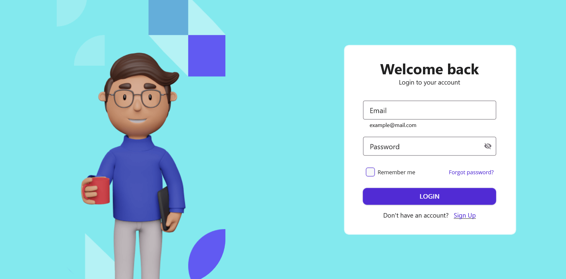
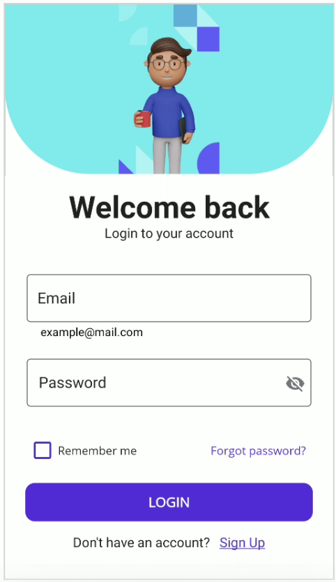
Change the keyboard for the email editor
Use the email field keyboard by updating the keyboard property in the GenerateDataFormItem event.
Refer to the following code to change the keyboard for the email editor.
MainPage.xaml
<ContentPage.Behaviors> <local:LoginFormBehavior/></ContentPage.Behaviors>
LoginFormBehavior.cs
this.dataForm = bindable.FindByName<SfDataForm>("loginForm"); this.dataForm.GenerateDataFormItem += this.OnGenerateDataFormItem;private void OnGenerateDataFormItem(object sender, GenerateDataFormItemEventArgs e){ if (e.DataFormItem != null && e.DataFormItem.FieldName == nameof(LoginFormModel.Email) && e.DataFormItem is DataFormTextEditorItem textItem) { textItem.Keyboard = Keyboard.Email; }}
Validate the login form
The email address and password fields must not be empty. If either field is left blank or has invalid data, an error message will be displayed, and the user cannot submit the form.
Please refer to the code to add EmailAddress and Required validation attributes.
LoginFormModel.cs
public class LoginFormModel{ [Display(Prompt = "example@mail.com", Name = "Email")] [EmailAddress(ErrorMessage = "Enter your email - example@mail.com")] public string Email { get; set; } [Display(Name = "Password")] [DataType(DataType.Password)] [Required(ErrorMessage = "Enter the password")] public string Password { get; set; }}
The data form supports validating the data by using the ValidationMode property.
Refer to the following code to set the validation mode to PropertyChanged; the value will be validated immediately when changed.
MainPage.xaml
<dataForm:SfDataForm x:Name="loginForm" LayoutType="TextInputLayout" Grid.Row="1" DataObject="{Binding LoginFormModel}" ValidationMode="PropertyChanged" > <ContentPage.Behaviors> <local:LoginFormBehavior/> </ContentPage.Behaviors>
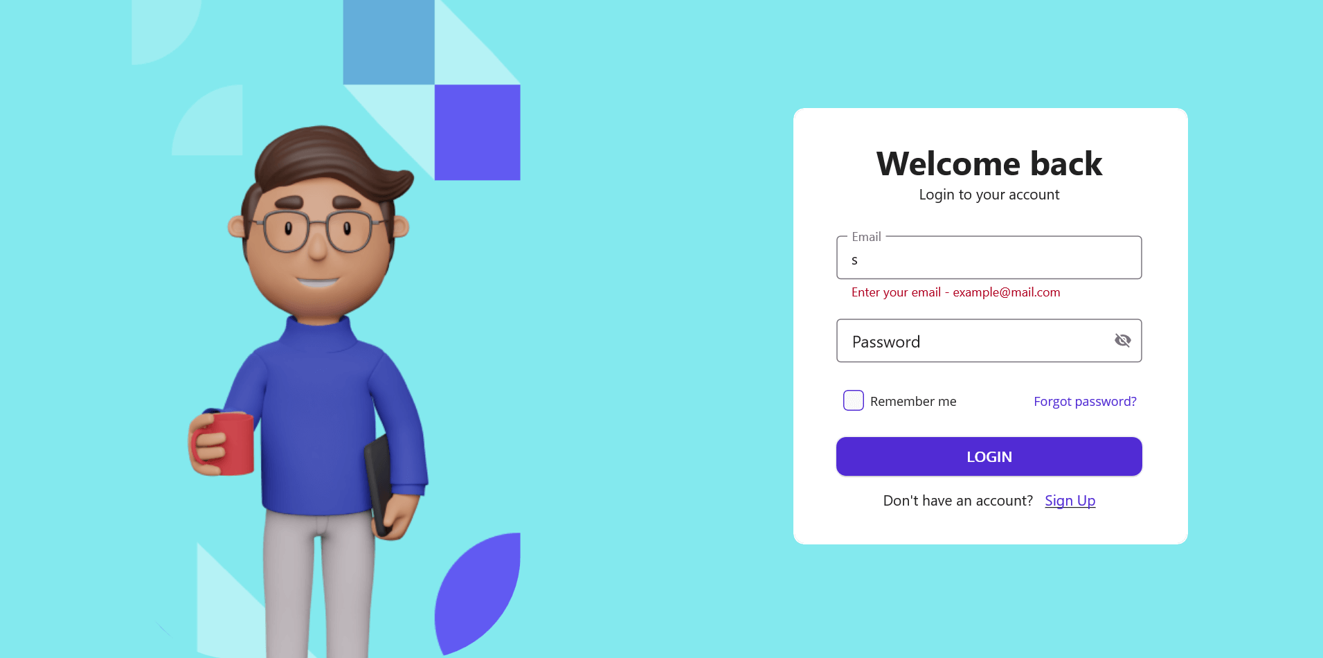
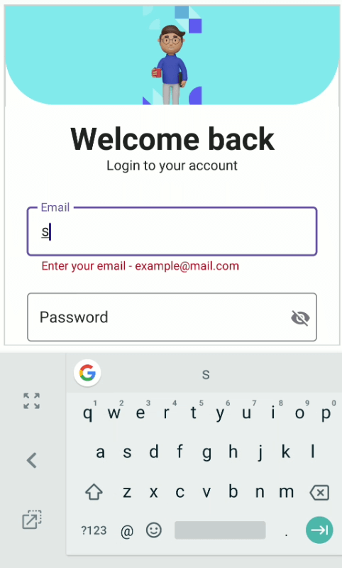
Login form validation can be handled while submitting the login button using the Validate method.
LoginFormBehavior.cs
private async void OnLoginButtonCliked(object sender, EventArgs e){ if(this.dataForm != null && App.Current?.MainPage != null) { if(this.dataForm.Validate()) { await App.Current.MainPage.DisplayAlert("", "Signed in successfully", "OK"); } else { await App.Current.MainPage.DisplayAlert("", "Please enter the required details", "OK"); } }}
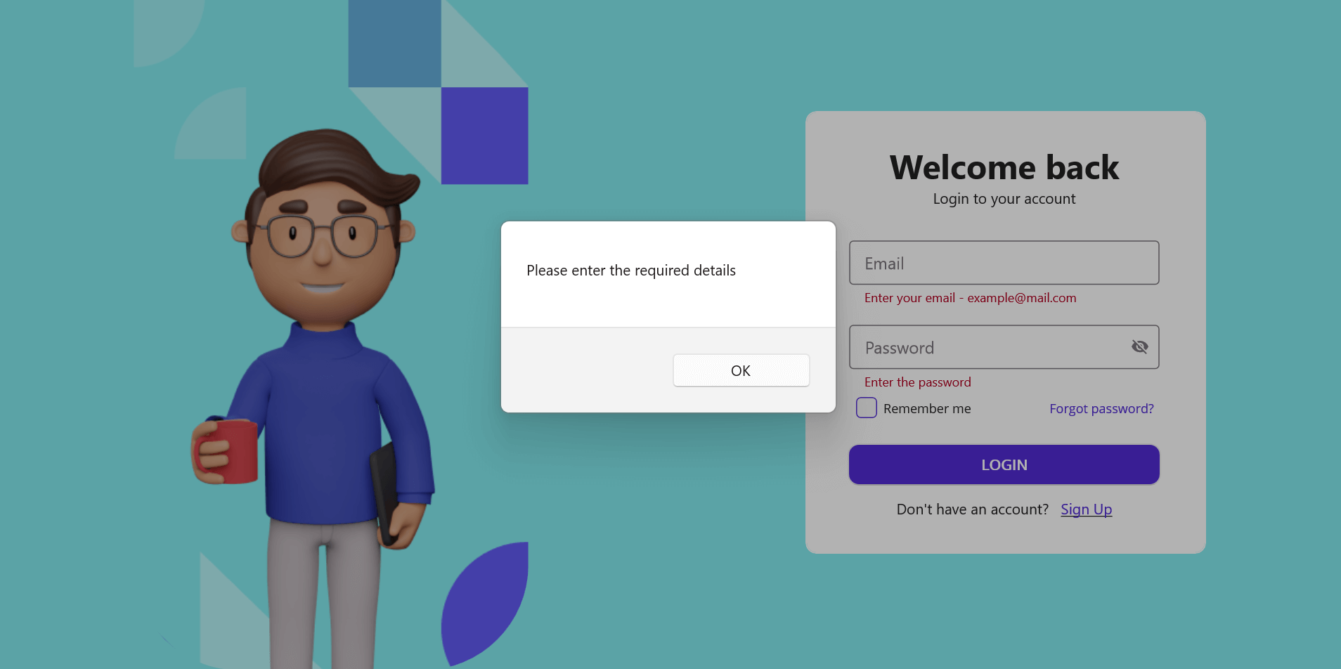
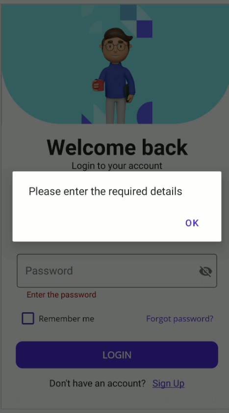
GitHub reference
Refer to the GitHub demo on this topic.
Conclusion
Thanks for reading. This blog demonstrated how to create and validate a login form using the .NET MAUI DataForm control. Try out the steps in this blog and leave your feedback in the comments section below.
For current Syncfusion customers, the newest version of Essential Studio is available from the license and downloads page. If you are not a customer, try our 30-day free trial to check out these new features. If you have questions, contact us through our support forums, feedback portal, or support portal. We are always happy to assist you!
Related Blogs
That is right! Everyone's favorite MP3 player is back! This time due to a collaboration with Guardians of the Galaxy, but it doesn't matter because Hanselman and others have found ways to revive it in 2023. We discuss the Zune software, UI stack, why we loved it, and why it may have been the best XAML to XAML.
Follow Us* Frank: Twitter, Blog, GitHub * James: Twitter, Blog, GitHub * Merge Conflict: Twitter, Facebook, Website, Chat on Discord * Music : Amethyst Seer - Citrine by Adventureface
⭐⭐ Review Us ⭐⭐
Machine transcription available on http://mergeconflict.fm
Support Merge Conflict
Links:
- Zune.net: Empowering the Galaxy
- ZuneDev
Event name: Update Days: .NET MAUI
Talk name: .NET MAUI Layouts, navigation, shell & MAUI Community Toolkit
Official Site: https://maui.updatedays.cz/schedule/en
Location: Prague, Czech Republic
Language: English
Date: March 23th & 24th, 2023
I was invited to speak at the Update Days .NET MAUI event held in Czech Republic. This prestigious conference brings together some of the most renowned experts in the industry to discuss the latest developments in .NET MAUI, the new technology developed by #Microsoft.
I’m incredibly grateful for the opportunity to have contributed my knowledge to all the participants at this event. I also had the privilege of meeting and connecting with other brilliant professionals in the industry, including Gerald Versluis , Roman Jasek!
Special thanks to Tomáš Herceg for the invitation! 


Thank for ready!

Cutting 50 minute iOS Apple TestFlight deployments to 50 seconds for Xamarin & MAUI

We are well into .NET6 and .NET7 release lifecycle and .NET8 coming up soon. Additionally end of life of Xamarin is coming increasingly closer, so I bet a lot of people are looking towards migrating to the newer bits.
The old way
Before iOS 16, it was pretty easy to lock a Page into a certain orientation. It was basically just one line of code (if you don’t count the DependencyService boilerplate code in):
UIDevice.CurrentDevice.SetValueForKey(new NSNumber((int)UIInterfaceOrientation.Portrait), new NSString("orientation"));
By calling this method whenever the size of a page was allocated, we were able to lock the orientation at runtime with Xamarin.Forms. With iOS 16, this does no longer work – even on native iOS applications.
The new way
To understand the why of the new way, you have to understand the SceneDelegate architecture Apple introduced with iOS 13. Before continuing, you should read this blog post by Donny Wals, which explains it very detailed: Understanding the iOS 13 Scene Delegate – Donny Wals.
Now that we know that the SceneDelegate is, we can move on with our implementation.
Page implementation
Both Xamarin.Forms and .NET MAUI implement the SceneDelegate architecture. That’s why we can update our code similarly to what native iOS implementations look like:
var rootWindowScene = (UIApplication.SharedApplication.ConnectedScenes.ToArray()?.FirstOrDefault()) as UIWindowScene;if (rootWindowScene == null) return;rootWindowScene.RequestGeometryUpdate(new UIWindowSceneGeometryPreferencesIOS(UIInterfaceOrientationMask.Portrait),error =>{ Debug.WriteLine("Error while attempting to lock orientation: {Error}", error.LocalizedDescription);});
On top, we have to tell the underlying ViewControllers to update their orientation as well:
var rootViewController = UIApplication.SharedApplication.KeyWindow?.RootViewController;if (rootViewController == null) return;rootViewController.SetNeedsUpdateOfSupportedInterfaceOrientations();rootViewController.NavigationController?.SetNeedsUpdateOfSupportedInterfaceOrientations();
The ViewController can be informed via the SetNeedsUpdateOfSupportedInterfaceOrientations method that it needs to redraw its view. If we put this all together, we can have a reusable implementation for our DeviceOrientationService implementation:
private void SetOrientation(UIInterfaceOrientationMask uiInterfaceOrientationMask){ var rootWindowScene = (UIApplication.SharedApplication.ConnectedScenes.ToArray()?.FirstOrDefault()) as UIWindowScene; if (rootWindowScene == null) return; var rootViewController = UIApplication.SharedApplication.KeyWindow?.RootViewController; if (rootViewController == null) return; rootWindowScene.RequestGeometryUpdate(new UIWindowSceneGeometryPreferencesIOS(uiInterfaceOrientationMask), error => { Debug.WriteLine("Error while attempting to lock orientation: {Error}", error.LocalizedDescription); }); rootViewController.SetNeedsUpdateOfSupportedInterfaceOrientations(); rootViewController.NavigationController?.SetNeedsUpdateOfSupportedInterfaceOrientations();}
To keep our existing code for older iOS versions working as well. We now just check if we are on iOS 16 and call our new method, below we still can use our traditional way:
public void LockPortrait(){ if (UIDevice.CurrentDevice.CheckSystemVersion(16, 0)) { \_applicationDelegate.CurrentLockedOrientation = UIInterfaceOrientationMask.Portrait; SetOrientation(UIInterfaceOrientationMask.Portrait); } else { UIDevice.CurrentDevice.SetValueForKey(new NSNumber((int)UIInterfaceOrientation.Portrait), new NSString("orientation")); }}
This will, however, do nothing without the last, very important step. You may have noticed the CurrentLockedOrientation property on the application delegate member above.
Every time the application has to decide whether to rotate or not, the application:supportedInterfaceOrientationsForWindow: gets called to ask for the supported orientations. Only if the application and the ViewController agree on the supported orientations, the action will be executed.
Extending our AppDelegate
Just as on native iOS, we need to implement the method above in our AppDelegate. Xamarin and .NET MAUI do this via the Export attribute, which tells the compiler to override the eventually existing native implementation.
For my solution, I created a derived version of the FormsApplicationDelegate / MauiUIApplicationDelegate classes, passing the current desired UIInterfaceOrientationMask value to the CurrentLockedOrientation property. Finally, I implement the GetSupportedInterfaceOrientationsForWindow method and just return the value of the CurrentLockedOrientation property:
public abstract class AppDelegateEx : MauiUIApplicationDelegate{ public virtual UIInterfaceOrientationMask CurrentLockedOrientation { get; set; } //according to the Apple docs, Application and ViewController have to agree on the supported orientation, this forces it //https://developer.apple.com/documentation/uikit/uiapplicationdelegate/1623107-application?language=objc [Foundation.Export("application:supportedInterfaceOrientationsForWindow:")] public virtual UIInterfaceOrientationMask GetSupportedInterfaceOrientationsForWindow(UIApplication application, UIWindow forWindow) => this.CurrentLockedOrientation;}
Now we just make the AppDelegate derive from AppDelegateEx (or whatever you call it) to finish the implementation for the orientation lock. Finally, locking the orientation works also on iOS 16.
Samples
I created two samples – one for Xamarin.Forms and one for .NET MAUI. The sample work similar on both platforms, and I wrote the code in a reusable way. You can find the samples in the corresponding GitHub repo.
Conclusion
It took me some time to figure out why the traditional way of locking the orientation doesn’t work any longer. After some research and some trial-and-error coding, I was able to come up with a clean and easy-to use solution, which is also reusable. I also learned some new things, like how MAUI implements Scenes and ViewControllers and got a better understanding of the iOS application structure and lifecycle on newer OS versions.
As always, I hope this post will be helpful for some of you as well.
Until the next post, happy coding!
Helpful links:
- Understanding the iOS 13 Scene Delegate – Donny Wals
- swift – How to resolve: ‘keyWindow’ was deprecated in iOS 13.0 – Stack Overflow
- requestGeometryUpdateWithPreferences:errorHandler: | Apple Developer Documentation
- application:supportedInterfaceOrientationsForWindow: | Apple Developer Documentation
- (UIInterfaceOrientationMask)applic… | Apple Developer Forums
- Forcing specific MAUI view to Landscape Orientation using MultiTargeting Feature working for Android but not iOS – Stack Overflow
Title Image created via Bing Create with AI
The post How to lock orientation at runtime on iOS 16 with .NET MAUI and Xamarin.Forms appeared first on MSicc's Blog.
Show NotesIt's been a little bit... but James, David, and Matt are back with the latest .NET MAUI and Azure news!
Latest Releases* The latest on .NET MAUI * .NET Upgrade Assistant * .NET Upgrade Assistant NuGet * .NET 8 Preview 3 * Visual Studio 17.6 preview 2 * Visual Studio 17.5 updates
Latest News* Drawing elements on maps in .NET MAUI * Azure Developers - .NET Day * Let's Learn .NET - All Around the World * Build, Build, and more Build * File and folder dialogs in with the .NET MAUI Community Toolkit
Azure News* Getting started with OpenAI in .NET * Data API Builder - Public Preview * .NET SQL Passwordless connections
Azure Service of the Month* Microsoft Dev Box
Pick of the Pod* Apple command line tooling
Follow Us:
- James: Twitter, Blog, GitHub, Merge Conflict Podcast
- Matt: Twitter, Blog, GitHub
- David: Twitter, Github
I have gone all in on Arm devices! My main MAC machine is a Mac Book Air M1 and now my main driver at work is a Windows Dev Kit 2023 (aka Project Volterra). One tricky thing for developers is getting all the software we use to work properly on Arm. Things have come a long way since the original release of Arm devices for Mac and Windows. I have a full setup guide for my M1 for Xamarin and now .NET MAUI development, but what about Windows?
Visual Studio 2022 recently released a full native Arm version and they have been adding more workloads for developers to use. .NET MAUI was recently introduced, which got me excited but I right away ran into an issue, which was that there are no compatible Android emulators for Windows Arm and apparently no plans from Google :(. So, what are our options? Two come to mind.
Deploy to a device
Well, it may be obvious, but you can just plug in a device and use something like Vysor to mirror your device. I am always a fan of deploying and testing on devices as you have full access to everything including Google Play services. As a bonus you don't drag down any resources on your main machine. If you don't have a device, you are still in luck!
Windows Subsystem for Android
That's right! I have blogged and talked about it a bunch, but the Windows Subsystem for Android(WSA) is a great way to deploy and debug applications on any Windows 11 machine. It has expanded into more regions since its first release, which is awesome. If you haven't heard about WSA, it is a mode that you can enable that allows you to run Android applications directly on your Windows machine. There are limitations of course, the largest being no access to Google Play services, but for a lot of developers this will get you off the ground running. Checkout my full video:
If you are using Visual Studio 2022 there is a great extension that will help you get up and running and automatically connect.
Once you have it all set up, it is ready and available!
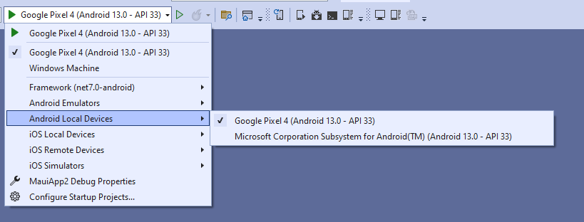
So, there you go! Two ways to get deploying Android apps if you are developing on a Windows Arm device.
This post will be focused on some hints that can help you to make the migration from Xamarin.Forms to .NET MAUI a smoother process.
In recent years, the development of mobile applications has gained great importance in the world of technology. The demand for mobile apps has increased significantly, which has led to increased competition in the market. For this reason, developers are looking for tools and technologies that allow them to create mobile applications faster and more efficiently. One of these tools is .NET MAUI.
.NET MAUI is an open-source mobile development platform that allows developers to create mobile apps for Android, iOS, and Windows in a single codebase. This means that developers only have to write the code once and can compile it for different mobile platforms. .NET MAUI is a Xamarin.Forms-based technology that has been enhanced for a smoother and easier development experience.
In this article, we’ll teach you how to create a mobile app with .NET MAUI in 10 easy steps. These steps guide you from initial setup to creating a user interface, connecting to a database, and publishing your app to app stores.
.NET MAUI in 10 easy steps
Step 1: Set up your development environment
The first thing you need to do is set up your development environment. To work with .NET MAUI you will need to have Visual Studio 2022 installed. You also need to install the .NET 6.0 SDK. In addition, you’ll need to install the .NET MAUI plug-in for Visual Studio.
Guide: Installing Visual Studio 2022
Step 2: Create a .NET MAUI Project
The next step is to create a new .NET MAUI project in Visual Studio. To do this, select “File” from the menu bar, then “New” and “Project”. Select “.NET MAUI Mobile App” and set the project name and location.
Tutorial: Tutorial: Creating a MAUI Application
Step 3: Build your project
Build or run your first cross-platform .NET MAUI app in Visual Studio 2022 on Windows or Visual Studio 2022 for Mac. This will help ensure that the development environment is configured correctly.
Walkthrough: Building Your First MAUI App
Step 4: Create a user interface
Once you’ve set up the project, it’s time to create the user interface. To do this, you can use a wide variety of controls. These controls allow you to design the user interface easily and quickly.
Documentation: Controls – .NET MAUI
Step 5: Add functionality to your app
After you create the UI, it’s time to add functionality to your app. You can add functionality such as camera, GPS, and Internet connectivity using the .NET MAUI Community Toolkit libraries.
Documentation: .NET MAUI Community Toolkit documentation
You can also integrate third-party services such as social networks or online payment services.
Documentation: Consuming a REST-based Web Service
Step 6: Connect to a database
Most mobile apps require a database to store and manage the data. With .NET MAUI, you can use the SQLite library to connect to a database. SQLite is a relational database that is very easy to use and is compatible with most mobile platforms.
Documentation: Local .NET MAUI Databases
Step 7: Test and debug your app
Before you publish your app to the app stores, it’s important to test and debug it to make sure it’s working properly. Use the Visual Studio debugger to find and fix errors.
Documentation: Debugging on the Android Emulator
Step 8: Publish the app
Once you’ve tested and debugged your app, it’s time to publish it to the app stores. To do this, you’ll need to create a developer account on the Google Play Store and Apple’s App Store. Then, you’ll need to follow the steps to publish the app to each of the stores.
Documentation: Deployment – .NET MAUI
Step 9: Maintain and update the application
Once your app is published, it’s important to keep it up to date and fix any errors that arise. It is also important to update the application to add new functionalities and improve the user experience.
Step 10: Track and analyze performance
Finally, it’s important that you track and analyze your app’s performance. Use tools like Google Analytics or App Annie to monitor the number of downloads, retention rate, and other key performance indicators.
Conclusion
Creating a mobile app with .NET MAUI is easier than it sounds. In just 10 steps, you can create a mobile app for Android, iOS, and Windows using a single codebase. In addition, .NET MAUI lets you build an app with an attractive user interface, advanced features, and a robust database.
If you’re a developer looking for an easy-to-use and efficient mobile development platform, .NET MAUI is a great choice. Follow these 10 steps, and you’ll be well on your way to creating a successful mobile app.
The post How to create a mobile app with .NET MAUI in 10 easy steps appeared first on Luis Matos.
When it comes to custom renderers in your Xamarin.Forms app, how do those migrate to .NET MAUI? One option is handlers.
Use Ansight to record, replay and analyse testing sessions of your Android apps. No SDKs, code changes or developer tools needed. Fully plug and play. Framework agnostic.
Roll up your sleeves! It’s time to get to work migrating a real app from Xamarin to .NET MAUI!
What steps should you take when preparing to migrate your app from Xamarin.Forms to .NET MAUI? This list will help you think it through.
Examine the benefits of migrating to .NET MAUI from Xamarin.Forms for the dev experience, the app and our end users, plus any downsides, so you can decide if and when migration is right for your app.
A new property in .NET 8 helps to make the app context-aware thus improving the overall user experience.
Xamarin Forms developers need to take note of these small yet significant changes from the layout rules you knew in Xamarin to how layouts will work in .NET MAUI.
When it comes to developing mobile apps, there are many tools available in the market. However, not all tools are created equal. Some tools are better suited for specific projects, while others may be more flexible and versatile. In this article, we’ll talk about the advantages of .NET MAUI compared to other mobile development tools and why you should consider using it for your next project.
.NET MAUI and its advantages
.NET MAUI is a cross-platform mobile development tool that allows developers to create iOS, Android, and Windows apps in a single project. Here are some advantages of .NET MAUI compared to other mobile development tools:
- Familiar programming language: .NET MAUI is based on C# and .NET, popular languages widely used in the developer community. This means that developers won’t have to learn a new programming language to use .NET MAUI, allowing them to speed up the development process and be more efficient.
- Visual Studio integration: .NET MAUI integrates seamlessly with Visual Studio, Microsoft’s integrated development environment (IDE). This means that developers can use Visual Studio to develop .NET MAUI applications, allowing them to take advantage of the advanced debugging features and productivity tools offered by Visual Studio.
- Support for the latest version of .NET: .NET MAUI supports the latest version of .NET. This means developers can take advantage of the new features and performance improvements offered by .NET to build faster, more efficient applications.
- Community and Support: The .NET MAUI community is active and growing, which means there are many resources available for developers who need help or have questions. In addition, Microsoft, the creator of .NET MAUI, offers support and continuous updates for the tool, ensuring it keeps up with the latest technologies and trends.
- Responsive design: .NET MAUI uses XAML, a markup language, and C# for UI design. These tools allow developers to create responsive layouts that automatically adjust to the screen size of the device the app is running on. This means developers can create user interfaces that look good on devices of different sizes and resolutions.
- Control and Component Library: .NET MAUI provides an extensive library of controls and components to help developers create sophisticated, customized user interfaces. These controls and components can be used in iOS, Android, and Windows apps, enabling developers to create consistent, high-quality apps across platforms.
- Integrated debugging and testing: .NET MAUI provides advanced debugging and testing tools built into Visual Studio. Developers can debug their code in real time and perform automated testing to make sure their app works correctly on all platforms.
Recommendations
If you’re looking for a cross-platform mobile development tool, you should consider .NET MAUI. Some recommendations for getting the most out of .NET MAUI include:
- Learn C# and .NET: If you’re not familiar with C# and .NET, you should take the time to learn these programming languages. This will allow you to get the most out of .NET MAUI and be more efficient in the development process.
- Use Visual Studio: If you’re not already using Visual Studio, you should start using it to develop .NET MAUI applications. Visual Studio offers advanced debugging and productivity tools that help you be more efficient in the development process.
- Join the .NET MAUI Community: If you have questions or need help with .NET MAUI, you should join the .NET MAUI community. There are many resources available, including forums, discussion groups, and online tutorials.
- Use the MVVM pattern: .NET MAUI integrates seamlessly with the MVVM (Model-View-ViewModel) pattern, which is a design pattern commonly used in Xamarin apps. Using the MVVM pattern can help developers create more structured and maintainable applications.
- Use web services: .NET MAUI integrates well with web services, which means developers can use web services to store and retrieve data in their applications. Using web services can help developers build more scalable and efficient applications.
- Test on real devices: Although .NET MAUI offers advanced debugging and testing tools, it is important to test your application on real devices before releasing it to the market. Developers should ensure that their app looks and works properly on all supported devices and operating systems.
Resources
Here is a list of helpful resources to learn more about .NET MAUI:
- Official .NET MAUI documentation: The official .NET MAUI documentation provides detailed guidance on how to get started developing cross-platform mobile apps using .NET MAUI. You can access the documentation on Microsoft’s official website.
- Microsoft Developer YouTube channel: The Microsoft Developer YouTube channel offers instructional videos on .NET MAUI, including tutorials on how to build cross-platform mobile apps with .NET MAUI.
- .NET MAUI Community: The .NET MAUI community is a valuable resource for any developer interested in this tool. The community website offers forums, blogs, and discussion groups where developers can interact and share information about .NET MAUI.
- Microsoft Learn Course: Microsoft Learn offers a comprehensive course on .NET MAUI that covers everything from the basics to building sophisticated cross-platform mobile apps.
- .NET MAUI sample code: Microsoft has published a lot of sample .NET MAUI code on its website, which can help developers understand how the tool works in practice.
- Visual Studio Community: Visual Studio Community is a free version of Visual Studio that includes all the tools needed to develop cross-platform mobile apps with .NET MAUI.
- Xamarin.Forms Documentation: Xamarin.Forms is the mobile development tool that predates .NET MAUI, but is still supported. The Xamarin.Forms documentation is useful for understanding the concepts and patterns that apply in .NET MAUI.
Conclusion
In conclusion, .NET MAUI is a cross-platform mobile development tool that offers many advantages compared to other tools. By using familiar programming languages, integrating with Visual Studio, supporting .NET 6, and having an active community and ongoing support, .NET MAUI presents itself as a versatile and efficient tool for cross-platform mobile application development.
If you’re looking for a mobile development tool that allows you to build iOS, Android, and Windows apps in a single project, you should consider .NET MAUI as a viable option.
I hope these advantages and recommendations will help you consider .NET MAUI as an effective tool for cross-platform mobile application development. Good luck in your mobile app development project!
The post Why is .NET MAUI the best tool for cross-platform mobile development? appeared first on Luis Matos.
Cuando se trata de desarrollar aplicaciones móviles, hay muchas herramientas disponibles en el mercado. Sin embargo, no todas las herramientas son iguales. Algunas herramientas son más adecuadas para proyectos específicos, mientras que otras pueden ser más flexibles y versátiles. En este artículo, hablaremos sobre las ventajas de .NET MAUI en comparación con otras herramientas de desarrollo móvil y por qué deberías considerar utilizarla para tu próximo proyecto.
.NET MAUI y sus ventajas
.NET MAUI es una herramienta de desarrollo móvil multiplataforma que permite a los desarrolladores crear aplicaciones para iOS, Android y Windows en un solo proyecto. A continuación, se presentan algunas ventajas de .NET MAUI en comparación con otras herramientas de desarrollo móvil:
- Lenguaje de programación familiar: .NET MAUI se basa en C# y .NET, lenguajes populares y ampliamente utilizados en la comunidad de desarrolladores. Esto significa que los desarrolladores no tendrán que aprender un nuevo lenguaje de programación para utilizar .NET MAUI, lo que les permitirá acelerar el proceso de desarrollo y ser más eficientes.
- Integración con Visual Studio: .NET MAUI se integra perfectamente con Visual Studio, el entorno de desarrollo integrado (IDE) de Microsoft. Esto significa que los desarrolladores pueden utilizar Visual Studio para desarrollar aplicaciones de .NET MAUI, lo que les permitirá aprovechar las características avanzadas de depuración y herramientas de productividad que ofrece Visual Studio.
- Compatibilidad con la última versión de .NET: .NET MAUI es compatible con la última versión de .NET. Esto significa que los desarrolladores pueden aprovechar las nuevas características y mejoras de rendimiento que ofrece .NET para crear aplicaciones más rápidas y eficientes.
- Comunidad y soporte: La comunidad de .NET MAUI es activa y en crecimiento, lo que significa que hay muchos recursos disponibles para los desarrolladores que necesitan ayuda o tienen preguntas. Además, Microsoft, el creador de .NET MAUI, ofrece soporte y actualizaciones continuas para la herramienta, lo que garantiza que se mantenga al día con las últimas tecnologías y tendencias.
- Diseño adaptable: .NET MAUI utiliza XAML, un lenguaje de marcado, y C# para el diseño de interfaces de usuario. Estas herramientas permiten a los desarrolladores crear diseños adaptables que se ajustan automáticamente al tamaño de la pantalla del dispositivo en el que se está ejecutando la aplicación. Esto significa que los desarrolladores pueden crear interfaces de usuario que se vean bien en dispositivos de diferentes tamaños y resoluciones.
- Biblioteca de controles y componentes: .NET MAUI ofrece una amplia biblioteca de controles y componentes para ayudar a los desarrolladores a crear interfaces de usuario sofisticadas y personalizadas. Estos controles y componentes se pueden utilizar en aplicaciones de iOS, Android y Windows, lo que permite a los desarrolladores crear aplicaciones coherentes y de alta calidad en todas las plataformas.
- Depuración y pruebas integradas: .NET MAUI ofrece herramientas avanzadas de depuración y pruebas integradas en Visual Studio. Los desarrolladores pueden depurar su código en tiempo real y realizar pruebas automatizadas para asegurarse de que su aplicación funciona correctamente en todas las plataformas.
Recomendaciones
Si estás buscando una herramienta de desarrollo móvil multiplataforma, deberías considerar .NET MAUI. Algunas recomendaciones para aprovechar al máximo .NET MAUI incluyen:
- Aprender C# y .NET: Si no estás familiarizado con C# y .NET, deberías tomar el tiempo para aprender estos lenguajes de programación. Esto te permitirá aprovechar al máximo .NET MAUI y ser más eficiente en el proceso de desarrollo.
- Utilizar Visual Studio: Si aún no estás utilizando Visual Studio, deberías empezar a utilizarlo para desarrollar aplicaciones de .NET MAUI. Visual Studio ofrece herramientas avanzadas de depuración y productividad que te ayudarán a ser más eficiente en el proceso de desarrollo.
- Unirse a la comunidad de .NET MAUI: Si tienes preguntas o necesitas ayuda con .NET MAUI, deberías unirte a la comunidad de .NET MAUI. Hay muchos recursos disponibles, incluyendo foros, grupos de discusión y tutoriales en línea.
- Utilizar el patrón MVVM: .NET MAUI se integra perfectamente con el patrón MVVM (Model-View-ViewModel), que es un patrón de diseño comúnmente utilizado en aplicaciones de Xamarin. Utilizar el patrón MVVM puede ayudar a los desarrolladores a crear aplicaciones más estructuradas y fáciles de mantener.
- Utilizar servicios web: .NET MAUI se integra bien con servicios web, lo que significa que los desarrolladores pueden utilizar servicios web para almacenar y recuperar datos en sus aplicaciones. Utilizar servicios web puede ayudar a los desarrolladores a crear aplicaciones más escalables y eficientes.
- Probar en dispositivos reales: Aunque .NET MAUI ofrece herramientas avanzadas de depuración y pruebas, es importante probar la aplicación en dispositivos reales antes de lanzarla al mercado. Los desarrolladores deben asegurarse de que su aplicación se vea y funcione correctamente en todos los dispositivos y sistemas operativos compatibles.
Recursos
Aquí hay una lista de recursos útiles para obtener más información sobre .NET MAUI:
- Documentación oficial de .NET MAUI: La documentación oficial de .NET MAUI ofrece una guía detallada sobre cómo comenzar a desarrollar aplicaciones móviles multiplataformas utilizando .NET MAUI. Puedes acceder a la documentación en el sitio web oficial de Microsoft.
- Canal de YouTube de Microsoft Developer: El canal de YouTube de Microsoft Developer ofrece videos instructivos sobre .NET MAUI, incluyendo tutoriales sobre cómo crear aplicaciones móviles multiplataformas con .NET MAUI.
- Comunidad de .NET MAUI: La comunidad de .NET MAUI es un recurso valioso para cualquier desarrollador interesado en esta herramienta. El sitio web de la comunidad ofrece foros, blogs y grupos de discusión donde los desarrolladores pueden interactuar y compartir información sobre .NET MAUI.
- Curso de Microsoft Learn: Microsoft Learn ofrece un curso completo sobre .NET MAUI que cubre todo, desde los conceptos básicos hasta la creación de aplicaciones móviles multiplataforma sofisticadas.
- Código de ejemplo de .NET MAUI: Microsoft ha publicado una gran cantidad de código de ejemplo de .NET MAUI en su sitio web, lo que puede ayudar a los desarrolladores a comprender cómo funciona la herramienta en la práctica.
- Visual Studio Community: Visual Studio Community es una versión gratuita de Visual Studio que incluye todas las herramientas necesarias para desarrollar aplicaciones móviles multiplataformas con .NET MAUI.
- Xamarin.Forms Documentation: Xamarin.Forms es la herramienta de desarrollo móvil anterior a .NET MAUI, pero que aún es compatible. La documentación de Xamarin.Forms es útil para comprender los conceptos y patrones que se aplican en .NET MAUI.
Conclusión
En conclusión, .NET MAUI es una herramienta de desarrollo móvil multiplataforma que ofrece muchas ventajas en comparación con otras herramientas. Al utilizar lenguajes de programación familiares, integrarse con Visual Studio, ser compatible con .NET 6 y contar con una comunidad activa y un soporte continuo, .NET MAUI se presenta como una herramienta versátil y eficiente para el desarrollo de aplicaciones móviles multiplataforma.
Si estás buscando una herramienta de desarrollo móvil que te permita crear aplicaciones para iOS, Android y Windows en un solo proyecto, deberías considerar .NET MAUI como una opción viable.
Espero que estas ventajas y recomendaciones te ayuden a considerar .NET MAUI como una herramienta eficaz para el desarrollo de aplicaciones móviles multiplataforma. ¡Buena suerte en tu proyecto de desarrollo de aplicaciones móviles!
The post ¿Por qué .NET MAUI es la mejor herramienta para el desarrollo móvil multiplataforma? appeared first on Luis Matos.
The Syncfusion .NET MAUI Rating control is the first choice for developers who need to get or display a rating in their .NET MAUI application. It enables users to assign a rating value from a group of visual symbols, typically in the form of stars.
With this control, developers can create intuitive and user-friendly interfaces that allow users to provide quick feedback in the form of ratings, helping to improve the overall user experience. For instance, it can be utilized to rate the quality of movies, software apps, or services a business provides.
This control also offers a customizable shape feature that allows you to use custom shapes that align with your brand or your needs. In this blog, we’ll see how to apply a custom shape to the Rating control. The control offers 100 custom shapes that can be readily applied.
Predefined shapes of .NET MAUI Rating control
There are four predefined shapes available in the .NET MAUI Rating control:
- Star (default)
- Heart
- Circle
- Diamond
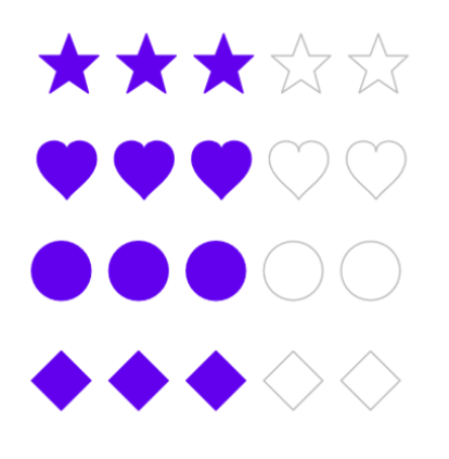
The star is the default shape, but the other shapes can be chosen to provide a more unique rating UI control.
Custom shapes of .NET MAUI Rating control
The custom shapes feature allows developers to apply their desired shape as the rating UI. To use this feature, set the RatingShape property to Custom and assign the custom path to the Path property of the .NET MAUI Rating control.
Refer to the following code example for the custom shape Bell.
<rating:SfRating x:Name="rating" RatingShape="Custom" Path="M17.5 35.5C19.9063 35.5 21.875 33.8846 21.875 31.9103H13.125C13.125 33.8846 15.0719 35.5 17.5 35.5ZM30.625 24.7308V15.7564C30.625 10.2462 27.0375 5.63334 20.7812 4.41282V3.19231C20.7812 1.70256 19.3156 0.5 17.5 0.5C15.6844 0.5 14.2188 1.70256 14.2188 3.19231V4.41282C7.94063 5.63334 4.375 10.2282 4.375 15.7564V24.7308L0 28.3205V30.1154H35V28.3205L30.625 24.7308Z"/>
Refer to the following output image.

100 custom shape paths for .NET MAUI Rating control
Refer to the following code for the 100 custom shape paths. Use them to integrate more interesting shapes into the .NET MAUI Rating control.
1. Bell
<rating:SfRating Path="M17.5 35.5C19.9063 35.5 21.875 33.8846 21.875 31.9103H13.125C13.125 33.8846 15.0719 35.5 17.5 35.5ZM30.625 24.7308V15.7564C30.625 10.2462 27.0375 5.63334 20.7812 4.41282V3.19231C20.7812 1.70256 19.3156 0.5 17.5 0.5C15.6844 0.5 14.2188 1.70256 14.2188 3.19231V4.41282C7.94063 5.63334 4.375 10.2282 4.375 15.7564V24.7308L0 28.3205V30.1154H35V28.3205L30.625 24.7308Z"/>
2. Flag
<rating:SfRating Path="M13.600255,0C13.900248,1.2000122 16.30025,4.6000366 19.20032,6.7000122 22.300347,9 27.20045,10.600037 27.100473,16.200012 27.000434,25.600037 18.100328,27.600037 14.300218,21L14.20024,20.900024 14.300218,21.300049C15.90028,30.200012,23.600417,32,23.600417,32L3.6000639,32C11.200193,30,12.800224,24.200012,13.000209,20.800049L13.000209,20.600037C9.1001521,27.900024 0.10000761,25.600037 0,16 -1.0474832E-07,10.5 4.7000877,8.8000488 7.9001514,6.5 11.100185,4.5 13.300202,1.2000122 13.600255,0z"/>
3. Spade
<rating:SfRating Path="M13.600255,0C13.900248,1.2000122 16.30025,4.6000366 19.20032,6.7000122 22.300347,9 27.20045,10.600037 27.100473,16.200012 27.000434,25.600037 18.100328,27.600037 14.300218,21L14.20024,20.900024 14.300218,21.300049C15.90028,30.200012,23.600417,32,23.600417,32L3.6000639,32C11.200193,30,12.800224,24.200012,13.000209,20.800049L13.000209,20.600037C9.1001521,27.900024 0.10000761,25.600037 0,16 -1.0474832E-07,10.5 4.7000877,8.8000488 7.9001514,6.5 11.100185,4.5 13.300202,1.2000122 13.600255,0z"/>
4. Clover
<rating:SfRating Path="M16.499985,0C19.999982,0 22.799979,2.7999992 22.799979,6.1999998 22.799979,9.0999994 20.799981,11.5 18.099983,12.2L18.099983,15.6 20.199982,15.6C21.29998,13.7 23.299978,12.4 25.699976,12.4 29.199973,12.4 31.99997,15.2 31.99997,18.6 31.99997,22 29.199973,24.8 25.699976,24.8 23.099979,24.8 20.899981,23.3 19.899982,21.1L18.099983,21.1 18.099983,27 21.299981,30.3C21.39998,30.400001 21.49998,30.6 21.39998,30.8 21.19998,31.000001 21.099981,31.1 20.999981,31.1L11.39999,31.1C11.19999,31.1 11.09999,31.000001 10.99999,30.8 10.89999,30.6 10.99999,30.500001 11.09999,30.3L14.299987,27 14.299987,21.1 12.099989,21.1C11.09999,23.3 8.899992,24.8 6.2999954,24.8 2.7999973,24.8 0,22 0,18.6 0,15.2 2.7999973,12.4 6.2999954,12.4 8.6999922,12.4 10.69999,13.7 11.79999,15.6L14.299987,15.6 14.299987,12C11.899989,11.099999 10.099991,8.8999996 10.099991,6.1999998 10.099991,2.7999992 12.999989,0 16.499985,0z"/>
5. Box
<rating:SfRating Path="M32,7.199995L32,22.6 17.699982,28.900001 17.699982,13.499996z M0,6.9000072L14.299988,13.199993 14.299988,28.599998 0,22.299997z M15.799988,0L28.600006,5.4000077 16.100006,10.8 2.7999878,5.1000046z"/>
6. Cloud
<rating:SfRating Path="M16.057999,0C19.938004,1.2542023E-07 23.380997,2.294006 24.832001,5.7030019 25.012009,6.126006 25.421005,6.4270009 25.900009,6.5299977 29.384003,7.2799977 32,10.303007 32,13.912992 32,18.084988 28.512009,21.479 24.220001,21.479L5.697998,21.479C2.5550003,21.479 0,18.989986 0,15.936002 0,12.877989 2.5550003,10.39401 5.697998,10.39401 5.7389984,10.39401 5.7789993,10.39401 5.8199997,10.394987 6.2430038,10.406004 6.598999,10.093992 6.5740051,9.7049845 6.5650024,9.5490092 6.5600052,9.3930043 6.5600052,9.2369984 6.5600052,4.1430048 10.820999,1.2542023E-07 16.057999,0z"/>
7. Shield
<rating:SfRating Path="M12.678023,5.8000488C12.678023,5.8000488 17.477961,8.7000122 20.577904,8.2000122 20.577904,8.2000122 22.67792,22.600037 12.678023,26.600037 2.6781254,22.600037 4.7780793,8.2000122 4.7780793,8.2000122 7.878023,8.8000488 12.678023,5.8000488 12.678023,5.8000488z M12.678023,2.1000366C12.678023,2.1000366 6.1780894,6 2.0780948,5.3000488 2.0780948,5.3000488 -0.82183857,24.600037 12.678023,30 26.177883,24.700012 23.277888,5.4000244 23.277888,5.4000244 19.177956,6.1000366 12.678023,2.1000366 12.678023,2.1000366z M12.678023,0L13.577977,0.60003662C14.977987,1.4000244 19.27793,3.6000366 22.177923,3.6000366 22.477909,3.6000366 22.67792,3.6000366 22.977904,3.5L24.777872,3.2000122 25.077858,5C25.177893,5.8000488,27.977852,25.800049,13.377966,31.600037L12.678023,32 11.978017,31.700012C-2.6218688,25.900024,0.17815109,5.9000244,0.27812545,5.1000366L0.57811038,3.3000488 2.3780797,3.6000366C2.5780898,3.6000366 2.8780745,3.7000122 3.1781204,3.7000122 6.0780538,3.7000122 10.377997,1.5 11.778007,0.70001221z"/>
8. Check mark
<rating:SfRating Path="M28.805753,0L31.974733,0C32.167724,0.27001924 31.208732,0.60900805 30.678737,0.9630113 22.839801,6.2050091 16.330854,13.03398 10.513902,19.745 6.9349381,16.519997 3.7629682,13.021987 0,9.9210077 0.63698797,9.253986 1.4519834,8.7079969 2.4479772,8.2830092 4.1869603,9.2220036 5.6669437,10.081988 7.7689305,11.090989 8.0639258,11.23201 10.055913,12.143997 10.22591,12.136001 10.603912,12.115982 11.617896,10.918992 12.2419,10.401994 16.76185,6.6610023 23.254806,2.4390226 28.805753,0z"/>
9. Close
<rating:SfRating Path="M2.999979,0C3.8000264,0,4.4999763,0.30000305,5.1000115,0.90000927L15.999954,11.700012 26.899959,0.90000927C28.099967,-0.29998779 29.999927,-0.29998779 31.099961,0.90000927 32.299972,2.1000061 32.299972,4 31.099961,5.1000061L20.199958,16 31.099961,26.900009C32.299972,28.100006 32.299972,30 31.099961,31.100006 29.899951,32.300003 27.999931,32.300003 26.899959,31.100006L15.999954,20.200012 5.1000115,31.100006C3.9000017,32.300003 1.9999809,32.300003 0.90000743,31.100006 -0.30000248,29.900009 -0.30000248,28 0.90000743,26.900009L11.800011,16 0.90000743,5.1000061C-0.30000248,3.9000092 -0.30000248,2 0.90000743,0.90000927 1.4999818,0.30000305 2.1999928,0 2.999979,0z"/>
10. Soccer ball
<rating:SfRating Path="M15.9,27.2L12.8,28.4 12.4,30.4C14.8,31,17.4,31,19.7,30.4L19.6,28.3z M22.5,18.6L16.4,22.9 16.4,26.2 20.1,27.3 25.599999,23.4 25.4,19.6z M9.6999998,18.5L6.3999996,19.6 6.5,23.599999 12.2,27.5 15.3,26.3 15.3,22.9z M3,16.7L1.1999998,16.9C1.3999996,19.6,2.1999998,22.1,3.6999998,24.3L5.3999996,23.5 5.3000002,19.4z M29,16.1L26.5,19.4 26.7,23.3 28.4,24.4C30,22.1,30.9,19.4,31,16.6z M9.3999996,8.2999997L5.7999997,9.4000001 3.8000002,16 6,18.6 9.3999996,17.4 11.8,10.6z M22.3,7.7999997L20.4,10.5 22.9,17.5 25.7,18.5 28.099999,15.3 25.9,8.6999998z M19.4,4.3000002L12.5,4.3999996 10.3,7.6999998 12.6,10 19.6,10 21.5,7.2999997z M10.7,2.0999994C8.1999998,3.0999994,6,4.6999998,4.3000002,6.9000001L5.5999994,8.4000001 9.1999998,7.2999997 11.4,4z M21.2,2L20.2,3.5999994 22.4,6.6999998 26,7.6999998 27.5,6.5C25.8,4.5,23.7,3,21.2,2z M16,0C24.8,0 32,7.1999998 32,16 32,24.8 24.8,32 16,32 7.1999998,32 0,24.8 0,16 0,7.1999998 7.1999998,0 16,0z"/>
11. USD
<rating:SfRating Path="M12.61799,18.807996L12.61799,24.108986C14.800975,23.853981 15.893993,23.018991 15.893993,21.60798 15.893993,20.462993 14.800975,19.533001 12.61799,18.807996z M9.2749698,7.3460013C7.1519825,7.6410143 6.0919845,8.486015 6.0919845,9.8870141 6.0919845,11.086995 7.1519825,12.086994 9.2749698,12.892016z M9.2749698,0L12.61799,0 12.61799,3.1800203C15.839,3.3010222,18.245009,3.6960108,19.831984,4.3709981L19.831984,9.0959994C17.695019,8.1060101,15.291027,7.4959952,12.61799,7.275994L12.61799,13.906999C15.961986,14.831986 18.359023,15.882003 19.808974,17.068008 21.258988,18.253004 21.985001,19.682995 21.985001,21.362985 21.985001,23.29899 21.177018,24.859016 19.558974,26.044012 17.938977,27.229009 15.627025,27.948978 12.61799,28.203983L12.61799,32 9.2749698,32 9.2749698,28.308963C6.1749923,28.299015,3.291018,27.763981,0.61798145,26.69898L0.61798145,21.853006C1.5039684,22.402994 2.8250143,22.909006 4.5799596,23.379005 6.336003,23.844001 7.9010069,24.108986 9.2749698,24.178993L9.2749698,17.813001C5.7019693,16.797989 3.2639794,15.697007 1.9580092,14.51201 0.65197809,13.327014 7.8710173E-08,11.887012 0,10.181997 7.8710173E-08,8.3510053 0.84698553,6.7910091 2.541994,5.501002 4.2370026,4.2110249 6.4809615,3.4610257 9.2749698,3.2510037z"/>
12. Euro
<rating:SfRating Path="M22.92401,0C26.382994,0,29.291014,0.56800086,31.650999,1.709999L30.535002,5.6339994C28.269011,4.2140012 25.693999,3.5029987 22.81201,3.5029989 19.690001,3.5029987 17.067015,4.0740019 14.949004,5.2130018 13.68399,5.8899999 12.537994,6.843999 11.519988,8.0830007 10.475005,9.3639999 9.863006,10.583002 9.6749872,11.735002L28.699004,11.735002 27.943999,14.564001 9.2300103,14.564001C9.2109979,14.859003 9.2040094,15.141 9.2040094,15.408002 9.2040094,16.491003 9.2109979,17.138002 9.2300103,17.352003L27.187987,17.352003 26.408995,20.179002 9.817016,20.179002C10.597991,23.402004 12.475005,25.689003 15.450012,27.040004 17.588011,28.010002 19.902006,28.497005 22.390013,28.497005 25.869994,28.497005 28.587004,27.806003 30.535002,26.427002L30.535002,30.775001C28.213011,31.592002 25.647002,32 22.837004,32 14.434997,32 8.7569879,29.355003 5.8020018,24.063003 5.2070006,22.994003 4.692993,21.701004 4.2669981,20.179002L0,20.179002 0.77999879,17.352003 3.7120055,17.352003C3.6520081,16.761003 3.623993,16.12 3.6239928,15.429002 3.623993,15.148 3.6329957,14.859003 3.6520079,14.564001L0,14.564001 0.77999879,11.735002 4.0150145,11.735002C5.1679991,7.1479998 8.1719964,3.8550001 13.022003,1.8569984 16.016997,0.61899955 19.317015,0 22.92401,0z"/>
13. Yen
<rating:SfRating Path="M0,0L6.1860043,0 13.027984,10.141998C14.082,11.81601,14.871978,13.14502,15.660979,14.622009L15.858977,14.622009C16.515989,13.243011,17.371977,11.71701,18.489988,10.042999L25.596983,0 31.650999,0 19.871977,14.917023 28.427,14.917023 28.427,17.32901 18.161986,17.32901 18.161986,20.923004 28.427,20.923004 28.427,23.335999 18.161986,23.335999 18.161986,32 12.699981,32 12.699981,23.335999 2.4999994,23.335999 2.4999994,20.923004 12.699981,20.923004 12.699981,17.32901 2.4999994,17.32901 2.4999994,14.917023 11.121001,14.917023z"/>
14. Indian rupee
<rating:SfRating Path="M0.18400574,0L22.001011,0C22.125004,0.014984131,22.185001,0.074981689,22.185001,0.17498779L22.185001,2.1300049C22.185001,2.2449951,22.125004,2.2999878,22.001011,2.2999878L13.791002,2.2999878 13.791002,2.4750061C14.960008,3.0700073,15.867998,4.2850037,16.51201,6.1199951L16.604997,6.75 22.001011,6.75C22.125004,6.7649841,22.185001,6.8200073,22.185001,6.9199829L22.185001,8.875C22.185001,8.9899902,22.125004,9.0499878,22.001011,9.0499878L16.811998,9.0499878C16.811998,11.234985 15.390001,13.359985 12.546999,15.424988 10.024004,16.785004 8.2330025,17.464996 7.1719979,17.464996 7.1719979,17.524994 7.1110085,17.554993 6.9889992,17.554993L18.703005,31.829987 18.703005,32 14.253008,32C14.207002,32,9.6780108,26.475006,0.66999815,15.424988L0.66999815,15.339996 2.0760046,15.339996C7.0570076,15.339996 10.046999,13.654999 11.046999,10.285004 11.108003,9.8800049 11.139009,9.5549927 11.139009,9.3099976L11.139009,9.0499878 0.18400574,9.0499878C0.061996609,9.0499878,1.41692E-07,8.9899902,0,8.875L0,6.9199829C0.014999533,6.8049927,0.076995998,6.75,0.18400574,6.75L11.046999,6.75C10.678011,5.4349976 9.8930071,4.3649902 8.6940011,3.539978 7.0339974,2.7149963 5.5209969,2.2999878 4.1510018,2.2999878L0.18400574,2.2999878C0.061996609,2.2999878,1.41692E-07,2.2449951,0,2.1300049L0,0.17498779C0.014999533,0.059997559,0.076995998,0,0.18400574,0z"/>
15. Apple
<rating:SfRating Path="M18.981716,6.9006311C21.064487,6.9021536 26.552768,7.7438399 27.163088,14.461067 27.919075,22.765093 23.76407,27.995129 23.76407,27.995129 23.76407,27.995129 19.962034,33.684151 14.43397,31.501158 14.161996,31.395138 13.889959,31.275143 13.608951,31.126156 13.21698,31.274136 12.846982,31.39114 12.479974,31.486143 6.4149177,33.052158 3.5708988,27.995129 3.5708988,27.995129 3.5708988,27.995129 -0.51214518,22.765093 0.053838927,14.461067 0.5118507,7.7310244 5.9769256,6.901034 8.2139451,6.901034 8.3629329,6.901034 8.4979436,6.9040247 8.6159265,6.9100367 9.9569414,6.9780303 11.006939,7.4240466 12.339958,7.8140327L12.339958,11.091056C11.673937,10.891043 11.268965,10.607045 10.886943,10.224048 10.733926,10.071032 10.34696,10.083056 10.193943,10.237048 10.040927,10.391041 10.040927,10.662038 10.193943,10.817038 10.764931,11.388055 11.454941,11.846065 12.207938,12.070065 12.275931,12.128049 12.361931,12.262052 12.458977,12.262052L12.578974,12.262052C12.908932,12.262052 13.247986,12.371061 13.59296,12.371061 13.938971,12.371061 14.277963,12.262052 14.606946,12.262052L14.727979,12.262052C14.823989,12.262052 14.903946,12.128049 14.970962,12.070065 15.72396,11.846065 16.407011,11.339044 16.978975,10.768057 17.131016,10.613057 17.116977,10.366047 16.964998,10.212054 16.809969,10.058062 16.533964,10.058062 16.379972,10.212054 15.996973,10.595052 15.673972,10.891043 15.006974,11.090049L15.006974,7.5920469C16.339994,7.2850386 17.147007,6.9920379 18.613024,6.9100367 18.719148,6.9041621 18.842865,6.9005295 18.981716,6.9006311z M21.498058,1.9750153C23.040064,1.9830111,24.443031,2.4320184,25.191084,2.7219981L14.789992,6.8820216C15.31197,5.7750212 16.678985,3.3530129 19.035024,2.410015 19.843992,2.0870155 20.690008,1.9700106 21.498058,1.9750153z M14.339976,0L14.339976,11.595057 13.006956,11.595057 13.006956,0.42599709 13.006956,0.26199473 14.203988,0.26199473C14.248972,0.26199467,14.339976,0.0069885586,14.339976,0z M13.006956,0L13.006956,0.26199473 12.981931,0.26199473C12.936949,0.26199467,13.006956,0.0069885586,13.006956,0z"/>
16. Man
<rating:SfRating Path="M14.345001,0C14.345001,0.099975586 14.746002,0 15.348,0 16.451004,0 18.156998,0.20098877 18.959,1.4039917 18.959,1.4039917 26.181999,2.2070007 21.969002,9.8309937 21.969002,9.8309937 22.972,9.9309998 22.570999,11.033997 22.570999,11.033997 22.168999,13.140991 21.567001,13.441986 21.567001,13.441986 21.567001,16.450989 19.560997,18.759003L19.560997,18.858978C20.063004,21.968994 25.278999,23.171997 25.278999,23.171997 28.790001,24.074982 32,25.980988 32,25.980988L32,29.391998 0,29.391998 0,25.078003C0.099998474,24.677002 5.4169998,22.971985 5.4169998,22.971985 8.125,22.269989 9.2290039,21.667999 9.2290039,21.667999 9.2290039,21.46698 9.7300034,21.165985 9.7300034,21.165985 10.933998,20.965973 11.536003,19.460999 11.737,18.65799 11.536003,18.457977 10.132004,16.651978 10.030998,13.240997 10.030998,13.240997 9.5299988,13.040985 9.0279999,10.432983 9.0279999,10.432983 8.9280014,9.6299744 9.8310013,9.5299988 9.8310013,9.5299988 8.6269989,5.617981 9.5299988,3.2099915 9.5299988,3.2099915 10.933998,0.60198975 14.345001,0z"/>
17. Woman
<rating:SfRating Path="M14.2,0C15.3,0 16.1,0.19999981 16.1,0.19999981 21.9,-0.40000057 22.9,9.7999998 22.9,9.7999997 22.9,10.5 25,17 25,17 25.8,18.5 23.5,18.7 23.5,18.7 24.3,19.9 21.2,20.599999 20.2,20.8L20.1,20.8C21.099999,24 27.7,25.7 27.7,25.7 30.299999,26.3 32,28.7 32,28.7L32,30.999999 0,30.999999 0,27.499999C1.3000002,25.999999 3.1999998,25.7 3.1999998,25.7 9,24.2 10.5,21.8 10.9,20.8 9.9999998,20.8 8.6999998,20.3 8.6999998,20.3 6.6999998,19.4 7,18.599999 7,18.599999 7.2999997,18.5 7.3999996,18.2 7.3999996,18.2 6.6999998,18.3 6.1999998,18.099999 6.1999998,18.099999 4.8999996,17.7 5.6999998,16.4 5.6999998,16.4 7.5999999,11.7 7.7999997,8.7999998 7.7999997,8.7999997 7.8999996,6.2999997 8.2999997,4.5999999 8.2999997,4.5999999 9.5999999,0.80000019 12.4,0 14.2,0z"/>
18. Airplane
<rating:SfRating Path="M30.299999,0L29.700008,2.7000046C29.700008,2.8000031,29.700008,2.9000015,29.600002,3.0999985L29.600002,3.2000046C29.500012,3.4000015,29.299999,3.7000046,29.000012,4L21.700007,11.800003 25.900005,29 23.1,32 16.1,17.599998 10.6,23.5 11.1,28 9.0000011,30.300003 6.5000006,25.099998 1.7000046,22.400002 3.9000021,20.099998 8.2000056,20.700005 13.700006,14.800003 0,7.2000046 2.7000047,4.3000031 19.1,8.9000015 26.299999,1.2000046C26.600002,0.90000153,26.900005,0.70000458,27.200008,0.59999847L27.299999,0.59999847 27.600002,0.59999847z"/>
19. Leaf
<rating:SfRating Path="M3.0263408,0C7.2224015,5.0950343 18.711398,2.8970153 25.605466,11.989112 31.699485,20.081168 22.508409,25.176217 20.010414,24.877234 28.003425,29.672261 30.101455,28.673259 31.20046,28.973281 32.598476,29.372271 32.099449,31.271275 30.200456,31.071292 27.403447,30.571288 21.109416,26.975245 19.411413,25.776229 17.812408,24.67722 10.119385,19.382186 5.6243728,9.7910926 8.9204057,20.68118 16.314416,26.275225 17.413419,27.174252 16.713405,28.074254 15.314412,29.372271 12.01838,29.872275 5.1243709,30.871278 -5.1656462,22.879199 3.0263408,0z"/>
20. Flower
<rating:SfRating Path="M11.664001,10.46701C11.863007,10.966003 12.063019,11.463989 12.162018,11.963013 10.867004,13.058989 10.069,14.753997 10.069,16.548004 10.069,17.046997 10.169006,17.445007 10.268005,17.843994 9.8699951,18.143005 9.4710083,18.441986 8.9720154,18.740997 9.3710022,18.641998 9.6700134,18.641998 10.069,18.641998L10.567017,18.641998C11.365021,20.834989 13.359009,22.429991 15.851013,22.529997 16.000504,22.878492 16.10025,23.252241 16.162624,23.638491L16.189045,23.831411 16.259726,23.550848C16.338678,23.266422 16.436882,22.990751 16.549011,22.729002 18.84201,22.529997 20.736023,21.033995 21.53302,18.841003 21.733002,18.841003 22.032013,18.740997 22.231018,18.740997 22.529999,18.740997 22.729004,18.740997 23.029022,18.841003 22.630005,18.641998 22.131012,18.342987 21.832001,17.944 21.932007,17.545013 22.032013,17.046997 22.032013,16.64801 22.032013,14.753997 21.234009,13.158996 19.838013,12.062012 19.938019,11.664001 20.037994,11.36499 20.138,10.966003 19.838013,11.165008 19.539001,11.463989 19.240021,11.563995 18.343018,10.966003 17.147003,10.566986 15.951019,10.566986 14.753998,10.566986 13.757019,10.865997 12.860016,11.463989 12.462006,11.165008 12.063019,10.865997 11.664001,10.46701z M16.149994,0C19.539001,1.2808141E-07 22.330994,2.790985 22.330994,6.2799987 22.330994,7.0780028 22.131012,7.8749999 21.832001,8.5729979 22.929016,7.5759886 24.324005,6.9779967 25.820007,6.9779967 29.209015,6.9779967 32,9.7690123 32,13.259002 32,16.747986 29.209015,19.539001 25.820007,19.539001 25.520996,19.539001 25.321014,19.539001 25.022003,19.438995 27.016022,20.436003 28.412018,22.529997 28.412018,25.022001 28.412018,28.510984 25.619995,31.302 22.231018,31.302 19.265636,31.302 16.757345,29.165129 16.176605,26.293566L16.132391,26.043009 16.123413,26.093893C15.542673,28.966146 13.034382,31.102995 10.069,31.102995 6.6800232,31.102995 3.8880005,28.31201 3.8880005,24.821989 3.8880005,22.329985 5.2839966,20.236999 7.2780151,19.23999 6.9790039,19.339996 6.5800171,19.339996 6.1809998,19.339996 2.7920227,19.339996 0,16.548004 0,13.058989 0,9.5700072 2.7920227,6.7789916 6.1809998,6.7789916 7.9760132,6.7789916 9.4710083,7.5759886 10.667023,8.7730101 10.268005,8.1740111 10.069,7.2770079 10.069,6.2799987 10.069,2.790985 12.761017,1.2808141E-07 16.149994,0z"/>
21. Tree
<rating:SfRating Path="M14.700006,14.2L16.900006,16.9 15.900006,23.400001 18.700007,20 20.100008,21.2C20.100008,21.2,15.200006,27.300001,17.500007,28.900001L22.600008,30.400001 22.600008,32 7.3000021,32C7.3000021,32 9.2000031,29.900001 12.200005,29.1 12.300004,29.1 13.200005,16.6 14.700006,14.2z M14.300005,0C18.300007,0,21.600008,2.1000004,22.800009,5.1000003L22.800009,5.2000002 23.000009,5.2000002 23.200009,5.2000002C27.40001,5.2000002 30.800012,8.6000003 30.800012,12.8 30.800012,15.9 29.000011,18.6 26.30001,19.800001L26.20001,19.800001 26.30001,20C26.40001,20.4 26.40001,20.800001 26.40001,21.2 26.40001,23.800001 24.300009,25.900001 21.700008,25.900001 20.700008,25.900001 19.800007,25.6 19.000007,25L19.100007,24.900001C20.100008,23.1,21.300008,21,21.300008,21L18.700007,18.5 17.900007,19.6 18.100007,16.5 14.300005,11.5 14.000005,12.1C14.100005,13.3,12.200005,20.7,12.200005,20.7L10.700004,18.6 10.100004,19.800001 11.100004,21.9 11.100004,25C10.500004,25.2 9.9000034,25.400001 9.2000031,25.400001 6.5000019,25.400001 4.4000015,23.2 4.4000015,20.6L4.4000015,20.1 4.3000011,20.1C1.9000006,19.6 0,17.2 0,14.2 0,11 2.3000002,8.4000002 5.1000013,8.4000005L5.4000015,8.4000005 5.5000019,8.4000005C5.5000019,8.0000002 5.4000015,7.6000002 5.4000015,7.2000002 5.4000015,3.2000003 9.4000034,0 14.300005,0z"/>
22. Lion
<rating:SfRating Path="M23.277061,17.54599L23.878068,18.048004 25.081056,21.256012 26.686019,21.757996 27.187051,23.462006 24.179029,23.462006 23.678058,21.757996C23.477071,21.355988,22.274081,21.256012,22.274081,21.256012L21.97306,20.45401z M6.0312867,15.23999C6.0312867,15.742005,7.3342505,18.549011,7.3342505,18.549011L6.2322731,21.656983 8.2372551,21.958008 8.738226,23.763001 4.6272502,23.763001C4.3272658,23.260987,4.1262794,19.85199,4.1262794,19.85199z M6.6332698,7.9209902L5.9312511,8.9240114C4.9282723,9.023987 3.0233257,10.026001 3.0233257,10.026001 1.3193046,11.028992 0.71732172,14.238007 0.61734738,14.639008L0.71732148,14.639008C1.3193046,15.040009 1.5193144,16.243012 1.5193144,16.243012 1.5193144,17.647003 0.91830816,18.449005 0.91830828,18.449005 0.71732172,18.347992 0.21635088,17.346008 0.21635092,17.346008 -0.28565753,15.842011 0.21635088,14.938996 0.4162996,14.639008L0.4162996,14.537995C0.41629975,13.635987 1.1183181,11.730988 1.118318,11.730988 2.3213072,8.3219912 6.6332698,7.9209902 6.6332698,7.9209902z M28.790975,4.9129946C28.691001,5.2139894 29.091996,5.6149904 29.091996,5.6149904 29.39302,5.8150026 29.492993,5.5149843 29.492993,5.5149843 29.492993,5.2139894 28.790975,4.9129946 28.790975,4.9129946z M25.783013,2.3059999C25.382018,2.3059999 25.081056,2.7070009 25.081056,2.7070007 24.781072,3.5090029 25.282043,4.0109865 25.282043,4.0109865 25.282043,3.8099977 25.382018,3.208008 25.382018,3.208008 25.68304,2.2059938 26.786054,3.0079958 26.786054,3.007996L26.285022,2.5069887C26.184011,2.4060061,25.984061,2.3059999,25.783013,2.3059999z M24.179029,0L27.087014,0.40100126 29.091996,0.20098914 30.394961,2.105988C30.195012,2.0050051 28.490014,2.3059999 28.490014,2.3059999 28.891011,2.6069948 30.294986,2.7070009 30.294986,2.7070007L29.292983,3.6099855C29.993964,4.0109865 30.495973,5.2139894 30.495973,5.2139894 30.195012,6.6170046 31.999984,7.2189943 31.999984,7.2189943 31.096978,9.1239931 30.094975,9.3250124 30.094975,9.3250124 27.989043,10.126984 25.482053,7.3190004 25.482053,7.3190004 25.382018,8.5230104 28.490014,9.7259829 28.490014,9.7259829 28.290004,10.727997 25.182069,16.041992 25.182069,16.041992 25.282043,15.842011 24.981021,14.337982 24.981021,14.337982 24.781072,14.537995 24.580024,16.544007 24.580024,16.544007 24.079053,16.845001 23.778031,15.23999 23.778031,15.23999L23.377036,16.143006C22.9761,15.742005 21.372115,9.9259951 21.372115,9.9259951 21.271102,14.238007 23.176049,16.845001 23.176049,16.845001L23.076074,16.845001 23.076074,17.144989 21.372115,21.656983C21.372115,21.656983,23.277061,21.858002,23.377036,21.958008L23.978042,23.662995 19.667117,23.662995 19.166085,19.953003 19.767091,17.144989C19.767091,17.144989 19.366096,16.342987 18.163106,16.342987 18.163106,16.342987 13.150163,15.941986 11.646213,15.341004 11.646213,15.341004 14.153142,11.631012 13.651195,10.126984 13.651195,10.126984 11.646213,15.139984 9.7412052,17.144989L11.145181,21.457001 12.949177,21.958008 13.451184,23.662995 9.0392475,23.662995C9.0392475,23.662995 6.4322829,15.23999 6.3322478,14.537995 6.3322478,14.537995 5.3292685,9.023987 7.1342406,7.8209841 7.1342406,7.8209841 10.342212,6.7179873 17.762109,7.5199892L18.163106,7.5199892C18.664138,7.7200014,19.366096,6.0159914,19.366096,6.0159914L20.269099,2.9079895 21.171067,2.3059999z"/>
23. Elephant
<rating:SfRating Path="M7.5990569,21.292C7.5990569,21.292,9.0990689,21.592003,9.4990351,21.592003L10.198076,25.29101 6.3990357,25.991007C6.3990357,25.891,6.3990357,21.992012,7.5990569,21.292z M24.397159,11.696004C24.197145,11.696004,23.897155,11.795994,23.497127,12.095998L23.397151,12.095998C23.697141,12.396001,24.197145,13.095006,25.197152,13.495L25.297191,13.495C25.197152,12.895009 24.997138,12.295994 24.697149,11.696004 24.697149,11.795994 24.597173,11.696004 24.397159,11.696004z M22.097154,3.6990065C21.59715,3.6990065 21.29716,4.0990006 21.29716,4.4980027 21.29716,4.8979966 21.697126,5.2980063 22.097154,5.2980063 22.597158,5.2980063 22.897147,4.8979966 22.897147,4.4980027 22.897147,4.0990006 22.597158,3.6990065 22.097154,3.6990065z M14.398059,0L14.69811,0C15.398067,4.938272E-08 17.698133,0.099990928 19.497096,1.0999913 20.397128,0.5999911 23.197137,-0.40000926 25.697156,2.3990032 25.697156,2.399003 28.396213,5.097994 28.596166,11.996007L28.596166,14.095007C29.09617,14.095007 29.596174,13.995001 30.196214,13.89501 30.196214,13.89501 32.096193,13.194997 31.996215,13.89501 31.996215,13.89501 30.396228,15.594 28.696202,15.894003L28.596166,15.894003 28.596166,24.891C28.596166,24.891 29.39622,26.391 28.896217,26.590006 28.896217,26.590006 27.396205,27.390009 26.297199,26.989999 26.297199,26.989999 25.297191,26.790003 25.497142,25.691004 25.497142,25.691004 25.697156,18.094001 25.497142,15.894003 24.397159,15.694006 23.097162,15.295004 21.997115,14.39501L21.997115,14.595007C21.497112,16.594 20.897132,20.193001 20.697118,26.790003 20.697118,26.790003 15.798094,27.390009 15.798094,26.590006L15.798094,19.59301C15.798094,19.59301 11.398036,21.092003 8.0990612,20.09301 8.0990612,20.09301 6.5990493,19.793007 5.5990417,21.592003 5.5990417,21.592003 4.5990341,23.292001 4.5990341,26.690012 4.5990341,26.690012 0.09997635,26.989999 0,26.690012 0,26.690012 0,20.59301 2.1989913,17.994011 2.1989913,17.994011 1.8000015,16.694006 1.8000012,16.293997 1.8000015,16.293997 1.0000076,18.392997 0.099976149,16.793997 0.09997635,16.793997 1.3999741,11.196004 6.5990493,8.2969996 6.5990493,8.2969996 10.99807,6.4980037 13.598066,6.5979945 13.598066,6.5979945 10.498066,1.1999974 14.398059,0z"/>
24. Monkey
<rating:SfRating Path="M19.175898,17.899994C19.075894,17.899994,18.975898,18,18.875901,18.100006L18.875901,18.200012C18.575902,19.100006 15.475953,27.600006 15.175962,29.399994 14.975961,30.299988 14.775966,31.200012 14.375972,31.600006L15.175962,31.600006C15.475953,31.100006 15.675954,30.399994 15.775951,29.5 16.075942,27.700012 19.47589,18.399994 19.47589,18.299988 19.575887,18.100006 19.47589,18 19.275895,17.899994z M5.6761135,17.700012C5.4761117,17.799988 5.4761117,17.899994 5.4761117,18.100006 5.4761117,18.200012 8.4760645,27.5 8.7760628,29.399994 8.8760594,30.299988 9.0760535,31 9.3760518,31.5L10.076037,31.5C9.67605,31.100006 9.4760483,30.200012 9.3760518,29.299988 9.0760535,27.5 6.376099,18.899994 6.0761007,18L6.0761007,17.899994C6.0761007,17.799988,5.9761041,17.799988,5.77611,17.700012z M9.67605,17.399994C9.4760483,17.399994,9.3760518,17.600006,9.3760518,17.700012L11.876012,29.899994C11.876012,29.899994 12.17601,30.799988 11.876012,31.299988 11.876012,31.399994 11.776015,31.5 11.676018,31.5L12.975993,31.5C12.875995,31.399994 12.775999,31.299988 12.676002,31.200012 12.575997,31.100006 12.575997,31 12.575997,30.899994L12.575997,30.700012 12.575997,30.399994C12.575997,30.100006,12.676002,29.899994,12.676002,29.899994L15.375955,17.899994C15.375955,17.700012 15.275959,17.600006 15.175962,17.5 14.975961,17.5 14.875964,17.600006 14.775966,17.700012 14.775966,17.700012 12.875995,26.200012 12.276007,28.899994 11.676018,26.100006 9.9760407,17.700012 9.9760407,17.700012 9.8760432,17.5 9.7760466,17.399994 9.67605,17.399994z M17.575917,8.5C18.675906,9.2999878 21.175866,11.899994 20.475873,18.200012 20.475873,18.200012 21.875851,17.200012 23.575822,18 25.175803,18.799988 25.575791,21.299988 24.275815,23.700012L21.675858,29.899994C21.675858,29.899994 22.175851,30 22.675843,30.200012 23.275832,30.399994 23.875821,30.700012 23.875821,31.399994 23.875821,31.399994 23.875821,32 22.875836,32L21.475858,32 3.176153,32 2.1761688,32C1.1761849,32 1.1761849,31.399994 1.1761851,31.399994 1.0761804,30.799988 1.7761738,30.5 2.3761629,30.200012 2.8761547,30 3.3761469,29.899994 3.3761466,29.899994L0.77618971,23.700012C-0.5237926,21.299988 -0.12379746,18.700012 1.4761758,18 3.176153,17.200012 4.5761245,18.200012 4.5761245,18.200012 3.776142,12 6.1761053,9.3999939 7.2760862,8.6000061 7.9760722,10.299988 9.4760483,12.100006 12.476001,12.100006 15.57595,12 16.975928,10.100006 17.575917,8.5z M12.975993,8C13.175994,8 13.275991,8.1000061 13.275991,8.2999878 13.275991,8.5 13.175994,8.6000061 12.975993,8.6000061 12.775999,8.6000061 12.676002,8.5 12.676002,8.2999878 12.575997,8.1000061 12.775999,8 12.975993,8z M11.876012,8C12.076006,8 12.17601,8.1000061 12.17601,8.2999878 12.17601,8.5 12.076006,8.6000061 11.876012,8.6000061 11.676018,8.6000061 11.576013,8.5 11.576013,8.2999878 11.476017,8.1000061 11.676018,8 11.876012,8z M13.975977,4.5C14.275975,4.5 14.575966,4.7999878 14.575966,5.1000061 14.575966,5.3999939 14.275975,5.7000122 13.975977,5.7000122 13.675986,5.7000122 13.375988,5.3999939 13.375988,5.1000061 13.375988,4.7999878 13.675986,4.5 13.975977,4.5z M10.976024,4.5C11.276023,4.5 11.576013,4.7999878 11.576013,5.1000061 11.576013,5.3999939 11.276023,5.7000122 10.976024,5.7000122 10.676034,5.7000122 10.376036,5.3999939 10.376036,5.1000061 10.476032,4.7999878 10.676034,4.5 10.976024,4.5z M18.175914,4C18.975898,4.2000122 19.47589,5 19.47589,6 19.47589,7.1000061 18.775903,8 17.875916,8z M6.7760943,4L7.0760849,8C6.1761053,8 5.4761117,7.1000061 5.4761117,6 5.4761117,5 5.9761041,4.2000122 6.7760943,4z M12.476001,0C13.275991,0 15.675954,0 16.875932,2.3999939 17.975913,4.5 17.575917,6.6000061 17.275927,7.6000061 17.275927,7.6000061 16.475938,10.799988 13.775983,11.299988 14.175978,11.100006 14.275975,10.799988 14.375972,10.399994 14.575966,9.7000122 14.175978,9.1000061 14.375972,8.2000122 14.575966,7.3999939 14.775966,7.2999878 15.175962,6.8999939 15.475953,6.6000061 15.775951,6 15.775951,5.2000122 15.775951,2.8999939 13.175994,2.8999939 12.476001,2.8999939 11.776015,2.8999939 9.1760577,2.8999939 9.1760577,5.2000122 9.1760577,6 9.4760483,6.6000061 9.7760466,6.8999939 10.076037,7.2999878 10.376036,7.3999939 10.57603,8.2000122 10.77603,9 10.276039,9.6000061 10.57603,10.399994 10.676034,10.799988 10.876028,11.100006 11.176026,11.299988 9.3760518,10.799988 8.376067,9.5 7.8760751,8.2999878 7.8760751,8.2999878 6.476096,5.2000122 8.0760687,2.5 9.3760518,0.1000061 11.676018,0 12.476001,0z"/>
25. Horse
<rating:SfRating Path="M29.422973,0L28.325977,1.4950104 29.621952,8.1740112C29.721988,9.2709961,28.325977,9.3710022,28.325977,9.3710022L27.628948,9.1710205C27.129919,9.5700073,26.830967,7.9750061,26.830967,7.9750061L25.833946,6.1809998C25.734945,6.1809998 24.936903,5.9810181 24.936903,5.9810181 24.338936,7.4770203 24.936903,9.5700073 24.936903,9.5700073 25.933923,12.959991 25.335954,13.856995 25.335954,13.856995 27.927963,13.757019 29.621952,14.355011 29.621952,14.355011 30.818985,14.653992 30.818985,15.651001 30.818985,15.651001 30.917986,17.744995 30.419994,20.636017 30.419994,20.636017 30.021003,22.429993 28.126939,23.128021 28.126939,23.128021L27.727949,21.333008 28.525991,21.134003C28.525991,20.735016 28.924984,20.237 28.924984,20.237 29.223997,20.136993 29.322998,19.738007 29.322998,19.738007L28.924984,16.947021C28.824945,16.548004 28.525991,16.449005 28.525991,16.449005 28.126939,16.548004 26.730928,16.548004 26.730928,16.548004 25.036941,17.046997 23.540891,16.449005 23.540891,16.449005 23.341915,16.449005 23.0429,17.246002 23.0429,17.246002 22.244919,18.044006 21.148897,24.722992 21.148897,24.722992 20.948883,25.421021 21.447912,25.819 21.447912,25.819 21.846903,26.019012 23.0429,27.414001 23.0429,27.414001L20.948883,27.912994C20.64987,26.71701 20.151878,26.516998 20.151878,26.516998 19.453872,26.317993 19.752885,25.122009 19.752885,25.122009 19.952902,24.722992 20.051901,23.028015 20.051901,23.028015L19.952902,17.246002C17.360832,18.541992 12.973821,18.641998 12.973821,18.641998 13.073798,19.040009 12.874821,22.330017 12.874821,22.330017 12.674806,23.22702 13.173774,23.726013 13.272774,23.826019 13.372812,23.925018 18.357853,28.610992 18.357853,28.610992L15.964821,29.109009 15.565829,28.112C14.867823,28.112 14.568809,27.214996 14.568809,27.214996 13.173774,25.421021 10.581767,24.223999 10.581767,24.223999 9.9837376,24.223999 10.082738,22.928009 10.082738,22.928009 10.182775,20.536011 8.3887498,20.037018 8.3887498,20.037018 8.0897347,21.134003 6.2947327,23.22702 6.2947327,23.22702 5.4977271,24.223999 5.098736,25.321014 5.098736,25.321014 4.7997214,26.019012 4.6996833,29.209015 4.6996833,29.209015 4.6996833,29.807007 4.9986979,30.106018 4.9986979,30.106018 5.2977125,30.404999 6.1957323,31.502014 6.1957323,31.502014L4.2016923,32 4.0016781,31.003021C3.9026779,30.70401 3.7027246,30.70401 3.7027248,30.70401 3.0056955,30.304993 3.40371,29.308014 3.4037103,29.308014L3.5036868,25.720001C3.6037244,25.321014 3.3047098,24.324005 3.3047098,24.324005 3.0056955,23.826019 3.40371,23.22702 3.4037103,23.22702 4.4007303,22.231018 4.2016923,19.140015 4.2016923,19.140015 4.2016923,19.140015 3.9026779,17.046997 3.5036868,16.050018 3.2046723,15.35202 3.9026779,13.657013 4.4007303,12.76001L4.4007303,12.660004C2.5066666,13.657013 2.40669,15.35202 2.40669,15.35202 2.3076898,17.445007 3.3047098,21.234009 3.3047098,21.234009L0.51268754,21.931C-0.88234719,16.248993 1.0116552,14.056 1.0116551,14.056 2.40669,12.561005 3.8027012,12.360992 4.5007068,12.360992L4.5007068,12.261993C6.9927384,10.368011 9.9837376,10.167999 9.9837376,10.167999 14.668786,9.9689941 16.762863,9.0720215 16.762863,9.0720215 18.955881,8.3739929 20.251854,5.6820068 20.251854,5.6820068 20.749906,4.5859985 21.945903,2.9910126 21.945903,2.9910126 23.939943,0.39900208 26.830967,0.89700317 26.830967,0.89700317 27.428934,0.29901123 29.422973,0 29.422973,0z"/>
Refer to the following GIF image.
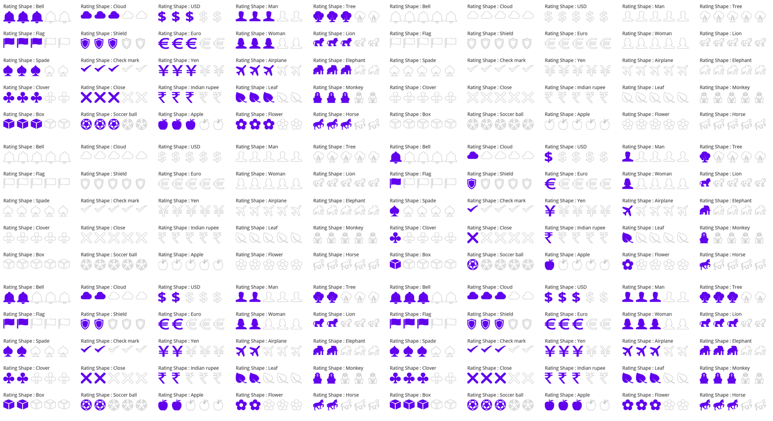
26. Thumbs up
<rating:SfRating Path="M19.399159,0.0002787064C22.20918,0.043278397 22.416182,2.2572923 22.593186,3.777288 22.356185,6.4943102 19.635154,9.1193216 19.635154,9.1193216L17.269137,12.113322C17.269137,12.113322 18.150141,12.074321 20.937167,12.195324 23.150182,12.291332 25.465203,11.97732 28.569232,12.712324 35.60928,15.475336 29.633237,17.410342 29.633237,17.410342 33.479275,19.574353 30.04724,21.877372 30.04724,21.877372 32.474263,25.285376 28.513232,25.994393 28.746236,26.022378 29.515238,26.11439 32.177262,28.279406 27.622218,30.167416 27.622218,30.167416 22.652177,31.872411 19.931161,31.872411 18.156153,32.101416 13.068099,32.148413 9.223067,30.904418 4.6670301,30.305417 3.786026,30.692412 0,31.245423L0.052994262,19.067363C0.052994061,19.067363 2.8330154,18.51435 5.3180363,15.935345 6.3240564,14.830344 7.2110569,12.804334 7.8620631,11.008322 8.4540632,9.9943255 8.2760675,9.533325 11.056089,8.6583212 12.831097,7.8763045 15.612126,6.2633064 16.85414,3.6842852 17.20914,2.5332945 16.707137,-0.030727048 19.399159,0.0002787064z"/>
27. Thumbs down
<rating:SfRating Path="M14.563856,7.4782818E-05C16.901871,-0.0049298852 20.132901,0.24006255 22.776919,1.096056 27.330958,1.6940566 28.21396,1.3080593 32.000003,0.75505637L31.946992,12.932931C31.946992,12.932931 29.166972,13.484928 26.680959,16.063895 25.677945,17.169884 24.789937,19.194872 24.136931,20.991848 23.544932,22.005816 23.722926,22.466839 20.943913,23.34183 19.168889,24.123803 16.386868,25.735785 15.144854,28.313759 14.788864,29.466763 15.292866,32.029723 12.600842,31.999724 9.7908218,31.956725 9.584812,29.74273 9.4048174,28.222758 9.6428106,25.505776 12.361842,22.880806 12.361842,22.880806L14.730864,19.886851C14.730864,19.886851 13.850853,19.925852 11.060821,19.80485 8.8498047,19.708844 6.5337918,20.021859 3.4307621,19.287857 -3.6092879,16.523896 2.3667584,14.589911 2.3667586,14.589911 -1.480273,12.425933 1.9527536,10.122965 1.9527537,10.122965 -0.47326861,6.7149977 3.4857631,6.0060057 3.2527669,5.9769992 2.4817572,5.886012 -0.18026696,3.7210271 4.376777,1.8330474 4.376777,1.8330474 9.3468187,0.12806426 12.068841,0.12806408 12.622845,0.056074086 13.500844,0.0020738221 14.563856,7.4782818E-05z"/>
28. Balloon
<rating:SfRating Path="M9.7999993,0C15.2,0 19.599998,5.3000031 19.599998,11.699997 19.599998,17.800003 15.800007,22.800003 10.8,23.400009L10.599988,23.400009 10.599988,23.800003 10.599988,23.900009 10.699994,23.900009 10.699994,24C10.8,24.100006 11.000013,24.199997 11.000013,24.199997 11.099989,24.199997 11.199995,24.5 11.199995,24.800003 11.199995,25.100006 11.500013,25 11.300001,25.100006 11.099989,25.199997 11.099989,25 10.599988,24.800003 10.099988,24.600006 10.400006,24.800003 10.199994,24.900009 10.000011,25 9.9000054,25 9.599987,25 9.2999993,25 9.4000054,24.699997 9.1999922,24.800003 9.0999861,24.800003 9.0000105,24.900009 9.0000105,24.900009 9.0000105,25.400009 9.0000105,26 9.4000054,26.699997 9.599987,27.100006 9.7999993,27.400009 10.000011,27.600006 10.400006,28.100006 10.400006,28.199997 10.3,29.199997 10.199994,29.900009 9.9000054,30.5 9.6999931,30.900009 9.599987,31.199997 9.4000054,31.5 9.5000115,31.600006L9.2999993,32C9.1999922,31.800003 9.2999993,31.5 9.5000115,31.100006 9.6999931,30.699997 9.9000054,30.100006 10.000011,29.400009 10.199994,28.5 10.099988,28.400009 9.7999993,27.900009 9.6999931,27.699997 9.5000115,27.400009 9.1999922,27 8.7999983,26.300003 8.7999983,25.699997 8.7999983,25.100006 8.7999983,25.100006 8.6999922,25.100006 8.5999861,25 8.2999973,24.800003 8.5000105,24.800003 8.7999983,24.600006 8.9000044,24.199997 9.0000105,24 9.0000105,24L9.0000105,23.900009 9.0999861,23.900009 9.0999861,23.699997 9.0999861,23.600006C4.0999804,23.100006 -1.4297257E-08,18 0,11.699997 -1.4297257E-08,5.3000031 4.3999992,0 9.7999993,0z"/>
29. Candle
<rating:SfRating Path="M0.49999999,16.899994L12.300024,19.700012 12.4,31.700012 0.6000061,32C0.39999404,32,-5.2263204E-08,31.799988,0,31.700012L0,17C-5.2263204E-08,17,0.30001839,16.899994,0.49999999,16.899994z M7.2000156,0C7.8000222,2.2000122 8.7000161,4 9.700017,6.1000061 10.399999,7.7000122 11.300024,9.5 11.500006,11.200012 11.800024,13.600006 11.000005,16.5 8.3000222,17 7.2000156,17.200012 6.3999968,17.100006 5.3999963,16.700012L5.0000024,16.399994C3.80002,15.700012 2.8999951,14.399994 2.7000137,13.200012 2.3999949,11.5 2.8999951,10.200012 3.8999959,8.8999939 4.7000142,7.7999878 5.8999968,6.7999878 6.3999968,5.5 7.1000095,3.7999878 7.2000156,1.7999878 7.2000156,0z"/>
30. Award
<rating:SfRating Path="M15.358993,18.785L15.358993,32 10.539992,28.890991 6.4960017,30.648995 6.4960017,20.027994C6.4960017,20.027994,11.274001,22.402994,15.358993,18.785z M3.098999,18.471996C3.0989988,18.471996,4.2649994,19.327999,5.0409999,19.562998L5.0409999,24.143999C5.0409999,24.143999,2.552002,21.272997,0.22299194,23.062998z M9.3329916,0C14.485,0 18.664,4.1340019 18.664,9.2379972 18.664,14.338001 14.485,18.471996 9.3329916,18.471996 4.1779938,18.471996 6.2046638E-08,14.338001 0,9.2379972 6.2046638E-08,4.1340019 4.1779938,0 9.3329916,0z"/>
31. Eagle
<rating:SfRating Path="M15.055819,7.3340033C15.280823,7.3340033 15.462797,7.517002 15.462797,7.7420004 15.462797,7.9669989 15.280823,8.1489981 15.055819,8.1489981 14.829809,8.1489981 14.647835,7.9669989 14.647835,7.7420004 14.647835,7.517002 14.829809,7.3340033 15.055819,7.3340033z M11.42885,6.3569983C11.958842,7.3340033 14.117812,7.9050025 14.117812,7.9050025 16.236804,9.900997 17.092782,7.4969977 17.092782,7.4969977 17.458774,5.9490012 16.399796,6.5200003 16.399796,6.5200003 13.873827,8.3940009 11.42885,6.3569983 11.42885,6.3569983z M5.6659212,4.0430029C6.7129054,4.0229987 7.9059143,4.3740042 8.8419075,5.6840018 8.8419075,5.6840018 9.8808651,8.0069998 9.3298778,10.328998 9.3298778,10.328998 4.0129571,9.3510016 2.3019798,11.674 2.30198,11.674 1.2629913,12.713001 2.667973,15.218998 2.6679728,15.218998 -3.6869595,10.328998 3.2189607,4.7059973 3.2189607,4.7059973 4.3209367,4.0679968 5.6659212,4.0430029z M20.881736,0L19.333751,0.89699904C19.333751,0.89699922,24.792699,1.1409987,27.156651,5.6229971L26.748668,5.6229971C26.748668,5.6229971 28.092645,9.229 28.826646,14.912998 28.826646,14.912998 30.538629,23.041004 31.210618,23.225002 31.210618,23.225002 32.249606,25.730999 31.94361,28.174999 31.94361,28.174999 30.965627,28.357998 27.482667,25.119999 27.482667,25.119999 27.543672,28.114002 26.748668,29.091999 26.748668,29.091999 23.876695,26.830997 23.814713,26.035999 23.814713,26.035999 23.203729,29.091999 22.408725,29.52 22.408725,29.52 20.880729,28.603001 19.964755,25.792003 19.964755,25.792003 19.169751,29.764004 17.947782,30.131 17.947782,30.131 17.031777,29.397999 15.869805,26.158001 15.869805,26.158001 15.136812,28.909 13.975816,29.580997 13.975816,29.580997 12.630832,28.420002 12.202858,25.486004 12.202858,25.486004 11.102865,28.114002 9.1468963,29.031002 9.1468963,29.031002 8.1689119,27.746998 8.2908888,25.913998 8.2908888,25.913998 6.8859076,27.258999 3.8299456,27.381 3.8299456,27.381 8.2299156,17.541004 8.4128961,14.241001 8.4128961,14.241001 6.7019191,11.674 2.973969,11.979 2.9739687,11.979 3.6459575,10.146 10.186861,11.124004 10.186861,11.124004 11.34685,6.3360022 8.4128961,3.9929997 8.4128961,3.9929999 11.34685,0.24499879 20.881736,0z"/>
32. Globe
<rating:SfRating Path="M10.215968,2.4824114C15.858958,2.4824116 20.43295,7.0553477 20.43295,12.698276 20.43295,18.340197 15.858958,22.914126 10.215968,22.914126 4.5729933,22.914126 3.0252465E-08,18.340197 0,12.698276 3.0252465E-08,7.0553477 4.5729933,2.4824116 10.215968,2.4824114z M17.507955,0.00044305106C17.610952,-0.0055611199,17.703954,0.051444941,17.703954,0.051445079L18.836946,0.79443079C18.836946,0.79443103 18.898958,0.8284272 18.945955,0.88443381 19.128953,1.0994272 19.021944,1.4614218 19.241945,1.6404201 24.896926,6.2373502 26.268934,14.462245 22.183937,20.690158 20.089948,23.885121 16.940956,25.971091 13.495973,26.793071 13.349962,26.828074 13.203967,26.858073 13.056963,26.885079 12.787967,26.936074 12.613971,27.188069 12.613971,27.461076L12.613971,28.74005C12.613971,29.01504,12.835971,29.236047,13.110964,29.236047L19.299943,29.236047C20.06294,29.236047 20.681943,29.85504 20.681943,30.618031 20.681943,31.382012 20.06294,32.000001 19.299943,32.000001L3.8829927,32.000001C3.1199942,32.000001 2.5009925,31.382012 2.5009923,30.618031 2.5009925,29.85504 3.1199942,29.236047 3.8829927,29.236047L10.066982,29.236047C10.341975,29.236047,10.563974,29.01504,10.563974,28.74005L10.563974,27.66606C10.563974,27.399066 10.351969,27.177068 10.08398,27.178075 9.606976,27.179066 9.1269812,27.160069 8.6479792,27.110068 6.8859901,26.927071 5.1359954,26.415086 3.4919872,25.555096 3.2469928,25.4261 2.9439921,25.584088 2.6899948,25.476102 2.6529927,25.461104 2.6139989,25.439101 2.5699925,25.410094 2.2769942,25.207093 1.8339946,24.925099 1.5709948,24.746102 1.2739986,24.544108 1.5379978,24.180115 1.5379977,24.180115 1.5379978,24.180115 2.0929966,23.325131 2.2739959,23.059129 2.4539957,22.794133 2.6949923,22.97313 2.6949921,22.97313L3.7879915,23.691123C3.7879918,23.691123 3.8509951,23.729117 3.8979916,23.794118 4.037991,23.991122 3.9989896,24.30812 4.2129936,24.418103 6.9349861,25.815087 9.9669757,26.165089 12.806964,25.574094 16.078958,24.893103 19.084947,22.970124 21.063945,19.955167 23.041936,16.938208 23.607944,13.414255 22.928945,10.141304 22.337944,7.3013465 20.809947,4.6613829 18.443958,2.7194083 18.222949,2.5384107 17.870962,2.7114048 17.646947,2.533406 17.646947,2.5334058 16.735954,1.9374132 16.51896,1.7984153 16.299951,1.6594172 16.419961,1.496425 16.419961,1.4964253 16.419961,1.496425 17.197959,0.30843762 17.330953,0.1064368 17.380956,0.03144094 17.445959,0.0044408803 17.507955,0.00044305106z"/>
33. Location
<rating:SfRating Path="M4.7000001,23.900024C4.899997,24.200012 5.2000001,24.600006 5.399997,24.900024 4.2999985,25.5 3.599998,26.400024 3.599998,27.300018 3.599998,29.200012 6.4999993,30.800018 9.799998,30.800018 13.099996,30.800018 15.999997,29.200012 15.999997,27.300018 15.999997,26.400024 15.300001,25.5 14.199995,24.900024 14.399999,24.600006 14.699995,24.300018 14.899999,23.900024 16.300001,24.800018 17.199995,25.900024 17.199995,27.300018 17.199995,29.900024 13.899999,32 9.799998,32 5.7000001,32 2.3999975,29.900024 2.3999977,27.300018 2.3999975,26 3.2999988,24.800018 4.7000001,23.900024z M9.799998,3.2000122C6.8999965,3.2000122 4.4999993,5.6000061 4.4999993,8.5 4.4999993,11.400024 6.8999965,13.800018 9.799998,13.800018 12.799997,13.800018 15.099996,11.400024 15.099996,8.5 15.199995,5.6000061 12.799997,3.2000122 9.799998,3.2000122z M9.8999965,0C15.300001,0 19.799999,4.4000244 19.799999,9.9000244 19.799999,15.300018 9.8999965,27.400024 9.8999965,27.400024 9.8999965,27.400024 2.3439225E-07,15.300018 0,9.9000244 2.3439225E-07,4.4000244 4.399997,0 9.8999965,0z"/>
34. Book
<rating:SfRating Path="M0,2.4680732L1.2969971,2.4680732 1.2969971,22.602019C3.4710083,22.732022 10.593994,23.55102 16.182983,28.579009 20.546021,23.964022 28.437012,22.854024 30.703003,22.630019L30.703003,2.4680732 32,2.4680732 32,23.834017 31.392029,23.872019C31.29303,23.879016,21.811035,24.566018,17.130981,29.481007L16.203979,30.388001C9.9730225,24.003016,0.73699951,23.874018,0.64501953,23.874018L0,23.87002z M28.973022,7.7122028E-05C29.328979,0.0010767093,29.689026,0.012078269,30.054016,0.035080785L30.054016,21.846024C30.054016,21.846024,22.893005,21.279023,16.541016,26.630007L16.541016,4.2520657C16.541016,4.2520657,21.744995,-0.020918781,28.973022,7.7122028E-05z M3.3510132,7.7122028E-05C10.578979,-0.020918781,15.78302,4.2520657,15.78302,4.2520657L15.78302,26.630007C9.4310303,21.279023,2.2700195,21.846024,2.2700195,21.846024L2.2700195,0.035080785C2.6350098,0.012078269,2.9960327,0.0010767093,3.3510132,7.7122028E-05z"/>
35. Smile
<rating:SfRating Path="M24.711975,18.737C24.217957,18.737 23.81897,19.123993 23.81897,19.60199 23.81897,19.625992 23.830994,19.647003 23.833984,19.671997 23.549988,23.422989 19.878967,25.996994 15.658997,25.996994 11.385986,25.996994 8.8889771,23.334 8.0979614,19.699997L8.065979,19.696991C7.9879761,19.302002 7.6599731,18.996994 7.2470093,18.996994 6.776001,18.996994 6.3939819,19.384003 6.3939819,19.862 7.0650024,24.127991 10.313965,27.658997 15.841003,27.658997 21.369995,27.658997 24.811951,24.365997 25.531006,20.358002 25.575989,20.106003 25.615967,19.850998 25.60199,19.608994L25.604004,19.60199 25.589966,19.530991C25.550964,19.087997,25.179993,18.737,24.711975,18.737z M23.586975,9.5930023C22.811951,9.5930023 22.187988,10.093994 22.187988,10.71199 22.187988,11.330994 22.811951,11.832001 23.586975,11.832001 24.357971,11.832001 24.984009,11.330994 24.984009,10.71199 24.984009,10.093994 24.357971,9.5930023 23.586975,9.5930023z M8.1350098,9.5930023C7.3599854,9.5930023 6.7349854,10.093994 6.7349854,10.71199 6.7349854,11.330994 7.3599854,11.832001 8.1350098,11.832001 8.9060059,11.832001 9.5310059,11.330994 9.5310059,10.71199 9.5310059,10.093994 8.9060059,9.5930023 8.1350098,9.5930023z M16,0C24.835999,0 32,7.1640015 32,16 32,24.83699 24.835999,32 16,32 7.1629639,32 0,24.83699 0,16 0,7.1640015 7.1629639,0 16,0z"/>
36. Alarm
<rating:SfRating Path="M9.3001308,7.4000008C9.3001308,7.4999993 9.200138,7.4999993 9.200138,7.5999978 10.800154,11.099998 13.300193,13.800002 15.800231,16.400001 15.700238,16.599998 15.600231,16.900001 15.600231,17.199996 15.600231,17.599998 15.700238,17.999999 16.000247,18.300002 15.100223,18.999999 14.500223,19.999999 13.900207,20.999999 13.300193,21.900001 12.400185,22.999999 12.500193,24.400001 13.700208,24.099998 14.400215,22.999999 15.100223,22.099998 15.800231,21.099998 16.400247,20.099998 16.900254,18.999999 17.100253,18.999999 17.200261,19.099998 17.400262,19.099998 18.400277,19.099998 19.200292,18.300002 19.200292,17.300002 19.200292,16.300002 18.400277,15.499999 17.400262,15.499999 17.000262,15.499999 16.700253,15.599998 16.400247,15.800002 14.400215,12.699996 12.300177,9.5999978 9.3001308,7.4999993 9.4001388,7.4000008 9.3001308,7.4000008 9.3001308,7.4000008z M15.500238,4.0999983L16.200246,4.0999983C20.400308,4.0999983 23.200354,5.799999 25.300378,7.9999993 27.200416,9.9999993 28.700438,12.999999 28.700438,16.599998 28.60043,20.199996 27.100408,23.099998 25.300378,25.099998 23.500361,26.999997 20.500316,28.699994 17.100253,28.899999L15.600231,28.899999C11.900177,28.699994 9.3001308,26.899999 7.4001078,24.999999 5.5000848,23.099998 4.0000614,19.999999 4.0000614,16.499999 4.0000614,12.800002 5.4000768,9.9999993 7.4001078,7.9000008 9.3001308,5.9000013 12.100177,4.299999 15.500238,4.0999983z M16.200246,0.59999833C17.000262,0.59999833 17.700269,1.299999 17.700269,2.0999983 17.700269,2.9000013 17.000262,3.5999983 16.200246,3.599998 15.40023,3.5999983 14.700223,2.9000013 14.700223,2.0999983 14.700223,1.299999 15.40023,0.59999833 16.200246,0.59999833z M6.1000847,0.40000141L7.2001075,0.40000141C9.200138,0.70000062,10.600154,1.4000013,11.600169,2.7000003L1.700023,11.400001C0.70000771,10.499999,0.20000002,9.2000001,0,7.5999978L0,6.4999993C0.60000006,2.9999998,2.6000308,0.90000138,6.1000847,0.40000141z M24.800368,0L25.900391,0C29.200446,0.40000141 31.900485,2.9000013 32.000491,6.4000008 32.100486,8.2999986 31.400477,9.7999986 30.400462,10.999999 27.000415,8.0999978 23.700362,5.2000006 20.400308,2.2999988 21.400323,1.0999983 22.800338,0.29999912 24.800368,0z"/>
37. Knight
<rating:SfRating Path="M14.399726,27.899994C15.49968,27.899994 16.499659,28.799988 16.499659,29.899994 16.499659,31 15.599713,31.899994 14.399726,31.899994L2.0999931,32C0.90000567,32 -1.5387559E-07,31.100006 0,30 -1.5387559E-07,28.899994 0.90000567,28 2.0999931,28z M13.899737,0C14.699708,0.20001221 13.799702,1.8999939 13.799702,2.6000061 17.099682,4.3999939 18.899634,8 18.599651,13.100006 18.499617,14.799988 18.099663,16.399994 17.599672,17.799988 16.799641,20.100006 15.699687,22.700012 16.099703,26.299988 10.899799,26.299988 5.7998678,26.200012 0.6000242,26.200012 -1.5387559E-07,23.600006 1.1000138,21.200012 2.29994,19.799988 4.4999067,17 8.4998237,15.899994 8.7998058,11 7.7998263,11.200012 6.6998736,10.899994 5.7998678,11.200012 4.4999067,11.600006 4.0999519,13.700012 2.1999663,13.200012 1.3999954,13 0.29998142,11.700012 0.2999816,10.600006 0.40001598,9.8999939 1.3999954,9 2.29994,8.1000061 3.8999435,6.5 5.1999046,5.1000061 6.9998552,3.8999939 7.9998342,3.2000122 9.0998479,3.1000061 10.099828,2.5 10.599817,2.2000122 10.999772,1.7000122 11.499762,1.2999878 12.299733,0.79998779 13.099766,0.3999939 13.899737,0z "/>
38. Rook
<rating:SfRating Path=" M1.3004287,0L6.2694741,0 6.2694741,2.7830048 10.045515,2.7830048 10.045515,0 14.120508,0 14.120508,2.7830048 17.896549,2.7830048 17.896549,0 22.865655,0C22.865655,0 22.666618,1.9880066 21.673626,3.3789978 20.679597,4.7700043 18.890577,5.8630066 18.890577,5.8630066L18.890577,5.9629974C19.685567,5.9629974 20.38162,6.4600067 20.38162,7.0559998 20.38162,7.6519928 19.685567,8.1490021 18.890577,8.1490021L18.592599,8.1490021C18.6916,9.2420044,20.083581,19.179993,20.182582,19.776001L21.076635,19.776001C21.772626,19.776001,22.26964,20.173996,22.26964,20.570999L22.26964,20.671005 22.26964,20.770004C22.170641,21.067993 21.871625,21.266998 21.474588,21.365997 21.573589,21.565002 24.257637,24.546997 24.356638,26.037003 24.455637,27.528 23.660646,28.820007 22.666618,29.813995 22.666618,29.912994 23.561645,30.608994 23.760622,31.005997 23.958623,31.404007 24.157661,32 24.157661,32L0.2073996,32C0.20739967,32 0.40637635,31.304001 0.60437654,30.906998 0.80341416,30.509003 1.5984053,29.912994 1.5984052,29.912994 0.70441412,28.919006 -0.090638089,27.626999 0.0083620455,26.136993 0.10736201,24.744995 2.8904109,21.962997 3.2884253,21.565002 2.8904109,21.565002 2.5924342,21.365997 2.3933967,21.266998L2.2943967,21.167999C2.2943964,21.167999 2.2943964,21.067993 2.1944201,21.067993 2.1944199,20.968994 2.0954197,20.968994 2.0954197,20.869995L2.0954197,20.770004C2.0954197,20.272995,2.5924342,19.975006,3.2884253,19.975006L3.9834397,19.975006C4.0834165,19.876007,4.0834165,19.677002,4.0834165,19.677002L5.6734596,8.2480011 5.573422,8.0500031 5.3754221,8.0500031C4.778431,8.0500031,4.1824165,7.7519989,3.9834397,7.3540039L3.9834397,7.2550049 3.9834397,6.9570007C3.9834397,6.3600006 4.580431,5.9629974 5.3754221,5.8630066 5.3754221,5.8630066 3.7844022,5.0679932 2.5924342,3.3789978 1.3994287,1.6889954 1.3004286,0 1.3004287,0z"/>
39. Pawn
<rating:SfRating Path=" M7.600003,0C10.100002,0 11.999994,2 11.999994,4.3999939 11.999994,5.8999939 11.200008,7.3000031 10.100002,8.1000061L9.8999893,8.1999969 11.700007,8.1999969C12.600001,8.1999969 13.399988,8.8000031 13.399988,9.5 13.399988,10.199997 12.700007,10.800003 11.700007,10.800003L9.6000015,10.800003 9.6000015,11.199997C10.300014,16.399994,12.999994,21.699997,13.200007,22L13.300013,22C13.600001,22 13.899988,22.300003 13.899988,22.600006 13.899988,22.899994 13.700007,23.100006 13.499994,23.199997L13.499994,23.399994C13.600001,23.5 14.200006,24.5 14.200006,24.5 15.399987,26.800003 14.999994,28.199997 14.999994,28.199997 14.899987,29.300003 14.300012,30.199997 14.200006,30.300003 14.300012,30.300003 14.399987,30.399994 14.399987,30.5 14.399987,30.600006 14.300012,30.699997 14.200006,30.699997L13.899988,30.699997C14.6,30.800003,15.1,31.300003,15.1,32L0,32C-1.9706749E-07,31.300003,0.60000564,30.699997,1.2000112,30.699997L0.89999344,30.699997C0.80001779,30.699997 0.70001169,30.600006 0.70001175,30.5 0.70001169,30.399994 0.80001779,30.300003 0.89999344,30.300003L0.99999954,30.300003 0.89999344,30.100006C0.300018,29.199997 0.20001193,28.100006 0.20001173,28.100006 -0.19998181,26.199997 1.1000055,24.399994 1.1000056,24.399994 1.4999991,23.800003 1.8000173,23.300003 1.8999929,23.100006L1.8000173,23.100006C1.4999991,23.100006 1.3000176,22.800003 1.3000173,22.5 1.3000176,22.100006 1.6000052,21.899994 1.8999929,21.899994L2.1000051,21.899994C3.7000105,18.199997,5.3000161,11.699997,5.4999973,10.800003L3.4999981,10.800003C2.6000049,10.800003 1.8000173,10.199997 1.8000173,9.5 1.8000173,8.8000031 2.4999988,8.1999969 3.4999981,8.1999969L5.3000161,8.1999969 5.20001,8.1000061C3.9999981,7.3000031 3.2000107,5.8999939 3.2000107,4.3999939 3.2000107,2 5.20001,0 7.600003,0z"/>
40. Paw print
<rating:SfRating Path=" M16.599524,16.686905C20.296603,16.686905 26.991711,24.28085 23.893643,29.076809 22.494633,31.274794 18.198548,27.177836 16.299532,27.177836 14.501531,27.177836 10.604438,31.074814 9.305407,29.076809 6.1073599,24.379849 12.80247,16.686905 16.599524,16.686905z M2.6102974,9.4919438C4.0093665,9.4919438 5.6083898,10.790916 6.807383,12.889902 8.4064059,15.886892 8.4064059,19.383879 6.9074211,20.782856 5.4083748,22.181866 2.8103127,20.882863 1.2112892,17.985878 -0.38669656,14.987911 -0.38669656,11.490923 1.111312,10.091946 1.6113198,9.591949 2.1113274,9.4919438 2.6102974,9.4919438z M29.38976,7.0939488C29.88873,7.0939488 30.488774,7.2939596 30.888745,7.6939511 32.386752,9.0929293 32.386752,12.589916 30.788767,15.587882 29.189744,18.584874 26.69172,19.783871 25.092696,18.384892 23.593649,16.985884 23.593649,13.488897 25.192673,10.491937 26.291689,8.3929515 27.990689,7.0939488 29.38976,7.0939488z M10.272758,0.59818277C12.008328,0.65690003 13.613994,3.1009969 14.001523,6.2949424 14.501531,9.7919297 13.402515,13.089913 11.503438,13.488897 9.7054372,13.888918 7.8064217,11.390918 7.3064141,7.7939563 6.807383,4.2969694 7.9063988,1.0989918 9.8044381,0.60000191L10.104431,0.60000191C10.160651,0.5968769,10.216772,0.59628884,10.272758,0.59818277z M20.296603,0L20.496617,0C22.394658,0.20001077 23.693627,3.2969758 23.394673,6.8939681 23.094618,10.491937 21.395619,13.188911 19.497578,12.989907 17.598563,12.789927 16.299532,9.6919245 16.599524,6.0949621 16.899518,2.5979752 18.497563,-1.6992999E-07 20.296603,0z"/>
41. Key
<rating:SfRating Path="M23.242747,2.7636242C22.718753,2.763999 22.194507,2.9639988 21.79601,3.3639984 20.996022,4.1629982 20.996022,5.4560013 21.79601,6.2599983 22.593982,7.0589981 23.887988,7.0579987 24.687976,6.262001L24.687976,6.2610016C25.49199,5.4550018 25.49199,4.1650009 24.687976,3.3610001 24.290484,2.9624996 23.766742,2.7632494 23.242747,2.7636242z M20.233022,0L20.236012,0C25.317004,0 29.433028,4.1199989 29.429,9.2019997 29.429,14.278999 25.309008,18.401001 20.231984,18.401001 19.186025,18.400002 18.179984,18.216999 17.239982,17.894001L15.907035,19.226002 13.098016,18.880001 13.665032,21.467003 10.743036,21.233002 11.143,23.992996 7.8829917,24.097 8.4509848,26.682999 5.4910248,26.488998 5.9880341,29.147003 3.1420275,32 1.0350337,27.487999 12.398003,16.125 11.684992,15.417999 0.58001708,26.523003 0,25.268997 11.991999,13.273998C11.387018,12.044998 11.033991,10.664001 11.033991,9.2019997 11.033991,4.1199989 15.150017,0.0019989014 20.233022,0z"/>
42. Pin
<rating:SfRating Path="M16.833997,0L14.443011,4.8720093 14.504962,12.14502 16.928966,12.127991 19.396001,16.953979 12.118983,17.018005 12.141993,19.437988 9.8739941,32 7.2920315,19.47998 7.2759797,17.054016 0,17.114014 2.3820119,12.247986 4.8080303,12.224976 4.7480328,4.9520264 2.2820363,0.11999512z"/>
43. Speaker
<rating:SfRating Path="M25.108002,9.7950144C26.164001,11.988008 26.654022,14.687014 26.352997,17.528995 26.151001,19.429996 25.615021,21.186007 24.835022,22.722018L22.322021,21.539004C22.971008,20.278995 23.421021,18.812015 23.587006,17.237002 23.83902,14.863008 23.406006,12.602999 22.513,10.83301z M30.25,7.7470102C31.640015,10.783998 32.281006,14.356997 31.884003,18.118991 31.615021,20.640994 30.895996,22.993991 29.852997,25.079989L27.34201,23.902011C28.255005,22.088992 28.882019,20.036014 29.117004,17.82001 29.46701,14.526003 28.89801,11.390993 27.671021,8.7749948z M19.613007,0L19.613007,31.379003 8.3120117,21.89899 0,21.89899 0,9.4800119 8.3160095,9.4800119z"/>
44. Microphone
<rating:SfRating Path=" M17.000021,13.300003C17.599999,13.300003,18.099999,13.800003,18.099999,14.400009L18.099999,15C18.099999,19.400009,15.000019,23,10.900039,23.800003L10.800001,23.800003 10.800001,30 14.599995,30 14.599995,32 3.4000287,32 3.4000287,30 7.0000088,30 7.0000088,23.900009C3.0000038,23,-2.0903099E-07,19.400009,0,15.100006L0,14.900009 0,14.800003C-2.0903099E-07,14.200012 0.50000045,13.700012 1.099977,13.700012 1.7000142,13.700012 2.2000148,14.200012 2.2000146,14.800003L2.2000146,15.200012C2.2000148,19 5.2999947,22.100006 9.0999872,22.100006 12.900041,22.100006 16.000021,19 16.000021,15.200012L16.000021,14.600006C15.900045,13.800003,16.400046,13.300003,17.000021,13.300003z M8.9000361,0C11.90004,0,14.300006,2.4000092,14.300006,5.4000092L14.300006,14.900009C14.300006,17.900009 11.90004,20.300003 8.9000361,20.300003 5.9000318,20.300003 3.5000043,17.900009 3.5000043,14.900009L3.5000043,12.400009 9.2999994,12.400009C9.5999882,12.400009 9.900037,12.200012 9.900037,11.800003 9.900037,11.5 9.7000248,11.200012 9.2999994,11.200012L3.5000043,11.200012 3.5000043,10 9.2999994,10C9.5999882,10 9.900037,9.8000031 9.900037,9.4000092 9.900037,9.1000061 9.7000248,8.8000031 9.2999994,8.8000031L3.5000043,8.8000031 3.5000043,7.8000031 9.2999994,7.8000031C9.5999882,7.8000031 9.900037,7.6000061 9.900037,7.2000122 9.8000004,7.2000122 9.5999882,7 9.2999994,7L3.5000043,7 3.5000043,5.8000031 9.2999994,5.8000031C9.5999882,5.8000031 9.900037,5.6000061 9.900037,5.2000122 9.900037,4.9000092 9.7000248,4.6000061 9.2999994,4.6000061L3.5999798,4.6000061C3.9000294,2.1000061,6.20002,0,8.9000361,0z"/>
45. Brightness
<rating:SfRating Path=" M14.758999,27.624996C15.167,27.668025 15.580998,27.692989 15.999001,27.692989 16.418999,27.692989 16.833,27.668025 17.240997,27.624996L17.240997,32.000001 14.758999,32.000001z M25.091,23.336997L28.191002,26.437007 26.437,28.191036 23.335999,25.090997C23.980999,24.569024,24.57,23.982017,25.091,23.336997z M6.9090006,23.336997C7.4300005,23.982017,8.0179979,24.569024,8.6629984,25.090997L5.5629999,28.191036 3.8079988,26.437007z M27.624001,14.758986L32,14.758986 32,17.241014 27.624001,17.241014C27.667999,16.832994 27.691998,16.418992 27.691998,16.000015 27.691998,15.581008 27.667999,15.167007 27.624001,14.758986z M0,14.758986L4.3759996,14.758986C4.3320009,15.167007 4.3079988,15.581008 4.3079988,16.000015 4.3079988,16.418992 4.3320009,16.832994 4.3759996,17.241014L0,17.241014z M15.999001,8.3100055L15.999001,23.689994C20.238999,23.689994 23.688999,20.241016 23.688999,16.000015 23.688999,11.75999 20.238999,8.3100055 15.999001,8.3100055z M15.999001,6.4350036C21.281998,6.4350036 25.565998,10.717997 25.565998,16.000015 25.565998,21.28301 21.281998,25.566034 15.999001,25.566034 10.717999,25.566034 6.4349977,21.28301 6.4349977,16.000015 6.4349977,10.717997 10.717999,6.4350036 15.999001,6.4350036z M26.437,3.8089939L28.191002,5.5640005 25.091,8.6640094C24.57,8.019997,23.980999,7.4310068,23.335999,6.9090031z M5.5629999,3.8089939L8.6629984,6.9090031C8.0179979,7.4310068,7.4300005,8.0179828,6.9090006,8.6640094L3.8079988,5.5640005z M14.758999,0L17.240997,0 17.240997,4.3759807C16.833,4.3320049 16.418999,4.3089946 15.999001,4.3089946 15.580998,4.3089946 15.167,4.3320049 14.758999,4.3759807z"/>
46. Gift
<rating:SfRating Path=" M14.072999,21.71989L14.173005,21.71989 23.954012,21.71989 23.954012,30.402982C23.954012,31.300994,23.255007,31.999997,22.356997,31.999997L14.072999,31.999997z M1.2980041,21.71989L11.178987,21.71989 11.178987,31.999997 2.8949892,31.999997C1.9960022,31.999997,1.2980041,31.300994,1.2980041,30.402982z M19.661989,3.2556945C19.06299,3.2556945,14.072999,7.3477336,12.975007,8.545744L12.975007,8.8447515C13.674012,8.6447526 15.670015,7.1477343 17.267,6.1497227 19.162996,5.0517112 19.962008,3.7546926 19.661989,3.2556945z M5.5889899,3.2556945C5.3899848,3.7546926 6.1879889,5.0517112 7.984986,6.2497221 9.4819957,7.2477342 11.578004,8.6447526 12.277009,8.9447509L12.277009,8.6447526C11.178987,7.3477336,6.287995,3.2556945,5.5889899,3.2556945z M17.864281,0.00017286225C18.476668,-0.0068490629 19.175909,0.19928326 19.962008,0.76066515 22.756014,2.6566814 22.656008,4.2536984 22.656008,5.2517105 22.157015,7.447733 19.463015,8.4457446 16.868014,8.9447509L23.355013,8.9447509C24.252993,8.9447509,24.951998,9.6427566,24.951998,10.541768L24.951998,13.235797C24.951998,13.834803,24.553011,14.433808,24.053988,14.633815L24.053988,19.723867 14.173005,19.723867 14.173005,9.3437568 13.574006,9.3437568 13.075013,9.3437568 12.675996,9.3437568 12.277009,9.3437568 11.578004,9.3437568 11.477998,9.3437568 11.178987,9.3437568 11.178987,19.723867 1.2980041,19.723867 1.2980041,14.732815C0.59899889,14.533815,-2.3291432E-07,13.934802,0,13.136797L0,10.441769C-2.3291432E-07,9.5437566,0.69900499,8.8447515,1.5969848,8.8447515L8.4840099,8.8447515C5.8890082,8.545744 3.0939943,7.447733 2.6950075,5.2517105 2.6950075,4.353706 2.5950014,2.7566885 5.3899848,0.76066515 6.0889899,0.261659 6.7869879,0.061659901 7.385987,0.061660053 8.9830028,0.061659901 10.080995,1.4586705 10.480012,1.8586761 10.878999,2.2576827 12.076997,4.452706 12.675996,6.6487285 13.274995,4.452706 14.471986,2.2576827 14.871003,1.8586761 15.301535,1.4281411 16.29929,0.018116923 17.864281,0.00017286225z"/>
47. House
<rating:SfRating Path=" M16.200012,6.9000092L27.899994,14.699997 27.899994,26.5 20.200012,26.5 20.200012,18.699997 11.700012,18.699997 11.700012,26.5 4.1000061,26.5 4.1000061,14.699997z M16.200012,0L32,10.800003 32,14.400009 16.200012,3.6000061 0,14.699997 0,11.100006z"/>
48. Tag
<rating:SfRating Path="M5.3999968,4C5.7999964,4 6.0999961,4.1999998 6.3999963,4.3999996 6.8999958,5 6.8999958,5.8999996 6.2999964,6.3999996 5.7999964,6.8999996 4.8999968,6.8999996 4.3999977,6.2999997 3.8999977,5.6999998 3.8999977,4.8999996 4.4999971,4.3999996 4.6999969,4.0999994 5.0999966,4 5.3999968,4z M5.3999968,3C4.7999973,3 4.1999969,3.1999998 3.7999973,3.5999994 2.7999983,4.5 2.6999979,5.9999995 3.5999975,6.9999995 4.4999971,7.9999995 5.9999962,7.9999995 6.9999957,7.1999998 7.9999952,6.2999997 7.9999952,4.7999992 7.0999956,3.7999992 6.699996,3.1999998 5.9999962,3 5.3999968,3z M5.6999965,0L12.799992,1 30.799981,20.599999 18.299989,31.999999 0.30000019,12.4 0,5.2999992z"/>
49. Water drop
<rating:SfRating Path=" M1.9970116,20.930969C2.0029928,20.982971 2.0579857,21.202942 2.1129784,21.532959 3.0109896,26.987 8.049021,30.115967 13.151016,28.540955 8.1690161,29.401978 3.1489903,25.559998 1.9970116,20.930969z M10.348035,0C13.466019,5.1989746 17.279012,10.396973 20.451013,15.485962 20.927026,16.29895 21.302028,17.178955 21.558009,18.107971 21.813014,19.037964 21.949001,20.015991 21.949001,21.026001 21.949001,27.086975 17.034993,32 10.974988,32 4.9140069,32 -1.935332E-07,27.086975 0,21.026001 -1.935332E-07,20.015991 0.1370239,19.037964 0.39196826,18.107971 0.64801081,17.178955 1.0219737,16.29895 1.4990248,15.485962 4.4559986,10.396973 7.2279746,5.1989746 10.348035,0z"/>
50. Snow
<rating:SfRating Path="M7.9500122,0L9.6599731,0 11.572021,3.2200022 13.182007,0.401978 14.893005,0.401978 15.697998,1.9119878 13.182007,6.2389849 16,11.069003 18.817993,6.2389849 16.302002,1.9119878 17.106995,0.401978 18.817993,0.401978 20.427979,3.2200022 22.339966,0 24.049988,0 24.85498,1.5090032 22.942993,4.7290051 26.263977,4.7290051 27.06897,6.2389849 26.263977,7.747988 21.333008,7.747988 18.515991,12.578983 24.049988,12.578983 26.565979,8.2509783 28.276978,8.2509783 29.08197,9.760989 27.471985,12.578983 31.195007,12.578983 32,14.087986 31.195007,15.596988 27.471985,15.596988 29.08197,18.414983 28.276978,19.923985 26.565979,19.923985 24.049988,15.596988 18.515991,15.596988 21.333008,20.427983 26.263977,20.427983 27.06897,21.936986 26.263977,23.446997 22.942993,23.446997 24.85498,26.666999 24.049988,28.176001 22.339966,28.176001 20.427979,24.956 18.817993,27.773993 17.106995,27.773993 16.302002,26.263984 18.817993,21.936986 16,17.106999 13.182007,21.936986 15.697998,26.263984 14.893005,27.773993 13.182007,27.773993 11.572021,24.956 9.6599731,28.176001 7.9500122,28.176001 7.1450195,26.666999 9.0570068,23.446997 5.7359619,23.446997 4.9309692,21.936986 5.7359619,20.427983 10.666992,20.427983 13.484009,15.596988 7.9500122,15.596988 5.434021,19.923985 3.7229614,19.923985 2.9179688,18.414983 4.5280151,15.596988 0.80499268,15.596988 0,14.087986 0.80499268,12.578983 4.5280151,12.578983 2.9179688,9.760989 3.7229614,8.2509783 5.434021,8.2509783 7.9500122,12.578983 13.484009,12.578983 10.666992,7.747988 5.7359619,7.747988 4.9309692,6.2389849 5.7359619,4.7290051 9.0570068,4.7290051 7.1450195,1.5090032z"/>
Refer to the following GIF image.
51. Battery
<rating:SfRating Path=" M2.5919805,24.821991C2.1929935,24.821991,1.8939823,24.921997,1.8939824,24.921997L1.8939824,29.806992C1.8939823,29.906998,2.1929935,29.906998,2.5919805,29.906998L10.966006,29.906998C11.364993,29.906998,11.664004,29.806992,11.664004,29.806992L11.664004,24.921997C11.664004,24.821991,11.364993,24.821991,10.966006,24.821991z M2.5919805,17.444992C2.1929935,17.444992,1.8939823,17.544998,1.8939824,17.544998L1.8939824,22.429993C1.8939823,22.529999,2.1929935,22.529999,2.5919805,22.529999L10.966006,22.529999C11.364993,22.529999,11.664004,22.429993,11.664004,22.429993L11.664004,17.544998C11.664004,17.444992,11.364993,17.444992,10.966006,17.444992z M2.5919805,10.069C2.1929935,10.069,1.8939823,10.167999,1.8939824,10.167999L1.8939824,15.052994C1.8939823,15.153,2.1929935,15.153,2.5919805,15.153L10.966006,15.153C11.364993,15.153,11.664004,15.052994,11.664004,15.052994L11.664004,10.167999C11.664004,10.069,11.364993,10.069,10.966006,10.069z M0.69799802,5.4830017L12.461001,5.4830017C12.859988,5.4830017,13.159,5.7819977,13.159,6.0809937L13.159,31.401993C13.159,31.701004,12.859988,32,12.461001,32L0.69799802,32C0.2990112,31.899994,-9.0753019E-08,31.600998,0,31.302002L0,6.0809937C-9.0753019E-08,5.6819916,0.2990112,5.4830017,0.69799802,5.4830017z M3.5889903,0L9.5700093,0C10.068972,0,10.46802,0.39900208,10.46802,0.89700317L10.46802,2.5919952C10.46802,3.0899963,10.068972,3.4889984,9.5700093,3.4889984L3.5889903,3.4889984C3.091004,3.4889984,2.6920172,3.0899963,2.6920172,2.5919952L2.6920172,0.89700317C2.6920172,0.39900208,3.091004,0,3.5889903,0z"/>
52. Wireless
<rating:SfRating Path="M16.79575,22.894002C17.695761,22.894002 18.295729,23.593984 18.295729,24.394002 18.295729,25.192983 17.695761,25.993001 16.79575,25.993001 15.895768,25.993001 15.295786,25.292989 15.295786,24.494008 15.295786,23.69399 15.995773,22.894002 16.79575,22.894002z M16.59577,17.096002L16.995758,17.096002C18.69474,17.096002 20.294724,17.895011 21.294708,19.194999 21.394682,19.395011 21.494688,19.594993 21.494688,19.795005 21.494688,20.395011 21.0947,20.895011 20.394697,20.895011L20.294724,20.895011C19.894705,20.895011 19.594721,20.694999 19.394711,20.395011 18.794745,19.594993 17.795734,19.094993 16.695776,19.194999 15.595785,19.295005 14.5958,19.795005 14.096798,20.694999L13.996809,20.895011C13.7968,21.093986 13.496816,21.193992 13.196817,21.293998 12.896818,21.293998 12.59682,21.193992 12.396826,20.99401 12.196832,20.795005 12.096827,20.594993 12.096827,20.295005 12.096827,20.094993 12.196832,19.795005 12.296821,19.594993 13.196817,18.194999 14.795794,17.195001 16.59577,17.096002z M16.095778,8.4980125C16.395762,8.5980186 16.695776,8.5980186 16.895754,8.5980186 20.594706,8.5980186 24.093649,10.296992 26.092613,13.09701 26.292624,13.39599 26.492632,13.696009 26.492632,14.096003 26.492632,15.096002 25.793636,15.895989 24.593641,15.895989 23.993645,15.895989 23.393677,15.596002 22.993658,14.995995 21.494688,12.997003 18.994722,11.896998 16.295773,11.997004 13.596806,12.097011 11.096841,13.596003 9.897853,15.696008L9.7978641,15.796014C9.7978641,15.895989 9.6978589,15.995995 9.59787,15.995995 9.2978707,16.395989 8.7978784,16.596002 8.297885,16.596002 7.2978998,16.696008 6.3989106,15.895989 6.3989106,14.995995 6.3989106,14.596002 6.4989153,14.196009 6.6989094,13.89599 8.5978843,10.697017 12.196832,8.6979942 16.095778,8.4980125z M15.49578,0L16.395762,0C22.693676,-2.2080167E-07 28.392599,3.2990097 31.591559,8.2980003 31.791538,8.5980186 31.991547,8.8980064 31.991547,9.2980003 32.091551,10.296992 31.291544,11.097011 30.191586,11.197017 29.49259,11.197017 28.992598,10.796992 28.592579,10.197017 25.793636,5.9980134 20.994694,3.2990097 15.695774,3.5989975 10.297856,3.8990154 5.6989237,7.0980191 3.1989594,11.896998 2.8999678,12.296991 2.3999749,12.59701 1.8999822,12.59701 0.89999626,12.697016 0.10000467,11.896998 0,10.896998 0,10.497004 0.10000467,10.097011 0.29999865,9.7969932 3.1989594,4.2990093 8.7978784,0.39999351 15.49578,0z"/>
53. Hand
<rating:SfRating Path="M11.399994,0C12.399994,0,13.199982,0.69999695,13.199982,1.6000061L13.199982,14.199997 13.399994,14.300003C13.600006,14.400009,13.899994,14.5,14.100006,14.699997L14.299988,14.800003 14.299988,3.6999969C14.299988,2.8000031 15.100006,2.1000061 16.100006,2.1000061 17.100006,2.1000061 17.899994,2.8000031 17.899994,3.6999969L17.899994,16.5 18.399994,16.300003C20.299988,13.699997 21.799988,12.900009 23,12.900009 24.600006,12.900009 25.5,14.300003 25.5,14.300003L20.5,20.900009C19.199982,25,17.5,27.5,15.899994,29L16,29.199997C15.600006,29.600006,15.100006,30,14.600006,30.300003L14.399994,30.400009 14.299988,30.5C13.5,31,13,31.199997,12.699982,31.300003L12.5,31.400009C11.5,31.800003 10.399994,32 9.2999878,32 4.1999817,32 0,27.800003 0,22.600006 0,22 0.1000061,21.5 0.1000061,20.900009L0.1000061,20.800003 0.1000061,20.699997 0.1000061,6.3000031C0.1000061,5.4000092 0.79998779,4.6999969 1.6999817,4.6999969 2.6000061,4.6999969 3.2999878,5.4000092 3.2999878,6.3000031L3.2999878,15.5 3.3999939,15.5C3.7999878,15.199997,4.1999817,14.900009,4.6999817,14.600006L4.7999878,14.5 4.7999878,2.6999969C4.7999878,1.8000031 5.6000061,1.1000061 6.6000061,1.1000061 7.6000061,1.1000061 8.3999939,1.8000031 8.3999939,2.6999969L8.3999939,13.300003 9.1999817,13.300003 9.3999939,13.300003 9.3999939,1.6000061C9.6000061,0.69999695,10.399994,0,11.399994,0z"/>
54. Timer
<rating:SfRating Path="M13.852997,10.320002C8.719002,10.320002,5.1340029,15.430001,6.4449999,20.539983L13.852997,17.694984z M13.852997,8.3099932C14.065003,8.3099932 14.277001,8.320003 14.486,8.3350023 15.529999,8.3999895 16.529,8.6300005 17.459999,8.9949907 17.832001,9.139995 18.193001,9.3099932 18.542,9.4999956 18.82,9.6499895 19.090996,9.8149981 19.353997,9.9900011 19.875,10.344996 20.362999,10.749995 20.807999,11.195002 22.588997,12.975 23.691002,15.430001 23.691002,18.150001 23.691002,20.864995 22.588997,23.324985 20.807999,25.104984 20.362999,25.549991 19.875,25.953983 19.353997,26.304996 19.090996,26.479984 18.821999,26.649997 18.542,26.794986 18.193001,26.989993 17.832001,27.155002 17.459999,27.298982 16.529,27.668977 15.529999,27.898988 14.486,27.963991 14.277001,27.974 14.065003,27.98398 13.852997,27.98398 12.154,27.98398 10.558998,27.554994 9.1640017,26.794986 8.8870013,26.649997 8.6159976,26.479984 8.3519976,26.304996 7.8310015,25.953983 7.3430026,25.549991 6.8980029,25.104984 5.1179965,23.324985 4.0159991,20.864995 4.0159991,18.150001 4.0159991,15.430001 5.1179965,12.975 6.8980029,11.195002 7.3430026,10.749995 7.8290026,10.344996 8.3519976,9.9900011 8.6159976,9.8149981 8.8840029,9.6499895 9.1640017,9.4999956 10.558998,8.7449907 12.154,8.3099932 13.852997,8.3099932z M13.852997,6.6450013C11.859001,6.6450013 9.9779971,7.1600002 8.3420031,8.0550045 7.3619997,8.5949968 6.4720004,9.264995 5.693001,10.055004 3.6279986,12.134989 2.3499987,14.994988 2.3499989,18.150001 2.3499987,24.494998 7.5110018,29.649995 13.852997,29.649995 20.197998,29.649995 25.357002,24.494998 25.357002,18.150001 25.357002,11.805003 20.197998,6.6450013 13.852997,6.6450013z M5.4440005,3.8699931C6.2170031,3.8699934 6.9229968,4.1499919 7.4649966,4.6199931 5.6139986,5.4949927 3.9729998,6.7459988 2.6320004,8.2660021 2.450001,7.8709983 2.3439982,7.4309963 2.3439984,6.9710049 2.3439982,5.2550024 3.7309992,3.8699934 5.4440005,3.8699931z M10.306999,0L17.398003,0C17.796997,0 18.120003,0.43000774 18.120003,0.94999645 18.120003,1.4750054 17.796997,1.899993 17.398003,1.8999929L16.197998,1.8999929 16.197998,4.499998C22.733002,5.6099981 27.707001,11.299998 27.707001,18.150001 27.707001,25.799991 21.503998,31.999999 13.852997,31.999999 6.2040026,31.999999 2.3576422E-07,25.799991 0,18.150001 2.3576422E-07,14.729988 1.2399981,11.609995 3.2889981,9.195003 4.6159976,7.6249966 6.2849963,6.3650026 8.1780016,5.5149969 9.2259982,5.0399908 10.342003,4.6950049 11.509003,4.499998L11.509003,1.8999929 10.306999,1.8999929C9.9109957,1.899993 9.5869982,1.4750054 9.5869982,0.94999645 9.5869982,0.43000774 9.9109957,0 10.306999,0z"/>
55. Shirt
<rating:SfRating Path="M11.100002,0L16.000002,4.1000023 20.900002,0 32.000004,1.1000004 32.000004,6.1000032 24.600003,6.1000032 24.600003,19.800012 7.4000015,19.800012 7.4000015,6.0000033 0,6.0000033 0,1z"/>
56. Boat
<rating:SfRating Path="M0,17.700007L32,17.700007C32,17.700007 29.799988,21.400002 28.699982,22.599999 27.899994,23.499991 24.5,25.9 24.5,25.9L0,25.9z M17.5,3.9000077C17.5,3.9000077 23,6.9999973 24.299988,8.4000055 25.699982,9.7999994 28.100006,14.999994 28.100006,14.999994L17.5,14.999994z M14.600006,0L14.600006,15.100001 0,15.100001z"/>
57. Car
<rating:SfRating Path="M5.5020646,22.087623C6.2020649,22.18662 6.9020647,22.18662 7.6010617,22.286609 7.5010632,22.786601 7.5010632,23.286592 7.1010622,23.386596 6.6020621,23.586589 6.0020641,23.286592 5.4020666,23.386596 5.4020666,22.98661 5.4020666,22.586606 5.5020646,22.087623z M26.490042,21.887614C26.490042,22.286609 26.590048,22.786601 26.590048,23.186603 25.991041,23.086598 25.291044,23.386596 24.791046,23.086598 24.392044,22.886605 24.392044,22.486617 24.292045,21.987619 25.091049,22.087623 25.791044,21.987619 26.490042,21.887614z M31.088035,18.888675C30.988037,20.288644 30.988037,21.687621 30.888039,23.186603 30.888039,23.686593 30.78804,24.185594 30.488039,24.285567 30.188043,24.385572 29.38904,24.285567 29.089037,24.285567 28.689045,24.285567 27.99004,24.385572 27.690044,24.285567 27.390041,24.185594 27.390041,23.586589 27.290043,23.186603 27.290043,22.686612 27.190044,22.286609 27.190044,21.787625 28.989038,21.387624 30.38804,20.487645 31.088035,18.888675z M0.90506959,18.888675C1.7040685,20.388648 3.0040702,21.387624 4.9030665,21.787625 4.9030665,22.286609 4.803068,22.686612 4.803068,23.186603 4.803068,23.586589 4.803068,24.185594 4.403067,24.285567 4.1030682,24.385572 3.3040692,24.285567 2.9040681,24.285567 2.5040706,24.285567 1.8040707,24.385572 1.5050714,24.285567 1.0050718,24.085589 1.1050701,22.486617 1.0050719,21.787625 1.0050718,21.287633 1.0050718,20.787643 0.90506959,20.388648z M26.091047,11.393811C24.991043,11.393811 24.292045,11.4938 23.492042,11.792807 22.893045,11.9928 21.993051,12.392787 21.893045,13.192776 21.893045,13.691759 22.193048,14.39176 22.59305,14.691742 22.992044,14.991739 23.692047,15.190742 24.392044,15.190742 26.091047,15.190742 27.790043,14.691742 28.789043,13.791764 29.089037,13.59177 29.589037,13.092772 29.489038,12.492791 29.489038,12.192793 29.189043,11.9928 28.989038,11.892796 28.389042,11.4938 27.390041,11.393811 26.490042,11.393811z M5.6020669,11.393811C4.9030665,11.393811 4.3030685,11.393811 3.7030667,11.592797 3.2040669,11.692802 2.6040691,11.9928 2.5040709,12.392787 2.4040686,12.892778 2.9040681,13.391777 3.2040666,13.691759 4.2030662,14.591753 6.0020641,15.090737 7.7010673,15.090737 8.1010608,15.090737 8.7010669,14.991739 9.0000619,14.89175 9.6000603,14.691742 10.300064,13.791764 10.200058,12.992782 10.100059,12.692784 9.800064,12.392787 9.5000619,12.192793 8.6010608,11.592797 7.4010648,11.393811 6.1020664,11.393811z M16.496055,1.4989818C15.597055,1.4989816 14.697055,1.4989816 13.798054,1.598986 11.299064,1.698975 9.1000603,1.698975 6.8020662,1.9989726 5.7020654,3.6979481 5.003065,5.7969099 4.3030685,7.8958717 11.99906,7.9948693 19.894049,7.9948693 27.690044,7.8958717 27.190044,6.1968966 26.690046,4.7969275 25.991041,3.1979566 25.791044,2.997948 25.391043,1.9989727 25.091049,1.8989684 24.991043,1.7989794 24.691048,1.8989684 24.392044,1.7989796 21.993051,1.698975 19.195051,1.4989816 16.496055,1.4989818z M16.696052,2.7739588E-10C18.29505,-1.2416422E-07 19.894049,0.20000856 21.393047,0.29999776 23.09205,0.49999105 24.891045,0.69999971 25.891043,1.6989749 26.191046,1.9989727 26.490042,2.4989639 26.690046,2.9979478 27.49004,4.2979284 28.090046,5.7969099 28.689045,7.3958808 28.789043,5.9969035 31.78804,5.8968988 31.987038,7.2958766 32.087036,7.7958675 31.588035,8.0948582 31.188042,8.2948666 30.78804,8.3948556 30.188043,8.4948607 29.789041,8.3948556 29.489038,8.2948666 29.089037,7.9948693 28.989038,8.1948624 28.88904,8.2948666 29.189043,8.4948607 29.289041,8.5948497 29.689043,8.9948512 29.989038,9.2948495 30.38804,9.6948357 30.78804,10.19382 31.388039,10.793816 31.588035,11.393811 31.78804,12.092789 31.588035,13.29278 31.488037,13.991757 31.388039,14.791746 31.388039,15.690733 31.28804,16.490722 31.088035,18.988679 29.789041,20.487645 27.690044,21.08764 26.990042,21.287633 26.191046,21.287633 25.291044,21.387624 23.792045,21.487628 22.293047,21.587632 20.69405,21.587632L20.594051,21.587632 11.699057,21.587632 11.599058,21.587632C10.000061,21.587632 8.3010653,21.487628 6.8020662,21.387624 5.9020661,21.287633 5.1030668,21.287633 4.403067,21.08764 2.3040701,20.487645 1.0050718,19.088668 0.80507118,16.490722 0.80507124,15.690733 0.60507065,14.791746 0.60507089,13.991757 0.5050723,13.192776 0.40507013,12.192793 0.60507089,11.4938 0.80507124,10.793816 1.3050706,10.293824 1.7040683,9.7938338 2.2040681,9.2948495 2.7040674,8.894847 3.1040686,8.3948556 2.8040696,8.1948624 2.6040691,8.3948556 2.3040701,8.4948607 1.3050706,8.4948607 -0.094929334,8.1948624 0.0050729644,7.1958872 0.20507339,5.9969035 3.1040686,5.9969035 3.3040689,7.2958766 3.9030675,5.7969099 4.403067,4.197939 5.3020681,2.8979588 5.5020646,2.4989639 5.8020676,1.9989727 6.1020664,1.6989749 7.1010622,0.69999971 8.6010608,0.49999105 10.300064,0.40000196 11.199057,0.29999765 11.99906,0.20000856 12.898061,0.20000837 13.798054,0.20000856 14.697055,0.10000421 15.597055,0.10000418 15.996056,-1.2416422E-07 16.296053,-1.2416422E-07 16.696052,2.7739588E-10z"/>
58. Bus
<rating:SfRating Path="M24.799996,18.100006C23.000008,18.100006 21.500008,19.400009 21.500008,20.900009 21.500008,22.5 23.000008,23.700012 24.799996,23.700012 26.599986,23.700012 28.099986,22.400009 28.099986,20.900009 28.099986,19.300003 26.599986,18.100006 24.799996,18.100006z M5.6999533,18.100006C3.8999651,18.100006 2.3999644,19.400009 2.3999644,20.900009 2.3999644,22.5 3.8999651,23.700012 5.6999533,23.700012 7.5000031,23.700012 9.0000036,22.400009 9.0000036,20.900009 8.899967,19.300003 7.5000031,18.100006 5.6999533,18.100006z M3.7999893,5.5L3.7999893,15.200012 25.899974,15.200012 25.899974,5.5z M8.399967,1.7000122C7.399966,1.7000122,7.5000031,4,8.399967,4L21.799996,4C23.19996,4,23.000008,1.7000122,21.799996,1.7000122z M0,0L30.299998,0 30.299998,5.4000092 30.299998,22.700012 30.299998,28.200012 28.00001,28.200012C28.00001,28.200012 28.099986,32 24.500008,32 20.799996,32 21.000008,28.200012 21.000008,28.200012L15.299993,28.200012 15.000006,28.200012 9.2999914,28.200012C9.2999914,28.200012 9.399967,32 5.79999,32 2.0999766,32 2.2999888,28.200012 2.2999888,28.200012L0,28.200012 0,22.700012 0,5.4000092z"/>
59. Tram
<rating:SfRating Path=" M4.2000038,31L21.199971,31C21.499959,31 21.699971,31.199982 21.699971,31.5 21.699971,31.799988 21.499959,32 21.199971,32L4.2000038,32C3.9000167,32 3.700005,31.799988 3.700005,31.5 3.700005,31.199982 3.9000167,31 4.2000038,31z M20.599998,22.599976C19.699975,22.599976 18.999963,23.299988 18.999963,24.199982 18.999963,25.099976 19.699975,25.799988 20.599998,25.799988 21.499959,25.799988 22.199969,25.099976 22.199969,24.199982 22.199969,23.299988 21.499959,22.599976 20.599998,22.599976z M4.8000395,22.599976C3.9000167,22.599976 3.2000059,23.299988 3.2000059,24.199982 3.2000059,25.099976 3.9000167,25.799988 4.8000395,25.799988 5.7000009,25.799988 6.4000122,25.099976 6.4000122,24.199982 6.4000122,23.299988 5.7000009,22.599976 4.8000395,22.599976z M4.8000395,10.399994L3.9000167,18.299988 21.399984,18.299988 20.599998,10.399994z M0,10.399994L2.2000079,10.399994 2.2000079,15.299988 0,15.299988z M23.099992,10.299988L25.3,10.299988 25.3,15.199982 23.099992,15.199982z M8.1000206,7.0999756L8.1000206,9.1999817 17.199979,9.1999817 17.199979,7.0999756z M9.4999821,0.69998169L11.800026,5.0999756 13.60001,5.0999756 15.99997,0.69998169z M6.4999873,0L18.899987,0 18.899987,0.69998169 16.499969,0.69998169 14.199985,5.0999756 14.899996,5.0999756 14.899996,6 18.899987,6C20.599998,6,21.999957,7.3999939,21.999957,9.0999756L23.599992,25.399994C23.599992,27.099976,22.199969,28.5,20.499961,28.5L4.9000151,28.5C3.2000059,28.5,1.8000452,27.099976,1.8000451,25.399994L3.4000177,9.1999817C3.4000177,7.5,4.8000395,6.0999756,6.4999873,6.0999756L10.49998,6.0999756 10.49998,5.0999756 11.300027,5.0999756 8.9000074,0.69998169 6.4999873,0.69998169z"/>
60. Van
<rating:SfRating Path="M25.400024,21L25.400024,23.700012 28.400024,23.700012 28.400024,21z M3.8000183,20.5L3.8000183,23.200012 6.8000183,23.200012 6.8000183,20.5z M3.7000122,3.6000061L2.3000183,11.800018 29.600006,11.800018 28.200012,3.6000061z M2.5,0L29.5,0 32,13.600006 32,27.5 29.400024,27.5 29.400024,32 25,32 25,27.399994 7.1000061,27.399994 7.1000061,32 2.6000061,32 2.6000061,27.399994 0,27.399994 0,13.600006z"/>
61. Butterfly
<rating:SfRating Path="M1.9706379,1.5620572E-10C2.1706531,-8.4716817E-08,2.2706299,-8.4716817E-08,2.4706447,0.10000744L3.67165,0.30000659C3.6716497,0.30000673 9.574744,2.4010309 11.775761,5.4030672 11.775761,5.4030672 14.377786,9.0051171 15.177846,11.006142L15.277822,11.206141 15.477837,11.206141 15.477837,10.806135 15.3778,10.706135C15.277822,10.606135 15.177846,10.406136 15.177846,10.306129 15.177846,10.106129 15.277822,10.00513 15.3778,9.90513L15.477837,9.805123 13.276819,4.903061 13.476773,4.8030616 15.577815,9.7051236 15.778806,9.7051236C15.878844,9.7051236,15.978821,9.7051236,16.078858,9.805123L18.279877,4.903061 18.479892,5.0030686 16.278813,10.00513 16.37885,10.106129C16.478827,10.206129 16.478827,10.306129 16.478827,10.506136 16.478827,10.606135 16.478827,10.806135 16.37885,10.906142L16.278813,11.006142 16.278813,11.406149 16.578866,11.406149 16.678843,11.206141C17.478841,9.2051169 20.080865,5.6030747 20.080865,5.6030747 22.281945,2.6010381 28.184977,0.50000616 28.184977,0.50000622L29.386042,0.30000659C29.585997,-8.4716817E-08 29.786011,-8.4716817E-08 29.986028,1.5620572E-10 32.28806,-8.4716817E-08 31.987031,3.8020495 31.987031,3.8020495 30.787062,5.103068 30.086003,10.706135 30.086003,10.706135 28.886037,13.607173 23.582927,12.907167 23.582927,12.907167 26.584004,14.308185 28.785998,17.209216 28.785998,17.209216 28.085,24.213309 25.483952,27.515343 25.483952,27.515343 22.481898,29.916375 19.680898,23.313296 19.680898,23.313296 18.879861,21.512271 18.279877,19.711253 17.879847,18.010228L17.77987,17.710221 17.679833,17.410222C17.378863,16.60921,16.978835,15.809204,16.778819,15.508197L16.778819,18.710232C16.778819,19.11024 16.478827,19.411246 16.078858,19.411246 15.678829,19.411246 15.3778,19.11024 15.3778,18.710232L15.3778,15.609196C15.277822,15.709196,14.877793,16.109202,14.377786,17.410222L14.377786,17.510222 14.277809,17.710221C13.87778,19.411246 13.176781,21.31227 12.376783,23.313296 12.376783,23.313296 9.574744,29.916375 6.5737269,27.515343 6.5737269,27.515343 4.0716794,24.213309 3.2716806,17.209216 3.2716809,17.209216 5.472699,14.308185 8.4747532,12.907167 8.4747532,12.907167 3.171643,13.607173 1.9706379,10.706135 1.9706382,10.706135 1.2706166,5.103068 0.069611577,3.8020495 -0.030365108,3.8020495 -0.3303569,-8.4716817E-08 1.9706379,1.5620572E-10z"/>
62. Bear
<rating:SfRating Path="M3.6219788,0.70399866C3.5209961,0.70399854 3.42099,0.70399854 3.3200073,0.80500469 3.3200073,0.80500464 3.0180054,1.3080056 3.3200073,1.4090039 3.5084343,1.409004 4.2277241,1.0548032 4.4001317,1.0105278L4.4123874,1.0084635 4.4003515,1.0014259C4.2823601,0.93069146,3.9234848,0.70399854,3.6219788,0.70399866z M4.9299927,0C5.5339966,2.0925199E-07 6.1369934,0.10099865 6.84198,0.3020039 6.84198,0.30200372 8.4509888,0.20099764 10.363007,1.3080055 10.363007,1.3080056 13.984985,2.2140084 15.09198,2.3140076 15.09198,2.3140073 17.606995,2.0120116 18.311981,1.8110062 18.311981,1.8110065 22.638,0.50300113 26.661987,2.3140076 26.661987,2.3140073 31.893982,3.8230179 31.994995,8.150043 31.994995,8.150043 32.095978,10.061049 31.390991,11.168057L31.592987,11.571059C31.794006,12.07406 31.794006,12.677067 31.794006,13.180069 31.692993,14.18607 31.492004,15.092073 31.190002,15.998084 30.787994,17.507085 30.585999,21.129106 28.674988,21.330112 27.869995,21.43111 27.869995,21.43111 26.763,21.229105 26.763,21.229105 25.253998,20.626106 26.259979,19.821102 26.259979,19.821102 29.277985,18.613094 26.561981,16.098083 26.561981,16.098083 24.751007,14.790077 24.347992,13.58307 23.140991,13.482071 22.033997,13.180069 20.927979,12.979063 19.518982,12.677067 18.613007,13.180069 19.518982,14.690071 19.518982,14.690071 20.324005,18.613094 19.115997,20.4241 19.115997,20.4241 19.21698,22.135116 17.606995,22.034111 17.104004,22.034111 16.199005,22.135116 15.393982,22.034111 15.393982,22.034111 13.583008,21.129106 15.79599,20.525108 16.298981,20.324102 16.399994,19.3181 16.501007,19.117096 16.701996,18.211092 16.199005,17.406087 15.897003,16.601083 15.695984,16.199081 15.595001,15.69608 15.493988,15.193079 15.493988,15.092073 15.393982,14.18607 15.292999,14.086071 15.292999,14.086071 13.682983,12.979063 13.583008,12.375063 13.583008,12.375063 13.381989,17.809089 13.079987,18.010095 13.079987,18.010095 12.375,19.9211 10.664978,20.92811 9.9609985,21.229105 8.6529846,21.028108 7.6470032,21.229105 7.6470032,21.229105 4.9299927,20.827102 7.7469788,19.3181L7.8479919,19.217094C8.0489807,19.217094 9.3569946,19.016096 9.3569946,16.903087 9.3569946,16.903087 7.947998,10.061049 8.552002,8.4520393 8.552002,8.4520393 8.8540039,7.3450389 4.9299927,6.037026 4.9299927,6.037026 3.7229919,5.5340252 2.917999,4.7290206 2.9179993,4.7290206 1.6099854,3.9240163 0.50299078,3.8230181 0.50299072,3.8230179 0,3.1190119 0,2.4150136L0,2.3140076C0.20098877,2.3140073 0.40197754,2.2140084 0.60400397,2.0120118 0.80499268,1.8110065 0.80499268,1.509003 0.70397955,1.3080055L0.80499279,1.3080055C0.90499878,1.1070081 1.1069946,1.0060021 1.3079835,0.9060031 1.3079834,0.9060031 2.8169861,2.0925199E-07 4.9299927,0z"/>
63. Cat
<rating:SfRating Path="M20.344451,11.600006C19.744452,11.600006 19.344451,12 19.344451,12.600006 19.344451,13.199997 19.744452,13.600006 20.344451,13.600006 20.944449,13.600006 21.344451,13.199997 21.344451,12.600006 21.344451,12 20.844451,11.600006 20.344451,11.600006z M15.444448,11.400009C14.84445,11.400009 14.444448,11.800003 14.444448,12.400009 14.444448,13 14.84445,13.400009 15.444448,13.400009 16.044448,13.400009 16.444449,13 16.444449,12.400009 16.444449,11.800003 15.944448,11.400009 15.444448,11.400009z M7.3444479,0C7.9444463,0 8.3444479,0.1000061 8.3444479,0.1000061 11.844449,0.69999695 12.944447,2.5 12.944447,2.5 13.044446,5.5 10.944447,4 10.944447,4 7.9444463,1.6000061 4.9444454,4 4.9444454,4 2.4444449,6.6000061 4.7444484,8.8000031 4.7444484,8.8000031L5.0444443,8.6999969C6.6444504,8.1000061 8.6444509,7.8000031 10.944447,8.8000031 10.944447,8.8000031 9.4444463,13.600006 12.344449,16.600006 12.344449,16.600006 14.144453,19.100006 16.844451,18.400009L16.944449,18.400009C15.34445,18 13.344449,16.800003 12.544446,13.100006 12.544446,13.100006 12.344449,9.9000092 13.044446,7.9000092 13.044446,7.9000092 13.344449,7.1000061 13.544446,7 13.544446,7 15.044447,7.6000061 16.644454,10.100006 16.644454,10.100006 17.844451,9.6000061 19.944449,10.400009 19.944449,10.400009 22.244452,8.4000092 22.944449,8.1000061 22.944449,8.1000061 23.744452,7.5 23.844451,8.6000061 23.844451,8.6000061 25.144456,16.300003 19.344451,18.400009 19.344451,18.400009 19.144454,18.5 18.744452,18.5L15.84445,30.699997C15.644453,31.300003 15.044447,31.800003 14.34445,31.800003 13.544446,31.800003 12.844449,31.100006 12.844449,30.300003L12.844449,30 12.844449,29.900009 13.74445,25C13.544446,25.100006 13.24445,25.199997 13.044446,25.199997 12.74445,25.199997 12.444447,25.100006 12.144452,24.900009L12.044446,24.800003 10.944447,30.5C10.844449,31.199997 10.24445,31.800003 9.5444448,31.800003 8.8444479,31.800003 8.2444494,31.300003 8.1444509,30.699997L8.1444509,30.600006 8.1444509,30.5 8.1444509,30.400009 8.1444509,22.5 5.7444489,22 5.7444489,30.199997 5.7444489,30.300003 5.7444489,30.5C5.7444489,31.400009 5.0444443,32 4.14445,32 3.2444482,32 2.5444436,31.300003 2.5444434,30.5 2.5444436,29.699997 -0.055555589,17.199997 0.044443004,16.900009 0.044442907,16.900009 -0.35555109,13.900009 1.2444476,11.400009L1.3444465,11.300003 1.3444465,11.199997C-1.5555559,6.8000031 1.2444477,2.9000092 1.2444476,2.9000092 3.3444467,0.40000916 5.9444459,0 7.3444479,0z"/>
64. Deer
<rating:SfRating Path="M9.1000061,23.5C9.4000244,23.5,9.7000122,23.5,10,23.600006L10.100006,23.600006 10.100006,23.699997C9,25.5 7,27.199997 7,27.199997 6.3000183,28.300003 7.4000244,31.199997 7.7000122,32L6.4000244,32C6,30.300003 5.4000244,27.600006 5.4000244,27.600006 6,26.400009 6.4000244,25.400009 6.5,24.5L6.6000061,24.5C7.1000061,24,8,23.5,9.1000061,23.5z M24.600006,0C26.100006,3.1999969,25.600006,6.6999969,23.600006,8.6999969L23.700012,8.6999969C24,8.6000061 24.200012,8.5 24.200012,8.5 24.600006,7.6999969 25.600006,7.6999969 25.600006,7.6999969 25.800018,8.5 24.600006,9.6000061 24.600006,9.6000061L24.700012,10.600006C25.200012,10.900009 26,11.900009 26,11.900009 25.900024,12.800003 25,12.900009 25,12.900009 24.400024,13 23.200012,13 23.200012,13 22.700012,20.600006 19.800018,25.199997 19.800018,25.199997 19.300018,29.5 19.600006,31.199997 19.800018,32L18.400024,32C18.400024,30.300003 17.800018,24.5 17.800018,24.5 17.200012,25.400009 16.900024,30.400009 16.800018,32L15.700012,32C15.600006,29.900009 15.300018,23.800003 15.300018,23.800003 14.200012,24.199997 12.700012,24 11.400024,23.5L11,23.5C10.900024,23.400009,10.700012,23.400009,10.600006,23.300003L10.5,23.300003 10.400024,23.300003 10.300018,23.300003 10.200012,23.300003C8.6000061,22.900009 7.3000183,23.5 6.5,24 6.3000183,24.100006 6.2000122,24.199997 6.1000061,24.300003L6,24.300003 5.9000244,24.300003C4.6000061,25.199997 3.3000183,25.699997 3.2000122,25.900009 3.1000061,26.400009 3,30.199997 2.9000244,32L1.7000122,32C2.3000183,28.800003 1.6000061,25 1.6000061,25 3.3000183,23.5 4,21.400009 4,21.400009 3.8000183,21.100006 3.4000244,20.400009 3,19.699997L2.9000244,19.699997C1.4000244,20.400009 0,20.699997 0,20.699997 0.5,18.800003 2.7000122,17.199997 2.7000122,17.199997 3.1000061,16.900009 3.5,16.699997 3.9000244,16.400009 5.6000061,15.5 7.4000244,15.199997 7.4000244,15.199997 9,14.800003 15.700012,15.199997 15.700012,15.199997 20.400024,15.199997 19.800018,10.199997 19.800018,10.199997 18.100006,9.5 17.700012,7.5 17.700012,7.5 18.800018,7.6000061 20.400024,8.8000031 20.400024,8.8000031L20.5,8.8000031 20.300018,8.6000061C19.700012,8 19.200012,7.3000031 18.900024,6.5 18.100006,4.6999969 17.900024,2.5 18.400024,0.40000916L18.700012,0.5C18.200012,2.5 18.800018,4.6000061 19.600006,6.1999969 20.200012,7.3000031 21,8.3000031 22,8.8000031L22.100006,8.8000031 22.200012,8.8000031 22.300018,8.8000031C24.800018,7.3000031,25.900024,3.4000092,24.400024,0.1000061z"/>
65. Camel
<rating:SfRating Path="M12.930873,0L13.331869,0C14.233836,0.099999062 15.436824,0.70199945 16.238817,1.2030015 16.940834,1.6040043 19.54676,2.6060084 20.148803,3.2080162 20.849783,3.9090162 21.651775,6.0150295 23.155725,5.8140245 24.057752,5.7140256 24.358713,4.3100191 24.659734,3.3080154 25.059692,2.2050053 25.26074,1.7040034 25.360715,0.50100227 25.861684,0.60100105 26.463729,0.19999804 27.064674,0.30099665 27.26572,0.30099647 27.465669,0.50100204 27.766691,0.60100105 29.470649,1.1030024 32.277624,0.30099647 31.976661,2.5060094 31.776653,2.5060094 30.673639,2.3060113 30.473629,2.205005 29.971681,2.3060113 31.475631,2.7070068 31.375656,3.0070113 30.673639,3.2080162 30.473629,3.0070113 29.971681,3.3080154 29.270641,3.6090117 29.069654,4.5110165 28.167688,4.711022 27.766691,6.9170347 26.76469,8.6210376 24.959718,9.7240477 24.358713,10.024045 22.052772,10.22505 21.651775,10.22505 20.148803,10.325049 20.549799,14.134066 20.849783,15.538073 20.949758,16.23908 21.55174,18.244086 21.55174,18.545091 21.651775,19.8481 21.952735,20.851102 22.553741,21.552102 23.055749,22.254109 23.957716,22.354108 24.458747,23.256114 23.656755,23.45711 22.353733,23.657117 21.55174,23.357112 21.55174,23.156114 21.050769,20.450099 20.549799,19.347097 20.148803,18.545091 18.844802,13.032063 17.942775,11.428051 17.140844,11.929053 16.639812,12.831058 16.038806,13.733063 15.536859,14.535069 14.534857,17.041078 14.434822,17.242084 14.233836,17.944083 13.532856,18.345086 13.231834,18.946094 12.930873,19.447097 12.529877,20.349101 12.529877,21.151099L12.529877,22.354108C12.529877,22.855109 13.030847,23.056115 13.131859,23.45711 12.228856,23.557117 10.925892,23.557117 10.424923,23.156114 10.524896,22.555106 11.727885,20.049096 12.028906,19.24709 12.329867,18.345086 12.930873,16.039075 13.131859,15.738078 13.83284,14.535069 14.133861,13.032063 14.734868,11.829054 14.634832,11.929053 13.932875,11.728056 12.529877,11.328052 11.727885,11.127054 9.7229038,10.826051 8.4199415,11.428051 7.3169275,11.929053 6.9159318,13.433066 6.7159219,13.934068 6.5149355,14.636067 6.4149609,16.139081 6.3149257,17.142085 6.2149511,19.147092 6.7159219,21.953105 7.7179237,22.555106 8.2199321,22.855109 8.9209123,22.655112 8.9209123,23.45711 8.1189199,23.45711 7.2169533,23.657117 6.4149609,23.45711 6.3149257,22.154111 5.8139554,20.650098 5.3129845,19.347097 5.0119629,18.545091 4.4099804,17.342082 4.3099452,16.640082 4.3099452,16.23908 4.6109667,14.836073 4.8109766,13.934068 4.5109926,14.235065 4.0089846,14.535069 3.8089748,14.836073 2.8059962,16.039075 2.0040041,17.643087 2.0040038,19.648093 2.0040041,20.049096 2.1050158,20.349101 2.0040038,20.750104 1.9040295,21.252105 1.402998,21.452104 1.3030236,21.953105 1.2029883,22.354108 1.402998,22.555106 1.1020371,23.056115 0.1000354,23.056115 0,22.054103 0,21.051101 0.1000354,20.851102 0.9020276,19.948098 1.0020022,19.347097 1.1020374,18.645089 1.1020374,17.843083 1.1020371,17.142085 1.0020019,16.440078 0.9020276,15.638071 1.0020022,15.137069 1.1020374,14.535069 2.6059864,13.533065 3.0069826,13.132062 3.908949,12.129059 4.5109926,10.726051 4.6109667,8.922042L4.6109667,8.8210431 4.5109926,7.9190384C4.4099804,7.4180365 4.3099452,6.9170347 4.3099452,6.3150264 3.507953,6.6160303 3.507953,7.7190328 3.507953,8.8210431 3.507953,10.927049 2.405,11.829054 1.0020022,12.831058 0.80199217,12.530062 1.5030335,12.029059 1.70402,11.829054 3.0069824,10.927049 2.6059864,9.0220404 2.7059606,7.31803 2.8059962,5.8140245 3.8089748,5.4130216 4.9119888,4.9120198 5.5129333,4.3100191 5.612969,3.7090183 6.2149511,3.3080154 7.1169177,2.7070068 10.223875,1.002004 10.925892,0.60100105 11.326889,0.19999804 12.028906,8.9426806E-08 12.930873,0z"/>
66. Frog
<rating:SfRating Path="M28.776301,13.482967C27.066284,13.482967 23.444245,14.287965 19.016199,19.921951 19.016199,19.921951 24.752259,13.884966 29.883313,13.683967 29.883313,13.582967 29.481309,13.482967 28.776301,13.482967z M4.326045,2.5149937C3.9240408,2.5149937 3.6220379,2.7169933 3.5210371,3.0189924 3.320035,3.4209914 3.7230387,4.0249898 4.326045,4.3269892 5.0310526,4.6279886 5.7350597,4.5279887 5.9360619,4.0249901 6.137064,3.6219912 5.7350597,3.0189924 5.1310539,2.7169933 4.8290501,2.6159935 4.5280476,2.5149937 4.326045,2.5149937z M6.2380648,0C6.8420715,0 7.4450779,0.30199909 7.9480834,1.2069969 7.9480834,1.2069969 10.967115,1.8109956 12.677133,2.8169928 12.677133,2.8169928 15.29416,3.9239902 16.602174,4.2259898 16.602174,4.2259896 19.821208,3.3199916 21.632227,5.8359857 21.632227,5.8359857 26.66328,7.0429826 28.977304,9.3569767 28.977304,9.356977 30.990325,10.161975 28.977304,12.17497L29.279307,13.180968C29.279307,13.180968 33.908356,13.482967 31.090326,17.104959 31.090326,17.104959 28.575299,20.42495 26.864282,21.833946 26.864282,21.833946 20.526215,25.455937 16.501173,25.254939L16.602174,24.348941 13.080137,24.650939 16.400172,23.342943 13.684143,23.040944 16.501173,22.336946C16.501173,22.336946 12.979136,20.32495 17.708186,16.601959 17.708186,16.601959 15.193159,16.701959 13.583142,15.896961 13.583142,15.896961 12.074126,18.211955 9.659101,19.619952 9.659101,19.619952 8.0490842,21.229948 3.5210371,19.418953L5.9360619,18.814954 4.9300518,17.708957 6.7410707,18.412955C6.7410707,18.412955 8.1500854,17.708957 9.156096,16.29996 9.156096,16.29996 9.9611044,15.695961 8.0490842,13.381967L6.8420715,14.790964 7.2440758,12.777968 4.6280479,13.784966 6.137064,12.07397 4.9300518,11.771971 7.2440758,10.564974C7.2440758,10.564974 6.2380648,9.8599757 5.0310526,9.3569767 4.2260437,8.5519789 0.40200424,4.4269891 0.40200424,4.4269891 0.40200424,4.4269891 0.10000038,4.0249898 0,3.5219913L0,3.4209914 0.10000038,3.5219913C1.0060101,4.2259896,1.9110203,4.5279887,1.9110203,4.5279889L0,2.1129947 0.10000038,2.0119948C0.40200424,1.6099958 0.90500927,1.3079967 1.9110203,1.2069969 3.1190329,1.106997 3.82304,0.90599775 4.5280476,0.60399818 5.1310539,0.20099926 5.634059,0 6.2380648,0z"/>
67. Fly
<rating:SfRating Path="M13.767894,9.8228018C13.767895,9.8228018,13.767895,9.9217997,13.866894,9.9217994L13.965893,9.9217994C13.866894,9.9217997,13.767895,9.8228018,13.767894,9.8228018z M24.88081,0L24.979809,0C25.078809,0 25.177808,0 25.277807,0.09899807 25.376806,0.19799519 25.277807,0.29799366 25.177808,0.39699173 23.391821,0.9919796 22.399829,2.2819538 21.705834,3.571928 21.605835,3.9689198 21.506835,4.3659115 21.506835,4.7629037 21.308837,5.9528799 21.109838,7.1438556 19.720849,8.0368376 19.720849,8.1358356 19.720849,8.1358356 19.819849,8.2358336L19.919848,8.2358336C20.117846,8.3348317 20.216846,8.4338298 20.415844,8.5328274 20.712842,8.5328276 20.91184,8.6328256 21.208838,8.6328254 22.697826,8.9298198 24.284814,9.1288157 25.574804,9.8228018 26.070801,10.021798 26.567797,10.318792 26.963794,10.517788 27.857787,11.013778 28.650781,11.509768 29.742773,11.708764 30.436768,11.90676 31.230762,12.204754 31.925756,12.601746 32.024755,12.700744 32.024755,12.799742 31.925756,12.89874 31.826756,12.89874 31.826756,12.997738 31.726758,12.997738 31.627758,12.997738 31.528759,12.997738 31.528759,12.89874 30.932764,12.601746 30.238769,12.303752 29.543775,12.104756 28.353784,11.90676 27.46079,11.41077 26.567797,10.814782 26.1708,10.517788 25.674804,10.318792 25.177808,10.120796 23.888817,9.5258076 22.300829,9.2278137 20.91184,8.9298198L20.812841,8.9298198C21.308837,9.4258096 21.804833,10.021798 22.300829,10.715784 22.796826,11.013778 23.193823,11.211774 23.689819,11.509768 23.888817,11.608766 23.987817,11.708764 24.185815,11.807762 24.88081,12.303752 25.277807,12.799742 25.674804,13.295732 26.1708,13.89072 26.567797,14.486708 27.360791,14.8837 27.658789,15.081696 27.956786,15.280692 28.253784,15.379689 29.047778,15.776682 29.841772,16.272672 30.337769,16.86766 30.436768,16.966658 30.337769,17.066656 30.238769,17.165654L30.13977,17.165654C30.03977,17.165654 29.940771,17.165654 29.841772,17.066656 29.345776,16.570666 28.650781,16.073676 27.857787,15.677684 27.55979,15.478688 27.261791,15.280692 26.963794,15.180694 26.070801,14.684704 25.574804,14.089716 25.177808,13.494728 24.781811,12.997738 24.384813,12.501748 23.788818,12.104756 23.59082,12.005758 23.49182,11.90676 23.292822,11.807762 23.193823,11.708764 23.094823,11.708764 22.995824,11.608766 23.59082,12.40275 24.086816,13.196734 24.483813,13.692724 26.368798,16.073676 26.666796,20.34059 24.384813,21.134574 22.498828,21.729562 19.62185,19.745602 17.537866,17.760642 17.04187,18.058636 16.545873,18.256632 15.950878,18.256632 15.354882,18.256632 14.858886,18.058636 14.46189,17.760642 12.377905,19.8446 9.4019279,21.928557 7.5159426,21.33257 5.2339602,20.638584 5.5319576,16.272672 7.4169426,13.89072 7.9129391,13.295732 8.607934,12.104756 9.500927,11.013778 9.4019279,11.112776 9.2029295,11.112776 9.10393,11.211774 7.714941,11.90676 6.8219481,12.700744 6.6229486,13.494728 6.1269531,14.38771 5.2339602,15.280692 4.0439692,16.073676 3.9439697,16.173674 3.8449707,16.173674 3.7459707,16.272672 3.5469723,16.37167 3.2499752,16.470668 3.1509752,16.669664 3.0509768,16.768662 2.9519768,16.768662 2.8529778,16.768662L2.6539793,16.768662C2.5549803,16.669664 2.4559813,16.570666 2.5549803,16.470668 2.7539787,16.272672 3.0509768,16.173674 3.2499752,15.974678 3.3489742,15.974678 3.4479733,15.87568 3.5469723,15.87568 4.6389647,15.081696 5.4329586,14.287712 5.9289541,13.494728 6.2269526,12.601746 7.1199455,11.807762 8.706933,11.013778 8.9059315,10.91478 9.10393,10.814782 9.3019285,10.715784 9.500927,10.616786 9.7989249,10.517788 9.9969234,10.41879 10.39392,9.9217997 10.691918,9.5258076 11.088915,9.227814 9.500927,9.1288157 8.0129385,9.4258096 6.8219481,10.021797 6.3259516,10.219794 5.9289541,10.517788 5.4329586,10.715784 4.5399647,11.211774 3.6469717,11.708764 2.4559813,12.005758 1.7609863,12.204754 1.0669918,12.40275 0.4709959,12.799742 0.37199688,12.799742 0.37199688,12.89874 0.2729969,12.89874 0.17399788,12.89874 0.074998856,12.89874 0.074998856,12.799742 -0.024999619,12.700744 -0.024999619,12.601746 0.074998856,12.501748 0.66999435,12.104756 1.5629873,11.807762 2.2579823,11.608766 3.3489742,11.41077 4.1429682,10.91478 5.0359612,10.41879 5.5319576,10.219794 6.0279541,9.9217997 6.5239496,9.7238038 7.81394,9.0288177 9.4019279,8.7318237 10.889916,8.5328274 11.088915,8.5328276 11.286913,8.4338298 11.484912,8.4338298 11.584911,8.3348317 11.68391,8.3348317 11.78291,8.2358336 11.881909,8.1358356 12.080907,8.1358356 12.179907,8.1358356 12.179907,7.9378395 12.278906,7.7398438 12.377905,7.5408478 12.080907,6.8458619 11.385913,6.2508736 10.691918,5.6558857 9.8979239,5.1598959 9.2029295,4.6639056 8.8059325,3.9689198 8.706933,3.6709261 8.706933,3.47293 8.607934,3.2739334 8.607934,3.0759373 8.5089345,2.8779421 8.4089355,2.7779436 8.1119375,2.2819538 7.615942,1.785964 7.0199461,1.2899733 6.9209471,1.1909752 6.7229481,1.1909752 6.6229486,1.0909777 6.3259516,0.89298153 5.9289541,0.79398346 5.7299557,0.4959898 5.6309566,0.39699173 5.7299557,0.29799366 5.8299551,0.19799519 5.9289541,0.09899807 6.1269531,0.19799519 6.2269526,0.29799366 6.4249506,0.4959898 6.7229481,0.59498787 7.0199461,0.79398346 7.1199455,0.89298153 7.3179436,0.9919796 7.5159426,1.0909777 8.1119375,1.5879679 8.706933,2.0839577 9.004931,2.6789455 9.10393,2.8779421 9.2029295,3.0759373 9.2029295,3.2739334 9.2029295,3.47293 9.3019285,3.6709261 9.4019279,3.8699217 9.6989255,4.5639076 10.39392,5.0598979 11.088915,5.6558857 11.68391,6.1518755 12.278906,6.6478658 12.675903,7.2428536 12.973901,6.6478658 13.370898,6.2508736 13.767894,5.9528799 12.179907,5.7548838 12.675903,5.1598959 13.370897,4.5639076 13.171899,4.4649096 13.0729,4.2669134 13.0729,3.9689198 13.0729,3.47293 13.568896,3.1749353 14.263891,3.1749353L14.560889,3.1749353C14.957886,2.5799475 15.354882,2.2819538 15.950878,2.7779436 16.644873,2.3809519 16.94287,2.5799475 17.339867,3.1749353L17.736864,3.1749353C18.430859,3.1749353 18.926855,3.571928 18.926855,3.9689198 18.926855,4.1669159 18.728857,4.4649096 18.529859,4.5639076 19.026855,5.1598959 19.323852,5.5568876 18.728857,5.7548838 18.529858,5.9528799 18.33186,5.9528799 18.033862,6.0528779 18.629858,6.5488677 19.026855,7.0448575 19.323852,7.5408478 20.415844,6.7468638 20.613842,5.7548838 20.712842,4.6639056 20.812841,4.2669134 20.812841,3.8699217 21.010839,3.47293 21.804833,2.0839577 22.895825,0.69498539 24.88081,0z"/>
68. Cow
lt;rating:SfRating Path="M5.9088897,0C6.1088866,7.3422598E-08 6.6088862,0.10000616 6.9088892,1.8990018 6.9088892,1.8990019 8.3078832,2.9980008 10.907888,2.9980011 10.907888,2.9980008 20.804879,2.9980008 24.503882,1.8990018 24.503882,1.8990019 29.802876,0.3000031 31.102878,4.9960015 31.102878,4.9960015 31.102878,5.1959984 31.202868,5.4960015L31.202868,5.5960076C31.202868,5.5960076 31.701877,10.492004 31.402881,11.990996 31.402881,11.990996 32.601869,13.490004 31.60187,15.488005 31.60187,15.488005 30.202868,15.089003 30.902881,12.290999 30.902881,12.290999 31.102878,9.4930107 30.902881,7.9940026L30.902881,8.0940087C30.702868,8.6930077 30.502871,9.2929985 30.102878,9.8919976 30.102878,9.8919976 29.002873,12.690001 28.902883,14.689009L28.70287,19.684995 28.102879,21.284009 26.50388,21.284009C26.50388,21.284009 26.703877,20.184995 27.303883,19.885007 27.303883,19.885007 27.50388,16.486997 27.103871,15.988005 27.103871,15.988005 26.303883,17.587003 26.303883,18.986005L25.603873,20.583997 24.403876,20.583997C24.403876,20.583997 24.703879,19.785001 25.103873,19.484998 25.103873,19.484998 25.503882,17.486997 25.403876,15.587996 25.403876,15.587996 24.003882,14.189009 23.504874,12.790007 23.504874,12.790007 19.904885,15.488005 13.506878,13.988997 13.506878,13.988997 12.706891,18.885999 12.906888,19.984998L12.406888,21.384 10.807882,21.384C10.807882,21.384 11.207883,20.583997 11.707883,20.184995 11.707883,20.184995 11.107884,15.788008 10.807882,15.587996 10.807882,15.587996 10.307882,19.684995 10.407888,19.984998 10.507887,20.285001 10.007887,20.884 10.007887,20.884L8.7078847,20.884C8.7078847,20.884 9.1078853,20.285001 9.5078868,19.984998 9.5078868,19.984998 9.8078822,15.988005 9.5078868,14.889006 9.5078868,14.889006 6.4088897,12.790007 5.8088836,9.0930016 5.6088866,8.5930016 5.4088902,8.3939965 5.1088871,8.2940056 4.4088906,7.8939965 3.4098903,7.6939995 2.9098906,6.8950035 2.9098906,6.8950035 0.40989183,6.6950066 0.10988902,5.9950096 0.10988893,5.9950096 -0.4891098,4.8960106 1.1098887,4.0969999 1.1098885,4.0969999 3.9098901,2.5980069 4.1088876,1.299011 4.1088876,1.2990111 4.7088856,0.20001225 5.8088836,0.99900834 5.8088836,1.098999 6.0088882,0.40000917 5.9088897,0z"/>
69. Crab
<rating:SfRating Path="M19.499915,26.1C19.499915,26.1 22.699901,29 22.099903,32 22.099903,32 19.699914,28.3 18.19992,27.9z M21.699904,24.1C21.699904,24.1 24.799891,26.7 27.599879,26.1 27.599879,26.1 24.899891,29.2 20.099912,25.8 20.099912,25.8 20.899908,24.2 21.699904,24.1z M6.7999701,22.3L6.8999696,24.6C5.3999763,24.2 1.3999939,25.9 1.3999939,25.9 2.4999886,22.9 6.7999701,22.3 6.7999701,22.3z M29.999868,21.5C29.999868,21.5,27.199881,27.1,22.299902,23.6L24.599892,22.2C24.699892,22.2,27.49988,23.5,29.999868,21.5z M0,17.8C1.9999914,19.9 5.9999738,19.4 5.9999738,19.4 6.5999708,19.9 6.399972,21.7 6.399972,21.7 0.49999809,21.9 0,17.8 0,17.8z M18.099921,14.2C17.699923,14.2 17.399924,14.5 17.399924,14.9 17.399924,15.3 17.699923,15.6 18.099921,15.6 18.499919,15.6 18.799918,15.3 18.799918,14.9 18.799918,14.6 18.499919,14.2 18.099921,14.2z M13.999938,13C13.59994,13 13.299942,13.3 13.299942,13.7 13.299942,14.1 13.59994,14.4 13.999938,14.4 14.399937,14.4 14.699935,14.1 14.699935,13.7 14.699935,13.4 14.399937,13 13.999938,13z M0.49999809,12.6C1.4999933,15.7,4.5999799,16.1,4.5999799,16.1L5.7999744,18.6C-0.29999924,18.8,0.49999809,12.6,0.49999809,12.6z M14.599936,11L14.899935,11C17.899921,11.1 19.599914,12.8 19.599914,12.8 21.999904,14.4 24.499892,21.5 24.499892,21.5 23.599896,21.6 19.999912,24.9 19.999912,24.9 17.799922,27.5 16.599927,27.8 16.599927,27.8 11.699949,28 7.699966,24.6 7.699966,24.6 7.699966,21.2 5.3999763,15.9 5.3999763,15.9 7.2999678,13.7 12.699944,11.2 12.699944,11.2 13.299942,11.1 13.999938,11 14.599936,11z M21.199907,9.8999996C21.599905,10.4,23.799895,10.8,23.799895,10.8L23.299898,12.5C21.299907,11.2,21.199907,9.8999996,21.199907,9.8999996z M24.458458,7.4987192C27.771192,7.5426264 29.999868,12 29.999868,12 31.999859,19.4 24.899891,21.5 24.899891,21.5L24.599892,19.7C29.099873,16.1 23.899895,12.5 23.899895,12.5 25.999886,7.8000002 21.199907,8.8999996 21.199907,8.8999996 22.399901,7.8999996 23.399898,7.6000004 24.299893,7.5 24.353018,7.4984379 24.405874,7.4980221 24.458458,7.4987192z M15.199933,5.3999996C16.199929,7.1999998 18.899917,6.6999998 18.899917,6.6999998 16.299929,9 13.69994,8 13.69994,8 13.799939,6 15.199933,5.3999996 15.199933,5.3999996z M11.499949,0L11.899948,0C19.599914,0.10000038 19.399915,5.3000002 19.399915,5.3000002 17.399924,3.1000004 15.699931,4.1000004 15.699931,4.1000004 12.799944,5 12.699944,7.8000002 12.699944,7.8000002 10.399954,7 7.8999653,8 7.8999653,8 4.3999805,9.8000002 6.2999725,14.3 6.2999725,14.3L4.7999787,15.5C2.7999878,13.7 2.1999903,10.1 2.1999903,10.1 1.6999922,2.1000004 8.6999617,0.20000076 8.6999617,0.20000076 9.6999574,0.10000038 10.599953,0 11.499949,0z"/>
70. Bug
lt;rating:SfRating Path="M16.351013,22.37C15.447998,22.37 14.645996,23.172002 14.645996,24.075002 14.645996,24.978002 15.447998,25.780995 16.351013,25.780995 17.253967,25.780995 18.057007,24.978002 18.057007,24.075002 18.057007,23.071996 17.253967,22.37 16.351013,22.37z M20.263,15.748999C19.360962,15.748999 18.557983,16.551999 18.557983,17.454999 18.557983,18.356999 19.360962,19.160001 20.263,19.160001 21.166016,19.160001 21.968994,18.356999 21.968994,17.454999 21.968994,16.551999 21.166016,15.748999 20.263,15.748999z M12.138,15.247999C11.234985,15.247999 10.432983,16.05 10.432983,16.953 10.432983,17.856 11.234985,18.658002 12.138,18.658002 13.041016,18.658002 13.843018,17.856 13.843018,16.953 13.742981,15.950003 13.041016,15.247999 12.138,15.247999z M3.7119751,3.5110011C4.4140015,3.5110011 4.9160156,4.1129985 4.9160156,4.7150035 4.9160156,8.727004 6.4199829,10.533004 7.6239624,11.436004L7.723999,11.436004C8.9279785,11.836997 11.435974,13.541998 16.049988,13.541998 19.159973,13.541998 21.266968,12.840002 22.770996,12.339003L22.872009,12.339003C22.971985,12.237997 23.07196,12.237997 23.172974,12.237997 23.372986,12.237997 27.184998,11.135001 27.184998,4.815002 27.184998,4.1129985 27.786987,3.6109996 28.388977,3.6109996 29.091003,3.6109996 29.593018,4.2130046 29.593018,4.815002 29.593018,10.030997 27.385986,12.539 25.679993,13.743002L25.580017,13.743002 25.580017,13.843 25.580017,15.950003 30.795959,15.950003C31.498962,15.950003 32,16.551999 32,17.153996 32,17.755002 31.39801,18.356999 30.795959,18.356999L25.380005,18.356999 25.380005,18.457997C25.278992,18.958997,25.179016,19.460996,24.977966,19.961995L24.977966,20.063001 25.278992,20.162999C27.987976,21.165998 30.896973,23.472997 30.896973,28.188001 30.896973,28.889997 30.294983,29.391995 29.692993,29.391995 28.990967,29.391995 28.489014,28.789998 28.489014,28.188001 28.489014,24.375997 25.880981,22.870999 24.075012,22.37L23.974976,22.37 23.875,22.570996C22.369995,25.078,20.062988,26.983998,17.354004,27.787L14.846985,27.787C12.138,26.983998,9.8309937,25.078,8.3259888,22.570996L8.2260132,22.37 8.0249634,22.469998C6.2199707,23.071996 3.8120117,24.577001 3.8120117,28.287999 3.8120117,28.991002 3.2099609,29.492002 2.6079712,29.492002 1.9060059,29.492002 1.4049683,28.889997 1.4049683,28.287999 1.4049683,23.574002 4.3139648,21.265996 7.0219727,20.262998L7.1220093,20.063001 7.0219727,19.861997C6.8219604,19.360997,6.7210083,18.858998,6.6209717,18.356999L6.6209717,18.257001 1.2039795,18.257001C0.60198975,18.257001 0,17.755002 0,17.052999 0,16.351003 0.60198975,15.849997 1.2039795,15.849997L6.4199829,15.849997 6.4199829,13.743002C4.7149658,12.539 2.5079956,10.030997 2.5079956,4.815002 2.5079956,4.013 3.0100098,3.5110011 3.7119751,3.5110011z M15.950012,0C18.657959,1.8776518E-09,20.765015,1.5050048,20.765015,3.5110011L20.765015,3.6109996 20.86499,3.7119975C22.27002,4.5139995 23.172974,5.6180034 23.172974,7.3229971 23.172974,10.633002 21.567993,12.038 15.950012,12.038 10.33197,12.038 8.7269897,10.633002 8.7269897,7.3229971 8.7269897,5.8180003 9.6300049,4.6139979 10.833984,3.9120021L10.93396,3.8120036 10.93396,3.6109996C11.13501,1.5050048,13.242004,1.8776518E-09,15.950012,0z"/>
71. Dog
<rating:SfRating Path="M1.8969812,6.5870018C2.1959782,6.5870018,2.395977,6.6870022,2.5949745,6.7860022L2.6949739,6.7860022 2.6949739,6.8860016C2.7949734,6.986002,2.8949718,7.0860019,2.8949718,7.1860023L5.4889469,11.277003 17.864829,11.178003 24.550765,15.768004 24.05177,16.966004 24.05177,28.543007 24.05177,28.643007C23.951771,29.441007 23.253778,30.040008 22.355786,30.040008 21.456795,30.040008 20.758801,29.441007 20.658803,28.643007L20.658803,28.543007 20.658803,22.355005C20.658803,22.355005,12.474881,22.255005,8.882915,19.860005L4.4909563,22.655005 3.1939688,28.443007 3.1939688,28.543007C3.0939703,29.341007 2.395977,29.940007 1.5969839,29.940007 0.69899273,29.940007 0,29.241007 0,28.443007 0,28.243007 0,28.144007 0.099998474,27.944007L0.099998474,27.844007 1.1979885,20.359005C1.1979885,20.359005,3.8929625,18.363004,3.6929646,15.369004L0.99798965,8.1840024C0.89899063,7.9840021 0.79899216,7.7840023 0.79899216,7.5850019 0.79899216,7.0860019 1.297987,6.5870018 1.8969812,6.5870018z M22.255787,1.3970003C22.654783,1.3970003,22.953781,1.5970011,23.153779,1.7960005L23.153779,1.8960009 23.153779,1.9960012C23.153779,2.0960007,23.153779,2.0960007,23.253778,2.1960011L24.15177,4.5910015 26.047751,5.5890017 26.047751,5.788002C26.047751,6.0880022 26.347749,6.387002 26.646746,6.387002 26.846744,6.387002 27.045742,6.2870016 27.145741,6.0880022L30.738707,8.084002C30.738707,8.084002,32.335691,8.5830026,31.935696,10.379003L31.237701,12.176003C31.237701,12.176003,30.937704,12.874003,29.840715,12.974003L26.047751,12.874003 25.548756,13.972004 19.061818,9.6810026 21.656793,5.788002 21.257797,2.6950006 21.257797,2.5950012 21.257797,2.295001C21.157798,1.7960005,21.656793,1.3970003,22.255787,1.3970003z M1.1979885,0L1.3979864,0 17.564832,8.6830025C17.76483,8.7820024,17.864829,8.9820023,17.76483,9.1820025L17.564832,9.6810026C17.464833,9.8800025,17.265835,9.9800029,17.065837,9.8800025L0.79899216,1.1980009C0.59899426,1.0980005,0.49899483,0.79800034,0.59899426,0.69900036L0.79899216,0.20000076C0.89899063,0.10000038,1.0979891,0,1.1979885,0z"/>
72. Fish
<rating:SfRating Path="M4.2018349,7.8610336C3.5058265,7.8610336 2.9088185,8.4580523 2.9088185,9.1550471 2.9088185,9.8510643 3.5058265,10.448053 4.2018349,10.448053 4.8988426,10.448053 5.4958508,9.8510643 5.4958508,9.1550471 5.4958508,8.4580523 4.8988426,7.8610336 4.2018349,7.8610336z M12.659947,4.8760325C11.16793,4.8760325 10.072915,5.4730207 10.072915,5.4730207 9.9739149,5.5720202 10.271915,5.7710263 10.271915,5.7710263 13.853963,4.8760325 16.840002,7.6620275 16.840002,7.6620275 17.039003,7.9610402 17.13801,7.6620275 17.13801,7.6620275 15.744987,5.4730207 14.052963,4.8760325 12.659947,4.8760325z M14.749979,0C15.446986,-1.2671717E-07,16.242994,0.29901268,16.341995,1.4930192L16.441995,4.0800077C16.441995,4.0800077,22.412075,5.2740141,24.004099,6.8660332L29.776171,3.6820261C29.776171,3.6820261,32.86022,2.5870191,31.766203,5.9700324L29.875179,9.05504C29.875179,9.05504 32.263212,12.339054 31.467195,15.225086 31.467195,15.225086 30.373178,16.916074 24.900106,11.642059L24.004099,12.239078C24.004099,12.239078 24.303098,16.120079 22.313074,16.120079 22.313074,16.120079 20.42205,15.225086 19.626043,14.030072L16.641002,14.827074C16.641002,14.827074 17.437011,19.105112 13.754963,17.712099 13.754963,17.712099 11.366931,15.921074 10.968922,15.125079 10.968922,15.125079 3.7048266,13.831066 1.3167985,11.941072 1.3167983,11.941072 -0.47522514,10.548059 0.12178312,9.5530592 0.12178289,9.5530592 2.1128104,5.4730207 10.470915,3.5820192L13.256955,0.39801227C13.356954,0.29901268,14.052963,-1.2671717E-07,14.749979,0z"/>
73. Octopus
<rating:SfRating Path="M14.098166,17.345885C14.098166,17.345885,15.594171,20.236866,17.986179,17.545883z M19.083182,11.563923C18.48518,11.563923 17.887178,12.06292 17.887178,12.759915 17.887178,13.358912 18.38518,13.956907 19.083182,13.956907 19.681184,13.956907 20.279186,13.457911 20.279186,12.759915 20.279186,12.06292 19.781185,11.563923 19.083182,11.563923z M13.002162,11.065927C12.30416,11.065927 11.706158,11.663923 11.706158,12.361918 11.706158,13.059914 12.30416,13.657909 13.002162,13.657909 13.700164,13.657909 14.298166,13.059914 14.298166,12.361918 14.298166,11.663923 13.700164,11.065927 13.002162,11.065927z M15.993172,1.3959908C14.796168,1.3959908 9.7121506,1.7939882 8.9151478,7.57695 8.9151478,7.5769498 9.2141495,7.8759478 9.4131498,7.4769505 9.4131498,7.4769505 11.507157,2.7909818 16.192173,1.8939877 16.192173,1.8939877 16.391173,1.4949903 16.192173,1.3959908z M16.192173,0C19.681184,0,22.772194,1.6949887,24.167199,4.2869716L24.2672,4.5859699C24.865201,5.7819617,26.261206,9.2709386,23.071196,13.856908L22.772194,14.155906 22.772194,14.255906C22.273193,15.950894 22.173193,18.242879 25.164203,19.239872 25.164203,19.239872 27.756211,19.738869 28.952215,17.246885 28.952215,17.246885 30.049219,15.252899 28.055212,13.457911 28.055212,13.457911 26.460207,11.862921 28.853215,11.463924 28.853215,11.463924 31.345223,12.361918 31.943225,15.351898 31.943225,15.351898 32.741228,19.937868 28.354213,22.031854 28.354213,22.031854 26.061205,23.227846 23.071196,22.529851 23.071196,22.529851 25.762205,26.517824 28.653214,25.819828 28.653214,25.819828 30.14922,25.420832 30.248219,26.816822 30.248219,26.816822 30.049219,29.109806 25.862205,28.411812 25.862205,28.411812 21.47619,27.21582 18.186179,22.928848 18.186179,22.928848 17.089175,21.632856 15.59417,21.732856L15.49417,21.732856 15.39417,21.732856C14.497167,22.031854 13.799165,22.828848 13.799165,22.828848 10.510154,27.21582 6.1231394,28.311811 6.1231394,28.311811 1.9361248,29.009808 1.7371235,26.716824 1.7371235,26.716824 1.8361244,25.321833 3.3321295,25.71983 3.3321295,25.71983 6.2231388,26.417824 8.9151478,22.430851 8.9151478,22.430851 6.023139,23.028847 3.6311302,21.931854 3.6311302,21.931854 -0.65588379,19.937868 0.042118073,15.351898 0.042118073,15.351898 0.64012146,12.261919 3.1321287,11.463924 3.1321287,11.463924 5.4251366,11.763922 3.8301315,13.457911 3.8301315,13.457911 1.8361244,15.1529 2.9331284,17.246885 2.9331284,17.246885 4.1291323,19.738869 6.7211409,19.239872 6.7211409,19.239872 10.011152,18.14388 9.6121502,15.451898 8.9151478,13.756909L8.8151484,13.55791 8.8151484,13.457911C8.6151476,13.158913,8.4161463,12.660916,8.2171459,12.261919L8.2171459,12.16192 8.2171459,12.06292C7.4191437,10.168933,6.7211409,7.5769498,7.8181448,5.0839664L7.8181448,4.9849669 7.8181448,4.8849679C9.1141491,2.093986,12.40416,0,16.192173,0z"/>
74. Rabbit
<rating:SfRating Path="M21.648985,8.7939641C21.248991,8.7939641 20.849973,9.0939509 20.849973,9.592941 20.849973,9.9929635 21.148985,10.392955 21.648985,10.392955 22.048981,10.392955 22.447998,10.092939 22.447998,9.592941 22.348968,9.0939509 22.048981,8.7939641 21.648985,8.7939641z M15.053971,0.89898257C15.552965,0.89898251 17.35198,1.2990051 20.349972,6.5949699 20.349972,6.5949699 26.146004,6.4949643 27.044992,13.390927 27.044992,13.390927 27.144998,13.789942 26.944986,14.389915L25.146978,13.789942 26.646005,15.089924C26.245979,15.788926 25.345983,16.488904 23.747989,16.887919 23.747989,16.887919 25.146978,24.282874 20.549984,27.480857L20.449978,30.678839 20.449978,30.778845C20.449978,31.377841 19.84997,31.877839 19.150965,31.877839 18.450981,31.877839 17.85198,31.377841 17.85198,30.778845L17.85198,28.279864C17.85198,28.279864,17.85198,27.680867,17.05196,27.580863L13.554975,27.780873C13.554975,27.780873,14.853958,28.279864,15.053971,29.379864L15.053971,31.977845 8.1579607,31.977845C8.1579607,31.977845 4.7609508,32.377835 3.1619485,29.778849 3.1619485,29.778849 1.7629283,30.678839 1.0629451,29.079848 1.0629452,29.079848 -1.0350511,28.179858 0.66392676,26.181882 0.663927,26.181882 1.1629515,24.282874 3.0619424,25.282868 3.0619421,25.282868 4.1609433,15.988907 16.851978,13.390927 16.851978,13.390927 16.352985,11.291938 17.151968,9.3929602 17.151968,9.3929602 12.055948,3.7969789 14.953965,0.9989882 14.853958,0.99898814 14.953965,0.89898251 15.053971,0.89898257z M20.249965,0C22.048981,0,22.447998,5.8959681,22.447998,5.8959681L20.94998,5.6959569C20.849973,4.9969856 18.650963,2.0989889 18.650963,2.0989889 19.150965,0.60000323 19.949978,0.10000563 19.949978,0.10000563 20.049984,0 20.14999,0 20.249965,0z"/>
75. Parachute
lt;rating:SfRating Path="M26.499985,11.199997C24.999985,11.199997,23.699997,12,23.099993,13.199997L22.999987,13.300003 16.499991,28.600006 16.599997,28.699997C16.700003,28.800003,16.800009,28.899994,16.800009,29L29.999981,13.100006 29.899977,13C29.199995,12,27.999983,11.199997,26.499985,11.199997z M18.899983,11.199997C17.300007,11.199997,15.899984,12,15.300009,13.199997L15.200003,13.300003 15.300009,28 15.399984,28C15.700003,28.100006,15.899984,28.199997,16.099997,28.300003L22.499987,13.199997C21.899981,12,20.499987,11.199997,18.899983,11.199997z M11.399987,11.199997C9.8999883,11.199997,8.6000005,12,7.9999954,13.199997L14.099998,28.100006 14.200004,28.100006C14.399985,28,14.700004,27.899994,14.899984,27.899994L14.999991,27.899994 14.899984,13.300003 14.899984,13.199997C14.200004,12,12.899986,11.199997,11.399987,11.199997z M3.8999914,11C2.3000168,11,0.89999325,11.699997,0.20001174,12.899994L13.30001,28.800003 13.399985,28.699997C13.499992,28.600006,13.599998,28.5,13.700004,28.399994L7.6000015,13.399994 7.4999954,13.300003C6.8999897,12.100006,5.4999968,11,3.8999914,11z M15.200003,0C23.499987,0,30.299999,6,30.299999,13.300003L30.299999,13.399994 30.299999,13.600006 30.199993,13.600006 30.199993,13.5 16.999991,29.399994C16.999991,29.600006 17.099997,29.699997 17.099997,29.899994 17.099997,31 16.200003,32 14.999991,32 13.899985,32 12.899986,31.100006 12.899986,29.899994 12.899986,29.600006 12.999992,29.300003 13.099999,29.100006L0,13.199997 0.1000061,13 0.1000061,12.699997C0.30001802,5.6999969,6.9999958,0,15.200003,0z"/>
Refer to the following GIF image.
76. Coffee
<rating:SfRating Path="M25.008985,17.204142C24.885023,19.22412 24.629041,21.3091 24.080028,23.244078 27.098035,22.874087 27.560987,21.794095 27.589002,20.204114 27.614027,18.799121 27.21803,17.714131 25.008985,17.204142z M3.030031,13.979166C3.030031,13.979166 1.7470103,22.469092 8.1699872,27.395041 8.1699872,27.395041 5.2000151,19.174117 6.9589877,13.979166z M0,12.029187L25.122999,12.029187C25.122999,12.889179 25.120008,13.80917 25.104017,14.764162 29.04103,15.424152 30.820999,17.584136 30.820999,20.144109 30.820999,23.094086 28.464002,25.505059 23.167003,25.719062 22.44099,27.270043 21.442028,28.635035 20.072031,29.690026 23.13203,29.925017 25.122999,30.300013 25.122999,30.720015 25.122999,31.430007 19.497995,32.000003 12.562018,32.000003 5.6240263,32.000003 2.0707012E-07,31.430007 0,30.720015 2.0707012E-07,30.300013 1.9879773,29.925017 5.0499906,29.690026 0.0059816551,25.799056 2.0707012E-07,17.644133 0,12.029187z M26.430006,1.4902836C26.802015,1.4912829 27.203992,1.730279 27.266004,2.2002762 27.544996,4.3652566 26.382032,5.7752474 24.343029,6.365238 22.447032,6.9152358 19.476022,6.9552367 18.807016,9.2142103 18.534006,10.1342 17.098032,9.7442043 17.370981,8.8202169 17.97999,6.7752378 19.758005,5.9402464 21.705028,5.480244 23.706005,5.0102551 26.115003,4.8152569 25.779005,2.2002762 25.71803,1.723283 26.057996,1.4882845 26.430006,1.4902836z M22.273998,0.00029942672C22.580028,-0.0077037629 22.893993,0.14429525 23.023998,0.50829032 25.104017,6.3822363 15.117012,4.1172579 14.616035,8.6422174 14.512031,9.5872085 13.021002,9.5972107 13.129035,8.6422174 13.388983,6.2772415 15.146003,5.0922473 17.266,4.3822549 19.031991,3.792264 22.500988,3.4822693 21.588024,0.90828803 21.398021,0.36729276 21.827037,0.012300323 22.273998,0.00029942672z"/>
77. Cheese
<rating:SfRating Path="M24.343038,13.597992C24.011039,13.595978,23.662042,13.669983,23.328042,13.829987L23.321039,13.834991C23.141033,13.894989 22.968044,13.973999 22.788036,14.070984 21.468049,14.819977 20.898044,16.334991 21.528047,17.452972 22.15805,18.572998 23.74903,18.871979 25.076038,18.122986 26.411023,17.372986 26.974025,15.858978 26.344022,14.738983 26.096023,14.307983 25.714034,14.002991 25.256028,13.827972 24.990024,13.681 24.675037,13.600983 24.343038,13.597992z M15.001064,4.7549744C14.697064,4.7579956 14.372068,4.7989808 14.040068,4.8799744 12.712071,5.2070008 11.775078,6.0669861 11.955085,6.7999878 12.135077,7.5329895 13.357072,7.8629761 14.692074,7.5369873 16.020072,7.2109986 16.950061,6.3509827 16.770068,5.617981 16.635061,5.0679932 15.913062,4.7449952 15.001064,4.7549744z M0.296133,3.5099793C2.9521132,11.979981,8.7880891,15.218994,10.671093,16.062988L12.831073,30.056C-0.7688655,21.337982,-0.46887887,8.6059876,0.296133,3.5099793z M32.000005,1.2709963L30.942012,17.448975 14.904064,30.037994 12.699086,15.78598 15.332071,13.809998C15.812064,14.763001 17.132068,15.084991 18.310056,14.523987 19.510049,13.958984 20.095054,12.704987 19.63006,11.723999 19.49505,11.435974 19.278055,11.210999 19.015056,11.041992L23.561044,7.6169739C24.12403,8.4119873 25.331025,8.6549988 26.426023,8.1349793 27.612024,7.5679932 28.204015,6.3129883 27.739021,5.3320008 27.634027,5.1229859 27.492029,4.9440003 27.319024,4.79599z M30.277006,0C26.077026,3.1569825 12.202078,13.595978 11.445077,14.164978 9.7270969,13.384979 3.9901038,10.179993 1.8381192,1.423981L1.7931211,1.2369997 7.8530954,0.9729921 7.8451002,1.0649721C7.8750985,1.9029847 8.9400972,2.5409851 10.237089,2.4979859 11.527078,2.4549866 12.555073,1.7459717 12.525075,0.91198746L12.50208,0.77197276 19.717048,0.45898445 19.695045,0.61999522C19.725044,1.4539795 20.797046,2.0950013 22.087035,2.0509947 23.385034,2.0089722 24.405034,1.2979737 24.382039,0.46298225L24.337026,0.25497441z"/>
78. Candy
<rating:SfRating Path="M4.9696375,16.311769C2.496643,16.317781 0.31558351,16.785762 1.3785861,19.362723 2.464599,19.968734 3.5786275,19.76674 4.4186655,20.376718 6.4836956,21.876699 5.1346785,26.736652 9.4847123,25.892636 11.082756,25.163673 11.445737,23.199679 11.51074,20.938722 11.013724,20.460731 10.567734,19.930739 9.9347302,19.587726 9.1516997,20.267711 8.757713,21.33871 7.4586841,21.501702 6.5336839,20.090741 8.8106924,20.129712 8.6966769,18.799743 8.1537005,18.491733 6.6607,19.487722 6.5576712,18.349736 6.7786824,17.67076 7.8136693,17.804761 8.6966769,17.786756 8.8617178,17.419755 8.2356726,17.009757 8.24672,16.43576 7.278689,16.401763 6.0936757,16.308778 4.9696375,16.311769z M16.914805,13.621801C16.115782,16.354768 12.952777,17.779767 9.5976902,17.223775 11.157708,19.842729 14.149752,22.183702 18.490815,21.2767 18.574799,18.332738 18.99784,14.69979 16.914805,13.621801z M22.768885,7.7678734C20.487851,9.2018758 17.413834,9.8418513 16.801827,12.945815 20.730834,12.994825 22.551903,15.15178 23.331881,18.349736 25.771918,15.928778 25.375916,9.674862 22.768885,7.7678734z M17.364823,5.178918C12.46577,5.1949092 10.022745,7.6668921 8.9217163,11.482852 10.843739,12.372825 13.79379,14.701804 16.464785,13.283823 14.528786,11.159827 15.684807,7.3678847 16.914805,5.8538972 17.055798,5.6799184 17.722798,5.4489037 17.364823,5.178918z M26.466933,1.1109781C25.266905,1.126969 24.25792,2.4319447 23.6699,3.1519364 23.059907,3.8989359 22.568871,4.7989183 22.09389,5.6289245 22.502892,6.2329203 23.042876,6.705906 23.6699,7.0928946 24.101912,6.2869054 24.44591,5.3919278 25.357911,5.0659128 25.573916,5.2629319 25.762944,5.4869281 25.808905,5.8538972 25.5199,6.6528979 24.636893,6.8579122 24.682913,7.9928766 25.312926,8.2358848 26.559952,6.8158899 26.934958,8.1048747 26.550919,8.6968776 25.752934,8.8748837 24.907891,9.0058642 25.192929,9.9968482 25.745915,10.718854 25.808905,11.932828 26.65993,12.897811 30.497018,13.303812 30.875012,11.707825 31.157975,10.511856 29.841979,9.6168481 29.299002,8.5548812 28.728987,7.442896 28.79094,5.6119262 28.622967,4.389927 28.465983,3.2429386 27.871981,1.2819657 26.708941,1.1259618 26.627947,1.1149758 26.546952,1.1099709 26.466933,1.1109781z M26.258923,0L26.708941,0C27.90494,0.30999357 28.854966,1.2039638 29.297965,2.3639523 29.932007,4.0189296 29.383965,6.190898 30.086001,7.8798715 30.633982,9.1958638 31.928982,9.6578637 32.000027,11.032846L32.000027,12.045833C31.360982,13.935792 28.042943,14.190794 26.033944,13.396829 25.993905,20.534705 19.050818,24.421678 12.524731,21.614709 12.376718,23.204684 12.335764,24.239675 11.736757,25.329656 10.755726,27.111646 8.1667019,27.680638 6.3326928,26.342643 5.8856651,26.015651 5.3746721,25.19065 5.094639,24.540666 4.5776645,23.344697 4.4956318,21.874715 3.7436079,21.2767 3.0946123,20.760715 1.7626243,20.741704 1.0416064,20.488715 0.26858581,19.797715 -0.11142416,18.714751 0.028592223,17.111775 1.1456117,15.0338 4.8156434,14.97478 7.7967016,15.422772 6.3816434,7.4148813 13.866789,1.7139669 21.192876,5.0659128 22.380881,2.875939 23.773905,0.89296326 26.258923,0z"/>
79. Cupcake
<rating:SfRating Path="M27.035044,20.609985L25.706009,28.519012C25.706009,30.440002 20.910071,32 14.995058,32 9.0780921,32 4.2841067,30.440002 4.2841067,28.519012L3.1421439,21.717987C3.317131,21.766998 3.497123,21.809998 3.6910917,21.838989 3.8831076,21.867004 4.0811047,21.881989 4.2751345,21.881989 5.2031092,21.881989 5.9991259,21.562012 6.6980977,21.277985 7.2060909,21.072998 7.6841163,20.878998 8.1310744,20.84201 8.2181105,20.835999 8.3050847,20.832001 8.3891301,20.832001 9.5901131,20.832001 10.602072,21.522003 11.775101,22.319 12.320082,22.690002 12.883068,23.071991 13.496102,23.401001 14.532048,23.958984 15.650084,24.229004 16.914055,24.229004 17.60607,24.229004 18.348071,24.145996 19.17906,23.977997 20.466042,23.718994 21.388035,23.002991 22.20401,22.371002 22.479033,22.158997 22.737029,21.959991 23.007046,21.774994 23.788048,21.240997 24.493002,20.981995 25.60701,20.81601 25.753006,20.79599 25.904007,20.778992 26.057021,20.759003 26.354016,20.725006 26.690014,20.68399 27.035044,20.609985z M7.2981314,4.8160095C8.1421218,4.8049927 8.9681067,5.0599976 9.720118,5.6470032 11.95308,7.3880005 12.105056,10.760986 14.951052,10.760986 17.78307,10.760986 17.943043,7.3930054 20.181071,5.6900024 24.569052,2.3500061 29.320008,10.127991 29.320008,13.796997 29.320008,15.23999 29.111023,17.007996 28.113041,18.131012 27.450997,18.875 26.352002,18.867004 25.43001,19.002991 24.251059,19.177002 23.333033,19.470001 22.327057,20.157013 21.200047,20.924988 20.316018,21.894989 18.939072,22.174988 17.258049,22.514008 15.617065,22.550995 14.067084,21.71701 12.093093,20.65799 10.462119,18.822998 8.0340905,19.019012 6.5680933,19.136993 5.3701005,20.25 3.8721211,20.024994 2.5161092,19.820984 1.8030996,18.877014 1.0681173,17.79599 0.68811431,17.235992 0.51215073,16.630005 0.31213929,15.993011 -1.229846,11.076996 3.2331471,4.8670044 7.2981314,4.8160095z M14.95209,0C17.006035,0 18.671067,1.6659851 18.671067,3.7200012 18.671067,5.7749939 17.006035,7.4400024 14.95209,7.4400024 12.897106,7.4400024 11.232074,5.7749939 11.232074,3.7200012 11.232074,1.6659851 12.897106,0 14.95209,0z"/>
80. Burger
<rating:SfRating Path="M2.0828958,18.889008L29.917918,18.889008 29.917918,22.449 2.0828958,22.449z M10.487925,11.233014C12.553904,11.220013 14.56489,13.395975 15.999888,12.045025 17.581919,10.554975 20.844919,12.790019 22.274912,12.790019 23.702891,12.790019 25.273936,11.598004 27.703928,11.332989 30.131907,11.067976 30.417918,13.833962 31.559946,14.561989 32.703928,15.290991 31.416941,16.665013 29.988901,17.634005 29.050913,18.26999 27.128916,16.819003 26.241892,15.873997L26.237925,15.869969 26.240916,15.866978C26.423899,15.57102 26.345896,15.314977 25.988901,15.174964 25.63093,15.03501 25.747935,15.317968 26.121897,15.741979L26.237925,15.869969 26.177927,15.957005C25.682932,16.595006 24.041941,17.376986 21.416941,17.598971 17.415903,17.936005 17.13093,15.770971 17.13093,15.770971 17.13093,15.770971 16.13093,16.069005 12.702891,17.295993 9.2739356,18.52298 7.9879248,15.621984 7.9879248,15.621984 7.9879248,15.621984 5.9869483,16.962985 3.1309302,17.260958 0.27393559,17.558993 2.416941,15.920018 1.1298926,14.876013 -0.15508052,13.833962 -0.58305904,14.131019 1.1298926,12.194988 2.8449195,10.257003 4.1309302,12.194988 4.1309302,12.194988 4.1309302,12.194988 7.5589087,11.895977 9.845896,11.314007 10.059946,11.259991 10.273936,11.234967 10.487925,11.233014z M15.944895,0C22.142893,-1.0193253E-07,27.402903,2.3309898,29.917918,5.7499906L29.917918,9.960982 2.0828958,9.960982 2.0828958,5.7499906C4.5979102,2.3309898,9.746897,-1.0193253E-07,15.944895,0z"/>
81. Doughnut
<rating:SfRating Path="M29.97699,11.942003C30.627991,11.949999,31.241028,12.098008,31.798035,12.322007L31.962036,12.392015 31.953003,12.486985C31.325012,18.473977 24.423035,23.189 16,23.189 7.8530273,23.189 1.1290283,18.777993 0.12902832,13.072006L0.10900879,12.947983 0.32299805,12.863022C0.69403076,12.728013 1.1260376,12.63701 1.5960083,12.658982 2.651001,12.710984 3.6619873,13.319016 4.6010132,14.467025 7.6140137,18.150004 9.5220337,17.413005 11.054016,16.821025 11.197021,16.765971 11.338989,16.710979 11.47998,16.660991 13.132996,16.069989 16.083984,16.09599 17.419983,18.558023 17.442993,18.613015 18.01001,19.897988 19.346008,20.017005 19.411011,20.022987 19.476013,20.025977 19.541992,20.025977 21.04303,20.025977 22.794983,18.523965 24.754028,15.556012 26.337036,13.158005 28.093994,11.942003 29.97699,11.942003z M16,6.5410081C12.679016,6.5410081 9.9860229,8.0950223 9.9860229,10.010975 9.9860229,11.926989 12.679016,13.480026 16,13.480026 19.320984,13.480026 22.014038,11.926989 22.014038,10.010975 22.014038,8.0950223 19.320984,6.5410081 16,6.5410081z M16,0C24.837036,-1.1221346E-07,32,5.191034,32,11.595018L31.999023,11.647997 31.939026,11.62401C31.348022,11.400011 30.708008,11.254992 30.039001,11.246996 27.880981,11.225023 25.910034,12.541001 24.174011,15.17198 21.819031,18.738992 20.283997,19.390969 19.414001,19.32499 18.492004,19.246987 18.062012,18.291972 18.044983,18.254985 16.488037,15.379988 13.125,15.333967 11.246033,16.006024 11.098999,16.058026 10.952026,16.114972 10.804016,16.171979 9.3439941,16.738017 7.8339844,17.319987 5.1390381,14.027022 4.0709839,12.720994 2.8900146,12.027024 1.6309814,11.963976 1.0629883,11.934984 0.54699707,12.038011 0.10498047,12.196031L0.023986816,12.228013 0.020996094,12.191026C0.007019043,11.994005 0,11.795031 0,11.595018 0,5.191034 7.1630249,-1.1221346E-07 16,0z"/>
82. Cake
<rating:SfRating Path="M31.575012,19.010061L31.219971,24.517019 6.3109741,24.716007 4.6300049,19.75505z M32,12.412107L31.651001,17.812072 4.2310181,18.56907 2.3359985,12.982109C12.327026,14.407101,26.648987,13.024117,32,12.412107z M13.682007,2.0002048L31.580017,11.192131C25.572021,11.823122,11.765015,13.053108,2.7249756,11.825121L5.9719849,8.9141495C6.6389771,9.4481423 7.4829712,9.7701304 8.4039917,9.7701304 10.549988,9.7701304 12.288025,8.0311463 12.288025,5.8851674 12.288025,5.1161764 12.062012,4.4021781 11.676025,3.799186z M1.7849731,0.00022094523C3.9299927,0.026221808,6.0369873,2.1772053,6.934021,3.2211878L7.0599976,3.1441925C8.5239868,2.3781924 10.330017,2.9431901 11.096008,4.4061759 11.862,5.8691614 11.296997,7.6731474 9.8339844,8.4401391 8.3709717,9.2061398 6.565979,8.6421492 5.8010254,7.1791632 5.2540283,6.1341584 5.3880005,4.9171732 6.039978,4.0261891 5.0789795,2.9181964 2.5009766,0.287206 0.67498779,1.536204L0,0.54921264C0.58099365,0.1522126,1.184021,-0.006782684,1.7849731,0.00022094523z"/>
83. Camera
<rating:SfRating Path="M16.199967,8.1999993C19.599988,8.1999993 22.399972,11.000001 22.399972,14.399995 22.399972,17.799996 19.599988,20.599999 16.199967,20.599999 12.800007,20.599999 10.000021,17.799996 10.000021,14.399995 10.000021,13.899995 10.099996,13.299997 10.199972,12.799997 10.699972,14.000001 11.899982,14.799997 13.300006,14.799997 15.199967,14.799997 16.699965,13.299997 16.699965,11.399995 16.699965,10.000002 15.899978,8.7999978 14.699968,8.2999978 15.199967,8.1999993 15.699967,8.1999993 16.199967,8.1999993z M16.199967,5.6999998C11.399983,5.6999998 7.5000235,9.6000009 7.5000235,14.399995 7.5000235,19.199997 11.399983,23.099999 16.199967,23.099999 21.00001,23.099999 24.89997,19.199997 24.89997,14.399995 24.89997,9.6000009 21.00001,5.6999998 16.199967,5.6999998z M3.200009,5.4000006C2.4999976,5.4000006 1.999998,5.999999 1.999998,6.5999975 1.999998,7.1999993 2.4999976,7.6999993 3.1000034,7.6999993 3.6999781,7.6999993 4.1999776,7.1999993 4.1999776,6.5999975 4.3000142,5.999999 3.8000147,5.4000006 3.200009,5.4000006z M10.800008,0L21.399974,0C22.399972,4.9414894E-08,23.199959,0.79999911,23.199959,1.7999988L23.500008,3.599998 23.500008,3.6999998 32.000001,3.6999998 32.000001,25.499999 0,25.499999 0,3.599998 8.5999982,3.599998 8.5999982,3.4999995 9.0000216,1.7000003C9.0999972,0.79999911,9.8000094,4.9414894E-08,10.800008,0z"/>
84. Fan
<rating:SfRating Path="M4.3999673,11.899994C4.8999678,11.899994 5.3999683,12.199997 5.3999683,12.199997 6.5999819,13 9.3999721,13.099991 9.3999721,13.099991 9.6999599,16.5 12.899976,16.5 12.899976,16.5 12.099987,22.5 8.8999721,21.399994 8.8999721,21.399994 4.2999918,20.099991 3.2999908,15 3.2999906,15 2.7999903,12.399994 3.5999788,11.899994 4.3999673,11.899994z M19.199968,11C22.199972,11 22.399985,13.099991 22.399985,13.099991 23.099997,17.699997 18.899981,20.699997 18.899981,20.699997 15.199966,23.299988 15.399978,20 15.399978,20 15.59999,18.599991 14.599989,16 14.599989,16 17.599993,14.299988 16.300003,11.399994 16.300003,11.399994 17.500017,11.099991 18.399981,11 19.199968,11z M12.899976,10.099991C14.399977,10.099991 15.699966,11.299988 15.699966,12.899994 15.699966,14.399994 14.500013,15.699997 12.899976,15.699997 11.399974,15.699997 10.099985,14.5 10.099985,12.899994 10.199961,11.299988 11.399974,10.099991 12.899976,10.099991z M13.000013,3.0999908C15.09999,3.0999908 16.800003,3.8999939 16.800003,3.8999939 20.899983,5.6999969 18.000017,7.1999969 18.000017,7.1999969 16.699967,7.6999969 14.899978,9.8999939 14.899978,9.8999939 11.899975,8.1999969 10.099985,10.699997 10.099985,10.699997 5.6999566,6.5999908 8.5000078,4.6999969 8.5000078,4.6999969 9.8999731,3.5 11.599986,3.0999908 13.000013,3.0999908z M12.799999,1.5C6.5999819,1.5 1.5999769,6.5 1.599977,12.699997 1.5000013,19 6.5999819,24 12.799999,24 19.000017,24 24.000023,19 24.000023,12.799988 24.000023,6.5999908 19.000017,1.5 12.799999,1.5z M12.799999,0C19.899983,0 25.600001,5.6999969 25.600001,12.799988 25.500025,19 21.000019,24.299988 15.000014,25.299988L14.899978,25.299988 14.899978,29 15.699966,29 15.699966,28.099991C15.699966,28,15.800002,27.899994,15.899979,27.899994L17.699968,27.899994C17.800005,27.899994,17.899981,28,17.899981,28.099991L17.899981,29 20.300007,29C20.69997,29,21.099995,29.399994,21.099995,29.799988L21.099995,32 4.2999918,32 4.2999918,29.799988C4.2999918,29.399994,4.6999556,29,5.0999805,29L7.5999829,29 7.5999829,28.099991C7.5999829,28,7.6999585,27.899994,7.7999951,27.899994L9.5999843,27.899994C9.6999599,27.899994,9.7999965,28,9.7999965,28.099991L9.7999965,29 10.50001,29 10.50001,25.299988 10.399973,25.299988C4.500004,24.299988 -1.4709076E-07,19 0,12.799988 -1.4709076E-07,5.6999969 5.6999566,0 12.799999,0z"/>
85. Telephone
<rating:SfRating Path="M16,9.7999933C14,9.7999933 12.299988,11.500007 12.299988,13.500008 12.299988,15.500009 14,17.200023 16,17.200023 18,17.200023 19.699982,15.500009 19.699982,13.500008 19.699982,11.4 18,9.7999933 16,9.7999933z M16,7.2000168C21.199982,7.2000168,25.399994,11.4,25.399994,16.600015L25.399994,20.800001 6.5999756,20.800001 6.5999756,16.600015C6.5999756,11.4,10.799988,7.2000168,16,7.2000168z M16,0C23.799988,1.6716149E-07 30.299988,2.5000017 31.899994,8.0000046 32,8.1000107 32,8.2000168 32,8.3999995 32,9.2999933 30.399994,9.9000004 28.399994,9.9000004 26.399994,9.9000004 24.799988,9.2000178 24.799988,8.3999995 23.399994,4.8999971 20,4.1000088 16,4.1000088 12,4.1000088 8.5999756,4.8999971 7.1999817,8.3999995 7.1999817,9.2999933 5.5999756,9.9000004 3.5999756,9.9000004 1.5999756,9.9000004 0,9.2000178 0,8.3999995 0,8.2000168 0,8.1000107 0.099975586,8.0000046 1.6999817,2.5000017 8.1999817,1.6716149E-07 16,0z"/>
86. Headphones
<rating:SfRating Path="M28.889999,20.665009L28.889999,20.764999 29.090004,20.665009 28.990005,20.665009z M16.150002,0C23.874001,0,30.094002,6.0190125,30.495003,13.542007L30.495003,13.643005C31.398003,14.345001 32,15.549011 32,16.853012 32,18.35701 31.297005,19.661011 30.194,20.263L30.094002,20.263C29.592003,21.969009,27.183998,27.887009,19.159,29.292007L19.059002,29.292007 19.059002,29.391998C18.758003,30.897003 17.454002,32 15.949001,32 14.144001,32 12.739002,30.596008 12.739002,28.790009 12.739002,26.984009 14.144001,25.580002 15.949001,25.580002 17.253002,25.580002 18.357002,26.281998 18.858002,27.386002L18.959003,27.486008C19.962002,27.285004,23.874001,26.182007,26.382004,23.072006L26.482002,22.972 26.382004,22.972C25.078003,22.871002,23.973999,21.868011,23.973999,20.464005L23.973999,13.041C23.973999,11.636002 25.078003,10.533005 26.482002,10.533005 26.884003,10.533005 27.285004,10.633011 27.686005,10.834 25.479004,6.2190094 21.065002,3.0090027 15.949001,3.0090027 10.532001,3.0090027 5.9180031,6.6210022 3.9120026,11.737L3.9120026,11.837006 4.012001,11.636002C4.413002,11.235001 5.1160011,10.934006 5.8180008,10.934006 7.2220001,10.934006 8.3260002,12.03801 8.3260002,13.442001L8.3260002,20.865005C8.3260002,22.270004 7.2220001,23.373001 5.8180008,23.373001 4.5140038,23.373001 3.4100037,22.37001 3.3100014,20.966003L3.3100014,20.865005 3.2100029,20.865005C1.4040031,20.764999 0,19.060013 0,16.953003 0,15.447998 0.80200195,14.144012 1.9050026,13.442001L2.0060005,13.442001 2.0060005,13.141006C2.507,5.8180084,8.7270012,0,16.150002,0z"/>
87. Game controller
<rating:SfRating Path="M24.200012,9.9000071C23.599976,9.9000071 23.099976,10.600004 23.099976,11.400007 23.099976,12.199995 23.599976,12.900007 24.200012,12.900007 24.799988,12.900007 25.299988,12.199995 25.299988,11.400007 25.299988,10.600004 24.799988,9.9000071 24.200012,9.9000071z M26.599976,6.9999989C26,6.9999989 25.5,7.6999959 25.5,8.4999989 25.5,9.300002 26,9.999998 26.599976,9.999998 27.200012,9.999998 27.700012,9.300002 27.700012,8.4999989 27.700012,7.600005 27.200012,6.9999989 26.599976,6.9999989z M5.7000122,6.100005L5.7000122,8.600005 3.7999878,8.600005 3.7999878,11.100004 5.7000122,11.100004 5.7000122,13.600004 7.5999756,13.600004 7.5999756,11.100004 9.5,11.100004 9.5,8.600005 7.5999756,8.600005 7.5999756,6.100005z M6.7000122,0L25.299988,0C29,1.1649172E-07 32,4.4000086 32,9.9000071 32,15.400006 29,19.799999 25.299988,19.799999 22,19.799999 19.299988,16.400007 18.700012,11.800001L13.299988,11.800001C12.700012,16.300001 10,19.799999 6.7000122,19.799999 3,19.699993 0,15.3 0,9.9000071 0,4.4000086 3,1.1649172E-07 6.7000122,0z"/>
88. Light bulb
<rating:SfRating Path="M12.400003,30C12.800004,30 13.1,30.300018 13.1,30.600006 13.1,31 12.900003,31.300018 12.500001,31.399994L7.2000052,32 7.0999991,32C6.7000052,32 6.4000021,31.700012 6.4000021,31.399994 6.4000021,31 6.5999991,30.700012 7.0000006,30.600006z M14.1,27.399994C14.500002,27.399994 14.800005,27.700012 14.800005,28 14.800005,28.399994 14.600001,28.700012 14.200006,28.800018L5.5000006,29.800018 5.4000021,29.800018C5.0000006,29.800018 4.7000052,29.5 4.7000052,29.200012 4.7000052,28.800018 4.9000021,28.5 5.3000037,28.399994z M14.1,25C14.500002,25 14.800005,25.300018 14.800005,25.600006 14.800005,26 14.600001,26.300018 14.200006,26.399994L5.5000006,27.399994 5.4000021,27.399994C5.0000006,27.399994 4.7000052,27.100006 4.7000052,26.800018 4.7000052,26.399994 4.9000021,26.100006 5.3000037,26z M9.5000011,2.5C5.8000037,2.5 2.9000017,5.5 2.9000014,9.1000061 2.9000017,9.5 3.2000047,9.8999939 3.700005,9.8999939 4.0999986,9.8999939 4.5000006,9.6000061 4.5000006,9.1000061 4.5000006,7.7000122 5.0999991,6.3999939 6.0000006,5.5 6.8000037,4.6000061 8.0000011,4 9.5000011,4 9.9000026,4 10.300004,3.7000122 10.300004,3.2000122 10.300004,2.7000122 9.9000026,2.5 9.5000011,2.5z M9.8000042,0C15.200007,0 19.600001,4.3999939 19.600001,9.7000122 19.600001,13.300018 16.300004,16.600006 16.300004,16.600006 15.500002,17.399994 14.800005,19.100006 14.800005,20.200012L14.800005,20.5C14.800005,21.700012,13.800004,22.600006,12.700006,22.600006L6.9000021,22.600006C5.7000052,22.600006,4.8000037,21.600006,4.8000037,20.5L4.8000037,20.200012C4.8000037,19 4.0999986,17.399994 3.300003,16.600006 3.3000032,16.600006 -1.4722355E-07,13.300018 0,9.7000122 -1.4722355E-07,4.3999939 4.4000017,0 9.8000042,0z"/>
89. Sun
<rating:SfRating Path="M14.255,27.812979C14.853,27.912979 15.352,27.912979 15.95,27.912979 16.548,27.912979 17.047,27.912979 17.645,27.812979L17.645,30.205976C17.645,31.102976 16.947,31.899975 15.95,31.899975 15.053,31.899975 14.255,31.201977 14.255,30.205976z M23.227,25.42098L24.424,27.513979C24.822001,28.311978 24.623,29.307978 23.825,29.806976 23.028,30.205976 22.031,30.005978 21.533,29.208978L20.336,27.11498C21.433,26.71698,22.33,26.11798,23.227,25.42098z M8.473,25.220981C9.3710001,25.918981,10.268,26.51698,11.265,26.915979L9.9689999,29.008978C9.47,29.806976 8.473,30.005978 7.6760001,29.606977 6.878,29.108977 6.6790001,28.111979 7.0780001,27.31498z M27.014999,20.435985L29.209,21.731983C30.006001,22.230983 30.305,23.226982 29.806999,24.024981 29.308001,24.821981 28.311001,25.120981 27.514,24.622981L25.321,23.426982C26.019,22.429983,26.617001,21.432983,27.014999,20.435985z M4.8850002,20.236985C5.283,21.233984,5.7820001,22.230983,6.48,23.127982L4.2860003,24.323981C3.4889998,24.722981 2.4919996,24.522982 1.9940004,23.725982 1.5950003,22.927982 1.8940001,21.930984 2.691,21.532984z M27.712999,14.254989L30.305,14.254989C31.202,14.254989 32,14.952989 32,15.949988 32,16.846987 31.302,17.644987 30.305,17.644987L27.813,17.644987C27.913,17.145987 27.913,16.647987 27.913,16.149988 27.813,15.451988 27.813,14.853989 27.712999,14.254989z M1.6949997,14.254989L4.2860003,14.254989C4.1870003,14.853989 4.1870003,15.451988 4.1870003,16.049988 4.1870003,16.547987 4.1870003,17.046987 4.2860003,17.544987L1.6949997,17.544987C0.69799995,17.644987 0,16.846987 0,15.949988 0,15.052989 0.69799995,14.254989 1.6949997,14.254989z M28.410999,7.2769947C29.009001,7.2769947 29.607,7.5759945 29.906,8.0749941 30.305,8.8719931 30.106001,9.8689926 29.308001,10.367992L27.014999,11.663991C26.617001,10.666992,26.019,9.6699927,25.42,8.7729936L27.712999,7.4769945C27.913,7.3769946,28.112,7.2769947,28.410999,7.2769947z M3.5890002,7.1779947C3.888,7.1779947,4.0869999,7.2769947,4.3860002,7.3769946L6.6789999,8.6729932C5.9809999,9.5699928,5.3829999,10.466992,4.9840002,11.563991L2.691,10.267992C1.9940004,9.7689927 1.6949997,8.7729936 2.0930004,7.9749942 2.4919996,7.4769945 2.9900002,7.1779947 3.5890002,7.1779947z M15.95,5.9809957C21.533,5.9809957 26.019,10.466992 26.019,16.049988 26.019,21.631984 21.533,26.11798 15.95,26.11798 10.367,26.11798 5.881,21.631984 5.881,16.049988 5.881,10.466992 10.367,5.9809957 15.95,5.9809957z M23.327,1.9939985L23.427,1.9939985C23.726,1.9939985 23.925,2.0929985 24.224,2.1929979 25.022,2.6919975 25.221,3.6879969 24.822001,4.4859962L23.427,6.778995C22.529,6.0809956,21.632,5.482996,20.536,5.0839958L21.931,2.8909979C22.23,2.2929983,22.729,2.0929985,23.327,1.9939985z M8.8720002,1.8939981C9.47,1.8939981,10.068,2.1929979,10.367,2.6919975L11.663,4.9839964C10.666,5.3829961,9.6700001,5.9809957,8.7720003,6.5789952L7.4759998,4.2869968C6.9780002,3.4889975 7.2770002,2.4919977 8.0749998,2.0929985 8.3740001,1.8939981 8.5730001,1.8939981 8.8720002,1.8939981z M15.95,0C16.847,0,17.645,0.69799995,17.645,1.6949987L17.645,4.3859968C17.146,4.2869968 16.548,4.2869968 15.95,4.2869968 15.352,4.2869968 14.853,4.2869968 14.255,4.3859968L14.255,1.6949987C14.255,0.69799995,15.053,0,15.95,0z"/>
90. Shopping cart
<rating:SfRating Path="M25.600006,25.600006C27.400024,25.600006 28.800018,27 28.800018,28.800018 28.800018,30.600006 27.400024,32 25.600006,32 23.800018,32 22.400024,30.600006 22.400024,28.800018 22.400024,27 23.800018,25.600006 25.600006,25.600006z M9.6000061,25.600006C11.400024,25.600006 12.800018,27 12.800018,28.800018 12.800018,30.600006 11.400024,32 9.6000061,32 7.8000183,32 6.4000244,30.600006 6.4000244,28.800018 6.4000244,27 7.8000183,25.600006 9.6000061,25.600006z M0,0L5.3000183,0 6.7000122,3.2000122 30.400024,3.2000122C31.400024,3.2000122 32,3.8000183 32,4.8000183 32,5.1000061 32,5.3000183 31.700012,5.6000061L25.900024,16C25.400024,17,24.5,17.600006,23.200012,17.600006L11.400024,17.600006 10,20.300018 10,20.5C10,20.700012,10.200012,20.800018,10.300018,20.800018L28.900024,20.800018 28.900024,24 9.6000061,24C7.8000183,24 6.4000244,22.600006 6.4000244,20.800018 6.4000244,20.300018 6.6000061,19.700012 6.7000122,19.200012L9,15.400024 3.2000122,3.2000122 0,3.2000122z"/>
91. Clipboard
<rating:SfRating Path="M1.0000004,2.6999969L5.2999904,2.6999969 5.2999904,5.2999954C5.2999904,6.0999985,6.0000031,6.7999954,6.7999914,6.7999954L16.000007,6.7999954C16.799995,6.7999954,17.500009,6.0999985,17.500009,5.2999954L17.500009,2.6999969 21.799999,2.6999969C22.399975,2.6999969,22.799999,3.1999969,22.799999,3.6999969L22.799999,31C22.799999,31.599998,22.299999,32,21.799999,32L1.0000004,32C0.39996377,32,2.0614243E-07,31.5,0,31L0,3.7999954C2.0614243E-07,3.1999969,0.50000045,2.6999969,1.0000004,2.6999969z M11.399969,0C12.599982,0,13.500006,0.8999939,13.500006,2L16.000007,2C16.399971,2,16.699959,2.2999954,16.699959,2.6999969L16.699959,5.3999939C16.699959,5.6999969,16.399971,6,16.000007,6L6.7999914,6C6.3999665,6,6.0999787,5.6999969,6.0999787,5.3999939L6.0999787,2.6999969C6.0999787,2.2999954,6.3999665,2,6.7999914,2L9.2999924,2C9.2999924,0.8999939,10.199957,0,11.399969,0z"/>
92. Binoculars
<rating:SfRating Path="M18.701,5.9999995L28.1,5.9999995 32,22.599999 32,30.899999C32,31.2 31.9,31.499999 31.701,31.7 31.5,31.899999 31.201,31.999999 31,31.999999L22,31.999999C21.6,31.999999,21.4,31.599999,21.4,30.899999L21.4,19.3 20,19.3 19.9,19.2C19.6,19.2 19.3,19.099999 19.1,18.8 18.9,18.599999 18.701,18.3 18.701,18z M14.701,5.9999995L17.301,5.9999995 17.301,17.3 14.701,17.3z M3.8999996,5.9999995L13.3,5.9999995 13.3,18.099999C13.3,18.4 13.201,18.7 12.9,18.9 12.701,19.099999 12.4,19.3 12.099999,19.3L12,19.3 10.599999,19.3 10.599999,30.999999C10.599999,31.7,10.4,31.999999,9.8999996,31.999999L1,31.999999C0.70100021,31.999999 0.5,31.899999 0.29999924,31.7 0.10000038,31.499999 0,31.2 0,30.999999L0,22.599999z M18.701,0L25.301,0 25.301,4.6999998 18.701,4.6999998z M7.3999996,0L13.4,0 13.4,4.6999998 7.3999996,4.6999998z"/>
93. CCTV
<rating:SfRating Path="M26.599999,11.100002C25.2,11.100002 24.000001,12.300003 24.000001,13.700003 24.000001,15.100003 25.2,16.300004 26.599999,16.300004 28.099999,16.300004 29.2,15.100003 29.2,13.700003 29.3,12.300003 28.099999,11.100002 26.599999,11.100002z M24.400001,9.4000015C24.7,9.4000018,25.000001,9.4000018,25.2,9.5000019L25.3,9.5000019 27.400001,10.200002 27.500001,10.200002C29.099999,10.600002 30.2,12.000002 30.2,13.700003 30.2,15.700003 28.599999,17.400004 26.500001,17.400004 26.000001,17.400004 25.599999,17.300004 25.099999,17.100004L25.000001,17.100004 23.2,16.500003C23.1,16.500003 23,16.400003 22.900001,16.400003 21.6,15.800004 20.8,14.600003 20.8,13.100003 20.8,11.000002 22.400001,9.4000018 24.400001,9.4000015z M19,7.3000011C18.1,7.3000014,17.3,8.1000016,17.3,9.0000014L17.3,17.000003C17.3,17.900004,18.1,18.700004,19,18.700004L29.7,18.700004C30.599999,18.700004,31.400001,17.900004,31.400001,17.000003L31.400001,9.0000014C31.400001,8.1000016,30.599999,7.3000014,29.7,7.3000011z M3.5999999,0L11.6,0 11.9,0 12.1,0 12.2,0 30.099999,5.8000011 30.3,5.8000011C31.3,6.0000011,32.000001,6.8000013,32.000001,7.6000014L32.000001,17.900004C32.000001,18.900004,30.900001,19.800004,29.599999,19.800004L18.3,19.800004C17.6,19.800004,16.900001,19.500004,16.5,19.100004L13,17.400004 13,20.600004 0,28.900006 0,24.400006 8.9000003,18.800004 8.9000003,15.300004 3,12.500002 2.9000001,12.500002C2.3000002,12.200002,1.9000001,11.600002,1.9000001,10.900002L1.9000001,1.7000003C1.9000001,0.80000019,2.7000003,0,3.5999999,0z"/>
94. Film roll
<rating:SfRating Path="M21,20.699982C19.200012,20.699982 17.700012,22.199982 17.700012,24 17.700012,25.799988 19.200012,27.299988 21,27.299988 22.800003,27.299988 24.300003,25.799988 24.300003,24 24.300003,22.199982 22.800003,20.699982 21,20.699982z M10.300003,20.699982C8.5,20.699982 7,22.199982 7,24 7,25.799988 8.5,27.299988 10.300003,27.299988 12.100006,27.299988 13.600006,25.799988 13.600006,24 13.600006,22.199982 12.100006,20.699982 10.300003,20.699982z M16,14.100006C15,14.100006 14.100006,14.899994 14.100006,16 14.100006,17 14.900009,17.899994 16,17.899994 17,17.899994 17.900009,17.100006 17.900009,16 17.900009,15 17,14.100006 16,14.100006z M25,11.299988C23.200012,11.299988 21.700012,12.799988 21.700012,14.600006 21.700012,16.399994 23.200012,17.899994 25,17.899994 26.800003,17.899994 28.300003,16.399994 28.300003,14.600006 28.300003,12.699982 26.800003,11.299988 25,11.299988z M7,11.299988C5.2000122,11.299988 3.7000122,12.799988 3.7000122,14.600006 3.7000122,16.399994 5.2000122,17.899994 7,17.899994 8.8000031,17.899994 10.300003,16.399994 10.300003,14.600006 10.300003,12.699982 8.8000031,11.299988 7,11.299988z M15.600006,4.6999817C13.800003,4.6999817 12.300003,6.1999817 12.300003,8 12.300003,9.7999878 13.800003,11.299988 15.600006,11.299988 17.400009,11.299988 18.900009,9.7999878 18.900009,8 18.900009,6.1000061 17.400009,4.6999817 15.600006,4.6999817z M16,0C24.800003,0 32,7.1999817 32,16 32,24.799988 24.800003,32 16,32 7.2000122,32 0,24.799988 0,16 0,7.1999817 7.2000122,0 16,0z"/>
95. Bluetooth
<rating:SfRating Path="M12.799973,18.599998L15.69996,21.5 12.799973,24.399994z M12.799973,7.5L15.69996,10.399994 12.799973,13.299995z M10.599981,2.2999954L10.599981,13.299995 5.9999857,8.5999985 4.299993,10.299995 9.9999761,16 4.299993,21.699997 5.8999801,23.399994 10.599981,18.699997 10.599981,29.799995 18.899949,21.5 13.299972,16 18.899949,10.399994z M11.099979,0L11.799975,0C16.999959,0.099998474 19.69995,1.7999954 21.399959,5.0999985 23.099936,8.2999954 24.399951,17.5 22.599936,23.899994 20.799954,30.299995 17.099965,31.899994 11.599978,32L10.799977,32C5.6999836,31.899994 2.899987,29.599998 1.2999997,25.699997 0.39999296,23.699997 0.10000588,21 0,18.199997L0,15C0.10000588,13.099998 0.19999649,11.099998 0.39999293,9.1999969 0.80000113,3.3999939 4.9999881,0.099998474 11.099979,0z"/>
96. Tool
<rating:SfRating Path="M5.5803752,0C7.1813383,0 8.8833761,0.6000061 10.084373,1.8009948 11.785374,3.5029907 12.285377,5.8049927 11.685397,7.9060059L24.094478,20.31601C26.096505,19.714996 28.398524,20.216003 30.099524,21.916992 31.500535,23.317993 32.101552,25.320007 31.901538,27.121002L28.998504,24.118988C27.69753,22.817993 25.496465,22.817993 24.094478,24.118988 22.693467,25.519989 22.693467,27.622009 24.094478,29.02301L26.997514,31.924988C25.195498,32.225006 23.194447,31.625 21.793437,30.123993 20.191436,28.522003 19.591456,26.119995 20.191436,24.118988L7.7823553,11.709015C5.6803512,12.309998 3.3783338,11.80899 1.6773333,10.108002 0.37629925,8.7070007 -0.224718,6.8049927 0.076309212,5.0039978L2.978307,7.9060059C4.2793407,9.2070007 6.4813823,9.2070007 7.8823928,7.9060059 9.2834034,6.605011 9.2834034,4.4030151 7.8823928,3.0020142L4.9803342,0.10000607C5.1803479,0,5.3803615,0,5.5803752,0z"/>
97. Gas pump
<rating:SfRating Path="M4.1999965,2.5L4.1999965,12.300003 17.3,12.300003 17.3,2.5z M2,0L19.699994,0 19.699994,17.199997 22.100003,17.199997 22.100003,24.100006C24.600003,23.900009 26.499997,20.699997 26.499997,16.699997 26.499997,12.5 24.3,8.9000092 21.900006,8.9000092L21.699994,8.9000092 21.699994,7.9000092 21.900006,7.9000092C25.100003,7.9000092 27.8,11.800003 27.8,16.600006 27.8,21.400009 25.199994,25.300003 21.900006,25.300003L20.8,25.300003 20.8,18.400009 19.699994,18.400009 19.699994,28.800003 21.999997,28.800003 21.999997,32 0,32 0,28.900009 2,28.900009z"/>
98. Trophy
<rating:SfRating Path="M24.47601,5.7179999C24.376011,9.9310001 23.57301,12.74 22.57001,14.846 25.580011,12.74 28.389012,10.433 28.890013,5.7179999z M2.5080004,5.7179999C2.9090014,10.433 5.7180023,12.84 8.8270035,14.846 7.8240032,12.74 7.0220032,9.9310001 6.9210024,5.7179999z M15.749007,2.1070004C10.934004,2.1070004 9.0280037,4.1130004 9.0280037,4.8150001 9.0280037,5.5170002 10.934004,7.5240002 15.649007,7.5240002 20.464009,7.5240002 22.26901,5.618 22.26901,4.8150001 22.370009,4.1130004 20.464009,2.1070004 15.749007,2.1070004z M15.749007,0C20.865009,0,23.37301,1.7049999,24.276011,3.21L30.294013,3.21C30.997013,3.21 31.498013,3.7120004 31.498013,4.414 31.498013,11.937 26.783011,15.047 22.87101,17.555 19.762009,19.661 17.856008,21.066 17.856008,23.574L17.856008,25.881001C21.166009,26.282001 23.57301,27.486 23.57301,28.89 23.57301,30.596 20.062008,32.000001 15.849007,32.000001 11.536005,32.000001 8.1250033,30.596 8.1250033,28.89 8.1250033,27.486 10.533004,26.182 13.843006,25.881001L13.843006,23.574C13.843006,21.066 11.937005,19.661 8.8270035,17.555 4.8150015,15.147 0,11.937 0,4.414 0,3.7120004 0.60200024,3.21 1.2040005,3.21L7.222003,3.21C8.025003,1.7049999,10.633004,0,15.749007,0z"/>
99. Setting
<rating:SfRating Path="M15.799988,7.9000244C11.400024,7.9000244 7.7999878,11.5 7.7999878,15.900024 7.7999878,20.300018 11.400024,23.900024 15.799988,23.900024 20.200012,23.900024 23.799988,20.300018 23.799988,15.900024 23.799988,11.400024 20.299988,7.9000244 15.799988,7.9000244z M12.600037,0L15.5,4.1000061 16.900024,4.1000061 17.100037,4.1000061 20.100037,0.20001221 24.600037,2.2000122 23.799988,7.1000061 23.900024,7.2000122C24.200012,7.6000061,24.600037,8,25,8.4000244L25.100037,8.6000061 30.200012,7.9000244 32,12.5 27.700012,15.600006 27.700012,17 31.799988,20.100006 29.799988,24.600006 24.700012,23.700012 24.600037,23.800018 23.900024,24.5 23.700012,24.700012 24.400024,30.100006 19.700012,32 16.700012,27.700012 16.5,27.700012 15.200012,27.700012 14.799988,27.700012 11.5,31.900024 7,29.900024 7.9000244,24.700012 7.7999878,24.600006C7.5,24.400024,7.2999878,24.100006,7.1000366,23.900024L6.9000244,23.600006 1.7999878,24.300018 0,19.700012 4,16.800018 4,16.5 4,14.800018 0,11.700012 2,7.2000122 7,8C7.5,7.5,8,7,8.5,6.6000061L8,1.8000183z"/>
100. Praying hands
<rating:SfRating Path="M30.903999,21.033991C31.402,21.033991,31.801001,21.432991,31.801001,21.831991L32,30.703986C32,31.201987,31.601,31.600987,31.202999,31.600987L28.81,31.002988C28.312,31.002988,27.913,30.603988,27.913,30.205987L27.813,22.52999C27.813,22.030991,28.212,21.63199,28.611,21.63199z M0.99699974,21.033991L3.3889999,21.63199C3.8879995,21.63199,4.1870003,22.030991,4.1870003,22.52999L4.0869999,30.205987C4.0869999,30.703986,3.6890001,31.002988,3.1899996,31.002988L0.79800034,31.600987C0.29899979,31.600987,0,31.201987,0,30.703986L0.19900036,21.831991C0.19900036,21.432991,0.59799957,21.033991,0.99699974,21.033991z M13.857,0C14.654,0,15.551,1.1959991,15.851,2.0929995L15.851,2.1929989C16.15,1.2959995 17.147,0 17.944,0 18.442,0 18.841,0.39900017 19.041,1.5949993 19.34,3.2899981 20.337,7.9749966 21.234,11.164995 22.53,15.451993 22.131,19.438992 23.128,20.535991 24.922,22.32999 26.617,22.32999 26.617,22.32999L26.617,30.205987C23.526999,30.902987 21.832,30.703986 20.237,30.304988 17.047,29.606988 16.05,26.317989 15.95,25.619989 15.751,26.317989 14.854,29.606988 11.664,30.304988 9.9689999,30.703986 8.2740002,30.902987 5.184,30.205987L5.184,22.32999C5.184,22.32999 6.8789997,22.32999 8.6729999,20.535991 9.6700001,19.538992 9.2709999,15.451993 10.567,11.164995 11.564,7.9749966 12.461,3.2899981 12.76,1.5949993 12.96,0.39900017 13.358,0 13.857,0z"/>
Refer to the following GIF image.
Get shape paths from Syncfusion Metro Studio
With a collection of over 7,000 flat and wireframe icon templates, Syncfusion’s Metro Studio offers a wide range of customization options to create unique icons. The 100 icons listed above are just a small sample of what Metro Studio offers.
In addition to custom icons, Metro Studio also supports the creation of icon font packages, enabling designers to create and use their own sets of icons. With its comprehensive collection and customization options, Syncfusion Metro Studio is a valuable tool for designers looking to elevate their design game.
Conclusion
Thanks for reading! In this blog, we have seen the 100 types of ready-to-use custom shapes available in the Syncfusion .NET MAUI Rating control. Try them out and elegantly design a rating UI in your .NET MAUI application.
You can download the free trial of Essential Studio for .NET MAUI to evaluate this control.
If you need any clarification, please mention it in the comments section below! You can also contact us through our support forum, support portal, or feedback portal. We are always happy to assist you!
Related blogs
Due March 31, from Packt

Very excited about this book. Feedback is very welcome at jesseliberty@gmail.com.
Thanks!
In 2023, the life of a C# iOS developer is pretty good. We have apple silicon, and dotnet supports it. The legacy Xamarin toolchain is not arm64 friendly and probably never will be, but once you migrate to the new stuff, you'll find yourself in an all-arm64 development nirvana, where builds zip away silently, and the hot, noisy days of intel past are but a faint memory.
Everything is as it should be 🏝️💻 . . .
...
...
...
Or is it? In this post we'll learn how to identity and replace some of the pesky intel binaries that sit between us and a trip to csrutil disable to remove Rosetta for good^, and speed up iOS publishes along the way.
an al-arm-ing discovery
You can follow along if you're on an M1, or just take my word for it:
Open Activity Monitor, sort the process list by Kind.
If you don't have the Kind column, you should 😤
(you can turn it on by right-clicking the column headers)
Open Terminal and get yourself to a dotnet ios/maui project on your machine somewhere.
If you don't have one, dotnet new maui -o gathering\_intel && cd gathering\_intel will get you set up with a starter project
Then kick off a publish dotnet publish -c:Release -f:net7.0-ios -r:ios-arm64 -p:EnableCodeSigning=false -v:n
Before long, you'll start to see the mono-aot-cross invocations fill the terminal. They start off like this:
Tool /usr/local/share/dotnet/packs/Microsoft.NETCore.App.Runtime.AOT.osx-x64.Cross.ios-arm64/7.0.3/Sdk/../tools/mono-aot-cross execution started with arguments: ...
Take note of the path to mono-aot-cross for later. Now switch back to Activity Monitor, and try not to audibly gasp.
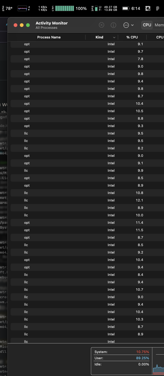
Just to be sure:
find /usr/local/share/dotnet/packs/Microsoft.NETCore.App.Runtime.AOT.osx-x64.Cross.ios-arm64/7.0.3/Sdk/../tools/ | grep cross/ios-arm64/ | xargs file | grep executable
/usr/local/share/dotnet/packs/Microsoft.NETCore.App.Runtime.AOT.osx-x64.Cross.ios-arm64/7.0.3/Sdk/../tools/llc: Mach-O 64-bit executable x86\_64/usr/local/share/dotnet/packs/Microsoft.NETCore.App.Runtime.AOT.osx-x64.Cross.ios-arm64/7.0.3/Sdk/../tools/opt: Mach-O 64-bit executable x86\_64/usr/local/share/dotnet/packs/Microsoft.NETCore.App.Runtime.AOT.osx-x64.Cross.ios-arm64/7.0.3/Sdk/../tools/mono-aot-cross: Mach-O 64-bit executable x86\_64Yes it's true: even in our arm64 dotnet install, mono-aot-cross, llc and opt - the bits that handle AOT compilation and optimisation - currently ship as x86\_64 binaries and are run under Rosetta.
eh, this only affects publishing, it's no big deal!
That's fair - most of the time, we don't care that much about how long release builds take. Because of changes to the build approach in dotnet ios, or maybe just because of most everything else being arm64 on apple silicon, the development-time experience is pretty zippy (I still make heavy use of tbc though).
But what about when you're gearing up for release and start to focus on bundle size, or things like startup performance? That's the thing: The only way to know the true impact of a change with respect to bundle size or performance is to perform a release build. So at some point in your project you might just find yourself in an 'inner-dev-loop' of release builds, and at that time, build times might matter.
I went in search and found that unsurprisingly, the dotnet team already identified this gap in the arm64 binaries, and this issue tracked it. The scope of that issue was eventually narrowed and the remainder (including macos arm64) is tracked here. That means that this should eventually get resolved, maybe even in a future net8 preview, and you could just wait for that. But what if you're doing size/performance optimisation work NOW? You'll have to get your hands dirty, but is possible to solve this for yourself (for some definition of solve).
how much faster is using native AOT binaries over rosetta
So you can decide whether it's worth doing this, I've run some highly un-scientific speed tests. Here's a chart of my findings:
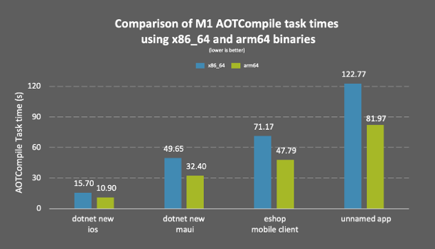
I tried four projects - dotnet new ios, dotnet new maui, eshop mobile client (from here) and one of my own. I added -clp:PerformanceSummary to the publish invocation to get the timings for the AOTCompile task.
On my machine, the aot compilation time reduction ranged from 30-35% across the projects - let's call it a third. Apple says the M2 gives up to 20% faster CPU performance than the M1, so if like me you have an M1 and sometimes have irresponsible thoughts about an M2, this basically saves you six to eight thousand australian dollarydoos.
how to (high level)
We saw in the github issue that the dotnet team ran into issues doing this - how can we expect to be able to make it work? We can make it work because we have simpler goals. The dotnet team has to worry about pesky things like "passing build pipelines", "architectures other than arm64", "solutions that don't just work on one person's machine" and other realities of shipping an sdk and runtime. We don't need to concern ourselves with those kinds of hassles.
We just want to take our arm64 mac and produce arm64 aot compiler binaries that aot for ios-arm64, and then somehow have them be used by the build. For that, we can build our own out of dotnet/runtime, and then just overwrite the the intel binaries we originally got from official sources with our bootleg ones. What could possibly go wrong?
Just like back in the day when we were rolling our own reflection-emit-enabled Xamarin.iOS versions, it goes without saying that you should exercise caution when replacing core parts of the dotnet build pipeline with custom built tools. It's true that we are building off tagged ("blessed") commits, but the reality is that arm64 aot compiling binaries aren't officially produced right now and the use case may not have been through the same testing rigour that supported use cases have. I haven't had any issues (yet?), but it's probably best to limit use of these binaries use to the aforementioned 'inner-release-loop' scenarios only, and use the official binaries for builds you actually want to ship. No warranties provided, proceed at your own risk, etc. etc.
how to (in detail)
With disclaimers out of the way, if you're still on board we're ready to start making a mess. With any luck, this process should only take 10-20 minutes.
First, clone dotnet/runtime:
git clone https://github.com/dotnet/runtime.git && cd runtime
Then, check out the tag that matches the version of the sdk you're using to build. You can see it in the path of the aot invocation from earlier. In this post, the invocation was:
Tool /usr/local/share/dotnet/packs/Microsoft.NETCore.App.Runtime.AOT.osx-x64.Cross.ios-arm64/7.0.3/Sdk/../tools/mono-aot-cross execution started with arguments: ...
so we want 7.0.3. In dotnet/runtime, the version tags are preceded by a 'v', so:
git checkout v7.0.3
(It's important to build off the tag matching the version of the dotnet sdk you're using. If not, you may run into errors due to differneces between versions. For example, you can't build off the tip of main, which right now is .net8, then use the outputs with a .net7 sdk; things will go badly. An implication of this is that when you update dotnet, or if you have different projects pinned to different versions of dotnet, you'll likely need to need to follow these steps and build binaries for each of them individually. Basically let's just hope arm64 binaries start shipping soon)
Ok, now we're ready to build things. There are flags you can pass to the runtime build script to isolate the build of the AOT cross compiler, but I didn't get great results with various combinations of these (either only some binaries came out arm64, or the build just didn't work - which is maybe what the updated issue tracks). So let's keep it simple:
./build.sh -s mono+libs -os ios -arch arm64 -c Release
This should take somewhere between 5-10 minutes, and complete without issues. It's pretty impressive really (go look in artifacts to see all the things we built with one command and no shenanigans).
Now make sure that we got what we wanted:
find . | grep cross/ios-arm64/ | xargs file
You should see:
./artifacts/bin/mono/iOS.arm64.Release/cross/ios-arm64/llc: Mach-O 64-bit executable arm64./artifacts/bin/mono/iOS.arm64.Release/cross/ios-arm64/opt: Mach-O 64-bit executable arm64./artifacts/bin/mono/iOS.arm64.Release/cross/ios-arm64/mono-aot-cross: Mach-O 64-bit executable arm64Yes! arm64 all the things!
All that's left to do is to overwrite the official binaries with our own ones. Once again, the invocation from earlier tells us where these need to go. Just in case, let's keep a copy of the original bits around (also useful if you want to do comparisons).
(Remember to substitute the 7.0.3s here and below for your version if necessary)
sudo cp -R /usr/local/share/dotnet/packs/Microsoft.NETCore.App.Runtime.AOT.osx-x64.Cross.ios-arm64/7.0.3/Sdk/../tools/ /usr/local/share/dotnet/packs/Microsoft.NETCore.App.Runtime.AOT.osx-x64.Cross.ios-arm64/7.0.3/Sdk/../tools/backup
That put all the original binaries under a subdirectory called backup. Now copy our new files over.
sudo cp artifacts/bin/mono/iOS.arm64.Release/cross/ios-arm64/* /usr/local/share/dotnet/packs/Microsoft.NETCore.App.Runtime.AOT.osx-x64.Cross.ios-arm64/7.0.3/Sdk/../tools/
And that's it! Let's run another publish and see how it goes.
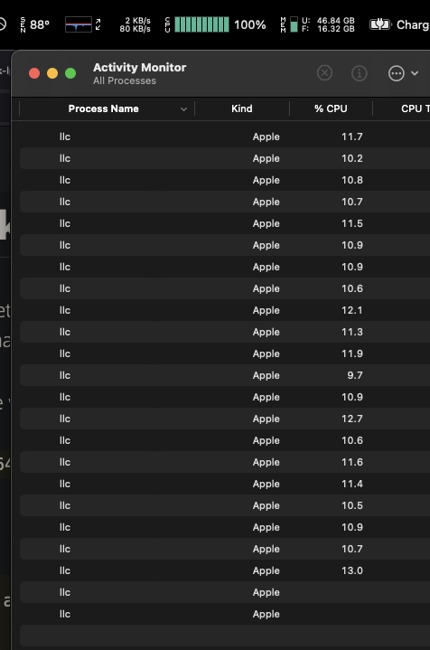
Now we're cooking with charcoal. Enjoy your 33% faster builds!
^(Only one intel binary left!)
(it's m l a u n c h)
bonus thoughts: other factors affecting build time
Switching from x64 to arm64 binaries is a nice 'free' build time improvement. There are a couple of other things that you can look at.
💡 Linking/Trimming
The less code you have, the less code needs to be AOT compiled. Using the linker will reduce the time spent in AOTCompile (and the output binary size). Some of it will be moved to the ILLink task, but the net effect should be a faster build and a happier user.
💡 Dealing with AOT-unfriendly assemblies
In the chart from earlier, "my app"'s AOT time went from ~120s to ~80s when switching to arm64 binaries. But when I first started looking at the build time, the non-arm64 AOT time was around 800s 🤯. Watching CPU usage and looking at build output made it clear - one assembly in the project took several times longer to AOT than all of the others.
The way the AOT step works is that the build system basically spawns an AOT process per assembly, for all assemblies at once, and lets the operating system manage their resource allocation. That's why in the screenshots of Activity Monitor in this post, you see a large number of processes using a small fraction of a cpu core - there are some 100+ processes trying to get their slice of 10 cores. Each of the AOT processes appears to operate on a single thread, which is fine in the beginning when there are more processes than cores and the cpu is oversubscribed. But if a single process takes much longer than the others, eventually it will be left running on it's own on a single thread, which is not very optimal. Scraping the output, I was able to see this behaviour in my own build (names removed to protect the innocent):
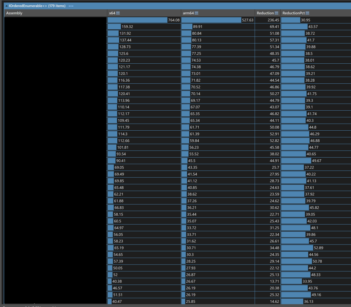
(n.b. Because of the probably indeterminate nature of oversubscription, it's not truly fair to compare any of the specific numbers in the above diagram, but for general magnitudes we can use it)
Essentially, the AOT of one assembly is responsible for blowing out the build time by 10+minutes. In my case, the functionality being used in that library was something that could be replicated natively without too much hassle, so I switched to that and removed the assembly. Another option would have likely been to link aggressively on that assembly to remove more of the code causing the AOT work (my guess - heavy use of generics).
💡 Opting to interpret some assemblies
This is more of a build size vs performance tip, and that should be your driving factor for this (not release build time), but I'll include it anyway. For a while now, we've had access to the interpreter option which enables various scenarios. In new dotnet ios, having it enabled is currently something you probably need to do because it is easy to unintentionally trigger code-gen (my theory is we had some special BCL assemblies in Xamarin days that avoided code-gen in certain methods but now that we share with dotnet you can hit it more easily). But don't just enable it and interpret everything!
Don't: (enable the interpreter and interpret all our assemblies)
<UseInterpreter>true</UseInterpreter> Do: (enable the interpreter and interpret none of our assemblies, but be ready to interpret any codegen)
<UseInterpreter>true</UseInterpreter> <MTouchInterpreter>-all</MTouchInterpreter> Doing the first one will skip AOTing everything, so I guess in the spirit of this blogpost it's going to make your release builds super fast and your outputs super small, but it's also going to make things much slower.
Consider: (enable the interpreter and interpret specific assemblies)
<UseInterpreter>true</UseInterpreter> <MTouchInterpreter>-all,AssemblyToNotAOT1,AssemblyToNotAOT2</MTouchInterpreter> Here we name AssemblyToNotAOT1 and AssemblyToNotAOT2 as assemblies that will be interpreted at run-time, so they won't be AOT-compiled at build time. This will reduce output size and release build time
💡 Getting an M2
No no... just do some of the above 😎
By combining the use of arm64-specific binaries and maybe a few build tips, hopefully you can see an improvement in your release-build times like I did, plus better battery life and an improvement in your general health and wellbeing.
Finally, everything as it should be 🏝️💻 . . .

Syncfusion is gearing up for the first major release of this year with Essential Studio 2023 Volume 1. The upcoming release promises many new and exciting features to enhance the user experience. You can expect the release by the end of March and we are confident that it will exceed users’ expectations.
This article gives you a sneak peek at some of the new features that will be included in the Syncfusion Xamarin.Forms suite in the 2023 Volume 1 release.
PDF Viewer
The Xamarin.Forms PDF Viewer will offer the following new features in the upcoming Volume 1 release.
Crop box calculation of PDF pages
The crop box is like the margin and padding feature available on a PDF page. Previously, this wasn’t considered while adding annotations and highlighting a search result. Thus, it resulted in some alignment mismatches in the PDF documents.
We have overcome this issue by considering the crop box value for the calculation while adding annotations and highlighting the searched text.
PDFium custom rendering (UWP)
PDFium is a third-party custom renderer. We had a scenario with a particular PDF document in which the images weren’t properly rendered with the native rendering APIs.
The PDFIum support helps us return the proper PDF pages’ images for rendering. Currently, we have this support only in the Android platform. From the 2023 Volume 1 release on, you can also enjoy this support in the UWP platform.
Preserve original order in rendered annotations
Previously, if we added annotations one over the other in an overlapping manner in other PDF viewers and loaded them in the Syncfusion PDF Viewer, they would not render in their original order. The annotation at the bottom would be on top, and the one on top would be in the middle.
From the upcoming release, you can render and save the annotations in their original order using our Xamarin.Forms PDF Viewer.
Add and modify form field values
The support to programmatically add, modify, and clear form data in a PDF document will be included.
Enable and disable editing in form fields
With this feature, you will be able to enable or disable the editing features of the form fields in a PDF document.
Change the bounds of ink and signature annotations
This feature will let you programmatically modify the ink’s bounds and signature annotations.
Render existing digital signatures
Users will be able to render flattened digital signatures in a PDF document to avoid data loss.
Adjust selector padding
You will be able to adjust the selector padding of annotations while selecting them in a PDF document.
Adjust the eraser thickness
This feature will allow you to adjust the ink eraser thickness in the Xamarin.Forms PDF Viewer.
Rich Text Editor
From 2023 Volume 1 on, the Xamarin.Forms Rich Text Editor will provide support to move the cursor positions (programmatically) to the beginning or end of the content.
Conclusion
Thanks for reading! Along with these updates, you can enjoy other exciting new features and bug fixes in our Syncfusion Xamarin.Forms suite in the 2023 Volume 1 release. You can check them out once the release is launched. It will not be long!
Stay tuned to our official Twitter, Facebook, and LinkedIn pages for announcements about the release. Please let us know in the comments section below if you have any feedback.
You can also reach us through our support forums, support portal, or feedback portal. We are always happy to assist you!
Related blogs
Writing mobile apps usually brings along its fair share of application logic run on the device. When writing code, it is paramount to test it. How else will you know if it is working as expected? The answer is testing. And since we are developers, we like to automate mundane tasks. So Unit Testing our logic can be a great way to test our logic. If you know how to set up unit tests, skip to the TL;DR; marker. 🙃 Unit Tests allow us to test the logic parts of our app. This will enable us to try most of our apps except the views. The most popular testing frameworks to the date of writing this post are XUnit, NUnit and MS Test. All three are solid choices and mostly have the same functionality. They mainly differ in how tests are written. For my Unit Tests, I usually like to go with XUnit. Ensure that the .NET MAUI and test projects use the same .NET version. In this example, it will be .NET 7. Given an existing .NET MAUI application, we can add a new testing project to the solution and choose XUnit as the testing framework. To have some code, we can test, I have rewritten the .NET MAUI hello world app to use a ViewModel (using the Community Toolkit MVVM framework). Doing so gives us the following ViewModel code. public partial class MainViewModel : ObservableObject { [ObservableProperty] public int _count; [ObservableProperty] public string _text = "Click me"; [RelayCommand] public void CounterClicked() { Count++; if (Count == 1) Text = $"Clicked {Count} time"; else Text = $"Clicked {Count} times"; } } We can test this logic by writing a Test that calls the command method in the well-known Arrange/Act/Assert pattern: public class MainViewModelShould { [Fact] public void IncrementcountOnCounterClicked() { // Arrange var sut = new MainViewModel(); // Act sut.CounterClickedCommand.Execute(null); // Assert Assert.Equal(1, sut.Count); } } This will require us to add a project reference from the test project to the .NET MAUI project. <Project Sdk="Microsoft.NET.Sdk"> <!-- ... --> <ItemGroup> <ProjectReference Include="..\MauiTesting101\MauiTesting101.csproj" /> </ItemGroup> </Project> TL;DR; Up to this point, we just followed the usual steps for setting up a Unit Test project. If you put your app logic in the .NET MAUI app project, you will get a weird error when compiling the test project. To make the compiler happy, we will have to change the .NET MAUI .csproj file as follows: <OutputType Condition="'$(TargetFramework)' != 'net7.0'">Exe</OutputType> Note that we have to add a condition to the <OutputType> or else you will get an error that there is no main method when executing the test. If you are using a different .NET version i.e. .NET 6 you would have to write the condition as follows <OutputType Condition="'$(TargetFramework)' != 'net6.0'">. And for .NET 8 we would have to replace number with an 8 and so forth. Note that we have to add a condition to the <OutputType>, or else you will get an error that there is no primary method when executing the test. If you are using a different .NET version, i.e. .NET 6, you would have to write the condition as follows <OutputType Condition="'$(TargetFramework)' != 'net6.0'">. And for .NET 8, we would have to replace the number with an 8. And for .NET 9, we … you get the point. 😉 With these changes, we can start running the tests from your IDE or via the command line using dotnet test . You can find the complete example on GitHub. HTH
![Developing a Temperature Monitor UI in .NET MAUI [Webinar Show Notes]](https://www.syncfusion.com/blogs/wp-content/uploads/2023/03/Developing-a-Temperature-Monitor-UI-in-.NET-MAUI-Webinar-Show-Notes-1-672x372.png)
This blog provides show notes for our March 9, 2023, webinar, “Developing a Temperature Monitor UI in .NET MAUI.” The webinar is presented and hosted by Syncfusion Senior Project Manager Suresh M. If you miss it or want to watch it again, you’ll find the recording on our YouTube channel or embedded below.
Overview
During this webinar, I will walk you through developing a temperature monitor UI using the Syncfusion Radial Gauge control in .NET MAUI.
Time Stamps
- [00:00] Introduction
- [4:50] Implementing the Radial Gauge Control
- [11:45] Customizing the Radial Gauge
- [30:30] Deploying the Application
- [31:27] Output
Q&A
The following are answers to questions we received from attendees during the webinar.
Does the Radial Gauge tool offer labeling and naming?
The .NET MAUI Radial Gauge supports customizing and formatting the axis labels. Please refer to the .NET MAUI Radial Gauge axis label customization documentation.
What was the code included in MauiProgram.cs before modifying MainPage.xaml?
That was code to register the handlers. Please refer to registering the handler for .NET MAUI Radial Gauge documentation.
How do I migrate from Xamarin to MAUI?
The following documentation will help you migrate Syncfusion controls from a Xamarin.Forms application to a .NET MAUI application.
So all these tools would need to integrate with MVVM and possibly have to do some complex bindings. What would you suggest we read up on to better understand more complex bindings?
You can get started with learning to bind from the following documentation.
When are all Syncfusion Xamarin controls expected to be ported to MAUI?
You can have a glance at our plan here.
The documentation is great, but if we need a tad more info within those docs, where could we possibly make suggestion or at least let you know where we are getting stuck?
If you have any suggestions and questions, you can reach us through our support forum, support portal, or feedback portal. We are always happy to assist you!
Conclusion
During this webinar, we created a temperature monitor UI with the Syncfusion Radial Gauge control for .NET MAUI and covered some introductory tips for MAUI development. We hope you enjoyed this webinar and will keep an eye out for our future webinars on .NET MAUI.
Related blogs

Medical Service — MAUI App Implementation. Phase #1 — Implementing Page in XAML with inline data.
Under this phase, we will implement page UI with static data sources in XAML, using only a few converters and local models.
Hi Folks 👋. This time we will use only XAML to implement the entire UI according to the Dribbble design from Phase #0:
Medical Service — MAUI App Implementation. Phase #0 — Review Design
What you will find here:
- Implementation of each control, step-by-step.
- Using Converters for Selectable Components.
- Using Code-Behind as the resolver for events callback.
What we don’t focus on at this stage:
- Duplicated Code
- Resources for Styles and Colors
It’s terrible, but I created it to show you later how to refactor such crappy code into “good enterprise quality” code.
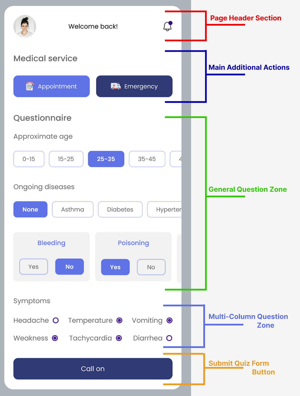
Source Code with GitKraken
Link to source code at GitHub:
GitHub - bbenetskyy/MAUI-Medical-service: Implementation of Medical Services Page
If you made it in MacOS, I strongly recommend using GitKraken. Using it will simplify branch managing; you can quickly review my changes or yours if you try to modify something. Also, later with the subsequent phases, you can see critical differences before and after merging branches.


Page Header Section

There are a few elements here, so we will focus on creating two Ellipses. The first will be used to Clip the profile image into a circle, while the second one will be to create a notification on the bell icon:
Main Additional Actions

As you can see, they are similar, and we will create a control for them later. We will pass into control the icon, text and background colour. But for now, we have duplicated our code twice. So here I will show the code for only one of them:
General Question Zone

We are lucky because we can reuse the same code for all selectable buttons. After all, they use the same radius, style and behaviour. An exception is “Yes-No” questions because we need to invalidate each button according to the questions.
Let’s start with creating models, they are needed to convert Background Color if an item is selected.
Now, we need to create converters. They will be used to change text and background colour. Separate for Selectable Model, where we will bind only IsSelected Property and separate for Questionable Model, where we will bind current answer and required one to match answers:
After all, that changes will get something like this in our Solution Explorer:

The next step is to create a selectable button and a “Yes-No” Quiz Card; place them into StackLayout with Bindable Item Source and Template. Values we also will bind in XAML. I know that it’s pretty rare and better to bind them from View Model. And it will be done in that way later, but now you can learn how to do it in XAML 😇, what a lovely day 🫠
And final thing — Tapped event Callback at Code Behind. We need to see which model was sent to us and who the sender is in the “Yes-No” Card Buttons case.
During refactoring, we will move dumb text-checking logic into control and replace it with enum checking, but for now, it’s more than enough for us.
Multi-Column Question Zone

Why did I name it? — All because we can’t just use Collection View(cause of scroll bug in MAUI) or Flex Layout(cause of not perfect alignment) and need sticky goes with three Stack Layouts inside one Grid with ColumnDefinitions="*,*,*", so all columns are the same; if we use the same layout inside Stacks, no matter which text we will place there 🥹. Later in the real app, we may get only a problem with data, but if we move it into custom control — we may add a special Data Manager who will be requested to solve it for us.
I’ll only insert one of the three stacks here because they’ll be the same:
Submit Quiz Form Button

There is nothing special here at the moment, but later we need to add validations and maybe make this button always visible on the screen — but this depends on business requirements and hard to identify it just by Dribbble Shot.
Thanks for reading, and see you in the next implementation Phase 😛
Medical Service — MAUI App Implementation. Phase #1 — Implementing Page in XAML with inline data. was originally published in Nerd For Tech on Medium, where people are continuing the conversation by highlighting and responding to this story.
Digital signatures have become increasingly important in today’s world, where electronic documents are widely used.
Syncfusion’s .NET MAUI SignaturePad control is a user interface tool for capturing and storing signatures on mobile applications. Its simple yet essential functions allow users to save and export signatures.
In this blog, we will highlight the key features of the .NET MAUI SignaturePad control and how to get started with it.
.NET MAUI Signature Pad
The .NET MAUI Signature Pad control is user-friendly and customizable, enabling developers to tailor it to their specific needs.
It has the following key features:
- Supports customizing the stroke thickness and color and performing clear and undo operations.
- Easily captures signatures using touchscreens with touch gestures.
- Saves drawn signatures as an images and embeds them into PDFs and other documents with formats that support image signatures.
- Its unique stroke-rendering algorithm considers the speed of drawn gestures to produce a more authentic, handwritten look and feel to the signature.
 Overall, these features make the .NET MAUI SignaturePad control an essential tool for developers looking to integrate signature-capturing functionality into their apps.
Getting Started with the .NET MAUI SignaturePad
Let’s see how to incorporate the .NET MAUI SignaturePad control into your project and customize its basic features.
Step 1: First, create a new .NET MAUI application in Visual Studio.
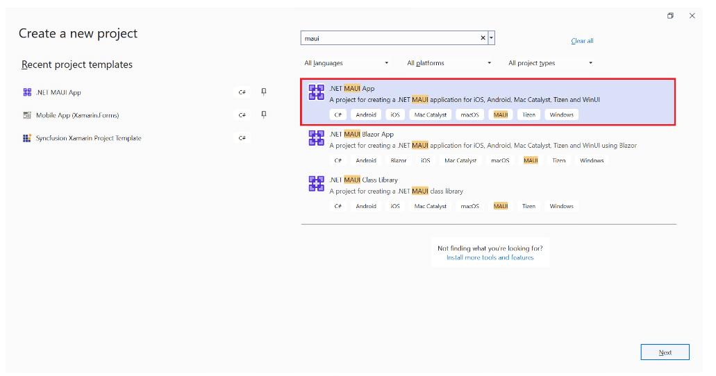
Step 2: Syncfusion .NET MAUI components are available on the NuGet Gallery. To add the SfSignaturePad to your project, open the NuGet package manager in Visual Studio, search for Syncfusion.Maui.SignaturePad, and install it.

Step 3: In the MauiProgram.cs file, register the handler for Syncfusion Core.
using Syncfusion.Maui.Core.Hosting; namespace SignaturePadGettingStarted { public static class MauiProgram { public static MauiApp CreateMauiApp() { var builder = MauiApp.CreateBuilder(); builder .UseMauiApp<App>() .ConfigureSyncfusionCore() .ConfigureFonts(fonts => { fonts.AddFont("OpenSans-Regular.ttf", "OpenSansRegular"); }); return builder.Build(); } } }
Step 4: Then, import the Syncfusion.Maui.SignaturePad namespace and initialize the SignaturePad as shown in the following code.
<ContentPage . . . xmlns:signaturePad="clr-namespace:Syncfusion.Maui.SignaturePad;assembly=Syncfusion.Maui.SignaturePad"> <Grid> <signaturePad:SfSignaturePad /> </Grid> </ContentPage>
Step 5: Here, we’ll customize the stroke color of the SignaturePad control using the StrokeColor property. The default stroke color is Colors.Black.
<signaturePad:SfSignaturePad StrokeColor="Blue" />
Step 6: We customize the thickness of the stroke by setting the MinimumStrokeThickness and MaximumStrokeThickness properties. The strokes will be drawn based on the speed and impression we provide through gestures within the minimum and maximum stroke thickness range. This way, the signature will be more realistic.
Refer to the following code example.
<signaturePad:SfSignaturePad MinimumStrokeThickness="1" MaximumStrokeThickness="6" />
Step 7: Finally, let’s save the signature drawn in the SignaturePad as an image using the ToImageSource() method. The stored signature image can further be synchronized with our devices and documents that need the signature.
Refer to the following code example.
<signaturePad:SfSignaturePad x:Name="signaturePad" /> <Button Text="Save" Clicked="OnSaveButtonClicked" />
private void OnClearButtonClicked(object? sender, EventArgs e) { ImageSource? source = signaturePad.Clear(); }
Conclusion
Thanks for reading! In this blog, we have seen the significant features of the Syncfusion .NET MAUI Signature Pad control. Try out this user-friendly control and share your feedback in the comments section below.
Also, check out our .NET MAUI control demos on GitHub.
Customers can download the latest Essential Studio version from the License and Downloads page. If you are not a Syncfusion customer, you can try our 30-day free trial to see how our controls can enhance your projects.
For questions, you can reach us through our support forum, support portal, or feedback portal. We are always happy to assist you!
Related blogs
Have you ever wondered how to cache images in your app? .NET MAUI already includes this functionality! In this article, we will quickly learn how to use it and adapt it to our specific needs.
The explanation will be divided into the following points:
How does image caching work?
Learning about its structure
Properties available
Let’s start!
How does image caching work?
In .NET MAUI, downloaded images are cached by default for one day. This functionality is in action whenever you download an image from a URL.
Let’s learn about its structure:
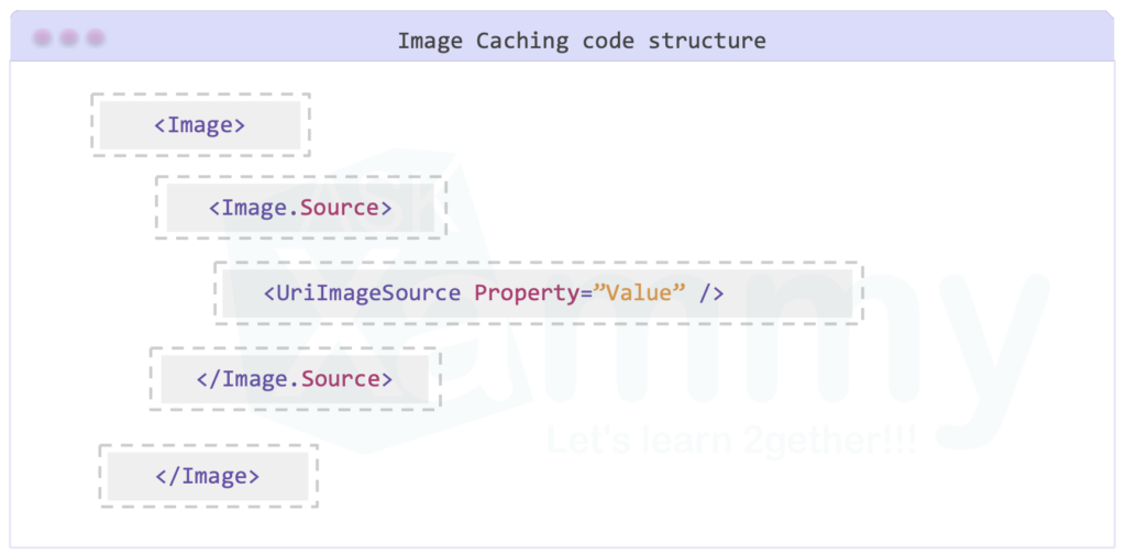
Properties available
You can experiment with different values using the properties provided by the UriImageSource class. Let’s explore each one of these properties:
URL: The URI of the image is provided, allowing it to be downloaded for display – It receives a Uri as value.
CachingEnabled: Determines whether the image cache is enabled or disabled. – It receives a Bool data type and its default value is True.
CacheValidity: The value entered here will decide how long the image is saved on the local device. Keep in mind that the default value is set with one day as value. – It receives a TimeSpan as value.
If you send a single number, it will be interpreted as the number of days you want the cache to store the data. Since this property is of type TimeSpan, you can format it in XAML and pass a value like this:
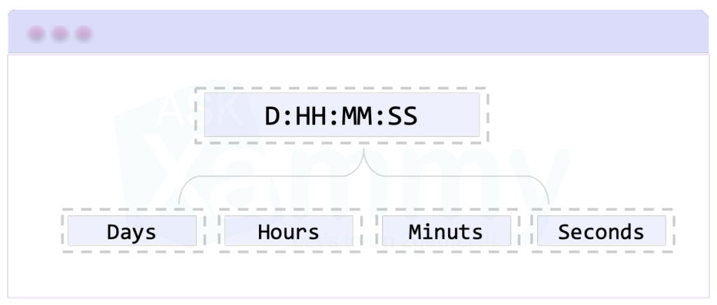
Now that we understand the structure and properties, let’s dive into the code implementation:
And done!! From now on, you are ready to works your Images with cache .NET MAUI I hope you like it!
<Label Text=”Thanks for ready! ” /> Spanish article:
Spanish post:
References:

Medical Service — MAUI App Implementation. Phase #0 — Review Design
This is a start of a journey to implement Apps in an accurate Enterprise way actual applications are made.
Hi Folks, I started with you a new journey about implementing mobile applications in .NET MAUI. We would implement one single page of Medical Service from a dribble.
Still, we will make it from a simple stupid showcase of implementing UI to a complete Enterprise application with controls, bindings and validations. All this will be done in separate blog posts and describe one thing in one post, so later, you can search for an exciting part of this story more easily.
Also, I would film all that process with some of my comments, hoping that will be useful for somebody.
Here is a list of future blogs; I will add links later after writing:
- Phase #1 — Implementing Page in XAML with inline data.
- Phase #2 — Adding View Model.
- Phase #3 — Adding Validation.
- Phase #4 — Adding Services with Mock Data.
- Phase #5 — Refactor XAML, creating custom controls.
- Phase #6 — Adding Unit Tests.
- Phase #7 — Adopt UI for Small/Large Screens.
Phase #0 — Review Design
In the real world, you will get this high-fidelity design from your designer in some web app, like Figma or Adobe or Zeplin. And you will have access to all details like font, font-size, colour, margins between, icons in SVG format and other crucial things. Here we have only one image, which is unacceptable in Enterprise development but may be a deal sometimes in some freelance development. Anyway, we got this; what should be our next steps now?
First, we should determine all margins and colours we would use and create Colors.xaml and Dimensions.xaml with all values we found there. This will be done in Phase #5 because I would like to show you how we can eject it from the raw XAML code. In Phase #1, we will use them all in our XAML.
I’m not a designer, but in an exemplary design, there should be a magic “x” value, and all margins and padding should re-use that “x” with some multiplier, like 2x, 4x, and 5x. And if that “x” is less, than 4px it is not so good.
I’m using Figma for such measuring because it’s free and ideal for the simple things we will do with that image. So, what are we doing here? — We first created a couple of squares of 16 or 24 pixels and checked how they fit. Later create more if they are needed. But, it’s essential to try not to make a difference between your “boxes” of 1 pixels, and if that is possible, also try to avoid all odd numbers of pixels.
And we were going to do this for all elements on the screen. After that, we need to pick up all colours we see there.
That’s it. The initial — preparation phase is done. Now we are going to move this UI to .NET MAUI, where we are going to use XAML for everything because I would like to show how raw XAML becomes an actual Enterprise Mobile app, see you folks 🙃 😉
Medical Service — MAUI App Implementation. Phase #0 — Review Design was originally published in Nerd For Tech on Medium, where people are continuing the conversation by highlighting and responding to this story.
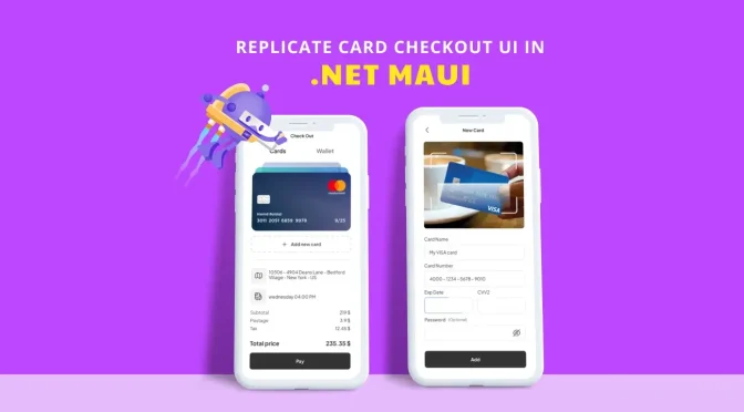
Practicing is always the best way to strengthen our knowledge. In this article, we will enhance your XAML skills by replicating a card checkout UI inspired by this Dribble design.
Let’s break down the creation of the UI into three steps. Each creates a set of visual elements that make up the UI. So, you can concentrate on each portion of the code and have a straightforward and faster understanding of XAML.
Refer to the following image.
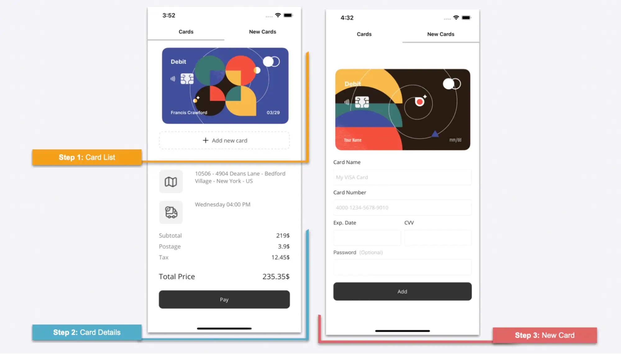
Skills you’ll develop
In addition to strengthening your XAML skills, you will learn to implement the following .NET MAUI features in this article:
- Syncfusion .NET MAUI Tab View: An interface for tabbed browsing in mobile and desktop apps, where users can switch among different tabs.
- Syncfusion’s .NET MAUI ListView: Show your information in a list in portrait or landscape orientation.
- Borders: Add a border to the desired visual elements.
- Grid: Design the main layout.
- Appearance mode: To develop the UI for both light and dark modes, we’ll use the AppThemeBinding markup extension in some properties.
Let’s start coding!

Easily build cross-platform mobile and desktop apps with the flexible and feature-rich controls of the Syncfusion .NET MAUI platform.
General settings
Configuring the Tab View
To get started, we’ll build the CheckOutPage.xaml page. To design it, we are going to use the Syncfusion .NET MAUI Tab View. It will contain all the visual elements that were shown in the previous image.
First, refer to the Getting started with .NET MAUI Tab View documentation. Then, follow these steps to implement the Tab View control:
- Add the Syncfusion.Maui.TabView NuGet package.

- Go to the MauiProgram.cs file and register the handler for the Syncfusion .NET MAUI Tab View. To do this, navigate to the CreateMauiApp method and then, just before the line return builder.Build(); method, add the .ConfigureSyncfusionCore() method.
- Now, add the Syncfusion.Maui.TabView namespace in the XAML page.
xmlns:tabView="clr-namespace:Syncfusion.Maui.TabView;assembly=Syncfusion.Maui.TabView"
- Finally, in the XAML page, add the Tab View control inside a layout, in this case, a VerticalStackLayout.
<VerticalStackLayout> <tabView:SfTabView x:Name="tabView" IndicatorBackground="Silver"> <tabView:SfTabView.Items> <tabView:SfTabItem Header="Cards" FontAttributes="Bold" TextColor="{AppThemeBinding Light=Black, Dark=White}"> <tabView:SfTabItem.Content> <!--1. First page: Add the code of your first page here --> </tabView:SfTabItem.Content> </tabView:SfTabItem> <tabView:SfTabItem Header="New Cards" FontAttributes="Bold" TextColor="{AppThemeBinding Light=Black, Dark=White}"> <tabView:SfTabItem.Content> <!--2. Second page: Add the code of your second page here --> </tabView:SfTabItem.Content> </tabView:SfTabItem> </tabView:SfTabView.Items> </tabView:SfTabView></VerticalStackLayout>
In the previous code example, you will find comments indicating where to add the first (steps 1 and 2) and second (step 3) pages. Keep this in mind so that you‘ll know where to add the code in the following explanations.
In the following, we can see how the Tab View will be rendered in both light and dark modes.
 We have configured the initial setup. Let’s start designing the first page of our UI, Cards.
Syncfusion’s .NET MAUI controls suite is the expert’s choice for building modern mobile apps.
Step 1: Card list
We are going to render the following UI elements:
- Main layout
- Card list
- New card button
- Separator
Main layout
To design the main layout, use a DataGrid control. Refer to the following code example.
<Grid RowDefinitions="Auto,Auto,Auto,Auto,Auto,Auto,Auto,Auto" ColumnDefinitions="Auto,*" VerticalOptions="Start" Margin="30,0"> <!-- Add here all the code explained in steps 1 and 2 --> </Grid>
Card list
As I said before, to show the list of cards, we are going to use the Syncfusion .NET MAUI ListView control. The cards will be organized horizontally.
First, refer to the Getting started with .NET MAUI ListView documentation. Then, follow these steps to implement the control:
- Add the Syncfusion.Maui.ListView NuGet package.

- Go to the MauiProgram.cs file and register the handler for the Syncfusion .NET MAUI ListView. To do so, navigate to the CreateMauiApp method and then, just before the line return builder.Build();, add the builder.ConfigureSyncfusionListView(); method.
- Now, add Syncfusion.Maui.ListView namespace in the XAML page.
xmlns:syncfusion="clr-namespace:Syncfusion.Maui.ListView;assembly=Syncfusion.Maui.ListView"
- Finally, add the following code in the XAML page.
<!-- Card list--> <syncfusion:SfListView Grid.Row="0" Grid.Column="0" Grid.ColumnSpan="2" ItemsSource="{Binding Cards}" ItemSize="350" ItemSpacing="5" ScrollBarVisibility="Never" HeightRequest="250" Orientation="Horizontal" VerticalOptions="Start" HorizontalOptions="Start"> <syncfusion:SfListView.ItemTemplate> <DataTemplate> <Image Source="{Binding Picture}" Aspect="AspectFit" /> </DataTemplate> </syncfusion:SfListView.ItemTemplate></syncfusion:SfListView> <!-- Add here all the code explained in the following code block -->
Note: The Card designs were obtained from this Dribbble design.
Rendering Add new card button
Next, we render the Add new card button with dashed border lines by following these steps:
- First, add a border with dashed lines.
<Border Grid.Row="1" Grid.Column="0" Grid.ColumnSpan="2" Margin="0,0,0,20" Stroke="#dadada" HorizontalOptions="FillAndExpand" StrokeThickness="3" StrokeDashArray="1.5" StrokeDashOffset="2" StrokeShape="RoundRectangle 10,10,10,10" HeightRequest="50"> <!-- Add the Button here --> </Border>
- Then, inside the border, add the Button element.
<!-- Button: Add new Card--> <Button Text="Add new card" FontSize="15" ImageSource="{AppThemeBinding Light=add\_black, Dark=add\_white}" TextColor="{AppThemeBinding Light=#505050, Dark=white}" BackgroundColor="Transparent"/> <!-- Add here all the code explained in the following code block -->
Separator
Now, let’s simulate a separator below the Add new card button using the BoxView.
<!-- Separator--> <BoxView Grid.Row="2" Grid.Column="0" Grid.ColumnSpan="2" HorizontalOptions="FillAndExpand" HeightRequest="1" Color="#f4f3f4" Margin="0,5,0,30"/> <!-- Add here all the code explained in the following code block -->
Note: You can also render the separator using lines.
After executing the previous code examples, our UI will look like the following image.
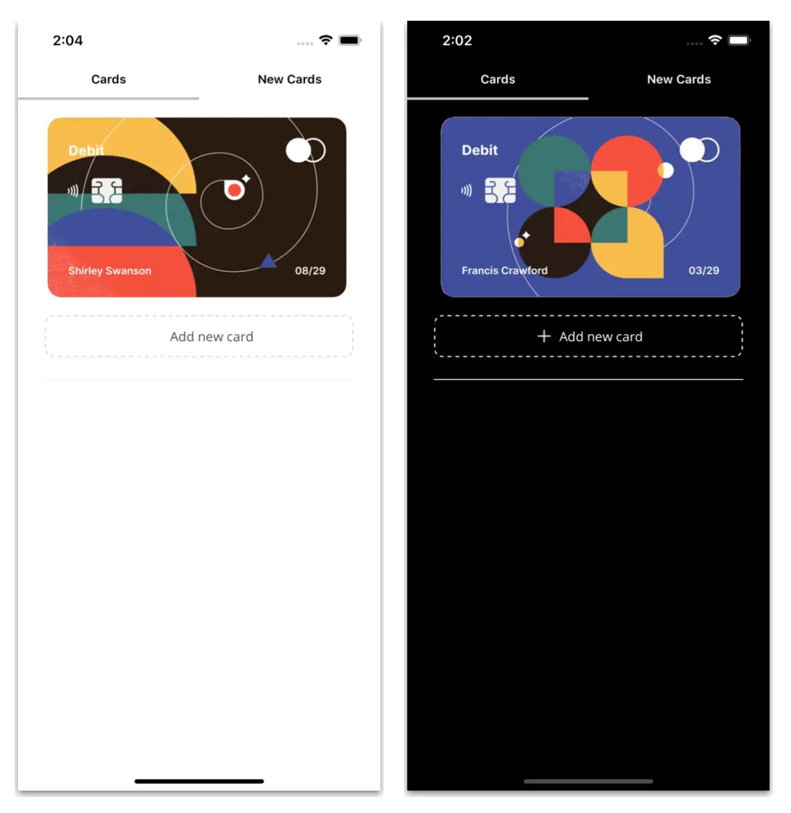
Every property of the Syncfusion .NET MAUI controls is completely documented to make it easy to get started.
Step 2: Card details
We have finished designing the UI for the card list. Let’s next design the UI for the card details with the following elements:
- Address and date
- Invoice details
- Pay button
Address and date
We’ll display the card holder’s address and date details with the following visual elements:
- An image within a border with a background color and rounded edges.
- A label with detailed information.
Refer to the following code example.
<!-- Details: Address & Date--><!-- Address --><Border Grid.Row="3" Grid.Column="0" Margin="0,0,0,20" Stroke="Transparent" HorizontalOptions="Start" BackgroundColor="#f2f2f2" HeightRequest="65" WidthRequest="65" StrokeShape="RoundRectangle 10,10,10,10"> <Image Source="location" HeightRequest="40" WidthRequest="40"/></Border><Label Grid.Row="3" Grid.Column="1" FontSize="15" TextColor="#777777" Text="10506 - 4904 Deans Lane - Bedford Village - New York - US"/><!-- Date --><Border Grid.Row="4" Grid.Column="0" Margin="0,0,0,20" Stroke="Transparent" HorizontalOptions="Start" BackgroundColor="#f2f2f2" HeightRequest="65" WidthRequest="65" StrokeShape="RoundRectangle 10,10,10,10"> <Image Source="truck" HeightRequest="40" WidthRequest="40"/></Border><Label Grid.Row="4" Grid.Column="1" FontSize="15" TextColor="#777777" Text="Wednesday 04:00 PM"/> <!-- Add here all the code explained in the following code block -->
Invoice details
Let’s use the Syncfusion .NET MAUI ListView control to render an invoice with the following information:
- Subtotal
- Postage
- Tax
Then, we’ll render the total price with a Label control, as shown in the following code example.
<!-- Invoice information--><syncfusion:SfListView Grid.Row="5" Grid.Column="0" Grid.ColumnSpan="2" ItemsSource="{Binding Invoice}" ScrollBarVisibility="Never" ItemSize="30" HeightRequest="110" HorizontalOptions="FillAndExpand" Orientation="Vertical"> <syncfusion:SfListView.ItemTemplate> <DataTemplate> <Grid ColumnDefinitions="*,*"> <Label Grid.Column="0" Text="{Binding Description}" TextColor="#7e7e7e" FontSize="16" /> <Label Grid.Column="1" Text="{Binding Price}" FontSize="16" HorizontalTextAlignment="End"/> </Grid> </DataTemplate> </syncfusion:SfListView.ItemTemplate></syncfusion:SfListView><!-- Total Price--><Label Grid.Row="6" Grid.Column="0" Text="Total Price" FontSize="20" FontAttributes="Bold"/><Label Grid.Row="6" Grid.Column="1" Text="235.35$" FontSize="20" HorizontalTextAlignment="End"/> <!-- Add here all the code explained in the following code block -->
Pay button
Refer to the following code example to design the Pay button.
<!-- Add Button--> <Button Grid.Row="7" Grid.Column="0" Grid.ColumnSpan="2" HeightRequest="50" CornerRadius="10" Margin="0,25,0,0" BackgroundColor="#333333" Text="Pay" TextColor="White"/>
After executing these code examples, our UI will look like the following image.
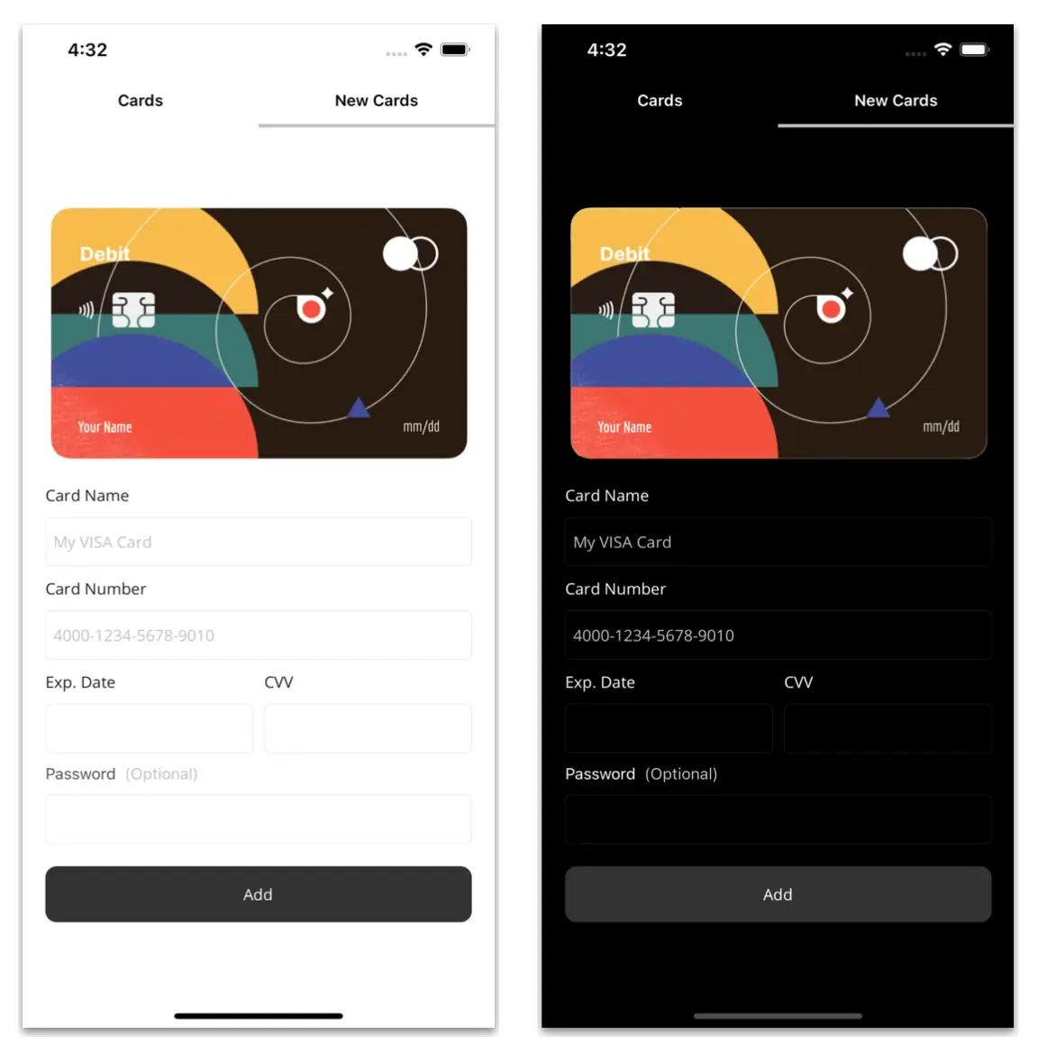
To make it easy for developers to include Syncfusion .NET MAUI controls in their projects, we have shared some working ones.
Step 3: New cards
Let’s design the second page of our UI, New Cards.
Do you remember when we implemented the Tab View? Go to the comment that says ‘’<!–2. Second page: Add the code of your second page here –>“. In this space, we need to add all the code that will be explained in this step.
We’ll design the UI with the following elements:
- Main layout
- Card information
- Add button
Main layout
Let’s use a DataGrid to design the main layout.
<Grid RowDefinitions="Auto,Auto,Auto,Auto,Auto,Auto,Auto,Auto,Auto,Auto" ColumnDefinitions="*,*" ColumnSpacing="10" RowSpacing="10" Margin="30,30,30,0" VerticalOptions="CenterAndExpand"> <!-- Add here all the code explained in step 3 --> </Grid>
Then, replicate the main image for the card using the following code example.
<!-- Main image--> <Image Grid.Row="0" Grid.Column="0" Grid.ColumnSpan="2" Source="ccardbase" Aspect="AspectFit" HeightRequest="250" /><!-- Add here all the code explained in the following code block -->
Card information
This section involves designing the UI to collect the following card information.
Card name and number
Refer to the following code example to get the card name and number details from the user.
<!--Card information--><!--Card Name--><Label Grid.Row="1" Grid.Column="0" Grid.ColumnSpan="2" Text="Card Name"/><Entry Grid.Row="2" Grid.Column="0" Grid.ColumnSpan="2" Placeholder="My VISA Card" PlaceholderColor="Silver"/><!--Card Number--><Label Grid.Row="3" Grid.Column="0" Grid.ColumnSpan="2" Text="Card Number"/><Entry Grid.Row="4" Grid.Column="0" Grid.ColumnSpan="2" Placeholder="4000-1234-5678-9010" PlaceholderColor="Silver"/> <!-- Add here all the code explained in the following code block -->
Expiration date and CVV
Refer to the following code example to collect the card expiration date and CVV details.
<!--Exp. Date--><Label Grid.Row="5" Grid.Column="0" Text="Exp. Date"/><Entry Grid.Row="6" Grid.Column="0" /><!--CVV--><Label Grid.Row="5" Grid.Column="1" Text="CVV"/><Entry Grid.Row="6" Grid.Column="1" /><!-- Add here all the code explained in the following code block -->
Password
Then, design the UI to set the password (optional) for the users’ cards.
<!--Password--><Label Grid.Row="7" Grid.Column="0" Grid.ColumnSpan="2"> <Label.FormattedText> <FormattedString> <Span Text="Password " TextColor="{AppThemeBinding Light=#505050, Dark=white}" /> <Span Text=" (Optional)" TextColor="Silver"/> </FormattedString> </Label.FormattedText></Label><Entry Grid.Row="8" Grid.Column="0" Grid.ColumnSpan="2" IsPassword="True"/> <!-- Add here all the code explained in the following code block -->
Syncfusion .NET MAUI controls allow you to build powerful line-of-business applications.
Add button
Refer to the following code example to render the Add button.
<!--Add Button--> <Button Grid.Row="9" Grid.Column="0" Grid.ColumnSpan="2" HeightRequest="50" CornerRadius="10" Margin="0,10,0,0" BackgroundColor="#333333" Text="Add" TextColor="White"/>
Finally, let’s see the result of this step in both light and dark modes!
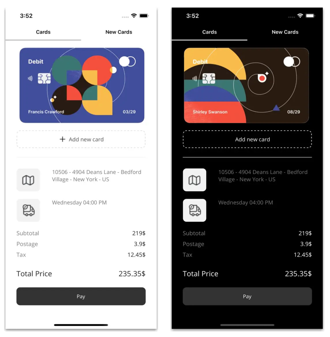 That is all! We have now finished the development of our Card Check Out UI in .NET MAUI!
GitHub reference
To see the complete code structure of this project, see our demo for Card Check Out UI in .NET MAUI on GitHub.
Conclusion
Thanks for reading! In this blog, we enhanced your XAML knowledge by teaching you how to replicate a card checkout UI using Syncfusion .NET MAUI controls. Try out the steps outlined in the post and leave your thoughts in the comments section below.
Syncfusion’s .NET MAUI controls were created from the ground up using .NET MAUI, which makes them feel like native framework controls. These controls are optimized to manage large amounts of data, making them ideal for building top-notch, cross-platform mobile and desktop applications.
If you have any questions or need assistance, don’t hesitate to reach us through our support forum, support portal, or feedback portal. We are always available to help you!
Related blogs
A sign-up form allows users to create an account in an application by providing details such as name, email address, and password. Usually, such a form is used for registration or membership subscription.
The Syncfusion .NET MAUI DataForm allows developers to create data entry forms. This control also supports validating user input. By validating the input, users will be prompted to provide only correct values into the form, maintaining the integrity and consistency of the data stored in the database to prevent errors, inconsistencies, and security threats.
In this article, we’ll see how to create a sign-up form and validate the data entered using the Syncfusion .NET MAUI DataForm control.
Note: Refer to the .NET MAUI DataForm documentation before getting started.
Creating a sign-up form using the .NET MAUI DataForm control
First, create a sign-up form using the .NET MAUI DataForm control.
Initialize the .NET MAUI DataForm control
Follow these steps to initialize the .NET MAUI DataForm control:
- Create a new .NET MAUI application in Visual Studio.
- Syncfusion .NET MAUI components are available in the NuGet Gallery. To add the DataForm to your project, open the NuGet package manager in Visual Studio, search for Syncfusion.Maui.DataForm, and then install it.
- Import the control’s namespace Syncfusion.Maui.DataForm in the XAML or C# code.
- Initialize the SfDataForm control in the XAML page.
<ContentPage> ….. xmlns:dataForm="clr-namespace:Syncfusion.Maui.DataForm;assembly=Syncfusion.Maui.DataForm" ….. <dataForm:SfDataForm/></ContentPage>
- The NuGet package Syncfusion.Maui.Core is a dependent package for all Syncfusion .NET MAUI controls. In the MauiProgram.cs file, register the handler for the Syncfusion core assembly.
builder.ConfigureSyncfusionCore()
Create the data form model
Let’s create the data form model for the sign-up form. This consists of fields to store specific information such as names, addresses, phone numbers, and more. You can also add attributes to the data model class properties for efficient data handling.
Refer to the following code example.
public class SignUpFormModel{ [Display(Prompt = "Enter your first name", Name = "First name")] public string FirstName { get; set; } [Display(Prompt = "Enter your last name", Name = "Last name")] public string LastName { get; set; } [Display(Prompt = "Enter your email", Name = "Email")] public string Email { get; set; } [Display(Prompt = "Enter your mobile number", Name = "Mobile number")] public double? MobileNumber { get; set; } [Display(Prompt = "Enter your password", Name = "Password")] public string Password { get; set; } [Display(Prompt = "Confirm password", Name = "Re-enter Password")] [DataType(DataType.Password)] public string RetypePassword { get; set; } [DataType(DataType.MultilineText)] [Display(Prompt = "Enter your address", Name = "Address")] public string Address { get; set; } [Display(Prompt = "Enter your city", Name = "City")] public string City { get; set; } [Display(Prompt = "Enter your state", Name = "State")] public string State { get; set; } [Display(Prompt = "Enter your country", Name = "Country")] public string Country { get; set; } [Display(Prompt = "Enter zip code", Name = "Zip code")] public double? ZipCode { get; set; }}
Create the sign-up form with editors
By default, the data form auto generates the data editors based on the primitive data types such as string, enumeration, DateTime, and TimeSpan in the DataObject property.
The .NET MAUI DataForm supports built-in editors such as text, password, multiline, combo box, autocomplete, date, time, checkbox, switch, and radio group.
Refer to the following code example. In it, we set the data form model (SignUpFormViewModel) to the DataObject property to create the data editors for the sign-up form.
XAML
<Grid.BindingContext> <local:SignUpFormViewModel/></Grid.BindingContext><dataForm:SfDataForm x:Name="signUpForm" DataObject="{Binding SignUpFormModel}"/>
C#
public class SignUpFormViewModel{ /// <summary> /// Initializes a new instance of the <see cref=" SignUpFormViewModel " /> class. /// </summary> public SignUpFormViewModel() { this.SignUpFormModel = new SignUpFormModel(); } /// <summary> /// Gets or sets the sign-up model. /// </summary> public SignUpFormModel SignUpFormModel { get; set; } }
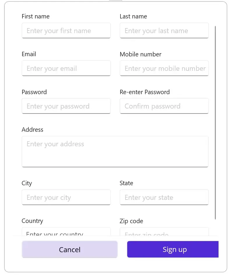
Validating the data in the sign-up form using the .NET MAUI DataForm control
We have created the sign-up form. Let’s proceed with the validation processes.
Validate the data using the validation attributes
The .NET MAUI DataForm control provides the attributes to handle data validation. In our example, we’ll add the following validation checks to our sign-up form:
- Required fields validation: Ensures that all required fields, such as name, email, and password, are filled out before submitting the form.
- Email validation: Checks whether the email data is in the correct format. The email data should include the @ character (e.g., example@domain.com).
- Password strength validation: Ensures that the provided password satisfies certain criteria, such as minimum length and the inclusion of special characters.
- Confirm password validation: Ensures that the confirmed password matches the provided password.
- Phone number validation: Ensures that the phone number provided is valid and is in the correct format.
Refer to the following code example.
[Display(Prompt = "Enter your first name", Name = "First name")][Required(ErrorMessage = "Please enter your first name")][StringLength(20, ErrorMessage = "First name should not exceed 20 characters")]public string FirstName { get; set; } [Display(Prompt = "Enter your last name", Name = "Last name")][Required(ErrorMessage = "Please enter your last name")][StringLength(20, ErrorMessage = "First name should not exceed 20 characters")]public string LastName { get; set; } [Display(Prompt = "Enter your email", Name = "Email")][EmailAddress(ErrorMessage = "Please enter your email")]public string Email { get; set; } [Display(Prompt = "Enter your mobile number", Name = "Mobile number")][StringLength(10, MinimumLength = 6, ErrorMessage = "Please enter a valid number")]public double? MobileNumber { get; set; } [Display(Prompt = "Enter your password", Name = "Password")][DataType(DataType.Password)][DataFormDisplayOptions(ColumnSpan = 2, ValidMessage = "Password strength is good")][Required(ErrorMessage = "Please enter the password")][RegularExpression(@"^(?=.*[a-z])(?=.*[A-Z])[a-zA-Z\d]{8,}$", ErrorMessage = "A minimum 8-character password should contain a combination of uppercase and lowercase letters.")]public string Password { get; set; } [Display(Prompt = "Confirm password", Name = "Re-enter Password")][DataType(DataType.Password)][Required(ErrorMessage = "Please enter the password")]public string RetypePassword { get; set; } [DataType(DataType.MultilineText)][Display(Prompt = "Enter your address", Name = "Address")][Required(ErrorMessage = "Please enter your address")]public string Address { get; set; } [Display(Prompt = "Enter your city", Name = "City")][Required(ErrorMessage = "Please enter your city")]public string City { get; set; } [Display(Prompt = "Enter your state", Name = "State")][Required(ErrorMessage = "Please enter your state")]public string State { get; set; } [Display(Prompt = "Enter your country", Name = "Country")]public string Country { get; set; } [Display(Prompt = "Enter zip code", Name = "Zip code")][Required(ErrorMessage = "Please enter your zip code")]public double? ZipCode { get; set; }
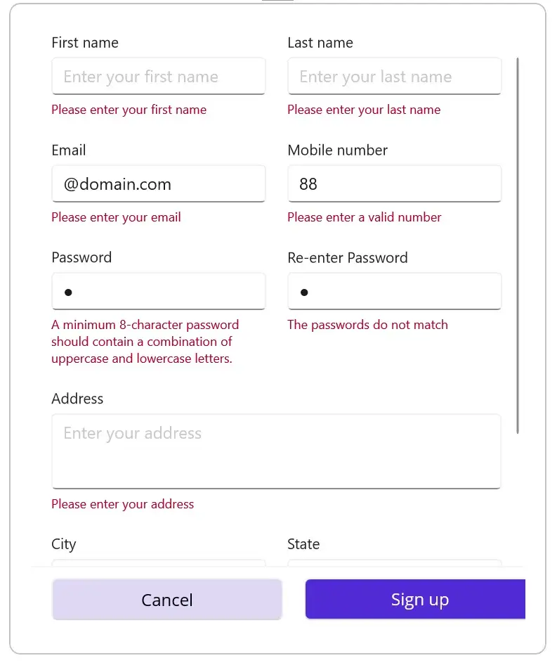
Show validation success message
If the input values are correct, show the successful validation message. This will show the users that their provided data is in the required format.
Refer to the following code example. Here, we will display the valid message Password strength is good at the bottom of the Password field upon successful validation.
[Display(Prompt = “Enter your password”, Name = “Password”)][DataType(DataType.Password)][DataFormDisplayOptions(ColumnSpan = 2, ValidMessage = “Password strength is good”)][Required(ErrorMessage = “Please enter the password”)][RegularExpression(@”^(?=.*[a-z])(?=.*[A-Z])[a-zA-Z\d]{8,}$”, ErrorMessage = “A minimum 8-character password should contain a combination of uppercase and lowercase letters.”)]public string Password { get; set; }
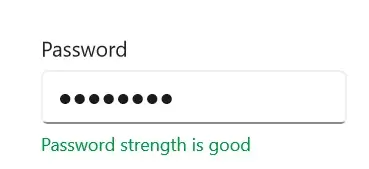
Set validate modes in the DataForm
The .NET MAUI DataForm control supports the following validation modes to denote when the value should be validated:
- LostFocus: This is the default validation mode, and the input value will be validated when the editor loses focus.
- PropertyChanged: The input value will be validated immediately when it is changed.
- Manual: Use this mode to manually validate the values by calling the Validate method.
Refer to the following code example. Here, we have set the validation mode as PropertyChanged.
<dataForm:SfDataForm x:Name="signUpForm" DataObject="{Binding SignUpFormModel}" ValidationMode="PropertyChanged" CommitMode="PropertyChanged"/>
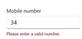
Validate the data using IDataErrorInfo
We can implement the IDataErrorInfo interface in the data object class to validate the sign-up form.
Refer to the following code example. Here, we implement the IDataErrorInfo validation in the RetypePassword field.
public class SignUpFormModel : IDataErrorInfo{ [Display(Prompt = "Enter your password", Name = "Password")] [DataType(DataType.Password)] [DataFormDisplayOptions(ColumnSpan = 2, ValidMessage = "Password strength is good")] [Required(ErrorMessage = "Please enter the password")] [RegularExpression(@"^(?=.*[a-z])(?=.*[A-Z])[a-zA-Z\d]{8,}$", ErrorMessage = "A minimum 8-character password should contain a combination of uppercase and lowercase letters.")] public string Password { get; set; } [Display(Prompt = "Confirm password", Name = "Re-enter Password")] [DataType(DataType.Password)] [Required(ErrorMessage = "Please enter the password")] [DataFormDisplayOptions(ColumnSpan = 2)] public string RetypePassword { get; set; } [Display(AutoGenerateField = false)] public string Error { get { return string.Empty; } } [Display(AutoGenerateField = false)] public string this[string name] { get { string result = string.Empty; if (name == nameof(RetypePassword) && this.Password != this.RetypePassword) { result = string.IsNullOrEmpty(this.RetypePassword) ? string.Empty : "The passwords do not match"; } return result; } }}
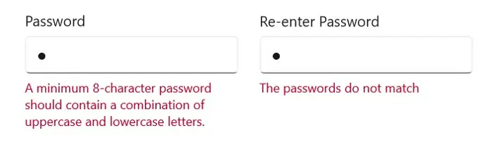
Validate the data using INotifyDataErrorInfo
You can also validate the data by implementing the INotifyDataErrorInfo interface in the data object class.
Refer to the following code example. Here we implemented INotifyDataErrorInfo validation in the Country field.
public class SignUpFormModel : INotifyDataErrorInfo{ [Display(Prompt = "Enter your country", Name = "Country")] public string Country { get; set; } [Display(AutoGenerateField = false)] public bool HasErrors { get { return false; } } public event EventHandler<DataErrorsChangedEventArgs> ErrorsChanged; [Display(AutoGenerateField = false)] public IEnumerable GetErrors(string propertyName) { var list = new List<string>(); if (propertyName.Equals("Country") && string.IsNullOrEmpty(this.Country)) list.Add("Please select your country"); return list; } }
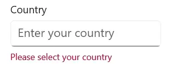
Validate the form before signing up
Finally, we’ll validate the complete form when the Sign-up button is clicked by using the Validate method.
Refer to the following code example.
private async void OnSignUpButtonClicked(object? sender, EventArgs e){ if (this.dataForm != null && App.Current?.MainPage != null) { if (this.dataForm.Validate()) { await App.Current.MainPage.DisplayAlert("", "Signed up successfully", "OK"); } else { await App.Current.MainPage.DisplayAlert("", "Please enter the required details", "OK"); } }}
After executing the previous code example, we will get the output shown in the following images.
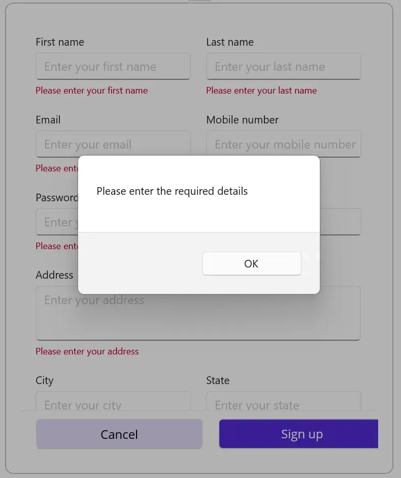
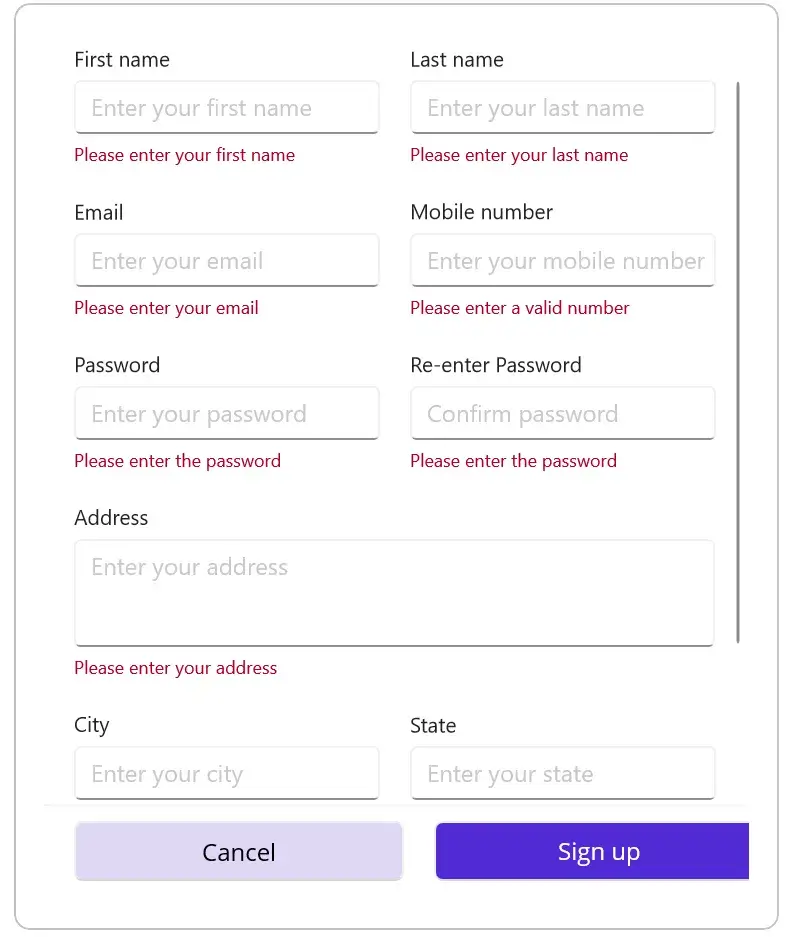
GitHub reference
Check out the complete code example to create and validate a sign-up form using the .NET MAUI DataForm on GitHub.
Conclusion
Thanks for reading! In this blog, we have learned how to create and validate a sign-up form using the .NET MAUI DataForm control. Try out the steps in this blog and leave your feedback in the comments section below.
For current Syncfusion customers, the newest version of Essential Studio is available from the license and downloads page. If you are not a customer, try our 30-day free trial to check out these new features.
You can also contact us through our support forums, feedback, or support portal. We are always happy to assist you!
Related blogs
In this first part of my post, I will focus on how to use the OpenAI APIs through HTTP POST requests, both to get text responses (completions) and to generate images with OpenAI technology. I want to emphasize that all the information presented in this publication is due to the valuable talk given by Luis Beltran, PhD, who gave us taught how to build a ChatGPT in .NET MAUI with the OpenAI APIs...
Franks heads back to create apps for games from the 1990s with .NET MAUI
Follow Us
- Frank: Twitter, Blog, GitHub
- James: Twitter, Blog, GitHub
- Merge Conflict: Twitter, Facebook, Website, Chat on Discord
- Music : Amethyst Seer - Citrine by Adventureface
⭐⭐ Review Us ⭐⭐
Machine transcription available on http://mergeconflict.fm
Sponsored By:
- Syncfusion: Syncfusion offers the largest selection of controls for .NET MAUI, Xamarin, WPF, Windows Form, Win UI, Flutter, Blazor, ASP.NET Core, and more! Check out our components on NuGet and don’t forget to download their free e-books.
Links:
This is a short article with a solution to a problem I couldn’t find on the internet. I upgraded VS for Mac to version 17.4.5 recently, and upgraded Xcode to the appropriate version as stated in the docs (https://learn.microsoft.com/en-us/visualstudio/releases/2022/mac-release-notes). As it happens often, I had a bad surprise after this. I tried uploading an app […]
The post Uploading Your Xamarin or MAUI iOS app to the App Store Without VS for Mac appeared first on Doumer's Blog.
An Avatar is a graphical representation that is associated with a specific user for identification purposes. This is widely used in our everyday applications, and that is why it’s important that you have the tools at hand that will help you achieve it.. In this article we will learn how to implement the .NET Maui Community Toolkit AvatarView in very simple and quick steps!
We will learn to integrate it in a simple way! The explanation will be divided into the following points:
.NET MAUI Community Toolkit: Implementation
Preparing your XAML to add the AvatarView
Knowing the AvatarView’s properties
Let’s start!
.NET MAUI Community Toolkit: Implementation
The key to achieve drawing in our App is to use Community.ToolKit.Maui NuGet package, let’s see its definition and how to implement it.
What is .NET MAUI Community Toolkit??
It’s a collection of reusable elements such as animations, behaviors converters, among others, for developing applications for iOS, Android, macOS and WinUI using MAUI.
Let’s implement it:
- Add from NuGet Package: Community.Toolkit.Maui

- Now let’s initialize: Go to your MauiProgram.cs file
In the CreateMauiApp method, place in the .UseMauiApp<App>() line and just below it add the following line of code:
Don’t forget to add the using CommunityToolkit.Maui;at the top of the class.
Preparing your XAML to add the AvatarView
What is AvatarView?
AvatarView is a control provided by Community.Toolkit.Maui which is responsible for providing a user’s avatar image or their initials. This one can be text, colores or shaped. And all with support for shadows and gestures.
To continue, add the following namespace on your XAML:
Then, you have to add the DrawingView tag with the properties that you need:
Knowing the DrawingView’s properties
It has different useful properties, let’s know some of them:

BackgroundColor: Sets the background color that the AvatarView will have.
BorderColor and BorderWidth: Are responsible of establishing the color and width of the border respectively, which the AvatarView will have.
Text and TextColor: Allow us to establish text and color of the letters respectively.
CornerRadius: Determines the shape of the control.
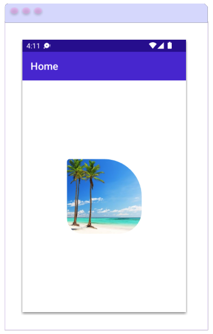 You can also add an image using the ImageSource property.
The CornerRadius Property, beside allowing us to set a single value to round all smooth edges, also allows us to add separate values for the top left, top right, bottom left, and bottom right of the control.
Keep in mind that if you add an image, you won’t be able to display the text.
 Additional information
The default value for the AvatarView’s WidthRequest and HeightRequest properties is 48. Unless the AvatarView is constrained by its design or the value of these properties is specified.
Spanish article: https://es.askxammy.com/agregando-un-avatar-con-net-maui-community-toolkit/

Join Syncfusion developer Chad Church and JetBrains developer advocate Khalid Abuhakmeh as they collaborate on a .NET MAUI mobile app for building personal cookbooks. You’ll be able to snap a picture of a recipe anywhere, annotate it, and pull it up whenever you need it. By the end, you’ll have the functionality to sort your cookbook for specific kinds of recipes, too.
This free webinar will take place on Thursday, March 16, at 11 a.m. EDT. Register now and see firsthand how .NET MAUI makes mobile development fast and efficient, putting powerful features at your fingertips.
Related Links
The Syncfusion .NET MAUI Calendar control allows users to select a single date, multiple dates, or a range of dates easily. It provides month, year, decade, and century views so you can quickly navigate to your desired date.
In this blog, we’ll explore the significant features of the .NET MAUI Calendar.
Calendar views
The .NET MAUI Calendar control supports month, year, decade, and century views. You can use them to navigate to and select a desired date quickly. The Calendar control also supports programmatic navigation.
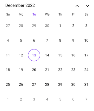 | 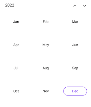 |
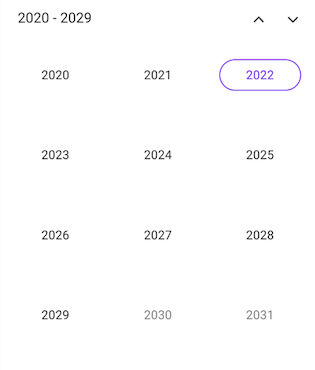 | 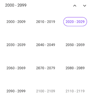 |
Multiple Views in the .NET MAUI Calendar Control
Selection modes
There are three different selection modes in the .NET MAUI Calendar to select dates:
- Single selection: The most basic selection mode, it allows you to select a single date on the calendar.
- Multiple selection: This mode allows you to select multiple dates on the calendar.
- Range selection: You can select a range of dates by specifying the start and end dates on the calendar.
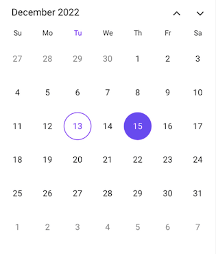 | 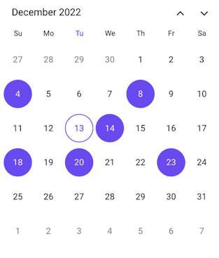 |
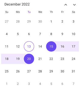
Date Selection Modes in the .NET MAUI Calendar Control
Range selection modes
You can extend the date-range selection with the following range selection modes in the .NET MAUI Calendar:
- Default: The basic type of range selection. It allows you to select different ranges once the current range is completed.
- Forward: Extend the date range’s end date farther into the future.
- Backward: Move the start date earlier to extend the date range.
- Both: Extending the date range both to start earlier and end later.
- None: Restrict the selection once the range is completed.
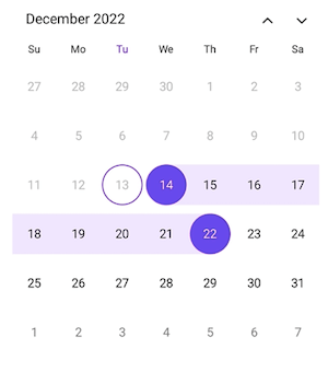 | 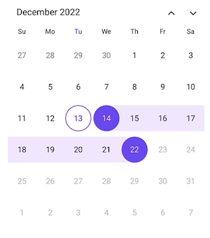 |
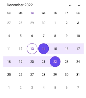 | 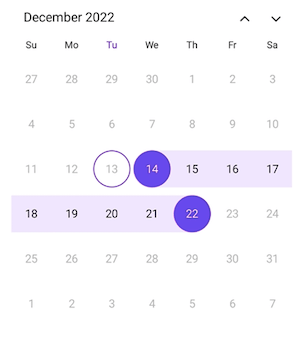 |
Date Range Selection Modes in the .NET MAUI Calendar Control
Managing the number of weeks in a month view
You can customize the number of weeks displayed in the Calendar. The month view rows will be rendered based on the specified number of weeks.
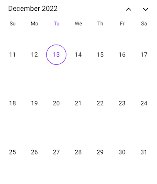
Week number view
The .NET MAUI Calendar also supports displaying the week numbers (of the year) in the month view in a separate column before the month cells.
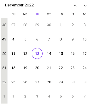
Customizing your date selection limits
Restrict interaction and navigation beyond the specified date limit by setting the minimum and maximum dates.
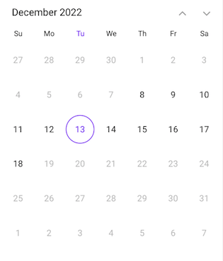
First day of the week
Not all calendar systems begin the week on Sunday. You can easily customize the first day of the week in the .NET MAUI Calendar’s monthly view to fit your needs.
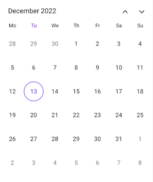
Restricting date selection
You can restrict date selection in the .NET MAUI Calendar using any of the following features:
- Minimum and maximum dates: Configure the minimum and maximum dates to prevent selection outside the date range.
- Selectable day predicate (BlackoutDates): Disable specific dates on the calendar view to prevent selection of them.
- Disable dates in the past: Disable the dates before today on the calendar view to prevent selection of them.
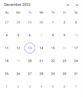 | 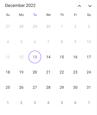 |
Restricting Date Selection in the .NET MAUI Calendar Control
Customizing the holidays
The .NET MAUI Calendar allows users to configure special dates like holidays and weekend days. Customize the background color and text style to highlight any date and every weekend in a month as special days.
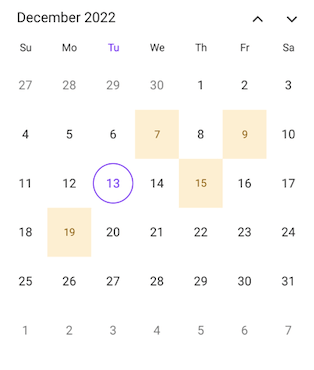 | 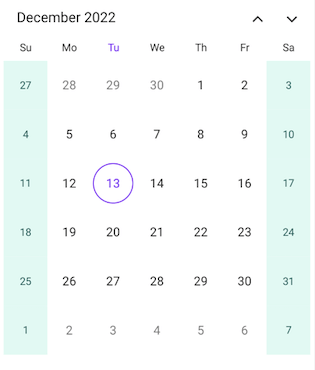 |
Customizing the Holidays and Weekends in the .NET MAUI Calendar
Personalize the appearance of your calendar
You can customize the appearance of calendar elements such as the header, month, year, decade, century, selected dates, trailing and leading dates, and disabled cells.
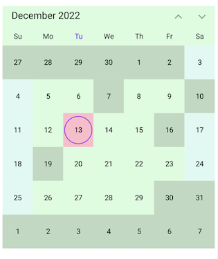
Right-to-left (RTL) support
The .NET MAUI Calendar includes right-to-left (RTL) rendering support to display the calendar views.
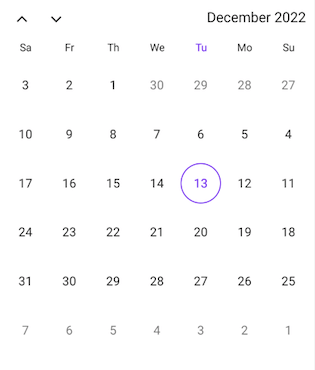
Globalization
You can display the .NET MAUI Calendar views based on global date and time formats. This will help you to reach out to a global audience easily.
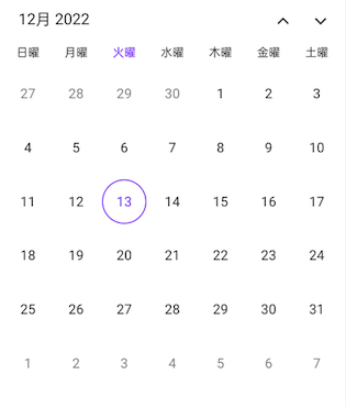
Conclusion
Thanks for reading! In this blog, we have seen the significant features of the Syncfusion .NET MAUI Calendar control. Try out this user-friendly control and share your feedback in the comments section below.
Also, check out our .NET MAUI controls demos on GitHub.
If you are not a Syncfusion customer, you can try our 30-day free trial to see how our components can enhance your projects.
For questions, you can reach us through our support forum, support portal, or feedback portal. We are always happy to assist you!
Related blogs
Earlier this week, the .NET SDK and Runtimes received some updates. Together with that, also Visual Studio for Mac was updated. Once I got past the installation of all updates, both Visual Studio and Rider were no longer restoring the required NuGet packages for my .NET MAUI project running on .NET 6.
I eventually fixed that issue by cleaning up all the .NET SDKs, Runtimes, workloads and NuGet caches on my MacBook Pro. Read on to learn about the tools I used.
.NET uninstall tool
I have been using the .NET uninstall tool in the past. Unlike on Windows, you have to download the executable from GitHub in its zipped form.
While the releases page shows some terminal commands to unpack and run the tool, they never worked for me as stated there. While I was able to make the new directory with the mkdir command, the unpacking always shows an error. So I opened up Finder and unzipped it manually with the Archive Utility app that ships with macOS.

After switching to the folder in Terminal, the tool is supposed to show the help. Instead, I got an error showing me that I am not allowed to run this app for security reasons. The OS blocks the execution. If the same happens for you, right click on the extracted executable and select “Open With” followed by “Terminal.app (default)“. This will prompt you with this screen:

Once you click on “Open“, a new Terminal window appears. Close this window, it is unusable as we are already in the exited state. Instead, open a new Terminal and change to the installation folder and call the help command:
cd ~/dotnet-core-uninstall./dotnet-core-uninstall -h

Now that we are able to run the tool, let’s have a look what we have installed by running the dotnet --list command. We need to call the command twice, once for the installed -sdks and once for the installed -runtimes:
dotnet --list-sdksdotnet --list-runtimes
You may be as surprised (I was, at least) how many versions you are accumulating over time. They never get removed by newer versions (it’s by design, according to Microsoft). To get rid of all versions except the latest, run the following commands with the uninstall tool (again once for — sdk, once for –runtime):
sudo ./dotnet-core-uninstall remove --all-but-latest --sdksudo ./dotnet-core-uninstall remove --all-but-latest --runtime
After uninstalling all previous versions, you may have to reinstall the latest .NET 6 SDK again. You could also use the –-all-but [Versions] command to specify the versions explicitly. No matter which way you’re going, if you run the dotnet --list commands again, you should see something similar to this:

Download: https://github.com/dotnet/cli-lab/releases
Documentation: https://learn.microsoft.com/en-us/dotnet/core/additional-tools/uninstall-tool?tabs=macos#step-3—uninstall-net-sdks-and-runtimes
dotnet workload command
As I had problems getting the required NuGet packages for my MAUI app, I decided to uninstall all .NET MAUI workloads as well. First, I had a look what is installed with the list command:
dotnet workload list

Once you have that list, you need to call the uninstall command for every single installed workload:
sudo dotnet workload uninstall macos maui-maccatalyst maui-ios maui-android ios maccatalyst maui tvos android
Once they are uninstalled, I cleared the Terminal and installed them all again using the install command:
sudo dotnet workload install macos maui-maccatalyst maui-ios maui-android ios maccatalyst maui tvos android

Now we have the latest .NET MAUI workload installed as well as the platform specific workloads as well.
Documentation: https://learn.microsoft.com/en-us/dotnet/core/tools/dotnet-workload
dotnet nuget locals
The final clean-up step involves all NuGet caches on your machine. Yes, you read that right, multiple caches. To see them all, run the following command:
dotnet nuget locals all --list
This will get you something like this:

Now let’s get rid of all those old NuGet packages:
sudo dotnet nuget locals all --clear
If you’re lucky, you will see this message:

My first attempt was not that successful. I needed to open the global packages’ folder in Finder and delete some remaining packages manually. Only after that, I was able to run the clear command with success.
Conclusion
Neither Visual Studio nor the .NET installer perform clean-up tasks on macOS. Until Microsoft changes their mind here, we will have to clean-up old packages manually to keep our system smoothly running. Luckily, there are at least CLI tools around to help us with that job. As always, I hope this blog post will be helpful for some of you.
Until the next post, happy coding, everyone!
The post How to use the .NET CLI clean-up tools on macOS appeared first on MSicc's Blog.
Have you had the need to add drawing functionality to your .NET MAUI apps? .. Probably yes, .. but beyond drawing… Have you required the user of your banking App to sign through it? In this article, we learn how to do it with the .NET MAUI Community Toolkit.
We will learn to integrate it in a simple way! The explanation will be divided into the following points:
.NET MAUI Community Toolkit: Implementation
Preparing your XAML to add the DrawView
Knowing the DrawingView’s properties
Cleaning the DrawView
Showing the image from DrawView
Let’s start!
.NET MAUI Community Toolkit: Implementation
The key to achieve drawing in our App is to use Community.ToolKit.Maui NuGet package, let’s see its definition and how to implement it.
What is .NET MAUI Community Toolkit??
It’s a collection of reusable elements such as animations, behaviors converters, among others, for developing applications for iOS, Android, macOS and WinUI using MAUI.
Let’s implement it:
- Add from NuGet Package: Community.Toolkit.Maui
- Now let’s initialize: Go to your MauiProgram.cs file
In the CreateMauiApp method, place in the .UseMauiApp<App>() line and just below it add the following line of code:
Don’t forget to add the using CommunityToolkit.Maui;at the top of the class.
Preparing your XAML to add the DrawView
What is DrawingView?
Is a class provided by Community.Toolkit.Maui which is responsible for providing a surface that allows drawing lines through touch or mouse interaction.
To continue, add the following namespace on your XAML:
Then, you have to add the DrawingView tag with the properties that you need:
Knowing the DrawingView’s properties
It has different useful properties, let’s know some of them:
WidthRequest and HeightRequest: These properties help to set the width and height respectively. Keep in mind that you must add both properties to your DrawingView in order for it to be displayed correctly in your app.
LineColor: It’s the color that the drawing line will have.
LineWidth: It’s the width that the drawing line will have.
IsMultiLineModeEnabled: By default, the DrawingView allows only one stroke to be drawn at a time. The IsMultiLineModeEnabled property allows you to change this and draw multiple lines at once. It receives Bool values. To activate it you need to set the value to True.

Cleaning the DrawView

If you want to clear the DrawView, do the following:
Add a button with a Click event.
Go to CodeBehind and in the Button event, add the following:
You can also do this with MMVM.
Showing the image from DrawView

Add an Image control to your XAML.
We will use the DrawingLineCompleted event for the DrawingView.
Finally, develop the event:
You can also do this with MMVM.
And done! You are ready to draw and sign in your .NET MAUI applications!
<Label Text=”Thanks for ready! ” />
Spanish article: https://es.askxammy.com/dibujando-con-net-maui-community-toolkit/
Reference: https://www.youtube.com/watch?v=7rw13\_a5GR0
There has never been a better time to update & migrate your Xamarin.iOS and Xamarin.Android apps to the latest version of .NET. The update process for most apps should be quick and when you are finished you will be able to take advantage of the latest features of .NET 7 including C# 11 and the new project system. In addition, iOS & Android apps built against .NET 6 and .NET 7 have large performance improvements and developer productivity features as they take advantage of build system enhancements. The team has just released upgrade documentation for apps, so go head over there for a full walkthrough. In this blog, I will walk you through some tips & tricks to get started with your update.

If you are looking to update and migrate your Xamarin.Forms based applications then skip this blog and follow the self-guided documentation that outlines out to manually update or take advantage of the .NET Upgrade Assistant.
Work in a Branch
Before you start your update process it is a good idea to work in a branch if you are using git! This will ensure you can easily roll back and iterate over time if you have a complex project.
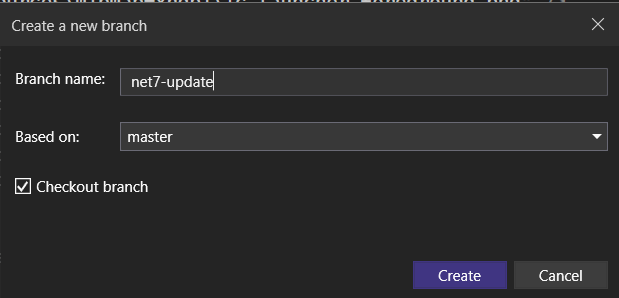
Analyze NuGet Packages
The first step in the upgrade process is to check your NuGet packages in your projects. You will need to ensure that they have been updated and re-compiled against .NET 6 or .NET 7 for iOS and Android.
Consider my Xamarin.Android app that I am looking to update, it has references to AndroidX, Material Design, Xamarin.Essentials, and a few of my own libraries:
<ItemGroup> <PackageReference Include="Xamarin.AndroidX.AppCompat" Version="1.6.0.1" /> <PackageReference Include="Xamarin.Google.Android.Material" Version="1.7.0.2" /> <PackageReference Include="Xamarin.Essentials" Version="1.7.4" /> <PackageReference Include="Plugin.InAppBilling" Version="6.7.0" /> <PackageReference Include="MonkeyCache.FileStore" Version="1.5.2" /></ItemGroup>You can browse NuGet.org to find your packages and see what frameworks they support. In the case of Xamarin.AndroidX.AppCompat we can see that it supports both monoandroid12.0 (Xamarin.Android) and net6.0-android31.0 (compiled against .NET 6).
Note: For Xamarin.Android projects it is recommended to migrate from Android Support Libraries as they are not supported in .NET 6+ Android projects. You can do this by migrating to AndroidX by following the migration guide documentation.
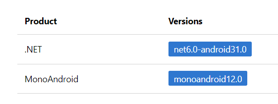
In this case, this library is fully compatible with the latest versions of .NET for Android. If the version of a NuGet package isn’t compatible with the latest framework you may need to update to a new version or find a replacement. Monkey Cache for example only supports only supported Xamarin apps in version 1.5.2, but version 2.0.1 was recompiled against .NET 6 and will be compatible.
Update Project Files
Android and iOS are now integrated directly into .NET. This means that they have have new Target Framework Monikers of net7.0-android and net7.0-ios. They also use the new .NET SDK project style. This means the configuration inside of your projects .csproj has been greatly simplified. The next step in the process is to unload your Android and iOS Projects. The easiest thing to do is delete all of the content inside of it and add the new base SDK style project settings:
Android:
<Project Sdk="Microsoft.NET.Sdk"> <PropertyGroup> <TargetFramework>net7.0-android</TargetFramework> <OutputType>Exe</OutputType> </PropertyGroup></Project>iOS:
<Project Sdk="Microsoft.NET.Sdk"> <PropertyGroup> <TargetFramework>net7.0-ios</TargetFramework> <OutputType>Exe</OutputType> </PropertyGroup></Project>Notice here that there is no longer the need to manually reference individual files, resources, or compilation settings for Debug or Release. The project system is automatically configured to use defaults. You can always update these settings with the new project settings dialog.
Before reloading the project it is a good idea to manually delete the obj and bin folders for the project.
Android: Delete Resource.designer.cs
In Xamarin.Android projects a Resource.designer.cs file was generated when resources changed and added into the Resources folder. This file is no longer needed and can be deleted as they are auto generated as a code generation step.
Delete AssemblyInfo.cs
Similar to the Resource.designer.cs the AssemblyInfo.cs file is automatically generated based on project settings. These files can be deleted from the Properties folder for both iOS and Android.
Note: You may have had permission settings in your Android project’s
AssemblyInfo.csfile. You can leave these and remove everything else, or move them to another file.
Xamarin.Essentials to .NET MAUI Essentials
Xamarin.Essentials was a fundamental library for nearly every Xamarin application. If you were using this NuGet package, you will want to remove it as Xamarin.Essentials is now part of .NET MAUI. The team has worked hard to ensure that while it comes pre-configured with every .NET MAUI application, it is still available to all iOS and Android apps built with .NET.
<PropertyGroup> <UseMauiEssentials>true</UseMauiEssentials></PropertyGroup>Once you update to .NET MAUI Essentials, you will need to update any using Xamarin.Essentials; using statements to the new .NET MAUI Essentials namespaces, which you can find in the documentation.
Add & Update NuGet Packages
Going back to the NuGet packages that we previously analyzed, now we can add them back into our project. For our Android app we will move over and update the packages to the latest versions that are compatible, and remove the reference to Xamarin.Essentials:
<ItemGroup> <PackageReference Include="Xamarin.AndroidX.AppCompat" Version="1.6.0.1" /> <PackageReference Include="Xamarin.Google.Android.Material" Version="1.7.0.2" /> <PackageReference Include="Plugin.InAppBilling" Version="6.7.0" /> <PackageReference Include="MonkeyCache.FileStore" Version="2.0.1" /></ItemGroup>Project References
If you reference any other .NET Standard libraries you can add them as a project reference. Any Xamarin.iOS or Xamarin.Android class library or binding library will also need to be updated to the new formats and then added back as references. You may want to consider updating your .NET Standard libraries to .NET 6 or .NET 7 to take advantage of the latest features of .NET and C#!
Use New Features
There are several enhancements to the project system that help you easily manage app settings. Now, you can manage your app versions, supported platform versions, app identifiers, and more!
Here are a few settings you can add to your ProjectGroup in your project:
<ApplicationTitle>MyApp</ApplicationTitle><SupportedOSPlatformVersion>21</SupportedOSPlatformVersion><ApplicationId>com.companyname.myapp</ApplicationId><ApplicationVersion>1</ApplicationVersion><ApplicationDisplayVersion>1.0</ApplicationDisplayVersion>Once these are added you can remove them from your AndroidManifest.xml and Info.plist. Additionally, you can remove the <uses-sdk/> node from the AndroidManifest.xml as these are now outlined with these settings. There are many more options that you can find on documentation for Android and documentation for iOS
Additionally, you may want to consider turning on implicit usings and enabling nullable reference types
<Nullable>enable</Nullable> <ImplicitUsings>enable</ImplicitUsings>Summary
I hope that you found this upgrade guide nifty on getting your Xamarin.iOS and Xamarin.Android apps updated to the latest version of iOS & Android for .NET. I tried to cover a lot of tips & tricks, but be sure to read the full migration documentation for even more.
For more information on the performance improvements be sure to browse through the amazing blog posts from Jonathan Peppers on .NET 6 improvements and .NET 7 improvements.
I also have uploaded full before and after code samples available on my GitHub.
Don’t forget to read through the Xamarin support policy to make sure you plan your upgrade and migration.
The post Tips & Tricks on Upgrading Xamarin.iOS & Xamarin.Android to .NET for iOS & Android appeared first on Xamarin Blog.
As you know, Android is always adding features in its new versions and now the Post Notifications permission has been introduced from Android 13. In this blog, we are going to explore how to request it in our Xamarin.Android projects.
Sample Project
1. Let’s set Android 13.0 as the Target framework.
Open your project settings by right-clicking on your Android project then then selecting -> Properties -> Application. This is required because this permission is only supported in API versions starting with 33, which means Android version 13 or later.

Next, Select Android Manifest -> Set Target Android version.
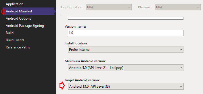
2. Let’s add the Post Notification permission on Android Manifest
Go to the Android project then right-click -> Properties -> Android Manifest

3. Let’s install the Xamarin.Essentials NuGet Package
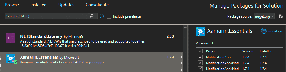
We have to initialize Xamarin.Essentials in our Android project, so let’s add this code in the MainActivity.cs file:
protected override void OnCreate(Bundle savedInstanceState){ base.OnCreate(savedInstanceState); Xamarin.Essentials.Platform.Init(this, savedInstanceState); global::Xamarin.Forms.Forms.Init(this, savedInstanceState); LoadApplication(new App());}public override void OnRequestPermissionsResult(int requestCode, string[] permissions, [GeneratedEnum] Android.Content.PM.Permission[] grantResults){ Xamarin.Essentials.Platform.OnRequestPermissionsResult(requestCode, permissions, grantResults); base.OnRequestPermissionsResult(requestCode, permissions, grantResults);}4. Let’s create an Interface in the shared project
For this example, we are going to create the file IPostNotificationPermissionService.cs, and then we’ll implement it in each platform.
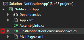
Add the following code to the file:
public interface IPostNotificationPermissionService{ Task<bool> CheckAndRequestPermissions();}5. Let’s implement IPostNotificationPermissionService in the Android project
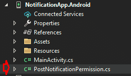
We need to request the Post Notifications permission and show the prompt, but how do we do that? We added Xamarin.Essentials to allow us to extend permissions. You can see the detailed documentation on permissions in Xamarin.Essentials here.
internal class PostNotificationsPermission : BasePlatformPermission{ public override (string androidPermission, bool isRuntime)[] RequiredPermissions => new List<(string androidPermission, bool isRuntime)> { (Manifest.Permission.PostNotifications, true) }.ToArray();}Now we can use PostNotificationsPermission to implement our IPostNotificationPermissionService interface.
public class PostNotificationPermissionService : IPostNotificationPermissionService{ public async Task<bool> CheckAndRequestPermissions() { // Tiramisu is Android v13 if (Build.VERSION.SdkInt >= BuildVersionCodes.Tiramisu) { var status = await CheckStatusAsync<PostNotificationsPermission>(); if (status == PermissionStatus.Granted) { return true; } status = await RequestAsync<PostNotificationsPermission>(); return status == PermissionStatus.Granted; } return true; }}6. Let’s inject PostNotificationsPermission
We are going to add the Xamarin Dependency Injection.
[assembly: Dependency(typeof(PostNotificationPermissionService))]namespace NotificationApp.Droid{ // Extend Xamarin Essentials internal class PostNotificationsPermission : BasePlatformPermission { // ... } // Implementing PostNotificationPermission public class PostNotificationPermissionService : IPostNotificationPermissionService { // ... }}7. Let’s use PostNotificationsPermission
We are going to override the OnAppearing method in the MainPage.xaml.cs
protected override async void OnAppearing(){ base.OnAppearing(); var service = DependencyService.Get<IPostNotificationPermissionService>(); await service.CheckAndRequestPermissions();}8. Let’s run the app

As you can see, that’s all it takes to implement a new Android permission in Xamarin. Easy, right?
All of my code is available on GitHub for you to review. Happy coding!
References
The post Adding a New Android Permission in a Xamarin App appeared first on Trailhead Technology Partners.

Nuke image caching library for dotnet MAUI.
 roubachof
Get it from NuGet:

Before, in Xamarin.Forms, to speed up our image loading we could use GlideX on Android, and Xamarin.Forms.Nuke on iOS.
With this solution, we achieved a perfect efficient native image caching solution for both platform.
But since MAUI, the Android platform has integrated the Glide native library. No need to use GlideX now.
Unfortunately on, iOS, there is no integrated native caching...
It means the caching and performance of using images on iOS is not so great in terms of speed and memory usage.
But rejoice!
Maui.Nuke is here to repair this injustice by implementing image caching with the fastest and most popular ios native caching library: Nuke \o/

Moreover, once installed, it is completely transparent to the user, you use your Image views just like before, all the work is done under the hood.
This project is using the NukeProxy library, which is a Swift .net6 proxy to the nuke native library. The new binding and the packaging has been done by the great @cheesebaron. Hail to the Cheese!
Current version of the Nuke library is 10.3.1.
Installation
public static MauiApp CreateMauiApp(){ var builder = MauiApp.CreateBuilder(); builder .UseMauiApp<App>() .UseNuke(showDebugLogs: false);}BOOM
You just achieved 90%+ memory reduction when manipulating Image views.

The .NET team focused on delivering several major updates and improvements to the .NET Framework for version 7. These included a unified codebase, a single base class library (BCL) for all supported platforms, and native support for ARM64. The team also enhanced .NET support for Linux and continued work on performance improvements and developer productivity upgrades.
One of the major themes of these updates was the emphasis on modern and cloud-native app development—the ability to build cross-platform mobile and desktop apps from the same codebase and support container-first workflows. The team also aimed to ease the development and deployment of distributed cloud-native apps using. NET.
In addition to these updates, the team also worked on simplifying the development process and making it easier for developers to write code. It introduced C# 11, which aims to reduce the amount of code needed to perform everyday tasks, and improved HTTP/3 and minimal APIs to support cloud-native app development.
Overall, the updates and improvements focused on making .NET a powerful and flexible framework for building modern, cloud-native applications and making it easier for developers to write and maintain their code. Let’s cover these updates in more detail.
Easily build cross-platform mobile and desktop apps with the flexible and feature-rich controls of the Syncfusion .NET MAUI platform.
A single base class library
The .NET team focused on delivering a unified codebase and a single base class library (BCL) for all supported platforms in the .NET 7 release. This means developers can use the same tools and libraries to build many applications, including cloud, web, mobile, and gaming apps. Developers will find it easier to work across different platforms and be confident that their code is consistent and portable. This change also makes it easier for developers to take advantage of new features and improvements in the .NET Framework, as they are available across all supported platforms.
Multiple platform support
The .NET 7 Framework supports multiple platforms, including Android, iOS, macOS, and Windows. Developers can use the same codebase to build applications on any platform. Additionally, the .NET Framework supports multiple CPU architectures, including x64, x86, ARM64, and ARM32, meaning developers can build applications that run on various devices, from phones to desktop computers.
The .NET Framework also includes tools and libraries that make it easy for developers to build applications that run on multiple platforms. It supports cross-platform APIs and tools for building, deploying, and debugging applications on different platforms. This makes it easier for developers to build applications that can run on any device, regardless of its operating system or CPU architecture.
Syncfusion .NET MAUI controls are well-documented, which helps to quickly get started and migrate your Xamarin apps.
Performance improvements for ARM64 using 64-bit IBM support
The .NET 7 Framework includes native support for ARM64, which enables applications to take advantage of the performance benefits of 64-bit processing on ARM-based devices. This feature can improve the overall performance of applications and can also help reduce power consumption on such devices.
The .NET team worked closely with IBM to support 64-bit ARM architectures in the .NET Framework. Their efforts included optimizing the .NET runtime and core libraries for ARM64 and implementing support for new features in the IBM POWER9 processor. This collaboration helped ensure that the .NET Framework can take full advantage of the performance and power-saving capabilities of 64-bit ARM architectures.
Native support for ARM64 in the .NET 7 Framework improves the performance and efficiency of applications running on ARM-based devices. This can help reduce power consumption and extend battery life. This makes the .NET Framework a powerful and flexible tool for building applications that run on various devices, including those with low-power processors.
Enhanced .NET support on Linux
The .NET 7 Framework includes enhanced support for Linux, delivering improvements to the .NET runtime, core libraries, and new tools and libraries for building, deploying, and debugging .NET applications on Linux.
Developers now have an easier time building and deploying .NET applications on Linux-based systems, such as servers, cloud environments, and IoT devices. The improvements positively affect the performance and reliability of such applications and make it easier for developers to take advantage of the unique features and capabilities of Linux-based systems.
To make it easy for developers to include Syncfusion .NET MAUI controls in their projects, we have shared some working ones.
New target framework moniker
The .NET 7 Framework introduces a new target framework moniker (TFM) for specifying the version of the .NET Framework that an application targets. The new TFM is net7.0, which replaces the previous TFM of net6.0 used in the previous stable version of the .NET Framework.
The new TFM is used in an application’s project file to specify which version of the .NET Framework the application targets. This allows developers to take advantage of new features and improvements in the .NET 7 Framework while still being able to build and run their applications on previous versions of the .NET Framework.
For example, a developer can specify the net7.0 TFM in their application’s project file, enabling the application to use new features and improvements in the .NET 7 Framework. However, the application will still be able to run on earlier versions of the .NET Framework, such as .NET 6.0, as long as it does not use any features or APIs that are not available in those earlier versions.
Overall, this can help improve the performance and reliability of .NET applications and make it easier for developers to maintain and upgrade their applications over time.
Built for cloud-native apps and mobile clients
The .NET MAUI (Multi-platform App UI) framework is specifically designed for building cloud-native and mobile applications. It is a cross-platform framework that enables developers to build applications that run on various platforms, including mobile devices, desktop computers, and cloud environments.
Syncfusion .NET MAUI controls allow you to build powerful line-of-business applications.
The .NET MAUI framework includes several features and tools that make it well-suited for building cloud-native and mobile applications. For example, it supports modern app development patterns, such as microservices and containers, and provides tools for building and deploying applications to the cloud. It also includes cross-platform APIs and controls for building user interfaces that can adapt to different screen sizes and resolutions, which is essential for building applications that run on a wide range of devices.
Developers can create scalable, reliable, and high-performance applications with .NET MAUI that run on any platform, and use the framework to better maintain and update their applications over time.
Conclusion
Thank you for reading! Syncfusion’s support for .NET MAUI is a continuous process, and we’ve just released our sixth set of controls and updates for the platform. More information about our MAUI controls and other features in Essential Studio 2022 Volume 4 can be found on our Release Notes and What’s New pages. Try out the upgrades and share your thoughts in the comment section below!
You can get in touch with us via our support forum, support portal, or feedback portal. We are always delighted to help!
Related blogs
The Syncfusion .NET MAUI DataGrid control displays and manipulates data in a tabular view. It was built from the ground up in .NET MAUI to achieve the best possible performance, even when loading a huge volume of data. It supports various built-in column types based on the data object bound to it.
The following table shows the supported data types and their corresponding column types.
Data type | Column |
string, object | |
Int, float, double, decimal, and their respective nullable types | |
DateTime | |
Bool | |
ImageSource |
Note: For the remaining data types, a Text Column will be created.
You can generate columns either automatically or manually. The .NET MAUI DataGrid creates columns automatically based on the bindable property AutoGenerateColumnsMode. The columns are generated based on the type of individual properties in the underlying collection set in the ItemsSource.
For more details, refer to the different modes of autogenerating columns in .NET MAUI DataGrid documentation.
Let’s explore the different column types in the .NET MAUI DataGrid control with code examples.
Types of columns
The .NET MAUI DataGrid supports the following built-in column types:
Each column has properties to handle different kinds of data. For this demo, we will display business data with the dealer’s name and ID, the shipped date, and more with these column types.
Note: If you’re new to our .NET MAUI DataGrid, please refer to its getting started documentation.
Text column
The text column hosts the text content in the record cells. Each record cell displays text based on the MappingName property that associates the column with a property in the data source.
Refer to the following code example to display the dealers’ names.
<syncfusion:SfDataGrid x:Name="dataGrid" ItemsSource="{Binding DealerInformation}" AutoGenerateColumnsMode="None"> <syncfusion:SfDataGrid.Columns> <syncfusion:DataGridTextColumn HeaderText="Name" MappingName="DealerName"> </syncfusion:DataGridTextColumn> </syncfusion:SfDataGrid.Columns></syncfusion:SfDataGrid>
Checkbox column
A checkbox column holds Boolean values in its cells. We will load the .NET MAUI CheckBox framework control as the content of the record cells and the checkboxes then respond to the Boolean value changes. Based on changes in the data source, the values in the checkbox will be toggled.
Refer to the following code example. We render checkboxes to denote the online status of the dealers.
<syncfusion:SfDataGrid x:Name="dataGrid" ItemsSource="{Binding DealerInformation}" AutoGenerateColumnsMode="None"> <syncfusion:SfDataGrid.Columns> <syncfusion:DataGridCheckBoxColumn HeaderText="Is Online" MinimumWidth="{StaticResource minimumWidth}" MappingName="IsOnline"> </syncfusion:DataGridCheckBoxColumn> </syncfusion:SfDataGrid.Columns></syncfusion:SfDataGrid>
Image column
An image column displays images in its record cells. We will load the .NET MAUI Image framework control to display the grid cell content.
Refer to the following code example to display the dealers’ images.
<syncfusion:SfDataGrid x:Name="dataGrid" ItemsSource="{Binding DealerInformation}" AutoGenerateColumnsMode="None"> <syncfusion:SfDataGrid.Columns> <syncfusion:DataGridImageColumn HeaderText="Dealer" MappingName="DealerImage" CellPadding="8"> </syncfusion:DataGridImageColumn> </syncfusion:SfDataGrid.Columns></syncfusion:SfDataGrid>
Template column
You can display the column values with your desired view using the CellTemplate property. By default, the underlying record is BindingContext for CellTemplate. So, we should define the template for each column to display values based on the MappingName property.
Refer to the following code example.
<syncfusion:SfDataGrid x:Name="dataGrid" ItemsSource="{Binding DealerInformation}" AutoGenerateColumnsMode="None"> <syncfusion:SfDataGrid.Columns> <syncfusion:DataGridTemplateColumn MappingName="Name" MinimumWidth="200" MaximumWidth="{StaticResource nameColumnWidth}"> <syncfusion:DataGridTemplateColumn.HeaderTemplate> <DataTemplate> <Label Text="Product Details" FontFamily="Roboto-Medium" FontSize="14" FontAttributes="Bold" HorizontalOptions="Start" VerticalOptions="Center" Margin="{OnPlatform WinUI='0,16,0,15', MacCatalyst='0,16,0,15', Android='10,8,0,7', iOS='10,8,0,7'}"></Label> </DataTemplate> </syncfusion:DataGridTemplateColumn.HeaderTemplate> <syncfusion:DataGridTemplateColumn.CellTemplate> <DataTemplate> <ContentView VerticalOptions="Start"> <StackLayout Orientation="Horizontal"> <StackLayout HeightRequest="84" Margin="{OnPlatform WinUI='0,8,4,8', iOS='8,8,4,8',Android='8,8,4,8', MacCatalyst='0,8,4,8'}" HorizontalOptions="End" VerticalOptions="Start"> <Label Margin="0,3,0,1" LineBreakMode="WordWrap" HorizontalTextAlignment="End" FontSize="14" Text="ID :" TextColor="Black"> </Label> <Label LineBreakMode="WordWrap" FontSize="14" VerticalOptions="Start" Margin="0,3,0,1" HorizontalTextAlignment="End" Text="No :" TextColor="Black"> </Label> <Label LineBreakMode="WordWrap" FontFamily="Roboto" FontSize="14" VerticalOptions="Start" Margin="0,3,0,1" HorizontalTextAlignment="End" Text="Price :" TextColor="Black"> </Label> </StackLayout> <StackLayout HeightRequest="84" HorizontalOptions="Start" Margin="0,8,0,8" VerticalOptions="Start"> <Label LineBreakMode="WordWrap" Margin="0,3,0,1" Text="{Binding ProductID}" TextColor="Black"> </Label> <Label LineBreakMode="WordWrap" Margin="0,3,0,1" Text="{Binding ProductNo}" TextColor="Black"> </Label> <Label LineBreakMode="WordWrap" Margin="0,3,0,1" Text="{Binding ProductPrice, StringFormat='{0:C}'}" TextColor="Black"> </Label> </StackLayout> </StackLayout> </ContentView> </DataTemplate> </syncfusion:DataGridTemplateColumn.CellTemplate> </syncfusion:DataGridTemplateColumn>
 </syncfusion:SfDataGrid.Columns></syncfusion:SfDataGrid>
Numeric column
A numeric column displays numeric values in the record cells. To create a numeric column, the property corresponding to the column in the underlying collection must be of type numeric.
Refer to the following code example to display the dealers’ IDs in the DataGrid.
<syncfusion:SfDataGrid x:Name=”dataGrid” ItemsSource=”{Binding DealerInformation}” AutoGenerateColumnsMode=”None”> <syncfusion:SfDataGrid.Columns> <syncfusion:DataGridNumericColumn Format=”D” HeaderText=”ID” MappingName=”ProductID”> </syncfusion:DataGridNumericColumn> </syncfusion:SfDataGrid.Columns></syncfusion:SfDataGrid>
Date column
With this column type, you can display date information as the content in a column. To create a date column, the property corresponding to the column in the underlying collection must be DateTime.
Refer to the following code example to display shipped dates.
<syncfusion:SfDataGrid x:Name="dataGrid" ItemsSource="{Binding DealerInformation}" AutoGenerateColumnsMode="None"> <syncfusion:SfDataGrid.Columns> <syncfusion:DataGridDateColumn HeaderText="Shipped Date" MinimumWidth="{StaticResource minimumWidth}" MappingName="ShippedDate">
 </syncfusion:SfDataGrid.Columns></syncfusion:SfDataGrid>
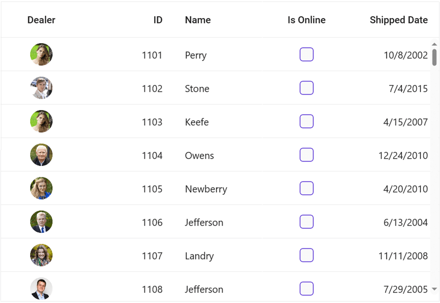
References
For more details, refer to different column types in the .NET MAUI DataGrid GitHub demo and documentation.
Conclusion
Thanks for reading! In this blog, we’ve seen the various column types in the .NET MAUI DataGrid with code examples. You can also enjoy the data binding, sorting, filtering, customization, and other features in the .NET MAUI DataGrid. Try them out and leave your feedback in the comments below!
Customers can download the latest Essential Studio version from the License and Downloads page. If you are not yet a Syncfusion customer, you can always download our free evaluation to examine all our controls.
For questions, you can contact us through our support forums, support portal, or feedback portal. We are delighted to help you!
Related blogs
As a mobile developer, it is essential to prioritize the creation of a simple and uncluttered user interface that enhances the overall usability of the application. One way to achieve this is by grouping the UI elements based on their purpose and function. A group box view can be helpful in this regard, as they allow developers to group related UI elements with a frame UI.
In this blog, we will explore using group box views on the .NET MAUI platform to organize and simplify the UI of a mobile application. By utilizing group box views, developers can improve the usability and clarity of their applications for users.
What is a .NET MAUI group box view?
A .NET MAUI group box view is a layout element in user interface design. It is a container that contains multiple controls within it. A .NET MAUI group box view aims to group related controls and provide a frame around them with an optional title.
Why a .NET MAUI group box view?
A .NET MAUI group box view organizes and categorizes related controls, making it easier for users to comprehend the controls’ purpose and function. In user interfaces, .NET MAUI group boxes are widely used to group controls that perform similar functions, such as input fields for a form or buttons for controlling a particular component of the program. They can help reduce clutter and improve the overall usability of an interface.
In addition to providing a visual grouping for controls, a .NET MAUI group box view can also be used to enable or disable a group of controls at once, allowing users to easily control the functionality of the controls within the group box. Overall, a group box is a useful tool for organizing and categorizing controls in user interfaces, helping improve the usability and clarity of the interface for users.
Where can I get a .NET MAUI group box view?
You can create a .NET MAUI group box view with the features mentioned by using Syncfusion’s .NET MAUI Text Input Layout.
Creating a .NET MAUI group box view
To create a group box view UI, you must configure the .NET MAUI Text Input Layout (SfTextInputLayout) control with a floating label. Follow these steps:
Steps to Add .NET MAUI Text Input Layout
Step 1: The Syncfusion .NET MAUI controls are available on NuGet.org. To add .NET MAUI Text Input Layout to your project, open the NuGet package manager in Visual Studio, search for Syncfusion.Maui.Core, and then install it.
Step 2: In the MauiProgram.cs file, register the handler for Syncfusion Core.
using Microsoft.Maui;using Microsoft.Maui.Hosting;using Microsoft.Maui.Controls.Compatibility;using Microsoft.Maui.Controls.Hosting;using Microsoft.Maui.Controls.Xaml;using Syncfusion.Maui.Core.Hosting;namespace TextInputLayoutSample{ public static class MauiProgram { public static MauiApp CreateMauiApp() {var builder = MauiApp.CreateBuilder();builder.UseMauiApp<App>().ConfigureSyncfusionCore().ConfigureFonts(fonts =>{ fonts.AddFont("OpenSans-Regular.ttf", "OpenSansRegular");});return builder.Build(); } }}
Step 3: Add the following namespace to add the .NET MAUI Text Input Layout.
xmlns:groupBoxView ="clr-namespace:Syncfusion.Maui.Core;assembly=Syncfusion.Maui.Core"
Step 4: Add the SfTextInputLayout control.
< groupBoxView:SfTextInputLayout/>
Creating a .NET MAUI group box view layout on a page
The code below defines a user interface for an application using the Syncfusion library’s SfTextInputLayout (for the group box view) and SfAvatarView components. The interface includes a SfAvatarView element for displaying a profile picture, a label for displaying a name, a SfTextInputLayout (for the group box view) segment with a text field and label for displaying information about the user, and two SfTextInputLayout elements with HorizontalStackLayout elements and SfAvatarView elements for displaying lists of friends. Some style properties are also applied to various elements, such as corner radius and stroke color.
<ContentPage xmlns="http://schemas.microsoft.com/dotnet/2021/maui" xmlns:x="http://schemas.microsoft.com/winfx/2009/xaml" xmlns:groupBoxView="clr-namespace:Syncfusion.Maui.Core;assembly=Syncfusion.Maui.Core" x:Class="GroupBoxViewApp.MainPage"> <ScrollView> <VerticalStackLayout WidthRequest="310" Padding="30,0" VerticalOptions="Center"> <groupBoxView:SfAvatarView ContentType="Custom" CornerRadius="75" Stroke="#ce04d1" ImageSource="selvaganapathy.png" WidthRequest="150" HeightRequest="150"/> <Label Text="Selva Ganapathy Kathiresan" Margin="0,10" FontSize="16" FontAttributes="Bold" HorizontalOptions="Center"/> <groupBoxView:SfTextInputLayout Hint="About" Stroke="#ce04d1" ContainerType="Outlined" ContainerBackground="White"> <groupBoxView:SfTextInputLayout.HintLabelStyle> <groupBoxView:LabelStyle TextColor="#d10489"/> </groupBoxView:SfTextInputLayout.HintLabelStyle> <VerticalStackLayout Margin="5"> <Label FontSize="10" Text="Selva Ganapathy Kathiresan is a Senior Product Manager at Syncfusion and a Microsoft MVP (2014), who sees through the development of Layout and Editors."/> <Grid ColumnDefinitions="Auto,*" Margin="0,10,0,0"> <Label Background="Transparent" Text="Follow" TextColor="#d10489" FontSize="12"/> <Label Grid.Column="1" Background="Transparent" HorizontalTextAlignment="End" HorizontalOptions="End" Text="Add Friend" TextColor="#ce04d1" FontSize="12"/> </Grid> </VerticalStackLayout> </groupBoxView:SfTextInputLayout> <groupBoxView:SfTextInputLayout Hint="Friends" Padding="-10,0" Stroke="#ce04d1" ContainerType="Outlined" ContainerBackground="White"> <groupBoxView:SfTextInputLayout.HintLabelStyle> <groupBoxView:LabelStyle TextColor="#d10489"/> </groupBoxView:SfTextInputLayout.HintLabelStyle> <VerticalStackLayout> <HorizontalStackLayout BindableLayout.ItemsSource="{Binding GroupMembers}" > <BindableLayout.ItemTemplate> <DataTemplate> <groupBoxView:SfAvatarView Margin="5,5,0,0" HeightRequest="70" WidthRequest="70" CornerRadius="35" ContentType="Custom" ImageSource="{Binding Picture}"/> </DataTemplate> </BindableLayout.ItemTemplate> </HorizontalStackLayout> <HorizontalStackLayout BindableLayout.ItemsSource="{Binding GroupMembers1}" > <BindableLayout.ItemTemplate> <DataTemplate> <groupBoxView:SfAvatarView Margin="5,5,0,0" HeightRequest="70" WidthRequest="70" CornerRadius="35" ContentType="Custom" ImageSource="{Binding Picture}"/> </DataTemplate> </BindableLayout.ItemTemplate> </HorizontalStackLayout> <HorizontalStackLayout BindableLayout.ItemsSource="{Binding GroupMembers2}" > <BindableLayout.ItemTemplate> <DataTemplate> <groupBoxView:SfAvatarView Margin="5,5,0,0" HeightRequest="70" WidthRequest="70" CornerRadius="35" ContentType="Custom" ImageSource="{Binding Picture}"/> </DataTemplate> </BindableLayout.ItemTemplate> </HorizontalStackLayout> </VerticalStackLayout> </groupBoxView:SfTextInputLayout> </VerticalStackLayout> </ScrollView></ContentPage>
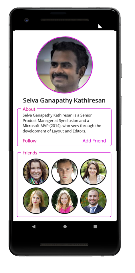
Resources
For more information, refer to the .NET MAUI Group Box View project on GitHub.
Conclusion
Thank you for your time! This article showed how to use the Syncfusion .NET MAUI Text Input Layout control to construct a group box control in a .NET application. This control makes it simple to add a text field and label to your interface and apply other style settings such as stroke color and corner radius. Overall, the Syncfusion.NET MAUI library offers a variety of valuable components for creating user interfaces and is worth checking out.
Are you already a Syncfusion user? You can download the product setup here. If you are not yet a Syncfusion user, you can download a 30-day free trial.
Please contact us via our support forum, support portal, or feedback portal, if you have any queries or issues. We are always happy to assist!
Related blogs
Show NotesIn addition to some good natured ribbing - James, Matt & David talk about the latest and greatest in .NET MAUI development.
Latest Releases* .NET MAUI Latest * Visual Studio 17.5 Previews + Markdown + Sticky Scroll + Dev tunnels + Spell checking * .NET MAUI Community Toolkit * .NET Community Toolkit
Latest News* MVVM in WinForms * Updates to the podcast app
Azure News* Azure Developers YouTube * Azure CosmosDB Conf
Azure Service of the Month* Azure OpenAI
Follow Us:
- James: Twitter, Blog, GitHub, Merge Conflict Podcast
- Matt: Twitter, Blog, GitHub
- David: Twitter, Github

Assume your application needs to display a list of tourist attractions in a city on a vertical list based on the city selected from a horizontal list. Here comes the Syncfusion .NET MAUI ListView to help you easily implement this in your .NET MAUI application.
The Syncfusion .NET MAUI ListView control is a list-like interface that renders a set of data in vertical and horizontal orientation with easy customization.
By customizing the Orientation property of the .NET MAUI ListView, you can easily configure the ListView to be horizontal or vertical.
Let’s get started with the development of this application.
Data population for a vertical and horizontal list
As we know, the .NET MAUI ListView is a data-bound control, and we must create a data model to bind to the ListView.
Creating a data model
Create a model class to hold the data values, such as the place’s name, image, and collection, which holds data for the vertical list.
Refer to the following code example.
public class PlaceInfo : INotifyPropertyChanged{ #region Fields private string? name; private string? description; private ImageSource? image; private ObservableCollection<PlaceInfo> touristPlaces; #endregion #region Constructor public PlaceInfo() { } #endregion #region Properties public string? Name { get { return name; } set { name = value; OnPropertyChanged("Name"); } } public string? Description { get { return description; } set { description = value; OnPropertyChanged("Description"); } } public ImageSource? Image { get { return image; } set { image = value; OnPropertyChanged("Image"); } } public ObservableCollection<PlaceInfo> TouristPlaces { get { return touristPlaces; } set { touristPlaces = value; OnPropertyChanged("TouristPlaces"); } } #endregion #region Interface Member public event PropertyChangedEventHandler? PropertyChanged; public void OnPropertyChanged(string name) { if (this.PropertyChanged != null) this.PropertyChanged(this, new PropertyChangedEventArgs(name)); } #endregion}
Populate model collection in ViewModel
Create an ObservableCollection of PlaceInfo named Places to hold the data for the horizontal ListView. Each PlaceInfo will have a collection of PlaceInfo named TouristPlaces, which holds data for the vertical list to show the travel places.
Refer to the following code.
public class ListViewOrientationViewModel : INotifyPropertyChanged{ #region Fields private ObservableCollection<PlaceInfo>? places; private PlaceInfo selectedItem; #endregion #region Constructor public ListViewOrientationViewModel() { var placesRepository = new PlaceInfoRepository(); Places = placesRepository.GeneratePlaces(); SelectedItem = Places[0]; } #endregion #region Properties public PlaceInfo SelectedItem { get { return selectedItem; } set { selectedItem = value; OnPropertyChanged("SelectedItem"); } } public ObservableCollection<PlaceInfo>? Places { get { return places; } set { this.places = value; OnPropertyChanged("Places"); } } #endregion #region INotifyPropertyChanged public event PropertyChangedEventHandler? PropertyChanged; private void OnPropertyChanged(string name) { if (PropertyChanged != null) PropertyChanged(this, new PropertyChangedEventArgs(name)); } #endregion}
Now, bind the ViewModel’s Places collection to the horizontal ListView control on the XAML page.
<ContentPage x:Class="ListViewMaui.HorizontalOrientation" xmlns="http://schemas.microsoft.com/dotnet/2021/maui" xmlns:x="http://schemas.microsoft.com/winfx/2009/xaml" xmlns:local="clr-namespace:ListViewMaui" xmlns:ListView="clr-namespace:Syncfusion.Maui.ListView;assembly=Syncfusion.Maui.ListView" BackgroundColor="White"> <ContentPage.BindingContext> <local:ListViewOrientationViewModel x:Name="viewModel"/> </ContentPage.BindingContext> <ListView:SfListView x:Name="listView" Grid.Row="1" ItemsSource="{Binding Places}" Orientation="Horizontal"> </ListView:SfListView> </ContentPage.Content></ContentPage>
Defining horizontal ListView’s ItemTemplate
Once the ItemsSource is bound, the ListView control will display only the business objects (like PlaceInfo) as the content of the ListView items. We must update them by defining the ItemTemplate.
By defining the ItemTemplate, you can easily set custom views to display the data items.
Refer to the following code.
<ListView:SfListView x:Name="listView" Grid.Row="1" ItemsSource="{Binding Places}" ScrollBarVisibility="Never" SelectionMode="Single" Orientation="Horizontal" SelectionBackground="Transparent" ItemSize="{OnPlatform Android=120,Default=130}" Margin="8,0,0,0" HeightRequest="180" SelectedItem="{Binding SelectedItem}"> <ListView:SfListView.ItemTemplate> <DataTemplate> <Grid Margin="8,0,8,0"> <Grid.RowDefinitions> <RowDefinition Height="130"/> <RowDefinition Height="Auto"/> </Grid.RowDefinitions> <Border Padding='{OnPlatform UWP="-5,-5,5,5"}' Stroke="#FFFDFD" StrokeThickness="6" HorizontalOptions="Center"> <Border.StrokeShape> <RoundRectangle CornerRadius="6"/> </Border.StrokeShape> <Image Grid.Row="0" Source="{Binding Image}" HeightRequest="130" WidthRequest="110" Aspect="Fill" Margin='{OnPlatform MacCatalyst=-3,iOS=-3}'/> </Border> <Label Grid.Row="1" Text="{Binding Name}" LineBreakMode="WordWrap" HorizontalTextAlignment="Center" HorizontalOptions="Center" VerticalTextAlignment="Center" FontFamily="Roboto-Regular" VerticalOptions="Center" HeightRequest="40" WidthRequest="110" TextColor="#99000000" FontSize="14"> </Label> </Grid> </DataTemplate> </ListView:SfListView.ItemTemplate> <ListView:SfListView.SelectedItemTemplate> <DataTemplate> <Grid Margin="8,0,8,0"> <Grid.RowDefinitions> <RowDefinition Height="130"/> <RowDefinition Height="Auto"/> </Grid.RowDefinitions> <Border Padding='{OnPlatform UWP="-5,-5,5,5"}' Stroke="#1899EF" StrokeThickness="6" HorizontalOptions="Center"> <Border.StrokeShape> <RoundRectangle CornerRadius="6"/> </Border.StrokeShape> <Image Grid.Row="0" Source="{Binding Image}" HeightRequest="130" WidthRequest="110" Aspect="Fill" Margin='{OnPlatform MacCatalyst=-3,iOS=-3}'/> </Border> <Label Grid.Row="1" Text="{Binding Name}" LineBreakMode="WordWrap" HorizontalTextAlignment="Center" HorizontalOptions="Center" VerticalTextAlignment="Center" FontFamily="Roboto-Regular" VerticalOptions="Center" HeightRequest="40" WidthRequest="110" TextColor="#99000000" FontSize="14"> </Label> </Grid> </DataTemplate> </ListView:SfListView.SelectedItemTemplate></ListView:SfListView>
Now the application will look like the following screenshot.

Data binding for vertical ListView
Now, selecting a city from the horizontal list will display the list of travel destinations by changing the ViewModel’s SelectedItem, which is bound to the horizontal ListView’s SelectedItem by using the bound property ItemsSource in the vertical ListView.
<ListView:SfListView x:Name="verticalListView" Grid.Row="3" ItemsSource="{Binding Path=SelectedItem.TouristPlaces, Source={x:Reference listView}}" ItemSize="60" ItemSpacing="16,8,16,8" SelectionMode="None"/>
Defining vertical ListView’s ItemTemplate
Here, we are showing the details of travel places by using their name, description, and image in custom views defined within the ItemTemplate property.
<ListView:SfListView x:Name="verticalListView" Grid.Row="3" ItemsSource="{Binding Path=SelectedItem.TouristPlaces, Source={x:Reference listView}}" ItemSize="60" ItemSpacing="16,8,16,8" SelectionMode="None"> <ListView:SfListView.ItemTemplate> <DataTemplate> <Grid> <Grid.ColumnDefinitions> <ColumnDefinition Width="76"/> <ColumnDefinition Width="*"/> </Grid.ColumnDefinitions> <Frame HorizontalOptions="Start" CornerRadius="3" IsClippedToBounds="True" Padding="0" Margin="0" HasShadow="False" HeightRequest="60" WidthRequest="60"> <Image Grid.Column="0" HorizontalOptions="Start" Source="{Binding Image}" Aspect="Fill" HeightRequest="60" WidthRequest="60"/> </Frame> <Grid Grid.Column="1" VerticalOptions="Center"> <Grid.RowDefinitions> <RowDefinition Height="Auto"/> <RowDefinition Height="*"/> </Grid.RowDefinitions> <Label Grid.Row="0" Text="{Binding Name}" FontSize="14" TextColor="#666666" FontFamily="Roboto-Regular" CharacterSpacing="0.25"/> <Label Grid.Row="1" Text="{Binding Description}" FontSize="14" FontFamily="Roboto-Regular" TextColor="#DE000000" LineBreakMode="WordWrap" CharacterSpacing="0.15" Margin="0,5,0,0"/> </Grid> </Grid> </DataTemplate> </ListView:SfListView.ItemTemplate></ListView:SfListView>
After executing this code example, we will get output like in the following GIF image. Tapping on the items in the horizontal ListView dynamically updates the content of the vertical ListView.
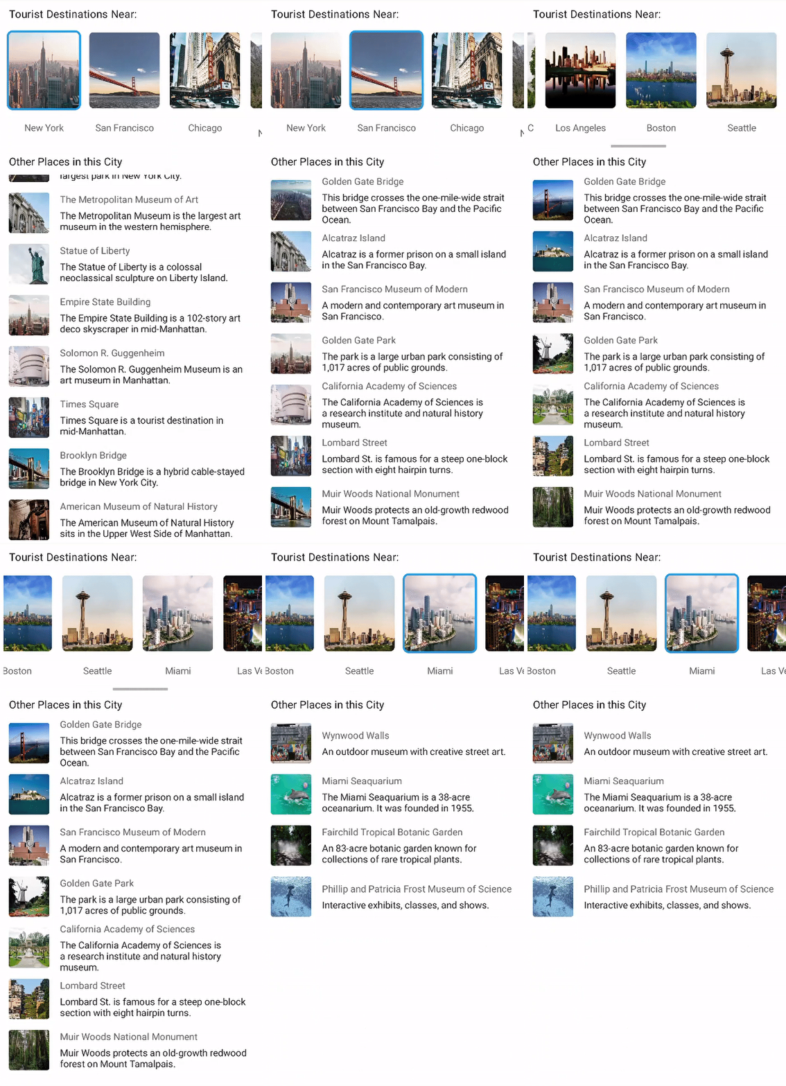
Resources
For more details, refer to the complete sample of Travel Place Listing UI in .NET MAUI in the GitHub repository.
Conclusion
Thanks for reading! I hope you now have a good idea of how to use the .NET MAUI ListView to display tourist places in a vertical list based on the city selected from a horizontal list. Try creating this sample project and share your feedback in the comment section below.
For questions, contact us through our support forum, support portal, or feedback portal. We are always happy to assist you!
Related blogs

Welcome to the second part of our blog on animation in .NET MAUI! In Part 1, we covered the basics of animation and how to add simple animations to your .NET MAUI application. Now, it’s time to take it to the next level and explore custom animation in .NET MAUI.
Custom animation allows you to create more complex and tailored animations. This blog will teach you how to create custom animations in your .NET MAUI apps.
Custom animation in .NET MAUI
The .NET Multi-Platform App UI, or .NET MAUI, is a framework for building cross-platform applications using the .NET ecosystem. One of the powerful features of .NET MAUI is the ability to add animations to your app to enhance the user experience and make it more visually appealing.
The Animation class is the foundation for all .NET MAUI animations. The ViewExtensions class provides the extension methods for creating one or more animation objects. When creating an animation object, we should specify the number of parameters, including the beginning and end values for the animated property and a callback function to update the property’s value as the animation progresses.
In addition to animating a single property, the Animation class allows you to create and synchronize child animations. This will enable you to create more complex animations that involve multiple properties and elements within your app.
To run an animation created with the Animation class, we need to call the Commit method and specify the duration of the animation. You can also specify a callback function to control whether the animation should repeat, as well as other parameters, such as easing functions, to control the speed and smoothness of the animation.
Easily build cross-platform mobile and desktop apps with the flexible and feature-rich controls of the Syncfusion .NET MAUI platform.
Create a custom animation
We will create an animation for a Cody image that appears to be moving and blocked by a brick wall. Cody then thinks and jumps over the wall with a flip. After successfully flipping over the wall, Cody will celebrate a jump before moving away.
We can achieve this animation with several different animation objects. Each one is responsible for animating a specific aspect of the Cody image.
For example, the movingLeftAnimation object is responsible for animating Cody’s movement from left to right, while the rotateJumpAnimation object is responsible for animating Cody’s rotation as it jumps over the wall.
Then, we need to add the animation objects to a parentAnimation object, which controls the overall flow of the animation. The parentAnimation object specifies the start and end times for each animation object, allowing them to be sequenced together to create the desired animation.
Finally, the parentAnimation object is committed to the screen using the Commit method. This method specifies the length of the animation (in our case, it is 10,000 milliseconds) and a flag to indicate that the animation should repeat indefinitely.
Refer to the following code example to initialize the UI.
<ContentPage xmlns="http://schemas.microsoft.com/dotnet/2021/maui" xmlns:x="http://schemas.microsoft.com/winfx/2009/xaml" x:Class="CustomAnimation.MainPage"> <Grid WidthRequest="700" Margin="10"> <Image x:Name="imageView" Source="cody.png" HeightRequest="100" HorizontalOptions="Start" VerticalOptions="End"/> <Image WidthRequest="50" Margin="125,0,0,0" Source="bricks.png" VerticalOptions="End" HeightRequest="100"/> </Grid> </ContentPage>
Refer to the following code to create a visually appealing animation of the Cody image that moves and jumps over a brick wall.
var parentAnimation = new Animation();var movingLeftAnimation = new Animation(v => imageView.TranslationX = v, 0, 250);var movingLeftBackAnimation = new Animation(v => imageView.TranslationX = v, 250, 200);var movingRightAnimation = new Animation(v => imageView.TranslationX = v, 500, 700); var rotateJumpAnimation = new Animation(v => imageView.Rotation = v, 0, 360);var movingJumpAnimation = new Animation(v => imageView.TranslationX = v, 200, 500);var movingJumpUpAnimation = new Animation(v => imageView.TranslationY = v, 0, -200);var movingJumpDownAnimation = new Animation(v => imageView.TranslationY = v, -200, 0); var jumpUpAnimation = new Animation(v => imageView.TranslationY = v, 0, -30);var jumpDownAnimation = new Animation(v => imageView.TranslationY = v, -30, 0);var jumpUpAnimation2 = new Animation(v => imageView.TranslationY = v, 0, -30);var jumpDownAnimation2 = new Animation(v => imageView.TranslationY = v, -30, 0); parentAnimation.Add(0, 0.15, movingLeftAnimation);parentAnimation.Add(0.25, 0.35, movingLeftBackAnimation); parentAnimation.Add(0.35, 0.65, rotateJumpAnimation);parentAnimation.Add(0.35, 0.65, movingJumpAnimation);parentAnimation.Add(0.35, 0.5, movingJumpUpAnimation);parentAnimation.Add(0.5, 0.65, movingJumpDownAnimation); parentAnimation.Add(0.7, 0.75, jumpUpAnimation);parentAnimation.Add(0.75, 0.8, jumpDownAnimation);parentAnimation.Add(0.8, 0.85, jumpUpAnimation2);parentAnimation.Add(0.85, 0.9, jumpDownAnimation2); parentAnimation.Add(0.9, 1, movingRightAnimation); parentAnimation.Commit(this, "ChildAnimations", 16, 10000, null, null,repeat:()=>true);

Syncfusion .NET MAUI controls are well-documented, which helps to quickly get started and migrate your Xamarin apps.
Custom animation with ViewExtensions class
The ViewExtensions class in .NET MAUI allows us to animate a property from its current value to the specified value. However, this will be difficult when creating a color-changing animation method that animates a color property from one value to another, as different controls have different color properties.
To solve this problem, the PaintTo method can be written with a callback method that passes the interpolated color value back to the caller and takes the start and end color arguments.
Refer to the following code example.
public static class ViewExtensions{ public static Task<bool> PaintTo(this VisualElement element, Color startColor, Color endColor, Action<Color> callback, uint length = 250, Easing easing = null) { Func<double, Color> transform = (t) => Color.FromRgba(startColor.Red + t * (endColor.Red - startColor.Red), startColor.Green + t * (endColor.Green - startColor.Green), startColor.Blue + t * (endColor.Blue - startColor.Blue), startColor.Alpha + t * (endColor.Alpha - startColor.Alpha)); return ChangePaint(element, "ChangePaint", transform, callback, length, easing); } public static void Cancel(this VisualElement self) { self.AbortAnimation("ColorTo"); } static Task<bool> ChangePaint(VisualElement element, string animation, Func<double, Color> transform, Action<Color> callback, uint length, Easing effect) { effect = effect ?? Easing.Linear; var source = new TaskCompletionSource<bool>(); element.Animate<Color>(animation, transform, callback, 16, length, effect, (v, c) => source.SetResult(c)); return source.Task; }}
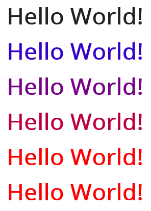
Reference
For more details, refer to the custom animation in the .NET MAUI documentation.
To make it easy for developers to include Syncfusion .NET MAUI controls in their projects, we have shared some working ones.
Conclusion
Thanks for reading! In this blog, we have seen how to create custom animations in your .NET MAUI applications. With these animations, you can provide a wonderful user experience in your apps!
Syncfusion .NET MAUI controls were built from scratch using .NET MAUI, so they feel like framework controls. They are fine-tuned to work with a vast volume of data. Use them to build your cross-platform mobile and desktop apps!
The Essential Studio for .NET MAUI suite is available from the License and Downloads page. If you are not a Syncfusion customer, you can always download our free evaluation to see all our controls.
For questions, you can contact us through our support forum, support portal, or feedback portal. We are always happy to assist you!
Related blogs

I finally ported sharpnado's xamarin.forms collection view to dotnet MAUI \o/
 | Sharpnado's MAUI CollectionView on Github |
 |
- Performance oriented
- Horizontal, Grid, Carousel or Vertical layout
- Header, Footer and GroupHeader
- Reveal custom animations
- Drag and Drop
- Column count
- Infinite loading with Paginator component
- Snapping on first or middle element
- Padding and item spacing
- Handles
NotifyCollectionChangedActionAdd, Remove and Reset actions - View and data template recycling
RecyclerViewon AndroidUICollectionViewon iOS
Installation
- In Core project, in
MauiProgram.cs:
public static MauiApp CreateMauiApp(){ var builder = MauiApp.CreateBuilder(); builder .UseMauiApp() .UseSharpnadoCollectionView(loggerEnabled: false);}Usage
<!-- As a Grid --><sho:GridView x:Name="HorizontalListView" CollectionPadding="30" ColumnCount="3" EnableDragAndDrop="True" HeightRequest="390" HorizontalOptions="Fill" ItemHeight="110" ItemsSource="{Binding Logo, Mode=OneTime}" /><!-- As a List with groups --><sho:CollectionView CollectionLayout="Vertical" CollectionPadding="0,30,0,30" CurrentIndex="{Binding CurrentIndex}" ItemHeight="120" ItemTemplate="{StaticResource HeaderFooterGroupingTemplateSelector}" ItemsSource="{Binding SillyPeople}" ScrollBeganCommand="{Binding OnScrollBeginCommand}" ScrollEndedCommand="{Binding OnScrollEndCommand}" TapCommand="{Binding TapCommand}" /><!-- As a carousel --><sho:CarouselView /><!-- As a HorizontalListView --><sho:HorizontalListView />Docs
Please find all the available documentation and a full maui app sample here:
roubachofI’m speaking about .NET MAUI in Prague on March 23 and 24. If you’re in the neighborhood…
I’ve been eager to rewrite some of my personal apps from Xamarin.Forms to .NET MAUI, but since all of them are dependant on map functionality, I had to wait until the arrival of .NET 7, since the .NET 6 release of MAUI didn’t ship with map support. Since .NET 7 shipped in November 2022, I was able to start rewriting my apps. I started with the most simple one, which is a single-page application (not that kind) that shows the different parking zones in my local municipality. The parking zones are drawn on a map as polygons. When you click on a zone, it gets highlighted and some info about the zone is shown in an info overlay. I posted on Twitter about my progress, but I wanted to do a full post about my experience with trying to migrate to .NET MAUI.
NOTE: Your milage may vary – my experience with the migration may differ greatly from yours. This is just to highlight the pain points that I had during my attempt. Having a machine with preview releases probably did not help me here.
The TL;DR:
Positives:
- Easy to copy over pages and convert namespaces
- Eliminated the need for a couple of plugins
Negatives:
- Workloads are a hassle
- Trying to migrate while .NET 7 was in preview was a mistake
- Lots of “smoke and mirrors”/yak-shaving
- Project file would randomly break
- App would crash in Release mode on iOS without reporting error to App Center
I’ll go into more detail on the different points as I go through my process.
Initial migration
My initial attempt was to have a go at migrating while .NET MAUI was still on .NET 6, so even though maps weren’t ready yet, I could still migrate the “outlining” project and just comment out the code that didn’t work. I converted the XAML namespaces, the using statements and the packages that were either redundant or had an update for them. Turns out a lot of it didn’t work since I didn’t have a working map (shocker), so the project laid dorment for a while.
.NET 7
When .NET 7 hit preview, I updated Visual Studio 2022 Preview and tried to upgrade the project. I cleaned the bin/obj folder, but I got some random build errors for Android. After restarting VS, they were gone for a while, but after doing some changes and building a couple of times they would come back so restarts of VS were frequent.
After this, I pulled in the NuGet package for MAUI maps and was able to comment back my code. After some code changes, the polygons were properly drawn on the map, at least for Android (as shown in the previous Twitter link). I hadn’t looked at when you click on the zones yet, as I had issue on iOS when drawing the polygons.
Polygons + iOS = 
In the app, I set the fill color of the different parking zones to be transparent, so that you can actually see the different street names. On iOS, the transparency only seemed to take effect on one of the several drawn polygons. I tried isolating what might be the error here, but it was so time consuming that I ended up leaving the project for a while and betting on that it would get fixed in a patch release of the MAUI maps package.
Oops, my project broke
After not having done much work on the project for a while, I picked it back up to see if I could isolate the problem with iOS further. But this time my project wouldn’t build. I tried clean/rebuild, delete bin/obj, restart VS, restart VS again. Nothing. I also tried updating my maui workloads via the CLI. For a while here, I was only able to build clean .NET 7 MAUI projects and not .NET 6 MAUI projects. After having given up completely, I created a clean new .NET 7 MAUI project and copied everything over to it and was able to build. But, I was still stuck with the polygon iOS problem. Sigh.
Smoke and mirrors
I was also thrown for a loop a couple of times during my process, which wasn’t related to MAUI at all. The API I used to fetch data about the different parking zones for altered the structure of the data without notice. I spent more time than I want to admit figuring this one out. Like I said, I was testing this out while the .NET 7 version of MAUI was in preview so a lot of stuff would randomly work or not work. Another one was a setting I applied to Visual Studio, which led to some hours of yak-shaving. At this point, I was pretty fed up with this whole process.
Update ALL the packages
After having put down the migration for a second time, I picked it up again later to see if my issue was magically resolved. After updating the MAUI maps NuGet package, it was working on iOS! After double checking that it was working on both platforms, I was ready to start publishing.
As I usually do, I start publishing on Android because I know this process is way faster and less error-prone than what it is for iOS. If I have an app that needs to be rolled out on both platforms simultaneously, I might start with iOS to make sure everything works. This time I wanted to save the “best” for last.
Certificates… Why’d it have to be certificates?
Anyone who’s worked with publishing apps for iOS has had to deal with the nightmare process that is certificates and provisioning profiles. Even after having worked with this process for eight years, I still never get it right on the first try. This time was no different. When trying to build the app for iOS in release, I got an error along the lines of that the self-signed certificate was not trusted. Turns out that XCode doesn’t ship with the latest intermediate signing certificate that you need, so you have to download that from the Apple Developer site. Also, there are three different types of them with varying expiration date, just to make you wonder which is the correct one you should choose. Delightful.
After spending an evening fixing this issue, I was finally able to create an ipa file I could upload to App Store Connect.
Submit for review
After submitting my update for review in App Store Connect, I got it back with them claiming the app crashed instantly on startup. Weird, since I remember testing the app on a physical device. I checked App Center and there was one crash report along the lines of: Attempting to JIT compile method […] while running in aot-only mode. Googling the error gave me some indication that this could happen when running a MAUI iOS app in Release mode.
I tried to distribute the app through App Center so that I would be able to reproduce the bug, but when trying to start the app on my iPad, I got the error that the app’s integrity could not be verified. Great. This usually indicates that something is wrong with the certificate and/or the provisioning profile, and I thought I had just gotten it right. After a lot of back and forth, it looks like I had to use an Ad-Hoc provisioning profile to sign the app to explicitly include my iPad for testing. More time spent.
After finally getting the app to work on my iPad, I reproduced the bug and the app instantly crashed on start. Never been so glad to see my app crash. I went to App Center in hopes of seeing my recent crash being reported, but nothing. I went to Twitter to ask for help on how to move along here, but honestly, I am so tired of trying to get this to work that I might put this whole thing on pause again.
Conclusion
I’m happy that I am just trying to do this with one of my personal apps and not for a client project. I will say, most of the time spent here has been caused by smoke and mirrors plus Apple’s provisioning nightmare, but a lot of time has been spent on tooling as well. I thought about rewriting another app I have that is a bit more complex, but I’m glad I waited off on it. I might give it a shot now, but this experience did leave a bad taste in my mouth when I had so much trouble with such a simple app. I hope you have a far better experience than I did, but I just wanted to share how my journey was.
The post My experience with migrating my app from Xamarin.Forms to .NET MAUI appeared first on Andreas Nesheim.
Welcome to the complete guide to distribution certificates, .p12 files, and provisioning profiles on iOS! Publishing and distributing apps on the Apple App Store requires a number of steps and technical requirements. These include creating a distribution certificate, a .p12 file, and a valid provisioning profile.
If you’re an iOS developer or trying to publish and distribute your first app on the App Store, this guide is for you. We’ll explain how to create and use each of these essentials in a detailed, easy-to-follow way.
Let’s start!
What you need to know
The steps below will guide you through the process of creating an iOS distribution certificate and .p12 file.
- A distribution certificate identifies your team/organization within a distribution provisioning profile and allows you to submit your app to the Apple App Store.
- A .p12 file contains the certificates that Apple needs to create and publish apps.
- A provisioning profile is a collection of information that links an application ID to signing certificates and authorized devices. It is used to control and authorize the devices on which the application can run and the Apple services that it can access (such as iCloud or In-App Payment).
We will also be using
- A CertificateSigningRequest (CSR) is a file that contains a public/private key pair.
NOTE:
These certificates are also useful for automating application distribution processes regardless of the framework you use. For example, these certificates are used in App Center and you can use fremework such as Xamarin, .NET MAUI, React Native, among others.
To learn more about certificates and how they work in the Apple App Store, visit the iOS Dev Center and see Apple’s official documentation.
Before you start
- You need a Mac to generate the certificates.
- Make sure you sign up for an iOS developer account.
- Make sure you’ve created an app ID in the iOS developer portal.
How to create a Distribution Certificate
Creating the Signing Certificate Request
- On your Mac, go to the Applications > Utilities folder and open Keychain Access. You can also use the search engine and directly type “Keychain Access”.
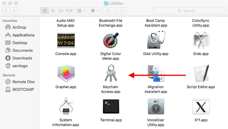
- Go to Keychain Access > Certificate Wizard > Request a certificate from a certificate authority.
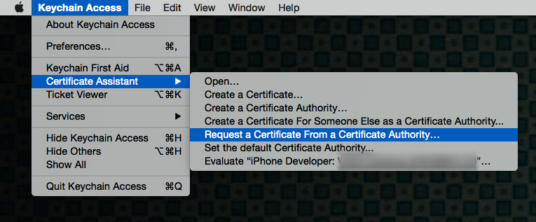
- Fill in the information window Certificate Information as specified below and click “Continue”.
- In the User email address field, enter the email address that you want to identify with this certificate.
- In the Common Name field, type your name.
- In the Request group, click on the “Save to disk” option
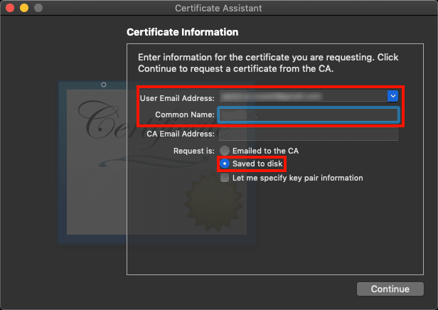
- Save the file to your hard drive.
The wizard creates a certificate signing request (CSR) file that contains a public/private key pair.
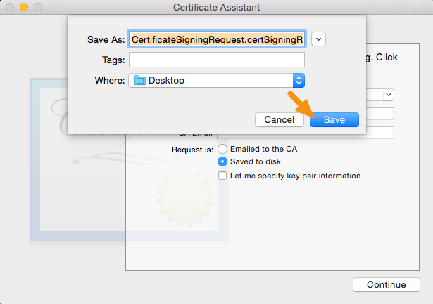
Creating the Distribution Certificate
- Sign in to your iOS Developer Console https://developer.apple.com
- Click on “Certificates, identifiers and profiles”.
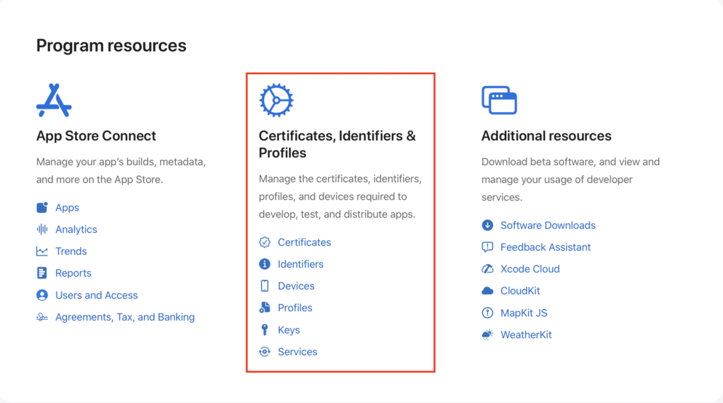
- Go to Certificates and click the “+” button to add a new certificate.
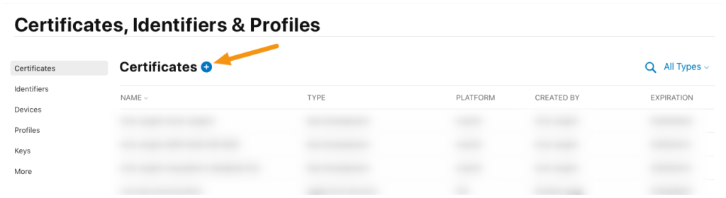
- Select “App Store and Ad Hoc” from the production options and click “Continue”.
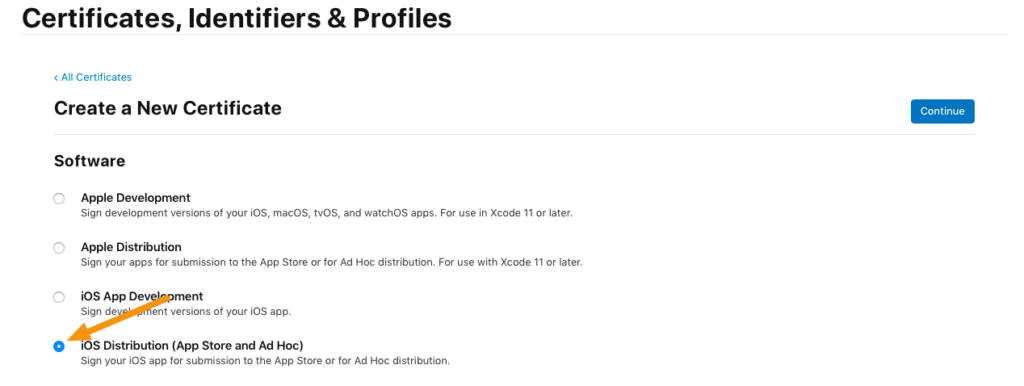
NOTE:
To use your certificates, you must have the intermediate signing certificate in your OS X system keychain. Xcode installs it automatically. However, if you need to reinstall the intermediate signing certificate, click the link at the bottom of the page.
- Click “Continue” again.
- Since you already created your CSR file in the previous steps, you don’t need to create another one.
- Click “Choose File” and select the CSR file you created earlier and then click “Continue”.
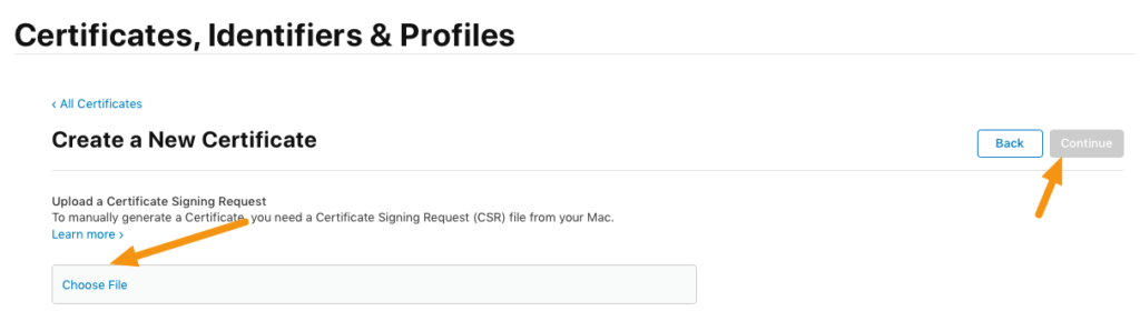
- Click the “Download” button to download a .cer file to your machine and then click “Done”.
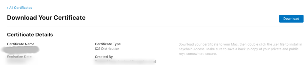
- Double-click the .cer file to install it under Keychain Access.
It will have the name “iPhone Distribution <first name> <last name>” and will expire one year from the date of creation.
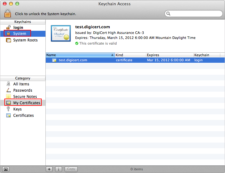
Exporting a distribution certificate as a .p12 file
A .p12 file is a special-formatted, encrypted file that contains the distribution certificate. It’s embedded in your app when you build it. iTunes Connect checks this file when you submit an app and will only accept the app if it contains a .p12 file that matches what you’ve set up in your iTunes Connect account.
- On your Mac, launch Keychain Access, select the certificate entry, and right-click on it to select “Export”.
All the certificates you have installed will be in the “login” keychain (Label 1) in the “My certificates” category (Label 2).
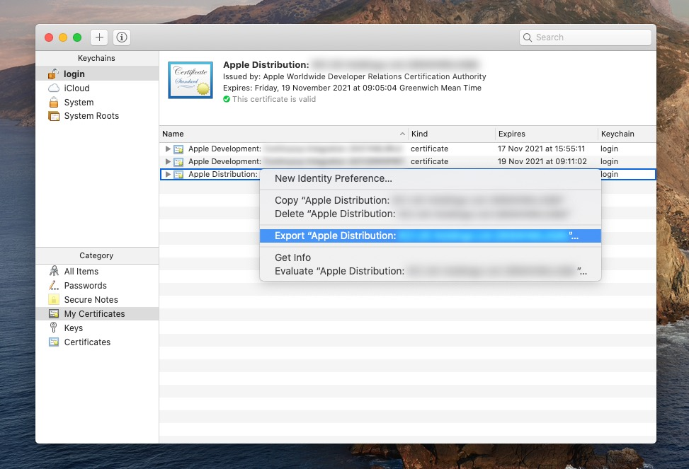
- In the window that appears, make sure the file format is set to “Personal Information Exchange (.p12)” and click “Save” to save it to your machine.
- When prompted for a password, you can leave it blank or assign one, then click “OK”.
- When prompted for the computer password, enter it and click “Allow”.
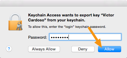
- Your .p12 file will be saved to the specified location.
Provisioning profiles (.mobileprovision)
Uploading an app to App Store Connect requires an app registration registered with an explicit app ID. You can create your own App Store provisioning profile with an explicit app ID to use when you upload your app to App Store Connect.
Creating a provisioning profile
- Under Certificates, IDs, and Profiles, click Profiles in the sidebar, then click the Add (+) button in the top left.
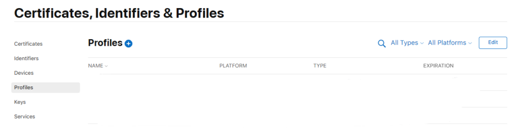
- Under Distribution, select an App Store distribution profile for your platform, then click Continue.
- App Store: For iOS and watchOS apps and App Clips.
- tvOS App Store: For tvOS apps.
- Mac App Store: For macOS apps, including those configured with Mac Catalyst.
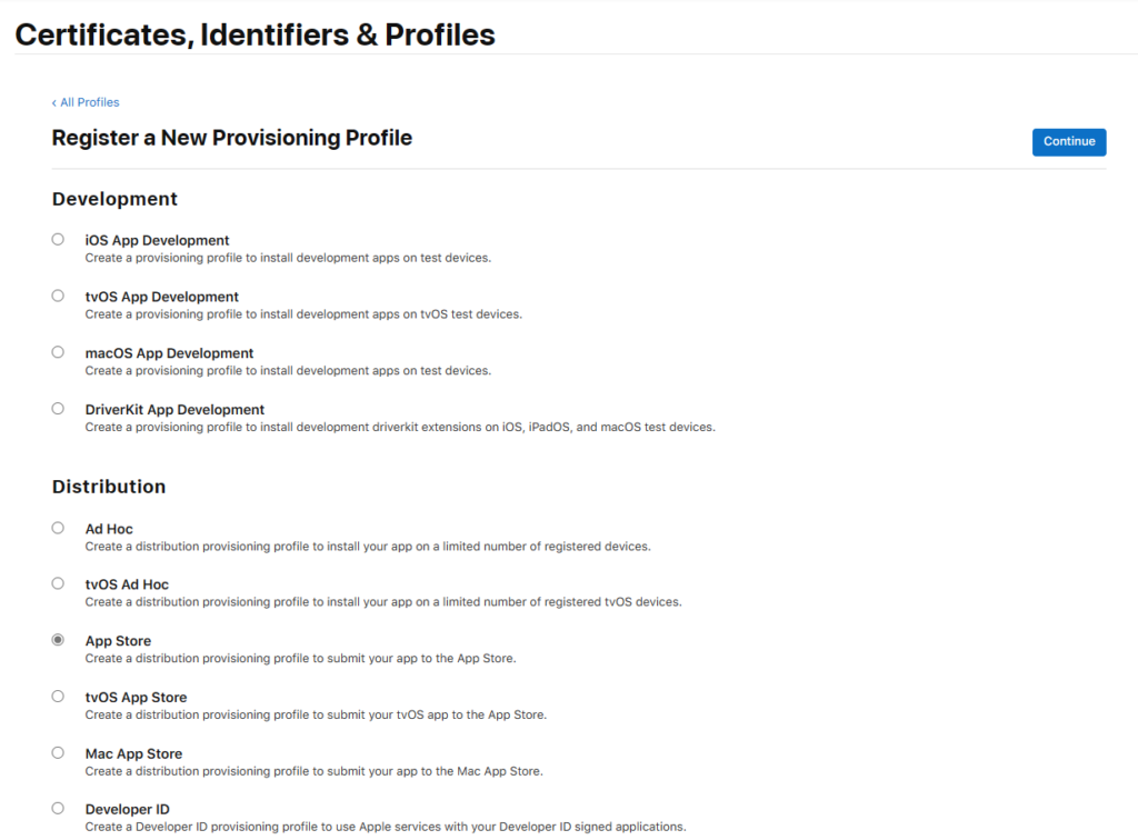
- Choose the app ID you used for development (the app ID that matches your package ID) from the App ID pop-up menu, then click Continue.
If you use autosignature during development, choose one of the following:- XC Wildcard if it is the only option.
- The explicit application ID managed by Xcode that starts with XC and contains its package ID.
- The ID of the app you registered and matches your package ID.
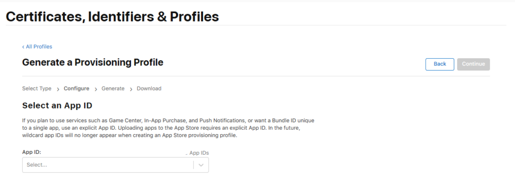
- Select your distribution certificate, then click Continue.
An App Store provisioning profile contains a single distribution certificate.
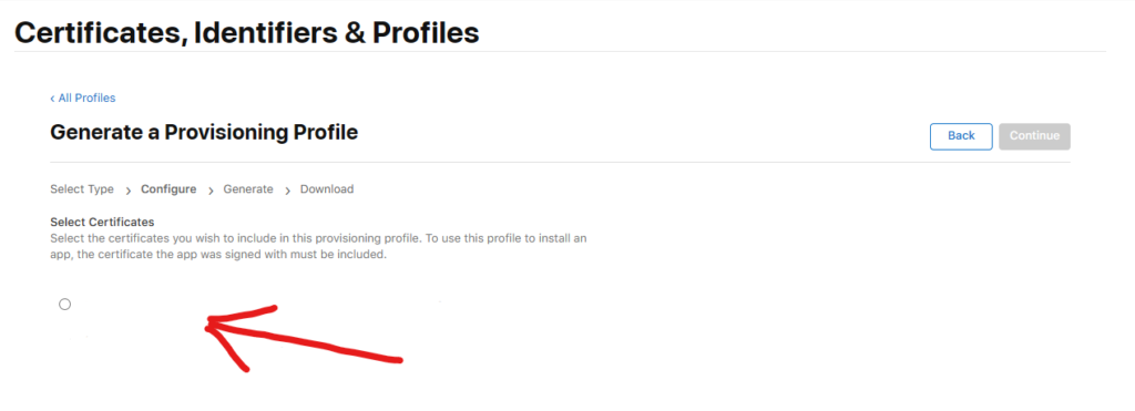
- Enter a profile name, then click Generate.
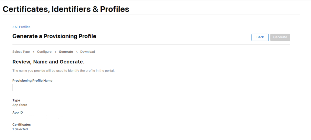
- Click Download.
Conclusion
Creating and using distribution certificates, .p12 files, and provisioning profiles are essential elements for publishing and distributing apps to the Apple App Store. This article gives you a detailed and easy-to-follow guide to creating and using these elements effectively. Now, you’re ready to publish and distribute your iOS apps with confidence and success.
Good luck in your app development!
The post Distribution certificates, .p12 files, and provisioning profiles with iOS appeared first on Luis Matos.
¡Bienvenidos a la guía completa sobre certificados de distribución, archivos .p12 y perfiles de aprovisionamiento en iOS! La publicación y distribución de aplicaciones en la App Store de Apple requiere de una serie de pasos y requisitos técnicos. Entre ellos, la creación de un certificado de distribución, un archivo .p12 y un perfil de aprovisionamiento válido.
Si eres un desarrollador de iOS o estás tratando de publicar y distribuir tu primera aplicación en la App Store, esta guía es para ti. Te explicaremos cómo crear y usar cada uno de estos elementos esenciales de manera detallada y fácil de seguir.
¡Empecemos!
Lo que necesitas saber
Los pasos a continuación lo guiarán a través del proceso de creación de un certificado de distribución de iOS y un archivo .p12.
- Un certificado de distribución identifica a su equipo/organización dentro de un perfil de aprovisionamiento de distribución y le permite enviar su aplicación a Apple App Store.
- Un archivo .p12 contiene los certificados que Apple necesita para crear y publicar aplicaciones.
- Un perfil de aprovisionamiento es una recopilación de información que vincula un ID de aplicación con certificados de firma y dispositivos autorizados. Se utiliza para controlar y autorizar los dispositivos en los que se puede ejecutar la aplicación y los servicios de Apple a los que puede acceder (como iCloud o In-App Payment).
También estaremos utilizando
- Un CertificateSigningRequest (Solicitud de Firma de Certificado) (CSR) es un archivo que contiene un par de claves pública/privada.
NOTA:
Estos certificados son útiles también para automatizar los procesos de distribución de aplicativo sin importar el framework que uses. Por ejemplo, en App Center se utilizan estos certificados y puedes usar fremework como Xamarin, .NET MAUI, React Native, entre otros.
Para obtener más información sobre los certificados y cómo funcionan en la App Store de Apple, visite el Centro de desarrollo de iOS y consulte la documentación oficial de Apple.
Antes de iniciar
- Necesitas un Mac para generar los certificados.
- Asegúrese de registrarse para obtener una cuenta de desarrollador de iOS.
- Asegúrese de haber creado un ID de aplicación en el portal para desarrolladores de iOS.
Como crear un Certificado de Distribución
Creando la Solicitud de Certificado de Firma
- En su Mac, vaya a la carpeta Aplicaciones > Utilidades y abra Acceso a Llaveros (Keychain Access). También puedes utilizar el buscador y escribir directamente «Keychain Access».
- Vaya a Acceso a Llaveros > Asistente de certificados > Solicitar un certificado de una autoridad de certificación.
- Complete la información en la ventana Información del certificado como se especifica a continuación y haga clic en «Continuar».
- En el campo Dirección de correo electrónico del usuario, introduzca la dirección de correo electrónico que desea identificar con este certificado.
- En el campo Nombre común, escriba su nombre.
- En el grupo Solicitud, haga clic en la opción «Guardado en disco»
- Guarde el archivo en su disco duro.
El asistente crea un archivo de solicitud de firma de certificado (CSR) que contiene un par de claves pública/privada.
Creando el Certificado de Distribución
- Inicia sesión en tu iOS Developer Console https://developer.apple.com
- Haga clic en «Certificados, identificadores y perfiles».
- Ve a Certificados y haga clic en el botón «+» para agregar un nuevo certificado.
- Seleccione «App Store y Ad Hoc» de las opciones de producción y haga clic en «Continuar».
NOTA:
Para usar sus certificados, debe tener el certificado de firma intermedio en su llavero del sistema OS X. Xcode lo instala automáticamente. Sin embargo, si necesita reinstalar el certificado de firma intermedio, haga clic en el enlace en la parte inferior de la página.
- Haga clic en «Continuar» nuevamente.
- Como ya creaste tu archivo CSR en los pasos anteriores, no necesitas crear otro.
- Haga clic en «Elegir archivo» y seleccione el archivo CSR que creó anteriormente y luego haga clic en «Continuar».
- Haga clic en el botón «Descargar» para descargar un archivo .cer a su máquina y luego haga clic en «Listo».
- 12. Haga doble clic en el archivo .cer para instalarlo en Acceso a Llaveros.
Tendrá el nombre «iPhone Distribution <nombre> <apellido>» y caducará un año a partir de la fecha de creación.
Exportando un certificado de distribución como un archivo .p12
Un archivo .p12 es un archivo con formato especial y cifrado que contiene el certificado de distribución. Está incrustado en tu aplicación al compilarla. iTunes Connect comprueba este archivo cuando envías una app y solo aceptará la app si contiene un archivo .p12 que coincida con lo que has configurado en tu cuenta de iTunes Connect.
- En su Mac, inicie Acceso a Llaveros, seleccione la entrada del certificado y haga clic derecho sobre ella para seleccionar «Exportar».
Todos los certificados que haya instalado estarán en el llavero «login» (Etiqueta 1) en la categoría «Mis certificados» (Etiqueta 2).
- En la ventana que aparece, asegúrese de que el formato de archivo esté configurado en «Intercambio de información personal (.p12)» y haga clic en «Guardar» para guardarlo en su máquina.
- Cuando se le solicite una contraseña, puedes dejarla en blanco o asignar una, luego haga clic en «Aceptar».
- Cuando se le solicite la contraseña de la computadora, ingrésela y haga clic en «Permitir».
- 5. Su archivo .p12 se guardará en la ubicación especificada.
Perfiles de aprovisionamiento (.mobileprovision)
Cargar una aplicación en App Store Connect requiere un registro de aplicación registrado con un ID de aplicación explícita. Puede crear su propio perfil de aprovisionamiento de App Store con un ID de aplicación explícita para usar cuando cargue su aplicación en App Store Connect.
Creando un perfil de aprovisionamiento
- En Certificados, identificadores y perfiles, haga clic en Perfiles en la barra lateral, luego haga clic en el botón Agregar (+) en la parte superior izquierda.
- En Distribución, seleccione un perfil de distribución de App Store para su plataforma, luego haga clic en Continuar.
- App Store: para aplicaciones iOS y watchOS y App Clips.
- Tienda de aplicaciones tvOS: para aplicaciones tvOS.
- Mac App Store: para aplicaciones macOS, incluidas las configuradas con Mac Catalyst.
- Elija el ID de la aplicación que usó para el desarrollo (el ID de la aplicación que coincide con su ID de paquete) en el menú emergente ID de la aplicación, luego haga clic en Continuar.
Si utiliza la firma automática durante el desarrollo, elija uno de los siguientes:- XC Wildcard si es la única opción.
- El ID de aplicación explícito administrado por Xcode que comienza con XC y contiene su ID de paquete.
- El ID de la aplicación que registró y coincide con su ID de paquete.
- Seleccione su certificado de distribución, luego haga clic en Continuar.
Un perfil de aprovisionamiento de App Store contiene un solo certificado de distribución.
- Ingrese un nombre de perfil, luego haga clic en Generar.
- Haz clic en Descargar.
Conclusión
La creación y uso de certificados de distribución, archivos .p12 y perfiles de aprovisionamiento son elementos esenciales para la publicación y distribución de aplicaciones en la App Store de Apple. Este artículo te brinda una guía detallada y fácil de seguir para crear y usar estos elementos de manera efectiva. Ahora, estás listo para publicar y distribuir tus aplicaciones de iOS con confianza y éxito.
¡Buena suerte en el desarrollo de aplicaciones!
The post Certificados de distribución, archivos .p12 y perfiles de aprovisionamiento con iOS appeared first on Luis Matos.
Most sought after feature of CommunityToolkit now available to play Audio/Video in a .NET MAUI app.
The Syncfusion .NET MAUI DataForm (SfDataForm) is used to gather, edit, and display data in a user-friendly interface. It supports built-in and custom data editors to create data entry forms such as contact, employee, sign-in, and sign-up forms. This control is available with the 2022 Volume 4 release.
This blog will explain how to create a contact form using the .NET MAUI DataForm control and its basic features in mobile and desktop applications from a single shared codebase.
Note: Refer to the .NET MAUI DataForm documentation before getting started.
Step 1: Initializing the .NET MAUI DataForm control
- First, create a new .NET MAUI application in Visual Studio.
- Syncfusion .NET MAUI controls are available in the NuGet Gallery. To add the SfDataForm to your project, open the NuGet package manager in Visual Studio, search for Syncfusion.Maui.DataForm, and then install it.
- Import the control namespace Syncfusion.Maui.DataForm in your XAML page.
- Now, initialize the SfDataForm.
<ContentPage> ….. xmlns:dataForm="clr-namespace:Syncfusion.Maui.DataForm;assembly=Syncfusion.Maui.DataForm" ….. <dataForm:SfDataForm/></ContentPage>
- The Syncfusion.Maui.Core NuGet is a dependent package for all Syncfusion .NET MAUI controls. So, in the MauiProgram.cs file, register the handler for the Syncfusion core assembly. Refer to the following code.
builder.ConfigureSyncfusionCore();
Step 2: Adding a model class to create a contact form
Let’s create the data form model class (ContactFormModel), which contains fields that store specific information such as names, addresses, and phone numbers. You can also use attributes to the data model class properties to effectively handle data.
Refer to the following code example.
public class ContactFormModel{ [DataFormDisplayOptions(ColumnSpan = 2, ShowLabel = false)] public string ProfileImage { get; set; } [Display(Prompt = "First name")] public string Name { get; set; } [Display(Prompt = "Last name")] public string LastName { get; set; } [Display(Prompt = "Mobile")] public double? Mobile { get; set; } [Display(Prompt = "Landline")] public double? Landline { get; set; } [Display(Prompt = "Address")] [DataFormDisplayOptions(ColumnSpan = 2)] public string Address { get; set; } [Display(Prompt = "City")] [DataFormDisplayOptions(ColumnSpan = 2)] public string City { get; set; } [Display(Prompt = "State")] public string State { get; set; } [Display(Prompt = "Zip code")] [DataFormDisplayOptions(ShowLabel = false)] public double? ZipCode { get; set; } [Display(Prompt = "Email")] public string Email { get; set; }}
Step 3: Defining the editors
By default, the .NET MAUI DataForm autogenerates editors based on primitive data types such as string, enumeration, DateTime, and TimeSpan in the DataObject property.
Some of the built-in editors are text, password, multi-line, combo box, autocomplete, date, time, checkbox, switch, and radio group.
Refer to the following code to set the data form model (ContactFormModel) to the DataObject property.
XAML
<Grid.BindingContext> <local:ContactFormViewModel/></Grid.BindingContext><dataForm:SfDataForm x:Name="contactForm" DataObject="{Binding ContactFormModel}" />
C#
public ContactFormViewModel(){ this.ContactFormModel = new ContactFormModel();}/// <summary>/// Gets or sets the contact form model./// </summary>public ContactFormModel ContactFormModel { get; set; }
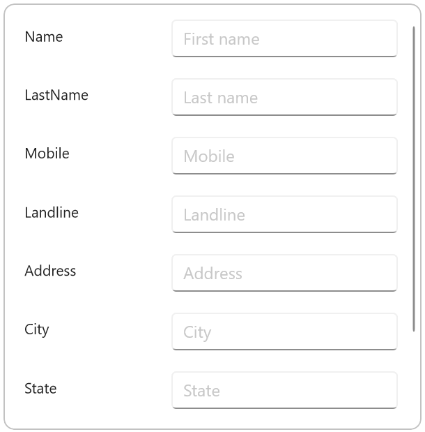
Step 4: Grouping the editors in the contact form
The .NET MAUI DataForm allows you to group or categorize related data. For example, we can create a Name group with the first and last name fields.
Refer to the following code example. In it, we have created the Name and Address groups.
<dataForm:SfDataForm x:Name="contactForm" DataObject="{Binding ContactFormModel}" AutoGenerateItems="False" > <dataForm:SfDataForm.Items> <!--Name group--> <dataForm:DataFormGroupItem Name="Name"> <dataForm:DataFormGroupItem.Items> <dataForm:DataFormTextItem FieldName="Name" Padding="0, 10, 10, 10" /> <dataForm:DataFormTextItem FieldName="LastName" Padding="0, 10, 10, 10"/> </dataForm:DataFormGroupItem.Items> </dataForm:DataFormGroupItem> <!--Address group--> <dataForm:DataFormGroupItem Name="Address"> <dataForm:DataFormGroupItem.Items> <dataForm:DataFormMultilineItem FieldName="Address" RowSpan="2" Padding="0, 10, 10, 10"/> <dataForm:DataFormTextItem FieldName="City" Padding="0, 10, 10, 10"/> <dataForm:DataFormTextItem FieldName="State" Padding="0, 10, 10, 10"/> </dataForm:DataFormGroupItem.Items> </dataForm:DataFormGroupItem> </dataForm:SfDataForm.Items></dataForm:SfDataForm>
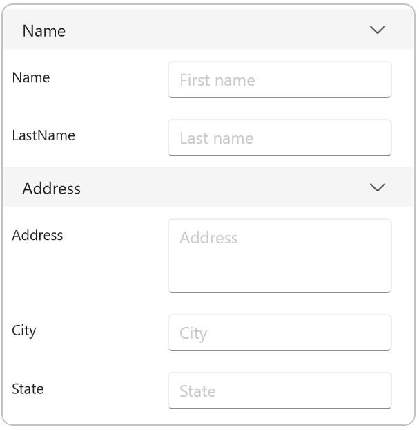
Step 5: Creating image-based labels
Let’s add custom fonts to the labels. To do so, we have to add the font file (.ttf) in the Fonts folder. Then, register the custom font in the CreateMauiApp method in the MauiProgram.cs file.
Refer to the following code example.
C#
builder .UseMauiApp<App>() .ConfigureFonts(fonts => { fonts.AddFont(“OpenSans-Regular.ttf”, “OpenSansRegular”); fonts.AddFont(“OpenSans-Semibold.ttf”, “OpenSansSemibold”); //// Register custom font. fonts.AddFont(“InputLayoutIcons.ttf”, “InputLayoutIcons”); });
XAML
<dataForm:SfDataForm.Items> <dataForm:DataFormGroupItem Name="Name"> <dataForm:DataFormGroupItem.Items> <dataForm:DataFormTextItem FieldName="Name" Padding="0, 10, 10, 10" > <!--Add custom font to label--> <dataForm:DataFormTextItem.LeadingLabelIcon> <FontImageSource Glyph="F" Color="#79747E" FontFamily="InputLayoutIcons" Size="18" /> </dataForm:DataFormTextItem.LeadingLabelIcon> </dataForm:DataFormTextItem> <dataForm:DataFormTextItem FieldName="LastName" LeadingLabelIcon="" Padding="0, 10, 10, 10"/> </dataForm:DataFormGroupItem.Items> </dataForm:DataFormGroupItem> …</dataForm:SfDataForm.Items>
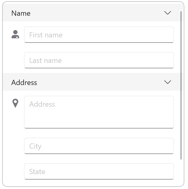
Step 6: Adding a custom image editor
You can also add a custom image editor in the DataForm to display the person’s image in the contact form.
Refer to the following code example.
<dataForm:SfDataForm.Items> <!--Custom image editor added--> <dataForm:DataFormCustomItem FieldName="ProfileImage"> <dataForm:DataFormCustomItem.EditorView> <Image Source="people.png" HeightRequest="80"/> </dataForm:DataFormCustomItem.EditorView> </dataForm:DataFormCustomItem> ….</dataForm:SfDataForm.Items>
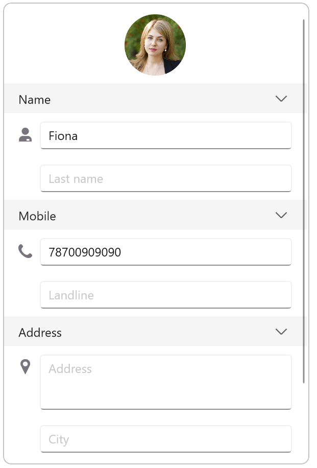
Step 7: Validating the data fields
The .NET MAUI DataForm supports validating the user input. Validation will make sure the users enter only correct values in the data form.
It supports the following data validations:
- Required field validation: To check whether all the required data has been entered. For example, the form can be submitted only after filling in all the data fields.
- Input format validation: To check that the data being entered is in the correct format. For example, email address data should include the @ character.
- Date range validation: To check that the data being entered is within the specific range. For example, dates should be selected within a specific date range.
We are going to add the required field validation to the phone number field in the contact form.
XAML
<dataForm:SfDataForm x:Name="contactForm" DataObject="{Binding ContactFormModel}" ColumnCount="1" AutoGenerateItems="False" ValidationMode="PropertyChanged"/>
C#
dataForm.ValidateProperty += this.OnDataFormValidateProperty; private void OnDataFormValidateProperty(object? sender, DataFormValidatePropertyEventArgs e){ if (e.PropertyName == nameof(ContactFormModel.Mobile) && !e.IsValid) { e.ErrorMessage = e.NewValue == null || string.IsNullOrEmpty(e.NewValue.ToString()) ? "Please enter the mobile number" : "Invalid mobile number"; }}
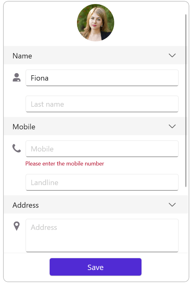
Step 8: Committing the data to the database
Now, you can save or submit the entered data in the underlying database with the help of the following commit modes in the .NET MAUI DataForm:
- LostFocus: The default commit mode, it commits the value to the underline data object when the editor loses focus.
- PropertyChanged: Immediately commits the value to the underline data object when the value changes.
- Manual: Manually commits the value by calling the Commit method.
Note: For more details, refer to the data committing in the .NET MAUI DataForm control documentation.
Step 9: Designing the contact form with layouts
You can elegantly design the contact form with the following layouts in the .NET MAUI DataForm control:
- Grid layout: To arrange the editors in the form in a grid-like pattern with rows and columns.
- Linear layout: To arrange the editors in a single column.
In this demo, I have added the grid layout to the Address group of the contact form.
<dataForm:DataFormGroupItem Name="Address" ColumnCount="2"> <dataForm:DataFormGroupItem.Items> <dataForm:DataFormMultilineItem FieldName="Address" RowSpan="2" Padding="0, 10, 10, 10"> <dataForm:DataFormMultilineItem.LeadingLabelIcon> <FontImageSource Glyph="C" Color="#79747E" FontFamily="InputLayoutIcons" Size="20" /> </dataForm:DataFormMultilineItem.LeadingLabelIcon> </dataForm:DataFormMultilineItem> <dataForm:DataFormTextItem FieldName="City" LeadingLabelIcon="" Padding="0, 10, 10, 10"/> <dataForm:DataFormTextItem FieldName="State" LeadingLabelIcon="" Padding="0, 10, 10, 10"> <dataForm:DataFormTextItem.DefaultLayoutSettings> <dataForm:DataFormDefaultLayoutSettings LabelWidth="{OnIdiom Desktop=0.2*, Phone=0.3*}" EditorWidth="{OnIdiom Desktop=0.8*, Phone=0.7*}"/> </dataForm:DataFormTextItem.DefaultLayoutSettings> </dataForm:DataFormTextItem> <dataForm:DataFormCustomItem FieldName="ZipCode" Padding="0, 10, 10, 10" /> </dataForm:DataFormGroupItem.Items> </dataForm:DataFormGroupItem>
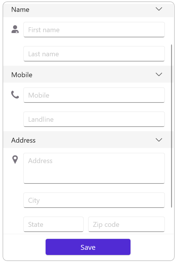
GitHub reference
For more details, refer to the creating a contact form using the .NET MAUI DataForm control GitHub demo.
Conclusion
Thanks for reading! In this blog, we have seen how to create a contact form easily using the Syncfusion .NET MAUI DataForm control. Try out the steps in this blog and leave your feedback in the comments section below!
For current Syncfusion customers, the newest version of Essential Studio is available from the license and downloads page. If you are not yet a customer, you can try our 30-day free trial to check out these features.
If you have any questions, you can contact us through our support forums, feedback portal, or support portal. We are always happy to assist you!
Related blogs
The .NET MAUI Scheduler is a tool for scheduling events in a .NET MAUI application. It supports scheduling recurring events, which are regularly or periodically occurring appointments or events. Scheduler’s API has been designed with simplicity and ease of use in mind, so that anyone can add recurring events to their project with just a few API calls. Supported by a robust internal scheduling engine, Scheduler gives you all the APIs you need to build simple and easy-to-maintain schedules.
Let’s see how to create and customize recurrence appointments in the .NET MAUI Scheduler.
Note: If you are new to this control, refer to the .NET MAUI Scheduler getting started documentation before proceeding.
Recurrence Rule
The Scheduler control uses the recurrence rule (string) to specify the recurrence details of an appointment. The recurrence rule specifies the recurrence frequency, interval, range, and position details.
Recurrence pattern
The pattern specifies the frequency or type of appointment: daily, weekly, monthly, and yearly.
Interval
Specify the interval between consecutive occurrences of the recurring appointment.
Range
The time range in which an appointment recurs. The range value is determined by the recurrence rule’s number of instances (count) or the end date (until). The recurring appointment is considered a never-ending appointment when the range is not specified.
Position details
The position (the day of the week, week of the month, month of the year) is specified and used on weekly, monthly, and yearly recurrence types.
Recurrence Types
Recurrence is the base term describing a repeating pattern. Business people use the concept of regular assignment of tasks or recurring events on certain days of the week, month, or even annually, like Jan. 1 every year.
Daily recurrence type
An appointment repeats daily with a specified day interval within a set date range. Following are some examples of daily recurrences.
| Rule | Description |
| FREQ=DAILY;INTERVAL=1;COUNT=5 | Repeats the appointment for 5 consecutive days. |
| FREQ=DAILY;INTERVAL=1;UNTIL=20221225 | Repeats the appointment every day until the specified end date. |
| FREQ=DAILY;INTERVAL=2 | Repeats the appointment every 2 days with no end date. |
Weekly recurrence type
An appointment repeats on a specified weekday with a specified week interval within the specified date range. Following are some examples of weekly recurrences.
| Rule | Description |
| FREQ=WEEKLY;INTERVAL=1;BYDAY=MO,WE;COUNT=5 | Repeats the appointment 5 times for specified weekdays (Monday, Wednesday) of every week. |
| FREQ=WEEKLY;INTERVAL=1;BYDAY=MO,WE;UNTIL=20221225 | Repeats the appointment on specified weekdays (Monday, Wednesday) of every week until the specified end date. |
| FREQ=WEEKLY;INTERVAL=2;BYDAY=MO,WE | Repeats the appointment on specified weekdays (Monday, Wednesday) every 2 weeks with no end date. |
Monthly recurrence type
An appointment repeats on a specified day of the month or weekday of a specified week position with a specified month interval within a set date range. Following are some examples of monthly recurrences.
| Rule | Description |
| FREQ=MONTHLY;BYMONTHDAY=3;INTERVAL=1;COUNT=5 | Repeats the appointment 5 times on a specified day (3rd) of every month. |
| FREQ=MONTHLY;INTERVAL=1;BYDAY=MO;BYSETPOS=2;UNTIL=20221225 | Repeats the appointment on a specified weekday (Monday) of a specified week (week 2) of every month until the specified end date. |
| FREQ=MONTHLY;INTERVAL=2;BYDAY=MO;BYSETPOS=2 | Repeats the appointment on a specified weekday (Monday) of a specified week (week 2) every 2 months with no end date. |
Yearly recurrence type
Schedule and repeat an appointment on a specified day of a month or weekday of specified week position of a month with a specified year interval within a specified date range.
| Rule | Description |
| FREQ=YEARLY;BYMONTHDAY=16;BYMONTH=6;INTERVAL=1;COUNT=5 | Repeats the appointment 5 times for a specified day (16th) in the same month (June) of every year. |
| FREQ=YEARLY;BYDAY=SU;BYSETPOS=3;BYMONTH=8;INTERVAL=1;UNTIL=20251225 | Repeats the appointment on a specified weekday (Sunday) of a specified week (week 3) in a specified month (August) for every year until the specified end date. |
| FREQ=YEARLY;BYDAY=SU;BYSETPOS=3;BYMONTH=8;INTERVAL=2; | Repeats the appointment on a specified weekday (Sunday) of a specified week (week 3) in a specified month (August) every two years with no end date. |
Example
SfScheduler scheduler = new SfScheduler();scheduler.View = SchedulerView.Week;var appointment = new ObservableCollection<SchedulerAppointment>();//Adding scheduler appointment in the scheduler appointment collection.appointment.Add(new SchedulerAppointment(){ StartTime = DateTime.Today.Date.AddHours(9), EndTime = DateTime.Today.Date.AddHours(11), Subject = "Daily scrum meeting", RecurrenceRule = "FREQ=DAILY;INTERVAL=1;COUNT=10"});//Adding the scheduler appointment collection to the AppointmentsSource of .NET MAUI Scheduler.scheduler.AppointmentsSource = appointment;this.Content = scheduler;
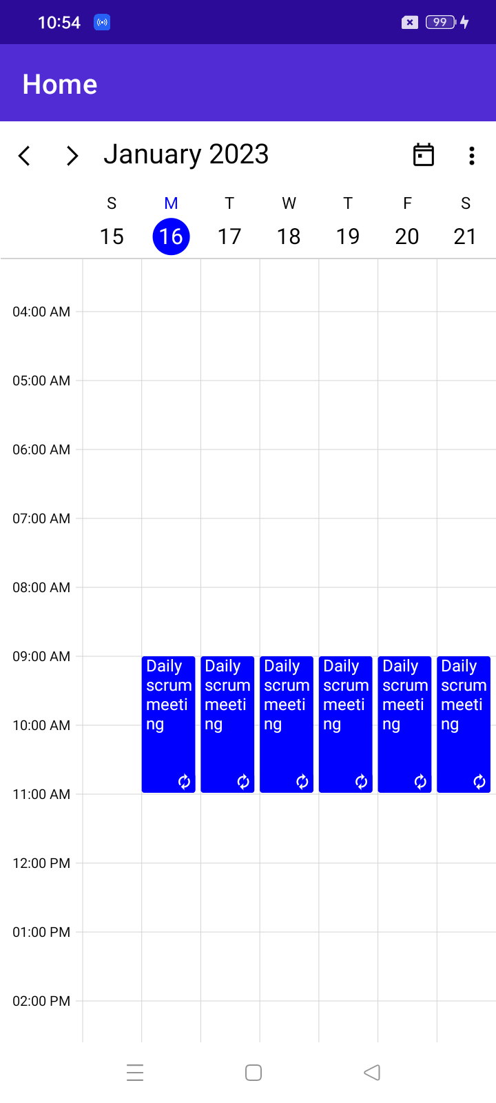
Note: For more details, refer to the Recurrence appointments in the .NET MAUI Scheduler documentation.
Recurrence Exception Appointment
The Scheduler control provides support to restrict (change start time, end time, and appointment details) occurrences and remove an occurrence of a repeating appointment with a recurrence exception.
Deleting a recurring appointment
The RecurrenceExceptionDates property in an appointment is used to remove the occurrence on specified dates.
Refer to the following code example.
SfScheduler scheduler = new SfScheduler();scheduler.View = SchedulerView.Week;var appointment = new ObservableCollection<SchedulerAppointment>();//Adding scheduler appointment in the scheduler appointment collection.appointment.Add(new SchedulerAppointment(){ StartTime = DateTime.Today.Date.AddHours(9), EndTime = DateTime.Today.Date.AddHours(11), Subject = "Daily scrum meeting", RecurrenceRule = "FREQ=DAILY;INTERVAL=1;COUNT=10", RecurrenceExceptionDates = new ObservableCollection<DateTime> { DateTime.Today.AddDays(1) },});//Adding the scheduler appointment collection to the AppointmentsSource of .NET MAUI Scheduler.scheduler.AppointmentsSource = appointment;this.Content = scheduler;
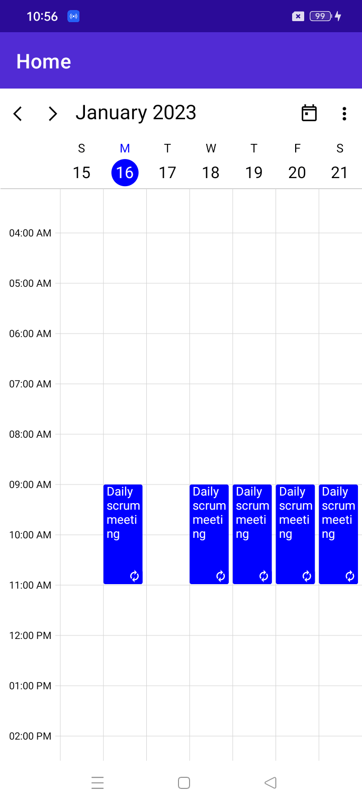
Modifying an occurrence of an appointment
The RecurrenceExceptionDates and RecurrenceId properties in an appointment are used to change the occurrence appointment details without removing the appointment on a specified date.
Refer to the following code example.
SfScheduler scheduler = new SfScheduler();scheduler.View = SchedulerView.Week;var appointment = new ObservableCollection<SchedulerAppointment>();//Adding scheduler appointment in the scheduler appointment collection.appointment.Add(new SchedulerAppointment(){ Id = 1, StartTime = DateTime.Today.Date.AddHours(9), EndTime = DateTime.Today.Date.AddHours(11), Subject = "Daily scrum meeting", RecurrenceRule = "FREQ=DAILY;INTERVAL=1;COUNT=10", RecurrenceExceptionDates = new ObservableCollection<DateTime> { DateTime.Today.AddDays(1) },});//Adding exception appointment in the scheduler appointment collection.Appointment.Add(new SchedulerAppointment(){ Id = 2, StartTime = DateTime.Today.AddDays(1).Date.AddHours(11), EndTime = DateTime.Today.AddDays(1).Date.AddHours(13), Subject = "Scrum meeting - Changed", RecurrenceId=1,});//Adding the scheduler appointment collection to the AppointmentsSource of .NET MAUI Scheduler.scheduler.AppointmentsSource = appointment;this.Content = scheduler;
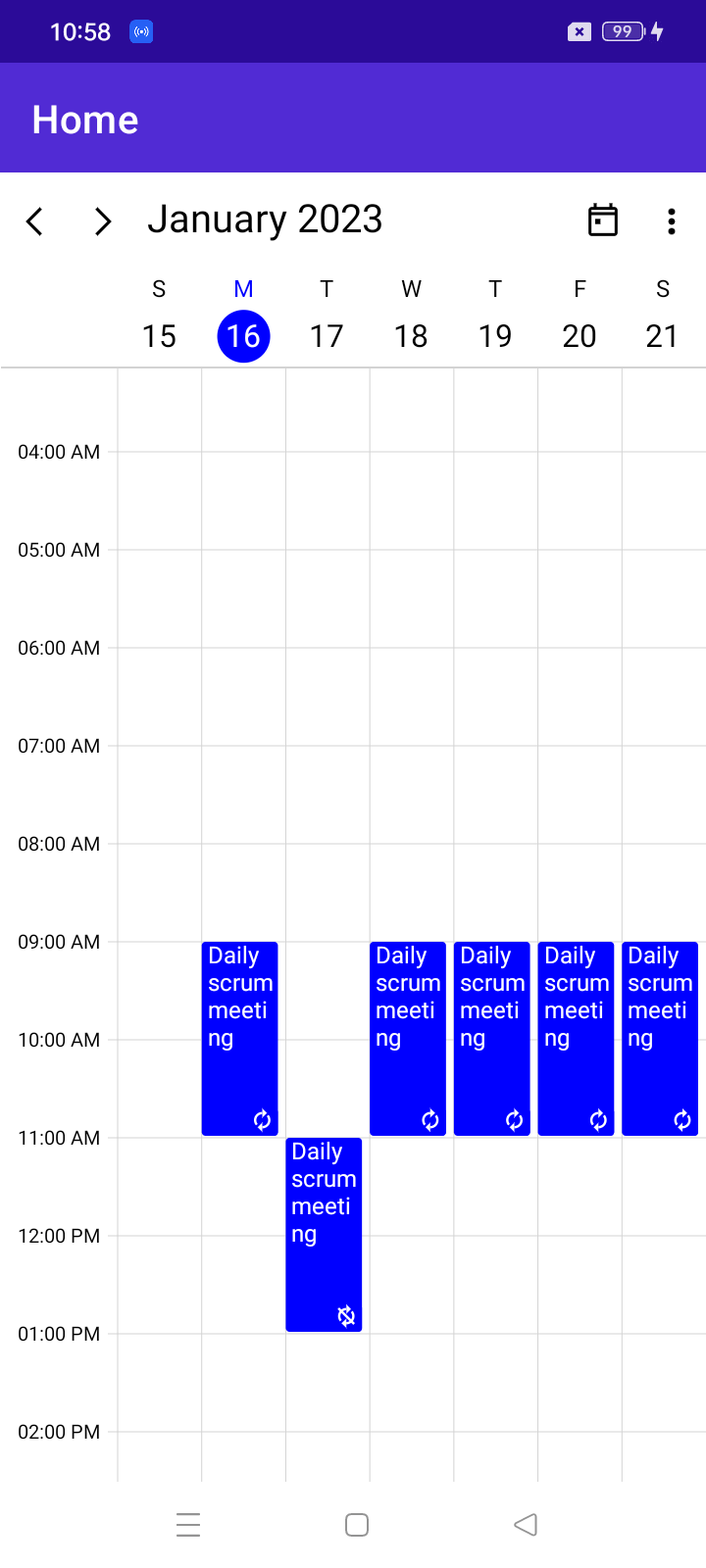
Conclusion
Thank you for your time! This blog post showed how to set a recurring appointment in the .NET MAUI Scheduler. You can explore other features in the Scheduler control in the documentation, where you can find detailed explanations of each with code examples.
If you are not a Syncfusion customer, you can try our 30-day free trial to see how our components can enhance your projects.
Please feel free to try out the samples available in our .NET MAUI sample location and share your feedback or ask questions in the comments section. Or contact us through our support forum, support portal, or feedback portal. We are happy to assist you!
Related blogs
As we all know, Microsoft SharePoint is one of the most popular and widely used applications for storing files in the cloud. In this blog, we will see how to implement SharePoint authentication, access PDF files, and view them easily in a Xamarin application using our Syncfusion Xamarin PDF Viewer.
Let’s get started!
Configuring the Xamarin application using the Azure Portal
To start with, you need to register your Xamarin application in Azure AD. Sign into the Azure Portal, search for and select Azure Active Directory, then go to the App registrations tab and select New registration.
Step 1: In the Register an application page:
- Enter a Name for your app registration.
- Select the type of accounts you want to grant access to your app.
- Select Register.
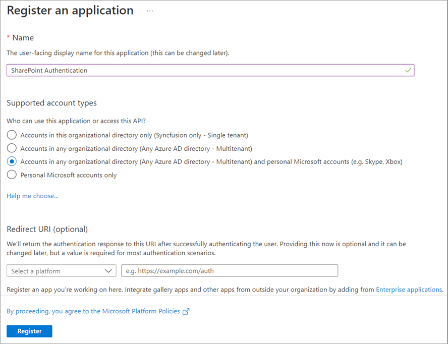
Step 2: After the app registration is created, take note of the Application (client) ID for later use. You can find it in the Overview tab of the application registration we just created.
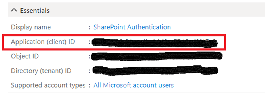
Step 3: Then, go to the Authentication tab, click Add a platform, and add both iOS and Android. Just for Android, we need to generate and provide a signature hash.
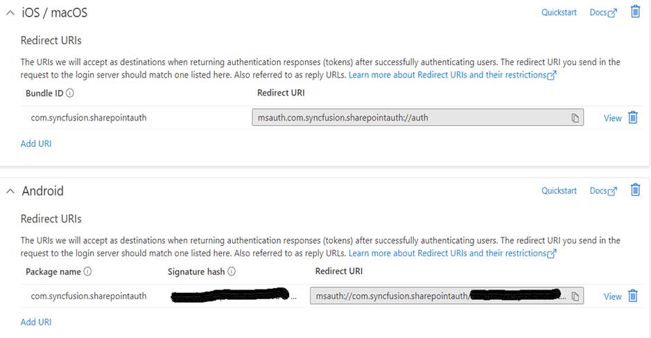
Creating and configuring a Xamarin application
Now, integrate the Microsoft SharePoint authentication into our Xamarin application to access the PDF documents and view them using our Syncfusion Xamarin PDF Viewer.
Step 1: Create a new Xamarin.Forms project.
Step 2: Install the following NuGet packages in the PCL and all platform projects:
- PnP.Framework—To authenticate and retrieve data from SharePoint.
- Syncfusion.Xamarin.SfPdfViewer—To view the PDF documents.
- Syncfusion.Xamarin.SfTreeView —To visualize the retrieved SharePoint documents like in a file explorer.
- Syncfusion.Xamarin.SfProgressBar—To indicate the progress of a task.
Additionally, in iOS, to launch the application with Syncfusion controls, you need to call the SfPdfDocumentViewRenderer.Init(),SfTreeViewRenderer.Init(), and SfLinearProgressBarRenderer.Init() methods in the FinishedLaunching overridden method of the AppDelegate class after the Xamarin.Forms framework has been initialized and before the LoadApplication is called. Refer to the following code sample.
public override bool FinishedLaunching(UIApplication app, NSDictionary options){ global::Xamarin.Forms.Forms.Init(); Syncfusion.SfPdfViewer.XForms.iOS.SfPdfDocumentViewRenderer.Init(); Syncfusion.XForms.iOS.TreeView.SfTreeViewRenderer.Init(); Syncfusion.XForms.iOS.ProgressBar.SfLinearProgressBarRenderer.Init(); LoadApplication(new App()); App.ParentWindow = null; return base.FinishedLaunching(app, options);}
Note: Here, the SfTreeView and SfProgressBar have just been used to improve the usability of the application. You can replace these with the controls of your choice.
Step 3: Create model classes named FileManager and PDFFile to hold the data of the SharePoint documents and the PDF document, respectively. Refer to the following code example.
FileManager.cs
using System.ComponentModel;using Xamarin.Forms;using Microsoft.SharePoint.Client;namespace SharePoint{ public class FileManager : INotifyPropertyChanged { private string itemName; private bool hasChildNodes; private Folder folder; private File file; private ImageSource imageIcon; public FileManager() { } public string ItemName { get { return itemName; } set { itemName = value; RaisedOnPropertyChanged("ItemName"); } } public bool HasChildNodes { get { return hasChildNodes; } set { hasChildNodes = value; RaisedOnPropertyChanged("HasChildNodes"); } } public Folder Folder { get { return folder; } set { folder = value; RaisedOnPropertyChanged("Folder"); } } public File File { get { return file; } set { file = value; RaisedOnPropertyChanged("File"); } } public ImageSource ImageIcon { get { return imageIcon; } set { imageIcon = value; RaisedOnPropertyChanged("ImageIcon"); } } public event PropertyChangedEventHandler PropertyChanged; public void RaisedOnPropertyChanged(string \_PropertyName) { if (PropertyChanged != null) { PropertyChanged(this, new PropertyChangedEventArgs(\_PropertyName)); } } }}
PDFFile.cs
using System.IO;namespace SharePoint{ public class PdfFile { public Stream DocumentStream { get; set; } public string Name { get; set; } public PdfFile(Stream pdfStream,string pdfName) { DocumentStream = pdfStream; Name = pdfName; } }}
Step 4: Create a ViewModel class named SharePointViewModel.cs. Implement the logic to authenticate and retrieve the SharePoint documents and return the document stream of the selected PDF file in the File Manager. Refer to the following code example.
SharePointViewModel.cs
using Microsoft.Identity.Client;using Microsoft.SharePoint.Client;using PnP.Framework;using Syncfusion.TreeView.Engine;using System;using System.Collections.ObjectModel;using System.IO;using System.Reflection;using System.Threading.Tasks;using System.Windows.Input;using Xamarin.Essentials;using Xamarin.Forms;namespace SharePoint{ internal class SharePointViewModel { // Replace with your SharePoint tenant name. private const string Tenant = "{YOUR TENANT NAME}"; // Replace with your targeted SharePoint site name. private const string SiteName = "{YOUR SITE NAME}"; // Replace with your Azure AD Application's Client ID. private const string ClientId = "{YOUR CLIENT ID}"; // Replace with your Azure AD Application's Package Name or Bundle ID. private const string AppId = "{YOUR APP ID}"; // For Android, replace with your Authentication Signature Hash. private const string SignatureHash = "{YOUR SIGNATURE HASH}"; public ObservableCollection<FileManager> Documents { get; set; } public ClientContext Context { get; set; } public ICommand DocumentsViewOnDemandCommand { get; set; } public SharePointViewModel() { DocumentsViewOnDemandCommand = new Command(ExecuteOnDemandLoading, CanExecuteOnDemandLoading); } private bool CanExecuteOnDemandLoading(object sender) { var hasChildNodes = ((sender as TreeViewNode).Content as FileManager).HasChildNodes; if (hasChildNodes) return true; else return false; } private void ExecuteOnDemandLoading(object obj) { var node = obj as TreeViewNode; // Skip the repeated population of child items when every time the node expands. if (node.ChildNodes.Count > 0) { node.IsExpanded = true; return; } //Animation starts for expander to show progress of load on demand. node.ShowExpanderAnimation = true; Microsoft.SharePoint.Client.Folder root = (node.Content as FileManager).Folder; var documents = GetDocuments(root); node.PopulateChildNodes(documents); if (documents.Count > 0) { //Expand the node after child items are added. node.IsExpanded = true; } //Stop the animation after load on demand is executed. If animation not stopped, it remains still after execution of load on demand. node.ShowExpanderAnimation = false; } /// <summary> /// Perform SharePoint authentication and return the documents of the target site. /// </summary> /// <returns>Documents of the target site</returns> internal async Task AuthenticateAndAcquireDocuments() { string redirectURI = DeviceInfo.Platform == DevicePlatform.Android ? $"msauth://{AppId}/{SignatureHash}" : $"msauth.{AppId}://auth"; IPublicClientApplication PublicClientApp = PublicClientApplicationBuilder.Create(ClientId) .WithIosKeychainSecurityGroup(AppId) .WithRedirectUri(redirectURI) .WithAuthority("https://login.microsoftonline.com/common") .Build(); var \_scopes = new String[] { $"https://{Tenant}.sharepoint.com/AllSites.Read" }; //Replace with your own permissions. try { AuthenticationResult authResult = await PublicClientApp.AcquireTokenInteractive(\_scopes) .WithParentActivityOrWindow(App.ParentWindow) .WithUseEmbeddedWebView(true) .ExecuteAsync(); var authManager = new AuthenticationManager().GetAccessTokenContext( $"https://{Tenant}.sharepoint.com/sites/{SiteName}", authResult.AccessToken); Context = authManager.GetSiteCollectionContext(); var web = Context.Web;//Gets target site web details. var docs = web.Lists.GetByTitle("Documents");//Gets site's documents list. Var root = docs.RootFolder; //Root folder. Documents = GetDocuments(root); } catch (Exception e) { } } /// <summary> /// Returns the documents present in the passed root or parent folder. /// </summary> /// <param name="root">Root folder</param> /// <returns>Documents of the root or parent folder</returns> internal ObservableCollection<FileManager> GetDocuments(Microsoft.SharePoint.Client.Folder root) { ObservableCollection<FileManager> documents = new ObservableCollection<FileManager>(); Assembly assembly = typeof(DocumentsPage).GetTypeInfo().Assembly; Context.Load(root, f => f.ItemCount, f => f.Folders); Context.Load(root, f => f.ItemCount, f => f.Files); Context.ExecuteQuery(); foreach (Microsoft.SharePoint.Client.Folder folder in root.Folders) { bool hasChildNodes = folder.ItemCount > 0 ? true : false; var folderItem = new FileManager() { ItemName = folder.Name, Folder = folder, HasChildNodes = hasChildNodes, ImageIcon = ImageSource.FromResource("SharePoint.Icons.treeview\_folder.png", assembly) }; documents.Add(folderItem); } foreach (Microsoft.SharePoint.Client.File file in root.Files) { if (file.Name.EndsWith(".pdf")) { var fileItem = new FileManager() { ItemName = file.Name, File = file, ImageIcon = ImageSource.FromResource("SharePoint.Icons.treeview\_pdf.png", assembly) }; documents.Add(fileItem); } } return documents; } /// <summary> /// Returns the chosen PDF document details. /// </summary> /// <param name="file">PDF file chosen from the File Explorer</param> /// <returns>PDF document details</returns> internal PdfFile GetPdfDocumentDetails(Microsoft.SharePoint.Client.File file) { MemoryStream PdfDocumentStream = new MemoryStream(); var fileStream = file.OpenBinaryStream(); Context.Load(file); Context.ExecuteQuery(); fileStream.Value.CopyTo(PdfDocumentStream); PdfDocumentStream.Position = 0; return new PdfFile(PdfDocumentStream, file.Name); } }}
Make sure to replace the following things in the previous code example:
- Tenant—SharePoint tenant name.
- SiteName—SharePoint site name.
- ClientId—Application’s Client ID noted from the Azure AD.
- AppId—Application’s package name [Android] or bundle ID [iOS] given during Azure AD authentication.
- SignatureHash—Signature hash noted from Android’s authentication.
Step 5: Create a view named PdfViewerPage to view the selected PDF file from the SharePoint documents. Refer to the following code example.
PdfViewerPage.xaml
<?xml version="1.0" encoding="utf-8" ?><ContentPage xmlns="http://xamarin.com/schemas/2014/forms" xmlns:x="http://schemas.microsoft.com/winfx/2009/xaml" xmlns:syncfusion="clr-namespace:Syncfusion.SfPdfViewer.XForms;assembly=Syncfusion.SfPdfViewer.XForms" x:Class="SharePoint.PdfViewerPage"> <ContentPage.Content> <syncfusion:SfPdfViewer x:Name="PdfViewer"/> </ContentPage.Content></ContentPage>
PdfViewerPage.xaml.cs
using Xamarin.Forms;using Xamarin.Forms.Xaml;namespace SharePoint{ [XamlCompilation(XamlCompilationOptions.Compile)] public partial class PdfViewerPage : ContentPage { public PdfViewerPage(PdfFile pdfFile) { InitializeComponent(); this.Title = pdfFile.Name; pdfFile.DocumentStream.Position = 0; PdfViewer.LoadDocument(pdfFile.DocumentStream); } protected override void OnDisappearing() { PdfViewer.Dispose(); base.OnDisappearing(); } }}
Step 6: Create another view named DocumentsPage to login and display the SharePoint documents of the given site name in the File Explorer-like Treeview. Also, in the TreeView’s ItemTapped handler method, implement the logic to retrieve the selected PDF document details and navigate to the PdfViewerPage to view them.
Note: In this example, we have used TreeView’s ItemTemplate Selector to customize the appearance of each item with different templates to create the file explorer view.
Refer to the following code example.
DocumentsPage.xaml
<?xml version="1.0" encoding="utf-8" ?><ContentPage xmlns="http://xamarin.com/schemas/2014/forms" xmlns:x="http://schemas.microsoft.com/winfx/2009/xaml" xmlns:treeView="clr-namespace:Syncfusion.XForms.TreeView;assembly=Syncfusion.SfTreeView.XForms" xmlns:progressBar="clr-namespace:Syncfusion.XForms.ProgressBar;assembly=Syncfusion.SfProgressBar.XForms" xmlns:local="clr-namespace:SharePoint" NavigationPage.HasNavigationBar="False" x:Class="SharePoint.DocumentsPage"> <ContentPage.BindingContext> <local:SharePointViewModel/> </ContentPage.BindingContext> <ContentPage.Resources> <ResourceDictionary> <local:ItemTemplateSelector x:Key="ItemTemplateSelector" /> </ResourceDictionary> </ContentPage.Resources> <ContentPage.Content> <Grid> <Grid.RowDefinitions> <RowDefinition Height="auto"/> <RowDefinition Height="*"/> </Grid.RowDefinitions> <progressBar:SfLinearProgressBar x:Name="ProgressBar" Grid.Row="0" HeightRequest="5" IsIndeterminate="True" IsVisible="false" ProgressColor="#038387"/> <StackLayout Grid.Row="1" Orientation="Vertical" VerticalOptions="Center"> <Image x:Name="SharepointImage" HeightRequest="175" WidthRequest="175" VerticalOptions="Center"></Image> <Button Text="SHAREPOINT LOGIN" x:Name="LoginButton" WidthRequest="250" HorizontalOptions="Center" Font="18" Clicked="LoginButton\_Clicked"/> <Label x:Name="DocumentsTitleLabel" HeightRequest="50" IsVisible="false" Text="Documents" HorizontalTextAlignment="Center" VerticalTextAlignment="Center" FontSize="20" TextColor="White" BackgroundColor="#038387"/> <treeView:SfTreeView x:Name="DocumentsView" ItemHeight="40" IsVisible="false" ChildPropertyName="SubFiles" LoadOnDemandCommand="{Binding DocumentsViewOnDemandCommand}" ItemTemplateContextType="Node" ItemTapped="DocumentsView\_ItemTapped" SelectionBackgroundColor="#038387" SelectionForegroundColor="White" Indentation="20" ExpanderWidth="40" ItemTemplate="{StaticResource ItemTemplateSelector}"> </treeView:SfTreeView> </StackLayout> </Grid> </ContentPage.Content></ContentPage>
DocumentsPage.xaml.cs
using System;using System.Reflection;using Xamarin.Forms;using Xamarin.Forms.Xaml;namespace SharePoint{ [XamlCompilation(XamlCompilationOptions.Compile)] public partial class DocumentsPage : ContentPage { public DocumentsPage() { InitializeComponent(); SharepointImage.Source = ImageSource.FromResource("SharePoint.Icons.sharepoint.png", typeof(DocumentsPage).GetTypeInfo().Assembly); } private async void LoginButton\_Clicked(object sender, EventArgs e) { ProgressBar.IsVisible = true; LoginButton.IsVisible = false; await (BindingContext as SharePointViewModel).AuthenticateAndAcquireDocuments(); SharepointImage.IsVisible = false; DocumentsTitleLabel.IsVisible = true; DocumentsView.IsVisible = true; DocumentsView.ItemsSource = (BindingContext as SharePointViewModel).Documents; ProgressBar.IsVisible = false; } private void DocumentsView\_ItemTapped(object sender, Syncfusion.XForms.TreeView.ItemTappedEventArgs e) { Microsoft.SharePoint.Client.File file = (e.Node.Content as FileManager).File; if (file != null) { Navigation.PushAsync(new PdfViewerPage((BindingContext as SharePointViewModel) .GetPdfDocumentDetails(file))); } } }}
In this example, you can navigate back to the Documents page from PDF Viewer page to choose or load another PDF document by clicking the back icon in the navigation bar. Refer to the following image.
Step 7: Before running the application, there are some configurations that need to be done in both Android and iOS platforms to make the SharePoint authentication successful and to continue with our application.
iOS
In iOS, to reopen our application after the authentication flow is completed, override the OpenUrl method in the AppDelegate class. Refer to the following code example.
public override bool OpenUrl(UIApplication app, NSUrl url, NSDictionary options){ AuthenticationContinuationHelper.SetAuthenticationContinuationEventArgs(url); return true;}
Next, open the Entitlements.plist file and check the Enable Keychain option. This will add an entry for our app to the keychain, which is where iOS securely stores our credentials.
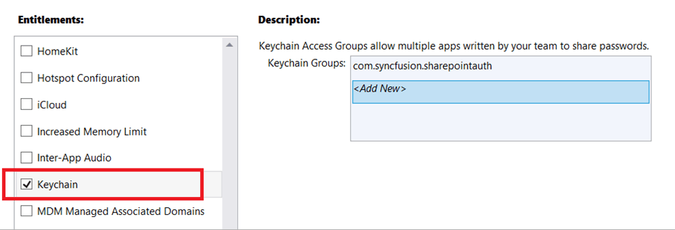
To allow the application to use the keychain, set the Custom Entitlements setting to point to the Entitlements.plist file. This setting option can be found in the Properties -> iOS Bundle Signing -> Additional Resources.
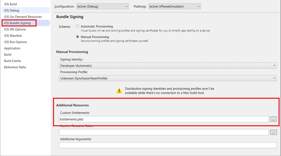
Finally, configure the iOS application to respond to the callback URL by defining a URL type in the Info.plist file. Add or update the Identifier, URL Schemes, and Role properties in the URL type. Refer to the following screenshot.
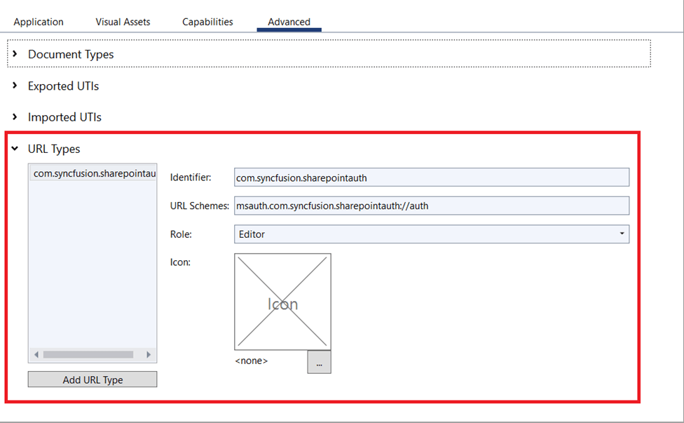
Android
In Android, to reopen our application after the authentication is completed, override the OnActivityResult method in the MainActivity class. Refer to the following code example.
protected override void OnActivityResult(int requestCode, Result resultCode, Intent data){ base.OnActivityResult(requestCode, resultCode, data); AuthenticationContinuationHelper.SetAuthenticationContinuationEventArgs(requestCode, resultCode, data);}
Next, configure the Android application to respond to the callback URL by providing an activity and an intent-filter in the AndroidManifest.xml file. Refer to the following code example.
AndroidManifest.xml
<?xml version="1.0" encoding="utf-8"?><manifest xmlns:android="http://schemas.android.com/apk/res/android" android:versionCode="1" android:versionName="1.0" package="com.companyname.SharePoint" android:installLocation="preferExternal"> <uses-sdk android:minSdkVersion="21" android:targetSdkVersion="30" /> <uses-permission android:name="android.permission.INTERNET" /> <uses-permission android:name="android.permission.ACCESS\_NETWORK\_STATE" /> <uses-permission android:name="android.permission.WRITE\_EXTERNAL\_STORAGE" /> <application android:label="SharePoint.Android"> <activity android:name="microsoft.identity.client.BrowserTabActivity"> <intent-filter> <action android:name="android.intent.action.VIEW" /> <category android:name="android.intent.category.DEFAULT" /> <category android:name="android.intent.category.BROWSABLE" /> <data android:scheme="msauth" android:host="com.syncfusion.sharepointauth" android:path="{YOUR\_SIGNATURE\_HASH}" /> </intent-filter> </activity> </application></manifest>
Note: Please make sure to replace the text {YOUR\_SIGNATURE\_HASH} with your application’s signature hash in the AndroidManifest.xml file.
Step 8: Finally, you can deploy the application. The output of this example application will look as follows.
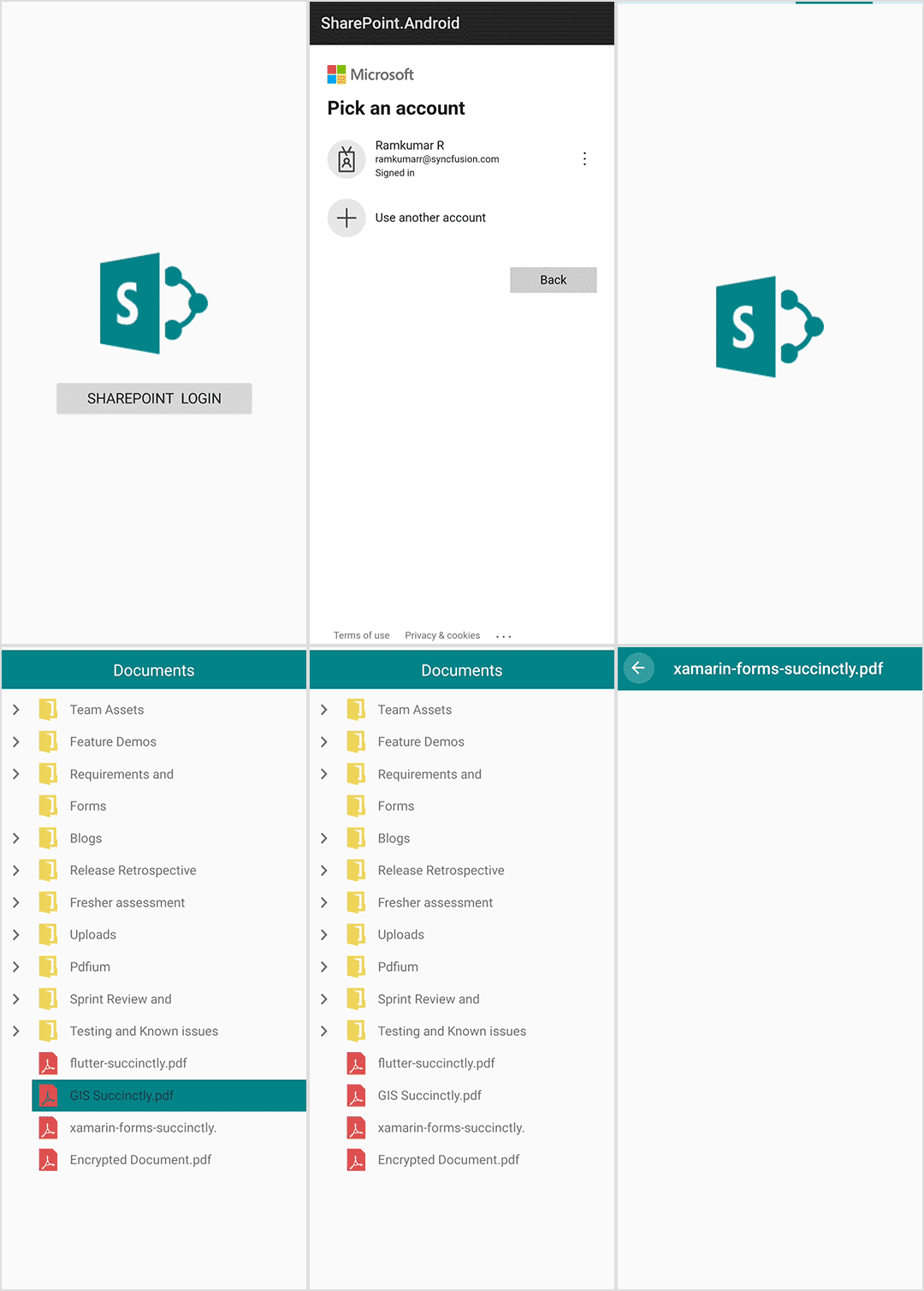
Resource
For more details, check out the complete code example on GitHub.
Conclusion
Thanks for reading! We have seen in this blog how to access PDF files from SharePoint and load them using Syncfusion’s Xamarin.Forms PDF Viewer control. Try this in your application and share your feedback in the comment section below!
If you aren’t a customer, you can try our 30-day free trial to check out these features. Also, try our other Xamarin examples from this GitHub location.
If you have any questions, you can contact us through our support forum, support portal, or feedback portal. We are always happy to assist you!
Related blogs
We are excited to announce that the Syncfusion .NET MAUI control demos are now available in the app stores. Syncfusion offers a wide range of .NET MAUI controls and document processing libraries, providing everything you need to build modern mobile and desktop applications for platforms such as Android, iOS, Mac Catalyst, and Windows.
To start off 2023, we have published our sample browser, which contains demos of our .NET MAUI controls, in the app stores for your convenience. With these demos, you can easily explore the capabilities of our controls and see how they can enhance your apps’ development. Whether you are building a new app or looking to upgrade your current app, Syncfusion’s .NET MAUI controls are the perfect solution.
Syncfusion .NET MAUI controls
Syncfusion offers the following 35+ .NET MAUI controls and file-format libraries:
Syncfusion’s .NET MAUI sample browser demos
Syncfusion’s .NET MAUI sample browser is a comprehensive app that showcases the capabilities of our .NET MAUI controls. You can deploy this app on various devices, including Android, iOS, macOS, and Windows. It can adapt to different screen sizes to provide an optimal user experience on mobile and desktop devices. The app also includes a settings page and code viewer navigator to help you customize and explore the demos.
This is a valuable resource for anyone looking to incorporate Syncfusion controls into their .NET MAUI apps. It features a wide range of demos that showcase real-world use cases, making it easy to see how these controls can be used in your projects. The controls are user-friendly and highly customizable, making them an excellent choice for developers who want to add rich, feature-packed functionalities to their apps. Whether you’re looking to build a mobile or desktop app, the Syncfusion .NET MAUI sample browser is an essential tool for anyone looking to take advantage of these robust controls.
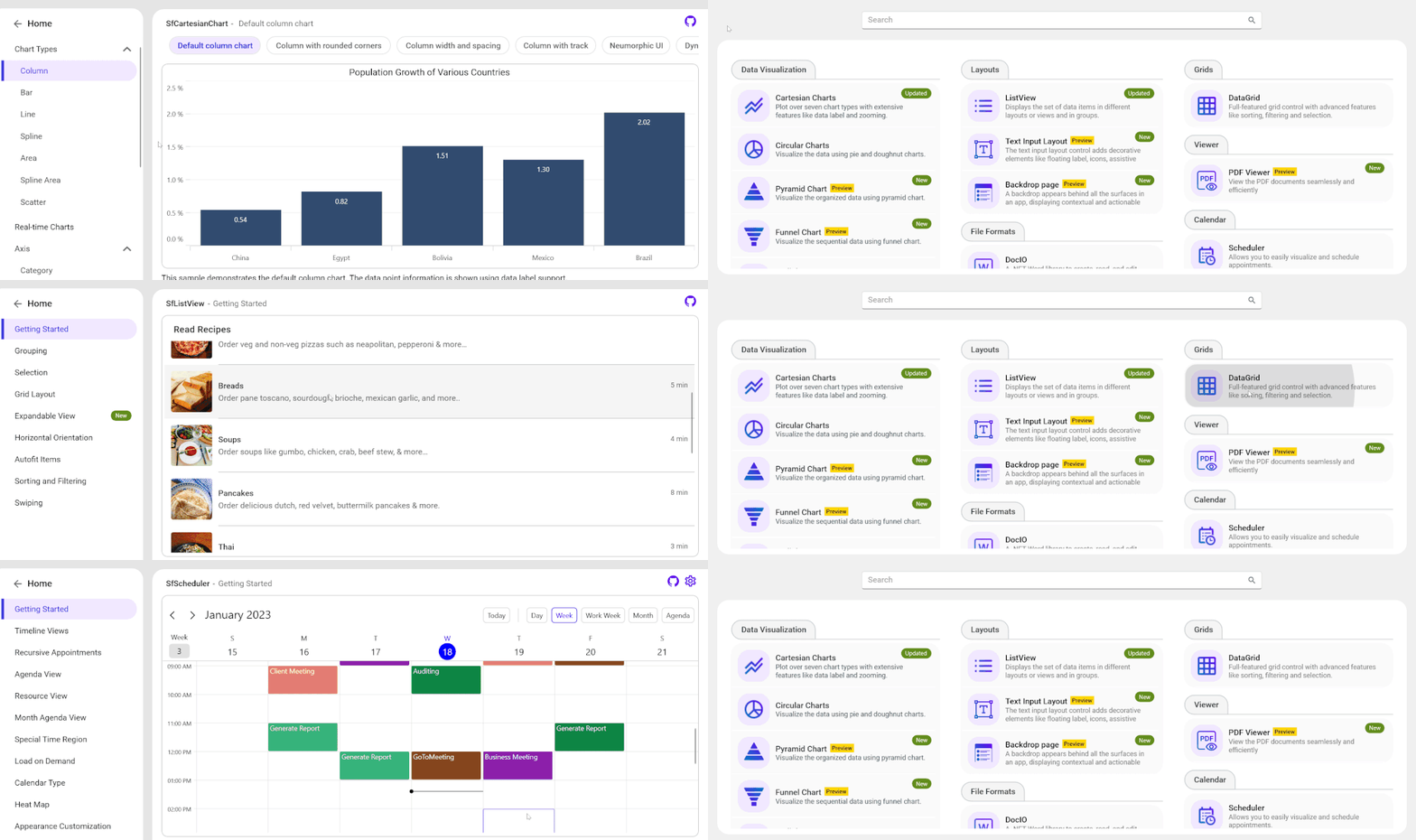
How to get and install the .NET MAUI sample browser app
The Syncfusion .NET MAUI sample browser app is available on the Android, iOS, macOS, and Windows stores.
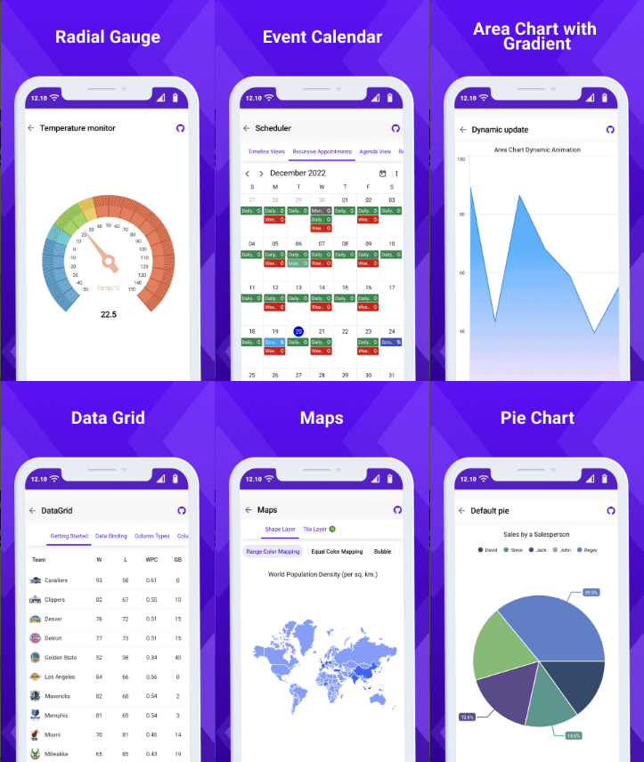
.NET MAUI demos for Android
Download the Syncfusion .NET MAUI demos for Android devices from the Google Play Store or scan the following QR code.
.NET MAUI demos for Windows
Install the .NET MAUI demos for Windows from the Microsoft Store or scan the following QR code.

.NET MAUI demos for iOS
According to Apple’s App Store Review Guidelines (section 2.2 on beta testing), we cannot upload our Syncfusion .NET MAUI sample browser app to the App Store. We understand and respect the guidelines set forth by Apple.
However, you can still experience the app in an iOS device. You can install our .NET MAUI demos for iOS using the TestFlight app on your device. Or you can scan the following QR code to get them.
.NET MAUI demos for macOS
Install the .NET MAUI demos for macOS from the App Center or scan the following QR code to download them.
View demo code on GitHub
You can also find the complete code examples for Syncfusion .NET MAUI controls on the GitHub repository.
Conclusion
Thanks for reading! In this blog, we have seen the availability of Syncfusion .NET MAUI control demos in the app stores for Android, iOS, macOS, and Windows platforms. These demonstrations go through the capabilities and features of our controls in detail and help you build elegant, high-performance, and cross-platform apps. Try them out and leave your feedback in the comments section below!
For questions, you can contact us through our support forum, support portal, or feedback portal. We are always happy to assist you!
I hope the demos are helpful and informative and you will consider using the Syncfusion .NET MAUI controls for your next project. Happy coding!
Related blogs
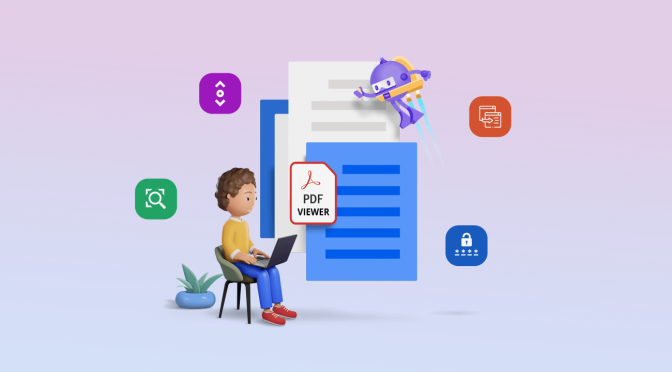
Syncfusion is excited to announce the availability of another valuable control, PDF Viewer, for the .NET MAUI platform in the 2022 Volume 4 release.
The new .NET MAUI PDF Viewer control allows you to easily add PDF viewing capabilities within your applications. It is supported in Windows, macOS, iOS, and Android platforms.
In this blog, we’ll explore the features of the .NET MAUI PDF Viewer and the steps to get started with it.
Key features
The key features of the new .NET MAUI PDF Viewer are:
- Virtual scrolling: Easily scroll through the pages in a PDF document with a fluent experience. The pages are rendered on demand in order to enhance the loading and scrolling performance.
- Magnification: The content of a PDF document can be efficiently zoomed in and out by pinching or changing the zoom factor programmatically.
- Page navigation: Navigate to the desired pages instantly using the programmatic page navigation or by dragging the scroll box in the UI.
- Opening password-protected PDFs: Load and view password-protected PDFs in a hassle-free way. Also, you can design a custom password request view and integrate the functionality easily with built-in options.
Getting started with .NET MAUI PDF Viewer
Let’s see how to integrate the Syncfusion .NET MAUI PDF Viewer control in your application and use its basic features.
Creating a .NET MAUI application with the PDF Viewer
Step 1: First, create a new .NET MAUI application in Visual Studio.
Step 2: Then, add the Syncfusion.Maui.PdfViewer NuGet package reference to your project from the NuGet Gallery.
Step 3: Then, register the handler for the Syncfusion core package in the MauiProgram.cs file. Refer to the following code.
using Syncfusion.Maui.Core.Hosting;namespace PdfViewerExample{ public static class MauiProgram { public static MauiApp CreateMauiApp() {var builder = MauiApp.CreateBuilder();builder .UseMauiApp<App>() .ConfigureFonts(fonts => { fonts.AddFont("OpenSans-Regular.ttf", "OpenSansRegular"); fonts.AddFont("OpenSans-Semibold.ttf", "OpenSansSemibold"); }); builder.ConfigureSyncfusionCore(); return builder.Build(); } }}
Step 4: Add a new folder to the project named Assets and add the PDF document you want to view (such as PDF\_Succinctly.pdf) using the PDF Viewer.
Note: You can also load PDF files from local storage or a URL.
Step 5: We are going to use the MVVM binding technique. So, create a new view model class named PdfViewerViewModel.cs and add the following code to it.
using System.ComponentModel;using System.Reflection;namespace PdfViewerExample{ internal class PdfViewerViewModel: INotifyPropertyChanged { private Stream? m\_pdfDocumentStream; /// <summary> /// An event to detect the change in the value of a property. /// </summary> public event PropertyChangedEventHandler? PropertyChanged; /// <summary> /// The PDF document stream that is loaded into the instance of the PDF viewer. /// </summary> public Stream PdfDocumentStream { get { return m\_pdfDocumentStream; } set { m\_pdfDocumentStream = value; OnPropertyChanged("PdfDocumentStream"); } } /// <summary> /// Constructor of the view model class. /// </summary> public PdfViewerViewModel() { //Accessing the PDF document that is added as an embedded resource as a stream. m\_pdfDocumentStream = typeof(App).GetTypeInfo().Assembly.GetManifestResourceStream("PdfViewerExample.Assets.PDF\_Succinctly.pdf"); } public void OnPropertyChanged(string name) { PropertyChanged?.Invoke(this, new PropertyChangedEventArgs(name)); } }}
Step 6: In the MainPage.xaml page, import the control namespace Syncfusion.Maui.PdfViewer, initialize the SfPdfViewer control, and bind the created PdfDocumentStream to the SfPdfViewer.DocumentSourceproperty. Refer to the following code example.
Note: The DocumentSource property accepts both stream and byte[] instances.
<?xml version="1.0" encoding="utf-8" ?><ContentPage xmlns="http://schemas.microsoft.com/dotnet/2021/maui" xmlns:x="http://schemas.microsoft.com/winfx/2009/xaml" xmlns:syncfusion="clr-namespace:Syncfusion.Maui.PdfViewer;assembly=Syncfusion.Maui.PdfViewer" xmlns:local="clr-namespace:PdfViewerExample" x:Class="PdfViewerExample.MainPage"> <ContentPage.BindingContext> <local:PdfViewerViewModel x:Name="viewModel" /> </ContentPage.BindingContext> <ContentPage.Content> <syncfusion:SfPdfViewer x:Name="PdfViewer" DocumentSource="{Binding PdfDocumentStream}"> </syncfusion:SfPdfViewer> </ContentPage.Content></ContentPage>
Note: If you are using multiple pages in your app, then make sure to unload the document from the SfPdfViewer class while leaving the page that has it to release the memory and resources consumed by the loaded PDF document. You can unload documents by calling the UnloadDocument method. Also, while changing or opening different documents on the same page, the previously loaded document will be unloaded automatically by the SfPdfViewer.
Step 7: Finally, run the app. Refer to the following output image.

Note: For more details, refer to the .NET MAUI PDF Viewer GitHub demo.
Creating a custom toolbar
Currently, we do not support a built-in toolbar in the .NET MAUI PDF Viewer. However, we have provided APIs for performing magnification and page navigation programmatically.
Therefore, you can design a simple custom toolbar and invoke the operations using the following APIs.
Load document API
API | Type | Description |
Property | Represents the source object to load PDF files from the stream or byte array. This property helps load a PDF document during control initialization and while switching to the document dynamically. |
Page navigation APIs
APIs | Type | Description |
Property | Gets the value that represents the GoToFirstPage command. | |
Property | Gets the value that represents the GoToLastPage command. | |
| Property | Gets the value that represents the GoToNextPage command. |
| Property | Gets the value that represents the GoToPreviousPage command. |
Property | Gets the value that represents the GoToPage command. | |
Method | Navigates to the first page of a PDF. | |
Method | Navigates to the last page of a PDF. | |
Method | Navigates to the next page in a PDF. | |
Method | Navigates to the previous page in a PDF. | |
Method | Navigates to the specified page of the PDF document. The parameter represents the page number (1-based index). | |
Property | Returns the current page number. | |
Bindable property | The backing store for the PageNumber bindable property. | |
Property | Returns the total number of pages in a PDF document. | |
Bindable property | The backing store for the PageCount bindable property. |
Zoom APIs
APIs | Type | Description |
Property | Returns and sets the zoom factor. The default value is 1, which represents 100% zoom. This value can be from 1 to 4. |
Note: For more details, refer to the .NET MAUI PDF Viewer with a custom toolbar demo on GitHub.
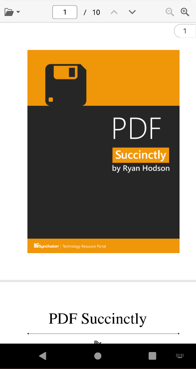
Opening a password-protected PDF
To open a password-protected or encrypted PDF document, you can use the LoadDocument() method by providing the password along with the document stream.
Refer to the following code example.
string password = "PASSWORD";pdfViewer.LoadDocument(pdfDocumentStream, password);
Using the following APIs, you can determine whether a PDF document is password protected.
APIs | Type | Description |
Event | This event will be called when a password is required to open a PDF document. | |
Event | This event will be called when the document fails to load. For example, this event occurs with the message, “Can’t open an encrypted document. The password is invalid,” when we provide a wrong or invalid password. |
Note: For more details, refer to the opening a password-protected PDF using the .NET MAUI PDF Viewer demo on GitHub.
Reference
Refer to the .NET MAUI PDF Viewer documentation to learn about its other features.
Coming soon
We have planned and are working to support the following major features in the .NET MAUI PDF Viewer control in upcoming releases:
- Built-in toolbar.
- Text search.
- Text selection and copy.
- Bookmark, TOC, and hyperlink navigation.
- Localization.
- Accessibility.
- RTL text.
- The ability to add, edit, save, and remove annotations.
- Form filling with edit and save functions.
- Single-page layout mode.
- Thumbnails.
- Themes.
Conclusion
Thanks for reading! I hope you enjoyed learning about the new Syncfusion .NET MAUI PDF Viewer introduced in 2022 Volume 4. You can download and check out our MAUI demo app from Google Play and the Microsoft Store.
Also, check out our Release Notes and the What’s New pages to see the other updates in this release.
For current customers, the new version is available for download from the License and Downloads page. If you are not yet a Syncfusion customer, you can try our 30-day free trial to check out our newest features.
You can share your feedback and questions through the comments section below or contact us through our support forums, support portal, or feedback portal. We are always happy to assist you!
Related blogs
I’ve been banging my head against a wall trying to run XUnit tests on my Mac, for my Xamarin Forms app.
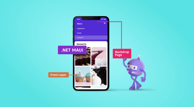
The .NET MAUI Backdrop included in our 2022 Volume 4 release is a specialized content page. It provides a full-screen interface for displaying and interacting with a single piece of content. This page comprises two surfaces, a back layer and a front layer, stacked one over the other. The back layer displays actions and context, while the rest of the page is covered by the front layer.
Integrating the Backdrop with built-in .NET MAUI pages such as NavigationPage and FlyoutPage allow you to utilize features such as title, icon, page navigation, and toolbar item customization.

The back layer holds options such as navigation, filtration, and more, which updates the front layer content on performing specific actions. When concealed, the back layer can provide contextual information about the front layer. When revealed, the back layer displays contextual controls that relate to the front layer.
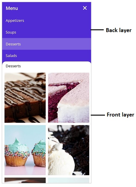
Front layer
The front layer is always visible in front of the back layer. It is displayed at full width and holds primary content.
You can customize the corner of the front layer of the .NET MAUI Backdrop to be curve or flat. You can customize one or both corners of the front layer with these shapes. It is also possible to change the default radius of the custom shapes.
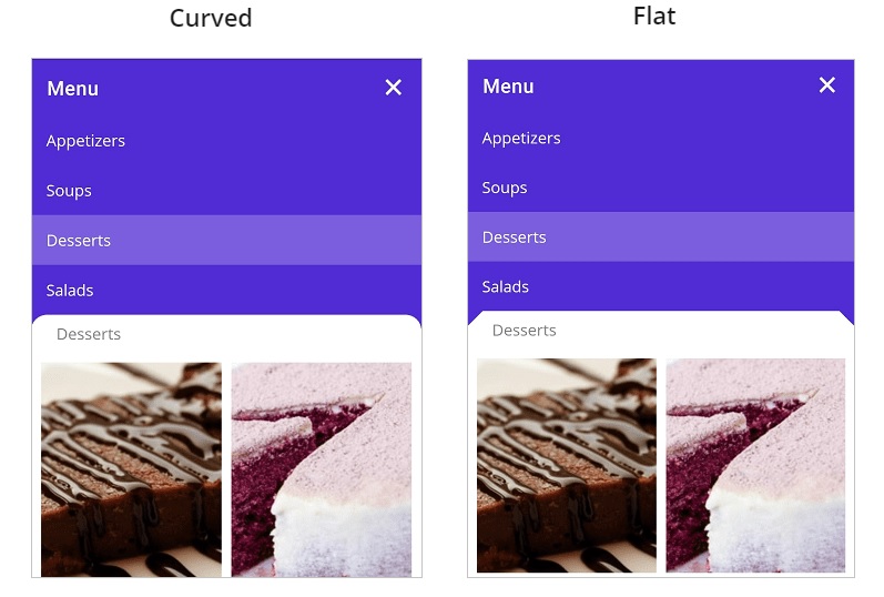
Back layer
The back layer appears at the lowest elevation in the app, filling the entire background. It holds actionable content that is relevant to the front layer.
When the back layer is revealed, use the auto adjustment option to adjust its height based on its content, or expand it fully until only the front layer’s header is visible.
Reveal and conceal the back layer
The Backdrop provides options to reveal and conceal the back layer.
- Programmatically: Reveals the back layer by setting the IsBackLayerRevealed property to true. By default, it is set to false.
- Touch interaction: Reveals the back layer by tapping the toolbar icon at the top-right corner of the navigation bar header. The hamburger icon reveals the back layer, while the close icon conceals it. When adding the Backdrop as a child of the FlyoutPage, the hamburger, and close icons will be replaced by expand (or down arrow) and collapse (or up arrow) icons, respectively.
Touch Interaction in .NET MAUI Backdrop Interface
- Swipe or flick action: Reveals the back layer when swiping or flicking the front layer header. Swipe downward to reveal, and swipe upward to conceal the back layer. The swipe or flick action will be handled only on the top of the front layer (header).
.NET MAUI Backdrop UI with Swipe Action
Add the .NET MAUI Backdrop to your application
We have seen the key features of the .NET MAUI Backdrop control. Let’s see how to create a simple .NET MAUI app with the Backdrop to demonstrate its primary usage.
Step 1: Create a .NET MAUI app.
First, create a new .NET MAUI app in Visual Studio.
Step 2: Install the NuGet packages.
Syncfusion .NET MAUI controls are available in the NuGet Gallery. To add the SfBackdropPage control to your project, open the NuGet package manager in Visual Studio, and search for Syncfusion.Maui.Backdrop, and then install it.
Step 3: Handler registration.
The Syncfusion.Maui.Core NuGet package is a dependent package for all Syncfusion .NET MAUI controls. In the MauiProgram.cs file, register the handler for the Syncfusion core package using the ConfigureSyncfusionCore() method.
Refer to the following code.
public static class MauiProgram{ public static MauiApp CreateMauiApp() { var builder = MauiApp.CreateBuilder(); builder.UseMauiApp<App>().ConfigureSyncfusionCore().ConfigureFonts(fonts =>{ fonts.AddFont("OpenSans-Regular.ttf", "OpenSansRegular"); fonts.AddFont("OpenSans-Semibold.ttf", "OpenSansSemibold");}); return builder.Build(); }}
Step 4: Initializing Backdrop
Create a page and import the SfBackdropPage XAML namespace. Refer to the following code.
<backdrop:SfBackdropPage xmlns="http://schemas.microsoft.com/dotnet/2021/maui" xmlns:x="http://schemas.microsoft.com/winfx/2009/xaml" x:Class= “BackdropGettingStarted.BackdropSamplePage” Title= “Menu” xmlns:backdrop= “clr-namespace:Syncfusion.Maui.Backdrop;assembly=Syncfusion.Maui.Backdrop” IsBackLayerRevealed= “True”>
Note: The Title and ToolBarItems properties of the Page can be used to customize the appearance of the navigation bar header.
Step 5: Configure the header
The page navigation bar header for the Backdrop appears only when adding Backdrop as a child of the NavigationPage. To learn more about it, refer to the header configuration.
Step 6: Add back layer content
The back layer holds actionable content (navigation or filtration) relevant to the front layer. The back layer will either fill the entire background or occupy the background based on the content height. Add a back layer using the BackLayer property as shown in the code below.
<backdrop:SfBackdropPage.BackLayer> <backdrop:BackdropBackLayer> <Grid> <Grid.RowDefinitions> <RowDefinition Height= “Auto”/> </Grid.RowDefinitions> <ListView> <ListView.ItemsSource> <x:Array Type="{x:Type x:String}"> <x:String>Appetizers</x:String> <x:String>Soups</x:String> <x:String>Desserts</x:String> <x:String>Salads</x:String> </x:Array> </ListView.ItemsSource> </ListView> </Grid> </backdrop:BackdropBackLayer></backdrop:SfBackdropPage.BackLayer>
Step 7: Add front layer content
The front layer always appears in front of the back layer and holds primary content. Add the front layer using the FrontLayer property as shown in the code below.
<backdrop:SfBackdropPage.FrontLayer> <backdrop:BackdropFrontLayer> <Grid BackgroundColor= “WhiteSmoke”/> </backdrop:BackdropFrontLayer></backdrop:SfBackdropPage.FrontLayer>
GitHub reference
For more information, refer to the .NET MAUI Backdrop Control Getting Started demo on GitHub.
Conclusion
Thanks for reading! In this blog, we walked you through the new Syncfusion .NET MAUI Backdrop control and its features. For more information, refer to its user guide.
Leave your feedback in the comments section below.
Refer to our Release Notes and What’s New pages to check out the other updates in this release. Also, you can contact us through our support forums, support portal, or feedback portal. We are always happy to assist you!
Related blogs

.NET MAUI is a cross-platform framework that allows developers to create desktop and mobile applications from a single codebase with C#. In this article, we develop a simple .NET MAUI OCR scanner to scan images and convert them to PDF with searchable text using the Syncfusion OCR library.
The Syncfusion .NET Optical Character Recognition (OCR) library extracts text from scanned PDFs and images. It uses the Tesseract OCR engine. The Syncfusion OCR library does not work on mobile platforms with the Tesseract engine, so starting from version 20.3.0.47, we added support to use any external OCR service, such as Azure Cognitive Services OCR, with our existing OCR library to process OCR in mobile platforms.
Steps to build an OCR scanner application in .NET MAUI
In the following steps, we will create a .NET MAUI app, install different dependencies, and use the Syncfusion OCR library to convert an image into a readable PDF.
Step 1: Create a .NET MAUI project
Create a simple .NET MAUI project by referring to the documentation build your first .NET MAUI app.
Step 2: Install the dependencies
Install the following NuGet packages:
- Syncfusion.PDF.OCR.NET: The Syncfusion .NET OCR library.
- Microsoft.Azure.CognitiveServices.Vision.ComputerVision: This client library provides access to the Microsoft Cognitive Services ComputerVision APIs.
Step 3: Add UI elements
In this application, we get images from the user in the following ways:
- Open the camera and capture images such as receipts, notes, documents, photos, and business cards.
- Select images from the device’s photo gallery.
Open camera and capture image
Add a button in the UI to open the camera.
<Button x:Name=”CameraBtn” Text=”Open Camera” Clicked=”OnCameraClicked” HorizontalOptions=”Center” />
Use the MAUI MediaPicker API to open and capture images using the camera. The MediaPicker API needs permission to access the camera and internal storage. Refer to the get started section of the API documentation to set the permissions.
Call the CapturePhotoAsync method to open the camera and capture the image. Refer to the complete code below.
private void OnCameraClicked(object sender, EventArgs e){ TakePhoto();}//Open camera and take photopublic async void TakePhoto(){ if (MediaPicker.Default.IsCaptureSupported) { FileResult photo = await MediaPicker.Default.CapturePhotoAsync(); if (photo != null) { // Save the file into local storage. string localFilePath = Path.Combine(FileSystem.CacheDirectory, photo.FileName); //Reduce the size of the image. using Stream sourceStream = await photo.OpenReadAsync(); using SKBitmap sourceBitmap=SKBitmap.Decode(sourceStream); int height = Math.Min(794, sourceBitmap.Height); int width = Math.Min(794, sourceBitmap.Width); using SKBitmap scaledBitmap = sourceBitmap.Resize(new SKImageInfo(width, height),SKFilterQuality.Medium); using SKImage scaledImage = SKImage.FromBitmap(scaledBitmap); using (SKData data = scaledImage.Encode()) { File.WriteAllBytes(localFilePath, data.ToArray()); } //Create model and add to the collection ImageModel model = new ImageModel() { ImagePath = localFilePath, Title = "sample", Description = "Cool" }; viewModel.Items.Add(model); } }}
Select an image from the gallery
Add a button in the UI to select an image.
<Buttonx:Name="CounterBtn"Text="Select Image"Clicked="OnCounterClicked"HorizontalOptions="Center" />
Use the MAUI MediaPicker API to select images from the device’s photo gallery. Use the PickPhotoAsync method to select images from the gallery. Refer to the following code snippet.
private void OnCounterClicked(object sender, EventArgs e){ PickPhoto();}//Select images from gallery.public async void PickPhoto(){ if (MediaPicker.Default.IsCaptureSupported) { FileResult photo = await MediaPicker.Default.PickPhotoAsync(); if (photo != null) { // Save the file into local storage. string localFilePath = Path.Combine(FileSystem.CacheDirectory, photo.FileName); using Stream sourceStream = await photo.OpenReadAsync(); using FileStream localFileStream = File.OpenWrite(localFilePath); await sourceStream.CopyToAsync(localFileStream); ImageModel model = new ImageModel() { ImagePath = localFilePath, Title = "sample", Description = "Cool" }; viewModel.Items.Add(model); } }}
Once we receive the images, present those images in the UI using the CollectionView. Refer to the MAUI data templates documentation to bind the image data into the CollectionView.
Finally, convert the image to PDF with OCR, so our simple UI looks like the following picture.
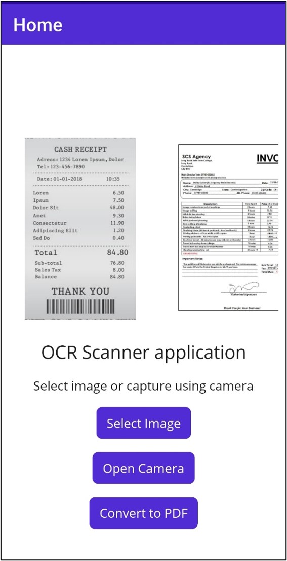 Refer to the MainPage.xaml file on GitHub for the complete UI.
Step 4: Convert images to PDF with OCR text
Here, we use the Syncfusion OCR library with the external Azure OCR engine to convert images to PDF.
Please refer to this article to configure and use the Azure Computer Vision OCR services. We have already created a class named AzureOcrEngine.cs to process images. You can use this class as it is in your project without any changes. You just need to add your subscription key and endpoint in the code.
The AzureOCREngine implements the interface IOcrEngine. The IOcrEngine has a method named PerformOCR that takes an image stream as an argument. Now, call the external OCR service with the input image and it returns OCRLayoutResult as the result.
Assign AzureOCREngine as an external OCR engine using the API ExternalEngine available in the OCRProcessor class from the Syncfusion PDF OCR library.
Refer to the following code example.
public void ConvertToPDF(){ Task.Run(async () => { PdfDocument finalDcoument = new PdfDocument(); if (viewModel.Items.Count == 0) return; using (OCRProcessor processor = new OCRProcessor()) { processor.ExternalEngine = new AzureOcrEngine(); foreach (var item in viewModel.Items) { FileStream imageStream = new FileStream(item.ImagePath,FileMode.Open); PdfDocument document = processor.PerformOCR(imageStream); MemoryStream saveStream = new MemoryStream(); document.Save(saveStream); document.Close(true); PdfDocument.Merge(finalDcoument,saveStream); } } MemoryStream fileSave = new MemoryStream(); finalDcoument.Save(fileSave); fileSave.Position = 0; finalDcoument.Close(true); Dispatcher.Dispatch(() => { popup.Close(); SaveService service = new SaveService(); service.SaveAndView("Output.pdf", "application/pdf", fileSave); }); });}
After executing the above code, you will get the following output.
 | 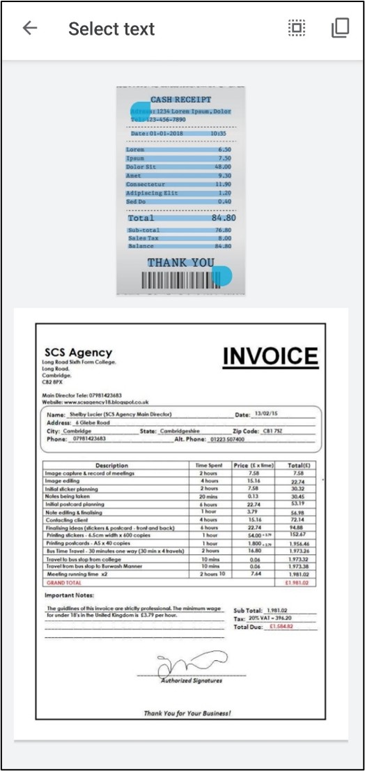 |
Note: To save the PDF document to external storage, add the platform-specific service classes. Refer to the respective classes in the following links:
GitHub sample
For more details about this project, refer to the complete .NET MAUI OCR scanner application on GitHub.
Conclusion
In this blog post, we created a simple .NET MAUI OCR scanner application to process existing images and new images captured using the camera into PDFs with machine-readable text.
Take a moment to explore the documentation, where you will find other options and features of the Syncfusion OCR library, all with accompanying code samples.
If you have any questions or comments, you can contact us through our support forums, support portal, or feedback portal. We are always happy to assist you!
Related blogs
If you liked this article, we think you would also like the following articles about our PDF Library:
When use an Image Control…  Have you ever been confused between the different values of the Aspect property? You are in the right place , in this article you will learn the difference of each one!
Let’s start!
Exploring the Aspect Property
The Image control has an Aspect property which allow us to indicate how an image will fit into the display area (scaling). This property offers different values which allows us to play with the visualization.
Let’s look at each one of them:
AspectFit: Allow the entire image to fit in the display area (If necessary letterboxes the image), it takes care of adding spaces at the top and bottom or on the sides (depending on the dimensions of the image).

AspectFill: Clips the image to fill the display area without altering the aspect ratio.

Fill: It’s responsible for stretching the image to completely fill the display area.

Center: It’s responsible for centralizing the image in the display area without altering the aspect ratio.

And done!! From now on, you are ready to play with the Image Aspect property in .NET MAUI I hope you like it!
” />
Howdy! In this blog, we’ll replicate a cruise travel application UI in .NET MAUI. It is a design created by Ilham Maulana that they shared on Dribbble.
Let’s start designing the UI by dividing it into the following block structure.
Skills that you’ll develop
In addition to strengthening your XAML skills, you will learn to implement the following .NET MAUI features in this article:
Easily build cross-platform mobile and desktop apps with the flexible and feature-rich controls of the Syncfusion .NET MAUI platform.
- Appearance modes: Manage the appearance of visual elements based on your UI design for both light and dark modes.
- Labels:
- Handle different styles on the same label.
- Add line breaks in the Text property.
- Overlapping visual elements:
- Implement the overlay effect on visual elements based on your UI design.
- Exploration controls: Use the Syncfusion .NET MAUI ListView control to present lists of data vertically or horizontally with different layouts.
General settings for the project
Page creation
Here, we are going to design two different pages. So, I recommend creating a Views folder and, inside it creating the following pages:
- CruisePage.xaml: We will add the list of all the ships available in the app to this page.
- CruiseDetailsPage.xaml: We will add the details about a specific cruise to this page.
Appearance mode
Before you begin, note the following point about the behavior of the appearance modes: It’s not mandatory to add colors to your UI to adapt to the different appearance modes if a visual element does not have a specific value assigned in a property that receives a color. The visual element will take the default values for the appearance mode in which the device is configured (i.e. light or dark).
Let’s understand this better with a use case!
Consider that if you don’t add the BackgroundColor property to your page and your device is set to dark mode, then your page’s background color will be black.
If your device is in light mode, your app will take the white background color. If you want to use a different color, then you should add the BackgroundColor property with the desired value.
Keeping this information in mind, since the CruisePage will have a different BackgroundColor for light mode, we have to add the following line of code in the ContentPage tags:
BackgroundColor="{AppThemeBinding Light=#efefef,Dark=Black}"
Step 1: Header
Every property of the Syncfusion .NET MAUI controls is completely documented to make it easy to get started.
Main layout
Let’s start building the CruisePage.xaml page. First, add the main layout that will contain all the content from blocks one through three.
Refer to the following code example.
<ScrollView Margin="0,0,0,-30" VerticalScrollBarVisibility="Never"> <Grid ColumnDefinitions="*,Auto" RowDefinitions="Auto,Auto,Auto,Auto,Auto,Auto,Auto" Padding="25,30,0,0"> <!-- Add all the information corresponding to block 1 -- > <!-- Add all the information corresponding to block 2 -- > <!-- Add all the information corresponding to block 3 -- > </Grid></ScrollView>
We have added everything inside a ScrollView to make the page content scrollable. Additionally, we added a Grid with two columns and seven rows to organize all the page elements.
Header elements
The header is composed of the following four elements:
- Greetings
- Bell icon
- Main title
- Search bar
Let’s design them!
Syncfusion’s .NET MAUI controls suite is the expert’s choice for building modern mobile apps.
Greetings and a bell icon
Refer to the following code example to render the greetings and bell icon.
<!-- Greetings and bell icon--> <Label Grid.Column="0" Grid.Row="0" Text="Hi, Shalima!" FontSize="17"/> <Image Grid.Column="1" Grid.Row="0" Source="bell" HeightRequest="30" WidthRequest="30" Margin="0,0,20,0"/><!-- Add here all the information explained in the next code block -- >
Main title
Here, we are going to use the FormattedString, that allows us to add different styles to the same Label. You can see our UI title (Choose a Cruise Ship to Explore the World) has purple text in bold and also black text without bold formatting.
We will also add line breaks using the string that you can see in some text properties.
The AppThemeBinding markup extension helps us adapt to the visual characteristics for both light and dark modes. In this case, we will use it to change the text color depending on the configured appearance mode.
Note: For more details, refer to the respond to system theme changes documentation page.
<!-- Main title--> <Label Grid.Column="0" Grid.Row="1" Grid.ColumnSpan="2" FontSize="25" Margin="0,20"> <Label.FormattedText> <FormattedString> <Span Text="Choose a " TextColor="{ AppThemeBinding Light=#383838, Dark=White}"/> <Span Text="Cruise Ship " TextColor="#625ba5" FontAttributes="Bold" /> <Span Text="to " TextColor="{ AppThemeBinding Light=#383838, Dark=White}"/> <Span Text="Explore The World" TextColor="#625ba5" FontAttributes="Bold" /> </FormattedString> </Label.FormattedText> </Label><!-- Add here all the information explained in the next code block -- >
Search bar
The search bar has small gray borders by default which we don’t need for this UI. So, let’s define the borders and negative padding as shown in the following code example to remove them.
<!—Search bar--><Border Grid.Column="0" Grid.Row="2" Grid.ColumnSpan="2" Stroke="Transparent" Padding="0,-20,0,0"> <SearchBar Placeholder="Search to find a cruise ship" BackgroundColor="{ AppThemeBinding Light=#fafafa, Dark=Transparent}" PlaceholderColor="Silver" Margin="0,10,20,0"/></Border><!-- Add here all the information explained in the next code block -- >
Step 2: American ships
To design the list of American Cruise Ships, first, add the labels that contain the ship descriptions. Then, to render the list, let’s use the Syncfusion .NET MAUI ListView control by following these steps:
Note: Before starting, please refer to the .NET MAUI ListView getting started guide.
- Add the Syncfusion.Maui.ListView NuGet package.

- Go to the MauiProgram.cs file and register the handler for the Syncfusion .NET MAUI ListView. To do this, navigate to the CreateMauiApp method and then just before the line return builder.Build();, add the builder.ConfigureSyncfusionListView(); method.
- Then, add the Syncfusion.Maui.ListView namespace in your XAML file.
xmlns:syncfusion="clr-namespace:Syncfusion.Maui.ListView;assembly=Syncfusion.Maui.ListView"
- Now, add the following code to your XAML page.
<!-- American Cruise Ship Descriptions--><Label Grid.Column="0" Grid.Row="3" Text="American Cruise Ships" FontSize="17" /><Label Grid.Column="1" Grid.Row="3" Text="See All" Padding="0,0,30,0" TextColor="#625ba5" HorizontalTextAlignment="End"/><!--American Cruise Ship List--><syncfusion:SfListView Grid.Column="0" Grid.Row="4" Grid.ColumnSpan="2" Margin="0,10,0,0" ItemsSource="{Binding Cruise}" ItemSize="190" ItemSpacing="5" ScrollBarVisibility="Never" HeightRequest="280" HorizontalOptions="Start" Orientation="Horizontal"> <syncfusion:SfListView.ItemTemplate> <DataTemplate> <Frame CornerRadius="10" BorderColor="Transparent" Padding="10,0,0,0" IsClippedToBounds="True" HorizontalOptions="Start" BackgroundColor="{ AppThemeBinding Light=White, Dark=#1c1c1f}"> <Grid RowDefinitions="Auto,Auto,Auto,Auto,Auto,Auto" Grid.ColumnDefinitions="Auto,*" RowSpacing="10"> <!-- Main picture--> <Image Grid.Column="0" Margin="-10,0" Grid.Row="0" Grid.ColumnSpan="2" Source="{Binding Picture}" WidthRequest="200" Aspect="AspectFill" HeightRequest="100"/> <!-- Cruise's name--> <Label Grid.Column="0" Grid.Row="1" Grid.ColumnSpan="2" Text="{Binding Name}" FontAttributes="Bold"/> <!-- Rating--> <Image Grid.Column="0" Grid.Row="2" Source="star" HeightRequest="20" WidthRequest="20" /> <Label Grid.Column="1" Grid.Row="2" Text="{Binding Rate}" Padding="5,0,0,0" TextColor="#B9B9B4"/> <!-- Location--> <Image Grid.Column="0" Grid.Row="3" Source="location" HeightRequest="20" WidthRequest="20" Aspect="AspectFill"/> <Label Grid.Column="1" Grid.Row="3" Text="{Binding Location}" Padding="5,0,0,0" TextColor="#B9B9B4"/> <!-- Starting From --> <Label Grid.Column="0" Grid.Row="4" Grid.ColumnSpan="2" Text="Starting from" FontSize="13" TextColor="#B9B9B4"/> <Label Grid.Column="0" Grid.Row="5" Grid.ColumnSpan="2" Text="{Binding StartingFrom}" FontSize="18" FontAttributes="Bold" TextColor="#7c77b4"/> </Grid> </Frame> </DataTemplate> </syncfusion:SfListView.ItemTemplate></syncfusion:SfListView><!-- Add here all the information explained in the next code block -- >
Step 3: European Ships
To design the list of European cruise ships, we are going to use the same visual elements and steps used in the previous block.
Refer to the following code example.
<!-- European Cruise Ship Descriptions--> <Label Grid.Column="0" Grid.Row="5" Text="Europe Cruise Ship" FontSize="17"/> <Label Grid.Column="1" Grid.Row="5" Text="See All" Padding="0,0,30,0" TextColor="#625ba5" HorizontalTextAlignment="End"/> <!--European Cruise Ship List--><syncfusion:SfListView Grid.Column="0" Grid.Row="6" Grid.ColumnSpan="2" Margin="0,10,0,0" ItemsSource="{Binding EuropeCruise}" ItemSize="190" ItemSpacing="5" ScrollBarVisibility="Never" HeightRequest="280" HorizontalOptions="Start" Orientation="Horizontal"> <syncfusion:SfListView.ItemTemplate> <DataTemplate> <Frame CornerRadius="10" BorderColor="Transparent" Padding="10,0,0,0" IsClippedToBounds="True" HorizontalOptions="Start" BackgroundColor="{ AppThemeBinding Light=White, Dark=#1c1c1f}"> <Grid RowDefinitions="Auto,Auto,Auto,Auto,Auto,Auto" Grid.ColumnDefinitions="Auto,*" RowSpacing="10"> <!-- Main picture--> <Image Grid.Column="0" Margin="-10,0" Grid.Row="0" Grid.ColumnSpan="2" Source="{Binding Picture}" Aspect="AspectFill" HeightRequest="100" WidthRequest="200"/> <!-- Cruise's name--> <Label Grid.Column="0" Grid.Row="1" Grid.ColumnSpan="2" Text="{Binding Name}" FontAttributes="Bold"/> <!-- Rating--> <Image Grid.Column="0" Grid.Row="2" Source="star" HeightRequest="20" WidthRequest="20" /> <Label Grid.Column="1" Grid.Row="2" Text="{Binding Rate}" Padding="5,0,0,0" TextColor="#B9B9B4"/> <!-- Location--> <Image Grid.Column="0" Grid.Row="3" Source="location" HeightRequest="20" WidthRequest="20" Aspect="AspectFill"/> <Label Grid.Column="1" Grid.Row="3" Text="{Binding Location}" Padding="5,0,0,0" TextColor="#B9B9B4"/> <!-- Starting From --> <Label Grid.Column="0" Grid.Row="4" Grid.ColumnSpan="2" Text="Starting from" FontSize="13" TextColor="#B9B9B4"/> <Label Grid.Column="0" Grid.Row="5" Grid.ColumnSpan="2" Text="{Binding StartingFrom}" FontSize="18" FontAttributes="Bold" TextColor="#7c77b4"/> </Grid> </Frame> </DataTemplate> </syncfusion:SfListView.ItemTemplate></syncfusion:SfListView>Step 4: Cruise’s picture
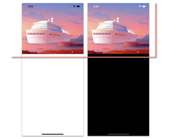
In this block, we will design the second page, the CruiseDetailsPage.xaml page, to display the details of a specific ship.
As in the first block, before starting with the code to add the image, let’s define the main layout.
Main layout
Here, we are going to define a Grid with two rows, one for the main image, and the other for the frame which contains all the remaining information of the page.
<Grid RowDefinitions="Auto,*"> <!-- Add all the information corresponding to block 4 -- > <!-- Add all the information corresponding to blocks 5 and 6 -- ></Grid>
Cruise picture
Now, add the main picture and place it in row number 0.
<Image Grid.Row="0" Source="cruise" Aspect="AspectFill" HeightRequest="350" Margin="0,-50,0,0"/><!-- Add here all the information explained in the next code block -- >
Step 5: Cruise’s description
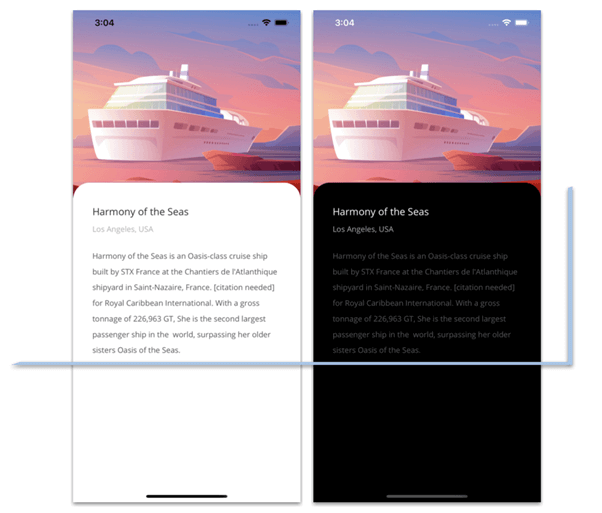
We are going to design the cruise’s description and price blocks inside a Frame.
First, let’s see how to render the cruise’s description.
Frame and overlapping
Add a Frame and place it in row number 1. Then, add a negative margin to design the rounded edges of the Frame and overlap it on the top of the image of the previous block.
In addition, inside the Frame, add a Grid to organize the additional information. Refer to the following code example.
<Frame Grid.Row="1" CornerRadius="30" Margin="0,-30,0,0" VerticalOptions="FillAndExpand" BorderColor="Transparent"> <Grid ColumnDefinitions="*,Auto" RowDefinitions="Auto,Auto,*,Auto,Auto,Auto,Auto" Margin="0,20" RowSpacing="10" Padding="15,0"> <!-- Add all the information corresponding to blocks 5 and 6 -- > </Grid></Frame>
Cruise description
We are going to modify this block a bit from the original design by rendering the following components:
- Name
- Location
- Description
Refer to the following code example.
<!--Name--><Label Grid.Column="0" Grid.Row="0" Text="Harmony of the Seas" FontAttributes="Bold" FontSize="18" TextColor="{AppThemeBinding Light=#303030, Dark=White}"/><!-- Location--><Label Grid.Column="0" Grid.Row="1" Text="Los Angeles, USA" TextColor="#aeaeb2"/><!-- Description--><Label Grid.Column="0" Grid.Row="2" Grid.ColumnSpan="2" TextColor="#565659" LineHeight="1.5" Padding="0,0,0,20" Text="Harmony of the Seas is an Oasis-class cruise ship built by STX France at the Chantiers de l'Atlanthique shipyard in Saint-Nazaire, France. [citation needed] for Royal Caribbean International. With a gross tonnage of 226,963 GT, She is the second largest passenger ship in the world, surpassing her older sisters Oasis of the Seas."/> <!-- Add here all the information explained in the next code block -- >Step 6: Cruise’s price
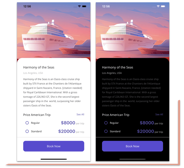
Finally, let’s develop the price block with the following elements:
- Price list
- Separator
- Book Now button
To make it easy for developers to include Syncfusion .NET MAUI controls in their projects, we have shared some working ones.
Price list
Refer to the following code example to design the title and description of the Cruise Ship, Price American Trip, and See All labels.
<!-- Price American Trip Description--><Label Grid.Column="0" Grid.Row="3" Text="Price American Trip" FontSize="17"/><Label Grid.Column="1" Grid.Row="3" Text="See All" TextColor="#625ba5" HorizontalTextAlignment="End"/><!-- Add here all the information explained in the next code block -- >
Now, let’s design the following components:
- Checkboxes for the options to select.
- Checkbox descriptions.
- The price and a label of other text descriptions with different formats. To design this, we’ll use FormattedText.
All of this is wrapped in the Syncfusion .NET MAUI ListView control.
<syncfusion:SfListView Grid.Column="0" Grid.Row="4" Grid.ColumnSpan="2" ItemsSource="{Binding Plan}" ScrollBarVisibility="Never" HeightRequest="85" HorizontalOptions="Start"> <syncfusion:SfListView.ItemTemplate> <DataTemplate> <Grid ColumnDefinitions="Auto,Auto,*"> <CheckBox Grid.Column="0" Color="#5b50b2" HeightRequest="20" WidthRequest="20" HorizontalOptions="Start"/> <Label Grid.Column="1" Text="{Binding Name}" VerticalTextAlignment="Center" /> <Label Grid.Column="2" HorizontalTextAlignment="End" VerticalTextAlignment="Center"> <Label.FormattedText> <FormattedString> <Span Text="{Binding Price}" TextColor="#5b50b2" FontAttributes="Bold" FontSize="25"/> <Span Text=" per trip" TextColor="#a9a9a9"/> </FormattedString> </Label.FormattedText> </Label> </Grid> </DataTemplate> </syncfusion:SfListView.ItemTemplate></syncfusion:SfListView><!-- Add here all the information explained in the next code block -- >Separator and button
To design the separator line, we will use a BoxView, and for the booking option, we are going to add a button.
Refer to the following code example.
<!--Separator and Button--><BoxView Grid.Column="0" Grid.Row="5" Grid.ColumnSpan="2" HorizontalOptions="FillAndExpand" HeightRequest="1" Color="#d8d5d5" Margin="-35,10"/><Button Grid.Column="0" Grid.Row="6" Grid.ColumnSpan="2" BackgroundColor="#594ad5" TextColor="White" Text="Book Now" FontAttributes="Bold" HeightRequest="60" FontSize="16" CornerRadius="13"/>
That’s all! We have now finished developing our cruise travel app UI!
GitHub reference
To see the complete code structure, refer to our Cruise Travel App UI in .NET MAUI demo on GitHub.
Syncfusion .NET MAUI controls allow you to build powerful line-of-business applications.
Conclusion
Thanks for reading! In this blog, we saw how to replicate a cruise travel app UI using the Syncfusion .NET MAUI controls. Try out the steps in this blog post and leave your feedback in the comments section below!
Syncfusion .NET MAUI controls were built from scratch using .NET MAUI, so they feel like framework controls. They are fine-tuned to work with a huge volume of data. Use them to build elite cross-platform mobile and desktop apps!
Also, if you have any questions, you can contact us through our support forum, support portal, or feedback portal. We are always happy to assist you!
See you next time!
Related blogs
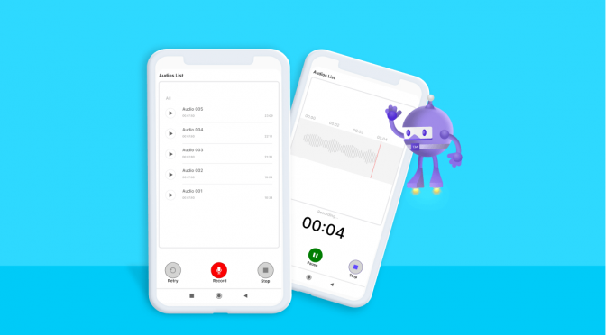
In this blog, you will learn how to develop an audio recorder and player in .NET MAUI. The audio player will record and play audio files.
This application can be deployed and used on both Android and iOS.
Let’s get started!
Prerequisites
Tool: Visual Studio 2022
Supported Platform: Android and iOS
Supported OS: Android (7.0 and above) and iOS (v12 and above)
Developing audio recorder and player app
Step 1: Add required permissions in both platforms.
To record audio and save it in a device, the application will have to access the device’s audio input and storage. For that, we need to grant the following permissions:
- RECORD\_AUDIO,
- READ\_EXTERNAL\_STORAGE
- WRITE\_EXTERNAL\_STORAGE
Note: In iOS, you can’t add storage permissions. It will always return Granted when checked and requested.
In Android, add the following code to the AndroidManifest.xml file.
<uses-permission android:name="android.permission.READ\_EXTERNAL\_STORAGE" /><uses-permission android:name="android.permission.WRITE\_EXTERNAL\_STORAGE" /><uses-permission android:name="android.permission.RECORD\_AUDIO" />
In iOS, add the following code to the Info.plist file.
<key>NSMicrophoneUsageDescription</key> <string>The audio recorder app wants to use your microphone to record audio.</string>
Easily build cross-platform mobile and desktop apps with the flexible and feature-rich controls of the Syncfusion .NET MAUI platform.
Step 2: Create a service for recording and playing the audio.
There is no direct support for recording audio and playing it in .NET MAUI. So, we must create a service in the native platform for recording and playing the audio files.
Before creating a service class, create an interface for invoking the native methods.
Refer to the following code.
public interface IAudioPlayer{ void PlayAudio(string filePath); void Pause(); void Stop(); string GetCurrentPlayTime(); bool CheckFinishedPlayingAudio();}public interface IRecordAudio{ void StartRecord(); string StopRecord(); void PauseRecord(); void ResetRecord();}
Then, create the service to record and play audio on both platforms.
Audio recorder service for Android
Reference the following methods and properties to create an audio recorder service for Android:
- Create an instance of MediaRecorder class, which will be used to record the audio.
- SetAudioSource(): Specify which hardware device to use to capture the audio input.
- SetOutputFile(): Specify the name of the output audio file.
- Prepare(): Initialize the audio recorder.
- Start(): Start recording the audio.
- Reset(): Discard the recorded audio and resets the recorder.
- Pause(): Pause the recording in the current running position.
- Resume(): Resume recording from the paused position.
- Stop(): Stop the audio recording.
Refer to the following code.
public class RecordAudio : IRecordAudio{ #region Fields private MediaRecorder mediaRecorder; private string storagePath; private bool isRecordStarted = false; #endregion #region Methods public void StartRecord() { if (mediaRecorder == null) { SetAudioFilePath(); mediaRecorder = new MediaRecorder(); mediaRecorder.Reset(); mediaRecorder.SetAudioSource(AudioSource.Mic); mediaRecorder.SetOutputFormat(OutputFormat.AacAdts); mediaRecorder.SetAudioEncoder(AudioEncoder.Aac); mediaRecorder.SetOutputFile(storagePath); mediaRecorder.Prepare(); mediaRecorder.Start(); } else { mediaRecorder.Resume(); } isRecordStarted = true; } public void PauseRecord() { if (mediaRecorder == null) { return; } mediaRecorder.Pause(); isRecordStarted = false; } public void ResetRecord() { if (mediaRecorder != null) { mediaRecorder.Resume(); mediaRecorder.Reset(); } mediaRecorder = null; isRecordStarted = false; } public string StopRecord() { if (mediaRecorder == null) { return string.Empty; } mediaRecorder.Resume(); mediaRecorder.Stop(); mediaRecorder = null; isRecordStarted = false; return storagePath; } private void SetAudioFilePath() { string fileName = "/Record\_" + DateTime.UtcNow.ToString("ddMMM\_hhmmss") + ".mp3"; var path = Environment.GetFolderPath(System.Environment.SpecialFolder.MyDocuments); storagePath = path + fileName; Directory.CreateDirectory(path); } #endregion}
Audio recorder service for iOS
Now, we create the audio recorder service for the iOS platform using AVAudioRecorder:
- Initialize the audio session before trying to record.
- Specify the recording format and location in which to save the recording. The recording format is specified as an entry from NSDictionary with two NSObject arrays containing the keys and values of the format.
- Call the Record method when ready to initiate recording the audio.
- When finished recording, call the Stop() method on the recorder.
Refer to the following code.
public class RecordAudio : IRecordAudio{ AVAudioRecorder recorder; NSUrl url; NSError error; NSDictionary settings; string audioFilePath; public RecordAudio() { InitializeAudioSession(); } private bool InitializeAudioSession() { var audioSession = AVAudioSession.SharedInstance(); var err = audioSession.SetCategory(AVAudioSessionCategory.PlayAndRecord); if (err != null) { Console.WriteLine("audioSession: {0}", err); return false; } err = audioSession.SetActive(true); if (err != null) { Console.WriteLine("audioSession: {0}", err); return false; } return false; } public void PauseRecord() { recorder.Pause(); } public void ResetRecord() { recorder.Dispose(); recorder = null; } public void StartRecord() { if (recorder == null) { string fileName = "/Record\_" + DateTime.UtcNow.ToString("ddMMM\_hhmmss") + ".wav"; var docuFolder = Environment.GetFolderPath(Environment.SpecialFolder.MyDocuments); audioFilePath = docuFolder + fileName; url = NSUrl.FromFilename(audioFilePath); NSObject[] values = new NSObject[] { NSNumber.FromFloat(44100.0f), NSNumber.FromInt32((int)AudioToolbox.AudioFormatType.LinearPCM), NSNumber.FromInt32(2), NSNumber.FromInt32(16), NSNumber.FromBoolean(false), NSNumber.FromBoolean(false) }; NSObject[] key = new NSObject[] { AVAudioSettings.AVSampleRateKey, AVAudioSettings.AVFormatIDKey, AVAudioSettings.AVNumberOfChannelsKey, AVAudioSettings.AVLinearPCMBitDepthKey, AVAudioSettings.AVLinearPCMIsBigEndianKey, AVAudioSettings.AVLinearPCMIsFloatKey }; settings = NSDictionary.FromObjectsAndKeys(values, key); recorder = AVAudioRecorder.Create(url, new AudioSettings(settings), out error); recorder.PrepareToRecord(); recorder.Record(); } else { recorder.Record(); } } public string StopRecord() { if (recorder == null) { return string.Empty; } recorder.Stop(); recorder = null; return audioFilePath; }}
Now, let’s implement an audio player service for playing the recorded audio on both platforms.
Syncfusion’s .NET MAUI controls suite is the expert’s choice for building modern mobile apps.
Audio player service for Android
Follow these steps to create an audio-playing service for Android:
- Create an instance of the MediaPlayer class to play the audio file.
- Provide the file path of the audio file to the MediaPlayer instance through the SetDataSource method.
- After setting the data source, prepare the media player by calling the Prepare method.
- Once the media player is prepared, start playing the audio using the Start method.
Refer to the following code.
public class AudioPlayer : IAudioPlayer{ #region Fields private MediaPlayer \_mediaPlayer; private int currentPositionLength = 0; private bool isPrepared; private bool isCompleted; #endregion #region Methods public void PlayAudio(string filePath) { if (\_mediaPlayer != null && !\_mediaPlayer.IsPlaying) { \_mediaPlayer.SeekTo(currentPositionLength); currentPositionLength = 0; \_mediaPlayer.Start(); } else if (\_mediaPlayer == null || !\_mediaPlayer.IsPlaying) { try { isCompleted = false; \_mediaPlayer = new MediaPlayer(); \_mediaPlayer.SetDataSource(filePath); \_mediaPlayer.SetAudioStreamType(Stream.Music); \_mediaPlayer.PrepareAsync(); \_mediaPlayer.Prepared += (sender, args) => { isPrepared = true; \_mediaPlayer.Start(); }; \_mediaPlayer.Completion += (sender, args) => { isCompleted = true; }; } catch (Exception e) { \_mediaPlayer = null; } } } public void Pause() { if (\_mediaPlayer != null && \_mediaPlayer.IsPlaying) { \_mediaPlayer.Pause(); currentPositionLength = \_mediaPlayer.CurrentPosition; } } public void Stop() { if (\_mediaPlayer != null) { if (isPrepared) { \_mediaPlayer.Stop(); \_mediaPlayer.Release(); isPrepared = false; } isCompleted = false; \_mediaPlayer = null; } } public string GetCurrentPlayTime() { if (\_mediaPlayer != null) { var positionTimeSeconds = double.Parse(\_mediaPlayer.CurrentPosition.ToString()); positionTimeSeconds = positionTimeSeconds / 1000; TimeSpan currentTime = TimeSpan.FromSeconds(positionTimeSeconds); string currentPlayTime = string.Format("{0:mm\\:ss}", currentTime); return currentPlayTime; } return null; } public bool CheckFinishedPlayingAudio() { return isCompleted; } #endregion}
Audio player service for iOS
Create an audio playing service in iOS using the AVPlayer class:
- Configure the audio file to play through the AVPlayerItem built-in class.
- Call the Play method to start the audio playing.
Refer to the following code.
public class AudioPlayer : IAudioPlayer{ AVPlayer \_player; NSObject notificationHandle; NSUrl url; private bool isFinishedPlaying; private bool isPlaying; public bool IsPlaying { get { return isPlaying; } set { if (\_player.Rate == 1 && \_player.Error == null) isPlaying = true; else isPlaying = false; } } public AudioPlayer() { RegisterNotification(); } ~AudioPlayer() { UnregisterNotification(); } public void PlayAudio(string filePath) { isFinishedPlaying = false; if (\_player == null) { url = NSUrl.FromString(filePath); AVPlayerItem avPlayerItem = new AVPlayerItem(URL); \_player = new AVPlayer(avPlayerItem); \_player.AutomaticallyWaitsToMinimizeStalling = false; \_player.Volume = 1; \_player.Play(); IsPlaying = true; isFinishedPlaying = false; } else if (\_player != null && !IsPlaying) { \_player.Play(); IsPlaying = true; isFinishedPlaying = false; } } public void Pause() { if (\_player != null && IsPlaying) { \_player.Pause(); IsPlaying = false; } } public void Stop() { if (\_player != null) { \_player.Dispose(); IsPlaying = false; \_player = null; } } public string GetCurrentPlayTime() { if (\_player != null) { var positionTimeSeconds = \_player.CurrentTime.Seconds; TimeSpan currentTime = TimeSpan.FromSeconds(positionTimeSeconds); string currentPlayTime = string.Format("{0:mm\\:ss}", currentTime); return currentPlayTime; } return null; } public bool CheckFinishedPlayingAudio() { return isFinishedPlaying; } private void RegisterNotification() { notificationHandle = NSNotificationCenter.DefaultCenter.AddObserver(AVPlayerItem.DidPlayToEndTimeNotification, HandleNotification); } private void UnregisterNotification() { NSNotificationCenter.DefaultCenter.RemoveObserver(notificationHandle); } private void HandleNotification(NSNotification notification) { isFinishedPlaying = true; Stop(); }}
Syncfusion .NET MAUI controls are well-documented, which helps to quickly get started and migrate your Xamarin apps.
Step 3: Creating a model.
Create a model class to show the recorded audio files in a list. Refer to the following code.
public class Audio : INotifyPropertyChanged{ #region Private private bool isPlayVisible; private bool isPauseVisible; private string currentAudioPostion; #endregion #region Constructor public Audio() { IsPlayVisible = true; } #endregion #region Properties public string AudioName { get; set; } public string AudioURL { get; set; } public string Caption { get; set; } public bool IsPlayVisible { get { return isPlayVisible; } set { isPlayVisible = value; OnPropertyChanged(); IsPauseVisble = !value; } } public bool IsPauseVisble { get { return isPauseVisible; } set { isPauseVisible = value; OnPropertyChanged(); } } public string CurrentAudioPosition { get { return currentAudioPostion; } set { if (string.IsNullOrEmpty(currentAudioPostion)) { currentAudioPostion = string.Format("{0:mm\\:ss}", new TimeSpan()); } else { currentAudioPostion = value; } OnPropertyChanged(); } } #endregion}
In the code, the CurrentAudioPosition property helps us to display the playing audio time.
Step 4: Creating the UI.
We are going to create a simple UI for showing recorded audio files and for recording audio. For this, we will be using Syncfusion’s ListView for .NET MAUI. Install the .NET MAUI ListView NuGet package, and then include it in the application.
The following XAML code will display the recorded audio in Syncfusion’s .NET MAUI ListView control.
<syncfusion:SfListView x:Name="AudioList" Grid.Row="0" Grid.ColumnSpan="2" Margin="0,8" IsVisible="true" ItemsSource="{Binding Audios}" SelectionMode="None"> <syncfusion:SfListView.ItemTemplate> <DataTemplate> <ViewCell> <Grid x:Name="PlayAudioGrid" Margin="0,4,0,12" BackgroundColor="Transparent" HeightRequest="60"> <Grid.ColumnDefinitions> <ColumnDefinition Width="50" /> <ColumnDefinition Width="*" /> <ColumnDefinition Width="50" /> <ColumnDefinition Width="80" /> </Grid.ColumnDefinitions> <Button Grid.Column="0" Padding="0" BackgroundColor="Transparent" Command="{Binding Path=BindingContext.PlayAudioCommand, Source={x:Reference mainPage}}" CommandParameter="{Binding .}" FontFamily="AudioIconFonts" FontSize="22" IsVisible="{Binding IsPlayVisible}" Text="" TextColor="Black" /> <Button Grid.Column="0" Padding="0" BackgroundColor="Transparent" BorderColor="LightGray" Command="{Binding Path=BindingContext.PauseAudioCommand, Source={x:Reference mainPage}}" CommandParameter="{Binding .}" FontFamily="AudioIconFonts" FontSize="22" IsVisible="{Binding IsPauseVisble}" Text="" TextColor="Black" /> <Label Grid.Column="1" FontSize="14" Text="{Binding AudioName}" TextColor="Black" VerticalTextAlignment="Center" /> <Label Grid.Column="2" Margin="0,0,12,0" FontSize="14" IsVisible="{Binding IsPauseVisble}" Text="{Binding CurrentAudioPosition}" TextColor="Black" VerticalTextAlignment="Center" /> <Button Grid.Column="3" BackgroundColor="Transparent" Command="{Binding Path=BindingContext.DeleteCommand, Source={x:Reference mainPage}}" CommandParameter="{Binding}" FontFamily="AudioIconFonts" FontSize="20" Text="" TextColor="Red" /> </Grid> </ViewCell> </DataTemplate> </syncfusion:SfListView.ItemTemplate></syncfusion:SfListView>
Every property of the Syncfusion .NET MAUI controls is completely documented to make it easy to get started.
The following XAML code is used to design the UI for recording audio.
<!-- Timer Label --><StackLayout Grid.Row="2" Grid.ColumnSpan="2" Margin="0,0,0,32" VerticalOptions="End"> <Label FontSize="14" HorizontalTextAlignment="Center" IsVisible="{Binding IsRecordingAudio}" Text="Recording…" TextColor="#7D898F" /> <Label FontSize="60" HorizontalTextAlignment="Center" IsVisible="{Binding IsRecordingAudio}" Text="{Binding TimerLabel}" TextColor="Black" /></StackLayout> <!-- Button Setup --><Grid Grid.Row="3" Grid.ColumnSpan="2" ColumnSpacing="60"> <Grid.ColumnDefinitions> <ColumnDefinition Width="*" /> <ColumnDefinition Width="*" /> <ColumnDefinition Width="*" /> </Grid.ColumnDefinitions> <!-- Retry --> <Grid Grid.Column="0" RowDefinitions="auto,auto"> <Button Grid.Row="0" BackgroundColor="LightGray" BorderColor="#5F49FF" BorderWidth="1" Command="{Binding ResetCommand}" CornerRadius="25" FontFamily="AudioIconFonts" FontSize="22" HeightRequest="50" IsEnabled="{Binding IsRecordingAudio}" Text="" TextColor="#5F49FF" WidthRequest="50"> <Button.Triggers> <DataTrigger Binding="{Binding IsRecordingAudio}" TargetType="Button" Value="False"> <Setter Property="TextColor" Value="Gray" /> <Setter Property="BorderColor" Value="Gray" /> </DataTrigger> </Button.Triggers> </Button> <Label Grid.Row="1" HorizontalOptions="Center" Text="Retry" /> </Grid> <!-- Play --> <Grid Grid.Column="1" HorizontalOptions="CenterAndExpand" RowDefinitions="auto,auto"> <!-- Record Button --> <Button Grid.Row="0" BackgroundColor="Red" BorderColor="Red" BorderWidth="1" Command="{Binding RecordCommand}" CornerRadius="25" FontFamily="AudioIconFonts" FontSize="22" HeightRequest="50" IsVisible="{Binding IsRecordButtonVisible}" Text="" TextColor="White" WidthRequest="50" /> <Label Grid.Row="1" HorizontalOptions="Center" IsVisible="{Binding IsRecordButtonVisible}" Text="Record" /> <!-- Pause Button --> <Button Grid.Row="0" BackgroundColor="Green" BorderColor="Green" BorderWidth="1" Command="{Binding PauseCommand}" CornerRadius="25" FontFamily="AudioIconFonts" FontSize="22" HeightRequest="50" IsVisible="{Binding IsPauseButtonVisible}" Text="" TextColor="White" WidthRequest="50" /> <Label Grid.Row="1" HorizontalOptions="Center" IsVisible="{Binding IsPauseButtonVisible}" Text="Pause" /> <!-- Resume Button --> <Button Grid.Row="0" BackgroundColor="Red" BorderColor="Red" BorderWidth="1" Command="{Binding RecordCommand}" CornerRadius="25" FontFamily="AudioIconFonts" FontSize="22" HeightRequest="50" IsVisible="{Binding IsResumeButtonVisible}" Text="" TextColor="White" WidthRequest="50" /> <Label Grid.Row="1" HorizontalOptions="Center" IsVisible="{Binding IsResumeButtonVisible}" Text="Resume" /> </Grid> <!-- Stop --> <Grid Grid.Column="2" RowDefinitions="auto,auto"> <Button Grid.Row="0" BackgroundColor="LightGray" BorderColor="#5F49FF" BorderWidth="1" Command="{Binding StopCommand}" CornerRadius="25" FontFamily="AudioIconFonts" FontSize="22" HeightRequest="50" IsEnabled="{Binding IsRecordingAudio}" Text="" TextColor="#5F49FF" WidthRequest="50"> <Button.Triggers> <DataTrigger Binding="{Binding IsRecordingAudio}" TargetType="Button" Value="False"> <Setter Property="TextColor" Value="Gray" /> <Setter Property="BorderColor" Value="Gray" /> </DataTrigger> </Button.Triggers> </Button> <Label Grid.Row="1" HorizontalOptions="Center" Text="Stop" /> </Grid></Grid>
Step 5: Register dependency injection to access the objects in the constructor.
Dependency injection is a way in which an object (client) receives other objects (services) that depend on it. To learn more about using dependency injection in .NET MAUI, refer to the blog Learn How to Use Dependency Injection in .NET MAUI.
Refer to the following code to register the dependency injection services. First, we must add the necessary services. Then, we can directly access the objects in the desired class constructors. Therefore, we can access the AudioPlayerService and RecordAudioService objects in the ViewModel.
public static MauiApp CreateMauiApp(){ var builder = MauiApp.CreateBuilder(); builder .UseMauiApp<App>() .ConfigureFonts(fonts => { fonts.AddFont("OpenSans-Regular.ttf", "OpenSansRegular"); fonts.AddFont("OpenSans-Semibold.ttf", "OpenSansSemibold"); fonts.AddFont("AudioIconFonts.ttf", "AudioIconFonts"); }); #if ANDROID || IOS builder.Services.AddTransient<IAudioPlayerService, AudioPlayerService>(); builder.Services.AddTransient<IRecordAudioService, RecordAudioService>(); #endif builder.Services.AddTransient<MainPage>(); builder.Services.AddTransient<AppShell>(); builder.ConfigureSyncfusionListView(); return builder.Build();}
To make it easy for developers to include Syncfusion .NET MAUI controls in their projects, we have shared some working ones.
Step 6: Creating a ViewModel.
We have followed the MVVM (model-view-viewmodel) structure to develop this application. So, we need to create a ViewModel (MainPageViewModel.cs) file for recording and playing audio. In the ViewModel, we generate an audio collection to bind the data for recorded audio.
Properties in ViewModel class
- recordTime, playTimer: The timer properties used in the UI when we play or record an audio.
- IsRecordingAudio: Controls the visibility of the reset and stop options.
- IsPauseButtonVisible: Controls the visibility of the Pause button in the UI.
- IsRecordButtonVisible: Controls the visibility of the Record button.
- IsResumeButtonVisible: Controls the visibility of the Resume button.
- audios: The collection of all the recorded audio files to be displayed in a list view.
- recordAudioService, audioPlayerService: These interface properties invoke the native platform-specific code.
The following code examples demonstrate the audio recorder.
Use the following code to initiate the recorder. We must invoke the dependency service method recordAudio.StartRecord() to start the recorder.
Note: Only if the permissions are granted can we start the recorder.
private async void StartRecording(){ if (!IsRecordingAudio) { var permissionStatus = await RequestandCheckPermission(); if (permissionStatus == PermissionStatus.Granted) { IsRecordingAudio = true; IsPauseButtonVisible = true; recordAudio.StartRecord(); IsRecordButtonVisible = false; isRecord = true; timerValue = new TimeSpan(0, 0, -1); recordTimer.Start(); } else { IsRecordingAudio = false; IsPauseButtonVisible = false; } } else { ResumeRecording(); }}
Pause the recorder using the recordAudio.PauseRecord() platform-specific method.
private void PauseRecording(){ isRecord = false; IsPauseButtonVisible = false; IsResumeButtonVisible = true; recordAudio.PauseRecord();}
The following method is used to continue the recording from a paused position.
private void ResumeRecording(){ recordAudio.StartRecord(); IsResumeButtonVisible = false; IsPauseButtonVisible = true; isRecord = true;}
Use the following code to reset the recorder and start it from the initial position. Use the platform-specific code recordAudio.ResetRecord() to reset the recorder.
private void ResetRecording(){ recordAudio.ResetRecord(); timerValue = new TimeSpan(); TimerLabel = string.Format("{0:mm\\:ss}", timerValue); IsRecordingAudio = false; IsPauseButtonVisible = false; IsResumeButtonVisible = false; StartRecording();}
To stop the recorder, use the platform-specific code recordAudio.StopRecord().
private async void StopRecording(){ IsPauseButtonVisible = false; IsResumeButtonVisible = false; IsRecordingAudio = false; IsRecordButtonVisible = true; timerValue = new TimeSpan(); recordTimer.Stop(); RecentAudioFilePath = recordAudio.StopRecord(); await App.Current.MainPage.DisplayAlert("Alert", "Audio has been recorded", "Ok"); TimerLabel = string.Format("{0:mm\\:ss}", timerValue); SendRecording();}private void SendRecording(){ Audio recordedFile = new Audio() { AudioURL = RecentAudioFilePath }; if (recordedFile != null) { recordedFile.AudioName = Path.GetFileName(RecentAudioFilePath); Audios.Insert(0, recordedFile); }}
The following code is used to get permission to record
public async Task<PermissionStatus> RequestandCheckPermission(){ PermissionStatus status = await Permissions.CheckStatusAsync<Permissions.StorageWrite>(); if (status != PermissionStatus.Granted) await Permissions.RequestAsync<Permissions.StorageWrite>(); status = await Permissions.CheckStatusAsync<Permissions.Microphone>(); if (status != PermissionStatus.Granted) await Permissions.RequestAsync<Permissions.Microphone>(); PermissionStatus storagePermission = await Permissions.CheckStatusAsync<Permissions.StorageWrite>(); PermissionStatus microPhonePermission = await Permissions.CheckStatusAsync<Permissions.Microphone>(); if (storagePermission == PermissionStatus.Granted && microPhonePermission == PermissionStatus.Granted) { return PermissionStatus.Granted; } return PermissionStatus.Denied;}
The following code examples demonstrate the audio player.
We invoke the platform-specific method audioPlayer.PlayAudio(audioFilePath) to play the audio.
private void StartPlayingAudio(object obj){ if (audioFile != null && audioFile != (Audio)obj) { AudioFile.IsPlayVisible = true; StopAudio(); } if (obj is Audio) { audioFile = (Audio)obj; audioFile.IsPlayVisible = false; string audioFilePath = AudioFile.AudioURL; audioPlayer.PlayAudio(audioFilePath); SetCurrentAudioPosition(); }}
Use the following method to pause the audio using the platform-specific method audioPlayer.Pause().
private void PauseAudio(object obj){ if (obj is Audio) { var audiophile = (Audio)obj; audioFile.IsPlayVisible = true; audioPlayer.Pause(); }}
Using the method audioPlayer.Stop() to stop the audio in the following code.
public void StopAudio(){ if (AudioFile != null) { audioPlayer.Stop(); playTimer.Stop(); }}
Syncfusion .NET MAUI controls allow you to build powerful line-of-business applications.
Use the following code to get the current position of the audio and display it in the UI.
private void SetCurrentAudioPosition(){ playTimer.Interval = new TimeSpan(0, 0, 0, 0, 250); playTimer.Tick += (s, e) => { if (AudioFile != null) { AudioFile.CurrentAudioPosition = audioPlayer.GetCurrentPlayTime(); bool isAudioCompleted = audioPlayer.CheckFinishedPlayingAudio(); if (isAudioCompleted) { AudioFile.IsPlayVisible = true; playTimer.Stop(); } } }; playTimer.Start();}
Output
The following is a screenshot of the application.
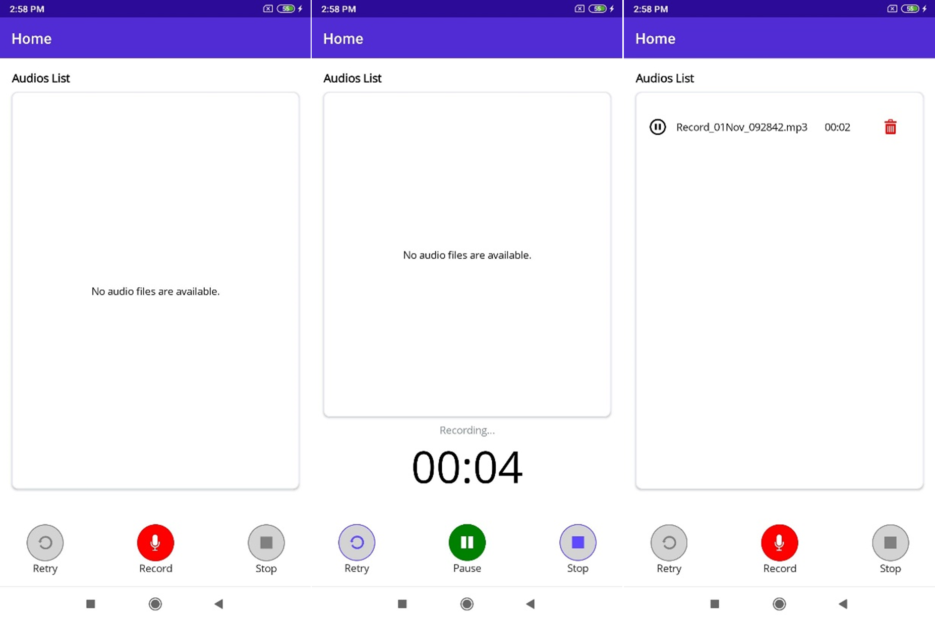
Resources
For more details, refer to the GitHub project .NET MAUI Audio Recorder and Player.
Conclusion
I hope you now have a clear idea of how to develop a .NET MAUI application to record and play audio files in your Android and iOS phones. Try the project sample and share your feedback in the comments section below.
Syncfusion’s .NET MAUI controls were built from scratch using .NET MAUI, so they feel like framework controls. They are fine-tuned to work with a huge volume of data. Use them to build better cross-platform mobile and desktop apps!
For current customers, the new Essential Studio version is available for download from the License and Downloads page. If you are not yet a Syncfusion customer, you can always download our free evaluation to see all our controls in action.
For questions, you can contact us through our support forum, support portal, or feedback portal. We are always happy to assist you!
Reference
Related blogs
In Essential Studio 2022 Volume 4, we have added one more data visualization tool to the Syncfusion .NET MAUI suite, the Pyramid Charts.
The new .NET MAUI Pyramid Charts is a powerful data visualization tool. It allows developers to concisely show hierarchical relationships among data. It is an excellent choice for displaying data hierarchies, such as showing the division of a total into its parts or visualizing the composition of a population.
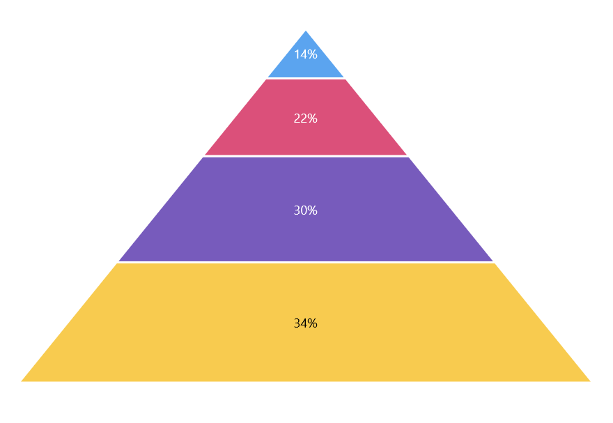
In this blog, we will explore the features of the new .NET MAUI Pyramid Charts and the steps to get started with it.
Features of .NET MAUI Pyramid Charts
Data labels
You can display data labels with various placement options in the Pyramid Charts. Place the data labels inside or outside of the pyramid segments. This makes it easy to focus on the significant information and quickly identify the breakdown.
In space-constrained scenarios, the data labels smartly align themselves based on the available space, thus improving the user experience and readability.
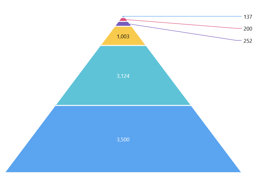
Tooltip
Use the tooltip feature to display more information about data points while hovering over them. By default, the tooltip displays the value (y–value) of each segment of the pyramid.
With the help of the TooltipTemplate support, we can customize tooltips to show different information using any .NET MAUI view control.
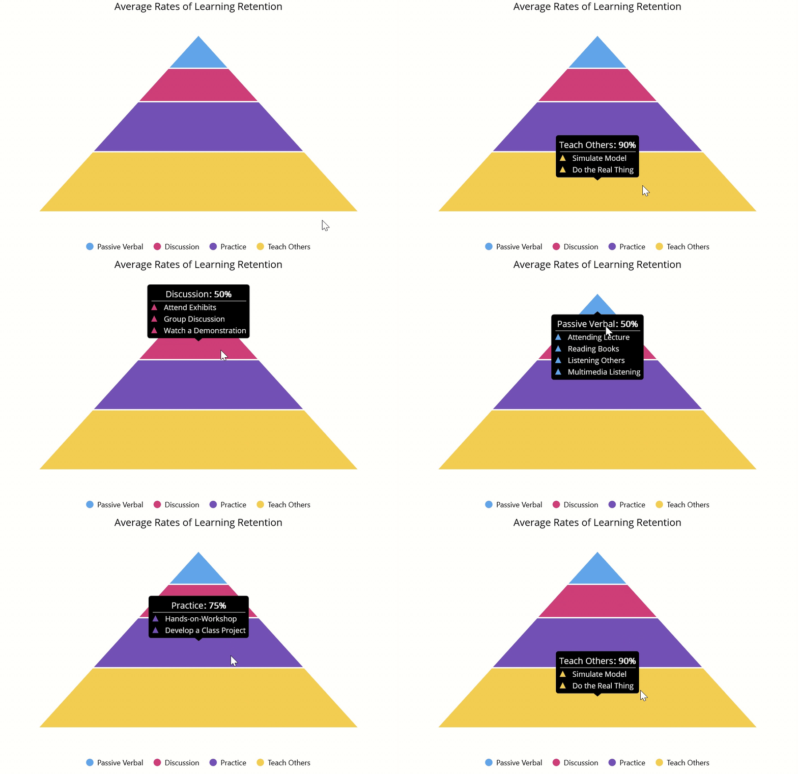
Legend
Render a legend next to your Pyramid Charts. By default, the legend items will appear with the names of the pyramid segments. You can customize the legend with any .NET MAUI view control using the ItemTemplate support.
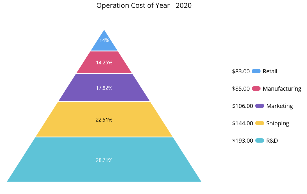
Note: Refer to the .NET MAUI Pyramid Charts documentation to know its other available features.
Getting started with .NET MAUI Pyramid Charts
This section explains the steps to getting started with the new .NET MAUI Pyramid Charts and populating it with data.
Step #1: First, create a simple .NET MAUI project.
Step #2: The Syncfusion .NET MAUI controls are available on the NuGet Gallery. To add the SfPyramidChart to your project, open the NuGet package manager in Visual Studio. Search for Syncfusion.Maui.Charts and then install it.
Step #3: Then, register the handler for Syncfusion core in the MauiProgram.cs file. Refer to the following code.
public static class MauiProgram{ public static MauiApp CreateMauiApp() { var builder = MauiApp.CreateBuilder(); builder .UseMauiApp<App>() .ConfigureSyncfusionCore() .ConfigureFonts(fonts => { fonts.AddFont("OpenSans-Regular.ttf", "OpenSansRegular"); fonts.AddFont("OpenSans-Semibold.ttf", "OpenSansSemibold"); }); builder.ConfigureSampleBrowserBase(); return builder.Build(); }}
Step #4: Next, import the Syncfusion.Maui.Charts namespace on your XAML page.
xmlns:chart= “clr-namespace:Syncfusion.Maui.Charts;assembly=Syncfusion.Maui.Charts”
Step #5: Initialize an empty Pyramid Charts control like in the following code.
<chart:SfPyramidChart/>
Step #6: Create a business model to populate items in the Pyramid Charts. This includes the creation of the example ChartDataModel class and ChartViewModel with the list of data objects.
public class ChartDataModel{ public string ProgressName { get; set; } public double Value { get; set; } }public class ChartViewModel{ public ObservableCollection<ChartDataModel> Data { get; set; } public ChartViewModel() { Data = new ObservableCollection<ChartDataModel> { new ChartDataModel("Retail",14), new ChartDataModel("Manufacturing",14.25), new ChartDataModel("Marketing",17.82), new ChartDataModel("Shipping",22.51), new ChartDataModel("R&D",28.71) }; }}
Step #7: Finally, set the BindingContext to the ChartViewModel. Bind the data to the Pyramid Charts’ ItemsSource property. Then, bind the ProgressName and Value properties with the XBindingPath, and YBindingPath properties, respectively.
Refer to the following code example.
<chart:SfPyramidChart ItemsSource="{Binding Data}" XBindingPath="ProgressName" YBindingPath="Value"> <chart:SfPyramidChart.BindingContext> <local:ChartViewModel/> </chart:SfPyramidChart.BindingContext></chart:SfPyramidChart>
After executing these code samples, we will get output like the following image.
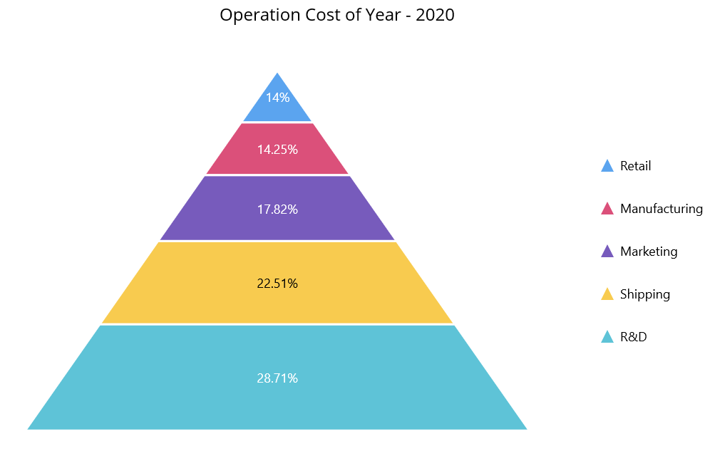
Conclusion
Thanks for reading! In this blog, we have seen the features of the new .NET MAUI Pyramid Charts, rolled out in the 2022 Volume 4 release. Try out this stunning data visualization control and leave your feedback in the comment section below!
Check out our Release Notes and the What’s New pages to see the other updates in this release.
For questions, you can reach us through our support forums, support portal, or feedback portal. We are always happy to assist you!
Related blogs
In the world of app development, it’s important to stay on top of the latest tools and technologies available. One of these is .NET MAUI (Multi-platform App UI), a cross-platform desktop and mobile application framework native to C# and XAML that enables developers to build apps for iOS, Android, macOS, and Windows from C# code shared.
If you are a beginner and interested in learning .NET MAUI in this new year 2023, you are at the right place. In this article, we will present you with a complete guide to learn .NET MAUI from scratch. From available learning options to required background knowledge and online resources, we’ll give you everything you need to get started with .NET MAUI and build your first apps.
So without further ado, let’s get started!
Learn .NET MAUI the best way
What is .NET MAUI
.NET MAUI (Multi-platform App UI) is a cross-platform desktop and mobile application framework native to C# and XAML that enables developers to build apps for iOS, Android, macOS, and Windows from shared C# code. If you are a beginner and interested in learning .NET MAUI in this new year of 2023, it is important to have a clear understanding of what it is and how it works.
.NET MAUI was announced at the .NET Conf 2020 event as the next generation of Xamarin.Forms, and that it is available from the beginning of 2022. Although it is only a year in the making, there are already many resources online that will help you to get ready.
Learning options
There are several options available to learn .NET MAUI in this new year 2023. One of them is the .NET Beginners series offered on Learn TV. In this series, you’ll get a thorough introduction to building apps with .NET MAUI. The episodes are broadcast live and are presented by experts, so it’s a great opportunity to learn something new and do it alongside others.
Another option is to visit the .NET MAUI Learn page on the Microsoft website. On this page, you’ll find an introductory video that will give you an overview of what .NET MAUI is and how it works. In addition, there are several guides and tutorials available to help you get started with .NET MAUI and build your first applications.
Finally, you can also follow the tutorials provided by Microsoft on their learning website. One of these tutorials shows you how to run your first .NET MAUI app on Windows. The tutorial includes detailed instructions and screenshots that walk you through the process step by step.
Necessary previous knowledge
Before you start learning .NET MAUI, it’s important to have some background knowledge. This includes a basic understanding of programming and programming languages, such as C# or XAML. If you don’t have previous programming experience, it’s a good idea to take a basic programming course or tutorial before starting to work with .NET MAUI.
In addition to programming, it’s also helpful to have a basic understanding of user interface (UI) design and experience working with graphic design tools, such as Adobe Photoshop or Illustrator. This will help you design and build apps that are visually appealing and easy to use.
Online Resources and Tutorials
.NET MAUI is now available, and there are many resources and tutorials online to help you prepare for its release. Some of these resources include:
- The .NET MAUI Learn page on the Microsoft website, which includes tutorials, guides, and documentation on working with .NET MAUI.
- The online .NET community, which offers forums and discussion groups where you can interact with other developers and get help and support.
- YouTube’s channels and developer blogs, which offer video tutorials and guides on working with .NET MAUI.
- .NET MAUI e-books and print books, which provide detailed information and step-by-step tutorials on working with the framework.
Here are some links that might be of interest:
- The .NET MAUI learn page on the Microsoft website:
https://dotnet.microsoft.com/en-us/learn/maui - The .NET MAUI documentation on the Microsoft developer page:
https://docs.microsoft.com/en-us/dotnet/maui/ - The Microsoft Visual Studio YouTube channel, which includes tutorials and videos on .NET MAUI:
https://www.youtube.com/user/VisualStudio - The .NET Developer’s Blog, including posts and tutorials on .NET MAUI:
https://devblogs.microsoft.com/dotnet/ - The .NET online community, which offers forums and discussion groups where you can interact with other developers and get help and support:
https://community.dot.net/
Practice and patience
As with any new skill, learning .NET MAUI will take time and practice. Don’t expect to master the framework right away, and don’t be discouraged if you run into obstacles or get frustrated at any point. Patience and persistence are key to success.
In addition to practice, it’s important to keep up to date with the latest trends and developments in the world of .NET MAUI. This includes reading technology blogs and magazines, attending conferences and workshops, and joining online developer communities. This will help you keep abreast of the latest developments and keep you motivated to continue learning.
Resume
In summary, learning .NET MAUI in this new year 2023 is a great opportunity to develop your skills as a programmer and create amazing applications for multiple platforms. With a combination of learning options, background knowledge, online resources, and practice, you can be on your way to success in the world of .NET MAUI.
I hope this article has helped you understand how to learn .NET MAUI and how to make the most of this framework to build cross-platform applications. Feel free to put what you’ve learned into practice and share your achievements with us in the .NET community!
Good luck learning .NET MAUI!
The post Learn .NET MAUI: Beginner’s Guide appeared first on Luis Matos.
En el mundo del desarrollo de aplicaciones, es importante estar al tanto de las últimas herramientas y tecnologías disponibles. Una de ellas es .NET MAUI (Multi-platform App UI), un marco de aplicaciones móviles y de escritorio multiplataforma nativas con C# y XAML que permite a los desarrolladores crear aplicaciones para iOS, Android, macOS y Windows a partir de un código C# compartido.
Si eres un principiante y estás interesado en aprender .NET MAUI en este nuevo año 2023, estás en el lugar correcto. En este artículo, te presentaremos una guía completa para aprender .NET MAUI desde cero. Desde las opciones de aprendizaje disponibles hasta los conocimientos previos necesarios y los recursos en línea, te daremos todo lo que necesitas para empezar a trabajar con .NET MAUI y crear tus primeras aplicaciones. ¡Así que sin más preámbulos, vamos a comenzar!
Aprende .NET MAUI de la mejor manera
Qué es .NET MAUI
.NET MAUI (Multi-platform App UI) es un marco de aplicaciones móviles y de escritorio multiplataforma nativas con C# y XAML que permite a los desarrolladores crear aplicaciones para iOS, Android, macOS y Windows a partir de un código C# compartido. Si eres un principiante y estás interesado en aprender .NET MAUI en este nuevo año 2023, es importante tener una comprensión clara de lo que es y cómo funciona.
.NET MAUI fue anunciado en el evento .NET Conf 2020 como la próxima generación de Xamarin.Forms, y que está disponible desde principios de 2022. Aunque solo tiene un año en curso, ya se pueden encontrar muchos recursos en línea que te ayudarán a prepararte.
Opciones de aprendizaje
Hay varias opciones disponibles para aprender .NET MAUI en este nuevo año 2023. Una de ellas es la serie de principiantes de .NET que se ofrece en Learn TV. En esta serie, obtendrás una introducción completa a la compilación de aplicaciones con .NET MAUI. Los capítulos se transmiten en vivo y están presentados por expertos, por lo que es una oportunidad excelente para aprender algo nuevo y hacerlo junto a otros.
Otra opción es visitar la página de aprendizaje de .NET MAUI en el sitio web de Microsoft. En esta página, encontrarás un vídeo introductorio que te dará una idea general de lo que es .NET MAUI y cómo funciona. Además, hay varias guías y tutoriales disponibles que te ayudarán a empezar a trabajar con .NET MAUI y a crear tus primeras aplicaciones.
Finalmente, también puedes seguir los tutoriales proporcionados por Microsoft en su sitio web de aprendizaje. Uno de estos tutoriales te muestra cómo ejecutar tu primera aplicación .NET MAUI en Windows. El tutorial incluye instrucciones detalladas y capturas de pantalla que te guían a través del proceso paso a paso.
Conocimientos previos necesarios
Antes de comenzar a aprender .NET MAUI, es importante tener ciertos conocimientos previos. Esto incluye una comprensión básica de programación y lenguajes de programación, como C# o XAML. Si no tienes experiencia previa en programación, es recomendable tomar un curso o tutorial básico de programación antes de comenzar a trabajar con .NET MAUI.
Además de la programación, también es útil tener conocimientos básicos de diseño de interfaz de usuario (UI) y experiencia trabajando con herramientas de diseño gráfico, como Adobe Photoshop o Illustrator. Esto te ayudará a diseñar y crear aplicaciones visualmente atractivas y fáciles de usar.
Recursos y tutoriales en línea
.NET MAUI ya está disponible, y hay muchos recursos y tutoriales en línea que te ayudarán a prepararte para su lanzamiento. Algunos de estos recursos incluyen:
- La página de aprendizaje de .NET MAUI en el sitio web de Microsoft, que incluye tutoriales, guías y documentación sobre cómo trabajar con .NET MAUI.
- La comunidad en línea de .NET, que ofrece foros y grupos de discusión donde puedes interactuar con otros desarrolladores y obtener ayuda y soporte.
- Los canales de YouTube y los blogs de desarrolladores, que ofrecen tutoriales y guías en video sobre cómo trabajar con .NET MAUI.
- Los libros electrónicos y los libros impresos sobre .NET MAUI, que ofrecen información detallada y tutoriales paso a paso sobre cómo trabajar con el marco.
Aquí hay algunos enlaces que podrían ser de interés:
- La página de aprendizaje de .NET MAUI en el sitio web de Microsoft: https://dotnet.microsoft.com/en-us/learn/maui
- La documentación de .NET MAUI en la página de desarrolladores de Microsoft: https://docs.microsoft.com/en-us/dotnet/maui/
- El canal de YouTube de Microsoft Visual Studio, que incluye tutoriales y videos sobre .NET MAUI: https://www.youtube.com/user/VisualStudio
- El blog de desarrolladores de .NET, que incluye publicaciones y tutoriales sobre .NET MAUI: https://devblogs.microsoft.com/dotnet/
- La comunidad en línea de .NET, que ofrece foros y grupos de discusión donde puedes interactuar con otros desarrolladores y obtener ayuda y soporte: https://community.dot.net/
Práctica y paciencia
Como con cualquier habilidad nueva, aprender .NET MAUI llevará tiempo y práctica. No esperes dominar el marco de inmediato, y no te desanimes si encuentras obstáculos o te sientes frustrado en algún momento. La paciencia y la persistencia son clave para el éxito.
Además de la práctica, es importante mantenerse actualizado con las últimas tendencias y desarrollos en el mundo de .NET MAUI. Esto incluye leer blogs y revistas de tecnología, asistir a conferencias y talleres, y unirse a comunidades en línea de desarrolladores. Esto te ayudará a mantenerte al tanto de las últimas novedades y te mantendrá motivado a seguir aprendiendo.
Resumen
En resumen, aprender .NET MAUI en este nuevo año 2023 es una gran oportunidad para desarrollar tus habilidades como programador y crear aplicaciones increíbles para múltiples plataformas. Con una combinación de opciones de aprendizaje, conocimientos previos, recursos en línea y práctica, puedes estar en el camino hacia el éxito en el mundo de .NET MAUI.
Espero que este artículo te haya ayudado a entender cómo aprender .NET MAUI y cómo aprovechar al máximo este marco para crear aplicaciones multiplataforma. ¡No dudes en poner en práctica lo que has aprendido y compartir tus logros con nosotros en la comunidad de .NET!
¡Buena suerte en tu aprendizaje con .NET MAUI!
The post Aprende .NET MAUI: Guía para principiantes appeared first on Luis Matos.
A text input layout control was one of the most-requested controls by our mobile app developers. We understand the requirement for this essential control and have now delivered the .NET MAUI Text Input Layout control in our 2022 Volume 4 release.
This control can be used to build UIs that require user input. It allows users to add floating labels, password toggle icons, leading and trailing icons, and assistive labels such as error messages and help text on top of the input controls. These features help improve the interface’s usability and make it easier for users to enter and submit information.
In this article, we will see the key features of the new .NET MAUI Text Input Layout and the steps to get started with it.
Key features
The .NET MAUI Text Input Layout supports numerous user-friendly features. Some of them are listed here.
- Supported input controls
- Container types
- Supported states
- Toggling password visibility
- Floating labels and hints
- Helper text
- Error text
- Leading and trailing icons
Supported input controls
The .NET MAUI Text Input Layout control can enhance the appearance and functionality of the Syncfusion Autocomplete or ComboBox controls, and the Microsoft Entry and Editor controls in the .NET MAUI framework.
By wrapping these input views with the Text Input Layout, you can easily add assistive labels and icons to improve your app’s usability and visual appeal.
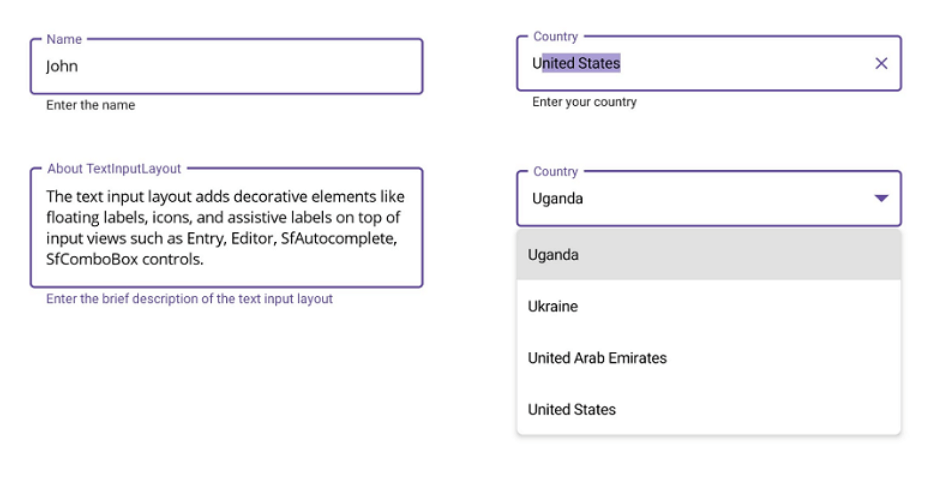
Container types
The .NET MAUI Text Input Layout supports the following container types:
- Filled: The background of the input view will fill with the container color, and the baseline stroke and thickness will change based on the state of the input view.
- Outlined: The container will be framed with a rounded border.
- None: The container will have an empty background and space around it.
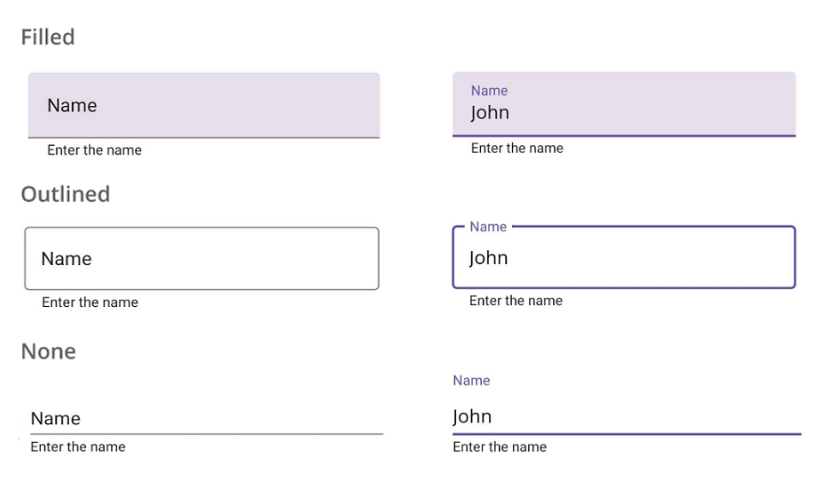
Supported states
The .NET MAUI Text Input Layout supports the focused, unfocused, error, and disabled visual states.
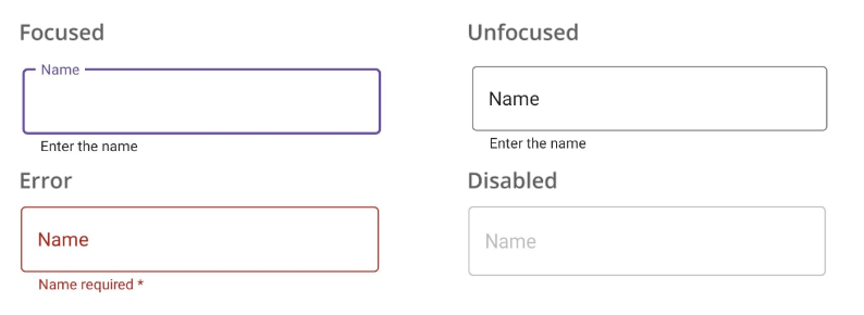
Toggling password visibility
You can enable the password toggle icon to show or hide a password interactively.
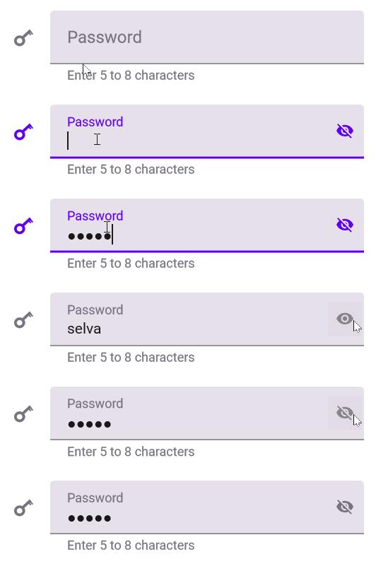
Floating labels and hints
Use the hint text feature to add placeholder text to the input view. This hint text will be displayed in the middle of the input view and will move to the top to become a floating label when the input field becomes active. This can help save space and avoid the need for additional titles.
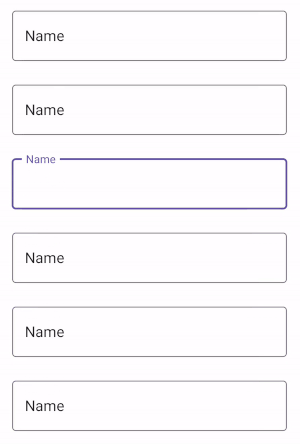
Helper text
In addition to the hint text, the Text Input Layout control also provides a helper text feature. It allows you to display additional information about the text that is expected to be entered. This can be useful for giving instructions or examples to help users understand how to correctly enter details in the input field.
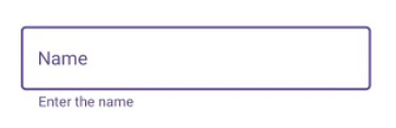
Error text
Use the error text feature to display error messages that assist users in solving validation errors. This can improve the usability of your app by providing clear feedback to users when there are problems with their input.
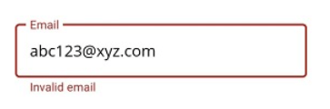
Leading and trailing icons
You can use leading icons to indicate the expected input type, such as a birth date, phone number, or password. These can help users understand the purpose of the input field and easily enter the appropriate information.
Trailing icons, on the other hand, can be used for various purposes, such as adding a clear button, error icon, voice input icon, or drop-down icon. These can improve the functionality of the input view and make it easier for users to interact with it.
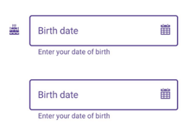
Note: For more details, refer to the .NET MAUI Text Input Layout documentation.
Getting started with the .NET MAUI Text Input Layout control
We have seen the key features of the .NET MAUI Text Input Layout (SfTextInputLayout). Let’s see how to configure it with a floating label.
Step 1: First, create a .NET MAUI application.
Step 2: The Syncfusion .NET MAUI controls are available on NuGet Gallery. To add the .NET MAUI Text Input Layout control to your project, open the NuGet package manager in Visual Studio. Search for Syncfusion.Maui.Core and then install it.
Step 3: Now, register the handler for the Syncfusion core in the MauiProgram.cs file.
using Microsoft.Maui;using Microsoft.Maui.Hosting;using Microsoft.Maui.Controls.Compatibility;using Microsoft.Maui.Controls.Hosting;using Microsoft.Maui.Controls.Xaml;using Syncfusion.Maui.Core.Hosting;namespace TextInputLayoutSample{ public static class MauiProgram {public static MauiApp CreateMauiApp(){var builder = MauiApp.CreateBuilder();builder.UseMauiApp<App>().ConfigureSyncfusionCore().ConfigureFonts(fonts =>{ fonts.AddFont("OpenSans-Regular.ttf", "OpenSansRegular");});return builder.Build(); } }}
Step 3: Add Syncfusion.Maui.Core namespace in your XAML page.
xmlns:inputLayout="clr-namespace:Syncfusion.Maui.Core;assembly=Syncfusion.Maui.Core"
Step 4:Then, add any input view control such as Entry, Editor, Autocomplete, or ComboBox to the Text Input Layout.
<inputLayout:SfTextInputLayout> <Entry /></inputLayout:SfTextInputLayout>
Step 5: Now, we can add the floating label for the Text Input Layout by setting the Hint property with the text you want to display as the label. You can also control the visibility of the hint by setting the ShowHint property as true or false. By default, it’s set to true to display the floating label.
Refer to the following code example.
<inputLayout:SfTextInputLayout Hint=”First Name”> <Entry Text = “Selva Ganapathy Kathiresan”/></inputLayout:SfTextInputLayout>
Conclusion
Thanks for reading! In this blog, we’ve seen the features of the new .NET MAUI Text Input Layout control rolled out in the 2022 Volume 4 release. Information about our other new controls and features is available in our Release Notes and What’s New pages. Try them out and leave your feedback in the comments section below!
Download Essential Studio for .NET MAUI to start evaluating them immediately.
If you have any questions or need further assistance, please don’t hesitate to contact us through our support forum, support portal, or feedback portal. We are always happy to help you!
Related blogs
When developing your desktop applications in .NET MAUI, you can control both the size and position of your application windows. In this article you will learn how to do it very quickly!
Let’s start!
Preparing the stage
First of all, you have to override the CreateWindows Method which allow you to handle the Window’s settings. Go to your App.xam.cs and add it! To overwrite it faster, apply the following steps:
Type “override Create” and press Enter or Tab button twice.
This will complete the base structure of the method.
Next, let’s access the window information using a variable, as shown in the following code:
Sizing your Windows
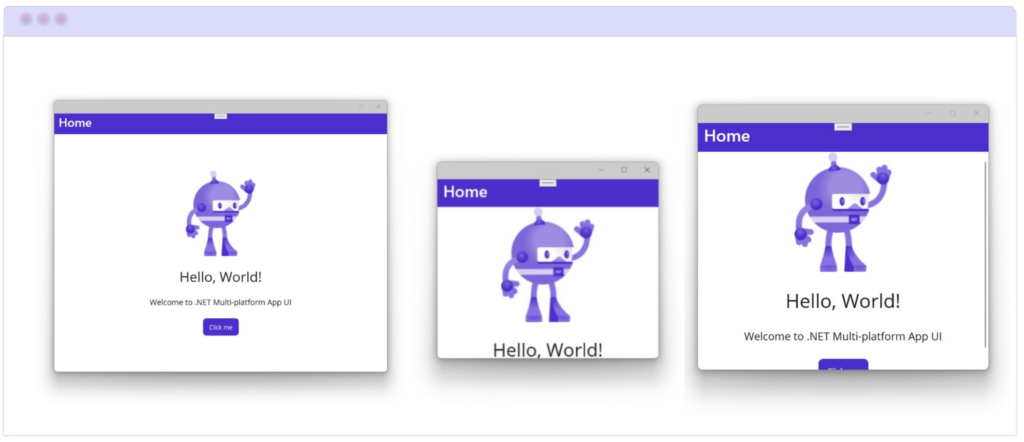
You already have the stage prepared, now you only have to add the properties. To modify the size of your window, you only have to access the Width and Height properties, as I show you below:
We also have properties that help us control the minimum or maximum values of the width or height of the screen which are the following:
MaximumHeight and MaximumWidth: Sets the maximum value that the screen can reach in width or height respectively. (Receives a double as value)
MinimumHeight and MinimumWidth: Sets the minimum value that the screen can reach in width or height respectively. (Receives a double as value)
Positioning your Windows

Finally, to position your Windows you can access the X and Y properties as follows:
 Limitations
Mac Catalyst does not support resizing or repositioning windows using the above.
And done!! From now on, you are ready to play with the size and position of your application windows in .NET MAUI! I hope you liked it!
” />
A project planning calendar for resource scheduling is an effective project management tool. It makes it easier to plan, track, update, and collaborate on project tasks with your team. The Syncfusion .NET MAUI Scheduler control allows you to create a real-time project planning and resource management calendar by using the resource view feature in timeline views.
In this blog, I’ll explain how to create a calendar for planning employees’ tasks using the Scheduler’s timeline month view.
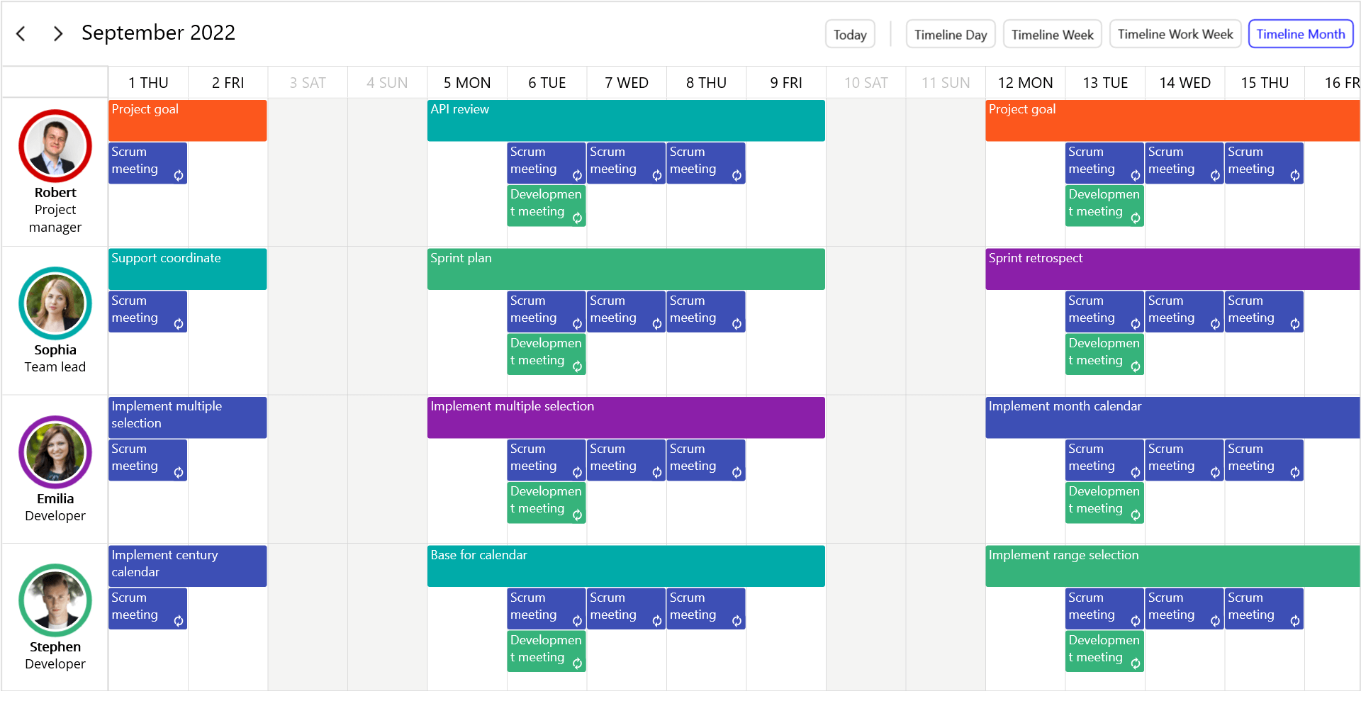
Note: If you are new to using our .NET MAUI Scheduler control, please read the Getting Started with .NET MAUI Scheduler documentation before proceeding further.
Designing the calendar for each resource
Create a calendar for each employee to schedule and manage their tasks in one place. The Scheduler resources feature can be used to manage tasks that the project team is planning to work on in the timeline day, timeline week, timeline workweek, and timeline month views.
Refer to the following code to initialize the scheduler timeline month view.
xmlns:schedule="clr-namespace:Syncfusion.Maui.Scheduler;assembly=Syncfusion.Maui.Scheduler" <schedule:SfScheduler x:Name="Scheduler" View="TimelineMonth"/>
Create an employee model
It’s very simple to add a resource view to the Scheduler control. You can create any kind of object and bind it in the Resources property of SchedulerResourceView class.
Here, we have created a custom Employee resource model with the required fields Id, Name, and other optional fields like Background, Role, and ImageName.
public class Employee{ /// <summary> /// Gets or sets employee name. /// </summary> public string Name { get; set; } /// <summary> /// Gets or sets resource object id. /// </summary> public object Id { get; set; } /// <summary> /// Gets or sets employee background. /// </summary> public Brush Background { get; set; } /// <summary> /// Gets or sets an image for an employee. /// </summary> public string ImageName { get; set; } /// <summary> /// Gets or sets employee role. /// </summary> public string Role { get; set; }}
Then, map the custom Employee properties to the Mapping properties of the SchedulerResourceView class.
Refer to the following code.
<schedule:SfScheduler x:Name="Scheduler" View="TimelineMonth"> <schedule:SfScheduler.ResourceView> <schedule:SchedulerResourceView> <schedule:SchedulerResourceView.Mapping> <schedule:SchedulerResourceMapping Name="Name" Id="Id" Background="Background" /> </schedule:SchedulerResourceView.Mapping> </schedule:SchedulerResourceView> </schedule:SfScheduler.ResourceView> </schedule:SfScheduler>
Adding resources to the Scheduler
To add the resources to the Scheduler, create custom resources or employees and bind them to the Resources property of the SchedulerResourceView class.
Refer to the following code.
this.Resources = this.GetSchedulerResources();/// <summary>/// Method to get resources or employees to the scheduler./// </summary>/// <returns>Scheduler resources</returns>private List<object> GetSchedulerResources(){ Random random = new(); List<object> resources = new(); List<string> employeeNames = new List<string> { "Robert", "Sophia", "Emilia" , "Stephen", "James William", "Johnny", "Daniel", "Adeline Ruby","Kinsley Elena", }; for (int i = 0; i < 9; i++) { Employee employees = new(); employees.Name = employeeNames[i]; employees.Background = this.resourceColors[random.Next(this.resourceColors.Count)]; employees.Id = i + 1; if (employees.Name == "Robert") { employees.ImageName = "people9.png"; employees.Role = "Project manager"; } else if (employees.Name == "Sophia") { employees.ImageName = "people2.png"; employees.Role = "Team lead"; } else if (employees.Name == "Emilia") { employees.ImageName = "people7.png"; employees.Role = "Developer"; } else if (employees.Name == "Stephen") { employees.ImageName = "people1.png"; employees.Role = "Developer"; } else if (employees.Name == "James William") { employees.ImageName = "people6.png"; employees.Role = "Developer"; } else if (employees.Name == "Daniel") { employees.ImageName = "people3.png"; employees.Role = "Tester"; } else if (employees.Name == "Johnny") { employees.ImageName = "people8.png"; employees.Role = "Tester"; } else if (employees.Name == "Adeline Ruby") { employees.ImageName = "people4.png"; employees.Role = "Support Engineer"; } else if (employees.Name == "Kinsley Elena") { employees.ImageName = "people5.png"; employees.Role = "Content writer"; } resources.Add(employees); } return resources;}
<schedule:SfScheduler x:Name="Scheduler" View="TimelineMonth"> <schedule:SfScheduler.ResourceView> <!--Bind custom Resources from view model--> <schedule:SchedulerResourceView Resources="{Binding Resources}"> <schedule:SchedulerResourceView.Mapping> <schedule:SchedulerResourceMapping Name="Name" Id="Id" Background="Background" Foreground="Foreground"/> </schedule:SchedulerResourceView.Mapping> </schedule:SchedulerResourceView> </schedule:SfScheduler.ResourceView> <schedule:SfScheduler.BindingContext> <local:ResourceViewModel/> </schedule:SfScheduler.BindingContext></schedule:SfScheduler>
Customizing the resource view appearance
You can also customize the resource view’s appearance using the HeaderTemplate property in the SchedulerResourceView class.
Refer to the following code example to customize the resource view appearance.
<ContentPage.Resources> <local:ImageSourceConverter x:Key="imageConverter"/> </ContentPage.Resources> <schedule:SfScheduler x:Name="Scheduler" View="TimelineMonth"> <schedule:SfScheduler.ResourceView> <schedule:SchedulerResourceView Resources="{Binding Resources}"> <!--Customize the resource view appearance--> <schedule:SchedulerResourceView.HeaderTemplate> <DataTemplate> <StackLayout Padding="5" Orientation="Vertical" VerticalOptions="Center" HorizontalOptions="Fill"> <Border StrokeThickness="5" Stroke="{Binding Background}" HorizontalOptions="Center" HeightRequest="{OnIdiom Desktop = 70, Phone = 65}" WidthRequest="{OnIdiom Desktop= 70, Phone=65}"> <Border.StrokeShape> <RoundRectangle CornerRadius="150"/> </Border.StrokeShape> <Image WidthRequest="{OnIdiom Desktop = 55, Phone = 50}" HeightRequest="{OnIdiom Desktop = 55, Phone = 50}" HorizontalOptions="Center" Source="{Binding DataItem.ImageName,Converter={StaticResource imageConverter}}" VerticalOptions="Center" Aspect="Fill"/> </Border> <Label Text="{Binding Name}" TextColor="Black" FontSize="{OnIdiom Desktop= 12, Phone=10}" VerticalTextAlignment="Center" HorizontalTextAlignment="Center"/> </StackLayout> </DataTemplate> </schedule:SchedulerResourceView.HeaderTemplate> <schedule:SchedulerResourceView.Mapping> <schedule:SchedulerResourceMapping Name="Name" Id="Id" Background="Background" Foreground="Foreground"/> </schedule:SchedulerResourceView.Mapping> </schedule:SchedulerResourceView> </schedule:SfScheduler.ResourceView> <schedule:SfScheduler.BindingContext> <local:ResourceViewModel/> </schedule:SfScheduler.BindingContext></schedule:SfScheduler>
public class ImageSourceConverter : IValueConverter{ public object Convert(object? value, Type targetType, object parameter, CultureInfo culture) { return ImageSource.FromFile(value as string); } public object ConvertBack(object value, Type targetType, object parameter, CultureInfo culture) { throw new NotImplementedException(); }}
Resource availability
You can manage and track the availability of resources by using the special time region or blackout dates in timeline views.
The following code example adds Saturday and Sunday as blackout dates to avoid task planning during days off.
scheduler.SelectableDayPredicate = (date) =>{ if (date.DayOfWeek == DayOfWeek.Sunday || date.DayOfWeek == DayOfWeek.Saturday) { return false; } return true;};
Scheduling tasks to the resources
Next, we are going to create tasks for employees by using the AppointmentsSource property.
Creating employee Task model
Create a custom Task data model for an employee with the required fields From, To, and other optional fields.
public class Task{ /// <summary> /// Gets or sets the value to display the start date. /// </summary> public DateTime From { get; set; } /// <summary> /// Gets or sets the value to display the end date. /// </summary> public DateTime To { get; set; } /// <summary> /// Gets or sets the value to display the subject. /// </summary> public string TaskName { get; set; } /// <summary> /// Gets or sets the value to display the background. /// </summary> public Brush Background { get; set; } /// <summary> /// Gets or sets the value to display the Rule. /// </summary> public string RecurrenceRule { get; set; } /// <summary> /// Gets or sets the value to display the resource collection. /// </summary> public ObservableCollection<object> Resources { get; set; } /// <summary> /// Gets or sets the value to an all-day appointment. /// </summary> public bool IsAllDay { get; set; } }
Mapping the custom task module to the Scheduler
Then, map the custom employee Task data model properties to the AppointmentMapping properties of the SfScheduler class. You can create tasks for employees by using the ResourceIds property of the SchedulerAppointmentMapping class.
<schedule:SfScheduler x:Name="Scheduler" AllowedViews="TimelineDay,TimelineWeek,TimelineWorkWeek,TimelineMonth" View="TimelineMonth"> <schedule:SfScheduler.AppointmentMapping> <schedule:SchedulerAppointmentMapping Subject="TaskName" StartTime="From" EndTime="To" IsAllDay="IsAllDay" Background="Background" RecurrenceRule="RecurrenceRule" ResourceIds="Resources"/> </schedule:SfScheduler.AppointmentMapping> </schedule:SfScheduler>
Create tasks for the employees
In the following, tasks are created for resources using the Resources of Task by assigning the Id of the scheduler resources.
this.Tasks = this.GetEmployeeTasks();/// <summary>/// Method to get tasks for employees./// </summary>/// <returns>Employee tasks</returns>private List<Task> GetEmployeeTasks(){ Random random = new(); List<Task> tasks = new(); DateTime dateFrom = DateTime.Now.AddDays(-80); DateTime dateTo = DateTime.Now.AddDays(80); List<string> managerTasks = new List<string> { "Project goal", "Project plan", "API review", "Project final review" }; List<string> teamleadTasks = new List<string> { "Project requirments", "Project design", "API analysis", "Feature review", "Support coordinate", "Tech Blog", "Sprint plan", "Sprint review", "Sprint retrospect" }; List<string> supportTasks = new List<string> { "Customer meeting", "User guide documentation", "Knowbase document" }; List<string> developmentTasks = new List<string> { "Base for calendar", "Implement month calendar", "Implement year calendar", "Implement decade calendar", "Implement century calendar", "Implement date selection", "Implement range selection", "Implement blackout dates", "Implement multiple selection" }; List<string> testingTasks = new List<string> { "Unit testing", "UI automation", "Performance testing", "Memory leak testing", "Feature testing", "Demos testing", "Automate test cases", "Peer testing", "Exploratory testing", "Sanity testing" }; List<string> documentationTasks = new List<string> { "User guide documentation", "Feature tour", "Whats new", "Road map", "Knowledge base", "Technical review", "Content review", }; for (DateTime date = dateFrom; date < dateTo; date = date.AddDays(1)) { if (date.DayOfWeek != DayOfWeek.Monday) continue; for (int i = 0; i < 9; i++) { Employee resource = this.Resources[i] as Employee; DateTime startDate = new DateTime(date.Year, date.Month, date.Day, random.Next(9, 18), 0, 0); //// Create a task for an employee. Task task = new(); task.From = startDate; task.To = startDate.AddDays(4).AddHours(1); task.Background = this.resourceColors[random.Next(resourceColors.Count)]; //// Assign tasks to the employees. task.Resources = new ObservableCollection<object>() { resource.Id }; task.IsAllDay = true; if (string.Equals(resource.Role, "Project manager")) { task.TaskName = managerTasks[random.Next(managerTasks.Count)]; } else if (string.Equals(resource.Role, "Team lead")) { task.TaskName = teamleadTasks[random.Next(teamleadTasks.Count)]; } else if (string.Equals(resource.Role, "Developer")) { task.TaskName = developmentTasks[random.Next(developmentTasks.Count)]; } else if (string.Equals(resource.Role, "Tester")) { task.TaskName = testingTasks[random.Next(testingTasks.Count)]; } else if (string.Equals(resource.Role, "Support Engineer")) { task.TaskName = supportTasks[random.Next(supportTasks.Count)]; } else if (string.Equals(resource.Role, "Content writer")) { task.TaskName = documentationTasks[random.Next(documentationTasks.Count)]; } tasks.Add(task); } } return tasks; }
Bind the employee’s tasks to the Scheduler
Then, bind the employees’ tasks by using the AppointmentsSource property.
In the following code, the Tasks property binds to the AppointmentsSource property from the view model to plan the employee’s tasks.
<!--Bind custom Tasks from the view model to AppointmentsSource property--> <schedule:SfScheduler x:Name="Scheduler" AppointmentsSource="{Binding Tasks}" AllowedViews="TimelineDay,TimelineWeek,TimelineWorkWeek,TimelineMonth" View="TimelineMonth"> <schedule:SfScheduler.AppointmentMapping> <schedule:SchedulerAppointmentMapping Subject="TaskName" StartTime="From" EndTime="To" IsAllDay="IsAllDay" Background="Background" RecurrenceRule="RecurrenceRule" ResourceIds="Resources"/> </schedule:SfScheduler.AppointmentMapping> <schedule:SfScheduler.BindingContext> <local:ResourceViewModel/> </schedule:SfScheduler.BindingContext></schedule:SfScheduler>
Sharing appointments with multiple resources
You can share the same event or common progress meetings with multiple resources to discuss the progress of the tasks by using multiresource sharing support.
Please refer to the following code example to create multiple-resource-sharing appointments by listing the required resource IDs for the appointments.
//// Plan weekly development meeting. Task overAllDevelopmentMeeting = new();overAllDevelopmentMeeting.TaskName = "Development meeting";overAllDevelopmentMeeting.From = new DateTime(dateFrom.Year, dateFrom.Month, dateFrom.Day, 11, 30, 0);overAllDevelopmentMeeting.To = overAllDevelopmentMeeting.From.AddMinutes(30);overAllDevelopmentMeeting.Background = Color.FromArgb("#FF36B37B");//// Same appointment will be shared with the multiresource.overAllDevelopmentMeeting.Resources = new ObservableCollection<object>() { 1, 2, 3, 4, 5, 6, 7, 8, 9 };overAllDevelopmentMeeting.IsAllDay = false;overAllDevelopmentMeeting.RecurrenceRule = "FREQ=WEEKLY;BYDAY=TU;INTERVAL=1";tasks.Add(overAllDevelopmentMeeting);
GitHub reference
For more information, you can download the complete example of the project planning calendar for resource scheduling using the .NET MAUI Scheduler.
Conclusion
Thank you for reading! In this blog, we had a quick overview of how to create a project planning and resource management calendar using the Syncfusion .NET MAUI Scheduler.
Please let us know in the comments section below if you have any feedback, specific requirements, or controls that you’d like to see in our .NET MAUI suite.
You can also contact us through our support forum, support portal, or feedback portal. We are always happy to assist you!
Related blogs

Are you looking for a tool to visualize data and show progress through a series of steps or stages?
Then our new .NET MAUI Funnel Charts is the ultimate choice!
The .NET MAUI Funnel Charts (SfFunnelChart) is an efficient tool for visualizing data flow from one stage to the next and identifying areas where progress might be slower or faster than expected. You can easily create and customize it to satisfy your specific needs.
This component was part of the Syncfusion Essential Studio 2022 Volume 4 release.
In this blog, we will see the features of the .NET MAUI Funnel Charts and the steps to get started with it!
Features of .NET MAUI Funnel Charts
Data Labels
One of the Funnel Charts’ key features is its ability to display data labels with custom placement options. You can place the labels inside or outside of the funnel segments. This makes it easy to focus on the most important information and quickly identify the trends and patterns in the data.
The data labels smartly align themselves in space-constrained scenarios based on space availability. Thus, they improve the user experience and readability.
Tooltip
We can display information about each funnel segment while hovering over it using the tooltip feature. By default, the tooltip displays the value of each stage in the funnel.
With the help of the TooltipTemplate support, this can be customized to show other information using any .NET MAUI View control.
Legend
The Funnel Charts supports rendering a legend next to the funnel to display information about each segment or stage. By default, the legend will appear with the names of the funnel stages. You can customize it with any .NET MAUI view control using the ItemTemplate support.
Note: Refer to the .NET MAUI Funnel Charts documentation to see its other available features.
Getting started with .NET MAUI Funnel Charts
Let’s see how to get started with the .NET MAUI Funnel Charts and populate it with data in your application.
Step 1: First, create a .NET MAUI application.
Step 2: Syncfusion .NET MAUI components are available in the NuGet Gallery. To add the SfFunnelChart to your project, open the NuGet package manager in Visual Studio. Search for Syncfusion.Maui.Charts, and then install it.
Step 3: Now, register the handler for the Syncfusion core in the MauiProgram.cs file. Refer to the following code.
public static class MauiProgram{ public static MauiApp CreateMauiApp() { var builder = MauiApp.CreateBuilder(); builder.UseMauiApp<App>().ConfigureSyncfusionCore().ConfigureFonts(fonts => { fonts.AddFont("OpenSans-Regular.ttf", "OpenSansRegular"); fonts.AddFont("OpenSans-Semibold.ttf", "OpenSansSemibold"); }); builder.ConfigureSampleBrowserBase(); return builder.Build(); }}
Step 4: Import the Syncfusion.Maui.Charts namespace in your XAML page.
xmlns:chart="clr-namespace:Syncfusion.Maui.Charts;assembly=Syncfusion.Maui.Charts">
Step 5: Then, initialize an empty funnel chart like in the following code.
<chart:SfFunnelChart/>
Step 6: Create a business model to populate items in the Funnel Charts. This includes creating the example Model class and ChartViewModel with the list of data objects.
public class Model{ public string ProgressName { get; set; } public double Value { get; set; } }public class ChartViewModel{ public ObservableCollection Data { get; set; } public ChartViewModel() { Data = new ObservableCollection() { new Model(){ProgressName = "Process A", Value = 50}, new Model(){ProgressName = "Process B", Value = 20}, new Model(){ProgressName = "Process C", Value = 15}, new Model(){ProgressName = "Process D", Value = 5}, }; }}
Step 7: Finally, set the BindingContext to the ChartViewModel. Bind the data to the Funnel Charts’ ItemsSource property. Then, bind the ProgressName and Value properties with the XBindingPath, and YBindingPath properties, respectively.
<chart:SfFunnelChart ItemsSource="{Binding Data}" XBindingPath="ProgressName" YBindingPath="Value"> <chart:SfFunnelChart.BindingContext> <local:ChartViewModel/> </chart:SfFunnelChart.BindingContext></chart:SfFunnelChart>
After executing these code examples, our funnel chart will look like the following image.
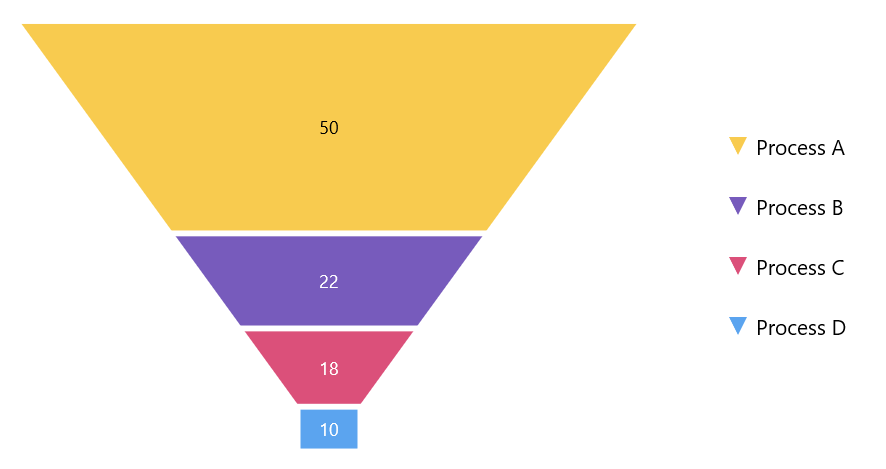
Conclusion
Thanks for reading! In this blog, we have seen the features of the new .NET MAUI Funnel Charts rolled out in the 2022 Volume 4 release. Information on other release enhancements is available on our Release Notes and What’s New pages. Try them out to visualize your data elegantly with better readability!
For questions, you can reach us through our support forum, support portal, or feedback portal. We are always happy to assist you!
Related blogs
MAUI — Playing MP3 Files
We will show how easily “raw” MP3 files are played in MAUI with native platform code.
When it comes to playing sound on mobile devices, there are several ways to do it. You can use a third-party library, such as https://github.com/jfversluis/Plugin.Maui.Audio, or the native methods provided by the operating system(AVFoundation on iOS or MediaPlayer on Android). In this post, we will focus on the native ways to play sound on Android and iOS devices.
Original issue from GitHub: https://github.com/dotnet/maui/discussions/7458#discussioncomment-4499507
Playing sound on Android devices.
On Android, you can use the MediaPlayer class to play sound. The MediaPlayer class can play audio and video files, and it provides a rich set of features such as seeking, looping, and volume control. Here is an example of how to use the MediaPlayer class to play a sound file:
As you can see the MediaPlayer class also provides a set of callback methods that you can override to receive notifications about the status of the media player, such as when the media player has finished playing the sound.
Playing sound on iOS devices.
On iOS, you can use the AVFoundation framework to play sound. The AVFoundation framework provides classes for playing, recording, and editing audio and video. To play a sound on iOS, you can use the AVPlayer class. Here is an example of how to use the AVPlayer class to play a sound file:
Like the MediaPlayer class on Android, the AVAudioPlayer class also provides a set of delegate methods that you can use to receive notifications about the status of the audio player, such as when the audio player has finished playing the sound.
MAUI Shared Code and Configuration.
The last thing is to add an interface for our partial class:
And don’t forget to add special construction to your csproj to build the right files in the right conditions 😅

Conclusion
In this post, we looked at the native ways to play sound on Android and iOS devices. We saw how to use the MediaPlayer class on Android and the AVPlayer class on iOS to play sound files. Both classes provide a rich set of features and notifications to make playing sound in your mobile app easy.
Bohdan Benetskyi is creating advanced CSS gradients for Xamarin, speak at conferences
https://twitter.com/bbenetskyy
If you want to implement photo capturing for your .NET MAUI app, you can use the built-in Media picker to both pick and capture photos and video. While this works great in most cases, it’s not very customizable. Say you have a back-end where you want to save uploaded images to, but you have limited space available or you want to save bandwidth, but all your users are on iPhone Pro models. You might want to scale down or compress the images. In that case, you could use the MediaPlugin from James Montemagno. The plugin is currently in beta for MAUI support, but it supports features such as resizing and setting compression quality and max width/height of your captured image.
This post will show you how you can get started with the plugin and I’ll be showing an example where you set the compression quality on your captured photo.
File -> New Project
First, create new .NET MAUI project. You can choose either .NET 6 or .NET 7 as target framework, as the plugin works with both. Search for the NuGet package Xam.Plugin.Media and check the “Prerelease” checkbox. Install version 6.0.1-beta.
Add the following platform specifics:
iOS
Add these permissions to your Info.plist file (under Platforms -> iOS) in order to be able to pick and capture photos and video:
<key>NSCameraUsageDescription</key><string>This app needs access to the camera to take photos.</string><key>NSPhotoLibraryUsageDescription</key><string>This app needs access to photos.</string><key>NSMicrophoneUsageDescription</key><string>This app needs access to microphone.</string><key>NSPhotoLibraryAddUsageDescription</key><string>This app needs access to the photo gallery.</string>Android
The plugin will add the necessary permissions automatically, but you will have to add a file provider setup.
Add this to your AndroidManifest.xml file (under Platforms -> Android) inside the <application> tags:
<provider android:name="androidx.core.content.FileProvider" android:authorities="${applicationId}.fileprovider" android:exported="false" android:grantUriPermissions="true"> <meta-data android:name="android.support.FILE\_PROVIDER\_PATHS" android:resource="@xml/file\_paths"></meta-data></provider>Add a new folder called xml into your Resources folder and add a new XML file called file\_paths.xml.
Add the following code into the file:
<?xml version="1.0" encoding="utf-8"?><paths xmlns:android="http://schemas.android.com/apk/res/android"> <external-files-path name="my\_images" path="Pictures" /> <external-files-path name="my\_movies" path="Movies" /></paths>Example
In this example, we’ll take a picture and set the desired compression quality. We’ll use a Slider to set the compression value. We’ll add a Button with an event handler to capture a photo first.
private async void OnTakePhotoClicked(object sender, EventArgs e){ var options = new StoreCameraMediaOptions { CompressionQuality = selectedCompressionQuality }; var result = await CrossMedia.Current.TakePhotoAsync(options); ...}The variable selectedCompressionQuality is the scaled value from the Slider and is a value between 0 and 100, where 0 is the maximum compression. The StoreCameraMediaOptions is the object we’ll use to set compression quality, resizing etc.
Add an Image to the XAML page. After the picture has been taken, we’ll set the result to the Image we added:
UploadedOrSelectedImage.Source = result?.Path;Depending on the picture, it might be hard to actually see the result of the compression. We’ll add a Label to the page that will display the resulting file size of the picture.
var fileInfo = new FileInfo(result?.Path);var fileLength = fileInfo.Length;FileSizeLabel.Text = $"Image size: {fileLength / 1000} kB";Since fileInfo.Length returns the length in bytes, we divide it by 1000 to get the result in kilobytes.
In the example, I also added a button for picking an existing photo, but setting the compression quality doesn’t have any effect on this.
Here’s how it all looks together:
Here’s the full example on GitHub, if you want to check it out.
The post Photo capturing options for your .NET MAUI app appeared first on Andreas Nesheim.
After a quick recap of our top "things" from 2022, we discuss Frank's holiday hack, a DIT smart thermostat powered by .NET and ML.NET!
Follow Us* Frank: Twitter, Blog, GitHub * James: Twitter, Blog, GitHub * Merge Conflict: Twitter, Facebook, Website, Chat on Discord * Music : Amethyst Seer - Citrine by Adventureface
⭐⭐ Review Us ⭐⭐
Machine transcription available on http://mergeconflict.fm
Support Merge Conflict
First things first, wishing you all a very happy, healthy, and prosperous new year 2023. As a recap, 2022 has been the most happening year for .NET MAUI: On the .NET MAUI front, more lined-up, service releases will continue on .NET 6 and .NET 7 stable channels and preview releases on .NET 8 (can be […]
In this post I share my experience of migrating my Mitawi app to .NET MAUI and discover promising opportunities to improve the efficiency of my mobile projects. Mitawi is an open source weather forecast application that provides accurate and up-to-date daily and weekly weather forecasts for locations around the world. Recently, it was ported to .NET MAUI to improve its performance and ease of ...
Merry Christmas!  I hope you are very well on these dates and you are happy with yours!
  It’s a time where we usually set goals for the next year with the aim of continuing to grow every day! And to contribute to your goals of practicing XAML, I have brought you this article as my last gift of the year, we will be exploring a Christmas UI by Anton Mishin obtained from Dribbble.
In addition to using XAML, in this article we will learn about the following topics:
XAML Styles
Adding external Fonts
Adaptation to light and dark mode
Shadows
Let’s start!
Let’s divide the original design into blocks
For a better understanding, I divided the original design into blocks, which are listed in the order in which we will be reproducing each one:
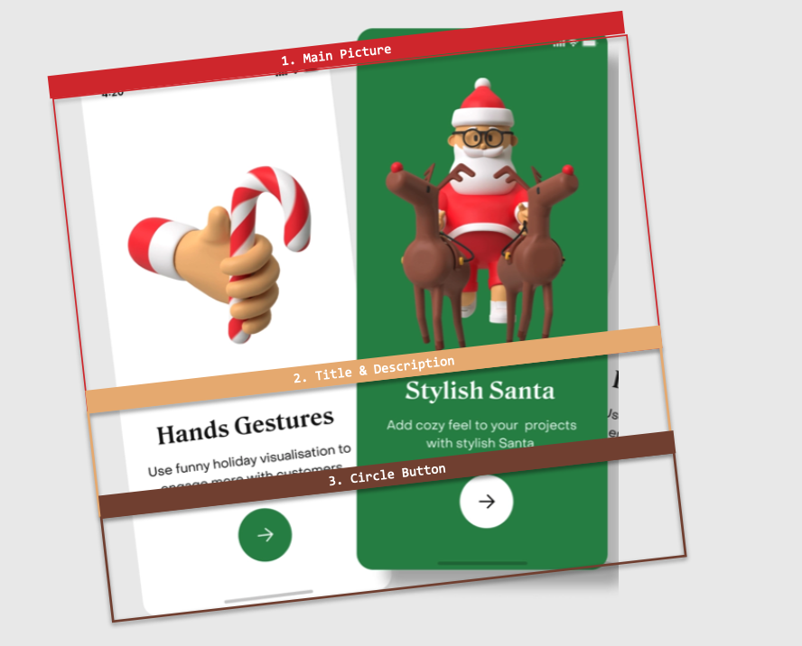

Both screens have the same visual elements, so I’ll explain them simultaneously in each block. We’ll start by creating the WalkingStickPage.xaml page which is composed by the following elements:
 BackgroundColor: It will have a background color that accommodates light and dark modes (this’s why you’ll see the AppThemeBinding markup extension). This time the light mode will have a white background color while the dark mode will have a dark green one. Add it to your Contentpage as follows:
 If you want to know more information about handling light and dark modes in your apps, I recommend the article “Handling Light and Dark Mode With .NET MAUI”.
- Did you notice that the dark green color is added as a StaticResource? This helps us to have the color in a single source, so maintenance will be easier because we only have to change it once. Go to Resources Styles Colors.xaml and add the following:
- Did you notice that the dark green color is added as a StaticResource? This helps us to have the color in a single source, so maintenance will be easier because we only have to change it once. Go to Resources
Main layout: We’ll use the VerticalStackLayout as the main layout and add its properties in a style. Let’s start by creating the style:
If you want to know more information about VerticalStackLayout, I recommend the article “Horizontal & VerticalStackLayout in .NET MAUI”.
Now, let’s add the layout and the main image to our .xaml:
Let’s see the results for both light and dark mode!
Also, let’s take the opportunity to create the other page (SantaClaus.xaml), this will benefit from the styles and resources created above (don’t forget to add the BackgroundColor to your Contentpage). We just have to add the following code:

This block contains a Title and a Description. At this point we’ll be focusing on implementing styles and we’ll be also adding external Fonts, as you can see below:
- Styles for Title and Description
- Adding external Fonts
We’ll add the fonts: Dutch-Bold for the Title and Antebas for the Description.
 Tip: If you don’t know the name of the font that your UI has, I recommend WhatTheFont, uploading a screenshot of your UI, this site will indicate the name of the font and other similar ones.
For more information on how to add external fonts I recommend the article “Adding Fonts in .NET MAUI”.
Let’s add them to the WalkingStickPage.xaml page: Add your labels with the new fonts and styles!
Let’s continue with the SantaClausPage.xaml page

Finally, we have a circular button with a shadow behind it!
Let’s start creating the Button style
Add the Button with Shadow
If you want to know more information about Shadows, I recommend the article “Adding Shadows with .NET MAUI”
This code is exactly the same for both WalkingStickPage.xaml and SantaClausPage.xaml, so I won’t add another block of code. Let’s see the results of both:
- WalkingStickPage.xaml
- SantaClausPage.xaml
And done!! In a few minutes we have practiced different interesting topics by replicating this Christmas UI! I hope you liked it!
” /> 


At Syncfusion, our ultimate goal is to deliver high-quality products that meet the needs of our customers. That is why we are continuously improving and fine-tuning our .NET MAUI controls to be even more effective than our Xamarin.Forms controls.
As of now, we have provided 34 controls in our .NET MAUI suite, and we will continue to add more in the future to help you build the best possible applications and improve your workflow.
We are grateful for your support for Syncfusion and your enthusiastic response to our products. Thank you for choosing Syncfusion, and we hope our .NET MAUI controls will continue to meet your needs and exceed your expectations.
This blog will explain our strategy and commitment to the .NET MAUI platform for 2023.
Syncfusion .NET MAUI available controls as of the end of 2022
We delivered what we hoped to in our 2022 roadmap a year ago. So far, we offer 34 controls and file-formats libraries, a few still in preview:
Note: We have also provided 24 built-in .NET MAUI value converters.
We have delivered 34 controls and file-format libraries in the last six releases, with an average of six controls per release. We’ve been concentrating on bringing you the most significant controls first, such as Charts, DataGrid, ListView, Scheduler, and PDF Viewer.
Overview of the 2023 release plans
We plan to introduce 18 new controls, several new features in the existing controls, and common enhancements in our .NET MAUI suite for 2023. Following is the complete list, which I will then break down by volume.
New .NET MAUI controls for 2023
| Buttons | Chat | CheckBox |
| Chips | Date Picker | DateTime Picker |
| Image Editor | Masked Entry | Numeric Entry (numeric updown) |
| Picker | Popup | Pull To Refresh |
| Radio Button | Segmented Control | Shimmer |
| Switch | Time Picker | TreeView |
Syncfusion releases
We proudly stand behind our products and will work with you under tight deadlines to help ship your products on time. Along with our four major releases each year (with a service pack release for each volume), you can update your products weekly through our weekly NuGet release.
Essential Studio for .NET MAUI: 2023 Volume 1
This will be the first major release of the year, which we’re currently scheduling for the end of March:
- Masked Entry: A custom entry control used to restrict input values to certain types of characters and numbers using mask characters or regex.
- Popup: An alert dialog or pop-up that can be displayed in a desired position.
- Shimmer: Used to improve the perceived responsiveness of an app by showing a shimmer effect when data is being loaded in the background.
Essential Studio for .NET MAUI: 2023 Volume 2
This will be the second major release of the year, which we’re tentatively scheduling for the end of June:
- Chips: A feature-rich control that presents information in an interactive and customizable layout. It arranges multiple chips in a layout and groups them for easy selection.
- Image Editor: A powerful image editing component. You can easily modify images by cropping and rotating them, and you can insert text and shapes on top of them.
- Numeric Entry: An extension of the entry control, it restricts the input of numeric values. It also supports culture-based formatting. You can add up-down buttons to create a numeric up-down control, allowing users to increase or decrease a numeric value using increment and decrement buttons.
- Switch: Users can turn an item on and off. The control provides an optional indeterminate state.
- TreeView: A list view representing hierarchical data in a tree-like structure with expand and collapse node options.
Essential Studio for .NET MAUI: 2023 Volume 3
This will be the third major release of 2023, coming to you at the end of September:
- Button: A custom button control. It has several built-in features such as UI customization, support for icons, pre-defined styles, toggle states, corner edge radii, and customization of different visual states’ appearance using the visual state manager.
- CheckBox: A selection control that allows users to select one or more options from a list of predefined choices.
- Date Picker: A fully customizable control for picking a date.
- DateTime Picker: A fully customizable control for picking a date and time.
- Picker: An item selector control that can be opened as a dialog.
- Pull To Refresh: A panel that can be pulled to refresh data in an app either through user interaction or programmatically.
- Radio Button: A selection control that allows users to select one option from a list of predefined choices.
- Time Picker: A fully customizable control to pick a time with a smooth, touch-friendly UI experience.
Essential Studio for .NET MAUI: 2023 Volume 4
This will be the final major release of the year and can be expected around the middle of December:
- Chat: Also known as a conversational UI, Chat provides a modern, conversational chatbot experience.
- Segmented Control: A linear segment composed of multiple segments, each functioning as a button.
Common enhancements
Toolbox support
We plan to provide a Visual Studio toolbox for the Syncfusion .NET MAUI platform to include our components in your .NET MAUI applications easily. This toolbox will allow you to effortlessly add the code for Syncfusion .NET MAUI components to your app at the appropriate place in the XAML design file.
Project templates
We intend to provide Visual Studio project templates for the Syncfusion .NET MAUI platform. They will allow you to develop a Syncfusion .NET MAUI app quickly by adding NuGet packages’ required controls.
Visual theme for Syncfusion .NET MAUI controls
We also plan to provide visual theming support for all our .NET MAUI controls with a uniform approach, delivering a consistent look and feel to your apps.
Our proposed approach is key-based theming for light and dark themes, which uses a separate ResourceDictionary class for each theme and loads the resources with the DynamicResource markup extension.
Missing features in existing controls
When compared to our Xamarin controls, you may notice that some features are missing in our .NET MAUI controls.
We have already included the most significant features in the released controls. But there are some other features that still need to be included.
We are committed to providing all of the features that our customers need and will release them in the subsequent two or three releases. Thank you for your patience and understanding as we continue to improve and expand our product offerings.
Enhancing accessibility
We are committed to improving the accessibility of our .NET MAUI controls to ensure that they are fully functional and easy to use for everyone. We are also actively checking the accessibility of our controls to ensure that they meet the needs of all users. Let us know if you come across something that can be improved.
Conclusion
We hope this roadmap has provided you with a clear understanding of our plans for our .NET MAUI controls in 2023. If there are any specific controls you would like to see in our future releases, please don’t hesitate to let us know by making a request. We will adjust our plans according to your feedback.
To help you migrate your app to the .NET MAUI platform, we have created exclusive migration documents for each control. These documents will guide you through the process of replacing the Xamarin.Forms controls with their .NET MAUI counterparts. We hope these resources will make it easier for you to take advantage of the new features and capabilities of .NET MAUI.
At Syncfusion, we are dedicated to building world-class products that exceed the needs and expectations of developers. Your support and feedback helped us to create market-leading Xamarin controls, and we are excited to continue this success with our .NET MAUI controls. Thank you for your continued support and enthusiasm for our products!
If you have questions, feel free to contact us through our support forum, support portal, or feedback portal. We are always happy to assist you!
Thanks for reading!
Related blogs
Frank drives into all of the complexities with android publishing including API targeting, AndroidX, and so much more.
Follow Us* Frank: Twitter, Blog, GitHub * James: Twitter, Blog, GitHub * Merge Conflict: Twitter, Facebook, Website, Chat on Discord * Music : Amethyst Seer - Citrine by Adventureface
⭐⭐ Review Us ⭐⭐
Machine transcription available on http://mergeconflict.fm
Support Merge Conflict

A rating UI control was one of the controls most requested by our mobile app developers. We at Syncfusion understand the requirement for this essential control and have now delivered the .NET MAUI Rating control in our 2022 Volume 4 release.
Let’s look at the key features of the new .NET MAUI Rating control and the steps to get started with it.
Key features
The .NET MAUI Rating control allows users to select a rating value from a group of visual symbols like stars. It can provide ratings for services provided or products, such as movies and software apps.
The control is packed with a lot of cool features, some of the most important being:
Rating precision
The .NET MAUI Rating control provides flexible precision support to handle full, half, or exact values.
Standard (full)
Users can select a rating from whole values.

Half
Users can select a rating to the nearest half-value.

Exact
Users can select precise values as their rating.

Rating shapes
The .NET MAUI Rating control provides four predefined shapes and a custom shape option.
Predefined shapes
The following predefined shapes are available:
- Star (default)
- Heart
- Circle
- Diamond
Custom rating shapes
You can load custom path shapes as rating items, too.

Rating with read-only mode
The .NET MAUI Rating control can also be used in a read-only mode. In this mode, users cannot interact with the control.

Customization
You can customize the item color, border color, spacing, and selection color of the .NET MAUI Rating control to fit the items to your app’s theme.
Custom item size
You can make the Rating control more accessible and enhance its accuracy by customizing the item size.
Custom items count
Specify the number of items displayed in the Rating control (e.g., how many stars).
Custom item spacing
You can also specify the amount of space between each item in the Rating control like in the following image.
Selected and unselected colors
Customize the fill colors for the selected and unselected states for items.
Custom items border color
An item’s border color can make its appearance more attractive. Customize the border color to highlight the selected and unselected items’ fill colors.
Custom stroke thickness
You can customize the stroke thickness of the item borders, like in the following image.
Getting started with .NET MAUI Rating control
We have seen the top features of the .NET MAUI Rating control. Let’s now see how to add it to your application.
Step 1: Create a .NET MAUI project.
First, create a .NET MAUI project.
Step 2: Add .NET MAUI Rating NuGet package.
Syncfusion .NET MAUI controls are available in the NuGet Gallery. To add the .NET MAUI Rating control to your project, open the NuGet package manager in Visual Studio, and search for Syncfusion.Maui.Inputs, and then install it.
Step 3: Register the handler.
In the MauiProgram.cs file, register the handler for Syncfusion core. Refer to the following code.
using Microsoft.Maui;using Microsoft.Maui.Hosting;using Microsoft.Maui.Controls.Compatibility;using Microsoft.Maui.Controls.Hosting;using Microsoft.Maui.Controls.Xaml;using Syncfusion.Maui.Core.Hosting;using Syncfusion.Maui.ListView.Hosting; namespace RatingSample{ public static class MauiProgram { public static MauiApp CreateMauiApp() { var builder = MauiApp.CreateBuilder(); builder .UseMauiApp<App>() .ConfigureSyncfusionCore() .ConfigureSyncfusionListView() .ConfigureFonts(fonts => { fonts.AddFont("OpenSans-Regular.ttf", "OpenSansRegular"); }); return builder.Build(); } }}
Step 4: Add the namespace.
Now, add Syncfusion.Maui.Inputs namespace in your XAML page.
<xmlns:rating="clr-namespace:Syncfusion.Maui.Inputs;assembly=Syncfusion.Maui.Inputs"/>
Step 4: Initialize the Rating control.
Then, add the .NET MAUI Rating control with the required optimal name using the included namespace.
<rating:SfRating x:Name="rating" />
Step 5: Set the number of rating items.
In this demo, we will create a rating application with 5 items. To do so, we use the ItemCount property to define the number of rating items.
<rating:SfRating ItemCount="5" />
Note: The default value of ItemCount is 5. You can customize it.
Step 6: Set the rating value.
Now, let’s programmatically assign a value to the Value property to display the selected rating. We are setting the display value as 3.
<rating:SfRating Value="3" />
Note: The default value of the Value property is 0.
Step 7: Set precision.
Finally, we need to choose if full, half or exact values can be chosen for ratings. This can be set using the Precision property. By default, the precision mode is Standard.
<rating:SfRating Precision="Standard" />
Refer to the following image.

Conclusion
Thanks for reading! In this blog, we have seen the new .NET MAUI Rating control features available in our 2022 Volume 4 release. You can download Essential Studio for .NET MAUI to evaluate this control. Check out our Release Notes and What’s New pages to see the other updates in this release.
If you need any clarification, please mention it in the comments section below! You can also contact us through our support forum, support portal, or feedback portal. We are always happy to assist you!
Related blogs
Syncfusion is happy to roll out our sixth set of new .NET MAUI controls and features in the Essential Studio 2022 Volume 4 release. We’ll explore them in this blog.
New .NET MAUI controls
In the 2022 Volume 4 release, we introduce the following .NET MAUI controls in preview mode:
.NET MAUI Backdrop Page
The .NET MAUI Backdrop Page comprises back and front layers. The back layer holds the actionable content (like navigation or filtration) relevant to the front layer.
Key features
- You can easily add the control to the navigation page. It supports seamless navigation and toolbar customizations.
- The height of the back layer auto-adjusts based on its content and you can expand the content to fit the screen.
- Curved and flat-edge shapes can be used for the front layer with custom corner radius options.
- Smooth animations can reveal and conceal the back layer content.

.NET MAUI Calendar View
The .NET MAUI Calendar View control provides a multi-view display to select one or more dates within specified ranges.
Key features
- Display dates in a month, year, decade, or century view mode.
- Select one or multiple dates.
- Limit visible dates by specifying the minimum and maximum dates.
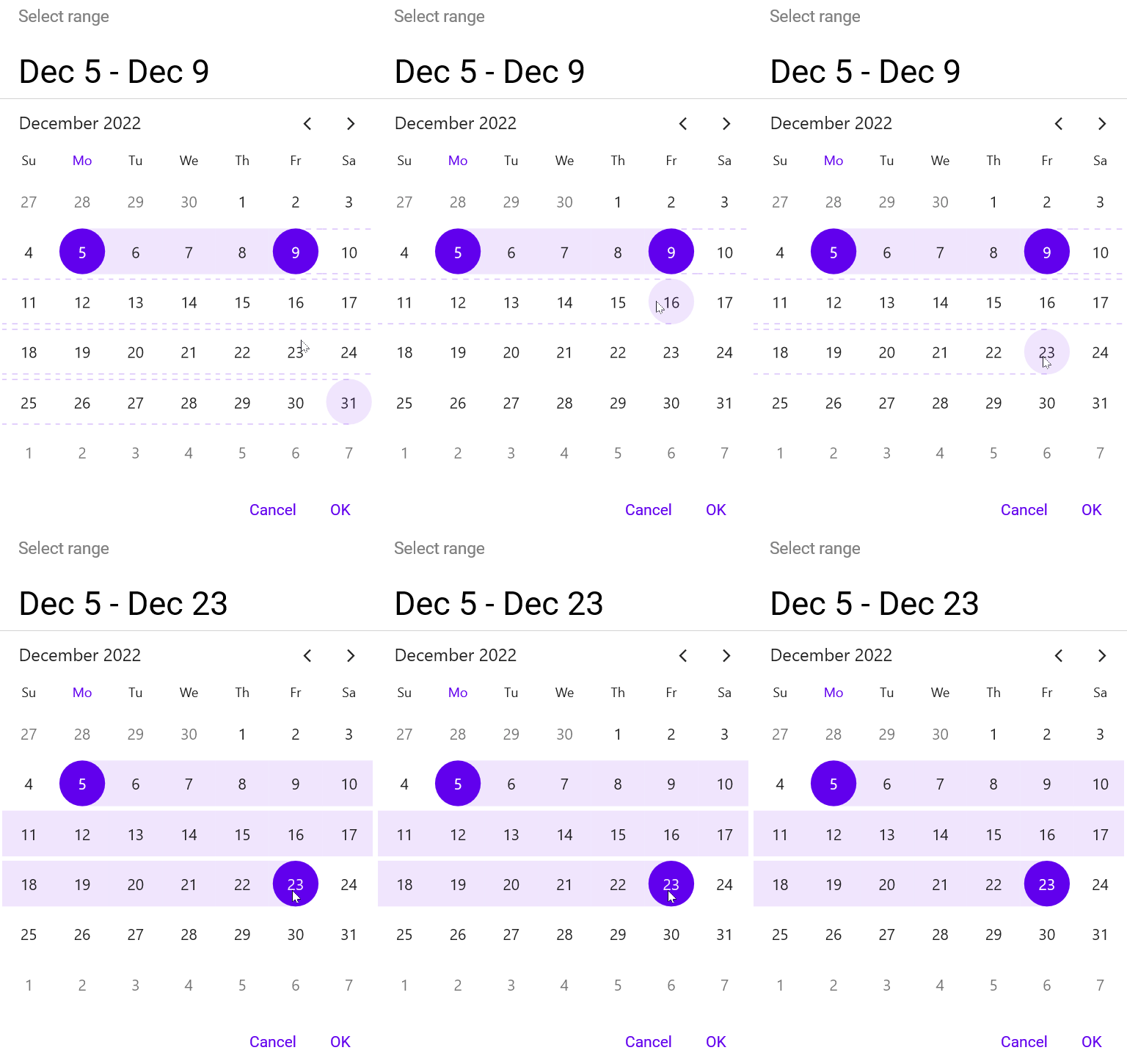
.NET MAUI Data Form
The .NET MAUI Data Form allows users to create and edit forms for any data easily, such as login, reservation, contact, and employee forms.
Key features
- Supports built-in editors based on the property type: text, password, multi-line, combo box, autocomplete, date, time, checkbox, switch, and radio group.
- Supports adding custom editors.
- Supports linear, grid, and grouping layouts.
- Supports data handling and validation.
- Supports customizing the appearance of labels, editors, groups, and headers.
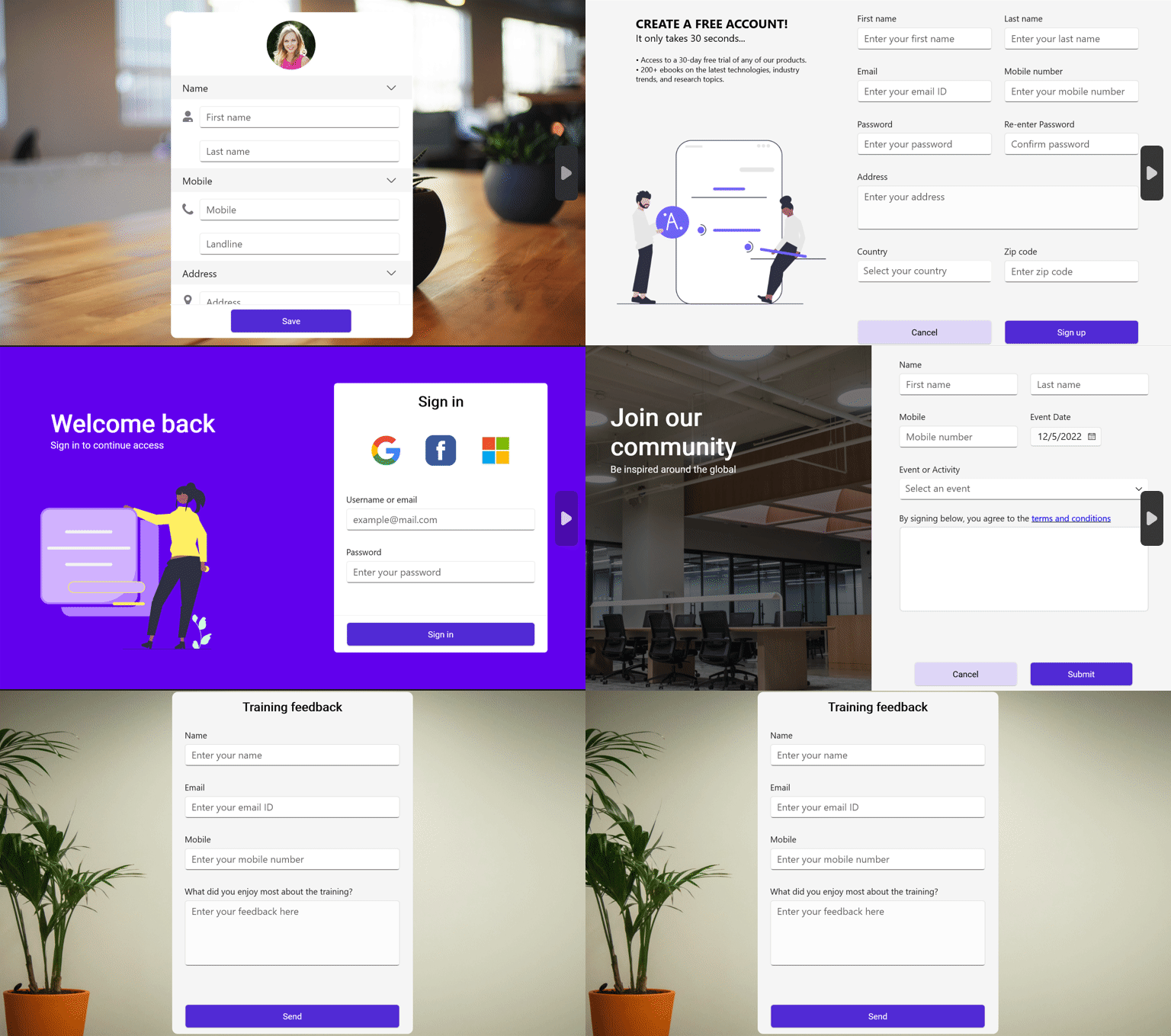
.NET MAUI Funnel Chart
The .NET MAUI Funnel Chart can be used to represent stages in a sales process and show the potential revenue for each stage.
Key features
- User-friendly and has excellent UI visualization.
- The end-user experience is greatly enhanced by including user interaction features such as callbacks, selection, and a tooltip.
- Legends display additional information about the chart series. A legend can be used to collapse series. Also, you can scroll a legend if items exceed the available bounds.
- Chart features such as titles, data labels, legends, and gap ratios can be customized.
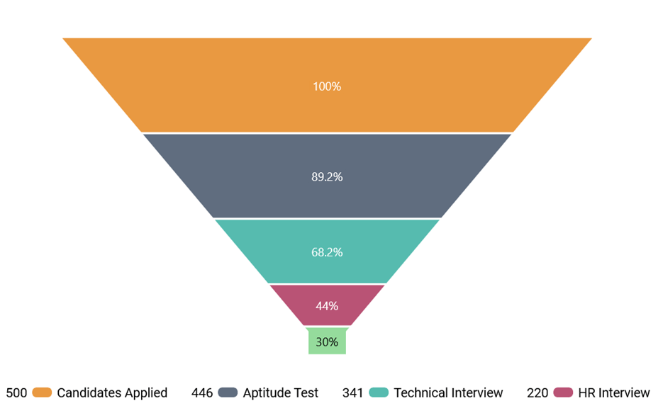
.NET MAUI PDF Viewer
The .NET MAUI PDF Viewer control lets you view PDF documents seamlessly and efficiently. It has highly interactive and customizable features such as magnification and page navigation.
Key features
- Easily scroll through the pages in a document with fluent experience. The pages will be rendered on demand when the scroll bar reaches the end of a page.
- The content of a PDF document can be efficiently zoomed in and out by pinching on touch devices or changing the zoom factor programmatically. You can also control zooming using keyboard shortcuts and mouse wheel actions.
- Navigate to a desired page instantly using the page navigation programmatically or by dragging the scroll bar in the UI.

.NET MAUI Pyramid Chart
The .NET MAUI Pyramid Chart visually presents hierarchical data in a pyramid-like structure with each segment a proportion of a total. An item’s width indicates its level in the hierarchy, and each item’s height corresponds to its value.
Key features
- User-friendly data representation and excellent UI visualization.
- User interaction features such as a tooltip and selection are included to enhance the end-user experience.
- Legends provide more information about the segments. A legend can be used to collapse the segments. You can also scroll a legend if items exceed the available bounds.
- Chart features like the titles, data labels, legends, and gap ratio can be customized.
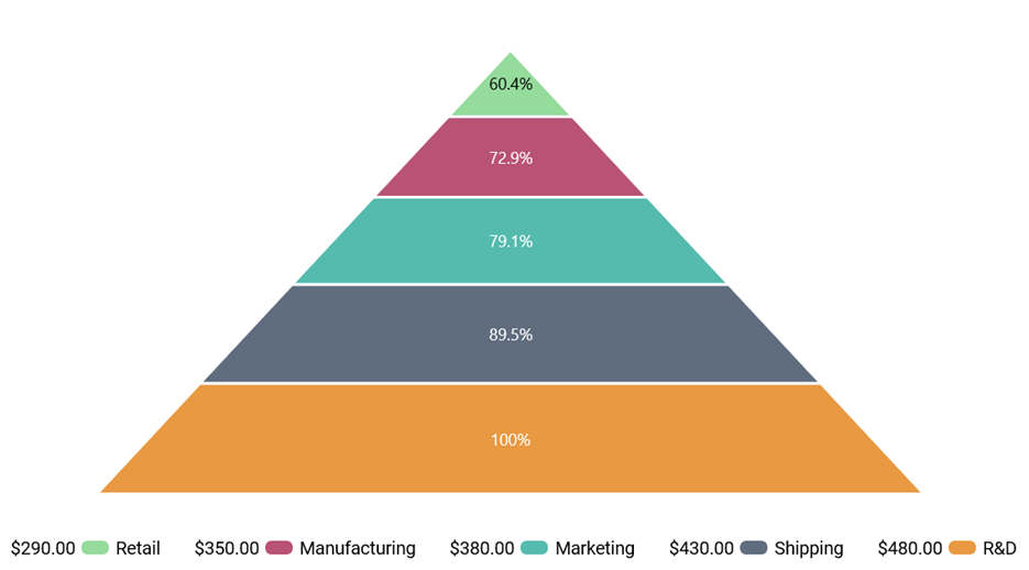
.NET MAUI Rating
The .NET MAUI Rating control allows us to display ratings with stars. You can customize the item size, spacing, and more.
Key features
- Decide the precision level of ratings.
- Determine the number of rating items to be displayed.
- Choose star, heart, circle, diamond, or custom shapes.

.NET MAUI Text Input Layout
The .NET MAUI Text Input Layout control allows us to add decorative elements such as floating labels, icons, and assistive labels on top of input controls such as Autocomplete, ComboBox, entry, and editor controls.
Key features
- Displays floating labels when the input view is in focus.
- Displays error labels.
- Supports filled, outlined, and none container types.
- Provides options to reserve space for assistive labels.
- Displays leading and trailing icons.
- Displays help labels.
- Displays maximum character count.
- Toggles password visibility.
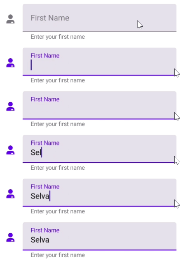
What’s new in our existing .NET MAUI controls?
We have seen the new controls introduced for our .NET MAUI suite in the 2022 Volume 4 release. Now, let’s look at the new features rolled out in our existing controls.
Cartesian Charts
The .NET MAUI Cartesian Chart control is gaining the following user-friendly features.
Legend template
You can customize each legend item using the ItemTemplate property in the ChartLegend class.
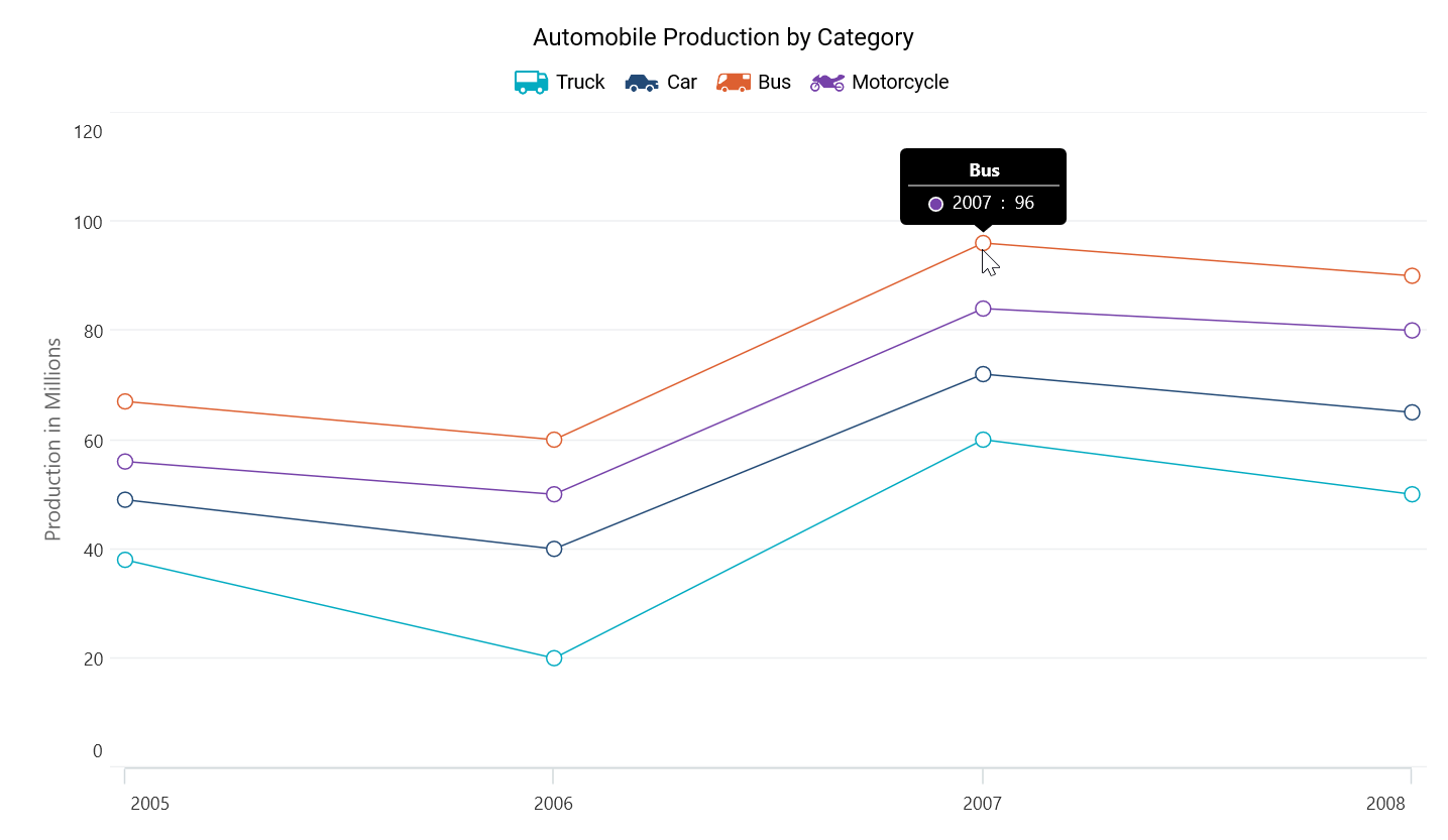
Trackball
A trackball allows you to track a data point closer to the cursor. The x-values are determined by the position of the vertical line in the axis, and the y-values are determined by the points touching the vertical line in the series.
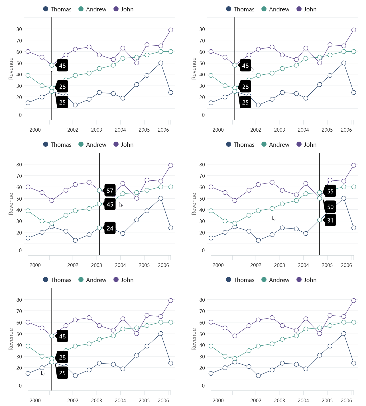
Data markers
Data markers are used to provide information about the data points. You can add a shape and label to adorn each data point in area, line, and spline charts.
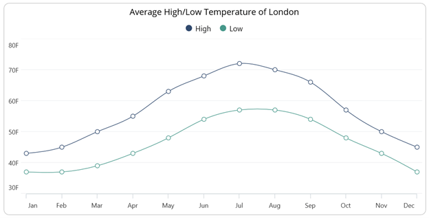
ListView
The .NET MAUI ListView gains these new features in this 2022 Volume 4 release.
EmptyView
This feature allows users to display text or a view in the ListView when there is no data to display.
Keyboard navigation
You can easily navigate among items using an external keyboard connected to an iOS device or a built-in keyboard in macOS.
Maps
The new features in the .NET MAUI Maps controls are as follows.
OpenStreetMap
OpenStreetMap (OSM) is a map of the world built by a community of mapmakers. It is free to use under an open license and allows users to view geographical data collaboratively from anywhere on earth.
From 2022 Volume 4 onward, our .NET MAUI Maps control provides support to render OpenStreetMap data in it.
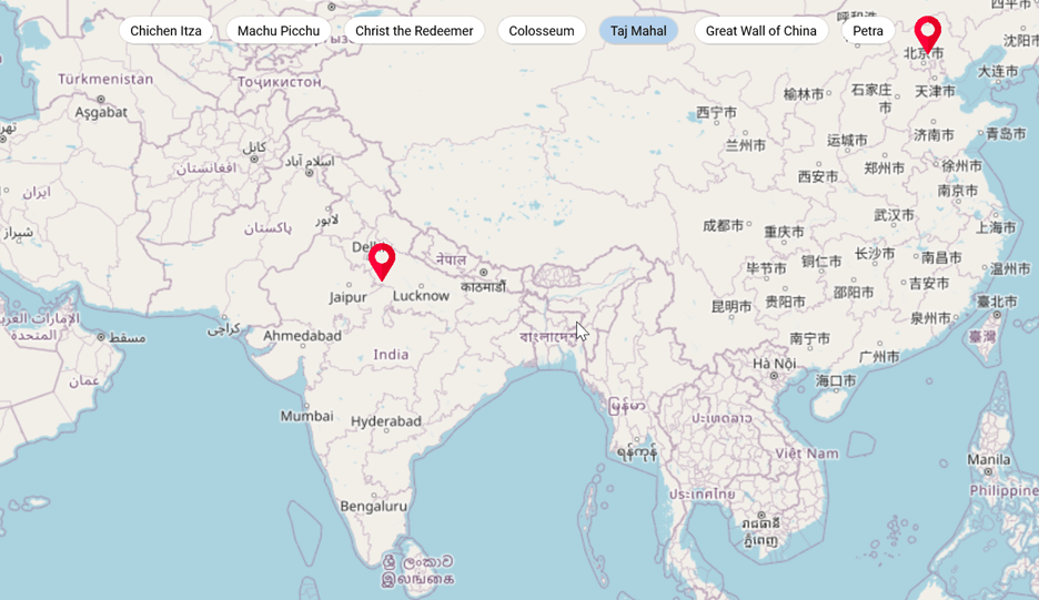
Shapes
Now, you can use various shape types, such as polygons, polylines, arcs, and lines, in the ShapeFileLayer.
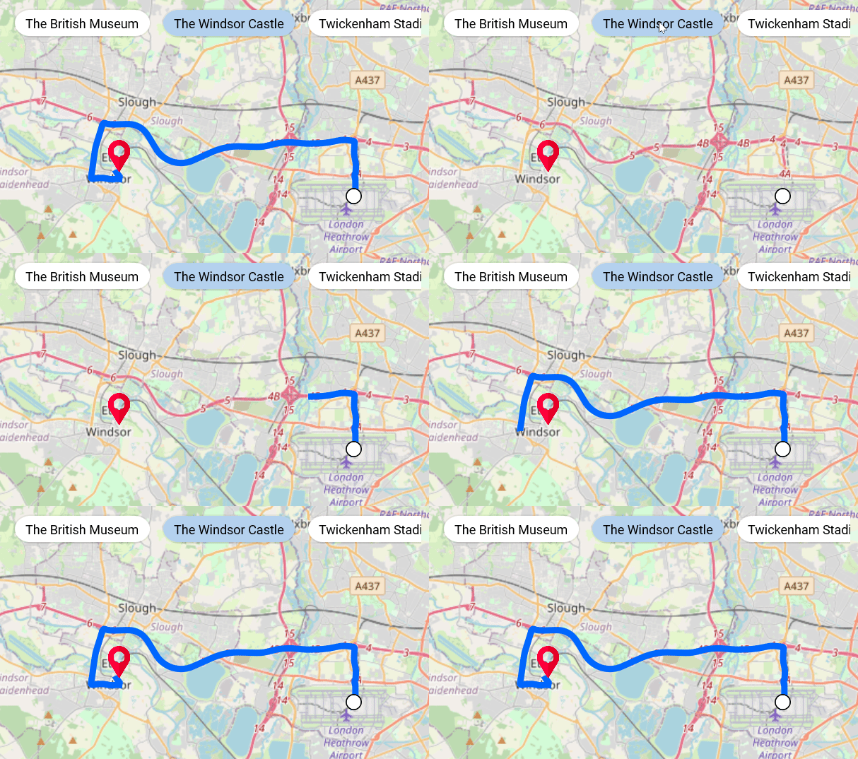
Range Selector / Range Slider / Slider
Deferred update
This feature will defer updating the data (data zoomed at the top) while thumbs are dragged continuously in the range axis. The data will be updated only after finishing the range selection.
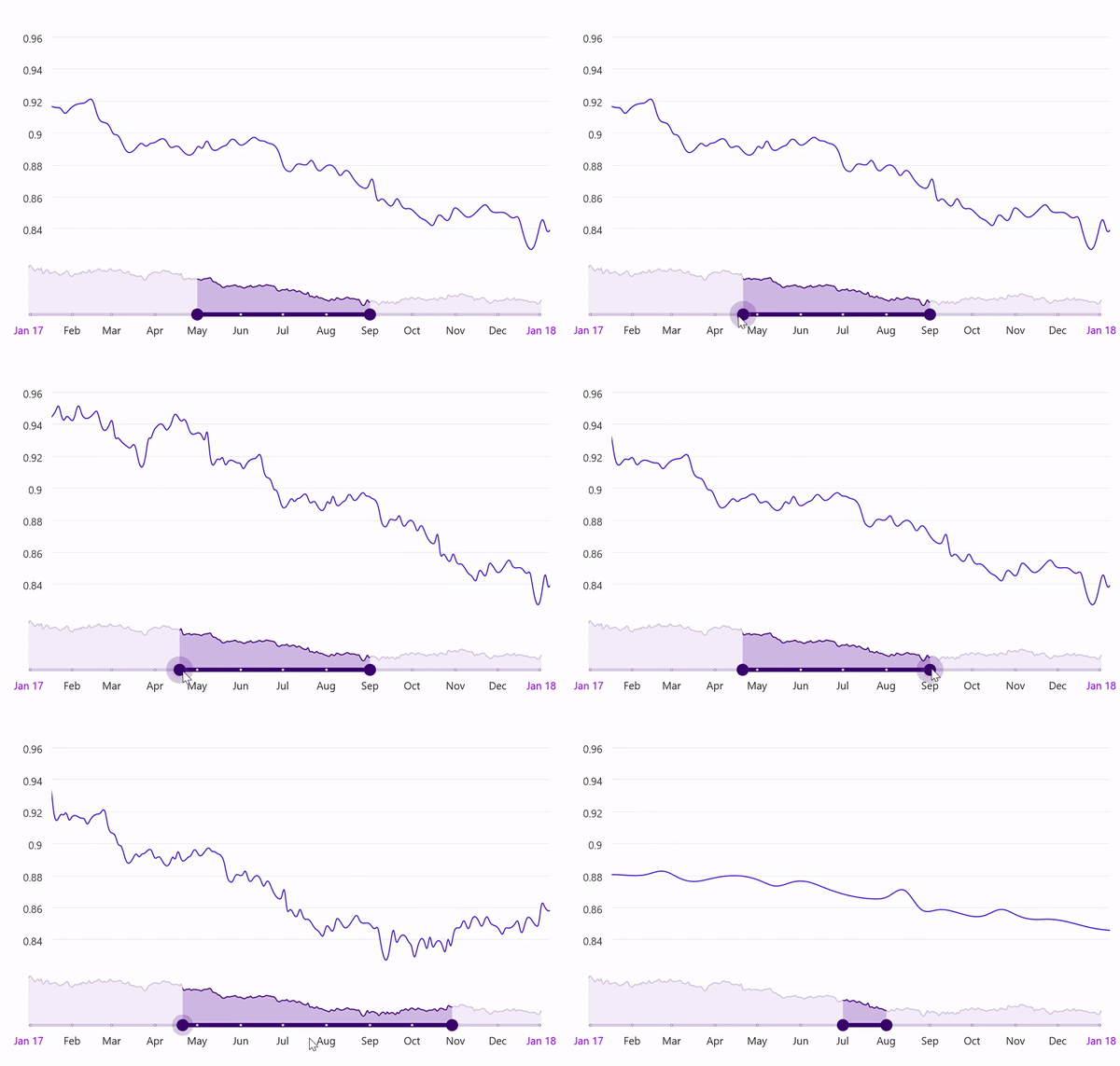
Auto interval
This feature automatically sets the interval between the values when the Interval, IntervalType, or DateFormat properties are not set.
Production-ready controls
The following .NET MAUI controls have been developed to meet industry standards and are now marked as production-ready for this 2022 Volume 4 release:
- Avatar View
- Badge View
- Effects View
- Tab View
- Signature Pad
- Slider
- Range Slider
- Range Selector
- DateTime Slider
- Date Time Range Slider
- Date Time Range Selector
- Scheduler
- Cartesian Chart
- Circular Chart
- DataGrid
- ListView
- Busy Indicator
- Progress Bar (Linear and Circular)
Conclusion
Thanks for reading! Syncfusion’s support for .NET MAUI is still a work in progress. This is the sixth set of .NET MAUI controls rolled out in our quarterly releases. More details on these controls and the Essential Studio 2022 Volume 4 release are available on our Release Notes and What’s New pages. Try out these latest updates and leave your feedback in the comments section below!
You can also contact us through our support forum, support portal, or feedback portal. We are always happy to assist you!
Related blogs
In collaboration with Luis Beltrán’s Advent Calendar 2022, today I’ll be teaching you step by step how to implement the TwoPaneView in .NET MAUI! Sometimes we have to adapt our design for foldable devices to give the best user experience, that’s why this is an important topic.
This article will have the following structure:
What is TwoPaneView?
Foldable device support
Inicial setup
Adding a TwoPaneView
Limitations
Let’s start!
What is TwoPaneView?
The TwoPaneView class represents a container with two views that can be next to or below each other, these views adjust to the size and position of the content in the available space on the device.
Foldable device support
Foldable devices include Microsoft Surface Duo and Android devices from other manufacturers. This makes it easier to adapt the design to different types of mobile or computer devices while adjusting screen size and orientations on the same device, including adapting to a hinge or crease on the screen.
Initial setup
To implement it in our App, you must apply some steps, which I explain below:
Add from NuGet Package the plugin: Microsoft.Maui.Controls.Foldable

Let’s add a TwoPaneView
Now that we have the above settings applied, let’s get started with the code implementation of the TwoPaneView!
The first thing you need is to add the namespace in the XAML!
Understanding the Foldable structure tags

- <foldable:TwoPaneView>: It is responsible for initializing the TwoPaneView.
- <foldable:TwoPaneView.PaneX>: Indicates each of the panels, inside you must add all the visual elements you need. Where it says “PaneX” you can replace it with both Pane1 and Pane2.
- PaneX: Here you can add the Pane you are working on which can be “Pane1” or “Pane2”. It is necessary to repeat the same labels from the previous step for each Pane.
Code implementation
TwoPaneView modes
We have some properties that help us organize the positions of each panel on our screen, let’s see each one of them:
Wide: By means of the WideModeConfiguration property the panels are placed horizontally on the screen.
Supported values allow to organice your panels are the follows:
- LeftRight: Organize the panels from Left to Right.
- RightLeft: Organize the panels from Right to Left.
- SinglePane: Only one panel to be seen.
Tall: By means of the TallModeConfiguration property the panels are placed vertically on the screen.
Supported values allow to organice your panels are the follows:
- BottomTop: Organize the panels from Bottom to Top.
- TopBottom: Organize the panels from Top to Bottom.
- SinglePane: Only one panel to be seen..
Please note that only one of these modes can be active.
Control TwoPaneView when it’s only on one screen
- MinTallModeHeight is responsible to establish the minimum height the control must be to enter Tall mode.
- MinWideModeWidth is responsible to establish the minimum width the control must be to enter Wide mode.
- Pane1Length / Pane2Length sets the width of Pane1 and Pane 2 respectively to Wide mode. The height of both Panes in Tall mode and have no effect in SinglePane mode.
Properties that apply when on one screen or two
- TallModeConfiguration Sets two options, the first is when the Top/Bottom layout is in High mode, the second if you only want a single pane to be visible as defined by TwoPaneViewPriority.
- WideModeConfiguration Sets two options, the first is when in Wide mode, the Left/Right arrangement, the second if you only want a single pane to be visible as defined by TwoPaneViewPriority.
- PanePriority determines the Pane to display (Pane1 or Pane2) when in SinglePane mode.
Limitations
If the TwoPaneView is spanned across a hinge or fold the properties when it’s only on one screen have no effect.
Only fits Android foldable devices that introduced the Jetpack Window Manager API provided by Google (such as Microsoft Surface Duo).
On all other platforms and devices, it acts as a responsive and configurable split view that can dynamically display one or two panes, proportionally sized on the screen.
Thanks for reading!
See you next time!
Spanish article: https://es.askxammy.com/twopaneview-layout-en-net-maui/
Android 12 has a few surprises for mobile developers, and its new splash screen is one of the most notorious. In previous versions of the SDK, you needed to create an activity if you wanted to customize the splash screen. However, we now have access to the splash screen API to customize the screen. You can read more about it here and here.
In this post I will show Xamarin mobile developers how to use the new properties to include an icon on the splash screen. Also, I will demonstrate how to perform a basic animation on the splash screen so we can test out this new feature.
Android Icon and Resources
First, we need the appropriate images set in the app. You can use the default Xamarin.Forms icons, but I’ll use Trailhead’s logo :). I’ll begin by replacing the icons. I’m using IconKitchen to generate all the files for every screen size quickly:
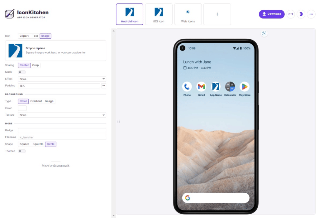
Download the zip file, and after you are done replacing the resources, your solution should look something like this:

Now, there are additional changes we need to make. In our style.xml file, we need to define the splash screen properties for our theme:

“windowSplashScreenBackground” is the background color for the splash screen. It will attempt to calculate it from “windowBackground” if we don’t set it.
“windowSplashScreenAnimatedIcon” is what interests us in this example. It replaces an icon in the center of the starting window. If the object is animated and drawable, it will also play the animation while showing the starting window.
Remember, these values only work for the API level 31 or newer and will be ignored on older versions.

Android Animation
Now, let’s get into the more complicated part. You can perform the animation with a png, but I would advise against it because animations usually transform and distort the content and you might not get the desired result. Different-sized PNGs were meant to be used in earlier versions of Android when nobody knew how many screen sizes manufacturers would create. SVGs are the safest option here because it won’t matter on which screen it’s drawn; it will scale to fit it perfectly.
Having said that. If you don’t have an SVG file, you can either ask your local designer to create one, or you can use FreeConvert to generate one (you might need to clean the result a bit, though).
The Android splash screen dimensions follow the same specifications as Adaptive icons. If you need to adjust your image, you can use a free editor, like Method Draw.

Open Shapeshifter and import your SVG file. If it’s not in a group, you must create one and move your layers under that group. Notice there’s a small clock to the right of each layer. That’s where we can set an animation for our SVG. Sadly, you can only add an alpha transition to the vector, hence you need to create a group. Groups can create rotations, scaling, translations, and so on. You can read more about it here.

First, check the dimensions of your vector and set the pivot by half of the height and width in your group. This will make the animation origin in the center.


Now you can set the animation in the group. In this example, I’ve decided to use a rotation animation with an alpha transition.
Once you are happy with the result, export it as an “Animated Vector Drawable” and add it to your Android project.

Don’t forget to replace the old icon with your new animated icon. Also, you might need to add the animation duration:
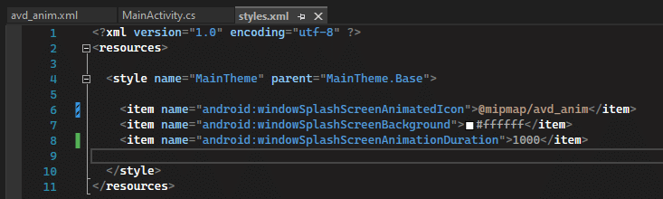
“windowSplashScreenAnimationDuration” was introduced in API 31. It was meant to be used to set the animation duration. Sadly, it had a short life. It was deprecated in API 33 because the app can infer the animation duration based on the animated vector drawable you’ve set.
Now let’s see the result!

Not so bad, huh? Now you know how to include animations in your splash screens.
BONUS TRACK: Branding
Want to add a branding image to the splash screen? Sure! You only need to set the “android:windowSplashScreenBrandingImage” property:
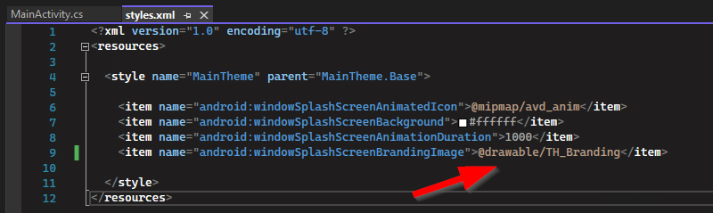
And this is the outcome:
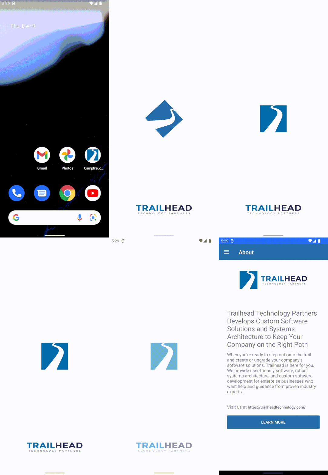
I hope this can help you. As always, you can check the source code here. Happy coding!
The post Android Splash Screen Logos and Animations with Xamarin appeared first on Trailhead Technology Partners.
James gets into maps and drawing all sorts of points and lines. We discuss.
Follow Us* Frank: Twitter, Blog, GitHub * James: Twitter, Blog, GitHub * Merge Conflict: Twitter, Facebook, Website, Chat on Discord * Music : Amethyst Seer - Citrine by Adventureface
⭐⭐ Review Us ⭐⭐
Machine transcription available on http://mergeconflict.fm
Support Merge Conflict
Links:
- Avenza Maps - Discover Hiking, Recreation, Topographic & Park Maps With Offline Use on iOS and Android
- Mapsui
- map.xaml.cs
.NET Conf 2022 es la conferencia más grande de Microsoft con oradores de todo el mundo. En esta ocasión hicimos una charla en las Oficinas de Microsoft Dominicana para todo la comunidad .NET con el objetivo de brindar un resumen con los apartados más importantes mostrados en la conferencia.
Grabaciones
Tuvimos tres sesiones increíbles de la comunidad que nos mostraron todo tipo de cosas interesantes mostradas en el .NET Conf 2022. Puede ver todas las sesiones ahora mismo en YouTube.
¡Vamos a ello!
Web
Luis Matos: CEO de Malla Agency y Microsoft MVP. Luis tiene más de 10 años de experiencia en el área de desarrollo y cuenta con un blog con mucho contenido interesante que es visitado por miles de personas.
Móvil
Leomaris Reyes: Ingeniera en Software de la República Dominicana. Ganadora del premio de Microsoft MVP en la categoría de Developer Technologies por cuatro años consecutivos. Estudiante líder de equipo en Platzi.
Cloud
Victor S. Recio: Es un Ex-Microsoft, con el puesto de Cloud Solution Architect (CSA) para la Rep. Dominicana, en la actualidad trabaja como Sr. Cloud Engineer/DevOps con foco en modernización, migración y aplicación de tecnologías de Contenedores para clientes en USA y Caribe.
Fotos y presentaciones
Puedes ver todas las fotos y presentaciones en el siguiente enlace.
Conclusión
Disfruta. Si quieres que profundicemos en esta noticia házmelo saber en mi Twitter, estoy muy activo allí.
Recuerde que sus interacciones son las que me ayudan a saber a dónde dirigir el contenido. Al final, la idea es ayudar en todo lo que podamos.
Espero que encuentre útil este vídeo. Un abrazo y hasta la próxima.
The post Dotnet Conf Recap 2022 appeared first on Luis Matos.
David Ortinau, Program Manager .NET and voice of .NET MAUI discusses MAUI as a platform, Blazor Hybrid, Community Toolkits, as well as what’s on the road map for .NET MAUI.
What’s your opinion: XAML vs. Fluent C# for new MAUI programmers?

Please note that something went wrong with distributing this podcast and so I am reposting.
David Ortinau, Program Manager .NET and voice of .NET MAUI discusses MAUI as a platform, Blazor Hybrid, Community Toolkits, as well as what’s on the road map for .NET MAUI.
What’s your opinion: XAML vs. Fluent C# for new MAUI programmers?

Show Notes.NET Conf happened, it was amazing, and David, James and Matt will bring you up to date! The latest MAUI, .NET, and Azure are all coming at you.
Latest News* .NET Conf * .NET Student Zone
Azure News* Azure bicep
Azure Service of the Month* Form recognizer
Follow Us:
- James: Twitter, Blog, GitHub, Merge Conflict Podcast
- Matt: Twitter, Blog, GitHub
- David: Twitter, Github
We can now identify Pointer Gestures in .NET MAUI ! Which will allow us to add interactions, make decisions based on what our user is doing and in this way to be able to improve their experience! In this article we will learn to implement them in a very fast and easy way!
Let’s start!
Starting with Pointer Gestures
Pointer Gesture Recognizer allow us to detect when the pointer enters, exists and moves within an assigned view.
Let’s look at each of these gestures in a visual example:
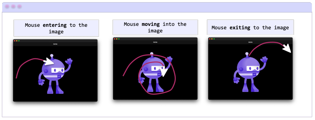
Enter: It allows us to detect that the pointer has entered the bounding area of the view.
Move: It allows us to detect that the pointer is moving inside the bounding area of the view.
Exist: It allows us to detect that the pointer has exited the bounding area of the view.
Commands & events
Commands
The PointerGestureRecognizer class has defined Commands for each of the gestures included above, which are invoked once the mouse enters, exits or moves over the element that was assigned, below I show you a table where these commands are named:
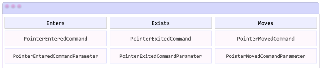
Events
But also the PointerGestureRecognizer class defines three events that are raised when the pointer enters, moves, or exits the bounded area of the view.

Now let’s practice!
Now that you have all the needed knowledge, we just need to know how to translate this into code, it’s very easy, let’s see below:
Finally, let’s add your events!
Getting the gesture position
We can also get the position at which a pointer gesture occurred. You can do it with the GetPosition method on a PointerEventArgs object. This one accepts an Element? argument, and returns the position as a Point?. Let’s take a closer look at these elements:
Element?: Defines the element with respect to which the position should be obtained. Providing a null value as this argument means that the GetPosition method returns a Point?
Point?: Defines the position of the pointer gesture within the window.
Let’s see an example:
 Important to know:
.NET MAUI have defined the PointerOver Visual State which allows us to change the appearance of a view when the pointer is over it. You can view more information here.
Pointer gesture recognition is only supported on iPadOS, Mac Catalyst, and Windows.
Thanks for ready!
See you next time!
References: https://es.askxammy.com/organizando-elementos-con-zindex-en-net-maui/
Spanish article: https://askxammy.com/pointer-gesture-recognizer-in-net-maui/
The agenda view in the Syncfusion .NET MAUI Scheduler is the best tool for task planners to create effective business scheduling software.
It shows appointments in a list format for each date between the minimum and maximum dates, grouped by week. Using the agenda view, you can show a list of appointments for a day with a day, week, or month header. You can customize each header with unique styles. Localization, globalization, and customization are also supported in this comprehensive feature set.
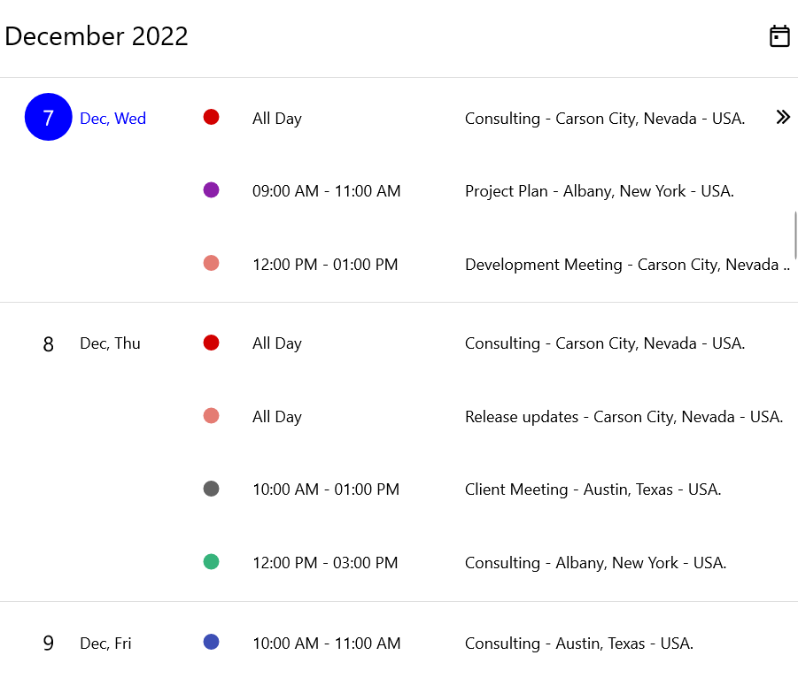
In this blog, we are going to explore the user-friendly features of the .NET MAUI Scheduler’s agenda view with code examples.
Note: If you are new to our .NET MAUI Scheduler control, please refer to its getting started documentation before proceeding.
Different UIs
The agenda view displays the user interface in the following two ways:
- Android and iPhone apps: Display appointments with date, week, and month headers.
- Windows and Mac apps: Display appointments with only the date header.
|
|
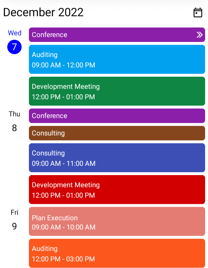
Customizing the .NET MAUI Scheduler’s agenda view
The agenda view allows you to customize the appointment view, header views, and date and day formats. Let’s see how to customize them with code examples.
Month header customization
The month header in the .NET MAUI Scheduler shows the month and year at the start of a new month. You can customize the format and style of the month header in the Agenda View using the MonthHeaderSettings property.
The SchedulerMonthHeaderSettings class contains the properties that allow you to customize the month header in the agenda view. This can be done by setting unique values for the DateFormat, Height, TextStyle, and Background properties in the SchedulerMonthHeaderSettings.
Refer to the following code example.
XAML
<scheduler:SfScheduler x:Name=”Scheduler” View=”Agenda”> <scheduler:SfScheduler.AgendaView> <scheduler:SchedulerAgendaView> <scheduler:SchedulerAgendaView.MonthHeaderSettings> <scheduler:SchedulerMonthHeaderSettings DateFormat=”MMM yyy” Height=”200” Background=”LightGreen” /> </scheduler:SchedulerAgendaView.MonthHeaderSettings> </scheduler:SchedulerAgendaView> </scheduler:SfScheduler.AgendaView></scheduler:SfScheduler>
C#
SchedulerTextStyle textStyle = new SchedulerTextStyle(){ TextColor = Colors.Red, FontSize = 12,}; SchedulerMonthHeaderSettings monthHeaderSetting = new SchedulerMonthHeaderSettings(){ DateFormat = “MMM yyy”, Height = 200, TextStyle = textStyle, Background = Brush.LightGreen}; this.Scheduler.AgendaView = new SchedulerAgendaView(){ MonthHeaderSettings = monthHeaderSetting,};
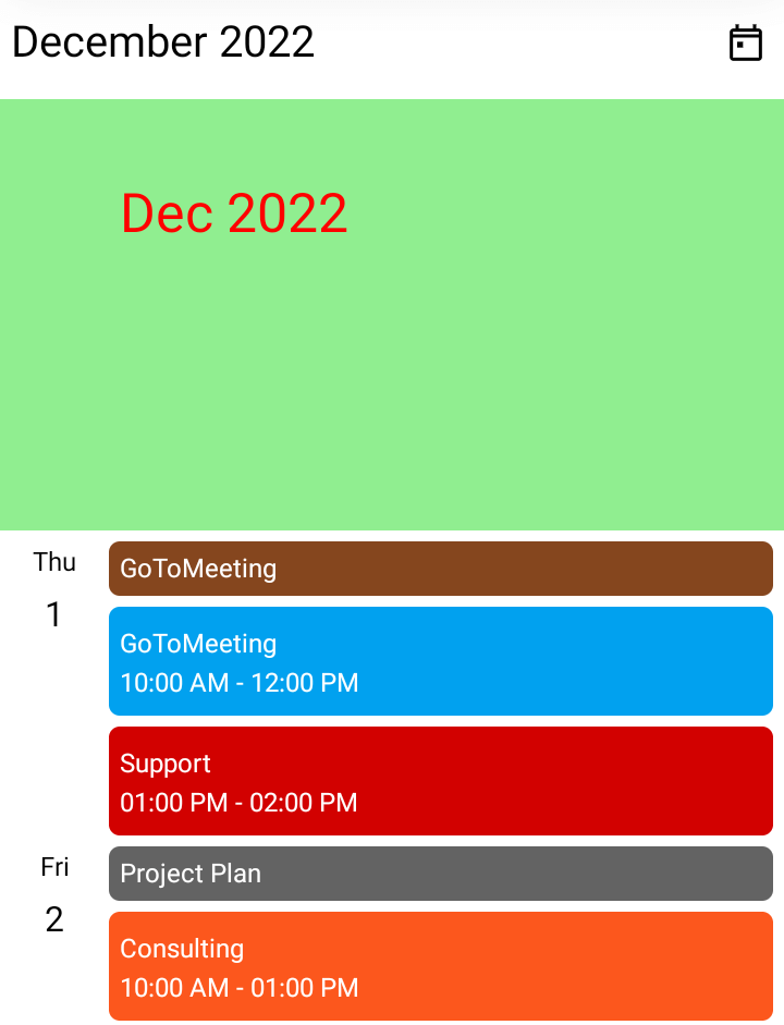
Also, you can customize the month header by replacing it with a custom header using the MonthHeaderTemplate property in the AgendaView.
Refer to the following code example.
XAML
<scheduler:SfScheduler x:Name=”Scheduler” View=”Agenda”> <scheduler:SfScheduler.AgendaView> <scheduler:SchedulerAgendaView> <scheduler:SchedulerAgendaView.MonthHeaderTemplate> <DataTemplate> <Grid> <Label x:Name=”label” HorizontalOptions=”Center” Background=”LightGreen” VerticalOptions=”Center” TextColor=”Black” FontSize=”25” Text=”{Binding StringFormat=’{0:MMMM yyyy}’}” /> </Grid> </DataTemplate> </scheduler:SchedulerAgendaView.MonthHeaderTemplate> </scheduler:SchedulerAgendaView> </scheduler:SfScheduler.AgendaView></scheduler:SfScheduler>
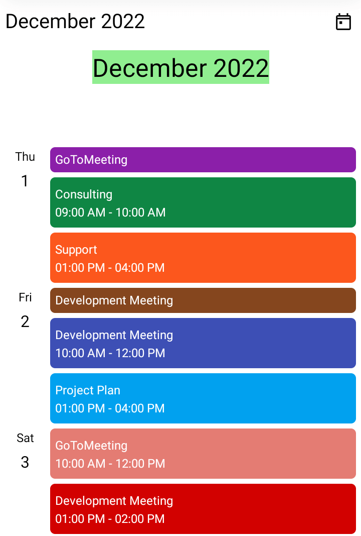
Day header customization
The day header is the UI shown on the left side of the agenda view. It shows the date and day of the appointment view. It is shown on the agenda view only when a date has an appointment. You can customize the format and style of the day header in the AgendaView using the DayHeaderSettings property.
The SchedulerDayHeaderSettings class contains the properties that allow you to customize the day header on the agenda view. This can be done by setting different values to the Background, DayFormat, Width, DayTextStyle, and DateTextStyle properties in the SchedulerDayHeaderSettings.
Refer to the following code example.
XAML
<scheduler:SfScheduler x:Name=”Scheduler” View=”Agenda”> <scheduler:SfScheduler.AgendaView> <scheduler:SchedulerAgendaView> <scheduler:SchedulerAgendaView.DayHeaderSettings> <scheduler:SchedulerDayHeaderSettings DayFormat=”MM, ddd” Background=”LightGreen”/> </scheduler:SchedulerAgendaView.DayHeaderSettings> </scheduler:SchedulerAgendaView> </scheduler:SfScheduler.AgendaView></scheduler:SfScheduler>
C#
SchedulerTextStyle textStyle = new SchedulerTextStyle(){ TextColor = Colors.Red, FontSize = 12,}; SchedulerDayHeaderSettings dayHeaderSetting = new SchedulerDayHeaderSettings(){ DayFormat = “MM, ddd”, Background = Colors.LightGreen, DayTextStyle = textStyle, DateTextStyle = textStyle,}; this.Scheduler.AgendaView = new SchedulerAgendaView(){ DayHeaderSettings = dayHeaderSetting,};
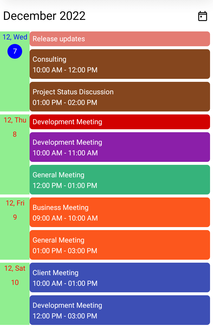
Week header customization
The week header shows the first and last dates of a week at the start of the week. You can customize the format and style of the week header in the AgendaView using the WeekHeaderSettings property.
The SchedulerWeekHeaderSettings class contains the properties that allow you to customize the week header on the agenda view. This can be done by setting different values to the DateFormat, Height, TextStyle, and Background properties in the SchedulerWeekHeaderSettings class.
Refer to the following code example.
XAML
<scheduler:SfScheduler x:Name=”Scheduler” View=”Agenda”> <scheduler:SfScheduler.AgendaView> <scheduler:SchedulerAgendaView> <scheduler:SchedulerAgendaView.WeekHeaderSettings> <scheduler:SchedulerWeekHeaderSettings DateFormat=”dd, ddd” Height=”100” Background=”LightGreen” /> </scheduler:SchedulerAgendaView.WeekHeaderSettings> </scheduler:SchedulerAgendaView> </scheduler:SfScheduler.AgendaView></scheduler:SfScheduler>
C#
SchedulerTextStyle textStyle = new SchedulerTextStyle(){ TextColor = Colors.Red, FontSize = 12,}; SchedulerWeekHeaderSettings weekHeaderSetting = new SchedulerWeekHeaderSettings(){ DateFormat = “dd, ddd”, Height = 100, TextStyle = textStyle, Background = Brush.LightGreen}; this.Scheduler.AgendaView = new SchedulerAgendaView(){ WeekHeaderSettings = weekHeaderSetting,};
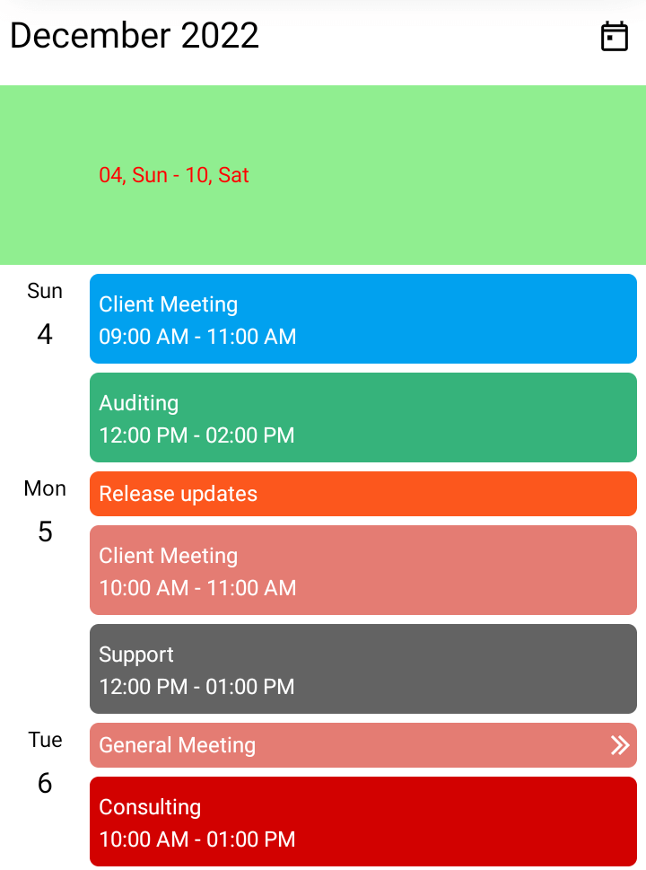
Appointment text customization
Also, you can customize the agenda view’s appointment text style using the AppointmentTextStyle property in the SfScheduler. Refer to the following code example.
XAML
<scheduler:SfScheduler x:Name=”Scheduler” View=”Agenda”/>
C#
SchedulerTextStyle appointmentTextStyle = new SchedulerTextStyle(){ TextColor = Colors.Yellow, FontSize = 12,}; this.Scheduler.AppointmentTextStyle = appointmentTextStyle;
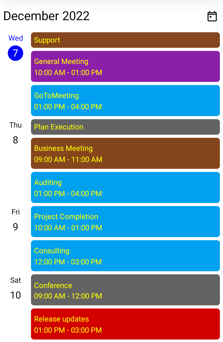
Conclusion
Thanks for reading! In this blog post, we had a quick overview of the key features of the agenda view in the Syncfusion .NET MAUI Scheduler. Use these marvelous features to effectively schedule and manage your appointments!
Also, try out our .NET MAUI controls demos on GitHub and share your feedback or ask questions in the comments section below.
If you are not yet a Syncfusion customer, you can try our 30-day free trial to see how our components can enhance your projects.
You can also reach us through our support forum, support portal, or feedback portal. We are always happy to assist you!
Related
 | https://github.com/roubachof/Sharpnado.Tabs |
 |
You may know the LazyView, which builds lazily the views it wraps.
Doing so, it reduces your page loading time, especially if you have complex pages.
So the lazy view is great for reducing your loading time, but not so great to keep your app responsive. Let's consider this design:
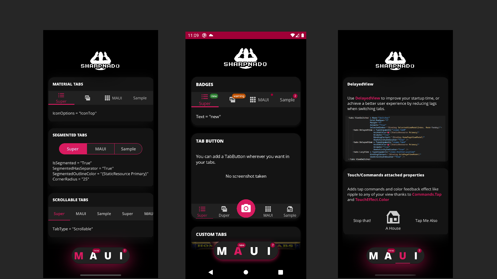
You can see that each tab has a lot of views and UI effects embedded.
Here is the matching xaml:
<Grid Margin="16,0" RowDefinitions="120,*,95"> <ContentView ZIndex="100"> <ContentView.Background> <LinearGradientBrush StartPoint="0,0" EndPoint="0,1"> <GradientStop Offset="0.2" Color="{StaticResource Black}" /> <GradientStop Offset="1" Color="Transparent" /> </LinearGradientBrush> </ContentView.Background> <Image Margin="0,20" Source="logo.png"> <Image.Shadow> <Shadow Brush="{StaticResource Black}" Opacity="0.9" Radius="30" Offset="0,10" /> </Image.Shadow> </Image> </ContentView> <tabs:ViewSwitcher x:Name="Switcher" Grid.RowSpan="3" Margin="0" Animate="True" SelectedIndex="{Binding SelectedViewModelIndex, Mode=TwoWay}"> <tabs:LazyView x:TypeArguments="views:TabM" AccentColor="{StaticResource Primary}" Animate="True" BindingContext="{Binding HomePageViewModel}" UseActivityIndicator="True" /> <tabs:LazyView x:TypeArguments="views:TabA" AccentColor="{StaticResource Primary}" Animate="True" UseActivityIndicator="True" /> <tabs:LazyView x:TypeArguments="views:TabU" AccentColor="{StaticResource Primary}" Animate="True" UseActivityIndicator="True" /> <tabs:LazyView x:TypeArguments="views:TabI" Animate="True" /> </tabs:ViewSwitcher> <ContentView Grid.Row="2"> <ContentView.Background> <LinearGradientBrush StartPoint="0,0" EndPoint="0,1"> <GradientStop Offset="0.0" Color="Transparent" /> <GradientStop Offset="0.5" Color="{StaticResource Black}" /> </LinearGradientBrush> </ContentView.Background> <tabs:TabHostView WidthRequest="250" HeightRequest="60" Padding="20,0" HorizontalOptions="Center" BackgroundColor="{StaticResource Gray900}" CornerRadius="30" IsSegmented="True" Orientation="Horizontal" SegmentedOutlineColor="{StaticResource Gray950}" SelectedIndex="{Binding Source={x:Reference Switcher}, Path=SelectedIndex, Mode=TwoWay}" TabType="Fixed"> <tabs:TabHostView.Shadow> <Shadow Brush="{StaticResource Primary}" Opacity="0.7" Radius="30" Offset="0,10" /> </tabs:TabHostView.Shadow> <tabs:BottomTabItem Style="{StaticResource BottomTab}" Label="M" /> <tabs:BottomTabItem Style="{StaticResource BottomTab}" Label="A"> <tabs:BottomTabItem.Badge> <tabs:BadgeView BackgroundColor="{StaticResource Tertiary}" Text="new" /> </tabs:BottomTabItem.Badge> </tabs:BottomTabItem> <tabs:UnderlinedTabItem FontFamily="OpenSansExtraBold" Label="U" LabelSize="36" SelectedTabColor="{StaticResource Primary}" UnselectedLabelColor="{StaticResource White}" /> <tabs:BottomTabItem Style="{StaticResource BottomTab}" Padding="0,0,10,0" Label="I"> <tabs:BottomTabItem.Badge> <tabs:BadgeView BackgroundColor="{StaticResource Tertiary}" Text="2" /> </tabs:BottomTabItem.Badge> </tabs:BottomTabItem> </tabs:TabHostView> </ContentView></Grid>Now let's zoom to the ViewSwitcher
<tabs:ViewSwitcher x:Name="Switcher" Grid.RowSpan="3" Margin="0" Animate="True" SelectedIndex="{Binding SelectedViewModelIndex, Mode=TwoWay}"> <tabs:LazyView x:TypeArguments="views:TabM" AccentColor="{StaticResource Primary}" Animate="True" BindingContext="{Binding HomePageViewModel}" UseActivityIndicator="True" /> <tabs:LazyView x:TypeArguments="views:TabA" AccentColor="{StaticResource Primary}" Animate="True" UseActivityIndicator="True" /> <tabs:LazyView x:TypeArguments="views:TabU" AccentColor="{StaticResource Primary}" Animate="True" UseActivityIndicator="True" /> <tabs:LazyView x:TypeArguments="views:TabI" Animate="True" /></tabs:ViewSwitcher>Since the children of our view switcher are pretty complex, when we will try to switch tabs, it will induce a nasty lag (the time for the views to be built).
But, if we add a simple async delay before building our UI and gave loading feedback to our user, the app will feel really smoother, no lag will be induced.
We just need to change all LazyView by DelayedView, you will achieve a far better result in terms of app smoothness.
<tabs:ViewSwitcher x:Name="Switcher" Grid.RowSpan="3" Margin="0" Animate="True" SelectedIndex="{Binding SelectedViewModelIndex, Mode=TwoWay}"> <tabs:DelayedView x:TypeArguments="views:TabM" AccentColor="{StaticResource Primary}" Animate="True" BindingContext="{Binding HomePageViewModel}" UseActivityIndicator="True" /> <tabs:DelayedView x:TypeArguments="views:TabA" AccentColor="{StaticResource Primary}" Animate="True" UseActivityIndicator="True" /> <tabs:DelayedView x:TypeArguments="views:TabU" AccentColor="{StaticResource Primary}" Animate="True" UseActivityIndicator="True" /> <tabs:DelayedView x:TypeArguments="views:TabI" Animate="True" /></tabs:ViewSwitcher>What happens here?
Whereas it's the same loading time, the DelayedView give a far better experience to our user by giving him a simple feedback saying "we acknowledge your action pal, everything is A-OK!".
The implementation is super simple:
public class DelayedView : ALazyView{ public static readonly BindableProperty ViewProperty = BindableProperty.Create( nameof(View), typeof(View), typeof(DelayedView), default(View)); public View View { get => (View)GetValue(ViewProperty); set => SetValue(ViewProperty, value); } public int DelayInMilliseconds { get; set; } = 200; public override void LoadView() { if (IsLoaded) { return; } TaskMonitor.Create( async () => { await Task.Delay(DelayInMilliseconds); if (IsLoaded) { return; } IsLoaded = true; Content = View; }); }} You can use a DelayedView wherever your want.
For example as a container for a complex view hierarchy at the root of a content page.

We at Syncfusion are working on the fourth and last major release of the year 2022. Packed with cool and exciting features, we expect to release Essential Studio 2022 Volume 4 in the middle of December.
The Syncfusion Xamarin.Forms suite offers popular Charts and DataGrid controls and unique file-format libraries for working with Excel, Word, PDF, and PowerPoint files.
Let’s look at some of the new features on the agenda that will enhance this platform even more in the 2022 Volume 4 release.
PDF Viewer
The Xamarin.Forms PDF Viewer will gain the following new features.
Ink eraser tool
You can use this tool to erase ink strokes in a PDF document.
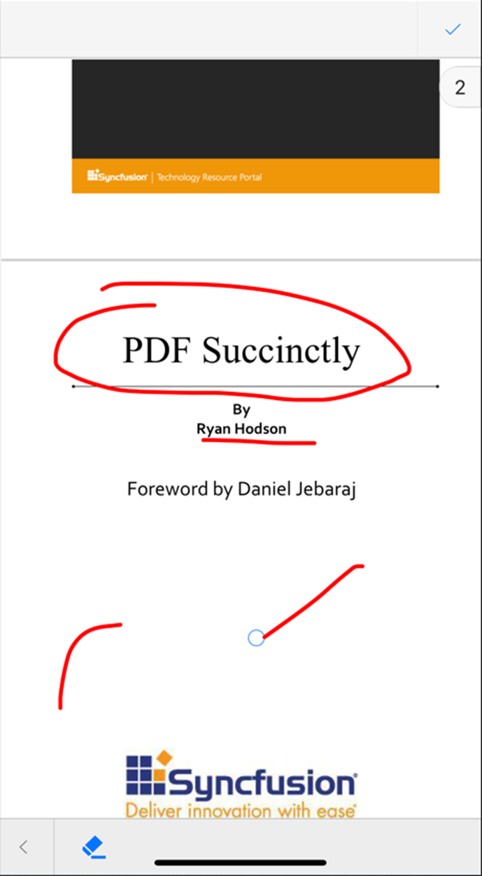
Custom bookmarks
The Xamarin.Forms PDF Viewer already has support to show bookmarks in a PDF document.
With 2022 Volume 4, you will be able to add bookmarks dynamically. These dynamic bookmarks will not be visible when you open the PDF file in other PDF viewers. You can view them only in our Syncfusion PDF Viewer. These bookmarks will be displayed in a tab separate from the content bookmarks of the PDF, like in the following image.
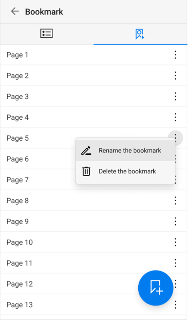
Maintain the original z-order of annotations
Previously, if we added annotations one over the other in an overlapping manner in other PDF viewers and loaded them in the Syncfusion PDF Viewer, they would not render in their original order. The annotation at the bottom would be on top, and the one on top would be in the middle.
Now, you can render and save the annotations in their original order using our Xamarin.Forms PDF Viewer.
Persist the zoom percentage
The Xamarin.Forms PDF Viewer will provide support to persist the zoom percentage when the PDF pages are switched to single-page view mode.
Previously, in single-page view mode, when we zoomed in or out in a page and then moved on to another page, the new page would load with the default zoom value. From now on, the PDF Viewer will have the support to load even the new page with the zoom factor that was applied to the previous page.
Chips
From the 2022 Volume 4 release on, you will be able to customize the font family in the Xamarin.Forms Chips control.
Conclusion
Thanks for reading! Along with these updates, there will also be other new features and bug fixes in our Syncfusion Xamarin.Forms suite in the 2022 Volume 4 release. You can check them out once the release is launched. It will not be long!
Stay tuned to our official Twitter, Facebook, and LinkedIn pages for announcements about the release. Please let us know in the comments section below if you have any feedback.
You can also reach us through our support forums, support portal, or feedback portal. We are always happy to assist you!
Related blogs
The MAUI plugin for playing audio just got a stable release (v1.1.0), and with it you can play sounds and music in your .NET MAUI app. This short and sweet guide will show you how you can easily get started.
File -> New Project
Create a new .NET MAUI project. For target framework, you can choose .NET 6 or .NET 7 as the plugin supports both. Install the package Plugin.Maui.Audio, as shown in the screenshot below:
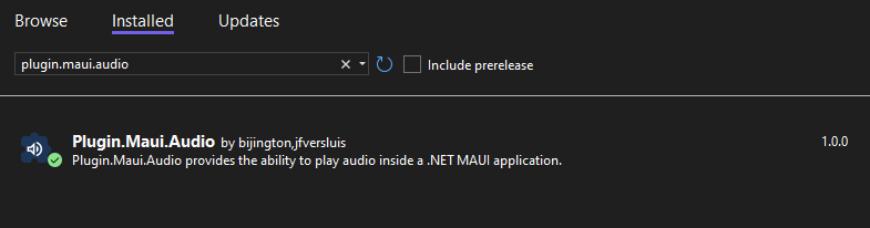
Then, add the audio file that you want to play to your project. Add it under the Resources/Raw folder. Remove the lines that was automatically added to your csproj file, as there already exists a config in your csproj that builds all assets in this folder as MauiAssets.
In this example, we’ll edit the click event for the button provided by the template to play our audio file on click:
private async void OnCounterClicked(object sender, EventArgs e){ var audioPlayer = AudioManager.Current.CreatePlayer(await FileSystem.OpenAppPackageFileAsync("ukelele.mp3")); audioPlayer.Play();}You can use the AudioManager.Current directly or you can use it through dependency injection. You can also access properties like IsPlaying, Duration and CurrentPosition. Check out the readme on the GitHub page for the plugin for more info.
Thanks to Gerald Versluis, Shaun Lawrence and the other contributors for creating this package!
The post Playing audio in a .NET MAUI app appeared first on Andreas Nesheim.
We explore the world of GitHub Codespaces and all the joy that it can bring to development.
Follow Us* Frank: Twitter, Blog, GitHub * James: Twitter, Blog, GitHub * Merge Conflict: Twitter, Facebook, Website, Chat on Discord * Music : Amethyst Seer - Citrine by Adventureface
⭐⭐ Review Us ⭐⭐
Machine transcription available on http://mergeconflict.fm
Support Merge Conflict
As you know, Xamarin.Forms (and now .NET MAUI) allows us to create cross-platform mobile apps. However, one of the biggest challenges with these technologies is knowing how to customize your Controls and UI.
In this blog, we are going to explore some awesome libraries to add cool drop shadow effects to our projects.
Xamarin Community Toolkit’s ShadowEffect
In a previous blog, we used the Xamarin Community Toolkit to build Awesome Mobile Forms. Now, let’s use its ShadowEffects to customize the look of Labels and Frames.
1. Let’s start by adding Xamarin.CommunityToolkit in our project as a NuGet package.

2. Let’s add Xamarin.CommunityToolkit in our ContentPage.

3. That’s all. Let’s use it.
We can add the effect by adding xct:ShadowEffect.
We’ll set the following properties on XAML:
- Color: is the shadow color.
- Opacity: controls the opacity of the shadow.
- Radius: controls the blurring.
- OffsetX/OffsetY: specified the horizontal or vertical displacement.
<Label HorizontalOptions="Center" VerticalOptions="Center" Text="Shadows with Xamarin Toolkit" FontSize="18" xct:ShadowEffect.Color="Red" xct:ShadowEffect.OffsetX="5" xct:ShadowEffect.OffsetY="5" xct:ShadowEffect.Radius="2" xct:ShadowEffect.Opacity="0.8"/> <Frame HasShadow="True" CornerRadius="10" WidthRequest="80" BackgroundColor="White" Padding="10" HorizontalOptions="Center" VerticalOptions="Center" IsClippedToBounds="True" xct:ShadowEffect.Color="Red" xct:ShadowEffect.Radius="5" xct:ShadowEffect.Opacity="1" Margin="10"> <Image Source="full\_trailhead\_logo.png" WidthRequest="80" /></Frame>
Sharpnado.Shadows
Sharpnado.Shadows is a third-party library that helps us add shadows easily.
1. Let’s start by adding Sharpnado.Shadows in our project as a NuGet package.

2. Let’s add an Initialize in AppDelegate.cs on the iOS project.
public override bool FinishedLaunching(UIApplication app, NSDictionary options){ global::Xamarin.Forms.Forms.Init(); Sharpnado.Shades.iOS.iOSShadowsRenderer.Initialize(); LoadApplication(new App()) return base.FinishedLaunching(app, options);}3. Let’s add Sharpnado.Shades in our ContentPage.

4. Let’s use it by setting the following properties:
- Color: is the shadow color.
- Opacity: controls the opacity of the shadow.
- BlurRadius: controls the blurring.
- Offset: specified the horizontal or vertical displacement.
- CornerRadius: specified the size of the rounded corners of the shadow.
- ImmutableShades: allows us to add more than one Shades.
We can define a SingleShade:
<sh:Shadows Margin="0,0,0,5" Shades="{sh:SingleShade Offset='2,5', Opacity=0.4, BlurRadius=3, Color=#00B0FB}" CornerRadius="10"> <Label Text="Shadows with a Single Sharpnado.Shadows" FontSize="18" HorizontalOptions="Center"/></sh:Shadows>or multiple shadows at one:
<sh:Shadows CornerRadius="10" Margin="0,10,0,0"> <sh:Shadows.Shades> <sh:ImmutableShades> <sh:Shade BlurRadius="10" Opacity="0.5" Offset="10,10" Color="#0076AE" /> <sh:Shade BlurRadius="10" Opacity="0.5" Offset="-10,-10" Color="Orange" /> </sh:ImmutableShades> </sh:Shadows.Shades> <Frame WidthRequest="80" Padding="10" HorizontalOptions="Center" VerticalOptions="Center" BackgroundColor="White" CornerRadius="10"> <Image Source="full\_trailhead\_logo.png" WidthRequest="80" /> </Frame></sh:Shadows>
A Note on .NET MAUI
The Xamarin Community Toolkit is available to use with .NET MAUI. However, it throws an exception if you try to use a ShadowEffect:
No service for type 'Microsoft.Maui.Controls.Hosting.EffectsFactory' has been registered.Unfortunately, there also is no current version of the Sharpnado.Shadows library available for .NET MAUI. But don’t worry, the Microsoft team has released a built-in Shadow class that we can use instead.
See my example of using it below setting the following properties:
Radius: controls the blurring.Opacity: controls the opacity of the shadow.Brush: represents the brush used to colorize the shadow.OffSet: specified the horizontal or vertical displacement.
<Image Source="full\_trailhead\_logo.png" SemanticProperties.Description="Trailhead logo" HeightRequest="200" HorizontalOptions="Center" > <Image.Shadow> <Shadow Brush="Black" Offset="20,20" Radius="40" Opacity="0.8" /> </Image.Shadow></Image>
Conclusion
That’s all. The code is available on GitHub for you to review. Happy coding!
The post Shadows Everywhere in Xamarin.Forms appeared first on Trailhead Technology Partners.

The .NET MAUI ListView component can virtually present data lists in a vertical or horizontal orientation with different layouts. Its rich feature set includes selection, template selectors, horizontal and vertical orientation, load more items, autofitting items, sorting, grouping, filtering, and more. It also supports swiping the ListView items in an Outlook-like fashion.
You can create an Outlook-like inbox appearance by customizing the ItemTemplate property and enabling the swiping feature using the AllowSwiping property. This blog will take you through the steps to do this.
Let’s get started!
Create the .NET MAUI ListView control
First, create a simple .NET MAUI app in Visual Studio and add the Syncfusion .NET MAUI ListView to it.
Data population
The .NET MAUI ListView is a data-bound control, so we have to create a data model to bind items to it.
Creating the data model
We need a model class to hold the data values, such as the sender, subject, and description, as in a simple data source to bind UI values. Additionally, I have used the IsAttached property to show the attachments in the emails and the IsImportant property to indicate the significance of the emails.
Refer to the following code example of the model class.
Public class InboxInfo : InotifyPropertyChanged{ #region Constructor public InboxInfo() { } #endregion #region Properties public string Name { get { return name; } set { name = value; OnPropertyChanged(“Name”); } } public string ProfileName { get { return profileName; } set { profileName = value; OnPropertyChanged(“ProfileName”); } } public string Subject { get { return subject; } set { subject = value; OnPropertyChanged(“Subject”); } } public string Description { get { return description; } set { description = value; OnPropertyChanged(“Description”); } } public DateTime Date { get { return date; } set { date = value; OnPropertyChanged(“Date”); } } public ImageSource Image { get { return image; } set { image = value; OnPropertyChanged(“Image”); } } public bool? IsAttached { get { return isAttached; } set { isAttached = value; OnPropertyChanged(“IsAttached”); } } public bool IsImportant { get { return isImportant; } set { isImportant = value; OnPropertyChanged(“IsImportant”); } } public bool IsOpened { get { return isOpened; } set { isOpened = value; OnPropertyChanged(“IsOpened”); } } #endregion #region Interface Member public event PropertyChangedEventHandler PropertyChanged; public void OnPropertyChanged(string name) { if (PropertyChanged != null) PropertyChanged(this, new PropertyChangedEventArgs(name)); } #endregion}
Creating the ViewModel
Let’s create a ViewModel and populate the InBoxInfos property with the data for the .NET MAUI ListView control. We have to populate each InBoxInfo property with its respective collection type property.
Refer to the following code example.
public class ViewModel : INotifyPropertyChanged{ #region Fields private ObservableCollection inboxInfos; #endregion #region Interface Member public event PropertyChangedEventHandler PropertyChanged; public void OnPropertyChanged(string name) { if (PropertyChanged != null) PropertyChanged(this, new PropertyChangedEventArgs(name)); } #endregion #region Constructor public ListViewSwipingViewModel() { GenerateSource(); } #endregion #region Properties public ObservableCollection<ListViewInboxInfo> InboxInfos { get { return inboxInfos; } set { inboxInfos = value; OnPropertyChanged("InboxInfos"); } } #endregion #region Generate Source private void GenerateSource() { ListViewInboxInfoRepository inboxinfo = new ListViewInboxInfoRepository(); inboxInfos = inboxinfo.GetInboxInfo(); } #endregion}
Define swiping actions in the ViewModel
Now, we’ll define the indefinite swiping actions in the ViewModel using the elements of the SwipeTemplate property, like in the following code example.
public class ViewModel : INotifyPropertyChanged{ #region Fields ---------------- #region Interface Member public event PropertyChangedEventHandler PropertyChanged; public void OnPropertyChanged(string name) { if (PropertyChanged != null) PropertyChanged(this, new PropertyChangedEventArgs(name)); } #endregion #region Constructor public ViewModel() { } #endregion #region Properties public Command DeleteCommand { get { return deleteCommand; } protected set { deleteCommand = value; } } public Command UndoCommand { get { return undoCommand; } protected set { undoCommand = value; } } public Command ArchiveCommand { get { return archiveCommand; } protected set { archiveCommand = value; } } #endregion #region Generate Source private void GenerateSource() { --------------------------------- deleteCommand = new Command(OnDelete); undoCommand = new Command(OnUndo); archiveCommand = new Command(OnArchive); } private async void OnDelete(object item) { listViewItem = (ListViewInboxInfo)item; inboxInfo!.Remove(listViewItem); } private async void OnArchive(object item) { listViewItem = (ListViewInboxInfo)item; inboxInfo!.Remove(listViewItem); } private void OnUndo() { if (listViewItem != null) { inboxInfo!.Insert(listViewItemIndex, listViewItem); } }}
Defining the ItemTemplate
Then, we’ll define the Outlook-like UI using the .NET MAUI ListView’s ItemTemplate property on the XAML page.
<ListView:SfListView.ItemTemplate> <DataTemplate> <Grid> <Grid.RowDefinitions> <RowDefinition Height=”5” /> <RowDefinition Height=”20” /> <RowDefinition Height=”20” /> <RowDefinition Height=”20” /> <RowDefinition Height=”5” /> </Grid.RowDefinitions> <Grid.ColumnDefinitions> <ColumnDefinition Width=”72” /> <ColumnDefinition Width=”*” /> <ColumnDefinition Width=”70” /> </Grid.ColumnDefinitions> <Grid Grid.Row=”1” Grid.Column=”0” Grid.RowSpan=”2” HeightRequest=”35” WidthRequest=”35” HorizontalOptions=”Center” VerticalOptions=”Center”> <Image Source=”{Binding Image}” HeightRequest=”40” WidthRequest=”40” Margin=”0, 15, 0, 0” /> <Label Text=”{Binding ProfileName}” TextColor=”#FFFFFF” FontSize=”14” HorizontalTextAlignment=”Center” HorizontalOptions=”Center” VerticalOptions=”Center” VerticalTextAlignment=”Center” FontFamily=”Roboto-Regular” CharacterSpacing=”0.25” Margin=”0, 15, 0, 0” /> </Grid> <Label Grid.Row=”1” Grid.Column=”1” Text=”{Binding Name}” FontFamily=”Roboto-Medium” FontSize=”14” TextColor=”#000000” Margin=”0, 2, 0, 0” LineBreakMode=”TailTruncation” CharacterSpacing=”0.25” /> <Label Grid.Row=”2” Grid.Column=”1” Grid.ColumnSpan=”2” Text=”{Binding Subject}” FontFamily=”Roboto-Medium” FontSize=”13” Margin=”0,0,16,3” TextColor=”#000000” LineBreakMode=”TailTruncation” CharacterSpacing=”0.25” /> <Label Grid.Row=”3” Grid.Column=”1” Grid.ColumnSpan=”2” Text=”{Binding Description}” FontFamily=”Roboto-Regular” FontSize=”12” TextColor=”#666666” Margin=”0,0,16,1” LineBreakMode=”TailTruncation” CharacterSpacing=”0.25” /> <Label Grid.Row=”1” Grid.Column=”2” Text=”{Binding Date, Converter={StaticResource dateTimeConverter}}” TextColor=”#666666” FontFamily=”Roboto-Regular” HorizontalOptions=”End” HorizontalTextAlignment=”End” FontSize=”11” Margin=”0,0,16,0” CharacterSpacing=”0.15” /> <Image Grid.Row=”2” Grid.Column=”2” HeightRequest=”30” WidthRequest=”30” Margin=”0, 0, 8, 0” Source=”paperclip.png” IsVisible=”{Binding IsAttached}” HorizontalOptions=”End” VerticalOptions=”Center”> </Image> <Image Grid.Row=”2” Grid.Column=”2” HeightRequest=”40” WidthRequest=”40” Margin=”0, 0, 2, 0” Source=”important.png” IsVisible=”{Binding IsImportant}” HorizontalOptions=”End” VerticalOptions=”Center”> </Image> </Grid> </DataTemplate></ListView:SfListView.ItemTemplate>
Defining swipe templates
You can customize the UI to be displayed when performing swiping actions using the StartSwipeTemplate and EndSwipeTemplate properties.
In this demo, we are going to display the archive and delete icons at the start and end of swiping, respectively.
<ListView:SfListView.StartSwipeTemplate> <DataTemplate> <Grid BackgroundColor=”#D8F3D4”> <Label Text=”” FontFamily=’{OnPlatform Android=ListViewFontIcons.ttf#,UWP=ListViewFontIcons.ttf#ListViewFontIcons,MacCatalyst=ListViewFontIcons,iOS=ListViewFontIcons}’ TextColor=”Green” HorizontalOptions=”Center” FontSize=”22” FontAttributes=”Bold” VerticalOptions=”Center”> </Label> </Grid> </DataTemplate></ListView:SfListView.StartSwipeTemplate><ListView:SfListView.EndSwipeTemplate> <DataTemplate> <Grid BackgroundColor=”#F4DEDE” x:Name=”listViewGrid”> <Label Text=”” FontFamily=’{OnPlatform Android=ListViewFontIcons.ttf#,UWP=ListViewFontIcons.ttf#ListViewFontIcons,MacCatalyst=ListViewFontIcons,iOS=ListViewFontIcons}’ TextColor=”DarkRed” HorizontalOptions=”Center” FontSize=”26” VerticalOptions=”Center”> </Label> </Grid> </DataTemplate></ListView:SfListView.EndSwipeTemplate>
Refer to the following images.
|
|
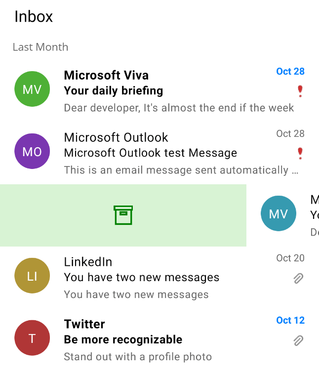
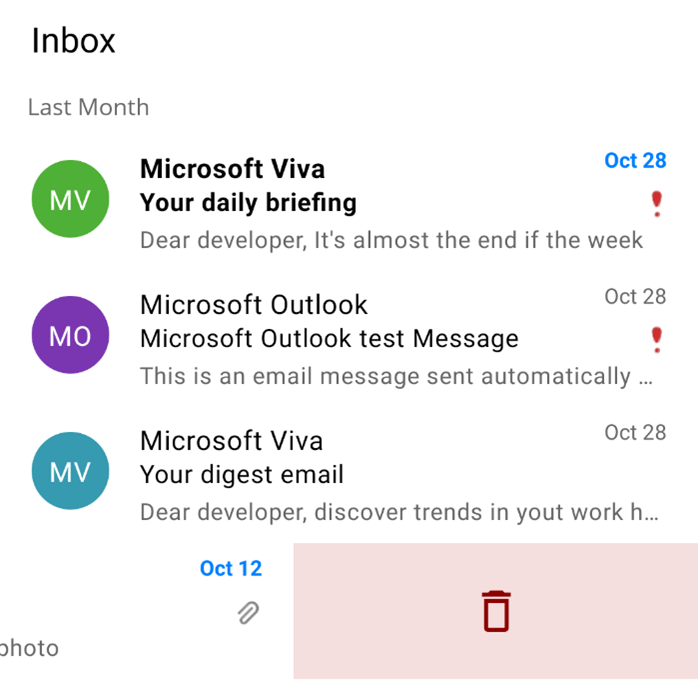
Swipe actions defined in the ViewModel will be executed from the SwipeEnded event to achieve the Outlook-like swiping behavior. The SwipeEnded event will be raised when you complete the swiping action.
Refer to the following code example.
Private async void ListView\_SwipeEnded(object sender, Syncfusion.Maui.ListView.SwipeEndedEventArgs e){ if (e.Offset <= 100) { return; } if (e.Direction == SwipeDirection.Right) { ViewModel.ArchiveCommand.Execute(null); } if (e.Direction == SwipeDirection.Left) { ViewModel.DeleteImageCommand.Execute(null); }}
Finally, the actual code does the indefinite swiping, like in Outlook. In it, we use the SwipeOffset property by considering the width or height of the .NET MAUI ListView control with the SfListView.Orientation property accordingly.
Private void ListView\_PropertyChanged(object sender, PropertyChangedEventArgs e){ if (e.PropertyName == “Width” && ListView.Orientation == ItemsLayoutOrientation.Vertical && ListView.SwipeOffset != ListView.Width) ListView.SwipeOffset = ListView.Width; else if (e.PropertyName == “Height” && ListView.Orientation == ItemsLayoutOrientation.Horizontal && ListView.SwipeOffset != ListView.Height) ListView.SwipeOffset = ListView.Height;}
To summarize, each InboxInfo model population and swiping action is done in the ViewModel’s InboxInfos collection property and Commands, respectively. The InboxInfos collection will be bound to the .NET MAUI ListView on your XAML page. The SwipeOffset will be updated based on the orientation, swiping will be updated based on the swiping actions listed in the SwipeEnded event, and other UI-related actions will be handled in the Behavior class.
After executing the previous code examples, we will get output like the following GIF image.
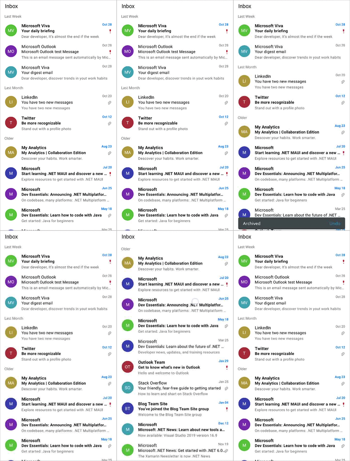
GitHub reference
You can download the entire code example for Outlook-like swiping in .NET MAUI ListView on GitHub.
Conclusion
Thanks for reading! In this blog, we have seen how to achieve an Outlook-like swiping feature in your .NET MAUI app using the Syncfusion .NET MAUI ListView. Try out the steps in this blog and leave your feedback in the comments section below!
For current customers, the newest version of Essential Studio for .NET MAUI is available from the License and Downloads page. If you are not a Syncfusion customer, you can always download our free evaluation to see all our controls.
For questions, you can reach us through our support forum, support portal, or feedback portal. We are always happy to assist you!
Related blogs

Howdy! This blog explains how to replicate an invoice page UI based on this Dribbble design.
Let’s break down the creation of the UI into four steps, as illustrated by the following screenshot.
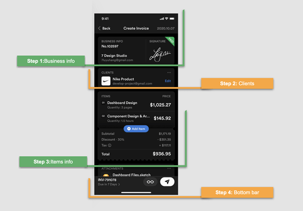
Before starting to develop the UI, let me highlight some important points. In this article, we will learn to:
- Use XAML components in different ways.
- Use the Syncfusion .NET MAUI SignaturePad and ListView controls in your app.
- Manage properties with independent values for light and dark modes.
Let’s code!
Easily build cross-platform mobile and desktop apps with the flexible and feature-rich controls of the Syncfusion .NET MAUI platform.
Main layout
The initial structure should be prepared for the content we will add in all the development steps. It should be noted that step four is designing a bottom bar that is fixed and does not move regardless of the content of the remaining blocks.
To add both the bottom bar and the remaining content, we will create the following pieces:
- Main layout: The main layout includes a grid with a single row. This is because both the bottom bar and the remaining content will be in the same grid row. Only the bottom bar will be in a fixed orientation at the bottom of the screen.
- ScrollView: We are going to design the top content with a ScrollView to make the content scrollable in case the amount of information grows. Inside this ScrollView, we will add a DataGrid, which is the layout in charge of organizing the elements contained in this upper part.
- Bottom bar: Finally, you will see a comment that says <!– Add your Bottom Bar here–>, and for the moment, we will leave it that way. Keep in mind, though, that when you get to step number four, you must add that code in this part.
Therefore, implementing all these pieces will look like the following code.
<!-- Main layout--><Grid RowDefinitions="*"> <!-- Allows top information to be scrolled--> <ScrollView Grid.Row="0" Margin="15,10"> <!--Layout top information--> <Grid RowDefinitions="Auto,Auto,Auto,Auto,Auto" RowSpacing="10"> <!-- Add here the information needed in the top --> </Grid> </ScrollView> <!-- Add your bottom bar here--> </Grid></Grid>
General settings
This application will be developed to support both light and dark modes. For that, we have to keep in mind the visual values that we will assign to each property. To do so, we will be using the Markup Extension AppThemeBinding.
We need to provide a background color to the content page by adding the following code to the content page’s header.
BackgroundColor="{AppThemeBinding Light=#efefef,Dark=Black}"
The .NET MAUI framework already has predefined global styles for each visual element. So, we need to modify only some properties of the default style. To locate it, navigate to Resources  Styles Styles.xaml. We are going to modify the styles for the frames and box views. Refer to the following code examples.
Frame
<Style TargetType="Frame"> <Setter Property="HasShadow" Value="False" /> <Setter Property="BackgroundColor" Value="{AppThemeBinding Light=White, Dark=#181818}" /> <Setter Property="CornerRadius" Value="10" /></Style>
BoxView
<Style TargetType="BoxView"> <Setter Property="Color" Value="{AppThemeBinding Dark=#252525,Light=Silver}" /> <Setter Property="HorizontalOptions" Value="FillAndExpand" /> <Setter Property="Margin" Value="25,10" /></Style>
Syncfusion .NET MAUI controls are well-documented, which helps to quickly get started and migrate your Xamarin apps.
Step 1: Business info
Now that we have configured the initial setup, let’s get started with the UI design!
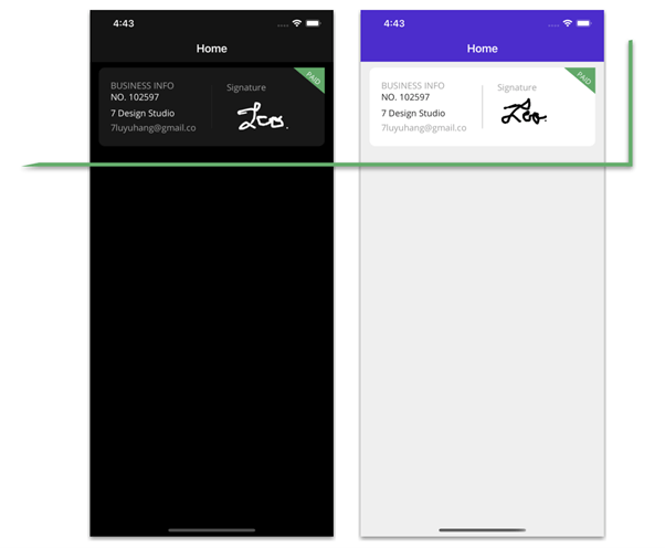
Adding a business frame
Let’s add business information inside a frame. Don’t worry about its properties for light and dark modes. Remember that we have already defined this in the styles section of the general settings.
<!-- Business info--> <Frame Grid.Row="0"> <Grid RowDefinitions="*,*,*,*" ColumnDefinitions="*,Auto,*"> <!-- Add all the information corresponding to block 1 here -- > </Grid> </Frame><!-- Add all the information corresponding to block 2 here -- ><!-- Add all the information corresponding to block 3 here -- >
Business information details
This block contains the following information:
- Title
- Identification
- Name
- Separator
- Signature board
- Payment badge
First, let’s start with the code to implement the title, identification, name, email, and a separator.
<!-- Business description--><!-- Title--> <Label Grid.Column="0" Grid.Row="0" Text="BUSINESS INFO" TextColor="#a0a0a0"/><!-- Identification--> <Label Grid.Column="0" Grid.Row="1" Text="NO. 102597" FontAttributes="Bold" Padding="0,0,0,11"/><!-- Name--> <Label Grid.Column="0" Grid.Row="2" Text="7 Design Studio" FontAttributes="Bold"/><!-- Email--> <Label Grid.Column="0" Grid.Row="3" Text="7luyuhang@gmail.com" TextColor="#a0a0a0"/><!-- Separator--><BoxView Grid.Row="0" Grid.RowSpan="4" Grid.Column="1" WidthRequest="1"/>
To make it easy for developers to include Syncfusion .NET MAUI controls in their projects, we have shared some working ones.
Signature board
To design the signature board, we are going to use the Syncfusion .NET MAUI SignaturePad control. To do so, follow these steps:
Note: Refer to the .NET MAUI SignaturePad control’s getting started documentation for more information.
- First, install the Syncfusion.Maui.SignaturePad NuGet package.

- Second, register the handler for the Syncfusion core in the MauiProgram.cs file. Go to the CreateMauiApp method, and just below the line .UseMauiApp<App>(), add the .ConfigureSyncfusionSignaturePad() method.
- Third, add the Syncfusion.Maui.SignaturePad namespace in your XAML page.
xmlns:signaturePad="clr-namespace:Syncfusion.Maui.SignaturePad;assembly=Syncfusion.Maui.SignaturePad"
- Finally, add the following code to your XAML page.
<!--Signature --><!-- Title--> <Label Grid.Column="2" Grid.Row="0" Text="Signature" TextColor="#a0a0a0" VerticalTextAlignment="End"/><!-- Syncfusion Signature Pad--><signaturePad:SfSignaturePad Grid.Column="2" Grid.Row="1" Grid.RowSpan="3" MinimumStrokeThickness="1" MaximumStrokeThickness="4" StrokeColor="{AppThemeBinding Light=Black, Dark=White}" />
Payment badge
To design the paid badge located in the upper-right corner of the screen, we will use a label. Let’s use the following three properties of the label to obtain this UI design:
- Padding: Indicates the space that the label will have.
- BackgroundColor: Assigns a color to the visible space in the background.
- Rotation: Helps rotate the elements, in this case, to put the label diagonal.
<!-- Paid badge--><Label Grid.Column="2" Grid.RowSpan="4" BackgroundColor="#46aa62" Text="PAID" TextColor="White" Padding="0,50,20,0" Rotation="40" VerticalOptions="Start" FontSize="11" HorizontalTextAlignment="End" TranslationX="60" TranslationY="-80"/>
Step 2: Clients
 The clients’ details will also be contained in the frame. Inside it, I have added a DataGrid to organize the information. Refer to the following code example.
<Frame Grid.Row="1"> <Grid RowDefinitions="*,*,*" RowSpacing="10" ColumnDefinitions="Auto,*,Auto"> <!-- Add all the information corresponding to block 2 here -- > </Grid></Frame>
Let’s design the following elements in this block:
- Title and logo
- Name and email address
- Icon and edit label
Syncfusion’s .NET MAUI controls suite is the expert’s choice for building modern web apps.
Title and logo
The title of this content is a label. To design the logo, we use the border support available in the .NET MAUI framework and color the background according to the appearance mode that you have configured in the device (dark or light mode).
Finally, we add an image inside it with a transparent background (the logo) so that it can be reflected in the previously added background.
<!-- Title--> <Label Grid.Column="0" Grid.Row="0" Text="CLIENTS" TextColor="#a0a0a0"/><!-- Logo--> <Border Grid.Row="1" Grid.RowSpan="2" Grid.Column="0" Margin="0,0,20,0" Stroke="Transparent" BackgroundColor="{AppThemeBinding Light=Black, Dark=White}" StrokeThickness="4" WidthRequest="50" HeightRequest="50" StrokeShape="RoundRectangle 7"> <Image Aspect="AspectFill" Source="{AppThemeBinding Dark=niken, Light=nike}" /> </Border> <!-- Add here all the information explained in the next code block -- >
Name and email address
Design the name and email address details, referring to the following code example.
<!-- Name--> <Label Grid.Column="1" Grid.Row="1" Text="Nike Product" FontAttributes="Bold"/><!-- Email--> <Label Grid.Column="1" Grid.Row="2" Text="develop-project@gmail.com" TextColor="#a0a0a0"/><!-- Add here all the information explained in the next code block -- >
Icon and edit label
Design the icon and edit label, referring to the following code example.
<!-- Icon--> <Image Grid.Column="2" Grid.Row="0" Source="points"/><!-- Edit Label--> <Label Grid.Column="2" Grid.Row="1" Grid.RowSpan="2" TextColor="#3373dc" VerticalTextAlignment="Center" Text="Edit"/>
Step 3: Items info
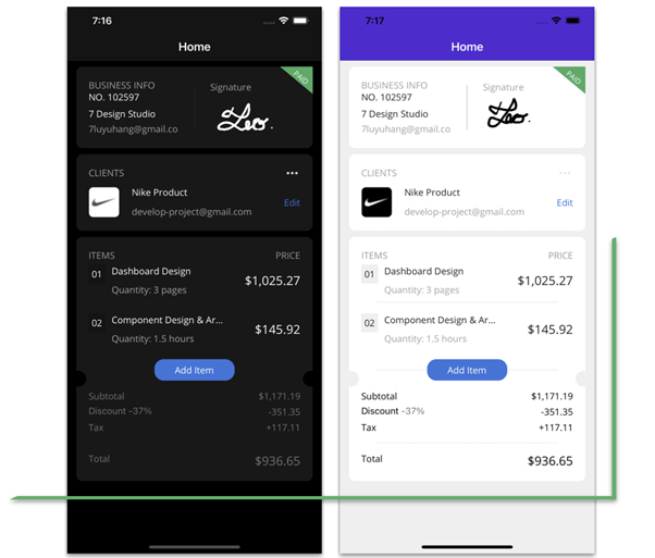 Continuing with the third block, Items Info, we modified this a bit from the original design. Here, you will learn to use:
- Syncfusion’s ListView control
- Shapes in the .NET MAUI framework
Now, we are going to design the frame and the layout to display the items’ information.
<!-- Items--> <Frame Grid.Row="2"> <Grid RowDefinitions="Auto,*,Auto,Auto,Auto,Auto,Auto,Auto,Auto" ColumnDefinitions="*,Auto" RowSpacing="5"> <!-- Add all the information corresponding to block 3 here -- > </Grid> </Frame>
Every property of the Syncfusion .NET MAUI controls is completely documented to make it easy to get started.
Items and price titles
Refer to the following code example to add the titles for the items before adding them to the list.
<!--Item and prices title--> <Label Grid.Row="0" Grid.Column="0" Text="ITEMS" HorizontalTextAlignment="Start" TextColor="#9a9a9a"/> <Label Grid.Row="0" Grid.Column="1" Text="PRICE" HorizontalTextAlignment="End" TextColor="#9a9a9a"/>
Items list
To design the items list, we are going to use the Syncfusion .NET MAUI ListView control. Please follow these steps:
Note: Refer to the .NET MAUI ListView control getting started documentation
- First, add Syncfusion.Maui.ListView NuGet package.

- Second, go to your MauiProgram.cs file and register the handler for the Syncfusion .NET MAUI ListView. Go to the CreateMauiApp method, just before the line return builder.Build();, and add the builder.ConfigureSyncfusionListView(); method.
- Third, add Syncfusion.Maui.ListView namespace in your XAML
page.xmlns:syncfusion="clr-namespace:Syncfusion.Maui.ListView;assembly=Syncfusion.Maui.ListView"
- Then, add the following code to your XAML page.
<!-- Item List: Syncfusion ListView Control--> <syncfusion:SfListView Grid.Row="1" Grid.Column="0" Grid.ColumnSpan="2" ItemsSource="{Binding ItemInfo}" ItemSize="80" ScrollBarVisibility="Never" HeightRequest="140" HorizontalOptions="FillAndExpand" Orientation="Vertical"> <syncfusion:SfListView.ItemTemplate> <DataTemplate> <Grid RowDefinitions="Auto,Auto,Auto" ColumnDefinitions="Auto,Auto,*"> <Label Grid.Row="0" Grid.Column="0" Text="{Binding Order}" Padding="5" BackgroundColor="{AppThemeBinding Dark=#141414, Light=#efefef}" Margin="0,0,10,0"/> <Label Grid.Row="0" Grid.Column="1" Text="{Binding Title}"/> <Label Grid.Row="1" Grid.Column="1" Text="{Binding Description}" TextColor="#a3a3a3"/> <Label Grid.Row="0" Grid.Column="2" Grid.RowSpan="2" Text="{Binding Price}" FontSize="18" HorizontalOptions="End" VerticalTextAlignment="Center"/> <BoxView Grid.Row="2" Grid.Column="0" Grid.ColumnSpan="3" HeightRequest="0.5"/> </Grid> </DataTemplate> </syncfusion:SfListView.ItemTemplate></syncfusion:SfListView> <!-- Add here all the information explained in the next code block -- >
Separator and center button
Now, we are going to use a box view to add a line as a separator and locate a button in the center of the frame.
<!-- Separator--> <BoxView Grid.Row="2" Grid.Column="0" Grid.ColumnSpan="2" HeightRequest="0.5"/><!-- Middle Button--> <Button Grid.Row="2" Grid.Column="0" Grid.ColumnSpan="2" Text="Add Item" CornerRadius="15" WidthRequest="130" HeightRequest="35" BackgroundColor="#3775dc" HorizontalOptions="Center" TextColor="White" Margin="0,10"/><!-- Add here all the information explained in the next code block -- >
Side cutouts in circles of the frame
Did you see the frame with two circular holes at each end? To replicate it, we’ll use the shapes and position them on each side, as in the following code example.
<!-- Cutouts in circles --> <Ellipse Grid.Row="2" Grid.Column="0" HorizontalOptions="Start" Margin="-30,-30,0,0" Fill="{AppThemeBinding Light=#efefef,Dark=Black}" VerticalOptions="End" HeightRequest="26" WidthRequest="26" StrokeThickness="0"/> <Ellipse Grid.Row="2" Grid.Column="1" HorizontalOptions="End" Margin="0,-30,-30,0" Fill="{AppThemeBinding Light=#efefef,Dark=Black}" VerticalOptions="End" HeightRequest="26" WidthRequest="26" StrokeThickness="0"/>
Total information
This last sub-block is made up of the following elements:
- Subtotal information
- Discount information
- Tax information
- Separator
- Total
Refer to the following code to design them in the UI.
<!--Total information--> <!-- Subtotal information--> <Label Grid.Row="3" Grid.Column="0" Text="Subtotal" TextColor="{AppThemeBinding Light=Black, Dark=#727272}"/> <Label Grid.Row="3" Grid.Column="1" Text="$1,171.19" TextColor="{AppThemeBinding Light=Black, Dark=#727272}" HorizontalTextAlignment="End"/><!-- Discount--> <Label Grid.Row="4" Grid.Column="0"> <Label.FormattedText> <FormattedString> <Span Text="Discount" TextColor="{AppThemeBinding Light=Black, Dark=#727272}" /> <Span Text=" -37%" TextColor="#727272"/> </FormattedString> </Label.FormattedText> </Label> <Label Grid.Row="4" Grid.Column="1" Text="-351.35" TextColor="{AppThemeBinding Light=Black, Dark=#727272}" HorizontalTextAlignment="End"/><!-- Tax--> <Label Grid.Row="5" Grid.Column="0" Text="Tax" TextColor="{AppThemeBinding Light=Black, Dark=#727272}"/> <Label Grid.Row="5" Grid.Column="1" Text="+117.11" TextColor="{AppThemeBinding Light=Black, Dark=#727272}" HorizontalTextAlignment="End"/><!-- Separator--> <BoxView Grid.Row="6" Grid.Column="0" Grid.ColumnSpan="2" HeightRequest="0.5"/><!-- Total--> <Label Grid.Row="7" Grid.Column="0" Text="Total" TextColor="{AppThemeBinding Light=Black, Dark=#727272}"/> <Label Grid.Row="7" Grid.Column="1" Text="$936.65" TextColor="{AppThemeBinding Light=Black, Dark=#727272}" FontSize="18" HorizontalTextAlignment="End"/>
Syncfusion .NET MAUI controls allow you to build powerful line-of-business applications.
Step 4: Bottom bar
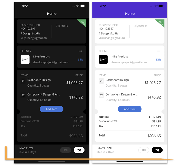 Let’s design the last block. We are going to add the following elements to the bottom bar:
- Invoice number
- Period of days
- Call to action buttons
Refer to the following code example.
<!-- Button Bar--> <Grid Grid.Row="0" RowDefinitions="Auto,Auto" ColumnDefinitions="*,Auto,Auto" HeightRequest="100" Margin="0,0,0,-30" Padding="25,10" VerticalOptions="End" BackgroundColor="{AppThemeBinding Light=White, Dark=#181818}"><!--Invoice number--> <Label Grid.Row="0" Grid.Column="0" Text="INV-791078" TextColor="{AppThemeBinding Dark=White, Light=Black}" FontAttributes="Bold"/><!--Period of days--> <Label Grid.Row="1" Grid.Column="0" Text="Due in 7 Days " TextColor="#9d9d9d"/><!--Call to action buttons--> <Button Grid.Row="0" Grid.RowSpan="2" Grid.Column="1" BackgroundColor="{AppThemeBinding Dark=#313131, Light=White}" CornerRadius="18" WidthRequest="60" HeightRequest="35" ImageSource="{AppThemeBinding Light=glasses, Dark=glassesn}" BorderWidth="2" BorderColor="{AppThemeBinding Light=#ededed ,Dark=Transparent}" Margin="0,0,15,0"/> <Button Grid.Row="0" Grid.RowSpan="2" Grid.Column="2" BackgroundColor="{AppThemeBinding Dark=White, Light=Black}" CornerRadius="18" WidthRequest="60" HeightRequest="35" ImageSource="{AppThemeBinding Light=telegram, Dark=telegramn}"/> </Grid>
And our UI is done!
GitHub reference
For more details, refer to our Invoice Page UI in .NET MAUI demo on GitHub.
Conclusion
Thanks for reading! In this blog, we saw how to replicate an invoice page UI using Syncfusion .NET MAUI controls. Try out the steps in this blog post and leave your feedback in the comments section below!
Syncfusion .NET MAUI controls were built from scratch using .NET MAUI, so they feel like framework controls. They are fine-tuned to work with a huge volume of data. Use them to build your cross-platform mobile and desktop apps!
For current customers, the new Essential Studio version is available for download from the License and Downloads page. If you are not a Syncfusion customer, you can always download our free evaluation to see all our controls.
For questions, you can contact us through our support forum, support portal, or feedback portal. We are always happy to assist you!
See you next time!
Related blogs
.NET 7 is a major update to the .NET platform and it comes packed with some awesome new features! In this podcast, we'll take a look at some of the most important new features in .NET 7 and what you need to know about them if you're using .NET 7 in your development work. https://www.youtube.com/watch?v=0BvCzZ9P7UY Follow Us Frank: Twitter, Blog, GitHub James: Twitter, Blog, GitHub Merge Conflict: Twitter, Facebook, Website, Chat on Discord Music : Amethyst Seer - Citrine by Adventureface ⭐⭐ Review Us (https://itunes.apple.com/us/podcast/merge-conflict/id1133064277?mt=2&ls=1) ⭐⭐ Machine transcription available on http://mergeconflict.fm
Managing images, icons, and splash screens cross-platform is more challenging since we need to manage assert and resource folders specific to each platform, as well as image folders for each resolution. During testing, we received feedback from our QA friends that the images were not working on this device or at this resolution. Hopefully, all of you have encountered this problem in the past, and MAUI application has released great solutions for this issue.In your .NET MAUI application, managing your resources is much simpler than in Xamarin and other hybrid applications, as it is not as complicated. Resources refers to the main topic of managing images. With NET MAUI, you can stop worrying about scaling and resizing your images to fit every platform and screen resolution. Better yet, you won't need to keep track of the website that generates everything for you. .NET MAUI will take care of the process for you at build time; just add your images to your project and make sure the build actions are set up. The purpose of this article is to demonstrate how the MAUI application manages its resources.
The ultimate design goal of one single project for all supported platforms the way to manage resources from one place. Be it fonts, images, splash screen, or raw assets. It is an incredible feature that MAUI introduced using SVG files and PNG files and have them automatically resized for all the different resolutions when they are uploaded. Regardless if you've already used ResizetizerNT in your Xamarin project, MAUI will do the same internally while the build process is running in the background.
Resource files should be placed in the Resources folder of your. NET MAUI app project, or in child folders of the Resources folder, and their build action should be correctly set. The following sections will be explained one by one as we go along. Android resource naming rules is that image filenames must start with a letter character, end with a letter character, and contain only alphanumeric characters or underscores, so make sure your image name follows the same rules
* The .NET MAUI app converts SVG files to PNG files. When adding an SVG file, reference it from XAML or C# with a .png extension. You should reference the SVG file in your project file as a best practice.
* The values for the Foreground Color and Background Color can be specified either in hexadecimal or as a .NET MAUI color. For example, Color="Green" is valid.
MAUI ImagesImages can be specified in one location in your app project, and at build time they are automatically resized and added to your app package. By doing this, you avoid manually duplicating and naming images per platform.First Step, You can add images to your app project by dragging them into the Resources/Images folder of the app project which will allow you to add them to the project.In the next step, you will be able to ensure that MauiImage build action is set automatically, if not set, you can ensure that the build action should be MAUIImage by selecting it from the Image Property.
MAUI Image Guideline1. The default MAUIImage tag, which includes all images, can be found in the.csproj file, and you can also specify the image name. The wildcard character () indicates that all files in the folder are considered to be of the specified resource type.
2. You can also add images to other folders(not only Image folder). In this scenario, MauiImage must be manually set in the Properties window.
MAUI Image Property* The base size is specified with the BaseSize="W,H" attribute, where W is the width of the icon and H is the height of the icon. The value specified as the base size must be divisible by 8. The following example sets the base size.
* It is also possible to stop the automatic resizing of the images. The following example code shows how to stop the automatic resizing
* The background image used in composing the app icon can be recolored using the Color attribute on the
MAUI IconIn most apps, there is a logo icon that represents the app, and that icon appears in different places.
on iOS the app icon appears on the Home screen and throughout the system, such as in Settings, notifications, and search results, and in the App Store.
On Android, the app icon appears as a launcher icon and throughout the system, such as on the action bar, notifications, and in the Google Play Store.
On Windows, the app icon appears in the app list in the start menu, the taskbar, the app's tile, and in the Microsoft Store.
In a .NET Multi-platform App UI (.NET MAUI) app project, an app icon can be specified in a single location in your app project. At build time, this icon can be automatically resized to the correct resolution for the target platform and device, and added to your app package. This avoids having to manually duplicate and name the app icon on a per platform basisMAUI Icon Include & ForgroundFileOn the .csproj file, the app icon can be composed of two images, one image representing the background and another representing the foreground.
1. Include attribute represents the icon background image( must specify)
2. Foreground attribute represents the foreground image (optional)
Platform specific configuration for MAUI App iconThe project file declares what resources make up the app icon, but you must update the individual platform configurations to reference these icon references. On iPhone, Mac, and Android, the following settings need to be made in the configuration, but Windows does not require any specific configurationInfo.Plist
This configuration will be automatically updated in Info.plist if you don't change app icon names, but if you change app icon names, make sure you update the configuration in Info.plist.
The Info.plist file contains a
Android Manifest
The following Android configuration is defined by default, so all you need to do is migrate the application or make any modifications. Make sure the configuration is set correctly.
Use a different MAUI icon per platformIf you want to use different icon resources or settings per platform, add the Condition attribute to the
Only the first valid
For example, a condition that targets Android would be Condition="$([MSBuild]::GetTargetPlatformIdentifier('$(TargetFramework)')) == 'android'".
The following XML demonstrates declaring a specific icon for Windows and a fallback icon for all other platforms:
MAUI Icon Guideline1. In your project file, the
MAUI Splash ScreenOn Android and iOS, .NET Multi-platform App UI (.NET MAUI) apps can display a splash screen while their initialization process completes. The splash screen is displayed immediately when an app is launched, providing immediate feedback to users while app resources are initialized:
In a .NET MAUI app project, a splash screen can be specified in a single location in your app project, and at build time it can be automatically resized to the correct resolution for the target platform and device and added to your app package. This avoids having to manually duplicate and name the splash screen on a per platform basis.
A splash screen can be added to your app project by dragging an image into the Resources\Splash folder of the project, where its build action will automatically be set to MauiSplashScreen. This creates a corresponding entry in your project file as like below screen
At build time, the splash screen can be resized to the correct resolution for the target platform and device. The resulting splash screen is then added to your app package.
Platform specific configurationThe code that's specific to a platform automatically gets added to the code base, but you have to know where it goes and why, it'll help you with the migration processOn Androidthe splash screen is added to your app package as Resourcs/values/maui_colors.xml and Resources/drawable/maui_splash_image.xml. .NET MAUI apps use the Maui.SplashTheme by default, which ensures that a splash screen will be displayed if present. Therefore, you should not specify a different theme in your manifest file or in your MainActivity class
using Android.App;
using Android.Content.PM;
using Android.OS;
namespace NewProjectFile7._0; [Activity(Theme = "@style/Maui.SplashTheme*", MainLauncher = true, ConfigurationChanges = ConfigChanges.ScreenSize | ConfigChanges.Orientation | ConfigChanges.UiMode | ConfigChanges.ScreenLayout | ConfigChanges.SmallestScreenSize | ConfigChanges.Density)]
public class MainActivity : MauiAppCompatActivity
{
}*On iOS
It is not necessary for you to do iOS-specific settings because the build will automatically take care of this for you. the splash screen is added to the app package as a storyboard named MauiSplash.storyboard, which is set as value of the UILaunchStoryboardName key in the app package's Info.plist automatically add UILaunchStoryboardName as a key and string value is MauiSplashSummaryIf you have any further questions regarding MAUI app icon, MAUI splash screen, or MAUI image, please don't hesitate to let me know in the comment section. I hope that this article can help you to understand MAUI app icon, MAUI splash screen, and MAUI image to different mobile platforms. . In case you missed my previous article, you can refer to the links below..NET MAUI : Runs on multiple platforms in one project (iOS, Android, and Windows)How to use .Net MAUI Secure storage in your Mobile application ( iOS, Android and Windows ).Net MAUI : Mobile local Storage Preferences using .NET MAUIXamarin MAUI: Pair to Mac M1 chip from Windows machine for iOS development using Visual Studio 2022 PreviewXamarin MAUI: First iOS, Android and Windows Mobile App using Visual studio 2022
Help to Developer to manage and deliver hands-on digital learning experiences in MAUI, Xamarin,Azure, and Microsoft AI free Learning portal by Suthahar Jegatheesan
According to Wikipedia, “An annotation is extra information associated with a particular point in a document.” Annotations can be locked...
Picking up where we left off, I want to add unit tests to my program. Now, I know, I should have been using unit tests all along. I have no excuse and hang my head in shame. To get started, … Continue reading →
Signing, provisioning, certificates, oh my! We break down what you need to know on how to really ship apps to the app store. Follow Us Frank: Twitter, Blog, GitHub James: Twitter, Blog, GitHub Merge Conflict: Twitter, Facebook, Website, Chat on Discord Music : Amethyst Seer - Citrine by Adventureface ⭐⭐ Review Us (https://itunes.apple.com/us/podcast/merge-conflict/id1133064277?mt=2&ls=1) ⭐⭐ Machine transcription available on http://mergeconflict.fm
The name MAUI stands for .NET Multi-platform App UI. Many IT companies struggle with deciding whether to migrate from XAMARIN or to start from scratch with a new hybrid application. You should not make any mistakes, better choose to move to MAUI. Prior to migration, you must understand what the main project file and platform specific changes are that differ from XAMARIN. It is not the purpose of this article to explain migration, but you should know before you migrate what the main changes have been to the project files in MAUI. To gain a deeper understanding of MAUI project files, let's follow me one by one in this article
Prerequisites
Visual Studio 2022 with the MAUI workload installed
Xamarin, MAUI Support for Visual Studio Mac
As we all know, Microsoft supports MAUI from Visual Studio 2022 latest version in Macs and Windows. Several people asked me if I could install Visual 2022 from my Mac, and if so, could it keep creating/modify Xamarin Forms, and the answer is yes, which means Microsoft continues to support Xamarin for now, so the latest Visual studio 2022 has both Xamairn and MAUI project templates, so if you are starting a new project, choose MAUI as the template, because it has wonderful features.
MAUI Project File
A user can build a .NET MAUI application for Android, iOS, macOS, and Windows in one project file. Xamarin Forms uses different project files for Individual platforms. the .NET MAUI application is focused on Android, iOS, macOS, and Windows, simplifying and standardizing the cross-platform development experience for all four platforms.
MAUI SDK-style format
The .NET SDK is the base SDK for .NET. Projects associated with the other SDKs have access to all the .NET SDK properties. The default .Net Framework project is not SDK style and the default .Net Core, MAUI and .Net Standard project will be SDK style by default, Right click on your project and see the project file Below is the code for the MAUI project file, which is an XML file. The Sdk attribute defines which SDK is targeted.
All project-level properties are enclosed within the PropertyGroup node. ItemGroup node holds dependencies, such as Project(s) referenced, NuGet package(s) added, Resource definitions, etc, will check line by line here
Multiple Target Platform
MAUI is multi-targeting by design, hence the TargetFrameworks list (which is separated by a semicolon).The Target Framework Monikers are all prefixed with net7.0-.The reason for this is that there is only one BCL.The actual platform is then specified (iOS, Android, MacCatalyst, and Windows).
Use MAUI & Output TypeOutPutType : This MAUI project will produce an executable (an App) on each of the platforms as the output type.
UseMAUI: UseWPF introduced in .NET Core 3 is familiar to developers with WinForms/WPF backgrounds.Whether or not to include references to MAUI libraries is controlled by the UseMAUI property.The MSBuild pipeline is also altered to correctly process a MAUI project and related files. Instead of referencing NuGet packages, set the UseMAUI property to true to add MAUI packages
SingleProject
The SingleProject tag represents .NET MAUI's main design goal, multi-targeting.
RootNamespace
RootNamespace, the root namespace for the types contained within this project.(My Project name - NewProjectFile7._0)
ImplicitUsings
.NET 6 introduces implicit namespace support for C# projects. To reduce the amount of using directives boilerplate in .NET C# project templates, namespaces are implicitly included by utilizing the global using feature introduced in C# 10. When you create a new .NET 6 and above project it will enable this new property
Mobile App Shared Configuration (App manifest)
Since we only have one project, we don't have to manage different platform configurations. We are able to configure in one project and we are not required to manage different platform configurations.
MAUI ImageMAUI Image is a newly introduced node, which helps in including SVG images and is based on the popular resize component, which resizes the images internally based on the platform.Provides developers with a much easier process for including images across multiple platforms.
In a .NET Multi-platform App UI (.NET MAUI) app project, images can be specified in a single location in your app project, and at build time they can be automatically resized to the correct resolution for the target platform and device, and added to your app package. This avoids having to manually duplicate and name images on a per platform basis. By default, bitmap (non-vector) image formats, including animated GIFs, are not automatically resized by .NET MAUI.
.NET MAUI images can use any of the standard platform image formats, including Scalable Vector Graphics (SVG) files
MAUI Icon
An app icon can be specified in a single location in your .NET Multi-platform App UI (.NET MAUI) project. Your app package can automatically resize this icon to the appropriate resolution for the target platform and device at build time.
By doing this, it will be possible to avoid having to duplicate and name app icons on a platform-by-platform basis. .NET MAUI does not automatically resize bitmap (non-vector) image formats.
Maui Splash Screen
At build time, a splash screen can be automatically resized to the correct resolution for the target platform and device, and added to the app package for a .NET MAUI app project. This eliminates having to duplicate and name splash screens on a platform-by-platform basis.
SVG Image convert to PNG
SVG files are converted to PNG files by NET MAUI. When adding an SVG file to your .NET MAUI app project, it should be referenced from XAML or C# with a .png extension. SVG files should only be referenced in project files.
MAUI Mobile Target Version
I'll explain this part of the configuration UI screen, select your Root project from solutions and click the Properties afterward.
The Target platform shows all the basic details of a mobile app platform, such as Target .Net Run time, Target mobile OS version, and the Min mobile OS version. You can choose your app's Min and Max target mobile OS version.MAUI Shared Application Setting
On the below screen, you will see that .NET MAUI project settings are shared among all target mobile platforms.
- Application Title - It is the name that appears as the Title in installed apps.
- Application ID - the unique identifier of the application in reverse domain name format, for example com.msdevbuild.maui.
- Application ID (GUID) - The identifier of the application in GUID format.
- Application Display Version - The version of the application. This should be a single digit integer. Defaults to 1.
Platform Specific Configuration
You can add all your platform specific configurations for iOS, Android, Windows and Mac by selecting the section. This was previously done in a platform-specific project in an target project, but now it can be done in a shared project configuration.
Platform-specific code
A .NET MAUI app project contains a Platforms folder, with each child folder representing a platform that .NET MAUI can target, The folders for each platform contain platform-specific resources, and code that starts the app on each platform and there are platform-specific configuration files for every platform, like the App manifest, info.plist, and other configuration files.
Summary
I hope that this article helps you to understand how you can create one project for multiple platforms. In case you missed my previous article, you can refer to the links below.How to use .Net MAUI Secure storage in your Mobile application ( iOS, Android and Windows ).Net MAUI : Mobile local Storage Preferences using .NET MAUIXamarin MAUI: Pair to Mac M1 chip from Windows machine for iOS development using Visual Studio 2022 PreviewXamarin MAUI: First iOS, Android and Windows Mobile App using Visual studio 2022Help to Developer to manage and deliver hands-on digital learning experiences in MAUI, Xamarin,Azure, and Microsoft AI free Learning portal by Suthahar Jegatheesan
If you need to draw 2D graphical objects in your application without a platform handler in .NET MAUI, then you...
For many users, keyboard shortcuts are more convenient than a touchscreen or mouse. From the 2022 Volume 3 release onward,...
The .NET Multi-platform App UI (.NET MAUI) is a cross-platform framework that helps developers create native mobile and desktop apps...
Finally .NET Conf is here with all the latest news and information! We break down all the .NET 7 new and our favorite sessions from the conference. Follow Us Frank: Twitter, Blog, GitHub James: Twitter, Blog, GitHub Merge Conflict: Twitter, Facebook, Website, Chat on Discord Music : Amethyst Seer - Citrine by Adventureface ⭐⭐ Review Us (https://itunes.apple.com/us/podcast/merge-conflict/id1133064277?mt=2&ls=1) ⭐⭐ Machine transcription available on http://mergeconflict.fm
I have posted the (incomplete) code at https://github.com/jesseliberty/GraniteStateForgetMeNot and a video of much of the material captured in this series is now on YouTube
Building on the previous postings, today I want to discuss the magic of Dependency Injection (DI) Dependency Injection makes for cleaner and more testable code. We’ll get into testing and Mocks in a later blog post, but using DI allows … Continue reading →
It is that time of the podcast where we do lighting topics! This time we are covering upgrading iPhone, Twitter takeover, the next social/metaverse platform, USB-C standards, and Apple's Ads on the App Store. Follow Us Frank: Twitter, Blog, GitHub James: Twitter, Blog, GitHub Merge Conflict: Twitter, Facebook, Website, Chat on Discord Music : Amethyst Seer - Citrine by Adventureface ⭐⭐ Review Us (https://itunes.apple.com/us/podcast/merge-conflict/id1133064277?mt=2&ls=1) ⭐⭐ Machine transcription available on http://mergeconflict.fm
Hi everybody, in today's article we will talk about .NET MAUI. “New” and shiny platform from #dotnet for building cross-platform applications.
Before we start just to provide you some context, I am Almir Vuk, Microsoft MVP and Software Engineer who is working primarily on the .NET platform and using professionally
Building on the previous blog posts, here I’d like to illustrate how you can pass complex data from one page’s view model to another’s. Let’s assume we’ve tapped on the Buddies Icon on the tab bar and were taken to … Continue reading →
.NET MAUI is out, Xamarin.Forms support will end on May 1, 2024, and you are probably thinking “How can I migrate my Xamarin.Forms app to this new .NET MAUI framework?” Fear not, my fellow developers! I shall provide an example of how we can migrate an app to .NET MAUI. However, there are some requirements you […]
The post So You Want to Migrate a Xamarin.Forms App to .NET MAUI appeared first on Trailhead Technology Partners.
A ComboBox is a crucial UI element that most mobile app developers use in their projects. We at Syncfusion understand the wide-ranging...
Most sought after feature of .NET MAUI now available in developer preview to try it out.
In my previous post, I showed you how to use App Center Diagnostics & Analytics in your .NET MAUI app.…
The post Using App Center Distribution with .NET MAUI appeared first on Andreas Nesheim.
iPadOS 16 is here and with it are a bunch of new fancy iPads that Apple just released. We break down the latest Apple event and products and give a hands on review of Stage Manager. Follow Us Frank: Twitter, Blog, GitHub James: Twitter, Blog, GitHub Merge Conflict: Twitter, Facebook, Website, Chat on Discord Music : Amethyst Seer - Citrine by Adventureface ⭐⭐ Review Us (https://itunes.apple.com/us/podcast/merge-conflict/id1133064277?mt=2&ls=1) ⭐⭐ Machine transcription available on http://mergeconflict.fm
Validation rules are a great tool for our .NET MAUI and Xamarin.Forms applications. Now in this installment we will talk about slightly more advanced concepts related to the library Plugin.ValidationRules.
The post Advance Validation Rules for .NET MAUI and Xamarin.Forms appeared first on Luis Matos.
Las reglas de validación son una gran herramienta para nuestras aplicaciones en .NET MAUI y Xamarin.Forms.
The post Reglas de validación avanzadas para .NET MAUI y Xamarin.Forms appeared first on Luis Matos.
This is part 4 in an ongoing series in which I will build and dissect a non-trivial app. For details, please see the first in this series. Part 3 ended with a teaser about the Preferences Page. As you’ll remember, … Continue reading →
Syncfusion is sponsoring the upcoming .NET Conf 2022, a free virtual event on Nov. 8–10, 2022. As part of our...
Show Notes With .NET 7 around the corner, we're putting the finishing touches on everything in preparation - tune in to find out more! David, James, and Matt will fill you in on all the details plus the latest in Visual Studio and Azure news! New releases .NET MAUI support for .NET 7 RC2 (https://devblogs.microsoft.com/dotnet/dotnet-maui-rc2/?WT.mc_id=dotnet-79812-masoucou) On.NET with David with .NET MAUI for .NET 7 (https://www.youtube.com/watch?v=VV6DnxVyIOo) Draw all over your maps (https://www.andreasnesheim.no/creating-outlined-map-polygons-in-net-maui/) .NET MAUI support for XCode 14 (https://devblogs.microsoft.com/dotnet/dotnet-maui-xcode14/?WT.mc_id=dotnet-79812-masoucou) .NET 7 RC2 (https://devblogs.microsoft.com/dotnet/announcing-dotnet-7-rc-2/?WT.mc_id=dotnet-79812-masoucou) VS Mac 17.4 P2.1 (https://devblogs.microsoft.com/visualstudio/visual-studio-for-mac-17-4-preview-2-1-is-now-available/?WT.mc_id=dotnet-79812-masoucou) .NET MAUI Community Toolkit v1.3 (https://devblogs.microsoft.com/dotnet/announcing-the-dotnet-maui-community-toolkit-v13/?WT.mc_id=dotnet-79812-masoucou) Latest News Microsoft Teams Infrastructure and ACS migration to .NET 6 (https://devblogs.microsoft.com/dotnet/microsoft-teams-infrastructure-and-azure-communication-services-journey-to-dotnet-6/?WT.mc_id=dotnet-79812-masoucou) Microsoft Commerce migration to .NET 6 (https://devblogs.microsoft.com/dotnet/microsoft-commerce-dotnet-6-migration-journey/?WT.mc_id=dotnet-79812-masoucou) Bing Ads Campaigns migration to .NET 6 (https://devblogs.microsoft.com/dotnet/bing-ads-campaign-platform-journey-to-dotnet-6/?WT.mc_id=dotnet-79812-masoucou) Compare files in Visual Studio (https://devblogs.microsoft.com/visualstudio/comparing-files-in-visual-studio/?WT.mc_id=dotnet-79812-masoucou) .NET Conf is coming up! (https://dotnetconf.net) The .NET Conf Student Zone (https://techcommunity.microsoft.com/t5/educator-developer-blog/net-conference-student-zone-7th-nov-2022/ba-p/3655584) Azure News All the goodness for .NET 7 in Azure Functions and App Service (https://techcommunity.microsoft.com/t5/apps-on-azure-blog/azure-functions-2022-update/ba-p/3648731?WT.mc_id=dotnet-79812-masoucou) Azure Service of the Month Azure App Configuration (https://learn.microsoft.com/en-us/azure/azure-app-configuration/?WT.mc_id=dotnet-79812-masoucou) Follow Us: * James: Twitter (https://twitter.com/jamesmontemagno), Blog (https://montemagno.com), GitHub (http://github.com/jamesmontemagno), Merge Conflict Podcast (http://mergeconflict.fm) * Matt: Twitter (https://twitter.com/codemillmatt), Blog (https://codemilltech.com), GitHub (https://github.com/codemillmatt) * David: Twitter (https://twitter.com/davidortinau), Github (https://github.com/davidortinau)
To elegantly visualize the progression of tasks, you need a groundbreaking progress bar! In that regard, our new .NET MAUI...
Howdy!!! Remember that practice is the key to success in everything you do, in this case in your XAML skills. This time we will be replicating the Billing Dashboard UI in .NET MAUI! This design was created by Liev Liakh obtained from Dribbble. And today we will convert it to XAML code! I hope this is useful for you! 💚…Continue Reading→
In the previous postings we looked at creating the basic app and adding a single, simple page. This post will really begin to get into it. We’re going to have a number of pages A page for you to enter … Continue reading →
We break down all of the latest goodies that Microsoft has from the latest Surface event including all of the new hardware, accessories, and software. Oh, and ARM on Windows is here in the main line Surface lineup with a whole bunch of AI features! Follow Us Frank: Twitter, Blog, GitHub James: Twitter, Blog, GitHub Merge Conflict: Twitter, Facebook, Website, Chat on Discord Music : Amethyst Seer - Citrine by Adventureface ⭐⭐ Review Us (https://itunes.apple.com/us/podcast/merge-conflict/id1133064277?mt=2&ls=1) ⭐⭐ Machine transcription available on http://mergeconflict.fm
Event name: DevFest Santo Domingo, 2022 Talk name: Theming & styles in .NET MAUI Language: …Continue Reading→
In Part 1 we created the skeleton of Forget Me Not (and explained what it is). Here in Part 2 we’ll add an about page. This is so easy that this will be a short post. Create the page Creating … Continue reading →
My buddy in Argentina, Roberto Juarez, and I have set out to create a real-world, non-trivial program using .NET MAUI. This is a learning exercise, and I’d like to invite you to join us. We anticipate that (eventually) this will … Continue reading →
App Center is alive! With a pre-release version of the App Center packages, they’re showing that they’re adding .NET MAUI…
The post Using App Center Diagnostics & Analytics with .NET MAUI appeared first on Andreas Nesheim.
Frank has one heck of a journey trying to setup his new iPhone 14 Pro. From iCloud backups to eSim transfer.... it was an exciting adventure. How did it end and what is his overall review of the new phone? Tune-in! Follow Us Frank: Twitter, Blog, GitHub James: Twitter, Blog, GitHub Merge Conflict: Twitter, Facebook, Website, Chat on Discord Music : Amethyst Seer - Citrine by Adventureface ⭐⭐ Review Us (https://itunes.apple.com/us/podcast/merge-conflict/id1133064277?mt=2&ls=1) ⭐⭐ Machine transcription available on http://mergeconflict.fm
If you need a solution to create multilingual applications without the hassle of implementing all kinds of code, I have good news for you. I’ve migrated my Xamarin.Forms package to .NET MAUI, and you can easily build multilingual applications with MAUI. No need to restart the application, the language takes effect immediately and works on ... Read more
The post .NET MAUI : Write multilingual apps easily appeared first on András Tóth's professional blog | banditoth.
Screenshots, as the name implies, are photos that are taken of the screen of our device and allow us to capture exactly the scenario that we want in an application. In this case, we will learn how to implement that in our .NET MAUI applications in a super easy way! Let’s start! To take Screenshots .NET MAUI gives us the…Continue Reading→
According to Wikipedia, “Animation is a method in which figures are manipulated to appear as moving objects.” Animation in an...
Show Notes Whether it's summer or winter where you live, one thing is for certain - it's the season of .NET MAUI! Tune in for the latest and greatest in Azure, Visual Studio, and .NET MAUI news. New releases .NET Community Toolkit 8.0 (https://devblogs.microsoft.com/dotnet/announcing-the-dotnet-community-toolkit-800/?WT.mc_id= dotnet-70280-masoucou) Visual Studio 17.3 (https://devblogs.microsoft.com/visualstudio/visual-studio-2022-17-3-is-now-available/?WT.mc_id= dotnet-70280-masoucou) Visual Studio Mac 17.3 (https://devblogs.microsoft.com/visualstudio/visual-studio-for-mac-17-3-is-now-available/?WT.mc_id= dotnet-70280-masoucou) Visual Studio 17.4 Preview 1 (https://devblogs.microsoft.com/visualstudio/visual-studio-2022-17-4-preview-1/?WT.mc_id= dotnet-70280-masoucou) Latest News .NET MAUI – Learn Live! (https://docs.microsoft.com/events/learn-events/learnlive-mobile-desktop-apps-dotnet-maui/?WT.mc_id= dotnet-70280-masoucou) .NET Conf – Focus on MAUI recap (https://devblogs.microsoft.com/dotnet/dotnet-conf-focus-on-maui-recap/?WT.mc_id= dotnet-70280-masoucou) .NET MAUI Beautiful UI Challenge (https://devblogs.microsoft.com/dotnet/announcing-dotnet-maui-beautiful-ui-challenge/?WT.mc_id= dotnet-70280-masoucou) Local events (https://dev.to/dotnet/local-net-maui-events-happening-around-the-world-2h8i) .NET MAUI Cloud Skills Challenge (https://aka.ms/maui/cloudchallenge) Azure News Azure SQL temporal tables (https://docs.microsoft.com/en-us/shows/azure-friday/azure-sql-database-an-introduction-to-temporal-tables/?WT.mc_id= dotnet-70280-masoucou) Azure SQL multi-model (https://docs.microsoft.com/en-us/shows/azure-friday/azure-sql-database-multi-model-features/?WT.mc_id= dotnet-70280-masoucou) Azure Service of the Month Azure SignalR (https://docs.microsoft.com/en-us/azure/azure-signalr/?WT.mc_id= dotnet-70280-masoucou) Pick of the Pod MapsUI (https://mapsui.com) Point of Sale print (https://github.com/Bliitze/PointOfSale/blob/master/PointOfSale/Helpers/PosPrint.cs) SunmiV2MAUI (https://github.com/exendahal/SunmiV2MAUI/tree/master/SunmiV2MAUI) Follow Us: * James: Twitter (https://twitter.com/jamesmontemagno), Blog (https://montemagno.com), GitHub (http://github.com/jamesmontemagno), Merge Conflict Podcast (http://mergeconflict.fm) * Matt: Twitter (https://twitter.com/codemillmatt), Blog (https://codemilltech.com), GitHub (https://github.com/codemillmatt) * David: Twitter (https://twitter.com/davidortinau), Github (https://github.com/davidortinau)
MAUI finally had its day in the limelight at .NETConf with a dedicated "focused" event. There was a lot of good content shared in a roughly 8 hours long live stream. In addition to live stream, there are recorded sessions that are also available at .NET YouTube channel. Here are some of the highlights from the event that I am excited about.
Lazy loading, or on-demand loading, is a technique that enhances loading performance. With it, we can show a fixed amount...
In this post I’ll be showing you how you can control your local Sonos speakers using a .NET MAUI application.…
The post Controlling your Sonos speaker with .NET MAUI appeared first on Andreas Nesheim.
This blog provides show notes for our August 11, 2022, webinar, “Create a Shopping UI in .NET MAUI with SQLite.”...
On August 9th, I had the great honor of being part of the DotNetConf event, participating with my talk “UI Design for .NET MAUI” where I shared different tips for developing UIs in XAML, we also analyzed the step by step in UI code. Special thanks to David Ortinau and Maddy Montaquilla for the invitation! 💚 Event name: …Continue Reading→
Android recently changed how splash screens work in Android v12.0 (API Level 31). Let's take a look at how to support it in our Xamarin.Forms apps!
As .NET MAUI has been officially released, a lot of people are still holding off on using it until their…
The post Crashlytics for .NET MAUI with Sentry appeared first on Andreas Nesheim.
We diagnosed and fixed performance problems in the wild and we break down how we did it and what you need to know. Follow Us Frank: Twitter, Blog, GitHub James: Twitter, Blog, GitHub Merge Conflict: Twitter, Facebook, Website, Chat on Discord Music : Amethyst Seer - Citrine by Adventureface ⭐⭐ Review Us (https://itunes.apple.com/us/podcast/merge-conflict/id1133064277?mt=2&ls=1) ⭐⭐ Machine transcription available on http://mergeconflict.fm
Many years ago I wrote a behaviours library for Xamarin.Forms. The conventional view was that behaviours extend the functionality of controls, with typical examples validating user text input. Inspired by the then Blend SDK, my thought was that behaviors can be split into two concepts. Behaviours are attached to a control and listen for something to happen. When the something happens, it triggers one or more actions in response. So actions are invoked by behaviours and executed on a specified control. Typical behaviors are listening for an event firing, or data changing. Typical actions are invoking a command, invoking a method, setting a property etc.
I ended up producing a behaviours library for Xamarin.Forms, based on the Blend SDK, that I shipped on NuGet and for a while it was moderately successful. I updated it from time to time, but eventually forgot all about it.
I’ve now resurrected it for .NET MAUI. But I’m not going to ship it as a NuGet. Doing so for the previous version caused me lots of work that I’d like to avoid now.
What is it?Behaviours for .NET MAUI is a class library I’ve created that can be consumed by .NET MAUI apps. It supports the following scenarios:
- Invoking commands from XAML when an event fires or when data changes.
- Invoking methods from XAML (in the view or view model) when an event fires or when data changes.
- Setting properties from XAML (in the view or view model) when an event fires or when data changes.
- Invoke animations from XAML, including compound animations, when an event fires or when data changes.
- Triggering a specified
VisualStateon aVisualElementfrom XAML, when an event fires or when data changes.
The result of using the library is that you can eliminate lots of boiler plate C# code, instead moving it to XAML.
BehavioursThe library contains the following behaviours:
EventHandlerBehavior- listens for a specific event to occur, and executes one or more actions in response.DataChangedBehavior- listens for the bound data to meet a specified condition, and executes one or more actions in response.
ActionsThe library contains the following actions:
InvokeCommandAction- executes a specifiedICommandwhen invoked.InvokeMethodAction- executes a method on a specified object when invoked.SetPropertyAction- changes a specified property to a specified value.FadeAction- performs a fade animation when invoked,RotateAction- performs a rotate animation when invoked.ScaleAction- performs a scale animation when invoked.TranslateAction- performs a translate animation when invoked.GoToStateAction- invokes visual state changes.
Where is it?You can download the library and a sample that demos it from its repo.
How do I use it?Using the library is a three step process:
- Clone the library from its repo and add the BehaviorsLibrary class library project to your .NET MAUI solution.
- Add a reference to the BehaviorsLibrary project to your app project.
- Add an
xmlnsto the library to your XAML file, and then consume the required behaviors/actions from XAML.
The following code example shows an example of using the EventHandlerBehavior to invoke two commands:
```
xmlns:behaviors="clr-namespace:Behaviors;assembly=Behaviors"
...>
<ContentPage.Resources>
    <converters:SelectedItemEventArgsToSelectedItemConverter x:Key="SelectedItemConverter" />
</ContentPage.Resources>
...
<ListView x:Name="listView"
             ItemsSource="{Binding People}">
    <ListView.Behaviors>
        <behaviors:EventHandlerBehavior EventName="ItemSelected">
            <behaviors:InvokeCommandAction Command="{Binding ItemSelectedCommand}"
                                           Converter="{StaticResource SelectedItemConverter}" />
            <behaviors:InvokeCommandAction Command="{Binding OutputAgeCommand}"
                                           Converter="{StaticResource SelectedItemConverter}"
                                           ConverterParameter="35" />
        </behaviors:EventHandlerBehavior>
    </ListView.Behaviors>
</ListView>
``
In this example, when theListView.ItemSelectedevent is raised, theItemSelectedCommandandOutputAgeCommandare sequentially executed on the bound view model (theInvokeCommandActionclass expects to find theCommandobjects on theBindingContext` of the attached object). The advantage of this approach is that it enables commands to be associated with controls that weren’t designed to interact with commands, thereby removing boiler-plate event handling code from code-behind files.
In the coming weeks I’ll explore all the functionality the library offers in more detail.
As an experienced XF programmer, you know that there are times you need a relational database, and SQLite has been the mobile db of choice for a very long time. In this post we’ll create a table in SQLite and … Continue reading →
Before you ship your mobile app to production, it’s important to put it in the hands of testers to make…
The post Distribute your .NET MAUI apps with Firebase appeared first on Andreas Nesheim.
Many apps, whether mobile or desktop, require the ability to show a map. However, .NET MAUI doesn’t currently have a view (control) capable of displaying a map. That’s frustrating because the underlying platforms that .NET MAUI supports all largely have native map views. Android has the MapView. iOS/MacCatalyst has MKMapView. WinUI has…nothing.
So, most of the platforms .NET MAUI runs on can display a map, but .NET MAUI itself lacks a cross-platform view to display a map. Therefore I’ve created a very simple cross-platform Map view. It was written primarily for me to understand how to write handlers, rather than being a fully featured control. It displays a map, lets you scroll it, zoom it, show your location, show traffic data, and change the map imagery (street/satellite/hybrid). There’s plenty it doesn’t do - no initialising the map to a specific location, no map pins, no routes, no drawing on the map surface etc. A fully featured Map view is beyond the scope of what I was attempting to do, and besides, there will be one appearing in .NET MAUI in the not too distant future.
As it’s a simpler example than the Video view I published yesterday, I thought I’d share it.
Handler architecture.NET MAUI has an extension mechanism, known as handlers, that you can use to customise existing .NET MAUI controls, and write your own cross-platform views whose implementations are provided by native views.
Each .NET MAUI view has an interface representation, that abstracts a cross-platform view. Cross-platform views that implement these interfaces are known as virtual views. Handlers map these virtual views to native views on each platform, and are responsible for creating the underlying native view, and mapping their API to the cross-platform control.
Handlers are accessed through their view-specific interface. This avoids the cross-platform view having to reference its handler, and the handler having to reference the cross-platform view. Each handler typically provides a property mapper, and sometimes a command mapper, that maps the cross-platform view API to the native view API.
The following diagram shows the handler architecture for the Map view:
The Map view implements the IMap interface. On iOS/MacCatalyst, the MapHandler class maps the cross-platform Map view to an iOS/MacCatalyst MKMapView. On Android, the Map view is mapped to a MapView that's provided by the Xamarin.GooglePlayServices.Maps NuGet package. There’s no Windows implementation, due to the lack of a map control on WinUI.
The PropertyMapper in the MapHandler class maps the cross-platform view properties to native view APIs via mapper methods. Each platform then provides implementations of the mapper methods, which manipulate the native view API as appropriate. The overall effect is that when a property is set on the cross-platform view, the underlying native view is updated as required.
Handler implementations on each platform must override the CreatePlatformView method, and optionally the ConnectHandler and DisconnectHandler methods. The CreatePlatformView method should return the native view that implements the cross-platform view. The ConnectHandler method should perform any required native view setup, and the DisconnectHandler method should perform any required native view cleanup. Note that the DisconnectHandler override is intentionally not invoked by .NET MAUI - you have to invoke it yourself from a suitable place in your app’s lifecycle.
CodeI’m not going to provide a walkthrough of the code. But you can download it, and step through it yourself, by cloning the repo. However, I will give you some pointers to working through the code.
The important files in the solution are highlighted below:
- Controls - the cross-platform view implementation.
IMapabstracts theMapview and exposes members that the handler needs to be able to access, and derives from .NET MAUI’sView. TheMapclass, which derives from .NET MAUI’sViewclass, provides the cross-platform implementation, and is simply a collection ofBindablePropertyobjects. - Handlers - The
IMapHandlerinterface, which derives from .NET MAUI’sIViewHandler, specifiesVirtualViewandPlatformViewproperties. TheVirtualViewproperty is used to access the cross-platform view from the handler, and thePlatformViewproperty is used to access the native view that implements theMapview. TheMapHandlerclass is a partial class, whose platform-specific implementations are in the MapHandler.Android.cs, MapHandler.iOS.cs and MapHandler.Windows.cs files.
A handler must be registered against its cross-platform view, and this takes place in MauiProgram.cs with the ConfigureMauiHandler/AddHandler methods.
On Android you’ll need to insert your Google Map API key into the Android Manifest for the map to appear.
I hope this ends up being useful to folks on their journey to understand how to write custom controls backed by .NET MAUI handlers.
Many apps, whether mobile or desktop, require the ability to play video. That video may be remote, stored in the app bundle, or be chosen from the user’s device. However, .NET MAUI currently doesn’t have a view (control) capable of playing video. That’s frustrating because the underlying platforms that .NET MAUI supports all largely have native views for playing video. Android has the VideoView. iOS/MacCatalyst has AVPlayer. WinUI has…nothing yet, but I understand it’s coming soon.
So, most of the platforms .NET MAUI runs on can play video, but .NET MAUI itself lacks a cross-platform view to play video. Therefore I’ve created a cross-platform Video view. It changed name as I iterated over it. It started out as VideoPlayer, changed to VideoView, then I settled on Video, purely because .NET MAUI’s image view is called Image. Obviously the Video view plays video. Specifically, it plays video from URLs, from videos embedded in your app package (and hence embedded in your single project), and files chosen by the user on your device. As well as using the in-built transport controls to control video playback, you can provide your own transport controls. Does it play audio? Potentially but I’ve not tried it. It will most likely require some work to turn it into a Media view.
Handler architecture.NET MAUI has an extension mechanism, known as handlers, that you can use to customise existing .NET MAUI controls, and write your own cross-platform views whose implementations are provided by native views.
Each .NET MAUI view has an interface representation, that abstracts a cross-platform view. Cross-platform views that implement these interfaces are known as virtual views. Handlers map these virtual views to native views on each platform, and are responsible for creating the underlying native view, and mapping their API to the cross-platform control.
Handlers are accessed through their view-specific interface. This avoids the cross-platform view having to reference its handler, and the handler having to reference the cross-platform view. Each handler typically provides a property mapper, and potentially a command mapper, that maps the cross-platform view API to the native view API.
The following diagram shows the handler architecture for the Video view:
The Video view implements the IVideo interface. On iOS/MacCatalyst, the VideoHandler class maps the cross-platform Video view to an iOS/MacCatalyst AVPlayer. On Android, the Video view is mapped to a VideoView. There’s currently no WinUI implementation (due to the lack of a MediaElement control on WinUI) but I’ll add one once WinUI supports playing video.
The PropertyMapper in the VideoHandler class maps the cross-platform view properties to native view APIs via mapper methods. Each platform then provides implementations of the mapper methods, which manipulate the native view API as appropriate. The overall effect is that when a property is set on the cross-platform view, the underlying native view is updated as required.
The CommandMapper in the VideoHandler class maps cross-platform view commands to native view APIs via mapper methods. Command mappers provide a way for cross-platform controls to send commands to native views on each platform. They’re similar to property mappers, but allow for additional data to be passed. Note that commands, in this context, doesn’t mean ICommand implementations. In this context, a command is just a way of invoking some functionality on a native control. For example, the ScrollView in .NET MAUI uses a command mapper so that the ScrollView asks its handler to instruct the native views to scroll to a specific location, passing along the scroll arguments (such as the position or element it wants to scroll to). The ScrollView handler on each platform unpacks the scroll arguments and invokes native view functionality to perform the desired scroll. This was analogous in Xamarin.Forms to having an event on the cross-platform view, with the renderer subscribing to the event. The advantage of the command mapper approach is that it decouples the native view from the cross-platform view, and avoids the need to unsubscribe from events. It also allows for easy customisation - the command mapper can be modified by consumers without subclassing.
Handler implementations on each platform must override the CreatePlatformView method, and optionally the ConnectHandler and DisconnectHandler methods. The CreatePlatformView method should return the native view that implements the cross-platform view. The ConnectHandler method should perform any required native view setup, and the DisconnectHandler method should perform any required native view cleanup. Note that the DisconnectHandler override is intentionally not invoked by .NET MAUI - you have to invoke it yourself from a suitable place in your app's lifecycle.
CodeI’m not going to provide a walkthrough of the code. But you can download it, and step through it yourself, by cloning the repo. However, I will give you some pointers to working through the code.
The solution is structured as follows:
The important folders in the solution are:
- Controls - the cross-platform view implementation.
IVideo abstracts the Video view and exposes members that the handler needs to be able to access, and derives from .NET MAUI’s IView. The Video class, which derives from .NET MAUI’s View class, provides the cross-platform implementation, and is a collection of BindableProperty objects, events, and public methods.
* Handlers - the handler implementation.
The IVideoHandler interface, which derives from .NET MAUI’s IViewHandler, specifies VirtualView and PlatformView properties. The VirtualView property is used to access the cross-platform view from the handler/native view layer, and the PlatformView property is used to access the native view that implements the Video view. The VideoHandler class is a partial class, whose platform-specific implementations are in the ViewHandler.Android.cs, ViewHandler.iOS.cs and ViewHandler.Windows.cs files.
* Platforms - the native view implementations.
Rather than implement the native views directly in the handler, I’ve split them out into native view implementations called MauiVideoPlayer. On Android, MauiVideoPlayer derives from RelativeLayout (for positioning the video on the page) and uses a VideoView to play videos (along with a MediaController for the transport controls). On Android there’s also a VideoProvider class, which is a content provider that retrieves the embedded video files from the assets folder of its bundle. On iOS/MacCatalyst, MauiVideoPlayer derives from UIView and uses an AVPlayer to play videos (along with an AVPlayerViewController for the transport controls).
* Resources/Raw - three embedded video files.
The video files have a build action of MauiAsset.
* Views - pages that exercise the Video view. An event handler for the Unloaded event on each page invokes the DisconnectHandler override of the VideoHandler.
A handler must be registered against its cross-platform view, and this takes place in MauiProgram.cs with the ConfigureMauiHandler/AddHandler methods.
Next stepsThere are currently two bugs I’m aware of in the implementation. Firstly, on Android the video is meant to be centred on the page, but it insists on aligning itself to the top of the page. I have suspicions for why this is happening. Secondly, on iOS, when using a Slider as a custom positioning bar, the scale of the Slider isn’t updated at runtime when setting its Maximum property. This makes it impossible right now to use a Slider to control the video’s position. I’ve pin pointed this to a bug in .NET MAUI on iOS, and logged it.
I’m planning on turning this into an official sample during August, and writing official docs on how to create custom controls using .NET MAUI handlers.
Annotations show additional information in a document. PDF annotations can be grouped and showcased in a list view at the...
The amazing performance-driven MetroLog logging library was finally ported to .net 6 and MAUI!
Very excited to have Maddy back on Yet Another Podcast. Today we go beyond the basics to intermediate and advanced topics in .NET MAUI. Or wherever you get your podcasts.
You may have noticed that if you give an image a FontImageSource, the image does not display properly on the UWP platform. This is probably because the default value of the FontImageSource Color property is white, and you probably want to draw it white. Check if you are giving an explicit value to the Color ... Read more
The post Xamarin.UWP FontImageSource does not get displayed appeared first on András Tóth's professional blog | banditoth.
In my previous post I talked about how to set up CI for your .NET MAUI Windows app in Azure…
The post Setting up CI for your .NET MAUI Windows app with GitHub Actions appeared first on Andreas Nesheim.
When developing a .NET MAUI app for Windows, you might find yourself in a situation where you need to run your app elevated. Elevated meaning that you get the UAC dialog and the app gets more rights to your system. It’s not super straight-forward how to set it up, so here is a little blog ... Read more
The post Running a .NET MAUI Windows App as Administrator (Elevated) appeared first on Gerald Versluis.
The Telerik UI for Xamarin ProgressBar is designed to display progress information to the users during a long-running operation. The control has an indeterminate mode and segments support. In addition, you can customize it using the Flexible Styling API.
Howdy! In this blog, we’ll replicate an online store UI based on this Dribbble design. We are going to develop...
I recently started to port my internal MVVM libraries over to .NET MAUI. It did not take long until I reached the point where I needed to invoke platform code. This post is about my experience with that.
The post Invoke platform code in a MAUI app using the built-in Dependency Injection appeared first on MSicc's Blog.
“Never depend on a single income. Make investment to create a second source” – Warren Buffet Today, people are more...
En este post encontraras los links a referencias y ejemplos de codigo que pueden ser utiles si vienes de mi charla sobre Azure AD B2C + .NET MAUI.
SlidesRepositorio de GithubNo olvides dejar tu estrella.
https://github.com/jesulink2514/TechiesMoney
Links* Authenticate Users with Azure Active Directory B2C -
Frank tried to build a MacCatalyst app with OpenGL and soon realizes that it doesn't exists!!?!?! Follow Us Frank: Twitter, Blog, GitHub James: Twitter, Blog, GitHub Merge Conflict: Twitter, Facebook, Website, Chat on Discord Music : Amethyst Seer - Citrine by Adventureface ⭐⭐ Review Us (https://itunes.apple.com/us/podcast/merge-conflict/id1133064277?mt=2&ls=1) ⭐⭐ Machine transcription available on http://mergeconflict.fm
.NET MAUI Roadmap. Es bueno recordar que esta guía puede considerarse como un cumplido, no se puede tomar como la guía final.
The post .NET MAUI Roadmap appeared first on Luis Matos.
.NET MAUI Roadmap. It is good to remember that this guide can be considered as a compliment, it can not be taken as the final guide.
The post .NET MAUI Roadmap appeared first on Luis Matos.
.NET MAUI went GA last week 🎉 with the release of Visual Studio 2022 17.3 Preview 1.1 on Windows. Unfortunately updating to this version of Visual Studio breaks development of Xamarin apps for iOS because by default it uninstalls the Xamarin SDKs! 🙈 Fortunately I have a quick fix so you can continue to develop Xamarin.iOS and Xamarin.Forms apps alongside your .NET MAUI apps with Visual Studio 2022 17.3 Preview 1.1. 😁
- Open the Visual Studio Installer and click the Modify button on your Visual Studio 2022 Preview installation.
- On the right-hand side open the .NET Multi-platform App UI node.
- Open the Optional node under .NET MAUI.
- Check the Xamarin SDKs node to install the Xamarin SDKs.
- Click Modify.
The Visual Studio installer will now download and re-install your missing Xamarin SDKs. 🥳
Cover image includes a background vector created by sentavio from www.freepik.com.
The .NET Multi-platform App UI (.NET MAUI) is a cross-platform framework. It helps us to create native mobile and desktop...
Ok the name kind of gives it away, but Prism for .NET MAUI is now available as a Public Beta! We've been working hard the past year on Prism for .NET MAUI, and at times it felt almost impossible as every time I would catch up with the MAUI team there would be new breaking changes that made it all pointless... The great news is that .NET MAUI has finally reached a certain level of API stability and we've been able to make some incredible process along the way. You might be asking, "Isn't this really just Prism for Xamarin.Forms but built against .NET MAUI?"
The answer to that is a little complex, but in short the answer is Yes... and No... The Prism.Maui initiative started with the Prism.Forms codebase and then over the past year we've made one improvement after another really in one of two categories:
1) .NET MAUI had a change in API or Paradigm that required a change in how Prism handles "...."
2) Prism.Forms was great but we really wish that we could have made "...." change
Application Startup One of the first things that you'll notice when you create a new .NET MAUI project is that you no longer have multiple Platform Heads with a common core project that contains your shared business logic. Single Project is here and it really cleans some things up. With Single Project we also get the MauiAppBuilder which is modeled after the App Builder pattern we've seen across the .NET Ecosystem from Console Apps to AspNetCore. This change is rather significant for developers coming from Prism.Forms as it moves the App Startup Logic outside of the PrismApplication and into the new PrismAppBuilder. One of the great things about the AppBuilder is that you get the opportunity to easily see what configuration options Prism offers and even get a few overloads to match what you need to do. In fact this gives you the opportunity to even write your own extension methods for the PrismAppBuilder as you can potentially call methods on the App Builder multiple times allowing you to split up your logic around what you might need to Register or Initialize.
```
// It's as easy as...
MauiApp.CreateBuilder()
.UsePrismApp
// Or take control of your navigation
MauiApp.CreateBuilder()
.UsePrismApp
The PrismAppBuilder doesn't stop there though as we also make it easier to maintain a fluent API and try to meet you where you want to be. This means that instead of having to access the ILoggingBuilder or IServiceCollection off of the MauiAppBuilder, we give you easy to use extensions to provide your delegate. Not only did we do that, but we also made sure that if you need to use the IServiceCollection to register your services, you can easily access the same registration methods to register your Views for Navigation with the IServiceCollection.
Service Registration For years Prism simply relied on 3rd party DI Containers. Due to issues surrounding different APIs with different containers, we began creating a robust container Abstraction layer that was powerful enough for most power users without needing to directly use the underlying container. We're rather proud of what this has unlocked for many developers. MAUI though brings Microsoft.Extensions.DependencyInjection into the Application Framework as a First Class citizen for the first time. While the Prism DI Abstraction layer isn't going anywhere, we did feel it was important to support both IContainerRegistry and IServiceCollection for registering your services.
NOTE: Prism does not at this time directly support Microsoft.Extensions.DependencyInjection. There are limitations of the container which currently make it incompatible with Prism.
Navigation Over the years I've been incredibly blessed to travel to some amazing places and meet developers around the world. Without a doubt no matter where I go, everyone's favorite feature is Prism's awesome URI based Navigation for Prism.Forms. This was something that had to just work, but I also knew there was some room for improvement here as well. One of the first things was that the interface was cleaned up exposing only 3 methods with everything else being an extension method.
ViewModelLocator Prism has long had an Attached Property from the ViewModelLocator which allows you to optionally provide a boolean to Autowire the ViewModel. In early versions of Prism 6 this was required, however it was later made a Nullable Boolean with an assumption that if you had not set the property you probably wanted to Autowire the ViewModel. Prism.Maui changes this ever so slightly by introducing a ViewModelLocatorBehavior enum. You can either leave it Automatic and Prism will Autowire the ViewModel once the View is ready, or you can disable it entirely. It's important to note that if Prism detects that your View has a Binding Context that isn't itself or a Parent we will not Autowire your ViewModel.
Navigation Builder The Navigation Builder is brand new for Prism.Maui and something I think you'll really love. It is easy to use as an extension method on the INavigationService. The Navigation Builder has a number of helper methods to help you create complex Navigation URI's which can include parameters that are specific to individual Pages in your route, add a NavigationPage, or build a custom TabbedPage on the fly. Of course that's probably all things you've come to expect from Prism. For years I've often had developers request one thing over and over again with Navigation. They know that they shouldn't reference the View from the ViewModel as this breaks the MVVM pattern, and Prism hadn't offered ViewModel Navigation. This is something that you can now do with the NavigationBuilder.
navigationService.CreateBuilder()
    .AddNavigationSegment("ViewA") // use classic names
    .AddNavigationSegment<ViewBViewModel>() // use ViewModel First API
Overloaded Registrations
Prism's classic ViewModelLocationProvider has long had a limitation where a Single View can only be registered against a single ViewModel. This was something that I set out to solve with Prism.Maui. As a result, Prism.Maui is the first platform from Prism to support Registering a single View with different names each mapped to a different ViewModel. This will unlock so many possibilities particularly in the Enterprise and I'm excited to hear how this helps some of you create some incredible experiences.
container.RegisterForNavigation<BillingPage, MonthlyBillingViewModel>("MonthlyBilling");
container.RegisterForNavigation<BillingPage, SubscriptionsViewModel>("Subscriptions");
Global Navigation Events
One of the frustrations with the Navigation Service is that it has to be tied to a specific Page for context of where it will need to Navigate from. Over the years this has been transformed from a Transient to a Scoped Service which opens up a lot of possibilities when it comes to sharing the instance across types which may be resolved at different times such as the View, ViewModel, or even ViewModel for a Region within the Page. It also makes it harder to wire up a single handler to try to track the actual navigation stack or handle Navigation Errors. Prism.Maui has introduced a NavigationRequestEvent using Prism's tried and trusted IEventAggregator. You can hook up to this out of the box, or install the Prism.Maui.Rx package and get access to an IObservable<NavigationRequestContext> as part of the PrismAppBuilder pipeline.
MauiApp.CreateBuilder()
    .UsePrismApp<App>(prism =>
        prism.RegisterTypes(c => { })
            .AddGlobalNavigationObserver(x=>
                x.Subscribe(context => {
                    // Check for Navigation Errors
                    // Update a local context for your current Navigation Uri
                })
            ));
Region Navigation It might seem odd to some, certainly it always has to me. Regions ARE how you navigate with Prism.WPF, and this was missing API for a very long time from Prism.Forms. When we finally did offer it, it was in a separate package. Region Support in Prism.Maui is built in from the start and its really first class as a result. A lot of work has been given to ensure that Scoped Services such as the INavigationService will be injected into your Region Views and ViewModels the same as they are in the parent Page's ViewModel. In fact if you Register a View with a Region and it is an Active View within the Region, the Region's ViewModel can even participate in classic Prism Navigation ViewModels getting the INavigationParameters for the Initialize, OnNavigatedFrom, OnNavigatedTo, and even Page Lifecycle events with Prism's IPageLifecycleAware interface.
F.A.Q
Q. Is this Production Ready?
A. In general I would say anything serious with MAUI should wait for .NET 7. This is absolutely great for POCs.
Q. Is Prism.Maui API complete?
A. No, it's probably about 90%+ but we are still missing a few things like our XAML Navigation Extensions, & the newer Dialog Service
Q. Do I have to register my services with Prism's IContainerRegistry?
A. NO! You can choose whether to use IContainerRegistry or IServiceCollection... and ultimately you can use both if its easier for you.
Q. There is a flash of the Splash Screen when I do an Absolute Navigation. Is this normal? Will it be fixed?
A. Yes that is due to a known bug in .NET MAUI. Hopefully it will be fixed and we won't have to hack to make Absolute Navigation work in the near future.
Q. Is the API likely to change?
A. It's matured quite a bit, but I do think we're mostly stable. It is still a beta package so things could still change.
Q. Will there be a Template?
A. Yes there will be... but as of this post there currently is not one. It is coming though and soon!
Where To Get It The public beta is available now on nuget.org. For those who have stepped up as a GitHub sponsor you can access the latest CI packages on Sponsor Connect.
Please help keep Prism a sustainable Open Source project and become a GitHub Sponsor today.
In case you missed it, last week was Microsoft Build 2022! Here I share my top 10 favorite DEV+Cloud announcements and links for keeping an eye in 2022.
Hello Everyone. As a mobile dev, you might have come across a situation where you needed to add Country information in your app. As allowing the user to select a given country, or a specific region in that country. I’m sure while thinking about it, the first thing that comes to your mind is tapping […]
READ MORE
The post Getting Offline Country Data in Dotnet MAUI or Xamarin.Forms appeared first on Cool Coders.
Surely you have interacted with applications that do not inform you exactly what is happening, they simply remain static and do not indicate that the application is loading a process and that is why it does not allow you to continue interacting until it is completed… It has also happened to me. Keeping a user informed about the processes of…Continue Reading→
Page thumbnails are miniature previews of the pages in a document. You can use page thumbnails to navigate to a...
In the first part of this series, we covered how to build a task sequence. In this part I’m going to show you how to…
Continue ReadingBuilding a Task Sequence in Xamarin Forms/ MAUI (Part 2) The post Building a Task Sequence in Xamarin Forms/ MAUI (Part 2) appeared first on Xamboy.
Join me as I share the tips that I learned porting my NuGet Package, Plugin.ValidationRules to support .NET MAUI
The post Tips for Moving Your Xamarin Library to .NET MAUI appeared first on Xamarin Blog.
In order to do automated builds in Azure DevOps with the .NET MAUI Release Candidate release, we need a few extra steps in the pipeline configuration. I used these steps to ensure that the NuGet packages I develop are automatically compiled and uploaded to NuGet.org. In this article I won’t go into detail about how ... Read more
The post Configure CI pipeline with .NET MAUI Release candidate (for NuGets) appeared first on András Tóth's professional blog | banditoth.
Biometric authentication has become an increasingly integral part of mobile apps to ensure that the user is the rightful owner…
The post How to use biometric authentication in .NET MAUI appeared first on Andreas Nesheim.
An in-depth look into the options available in this toolkit for auto-generating the Properties and Commands to make MVVM programming a delight.
When is the time to make breaking changes that could completely upset every single user of your library? James is in this situation, and we discuss his options. Follow Us Frank: Twitter, Blog, GitHub James: Twitter, Blog, GitHub Merge Conflict: Twitter, Facebook, Website, Chat on Discord Music : Amethyst Seer - Citrine by Adventureface ⭐⭐ Review Us (https://itunes.apple.com/us/podcast/merge-conflict/id1133064277?mt=2&ls=1) ⭐⭐ Machine transcription available on http://mergeconflict.fm
Just as Xamarin.Forms is changing to a .NET MAUI, banditoth.Forms.RecurrenceToolkit will also undergo a change. As of today, I do not plan to develop any new functionality in the aforementioned package. Some parts of the package will be developed for .NET MAUI compatibility. You will be able to find the new packages in the future ... Read more
The post Forms.RecurrenceToolkit is discontinued appeared first on András Tóth's professional blog | banditoth.
Horizontal Calendar Control es un complemento multiplataforma para Xamarin.Forms que nos permite mostrar un calendario de una sola fila en nuestras aplicaciones. Cómo utilizarlo Lo primero que se debe de hacer es instalar el complemento mediante el administrador de paquetes solamente en el proyecto de Xamarin.Forms: Ya si se quiere hacer mediante la consola del … Sigue leyendo Implementando un Calendario Horizontal en Xamarin.Forms
I’m very happy to have participated in the Snorkeling in MAUI event hosted by Progress Telerik giving the “Single Project Architecture in .NET MAUI” talk, it’s a great honor to participate in this event and share the stage with great professionals such as David Ortinau, Shawn Lawrence, Petar Marchev, Luis Matos and Brandon Minnick. Special thanks to Sam Basu for the invitation!💚 …Continue Reading→
Design tools can improve your work. If you, my dear reader, know what I know then you know that it is the small details that make the difference. And these details take time, no matter the platform, branch or dimension … The details take time. This article belongs to the first #XamarinUIJuly where a calendar with recent […]
The post Design Tools for Xamarin Forms appeared first on Luis Matos.
If you don’t know how to use the Plugin.ValidationRules, I recommend you to see the main documentation. Well, once you know the plugin, we can continue to the next level. It’s good to clarify that this publication focuses on validating our model in Xamarin with the Plugin Plugin.ValidationRules. In the same way, you can see the examples with the approach used in […]
The post ValidationRules – Validating Our Model on Xamarin and Windows appeared first on Luis Matos.
Validation Rules Plugin. There is an eBook call Enterprise Application Patterns using Xamarin.Forms. “The eBook focuses on core patterns and architectural guidance for developing Xamarin.Forms enterprise apps that are easier to test, maintain, and evolve. Guidance is provided on how to implement the Model-View-ViewModel (MVVM) pattern, dependency injection, navigation, validation, and configuration management, while maintaining loose […]
The post Validation Rules for Xamarin and Windows appeared first on Luis Matos.
Shell, Visual y CollectionView are the new features highlighted in the new version of Xamarin.Forms. Once but the Xamarin team launches great new features with the new version of Xamarin.Forms 4.0. If you missed the new in its 3.4.0 version, you can see it here. It’s good to clarify that these updates are just an advance […]
The post Shell, Visual and CollectionView: New features in Xamarin.Forms 4.0 appeared first on Luis Matos.
Shell, Visual y CollectionView are the new features highlighted in the new version of Xamarin.Forms. Once but the Xamarin team launches great new features with the new version of Xamarin.Forms 4.0. If you missed the new in its 3.4.0 version, you can see it here. It’s good to clarify that these updates are just an advance […]
The post Shell, Visual and CollectionView: New features in Xamarin.Forms 4.0 appeared first on Luis Matos.
I know that many of you are looking for how to improve your mobile development application skills, that’s why I have decided to bring you this article with Examples and Tips for Xamarin Forms. This one is a very special content because it is a compilation that includes a lot of resources with examples and […]
The post Examples, and tips for creating applications in Xamarin Forms appeared first on Luis Matos.
Through this e-book of the 7 tactics to structure your projects in Xamarin forms I want to share more about the techniques that for years have helped many developers and development companies to build more scalable applications with the tools you already have. I still remember the first time I tried using a different structure […]
The post 7 Tactics to structure your project with Xamarin Forms appeared first on Luis Matos.
CSharp for Markup in Xamarin Forms. It has always been possible to use CSharp code (C#) to create views in Xamarin Forms, but the truth is that with all the features that XAML has in favor it can be a bit difficult for new developers to make the decision to use CSharp. With the appearance […]
The post CSharp for Markup in Xamarin Forms appeared first on Luis Matos.
Xamarin Forms Roadmap. This post is part of the Xamarin Roadmap that you can check if you didn’t. It is good to remember that this guide can be considered as a complement, it can not be taken as the final guide. There some things you need to know before to start this Xamarin Forms roadmap as […]
The post Xamarin Forms Roadmap appeared first on Luis Matos.
A while back I published a post on how to create a Xamarin.Forms app to control your Philips Hue lights.…
The post Controlling your Philips Hue lights with .NET MAUI appeared first on Andreas Nesheim.
A $230 drone... with no controller... with no GPS.... is this the future? Follow Us Frank: Twitter, Blog, GitHub James: Twitter, Blog, GitHub Merge Conflict: Twitter, Facebook, Website, Chat on Discord Music : Amethyst Seer - Citrine by Adventureface ⭐⭐ Review Us (https://itunes.apple.com/us/podcast/merge-conflict/id1133064277?mt=2&ls=1) ⭐⭐ Machine transcription available on http://mergeconflict.fm
I spend a lot of time in Visual Studio Code working with React Native these days. If you’re like me, you’re probably starting your debugging instances right from Visual Studio via the integrated terminal; npm run ios or npm run android is a super easy and quick way to kick of a build and begin … Continue reading DevOps: Launching an Android Emulator from the Terminal using Bash Scripts →
This is the final post in my series of replicating the UI for the Foodora app using .NET MAUI. In…
The post Replicating Foodora UI in .NET MAUI – Part 4 appeared first on Andreas Nesheim.
C# 11 is coming in hot with some awesome new previews and we break down our favorite features. Follow Us Frank: Twitter, Blog, GitHub James: Twitter, Blog, GitHub Merge Conflict: Twitter, Facebook, Website, Chat on Discord Music : Amethyst Seer - Citrine by Adventureface ⭐⭐ Review Us (https://itunes.apple.com/us/podcast/merge-conflict/id1133064277?mt=2&ls=1) ⭐⭐ Machine transcription available on http://mergeconflict.fm
This post will be the first in a series of posts talking about Uno.Extensions, a set of libraries that the Uno team have been working on to simplify common application scenarios and make it quicker and easier to build robust multi-platform applications using the Uno Platform. The source code for this post, and subsequent posts ... Read more
The post Add Uno.Extensions to a WinUI Multi-Platform Uno Application appeared first on Nick's .NET Travels.
Automate the way ViewModels are developed with CommunityToolkit.Mvvm (aka Microsoft MVVM Toolkit) NuGet package.
If you’re working in .NET MAUI, and you have two or more controls on top of each other that need to be revealed based on certain conditions, this article will undoubtedly assist you in handling that problem.
The order in which an element appears on the z-axis is represented by ZIndex, a property added in .NET MAUI Preview 12 to all the elements inherited from the IView interface. A control with a higher ZIndex value will be placed above others. For instance, a control with ZIndex 0 will be on the bottom, and control with ZIndex 1 or higher will be on the top (displayed).
In this blog, we’ll explore the ZIndex behaviors with default rendering and the procedure to bring .NET MAUI views to the front.
Rendering controls without handling ZIndex The following code example defines view elements with a grid without defining ZIndex.
```
```
The following screenshot shows the result of the above XAML code.
Rendering controls with ZIndex In the following code example, each view is defined with a ZIndex value. Here, the last view which was painted as the top layer in the previous example is set with a lower ZIndex value compared to the other views.
```
```
The views are rendered based on the assigned ZIndex values. Here, View1 is painted on top of the other layers as it has a higher ZIndex value.
Bring the .NET MAUI views to the front In the following code example, each view is defined with a ZIndex value during initial load.
```
```
Now, we are going to dynamically update the ZIndex value of the .NET MAUI views in the runtime. Here, we choose to bring the view to the front based on the click action. Refer to the following code example.
``` private async void OnBringToFrontAsync(object view) { var viewName = (view as Label).Text; bool answer = await Application.Current.MainPage.DisplayAlert("Bring to front", "I am "+viewName + " , " + "Shall i move to front ?", "Yes", "No"); if (answer) { (view as Label).ZIndex = Zindex; Zindex += 1; } }
```
Resource To play with ZIndex, you can use the dynamically update ZIndex in .NET MAUI project on GitHub.
Conclusion I hope you now have a clear idea about using ZIndex in .NET MAUI applications.
The Syncfusion .NET MAUI suite offers more than 10 UI controls and libraries to build .NET MAUI applications. Try them out and share your feedback with us.
If you’re waiting a little longer before dipping your toes into MAUI, Syncfusion’s Xamarin suite offers over 150 UI controls, from basic editors to powerful, advanced controls like DataGrid, Charts, ListView, and Rich Text Editor.
If you have any comments or questions, you can contact us through our support forum, support tickets, or feedback portal. We are always happy to assist you!
Thanks for reading!
Related Blog * Introducing the New .NET MAUI Range Selector * Generating QR Codes and Other Barcodes is Now Easy in .NET MAUI * Introducing the New .NET MAUI Linear Gauge Control * How to Add an Alert Notification UI to Your .NET MAUI App
Good news for .NET MAUI fans. We’ll soon have a stable version from the wonderful developers at Microsoft, but in the meantime, here we have the first RC version of .NET MAUI.There’s a lot of new features in this version, including integration with the Essentials package, much more customizable styles, etc.But today I want to ... Read more
The post .NET MAUI RC1 is available with VS for Mac support appeared first on András Tóth's professional blog | banditoth.
Howdy! In this blog post, we’ll be replicating a game store UI based on this Dribbble design.
We are going to break down this UI, and I’ll explain implementing different segments of the app in the following structure.
Replicating a Game Store UI in Xamarin.Forms Note: We will be using the Syncfusion Xamarin Rating control.
Let’s start coding!
Step 1: The main picture.
In this step, in addition to designing the main image, we will also work on the design of the white frame with rounded edges that slightly overlap the main image.
Let’s start by creating this first screen. I’m naming it GamePage.xaml.
```
Let’s add the image.
```
```
Now, let’s add the body of the frame. Following are some important points to highlight:
- I used the Margin property with a negative value in the Top position to create the overlap between the main image and the frame (Margin=”0,-15,0,0″).
- As part of the frame, I will add a grid that structures the visual information this frame will be receiving.
```
<!-- You must write here what is explained in step 3. -- > ```
Step 2: Game overview. The second step is made up of the following components:
- Title
- Description
- Like button.
```
<Label Grid.Column="0" Grid.ColumnSpan="2" Grid.Row="4" TextColor="Silver" Text="Experiencia Aloy's entire legendary quest to unravel the mysteries of a world ruled by deadly Machines.
An outcast from her tribe, the young hunter fights to uncover her past, discover her destiny... and stop a catastrophic threat to the future." />
  </Grid>
</DataTemplate>
```
Step 3: Rating and price. Do you remember the frame created in step 1? Now, we are going to add the code outside of that frame.
Note: Here, we have used FormattedString to add more than one style to text of the same label.
```
Our first screen is done!
Step 4: Game list. Since we are building a new screen, let’s start with the name of our XAML. I am naming it FavoritePage.xaml. Then, let’s continue with the main layout.
```
<!-- You must write here what is explained in the step number 4 -- >
SearchBar This screen has a search bar, followed by a label that displays the total results in the list. Let’s start to code these components.
<SearchBar Grid.Row="0" BackgroundColor="Transparent" />
  <Label Grid.Row="1" Text="Found 32 result" FontAttributes="Bold" Margin="10,20,0,0"/>
  <!-- You must write here what is explained in the next code block. -- >
CollectionView and Rating control Finally, add the structure of the list using a CollectionView. We will use the Syncfusion Xamarin Rating control to display the stars.
<!-- 4.  Game list-->
  <CollectionView VerticalScrollBarVisibility="Never" Grid.Row="2"
                  ItemsSource="{Binding Favorites}" >
    <CollectionView.ItemTemplate>
      <DataTemplate>
        <Grid ColumnDefinitions="*" Padding="0,20" VerticalOptions="Center">
           <Frame Grid.Column="0" HorizontalOptions="Fill" HasShadow="False" BackgroundColor="#f2f1f8" CornerRadius="10">
              <Grid ColumnDefinitions="*,Auto" RowDefinitions="Auto,Auto,Auto" Padding="125,0,0,0">
                  <Label Grid.Column="0" Grid.ColumnSpan="2" Grid.Row="0" Text="{Binding Title}" FontAttributes="Bold"/>
                  <Label Grid.Column="0" Grid.Row="1" Text="{Binding Description}" FontAttributes="Bold" TextColor="Silver"/>
                  <Label Grid.Column="0" Grid.Row="2" Text="{Binding Rating}" FontAttributes="Bold" />
                  <Label Grid.Column="1" Grid.Row="2" Text="{Binding Price}" FontAttributes="Bold" FontSize="18" TextColor="#8079c4"/>
              </Grid>
           </Frame>
           <Frame Grid.Column="0" BorderColor="Transparent" HorizontalOptions="Start" VerticalOptions="Start" WidthRequest="125" HeightRequest="135" HasShadow="False"  CornerRadius="10" Padding="0" IsClippedToBounds="True">
              <Image Source="{Binding Picture}" Aspect="Fill"/>
           </Frame>
         </Grid>
       </DataTemplate>
     </CollectionView.ItemTemplate>
  </CollectionView>
And our second UI is done! Here, you can see the full screens we have built.
Replicating a Game Store UI in Xamarin.Forms Resource To see the complete code structure of this project, refer to the Replicating a Game Store UI in Xamarin.Forms demo on GitHub.
Conclusion Thank you for reading this blog! I hope you find this useful in developing a UI for a game store mobile app in Xamarin.Forms. The Syncfusion Xamarin.Forms Rating control made it easy to implement the rating section in the app. Try replicating these steps and share your feedback.
Syncfusion’s Xamarin suite offers over 150 UI controls, from basic editors to powerful, advanced controls like Charts, ListView, and Rich Text Editor. Use them to build elite applications!
You can contact us through our support forum, support portal, or feedback portal. We are always happy to assist you!
Related blogs * Replicating a Fashion UI in Xamarin.Forms * Replicating an App Login Screen in Xamarin.Forms * Replicating a Social Profile UI in Xamarin.Forms * Creating a Floating Label Layout in Xamarin.Forms DataForm
We are pleased to announce that the MAUI Sliders package has been updated in the 2022 Volume 1 release with a Range Selector control along with some new features in the existing Slider and Range Slider controls.
The .NET MAUI Range Selector is a highly interactive UI control for selecting a smaller range from a larger data set. It supports adding any type of control as its content. You can use this control for range navigation in your .NET MAUI applications.
In this blog, we will explore the features of the new .NET MAUI Range Selector and the steps to getting started with it.
Key features The key elements of the .NET MAUI Range Selector control are:
- Scales
- Ticks and labels
- Dividers
- Tooltips
- Regions
Scales Technically, the new .NET MAUI Range Selector is implemented as two different controls: Numeric Range Selector to handle numeric values and DateTime Range Selector to handle date-time values. Other than the underlying value-type difference, they share a common set of features and functionalities. The separation in implementation is just for improving performance.
You can customize the active and inactive scale size and color using the built-in APIs, and for the date-time scale, you can have a range in any unit from years to seconds.
Ticks and labels The .NET MAUI Range Selector supports both major and minor ticks. Use major ticks to visualize the intervals and minor ticks as dividers between the intervals. Typically, ticks will be rendered at the bottom of the scale, but you can also move them to the top of the scale by setting a negative value to the offset property.
Also, you can easily customize the active and inactive tick size and color using the built-in APIs.
Show labels at designated intervals, just like major ticks. Change the visual representation of the labels using the numeric and date-time formatting properties. You can even customize the active and inactive font size, text color, font attributes, and font family using the built-in APIs.
Also, using the built-in events, we can easily customize all the text to represent low, medium, and high values.
Dividers Render dividers in each interval to show the ranges accurately. You can customize their color and size using the built-in APIs.
Tooltips Use tooltips to clearly indicate the selected values. You can make tooltips always visible or only visible when the user interacts with them.
You can also customize the tooltip text and its color, font size, font attributes, and font family using the built-in APIs.
Regions Render an overlay on the content to visualize the selected data clearly. You can customize its color and border using the built-in APIs.
Steps to getting started Follow these steps to add the .NET MAUI Range Selector to your app and use its basic features.
Step 1: Create an app with .NET MAUI First, create a new .NET MAUI app in Visual Studio.
Step 2: Install the Sliders package Open the NuGet Package Manager (Tools > NuGet Package Manager > Manage NuGet Packages for Solution). Select the nuget.org package source. In the Browse area, search for Syncfusion.Maui.Sliders and install it.
Refer to the following image.
Note: MAUI is still in preview mode, so the Syncfusion.Maui.Sliders package is tagged as preview. We have to select the Include Prerelease option to see the prerelease packages.
Step 3: Register the handler The Syncfusion.Maui.Core NuGet package is a dependent package for all our Syncfusion .NET MAUI controls. In the MauiProgram.cs file, register the handler for the Syncfusion Core using the ConfigureSyncfusionCore() method.
Refer to the following code.
``` using Syncfusion.Maui.Core.Hosting;
namespace GettingStarted;
public static class MauiProgram
{
public static MauiApp CreateMauiApp()
{
var builder = MauiApp.CreateBuilder();
builder
.UseMauiApp
return builder.Build(); } } ```
Step 4: Import the namespace Import the Syncfusion.Maui.Sliders control namespace in your XAML or C# code.
XAML
xmlns:sliders="clr-namespace:Syncfusion.Maui.Sliders;assembly=Syncfusion.Maui.Sliders"
C#
using Syncfusion.Maui.Sliders;
Step 5: Initialize the Range Selector The following code examples show how to initialize the numeric and date-time Range Selectors, respectively.
Numeric Range Selector XAML
<ContentPage ...
xmlns:sliders="clr-namespace:Syncfusion.Maui.Sliders;assembly=Syncfusion.Maui.Sliders"
...>
   <sliders:SfRangeSelector />
</ContentPage>
C#
``` using Syncfusion.Maui.Sliders;
namespace GettingStarted;
public partial class MainPage : ContentPage { public MainPage() { InitializeComponent(); SfRangeSelector selector = new SfRangeSelector(); Content = selector; } } ```
DateTime Range Selector We have to set the Minimum, Maximum, RangeStart, and RangeEnd properties like in the following code to use a DateTime Range Selector.
XAML
```
```
C#
``` using Syncfusion.Maui.Sliders;
namespace GettingStarted;
public partial class MainPage : ContentPage { public MainPage() { InitializeComponent();
SfDateTimeRangeSelector selector = new SfDateTimeRangeSelector() { Minimum = new DateTime(1990, 01, 01), Maximum = new DateTime(1991, 01, 01), RangeStart = new DateTime(1990, 03, 01), RangeEnd = new DateTime(1990, 09, 01), };
Content = selector; } } ```
Step 6: Adding content to Range Selector Here I’m going to add our .NET MAUI Charts component as content to the DateTime Range Selector. To do so, follow the same procedure described above for installing the Sliders package (Step 2) and install the Syncfusion.Maui.Charts package.
Initialize the view model for the chart Now, let’s create a simple data source for the chart.
C#
``` public class Data { public Data(DateTime x, double y) { X = x; Y = y; }
public DateTime X { get; set; }
public double Y { get; set; } }
public class ChartViewModel { public ChartViewModel() { Source = new ObservableCollection { new Data(new DateTime(1990, 01, 01), 415), new Data(new DateTime(1990, 01, 16), 408), new Data(new DateTime(1990, 02, 01), 415), new Data(new DateTime(1990, 02, 16), 350), new Data(new DateTime(1990, 03, 01), 375), new Data(new DateTime(1990, 03, 16), 500), new Data(new DateTime(1990, 04, 01), 390), new Data(new DateTime(1990, 04, 16), 400), new Data(new DateTime(1990, 05, 01), 440), new Data(new DateTime(1990, 05, 16), 350), new Data(new DateTime(1990, 06, 01), 400), new Data(new DateTime(1990, 06, 16), 365), new Data(new DateTime(1990, 07, 01), 490), new Data(new DateTime(1990, 07, 16), 400), new Data(new DateTime(1990, 08, 01), 520), new Data(new DateTime(1990, 08, 16), 510), new Data(new DateTime(1990, 09, 01), 395), new Data(new DateTime(1990, 09, 16), 380), new Data(new DateTime(1990, 10, 01), 404), new Data(new DateTime(1990, 10, 16), 430), new Data(new DateTime(1990, 11, 01), 375), new Data(new DateTime(1990, 11, 16), 350), new Data(new DateTime(1990, 12, 01), 398), new Data(new DateTime(1990, 12, 16), 432), }; }
public ObservableCollection Source { get; set; } } ```
Set the ChartViewModel instance as the BindingContext of your page to bind the ChartViewModel properties to the chart. Then, populate the chart by setting the above data as an ItemsSource for the AreaSeries and specifying the XBindingPath and YBindingPath as X and Y, respectively (X and Y are the model property names).
Now, set the interval as 1 month and enable the ticks, labels, and tooltip features to visualize the selected range clearly.
XAML
```
```
C#
``` using Syncfusion.Maui.Charts; using Syncfusion.Maui.Sliders;
namespace GettingStarted;
public partial class ZoomingPage : ContentPage { public ZoomingPage() { InitializeComponent();
ChartViewModel viewModel = new ChartViewModel();
SfDateTimeRangeSelector selector = new SfDateTimeRangeSelector() { Minimum = new DateTime(1990, 01, 01), Maximum = new DateTime(1991, 01, 01), RangeStart = new DateTime(1990, 03, 01), RangeEnd = new DateTime(1990, 09, 01), Interval = 1, IntervalType = SliderDateIntervalType.Months, ShowTicks = true, ShowLabels = true, DateFormat = "MMM", Tooltip = new SliderTooltip() { ShowAlways = true, DateFormat = "dd MMM" }, };
SfCartesianChart chart = new SfCartesianChart(); chart.XAxes.Add(new DateTimeAxis() { IsVisible = false, ShowMajorGridLines = false }); chart.YAxes.Add(new NumericalAxis() { IsVisible = false, ShowMajorGridLines = false, Minimum = 250, });
AreaSeries series = new AreaSeries() { ItemsSource = viewModel, XBindingPath = "X", YBindingPath = "Y" };
chart.Series.Add(series);
Content = selector; } } ```
Step 7: Visualize the selected data in the Range Selector using a chart Now, I am going to add a LineSeries chart on top of the Range Selector to visualize the selected range in a more detailed manner. I bind the DateTime Range Selector’s RangeStart to Minimum and its RangeEnd to Maximum of the chart’s DateTimeAxis. Doing this will update the line chart based on the data we selected in the Range Selector.
Refer to the following code example.
```
```
References For more details, refer to the Getting Started with .NET MAUI Range Selector GitHub demo and documentation.
Conclusion Thanks for reading! In this blog post, we explored the great features of our new .NET MAUI Range Selector available in the 2022 Volume 1 release. Try this wonderful control and share your feedback in the comments section below.
Also, you can contact us through our support forum, support portal, or feedback portal. As always, we are happy to assist you!
Related blogs * Syncfusion Essential Studio 2022 Volume 1 is Here! * Introducing the New .NET MAUI Linear Gauge Control * What’s New in .NET MAUI: 2022 Volume 1 * Syncfusion .NET MAUI 2022 Roadmap
Celebrate .NET MAUI RC1 release in style with more features. All-in-One is all you need.
Syncfusion is happy to share that a new, powerful Barcode Generator has been included for the .NET MAUI platform in the 2022 Volume 1 release.
The .NET MAUI Barcode Generator control is straightforward, easy to use, and simple to integrate into your application. It encodes input data into machine-readable, industry-standard 1D and 2D barcodes, making it an excellent way to provide essential information in a compact format.
This blog will guide you through the key features and how to get started with our new .NET MAUI Barcode Generator control.
Key features The key features of the .NET MAUI Barcode Generator are as follows:
- Supports several one-dimensional barcode symbologies: Code128, EAN8, EAN13, UPC-A, UPC-E, Code39, Code39 Extended, Code93, and Codabar. One-Dimensional Barcodes Supported by .NET MAUI Barcode Generator
-
Supports the popular two-dimensional QR code versions 1 to 40. .NET MAUI Barcode Generator Support for QR Code
-
Supports the popular two-dimensional Data Matrix code. .NET MAUI Barcode Generator Support for Data Matrix
- Display barcodes with or without human-readable text.
- Customize the text style, spacing, and alignment.
- Customize the barcode’s height, width, background color, and foreground color.
Let’s see how to generate one-dimensional or linear barcodes and QR codes using the Syncfusion .NET MAUI Barcode Generator control.
Add the .NET MAUI Barcode Generator to your app Let’s see how to create a simple .NET MAUI app with the Barcode Generator control to demonstrate its primary usage.
Step 1: Create a .NET MAUI app. First, create a new .NET MAUI app in Visual Studio.
Step 2: Install the NuGet packages. The Syncfusion .NET MAUI controls are available in the NuGet Gallery. To add the SfBarcodeGenerator control to your project, open the NuGet package manager in Visual Studio. Search for Syncfusion.Maui.Barcodes and then install it.
Step 3: Handler registration. The Syncfusion.Maui.Core NuGet package is a dependent package for all our Syncfusion .NET MAUI controls. In the MauiProgram.cs file, register the handler for Syncfusion core using the ConfigureSyncfusionCore() method.
Refer to the following code.
```
public static MauiApp CreateMauiApp()
{
var builder = MauiApp.CreateBuilder();
builder
.UseMauiApp
return builder.Build(); } ```
Step 4: Import the namespace. Then, import the Syncfusion.Maui.Barcode namespace in your XAML or C# code.
xmlns:barcode="clr-namespace:Syncfusion.Maui.Barcode;assembly=Syncfusion.Maui.Barcode"
Step 5: Initialize the Barcode Generator control. Now, initialize the SfBarcodeGenerator control with the Value property.
```
```
Generating a Barcode Using .NET MAUI Barcode Generator Note: The default symbology of SfBarcodeGenerator is Code128.
Step 6: Initialize QR Code symbology. You can set the symbology type to the Barcode Generator based on the input value by initializing the Symbology property.
In the following code example, the QR code is set as the barcode symbology.
<barcode:SfBarcodeGenerator Value="https://www.syncfusion.com/"
                            HeightRequest="250"
                            WidthRequest="250">
  <barcode:SfBarcodeGenerator.Symbology>
   <barcode:QRCode />
  </barcode:SfBarcodeGenerator.Symbology>
</barcode:SfBarcodeGenerator>
Generating a QR Code Using .NET MAUI Barcode Generator Step 7: Display input value. Enable the ShowText property to display the provided input value below the barcode.
Refer to the following code example.
<barcode:SfBarcodeGenerator Value="https://www.syncfusion.com/"  ShowText="True" HeightRequest="250" WidthRequest="250">
 <barcode:SfBarcodeGenerator.Symbology>
  <barcode:QRCode />
 </barcode:SfBarcodeGenerator.Symbology>
</barcode:SfBarcodeGenerator>
Displaying the Input Value Below the Generated QR Code GitHub reference For more details, refer to our .NET MAUI Barcode Generator Getting Started demo project.
Conclusion Thanks for reading! In this blog, we walked through our new .NET MAUI Barcode Generator control and its features available in the 2022 Volume 1 release. This control was developed from scratch with restructured APIs. For more details, check out the .NET MAUI Barcode Generator NuGet package and user guide.
If you need a specific feature in our .NET MAUI Barcode Generator control, please let us know in the comments section below. Also, you can contact us through our support forums, support portal, or feedback portal. We are always happy to assist you!
Related blogs * Syncfusion Essential Studio 2022 Volume 1 is Here! * What’s New in .NET MAUI: 2022 Volume 1 * 5 Important Things to Make Your Cross-Platform (.NET MAUI) App Accessible * Learn How to Use Dependency Injection in .NET MAUI
In my previous post, I replicated the UI for the second page of the Foodora app, where they list the…
The post Replicating Foodora UI in .NET MAUI – Part 3 appeared first on Andreas Nesheim.
I’m very happy!!! 🙈 The Episode 80 of the #DevTalk Podcast it’s here, where I talk about “Best practices for #XAML in #Xamarin Forms”. 😍 Take a look! I hope it will be very useful to you! Special thanks to Kerry W. Lothrop for the invite!💚 Podcast site: …Continue Reading→
On this episode of DevTalk I speak to Leomaris Reyes about best practices for XAML for Xamarin.Forms and .NET MAUI. Links: Leomaris’s blog #SomeTips: Best practices for UI Handling! Platzi
It is go time with the .NET MAUI RC!! Follow Us Frank: Twitter, Blog, GitHub James: Twitter, Blog, GitHub Merge Conflict: Twitter, Facebook, Website, Chat on Discord Music : Amethyst Seer - Citrine by Adventureface ⭐⭐ Review Us (https://itunes.apple.com/us/podcast/merge-conflict/id1133064277?mt=2&ls=1) ⭐⭐ Machine transcription available on http://mergeconflict.fm
One of the things that we take for granted when using applications that have been designed for Windows is the subtle cues that exist for when you’re using the mouse and/or keyboards. For example when you mouse over a button, or an item in a list, the background color changes slightly. Similarly when you use ... Read more
The post Styling Controls for Windows Apps appeared first on Nick's .NET Travels.
Si necesita migrar a .NET MAUI su librería de Xamarin.Forms, estas en el lugar correcto. Aquí, el enfoque se centra en actualizar una librería de Xamarin.Forms a .NET MAUI. De igual manera, esto le resultará útil si necesita actualizar cualquier libreria a .NET 6.
The post Migrar .NET MAUI tu librería Xamarin.Forms appeared first on Luis Matos.
If you need to port to a .NET MAUI library your Xamarin.Forms library, you are in the right place. Here, the focus is on upgrading a library from Xamarin.Forms to .NET MAUI, but you will find this helpful if you need to upgrade any code to .NET 6.
Your Codebase You have an SDK library for Xamarin.Forms targeting .NET Standard, Xamarin.iOS, and Mono because you are sharing some code between platforms. Some of your code may be ready to come along for the ride, and some may not. You will go through a process involving sorting through the projects and determining what to upgrade, abandon, or rewrite.
Refactor or Rewrite or Bifurcate? Once you change the framework target you will have to look at each of your projects one by one and see if you have any compatibility issues. You may find that you simply don’t have to do anything. And in some cases, you may have to update some code.
Refactoring involves updating existing code to work in the new environment under .NET 6.
Bifurcation means taking the old code, copying and pasting it into a new .NET 6 project, and having it run there. If you’re coming from .NET Standard you probably don’t need to do this, but you may need to update some namespaces.
Tips for porting to .NET MAUI your Xamarin.Forms libraries The process of porting your library from Xamarin.Forms to .NET MAUI can be easy or difficult depending on the library and the dependencies you have. Here are some tips.
TIP 1: Understand your dependencies If your library has dependencies on other libraries or projects, you should take some time to examine them and see what you can or cannot migrate. Your external NuGet packages that your projects depend on must exist in .NET 6 as well.
TIP 2: Upgrade the Visual Studio Project (.csproj) SDK The newer format (SDK Style) requires minimal explicit configuration and enables you to compile the code (target) for .NET Framework and .NET 6 or .NET Standard.
IMPORTANT
Before building your library you had to reference the SDK of ~~MSBuild.Sdk.Extras~~ but now you must reference Microsoft.NET.Sdk if you want it to work.
Here an example
```
TIP 3: Multi-target on .NET 6 Firstly, you should read through this documentation from Microsoft.
When your projects use the SDK Style project format, you can attempt to compile to .NET 6 or .NET Standard. See this documentation on multi-targeting. In our case, it might require you to target .NET 6. If you are targeting native platforms like MonoAndroid or Xamarin.iOS you should test your code with the new .NET 6 native platform libraries.
List of frameworks and versions Once you know your target frameworks you can do you can target the .NET 6 libraries you need.
```
```
TIP 4: Fix code issues Targeting the newer .NET 6 version maybe can cause some compilation and dependency issues. Some .NET libraries may not have versions compatible with .NET 6. You need to fix all the code issues that appear.
If .NET 6 is missing a library that you use, you will need to find an alternative or write the code yourself. The best thing is to find a more recent supported library and replace the existing code with code that uses the new library. Otherwise, you will need to use #if with different code paths for both targets.
You can take this opportunity to refactor your existing code and add unit tests, and so on. You should be able to upgrade all your projects without changing too much of the original code.
TIP
Where .NET 6 is incompatible with legacy code, you can use #if so that the old code stays exactly the same.
TIP 5: Don’t repeat yourself Look for ways to avoid copying and pasting code. Your previous code may not be that different on .NET 6 so you can usually find a way to reuse your code.
Keep filenames the same during the whole process. If you move files into new folders etc. you will have a lot of difficulty with merging.
Resume Upgrading your codebase in most scenarios can be easy. No effort at all. If you want to be updated and get all the benefits from .NET 6 you must update your target frameworks.
Also if you want your libraries to be consumed for the .NET MAUI community you must update your library.
And hey! You are not alone, if you need help just ask on Twitter with the hashtags #dotnetmaui #dotnet and we will be there for you. Also, if you need something you can always write to me on Twitter at @luismatosluna.
I hope you find this blog post useful. A hug, and until next time.
The post Porting to .NET MAUI your Xamarin.Forms library appeared first on Luis Matos.
The .NET Maui team at Microsoft recently dropped Release Candidate 1, so I thought it worth taking a quick look at how it compares to both it’s predecessor, Xamarin.Forms, and the Uno Platform, which is arguably the market leader for building multi-platform application with .NET. If you missed the announcement by Microsoft, here’s a tweet ... Read more
The post Xamarin.Forms, .NET Maui and the Uno Platform appeared first on Nick's .NET Travels.
If your Xamarin Android, iOS or UWP application is not starting when you are hitting the Run or F5 button, then probably your Build configurations are misconfigured. This usually happens when you are opening a too old source code. No worries, we will have a solution for it. Solution
The post Xamarin: Project not selected to build for this solution configuration appeared first on András Tóth's professional blog | banditoth.
If you are getting the error “Operation is not supported on this platform” when you are trying to set an ImageResource from file for an image on Xamarin.UWP, then the problem comes from this line of code: The solution: Image as Embadded Ressource shows “operation is not supported on this platform” in UWP and Release ... Read more
The post Xamarin.UWP: Image from embedded resource throws “Operation is not supported on this platform” error appeared first on András Tóth's professional blog | banditoth.
If you are getting the following error when using DryIoC with Xamarin.Forms on UWP: Then instantiate your container with this code: The reason why you need to do this is here: DryIoc/ResolutionPipeline.md at master · dadhi/DryIoc · GitHub
The post Xamarin.UWP DryIoC error: Code generation not supported on this platform appeared first on András Tóth's professional blog | banditoth.
Show Notes .NET MAUI RC is here. I don't need to say any more. New releases .NET MAUI RC (https://devblogs.microsoft.com/dotnet/dotnet-maui-rc-1/?WT.mc_id=dotnet-63888-masoucou) Visual Studio for Mac Preview 9 (https://devblogs.microsoft.com/visualstudio/visual-studio-2022-for-mac-preview-9/?WT.mc_id=dotnet-63888-masoucou) .NET MAUI Workshop (https://github.com/dotnet-presentations/dotnet-maui-workshop) Follow Us: * James: Twitter (https://twitter.com/jamesmontemagno), Blog (https://montemagno.com), GitHub (http://github.com/jamesmontemagno), Merge Conflict Podcast (http://mergeconflict.fm) * Matt: Twitter (https://twitter.com/codemillmatt), Blog (https://codemilltech.com), GitHub (https://github.com/codemillmatt) * David: Twitter (https://twitter.com/davidortinau), Github (https://github.com/davidortinau)
Yesterday, Apr 12, 2022, the first Release Candidate (RC) version of .NET MAUI got released with the freeze in API design surface before General Availability (GA) in May later this year. After multiple preview releases in the past 13 months, in fact, it all started with .NET 6 Preview 2 on Mar 11, 2021, and […]
Had the pleasure of hitting a bug in the net6.0-android TFM when targeting Android 31. This bug had been fixed in a preview version of the net6.0-android workload, targeting Android 32 or higher.
The goal of Apizr v4.0 is still to get all ready to use for web api requesting, with the more resiliency we can, but without the boilerplate. It’s based on Refit, so what we can do with Refit could be done with Apizr too. But Apizr has more to offer, with at least: Working offline with cache management Handling errors with retry pattern and global catching Handling request priority Checking connectivity Tracing http traffic Handling authentication Mapping model with DTO Using Mediator pattern Using Optional pattern Anyway, this post is about changes only, but we published a series about Apizr already which you can find here. If you want to know how to get started or how to configure it, please read the brand new documentation: Anytime, feel free to browse code and samples too: LIBRAIRIES Apizr features are still provided by several NuGet packages, depending on what you need,...
Mejore la calidad de los datos de su aplicación usando reglas de validación para .NET MAUI ahora está disponible para sus proyectos.
The post Reglas de validación para .NET MAUI appeared first on Luis Matos.
In my previous post, I started on replicating the UI of the Foodora app using .NET MAUI. In this post…
The post Replicating Foodora UI in .NET MAUI – Part 2 appeared first on Andreas Nesheim.
Where did my bash go says James! Well I am swimming with Fish over here says Frank! We explore what the heck is going on in terminals on all of the different operating systems and how to get them setup to your liking. Register for James's webinar with Syncfusion on .NET MAUI & Blazor Hybrid: https://bit.ly/3qV6Fij Fish Shell: https://fishshell.com/ Follow Us Frank: Twitter, Blog, GitHub James: Twitter, Blog, GitHub Merge Conflict: Twitter, Facebook, Website, Chat on Discord Music : Amethyst Seer - Citrine by Adventureface ⭐⭐ Review Us (https://itunes.apple.com/us/podcast/merge-conflict/id1133064277?mt=2&ls=1) ⭐⭐ Machine transcription available on http://mergeconflict.fm
In this series I figured I would test out .NET MAUI’s capabilities by replicating a UI for an existing application.…
The post Replicating Foodora UI in .NET MAUI – Part 1 appeared first on Andreas Nesheim.
We take your questions live on .NET MAUI, the state of mobile development, how to teach the next generation, and so much more! Follow Us Frank: Twitter, Blog, GitHub James: Twitter, Blog, GitHub Merge Conflict: Twitter, Facebook, Website, Chat on Discord Music : Amethyst Seer - Citrine by Adventureface ⭐⭐ Review Us (https://itunes.apple.com/us/podcast/merge-conflict/id1133064277?mt=2&ls=1) ⭐⭐ Machine transcription available on http://mergeconflict.fm
A quick tour flow allows you to understand what’s an application about and how it works before using it. The most common way is by creating an Onboarding screen (Which is an independent screen that shows some instructive images on how to use the application), but that’s not the only way to do this. In […]
The post Interactive Quick Tour in Xamarin Forms/MAUI appeared first on XamGirl.
In this post I’ll be showing you how to use app actions in your .NET MAUI app. App actions are…
The post App Actions in .NET MAUI appeared first on Andreas Nesheim.
Frank explains to James why and how he is doing databases all wrong! Email us for episode 300 - mergeconflictfm@gmail.com Watch episode 300 live - https://www.youtube.com/watch?v=LIyENBHwRX0 Follow Us Frank: Twitter, Blog, GitHub James: Twitter, Blog, GitHub Merge Conflict: Twitter, Facebook, Website, Chat on Discord Music : Amethyst Seer - Citrine by Adventureface ⭐⭐ Review Us (https://itunes.apple.com/us/podcast/merge-conflict/id1133064277?mt=2&ls=1) ⭐⭐ Machine transcription available on http://mergeconflict.fm
A task sequence is the concept of having a task flow that the application can run sequentially. One common scenario to use this is running…
Continue ReadingBuilding a Task Sequence in Xamarin Forms/ MAUI (Part 1) The post Building a Task Sequence in Xamarin Forms/ MAUI (Part 1) appeared first on Xamboy.
On this episode of DevTalk I speak to Mohsen Ramezanpoor about the state of mobile development.
Previously in Xamarin.Forms, having an image work as a button could be a bit tedious. Maybe you would use a…
The post ImageButton in .NET MAUI appeared first on Andreas Nesheim.
Frank has a grand conspiracy theory when it comes to what is going on with the M1 Ultra and M2. We discuss why they glued two chips together. Follow Us Frank: Twitter, Blog, GitHub James: Twitter, Blog, GitHub Merge Conflict: Twitter, Facebook, Website, Chat on Discord Music : Amethyst Seer - Citrine by Adventureface ⭐⭐ Review Us (https://itunes.apple.com/us/podcast/merge-conflict/id1133064277?mt=2&ls=1) ⭐⭐ Machine transcription available on http://mergeconflict.fm
Guys, this is unbelievable. Microsoft Community toolkit has added a tool that means you never have to worry about which MVVM framework you’re voting for. None can be as good as this one. It can be used not only for .NET MAUI, but also for other technologies (e.g. WPF). But before I sing your praises, ... Read more
The post The easiest and best MVVM toolkit also for .NET MAUI. appeared first on András Tóth's professional blog | banditoth.
While figuring out how to publish macOS apps built with .NET MAUI I came across the error in the title. Turns out, there is an easy fix to this and it isn’t .NET MAUIs fault, in fact, this also works for non-.NET MAUI apps. Let’s dive in! What Causes This Error? First, let’s have a ... Read more
The post The Application “{application name}” Can’t Be Opened on MacOS with .NET MAUI appeared first on Gerald Versluis.
Show Notes Another month, another step closer to the .NET MAUI GA! Join James, David and Matt to hear about the latest bits being added to .NET MAUI. Plus learn all about using GitHub Actions as a .NET developer, the latest on Azure, and of course, the pick of the pod! New releases .NET MAUI Preview 14 (https://devblogs.microsoft.com/dotnet/dotnet-maui-preview-14/?WT.mc_id=dotnet-60557-masoucou) Visual Studio for Mac Updates (https://devblogs.microsoft.com/visualstudio/visual-studio-2022-for-mac-preview-6/?WT.mc_id=dotnet-60557-masoucou) ...and hot off the press VS Mac Updates (https://devblogs.microsoft.com/visualstudio/visual-studio-2022-for-mac-preview-7/?WT.mc_id=dotnet-60557-masoucou) Latest news GitHub Actions for .NET Devs (https://devblogs.microsoft.com/dotnet/dotnet-loves-github-actions/?WT.mc_id=dotnet-60557-masoucou) GitHub Actions Code Metrics and Class Diagrams (https://devblogs.microsoft.com/dotnet/automate-code-metrics-and-class-diagrams-with-github-actions/?WT.mc_id=dotnet-60557-masoucou) Find out more about Mermaid! (https://github.blog/2022-02-14-include-diagrams-markdown-files-mermaid/) Sneak peek at C# 11 (https://devblogs.microsoft.com/dotnet/early-peek-at-csharp-11-features/?WT.mc_id=dotnet-60557-masoucou) Compatible packages at NuGet.org (https://devblogs.microsoft.com/nuget/introducing-compatible-frameworks-on-nuget-org/?WT.mc_id=dotnet-60557-masoucou) All the Azure in one spot ASE! Azure App Service Environments V3 (https://docs.microsoft.com/en-us/shows/azure-friday/an-introduction-to-app-service-environment-v3?WT.mc_id=dotnet-60557-masoucou) Pick of the Pod Dev Containers (https://docs.microsoft.com/shows/beginners-series-to-dev-containers/?WT.mc_id=dotnet-60557-masoucou) MVVM Source Generators (https://www.youtube.com/watch?v=aCxl0z04BN8) Follow Us: * James: Twitter (https://twitter.com/jamesmontemagno), Blog (https://montemagno.com), GitHub (http://github.com/jamesmontemagno), Merge Conflict Podcast (http://mergeconflict.fm) * Matt: Twitter (https://twitter.com/codemillmatt), Blog (https://codemilltech.com), GitHub (https://github.com/codemillmatt) * David: Twitter (https://twitter.com/davidortinau), Github (https://github.com/davidortinau)
.NET MAUI is still in beta so there are no final project templates to create a new MAUI application. The current project template omits the App.xaml, and MainPage.xaml files from the project (at least on mac), so we have to add them ourselves. Enable on Visual Studio, to show all files And select the missing ... Read more
The post .NET MAUI: App.xaml, MainPage.xaml is missing from the project appeared first on András Tóth's professional blog | banditoth.
VS for Mac 17.0 Preview version is not yet supporting MAUI applications. But you can run them on macOS too, but you will need a terminal window for it! If you are not familiar, how to set up your environment to start developing with .NET newest technology named MAUI, then read this article by me: ... Read more
The post Run .NET MAUI apps with Visual Studio for Mac appeared first on András Tóth's professional blog | banditoth.
If you break the look and feel of the app when you switch apps on mobile, and you use styles as DynamicResources, which you add as MergedDictionaries in App.Xaml,you should pay attention to this: When you don’t exit the Android app, but bring it back to the foreground after a very long time, the constructor ... Read more
The post Xamarin.Forms: Android app forgets the style when using DynamicResource appeared first on András Tóth's professional blog | banditoth.
If you want to make the cursor in Xamarin.Forms Entry blink behind the text you have already typed, instead of in front of it, after focusing, you need to do the following: Subscribe to the Focused event of the Entry and modify the eventhandler as follows: You can find more information about the CursorPosition at: ... Read more
The post Xamarin.Forms : Focus to the entry and set the cursor after the last character appeared first on András Tóth's professional blog | banditoth.
If calling ResourceManager.GetResource(“resourceName”) doesn’t work because the framework doesn’t return the resource you want, you can bypass it with the following code snippet: I used this code snippet to set a custom push notification sound
The post Xamarin.Android get resource id without ResourceManager. appeared first on András Tóth's professional blog | banditoth.
Howdy! In this blog post, we are going to replicate a fashion app UI based on this Dribbble design.
Our UI contains two screens: fashion details and cart. We are going to develop the UI based on the steps specified in this image:
Replicating a Fashion UI in Xamarin.Forms Before starting, I’d like to establish the specific points that we will be learning:
- You will continue to enhance your XAML skills.
- You are going to implement Syncfusion Xamarin.Forms controls such as Button and NumericUpDown.
Let’s code!
Step 1: Main picture
First, let’s work on the main layout structure of the fashion details page. Here, we are going to use the DataGrid component.
For a better understanding of how to use the DataGrid, refer to the blog 5 Tips to Easily Use the Grid for Layouts in Xamarin.Forms.
Refer to the following code example:
```
```
Now, as a next step 1.1, add the main image that makes up our UI. Refer to the following code example.
```
```
Step 2: Picture information Let’s design the frame information block. We will use a set of controls to present the required information.
Frame To present the container for detailed information, we will use a Frame and slightly overlap the Frame on the image using the Margin property.
Refer to the following code example.
```
```
Labels Then, we design the Labels to show information such as title, price, description, and size.
Refer to the following code example.
```
```
CollectionView To continue with the sizes, we have a set of information that should be displayed as a list. For this, use the CollectionView to create a single design. We can replicate this design to represent as many records as we have in the source.
We have four sizes—S, M, L, and XL—so the button will be painted four times automatically.
Refer to the following code example.
```
```
Button Then, add the Move to Cart button using the Syncfusion Xamarin.Forms Button.
For more details, refer to the Getting Started with Xamarin.Forms Button (SfButton) documentation.
Refer to the following code example.
```
```
We have finished the construction of our first screen! Let’s focus on the second screen!
Step 3: Cart
Let’s design the Cart page. Like the first screen, we are going to use the Grid component to design the main layout of the Cart page. This is followed by adding the main Label.
Refer to the following code example.
```
```
CollectionView Let’s display the list of items added to the cart using the CollectionView.
Inside this, add the set of labels and images required to present the cart details.
```
```
NumericUpDown Now, add the Syncfusion Xamarin.Forms NumericUpDown control to replicate the counter for each item in the cart and display the pricing details.
For more details, refer to the Getting Started with Xamarin.Forms NumericUpDown documentation.
Refer to the following code example.
```
```
Step 4: Cart details
Finally, include the labels and the Checkout button to display the final details of the total amount counted.
Refer to the following code example.
```
```
And our UI is done! Now you can see the full screens we have built.
Fashion UI in Xamarin GitHub reference You can check out our full example of replicating a fashion app UI in Xamarin.Forms on GitHub.
Conclusion Thanks for reading! In this blog, we have seen how to replicate a fashion app UI using Syncfusion Xamarin.Forms UI controls. Try it out and leave your feedback in the comments section below.
Syncfusion’s Xamarin suite offers over 150 UI controls, from basic editors to powerful, advanced controls like Charts, ListView, and Rich Text Editor. Use them to build elite applications!
You can contact us through our support forum, support portal, or feedback portal. We are always happy to assist you!
Related blogs * Replicating an App Login Screen in Xamarin.Forms * Create a Wizard View in Xamarin.Forms: A Novice’s Guide * Replicating a Drink and Food Menu UI in Xamarin.Forms * Replicating Banking Exploration UI in Xamarin
One of the guilty truths of software development is that despite our best efforts we never write enough tests, and seldom do we write enough automated tests. This isn’t entirely our fault because for some reason testing frameworks, particularly those for UI testing, always seem to be an after thought. In this post we’re going ... Read more
The post UI Testing for WASM (WebAssembly) with the Uno Platform appeared first on Nick's .NET Travels.
In my previous post, I showed how to set up CI for your .NET MAUI Android app using GitHub Actions.…
The post Setting up CI for your .NET MAUI iOS app with GitHub Actions appeared first on Andreas Nesheim.
We have a full breakdown of the latest Apple event with M1 Ultra, new Mac Studio, iPhone SE 3rd gen, and a new iPad! Follow Us Frank: Twitter, Blog, GitHub James: Twitter, Blog, GitHub Merge Conflict: Twitter, Facebook, Website, Chat on Discord Music : Amethyst Seer - Citrine by Adventureface ⭐⭐ Review Us (https://itunes.apple.com/us/podcast/merge-conflict/id1133064277?mt=2&ls=1) ⭐⭐ Machine transcription available on http://mergeconflict.fm
.NET MAUI, Microsoft’s new cross-platform UI framework to build apps in a single project is soon coming. .NET MAUI is the evolution of Xamarin Forms thus, it has every UI View Xamarin Forms offered and in addition to that, a few new UI views. We are going to discuss how to use some of these […]
READ MORE
The post Playing With New .NET MAUI Views: Border, Shadow & GraphicsView appeared first on Cool Coders.
Another customer success story - this time a Xamarin app that helps those in the construction industry with mental health. Follow Us: * James: Twitter (https://twitter.com/jamesmontemagno), Blog (https://montemagno.com), GitHub (http://github.com/jamesmontemagno), Merge Conflict Podcast (http://mergeconflict.fm) * Matt: Twitter (https://twitter.com/codemillmatt), Blog (https://codemilltech.com), GitHub (https://github.com/codemillmatt)
Howdy!!! In this article, we are going to replicate a Contact & Message UI obtained from Dribble. I hope this is useful for you! 💚 Before starting, to get the best out of the post, I’ll leave you some instructional notes so that you have a better experience reproducing the UI: At the beginning, you will see an image…Continue Reading→
In my previous posts, I’ve shown how you can set up CI for your .NET MAUI apps in Azure DevOps,…
The post Setting up CI for your .NET MAUI Android app with GitHub Actions appeared first on Andreas Nesheim.
Who doesn't love security? Who doesn't love security inside of the app sandbox?!?! We break down file-access and all of its complexity when building sandboxed apps for iOS, macOS, Android, and Windows! Follow Us Frank: Twitter, Blog, GitHub James: Twitter, Blog, GitHub Merge Conflict: Twitter, Facebook, Website, Chat on Discord Music : Amethyst Seer - Citrine by Adventureface ⭐⭐ Review Us (https://itunes.apple.com/us/podcast/merge-conflict/id1133064277?mt=2&ls=1) ⭐⭐ Machine transcription available on http://mergeconflict.fm
Si te pregunta cómo puede usar Blazor en aplicaciones móviles con .NET MAUI y Xamarin hoy, llegó al lugar correcto.
The post Blazor en Móviles – #DotNetDO appeared first on Luis Matos.
At the moment I’m working on a little .NET MAUI Blazor app and out of the box the iOS target has a white status bar at the top. I’m no designer, but I don’t like how that looks. In this post I’ll show you how to add a nice status bar color, even when rotating ... Read more
The post Change .NET MAUI iOS Status Bar Color (Background) appeared first on Gerald Versluis.
A time ago Steven Thewissen created a great plugin called StateSquid which allowed displaying a specific view when a page is in a specific state. It has evolved and now it’s part of the Xamarin Community Toolkit. In this article, I’m going to show you how to use and integrate it to load data into […]
The post StateLayout with Collections in Xamarin Forms/MAUI appeared first on XamGirl.
What to do when there are new APIs that improve but don't deprecate old ones? Do you throw away your old code? Write compatibility layers? Or do you just keep on with what you have? We discuss. Follow Us Frank: Twitter, Blog, GitHub James: Twitter, Blog, GitHub Merge Conflict: Twitter, Facebook, Website, Chat on Discord Music : Amethyst Seer - Citrine by Adventureface ⭐⭐ Review Us (https://itunes.apple.com/us/podcast/merge-conflict/id1133064277?mt=2&ls=1) ⭐⭐ Machine transcription available on http://mergeconflict.fm
Hello Friends, while building your mobile app, I’m sure you’ve already come across a situation where you need your app to do some time-consuming work in the background, without interfering with the user’s experience. Such tasks might include synchronizing data, sorting data, unzipping large files, etc. Though C# gives us a way to run asynchronous […]
READ MORE
The post Properly Manage Background Tasks in Xamarin Forms appeared first on Cool Coders.
Learn how easy it is to use an appsettings.json in your .NET MAUI app for complete control over configuration.
Howdy!!! I’m so excited to publish my first post on UI Replication this time using the .NET MAU! I made it with a lot of love, I hope you like it and it inspires and guides you to start this path in MAUI! In this case, we are going to replicate a Course Profile UI obtained from Dribble. I hope this…Continue Reading→
On this episode DevTalk I speak to Charlin Agramonte and Rendy del Rosario about improving the UX of Xamarin apps. Links: Improving the UX of our Xamarin Forms Apps – XamExpertDay 2021 Improving the UX of our Xamarin Forms Apps – Slides Xamarin.Forms goodlooking UI Samples Kym Phillpotts on Twitch
On February 21, Charlin Agramonte and I participated in a Podcast where we talked about improving the UX of Xamarin Forms Apps by covering topics related to…
Continue ReadingPodcast (DevTalk) – Improving the UX of Xamarin Forms Apps The post Podcast (DevTalk) – Improving the UX of Xamarin Forms Apps appeared first on Xamboy.
On February 21, Rendy Del Rosario and I participated in a Podcast where we talked about improving the UX of Xamarin Forms Apps by covering topics related to different UX areas such as Splash, Login/Register Forms, Profile/Contacts, Loading, Internet Connection, and General tips. This is an online Podcast called DevTalk organized by Kerry W. Lothrop. […]
The post Podcast (DevTalk) – Improving the UX of Xamarin Forms Apps appeared first on XamGirl.
It’s here already…!!!??!!!! That’s right, .NET 7 is on its way with awesome new features. Follow Us Frank: Twitter, Blog, GitHub James: Twitter, Blog, GitHub Merge Conflict: Twitter, Facebook, Website, Chat on Discord Music : Amethyst Seer - Citrine by Adventureface ⭐⭐ Review Us (https://itunes.apple.com/us/podcast/merge-conflict/id1133064277?mt=2&ls=1) ⭐⭐ Machine transcription available on http://mergeconflict.fm
Ahora con Plugin.ValidationRules podemos validar nuestra lista en Xamarin.Forms. Tenemos una nueva actualización Plugin.ValidationRules ahora con su versión 1.4 tiene una gran cantidad de nuevas características para acelerar nuestro trabajo. Esta versión tiene muchas mejoras de calidad y nuevas características agregadas, incluido un nuevo soporte de errores para ValidationUnit, entre otras cosas.
The post Validando listas con Plugin.ValidationRules 1.4 – Todo lo nuevo appeared first on Luis Matos.
.NET Frontend Day 2022 took place on 10th February with a great line-up of speakers from the community & Microsoft and topics for all .NET developers. I will highlight the sessions that were of most interest to Xamarin and .NET MAUI developers.
What is .NET Frontend Day? .NET Frontend Day is a virtual conference that started in 2021. It is organised and hosted by the creators of two of my favourtie podcasts - Jessica & Jimmy Engstrm from Coding After Work and Daniel Hindrikes from App in the Cloud. The first edition had eight speakers and some great sessions for .NET desktop and web developers. All the sessions from 2021 are available on YouTube.
This year's conference followed a similar format but had a strong focus on .NET MAUI and Blazor. Speakers included the incredibly prolific Gerald Versluis (if you haven't subscribed to his YouTube channel you should!), Maddy Leger Montaquila, James Montemagno and Daniel Roth from Microsoft, Sam Basu from Progress Software (Telerik) and MVPs Stacy Cashmore, Ed Charbeneau and Layla Porter.
Thanks to the hosts and all the speakers for a great afternoon of content!
.NET Frontend Day 2022 Sessions * Introduction to App Development with .NET MAUI - Gerald Versluis * Authenticating in Azure Static Web Apps - Stacy Cashmore * Writing JavaScript for C#'s Blazor - Ed Charbeneau * Top Tips For Blazor - Layla Porter * Visual Studio 2022 and .NET MAUI - Maddy Leger Montaquila * Migration & Modernization with .NET MAUI - Sam Basu * Go Hybrid across Web, Desktop, & Mobile with Blazor Hybrid - James Montemagno * Blazor for the Web and Beyond - Daniel Roth
A playlist for all 2022 sessions is available on YouTube.
Introduction to App Development with .NET MAUI Gerald Versluis
.NET MAUI enables developers to create cross platform apps for Android, iOS, MacOS, and Windows. In this session, Gerald introduces .NET MAUI, explains how it fits into the .NET ecosystem, how it differs from Xamarin and how to get started building great cross platform apps.
https://www.youtube.com/watch?v=xGhoQf4xha4 Visual Studio 2022 and .NET MAUI Maddy Leger Montaquila
Visual Studio 2022 shipped at the end of last year with a focus on speed and developer productivity, Visual Studio 2022 for Mac is being rebuilt from the ground up and .NET MAUI improves the developer experience for cross platform development. Maddy demonstrates how to be more productive building your .NET MAUI apps and provides the latest updates on the VS 2022, VS 2022 for Mac and .NET MAUI developer experiences.
https://www.youtube.com/watch?v=5n_Bf-2_fbA Migration & Modernization with .NET MAUI Sam Basu
.NET MAUI is the evolution of Xamarin.Forms running on .NET 6 but what if you have existing mobile apps built with Xamarin? How much work will it be to migrate to .NET MAUI? Would the Upgrade Assistants help? What about your custom renderers and what are MAUI handlers? Could Blazor help you share code with your web apps? Sam covers this and more with a real-world look at migration strategies and app modernisation with .NET MAUI.
https://www.youtube.com/watch?v=oF42MYA0CeA Go Hybrid across Web, Desktop, & Mobile with Blazor Hybrid James Montemagno
.NET MAUI Blazor apps enable you to re-use all of your Blazor knowledge, razor components, business logic and Blazor libraries to create native apps for desktop and mobile devices. Possibly the most friendly guy in the world 😄, James shows us how to wrap your existing Blazor web app or go full hybrid, including native UI and APIs, to create the best apps for any platform.
https://www.youtube.com/watch?v=m12HDgDwAOo Blazor for the Web and Beyond Daniel Roth
Blazor enables .NET developers to build applications using web UI for any platform or device. In this session, Dan looks at the many improvements to Blazor in .NET 6, the integration of Blazor into .NET MAUI and the future of Blazor. This is a must-watch session for the extensive Q&A at the end.
https://www.youtube.com/watch?v=AHH9QTZvkEg
In the last post, I showed you how to use the IServiceProvider interface in general for dependency injection in your Xamarin.Forms app. In this post, I will show you how to add multiple registrations of the same ViewModel type and make them accessible with a key.
The post Using Microsoft’s Extensions.DependencyInjection package in (Xamarin.Forms) MVVM applications (Part 2) appeared first on MSicc's Blog.
Show Notes Can you believe we're on .NET MAUI Preview 13? As David says, we're getting so close to release he can almost taste it! Plus we have other great news about Visual Studio - including the best Visual Studio feature ever - and a special Let's Learn .NET all about Git and GitHub. New releases .NET MAUI update (https://devblogs.microsoft.com/visualstudio/visual-studio-2022-17-1-is-now-available/?WT.mc_id=dotnet-58056-masoucou) Visual Studio 17.1 out! (https://devblogs.microsoft.com/visualstudio/visual-studio-2022-17-1-is-now-available/?WT.mc_id=dotnet-58056-masoucou) Latest news Let's Learn .NET - Git and GitHub (https://devblogs.microsoft.com/dotnet/happy-20th-anniversary-net/?WT.mc_id=dotnet-58056-masoucou) .NET 20th anniversary retrospective video (https://www.dot.net) All the Azure in one spot Visual Studio Connected Services (https://docs.microsoft.com/visualstudio/azure/overview-connected-services?view=vs-2022&WT.mc_id=dotnet-58056-masoucou) Pick of the Pod In app billing (https://montemagno.com/ios-android-subscription-implemenation-strategies/) - including new updates and .NET 6 support! Vijay Anand's MAUI templates (https://www.nuget.org/packages/VijayAnand.MauiTemplates/) macOS Big Sur icon Figma template (https://www.figma.com/community/file/857303226040719059) Easy app icon (https://easyappicon.com/) Follow Us: * James: Twitter (https://twitter.com/jamesmontemagno), Blog (https://montemagno.com), GitHub (http://github.com/jamesmontemagno), Merge Conflict Podcast (http://mergeconflict.fm) * Matt: Twitter (https://twitter.com/codemillmatt), Blog (https://codemilltech.com), GitHub (https://github.com/codemillmatt) * David: Twitter (https://twitter.com/davidortinau), Github (https://github.com/davidortinau)
When opening an App on our Android and iOS devices, we normally see a kind of welcome that is displayed full screen, this is usually made up of an image of its Logo with a background color which lasts a few seconds before showing us the features of the App! This is a Splash Screen. But… the only purpose of…Continue Reading→
This is post #4 in a series called ‘.NET MAUI Source of Truth’. About Source Of Truth – As any developer knows, source code is the purest form of truth in working software. So I’ve decided the best way to get deep into .NET MAUI is to look at the source code. In my last posts, […]
The post .NET MAUI – Exploring Overlays – Part 2 appeared first on Michael Ridland.
As with any good piece of content, this started as a Stack Overflow question: how to implement a folder picker with .NET MAUI? In this post I’ll show you just that by using dependency injection and implementing platform code. This post talks about dependency injection. Are you not 100% sure what that is or how ... Read more
The post Implement Folder Picker with .NET MAUI, WinUI and macOS appeared first on Gerald Versluis.
Yesterday, 14 Feb, .NET celebrated its birthday completing 20 years in the industry. A fantastic product to work with and an amazing community to engage with. Available to run on various form factors ranging from most-used ones (such as desktop, mobile, tablet, wearable) to IoT, HoloLens, Dual-screen devices. Rightly tagged as Free. Cross-platform. Open-source. A […]
Measure, measure, measure with dotnet-trace a "new" tool that Frank has been exploring to make apps super performant. Follow Us Frank: Twitter, Blog, GitHub James: Twitter, Blog, GitHub Merge Conflict: Twitter, Facebook, Website, Chat on Discord Music : Amethyst Seer - Citrine by Adventureface ⭐⭐ Review Us (https://itunes.apple.com/us/podcast/merge-conflict/id1133064277?mt=2&ls=1) ⭐⭐ Machine transcription available on http://mergeconflict.fm
In this article we will see how to force the white or light mode in an application developed in Xamarin.Forms Solution for iOS Let’s open our info.plist file and add the following key:
Intro The MAUI-team seems to be on a roll! We’ve seen multiple preview releases over the last months and with every release the product visibly improves! Last week I installed Preview 12 with the idea of creating a basic MVVM... Continue Reading →
Catch Logger is the app that helps you keep track of your catches. It is a non-social app, which means that you keep the catches for yourself. But of course, you can share them if you want. To keep your fishing places secret we have added an edit function so you can edit and your photos before sharing them. That is great if you want to hide the background for example.
With the "fishing session" feature you can easily count the number of catches during, add photos or register special catches if you catch a fish you want to save more information about.
You can also register a single catch or a record catch if you want to add a fish to the app without having to start a fishing session.
Get it here: https://www.catchlogger.app/share
Technical details Catch Logger is build with Xamarin.Forms and using some components from Syncfusion.
Backend is hosted in Azure, API is built with Azure Functions and data is stored in Azure Table Storage, except for users accounts that are stored in Azure AD B2C.
In this post, I am showing you how I am using Microsoft's Extensions.DependencyInjection package and how I implemented my own IServiceProvider for it.
The post Using Microsoft’s Extensions.DependencyInjection package in (Xamarin.Forms) MVVM applications (Part 1) [Updated] appeared first on MSicc's Blog.
Display data quickly in Telerik UI for Xamarin DataGrid control using DataTable source, all the DataGrid operations, such as CRUD, filtering, grouping and sorting are available as well.
Solution Remove your application source code from shared folderorYou are being signed in with my Microsoft account in windows instead of the local user accountorVisual Studio is not able to delete the application data in your local packages folder, go to C:\Users\
The post Xamarin.UWP deployment failure: 0x80073D1F appeared first on András Tóth's professional blog | banditoth.
Subscriptions can be tricky to implement on iOS and Android. I break down why you may want to introduce subscriptions and strategies for your app
If you’re a Xamarin developer, you’re probably pretty excited about .NET MAUI. If not, you should be! Why? Let me give you some examples of things that used to be (or are) a hassle in Xamarin that won’t be in .NET MAUI.
-
Resizing images How many hours have you spent resizing your images to hdpi, xhdpi, xxhdpi, 2x, 3x etc.? One? That’s a lie. Countless is the right answer, unless you’ve used icon packages or plugins to do the job for you. With .NET MAUI that will be a thing of the past. Just include the image with a big enough resolution and you can set it to whatever width and height you want. The Resizetizer tool by Jon Dick is built directly into the framework to do all that stuff for you behind the scenes. Neat!
-
Individual code for splash images Do you enjoy creating a
SplashActivity.csor aSplashScreen.storyboard? No? Me neither. Do you wish you could just set the splash image for both platforms with one line of code? Well, now you can! From the new templates, look how easily you can achieve this from the single-project .csproj-file:
<MauiSplashScreen Include="Resources\appiconfg.svg" Color="#512BD4" />
The Color will be the fill color you want to set if you have a transparent image such as an SVG or PNG.
-
Messy csproj-files In Xamarin, the iOS and Android project files will very often become big merge conflict-prone behemoths. Especially if you’re dealing with a lot of resources like images and fonts, and the fact that every file has to be included explicitly. With only one SDK-style project to worry about in .NET MAUI, the days of trying to resolve merge conflicts and manually including missing files in the project should be a thing of the past.
-
.NET Standard limitations Default Xamarin.Forms projects target .NET Standard 2.0, which defaults to C# language version 7.3. This means you don’t have access to the latest features of C#, like file scoped namespaces and global usings in C# 10. Although you can technically use the latest C# version as this blog post by James Montemagno states, you don’t get access to all the newest functionality. Since .NET MAUI is built on .NET 6, you have access to all the C# 10 functions out of the box. This also includes implicit usings, which I am not certain you get access to in Xamarin. Drop me a comment if you know anything about this.
-
Platform-specific initializations There might be some exemptions to this, but most of your initialization done in
AppDelegateandMainActivitycan now be done inMauiProgram.cs. This includes things like logging, crashlytics, dependendy injection and adding fonts and handlers (formerly renderers). -
Custom views for shadow If you want your view elements in Xamarin.Forms to have a shadow, you either have to use a Frame or a custom view like f.ex. PancakeView. You can add a shadow to almost any layout or control in .NET MAUI and you can tweak the settings to your liking. Check out this blog post by Leomaris Reyes on shadows in .NET MAUI and the official blog post from Microsoft on this.
Did I miss something? These are just some of the examples that I can think of, and .NET MAUI isn’t even officially out yet! Which means there could be even more goodies coming in the next previews. If I missed some killer features please let me know so I can add them to the list.
The post Things you don’t have to worry about in .NET MAUI (compared to Xamarin) appeared first on Andreas Nesheim.
James is back on in-app purchases and this time has a complete deep dive into all things in-app subscriptions! Follow Us Frank: Twitter, Blog, GitHub James: Twitter, Blog, GitHub Merge Conflict: Twitter, Facebook, Website, Chat on Discord Music : Amethyst Seer - Citrine by Adventureface ⭐⭐ Review Us (https://itunes.apple.com/us/podcast/merge-conflict/id1133064277?mt=2&ls=1) ⭐⭐ Machine transcription available on http://mergeconflict.fm
On Thursday 10 Feb, this year of .NET Frontend Day will be streamed with 8 great speakers talking about .NET MAUI/Xamarin, Blazor and more.
Read more here: https://dotnet-frontend.com
Hello you. I’m sure you’ve already used an app that can process URLs as it if was a web page. I’m sure you’ve come across a link that links to a page or a resource in an app, and when that app isn’t installed on your device, the link takes you to Playstore or AppStore […]
READ MORE
The post Firebase Dynamic Links with Xamarin Forms and .NET Backend appeared first on Cool Coders.
We're back at it again with a customer success story. In this episode, learn how you can use the ONNX runtime to add in on-device machine learning to your apps. Show Notes Machine Learning in .NET with ONNX Runtime (https://devblogs.microsoft.com/xamarin/machine-learning-in-xamarin-forms-with-onnx-runtime/?WT.mc_id=dotnet-56683-masoucou) ONNX Runtime (https://onnxruntime.ai/) Microsoft ONNX Runtime GitHub (https://github.com/microsoft/onnxruntime) ONNX GitHub (https://github.com/onnx/onnx) ONNX Model Zoo (https://github.com/onnx/models) Netron (https://netron.app/) Follow Us: * James: Twitter (https://twitter.com/jamesmontemagno), Blog (https://montemagno.com), GitHub (http://github.com/jamesmontemagno), Merge Conflict Podcast (http://mergeconflict.fm) * Matt: Twitter (https://twitter.com/codemillmatt), Blog (https://codemilltech.com), GitHub (https://github.com/codemillmatt)
To enforce light mode on the following platforms use this code iOS Solution Open up you info.plist file and add the following key: Android Solution Put this code into your MainAcitivity.cs
The post Xamarin.Forms: Prevent dark mode on iOS, Android appeared first on András Tóth's professional blog | banditoth.
This Xamarin how-to article shows (in my opinion) the easiest and cleanest way to implement the MVVM pattern in a DataTemplate. The example I will be using is a 'set up wizard' using a standard Xamarin.Forms CarouselView and IndicatorView. The example show how you can keep each 'page' in the setup wizard separate
Native applications are great – they allow a user to easily discover a brand through an app store they are familiar with, are super easy to manage and provide some quantum of functionality when connectivity is sparse or non-existent, as well can be extremely performant even when the network is slow. While I advocate for … Continue reading Offline-Capable Progressive Web Apps for the Modern Web →
As you may know, since 2021, .NET MAUI Preview is updated in the middle of every month. On Jan. 19, 2022, Microsoft released the update .NET MAUI Preview 12. I was really surprised to get an update on the Shell application in .NET MAUI Preview 12. In this blog, let’s see how easy it is to integrate Shell in a .NET MAUI application (.NET MAUI Preview 12).
.NET MAUI Preview 12 Overview .NET Multi-platform App UI (MAUI) released Preview 12 with many quality improvements and several new features:
- Documentation was added for apps (icons and lifecycle), brushes, and controls.
- RelativeLayout and AbsoluteLayout compatibility handlers.
- Z-index support for multiple-child layout.
- Windows extended toolbar—non-Shell.
The Shell feature is available in .NET MAUI Preview 12, so please ensure your Visual Studio 2022 is updated. For more details, please refer to the article, .NET MAUI Preview 12. Also, check the .NET MAUI Preview 12 release notes.
How to Use Shell in .NET MAUI Preview 12 Shell is basically an app scaffold designed with flyout menus and tabs. It is commonly named AppShell and can hold collections of pages. It will save you development time by reducing UI complexities, providing fundamental features like navigation and search.
Follow these steps to use Shell in .NET MAUI:
Step 1: First, create required content pages. I am going to show information for three authors on a tabbed page. To create a content page, right-click on the solution. Click Add, and then New Item. Select ContentPage or press Ctrl + Alt + a to create a new page. I am naming this content page SebastianInfoPage.
<ContentPage xmlns="http://schemas.microsoft.com/dotnet/2021/maui"
             xmlns:x="http://schemas.microsoft.com/winfx/2009/xaml"
             x:Class="MauiShell.SebastianInfoPage"
             Title="SebastianInfoPage"
             BackgroundColor="White">
  <StackLayout Orientation="Vertical" Margin="20">
    <Label Text="Sebastian"
           FontSize="24"
           FontAttributes="Bold"
           VerticalOptions="CenterAndExpand"
           HorizontalOptions="CenterAndExpand" />
    <Image Source="sebastian.png"
           HeightRequest="250"
           WidthRequest="250"
           VerticalOptions="CenterAndExpand"
           HorizontalOptions="CenterAndExpand" />
    <Label Text="Author"
           FontSize="12"
           FontAttributes="Bold"
           VerticalOptions="CenterAndExpand"
           HorizontalOptions="CenterAndExpand" />
    <Label Text="Lorem ipsum dolor sit amet, consectetur adipiscing elit, sed do eiusmod tempor incididunt ut labore et dolore magna aliqua. Ut enim ad minim veniam, quis nostrud exercitation ullamco laboris nisi ut aliquip ex ea commodo consequat. Duis aute irure dolor in reprehenderit in voluptate velit esse cillum dolore eu fugiat nulla pariatur."
           FontSize="12"
           VerticalOptions="CenterAndExpand"
           HorizontalOptions="CenterAndExpand" />
  </StackLayout>
</ContentPage>
Repeat this step twice to create two more author info pages, mine being NoraInfoPage and WashingtonInfoPage.
On each page, I have created a UI to show author details using labels (to show the name and description of the authors) and images (to show avatar images of the authors).
Step 2: Now, create another XAML content page by right-clicking the solution. Click Add, then New Item, and ContentPage. Name this content page AppShell.Xaml.
Step 3: Then, change the content page created in the previous step to a Shell page. Refer to the following code.
<Shell xmlns="http://schemas.microsoft.com/dotnet/2021/maui"
       xmlns:x="http://schemas.microsoft.com/winfx/2009/xaml"
       x:Class="MauiShell.AppShell"
       xmlns:Pages="clr-namespace:MauiShell"
       Title="AppShell"
       BackgroundColor="White"></Shell>
Change the content page into a Shell page in code behind, too.
public partial class AppShell : Shell
{
  public AppShell()
  {
    InitializeComponent();
  }
}
Step 4: In the Shell page, create a TabBar and add the required tabs with Title and Icon properties. Here, each tab is designed to hold one page.
<Shell xmlns="http://schemas.microsoft.com/dotnet/2021/maui"
       xmlns:x="http://schemas.microsoft.com/winfx/2009/xaml"
       x:Class="MauiShell.AppShell"
       xmlns:Pages="clr-namespace:MauiShell"
       Title="AppShell"
       BackgroundColor="White">
  <TabBar>
    <Tab Title="Sebastian"
         Icon="sebastian.png">
    </Tab>
    <Tab Title="Washington"
         Icon="washington.png">
    </Tab>
    <Tab Title="Nora"
         Icon="nora.png">
    </Tab>
  </TabBar>
</Shell>
Step 5: Then, add ShellContent inside each tab and set the ContentTemplate of the ShellContent to the info pages we created in Step 1.
<Shell xmlns="http://schemas.microsoft.com/dotnet/2021/maui"
       xmlns:x="http://schemas.microsoft.com/winfx/2009/xaml"
       x:Class="MauiShell.AppShell"
       xmlns:Pages="clr-namespace:MauiShell"
       Title="AppShell"
       BackgroundColor="White">
  <TabBar>
    <Tab Title="Sebastian"
         Icon="sebastian.png">
      <ShellContent ContentTemplate="{DataTemplate Pages:SebastianInfoPage}" />
    </Tab>
    <Tab Title="Washington"
         Icon="washington.png">
      <ShellContent ContentTemplate="{DataTemplate Pages:WashingtonInfoPage}" />
    </Tab>
    <Tab Title="Nora"
         Icon="nora.png">
      <ShellContent ContentTemplate="{DataTemplate Pages:NoraInfoPage}" />
    </Tab>
  </TabBar>
</Shell>
That’s it. Execute the project and you will see output like in the following screenshot.
Shell in .NET MAUI Preview 12 Add Shell Flyout View In MAUI Preview 12, you can show a page as a flyout menu. To do this, remove the TabBar and Tab. Then, add the ShellContent directly to the content of the Shell.
You need to provide a title for the ShellContent. The value provided to the title will be shown in the flyout menu. You can also add any view as the header of the flyout by using the FlyoutHeader property of the Shell.
Refer to the following code.
<Shell xmlns="http://schemas.microsoft.com/dotnet/2021/maui"
       xmlns:x="http://schemas.microsoft.com/winfx/2009/xaml"
       x:Class="MauiShell.AppShell"
       xmlns:Pages="clr-namespace:MauiShell"
       Title="AppShell"
       BackgroundColor="White">
  <Shell.FlyoutHeader>
    <Grid>
    <Image Source="dotnet\_bot.png"
          HeightRequest="142"
          VerticalOptions="Center"
          WidthRequest="230"
          HorizontalOptions="Center" />
    </Grid>
  </Shell.FlyoutHeader>
  <ShellContent Title="Sebastian" ContentTemplate="{DataTemplate Pages:SebastianInfoPage}" />
  <ShellContent Title="Washington" ContentTemplate="{DataTemplate Pages:WashingtonInfoPage}" />
  <ShellContent Title="Nora" ContentTemplate="{DataTemplate Pages:NoraInfoPage}" />
</Shell>
Now, execute the project and you will see output like in the following screenshot.
Shell with Flyout in .NET MAUI Preview 12 Navigation in .NET MAUI Shell You can use navigation support in Shell in .NET MAUI Preview 12. Navigation uses URI-based routing, and you need to register the routes to navigate among them. Along with URL, navigation progress in a Shell application also requires a:
- Route—The path to the content is determined by the Shell visual hierarchy.
- Page—Page can be pushed and popped onto the navigation stack of the Shell visual hierarchy.
- Parameters—Query parameters that can be passed to the destination page when you navigate from one page to another.
Registering routes in Shell navigation In Shell, you can register the routes explicitly for any pages that are not actually presented in the Shell visual hierarchy. To achieve this, use the Routing.RegisterRoute method, as shown in the following code.
Routing.RegisterRoute(nameof(SebastianInfoPage), typeof(SebastianInfoPage));
Routing.RegisterRoute(nameof(WashingtonInfoPage), typeof(WashingtonInfoPage));
Routing.RegisterRoute(nameof(NoraInfoPage), typeof(NoraInfoPage));
Shell and Dependency Injection To simplify accessing the ViewModels, you can inject the ViewModel in the main page using dependency injection. That way, an object receives other objects. Dependency injection is a version of the inversion of control pattern. The service class will inject dependencies into an object at runtime. You can learn how to use dependency injection in .NET MAUI here.
Syncfusion .NET MAUI Controls Compatible with .NET MAUI Preview 12 Syncfusion .NET MAUI controls are now compatible with .NET MAUI Preview 12. You can install our control package (latest version 19.4.48-preview) from nuget.org and use it in your application. Currently, Syncfusion offers nine controls: Cartesian Chart, Circular Chart, Scheduler, ListView, Tab View, Radial Gauge, Slider, RangeSlider, Badge View, and Effects View. The suite also supports file-format libraries for Excel, PDF, Word, and PowerPoint files. Check out our .NET MAUI controls road map for plans for our upcoming 2022 Volume 2 release and find more on our controls in their documentation.
Conclusion I hope you enjoyed this blog and thanks for reading! Now you know how easy it is to work on a .NET MAUI Shell application. For more details, please refer to the article, .NET MAUI Preview 12. Also, check out the .NET MAUI Preview 12 release notes.
As I said, our controls are compatible with .NET MAUI Preview 12, so you can use them in your .NET MAUI Shell application. We are working every quarter to deliver more .NET MAUI controls to replace our existing Xamarin.Forms controls, so you can use them if you migrate your Xamarin.Forms Shell projects to .NET MAUI projects. If you have any feedback, special requirements, or controls that you’d like to see in our .NET MAUI suite, please let us know in the comments section below.
Also, you can contact us through our support forum, support portal, or feedback portal. We are always happy to assist you!
Related blogs * Reuse Xamarin.Forms Custom Renderers in .NET MAUI * 5 Advantages of .NET MAUI Over Xamarin * The All-New .NET MAUI Tab View Control Is Here * Create Your First .NET MAUI App with Microsoft MVP Codrina Merigo [Webinar Show Notes]
Today’s topic is Code Quality & Performance with Xamarin / Xamarin.Forms.
When we talk about code quality and performance we talk about the user’s experience. When our application is poor in performance can cause slow interactions with the users, our app can be freeze sometimes, our app can reduce battery life or the device can get hot just because of an operation in a loop that’s never ended.
However, when we talk about quality and performance there is more than just implementing efficient code. We can improve our application performance in many ways. There are many techniques, tons of articles, and some really nice conferences talking about this topic.
What I have here is a recompilation of all of them with some best practices, tools, techniques, and so on. I’m telling you, this article is going to blow your mind if you work with Xamarin.
What is Xamarin? If your new in this world, just let’s start talking about what is XAMARIN. Xamarin is an open-source platform for building modern and performant applications for iOS, Android, and Windows with .NET. Xamarin is an abstraction layer that manages the communication of shared code with underlying platform code.
Xamarain Traditional When we talk about Xamarin we have two approaches that we can follow. One of them is Xamarin Traditional (Or Xamarin Classic as some people call it).
With this approach, you can write code logic once and share it across your Xamarin Android, iOS, and Windows projects, and in those separate projects you are writing code that is specific for that platform and you have access to their native APIs.
This means:
Anything you can do in Objective-C, Swift, or Java can be done in C# with Xamarin using Visual Studio, Visual Studio for Mac, and Visual Studio Code in near future with MAUI.
Xamarin.Forms On the other hand Xamarin.Forms is a UI framework that allows developers to build Xamarin.iOS, Xamarin.Android, and Windows applications from a single shared codebase.
Performance Brand new app? The first thing is making good architecture choices.
- So pick a good MVVM framework like Prism, ReactiveUI, MvvmLight, or just what you like.
- If there are going to be databases involved, make sure you’re picking a good repository pattern.
If you’re new in the Xamarin Forms world or you have a small project Xamarin.Forms Shell can be a good option because you will have probably all the tools you need to work with.
Pick your dependencies wisely. So don’t go too dependency-heavy. Try to make your app light and snappy. So pick those wisely, and of course test often.
Already have an app? The architecture that you have is the best choice? If it’s not I wrote an ebook with 7 Tactics to structure your Projects with Xamarin.Forms that you can use today for both new projects and projects already created.
You can download here.
In the official Microsoft Xamarin Documentation, there is a section focus on improving Xamarin.Forms app performance.
Here some recommendation:
- Enable the XAML compiler, Use compiled bindings, Use fast renderers***. These options are enabled by default but for older solutions, you need to enable them manually.
- Reduce unnecessary bindings: Don’t use bindings for content that can easily be set statically. (For example the name of the page)
- Choose the correct layout: For example, if you have a stack layout, that is capable of having multiples children, with a single child is wasteful.
- Optimize layout performance, Use asynchronous programming and Choose a dependency injection container carefully are specific tips that I recommend you to follow in the guide.
- Use CollectionView instead of ListView: CollectionView is more flexible, and performant than ListView.
- If you are using ListView be sure to Optimize performance with Initialization, Scrolling, and Interaction.
- Reduce the visual tree size: Reducing the number of elements on a page will make the page render faster.
- Reduce the application resource dictionary size: XAML that’s specific to a page shouldn’t be included in the application’s resource dictionary, because the resources will be parsed at application startup instead of when is required by a page.
You can follow the complete guide here.
Creating apps with Xamarin.Forms I wrote an article talking about Examples, and tips for creating applications in Xamarin FormsIn this article, I talk about The three pillars to develop better applications that are:
- Your app
- The purpose of your app and
- The developer
Also, I gave you some general tips and tips for increasing your application’s performance. In the performance section, I gave you some resources you can check.
An important tip:
Try to avoid RelativeLayout and AbsoluteLayout as much as you can.
Also in the same article, I gave some tips for Visual Studio and some tips to help you choose the best MVVM framework.
In the same way, you have their tips for your XAML and C# projects and much more.
You can read the complete article here.
Startup Performance I know this is list is small but if you think about it I promise you, you will see the results immediately.
- Don’t start/register all services right in the beginning, lazyload where possible.
- Don’t download all your data on startup.
- Lazy Load Anything You Don’t Need Immediately.
- Think about User Experience.
Release configuration Android * Enable layout compression * Enable startup tracing on Android + Use AOT with startup tracing for faster startup. + You can use custom profiles with startup tracing. * Linker settings + Turn on Link SDK Assemblies Only when your app is in Release [at the very least] + Turn on Link All/SDK and User Assembles when your app is in Release [test manually] * Enable [assembly:LinkerSafe] in binding projects * Use Android App Bundles.
Here some resources:
- Optimize Xamarin.Android builds. link
- Xamarin Android App Bundles. link
- Xamarin Show – Android App Bundles. link
- David Ortinau’s Blog Post to boot Xamarin.Forms startup time. link
- Using Custom AOT Profiles with Xamarin.Android. link
- Faster Startup Times with Startup Tracing on Android. link
- Faster Application Startup using Custom Profiles with Startup Tracing. link
Linker resouces:
- Investing Time in the Xamarin Linker for Smaller App Sizes. link
- Optimizing Xamarin Apps & Libraries with the Linker. link
- Linking on Xamarin.Android. link
- Xamarin.Android Linker Tricks Part 1. link
iOS * Enable LLVM optimizing compiler
Here some resources:
- Linking on Xamarin.iOS. link
Memory Management Event Handlers I know these things are something you’d hear again and again but trust me, it’s very important to remember these rules.
- Always detach Event Handlers and Dispose Observers
- Unsubscribe from events and avoid anonymous delegates to prevent memory leaks
- A reference to the anonymous method can be stored in a field and used to unsubscribe from the event
Just remember to unsubscribe from events and remember to unsubscribe them before the subscriber object is disposed of. That’s it, keep that in mind at the beginning.
Later then read the post I’ll give you and apply some other best practices.
Weak references In .NET, any normal reference to another object is a strong reference. That is, when you declare a variable of a type that’s not a primitive/value type, you are declaring a strong reference.
For example, here object A and object B have strong references to each other, and because of this, this creates what we call an immortal object.
TIP:
Immortal objects are circular strong references. On Xamarin.Android the GC handles that but in Xamarin.iOS we need to be careful.
But hey we can Use a weak references to prevent immortal objects.
A weak reference is created using the instance of the object being trapped. So object A maintains a strong reference to object B, but object B maintains a weak reference to Object A.
Load Data Efficiently When your loading a page you need to think about user experience. You need to be informative when you’re loading your views and their data.
A good practice is to load the local content first, I’m talking about your views and components that you have locally, and in the background then you can start loading your data.
You need to provide to users an experience of like, there’s something happening and not just like there is nothing appearing on the screen.
You can use a placeholder like labels, images, loading icons, activity indicators, etc. Something that I like is defining states like (busy, complete, canceled, etc..) and you can use that with some extra animations.
You need to provide to users an experience of like, there’s something happening and not just like there is nothing appearing on the screen.
You can use a placeholder like labels, images, loading icons, activity indicators, etc. Something that I like is defining states like (busy, complete, canceled, etc..) and you can use that with some extra animations.
The post Xamarin Code Quality & Performance appeared first on Luis Matos.
Event name: Women Dev Summit 2022 Talk name: Let’s talk about .NET MAUI Language: …Continue Reading→
In the ugly old days, if you had data that you wanted to display you would put the data into a variable and then write some code to copy that data to a control on your page. If the data … Continue reading →
For the complete article and hyperlinks, please visit my blog at http://JesseLiberty.com
When we talk about code quality and performance we talk about the user’s experience. When our application is poor in performance can cause slow interactions with the users, our app can be freeze sometimes, our app can reduce battery life or the device can get hot just because of an operation in a loop that’s never ended.
However, when we talk about quality and performance there is more than just implementing efficient code. We can improve our application performance in many ways. There are many techniques, tons of articles, and some really nice conferences talking about this topic.
What I have here is a recompilation of all of them with some best practices, tools, techniques, and so on. I’m telling you, this article is going to blow your mind if you work with Xamarin.
What is Xamarin? If your new in this world, just let’s start talking about what is XAMARIN. Xamarin is an open-source platform for building modern and performant applications for iOS, Android, and Windows with .NET. Xamarin is an abstraction layer that manages the communication of shared code with underlying platform code.
Xamarain Traditional When we talk about Xamarin we have two approaches that we can follow. One of them is Xamarin Traditional (Or Xamarin Classic as some people call it).
With this approach, you can write code logic once and share it across your Xamarin Android, iOS, and Windows projects, and in those separate projects you are writing code that is specific for that platform and you have access to their native APIs.
This means:
Anything you can do in Objective-C, Swift, or Java can be done in C# with Xamarin using Visual Studio, Visual Studio for Mac, and Visual Studio Code in near future with MAUI.
Xamarin.Forms
On the other hand Xamarin.Forms is a UI framework that allows developers to build Xamarin.iOS, Xamarin.Android, and Windows applications from a single shared codebase.
Performance
Brand new app?
The first thing is making good architecture choices. * So pick a good MVVM framework like Prism, ReactiveUI, MvvmLight, or just what you like. * If there are going to be databases involved, make sure you’re picking a good repository pattern. If you’re new in the Xamarin Forms world or you have a small project Xamarin.Forms Shell can be a good option because you will have probably all the tools you need to work with.
Pick your dependencies wisely. So don’t go too dependency-heavy. Try to make your app light and snappy. So pick those wisely, and of course test often.
Already have an app?
The architecture that you have is the best choice? If it’s not I wrote an ebook with 7 Tactics to structure your Projects with Xamarin.Forms that you can use today for both new projects and projects already created.
You can download here.
In the official Microsoft Xamarin Documentation, there is a section focus on improving Xamarin.Forms app performance.
Here some recommendation:
- Enable the XAML compiler, Use compiled bindings, Use fast renderers***. These options are enabled by default but for older solutions, you need to enable them manually.
- Reduce unnecessary bindings: Don’t use bindings for content that can easily be set statically. (For example the name of the page)
- Choose the correct layout: For example, if you have a stack layout, that is capable of having multiples children, with a single child is wasteful.
- Optimize layout performance, Use asynchronous programming and Choose a dependency injection container carefully are specific tips that I recommend you to follow in the guide.
- Use CollectionView instead of ListView: CollectionView is more flexible, and performant than ListView.
- If you are using ListView be sure to Optimize performance with Initialization, Scrolling, and Interaction.
- Reduce the visual tree size: Reducing the number of elements on a page will make the page render faster.
- Reduce the application resource dictionary size: XAML that’s specific to a page shouldn’t be included in the application’s resource dictionary, because the resources will be parsed at application startup instead of when is required by a page.
You can follow the complete guide here.
Creating apps with Xamarin.Forms I wrote an article talking about Examples, and tips for creating applications in Xamarin FormsIn this article, I talk about The three pillars to develop better applications that are:
- Your app
- The purpose of your app and
- The developer
Also, I gave you some general tips and tips for increasing your application’s performance. In the performance section, I gave you some resources you can check.
An important tip:
Try to avoid RelativeLayout and AbsoluteLayout as much as you can.
Also in the same article, I gave some tips for Visual Studio and some tips to help you choose the best MVVM framework.
In the same way, you have their tips for your XAML and C# projects and much more.
You can read the complete article here.
Startup Performance I know this is list is small but if you think about it I promise you, you will see the results immediately.
- Don’t start/register all services right in the beginning, lazyload where possible.
- Don’t download all your data on startup.
- Lazy Load Anything You Don’t Need Immediately.
- Think about User Experience.
Release configuration Android * Enable layout compression * Enable startup tracing on Android + Use AOT with startup tracing for faster startup. + You can use custom profiles with startup tracing. * Linker settings + Turn on Link SDK Assemblies Only when your app is in Release [at the very least] + Turn on Link All/SDK and User Assembles when your app is in Release [test manually] * Enable [assembly:LinkerSafe] in binding projects * Use Android App Bundles.
Here some resources:
- Optimize Xamarin.Android builds. link
- Xamarin Android App Bundles. link
- Xamarin Show – Android App Bundles. link
- David Ortinau’s Blog Post to boot Xamarin.Forms startup time. link
- Using Custom AOT Profiles with Xamarin.Android. link
- Faster Startup Times with Startup Tracing on Android. link
- Faster Application Startup using Custom Profiles with Startup Tracing. link
Linker resouces:
- Investing Time in the Xamarin Linker for Smaller App Sizes. link
- Optimizing Xamarin Apps & Libraries with the Linker. link
- Linking on Xamarin.Android. link
- Xamarin.Android Linker Tricks Part 1. link
iOS * Enable LLVM optimizing compiler
Here some resources:
- Linking on Xamarin.iOS. link
Memory Management Event Handlers I know these things are something you’d hear again and again but trust me, it’s very important to remember these rules.
- Always detach Event Handlers and Dispose Observers
- Unsubscribe from events and avoid anonymous delegates to prevent memory leaks
- A reference to the anonymous method can be stored in a field and used to unsubscribe from the event
Just remember to unsubscribe from events and remember to unsubscribe them before the subscriber object is disposed of. That’s it, keep that in mind at the beginning.
Later then read the post I’ll give you and apply some other best practices.
Weak references In .NET, any normal reference to another object is a strong reference. That is, when you declare a variable of a type that’s not a primitive/value type, you are declaring a strong reference.
For example, here object A and object B have strong references to each other, and because of this, this creates what we call an immortal object.
TIP:
Immortal objects are circular strong references. On Xamarin.Android the GC handles that but in Xamarin.iOS we need to be careful.
But hey we can Use a weak references to prevent immortal objects.
A weak reference is created using the instance of the object being trapped. So object A maintains a strong reference to object B, but object B maintains a weak reference to Object A.
Load Data Efficiently When your loading a page you need to think about user experience. You need to be informative when you’re loading your views and their data.
A good practice is to load the local content first, I’m talking about your views and components that you have locally, and in the background then you can start loading your data.
You need to provide to users an experience of like, there’s something happening and not just like there is nothing appearing on the screen.
You can use a placeholder like labels, images, loading icons, activity indicators, etc. Something that I like is defining states like (busy, complete, canceled, etc..) and you can use that with some extra animations.
Don’t bind things that can be set statically: if you have two labels, for example, one does describe something and the other one is what actually gets updated with some sort of data, don’t bind the descriptive label to the ViewModel, things like these will improve your app performance.
Aqui algunos recursos:
- Xamarin.Forms Memory Performance Best Practices. link
- Alexyey Strakh’s Xamarin Show Episodes: Memory Management. link
- Stop Weak reference: Xamarin Community Toolkit: WeakEventManager. link
Quality Async/Await and Task best practices I also wrote a post talking about this topic here.
Async/Await is one of those topics that you feel like you know a lot about but then you don’t. The reality is there are a lot of different ways to use Async/Await, and that’s part of the problem.
So, in the article, I give you some tips like how to invoke tasks, how to await multiple tasks,and what you need to know about threads.
For Tasks you have tips like how to return Tasks, avoid “using void” methods in order to know the state of your process, how to return Task inside try/catch or using block, and so on.
Also, you have some tips for Xamarin.Forms and some Plugins and extensions that you can use.
I really recommend you to read the post here.
Error handlers and Task wrappers I wrote an article about Global errors handling in Xamarin Forms
Many times we may encounter unhandled exceptions that are very difficult to detect and log, and you must do so in order to handle errors in your application.
There are global handlers on each platform to allow you to receive notifications of exceptions that you haven’t handled elsewhere. That’s a really nice post I recommend.
Also, I wrote an article called RunSafe Tasks / Commands wrapper withXamarin
When we work with Task and Command most of the time we do common implementations of scenarios where we use repetitive code. For example use IsBusy, try-catch, Loggin, etc.
The idea is to make a wrapper that allows us to store all this logic for us to reuse that code.
I have some really nice tips that you can check over there.
Validate User’s Entries There is a library that is included in all my Xamarin projects and that is Plugin.ValidationRules.
Improve the quality of your data using validation rules. Validation rules verify that the data the user enters into the record meets the standards you specify before the user can save the record.
A validation rule can contain a formula or expression that evaluates the data in one or more fields and returns a value “True” or “False”. Validation rules also include an error message to display to the user when the rule returns a value “False” due to an invalid value.
Simple but powerful
You can see the new version here.
Best practices for managing yours resources * Icons, Images, Assets + Using unoptimized asset for each platform and form factor ü * Faster image loading + Avoid: - Putting large files in .NET Standard project - Defer key/fundamental images or resources by loading from the web + Consider using: - GlideX.Forms - Xamarin.Forms.Nuke + Implement caching with FFImageLoading for frequently used images
Here some resources:
- Jonathon Pepper’s Blog Post on GlideX for Android. link
- Android Asset Studio. link
- Xamarin.Android Alternate Resources. link
- Xamarin.Forms Nuke. link
- FFImageLoading for Xamarin.Forms. link
- mFractor plugin for Visual Studio. link
- Shared Images for Xamarin with Resizetizer NT. link
Dependencies best practices
* Optimize dependencies being used
Remove everything not being used (extra nugets and dependencies). Make it nice and clean. So be smart about it, cut down and just use as many as necessary.
* Set your NuGet Package Manager options to use PackageReference as the default
Migrate package.config to PackageReference. Start moving over the Package Reference and in Visual Studio and under NuGet Manager you can actually set your default preference on new projects now, which is great and awesome.
Here some resources:
- Jonathan Pepper’s Android Performance Guide. link
- Migrate packages.config to PackageReference. link
Tools Profiler options When you want to get all sort of useful data from your app is when you need to use profiler.
Profiler helps you…
Look for memory leaks, large images, large object graphs, wide scopes, cross-references, contexts that prevent the garbage collector from working property, etc…
Measure: Startup time, Operation time, Memory consumption, CPU profile, Networking profile, I/O profile, Etc…
You have some profiler options that you have out there in case no one knows, we have Xamarin profiler, Xcode instruments, and Android Studio profiler.
And in case you’re wondering, how to start to use these tools, here you have all resources you need.
- Profiling Xamarin.iOS Applications with Instruments. link
- Profiling Android Apps. link
Visual studio extensions XamRight – Visual Studio Marketplace: Xamright helps you streamlines your Xamarin forms development and reduces your debugging cycle.
XAML Styler – Visual Studio Marketplace: XAML Styler is a visual studio extension that formats XAML source code based on a set of styling rules. •
Async Method Name Fixer – Visual Studio Marketplace: The easiest way to analyze and fix method names for asynchronous methods.
This is all that I have in this article for you. I know it’s going to be useful for you.
If you want to see more tips like this just follow me @luismatosluna on Twitter or add me, Luis Matos, on LinkedIn. See you there!
The post Today’s topic is Code Quality & Performance with Xamarin / Xamarin.Forms. appeared first on Luis Matos.
Preview 12 of .NET MAUI introduced the ZIndex property on all elements that inherits from the IView interface. That means you can practically order all view elements on the Z-axis as you want. This is useful if you want to f.ex. have a background image and have text on top of that.
If you wanted to achieve this in Xamarin.Forms you would have to use a Grid and add elements to the same row or column. The order of your XAML would dictate the order of your elements, with the last element being the one painted on top. With ZIndex you can arrange the elements as you like!
This can be done with both the Grid-layout and the AbsoluteLayout. Let’s see first how we can do it using a Grid.
ZIndex with Grid In the following example I’m creating a background image, an image on top of that and a label on top of that again. Using the ZIndex I can set the order with the highest number being the one drawn at the very top:
That would look like this:
ZIndex using a Grid layout.
ZIndex with AbsoluteLayout
If you like to use AbsoluteLayout, you can achieve the same with this. Here is an example with an image and a label that I want to show behind the image. If you don’t care about the order of your elements other than that you want one specific element to be in the background, you can put the ZIndex to -1. See the example below:
The result:
ZIndex using an AbsoluteLayout. You can read more about the ZIndex at the link provided at the top and the details of the .NET MAUI Preview 12 here. I’ve also provided a sample on GitHub with both these types of layouts. Check it out and let me know if there are other layouts you know this could be useful with!
The post Ordering elements with ZIndex in .NET MAUI appeared first on Andreas Nesheim.
Frank is finally all in on continuous integration and continuous delivery with .NET 6 and he did it all with GitHub actions! Follow Us Frank: Twitter, Blog, GitHub James: Twitter, Blog, GitHub Merge Conflict: Twitter, Facebook, Website, Chat on Discord Music : Amethyst Seer - Citrine by Adventureface ⭐⭐ Review Us (https://itunes.apple.com/us/podcast/merge-conflict/id1133064277?mt=2&ls=1) ⭐⭐ Machine transcription available on http://mergeconflict.fm
Si se pregunta cuáles fueron los últimos cambios/actualizaciones realizados en .NET MAUI, ha aterrizado en el lugar correcto.
The post Actualizaciones en .NET MAUI – Resumen 2021 appeared first on Luis Matos.
If you’re wondering what were the last changes/updates made in .NET MAUI, you’ve landed in the right place.
There is a bunch of news about .NET MAUI and here I will try to give a summary about what was introduced in 2021. So you can be updated.
Subscribe
Enjoy. If you want us to delve deeper into this news let me know on my Twitter, I am being very active there.
Remember that your interactions are what help me know where to direct content. In the end, the idea is to help as much as we can.
I hope you find this video useful. A hug, and until next time.
The post Updates in .NET MAUI – Summary 2021 appeared first on Luis Matos.
For the last few months, I have been writing about State Machine. As the final article of this series and the first article of the…
Continue ReadingUber Clone App using State Machine in Xamarin Forms The post Uber Clone App using State Machine in Xamarin Forms appeared first on Xamboy.
When writing a cross platform app it is common to need some platform specific code. In Xamarin.Forms we use DependencyService, in .NET MAUI we can use a similar dependency injection technique or take advantage of MAUI's multi-targeting and partial classes to write platform specific code. In this article I demonstrate how to use partial classes in .NET MAUI to retrieve device information.
As always, the code for my .NET MAUI articles is available on GitHub: irongut/MauiBeach
The Problem
Xamarin Essentials and MAUI Essentials include a DeviceInfo class which provides information about the device the application is running on but on Android it doesn't include the SDK version and on iOS it reports the model using Apple hardware identifiers, which are not very user friendly. In my Xamarin.Forms applications I use DependencyService and platform specific code to improve on the information provided by Xamarin Essentials, here I'll use partial classes to achieve the same results in .NET MAUI.
The Solution
In C# we normally write a class in a single file but it is possible to split a class over multiple files that are combined when the application is compiled by using partial classes. A partial class is created by using the partial keyword and every part of the partial class must be in the same assembly and namespace. Partial classes are part of the code that enables XAML to work so you will have used them before even if you didn't realise it.
Cross Platform Partial Class First we need to create a cross platform partial class that defines partial methods which will be implemented by our platform specific partial classes, think of this class as like an interface.
``` namespace MauiBeach.Services;
internal static partial class DeviceInfoService { internal static partial string Model();
internal static partial string Platform();
}
```
Our platform specific code will return two strings:
Modelsuch as iPhone 13 ProPlatformwhich will include the platform name and version, for example Android 9 (API 28 - Pie)
Remember, all the parts of our partial class must be in the same namespace - in this case MauiBeach.Services.
Android Partial Class
The Android implementation of our platform specific code goes in the Platforms\Android folder hierarchy.
``` using Android.OS;
namespace MauiBeach.Services;
internal static partial class DeviceInfoService { internal static partial string Model() => Build.Model;
internal static partial string Platform()
{
    return $"Android {Build.VERSION.Release} (API {AndroidSDK} - {AndroidCodename()})";
}

private static string AndroidCodename()
{
    return (int)Build.VERSION.SdkInt switch
    {
        (int)BuildVersionCodes.Lollipop or (int)BuildVersionCodes.LollipopMr1 => "Lollipop",
        (int)BuildVersionCodes.M => "Marshmallow",
        (int)BuildVersionCodes.N or (int)BuildVersionCodes.NMr1 => "Nougat",
        (int)BuildVersionCodes.O or (int)BuildVersionCodes.OMr1 => "Oreo",
        (int)BuildVersionCodes.P => "Pie",
        (int)BuildVersionCodes.Q => "Q",
        (int)BuildVersionCodes.R => "R",
        (int)BuildVersionCodes.S => "S",
        32 => "Sv2",
        _ => "Unknown",
    };
}

private static int AndroidSDK => (int)Build.VERSION.SdkInt;
}
```
On Android the information we want is available from the Build class. I've only included SDK codenames for versions of Android supported by .NET MAUI.
iOS Partial Class
The iOS implementation of our platform specific code goes in the Platforms\iOS folder hierarchy.
``` using Foundation; using Microsoft.Maui.Essentials; using ObjCRuntime; using System; using System.Runtime.InteropServices; using UIKit;
namespace MauiBeach.Services;
internal static partial class DeviceInfoService { // based on code from https://github.com/dannycabrera/Get-iOS-Model
private const string HardwareProperty = "hw.machine";

[DllImport(Constants.SystemLibrary)]
private static extern int sysctlbyname([MarshalAs(UnmanagedType.LPStr)] string property,
                                        IntPtr output,
                                        IntPtr oldLen,
                                        IntPtr newp,
                                        uint newlen);

internal static partial string Model()
{
    string version = FindVersion();
    if (version == "i386" || version == "x86_64")
    {
        return GetModel(NSProcessInfo.ProcessInfo.Environment["SIMULATOR_MODEL_IDENTIFIER"].ToString()) + " Simulator";
    }
    return GetModel(version);
}

internal static partial string Platform() => $"{DeviceInfo.Platform} {UIDevice.CurrentDevice.SystemVersion}";

private static string FindVersion()
{
    try
    {
        // get the length of the string that will be returned
        var pLen = Marshal.AllocHGlobal(sizeof(int));
        _ = sysctlbyname(HardwareProperty, IntPtr.Zero, pLen, IntPtr.Zero, 0);

        var length = Marshal.ReadInt32(pLen);

        // check to see if we got a length
        if (length == 0)
        {
            Marshal.FreeHGlobal(pLen);
            return "Unknown";
        }

        // get the hardware string
        var pStr = Marshal.AllocHGlobal(length);
        _ = sysctlbyname(HardwareProperty, pStr, pLen, IntPtr.Zero, 0);

        // convert the native string into a C# string
        var hardwareStr = Marshal.PtrToStringAnsi(pStr);

        // cleanup
        Marshal.FreeHGlobal(pLen);
        Marshal.FreeHGlobal(pStr);

        return hardwareStr;
    }
    catch (Exception ex)
    {
        Console.WriteLine("DeviceHardware.Version Ex: " + ex.Message);
    }

    return "Unknown";
}

private static string GetModel(string version)
{
    if (version.StartsWith("iPhone"))
    {
        switch (version)
        {
            case "iPhone14,2":
                return "iPhone 13 Pro";
            case "iPhone14,3":
                return "iPhone 13 Pro Max";
            case "iPhone14,4":
                return "iPhone 13 mini";
            case "iPhone14,5":
                return "iPhone 13";
            case "iPhone13,1":
                return "iPhone 12 mini";
            case "iPhone13,2":
                return "iPhone 12";
            case "iPhone13,3":
                return "iPhone 12 Pro";
            case "iPhone13,4":
                return "iPhone 12 Pro Max";
            case "iPhone12,8":
                return "iPhone SE (2nd generation)";
            case "iPhone12,5":
                return "iPhone 11 Pro Max";
            case "iPhone12,3":
                return "iPhone 11 Pro";
            case "iPhone12,1":
                return "iPhone 11";
            case "iPhone11,2":
                return "iPhone XS";
            case "iPhone11,4":
            case "iPhone11,6":
                return "iPhone XS Max";
            case "iPhone11,8":
                return "iPhone XR";
            case "iPhone10,3":
            case "iPhone10,6":
                return "iPhone X";
            case "iPhone10,2":
            case "iPhone10,5":
                return "iPhone 8 Plus";
            case "iPhone10,1":
            case "iPhone10,4":
                return "iPhone 8";
            case "iPhone9,2":
            case "iPhone9,4":
                return "iPhone 7 Plus";
            case "iPhone9,1":
            case "iPhone9,3":
                return "iPhone 7";
            case "iPhone8,4":
                return "iPhone SE";
            case "iPhone8,2":
                return "iPhone 6S Plus";
            case "iPhone8,1":
                return "iPhone 6S";
            case "iPhone7,1":
                return "iPhone 6 Plus";
            case "iPhone7,2":
                return "iPhone 6";
            case "iPhone6,2":
                return "iPhone 5S Global";
            case "iPhone6,1":
                return "iPhone 5S GSM";
            case "iPhone5,4":
                return "iPhone 5C Global";
            case "iPhone5,3":
                return "iPhone 5C GSM";
            case "iPhone5,2":
                return "iPhone 5 Global";
            case "iPhone5,1":
                return "iPhone 5 GSM";
        }
    }

    if (version.StartsWith("iPod"))
    {
        switch (version)
        {
            case "iPod9,1":
                return "iPod touch 7G";
            case "iPod7,1":
                return "iPod touch 6G";
        }
    }

    if (version.StartsWith("iPad"))
    {
        switch (version)
        {
            case "iPad14,2":
                return "iPad mini (6th generation) Wi-FI + Cellular";
            case "iPad14,1":
                return "iPad mini (6th generation) Wi-FI";
            case "iPad13,11":
            case "iPad13,10":
                return "iPad Pro (12.9-inch) (5th generation) Wi-Fi + Cellular";
            case "iPad13,9":
            case "iPad13,8":
                return "iPad Pro (12.9-inch) (5th generation) Wi-Fi";
            case "iPad13,7":
            case "iPad13,6":
                return "iPad Pro (11-inch) (3rd generation) Wi-Fi + Cellular";
            case "iPad13,5":
            case "iPad13,4":
                return "iPad Pro (11-inch) (3rd generation) Wi-Fi";
            case "iPad13,2":
                return "iPad Air (4th generation) Wi-Fi + Cellular";
            case "iPad13,1":
                return "iPad Air (4th generation) Wi-Fi";
            case "iPad12,2":
                return "iPad (9th Generation) Wi-Fi + Cellular";
            case "iPad12,1":
                return "iPad (9th generation) Wi-Fi";
            case "iPad11,7":
                return "iPad (8th Generation) Wi-Fi + Cellular";
            case "iPad11,6":
                return "iPad (8th Generation) Wi-Fi";
            case "iPad11,4":
                return "iPad Air (3rd generation) Wi-Fi + Cellular";
            case "iPad11,3":
                return "iPad Air (3rd generation) Wi-Fi";
            case "iPad11,2":
                return "iPad mini (5th generation) Wi-Fi + Cellular";
            case "iPad11,1":
                return "iPad mini (5th generation) Wi-Fi";
            case "iPad8,12":
                return "iPad Pro (12.9-inch) (4th generation) Wi-Fi + Cellular";
            case "iPad8,11":
                return "iPad Pro (12.9-inch) (4th generation) Wi-Fi";
            case "iPad8,10":
                return "iPad Pro (11-inch) (2nd generation) Wi-Fi + Cellular";
            case "iPad8,9":
                return "iPad Pro (11-inch) (2nd generation) Wi-Fi";
            case "iPad8,8":
                return "iPad Pro 12.9-inch (3rd Generation)";
            case "iPad8,7":
                return "iPad Pro 12.9-inch (3rd generation) Wi-Fi + Cellular";
            case "iPad8,6":
            case "iPad8,5":
                return "iPad Pro 12.9-inch (3rd Generation)";
            case "iPad8,4":
                return "iPad Pro 11-inch";
            case "iPad8,3":
                return "iPad Pro 11-inch Wi-Fi + Cellular";
            case "iPad8,2":
                return "iPad Pro 11-inch";
            case "iPad8,1":
                return "iPad Pro 11-inch Wi-Fi";
            case "iPad7,12":
                return "iPad (7th generation) Wi-Fi + Cellular";
            case "iPad7,11":
                return "iPad (7th generation) Wi-Fi";
            case "iPad7,6":
                return "iPad (6th generation) Wi-Fi + Cellular";
            case "iPad7,5":
                return "iPad (6th generation) Wi-Fi";
            case "iPad7,4":
                return "iPad Pro (10.5-inch) Wi-Fi + Cellular";
            case "iPad7,3":
                return "iPad Pro (10.5-inch) Wi-Fi";
            case "iPad7,2":
                return "iPad Pro 12.9-inch (2nd generation) Wi-Fi + Cellular";
            case "iPad7,1":
                return "iPad Pro 12.9-inch (2nd generation) Wi-Fi";
            case "iPad6,12":
                return "iPad (5th generation) Wi-Fi + Cellular";
            case "iPad6,11":
                return "iPad (5th generation) Wi-Fi";
            case "iPad6,8":
                return "iPad Pro 12.9-inch Wi-Fi + Cellular";
            case "iPad6,7":
                return "iPad Pro 12.9-inch Wi-Fi";
            case "iPad6,4":
                return "iPad Pro (9.7-inch) Wi-Fi + Cellular";
            case "iPad6,3":
                return "iPad Pro (9.7-inch) Wi-Fi";
            case "iPad5,4":
                return "iPad Air 2 Wi-Fi + Cellular";
            case "iPad5,3":
                return "iPad Air 2 Wi-Fi";
            case "iPad5,2":
                return "iPad mini 4 Wi-Fi + Cellular";
            case "iPad5,1":
                return "iPad mini 4 Wi-Fi";
            case "iPad4,9":
                return "iPad mini 3 Wi-Fi + Cellular (TD-LTE)";
            case "iPad4,8":
                return "iPad mini 3 Wi-Fi + Cellular";
            case "iPad4,7":
                return "iPad mini 3 Wi-Fi";
            case "iPad4,6":
                return "iPad mini 2 Wi-Fi + Cellular (TD-LTE)";
            case "iPad4,5":
                return "iPad mini 2 Wi-Fi + Cellular";
            case "iPad4,4":
                return "iPad mini 2 Wi-Fi";
            case "iPad4,3":
                return "iPad Air Wi-Fi + Cellular (TD-LTE)";
            case "iPad4,2":
                return "iPad Air Wi-Fi + Cellular";
            case "iPad4,1":
                return "iPad Air Wi-Fi";
            case "iPad3,6":
                return "iPad (4th generation) Wi-Fi + Cellular (MM)";
            case "iPad3,5":
                return "iPad (4th generation) Wi-Fi + Cellular";
            case "iPad3,4":
                return "iPad (4th generation) Wi-Fi";
        }
    }

    return string.IsNullOrWhiteSpace(version) ? "Unknown" : version;
}
}
```
The iOS implemntation is a lot more complicated because Apple does not provide an API for developers to get the model of a device. The hw.machine string provides a hardware identifier like iPhone10,6 which we need to map to the device model. Apple doesn't provide official mappings but non-official mappings can be found at The iPhone Wiki or Danny Cabrera's Get iOS Model project. My mapping is based on Danny's but I only include devices capable of running versions of iOS supported by .NET MAUI.
Windows Partial Class
The Windows implementation of our platform specific code goes in the Platforms\Windows folder hierarchy.
``` using Windows.Security.ExchangeActiveSyncProvisioning; using Windows.System.Profile;
namespace MauiBeach.Services;
internal static partial class DeviceInfoService { internal static partial string Model() => new EasClientDeviceInformation().SystemProductName;
internal static partial string Platform() => $"UWP {GetVersionString()}";

private static string GetVersionString()
{
    var version = AnalyticsInfo.VersionInfo.DeviceFamilyVersion;

    if (ulong.TryParse(version, out var v))
    {
        var v1 = (v & 0xFFFF000000000000L) >> 48;
        var v2 = (v & 0x0000FFFF00000000L) >> 32;
        var v3 = (v & 0x00000000FFFF0000L) >> 16;
        var v4 = v & 0x000000000000FFFFL;
        return $"{v1}.{v2}.{v3}.{v4}";
    }

    return version;
}
}
```
The Android and iOS implementations are the ones where we want more information and the Windows implementation is very similar to the way Xamarin / MAUI Essentials works.
MacCatalyst Partial Class
The MacCatalyst implementation of our platform specific code goes in the Platforms\MacCatalyst folder hierarchy.
``` using Microsoft.Maui.Essentials;
namespace MauiBeach.Services;
internal static partial class DeviceInfoService { internal static partial string Model() => DeviceInfo.Model;
internal static partial string Platform() => $"{DeviceInfo.Platform} {DeviceInfo.VersionString}";
}
```
I have no experience with MacCatalyst but if a MAUI app targets a platform it must include an implementation of the cross platform partial class for that platform. In order to fulfil that condition we simply return values from MAUI Essentials' DeviceInfo class. If that proves to be insufficient in future it will be easy to expand this class to provide more information.
Final Thoughts
Using partial classes to write platform specific code in .NET MAUI is quick to learn and I think slightly easier than the old DependencyService in Xamarin.Forms. And, most of the code in this article is copied and pasted from my Xamarin code so it is also easy to change from the old way to this new way of writing platform specific code. 🎉
Cover image includes a vector created by brgfx from www.freepik.com.
This is post #3 in a series called ‘.NET MAUI Source of Truth’. About Source Of Truth – As any developer knows, source code is the purest form of truth in working software. So I’ve decided the best way to get deep into .NET MAUI is to look at the source code. In my last posts, […]
The post .NET MAUI – Exploring Overlays appeared first on Michael Ridland.
Howdy!!! In this case, we are going to replicate a Boarding Pass UI obtained from Dribble. I hope this is useful for you! 💚 Before starting, to get the best out of the post, I’ll leave you some instructional notes so that you have a better experience reproducing the UI: At the beginning, you will see an image with…Continue Reading→
Some of my side project apps base themselves on showing the user the distance between them and some given locations. In Xamarin.Forms this is easily done with Xamarin.Essentials, but in .NET MAUI it’s even easier. The .NET MAUI essentials are built into the framework itself and doesn’t rely on an external package. Here I’ll show you just how easily its done using Android.
Using the latest preview version of Visual Studio (17.1 Preview 3), create a new .NET MAUI project. Lets modify the boilerplate MainPage.xaml.cs-file that was generated and remove everything inside the OnCounterClicked-method. What we need first is the user’s location. We’ll get this by using the Geolocation from the Microsoft.Maui.Essentials namespace:
var myLocation = await Geolocation.GetLocationAsync();
If we want this to run on Android, we’ll have to set the proper permissions for retrieving locations first. Locate the AndroidManifest.xml file (in .NET MAUI, this is located under Platforms -> Android):
Location of the AndroidManifest.xml file in .NET MAUI. Add the following lines to the file:
<uses-permission android:name="android.permission.ACCESS_COARSE_LOCATION" />
    <uses-permission android:name="android.permission.ACCESS_FINE_LOCATION" />
Currently there seems to be a bug with .NET MAUI essentials, which gives you an error if you try to run this. This GitHub answer seems to be a work-around until they fix the issue.
Next we’ll define a location we want to calculate the distance to. Here I’m creating a location which has the coordinates for a grocery store nearby:
var otherLocation = new Location(58.9438705, 5.7118685);
Now for the main event: calculating the distance between the two. .NET MAUI essentials provides a nifty extension method you can use on any Location-object. This takes the input of the location to calculate the distance to and what type of distance unit you want it to return (miles or kilometers):
var distance = myLocation.CalculateDistance(otherLocation, DistanceUnits.Kilometers);
This returns a double, which we might want to round. Finally we can use the existing CounterLabel to display the distance on the label, rounding it to show only two decimal digits:
CounterLabel.Text = $"Distance to Brustadbua: {distance:0.##} km";
And that’s it! 4 lines of code (technically 3) is all you need. Note that this most likely gives you the distance “as the crow flies”.
The code in action. I’ve provided a sample for this on GitHub if you want to clone it and check it out. Hope you found this useful!
The post Calculating distance between your device and a location with .NET MAUI appeared first on Andreas Nesheim.
We answer all of your questions! Which seem to mostly be about .NET MAUI :) Follow Us Frank: Twitter, Blog, GitHub James: Twitter, Blog, GitHub Merge Conflict: Twitter, Facebook, Website, Chat on Discord Music : Amethyst Seer - Citrine by Adventureface ⭐⭐ Review Us (https://itunes.apple.com/us/podcast/merge-conflict/id1133064277?mt=2&ls=1) ⭐⭐ Machine transcription available on http://mergeconflict.fm
Si eres un tipo de ASP Net Core, deberías estar familiarizado con la pesadilla que es la organización de archivos de inicio. Cada archivo de inicio de la aplicación ASP Core puede incluir configuraciones, declaración de middleware, definición de inyección de dependencias, configuraciones de autenticación, directivas, entre otras cosas.
En pocas palabras: las aplicaciones pesadas tienen grandes archivos de inicio ilegibles y desordenados con cientos de líneas de código difícil de desplazar.
En esta publicación, vamos a escribir sobre lo que consideramos las mejores prácticas para los archivos de organización de inicio mientras desarrollamos nuestro proyecto .NET Multi-platform App UI (.NET MAUI). Cómo podemos mejorarlo y cómo hacerlo más mantenible.
Mientras trabajamos en un proyecto, nuestro objetivo principal es hacer que funcione como se supone que debe funcionar y cumplir con todos los requisitos del cliente. Pero, ¿no estarías de acuerdo en que crear un proyecto que funcione no es suficiente? ¿No debería ese proyecto ser mantenible y legible también?
Resulta que necesitamos poner mucha más atención en nuestros proyectos para escribirlos de una manera más legible y mantenible. La razón principal detrás de esta declaración es que probablemente no seamos los únicos que trabajaremos en ese proyecto. Lo más probable es que otras personas trabajen en él una vez que hayamos terminado con él.
Inicio de la aplicación .NET MAUI permite inicializar aplicaciones desde una única ubicación. La clase MauiProgram es el punto de entrada a la aplicación, configurando la configuración y cableando los servicios que utilizará la aplicación.
La clase MauiProgram En .NET MAUI, la clase MauiProgram proporciona el punto de entrada para una aplicación. Dado que las aplicaciones MAUI de .NET se inician con el host genérico de .NET, permite que las aplicaciones se inicialicen desde una única ubicación y proporciona la capacidad de configurar fuentes, servicios y bibliotecas de terceros.
SUGERENCIA
Para más detalles, puedes ver algunos posts más antiguos donde hablo sobre la estructura del MauiProgram y su constructor.
Importante
Mi servidor fue eliminado. Mi proveedor no me da ninguna razón al respecto. Todas las publicaciones se pierden, pero encuentro un método de cómo puedo obtenerlas manualmente, pero tomará tiempo. Hasta eso, no puedes ver mis publicaciones más antiguas.
Servicios disponibles en el inicio .NET MAUI proporciona determinados servicios y objetos de aplicación durante el inicio de la aplicación. Puede solicitar ciertos conjuntos de estos servicios simplemente incluyendo la interfaz adecuada. Los servicios disponibles para cada método de la clase MauiProgram se describen a continuación. Los servicios y objetos del marco incluyen:
- Configuration
- Host
Se utiliza para generar la canalización de solicitudes de aplicación. - ILoggingBuilder
Proporciona un mecanismo para crear registradores. - IServiceCollection
Conjunto actual de servicios configurados en el contenedor.
Al observar cada método para la clase MauiAppBuilder en el orden en que se llaman, se pueden usar los siguientes métodos:
- ConfigureAnimations
- ConfigurarDespaching
- ConfigureEffects
- ConfigureFonts
- ConfigureImageSources
- ConfigureMauiHandlers
Práctica recomendada para organizar el archivo de clase MauiProgram Entonces, como habrás adivinado, aquí es donde los métodos de extensión vienen al rescate. Aprender a organizar tu MauiProgram.cs es parte de ser un buen programador de C# y tener métodos de extensión en tu arsenal es una necesidad. Al final de este artículo, aprenderá un truco ordenado y simple para mejorar la organización de sus archivos de inicio y ahorrarse el dolor del desplazamiento interminable de archivos de inicio en sus proyectos futuros.
Los métodos de extensión se pueden usar para extender un tipo existente sin crear un tipo derivado, volver a compilar o modificar el original.
En nuestro caso, vamos a crear un método de extensión para
- Fuentes
- Controladores
- Servicios
Métodos de extensión Como un breve ejemplo, agreguemos nuestro contenedor de configuración en otro archivo utilizando los métodos de extensión.
``` namespace OrganizeStartup { public static class ConfigExtensions { public static MauiAppBuilder RegisterFonts(this MauiAppBuilder builder) { return builder.ConfigureFonts(fonts => { // Your fonts here... //fonts.AddFont("OpenSans-Regular.ttf", "OpenSansRegular"); }); }
    public static MauiAppBuilder RegisterHandlers(this MauiAppBuilder builder)
    {
        RegisterMappers();

        return builder.ConfigureMauiHandlers(handlers =>
        {
            // Your handlers here...
            //handlers.AddHandler(typeof(MyEntry), typeof(MyEntryHandler));
        });
    }

    public static MauiAppBuilder RegisterServices(this MauiAppBuilder builder)
    {
        // Add your services here...

        // Default method
        //builder.Services.Add();

        // Scoped objects are the same within a request, but different across different requests.
        //builder.Services.AddScoped();

        // Singleton objects are created as a single instance throughout the application. It creates the instance for the first time and reuses the same object in the all calls.
        //builder.Services.AddSingleton();

        // Transient objects lifetime services are created each time they are requested. This lifetime works best for lightweight, stateless services.
        //builder.Services.AddTransient();


        return builder;
    }
}
} ```
Ahora, para usarlo, solo necesitamos importar el espacio de nombres OrganizeStartup.Extensions en nuestro proyecto, ¡y listo! Gracias a la magia de IntelliSense, nuestros nuevos métodos ahora se utilizan para cualquier objeto de tipo MauiAppBuilder.
```
public static class MauiProgram
{
public static MauiApp CreateMauiApp()
{
var builder = MauiApp.CreateBuilder();
builder
.UseMauiApp
    return builder.Build();
}
} ```
Consulte esta página de documentos de Microsoft para obtener más ejemplos sobre los métodos de extensión.
Organización de archivos Dependiendo del proyecto, puede estructurar cómo puede administrar su código y archivos. En nuestro caso, para proyectos grandes con el fin de reutilizar código, y mejor lectura vamos a dividir cada configuración por archivo. De esa manera estamos obteniendo la mejor organización de proyectos y separación de preocupaciones (SoC). Vea a continuación.
Sugerencia
Puede utilizar una clase parcial para todos los métodos de extensión de configuración.
Conclusión En este artículo, nuestro objetivo principal era familiarizarlo con las prácticas recomendadas al desarrollar un proyecto MAUI de .NET. Algunos de ellos también podrían usarse en otros marcos, por lo tanto, tenerlos en mente siempre es útil.
Recursos
Puedes encontrar el codigo de la solucion completa como ejemplo aqui.
Si encuentras que falta algo, no dudes en agregarlo en una sección de comentarios.
Gracias por leer el artículo y espero que hayas encontrado algo útil en él.
The post Organice su archivo .NET MAUI MauiProgram / Startup appeared first on Luis Matos.
If you’re an ASP Net Core guy, you should be familiar with the nightmare that is startup file organization. Every ASP Core application startup file can include configurations, middleware declaration, dependency injection definition, authentication configs, policies amongst other things.
So long story short: heavy applications have large messy unreadable startup files with hundreds of lines of, hard to scroll through, code.
In this post, we are going to write about what we consider to be the best practices for startup/program organization files while developing the .NET Multi-platform App UI (.NET MAUI) project. How we can make it better and how to make it more maintainable.
While we are working on a project, our main goal is to make it work as it is supposed to and fulfill all the customer’s requirements. But wouldn’t you agree that creating a project that works is not enough? Shouldn’t that project be maintainable and readable as well?
It turns out that we need to put a lot more attention to our projects to write them in a more readable and maintainable way. The main reason behind this statement is that probably we are not the only ones who will work on that project. Other people will most probably work on it once we are done with it.
Application Startup
.NET MAUI enables apps to be initialized from a single location. The MauiProgram class is the entry point to the application, setting up configuration and wiring up services the application will use.
The MauiProgram class
In .NET MAUI, the MauiProgram class provides the entry point for an application. Because .NET MAUI apps are bootstrapped using the .NET Generic Host it enables apps to be initialized from a single location and provides the ability to configure fonts, services, and third-party libraries.
TIP
For more details, you can see some older posts where I talk about the structure of the MauiProgram and its builder.
Important
My server was deleted. My provider gives me no reason about it. All posts are lost but I find a method of how I can get them manually but it will take time. Until that, you can not see my older posts.
Services Available in Startup
.NET MAUI provides certain application services and objects during your application’s startup. The services available to each method in the MauiProgram class are described below. The framework services and objects include:
- Configuration
- Host
Used to build the application request pipeline. - ILoggingBuilder
Provides a mechanism for creating loggers. - IServiceCollection
The current set of services configured in the container.
Looking at each method for the MauiAppBuilder class in the order in which they are called, the following methods can be used:
- ConfigureAnimations
- ConfigureDispatching
- ConfigureEffects
- ConfigureFonts
- ConfigureImageSources
- ConfigureMauiHandlers
Best practice for organizing your MauiProgram class file So, as you might have guessed, here is where extension methods come to the rescue. Learning to organize your MauiProgram.cs is part of being a good C# programmer and having extension methods in your arsenal is a must. By the end of this article, you will learn a neat and simple trick to improve the organization of your startup files and spare yourself the pain of endless startup file scrolling in your future projects.
Extension methods can be used to extend an existing type without creating a derived type, recompiling, or modifying the original one.
In our case, we are going to create an extension method for
- Fonts
- Handlers
- Services
Extension methods As a brief example, let’s add our configuration wrapper in another file using the extension methods.
``` namespace OrganizeStartup { public static class ConfigExtensions { public static MauiAppBuilder RegisterFonts(this MauiAppBuilder builder) { return builder.ConfigureFonts(fonts => { // Your fonts here... //fonts.AddFont("OpenSans-Regular.ttf", "OpenSansRegular"); }); }
    public static MauiAppBuilder RegisterHandlers(this MauiAppBuilder builder)
    {
        RegisterMappers();

        return builder.ConfigureMauiHandlers(handlers =>
        {
            // Your handlers here...
            //handlers.AddHandler(typeof(MyEntry), typeof(MyEntryHandler));
        });
    }

    public static MauiAppBuilder RegisterServices(this MauiAppBuilder builder)
    {
        // Add your services here...

        // Default method
        //builder.Services.Add();

        // Scoped objects are the same within a request, but different across different requests.
        //builder.Services.AddScoped();

        // Singleton objects are created as a single instance throughout the application. It creates the instance for the first time and reuses the same object in the all calls.
        //builder.Services.AddSingleton();

        // Transient objects lifetime services are created each time they are requested. This lifetime works best for lightweight, stateless services.
        //builder.Services.AddTransient();


        return builder;
    }
}
} ```
Now, to use it, we just need to import the namespace OrganizeStartup.Extensions in our project, and voilà! Thanks to the magic of IntelliSense, our new methods are now used for any object of type MauiAppBuilder.
```
public static class MauiProgram
{
public static MauiApp CreateMauiApp()
{
var builder = MauiApp.CreateBuilder();
builder
.UseMauiApp
    return builder.Build();
}
} ```
Check out this Microsoft docs page for more examples about extension methods.
Files organization Depending on the project you can structure how you can manage your code and files. In our case, for large projects in order to reuse code, and better reading we are going to split each configuration by file. That way we are getting the best project organization and separation of concerns (SoC). See below.
Tip
You can use a partial class for all the configuration extension methods.
Conclusion In this article, our main goal was to familiarize you with the best practices when developing a .NET MAUI project. Some of those could be used in other frameworks as well, therefore, having them in mind is always helpful.
Resources
You can find a full example code solution here.
If you find that something is missing, don’t hesitate to add it in a comment section.
Thank you for reading the article and I hope you found something useful in it.
The post Organize your .NET MAUI MauiProgram / Startup file appeared first on Luis Matos.
Show Notes Can you believe there were 2 .NET MAUI previews since our last episode? Come on in and listen and David Ortinau breaks all of the newness down.
And we have more on the latest releases of Visual Studio and the latest Azure news too!
New releases * .NET MAUI Preview 11 * .NET MAUI Preview 12 * New .NET MAUI documentation * Visual Studio 17.1 Preview 2 * Facebook SDK v12.2 for Xamarin
Latest news * Create .NET Microservices - Learn LIve Series * .NET Podcast app
Cloud news * Intro to Azure Chaos Studio * Azure Cosmos DB Conf Call For Papers open! * Azure Cosmos DB Conf * More new Azure SDKs
Azure service of the month * Azure Container Registry
Pick of the Pod * Microsoft Clarity
Follow Us:
- James: Twitter, Blog, GitHub, Merge Conflict Podcast
- Matt: Twitter, Blog, GitHub
- David: Twitter, Github
Accessing 3rd party libraries directly from C# is a great perk of developing mobile apps with .NET and Xamarin. You have the ability to create your very own binding projects, consume NuGets from the community, or leverage binding packages contributed to by our teams.
We have been hard at work to kick off the new year with several updates for popular libraries. The first of which is v12.2.0 of the Facebook SDK for iOS. This update brings together several SDK components from Facebook including CoreKit, LoginKit, ShareKit, GamingServiceKit, and AudienceNetwork.
Open Source & Issue Reporting We are scheduling future updates to these libraries for both iOS and Android prioritized by your feedback and usage. Work is done completely in the open on GitHub, which is the best place to follow the work being done by the team and where to report any issues. Here is a quick list of open source components that you may want to follow:
- Xamarin Components: Main directory for 3rd party binding projects
- Android Support Libraries
- Google Play services & Firebase APIs for Android
- Facebook SDKs
- Google & Firebase APIs for iOS
You can stay up to date by starring each of the repositories on GitHub. Additionally, turn on notifications under “Watch” as well to ensure you don’t miss a release!
We also encourage pull requests to any of the component repositories, including fixes for existing bindings or new 3rd party bindings, that you may be doing yourself.
Get Started with the Facebook SDK for iOS You can grab the latest NuGet packages for the Facebook SDK today, browse samples on GitHub, and read through the official Facebook documentation.
The post Facebook SDK v12.2 for Xamarin.iOS Now Available appeared first on Xamarin Blog.
O X do Xamarin Forms — Custom Dialogs , AiForms.Dialogs!Fala galera,
Tudo beleza?
A Muito tempo atras eu fiz um artigo sobre um controle que eu gosto bastante o ACR User Dialogs que nos ajuda a criar popups, toast e outros efeitos muito utilizados em Apps.
Porem hoje trago um outro pacote sensacional, que nos oferece um gama enorme de controles que nos ajudam a implementar essas telas em nossos Apps e este é o AiForms.Dialogs :
AiForms.Dialogs for Xamarin.Forms Demo (Dialog, Toast, Loading) — YouTube
Bora ver como utilizar?
Configurando o ControleVamos ao nosso querido Nuget instalar o pacote AiForms.Dialogs em todos os nossos projetos :
Agora vamos inicializar ele no iOS :
https://medium.com/media/fc1ff0a16ad10c492e4cf770308f21c7/hrefe no Android:
https://medium.com/media/36b87ef2a706c1f6388fd8df14a1141c/hrefPronto! Agora podemos utilizar!
Utilizando o ControleO AiForms.Dialogs tem muitos controles, então vamos dar uma explorada nele por partes :
Para facilitar nossa demo vamos criar uma View com os botões para chamar as ações :
https://medium.com/media/26a1428e26b0c8fe4263de930b60c68c/hrefDialog
Para utilizar o Dialog precisamos criar a nossa DialogView ,mas isso é bem simples :
Vamos criar uma ContentView e utilizar como base a DialogView do controle :
https://medium.com/media/8cf2874b4f142b36622572d7a7b1deef/hrefhttps://medium.com/media/099dd472affb6179619634b5ad1a4193/hrefPodemos dar Override em 4 métodos :
- public override void SetUp(){}: Acionado quando abre o Dialog
- public override void RunPresentationAnimation() {} : Define a animação de abertura
- public override void RunDismissalAnimation() {} : Define a animação de fechamento
- public override void Destroy() {} : Quando é executado o dispose e etc
Alem dos eventos eu adicionei 2 botões , um para chamar o DialogNotifier.Complete(); que chama o Evento de Complete no Dilog e outro que chama o de Cancelar o DialogNotifier.Cancel();
o Resultado :
Loading
Vamos criar um comando de carregamento simples :
https://medium.com/media/87ea12638e4614cabb517a562bbda110/hrefNo método LoadingConfig você determina as cores do indicador, do popup, opacidade , mensagem e etc.
Em seguida chamamos o Loading.Instance.StartAsync para que ele apareça na tela. Dentro do método você pode executar sua ação, nesse caso é apenas um exemplo com um Delay para ele ficar carregando :
Se você precisa editar o comportamento padrão é possivel, basta você implementar sua Própria LoadingView com o exemplo no próprio repositório : muak/AiForms.Dialogs: AiForms.Dialogs for Xamarin.Forms (github.com) :
AiForms.Dialogs/customloading.png at master · muak/AiForms.Dialogs (github.com)ToastPara utilizar o Toast precisamos criar a nossa ToastView ,mas como do Dialog isso também é bem simples :
Vamos criar uma ContentView e utilizar como base a ToastView do controle :
https://medium.com/media/dd92feec0501d3397741f55ac35d7543/hrefhttps://medium.com/media/0346ee03b3c7a7b5ca79f46eae23ced7/hrefPodemos dar Override em 3 métodos :
- public override void RunPresentationAnimation() {} : Acionado quando a animação aparece
- public override void RunDismissalAnimation() {} : Acionado quando a animação desaparece
- public override void Destroy() {} : Quando é executado o dispose e etc
Pegando como base o próprio exemplo do repositório eu adicionei uma imagem e um label.
Em seguida basta chamarmos o comando em nosso botão informando o nome de nossa ToastView :
https://medium.com/media/168df811a24d128ac81f28f590e7979a/hrefO Resultado :
O AiForms.Dialogs tem infinitas possibilidades de customização de seus controles e se quiser ver todas as opções basta verificar o repositório oficial.
Se quiser pode baixar o exemplo clicando aqui.
Quer ver outros artigos sobre Xamarin ? Clique aqui.
Espero ter ajudado!
Aquele abraço!
Microsoft released .NET 6 with a great focus on the availability of its runtime and SDK compiled natively for the arm64 architectures of Apple Silicon Macs. This is exciting news but, its just half of the history. When it comes to the developer side the native promise is still lacking decent tooling support.
This post is an attempt to document how I've setup my environment on a MacBook Pro with an M1 processor, trying to circumvent all the pains of being such an early adopter. 🤕
The Problem
Visual Studio 2019 for Mac doesn't support .NET 6 on Apple Silicon Macs at all.
This doesn't affect existing workflows like working in previous versions of .NET (5 and Core 3.1), and you can still setup your environment to work with your existing projects, like explained here and here.
The arm64 of the .NET 6 SDK can still be installed and used to compile new projects. The limitation here is around the tooling support. When you install the latest SDK you should get this banner message on your IDE:
Clicking on the button leads you to a support page with a cryptic message:
On Apple Silicon machines (also known as M1 or ARM), Visual Studio for Mac 8.10 does not currently support the .NET 6, .NET 5 and .NET Core 3.1 x64 SDKs released in November. It also does not support the .NET 6 Arm64 SDK. If any of these are installed, then they will break Visual Studio for Mac 8.10, and should be uninstalled, and the older .NET SDKs installed.
This is misleading and very confusing. Worst yet, the proposed solution is to uninstall all the SDK's and just install the latest ones without .NET 6. As I made it clear at first, .NET 6 is not supported on Visual Studio 2019 at all, even if you install the x86 version of it! But that shouldn't inhibit us from using the SDK from the command line with Visual Studio Code or other supported IDE.
The thing is, there is a workaround this issue. You can still have Visual Studio working correctly with previous versions by setting up the SDK Locations like below:
That should put you on a supported scenario where you can still work with your existing projects that you hasn't updated to .NET 6. The limitation is that you won't be able to work on those newer projects (and you will still get the annoying banner every time you open up Visual Studio).
Visual Studio 2022 for Mac Preview
While Visual Studio 2022 for Windows was released along-side with .NET 6 last November, its macOS counterpart is still in a very early Preview. Microsoft has decided to do a huge refactor to the IDE migrating several parts to native macOS code which will allow full arm64 support, but it will still take a bit longer until a stable release. Since the Preview 3 it added support to .NET 6, but you had to pick if you wanted it to work with the newer or the former versions, as described in the release notes:
On Apple Silicon (M1 or Arm64) machines, the .NET 5.0, 6.0 and .NET Core 3.1 x64 SDKs, released in November, are not supported by Visual Studio for Mac 17.0 Preview 3. This is because the new x64 .NET SDKs install into a different directory and Visual Studio for Mac currently only supports the original .NET SDK install location, which is now only used by the Arm64 SDK.
- If .NET 5.0, 6.0 or .NET Core 3.1 x64 SDKs are installed, then these should be removed, and the .NET 6 Arm64 SDK installed instead.
- Learn how to migrate to .NET 6 Arm64 SDK with these instructions.
- Visual Studio for Mac 8.10.13 and earlier versions are not supported side by side with Visual Studio for Mac 17.0 Preview 3.
This is once again confusing and misleading, but I've decided to try things out and I've found that as of the Preview 4 I was able to either run it side-by-side with 2019 version and to fully compile and run a solution that mixed projects for different SDK versions (Core 3.1, 5 and 6), although there wasn't any words about it on the Release Notes.
This sounds like a workaround and Microsoft seems to be heading to add the desired support for the former versions of the SDK, but we can't lose from sight that Visual Studio 2022 for Mac is an early Preview and does not yet have several features and workloads already available in the 2019 version. As its still in preview, we don't recommend it as your primary development tool but we expect that to change once it is fully released.
It's never been easy to be an early adopter! 🤷♂️
Using JetBrains Rider JetBrains has been gaining momentum as a preferred IDE for .NET developers beyond the confusion that Visual Studio for Mac is in its current state. Its most recent version is fully support on Apple Silicon Macs and is already using .NET 6 as its backend.
It is possible to use Rider for either former and the latest .NET releases. The tricky is to select the proper version of the CLI tool on the Preferences:
This can be set per solution, which means that you won't be able to mix current and former versions on the same solution, but with a bit of organization on your project structure it works pretty fine! So depending on your workload (and your will to spend on buying a Rider subscription), it may come as a good alternative if you're on such scenario.
What about MFractor? MFractor runs on top the Visual Studio engine and is supported on Visual Studio 2019 for Mac. The current preview of Visual Studio 2022 is lacking extension support, so we are unable to provide an updated version that can support you on .NET 6 projects. We'll be working on an update as soon as Microsoft adds extensions back to the product. In regards to Rider, there are no plans for supporting it at this time, so if you stick with Visual Studio 2019 for Mac for now you should be good to go.
Summary The release of .NET 6 represents an important milestone for developers who prefer macOS as the first to support a native runtime and SDK for the Apple Silicon processors. Yet, there are issues and flaws related to the tooling that should be addressed overtime. We're just in the middle of the expected 2 year transition to the new architecture and a lot has evolved. The thing is, there's no turn back when it comes to processor architecture on Apple systems, but early adopters always pay the price.
I hope that this post may shed some light on developers who have gone all-in like me to the new system, and needs to setup its environment properly. Please share your comments if you find anything that I've might have missed.
May we all have a great 2022! 🎄🎊🍾🎉🎁
1.1 MAUI: Introduction to .NET MAUI- creating project and run.
ToolsDownload and install Visual Studio 2022:
Visual Studio 2022 Community Edition - Pobierz najnowszą bezpłatną wersję
In Visual Studio Installer choose: Mobile development with .NET
ensure that .NET MAUI is enabled in Optional
Visual Studio InstallerCreate new project: MAUIOpen Visual Studio 2022 on your right you should see “Create new project”:
Visual Studio 2022: Create a new projectUse search entry to find “maui” project
Visual Studio 2022: Create a new projectName project and select location and “Create” project
Visual Studio 2022: Configure your projectSuccess project viewVisual Studio 2022: project viewSingle projectSingle project is unified way to share common code and resources as fonts, images, icons and other files.
Single project solution gives also easy way possibility to support platform specific / operation specific cases.
DependenciesHow you can see bellow One project and in Dependencies there are libraries related with Android, iOS, Mac Catalyst, Windows they enable work on those OS (operation systems/platforms).
Visual Studio: Solution ExplorerPlatformsIn “Platforms” Folder(Catalogue) there are subfolders for each supported operation system: Android, iOS, Mac Catalyst, Windows.
Here you can make operation system/platform specific code modifications.
Android specific code and Platforms Folder: Android, iOS, Mac Catalyst, WindowsResourcesHaving Resources as Images, Fonts in one place is great achievement and productivity booster. Resources are are platform specific thing and each platform handles it different way, but for developer comfort and development speed resources are kept in common place but also could be stored per platform.
Visual Studio 2022, Solution Explorer: All Resources foldersCommon resources:
Visual Studio 2022, Solution Explorer: Common resourcesPlatform specific resources:
Visual Studio 2022, Solution Explorer: Android resourcesVisual Studio 2022, Solution Explorer: iOS resourcesMauiProgram.csMauiProgram is main class where app is created and all configuration happens:
MauiProgram.csApp.xaml and XAML filesEXtensible Application Markup Language (XAML)files are files used to create User Interface (UI) / Graphic User Interface (GUI).
In Microsoft app world XAML is common language but have many dialects some them are used in WPF, UWP, XAMARIN.FORMS.
App.xaml is special, holds whole application, first that create others.
App.xaml and MainPage.xamlStart — App runDeveloper can run app(program) and chosen platform(Android, iOS, Mac Catalyst, Windows) on real device, remote device, emulator or simulator.
Android Emulator RunXaml, Xaml Preview, Android EmulatorHot Reload
Notice when running application there is “NEW” red flame icon it is Hot reload.
Red flame/comet icon it is Hot reload.Android Hot ReloadHot reload is next productivity booster that enables changing UI in when app is running(in runtime):
Hot Reload: Label text and color change in runtimeSometimes you will need to “Restart Application” to see more complex UI changes.
iOS Simulator runiOS run require real iPhone device connected via cable or pairing Mac remote machine:
Windows runWhen you are running on windows it can be faster to deploy and test your app on Windows.
App after “Windows Machine” runSummaryAfter successful download on windows you should be able to run and edit your code on any supported platform on real device, emulator, simulator via remote device.
Developer can manipulate UI on Android and iOS via “Hot reload” mechanism.
See also:Introduction to .NET MAUI
Old Xamarin concepts in same problem domain:* Xamarin: Hot Restart * Xamarin: Hot Reload 1: Tests * Design time data Hot Reload+MVVM * Hot Swap View Models: No Time for Monkey Business * Enterprise Design System in XAMARIN.FORM
Hello, and Happy new year to you 🥳. In my last article, I did a deep introduction to .Net MAUI. For my first article of the year, we will have an introduction to .NET MAUI handlers. If you are a Xamarin dev, you should know about the “Renderers” architecture. Well, handlers are what replaced renderers […]
READ MORE
The post Deep Introduction to .NET MAUI Handlers Architecture appeared first on Cool Coders.
Meu plugin minha vida — Xamarin.Forms.EventAggregatorFala galera,
Tudo beleza?
Em julho do ano passado eu publiquei um artigo chamado O X do Xamarin Forms — Utilizando EventAggregator (Sem o Prism). Muitas pessoas me procuraram , agradeceram e tem utilizado a dica no lugar doMessagingCenter .
Para facilitar mais ainda a utilização em novembro de 2020 eu criei um pacote nuget chamado Xamarin.Forms.EventAggregator e agora depois de 5.560 Downloads! Vim trazer ele aqui no medium para vocês , bora conhece?
Bem Antes de mais nada, para não ser repetitivo se você não sabe o que é a ideia do EventAggregator e como funciona não esqueça de ver o artigo :Utilizando EventAggregator (Sem o Prism)
Se você já leu, bora pro Plugin!
Configurando o PluginVamos ao querido Nuget baixar o pacote Xamarin.Forms.EventAggregator e instalar no projeto compartilhado :
Pronto! Não requer mais configurações :D
Utilizando o PluginVamos criar uma classe para ser nossa mensagem de exemplo :
https://medium.com/media/da6e3b8bc55b3691a10c8894fe1e9dab/hrefAgora vamos criar nossa View Principal que ira receber a mensagem:
https://medium.com/media/03130981006ee4a66de669beeb962b5d/hrefE sua ViewModel :
https://medium.com/media/78e75070256a55397b545001b2c14d3a/hrefpara facilitar a navegação eu utilizei o MVVMHelpers , que inclusive se quiser saber mais eu fiz um artigo sobre ele : O X do Xamarin Forms — MVVM Helpers
Note que nessa ViewModel fizemos a implementação do Plugin, o EventAggregator.Instance.RegisterHandler
Nesse caso ele recebe nossa TextMessage criada anteriormente e sobrescreve o valor da Propriedade Text pelo valor dela. Você pode criar qualquer tipo de Event dependendo da sua necessidade.
Agora vamos criar a pagina que ira enviar a Mensagem :
https://medium.com/media/0128724139e2f4ccff4651e2e27bbf21/hrefE sua ViewModel :
https://medium.com/media/12697c8445ca8d4e34e58d2a6f0b646d/hrefNessa ViewModel nos Chamamos o Método EventAggregator.Instance.SendMessage(TextMessage); Ele é o responsavel por enviar a mensagem para o Handler que ficou escutando o TextMessageEvent da ViewModel anterior.
Agora vamos rodar :
Muito legal né?
Caso não queira utilizar o pacote, pode pegar a implementação do código no repositório oficial.
Mas se preferir o pacote Nuget pode baixar o exemplo no repositório oficial do pacote clicando aqui.
Quer ver outros artigos sobre Xamarin ? Clique aqui.
Espero ter ajudado!
Aquele abraço!
If you’ve worked with Xamarin.Forms or any other type of application that uses XAML, you know how tedious it can be to try to tidy up those files. Especially if you like to structure your elements in a certain type of way. With the extension XAML Styler you can easily format your XAML documents based on a set of styling rules. You can use the default options out of the box or you can tweak them to your liking. It works similar to how an .editorconfig-file works on C# files.
Consistent styling If you’re working on a project with a team, this extension makes it easier to ensure that everyone adheres to the same styling. It also helps you clean up things like empty lines and removes the end tag of an empty element. The GitHub Wiki is a great place to see what settings are turned on out of the box and how you can configure them to work across your team.
Formatting a Button element. Format XAML on Save Depending on your preference, you can specify if you want to format the active XAML document on save. Personally I prefer this as I don’t have to remember to manually trigger the XAML Styler every time. If this is not turned on by default, you can turn it on via Tools -> Options -> XAML Styler or you can set it in your External Configuration File.
Setting “Format XAML on save” via the Options menu. Integration with pipeline If you really want to make sure everyone on your team (or contributors) are using the XAML Styler, you can integrate it with your build pipeline. The XAML Styler is available as a console tool through the XamlStyler.Console package and can be used in f.ex. a batch file, Git Bash or Git Hook. Check out the Script Integration part of the GitHub Wiki for more details.
The post Why you should be using XAML Styler appeared first on Andreas Nesheim.
Frank is in a rush to try to get out an app into the app store in record time, but he runs up against those bumps that we have talked about so many times. We discuss his biggest road blocks.
Follow Us * Frank: Twitter, Blog, GitHub * James: Twitter, Blog, GitHub * Merge Conflict: Twitter, Facebook, Website, Chat on Discord * Music : Amethyst Seer - Citrine by Adventureface
⭐⭐ Review Us ⭐⭐
Machine transcription available on http://mergeconflict.fm
Support Merge Conflict
Links:
- How To Get A Great App Icon: The Fiverr Experiment - James Montemagno
- How to spend $5 on awesome app icons! - YouTube
I’ve been working with Prism lately on a project and I’m a big fan of the framework. Unfortunately, the Prism Template Pack – which provides many useful templates like code snippets – doesn’t support Visual Studio 2022 yet. Until that time you can import some of the code snippets yourself into VS 2022. I took the existing code snippet for creating a bindable property and converted it to use expression bodied members, since I’ve started using them extensively lately.
Here’s the gist for the code snippet:
And here’s how it looks in action:
You can import the code snippet in VS 2022 via the Code Snippets Manager from the Tools menu. Hope you found this helpful!
The post Prism prop snippet with expression bodied members appeared first on Andreas Nesheim.
Another customer success story! ScreenMedia develops apps for a multitude of customers and find out how much fun they're having.
Follow Us:
- James: Twitter, Blog, GitHub, Merge Conflict Podcast
- Matt: Twitter, Blog, GitHub
Fala galera,
Tudo beleza?
Como vocês sabem eu gosto muito de plugins e controles para Xamarin.Forms. Muitos além de resolver dificuldades em alguma implementações, sempre nós ensinam coisas legais de novas implementações.
Esses dias para fazer uma POC acabei encontrando um controle bem legal que é capaz de fazer aquele efeito de overflow na tela, aquele efeito que vemos na AppleStore, como demonstrado abaixo :
https://raw.githubusercontent.com/nor0x/OverFlower/main/imgs/appstore.gifEsse controle é o OverFlower e vamos ver como implementa-lo.
Bora?
Configurando o ControleVamos ao nosso querido Nuget e instalar em nosso projeto compartilhado o pacote OverFlower :
Muito simples e não precisa configurar mais nada.
Utilizando o ControlePara utilizar o controle basta adicionar o namespace xmlns:over=”clr-namespace:OverFlower;assembly=OverFlower” , em seguida vamos criar uma tela bem simples utilizando resources online :
https://medium.com/media/32da44b6b77272f65ec6c2193b112749/hrefPerfeito! O legal do controle é que ele nos permite configurar as propriedades :
- BackgroundColor= Cor do Fundo
- ImageSource= Qualquer source de Imagem
- ImageWidth= Largura da Imagem
- ImageHeight= Altura da Imagem
- ScrollDirection= Para Qual lado o scroll vai rolar (Esquerda,Direita, Para cima ou para baixo)
- ScrollDuration= Duração do Efeito de Scroll
Agora vamos rodar :
Simples e bacana, você pode utilizar em seu app para alguma imagem ou destaque importante :D
Se quiser pode baixar o exemplo clicando aqui.
Quer ver outros artigos sobre Xamarin ? Clique aqui.
Espero ter ajudado!
Aquele abraço!
This is post #2 in a series called ‘.NET MAUI Source of Truth’.
About Source Of Truth – As any developer knows, source code is the purest form of truth in working software. So I’ve decided the best way to get deep into .NET MAUI is to look at the source code.
In my last post we explored the .NET MAUI codebase learning about the new Windows functionality but we could not get experience with overlays until Preview11. The great news is that Preview11 has been shipped.
You can learn more about the preview here: https://devblogs.microsoft.com/dotnet/announcing-dotnet-maui-preview-11/
I’m doing all this on the mac. You can also do this on Windows but you’ll need a ipad. If you want to use your Mac you can, you can see some details on installing this on a mac, you can find more detailed installation and upgrade notes at these locations:
https://github.com/dotnet/maui/wiki/macOS-Install
https://xam.com.au/installing-net-maui-preview/
On another note the documentation for .NET doesn’t provide instructions to set your path for dotnet permanently. If you want to do this then following these instructions. I found dotnet located here: /usr/local/share/dotnet/dotnet.
In my case I already had dotnet and maui installed, so I just needed to do an upgrade. At the time that I wrote this post then Maui Check was not upgrading me to Preview 11, but do note I did first run Maui Check and it resolved a few other issues for me so I would recommend doing a check first.
Here’s what I did.
1. Run Maui Check.
cd $HOME/.dotnet/tools
./maui-check
Then I resolve resolved all the issues associated
2. Manually update to preview11
sudo dotnet workload install maui
``` dotnet new --install Microsoft.Maui.Templates
```
dotnet new maui -n MauiPreview11Play
cd MauiPreview1Play
dotnet restore
``` dotnet build -t:Run -f net6.0-ios
```
Generally in .NET MAUI development(on the mac) I’ve been able to use Visual Studio Mac Preview, in this case I’ve updated to the latest version and now I can open the project.
Update: Initially I started with using VS MAC Preview but eventually it caused too many issues, not that I think this was a VS issue but more that .NET MAUI was not building and deploying without issues. Eventually I turned to VS Code the command line.
It took me a long time to get this working because I would have issues building and deploying, I was not able to tell if it was my issues or .NET MAUI. I had to switch between –no-incremental and a normal build when I had issues with build and deploy.
``` dotnet build --no-incremental -t:Run -f net6.0-maccatalyst / ios
dotnet build -t:Run -f net6.0-maccatalyst / ios
```
Multi-Window
Once we have the new project running we can start our setup for Multi-window.
Step 1. Add a SceneDelegate, you can add this under Platforms/MacCatalyst and Platforms/iOS.
``` using Foundation; using Microsoft.Maui; using ObjCRuntime; using UIKit;
namespace MauiPreview11Play;
[Register("SceneDelegate")] public class SceneDelegate : MauiUISceneDelegate {
}
```
Step 2. Update your info.plist to support multiple scenes. You can do this under /Platforms/iOS and /Platforms/MacCatalyst
```
```
Step 3. Setup the multi-window code. In this case I’ve just edited the existing files to add some buttons and methods.
```
```
```
private void OpenWindow(object sender, EventArgs e) { Application.Current.OpenWindow(new Window(new MainPage())) } ```
In order to open a window we can use the OpenWindow method on the Application, providing a new Window.
```
private void CloseWindow(object sender, EventArgs e) { var window = this.GetParentWindow(); if (window is not null) Application.Current.CloseWindow(window); }
```
In order to close a window we need to provide the window.
Here’s a video of multiple windows in a maccatalst app Also multiwindow in iPad. There we go, .NET MAUI Multi-Windows Apps. If you want to see the code you can find it here: https://github.com/rid00z/NETMAUIMultiWindow
Thanks
The post Exploring Multi-window Apps in .NET MAUI Preview 11 appeared first on Michael Ridland.
How to set up communication between WebView JavaScript and Xamarin.Forms ApplicationHello Folks 👋!!! Before switching this year to MAUI, let’s summarise not a typical case — communication with JavaScript through WebView. This blog post will show you how to set up JS to XF and XF to JS Commands for Android and iOS.
For our example, we will send some info and show an alert with delay. And react to some HTML button inside Xamarin App.
Prepare WebViewAt First, we need to create a new Custom Control inherited from WebView. Also, it will contain a function to call predefined JS Function and Action, which WebView will call from JS.
https://medium.com/media/3c221dc2a45a4200fd1030bf28c2a8fc/hrefCustomWebView can use it in the following way in code behind Popup or Page.
https://medium.com/media/250492e0cb7d3f7fd79b99ad746bb7e3/hrefJavaScript Binding at iOSFor iOS is enough to create one renderer; let’s name it CustomWebViewRenderer. It should be inherited from WkWebViewRenderer and implement IWKScriptMessageHandler an interface. Also, it should contain a definition of our JS Function InvokeDisplayJSText and registration of our Script Message Handler. Yep, not so much is needed for iOS. Here is the complete renderer code:
https://medium.com/media/8e97727552673ba4d1ae7af20a1f05f3/hrefJavaScript Binding at AndroidFor Android is slightly more complex, but implementation also starts from creating a renderer, let’s give it the same name CustomWebViewRenderer. It should be inherited from WebViewRenderer. Also, it should contain a definition of our JS Function InvokeDisplayJSText (similar to iOS) and registration of our custom JSBridge and JavascriptWebViewClient.
https://medium.com/media/76a06967978266ebc46f84c031e256c4/hrefDefinition of JavascriptWebViewClient is quite simple — it just needs to load defined JS Script when WebView will load page.
https://medium.com/media/bd4fc90fa0120c542bb44e3784773271/hrefDefinition of JSBridge won’t be more complex. We need to export JS Interfaces with the same name defined by our JS Code.
https://medium.com/media/728b9421b93a3171ecd0e441c33aeadd/hrefNow we are loading JS and executing Xamarin Code via JS Bridge 🙃
JavaScript to Xamarin.Forms Two Way Communication Setup was originally published in Nerd For Tech on Medium, where people are continuing the conversation by highlighting and responding to this story.
I recently needed to rework an existing Xamarin project and replace the MvvmLight implementation with the new Microsoft Mvvm Toolkit. This is generally an easy process and it has been designed as the spiritual successor to Laurent’s library. One area which had more changes was the Messaging namespace where the app had made use of […]
We give an update to our holiday hacks that have become real things that we need to actually care about. Did we go too far, or not far enough? We discuss.
Follow Us * Frank: Twitter, Blog, GitHub * James: Twitter, Blog, GitHub * Merge Conflict: Twitter, Facebook, Website, Chat on Discord * Music : Amethyst Seer - Citrine by Adventureface
⭐⭐ Review Us ⭐⭐
Machine transcription available on http://mergeconflict.fm
Support Merge Conflict
I stumbled upon this neat service from Azure, namely the Azure Form Recognizer. This allows you to analyze documents (like pictures or PDF’s) of invoices and extract the structure and text fields of the invoice, f.ex. vendor name, total amount and due date. I figured it would be neat if you could combine this with a mobile app to easily scan invoices, like some of the newer mobile bank applications allow you to do these days. So, here is how you can do it using a Xamarin.Forms app and a combination of Azure services.
Create the app Start off by creating a new blank Xamarin.Forms app. Make sure it uses the newest version of Xamarin.Essentials. As of writing this would be 1.7.0.
Take the picture
Use Xamarin.Essentials to take or pick a photo. I modified the MainPage.xaml with a button where the Clicked-event does something like this:
var photoResult = await MediaPicker.PickPhotoAsync();
Upload the picture
A small disadvantage with the Form Recognizer API is that the document to be analyzed has to be in the form of a URI, which means that the image has to be hosted somewhere. There are multiple ways of doing this, but since we already are going to use Azure, we can use Azure Blob Storage for this purpose.
The idea here is that when we’ve taken the picture, we upload it to the blob storage, retrieve the public URL for it and use that for the analysis. When we’re done analyzing, we clean up our resources by deleting the blob and its container.
We’ll start off by retrieving the file name and the full path of the image we took, which we’ll use further on:
var fullPath = photoResult.FullPath;
var fileName = photoResult.FileName;
Next we’ll upload the image to the blob storage. Follow this Microsoft quickstart for how to set up a storage account, how to retrieve the connection string for it and which NuGet package to add to your project. We’ll use some of the example code from the quickstart with some slight modifications:
``` var blobServiceClient = new BlobServiceClient("yourconnectionstring");
var containerName = "formrecognizerblobs" + Guid.NewGuid().ToString();
BlobContainerClient containerClient = await blobServiceClient.CreateBlobContainerAsync(containerName, PublicAccessType.Blob);
var blobClient = containerClient.GetBlobClient(fileName);
await blobClient.UploadAsync(filePath, true);
var absoluteUri = blobClient.Uri.AbsoluteUri;
```
Notice that when creating the blob container we set its access type to PublicAccessType.Blob. This is so that we can use the public URI anonymously. We’ll store and use the absoluteUri-variable for this later.
Analyze the picture
Now we can finally analyze the picture and retrieve the structured data. The following quickstart for how to use the Form Recognizer C# client library shows us what we need to set up in Azure and how we should use the Prebuilt model with the invoice model. We’ll use the same code example, only we’ll swap out the invoiceUri with the link to our uploaded blob:
Uri invoiceUri = new Uri(absoluteUri);
...
By using the example you can see how we can extract the desired values. In our MainPage.xaml, let’s add a Label with an x:Name set to InvoiceTotalLabel. In the example code where the invoice total is being extracted, let’s add an extra line at the end:
if (document.Fields.TryGetValue("InvoiceTotal", out DocumentField invoiceTotalField))
{
    if (invoiceTotalField.ValueType == DocumentFieldType.Double)
    {
        double invoiceTotal = invoiceTotalField.AsDouble();
        Console.WriteLine($"Invoice Total: '{invoiceTotal}', with confidence {invoiceTotalField.Confidence}");
        **InvoiceTotalLabel.Text = $"Invoice Total: {invoiceTotal}";**
    }
}
Finally, after we’re done analyzing and saving all the data that we need further on, we should delete the blob and its surrounding container as we no longer need it.
await containerClient.DeleteAsync();
And here you can see it all in action! I added some extra labels to show some more of the extracted data.
The Form Recognizer 5000 in action. Summary This guide showed you how to create a Xamarin.Forms app, take or select a picture of an invoice and how to extract the structured data from it using the Azure Form Recognizer. I’m sure this can be very helpful for business applications, f.ex. those that needs to expense invoices. This Azure service is super powerful and, by the looks of the documentation, can be used for so much more than just invoices. You can also play around with the Form Recognizer Studio to see its capabilities without having to set up everything locally. Give it a spin!
I’ve provided a sample code on GitHub if you want to clone it and check it out.
The post Scanning and analyzing invoices using Xamarin.Forms and Azure appeared first on Andreas Nesheim.
.NET MAUI Preview 11 now uses implicit usings to reduce the number of using statements you need to specify at the top of each file. For more information about implicit usings, see this blog post.
Specifically, from Preview 11 onwards you don’t need to add using statements for the following namespaces, which are all now available implicitly in .NET MAUI projects:
Microsoft.Extensions.DependencyInjectionMicrosoft.MauiMicrosoft.Maui.ControlsMicrosoft.Maui.Controls.HostingMicrosoft.Maui.Controls.XamlMicrosoft.Maui.GraphicsMicrosoft.Maui.EssentialsMicrosoft.Maui.Hosting
If you’re new to .NET MAUI, implicit usings really make life easier as you don’t have to hunt around to find out which namespaces specific types are in. However, note that there are sometimes types you’ll need to use that do reside in other namespaces for which you’ll have to add using statements (e.g. the types in Microsoft.Maui.Layouts).
The project templates also now use file-scoped namespaces. All I’ll say is it’s a syntax I’m still getting used to.
.NET Android.NET Android projects now include the following implicit usings:
Android.AppAndroid.WidgetAndroid.OS.Bundle
Therefore, it’s not necessary to add using statements for the above namespaces.
.NET iOS.NET iOS projects (and MacCatalyst, and tvOS) now include the following implicit usings:
CoreGraphicsFoundationUIKit
Therefore, it’s not necessary to add using statements for the above namespaces.
.NET macOS.NET macOS projects now include the following implicit usings:
AppKitCoreGraphicsFoundation
Therefore, it’s not necessary to add using statements for the above namespaces.
This is post #1 in a series called ‘.NET MAUI Source of Truth’.
About Source Of Truth – As any developer knows, source code is the purest form of truth in working software. So I’ve decided the best way to get deep into .NET MAUI is to look at the source code.
Exploring IWindow Recently I was exploring the .NET MAUI codebase and came across something that seemed interesting, IWindow. ‘Windows in MAUI? that doesn’t make sense’ because Xamarin.Forms never had windows. I set about to find out what IWindow was.
A Xamarin.Forms Recap Before we take a look at Windows in .NET MAUI let’s refresh ourselves on view hierarchies in Xamarin.Forms. In Xamarin.Forms we have an Application class with a MainPage property which takes a Page. You’re able to set the MainPage to either a single page or a navigation page.
So our hierarchies looks something like this:
Application->Page(Navigation/Page)->Page->Content
Windows in MAUI Important Note: In this article whenever I make reference to Window/Windows most of the time it’s going to be Windows concept from .NET MAUI, not the Windows platform support of .NET MAUI.
If I look into any samples of MAUI applications then they follow the same hierarchy we find in Xamarin.Forms. So where’s the Windows?
Initially looking at the latest preview10 of .NET MAUI it seems the functionality of Windows is limited. So in order to see what Windows are going to look like in the future of .NET MAUI then we need to look at the latest source code.
If we remember that we’ve always started in Forms applications using MainPage,
eg MainPage = new ContentPage();
then let’s start with that MainPage property on the application class, FYI this is code from the MAUI github repository. If we dig into that method we can see that the MainPage still is part of the hierarchy but now Window is a parent of that page.
``` public Page? MainPage { get { ... } set { if (MainPage == value) return;
    OnPropertyChanging();

    if (Windows.Count == 0)
    {
        _pendingMainPage = value;
    }
    else
    {
        Windows[0].Page = value;
    }

    OnPropertyChanged();
}
}
```
Now we can see that Window is a parent of Page, and Window has a property called Page.
If we look further into the implementation of the application class then we can see a new method that creates a new Window. I guess with the variable _pendingMainPage that we require some type of lazy loading.
``` IWindow IApplication.CreateWindow(IActivationState? activationState) { Window? window = null;
// try get the window that is pending
if (activationState?.State?.TryGetValue(MauiWindowIdKey, out var requestedWindowId) ?? false)
{
    if (requestedWindowId != null && _requestedWindows.TryGetValue(requestedWindowId, out var w))
        window = w;
}

// create a new one if there is no pending windows
if (window == null)
{
    window = CreateWindow(activationState);

    if (_pendingMainPage != null && window.Page != null && window.Page != _pendingMainPage)
        throw new InvalidOperationException($"Both {nameof(MainPage)} was set and {nameof(Application.CreateWindow)} was overridden to provide a page.");

    // clear out the pending main page as this will never be used again
    _pendingMainPage = null;
}

// make sure it is added to the windows list
if (!_windows.Contains(window))
    AddWindow(window);

return window;
} ```
Even more, is revealed if we take a look at IApplication. It looks like we will be able to OpenWindow, CloseWindow, and CreateWindow.
```
///
/// <summary>
/// Instantiate a new window.
/// </summary>
/// <param name="activationState">Argument containing specific information on each platform.</param>
/// <returns>The created window.</returns>
IWindow CreateWindow(IActivationState? activationState);

void OpenWindow(IWindow window);

/// <summary>
/// Requests that the application closes the window.
/// </summary>
/// <param name="window">The window to close.</param>
void CloseWindow(IWindow window);

/// <summary>
/// Notify a theme change.
/// </summary>
void ThemeChanged();
} ```
Here we can see one of the commits which is an initial implementation of Windows support: https://github.com/dotnet/maui/commit/6743036c67c4c19263ca180deb7523e0750b4820
From within .NET MAUI codebase, we can see a sample of how to use multiple windows in the .NET MAUI samples projects, look for MultiWindowPage.
``` public partial class MultiWindowPage : BasePage { static int windowCounter = 1;
public MultiWindowPage()
{
    InitializeComponent();

    label.Text = "Window Count: " + (windowCounter++).ToString();
}

void OnNewWindowClicked(object sender, EventArgs e)
{
    Application.Current.OpenWindow(new Window(new MultiWindowPage()));
}

void OnCloseWindowClicked(object sender, EventArgs e)
{
    var window = this.GetParentWindow();
    if (window is not null)
        Application.Current.CloseWindow(window);
}
} ```
It’s awesome to see that we have multiple windows going on, this is good for multiple reasons including support for Desktop Applications and IPad. This Window functionality will probably become more useful in future iOS/Android OS releases if the native OS build out the Windowing functionality further.
The current preview of .NET MAUI does not have the code changes for IWindow support so you will either need to download the .NET MAUI source or wait until we get our next preview release.
Here are the windows events all explained: https://github.com/dotnet/maui/issues/1720
Summary * Windows is a new concept built in .NET MAUI * Windows will allow you to open and close Windows * It looks like it will be very useful for Desktop applications
This is only a brief look at IWindow in .NET MAUI, there will be a lot more info to come as I discover more and the .NET team builds out the functionality further. I’m looking forward to sharing the knowledge. If you have any questions or need some .NET MAUI Consulting and XAM is here to help.
The post .NET MAUI Source Of Truth – Exploring IWindow appeared first on Michael Ridland.
Em maio de 2020 fiz uma live perguntando “o que você gostaria de ver em vídeo aulas sobre desenvolvimento de interfaces com Xamarin.Forms“. Afinal de contas, que fim teve essa iniciativa? É isso o que você vai saber neste post.
Durante e após a live, anotei todas as ideias sugeridas e as organizei em um board no GitHub. Foram diversas sugestões enviadas, e gostaria de agradecer a todos pela participação. Após organizar tudo, dei início a produção do conteúdo, mas ainda não tinha divulgado publicamente o resultado do trabalho.
Durante a produção do material, encontrei uma pessoa que se interessou pelo projeto e começou a contribuir também, pois produzir vídeos dá muito trabalho! Estou falando do Pedro Jesus, colega de profissão e uma pessoa muito entusiasta por contribuir em projetos de código aberto. Valeu, Jesus! Obrigado pela dedicação!
Ano novo, objetivos novos? Semana passada quando eu estava avaliando alguns objetivos para 2022, olhei para o material das vídeo aulas e pensei: “Preciso dar um retorno para as pessoas a respeito disso”, e fiz um post no Twitter falando sobre o que aconteceu e as decisões que tomamos.
Fala, pessoal! Já faz um tempo que chamei vocês para uma live afim de discutir sobre o que vocês gostariam de ver em vídeo aulas sobre desenvolvimento de interfaces com Xamarin.Forms, lembram?
Afinal de contas, que fim teve essa iniciativa?
— Ione Souza Junior (@ionixjunior) December 30, 2021
Post que realizei no Twitter contanto sobre o que aconteceu e as decisões que tomamos em relação às vídeo aulas. Legal, mas onde está o material? Conforme mencionei no tweet acima, o material é muito básico e contém apenas uma pequena fração do que havíamos planejado realizar. Criamos uma playlist no YouTube para agrupar os vídeos.
Primeiro vídeo da playlist da vídeo aula E o futuro das vídeo aulas? Bom, não sabemos se vamos continuar fazendo as vídeo aulas. Ainda tem muito conteúdo para roteirizar, preparar exemplo, gravar e editar. Isso dependerá muito do feedback que recebermos dos conteúdos criados até agora. Criar vídeos é um processo bem demorado, pelo menos para mim que não tenho experiência. Foram necessárias várias horas de dedicação para criar os vídeos, mesmo eles sendo curtos. Então, venho pensando em outras formas de contribuir.
Lições aprendidas Em um primeiro momento, tive o sentimento de que o projeto fracassou, pois passou 1 ano e 7 meses e as vídeos aulas ainda não estão finalizadas. Mas após algumas conversas, comecei a olhar o copo meio cheio: Para tudo o que fazermos existe um aprendizado. Neste caso, o aprendizado foi: Não adianta planejar algo super completo e complexo se demorarmos a entregar valor. O feedback das pessoas é o que há de mais valioso para decidirmos se algo deve continuar ou não, e até, se precisa ser adaptado.
Por isso, decidimos liberar todo o material para receber seu feedback. Fique à vontade para comentar no post ou diretamente nos vídeos. Toda a opinião é importante.
Um abraço!
The post Vídeo aulas de desenvolvimento de interfaces com Xamarin.Forms first appeared on Ione Souza Junior.
.NET 6 is now officially out, but MAUI and the bits for .NET for Android and .NET for iOS are still in development. Some of the bits are already in preview now and are available for testing. The new SDK-style projects for Xamarin.Android and Xamarin.iOS is something I am personally very much looking forward to, as it removes a lot of clutter in the existing .csproj-files. The Xamarin Native templates naturally hasn’t been updated yet to use these, but here is how you can convert the templates by hand into the new SDK-style projects already now.
Note! These bits are still in preview and are subject to change, so the following might not be what they land on when they release in Q2 2022.
Xamarin.Android For Xamarin.Android, create a File -> New Android App (Xamarin) project.
The Android workload might have been installed when you installed the iOS workload, but if it didn’t, run this from the command line:
dotnet install workload android
Then, replace the content of the Android .csproj-file with this:
<Project Sdk="Microsoft.NET.Sdk">
  <PropertyGroup>
    <TargetFramework>net6.0-android</TargetFramework>
    <OutputType>Exe</OutputType>
  </PropertyGroup>
  <ItemGroup>
    <PackageReference Include="Xamarin.AndroidX.AppCompat" Version="1.3.0" />
    <PackageReference Include="Xamarin.Google.Android.Material" Version="1.3.0.1" />
    <PackageReference Include="Xamarin.Essentials" Version="1.6.1" />
  </ItemGroup>
</Project>
Also, delete the AssemblyInfo.cs and the Resource.Designer.cs files. The .csproj has now been reduced down from 120 lines to just 11 lines. Nice!
Xamarin.iOS For Xamarin.iOS it doesn’t quite seem like all the bits are in place yet. In theory you should have to do the following, but I was not able to deploy it to a device. Nonetheless, here is how you should be able to do it in theory:
Create a File -> New iOS App (Xamarin) project.
Then you’ll need to install the new iOS workload from the command line:
dotnet install workload ios
Then, replace the content of the iOS .csproj-file with this:
<Project Sdk="Microsoft.NET.Sdk">
  <PropertyGroup>
    <TargetFramework>net6.0-ios</TargetFramework>
    <RuntimeIdentifier>iossimulator-x64</RuntimeIdentifier>
    <OutputType>Exe</OutputType>
  </PropertyGroup>
</Project>
This should at least work for testing on simulators. We will probably see a RuntimeIdentifier targeting actual hardware when Microsoft gets closer to release.
The first time you build the project, Visual Studio will probably try to download some packages and do some XCode validation. You may also have to change the Deployment Target version to the most current one (or match the one in your .csproj). You’ll also have to delete AssemblyInfo.cs, since this is not in use with the new SDK-style projects.
The post Converting Xamarin Native templates to .NET 6 appeared first on Andreas Nesheim.
We break down the winners and laggers in tech from 2021 as we look forward to the excitement of what is to come in 2022.
Follow Us * Frank: Twitter, Blog, GitHub * James: Twitter, Blog, GitHub * Merge Conflict: Twitter, Facebook, Website, Chat on Discord * Music : Amethyst Seer - Citrine by Adventureface
⭐⭐ Review Us ⭐⭐
Machine transcription available on http://mergeconflict.fm
Support Merge Conflict
It’s New Year Tale about how to make Draggable View in Xamarin.Forms Application.Once upon a time, a new requirement arrived in Fairy-tale land. “We need to create Draggable Button inside inner area of some control”, — it says. “That’s not a big deal”, —thought one of the developers, but he did not know that the Dark Lord of Mordor was not asleep.
“I want to make it reusable across different projects and scenarios” —he said — “That’s why it should allow putting any View inside!”
In the end, implementation requirements to the new Draggable View were next:
- Create new Custom Control inherited from ContentView to give a possibility to put any content.
- Drag restriction by some Limit Area(his parent)
And the work began…
The Old Good Custom ControlAs usually implementation starts with well known four words: public class DraggableView : ContentView {} . But what Bindable Properties do we need to define? We already can set any Content thanks to ContentView . LimitArea —we need to limit the translation of our control inside parental control! For that, we need a new model — DraggableArea Model.
https://medium.com/media/23526d13d34af7cf1ee1af6dc406b9ee/hrefhttps://medium.com/media/24363728633d825ae8dda942f3e70459/hrefTwo Towers - Android and iOS platform renderersThe well-known base of Custom Renderer was done and the developer start thinking about how to limit its translation by parent view.
https://medium.com/media/edc3b02195a9320c6e28326528b1de16/href“We need to handle a long click to start dragging control” —said Developer.
https://medium.com/media/02a1e2fadac0cd0c469323f637f2eba4/href“We don’t have properties were to set new temporary position” — said a developer.
The Land of Shadow — logic to drag custom controlReturning back to DraggableView the developer wasn’t sure if we needed to create new properties like Bindable. After long hours of meditation with beer, a solution comes into his mind — “This should be Bindable Properties because allow developers to bind and modify them without modification of Custom Renderer.”
https://medium.com/media/3c6cf0df4e4fb54aafbfd41b9784bf28/hrefAfter that, we need to identify Moving Gesture to set correct NewX and NewY before Translating Control itself.
https://medium.com/media/81d8c839a686e995695daa7d8854d20c/href“There is only a translation of element left” — the developer thought.
https://medium.com/media/7411bfa5f71eda5a3885aeaa9ea8239d/hrefThe developer was happy with all work done and started testing his control with a button inside…
Over the city of Gondor doubt and great dread had hung — Button Command doesn’t work well on both platforms.Fear and doubt were in the developer’s mind, but a solution was obvious. After clarifying requirements, he knows that inside may be only one clickable element, never more.
“In that case” — he shouted— “We can add Command Bindable Property into our DraggableView and use only when placed Content inside it has to respond when user clicks on it.”
All things now went well, with hope always of becoming still better…
It is the happy end of our New Year Tale. Special thanks to Andrii Kharechko.
Below you can find all code together for XF & Android & iOS 😉
Andrii Kharechko - Senior Xamarin Software Developer - Nexio Management Ltd. | LinkedIn
https://medium.com/media/67629c860d2206000455605536ec3df6/href
Xamarin.Forms and Draggable View. The New Year Tale was originally published in Nerd For Tech on Medium, where people are continuing the conversation by highlighting and responding to this story.
MAUI is still in preview state, so the production apps are not recommended to upgrade to .NET MAUI. But it is important to be open to new technology, so take some time to review the update. It’s possible that by the time you read this post, you’ll be able to convert a MAUI projects from ... Read more
The post Upgrading Xamarin.Forms projects to .NET MAUI with upgrade assistant appeared first on András Tóth's professional blog | banditoth.
This is the first in a series on advanced data binding. In this series we will look at: using value converters with binding, relative binding, the {Binding .} and {Binding self} constructs, and more. We hope to release one of … Continue reading →
For the complete article and hyperlinks, please visit my blog at http://JesseLiberty.com
You may also be interested to know how Xamarin.Forms has grown and who will be its successor. I was interested too, so I took the time between the two holidays to test the .NET MAUI developed by Microsoft, so you’ll get a couple of articles about it. First, I’ll show you the installation and how ... Read more
The post Setup .NET MAUI project on macOS appeared first on András Tóth's professional blog | banditoth.
In the latest preview of TinyMvvm, 4.0.1-pre4, there are new methods added to the ViewModelBase class. The new methods will make it easier to handle App lifecycle events in a ViewModel. For example, if you want to unsubscribe from an event when the app goes to sleep. Before you had to handle this in the Application class.
Following methods has been added for you to override:
- Task OnApplicationResume();
- Task OnApplicationSleep();
Those new features are available for both TinyMvvm.Forms (for Xamarin.Forms) and TinyMvvm.Maui (for .NET MAUI). To make them work you need to change the base class of your App class to TinyApplication instead of Application.
If you don't want to change to TinyApplication, nothing old will be broken, but the new methods will not work.
The code for this release is currently just in the maui branch, https://github.com/TinyStuff/TinyMvvm/tree/4.0.1-pre4
The year 2021 has brought us a lot of news related to .NET 6. However, we are going to highlight some milestones that must be taken into account for next year:
-
.NET MAUI release: This year we had a working preview of .NET MAUI and a lot of announcements. However, we will have the release of this long-awaited framework for mobile cross-platform development by the middle of next year. If you can’t wait, stay tuned because a release candidate will be out very soon
-
Visual Studio 2022 for Mac: This tool, which was once known as Xamarin Studio, is used by developers who use MacOS environments. For this version 2022 a new version was created using native components to achieve an improvement in performance. The bad news are that we don’t have currently a stable version, but we will soon in 2022. If you want to try, you can find a preview version that can be downloaded here.
-
C#11: Although there is no official announcement of what will come in the next version of this programming language, some issues have already appeared in the Github repository that give us some clues. For example, the keyword field and list patterns, features that were left out of version 10. When ? Probably at .NET 7 release.
-
Microsoft Build 2022: Starting in Q2 2022 we will find Microsoft’s most important developer-oriented event: Microsoft Build. This event, that used to be face-to-face, adopted full-remote in recent years due to the pandemic and although there is no official announcement of the event, we can imagine that it will continue in the same way. In this event the releases roadmap is usually announced for the rest of the year, will it be the chance to see the stable version of .NET MAUI?
-
.NET 7 release: Although .NET 6 is a long support version, the roadmap for this technology tells us that in 2022 we will have version 7 available. This version will be very important for the integration of .NET MAUI, since it will be the first version that supports it from the beginning. When ? November 2022, and as expected a new edition of the .NET Conf will accompany this release.
What are you looking forward the most? I definitely vote .NET MAUI release !
On behalf of the Xablu team, we wish you a great 2022!
The post 5 things for .NET MAUI devs to look forward to in 2022 appeared first on XABLU.
On this episode of DevTalk I speak to Daniel Hindrikes about .NET MAUI Blazor.
Links:
- Daniel on GitHub
- Xamarin for Cordova
- Daniel’s blog
- .NET Frontend Day
- The Xamarin Show on .NET MAUI Blazor
Microsoft announced more than a year ago its new framework for building cross-platform modern applications on mobile and desktop. They called it MAUI. We are not talking about the Maui beach here :-), MAUI actually stands for Multi-platform App UI. This framework is Xamarin.Forms’ evolution. This framework brings several features to make it extremely easy […]
READ MORE
The post Introduction to .NET MAUI appeared first on Cool Coders.
Hello Folks!
Today a quickie: since I don't know which version, the awesome Xamarin.Forms navigation framework Prism, stopped raising exceptions on navigation. It now returns a INavigationResult which has a Exception property...
The issue
Being a supporter of the component-oriented architecture, I love my Tasks.
When I navigate to a page, this action is embedded in a Task, and this Task is wrapped into a bindable object: the TaskLoaderCommand.
Doing so, I can bind my navigation command to a snackbar or whatever visual error I want:
```
public class CommandsPageViewModel : ANavigableViewModel
{
private readonly IRetroGamingService _retroGamingService;
public CommandsPageViewModel(INavigationService navigationService, IRetroGamingService retroGamingService)
    : base(navigationService)
{
    _retroGamingService = retroGamingService;

    Loader = new TaskLoaderNotifier<Game>();

    BuyGameCommand = new TaskLoaderCommand(BuyGame);
    PlayTheGameCommand = new TaskLoaderCommand(PlayTheGame);

    CompositeNotifier = new CompositeTaskLoaderNotifier(
        BuyGameCommand.Notifier,
        PlayTheGameCommand.Notifier);
}

public CompositeTaskLoaderNotifier CompositeNotifier { get; }

public TaskLoaderCommand BuyGameCommand { get; }

public TaskLoaderCommand PlayTheGameCommand { get; }

public TaskLoaderNotifier<Game> Loader { get; }

public string LoadingText { get; set; }

public override void OnNavigated(object parameter)
{
    Loader.Load(() => GetRandomGame());
}

private async Task<Game> GetRandomGame()
{
    await Task.Delay(TimeSpan.FromSeconds(2));

    return await _retroGamingService.GetRandomGame(true);
}

private async Task PlayTheGame()
{
    LoadingText = "Loading the game...";
    RaisePropertyChanged(nameof(LoadingText));

    NavigationService.NavigateAsync("GamePlayer");
}

private async Task BuyGame()
{
    LoadingText = "Proceeding to payment";
    RaisePropertyChanged(nameof(LoadingText));

    await Task.Delay(2000);
    throw new LocalizedException($"Sorry, we only accept DogeCoin...");
}
}
```
```
```
More about component-oriented architecture here: https://github.com/roubachof/Sharpnado.TaskLoaderView
Now you can see the issue, if Prism navigation service just swallows the exception, all the Task won't raise the exception and it will fail silently...
It's also very dull to debug, when creating new pages first navigations are unlikely to work on the first try. You will maybe have some xaml issues, or even code behind initialization issues. With the new Prism implementation, it will just silently fails...
Also, I really don't like to process all navigation results to see if an exception is thrown, it breaks the beauty of the Exception/Tasks duo.
The solution
Fortunately, the Prism framework is really easily extensible, so fixing this behavior is pretty straightforward.
We just have to extend the PageNavigationService and make it raise the exception:
```
using System;
using System.Threading.Tasks;
using Prism.Behaviors;
using Prism.Common;
using Prism.Ioc;
using Prism.Navigation;
namespace MyCompany.Navigation;
public class PageNavigationRaisingExceptionService : PageNavigationService
{
public PageNavigationRaisingExceptionService(
IContainerProvider container,
IApplicationProvider applicationProvider,
IPageBehaviorFactory pageBehaviorFactory)
: base(container, applicationProvider, pageBehaviorFactory)
{
}
protected override async Task<INavigationResult> GoBackInternal(
    INavigationParameters parameters,
    bool? useModalNavigation,
    bool animated)
{
    var result = await base.GoBackInternal(parameters, useModalNavigation, animated);
    if (result.Exception != null)
    {
        throw result.Exception;
    }

    return result;
}

protected override async Task<INavigationResult> GoBackToRootInternal(INavigationParameters parameters)
{
    var result = await base.GoBackToRootInternal(parameters);
    if (result.Exception != null)
    {
        throw result.Exception;
    }

    return result;
}

protected override async Task<INavigationResult> NavigateInternal(
    Uri uri,
    INavigationParameters parameters,
    bool? useModalNavigation,
    bool animated)
{
    var result = await base.NavigateInternal(uri, parameters, useModalNavigation, animated);
    if (result.Exception != null)
    {
        throw result.Exception;
    }

    return result;
}
}
```
Then we register the new implementation after the old one, in the App.xaml.cs:
```
namespace MyCompany
{
public partial class App
{
public App(IPlatformInitializer initializer)
: base(initializer)
{
}
    protected override void RegisterRequiredTypes(IContainerRegistry containerRegistry)
    {
        base.RegisterRequiredTypes(containerRegistry);
        containerRegistry.RegisterScoped<INavigationService, PageNavigationRaisingExceptionService>();
        containerRegistry.Register<INavigationService, PageNavigationRaisingExceptionService>(NavigationServiceName);
    }
}
}
```
And hooray! Navigation errors are now taken care of automatically thanks to our task-oriented architecture \o/
You can find the gist here: https://gist.github.com/roubachof/b127000a91e5054dfd73179344da2ecc
It is time for our holiday hacks! Frank is building and printing awesome 3D holograms with .NET and James is building apps for his favorite cross-country ski sno-park!
Follow Us * Frank: Twitter, Blog, GitHub * James: Twitter, Blog, GitHub * Merge Conflict: Twitter, Facebook, Website, Chat on Discord * Music : Amethyst Seer - Citrine by Adventureface
⭐⭐ Review Us ⭐⭐
Machine transcription available on http://mergeconflict.fm
Support Merge Conflict
Using SVG files as App Icons in iOS & Android Xamarin appsUsing ResizetizerNT to generate all the tedious Xcassets, PNGs & XMLs files, including adaptive and round iconsWe all love the ResizetizerNT library that allows you to use SVG files as images in the app, but wouldn’t it be amazing if could also automatically generated all the needed files for iOS & Android app icons in all the right locations during build time, including the Android adaptive and round icons? Well, this undocumented gem was hiding right in front of your eyes!
Created by Xamarin.Forms/MAUI Engineering Manager Jonathan Dick, at first I didn’t think it was completely supported because of no official article/documentation. But tired of generating new app icons for the infinity-eth time, despite the simple Python script we created 2.5 years ago, we decided to procrastinate (again) and reverse engineer the source code in the GitHub repo to figure this out, and share it so we can all save time collectively.
Prep your SVGFirst you will need the to split your app icon into two SVG’s of size 1024x1024, the background called appicon.svg and the foreground with a transparent background called foreground.svg. It’s easy to do this using a free website like Figma, just make two copies of the original SVG, and edit one with only the background and for the other, delete the background layer from the original SVG.
Split your icon to foreground and appicon and export the two as SVG filesSteps to use SVG as the app iconSearch and then add the ResizetizerNT nuget packageAdd the SVG’s to the project. Edit Project File after changing Build Action If you haven’t already, add the ResizetizerNT Nuget package to your Core and Platform specific projects.
* Then add your foreground and appicon* SVG files to your Core/Shared project, by right clicking on the Core project->Add->Existing Files->Select the SVG
* Then right click on the added appicon.svg file in Visual Studio-> Build Action-> SharedImage
* Then right click on your core project directory again-> Edit Project File, and update the SharedImage line containing appicon to this
Change Build Action to SharedImageInfo.plist file showing XSAppIconAssets value that was changed* Android — If your icon is set in your AndroidManifest.xml file, then change/add these values in the application tag: android:icon= "@mipmap/appicon" android:roundIcon= "@mipmap/appicon_round". If your icon isn’t set there, you’ll have to make the change in your main Activity file. Now, you should be able to delete all your older icon files. You might have to change the icon size in foreground.svg to properly generate the icon. * iOS —Go to Info.plist of the iOS project and change the XSAppIconAssets value to Assets.xcassets/appicon.appiconset. I was able to completely get rid of the original Media/Assets.xcassets file since there was nothing else there as I use ResizetizerNT for everything. Make sure the older icons are deleted and so are the references from the iOS project’s CSPROJ file.
App Icon Change is Successful!Depending on your build settings, you might need to do a Clean All, and delete any previously installed apps. Now test your apps and you will see that the new app icons appear!
Can’t be that easy, what’s the catch?Images: Left is original, Right is foreground that required size shrinkingThe ForegroundScale property only works for iOS, not Android. Due to that and some nuances with my SVG icon, for it to fit properly in the round icon, I had to reduce the size of my foreground icon more. There was some trial and error to figure out the final size (right of image), but once I figured the right size, I was able to use the ForegroundScale to just fix up the look of the iOS app.
I would recommend testing it on a device/emulator with round icons (like Google Pixel), as fitting within the round icon generally means the trick will work with other adaptive icons as well.
Other observationsNon hex values for color need to be changed* For some reason, my SVG file had color names for “white” and “black”, so I first needed to change them to their hex values to work with the library.
Parts of SVG that needed to be removed* SVG containing tags like filter="url.. or a “defs” section, are not supported by the library, there are ways of getting rid of them from your SVG * It took me sometime to figure this out, but I ended up using a trick John once shared to debug assets: Right click on the Solution in the solution explorer -> Display Options -> Show all files. Then in the platform specific project, go through the obj folder to see what files are generated * Feel free to reach out to me with questions on Twitter or Linkedin, and check out our portfolio! Also, try our free, no ads, open-source puzzle game called NumberBomb on iOS & Android!
https://medium.com/media/ec57fe2dcc9246d046277ea363fe0c62/href
Loading data is one of the most common tasks that we do in a mobile application. It can also be the thing that bothers our users the most when using it due to the time they must wait to obtain the desired result, that’s why we need to provide the best user experience possible to make it as pleasant as possible.
When thinking of loading indicators options, the first thing that comes to mind is using the Xamarin Forms default Activity Indicator:
Or the popular Acr.UserDialogs plugin by Allan Ritchie.
Both are great options, but the problem with these is that they lack customization which doesn’t allow us to give the user a great user experience.
In this article we are going to explore other options that will lead to a better user experience:
1. Use a Popup If you need to have a progress indicator that blocks the screen while loading data (same concept of Acr.UserDialog but using your own design) use a popup. There are several ways to create a popup in Xamarin Forms:
- Using the Rg.Plugins.Popup
- Using the Xamarin Community Toolkit
- Create your own overlay view
With this approach, you can just install one of packages mentioned above and add your own view inside:
Here is a full article by Sumit Singh on how to do it.
2. Use Lottie Lottie is one of my all-time favorite libraries, as it allows you to run animations. Also on their website, they have a lot of animation options to download and use in your project using the Xamarin Lottie Library.
When using it, instead of having a normal Activity Indicator you have a cool animation. You can check all the loading animation options here.
A time ago, I wrote a step-by-step article on how to use it.
3. Use SkiaSharp SkiaSharp is a Xamarin Forms library that allows you to create your own animation, it gives you full flexibility to create the animation you want. So why not use it for loading indicators? TharsanP did an article about this.
4. Use Syncfusion BusyIndicator Syncfusion is also a great option, they have a library called SfBusyIndictor with predefined animations that you can use to replace the normal activity indicator.
5. Use StateLayout StateLayout is a great functionality added by Steven Thewissen to the Xamarin Community Toolkit. It allows you to display a specific view when your app is in a specific state, it is a common behavior in apps like Facebook and Instagram.
For those scenarios where you are loading data to display into lists, this is the best option to use.
6. Use a Progress Bar If you can estimate how long the request will take, you can use a progress bar. It entertains the user while waiting and will give him the feeling that the time is less.
Is important to mention that the estimation doesn’t need to be exact since once the request is done, you can change to progress bar to 100%.
SomesTechies has a great article about on how to create an animated progress bar.
7. Do Background loads when possible As we know loading/uploading data in the background is faster and provides flexibility so that the user can still use the application while that action is taking place. Of course, using it will make more sense for those scenarios where you are loading heavy data
A good example of it is Instagram/Facebook when uploading, after the app finishes doing the background uploading process the user gets a notification that is done. Also doesn’t block the user since you can continue using the app while uploading the post.
To upload data in the background the Shiny plugin is a good option and to show a local notification you can use the Toast.Forms.Plugin.
–
Which one should I use? As you see there are a lot of loadings types you can use, but which one to use will depend on the scenario, according to what I had read about UX good practices in mobile these are the rules I usually use:
- Loading data that will take a significant amount of time: Load the data in the background and notify the user once it is done.
- Loading data and displaying it into lists: Use StateLayout.
- Action that requires that user can’t use the app while it is executing it (ex. processing a payment, etc): Use a blocking loading that can’t permit the user to leave that screen, to achieve it you can use a PopUp with an animation of SkiaSharp or Lottie.
- Action that allows the user to continue using the app while it is loading: Use a no blocking loading ex. Syncfusion.
- You can provide an estimation of how long a request could take: ProgressBar
That’s all for now, I hope this article has been helpful for you.
Happy coding!
The post Improving the UX when loading data in Xamarin Forms appeared first on XamGirl.
Oh ooh! Video file not streaming on Android… While developing a Xamarin.Forms app, we encountered an issue where an mp4 file wouldn’t play on Android, on iOS everything worked perfectly! To display the video we are using the MediaElement from... Continue Reading →
More C# features coming at you! Ones that you totally need to know about!
Follow Us * Frank: Twitter, Blog, GitHub * James: Twitter, Blog, GitHub * Merge Conflict: Twitter, Facebook, Website, Chat on Discord * Music : Amethyst Seer - Citrine by Adventureface
⭐⭐ Review Us ⭐⭐
Machine transcription available on http://mergeconflict.fm
Support Merge Conflict
Links:
- Patterns - C# reference | Microsoft Docs
IIf you are experiencing the oddity that the UWP version of your application can’t find the correct language version of your ‘resx’ files, then you have probably fallen into the same error I did. The language management of UWP apps works differently to its Android and iOS counterparts. Reade more about it at: https://docs.microsoft.com/en-us/windows/apps/design/globalizing/manage-language-and-region How ... Read more
The post Xamarin UWP: Use multilanguage resource files properly appeared first on András Tóth's professional blog | banditoth.
This advent I blogged on Bekk’s advent calendar, as tradition mandates. The carol of how a co-worker and I created the same app using 4 different frameworks: Flutter, React Native, Xamarin Forms and SwiftUI. We did this to answer the age-old question: “Which mobile application framework is the best?” and to learn for ourselves the pros and cons of different approaches. We also polled a lot of colleagues on their experiences, including authors of some of Norway’s most used and important apps. Read on to learn our and Norway’s favorite mobile application framework! My slides are available below and a talk-version of this post can also be viewed in 🇳🇴 on Bekk’s Vimeo-channel.
Show Notes Join Matt & James as they review the new .NET MAUI features, how to author Visual Studio extensions and the latest Azure news.
New releases * dot.net available in 2 new languages
Latest news * Writing Visual Studio Extensions made even easier * VSIX Cookbook * Everything you wanted to know about Onnx * MobCat GitHub
Cloud news * Tune Azure Storage uploads
Azure service of the month * Azure Orbital * See Azure Orbital in action
Follow Us:
- James: Twitter, Blog, GitHub, Merge Conflict Podcast
- Matt: Twitter, Blog, GitHub
- David: Twitter, Github
In this blog post, you will learn how to implement Style Inheritance in Xamarin.Forms app.
Introduction
Xamarin.Forms code runs on multiple platforms - each of which has its own filesystem. This means that reading and writing files is most easily done using the native file APIs on each platform. Alternatively, embedded resources are a simpler solution to distribute data files with an app. Style Inheritance
Style inheritance is performed by setting the Style.BasedOn property to an existing Style. In XAML, this is achieved by setting the BasedOn property to a StaticResource markup extension that references a previously created Style.
Prerequisites
- Visual Studio 2017 or later (Windows or Mac)
Setting up a Xamarin.Forms Project
Start by creating a new Xamarin.Forms project. You wíll learn more by going through the steps yourself.
Create a new or existing Xamarin forms(.Net standard) Project. With Android and iOS Platform.
BaseStyle
Now, I'm going to create the base style for buttons in App.Xaml
App.Xaml
Style Inheritance
RedButtonStyle
Here, I'm going to inhert base style into the RedbuttonStyle in App.Xaml. See below example
RedButtonStyle.xaml
GreenButtonStyle
Here, I'm going to inhert base style into the RedbuttonStyle in App.Xaml. See below example
GreenButtonStyle.xaml
Consume Style
Now, I'm going to consume the style into my button.
MainPage.Xaml
Run
I hope you have understood you will learn how to implement Style Inheritance in Xamarin.Forms.
Thanks for reading. Please share your comments and feedback.
Happy Coding :)
We occasionally want to include a specific UI design in our mobile apps that should look exactly the same on both Android and iOS, but we don’t want to construct custom controls to do so. This is when the NControl package comes into play and can help us construct custom controls without having to write platform-specific renderers!
NControl is a wrapper for NGraphics, a cross-platform library you can use to create graphically rich interactive views and UI widgets on .NET. In this example we will create an animated circular button, but you may use it to work with complex vectors, brushes, pens, and shapes, among other things. SVG and PNG files can also be imported and exported!
Now let’s get at it!
Let’s begin with the required libraries. NGraphics needs to be installed in all the projects, but NControl only needs to be in the Xamarin.Forms one.
Now, let’s create a CircularButtonControl class which will inherit from NControlView. In our class, we will define a label and a background to set the color.
``` public class CircularButtonControl : NControlView { private readonly NControlView _background; private readonly Label _label;
public CircularButtonControl()
{
    \_label = new Label
    {
        Text = "Learn more",
        TextColor = Xamarin.Forms.Color.White,
        FontSize = 20,
        HorizontalTextAlignment = Xamarin.Forms.TextAlignment.Center,
        VerticalTextAlignment = Xamarin.Forms.TextAlignment.Center
    };

    \_background = new NControlView
    {
        DrawingFunction = (canvas, rect) =>
        {

        }
    };

    var content = new Grid
    {
        Children = { \_background, \_label }
    };

    Content = content;
}
} ```
Let’s test our control by calling it in our XAML!
<controls:CircularButtonControl HeightRequest="150"
                                WidthRequest="150"
                                BackgroundColor="{StaticResource Primary}"
                                HorizontalOptions="Center"/>
A control needs properties, so we will include a few bindable properties to set the Text, the Text Color, the Font Size, and a Command from the XAML.
```
region Bindable Properties
public static BindableProperty CommandProperty = BindableProperty.Create(nameof(Command), typeof(ICommand), typeof(CircularButtonControl), defaultBindingMode: BindingMode.TwoWay, propertyChanged: (b, o, n) => ((CircularButtonControl)b).Command = (ICommand)n);
public static BindableProperty FontSizeProperty = BindableProperty.Create(nameof(FontSize), typeof(short), typeof(CircularButtonControl), propertyChanged: (b, o, n) => ((CircularButtonControl)b).FontSize = (short)n);
public static BindableProperty TextColorProperty = BindableProperty.Create(nameof(TextColor), typeof(Xamarin.Forms.Color), typeof(CircularButtonControl), propertyChanged: (b, o, n) => ((CircularButtonControl)b).TextColor = (Xamarin.Forms.Color)n);
public static BindableProperty TextProperty = BindableProperty.Create(nameof(Text), typeof(string), typeof(CircularButtonControl), propertyChanged: (b, o, n) => ((CircularButtonControl)b).Text = (string)n);
endregion Bindable Properties
region Properties
public ICommand Command { get => GetValue(CommandProperty) as ICommand; set { SetValue(CommandProperty, value); } }
public short FontSize { get => (short)GetValue(FontSizeProperty); set { SetValue(FontSizeProperty, value); _label.FontSize = value; Invalidate(); } }
public string Text { get => GetValue(TextProperty) as string; set { SetValue(TextProperty, value); _label.Text = value; Invalidate(); } } public Xamarin.Forms.Color TextColor { get => (Xamarin.Forms.Color)GetValue(TextColorProperty); set { SetValue(TextColorProperty, value); _label.TextColor = value; Invalidate(); } }
endregion Properties
```
You can remove the default values we placed in the constructor. It should look like this:
``` public CircularButtonControl() { _label = new Label { HorizontalTextAlignment = Xamarin.Forms.TextAlignment.Center, VerticalTextAlignment = Xamarin.Forms.TextAlignment.Center };
\_background = new NControlView
{
    DrawingFunction = (canvas, rect) =>
    {

    }
};

var content = new Grid
{
    Children = { \_background, \_label }
};

Content = content;
} ```
Now, let’s test it out by setting those properties in the XAML. Don’t forget to add a Command in the ViewModel!
``` public class AboutViewModel : BaseViewModel { public AboutViewModel() { Title = "About"; OpenWebCommand = new Command(async () => await Browser.OpenAsync("https://trailheadtechnology.com/")); }
public ICommand OpenWebCommand { get; } } ```
<controls:CircularButtonControl Text="Learn more"
                                TextColor="White"
                                FontSize="20"
                                HeightRequest="150"
                                WidthRequest="150"
                                BackgroundColor="{StaticResource Primary}"
                                HorizontalOptions="Center"
                                Command="{Binding OpenWebCommand}"/>
Great! It looks like you can set all of our properties from the XAML. Our control doesn’t know what to do with the Command yet, so let’s take care of that now. Let’s animate our control to make it react on touch and make it execute the command at the end of that animation.
```
region Methods
public override bool TouchesBegan(IEnumerable
public override bool TouchesCancelled(IEnumerable
public override bool TouchesEnded(IEnumerable
void CallCommandIfAvailable() { if (Command != null && Command.CanExecute(null)) Command.Execute(null); }
endregion Methods
```
Now, we will modify the control to have a round shape. Add a new bindable property to set the background color from the XAML. Note that this property must override the one from the NControlView by using the “new” keyword.
``` public static BindableProperty BackgroundColorProperty = BindableProperty.Create(nameof(BackgroundColor), typeof(Xamarin.Forms.Color), typeof(CircularButtonControl), propertyChanged: (b, o, n) => ((CircularButtonControl)b).BackgroundColor = (Xamarin.Forms.Color)n);
public new Xamarin.Forms.Color BackgroundColor { get => (Xamarin.Forms.Color)GetValue(BackgroundColorProperty); set { SetValue(BackgroundColorProperty, value); Invalidate(); } } ```
Lastly, define the round shape in the DrawingFunction within our constructor.
``` public CircularButtonControl() { _label = new Label { HorizontalTextAlignment = Xamarin.Forms.TextAlignment.Center, VerticalTextAlignment = Xamarin.Forms.TextAlignment.Center };
_background = new NControlView { DrawingFunction = (canvas, rect) => { canvas.FillEllipse(rect, new NGraphics.Color(BackgroundColor.R, BackgroundColor.G, BackgroundColor.B, BackgroundColor.A)); } };
var content = new Grid { Children = { _background, _label } };
Content = content; } ```
There you go! Of course, this is a simple example with the most basic components, but it is a good starting point to enrich your apps with fantastic custom controls using NControl. Happy coding!
The post Controls with NControl! appeared first on Trailhead Technology Partners.
Machine learning can be used to add smart capabilities to mobile applications and enhance the user experience. There are situations where inferencing on-device is required or preferable over cloud-based solutions. Key drivers include:
- Availability: works when the device is offline
- Privacy: data can remain on the device
- Performance: on-device inferencing is often faster than sending data to the cloud for processing
- Cost efficiencies: on-device inferencing can be free and more efficient by reducing data transfers between device and cloud
Android and iOS provide built-in capabilities for on-device inferencing with technologies such as TensorFlow Lite and Core ML.
ONNX Runtime has recently added support for Xamarin and can be integrated into your mobile application to execute cross-platform on-device inferencing of ONNX (Open Neural Network Exchange) models. It already powers machine learning models in key Microsoft products and services across Office, Azure, Bing, as well as other community projects. You can create your own ONNX models, using services such as Azure Custom Vision, or convert existing models to ONNX format.
This post walks through an example demonstrating the high-level steps for leveraging ONNX Runtime in a Xamarin.Forms app for on-device inferencing. An existing open-source image classification model (MobileNet) from the ONNX Model Zoo has been used for this example.
Getting Started Our sample Xamarin.Forms app classifies the primary object in the provided image, a golden retriever in this case, and displays the result with the highest score.
The following changes were made to the Blank App template which includes a common .NET Standard project along with Android and iOS targets.
- Updating NuGet packages for the entire solution
- Adding the OnnxRuntime NuGet package to each project
- Adding the sample photo, classification labels, and MobileNet model to the common project as embedded resources
- Setting the C# language version for the common project to Latest Major
- Updating info.plist, from the iOS project, to specify a minimum system version of 11.0
- Adding a new class called MobileNetImageClassifier to handle the inferencing
- Updating the templated MainPage XAML to include a Run Button
- Handling the Button Clicked event in the MainPage code-behind to run the inferencing
Inferencing With ONNX Runtime Two classes from the common project we’ll be focused on are:
- MobileNetImageClassifier
- MainPage
MobileNetImageClassifier MobileNetImageClassifier encapsulates the use of the model via ONNX Runtime as per the model documentation. You can see visualizations of the model’s network architecture, including the expected names, types, and shapes (dimensions) for its inputs and outputs using Netron.
This class exposes two public methods GetSampleImageAsync and GetClassificationAsync. The former loads a sample image for convenience and the latter performs the inferencing on the supplied image. Here’s a breakdown of the key steps.
Initialization Initialization involves loading those embedded resource files representing the model, labels, and sample image. The asynchronous initialization pattern is used to simplify its use downstream while preventing use of those resources before initialization work has completed. Our constructor starts the asynchronous initialization by calling InitAsync. The initialization Task is stored so several callers can await the completion of the same operation. In this case, the GetSampleImageAsync and GetClassificationAsync methods.
``` const int DimBatchSize = 1; const int DimNumberOfChannels = 3; const int ImageSizeX = 224; const int ImageSizeY = 224; const string ModelInputName = "input"; const string ModelOutputName = "output";
byte[] _model;
byte[] _sampleImage;
List
...
public MobileNetImageClassifier() { _ = InitAsync(); }
Task InitAsync() { if (_initTask == null || _initTask.IsFaulted) _initTask = InitTask();
return _initTask;
}
async Task InitTask() { var assembly = GetType().Assembly;
// Get labels
using var labelsStream = assembly.GetManifestResourceStream($"{assembly.GetName().Name}.imagenet_classes.txt");
using var reader = new StreamReader(labelsStream);

string text = await reader.ReadToEndAsync();
_labels = text.Split(new string[] { Environment.NewLine }, StringSplitOptions.RemoveEmptyEntries).ToList();

// Get model and create session
using var modelStream = assembly.GetManifestResourceStream($"{assembly.GetName().Name}.mobilenetv2-7.onnx");
using var modelMemoryStream = new MemoryStream();

modelStream.CopyTo(modelMemoryStream);
_model = modelMemoryStream.ToArray();
_session = new InferenceSession(_model);

// Get sample image
using var sampleImageStream = assembly.GetManifestResourceStream($"{assembly.GetName().Name}.dog.jpg");
using var sampleImageMemoryStream = new MemoryStream();

sampleImageStream.CopyTo(sampleImageMemoryStream);
_sampleImage = sampleImageMemoryStream.ToArray();
} ```
Preprocessing Raw images must be transformed according to the requirements of the model so it matches how the model was trained. Image data is then stored in a contiguous sequential block of memory, represented by a Tensor object, as input for inferencing.
Our first step in this process is to resize the original image if necessary so height and width is at least 224. In this case, images are first resized so the shortest edge is 224 then center-cropped so the longest edge is also 224. For the purposes of this example, SkiaSharp has been used to handle the requisite image processing.
``` using var sourceBitmap = SKBitmap.Decode(image); var pixels = sourceBitmap.Bytes;
if (sourceBitmap.Width != ImageSizeX || sourceBitmap.Height != ImageSizeY) { float ratio = (float)Math.Min(ImageSizeX, ImageSizeY) / Math.Min(sourceBitmap.Width, sourceBitmap.Height);
using SKBitmap scaledBitmap = sourceBitmap.Resize(new SKImageInfo(
    (int)(ratio * sourceBitmap.Width),
    (int)(ratio * sourceBitmap.Height)),
    SKFilterQuality.Medium);

var horizontalCrop = scaledBitmap.Width - ImageSizeX;
var verticalCrop = scaledBitmap.Height - ImageSizeY;
var leftOffset = horizontalCrop == 0 ? 0 : horizontalCrop / 2;
var topOffset = verticalCrop == 0 ? 0 : verticalCrop / 2;

var cropRect = SKRectI.Create(
    new SKPointI(leftOffset, topOffset),
    new SKSizeI(ImageSizeX, ImageSizeY));

using SKImage currentImage = SKImage.FromBitmap(scaledBitmap);
using SKImage croppedImage = currentImage.Subset(cropRect);
using SKBitmap croppedBitmap = SKBitmap.FromImage(croppedImage);

pixels = croppedBitmap.Bytes;
} ```
The second step is to normalize the resulting image pixels and store them in a flat array that can be used to create the Tensor object. In this case, the model expects the R, G, and B values to be in the range of [0, 1] normalized using mean = [0.485, 0.456, 0.406] and std = [0.229, 0.224, 0.225]. The loop below iterates over the image pixels one row at a time, applies the requisite normalization to each value, then stores each in the channelData array. Our channelData array stores the normalized R,G, and B values sequentially; first all the R values, then all the G, then all the B (instead of the original sequence i.e. RGB, RGB, etc.
``` var bytesPerPixel = sourceBitmap.BytesPerPixel; var rowLength = ImageSizeX * bytesPerPixel; var channelLength = ImageSizeX * ImageSizeY; var channelData = new float[channelLength * 3]; var channelDataIndex = 0;
for (int y = 0; y < ImageSizeY; y++) { var rowOffset = y * rowLength;
for (int x = 0, columnOffset = 0; x < ImageSizeX; x++, columnOffset += bytesPerPixel)
{
    var pixelOffset = rowOffset + columnOffset;

    var pixelR = pixels[pixelOffset];
    var pixelG = pixels[pixelOffset + 1];
    var pixelB = pixels[pixelOffset + 2];

    var rChannelIndex = channelDataIndex;
    var gChannelIndex = channelDataIndex + channelLength;
    var bChannelIndex = channelDataIndex + (channelLength * 2);

    channelData[rChannelIndex] = (pixelR / 255f - 0.485f) / 0.229f;
    channelData[gChannelIndex] = (pixelG / 255f - 0.456f) / 0.224f;
    channelData[bChannelIndex] = (pixelB / 255f - 0.406f) / 0.225f;

    channelDataIndex++;
}
} ```
This channelData array is then used to create the requisite Tensor object as input to the InferenceSession Run method. The dimensions (1, 3, 224, 224) represent the shape of the Tensor required by the model. In this case, mini-batches of 3-channel RGB images that are expected to have a height and width of 224.
var input = new DenseTensor<float>(channelData, new[]
{
    DimBatchSize,
    DimNumberOfChannels,
    ImageSizeX,
    ImageSizeY
});
Inferencing An InferenceSession is the runtime representation of an ONNX model. It’s used to run the model with a given input returning the computed output values. Both the input and output values are collections of NamedOnnxValue objects representing name-value pairs of string names and Tensor objects.
using var results = _session.Run(new List<NamedOnnxValue>
{
    NamedOnnxValue.CreateFromTensor(ModelInputName, input)
});
Postprocessing This model outputs a score for each classification. Our code resolves the Tensor by name and gets the highest score value for simplicity in this example. The corresponding label item is then used as the return value for the GetClassificationAsync method. Additional work would be required to calculate the softmax probability if you wanted to include an indication of confidence alongside the label.
var output = results.FirstOrDefault(i => i.Name == ModelOutputName);
var scores = output.AsTensor<float>().ToList();
var highestScore = scores.Max();
var highestScoreIndex = scores.IndexOf(highestScore);
var label = _labels.ElementAt(highestScoreIndex);
MainPage Our MainPage XAML features a single Button for running the inference via the MobileNetImageClassifier. It resolves the sample image then passes it into the GetClassificationAsync method before displaying the result via an alert.
var sampleImage = await _classifier.GetSampleImageAsync();
var result = await _classifier.GetClassificationAsync(sampleImage);
await DisplayAlert("Result", result, "OK");
Optimizations and Tips This first-principles example demonstrates basic inferencing with ONNX Runtime and leverages the default options for the most part. There are several optimizations recommended by the ONNX Runtime documentation that can be particularly beneficial for mobile.
Reuse InferenceSession objects You can accelerate inference speed by reusing the same InferenceSession across multiple inference runs to avoid unnecessary allocation/disposal overhead.
Consider whether to set values directly on an existing Tensor or create using an existing array Several examples create the Tensor object first and then set values on it directly. This is simpler and easier to follow since it avoids the need to perform the offset calculations used in this example. However, it’s faster to prepare a primitive array first then use that to create the Tensor object. The trade-off here is between simplicity and performance.
Experiment with different EPs (Execution Providers) ONNX Runtime executes models using the CPU EP (Execution Provider) by default. It’s possible to use the NNAPI EP (Android) or the Core ML EP (iOS) for ORT format models instead by using the appropriate SessionOptions when creating an InferenceSession. These may or may not offer better performance depending on how much of the model can be run using NNAPI / Core ML and the device capabilities. It’s worth testing with and without the platform-specific EPs then choosing what works best for your model. There are also several options per EP. See NNAPI Options and Core ML Options for more detail on how this can impact performance and accuracy.
The platform-specific EPs can be configured via the SessionOptions. For example:
Use NNAPI on Android
options.AppendExecutionProvider_Nnapi();
Use Core ML on iOS
options.AppendExecutionProvider_CoreML(CoreMLFlags.COREML_FLAG_ONLY_ENABLE_DEVICE_WITH_ANE)
SessionOptionsContainer can be used to simplify use of platform-specific SessionOptions from common platform-agnostic code. For example:
Register named platform-specific SessionOptions configuration
``` // Android SessionOptionsContainer.Register("sample_options", (sessionOptions) => sessionOptions.AppendExecutionProvider_Nnapi());
// iOS SessionOptionsContainer.Register("sample_options", (sessionOptions) => sessionOptions.AppendExecutionProvider_CoreML( CoreMLFlags.COREML_FLAG_ONLY_ENABLE_DEVICE_WITH_ANE));
```
Use in common platform-agnostic code
``` // Apply named configuration to new SessionOptions var options = SessionOptionsContainer.Create("sample_options");
...
// Alternatively, apply named configuration to existing SessionOptions options.ApplyConfiguration("sample_options"); ```
Quantize models to reduce size and execution time If you have access to the data that was used to train the model you can explore quantizing the model. At a high-level, quantization in ONNX Runtime involves mapping higher precision floating point values to lower precision 8-bit values. This topic is covered in detail in the ONNX performance tuning documentation, but the idea is to trade off some precision in order to reduce the size of the model and increase performance. It can be especially relevant for mobile apps where package size, battery life, and hardware constraints are key considerations. You can test this by switching out the mobilenetv2-7.onnx model, used in this example, for the mobilenetv2-7-quantized.onnx model included in the same repo. Quantization can only be performed on those models that use opset 10 and above. However, models using older opsets can be updated using the VersionConverter tool.
There are several pre-trained ready to deploy models available There are several existing ONNX models available such as those highlighted in the ONNX Model Zoo collection. Not all of these are optimized for mobile but you’re not limited to using models already in ONNX format. You can convert existing pre-trained ready to deploy models from other popular sources and formats, such as PyTorch Hub, TensorFlow Hub, and SciKit-Learn. The following resources provide guidance on how to convert each of these respective models to ONNX format:
- TensorFlow
- PyTorch
- SciKit-Learn
Your pre-processing must of course match how the model was trained and so you’ll need to find the model-specific instructions for the model you convert.
Disable Hot Reload if you hit a MissingMethodException related to ReadOnlySpan In Visual Studio 2022, Hot Reload loads some additional dependencies including System.Memory and System.Buffers which may cause conflicts with packages such as ONNX Runtime. You can Disable Hot Reload as a workaround until the issue has been addressed.
Summary The intent of this post was to provide a helpful on-ramp for those looking to leverage ONNX Runtime in their Xamarin.Forms apps. Be sure to checkout the official getting started and tutorial content as well as the Xamarin samples.
Useful links * MobileNetV2 * Netron (model viewer) * ONNX (Open Neural Network Exchange) * ONNX Model Zoo * ONNX Runtime Documentation * ONNX Runtime Xamarin Samples * ONNX Quantization
The post Machine Learning in Xamarin.Forms with ONNX Runtime appeared first on Xamarin Blog.
This is the second post in the custom control series. You can read the first one where we created a custom control to select dates.
In this second post in the series, I want to show you when and how to use control templates. A primary reason to use control templates is when you need additional content inserted into a custom control at a pre-defined location. You can define a common UI that also displays unique content in different places. Check the references section at the end of this post to see other uses of control templates, such as redefining a control’s UI.
For your reference, I added a container custom control to our code sample repository. It’s a view with a header and an icon that can be tapped. Our content will be shown after the header. The header and the icon can be hidden, and we can bind a command to the icon.
In the following image, you can see three different instances of the custom control, each one with its own content.
Control Template Implementation Usually, you will define the control template as a resource in a resource dictionary. In the following XAML code, I defined a control template and used the Key property to apply it to the ContentView with the ControlTemplate property. Instead of using Binding, I used the TemplateBinding markup extension that allows me to bind the ControlTemplate to properties defined on the custom control.
For example, the HeaderTitle property, defined in our custom control, will be used to set the text of the header. Using the ContentPresenter, I can set the place where the user content will be displayed. See the ContentPresenter tag in the sample XAML code below.
```
    <ResourceDictionary>

        <ControlTemplate x:Key="ContainerTemplate">
            <Frame Style="{DynamicResource FrameContainerStyle}">
                <StackLayout Spacing="0">

                    <Grid Style="{DynamicResource BoxHeadTitleContainer}"
                        IsVisible="{TemplateBinding HeaderTitleIsVisible}">

                        <Label Style="{DynamicResource BoxHeadTitle}" Text="{TemplateBinding HeaderTitle}" />

                        <Image
                            Style="{DynamicResource BoxHeadIcon}"
                            IsVisible="{TemplateBinding IconIsVisible}">
                            <Image.Source>
                                <!--Can't use style https://github.com/xamarin/Xamarin.Forms/issues/6421-->
                                <FontImageSource
                                    Glyph="{TemplateBinding Icon}"
                                    Color="{DynamicResource BoxHeadTextColor}"
                                    FontFamily="FA"
                                    Size="18" />
                            </Image.Source>
                            <Image.GestureRecognizers>
                                <TapGestureRecognizer Command="{TemplateBinding OnIconTappedCommand}"/>
                            </Image.GestureRecognizers>
                        </Image>

                    </Grid>

                    <StackLayout Style="{DynamicResource FrameContentStyle}">
                        <ContentPresenter />
                    </StackLayout>

                </StackLayout>
            </Frame>
        </ControlTemplate>

    </ResourceDictionary>
</ContentView.Resources>
```
Consuming a Custom Control In the MainPage.xaml file, you can see the use of the new custom control. Also, notice that I have the binding to MainPage’s command view model on line 6 to clean the dates when you tap on the icon, and the most important part, the user’s content starting in line 11 which will be shown inside the custom control. Notice that the line numbers I’m mentioning here are only for the partial code shown in this blog post, and not the full files in the code repository linked above.
``` . . .
Check out the references section below to learn about how to use custom fonts.
That’s all for now, please let me know what do you think in the comments section. Thanks for reading!
References Control Templates
Custom Fonts in Xamarin.Forms
The post Control Templates in Xamarin.Forms appeared first on Trailhead Technology Partners.
Xamarin Forms Embedded AssetsSe você já precisou carregar arquivos de páginas HTML, em seus projetos Xamarin, você provavelmente teve que replicar os arquivos para cada plataforma. O Xamarin.Forms.EmbeddedAssets vem para resolver isso e nos ajudar a centralizar cada vez mais os recursos no projeto compartilhado.
Nuget pra todo lado ✨Para utilizar essa ferramenta vamos precisar incluir o pacote Nuget em nosso projeto compartilhado.
Install-Package Xamarin.Forms.EmbeddedAssets -Version 1.0.0
Configurando no projeto 🚀Uma vez instalado vamos colocar nossos assets no projeto compartilhado definindo a ação de build para "Recurso Inserido".
Página html como recurso inseridoDepois só precisamos informar o nome do arquivo a ser utilizado, da mesma forma como fazemos com as fontes a partir da versão 4.5 do Xamarin.Forms.
https://medium.com/media/b6d3398faac99243731e7b0930d7330b/hrefPodemos adicionar o atributo ExportAsset em qualquer arquivo (App.xaml.cs, MainPage.cs, AssemblyInfo.cs e etc), apenas precisamos que esteja em nível de assembly. Ou seja, fora de um bloco de namespace.
Note que aqui eu defini o paramêtro loadAssociatedResourcesInFolder pra true, pois a minha página Html utiliza css e imagens. Dessa forma eu preciso que esses outros assets também sejam exportados.
Com isso nossa página HTML já está pronta pra uso, vamos utilizar uma markup extension para carregá-la em uma webview.
https://medium.com/media/a82569b019026ae9c166758f90d7cbc7/hrefA extensão EmbeddedAsset resolve o carregamento do recurso inserido para o webview, assim como para qualquer tipo de controle que precise do caminho para o arquivo.
Html Page from embedded resourcesPronto! Estamos exibindo uma página HTML, com seus arquivos associados, sem precisar ficar replicando por plataforma.
Eai? Curtiu?
Esse exemplo você encontra no meu Github:
GitHub - felipebaltazar/Xamarin.Forms.EmbeddedAssets: Free yourself from platform specifc assets
Referências* Código fonte do Xamarin Forms * Código fonte do Xamarin.Forms.EmbeddedAssets
Are global and implicit usings controversial? It seem so, we discuss all the details of this awesome C# 10 feature.
Follow Us * Frank: Twitter, Blog, GitHub * James: Twitter, Blog, GitHub * Merge Conflict: Twitter, Facebook, Website, Chat on Discord * Music : Amethyst Seer - Citrine by Adventureface
⭐⭐ Review Us ⭐⭐
Machine transcription available on http://mergeconflict.fm
Sponsored By:
- Syncfusion: Syncfusion offers the largest selection of controls for Xamarin.iOS, Xamarin.Android, and Xamarin.Forms. Check out our components on NuGet and don’t forget to download our Xamarin e-books.
Support Merge Conflict
Links:
- C# 10 - No more using directives! #Shorts - YouTube
- What's new in C# 10? Goodbye using directives 👋 - YouTube
Teste de mutação em .NetStryker Mutator — Kill the mutantsVocê já se perguntou se os testes que você escreve são de fato eficientes?
Temos como conhecimento base que o código de nossa aplicação está “seguro” quando criamos testes que garantam a qualidade e previnam regressões.
Mas quem garante a qualidade dos testes?
Quem testa os testes?Essa é uma pergunta bem comum no cenário de qualidade, quando falamos de testes em aplicações.
É bem comum olharmos para a cobertura de código para mensurar a eficiência dos testes que criamos. Porém quantidade não significa qualidade!
Mutantes em ação!Os testes de mutação surgem nesse cenario provocando alterações, no seu código, com a finalidade de quebrar o teste que cobre o trecho em questão.
Se pelo menos uma (aqui é um pouco mais abrangente, falaremos melhor mais abaixo) dessas mutações causar a quebra do teste, ou seja fazer o teste falhar, consideramos que o código está de fato coberto.
Stryker .NetO Stryker vem com a proposta de ser uma ferramenta para testes de mutação, oferecendo uma configuração simples e integrada a relatórios muito intuitivos.
A versão para dotNet pode ser utilizada como uma ferramenta dotnet (dotnet tool), via CLI.
dotnet tool install -g dotnet-stryker
Talk is cheap… Show me the codeSe o conceito de testes mutantes ainda não ficou muito claro, acredito que com o demo a seguir algumas dúvidas devem ser respondidas.
No exemplo a seguir, eu criei um projeto Xamarin.Forms, com uma ViewModel que possui uma lógica de validação de máscara de CPF.
À partir da versão 1.2.0 o Stryker suporta projetos Xamarin.Forms para testes mutantes. 🎉🎉
https://medium.com/media/0ae6a5e6fcf7ca143971d2a046563f7e/hrefEm cima dessa lógica eu criei os testes de unidade abaixo:
https://medium.com/media/199debdf9acf4a9c209bade3e13ae617/hrefApós isso fiz algumas configurações para os testes mutantes através de um arquivo stryker-config.json
https://medium.com/media/4a3adfffc05c5d7ab714addeec9e535e/hrefAqui eu basicamente configurei o nível das mutações pro mais avançado disponível pela ferramenta, quais relatórios eu quero gerar e os “limites” de percentuais para considerar um código de fato coberto.
Entenda:
- O High significa o mínimo de pontuação a se alcançar para um código ser considerado “bom” na cobertura dos testes (Aqui eu defini como 80%).
- O Low significa o mínimo aceitavel para considerar que um código está coberto.
- O Break define a pontuação para o stryker retornar um código de erro, então podemos utilizar para quebrar uma pipeline por exemplo, caso a pontuação do teste mutante seja tão baixa.
Executando o stryker .netDepois de ter instalado a ferramenta stryker, eu rodei ela no diretório onde fica o projeto de testes.
Resultado de 10 mutantes mortosCom isso obtivemos o resultado de 10 mutantes “mortos”, ou seja, que quebraram meus testes de unidade ao alterar a lógica da minha ViewModel.
É uma boa pontuação! De 12 mutantes 10 foram mortos nessa execução.
No relatório HTML podemos ver com mais detalhes qual foi a atuação do Striker no nosso código:
Stryker Report DashboardAqui no dashboard podemos ver que foram criados 13 mutantes ao total, para a MyViewModel, mas um deles não estava coberto (provavelmente uma das condições if/else).
Atingimos então o score de 76.92, assim ficamos na marca do Low que definimos no nosso arquivo de configuração.
Se clicarmos no nome do arquivo, temos mais detalhes sobre a mutação que aconteceu naquele código:
MyViewModel.cs Stryker .NetAqui podemos ver que foram aplicadas algumas mutações em cima do meu regex e muitas delas quebraram meus testes.
MyViewModel.cs Stryker .NetPor fim, temos aqui a condição onde foi criado uma mutação mas os nossos testes não cobrem, pois em nenhum teste eu envio um input nulo/vazio.
E ai? Curtiu a ferramenta?
O Striker também possuí uma extensão para adicionar o dashboard, do relatório HML, em uma aba no AzureDevops. Confere lá na doc como configurar.
Stryker AzureDevops extensionVocê encontra o exemplo desse artigo no meu github:
GitHub - felipebaltazar/XamarinStrykerSample: Stryker .net sample application
Referências: Oque são testes de mutação por Paulo Gonçalves * Documentação do Stryker .Net * Repositório do código do Stryker .net * Hugo van Rijswijk — Who is testing your tests?*
Update
After publishing this post, Gerald Versluis from Microsoft responded on Twitter with an interesting information on how to get the system colors into our ResourceDictionary without using the DependencyService:
Cool post! You shouldn’t have to implement all the code to reach those iOS colors though. You can use Device.GetNamedColor() and use the identifiers here: https://t.co/TACV0c7mk8
— Gerald Versluis (@jfversluis) December 11, 2021
I had a quick look at the NamedPlatformColor class, but noticed that the implementation in Xamarin.Forms is incomplete. Gerald will try to update them. Once that is done, I will update the library on Github and this post again.
Original version below:
Overview Let me give you a short overview first. To achieve our goal to use the iOS system colors, we need just a few easy steps:
Xamarin.Formsinterface that defines the colorsXamarin.iOSimplementation of that interfaceResourceDictionaryto make the colors available in XAML- Merging this dictionary with the application’s resource
- Handling of the
OnRequestedThemeChangedevent
Now that the plan is clear, let’s go into details.
ISystemColors interface
We will use the Xamarin.Forms DependencyService to get the colors from iOS to Xamarin.Forms. Let’s create our common interface:
``` using Xamarin.Forms;
namespace [YOURNAMESPACEHERE] { public interface ISystemColors { Color SystemRed { get; } Color SystemOrange { get; } Color SystemYellow { get; } Color SystemGreen { get; } Color SystemMint { get; } Color SystemTeal { get; } Color SystemCyan { get; } Color SystemBlue { get; } Color SystemIndigo { get; } Color SystemPurple { get; } Color SystemPink { get; } Color SystemBrown { get; } Color SystemGray { get; } Color SystemGray2 { get; } Color SystemGray3 { get; } Color SystemGray4 { get; } Color SystemGray5 { get; } Color SystemGray6 { get; } Color SystemLabel { get; } Color SecondaryLabel { get; } Color TertiaryLabel { get; } Color QuaternaryLabel { get; } Color Placeholder { get; } Color Separator { get; } Color OpaqueSeparator { get; } Color LinkColor { get; } Color FillColor { get; } Color SecondaryFillColor { get; } Color TertiaryFillColor { get; } Color QuaternaryFillColor { get; } Color SystemBackgroundColor { get; } Color SecondarySystemBackgroundColor { get; } Color TertiarySystemBackgroundColor { get; } Color SystemGroupedBackgroundColor { get; } Color SecondarySystemGroupedBackgroundColor { get; } Color TertiarySystemGroupedBackgroundColor { get; } Color DarkTextColor { get; } Color LightTextColor { get; } } }
```
As we are not able to change any of the system colors, we are just defining getters in the interface.
The Xamarin.iOS platform implementation
The implementation is straight forward. We are implementing the interface and just get the values for each system color. The list is based on Apple’s documentation for human interface and UI element colors.
``` using [YOURNAMESPACEHERE];
using UIKit;
using Xamarin.Forms; using Xamarin.Forms.Platform.iOS;
[assembly: Dependency(typeof(SystemColors))] namespace [YOURNAMESPACEHERE] { //https://developer.apple.com/design/human-interface-guidelines/ios/visual-design/color/ //https://developer.apple.com/documentation/uikit/uicolor/ui_element_colors
public class SystemColors : ISystemColors
{
    #region System Colors
    public Color SystemRed => UIColor.SystemRedColor.ToColor();
    public Color SystemOrange => UIColor.SystemOrangeColor.ToColor();
    public Color SystemYellow => UIColor.SystemYellowColor.ToColor();
    public Color SystemGreen => UIColor.SystemGreenColor.ToColor();
    public Color SystemMint => UIColor.SystemMintColor.ToColor();
    public Color SystemTeal => UIColor.SystemTealColor.ToColor();
    public Color SystemCyan => UIColor.SystemCyanColor.ToColor();
    public Color SystemBlue => UIColor.SystemBlueColor.ToColor();
    public Color SystemIndigo => UIColor.SystemIndigoColor.ToColor();
    public Color SystemPurple => UIColor.SystemPurpleColor.ToColor();
    public Color SystemPink => UIColor.SystemPinkColor.ToColor();
    public Color SystemBrown => UIColor.SystemBrownColor.ToColor();


    public Color SystemGray => UIColor.SystemGrayColor.ToColor();
    public Color SystemGray2 => UIColor.SystemGray2Color.ToColor();
    public Color SystemGray3 => UIColor.SystemGray3Color.ToColor();
    public Color SystemGray4 => UIColor.SystemGray4Color.ToColor();
    public Color SystemGray5 => UIColor.SystemGray5Color.ToColor();
    public Color SystemGray6 => UIColor.SystemGray6Color.ToColor();
    #endregion

    #region UI Element Colors
    public Color SystemLabel => UIColor.LabelColor.ToColor();
    public Color SecondaryLabel => UIColor.SecondaryLabelColor.ToColor();
    public Color TertiaryLabel => UIColor.TertiaryLabelColor.ToColor();
    public Color QuaternaryLabel => UIColor.QuaternaryLabelColor.ToColor();
    public Color Placeholder => UIColor.PlaceholderTextColor.ToColor();
    public Color Separator => UIColor.SeparatorColor.ToColor();
    public Color OpaqueSeparator => UIColor.SeparatorColor.ToColor();
    public Color LinkColor => UIColor.SeparatorColor.ToColor();

    public Color FillColor => UIColor.SystemFillColor.ToColor();
    public Color SecondaryFillColor => UIColor.SecondarySystemFillColor.ToColor();
    public Color TertiaryFillColor => UIColor.TertiarySystemFillColor.ToColor();
    public Color QuaternaryFillColor => UIColor.QuaternarySystemFillColor.ToColor();

    public Color SystemBackgroundColor => UIColor.SystemBackgroundColor.ToColor();
    public Color SecondarySystemBackgroundColor => UIColor.SecondarySystemBackgroundColor.ToColor();
    public Color TertiarySystemBackgroundColor => UIColor.TertiarySystemBackgroundColor.ToColor();

    public Color SystemGroupedBackgroundColor => UIColor.SystemGroupedBackgroundColor.ToColor();
    public Color SecondarySystemGroupedBackgroundColor => UIColor.SecondarySystemGroupedBackgroundColor.ToColor();
    public Color TertiarySystemGroupedBackgroundColor => UIColor.TertiarySystemGroupedBackgroundColor.ToColor();

    public Color DarkTextColor => UIColor.DarkTextColor.ToColor();
    public Color LightTextColor => UIColor.LightTextColor.ToColor();

    #endregion
}
}
```
Do not forget to add the Dependency attribute on top of the implementation, otherwise it won’t work.
The ResourceDictionary
As I prefer defining my UI in XAML in Xamarin.Forms, I naturally want those colors to be available there as well. This can be done by loading the colors into a ResourceDictionary. As you might remember, I prefer codeless ResourceDictionary implementations. This time, however, we need the code-behind file to make the ResourceDictionary work for us.
First, add a new ResourceDictionary:
Then, in the code-behind file, we are using the DependencyService of Xamarin.Forms to add the colors to the ResourceDictionary:
``` using Xamarin.Forms; using Xamarin.Forms.Xaml;
[assembly: XamlCompilation(XamlCompilationOptions.Compile)] namespace [YOURNAMESPACEHERE] { public partial class SystemColorsIosResourceDictionary { public SystemColorsIosResourceDictionary() { InitializeComponent();
        this.Add(nameof(ISystemColors.SystemRed), DependencyService.Get<ISystemColors>().SystemRed);
        this.Add(nameof(ISystemColors.SystemOrange), DependencyService.Get<ISystemColors>().SystemOrange);
        this.Add(nameof(ISystemColors.SystemYellow), DependencyService.Get<ISystemColors>().SystemYellow);
        this.Add(nameof(ISystemColors.SystemGreen), DependencyService.Get<ISystemColors>().SystemGreen);
        this.Add(nameof(ISystemColors.SystemMint), DependencyService.Get<ISystemColors>().SystemMint);
        this.Add(nameof(ISystemColors.SystemTeal), DependencyService.Get<ISystemColors>().SystemTeal);
        this.Add(nameof(ISystemColors.SystemCyan), DependencyService.Get<ISystemColors>().SystemCyan);
        this.Add(nameof(ISystemColors.SystemBlue), DependencyService.Get<ISystemColors>().SystemBlue);
        this.Add(nameof(ISystemColors.SystemIndigo), DependencyService.Get<ISystemColors>().SystemIndigo);
        this.Add(nameof(ISystemColors.SystemPurple), DependencyService.Get<ISystemColors>().SystemPurple);
        this.Add(nameof(ISystemColors.SystemPink), DependencyService.Get<ISystemColors>().SystemPink);
        this.Add(nameof(ISystemColors.SystemBrown), DependencyService.Get<ISystemColors>().SystemBrown);


        this.Add(nameof(ISystemColors.SystemGray), DependencyService.Get<ISystemColors>().SystemGray);
        this.Add(nameof(ISystemColors.SystemGray2), DependencyService.Get<ISystemColors>().SystemGray2);
        this.Add(nameof(ISystemColors.SystemGray3), DependencyService.Get<ISystemColors>().SystemGray3);
        this.Add(nameof(ISystemColors.SystemGray4), DependencyService.Get<ISystemColors>().SystemGray4);
        this.Add(nameof(ISystemColors.SystemGray5), DependencyService.Get<ISystemColors>().SystemGray5);
        this.Add(nameof(ISystemColors.SystemGray6), DependencyService.Get<ISystemColors>().SystemGray6);

        this.Add(nameof(ISystemColors.SystemLabel), DependencyService.Get<ISystemColors>().SystemLabel);
        this.Add(nameof(ISystemColors.SecondaryLabel), DependencyService.Get<ISystemColors>().SecondaryLabel);
        this.Add(nameof(ISystemColors.TertiaryLabel), DependencyService.Get<ISystemColors>().TertiaryLabel);
        this.Add(nameof(ISystemColors.QuaternaryLabel), DependencyService.Get<ISystemColors>().QuaternaryLabel);

        this.Add(nameof(ISystemColors.Placeholder), DependencyService.Get<ISystemColors>().Placeholder);
        this.Add(nameof(ISystemColors.Separator), DependencyService.Get<ISystemColors>().Separator);
        this.Add(nameof(ISystemColors.OpaqueSeparator), DependencyService.Get<ISystemColors>().OpaqueSeparator);
        this.Add(nameof(ISystemColors.LinkColor), DependencyService.Get<ISystemColors>().LinkColor);

        this.Add(nameof(ISystemColors.FillColor), DependencyService.Get<ISystemColors>().FillColor);
        this.Add(nameof(ISystemColors.SecondaryFillColor), DependencyService.Get<ISystemColors>().SecondaryFillColor);
        this.Add(nameof(ISystemColors.TertiaryFillColor), DependencyService.Get<ISystemColors>().TertiaryFillColor);
        this.Add(nameof(ISystemColors.QuaternaryFillColor), DependencyService.Get<ISystemColors>().QuaternaryFillColor);

        this.Add(nameof(ISystemColors.SystemBackgroundColor), DependencyService.Get<ISystemColors>().SystemBackgroundColor);
        this.Add(nameof(ISystemColors.SecondarySystemBackgroundColor), DependencyService.Get<ISystemColors>().SecondarySystemBackgroundColor);
        this.Add(nameof(ISystemColors.TertiarySystemBackgroundColor), DependencyService.Get<ISystemColors>().TertiarySystemBackgroundColor);

        this.Add(nameof(ISystemColors.SystemGroupedBackgroundColor), DependencyService.Get<ISystemColors>().SystemGroupedBackgroundColor);
        this.Add(nameof(ISystemColors.SecondarySystemGroupedBackgroundColor), DependencyService.Get<ISystemColors>().SecondarySystemGroupedBackgroundColor);
        this.Add(nameof(ISystemColors.TertiarySystemGroupedBackgroundColor), DependencyService.Get<ISystemColors>().TertiarySystemGroupedBackgroundColor);

        this.Add(nameof(ISystemColors.DarkTextColor), DependencyService.Get<ISystemColors>().DarkTextColor);
        this.Add(nameof(ISystemColors.LightTextColor), DependencyService.Get<ISystemColors>().LightTextColor);

    }
}
}
```
That’s all for the implementation. Now let’s start having a look at how to use the whole code we wrote until now.
Merging the ResourceDictionary
In Xamarin.Forms, we are able to merge ResourceDictionary classes to make them available for the whole app or on view/page level only. I consider our above created dictionary as an app-level dictionary. On top, to make it reusable, I put all these classes in a separate multi-platform library, which you can find here on Github.
Please note that the syntax will be a little different if you implement the ResourceDictionary directly in your app. Using the library approach, you will merge the dictionary in this way in App.xaml:
```
Responding to system theme changes
Even if I personally only change the system theme at runtime for testing themes in my apps, your users may do so frequently. Luckily, it is just a matter of handling an event to handle this scenario. In your App.xaml.cs file, register for the RequestedThemeChanged event within the constructor:
``` public App() { InitializeComponent();
        Application.Current.RequestedThemeChanged += OnRequestedThemeChanged;

        this.MainVm = new MainViewModel();
        MainPage mainPage = new MainPage()
        {
            BindingContext = this.MainVm
        };

        MainPage = mainPage;
    }
```
As the system colors respond to the system theme change, we need to reload them to get these changes.
Within the OnRequestedThemeChanged method, we are first getting the actual merged ResourceDictionary instance. Then, we will remove this instance and register a new instance of the ResourceDictionary. This will lead to a full reload of the system colors from iOS into the app. Here is the code:
``` private void OnRequestedThemeChanged(object sender, AppThemeChangedEventArgs e) { ResourceDictionary iosResourceDict = App.Current.Resources.MergedDictionaries.SingleOrDefault(dict => dict.GetType() == typeof(SystemColorsIosResourceDictionary));
if (iosResourceDict != null)
{
    App.Current.Resources.MergedDictionaries.Remove(iosResourceDict);
    App.Current.Resources.MergedDictionaries.Add(new SystemColorsIosResourceDictionary());
}
} ```
That’s it, we are now ready to use the colors in XAML and our app adapts to system theme changes. Here is a sample XAML which I wrote to test the colors:
```
<StackLayout>
    <Frame
        Padding="12,42,24,12"
        BackgroundColor="{DynamicResource SystemGray3}"
        CornerRadius="0">
        <Label
            FontSize="36"
            HorizontalTextAlignment="Center"
            Text="iOS SystemColors in XF"
            TextColor="{AppThemeBinding Dark={DynamicResource LightTextColor},
                                        Light={DynamicResource DarkTextColor}}" />
    </Frame>

    <ScrollView>
        <StackLayout BindableLayout.ItemsSource="{Binding SystemColors}">
            <BindableLayout.ItemTemplate>
                <DataTemplate>
                    <Frame
                        Margin="6,3"
                        x:DataType="local:SystemColorViewModel"
                        BackgroundColor="{Binding Value}">
                        <Label Text="{Binding Name}" />
                    </Frame>
                </DataTemplate>
            </BindableLayout.ItemTemplate>
        </StackLayout>
    </ScrollView>
</StackLayout>
```
Please note that I use DynamicResource instead of StaticResource, even if some colors are static. Using DynamicResource forces the app to reload the colors, and there are some that change (like the SystemGray color palette).
Conclusion
Using the iOS system colors in Xamarin.Forms isn’t that complicated with this implementation. If you have more platforms, you could implement the same technique for the other platforms. As I am focusing on iOS for the moment, I just wrote that part. But who knows, maybe this will be extended in the future.
As always, I hope this post will be helpful for some of you.
Until the next post, happy coding, everyone! The post Use the iOS system colors in Xamarin.Forms (Updated) appeared first on MSicc's Blog.
Are we already living in a metaverse?
Follow Us * Frank: Twitter, Blog, GitHub * James: Twitter, Blog, GitHub * Merge Conflict: Twitter, Facebook, Website, Chat on Discord * Music : Amethyst Seer - Citrine by Adventureface
⭐⭐ Review Us ⭐⭐
Machine transcription available on http://mergeconflict.fm
Support Merge Conflict
If you are looking for an easy way to test Xamarin.Forms or MAUI Application in a couple of Android Emulators and iOS Simulators at the same time — use Cake Script to do all routine work 🙃 😉Hi Folks!!! 🤪 Long story short here is a link to the full script at GitHub Gist.
And my story begins — a year ago I saw a lovely speech from Damian, and just thought that it's pretty interesting to make scripts not in, instead of Bash and PowerShell. And I do nothing after that 😱.
In October, I read a blog post about all that once again:
Creating Cake script for building and deploying Xamarin app: Part 3 deployment | Damian Antonowicz
And that stands in my head that we can make some UI Tests or Deployments with Cake for Xamarin.Forms Applications. And at the end of November, I realised that I needed to deploy to test the application I worked on at two Android Emulators(one RTL) and two iOS Simulators(one RTL). And don't that from Rider takes a lot of time. I don't need to Debug that. I have already done it when testing on my primary iOS Simulator. I just need to ensure it looks nice on each platform and Device.
Yes, yes, we can make UI Tests for that, but the truth is — not each project has those tests and not each required.
So, I take a look if that possible to build, get all Emulators and Simulator, deploy and run my app. And damn yeah 🤩 🥳.
Before we beginWould you please read Damian blogs and install Cake on your machine? I will not focus on that inside this blog. I plan just to crack on and show what useful I found for myself and hopefully also for you 😇
Required Setup for ScriptI used that only at one project right now, and I’m not done it as a completely modular script, but try to make it as much as I can flexible and easy for modifications.
https://medium.com/media/bb02866f6fe333214960eb5939901147/hrefJust replace all const strings with your full Path and that’s all you need. I think provided comments explain all in the depth 😛.
Clean and Re-Build ProjectsAnd again, code for build and clean .Netprojects are really simple and have good code readability.
https://medium.com/media/14cb016f591bf9f7cf7fb3572daef496/hrefGet All Available Android DevicesThis part of the script can get all attached for Debug Android Devices(via USB or via WiFi) and all started Emulators and print that to output(terminal)
https://medium.com/media/c4e476a83625f74e9eef1c97640c5345/hrefGet All iOS SimulatorsAnd here is a little bit tricky, because this part of the script shows all simulators. No matter if they are started or not! And according to official documentation, we can identify Simulator status with Availability and IsAvailable properties in returned objects. But output in a terminal shows me that Availability is deprecated and IsAvailable is all time True (even if it’s not started). But the output of this script task is still useful because it can show correct names of Simulators which we can put into iosSimulators Argument(at top of our script).
https://medium.com/media/1cedb00d4d097e4578dfa28e0423ce56/hrefBuild And Run Android AppThis part of the script is slightly more complex, but still, I think you can understand what’s going on there. Here are just couple of interesting moments I would like to mention.
By Default Script works with BuildAndRunAndroid and BuildAndRuniOS that’s why we making build inside it as well. Yes we can make it before with IsDependentOn but I don’t want to make it in that way(I’m lazy and want to hold it in separate tasks)
if(!device.Serial.StartsWith("emulator"))
{
AdbUninstall(packageName: "you.com.YourBestProject", settings: settings);
}
I found that only on real Android Devices uninstalling before installing is required.
https://medium.com/media/ee3d50338862b610556cac6412f5e87a/hrefBuild And Run iOSIn my script, I want just to build Xamarin.Forms app in Debug|iPhoneSimulators mode, which is not a common case 🤨. After not a long research I found that we can do this with XBuildSettings :
https://medium.com/media/d5a92ddb2bca7fb9a51e8ce2f5cbed7c/hrefBut that doesn’t want work for me because I can’t find an output iOS app to deploy into Simulators 😥. After some experimentation, I realise that we can use standard MSBuild to build and get that iOS app in output 🤗
https://medium.com/media/5554657a5bc5e6a98034f5aadc71a82f/hrefA couple of words about this task in a script:
- I can’t identify if simulators are started or not.
- When I try to start the simulator from the script it does not react and doesn’t start. We need to start all required by ourselves before starting a script.
- The script waits till the Android app is installed, but don’t wait for the iOS app to be installed. That’s why we are waiting for 3s before launch.
End of ScriptAt the end of the script, we add a Default Task and run requested Target, where out target is an argument at top of the script and predefined to Default Task.
https://medium.com/media/3bda543d8d8831c22f1be40498c722fa/hrefThanks for reading this. Once again a whole script at GitHub Gist
https://medium.com/media/6833d9a9e1e5fc7190319fab65f0ceb5/href
Local Deploy to Multiple Emulators and Simulators with Cake was originally published in Nerd For Tech on Medium, where people are continuing the conversation by highlighting and responding to this story.
There have been a tonne of announcements at .NET Conf 2021 including .NET 6, C# 10, Visual Studio 2022, and MAUI Preview 10. This post is a recap of the most important parts for Xamarin, Blazor and Maui developers. For those of you who don’t want to sit through hours of videos, I have watched the sessions and linked the resources so you don’t have to.
This week, on the first day of December, it was the fourth edition of Monkey Conf.
Monkey Conf is a .NET related event, the biggest held in Spain. This edition and the one from the year before were online conferences because of the pandemic situation.
While this might sound as a downside, it was a great opportunity for them to go global, allowing not only viewers from all around the world but also speakers.
The talks Even though the event is oriented to .NET, all the talks were about mobile: Xamarin and .NET MAUI.
After the event’s Keynote, our fellow Sebastián Pérez was the first speaker.
He talked about what you need to know to get started with .NET MAUI: from how Xamarin became .NET MAUI, what tools to use or if you should wait until it’s release and more!
You can watch his talk in the video below:
But Sebastián was not the only one of our team who participated in the event, I was there too for the second talk.
Mine was about writing platform-specific code for your .NET MAUI applications. In this session you will learn what it is, why should you use it and different ways of implementing it with some code samples.
You can watch my talk in the video below:
There were other talks by great speakers, make sure to check them out!
The post Xablu Team participates in the Monkey Conf appeared first on XABLU.
It's another customer success story! This time learn how the M365 team created an app that allows you to administer your M365 instance on the go!
Follow Us:
- James: Twitter, Blog, GitHub, Merge Conflict Podcast
- Matt: Twitter, Blog, GitHub
You may have heard about Blazor Desktop, Blazor Hybrid, or maybe Blazor Native. All of them are the same, just different names. What it really is, is the BlazorWebView. A control for .NET MAUI (and Xamarin.Forms), WinForms and WPF.
BlazorWebView can be seen as the third option about how you will host your Blazor app. If you are a Blazor web developer you probably already know about Blazor Server and Blazor WebAssembly. With BlazorWebView you will host Blazor inside of your native app, in the same process as the rest of the app.
So why is this an interesting thing for WPF or WinForms developers?
- You can reuse your Blazor components from your web projects.
- You can use Blazor components from the community or third-party vendors, like Progress Telerik and Syncfusion.
- You can develop your app with web technology and have full native access (to what the platform offers).
- You can take your website and add it to a native shell and improve the experience with some native features.
Modernize your app Because you can use BlazorWebView as all other controls, you can use it wherever you want in your app. This means that you can use BlazorWebView to modernize your apps. For example, if you have an old WinForms app that you maybe want to replace with a website or you want to add new features to it that you already have on your website you can easily take your Blazor component and add them inside of your app. Instead of developing that feature again for the app, you are reusing what you already have developed. In the long run, you maybe will replace the whole app with a website but with this strategy you can do it step by step instead. Or you will keep the app, but with just web UI, but you have specified the website up with some native stuff.
Combine native and web UI A common strategy with BlazorWebView will be to keep some parts of the app native, navigation for example. In a WinForms or a WPF app, you probably want to have the menu native, but the actual content can be in a BlazorWebView and you can share it with your websites or with a .NET MAUI app for, iOS, Android, and/or MacOS. If you spcify a control that are a Router, you can also navigate inside of your BlazorWebView.
How to use BlazorWebView To use BlazorWebView you need to install the platform-specific Nuget package to your app project. In this repository on GitHub you can see how I am using Blazor WebView in a project I am working on, https://github.com/dhindrik/CodeBlogger.
You have to create a wwwroot folder in your project and that need to contain an HTML file and you need to include the following script:
```
```
Note, the script tag should not include autostart="true". That is only for .NET MAUI apps.
The HTML file needs to contain a container where the component should be inserted. For example, you can insert a div with an id set to “app”. You will point to that selector from your code.
```
```
CSS file or other content should be placed inside of the wwwroot folder.
In the project file you should change the top line from:
<Project Sdk="Microsoft.NET.Sdk">
to
<Project Sdk="Microsoft.NET.Sdk.Razor">
If you not are changing that, it will not work to have razor components inside of that project.
In the project file, you also have to add this rows to handle the web content.
<ItemGroup>
    <Content Update="wwwroot\**">
        <CopyToOutputDirectory>PreserveNewest</CopyToOutputDirectory>
    </Content>
</ItemGroup>
WinForms The NuGet package you need to install is Microsoft.AspNetCore.Components.WebView.WindowsForms
Open the code view for the form where you want to add the BlazorWebView to. You need to create a ServiceCollection because WinForms will not have that in the startup as a .NET MAUI app. If you are using BlazorWebView in multiple places in your app you can of course reuse the same ServiceCollection between them. You need to add the following using:
using Microsoft.AspNetCore.Components.WebView.WindowsForms;
When you have done that you can call AddBlazorWebView() to add it to the ServiceCollection.
After that, you can create the BlazorWebView and add the component you want to show to it. For the HostPage property you should specify the path to the HTML file.
The last step is to add the BlazorWebView to the view, in this case to the root control of the view. But you can add it to which control supports subcontrols that you want.
``` var services = new ServiceCollection(); services.AddBlazorWebView();
var blazorWebView = new BlazorWebView() { Dock = DockStyle.Fill, HostPage = @"wwwroot\index.html", Services = services.BuildServiceProvider(), };
blazorWebView.RootComponents.Add
Controls.Add(blazorWebView); ```
WPF The NuGet package you need to install is Microsoft.AspNetCore.Components.WebView.Wpf
To add a BlazorWebView to a WPF is very similar to how it works for WinForms, but you will do it from "the code behind" and you need to create an instance of the RootComponent object and set the ComponentType property to the type of component you want to use.
The reason I don't do this in the XAML is that we need to pass the ServiceCollection. It is doable in XAML too, if you prefer it, but I think this way is more simple.
``` var services = new ServiceCollection(); services.AddBlazorWebView();
    services.AddSingleton<IPostService, PostService>();
    var blazorWebView = new BlazorWebView()
    {
        HostPage = @"wwwroot\index.html",
        Services = services.BuildServiceProvider(),

    };

    blazorWebView.RootComponents.Add(new RootComponent()
    {
        ComponentType = typeof(Editor),
        Selector = "#app"
    });

    Content = blazorWebView;
```
On Geek dagen I did a talk about .NET MAUI. The talk is now uploaded to YouTube.
Note, the talk is in Swedish.
I’ve been debugging some network issues in one of my Apps recently. To help me I acquired the help of the excellent macOS Application Charles Proxy. I needed to see what was sent to and from the servers the App communicates with and also check the contents. One issue though, all the calls are through SSL, so without a little bit of setup, you will not get far checking the contents of the calls.
Custom schemes, http schemes, protocols, they are a pain to develop for, but are so powerful! After years of using them, we finally figured out how to automate it and we have a lot of ideas!
Follow Us * Frank: Twitter, Blog, GitHub * James: Twitter, Blog, GitHub * Merge Conflict: Twitter, Facebook, Website, Chat on Discord * Music : Amethyst Seer - Citrine by Adventureface
⭐⭐ Review Us ⭐⭐
Machine transcription available on http://mergeconflict.fm
Support Merge Conflict
Links:
- Quick way to open a Custom URL Scheme in iOS Simulator | Sarunw
In this blog post, you will learn how to validate xaml elements using Xamarin Community Toolkit in Xamarin.Forms App
Introduction
Part 1: https://xamarinmonkeys.blogspot.com/2021/11/xamarinforms-validation-using-xamarin.html
Xamarin.Forms code runs on multiple platforms - each of which has its own filesystem. This means that reading and writing files is most easily done using the native file APIs on each platform. Alternatively, embedded resources are a simpler solution to distribute data files with an app.
Xamarin Community Toolkit
Xamarin Community Toolkit is a collection of reusable elements for mobile development with Xamarin.Forms, including animations, behaviors, converters, effects, and helpers. It simplifies and demonstrates common developer tasks when building iOS, Android, macOS, WPF and UWP apps using Xamarin.Forms.
The Xamarin Community Toolkit is available as a Visual Studio NuGet package for new or existing Xamarin.Forms projects.
Validation Behaviours
-
CharactersValidationBehavior
-
EmailValidationBehavior
-
MultiValidationBehavior
-
NumericValidationBehavior
-
RequiredStringValidationBehavior
-
TextValidationBehavior
-
UriValidationBehavior
References
- https://docs.microsoft.com/en-us/xamarin/community-toolkit/behaviors/
- https://github.com/xamarin/XamarinCommunityToolkit
Prerequisites
- Visual Studio 2017 or later (Windows or Mac)
Let's Start
Setting up a Xamarin.Forms Project
Start by creating a new Xamarin.Forms project. You will learn more by going through the steps yourself.
Create a new or existing Xamarin forms(.Net standard) Project. With Android and iOS Platform.
Install Xamarin.CommunityToolkit NuGet
Install the following Nuget from Nuget Manager In your Visual Studio.
Xamarin.CommunityToolkit
NumericValidation
NumericValidationBehavior is a behavior that allows the user to determine if text input is a valid numeric value. For example, an Entry control can be styled differently depending on whether a valid or an invalid numeric input is provided.
Xaml code
More details
https://docs.microsoft.com/en-us/xamarin/community-toolkit/behaviors/numericvalidationbehavior
Result
RequiredStringValidation
RequiredStringValidationBehavior is a behavior that allows the user to determine if text input is equal to specific text. For example, an Entry control can be styled differently depending on whether a valid or an invalid text input is provided.
Xaml code
More details
https://docs.microsoft.com/en-us/xamarin/community-toolkit/behaviors/requiredstringvalidationbehavior
Result
TextValidation
TextValidationBehavior is a behavior that allows the user to validate a given text depending on specified parameters. By adding this behavior to an Entry control it can be styled differently depending on whether a valid or an invalid text value is provided.
Xaml Code
More details
https://docs.microsoft.com/en-us/xamarin/community-toolkit/behaviors/textvalidationbehavior
Result
UriValidation UriValidationBehavior is a behavior that allows users to determine whether or not text input is a valid URI. For example, an Entry control can be styled differently depending on whether a valid or an invalid URI is provided.
Xaml code
More details
https://docs.microsoft.com/en-us/xamarin/community-toolkit/behaviors/urivalidationbehavior
Result
Conclusion
I hope you have understood how to validate xaml elements using Xamarin Community Toolkit in Xamarin.Forms App
Thanks for reading. Please share your comments and feedback. Happy Coding :)
In the previous post I shared the videos that I recommend to see of the conference, however we didn’t see anything on .NET MAUI. Why? First because I was planning to do it in this post, but mainly because we are still in a preliminary version of this new .NET component and there weren’t many announcements.
To start, if it is your first approach to .NET MAUI I recommend you to read this post and watch this video of the conference:
A very interesting functionality that was presented is to use the controls already known in Xamarin Forms but a drawn version instead of its native version:
Blazor + MAUI: We can write web applications with Blazor in the same way as we did before but adding the chance of deploy them also on mobile devices:
Finally I here you have some updates related to one of the most used libraries which was created and maintained by the community: (Former Xamarin Community Toolkit) .NET Maui Community Toolkit
Although there were no big announcements, this point helps us to catch up and be ready for when the stable version comes out next year. Stay connected !
The post .NET Conf 2021: Updates in .NET MAUI appeared first on XABLU.
.Net MAUI is a cross-platform framework for creating native mobile and desktop app with c# and Xaml. In my previous article, we did warn welcome to Dotnet MAUI and shared information about the History of Xamarin.
MAUI as everybody already knows is a name for a new upgrade solution as a Multi-platform APP UI framework for building native cross-platform apps with .Net for android, iOS, macOS, and Windows. I am going to show how to create, build and debug the First MAUI application using Visual Studio 2022.
MAUI and other third-party framework teams started working on support for upgrading the app and old NuGet package to MAUI. MAUI will also provide you support for building the apps in different modern patterns and frameworks MVVM, MVU and RxUI.
.NET MAUI IDE
Microsoft provided 3 fantastic IDE Tools to create and develop apps with .NET MAUI and the happy news is MAUI is an open source.
1. Visual Studio
2. Visual Studio for Mac
3. Visual Studio Code
Visual Studio 2022On Windows or Mac machines you can use Visual Studio Code or Visual Studio/ VS for Mac for development. You will need the visual studio 2022 17.1.0 preview version. Microsoft released Visual studio 2022 version 17.0 in Nov month, but MUAI is still in preview so you can start to install visual studio 2022 17.1.0 preview version to create your first MUAI application.
After installation success, Open the Visual Studio IDE
In this sample demo application, I am going to show Android, iOS, and Windows app using MAUI, so Get started with “Create New Project”
On the new Project template, select project type as an” MAUI” and you will all the MAUI preview template, if you are not finding the MAUI template means, you have not installed the latest preview version so make sure you have installed the latest preview version 17.1 ++.
In the Configure your new project window, name your project, choose your project location where you need to save, and click the Create button
MAUI Solutions StructureAfter clicking on Create, MAUI solutions default template loaded with all the related MAUI NuGet packages. There is a single project with different platform folders and resources.
MainPage.XAMLThe main page, whichever design, will support all other platforms as well, and also Main Page XAML build action modified in MAUI app.
Main Page.Xaml build action modified with MAUIXAML, make sure Xaml Build action is correct.
Right click on the XAML page >>Properties>>BuildAction of XAML Page to MauiXaml.
.NET Generic Host
The Worker Service templates, create a .NET Generic Host, HostBuilder. The Generic Host can be used with other types of .NET applications, such as Console apps.
Maui Program class enables apps to be initialized from a single location, and provides the ability to configure fonts, services, and third-party libraries.
iOS, Android, windows, and all the platform entry point calls a CreateMauiApp method of the static MauiProgram class that creates and returns a MauiApp, while lunch the application
Application ClassThe App class derives from the Application class
ResourcesThe resources are a good improvement in MAUI. The AppIcon, image and font folder will be available under the MAUI project and it is just a single SVG, Looks like Maui will just automatically take care of generating all the different icon sizes for different devices.
Run IOS AppBuilding MAUI iOS applications requires access to Apple's build tools, which only run on a Mac. Because of this, Visual Studio 2022 must connect to a network-accessible Mac to build iOS applications.
You must install the Xcode 13.1++ version on the Mac machine before connecting Visual Studio 2022 to the Windows machine.
Windows Configuration 1. Connect same wifi network 2. Download and install Visual Studio 2022 with MAUI Mac Configuration1. Connect same wifi network 2. Install Xcode 13.1 ++ 3. On Network preference > switch on Remote login
Pair to Mac machine from windows
Program.csProgram class file is the main entry file on IOS app and executes the main method of the application, here you can define your custom app delegate file and other configuration files Appdelegate.csEach platform will call MauiProgram static class for initialize. On iOS will call as below
You can select iOS simulator and device and click Run icon for executing the application
The out as like below
Run Android AppThe android application, MainApplication.cs will execute first, it will call the MauiProgram static class initially as like below
You can select android simulator or device as below, press F5 to run the application
The output like below
Run Windows App
The Windows application executes App.xaml.cs file first, it will call the MauiProgram static class initially as like below
Select the device and run the Application
Demo VideoI have shared a recorded demo video with two versions, English and Tamil. It will help you to understand more about creating, building, and debuging the First MAUI application.English Demo Video
Tamil Demo Video
Hope this article is very useful for you, If you have any questions/ feedback/ issues, please write in the comment box
Help to Developer to manage and deliver hands-on digital learning experiences in Xamarin,Azure, and Microsoft AI free Learning portal by Suthahar Jegatheesan
.NET Conf is over and we get hands on with live .NET 6 bits and get excited about all sorts of new features! We cover all sorts of goodies in this lighting topic podcast.
Follow Us * Frank: Twitter, Blog, GitHub * James: Twitter, Blog, GitHub * Merge Conflict: Twitter, Facebook, Website, Chat on Discord * Music : Amethyst Seer - Citrine by Adventureface
⭐⭐ Review Us ⭐⭐
Machine transcription available on http://mergeconflict.fm
Support Merge Conflict
Show Notes James, David, and Matt go over .NET 6 and .NET Conf and all the goodness!
New releases * .NET MAUI Update * .NET 6 Release * Visual Studio 2022 * VS 2022 UI Upgrades * Personalize Docs in VS2022 * C# 10
Latest news * Journey to accessible apps * Xamarin platform updates
Cloud news * Azure Container Apps
Azure service of the month * Azure Form Recognizer
Follow Us:
- James: Twitter, Blog, GitHub, Merge Conflict Podcast
- Matt: Twitter, Blog, GitHub
- David: Twitter, Github
Demos un vistazo preliminar a .NET Maui previo a los primeros previews que estarán disponibles a la comunidad próximamente! Código y baterías incluídas!
Comparto las diapositivas, links, codigo en GitHub y mas detalles de la .NET Conf y la edicion especial en formato online para Latinoamérica. ¡Gracias comunidad Latina .NET!
Te perdiste Xamarin Assemble? Comparto mis diapositivas, links, codigo en GitHub y mas detalles del Xamarin Assemble 2020 Online. Gracias a todos/as por acompañarnos!
Introduction This blog, we are going to learn how to convert Image to base 64 and vice versa. The lot of struggle with converting a string to bitmap image and Image to base 64 string format conversion. I’ll share the code I used in my last project, that exactly worked for in all the cases. Story First, we can see how to convert, base64 string to Image. For the first time, I hear this base 64 string, I thought that was very tough, but that is not like that, it is very easy. The C# code I used for my project is given below.
Now, we can change Image to base64 string to image conversion, this code is given below.
The Full code is given below
Thanks for reading this. If, you get an exception, comment below.
Comparto las diapositivas, links, video y codigo en GitHub de mi participacion en el DotNet Conf Latam Online 2020. Gracias a todos por participar!
Comparto la grabación de mi charla del sábado 22 de febrero de 2020, donde la oportunidad de asistir como ponente remotamente en TechJam Nicaragua 2020.
Llegamos a la recta final del año 2019! Comparto algunas de las actividades, diapositivas y contenidos de mi actividad en temas de Azure, Xamarin, DevOps y otros mas!
Comparto las diapositivas, links, codigo en GitHub de mi participacion en el WordPress WordCamp 2019 en San Jose, Costa Rica. Gracias a todos por acompañarnos!
Esta semana tendra lugar la conferencia mas importante en años enfocada en desarrollo movil con Xamarin con grandes ponentes y actividades de la comunidad el 11-12 de Julio, 2019
Comparto las diapositivas, links, codigo en GitHub y detalles de las actividades en que participe en junio 2016 sobre .Net Core, Blazor y Xamarin con la comunidad .NET / Mobile Costa Rica. Gracias a todos por acompañarnos!
Mayo 2019 viene cargado de actividades, algunas de ellas sobre tecnologías Microsoft y otras tecnologías alrededor del mundo. Por aca los links